Transcripts
1. Introduction: I absolutely love hand lettering because it's essentially
drawing letters. And it's bringing personality
and style to your words. Hand lettering is a
compelling way to communicate a message and to tell a story through
illustration. Digital illustration has
really opened up a world of opportunities for
me and has greatly enhanced my work as a designer. Hi, I've just Miller. I'm a graphic designer
and illustrator. I've been designing for the past 14 years and I just recently started
illustrating on the iPad. I learned so much
about lettering and illustration from taking Skillshare classes
just like this. So I'm super excited to teach my very first
Skillshare class today, all about hand lettering
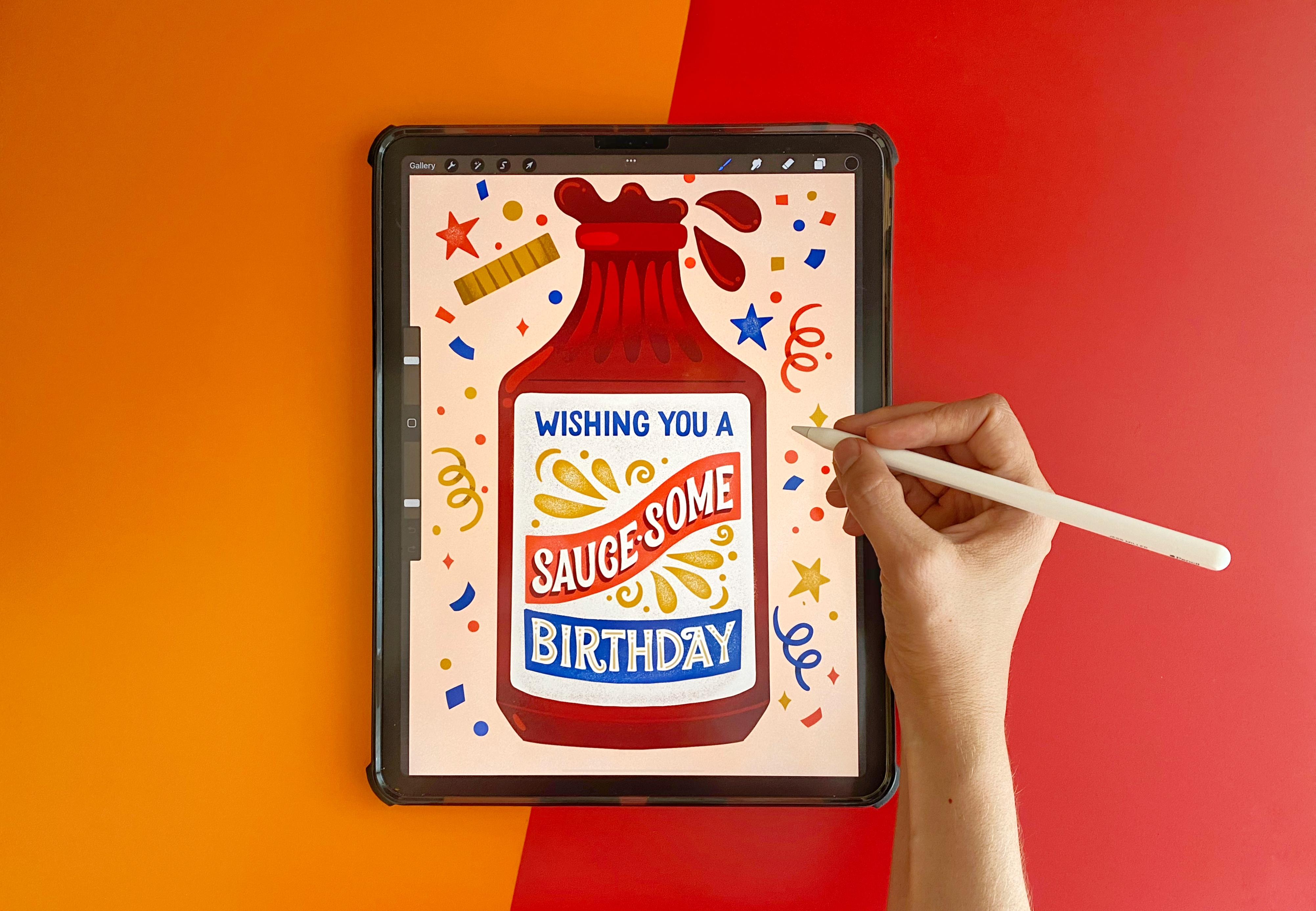
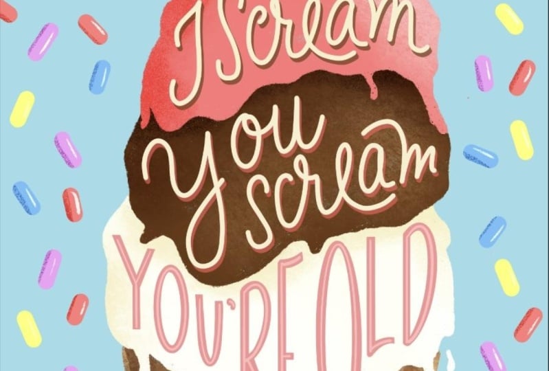
for illustrators. Creating custom greeting
cards from procreate. As an illustrator
greeting cards or one of my favorite
things to create. And they make up the bulk of
my work as an illustrator. Over the years, I've had
the pleasure to work with companies such as
American Greetings, minted paper culture, bicycle
cards, and many more. I get excited about creating greeting
cards because they're the perfect platform to showcase the fusion of
lettering and illustration. Cards are also just as
simple and inexpensive way to share a joke and to show a person how much
you care about them. I also love injecting heroin to my work. I love a good pun. Like this card I
designed for, minted. This creative wordplay and vintage style really makes it one of my best-selling cards. For this class, I'll be sharing my process including how
to brainstorm a topic, sketch out ideas, ink, color, and decorate your
final greeting card. By going through this process, you'll learn how
to tell a story by combining different
elements into a single integrated piece. This class is really
perfect for anyone that is somewhat
familiar with Procreate. But maybe you just want to add a little more hand lettering
to your illustrations, greeting cards, or one of my
favorite things to create. And I'm really excited to share my lettering and illustration
techniques with you. So if you're ready,
let's get started.
2. Class Project: For this class project, I'll
be walking you through how to handle in Illustrator
your own greeting card, specifically a birthday card. I chose this thing
because everybody has a birthday and it makes up a large part of the
greeting card business. But this is your project, so feel free to pick
anything that you'd like, including loving anniversary
Valentine's thank you card. There's so many greeting card themes that you
can choose from. I chose this project
because combining hand lettering and
illustration really makes my style unique
and memorable. It's also just a great
way to share a joke or a special message
with a loved one. It's also the
perfect platform to showcase the fusion of
lettering and illustration. For this class, you'll
need blank paper and a pencil, a drawing tablet, and drawing utensils
such as the iPad and Apple Pencil and the
drawing app Procreate. In addition, for this class, I included procreate
lettering brushes, a digital lettering guidebook, and color palettes found in
the class resource section. If you're ready,
let's get to LeBron.
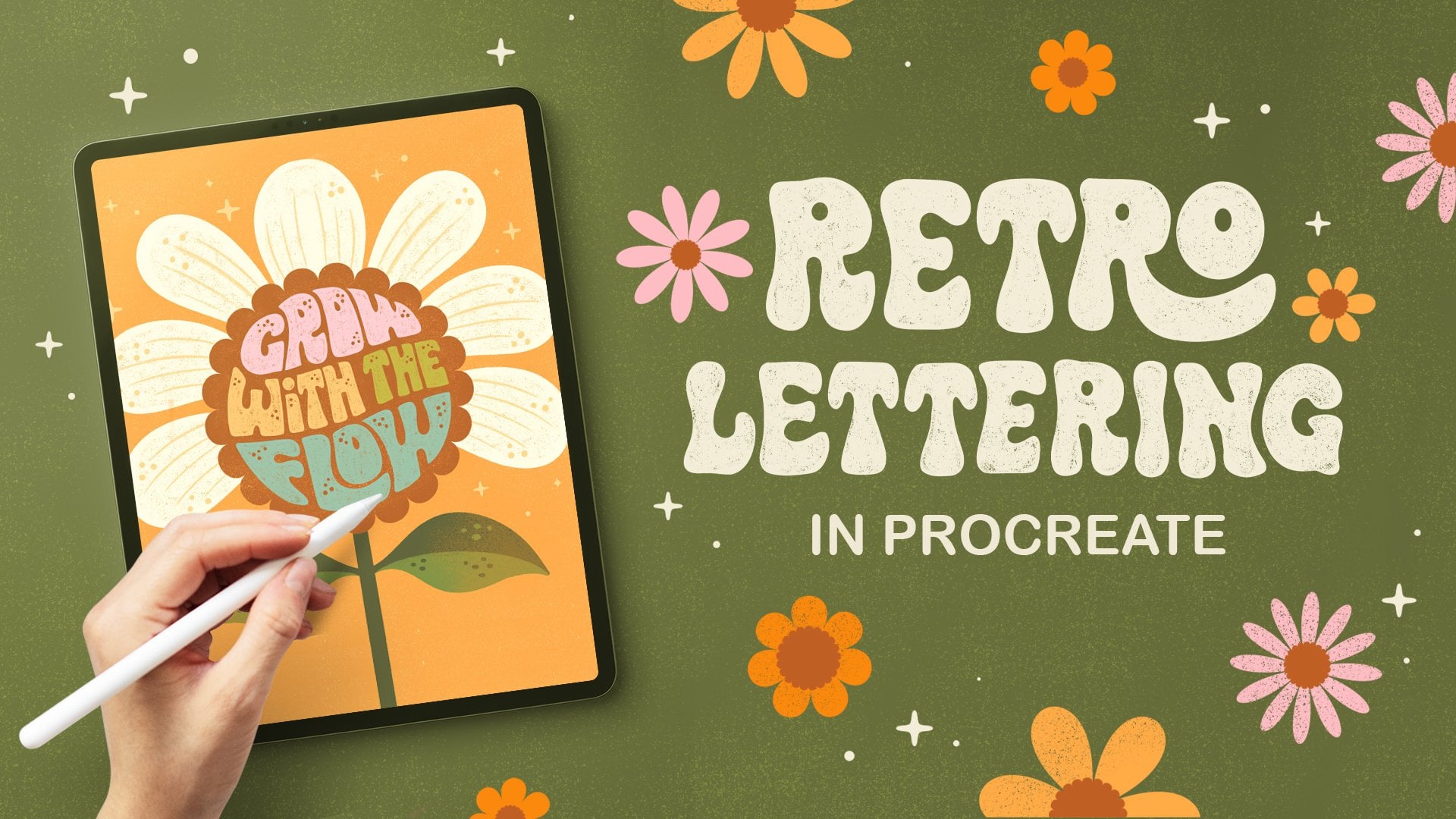
3. Terminology & Inspiration: You might be asking yourself, what is hand lettering
and how is it different from calligraphy
and typography? Let's clear up that confusion. Hand lettering is
an art form that focuses on drawing and
illustrating the letters. Each letter and phrases
hand-drawn and uniquely composed. Lettering is completely
customizable and perfect for projects that require more
illustrative work that you can't quite achieved
with a typeface. Calligraphy is also hand-drawn, but focuses on the beautiful
writing of letters. Calligraphers use
single brush strokes to create the letters. Often with traditional
tools including brush, pen, nib and ink, calligraphy requires
little or no retouching. Topography is not hand-drawn, but rather an art form that arranges type or
fonts in a clear, readable and visually
appealing manner. Arranging type is done so
by adjusting the size, letting, and kerning of a font. Obviously for this class I'll be focusing on hand lettering, but I wanted to
shed some light and clarity on the three
distinct art forms. Before I start
brainstorming ideas, I like to gather inspiration
and also consider what letter style I'd
like to use for my piece. There are four main types of lettering styles that
I'll be covering, including san-serif, serif,
script and representational. And I really like showing
those different styles through the hand-lettering ledger
book by Mary Kate McDevitt. She's just the queen
of hand lettering. And so she has a lot of just great lettering examples that I can reference
through this book. This is also just a great
resource to have on hand to if you just want to
practice more hand lettering. The first style is san-serif, miss the most basic with no extra flourish
or embellishment. But you can still tell how
very hand-drawn it is by these added up illustrations
that she does. She's still like you can definitely tell that
this is hand-drawn. It's not just a font. Does a lot of different
ways to embellish it and decorate it to make it just
fun and add more character. The second style is Sarah. And Sarah's have
extra strokes or feet on the ends of
the letter forms. And there are so many
different kinds of Sarah and that you can tell the little extra
serifs that are added. It also has a very old, old-school vintage feel to it. It can also be very ornate. Can tell like these. These added ornaments
on it is just very, very ornate and it takes on a totally
different character. The third style is script, which is closely related to
natural cursive handwriting. So the letter forms are connected to each other
with fluid strokes. So you can tell it's
just very more elegant. And you can see how all the letter forms are
connected with a fluid stroke. It's just like your handwriting. It you see a lot of
scripts and like wedding invitations is
because it has this like very sophisticated
romantic feel. The fourth style is
representational, and this is the
most illustrative. You can tell from
her examples here that she drew out solid leaves, like lettuce leaves for a salad to represent
the word salad. She has this ribbon hand lettered this ribbon
to spell Walzer. Zap. That literally looks like
electric electricity bolts. Also how she used hair
to represent haircuts. It's actually this scissors are cutting into
the letter form. That's really creative. And I love how she uses flowers. She illustrates flowers to represent each letter and fresh. So before I even start
sketching out thumbnails, I really like to reference lettering books for inspiration. One of my favorites is the slab serif type book by Stephen Heller
and Luis Valley. I love it so much that
it hits falling apart. But inside, they give really great examples
of advertisements. And how type is used, combined with illustration
is beautiful labels. Also examples of signage. I think just drawing from the
past is just really good. They just have great
examples of vintage type faces, border treatments. I love these color
combinations, very Americana. They also offer a lot of alphabet styles as well.
For you to reference. Just super helpful, just a really great
book to have on hand. Another one I like
to reference is the script style by
the same people. They give a lot of
really good examples of scripts and how they're combined with sand
Sara, Sara fonts. Very elegant calligraphy style of those bright
colors so saturated, also give a lot of
good border treatments and how to treat swashes. They also provide
alphabets as well. Just a really beautiful book
with lots of great examples. And as you can, if you see
something that really sparks, sparks your mind and you're
like how I loved that and I'd really like to adapt
some of that in my design. Just take a quick snapshot with your phone and
save it for later. I also really love to reference this letter styles library
book by Liz Kohler Brown. She is a fellow Skillshare
teacher and she's amazing. I've taken a lot of her classes. I've learned so much from her. She's also super nice person. And it's funny, she designed this book which basically has, I think over 25 different
styles, lettering styles. And she breaks it down for
you in a sketch and ink. And how to decorate
each letter and style. And then she gives you an
example of how it's used. And she even invited me to
be a feature Illustrator. So I illustrated some
of these as well. Which was a lot of fun, cute one I did a ton of
different styles. She has a bunch of
different scripts as well as some serifs. And she always shows you how to combine it and how to use
it in an illustration, which is super helpful. I wish I had this
book when I was first starting out because it's such a great reference
because you're like, I don't know what style
to use and you can just instantly reference
an entire alphabet from start to finish. It's a great book,
so you'll definitely want to check that out. I'm going to link
all these books in the resource section so that you can see where to purchase them. Purchase them if
you're interested. In addition to my
lettering books, I also like to
gather inspiration from Pinterest and I created this vintage packaging board
and it has great examples. I put the link in the
class resource section, but you can just see all
these different labels. I love the different
swash treatment and how they used it to
fill up the negative space. They also give you a ton
of examples to blow. This is really cute. How it's
just line work of a glass. And then it's behind melody that cuts
across in the middle. Luggage. It's kind of a nice canvas
that holds the type in. This is really cute. We'll see Shell have just lots of like
advertisements and labels. They use a lot of borders
to hold the letter, the letter shapes in place with the illustration
in the middle. And I kind of like echoes
that shape on the bottom. This is a really
lovely vintage script. I love how thick it is. It's very cute and
pointy serifs. Love this peachy tobacco. A p is really pretty. And how has that
slight drop shadow? Then the illustration
in the middle. Just kinda get lost in Pinterest because they
have such great examples. It's really vintage box
of Crayola crayons. And how they have
these ornate details. The kind of hug
the letter forms. It's really beautiful.
Border treatment. This is funny. I didn't even know that beer
came packaged like this, but apparently, this beer, it kinda looks like a
can of oil. It's crazy. But you can tell it's just like tons of examples of how they combined illustration with type. This is a beautiful example with a B curls in and then the
C, it's really lovely. I also really liked this texture that they did with
the stippled dots. Here's a good example of a mix of lots of different types. So they have less
diagonal treatment. They have this really nice
border that runs along it. They have some type
straight across, little bit of illustration, lots of type to fit into
that one little label. This is really beautiful, beautiful ribbon kinda goes up that has this type
than a circle at the top. They also give some similar
examples down below. It's pretty funny. I like how squirrels kind of
flat at the top and then the letter
forms kind of hug the shapes that fits that arch. Squirrel, peanut butter. That's how tasty too. You also really liked
these vegetable labels. Can get a lot of inspiration
from these border treatments and how they fit the type
inside these banners. For this stage is
definitely take your time and just kinda soak in all the different
inspiration that you can gather from vintage packaging. If you feel particularly
drawn to a piece, go ahead and take
a screenshot of it and save it for later just
so you can reference. This is kinda type
treatment that was used.
4. Brainstorming: Okay, For this lesson, I'm going to cover how to brainstorm the messaging
for my greeting card. I believe a good
greeting card always has a great hook, a funny pun, create a board play that draws the viewer in and it really
attracts the viewer. So I always try to
brainstorm ideas just to know to write out in a list form before I
even start sketching. So this is kinda like
what I call a brain dump. And so I usually just do
that on playing computer, printer paper with a pencil. I find that doing an analog version is
just much easier for me, but that's a
personal preference. If you want to do it
digitally on your tablet, go ahead or maybe you want to write it in your sketch book. That's, that's up to you. So I usually start just
writing a list. I'm going to write
birthday at the top because we know that we want
to make a birthday card. I'm going to write
everything that I can think of about a birthday. Let's see. I hope there's cake
at a birthday. Cupcake frosting. There's so many baking shows
about cooking these days. Sprinkles, presence, I hope
we received presence and gifts, decorations, streamers, confetti. I'm keeping it just very casual, just listing out
birthday related things. Candles, individual candles are those little number
candles, balloons. We can put that
under decorations. Maybe it's an adult, birthdays, so you'll have
drinks, cocktails. This is a celebration. This is a party. It's hopefully a gathering
with your friends. You know. Unfortunately
we're getting older. Maybe it's a good thing. Maybe you look forward to
getting older every year. But there's a lot of funny things you can do
about getting older. So I'm gonna put that down. I also want to think about like typical birthday gradients. So of course, you
know, happy birthday. So whole song about it. You know, we, we often wish
people happy birthdays. So wishing you, wishing you
dot-dot-dot a, wishing you a. And then I kinda want to think of adjectives that describe it. So spectacular could be one. Awesome, fabulous, Terrific, wonderful. You get the idea. I hope your birthday is
another popular one. Okay, I think we got a
pretty good list going. But everything we
know about birthday. So now I'm going to
write a separate list about things I like. This is totally
unrelated to birthday. Maybe it's, you know, activities
or things that you enjoy that you kind of then you
just want to make a list for. So what we wanna do is
eventually combine these two. So you kinda want to think like, Let's see, I really like coffee. I start every morning with
an, a cold brew coffee. So I'm going to put coffee
at the top of the list. You know, some people prefer T. So that's a good one.
Hiking, nature outdoors. I live in So Cal and I go hiking in the San Gabriel
Mountains all the time. I love it. Sunshine. I love the outdoors. Outside. The beach is wonderful. If you live near the beach. Tacos, things that you eat. I love tacos. I love hot sauce on my tacos. Some people don't like spicy
food, but I'm obsessed. I also love like a
good burger and fries. What are some some more
foods that you like? Summer it's almost summertime. I love fresh peaches, strawberries,
bananas, you name it. Go back, going back
to drinks like good cocktail, love
a good cocktail. Beer, wine. I also love to play games with my friends
like card games. We've game nights,
cards AND gates. There's a lot of fun
things you could do. Or my own cards, like there's, you know, a deck of cards, there's a king and a queen. Ace jack. Also, you know, like a suit of cards, the hearts, diamonds, spades, clubs. You get the idea. Okay. Pets, people love
their cats and dogs. Let's do pets. Cats and dogs. Okay, so I think we got
some good things going on. So now what we want to try
to do is combine these two and come up with like some funny puns
and creative wordplay. So I'm just going
to put any puns. Word play at the top. Let's see. So like combining maybe T, you can do a really
easy one would be like, hope you have a
terrific birthday. Let's see. Oh, for coffee. So thinking about all the different coffee
drinks there are. If you like lattes, wishing you a lot of
fun on your birthday. So funny. One dot, dot, dot. Yeah, so another thing
I want to keep in mind, I always tried to incorporate
a product as my canvas. So whether it's like a bottle
of ketchup and it says, let's catch up soon. I feel like that's a really
fun way to combine lettering, your messaging in
with illustration. So I kinda want to think of
that in the back of my head. So for example, like tacos, like, let's talk
about your birthday. You could maybe have the product via taco
and then letter like, let's talk about your birthday. You don't like hot sauce, thinking of like a bottle of hot sauce and then your
messaging could be the label. Let's, you know, the classic
Happy Birthday hot stuff. Let's see, you know, like hiking and nature. Like thinking of like
life's, life's a journey. You could say something
like enjoy the journey. Maybe you have a hiking boot is your canvas background and the lettering inside the
boot, that'd be pretty cute. Peaches, like, hope
your birthdays, peachy. Abbreviate, your BDS, BCCI, um, for, for maybe like Planet bar
cocktail, beer and wine. You could always say like
maybe a play on hip, hip hurray, It's your birthday, you say Sip, sip hurray. That rhymes too. So that's really cute. Over beer. You could, instead
of saying happy, you could say Happy birthday, Happy Beardy, about
that copy of your day. Because beer is
made out of hops. It's good one. My husband loves old fashions,
the cocktails. So you could say something
like wishing you. And old-fashion
birthday's pretty cute. There's a lot you could do
with like a deck of cards. You could say like your
straight up birthday queen and have illustrate a card
with the queen on it. What else? Oh, hope
your birthdays. Ace. Love that. Pets like for cats and dogs. You know, you could say like, have a hope your
birthday is happy, wishing you a Pawsome birthday. How about that? Because
cats and dogs have paused. Thinking about like
burgers and fries. You can also think more
about the condiments. I love like southern
food and barbecue sauce. It's like what happens
if you did like some kind of riff off of
the word awesome and did something like wishing you
a song, awesome, birthday. We're just having fun. We're making up words. So that's, I think I have quite a good list going on
with a lot of different ideas. I think for my card, I want to go, this
is pretty original. Haven't heard of
this one too much. So I think I'm going to put a little star around the wishing us awesome birthday
because I think that's the messaging that I want
to illustrate for my, for my greeting card. Once we have our messaging
selected from our list. In the next lesson, I'll go over how to sketch thumbnails so we can start sketching
out our composition.
5. Sketching Thumbnails: Okay, so after we've created
our brain dump of ideas and we've researched a lot in
our books and on Pinterest, we kinda have a good idea of
what style we want to use. Now it's time to start
sketching out our thumbnails. Are thumbnails are
good because it's just a really rough
and dirty way to show how to quickly combine lettering
into our composition. It also gives us some
different options to, before we start to refine
and get into the details. So I usually start and just
an 8.5 by 11 document. So I'll press Plus. I like to work in inches just because it's a
little easier for me. 8.5 by 11300 DPI. It gives me 75 maximum
layers, which is plenty. I click Create. Okay, so now I know that I want my messaging to say wishing
you a sauce and birthday. And I like to write that out at the top, the very beginning. I'm going to use my
sketching pencil. It comes pre-loaded in procreate in the sketching section. I'm going to draw that at the top just as a
quick reference. So it's good to write it out
ahead of time at the top. So it's really good to
write it out at the top as reference because
I've just kinda, I always start just drawing in. And then I've many times I have forgotten a word or
spell misspelled word. So it's really good just to
reference it up at the top. And it's also
really good to rank each phrase or word that
you want to highlight. You want to put emphasis on. For me, I think so awesome
is really important, so I'm going to rank
that as number one. Birthday's pretty
important because that is our main theme. So I'm going to mark
it as number two. Then wishing you a
is number three. Not as important
as the rest of it. I'm going to scale this
down just a tad. Okay. So for my thumbnails, I also want to divide it up into four equal sections
because I think I want to draw out four different
options I can choose from. So for that the easiest
way is to click your gear. Click on the Guide, edit guide. And then you want to
bump your grid size all the way to the top. And then procreate automatically divides your canvas
into four sections. So all I will quickly
do another layer. Just sketch out four squares. Holding my pencil down
gives me a straight line. Okay? So I know for
my composition, I want wishing you
a saw some birthday to act as our label
for the bottle. And they want that
messaging to fit inside of the barbecue
sauce bottle. Easiest way I think
is to just start drawing some bottles
during some shapes. This is just really rough. I'm just going to start
with a bottle cap first. Just start trying
some bottles shapes. This is your cards. So if you are having trouble
like referencing the shape, maybe go to the grocery store, checkout some different bottles shapes at the grocery store. And I know for this one,
I think I want the label to just fit right inside. Okay. Now, I want, I think I once saw some kind
of like to look like one of those flags and banners that we were looking at in
the Pinterest board. I want that to stand out first. I'm just going to quickly
sketch out a big flag banner. Okay, I think I wanna
write saw some inside of their easiest way
to get it to fit. Because it is kind
of a big word, is to figure out
what the middle is. The middle is about the EE. I'm going to draw that first. This isn't, this isn't precious. We haven't even, we're not
even figuring out styles yet. We're just trying to figure
out our composition. So it doesn't really
matter what style. I'm just going to write it e and then kinda work
backwards, right? See you. Okay. Then I think birthdays naturally going to have to fit down here. And this is kind of
an awkward shape. So I think I want
a script for this. So I'm just going to
use my own handwriting first for the script
just to lay it out. This has like an empty space here that I'd naturally
want to fill. One of the ways to do that is to draw what you call swash. And I find that drawing swash
is just naturally out of the ascenders and descenders
of letters works best. That fills up that empty
space right there. I like that. Okay. Now I got to fit, wishing you a. We got some space right here. I think we could
probably fit an a in. Its kinda like those
those packaging bottles, there's little Snipes
and bursts that say like 10% fat or
something. I don't know. That's what it reminds me of. Now I need to put wishing you a, I think I kinda made me
wanna do an arc shape. Just going to lightly
draw that in. I'm just going to write
wishing you, which she knew. Okay. I think that's
looking pretty good. There's a little empty
space right here, so I might come back to it. I don't know. I haven't figured quite
figured that out yet. That's why we're
doing thumbnails is just to kinda figure out the spacing of where we
want our words to go. And since this is a birthday, maybe I want to put a star in here just to kind
of act like a logo. Some kind of shape.
Maybe I want to draw some decorative raise to
give it some background. Can have like some stars. Maybe some confetti too. Just to make it more
festive but party-like. Okay, So I'm really
liking that one a lot, but I think I want to try maybe a different bottle shape
and a different composition that's a little too wide. Maybe. Maybe I want
to tell iodide or no. Maybe I'll do a different, like a rounded cap shape
for this one. I think I want the label to kind of be in this
half circle shape. Okay, so this is kind of an interesting,
interesting shape. I think I could maybe try a different flag
shape for this one. Does something a
little different. I'm going to put saw some
again in the middle. So it's really big and bold and highlighted similar to
how we treated this one. Again, I think the E is
probably the middle letter. That is easiest to figure out. Okay, so we've got
some awesome to kind of fit in there like that. Just going to trim
up my borders, just a hair just to kind
of clean up a little bit. And then I think I want
wishing you a way to kind of mimic the same shape. I think I'll just roughly
draw an arch for that. I think a good fit, really good right in there. Maybe we'll draw some
amorphous shapes. And then birthday can
fit right in here. Oh, it looks like I forgot my h. That's why you always write
it up at the top, right. That's an easy fix though. Procreate can just clip
it and add your h. Okay, so I kinda, you
know, I used dru, birthday just to kinda
mimic that shape. And so there's no
like negative space. It just kinda fits
really nicely inside. Like that. Although I'm not sure if it really reminds me
of barbecue sauce, but Council salad
dressing. That's okay. Maybe we can have like, uh, oh, I know. Maybe maybe the cap
can be off of it. So it's just like a lid. The caps the cap came off of it. And then barbecue sauce is
just like spilling out. Okay. I like that. All right, let's keep going. Let's do a third option. Let's see, for this one, I wanna do just a completely
different bottle shape. Again, you can go to your local grocery
store market or even do like a quick Google
search and see what kind of bottle shapes come up. I think I want it to be
just a little bit bigger. I can use my selection tool, select it and just
make it picker. We wouldn't want to do
that with our final piece, but we can totally do
that with your sketches because no one's going to see our sketches except for you. Let's say you want to
share your sketches. It's nice to kind of
show your process. I'm just drawing
some bottle details, maybe some like some
reflections and indentions ingredient
in the bottle. Okay, So this is gonna be my label and I think I want
it to wrap around this time. It'll kind of hug the bottle. And I'm not sure if that
might be a little too narrow, so maybe I'll have to widen, end up with it. Okay. So again, I wanted to start with sauce them just because
that's our number one word. I'm going to try just a
straight diagonal line. Then I'm going to write awesome. Again, starting with our E, finding the middle of the word. I'm working backwards. That fits nicely. Then I think I want
birthday to kind of fit in this triangle shape. And I also want to
put at the top, wishing you a maybe kinda small. Maybe I want to put it. Maybe we can do some kind of decoration or maybe better yet, like a flourish of some kind. We'll figure that out later. But I do want to put something in there just
to fill up that space. Always bothers me
when there's like negative space in
my composition. So we'll just make a note. Fill in with a curly
key right here. And for this one, maybe we can just do like
some amorphous kind of lines. Come, mimic barbecue sauce
flowing from the bottle. Some fun dots. Just some kind of
different decoration. Okay, and for my fourth one, I think I'm gonna go with the traditional like
squeeze bottle shape. Make this fit right
inside. Okay. I'm going to maybe just
write wishing you straight across at the top. Then we want. So awesome. I think I'm gonna have it since this is a really long Canvas. I think I'm going to
need some kind of like diagonal to kind
of go up at the top. That really cuts it in half. So we have a lot
of room in here. So who knows, we can
do some cool design. We've got to put
wishing you a in here. Maybe I want to fit
it in right there. Maybe wishing you really tiny. Showing you a. Then I want to turn up
the birthday in here. We can do some kind of shape, just a slight arc. Okay. I think age is probably in
the middle of birthday. I think we've got a lot of good rough composition
is going on. We got four different
bottle shapes. I think this one's looking a little play in the background. So what can I add? Even what kind of mimic? It gets? Written out some, some sauce. You can add, some stars and
maybe it will add confetti. Let's try that. Maybe some like curlicues,
like streamers. What makes you think
of birth their right? And we can reference
our brainstorming. I think we have four really distinct layouts and we have four very
different bottle shapes. So I think these are all
really good options. I think. I think I actually like I like all the
decoration that's going on. This seems like really festive. I also really like this. What we have going on with this layout, this
type treatment. I'm not really a fan of
those bottle shape though. Kinda reminds me of
like a glue bottle. I don't know. I'm not feeling it,
but I actually, I like this shape. I might combine this shape with this decoration.
What do you think? I'm going to put a
star next to both? You can pick and choose what, what elements you like best. But I think I'm going
to move forward with this kind of treatment
in this bottle shape. Okay, so now that we have our
for our thumbnail selected, we're going to move on to refining our sketches
in the next lesson.
6. Refining Sketches Part I: Okay, so for this next step, we want to really
refine our sketch. We want to get it into a
nice, tight, clean shape. So I think I actually like elements from
these two the best. So I'm going to do a
Frankenstein and cut them. So let me use my selection tool. This rectangle. Just drag across. Let me use a three-finger
swipe to copy. Then I'm going to
make a new document. We're going to make
a new document the size of our greeting card. Most greeting cards come
five by seven inches, just like a rough standards. So gonna do new canvas
size in inches. I like to give myself a
little bit of breathing room, make it a little bit bigger to account for bleed and crop. So giving myself just a little
bit extra always helps. I'm gonna do 5.25 by 7.253100 DPI and a maximum of 191
layers. And that's plenty. I'm going to press Create. Okay, so now we're going to paste our thumbnails
into our document. I'm gonna go ahead and erase
the stuff I don't need. I'm just going to use a
thick monoline brush. Just erase the elements
that I know I don't need. Okay? I actually like
this lockup better. So I'm gonna go ahead and
erase this one as well. So we just are left with
this lovely bottle shape. I like a lot. Okay. So now I want to cut
out this lockup shape. Use three fingers to copy. Three fingers to paste. Just going to move
it over here. Okay? So the proportions
are a little off. I'm actually going to adjust my bottle
shape a little bit. When you use the free form. Just kinda warp it to
fit a little bit better. In this shape. It's okay like we should never
warp our final in any way. But for legibility,
but for our sketch, it's totally fine to warp it. Because no one's going to
see it for you, right? Lets you share your sketch. And then I kinda just want to
tweak it a little bit just so that it fits
perfectly within. There. Must have been in my w. So every sketch it. I also really like these decorative elements
in the background. So I kinda want to pull those. So I'm going to just delete. I'm going to actually use the free form selection freehand. Just going to delete this
whole bottle design. We don't need it. Cut. Lots of Frankenstein. I do that a lot. Because I like certain
elements from one piece. I like to combine
it with another. So I'll very often
times do that. Okay. So now we can merge our layers. I'm just going to, you know, I think I actually liked the cap off from one of our
options and our thumbnail. So I think I'm going
to clip the cap. Cut it off. It will paste. Okay. It's almost like it just
popped right off the bottle. I'm gonna make some room for it. Just kind of delete
these decorations. Make room for the cap. Draw the lip of our
barbecue sauce. Okay. Then I look kinda like how
it was spilling out before. So I might just kinda, I kinda want to size it to
the shape of our canvas. I'm going to merge
that bottle cap down. So it's all on one layer. I'm gonna select uniform
and then just drag it, make it the size where
Canvas and look. It's pretty perfectly
within that space. Just fill in some of that
empty space there. Okay. Now this is getting better,
it's getting there. So we want to turn
down the opacity. I like to turn it
down to maybe 2524. Okay? This is just a
reference point so we can start refining our sketch. We want to definitely
make a new layer. We want to continue
using or six, be sketching pencil or whatever sketching
pencil you prefer. And I want to draw, I think my ball first, I want to draw this canvas. I'm going to select
my drawing guide, edit guide, and I want it to
be perfectly symmetrical, so I'm going to hit symmetry. You have some options down here, vertical, horizontal,
quadrant, radial. But for this one, I want
to keep it vertical. I'm going to collect,
select, Done. Okay? What's cool about the
symmetry tool is that when you start to sketch it out, procreate automatically starts
drawing the other side. So that's perfectly symmetrical
and it saves you time. You don't have to
draw the other side, which is great. I love it. I use this tool all the time. I'm gonna go ahead
and draw my ball. So next we want to start
blocking out our letter forms. We want to draw these, these ribbon shapes first. So I want to go to a new layer because I don't
want it to be symmetrical. And I'm just going to lightly,
lightly trace over it. I'm actually not
start from here. I'm really glad that we started with thumbnail sketches because it's not as
intimidating when you have something to trace. Because often when
you just start sketching on a blank canvas, it can be very intimidating. Just going to adjust
a little bit. Okay, Then we want to kind of block out a
shape for birthday. I think I want to
give it a little arc. This a little shapes. It's not totally straight. Fits the shape of
the bottle better. Alright, and now we want to establish some
guides for our letters. And to do so, I'm gonna go
ahead and make a new layer. You want to hit the gear, you're using your
drawing guide again. I'm going to edit. We
want to use the 2D guide. So for this, I want to draw
a straight line across so that all of these letter forms
and wishing you a lineup, their baseline lines up. So we want a smallish grid, maybe about 40 pixels, a little smaller, 25. Okay, that looks good. Hit Done. Okay, now I want to
pick a new color. Let's pick blue for
our guide color. Okay. I just want to draw
in my baseline, this is where all of the
letters are going to line up. Alright? And then
you also want to draw in the cap height. And the cap height
is just indicates where the height of your towels capital
letters are gonna go. And we also want to establish
where our midline is. Or x-height, which is the
height of a lowercase x. So this is super rough. I just loosely blocked in. We're wishing you
a is going to go. I'm going to select
my black again. Okay? I'm gonna be a little
more careful this time. I'm just I still don't have an established
my letter style yet, but I know that it's
going to be all caps. I'd like it to be all caps. So kinda mimics a label
of barbecue sauce. I just want to
write it all out a little more carefully
in little neater. My thumbnail was pretty rough. I can also use these guides
to line up my letter forms. So you can see this
eye is a little wonky, so I'm going to redraw it. I don't want it to be
pretty perfect Up and Down. Want to account for this
spacing a little bit better. Next is my g. Okay, that worked
out fairly well. The crossbar for
the a actually is below the x-height because
if it was up here, it'd be really tight
and it would be really hard to read that ASU actually adjust it and you
make it a little lower than the x-height owner. Oh, optically makes
it look smaller. Then we want to start
sketching out our sausage. We want to follow the
shape of this banner, but we want our letter
forms to be up and down, follow the grid
socially when i mean, I want to draw all my E Street, then I want this part to follow
the shape of the banner. Does that make sense? Birthday, we want to
find the midpoint, and I would say it's right
in-between this H and the t. So this is roughly the
middle of our canvas. I'm going to start
drying or H. I like working this way just
because I can fit the words a lot better when
I find the midpoint first. Just kinda learned that from my own by doing my own mistakes. And actually toggle back
between the thumbnail sketch. Okay, so that's how our banners this it's kind of it's
not fitting so good. So I think I kind of
wanted to just do some self adjustments
with my eye over, just tweak the
spacing a little bit. Okay. Now we can, Let's draw in some of the
decorations so we know where where it is on the page. We can turn our guide off. It's a little distracting. Just going to sketch
out the bottle cap. Okay, now, I don't
want to block in these decorations in here that we have to fill up
that negative space. And it mimics the shape
of the barbecue sauce, those flashing out at the top. All right, so I think that
that is looking pretty good. It's definitely tighter
than our thumbnail. I can kinda do a little
before and after. So here is our rough
thumbnail sketch that we just used as a guide. And then we have a much
tighter refined sketch. So we have, we know now where, how we should start building our letter forms when
it's much cleaner.
7. Refining Sketches Part II: Okay, this is getting an, a pretty good shape. One thing I definitely
want to add our guidelines for both
saw some and birthdays. So I'm gonna go
ahead and do that. The easiest way to do that is to actually take it from
this banner shape. Figure out which layer
it's on. Here it is. Okay. Excuse my clipping
tool, freehand. Use three fingers to
swipe down, copy, paste. It perfectly lines up. We want to use that
as our cap height. And I'm going to
go ahead and use Alpha Lock and color it blue
or a color of our guides. And it's actually, I'm
just going to duplicate it again and use it
as our baseline. Because I feel like it
should all align perfectly. Okay. And I kinda don't really like how that
banner shape is off. I just kind of free handed it. But I want it to
perfectly aligned with our lettering so I erase it. Just pull it down.
So that way it's the same line that we just pulled down and
everything lines up. It looks much better.
Switch this back to black. Go ahead and merge that
down our sketch layer. You can see it kinda where
I was off on my letters. So that's why we want
to use guides, right? They just line everything up. So I'm gonna go ahead
and fix those letters. I'm going to turn my
guide back on, guide on, so I can adjust
them accordingly. And C, This C is a little off. It's the same as the O and I'm going to want to adjust it. It's an optical illusion
because it's so round and there's a
lot of negative space. So I wanted to actually
extend over my guides. Use a little off. S is another one that you can
adjust the overshoot for. Just slightly. This is a little exaggerated. Okay. Oh, the little off. It's just a bigger
letter in general. Actually use my free formed
kinda tweak these guys. It's just a lot of refining, refining or finding or finding. I do sketch over, sketch, a rough
sketch sometimes. And I'm going to redraw this because I don't
really like it. To draw a better oh, I'm actually going to
draw half circle first. And then the straight part. That's a lot easier. Now I'm just going
to continue just to kinda tweak my letters. So they fit within my guides. Looks pretty good, that
looks much better. So this is a little
a little off. My spacing is
because I don't have a cap height established
or a baseline. So I want to go
ahead and do that. I'm going to use my
banner shape again. Then I drew just going to
erase the bottom part. Three fingers copy. Paste. Okay. I'll be color that
in my blue color. Duplicate it. Bottom of our guide. Your baseline. Okay. Duplicate. That one
will be the bottom, bottom of our banner.
So we want to color it. Like, Okay. I can kinda see where my
letters were a little bit off. The BI probably the
most new merged together my guides so that
they're all on the same layer. Okay, got almost all of
them on the same layer. Okay, so that's my guide layer. Now I want to adjust birthday. Okay. I'm again just
kind of refining. Okay, this looks a little tight. Everything else is
kinda aired out, so okay, so now we have
a really tight skeleton. Turn my grid off so we can
see it a little bit better. This is it's still super rough, but it's much cleaner. And I'll even show you our thumbnail that we had as a reference so you can
see how rough it was. Super rough, right? But that was just because
we're sketching over it. And we really just wanted
to tighten it up and get our letters in a really
good, legible place. And so for our next lesson, we're going to
continue to refine. We're going to add more
body and weight to our letters and
flush those out a bit more on top of our skeleton.
8. Refining Sketches Part III: Now we want to add more body
and weight to our letters. We also want to establish
more of a lettering style. I want to make it look a lot like a barbecue sauce bottles. I think I want to keep
these in all caps but I think I want to add a little more style and flair to them. Since this is not super
important messaging, I think I want to
keep it pretty basic, probably a sans serif font. It's just easy to read. Paired with maybe a slab serif or like a little bit of a flare. I think that would
be really nice. A good rule of thumb,
you don't want to mix more than three
lettering styles, especially for a greeting
card just because it is a small canvas and you want it to be pretty legible
and easy to read. You don't want a mix of too many styles because
then it can just be too busy and too hard to read. Simple is always better. You can tweak it as you go. From my skeleton, I can actually merge it down. I'm going to keep my guides on a separate layer at the top. Maybe just name it guides. Rename, guides. What's my lettering? Now
I can just merge down. Maybe even delete my thumbnail. I don't need it anymore. I'm going to turn the
assisted layer off too. Now we have our skeleton
sketch and our guides. I like to keep
those two separate. Now we want to add some
body to our letter forms. I'm going to continue
with the 6B Pencil. I'm going to turn
my guides back on. I'm just going to add
a little more weight. I want it to be bold. This is one of my favorite
lettering styles. I think I use it the most, it's just this really
pretty vintage flare. You know what I could do instead
of drawing that S again? I think I'm actually just
going to cut and paste it. That is a hack that
I do all the time, just so that it's the
same shape every time. That looks much better because we add a lot more
meat to our letters. We added more body
and we're going to do the same for
birthday and just follow our rough
skeleton or bones. I adopted that terminology
from Jessica Hische, she's the queen of lettering. I think she has a few
Skillshare classes too. But she's pretty amazing. She's got a lot of
pen lettering pieces. I think that's
looking really good. I like that style and
I like how it fits within these ribbon
shapes that we have. Now I just want to flush
out wishing you a. It's nice too to just
periodically zoom in and zoom out and take a look at how
it looks altogether. Because sometimes we zoom in, you're in the zone
and you're like, that letter is off, so
you can take some time to just zoom in and zoom out. This is in a pretty good spot, but I just want to
continue to refine and get it pretty close to
how I want it to be. We want our sketch to be
really tight before we ink it because that'll
be our next stage. I'm just going to continue
to refine some of my letters and fix up some of the spacing
that's going on. Here's a bit of an
empty space right here. I think I might add
a little swash, just coming up with the a, just to give it a little
character too, a personality. These are nice touches to add. Whenever there's an empty
space in my composition, I always try to add some
element to fill it up, whether it's a part of the letter form or maybe
it's just a shape. Our letters are
getting pretty good. I really added a
lot and I tweaked a lot of just the
little inconsistencies. I think I want to fix
up my bottle here, these lines that look a
little wonky. Let's see. I'm actually going to
go back into my guides, edit guide, and I'm going
to use the symmetry tool. Click "Done". Now my
symmetry tool on, I can adjust the shape. Our sketch is
looking pretty good. We've filled in a lot of the letter forms and we
straightened out a lot of things. We made a lot of
little minor tweaks, but that all is really just setting us up for
our next phase, which is the inking phase. Because we want our sketch to be a really solid foundation. If you're ready, we'll just
proceed with the inking
9. Inking: Okay, so now that
we've hopefully gotten your sketch in a
really good type place, and we're, now we're ready
for the inking section. Inky naturally stems from the traditional way letter forms were refined by using
traditional pen and ink. So of course, I'll
be demonstrating using digital brushes
in black and white. I personally like
to ink my lettering in black first and
then add color later. Drawing in black and white
just really adds high contrast and focuses more on the
lettering and legit legibility. So you're not too
distracted by color. And for inking, I like
to make a new layer. Then I prefer a monoline brush. I use a smooth monoline
brush to draw over my sketch so that the finished piece is
really clean and legible. And mono line, basically, it just means that the light, the weight does not
vary so it contains no taper and it creates a
really smooth brush line. Okay, so when I ink, I'll use my sketch. I'll reference my sketch. I'll just turn it down to probably like 20% opacity because I just want
to reference it. And then on my new layer, I'm ready to ink
with my mono line. I want to get it fairly small, test it out first. That's probably good. The finer line you have, the more detail you can get. I also want to turn my
guides back on my 2D guides, just so I can have a good sense of of where my line
should line up, ship turn on my guides. And once again, just
really, really lightly. Okay. So now I'm ready to ink. Just slightly tracing
over my sketch. I know the sketchy and
probably seemed really tedious and you wanted
to just kinda jump into the inking phase, but it's really important
that you just take your time with the sketching because the tighter
your sketches, the easier it will be to ink it. Trust me, okay. I will also want a monoline brush for my eraser. Go just so it's really clean. The thing I like about hand
lettering is that tan letter. Do you know? It's it's
really personable. It shows your touch where you can't really
get that with the font. I feel like a font. It's very can be a little
black, a little personality. It's very formal. So if you want perfection, I say, go ahead and use a font. But if you want to
show some character and mistakes and flaws,
use hand lettering. In procreate when you
hold down your lines, you can get it
snaps to straight, which is super helpful
when you're making straight lines and letter forms. It accommodates
for a shaky hand. Like this. I can just snap
it into place. It's great. Okay to save time, I use it a cheaters hack. Instead of drawing my S again. Instead of drawing my S Again, I kind of liked to clip
and paste, copy and paste. I can just use the same S. I don't have to redraw it as it's just
a little convenient. Then I want to merge that down. Okay, I think I drew
those on the same layer, but I think I actually want to separate it just because
it'll be easier to colors. So cut and paste, and now it's on its own layer. Now I want to make a
new layer for birthday. Just follow the same process. It's also easier to
ink when you can just rotate your canvas. So much easier than a traditional
inking. You can undo. Because in digital
illustration It's really easy if you make a mistake
and is quickly undo. Whereas the traditional medium, it's a little less forgiving. I'm just using the
drag-and-drop because it's I find it's pretty easiest to do that instead of traditionally filling
in every letter. Just to make an outline. I find it's much easier. I'll often use that
method to drag and drop. We did the hard part
of the lettering. Now I think it's safe
to say we can move on to inking our bottle. For the bottle inking, I want to turn on my
symmetry guide again. That snaps to the center. And I want to make a
new layer for my bottle and turn on the Drawing Assist can turn it off for birthday. That was a mistake. Okay. Using my same
monoline brush, I'm going to draw out my bottle. I'm just using my
snap in place lines to get a nice perfect arc shape. I do that just by holding down my pen to the iPad screen and
then it snaps into place. It's just really
easy and convenient. Because sometimes my
hands pretty shaky. Okay, so now we have
our bottle shape. I can turn off my
drawing assist. I'm actually going to
make another layer and start drawing in the sauce. Inking in the sauce,
I should say. I'm actually going to drag
and drop and fill that just so it's nice and solid. Okay. I'm just going to make
another layer for my, all my confetti elements. Use my eraser tool
and just trim up, get a really sharp Our Stars to excusing her lines to snap, make perfect straight
lines. Or star. I just drag and drop in each
negative space to fill it. And to make my circles, I just circle and hold down on the screen to
get a perfect ellipse shape. For my curly cues streamers, I think I want to use
a thicker mono line. Test it out a little bit,
maybe a little thicker. Okay, for this one, I'll just draw it in a
fast and quick. That might be a
little too thick. Then I don't really
like that ends. I'm just going to
make it a blunt edge. Use my eraser tool to trim it. Okay. I want to draw in my
bottle cap another layer. I just like to make layers for everything that is going to be probably a
different color. I can always merge them later, but I like to keep
everything pretty separate. Fill that in. Okay. And now I also want to draw
ink in my banner shapes. So I can go ahead and
make another layer. Use my mono line brush
and make it fairly small. And just free hand trace
over it as best as I can. It's pretty good. This brush is pretty forgiving. It looks a little tight. I might have to adjust my banner to allow more
room for. It's awesome. I was getting a little tight. Okay, that's better. Now, my birthday banner
can also edit your, your arc lines, gives you a little nodes so you
can kind of adjust it. That looks pretty good. That looks actually
a little funny. I think since this
is symmetrical, I think I'm going to
actually erase it and use the symmetry
tool to guide us. When in doubt, fall back
on your symmetry tool, will make a new layer and
turn on my drawing assist. It's already set
up. So this way, when I start on one side, it draws for me
there, that's better. Great. And I can also use that drawing assist to
finish up my bottle. I think that's getting
it looks pretty good. I think we're almost
ready for color. Just want to put all
my inking layers. I want to group them together. Kinda show you the difference
between our sketch. So this was our sketch
and this is our inking. So you can see it's much, much cleaner and darker
and a little more refined. So we're ready for coloring.
10. Adding Color : Okay, so now I have inked
eyepiece and black and white. I went ahead and even made some further tweaks and changes. I adjusted the size and shape
of my little curly cues. They were a little
too chunky before, so I refine them using
my studio pen brush, which is found in
the inking section that's preloaded in Procreate. I also kinda
thickened up some of these little curlicue
shapes there we're looking at just a
little too thin before. So I just wanted to make it all balanced in my composition. And I also just
made this label a little bit smaller,
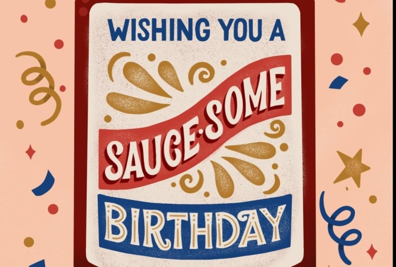
our messaging smaller. And then I added this label just because it's a
barbecue sauce bottles. So I feel like it
should have this really clear, distinct label form. And it just kinda
really locks in our messaging and
makes it stand out. Because mean, that's
why we ink it right, so that we can just really see our composition in high
contrast in black and white. Okay, So now we're
ready for color. And I'll give you a few tips and tricks that I use
when choosing color. For me, I like to use a
limited color palette, four to eight colors while
illustrating greeting cards. I like to keep the
color palettes simple yet really bold and impactful. So not too busy and overwhelming
with too many colors. I find from personal experience, it's easier to add more
colors and to take them away. So you definitely
want your messaging to stand out and draw
attention to the viewer. To make your messaging
and graphics data, it's actually easier
to use fewer colors. So I know for my
card, for my card, I'm going to use this
predetermined color palette because I know that
I really want to use this bold red color and this dark reddish color to
represent my barbecue sauce. And I kinda wanna keep it in this really Americano like red, white, and blue theme. I've figured out these
colors ahead of time. But I want to show
you a tip that I use to figure out colors. That's super helpful. I actually use the harmony tool. So I'm going to just
show you really quick. Using this bold red
color as an example, works really well
with bold colors. So I'm gonna go
ahead and show you. When I select red,
I'm using harmony. And select colors appear, you get a few options. So complimentary basically means it's the opposite hues
on the color wheel. So think opposites attract, they create the highest
possible contrast compared to any other
parents on the wheel. And I very often will use complimentary colors
in my own work for just a very high
contrast and bold Read, the complementary
color to red is blue. So even though this shade and this hue of blue
is much different, I'm using a darker
shade of blue. It's still very
much complimentary to our reds in this
color palette. And a second option that you
have is split complementary. And the split basically finds the colors in-between
that blue color. So it procreate,
kinda figures out mathematically which colors are the split complimentary
between those two. Then there is analogous, which are colors that are very similar to each other
on the color wheel, they're just right
next to each other. For example, this
red, red, orange, and purple all are very
analogous in nature. It's essentially sampling
colors that are just very similar to that red
color. That's kinda nice. It's a very sweet color palette, but it's not very bold
and impactful for mine, I definitely want to use
something complimentary, but I just want to show you these different
options just to help you build your color
pallets in the future. Next one is triadic, and that's basically
three colors that are evenly spaced
out on the color wheel. So the most basic
triadic palettes are primary colors like red, blue and yellow, and
secondary hues orange, purple, and green, kinda
like what we have here. Then lastly, we
have the triadic, which is four colors that are evenly spaced out
on the color wheel. So again, this is just harmony
is just like a quick tool to figure out some colors as you're building
color palettes. I provided some options in
case you're really stuck, but I just wanted to share
that tip because I often use the harmony tool to figure out colors when I'm
building my palettes. For this project, I already
have my palette built out, so I'm just going to kind of work backwards
now at this stage, I want to figure out what my background color will be
and then build up from there. I'm thinking this
peachy is neutral, peachy color would be nice, so I'm just going to
drag and drop and fill. And then I also want to fill all these
labels and banners. So I'm gonna go ahead
and do that right now. I'm just going to
fill them in black. Just sampling this black color. Okay. I'm just going to drag
and drop and fill. I'm just going to
turn it off right now for the time mean. So you can still
see the messaging. I'm going to color
in that big label. Okay. Also want to fill in
our bottle shape. I don't think I
closed it at the top. That's probably why it is
filling the whole page. You definitely want to
make sure all your shapes are are filled so that when
you drag and drop colors, the color doesn't spill
out over the shape. That happens to me all the time. Okay. So my next color that
I want to figure out is this this bottle color. And I think most barbecue
sauce bottles are, are like a reddish color. So I'm the easiest
way for me to recolor when it's black that I've found
is to use the Alpha Lock. Then, just referencing
my colors, I'm going to choose this little
darker, darker red color. I'm just going to go
ahead and fill layer. I can drag and drop to. But I also just like
to use fill because that is it'll fill
every element. So I'll kind of show you as an another
example what I mean. Oh, I forgot to
fill that in black. Just going to quickly fill
in my little indentions, my declaration of my bottle. Good. Turn Alpha alpha lock on. And if I just
dragged and dropped, it would just do like
one shape at a time. But if I want to do
this whole layer, I can just easily go fill layer and it will
fill the whole layer. Now we want to figure out what
are labeled color will be. I want the messaging
to really stand out. So I'm going to make it a
white color like a cream. I think they'll
look really nice. And I noticed that
my banner shape, it's, it's a little, it's a little glitchy. I kinda want to fix
it, so I want to turn my alpha lock on in
order to fix it. I have to turn it off
just using my studio pen. I kinda just want to clean
up those edges real quick. Because you can't make edits to it when you're alpha lock is on. I've learned. Okay. Okay. That's looking very bold. For my barbecue sauce
that's spilling out. I think I want to use that same, maybe a darker color,
maybe this dark color. Again, we wanna do our
alpha lock on each layer. Actually wanted to go
behind my bottle shape. So a tiny little dot
I want to clean up. Okay, that looks better. Okay, Now that I want to
start coloring in my banners. So let's try. I think I want to try
this bold red color for that really pops out. What color my birthday
banner in alpha lock fill. Then I think I want these
curly cues to be a gold color. I think that's
looking pretty nice. I think I want my cap
to be gold as well. And let's see, wishing you a would be nice
in bulk, in blue. Just so kind of alternates, like blue, gold,
red, gold, blue. And I definitely want my
messaging to pop out. So I think I'm gonna make my
messaging that cream color. Okay, I think that's
looking really good. And I definitely want to
color in my confetti. You can do alpha lock. Then. You can just do like
a fill color of everything. If you just want it to be a
little more muted behind it, you could leave it like that. But I actually, I can, I want it to be more
festive and decorative. So I think I'm going to
alternate different colors. And a really easy
way to do that is to just pick a color and
just drag and drop. And just hover over
the shape to fill. Just have fun filling in colors. I also want to bring
in some of that gold. Go ahead and just drag and drop. Okay, I think that is looking pretty close thing I want
to make that one goal. Yeah, I like that. Great. So now we've just did a really quick and easy
way to color our art. And now it's really coming
along and you can tell how the background,
it's like light, neutral, peachy
color in contrast to this really dark red of
our barbecue sauce bottle. And then the messaging with a white-label
really pops off. So these colors are just like
really bold and impactful. So I can see this
like really just like sitting and popping
off the shelves. Now, in the next lesson, after we've finished coloring, I'm going to show you how
to add texture and details.
11. Texture & Details: Okay, so now that we
have colored or peace, it's time to add
texture and details. And this is actually
my favorite part of the whole process just because I think adding
texture and detail, even when it's
just super subtle, it just adds so much more depth and feel too in personality
to your finished piece. And it's really just is the final finishing touches that brings the whole
piece together. Let's work on Our bottle first. I'm going to add a little texture to this
bottle, little shading. I'm going to add a new
layer and just create a clipping mask so that whatever I draw will fill
in the shape of the bottle. I'm actually going to
use this dark color. And I'm going to use this
noisy light brush that I made. It's available for you to use in the class resource section, so you can just download that
if you'd like to use it. I really like to
use noise brushes. They're just, they
just add a little, a little fun grainy
texture, too, flat artwork. So I'm gonna go ahead and
just start shading it in. I'm going to actually
use the noisy brush. Turn it up all the way. To start over again. Actually
like the light brush. So I'm going to use
the noisy light. Just kind of start shading n. As you can see, this is kinda disappearing
are little detail here. So I might use my adjustments
and use brightness. Maybe I'll darken
it up with that. Can also adjust the
color of our bottle. Maybe I'll bump it
up, brighten it a bit better. Okay. I think that looks pretty good. And I'm going to use
my eraser tool to just clean it up my bottles. Actually. I'm noticing some
level in consistencies in it. So I can just use my eraser tool just to trim it up a bit. I don't want to switch back
to my studio pen and just add just a little more
adjustments just to even it out. Okay, I think that looks better. Now. Details are getting
a little dark. I just want to
fill up and again, just play around with the
hue and the saturation. That actually looks good. And I might shade them. Let's shade them with our
critic clipping mask. And I want to sample
this dark color. My noisy brush again. I also like to use my
opacity just to kind of maybe it looks just a tad. That's the hair. I think I also want to add just a little
definition on the bottom. Some shading. This like noisy
texture brush it just adds, adds a lot of just
finishing touches and definition to your bottle to really bring the
shape together. I'm going to use my studio pen. And on that same shadow layer, I'm just going to Erase align. I think I actually want to use a bigger just want to indicate a little bottom
of the bottle right there. And my sauce, I think it's
looking a little dark. I just kinda want to adjust
the hue and saturation. And I want to add
maybe some shine and little more
texture to the sauce. What I do for that is
because it's a liquid. You want to add like maybe
a shine, shine highlight. I'll just use my
disk layer and just find a color that's
a little lighter. Let me use my studio pen brush. Just kinda draw. A little shine. Maybe you want to add a
little shadow on the sauce. Can create a clipping mask. I'm going to use my noisy brush. Sample that dark color. Another cool way
that I like to add some kind of distress
texture is to erase parts of the shape
and then fill it in again. And I'll show you what I mean. So I'm going to turn
the assisted layer off for our label. I'm going to choose
the cream color. I'm actually going to use
my eraser brush and I'm going to use my noisy light. I'm just kinda just going to
go in and erase some parts. Okay. And you might
be thinking like that looks bad. I can't
even read that. Don't worry. We're going to fill it in
again using the same brush. We're just going to fill it in. And it just gives it this
like distressed look. I use this all the
time in my my work. It's just kind of gives it
this like vintage feel, like it's put on the
shelf for a little while. And I just really liked this. Texture brings a lot of personality and
uniqueness to my work. And it seems really subtle, but it gives your
work just a little, a little something extra. You know, it might seem
kinda time-consuming. But I like this part. I like kinda just Sony now and adding texture and
details to my work. Yeah, I mean it's so subtle,
but when you zoom in, you can really see
it. It's kinda nice. I think I'm next, I want to maybe add some definition
to this bottle cap because just kinda looks
like this rectangle that's floating off and we
don't really know what it is, so I kinda want to shade it. I'm just sampling the
same color and sampling a darker color and using
a different layer, I created a clipping mask. And now I'm just kind
of shading the edges. Might even use my dry ink brush, which can be found
pre-loaded in Procreate. It's in the inking section. And on the same layer
I'm just going to draw little like
ridge lines, I guess. For the cap. I'm just eyeballing it. You know, it's not perfect. And let's see. I think I actually want to add a little texture
to the background. Make a new layer. I'm going to use this cream
color, my noisy brush. Just kind of color in
lightly the corners, corners of the canvas. And then I'm going to
use my eraser tool, the noisy light brush selected. And just erase just so that there's a really faint
distress texture left behind. Okay, I think this is
looking really good. I want to maybe add some highlights and
definition for our bottle. Just so that it has more of like a really feels like a bottle. So it's not so flat. When to use our
bright red color. Studio pen. Fairly large. Just draw like a
little highlight. Okay. I think I want to add some distress detail to
these banners as well. Again, I'm going to use
the same technique. Turn this alpha lock layer off my eraser tool for the
noisy light and just erase. The middle part can actually see that the
bottle is poking through. I might want to turn
that off for a second. And just fell in our label. Because if you remember
before we erase parts of it, it was covered by that banner. I'm just going to fill it in. Okay. I like that better now. Going to use our
blue to fill it in. And this is just a texture
technique that I use. You know, there's a
million ways that you can add texture to a piece. But I'm just showing
you one technique that I often use in my own work. I think our, our bottles
looking pretty good. And we've added a lot of
different texture and details to the
surrounding elements, but maybe you want to add a little decoration
into the letter forms. So let's see. One way we can do that is add some decorative details
inside the letters. I'll show you one
way that I like to decorate my letter forms. I create just a new
layer over birthday. I think I actually,
I want to try using the gold color as a decorative
detail and using my, I'm gonna try using
my studio pen. I'm just going to draw
some dots and lines. Inside the letters. You can draw whatever like
decorative detail you want. This is, these are your letters, this is your design. So it's really up to you. I'm just showing you just, just a fun way to
decorate your piece. That's one way you could
decorate your letters. Another way. Maybe if you wanted to
add like a drop shadow, so you really wanted
it to pop out. I can show you
that's really easy. You can make, let's
say I wanted to add a drop shadow behind. So awesome. I could just duplicate
that letter, that layer. And then I want it to maybe
be like a darker red sample, that color fill layer. I'm going to actually
use my hue and saturation to make it darker. Then I'm going to
just move it down. Okay, now there's one
more piece that I like to do just to kinda finish it off because as you can
see our shadow, it isn't connected
to the letter forms. And I often see this where
designers and illustrators, they just, they make a shadow and then they just leave it. But I actually like to complete my shadows and
I'll show you what I mean. You want to turn your
alpha layer off, your alpha lock off. And then using your pen
on that shadow layer, just connect, connect where it would meet the letter forms. It just gives you a much
polished, finished look. It looks a lot better than
just kinda leaving it. We've been your shadows hanging. You even want to connect
that top layer on the curve. It doesn't look like
it would connect, but it doesn't, it really
finishes off your piece. Okay, I look, I think
that's looking pretty good. I think the only other thing
that I want to add is maybe a little distressed texture
on our little curly cues. So I'm gonna go ahead and
use my noisy light brush. Just erase parts of it to
make it look distressed. I don't even think
I'm going to fill it in because I really like how much it erased it. I think this is
looking pretty good. We added a lot of
texture and details to both our letter forms as well
as our supporting elements. And I think it's just
looking like a really fun, festive, decorative
birthday card.
12. Conclusion: Congrats on completing
this class. I hope you enjoyed this
lesson and feel a bit more comfortable combining
lettering and illustration. The two skills are valuable
and go hand in hand. And they extend to products
beyond just greeting cards, including advertising,
packaging, surfaces on, on products and many, many more. We've covered a
lot in this class, including how to brainstorm
creative wordplay, how to sketch out
your letter forms, layout and composition. How to ink, color, and add detail to
your final piece. Now that you've completed
your birthday card, feel free to share it digitally or print it out
and give to a friend. A hand lettered and
illustrated card is such a great gift to share
with their loved one. If you have a
question or comment, feel free to reach out in
the class comments section. Don't forget to add your finished piece for
the class project gallery. I'd love to see what you create.
 Jess Miller, Graphic Designer & Illustrator