Transcripts
1. Retro Lettering in Procreate: I'm excited to teach
retro lettering because it's a style
that's fun and fluid and very illustrative style of lettering that I
use the most in my own work. Because I'm inspired
by the bold colors, fluid shapes, and positive
feel-good messages. It's also a super popular
design aesthetic, is popping up all over
stationary apparel in homeworks. You perfect style to
incorporate into your art licensing portfolio or
print on demand shop. Hi, I'm Jess Miller,
designer and illustrator. I'm so excited to announce my second skill share class all about how to illustrate retro style hand
lettering in Procreate. I'll be sharing my step-by-step process and how to illustrate Funky retro lettering
inspired by topography from
the '60s and '70s. In this course, I'm
demonstrating how to illustrate three distinct retro inspired lettering styles of lettering, bubble lettering, and
check the script. I'll show step-by-step
how I sketch ink, color and add texture and
detail to each style. I'm even sharing
how I incorporate illustrated elements to tie
together the finished piece. And how you can make it uniquely around this class is
perfect for all levels and great for artists looking to add a little fun and funky hand lettering to
their illustrations. Retro lettering is
fluid and forgiving, not as rigid as other
lettering styles. So feel free to let
loose, break the rules. If you're ready. Let's get to lettering. Meet me in the next lesson
and we're all cover the class project,
resources and materials.
2. Project Overview: For the class
project hand letter, a short quote from one of the three retro inspired
lettering styles. Block level, and then
checking script, feeling ambitious,
illustrate all three styles. I chose this project
because I love retro lettering
and I incorporate it into a lot of my own work. Style characterized
by vibrant colors, bold patterns,
distorted letter forms, and feel good messaging. It's fun and expressive and not as rigid as
other lettering courses. So feel free to drop
the perfectionism, break the rules and listen up. This class is perfect
for beginners and intermediate
illustrators who want to dabble in hand
lettering and start incorporating it into
their illustrations. It's also very trendy right
now and it's a great style to add to your art licensing
portfolio for this course, all you need is a
drawing tablet, drawing utensil, and the
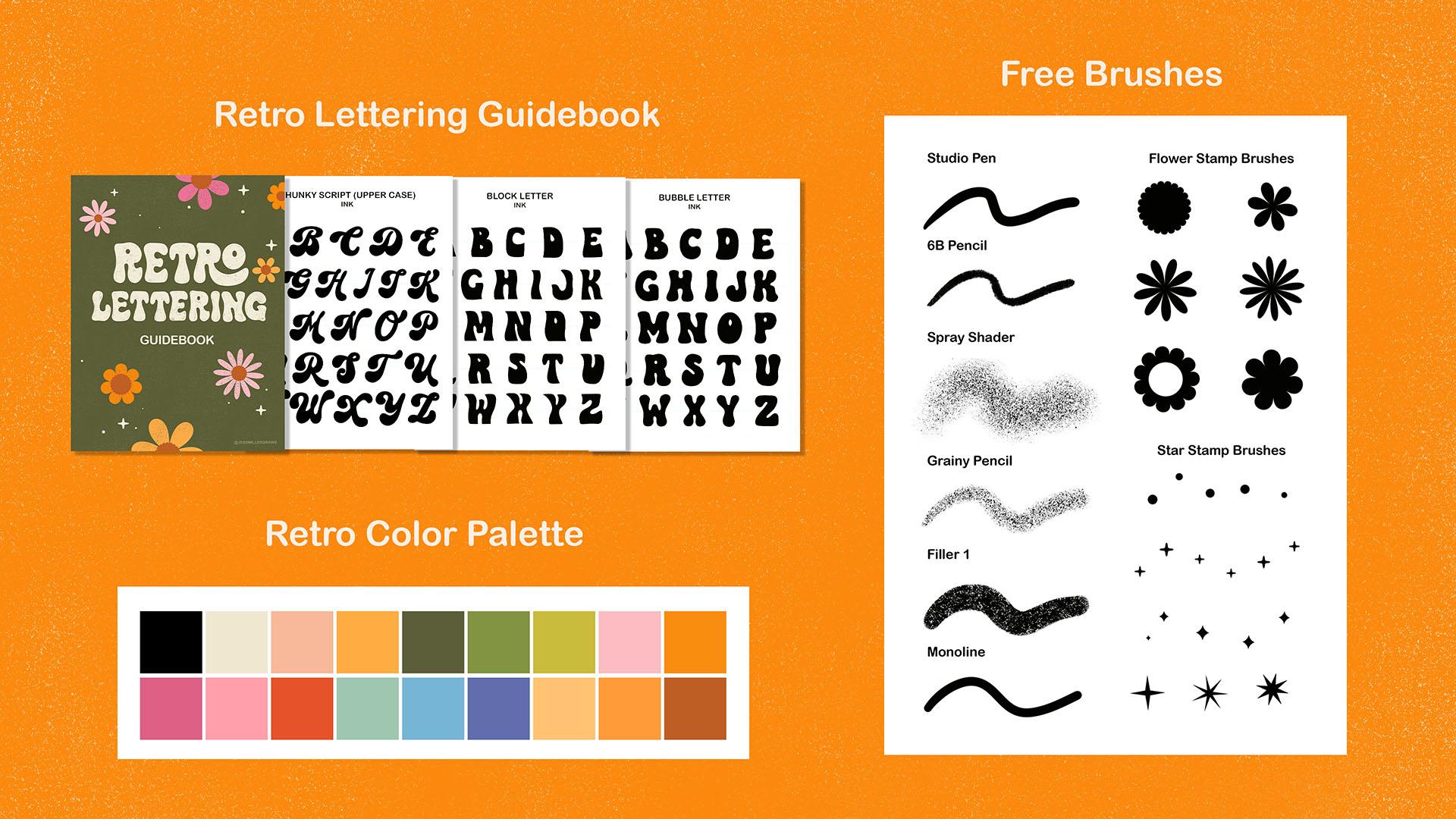
drawing app Procreate. In the class resource section, you'll find a link to all the
downloads for this class, including a retro color
palette, lettering, alphabet guide, list
of feel-good quotes, stamp brushes, and three free texture brushes
from SEO illustration. Join me in the next lesson. We're all sharing samples
of vintage and retro art to get you inspired about
hand-lettering your project.
3. Research & Inspiration: For this lesson, I'm going
to show you some examples of hand lettering styles
from the '60s and '70s. I created a Pinterest board 70 style inspiration
that shows a mix of vintage art from the '70s as well as new art that is
inspired by the era, were the main influences
of 1970s lettering was a psychedelic art movement characterized by vibrant colors, bold patterns,
distorted letter forms, and feel good messaging. This style of
lettering was often used in concert posters, album covers, and other printed materials associated
with rock music. I love this poster because the block lettering
fits inside her afro. And there's a lot of really
cool ornamental elements and it's very symmetrical. This is a really famous
Bob Dylan poster. These fluid shapes
indicate where his hair is and it's silhouettes nicely against the
cutout of his face. There was a use of a lot
of really striking colors. This red and blue color
combination vibrate. It almost looks like the
lines are swirling together. And there is equal weight and balance between the
illustration in the lettering. It's almost like they've become one and they're very amorphous. It was also really
typical of '70s retro art for the letters
to take on a shape. In this case, it says a
funky lover inside of lips. Here's an example of lettering
that's inside of a circle. And you can tell
that the baseline is very wavy and that the letters, they follow the
baseline, but they're different heights,
heights and widths. Here's an illustration of some iconic '70s fashion with
a vest and bell bottoms. Some very 70s colors with an olive green and
analogous colors, the yellow, orange, and pink. Analogous basically
means three colors next to each other
on the color wheel, a lot of really fluid lines
within these three posters. Here's a really cool
Jefferson Airplane poster where the hair just blends in and becomes
this thick block lettering. And again, they have
this wavy baseline and it's almost illegible
like you can barely read it, which I kinda like it. It just gives it so
much character and personality and just makes
it so distinctly retro. Here's an example of
a really fun script. You can tell that there is a contrast between the
thick and thin swashes. You had a lot of fun making these swashes fit in the negative space
within the lettering. And here's an example
of bubble lettering. You can tell that the
top of the letter is very narrow and then it
has this bell shape. It's indicative of
bell-bottom jeans. The very iconic fashion
item of the '70s. Here's another bubble lettering. It's very rounded, no, no sharp edges, hence the name. A lot of Smiley
faces, daisies, sons, eyeballs, mushrooms are
all very iconic retro art. This is even an example
of some bubble lettering. They had a lot of fun with
the ascenders and descenders. It just fills up
those negative spaces within the letter forms. This is a really fun poster to. It's very symmetrical. And with these block letters, you can tell they
have a variety of shape and they follow
this distorted baseline. They hold equal weight
compared to the illustration. It's almost like these
decorative elements just kind of blend in
with these letter forms. I also made a second
Pinterest board called feel-good quotes. This is just to inspire you. Like the '70s were just a feel-good era and they
had a lot of positivity. So I sampled quotes from all over Pinterest
and save them here just to kind of inspire the kind of wording
that you want to use for your class project. You can maybe take a portion of this quote or make it
your own in some way. But they're all very, very positive, very feel-good. And they fit in well with the 70s art style that
we're going to create. So before I dive
into the next lesson of sketching block
lettering, take some time, do some research and inspiration between
these Pinterest boards and decide upon a quote that you would like to
letter if you're ready, meet me in the next lesson, where I will sketch
block lettering.
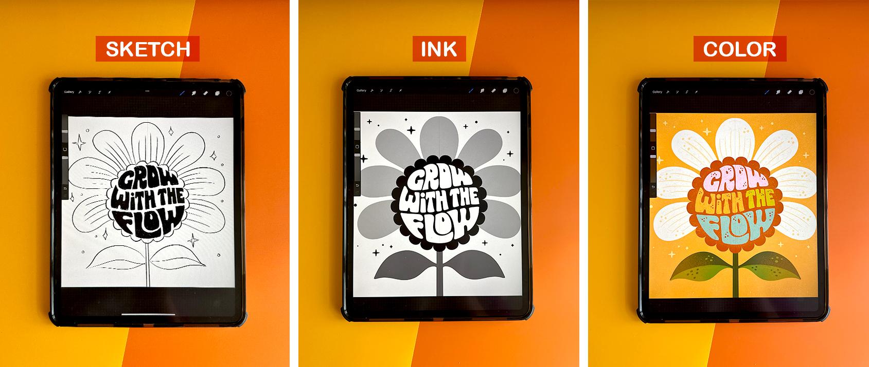
4. Sketching Block Lettering: Okay, so now that we've
taken some time to explore 70s style lettering
and illustration, I will show you how to sketch
the block lettering style. So let's start off with
a canvas of ten by 10300 DPI in Procreate. Just simply touch the plus sign in the upper right-hand corner. I haven't already
preloaded, already saved. But if you don't huge because simply just press the plus sign. Select your unit of measurement. I'm using inches,
10 " by 10300 DPI. It gives us a maximum
of 70 layers, which I think is
plenty for this class. And hit Create. Okay, I'm gonna give you a
quick rundown of what we have. We have the 70s color
palette that I provided, as well as the retro lettering. I have a studio pen which
is pre-loaded in Procreate, so you should already have it if you have the app Procreate. Six B pencil for sketching. I also have a mono
line brush for inking, which is also pre-loaded
in Procreate. And then I have these
three brushes from SC illustration that
our spray shader, grainy pencil and filler, which I'll show later on when I color and texture the piece. I also created these
fun stamp brushes. They're flowers and dots and stars that you can
use for decoration. And they should all be in
the class resource section. But for this lesson,
I'm going to use the six B pencil to
sketch out the piece. I'm going to hit black and test it out to see how thick it is. It's pretty thick. I think that's pretty good. So for the block
lettering style, I'm going to draw a giant Daisy. Fit the lettering, quote, grow with the flow inside
the center of the flower. You can pick any kind
of shape that you want. It could be an eyeball, a heart, or you could just follow along with me
here and draw a flower. I'm just going to start roughly sketching in the
shape of the flower. I'm going to first
start off with the center of the flower center. I drew a circle and then I held my finger down so I
can get a perfect circle. And then using my adjust tool, I can adjust it and
I hit my snapping. Snapping, it just snaps
all of your shapes into place and it shows where the center
of the canvas is. Because I want the
center of the flower to be in the center
of the canvas. Okay, so now I'm going to
start drawing in my puddles. It's going to be a giant Daisy. This is a pretty rough sketch. I'll go back and refine it. I just kinda want to
lay down a framework. So do the stem. Now I'm
going to draw the leaves. Okay? That is a basic
sketch of our daisy. And now again, I'm
going to fit the quote, grow with the flow inside of
the center of the flower. Now I'm going to draw the wavy baseline for
our letter forms. And the baseline is
just pretty much a guide for our letters. And in a lot of the
styles that we looked at, they had a wavy baseline, so I kinda want to
mimic that style. It kind of goes along
with the quote too. It's very like flowy and fluid. So these are gonna be
our guides where I'll start sketching in the
words for our quote. I'm going to hit Duplicate. And this is just to give a
little bit to account for some spacing in-between the words that I'm
going to stack. Want to merge those two down. And then I'm just going
to clean up a little bit. Okay? You can even turn down the opacity just so it's
very light guidelines, okay? For this style, it's very
blocky and I want it to follow the form
of this flower. And I'm just going to lightly sketch in the
skeleton of the words. So I'll start with grow. Okay, as you can see,
this is kinda getting a little tight and flow is getting a little crank gonna be a little cramped down here. I'm actually going to use my selection tool
just freehand it. Select width. And then using
the free form selection, I'm just kinda adjust. This is totally okay to
do in the sketch phase. You never wanna do this with your final art, warp and adjust. But for sketching, you're the only one that's
going to see the sketch. So it's totally fine to do this within the that is
blending in together. So I'm going to adjust that so that there's a little breathing
room between width. Naturally our baseline
is adjusting, so I'm going to move it
up to account for that. Okay, go back to
our sketch layer. And I'm going to draw flow. So again, the L, 0 and W and flow is quite larger than the f. So
I'm gonna just kinda adjust. You can also use the
distort and warp just to kind of get it to fit inside the center of the flower. Now I want to make my f larger. As you can see,
it's very playful. I used a lowercase
I in width and a I put the 0 kind of hugging
inside the L. So this style, it's very fluid and forgiving. And so you can kind of warp and adjust the
letters as needed. It's not as perfect
as other styles, which is the reason
why I like it so much because you can just have
fun with this style. Okay, So now I want
to lower the opacity. My sketch and I'm going to start blocking in the letter forms are adding meat to the skeleton. It's an another layer. Still using my sketching pencil. I'm going to just kinda
outline the shapes, shape of each letter. If you need help with what
shapes the letters are, I supply the alphabet for
each lettering styles. So this is, I show each step in the lettering alphabet guidebook that's in the resource section. Okay, so now that we've
outlined our letter forms, I'm going to actually turn off the layer with the
skeleton sketch because we don't really
need it anymore. And now I'm going to
fill in each outline. And this is really helpful
because you can really see the letter forms in high contrast and black and white when
they're blocked out, when they're outlined, you
can't sometimes you miss things and so I always
fill in the letter forms. This is kind of tedious, but it really does help to
visualize your letters. I'm also going to make just
some small adjustments with my G. Just to fill in all those little loose
spots, little empty areas. You can tweak your are
kinda wraps around. I'm kinda adding some
little points to this 0 so that it fills
in quite nicely. This w is gonna get quite interesting
filling up this space. But I still want
it to look like a W. I'm also using my eraser
tool just to clean it up. This w is, it's just going to, these ascenders going
to fill up that space. Okay, Now you can really
see our piece is starting to take some shape and
coming together nicely. I'm just using the
eraser tool just to tweak the letter
forms further. I'm just going to
kinda go in and refine some areas where I
can see some space. I just want to fill
in exactly where the letters are so that it
fits the circle really nicely. There's no space in between. Also, this is getting
kinda big and this H is rather narrow. So what I'm actually
going to do is fill it in and kind of find find the space in between the letters there. I think that looks a
little bit better. It can also make the tea kinda
turned down a little bit, fills up some more of the
space in between the letters. Okay, so now you can
really tell that our letter forms are following not only
like the baseline, but they're also filling in the center of the
flower quite nicely. Alright, now I'm going to add a few more details to my flower. Just some lines to the petals, just to indicate that
they are puddles. Alright? And then
what I like to do is I'm going to use the stamp, the flower center stamp as a guideline to kind of show where the center
is going to be. I'm going to make
it much larger. Okay? I'm going to, using a uniform
selection, find the center. Okay. Then I'm just going
to trace around. That way you have some
clear definition of where the center of the flower is and where the lettering is. I still wanted it to fit
the shape of a circle, but kind of nest inside of this, the center of the flower. I'm just going to delete that. Don't do it anymore. And I'm just going to take
some time to erase. Just clean up the inside shape. Okay. That's really
kinda coming together. Definitely has like
a '70s retro vibe. I'm going to turn off my guides. I don't really
need them anymore. And now I'm just going to
take some time and add maybe some stars and dots just to
fill in the empty space. Okay, So take as much time as you need to tighten
up your sketch. The more tight your sketches, the easier it will be to ink. So in our next lesson, I will cover how to ink your drawing with
using the mono line brush.
5. Inking Block Lettering: Okay, once your
content, your sketch, It's now time to move
on to the inking phase. In this lesson, I'm going
to cover how to take your time to really
clean crisp lines. This is an important step
to use an inking brush and fill in the shapes and black and white before jumping into color. It really helps to
visualize your piece in high contrast
black and white. So before we start, I'm actually going
to merge down all of our sketch layers and get rid of the layers
that we don't need. So I have it all down into one merge, down into one layer. And I'm going to turn the
opacity down to about 30%. Can add another layer. You have a couple options. You could use the studio pen, which has a tapered end. It's more like a
hand-drawn feel. Or you could use the
mono line brush, which just means that it's the same weight
through and through. And it doesn't have
any tapered ends. For this inking. I just want really
clean, crisp lines. And so I'm going to use
my monoline brush to ink this piece and
also a great tip. You can adjust your brush. If you just tap on it. You can adjust the amount of streamline as well as the
amount of stabilization. And that really helps
when you want to ink really clean shapes without
having a jittery hand. This, the amount of stabilization
that you use really helps and you can
just adjust it right within the brush studio
and your brushes. So once I'm happy with
that, I click Done, have a new layer and then I can adjust the size of
my monoline brush. I want a fairly
small size brush. I just want to carefully
trace each letter form. I'm going to drag and
drop and fill each shape. It's just really
clean and crisp. So I moved my oh, there, I just did it because
it was a little low. And for this style, it's very blocky so that the bottom half is
very heavy and chunky. So that's why I moved it. This is a great example of why
we incur sketch so that we can make adjustments to
our sketch as needed. You can also use the
edit ellipse tool to tweak the shape
of your ellipse. It's really helpful. I also use the eraser
tool to just kinda clean up some of my edges as needed. I know this, this phase
probably seems really tedious. And you're like, I just
want to jump into color, but it does really
help to visualize it. I think if I were just
to jump in and color it, I wouldn't make these slight
adjustments along the way. And these adjustments really do help make it really clean
and crisp and electrical. Okay, you can even
turn off your sketch. And this helps to just kind of visualize the way and where
some empty spaces are. I see this empty
space right here. That kinda bothers me. So I'm just going to
come in and fill it up. My I just feels drawn to those empty spaces and I just feel like I
need to fill it up. Also, this space
seems pretty tight. So I'm just gonna kinda go in with my eraser tool and
make some adjustments. Take as much time
as you need to. Just clean up and refine. Also, the space seems
a little bit big. So I'm gonna kinda go
in there and adjust. Okay, I think that's
looking pretty good. Turn my sketch layer back on. And now I want to draw the center and the petals and the stem and
leaves of my flower. On another layer. I will start drawing
the center shape. I could freehand it. I could use my symmetry tool, or I'm going to use
the stamp that I made. And then that way I can just tap once and get a perfect shape. I just need to make
some adjustments. So that's in the
center of our canvas. I'm using my snapping tool. I'm also going to
lower the opacity so I can adjust the scale. It's also selected uniform so that I'm not distorting
it in any way. Pretty much just want it to
fit around our letter forms. I think that's
looking pretty good. There's some breathing
room in-between the letters and the
center of the flower. For even more high contrast, you could fill
this all in black, and then you can alpha lock the layer with your letters
and fill it in white. Just fill layer. Then that's a really high
contrast and you can see how much space is in-between the center of the
flower and the letters. It just really helps you
visualize it in high contrast. So now I'm going to draw
the petals on my flower in black using my
monoline inking brush. I'm going to use my
symmetry tool in Canvas, drawing guide on Edit guide. Okay? Usually a 2D
guy will pop up, but I don't need the
2D guy that actually need the symmetry tool. You have some options. You have vertical, which
will trace these two sides. You have horizontal, which will help give you symmetry
of these two sides. Quadrants. So whatever you draw in this quadrant will be
repeated in these three. And then a radial. I am going to use the vertical
option because I just want to draw the
petals and then I want the other program to
trace the other half. So once you have vertical
selected, click done. And I'm gonna make
sure I have my layer, a new layer assist is selected, my monoline brush
and I'm going to start drawing the petals. I think I'm going to increase
the size a bit chunkier, probably around like 39, 40%. As you can see, when
I draw this half, the program in procreate is drawing automatically
drawing the other half. This is really convenient
so that you get a perfectly
symmetrical shape and you only have to draw one side. If you wanted a
more organic shape, you could totally free hand your flower or whatever
shape you're using. I just really loved
the symmetry tool and I wanted a perfectly
symmetrical daisy flower. So that's why I'm
using it to help me in the shape of the petals. You could even fill in the
shape if you like UPS. Somewhere, it's disconnected. I see. I'm just going to connect
these two petals. You can even fill that in. Let's fill it, make, adjust
it so that it's a gray color. Okay. So now I see, I can see my puddles, the center of the
flower as well as the letters that are
inside of the flower. Now, I want to draw the
stem and the leaves. I'm going to, since I already have my symmetry tool setup, I'll have to do is
click on the layer and click Drawing Assist. And then I can just start
drawing the stem of my flower. Fix that edge. Okay. Now you can see
our flower is inked. You could even adjust the
opacity of the leaves. Just so you can see each shape that's gonna be a
different color, is a different shade of black
and white on gray scale. Okay, Now I want to use my stamp brush to fill in some of these empty
layers with stars and dots. So I'm gonna make a new layer, go to my brushes. You could fill it in with these flower shapes
if you wanted to. You could freehand some shapes. I'm going to use the
round star scatter brush and just tap on my screen
where I'd like little stars. I also randomize the brush
so that it would have different sized stars
just randomly whenever I, I tap it, I kinda like having that feature and just
makes it really random, but little more organic. I'm also going to
toss in some dots, as well as some diamond
diamond stamps. Now you can turn off the sketch layer and
you can see that we ink dark drawing and
really clean, crisp lines. Now, if you're ready to
move on to the next lesson, we're going to cover how to color and add texture
to this piece.
6. Coloring Block Lettering: Alright, now that
we have interface, it's time to add color. And this is probably my
favorite part because the piece really comes to life
when you add color to it. And as I mentioned before, in our research and brainstorm, that '70s and retro
inspired colors, they often use analogous
color palettes. So analogous colors is usually when you have
one dominant color, a supporting color, and
then an accent color. And they're right next to each
other on the color wheel. So I'll just show
a quick example. If you select red, then yellow and pink are the colors right next to
it on the color wheel. And a really quick
and easy way to find this is using the harmony tool. So you can pick any color
and then find out which, which colors are analogous
to that main color. It's just a really cool trick. You can also figure out complimentary colors and
split complementary colors. I really go in depth into this in my last Skillshare class, which was handling
for illustrators. So if you want to check
that out, go ahead. But for this, this lesson, I'm just going to reference
the 70s color palette and use an analogous color palette
of orange, pink, and yellow. To get us started. I grouped all of our
inking elements. I just put them
all into a group. And I have our
sketch on one layer. So now I'm going to start
off with a new layer. I'm going to start out
with a background color. I want it to be this very
bright and bold gold color. And then I want the daisy color to be like
a white creamy color. I'm just going to
hit alpha lock. Then I'm going to select
the cream color fill layer. I'm going to do the
same for the center of the flower color at
this brown color. Then for the stem and leaves, I hit alpha lock. I'm going to use this
very dark olive color That's looking very '70s to me. So I like it a lot. Okay, now I want to
color in my stars. I think I'm actually
going to use a really light yellow for those. I just want them to kinda
really blending in. So I'm going to use
my hue saturation and brightness and just adjust
the brightness just a hair. Just a little bit. Because I want them to
blend in the background. I really want the petals to
be the hero and pop off. Now for the letters, you could color them cream. Or you could color
them this nice yellow. I think I might actually
alternate colors by word. I'll try that out and
see how it looks. I'm going to pick this really
light pink and just drag and drop on each letter. I think I'm going to keep
this one yellow and BB. The can be this peachy color. Then I think I like maybe
a light orange for flow. Okay, I think the orange
is kind of blending in. So I'm going to use
my selection tool. I'm going to start over. I just want to select flow. Then using the hue
saturation and brightness. I'll adjust the brightness. Okay, I think that's really fun. I really liked that
and it definitely has this vintage feel to it. The colors are very bold but also kinda
muted with the brown. So I'm kinda, I'm liking the
direction this is going in. Okay, So now is the fun part
to add texture and details. So I really like using brushes by SE
illustration to add texture. I'm going to start by adding texture and definition
to these leaves. I'm going to add a new layer. I'm gonna make this
a clipping mask. Then using a lighter
shade of green. Going to go up to
my brush pallet. And use this spray shader. Since this is symmetrical, whatever I draw on this leaf, I also want to
appear on this leaf. I'm going to turn on
the Drawing Assist. Then I'm just going to
use the spray shader to add some distressed
shading to this. I'm also going to use my
hue and saturation to kind of boost how light it is and maybe turn
down the saturation. I will also often color
this yellow or orange. And then I will turn down
the opacity and it gives it this really nice kind
of vintage color. I'll often do that
in my own work. I actually like that better than the light green
because it makes it, it looked really vintage. Now I'm going to turn Alpha
Lock off on the petals. But I'm going to keep
the drawing assist on. And I'm going to
use my eraser tool. I'm going to use the grainy
pencil illustration. And I'm just going
to boost it up. And I'm just going
to erase parts of the petals to give it
this really distressed fill. And now I'm going to sample
that same cream color. And I'm going to use this filler brush to just
really fill back in. I want I want the distressed look to
be a little more subtle, not as not as bold
as it is right now, but I still want some
kind of texture. You can see it's quite subtle, but it really does give
it this nice vintage, retro look, which I love. This is how I, I color
the majority of my work. I just erase parts of it
and then I fill it back in. Okay, And then I'm gonna do the same thing for the
center of the flower. I'm actually going to duplicate it and fill it in this
golden rod color. Because I want some
of that golden color to come in on through the brown. I'm going to turn
that alpha layer, alpha lock layer off. Let me use the same
process where I use the spray shader brush, brush for my eraser. Just gently erase the center. And then using the filler brush. Just gonna go back
in and fill it. Again. It's very, very subtle, but it does add
this really cool, vintage retro vibe to it. And now I'm going to make
another layer clipping mask. And I think I want even more of this golden color integrated into the center of the flower. So I'm going to take my
spray shader brush and just kind of lightly color. You can go in with
your eraser and select the same brush and just
erase some elements of it. Okay? I think I really like
how that's looking. I think I want to add a
little more definition into these petals. Select a new layer and
turn on my drawing assist. I'm going to sample this
really light yellow color and use my six B pencil
because I just want to add some sketchy
lines inside petal. Alright? And I
think I'm going to turn off the Drawing Assist. And I think I'm going
to use my studio pen. Just kinda add some random
dots and the petal. Just pencil in some gifts, the flower petal,
some character. I don't really want
it to be symmetrical. So that's why I turned
off the Drawing Assist to be a little hand hand done. Now, definitely want to add some texture in the background. So I'm going to hit a new layer. And using the same
light yellow color, I'm gonna use my
spray shader to just lightly add some distress
texture to the background. Again, this is just
really subtle. Use my eraser tool, the spray shader and
just kinda go back in and erase some of
that distress texture. And I'm going to
add some lines and definition within the leaves. And a new layer. Use this light green
color. And my pencil. And just sketch in. I think I actually, let's use our Symmetry
tool, save some time. And then we can fill it
in just for some color. I think that looks really nice. I'm going to use my eraser
tool and just erase some dots. I'm going to turn off
the Drawing Assist. I love to add dots and speckles and my flowers
and petals just to give, give them some character. Okay, now I want to add some distress texture
to the letter forms. Since everything else kind
of has this distress look. So I'm going to turn
Alpha Lock off. I'm just going to use the
same process I shared before. So I'm going to use
the granny pencils or eraser and just start gently
erasing some of the letters. Okay, that's pretty distressed. So I'm actually
going to just follow the same process and fill it back in using
our filler brush. I'm just going to
sample the same color. It's pretty big. Turn it down. Just gently, fill back in some of
that distress texture. You can fill in as
much as you'd like. This is just
personal preference. This is just a
technique that I use. You don't even have to use this distressed texture
technique if you don't like it, you can keep the letter forms
really clean and crisp. Okay, now, I really like
where this is headed. And even add some more detail. I'm going to make another
layer and use the Studio Pen. Use this brown color and just had some dots and speckles inside of the letters. This is something I do
very often in my own work. It just really gives the
letters personality. If that is too much
of a contrast, you could even play around
with your blending modes and see if you want maybe
a more subtle approach. So it's the same color, but
it's just on the screen mode. And it's just a little
bit more subtle. Subtle look like I
think it's a toss up. Actually. I think I like the
high contrast. And I think I want to
brighten up the cream colored just a tad using my
hue and saturation. There. I think that's
looking pretty good. And now hopefully
you have sketched, inked and colored and add
texture to your piece. If you're content
with this part, meet me in the next
lesson where I will cover the next lettering
style bubble lettering.
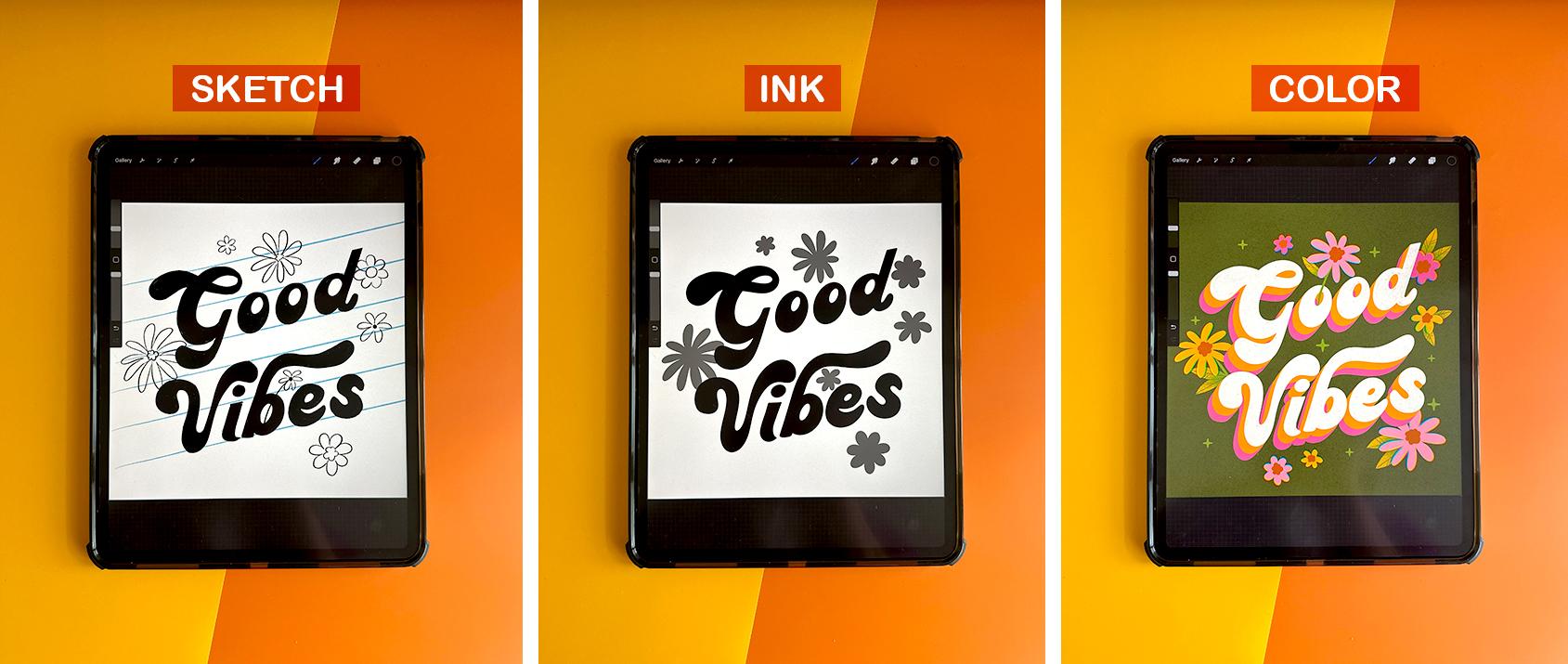
7. Sketching Bubble Lettering: In this lesson, I'm
going to demonstrate how to sketch the
bubble lettering style. Like its name suggests, this style is going
to look very bubbly with rounded shapes and
rounded letter forms. If you remember
from our research, bubble lettering is
characterized by high contrast, thick and thin shapes. Usually includes a heavy
bottom half or a bell-shape. That's indicative of
bell-bottom jeans. So the edges of the letters
are very round and not sharp, hence the bubble name. So let's start off
with a new Canvas. Hit the plus, and
let's go ten by ten. I have it already saved 300 DPI, same size that we use last time. I'm going to use this six B pencil to sketch
out my letter forms. And I'm actually going to start off using a drawing guide. This time, I'm going
to use the 2D grid. You can go to edit
drawing guide 2D grid. And then I'm going to adjust
the size of the squares. I'm going to make them fairly
large. That's about good. Okay? This way, It's gonna be really easy for me to draw a square
frame around my canvas. I'm going to draw
this square frame and then draw the lettering
inside of the square. I'm just tracing over the
guidelines right now. I'm just kinda
cleaning up the edges. Okay, since it's our guideline, we can let's actually re-color. It. Can just hit alpha lock. I like to use a light blue fill and then you can
just turn down the guide. Okay, so now that
that's like a frame, I'm going to use that to fill in as a guide to
fill in our letters. So I'm going to fill our
letters inside of the square. On a new layer. I'm
going to start sketching out the skeleton of
our letter forms. Go back to my guide. I'm going to make us
some smaller squares. For this piece. I'm going
to let her the phrase, You are made of magic. And I think I'm going
to stack the words. So it says you are
made of magic. So three lines. So now I'm just going to draw some guides for the
baselines of my letters. And you can actually just
duplicate that straight line. This will just be like a little breathing area
between the words. Can duplicate those. I'm going to select
these so I can just kinda move them around freely. I'm going to merge
my two guidelines. Just kind of clean
up a new layer. I'm going to now start lettering the skeleton
of my letter forms. And feel free to use
your selection tool and make some adjustments since this is the sketch so you can warp
it and adjust it as needed. Since this is such a free form, a type of style, I'm going
to have a lot of fun with the ascenders and
descenders of the letters. So for this one I'm
actually going to have the are kind of swoop down and then make the E kind
of nest inside that shape. I'm also playing around with lowercase and
uppercase letters. This is, this is your piece, so have fun with it. And you can also feel free to reference the lettering guide to while you're
shaping your letters. That is in the class
resource section. Alright, now we have some
very rough skeleton letters. So now I'm going to
outline a bubble shape so we can start building or
the shape of our letters. So a new layer, just kinda going in and
making some adjustments. I definitely want the top part of the letter to
be kind of short and compressed and
the bottom part to be very thick and chubby. Space is getting kind of big in-between the
eye and the Cs. So I'm just going to use the
free form selection tool to warp and adjust these
letters so that they nest. They nest together and they
fit well with each other. Okay, so now we can turn
off the skeleton layer. You can kinda see some
bubbly letter forms are starting to take shape. So let's go ahead like the
previous block style we are going to now fill
in our letters to really add body and
weight to them. Again, this feels
like super tedious, but it really does help. Because then I can just easily go back with
my eraser tool and erase and trim the letters that are or too thick and maybe build upon the ones
that are a little too thin. It just really does help. You can even drag and drop
if it's thick enough. Sometimes with the pencil, it's a little too porous. That one was a little too thin. In this case, it was actually
easier for me to fill in the entire letter
form and then just erase a small little hole for the E So you can tell the
letters are very rounded. There's no sharp edges. So it's looking very bubbly. Okay, and now it's really
starting to take some shape. You can also take some time to just really make
some adjustments. I'm not thrilled with
the shape of this. A, I think it's just very elongated and it's it's
looking a little funky. So I'm actually going to remove it and
draw an uppercase a. This is your drawings, so feel free to make any
adjustments that you want. It's totally okay to
warp your sketch. You never wanna do that
with your final art, but it's totally okay
to do it to your sketch because chances are you are the only one that's
going to see the sketch. Unless, of course you
share your process. It's totally fine to make
adjustments along the way. So now I'm just gonna kinda take some time and fill in
some of these gaps. These letter forms
are just super organic and just really, they're kind of amorphous so
you can have fun with it. They're not perfect
by any means. But that's okay. Some character, that's what makes it
really fun and unique. So take as much
time as you need. For the next lesson. I'm just going to
decrease the opacity. And on a new layer, I'm going to ink these letters
using my monoline brush. And it's the same
inking process that we used for the previous
block style. So I'm actually going to skip that lesson if you
need a refresher, go ahead and watch that, but it's the exact same process. I'm just going to trace over each letter using
my monoline brush. Once you have sketched
and ink to your letters, meet me in the next lesson, where I'll show you
how I'm going to add color and decoration
to this piece.
8. Coloring Bubble Lettering: Hopefully you've
taken some time to sketch out the bubble
letter forms and ink the letters using a
monoline brush or studio pen. To recap bubble lettering
is characterized by very rounded shapes and heavy bottoms and these
teardrop or bell shapes. Alright, now if you're ready, let's add some funky colors. You can totally do an alpha
lock on your ink layer. Then color drop. Or you can follow along. I'm going to show you
this different technique. If you remember from
our inspiration lesson, a lot of 70 styled art is characterized by
fluid wavy lines. For this piece,
I'm going to color the letters and add
this wavy pattern. I'm actually going to turn
the lettering layer off. And on a new layer, I'm just going to draw
some wavy organic lines. Let me use my monoline
brush for this. I have a pretty thick, heavy size set on
the same layer. I'm just going to alternate
different colors. Again, I'm not to be
too precise with this. I'm just dragging and
dropping and filling color. I'm making sure that the
colors line up so that I have orange and
orange and then I'll fill because otherwise it
won't color drop properly. And I'm going to just vary
the size and shape a bit. I'm going to make some
small, some large. And now you can actually turn on your lettering layer
and do a clipping mask. And you can see these
core wavy lines. You can, if you like that look, you can leave it as is. Or I'm going to just
quickly unclip it. I'm going to actually
take it a step further and go to my magic wand, scroll down to liquefy. And you have a bunch
of different options where you can play around with. You can select push. I think I'm going to
use this push Option and adjust the size of my brush. Can adjust the pressure and the amount of distortion
as well as momentum. And like the name describes, you just kinda push the lines. It's very organic and fluid
and it just kind of gives it this extra extra liquefied look that I'm not sure I
would have been able to get just doing on my own. You can also tap undo if you don't like that.
It's very smooth. It's almost like you're
touching colored water. Looks like I have a
little white mark. I'm just going to
push it off the page. But you can push and adjust as much or as little as you'd like. You can also play
around with some of these other settings
like twirl, right? And that twirls it right. Could twirl left. It's a little too much for me. If you're really not
happy with how it looks, you can always reset
and it will go back to the way it was. But I'm actually
really liking this. I'm just going to Keep adjusting, keep playing
around with the make sure the lines are going
in different directions. And I think I like that. I'm going to just tap
again on my magic wand. Now I'm going to hit
the clipping mask. And I can see it really has a lot of body and
movement and it looks really dynamic as
well as really retro, like, like a lot
of the art that we looked at in our
inspiration lesson. It had a lot of wavy lines. So this is looking kind of in that same vein of the '60s
and '70s art posters. Alright, now I want to add some stars using my black brush. I think I'm going to add
some diamonds, stars. This is a scatter brush. So you can actually hold it down and draw along your page. And it creates this
nice little star trail. You can use it that way or you can simply just tap the stars. And I randomize the size. So every time you tap, it's a little bit
different size and scale. So definitely play
around with it. I'm going to add some of
the eight point stars. I'm going to click Alpha Lock. Then I'm actually going to color it probably this pink color. And I'm going to want
to randomize the color. I don t think I
want them all pink. So I'm going to select
orange and just drag, drop and fill to recolor. You can actually also use
your free selection tool. Just kinda manually adjust the placement as well
as the size and scale. These are looking too large. Sometimes you just have to
manually go in and adjust. It's looking very magical
and I feel like it really fits well
with our messaging. You are made of
magic and let's pick a background for
this on a new layer. If you remember from
our inspiration, a lot of '70s color palettes, they use analogous colors
as well as a lot of cream. There's very rarely
bright white. So I'm going to pick
up cream background. And I feel like this might actually look really
good with black too. So I might make that as
an alternate option. That really pops in black and it looks really good
with the stars too. I can't really decide
which one I like better. It's black or white. I think I might add
both options to my class project and you guys can let me know
which color way you prefer. Alright, if you are content with the way that you
colored this piece, Meet me in the next lesson
we're all cover how to sketch out our 3D lettering
style chunky script.
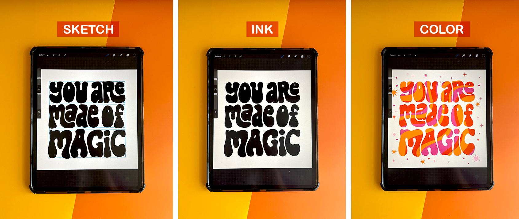
9. Sketching Chunky Script Lettering: Okay, In this lesson I'm
going to demonstrate how to sketch out or
retro chunky script, a script lettering style. So it's the closest style that's related to
cursive handwriting. And it's also very similar in style to the block and bubble in that it has a very high
contrast, thick and thins. And this style is
characterized by a lot of very fluid swashes extending from the ascenders
and descenders. So first let's make a
canvas of ten by ten. I'm just going to keep
be consistent and stay with the ten by 10
" for this canvas size, 300 DPI, I already
have it saved. I'm going to let her
the phrase, good vibes. Just going to keep it short
and simple with two words. And I want to stack them
at a diagonal angle. And the first step is to set
up some guidelines for that. So let's go to our drawing
guides to help assist us. Let's hit edit drawing guide. And I'm actually going to use this green nodule to
rotate the lines, to get a nice diagonal line. I'm just going to estimate. And I want to draw three lines to indicate
the cap height, the height of the
capital letter, the x-height, which is
height of the lowercase x, and the baseline, which is the baseline where all
the letters will rest. So first let's draw
our cap height. I'm just going to
duplicate that. That will be our x-height. Duplicate it again. That will be our baseline. And you can merge all
three lines together. I'm going to duplicate those. That will be the second word. So we have guide setup
for good and vibes. I'm going to merge these down. I'm going to go
back to my guides. Because now that we have
our guidelines set up, I'm going to need guides to assist me in
the letter forms. We're going to hit Edit guide. This green little note again. I'm going to rotate
it to the left. And I'm doing this because
script lettering is the style that's closest
related to cursive handwriting. And our natural handwriting
always slants to the right. It's the way that we draw. So when we hand letter a script, we always want it to slant
a little bit to the right, even when it is diagonal and
it's going up at an angle, will always slanted a
little bit to the right. Again, I'm just, I'm
just estimating. Just eyeballing it. That looks about right. Click Done. I'm going to switch
over to black. Using my six B pencil. I'm just going to
start sketching out the letter forms on a new layer. And I'm actually going
to start off drawing an oval for my G. And I'll
show you why in a second. You probably have been good. This doesn't look like a word, but this does help me
in forming my letters. So I'm going to merge
all these down. I'm going to turn this down. Then I'm going to
use these circles as a guide to shoot my letters. Okay, so now we have very rough skeleton
of these letters. Like I mentioned
before, this style has a lot of thick and thin. So we kinda want to start. Outlining these letters, similar to the bubble
and the block style, they have very heavy
bottoms, even the script. Just a characteristic
that's really common in retro lettering. And as I'm drawing the letters, I'm following these
vertical diagonal lines. I want my letter forms to
follow that same diagonal line. But let's also have fun breaking the rules and draw
some fun swashes. Technically, the S should actually look like this since that's more of like
a cursive handwriting. But I don't really like
that shape of an S. I feel like it's kind of hard
to read and I'm just kinda, kinda modernize it and make
it look like this shape of S. This is, this is
your, your work. So feel free to kinda like break the rules
when you want to. I'm not really a
stickler for rules. I actually like
breaking the rules. I feel like it makes
it more interesting. It gives it more character. Okay. Stacy, I can kinda, you can kinda see this
loose outline building up. I'm going to just kinda now adjust the spacing
in-between the letters. It seems like there's quite a lot of space
in-between, good. As well as vibe. So I'm
just gonna kinda just nudge these letters a
little closer together. I also like to sketch with
a really thick pencil. I feel like it really helps
just build the letter forms. I think it's my pencil
was quite thin. It would just be
a lot of a lot of filling in a lot of work. That's just a
personal preference. So feel free to use whatever
thickness brushes you like. You could even do a fun swash coming off of
this D if you wanted to. But I feel like that might be too many swashes
going on. Who knows? I might come back
to it, but you can also use decorations to
fill in those areas, which I'll show you later on. I think I'm actually
going to use some flowers to fill
in those empty areas. So now that our letters
have a loose outline, we're going to go in and
fill them With our pencil, just like we did
the other styles. Script is probably one most
difficult styles to draw. It is a little bit
more technical than the other two Henry
I demonstrated. But it's still fun. I still very much enjoy script. Took me a long time to get
comfortable drawing script. I struggled quite a bit, and I think it was just lots of practice watching tutorials
over and over again, lots of Skillshare classes until I got comfortable
drawing script. And also just looking at a
lot of examples and just seeing how other artists treat. Script lettering helped a
lot, helped quite a bit. I think that swash,
I kinda wanted to curl over a bit more. Technically, since
this is a script, the letters should connect. But again, I'm breaking the rules because
this is my class. I can, I can do
whatever I want so I am going to not connect them. It's a style choice. You can connect your
letters if you'd like. But as a style choice, I decided not to. If you get stuck
drawing this letters, don't forget to reference
the resource guide. I lettered an entire alphabet. Of uppercase and
lowercase letters. So you won't have to guess if you are really
struggling because I know that's what I found to
be most helpful when I was first learning how to let her I just needed
to see examples. And when an instructor was able to provide like
an entire alphabet, that was extremely
helpful to me. So I wanted to provide
the same in this lesson. I'm going to turn
off these guides. This space is looking
a little tight. Knees these two letters, the G and the V. So I'm going to just select vibes using
my free Select tool. And just kinda nudge
it down a little bit. Allows for some more
breathing room. Just going to adjust. Move the letters over
there, centered. Definitely take your time
to adjust your letters. Make sure you are happy
with the way they look. And I'm just going to show
you real quick how to sketch in some flowers to fill up
some of this empty space. And if you remember, I have provided a bunch of
different flower shapes. Feel free to use these as is, and then you can
just color them. Or if you want a
more organic feel, you can just use these as a
guide and trace over them. So that's what I'm gonna
do, is I want this to look a little more organic. So I think I'm just
going to use these as just guidelines for where
I want some flowers to go. Okay, these will probably
change later on, but I'm just using
these as a guide so I can sketch in a
more organic shape. I'm going to go back to
my 6 ft canceled that, just kind of use
this as a template. So definitely it takes some
time to perfect your sketch. This is a long process. I feel like the more you, the more time you
spend on your sketch, the less time you'll take for the inking
and the coloring. So definitely take your time to just perfect your letter forms. Go in and tweak them. Make some adjustments
along the way. This G, it's looking
a little guide. So I'm going to rotate it
in so that it flows better. But in doing so, I
created this gap, so I'm going to just fill it in. Okay, and in the next lesson, we're going to ink our letters. And I'm not going to
show you again just because it's the same process that I use for the
block lettering. So if you get stuck, just go ahead and look back at that inking lesson
and follow that. I'm just going to use
the monoline brush and trace over the
letters so that they are in solid black ink. Before I color.
10. Coloring Chunky Script Lettering: Okay, hopefully you
have taken some time to wrap up your sketch as
well as ink to your piece, and now we're ready to
jump into some color. So again, just to recap, I used my mono line brush, just to trace over my sketch, just to get some clean lines. I did that to the letter
forums as well as the flowers. Alright, I'm ready to color. I'm going to start off with
the background color first. I think I'm going to use
this dark green color. I'm just drag, drop
and fill the canvas. Use my alpha lock
layer on my type. And I'm going to color
it cream because I really want the
letters to pop off. I'm going to click Alpha
Lock on my flowers. I'm going to start coloring them using our 70s color palette. Alright, now I'm going to
use this technique that I've seen in a lot of '60s and '70s style lettering
where they basically, you duplicate the letters. And then on the bottom layer, you color it a different color. It's kinda like a color
blocking technique. And it's almost like a
shadow is extending. And they stuck a few
different colors. I'm actually going to
turn off the layer with my flowers because it's
a little distracting. And I'm going to duplicate
that orange layer. I want to make it a pink color. Then I just drag it
almost like a shadow. You see this a lot
with retro style art. But we also need to connect
these and fill in some gaps. So I'm going to
turn Alpha layer, alpha lock layer off. Using this orange color. My monoline brush. I'm just going to fill in. I think all the oranges connected. Now you want to follow
that same process and connect all of the pink. Make sure you're
on the pink layer. Turn on Alpha lock, and then start working on
connecting the pink layers. Like there's these
little marks may try to figure out where
they are. Okay. Looks like there's just a little Little hole in my B. Okay. It's looking very retro. I really liked the look of that. Alright, let's turn
on our flowers layer. This orange ones getting,
it's kinda overpowering. So I'm just going to rearrange the flowers and just kinda
scale back and adjust. I want some to overlap, but not be too distracting. When they're a little too
big and overpowering, they can just look a
little, a little too much. But I think this
is looking really cute and very, very retro. I think I need like
one more flower. This one is getting a little
lost. It's blending in. I think I might have to color it this orange color and
bring it to the top. Or just maybe move
a completely yeah, it's just kinda blending
in. I don't know. I just thought it was a
good idea at the time, but it might just might not
be working and that's okay. Sometimes things
look different in color than they do in black
and white and then sketch. And you just can't visualize it until
you see it in color. So it's okay to make
changes along the way. Alright, I think
we still need like one big flower like right here. I think I'm going to
make it a pink color. And I'm just going
to freehand it. Okay, so now I'm going to
draw in the centers of my flowers on another layer. I'm going to use
this brown color and just start drawing
in the centers. Actually going to use my
studio pen for this one. These colors are working
really well together. They're, they're bright, but they contrast well against the mutant
green background. Alright, now we can even draw
in some leaves if you want. You can leave them just kinda
floating flowers, whatever, whatever you're feeling this is, this is your piece, so
there's no hard rules. I think I'm just going to
start free handing some flour or some leaves behind
these flowers. Okay, I think this is
looking really cute. It's very retro and bright
and spring as well. I think I want to definitely add some distressed elements. If that's not your
thing, you can go ahead and skip this part. But I love adding
distress texture. It's like one of
my favorite things to bring my piece together. So I'm going to start with
the background first. And I think I want to
sample this color, but make it just a
little bit darker. And I'm going to use my
spray shader brush on a new layer and just kinda
lightly make it pretty big. 75% is good. Just lightly spray it
gives it like this, this light noise
in the background. Just kinda nice. Then I also want to make this
white letters distressed. So using our technique that
we used with block lettering, I'm going to duplicate it. The one on the bottom, I'm going to color orange. And then the one on top, I'm going to just start erasing the inside
of the letters. And then using the same
color, green color. I'm going to use my filler one. Just start filling in again. Super subtle, but I just loved this distressed
extra fields. These are some of my favorite texture brushes,
thereby SE illustration. I use them quite
frequently in my own work. And people are always asking
him what brushes do you use? Well, I use these texture pack and I'm just sampling these
three brushes for this class. But if you're interested in downloading the entire
pack of brushes, the link is in the
class resource section. And you can go ahead and head
over to her Etsy shop and download the whole brush pack if you'd like to purchase it. This is looking really good. I think I want to add some
texture to these flowers. And this technique,
I use quite a bit. If you head over to your
magic wand and click on chromatic
abrasion, aberration. I think that's how you say it. You basically want to
use your slider tool. You can kinda see there's a
shift in the color plates, in the RGB color plates. And this is actually a
tool used in photography. But I think it looks really
cool and illustrations, and it just kind of makes the flowers
that were once flat, really dynamic and
kinda pop off the page. So I use, I like to
use that in my work. You don't have to
use this technique, but I think it lends
itself really well to this retro style that I'm
teaching for this class. And I forgot this little flower. He's on its own layer. So you just want to
click on same thing. And just slide your
pencil back and forth to get the amount that you'd like a little bit
goes a long way. If you use too much, it might distort it quite a bit. So I always use just a little bit
and I just eyeball it to whatever to
whatever my leakiness. And I think to tie
it altogether, I'm going to add some sparkles. I add. I think we've added sparkles
to each one of our pieces. I might actually, okay, you can totally
leave this as is, but I just remembered
that I kinda want to add some color to these leaves. So on another layer, I'm going to sample, Let's see, I'm going to
select an orange color. And in my brushes going to use my spray shader clipping
mask on this new layer, It's going to clip
over the leaves. Use this spray shader brush. Turn it down a little bit. Just add some color variation to the leaves so
they're not so flat. If that's too bright for you, you can just simply use
the opacity layer and just kinda turn it down so it's a
little little more subtle. You can also play around
with your blending modes. You can use. Screen is kinda nice. Overlay, vivid light. Kinda like vivid light
looks pretty good. I think the last step I'm going to make another
layer clipping mask. I just want to add some
lines in the leaves. Just to give it a
little more definition. Use my studio pen and
make it very small. Test that out. I'm really happy with how
this final piece looks. The flowers are very bright. Contrast it against the dark
olive green background. It's also looking very retro with the stacked
color blocking. If you're ready to move on, Meet me in the final
video where I'll recap what we've
learned in this course.
11. Conclusion: Congrats on completing
this course. I hope you have been
following along and hand-lettering the
retro inspired block level and
script lettering. To recap, we covered
how to research and gather inspiration
for each lettering style. Sketch out a
balanced composition with fluttering
and illustrations. Ink RR to achieve clean
lines and add color, texture and decoration
to each illustration. Retro lettering is a
very fluid and loose. So have fun exploring the techniques we covered
in your class project. Reference, the resource
guide when needed, and take advantage in using
the tree texture brushes. If you enjoyed this class, please leave a review
and don't forget to share your finished work
in the class projects. I'd also love to see your work. Share it on Instagram. Simply use the hashtag, retro inspired lettering in your post so I can
see what you create. Thanks so much for
taking my course. See you next time.
 Jess Miller, Graphic Designer & Illustrator