Transcripts
1. Introduction: There's something about the marriage between lettering and watercolors that makes it a match made in heaven. I'm Vinitha Mammen, Mechanical Engineer turned Fashion Designer and Pattern Maker by profession, and a self-taught lettering artist and illustrator based in Muscat, Oman. Being the youngest member of a family of artists, I've always been inclined to all things creative and I've tried my hand at several different types of art. However, I found myself organically streamlining into the worlds of lettering and illustration, both watercolor and digital. I work out of my little happy corner, and this here is my Studio Assistant, Phoebe. In this class, you will learn to tackle lettering, three-dimensional sketching, and watercolor negative painting skills confidently and combine these to create captivating pieces of art. Combining these three skills, not only lets you create stunning pieces of art, but also helps you develop your skills using perfectly bite-sized pieces of knowledge. This class is designed for students at any skill level in each area I teach by reinforcing the basics to handhold beginners, but also sprinkle in a lot of useful insight for intermediate and advanced level artists to take their work up another notch. Throughout this class, you will find me throwing in a lot of pro tips based on my personal journey towards mastering these very same skills. Skip a lot of the intermediate [inaudible] by learning directly from my mistakes and experiments. I've also included a ton of downloadable resources which you will have access to simply by joining this class. If you are a lettering artists looking to take your work to the next dimension, one totally intended or if you want to explore adding watercolors to your skill set, then this class is definitely for you. Similarly if you are a watercolor artist who is always shy of dipping your toes into the world of lettering then you have come to the right place. By the end of this class, you will have a strong understanding of each of these skills and techniques and be able to apply them to your creative journey in your very own way. What are you waiting for? Let's get started on this adventure.
2. Class Overview: We will kick off with some basic concepts around negative space in the context of art, and then move on to some practical lessons in lettering. I will take you through three different approaches to lettering, calligraphy, monoline lettering, and faux calligraphy in a concise manner to help you explore all three and discover which process fascinates the lettering artist in you the most. Next, I teach you my foolproof method of converting flat two-dimensional lettering into a 3D piece, breaking down the fundamentals of 3D sketching. Then we will begin exploring the mysteries of watercolor through, in-depth lessons on themed consistency and brush control techniques. Finally, we put all of these skills together into a project piece that we will create together from concept to completion.
3. Your Class Project: Let's talk a little bit about your class project. Towards the end of this class, we're going to put to use all of the skills, techniques, and tips that we learned through the initial lessons to create a fun watercolor negative painted 3D lettering piece. Together we will brainstorm and arrive at a concept for the piece, and then build a sketch around that concept. Taking every opportunity we get to refine it, before transferring it to watercolor paper. We will then move on to painting with watercolors around the front face of our 3D lettering and finish by adding detail and decorative elements. I will be doing every step of this project on camera, and I'll take you through all the trial and error and the decision-making that I go through at every step. Which will make this a full-fledged learning experience for you, as opposed to just a peek at my process. Before we get into this main project, there will be a bunch of foundational and skill building lessons where I will explain and demonstrate all of the skills and techniques that you will be needing to successfully complete this project. Most of these lessons include practice exercises, which are essentially mini-projects that if done along with me, will enable you to do your best at the main class project. As you go through each of these mini-projects and finally, the main project for this class, please upload photos or scanned images of your process and finished pieces to our project gallery. I cannot wait to see what my students come up with at every stage. Please give me as many sneak peeks as possible along the way. In the spirit of encouraging growth, I promise to give you my honest feedback with each of your uploads. Sharing your work also helps to inspire your fellow classmates and me to create more on a daily basis. A frequent hiccup experienced by lettering artists is not knowing what to letter. We are eliminating that whole problem here by adding a fun twist to our class projects. We don't need to hunt for words to letter. Instead, we are going to each create our lettering pieces based on our very own creative soul names. What's that you ask? I have created a special name generator exclusively for this class that will help you find your creative soul name. Go ahead, check it out and find out what it says yours is. Besides uploading your work in the project gallery here, you can also post your pieces to Instagram using the #MyCreativeSoulName, and tag me in your post so I can feature your work, And we can eventually built a community around this class that supports and builds each other up. In the next lesson, I'm going to take you through the materials you will be needing to complete your practice exercises, and the main project for this class.
4. Materials: All right. Let's look at what materials you will be needing to follow along with me on the exercises and the main project for this class. Now, before we get into this I just want to say that these are just my suggestions based on what I have and use on a regular basis. Feel free to use whatever supplies that you are comfortable with, your favorite supplies if you have any. More importantly if you don't have any of the items that I'm talking about do not let that discourage you from learning what I'm teaching, use whatever you have a ton and make it work. We are creative people after all, right? We have all the skills that we need to work around such challenges so just use whatever you have at hand. Cool? Let's see what supplies I'll be using. First of all, we obviously need some watercolor paints. Watercolor paints come in different forms like pans, liquid concentrates and tubes, to name a few. These are a few that I have. This is the Winsor & Newton Cotman set of 45 half pans. This is a great entry level artist, great set and they come in smaller sets too with fewer colors if you want to experiment. Then we have some watercolor confections by Prima Marketing in the tropicals, currents and pastel dreams pellets. These are highly pigmented and good quality paints as well. These little guys here are the concentrated watercolors also by Prima Marketing. I don't find myself reaching out for these a lot but liquid concentrates like these are also an option if you'd like to try. As you can see I like to keep swatches of all of my paints so I know what color to expect when these go on paper. I don't have any tube paints at the moment. I mostly stick to pans because I don't do very large watercolor paintings. Pans work out perfectly for me. If you are a beginner and looking to buy a set of watercolor paints you can choose whatever suits your budget but I would stay away from any student grade paints as they rarely give you good enough results. But luckily entry level artist grade paints are available for a wide range of prices. For this class I'm going to be using this tropicals watercolor confection set. Oh, and I use the mixing wells that come in each palette to mix my paints to the consistency that I need. If yours doesn't have space for mixing you need something to mix paints in, like a palette or even just some white sediment plates. Next, we will be needing some watercolor paper. This is one of the more necessity items in our list of materials. This here is my go-to paper mostly because it's affordable and therefore I don't need to be too precious about it which is great when you're exploring. Watercolor paper comes in a wide variety of options. What you need to mainly look out for is the weight of the paper. We need it to be 300 GSM or 140 pounds ideally for best results for any kind of watercolor project. Now, in this class we're not going to be piling up several layers of paint or water on our paper so if you don't have 300 GSM watercolor paper you can get away with some mix media paper or other thick papers that do not have any glossy coatings on them. I'll show you some of the other papers that I like to use. This is the watercolor paper pad by Prima Marketing in the 12 inch square size. These are some loose A5 sheets by Canson, and this here is a little six inch square watercolor pad by Master's Touch. All of these have slightly different textures but they are all 300 GSM and work well for most projects. Next, we need some type of translucent paper for tracing. This comes useful in our process of converting two dimensional lettering into 3D. You can use any type of tracing paper like this one or layout paper or even baking sheet from your kitchen will do the job just fine. This layout paper is what I will be using. Now, besides watercolor paper and translucent paper you will also be needing some regular printer paper for your brainstorming and sketching process. Now, brushes. We're going to be painting in some really tight spaces for most of this class so I'll be using these detail brushes from Arteza. Any small sized brush that you have will work. When it comes to mixing my paints though I prefer to use these larger brushes just because it gets the paints to an even consistency much faster than if you were to use detail brushes, so anything upwards of size 2 will work. Now, if you only have these medium to large sized brushes and no detail brushes you just need to scale up your projects accordingly. One thing I would like to point out is the bristles. These are all synthetic brushes. You can also get squirrel hair brushes like these which are soft and hold a ton of water. They're usually great with watercolors but I do not recommend them for this class. As wonderful as they are these brushes don't offer the level of control that you will be needing for this specific type of work so stick to synthetic brushes in my opinion. Finally, I like to keep quite a large brush handy to dust off any eraser dust from my work without leaving any stains from my fingers, totally optional this one. Then we need a pencil, just any pencil does the job. These are my favorite pencils the Pentel GraphGear 1,000 in 0.9 and 0.3 MM sizes loaded with HB pencil leads. Whichever pencil you choose to use make sure you work gently to get fine light lines especially, when you work on the watercolor paper itself. We also need an eraser. Again, just any clean white eraser. I have this little dye to help me with detail erasing. This is a pen style eraser called the Tombow MONO Zero Eraser which is very cool but not at all a requirement. Then we need a ruler. Any basic ruler lying around so long as you have straight edges and some measurement guides. Next, fineliner pens. I use these micron pens by Sakura or the Uni-Ball Uni Pin fineliners in black color. Now, you will be using these only to outline your sketches to make them more easy to trace off of. You can use whatever pen that you like to or even just not use them at all. Then you need a jar of clean room temperature water. I have tried using two separate jars, one for the dirty water from washing the brushes and one for clean water to paint with but I eventually just end up using one of them. You do whatever works for you and just get yourself some water to paint with, and a box of tissues again, whatever type that you like to use. But it is a good practice to always keep these handy when painting with watercolors. Now, these are everything you will need to actually complete your project but if you'd like to follow along with some of the other hand lettering techniques that I will be demonstrating that requires specific tools like brush pens, it will be useful to have these. This is the Tombow dual tip brush pen that comes with a fairly large brush tip on one end and a small bullet tip on the other. This is the Karin brush marker PRO which is also similar in size to the Tombows. Finally, we have this smaller brush pen called Pentel touch which has a firmer and smaller brush tip. Like I said, you don't usually need a brush pen for this class since I will be teaching you a few different lettering techniques some of which can be achieved using just about any tool like a pencil or a ballpoint pen. That's it. Gather all your supplies and get ready to go on this adventure with me. Once again, do not let the lack of supplies stop you from trying. Grab what's available with you and let's get going. In the next lesson I'll take you through a little introduction to negative space and its use in art. See you there.
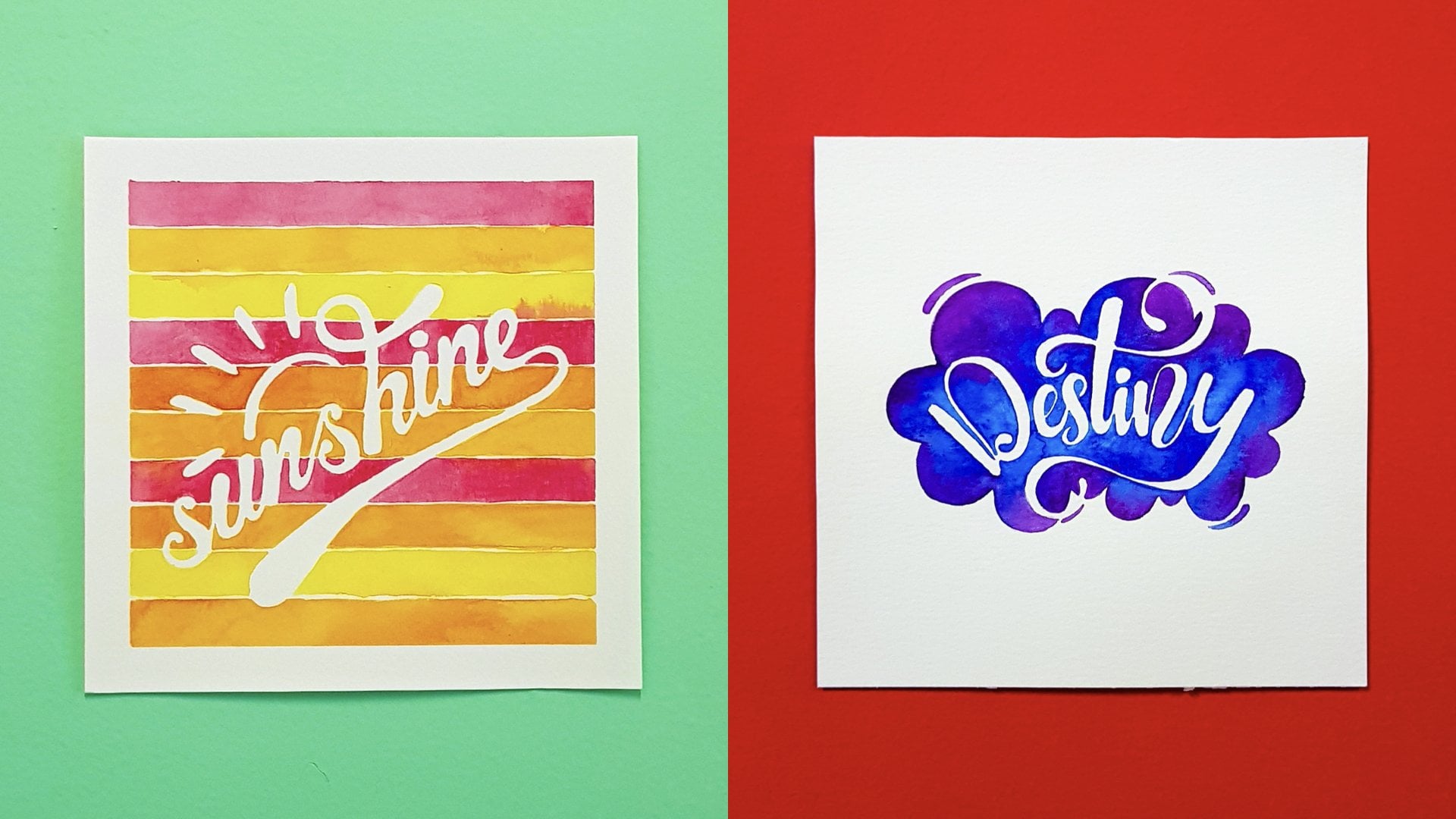
5. Negative Space And Its Use In Art: Before we get to the hands-on parts of this class, let's get some basics out of the way. In this lesson, I'll take you through what negative space is in the context of art, what we mean by negative painting, and some methods by which we can achieve negative painting artwork. We will also look at some examples of work by other artists and myself to try and understand the significance of negative space in art and design. What is negative space? Simply put, negative space is the space around the subject of an image. Usually especially when it's a solid area, we tend to just refer to it as the background. If this doughnut is my subject, then everything around it, so all the yellow parts make up the negative space, and the doughnut itself represents the positive space. Now, what is negative painting? Negative painting is when you paint by laying down your colors in the negative space as opposed to the positive space, that is around a shape instead of inside a shape. For example, let's bring the doughnut back. If I want to paint the doughnut, I can do it by painting inside a doughnut shape or I can do it by painting around a doughnut shape. Either way we can end up with a doughnut. The latter is what we would refer to as negative painting. Another way to define negative painting is, creating a shape by not painting it and painting everything else instead. It's there without being there, and that's the beauty of clever use of negative space. There are different ways in which we can achieve the effect of negative painting. Let's look at some analog methods specifically when using paint on paper. Masking tape is one of the most commonly used items to mask away certain areas while painting. This is especially useful if you were negative painting larger shapes with straight edges, like a geometric shape. I do use masking tape in many of my paintings but mostly just to get meet borders, not for negative painting as such. In this class, I'm not painting my sheet all the way up to the borders, so I will not be using any masking tape at all. Then there's masking fluid. This does the same job as masking tape, just that it's in liquid form and so can be applied with a lot more control especially in smaller spaces. This is a commonly used method by several artists. I currently don't prefer to use it a lot especially for lettering, mainly because it messes up my brushes and I can never get a clean stroke because I have to use an old brush. We will not be using any masking fluid for our projects in this class, which brings me to the next method, just straight up avoiding color in your positive spaces by manually painting around them. This is what we will be using in this class. Sounds like a pain to achieve. It's not that bad actually, but that intrigue factor is what makes this so exciting. Now, let's look at some examples of negative space being used creatively by other artists and designers. This is a piece by one of my most favorite artists on Instagram. She uses negative space so cleverly. Like in this piece, all the shadow areas are done in negative space and you can still clearly see the forms and shapes you need to see. Visit her Instagram feed to be overwhelmed with inspiration. Here, the t-shirt on the left piece and the bathing suit on the right one are there without you leaving there, so beautiful. A clever ad campaign promoting pet adoption. Do you see the canine in the negative space? This is another artist that heavily takes advantage of the clever use of negative space. In this piece, the space between the pages of the book so gracefully represent the trees in the woods that Little Red Riding Hood walks through. Here are the positive and negative spaces play with each other so elegantly to shape up the buildings, foliage, and the clouds. How cool is this with the unique shapes of the positive spaces making the negative space road look like a mustache. Is the black-bear defining Merida's orange hair or the other way round? I guess we'll never know. This is a negative painted watercolor piece where the cat, mushrooms, and foliage were all formed by painting around the respective shapes before adding detail elements. You can see more such fantastic work on this artist's Instagram feed. Negative space can also be used effectively with doodling like in this case, where all the highlights that define this portrait are left white and defined by the intricate doodling around them. This is another style that I really enjoy where lettering is formed using the negative space between illustrative elements. Check out Vidya's Instagram feed to see more of such fabulous work. Negative space becomes a valuable tool in logo design as well. Let's look at some examples. One of the most famous logos that use negative space creatively is the FedEx logo. Do you see the little arrow in the negative space? It's there without being there and that's the beauty of it. Here are some more logos demonstrating the clever use of negative space to sneak in design elements that are relevant to their respective brands. Negative space as you can probably tell is something that I'm always drawn towards using in my art and design process. Let me show you a few of my own pieces. I use negative space here to create an illusion of a window grill through which a botanical seeing outside is on display. I meticulously built it around the letters here to create this one. If doodling is meditative, negative space doodling is another level of meditative. I love using negative space in my watercolor lettering projects, and this is one of my favorite pieces that sparked this love. Here we have some holiday cheer using negative space lettering in a holiday inspired watercolor background. This is an example of negative painting in multiple layers. It's a super time consuming but extremely rewarding painting technique that I love to explore. This is also done using the same layered negative painting technique. I find myself doing this a lot with leaves and foliage. This is another one of my favorites where the negative lettering is set inside a negative layered grapefruits slice. Do you think the lettering would be this impactful if it was done any other way? This piece is one of two fun projects in my previous Skillshare class on negative space lettering with watercolors. Students who took that class came back to me saying they purely enjoyed following along as I created this from scratch. This is a second of the projects from the same class in cooperating one of my favorite elements to include in negative space pieces, clouds. I take my students through creating both these pieces from sketch to finish after retro few lessons on lettering and brush control techniques. If you haven't already taken this class, do check it out for some great introductory content on negative space lettering. I believe this was one of my first 3D lettering pieces incorporating negative space, somewhere along creating this one is when the idea for this class was born. Another negative space 3D lettering piece nestled in a frame of modern minimalist botanical. This one is a digital negative lettering piece, and I'm using the contrast of both negative and positive spaces to illustrate the salt. Another digital piece where the lettering is done using negative space techniques. Here, I've used negative space to imply the presence of a square frame around which the flowers are arranged. When it comes to achieving negative space effects digitally, the major chunk of the work is in conceptualizing. Actual execution is a bit more straightforward since you have the power of working in layers. I also use negative space elements in most of the logos that I designed. Here's a few. I hope I've shown you enough to get you excited to create some negative space projects. In the next lesson, we will dive right in and get to exploring some lettering essentials to get you started on your lettering journey if you haven't already and to brush up some basics if you're already into the lettering.
6. Lettering Essentials: Lettering is such a fun and exciting form of art and we're about dip our tools into this giant ocean. Lettering being such a huge world in itself can be intimidating, but I think it's just a matter of getting started. That's what I'm hoping to achieve in this lesson. I want to try and break down some key concepts that are fundamental to understanding lettering. There are also so many different styles of lettering to explore. Don't feel forced to go about this exactly as I do. What I'm hoping is that you get a strong sense of the basics from this lesson that will enable you to kick off and eventually find your own go-to styles. If you're already a lettering artist who's here to explore taking your lettering to the third dimension, then feel free to use your own preferred styles and techniques of lettering. If you're completely or relatively new to lettering, I want to encourage you to not only do this with me, but practice. Practice is key irrespective of style and I feel absolutely privileged to be able to hand-hold you as you begin this exciting journey. I want to start by trying to demystify some lettering-related terminology you've probably been coming across, like calligraphy, hand lettering, faux calligraphy, and monoline lettering. First of all, let's look at what calligraphy is and how it differs from hand lettering. Calligraphy is the art of beautiful writing. You might be using tools specifically intended for calligraphy, like fountain pens, calligraphy nibs, brushes, brush pens, etc, to write out letters in a particular style. Hand lettering is the art of illustrating letters by hand. You're essentially drawing out the different shapes that create each letter in the respective style. Now, faux calligraphy basically means fake calligraphy and its a hand lettering technique wherein you recreate the look of calligraphy using regular tools like a pencil or a pen. You're mimicking the final look of the strokes seen in calligraphy, but not by actually making those exact strokes. I'll show you what I mean in a bit. But before that, I also want to touch on monoline lettering. This is a bit of a gray area for me because depending on the tools and techniques you use, it could end up being categorized as either one of calligraphy or hand lettering. But this is what it is basically, it's the art of writing or illustrating letters without varying the thickness of the strokes. Or in other words, you maintain constant line weight. Okay, now I'll give you a better perspective. This is how you do calligraphy, you write by varying the pressure on your tool to create specific shapes using thick and thin strokes. In case of monoline lettering, the main difference is that you don't see the contrast of the thick and thin strokes anymore. All your lines are of even weight. In case of full calligraphy, you start with monoline strokes and then add thickness just to the strokes that need to be thick for your lettering to look like calligraphy. I'm going to demonstrate each of these for you. But first, I have some principles again, this time it is a set of guides. I've included a page of horizontal guides for you to practice your base strokes, letters, and words. A dot grid to scale up your lettering and create your own guides on and a page of slanted lines to guide your lettering if you want to do it at an angle. These are once again living in the resource section of this class, so head over and download them. You can print them off and use them for your practice or you could just pull them up into your digital softwares like Procreate to guide your digital practice. I've just printed off the horizontal guides and divided by page into three columns to demonstrate to you some techniques of calligraphy, monoline lettering, and faux calligraphy. Let's start with calligraphy. I'm going to be using this Pentel touch brush pen. I think it's a great tool to start with. I'll start by writing out a word using my calligraphy strokes. Watch as I make each stroke. Notice how I pause after every stroke. Sometimes I even break down a letter into multiple strokes. This is something I wish I figured out sooner. You can end up missing such really useful tips when you're just watching time-lapse videos of artists doing calligraphy, which is what I did a lot of initially. But stopping after each stroke has been life-changing for me. Try it out and see for yourselves. Like I said, calligraphy is made up of a combination of thick and thin strokes. Like all of these are thin strokes and these are thick strokes and this variation in line weight is created by varying the pressure on your writing tool. So more pressure to create thick strokes and light pressure for thin strokes. But exactly how do we decide which strokes should be thick and which strokes should be thin? Let see, at any given time, you are either going upwards or downwards. For example, here, we're going up and then down. This stroke is a combination of an upstroke and a downstroke. Similarly, we can break down the entire word and this is an upstroke. This is a downstroke and then a small upstroke. This is a downstroke, upstroke, another small upstroke, downstroke, you get the drift. It's basically just based on the natural movement of your hand as it creates each letter. Now, if you really look at this, you can see a pattern. It's not random at all. All the strokes going downwards are also the ones that are thick and similarly, the ones going upwards are the thin strokes. So that's basically it. The formula is that downstrokes are thick and upstrokes are thin. This is the most fundamental concept that you need to get familiar with to understand calligraphy. Downstrokes are thick and upstrokes are thin. Once you get this, then it's about really getting into the grind with practice. If you want to get good at calligraphy, you need to keep practicing some basic calligraphy strokes over and over again. It may seem unnatural initially to be breaking up your letters into strokes and varying the line weights. But you will need to take a conscious effort towards doing both of these. Then with consistent practice, this conscious effort will transform itself into muscle memory and it will become second nature to you. Now, let me show you some of these basic strokes that you need to practice if you want to learn calligraphy. First, it's these two. You need to keep doing your upstrokes over and over, and then your downstrokes over and over. Then you need to do combinations of the two. Like this. You'd think it's enough to just practice the upstrokes and downstrokes. But no, it's all these different combinations of upstrokes and downstrokes that form calligraphy letters. The muscle movement associated with each kind of stroke is different. Moreover, the transitions are important. One of the signs of a seasoned calligraphy artist is the smoothness of transitions between upstrokes and downstrokes. This is how I do an o or the round part of the lowercase a. I start on the top right with a small upstroke, then transition to a downstroke and then an upstroke. This stroke helps with the tail of letters like g, j, and y. This stroke is what we use for a lowercase l, b, and d, and the circular part of the b and d would go like this. The entry strokes for some letters like this, n here will be like this. I want you to fill up pages and pages with each of these strokes. Next, let's see how we can take this and create some bounds in the letters. Just follow the same concepts but without sticking to the baselines and x-height lines. By the way, I created these guides such that the solid lines are your base and top lines. The dotted lines indicate the x-height, which is nothing but the height of your lowercase letters in a traditional calligraphy style. In order to create bouncy letters, I usually alternate between going below the base line and above the x-height with every letter, so I end up with something like this. And in case you're wondering, I treat my horizontal strokes just like I do my upstrokes. I leave them thin. Now, let's look at some other styles. Again, the concept is the same. It's just about experimenting with the style. So feel free to slow down the video if you need to pay closer attention to my strokes, you can also use the concepts to create uppercase letters like this. Here's how you can do the same uppercase letters without the slant. Now, what happens if you don't vary the pressure? If you don't vary the line weight, we're just going to keep a constant line width throughout and that gives us monoline lettering. Let's take a look at that shall we? I'm shifting to a writing tool that does not have a flexible tip like the bullets tip end of the tombow brush pens here. Now let's see how this goes. I'm just doing the same strokes this time without varying the pressure I apply on the pen. Even if I do vary the pressure, since the bullet tip is quite sturdy, it doesn't translate into a variation in line weight, hence justifying the term monoline lettering. Note that it's still just as beneficial to break down your letters into strokes and pause between them. So this is what it looks like if you break it down, downstrokes, upstrokes, everything is the same thickness. However, even in this case, practice is important to get smooth, consistent lines. You can explore several styles using the same general idea. Just by changing your tool and technique, you can come up with completely different looking styles. Next, faux calligraphy. This I think, is one of the most straightforward approaches to getting started with lettering. I feel the technique is less intimidating to beginners. The fact that you can do this with just about any writing tool you have available at home, makes it that much more accessible. So let's get right to it. When we start off, we do nothing different from monoline lettering. In fact, we do the exact same thing. Next, we identify the downstrokes and thicken them by adding additional weight to each of them, like so. Then fill it in. That's it. Then we do the same for all the letters. As you start thickening the downstrokes try to mimic that smooth transition we aim for with true calligraphy. Let the downstrokes sprout organically from the upstrokes, right where the transition and just keep going. Now, I mostly thicken the strokes by adding weight to the right side of most of the downstrokes. But that's not a rule. I really just decide based on the space available on either side. Sometimes it might already be a bit packed on one side, in which case I can always thicken it on the other side or distribute the added thickness to both sides of the monoline stroke. Let's break this down into strokes as well. In this case, creating muscle memory is not our focus. Our focus is to mimic the results of calligraphy in the best way possible. So that's our downstroke and then the upstroke. See how I did not even bother drawing it upwards. It's because it doesn't matter. The only thing that matters is how it looks in the end. Of course, how much fun you're having. Just slowly bring it down and merge it into that upstroke. Remember, we want it to look as close to this as possible. So we aim at getting a nice smooth transition every time. Again, start from the upstroke and grandchild to thicken the downstroke. We do all the different styles we're exploring in the same manner. First, keeping all the lines thin and later thickening the downstrokes one by one. I hope I've managed to demystify these three lettering techniques a little bit. Sometimes we think we know what styles or techniques we want to explore based on the end result. But when we actually try them out, we realize a different process altogether is what we enjoy more. This is why I wanted to introduce you to all three techniques and help you figure out organically which of these processes brings you more joy. If you haven't already do, try out these techniques, practice them well and upload photos of your practice sheets to the project gallery so we can all enjoy looking at your hard work and your classmates may be encouraged to practice and share their own work as well. In the next lesson, we will look into what extra tips we need to follow while scaling up our lettering to larger sizes.
7. Scaling Up Your Lettering: I feel the need to specifically take you through scaling up your lettering. Since for most lettering projects, including our main project for this class, we need to do this at a slightly larger scale, and that sometimes calls for some more things to take care of. In this case, I'm switching over to the dot grid paper so that I can do it bigger. For the calligraphy technique, the typical way to scale up is to use a more appropriately sized tool. Like in this case, switching over from the small pentel touch to a bigger brush pen like the tombow will do the job. The technique itself remains exactly the same. So we carefully start with a thick downstroke and switchover to an upstroke and then again, a smooth transition to a downstroke. Just continue in the exact same manner. Now for the monoline lettering, I again start the same way as we did before with the bullet tip side of the tombow brush pen, but at this scale the lines are too thin and not effective enough. We can use a tool with a much larger bullet tip like this paint marker here, but I feel that really limits your options. Besides, there is a way to make it work with whatever tool that's available. So why not explore that? Here is where monoline lettering becomes kind of like faux calligraphy. Instead of thickening just a downstrokes, we thicken the whole thing in this case. So just carefully draw parallel strokes next to each of the thin strokes we already did in order to thicken them and then fill it in. Easy enough. You can go as thick as you like, depending on the scale and your personal preference. You can also go back in and smoothen any parts of your stroke that don't look as smooth as you like. Now there is one thing that you need to be careful about. If we thicken this stroke right here, we're going to mess up the baseline. We want to make sure that we thicken each of these curves here at the top so that we don't shift the baseline down. So this is what we'll do. We'll start off like normal and thicken this upstroke. As we approach the next downstroke, we just merge the two lines. Because we know that if we continue this way, we're going to push the letters past the baseline. So instead, we start thickening from the top side of this stroke and go up and merge into the same point at the top. Again over here and even up here, we need to be mindful of where we thicken so that we don't push the letters outside of our guidelines. In the case of these closed shapes like this, a, o, d, etc., we can just keep in mind that we need to thicken inside the shape and not outside. So just keep going. Always mindful of how you are thickening of the strokes is affecting the guidelines. Even if the letters are not intended to set within definite guides, they still need to be well balanced and the thickening needs to be done with that in mind. Finally, for the full calligraphy version, we follow the exact same process. The concept is the same. We just need to make the downstrokes thicker based on the new scale of the piece. If the size calls for thicker upstrokes too, you can thicken them as well. Just make sure you still have enough contrast between the thick and thin strokes in order for it to be effective. So that's basically it. As you can see, the techniques may not be that different, but it's still take some practicing to get the strokes looking smooth at a larger scale. In the next lesson, we will learn how to take this two-dimensional lettering into the third dimension. Some really exciting stuff coming up.
8. 3D Lettering : Now that we've learned how to create some fabulous lettering, who's ready to take it to a whole new dimension? Literally, in this lesson, we're going to take the 2D lettering that we just created and add some fun stuff to it to make it look three-dimensional. This part of the process is my favorite. So let's get right to it. Now, we need some kind of tracing paper, anything that has some transparency basically. This is one that I like to use. It's called layout paper. Let me show you. It's more translucent than transparent, which means it's white enough to feel like regular paper while also letting enough light through. So it works well for me. This particular one is by WHSmith, but you can obviously get whatever brand that's available locally. This here is another one that I have. This one is tracing paper. It's more transparent, thicker, and has a smoother finish. This is a bit more durable than the layout paper, but for this kind of work, I prefer slightly less transparency. I'm clearly just being nit-picky. You can use literally any paper that is partially transparent, even just baking sheet works actually. Anyway, I'm going to be using this one, the layout paper. Now, you need to position your translucent paper over the lettering that you did in the previous lesson. I'm going to use the four calligraphy version, but it doesn't matter, you can use whichever one you prefer. The process remains the same. I'm just going to trace this out with my pencil. Yeah, you might want to tape down your paper to keep it from moving. I'm just going to fill this in using my pencil. You can by all means do this as well, but you don't really have to. I just think it makes it easier later on for you to understand the process better this way. But again, totally up to you. Right, there we go. Our next step is to trace this again at an offset. So release the tape and just move this around until you find a position that you like. That's literally what I do every single time. There's no right or wrong. I just play around with it till I find that sweet spot. It can basically be anywhere except right on top of each other. Something like this looks good to me. You can use the dot grid to help align your transparent paper. We want the next tracing to be at the same angle as the previous one. Once you're happy with the position, press down that tape and get tracing. Now, you can go ahead and get rid of the tape. Also, we don't need this sheet anymore, so let me just keep that aside. Before we proceed with the next steps, let me just try to simplify this using a 3D object like this sharpener here. Let's assume that what we have here, the shaded lettering is basically the front phase of our 3D object. The one we just traced, the one with just the outlines, is this surface, the back surface. See, it's just like this. This back surface is what we just traced now. This just looks like a shadow right now. If we want this to look like a 3D object, it's still needs to have this other faces. There is this phase, there is this face, all of these. So we need to connect the front and back faces. The front and back faces need to be connected using parallel lines. To make it look like a 3D object, we need to make these connections. So that's what we're going to do next. See, this is just like how we were taught to draw a little 3D shapes as children back in school. For example, if we wanted to draw a cuboid, what do we do? We draw a rectangle for one of the faces, and then we draw another one next to it, parallel to it, so at the same angle. Let's say this is the front face. So we connect the front and back faces using parallel lines. Just like that. That's basically what we're trying to do here as well. The back surface can be anywhere doerly not just at this position. Like you can also do this or even this. In this case, just moving it a bit further away makes it appear like a longer cuboid. But in any case, the method is still the same. You draw the same shape at an offset, like if this here is the front face, you draw the same thing slightly away, and then connect the points using parallel lines. Connect the corresponding points, not just any points. Top left corner to the top left corner, top right corner to the top right corner, the bottom left corner to the bottom left corner. This won't be visible so you don't need to connect it. This is what we need to do next. First, we need to identify which points to connect. For example, this and this are corresponding points, so just connect them with a straight line. Similarly, this and this are corresponding points, so connect them. This and this, we don't need to set and connect every point, just the extreme points that form the shape. Just observe carefully and connect away. In this case, see, this is closer to this, so we might be inclined to connect these two, but this and this are the corresponding points. These two are the corresponding points. Just be mindful of these little details. You can even use a ruler to do this if you're not very comfortable drawing straight lines freehand. Just place it like that and draw straight lines. But I prefer to just do it free hand. Now, there are so many lines here that we don't actually need, because it's all inside the object, so we won't really see it outside. That's why we darken the outlines of only these. Same in this case, we don't need the lines inside. We only need the front surface. This much of the back surface because you can see this or this, be covered by the other sides. This we need, this we need, this we need. We don't need any of these lines inside. If you want, you can also get rid of them to make it more clear. Similarly, in this case as well. Now, we do the same thing here to our lettering. We don't need any of these lines here. We just need these. In this case, we need this and we need this. Here, we need this and this. We don't need all these. Just observe and identify the lines that we need and darken them. The more you do this kind of stuff, the more you'll develop an eye for this, and soon you'll be able to do this without thinking much. Now, in places like this, where the surface behind is overlapping with the front surface of some other letter, the front surface is our priority. All parts of the front surface, that is the shaded parts should be visible. That's it. That was easier than it seemed like quiznet. It's just about being patient and careful and breaking the process down into steps. How about I give you a recap of all the steps in the form of a QuickTime laps, but I convert our manila lettering from the previous lesson into 3D. Step 1, trace out your lettering onto a sheet of translucent paper. Step 2, offset the paper by moving it around till you find a satisfactory position and trace the lettering once again in this new position next to the previous one. Step 3, decide which one of the two will be your front face and fill in the outlines of that one using your pencil. Step 4, connect corresponding points on the two faces using straight lines to form the remaining sides of your 3D lettering. Step 5, identify the lines that are crucial for your lettering to look like a 3D object and darken them. You can either erase the lines you don't need or just ignore them. That's it. Now, if you haven't been doing this with me, I want you to do it now. This one especially is something that gets reinforced in your system, only when you actually do it, not just by watching someone else do it. As always, cannot wait to see your 3D lettering sketches. So please upload them to the project gallery right away. I think you just cannot deny the umpth that anything joined in 3D has. You can use this method to convert not just lettering, but any shape into 3D. There's a lot more you can do to make your 3D lettering look even more realistic. But I want to keep it simple with this one. If you want to take it up another notch, I suggest that you play with an imaginary light source, introduce some highlights and shadows to your 3D lettering pieces. For now, this works just fine. In the next lesson, we are going to start our watercolor exploration with a deep dive into paint consistency.
9. Paint Consistency: Let's talk about paint consistency because it's important. Mixing paints in the right consistency for your specific technique is a foundational skill that you need for any type of painting. You can use the knowledge from this lesson, not just to create negative space 3D lettering, but to inform the decisions that you take during every single watercolor project here after. When I say paint consistency, I'm essentially talking about the paint to water ratio. The ideal ratio varies depending on the technique and application. There's also no clear-cut formula to arrive directly at the right consistency every single time. But that doesn't mean you cannot master it. There are several things to look out for, clues to get you where you want to. Let me show you. We're going to explore the mysteries of paint consistency using what is called the tea to butter analogy. Basically, we compare the consistency of the paints we're mixing to common everyday items, such as butter, tea, and a few others in-between, and figure out what works for what. As we look at these different paint to water ratios, we will be looking out for some clues. One, paint dynamics. How is the paint moving around in the palette? Two, brushstrokes. Can you see distinct brushstrokes or do you end up with an even layer of paint? Three, smoothness of application. Are the marks you lay on paper rough or smooth? Are the edges well-defined? Four, control. How well are you able to control the paint on paper? Five, color value. Is the color intensely pigmented or just barely? Finally, transparency. Does the paint let the white of the paper shine through or not? This is significant because we know that when using watercolors, we don't usually paint with white. We indicate white areas by preserving the white of the paper. For this lesson, I'm going to pick out this bright pink shade called Sunset from my Tropicals palette by Prima Marketing. First, we're going to start with the thickest paint consistency, which would be just straight off the tube if we were using tube paints. But since pan paints are dry unless you wet them with water, we have to use some water to activate the paint. As you may have guessed, we're aiming at a consistency similar to butter here. We add just enough water and swirl the brush around to get a thick, barely wet layer of paint on our brush. Notice how the paint just coats the brush and sits right there, it does not drip off of the brush and onto the palette. Paint dynamics, none. Now let's try laying down the paint on our watercolor paper. It is, as you can see, a very dry and rough layer of paint. You can clearly see the brushstrokes. The color is as intense as it gets for this specific pigment and the layer of paint is so thick that you can barely see any of the white of the paper at all through it. The edges are not smooth at all, but you get some interesting effects that can be useful in certain applications called dry brush techniques. This is butter consistency for you. Now let's go ahead and add some more water to our paint pan. This time we are trying to achieve a consistency similar to cream. Still quite thick but more creamy. We can take out some of the paints into our mixing area to further adjust the ratio of paint to water. This is about what we're looking to achieve for the cream consistency. The paint begins to move around now, but mostly only when it's pushed around with the brush. Even if you tilt the palette, the paint doesn't exactly move around just by gravity. Also, see how the movement of the brush causes brushstrokes in the paint. This is one of the observations that indicates cream consistency. Now let's see how this lays down on paper. It's still quite thick and intensely pigmented. Slightly less than butter, of course, but still quite close to maximum intensity. You can still see brushstrokes almost distinctly. They're still very good control because the paint doesn't just move on its own. But the edges are slightly smoother and more even this time. The white of the paper still barely shines through that thick coat of paint. This comes in handy for details or when you need to get a higher contrast between light and dark areas. More water now till we reach the milk consistency. We're talking regular full-fat milk, not skimmed milk. But it might be worth noting that none of these consistencies is actually a fixed ratio. There's still a range of ratios within each consistency but it just helps us to categorize them as we explore the medium and get familiar with it. Cool. This looks like it. See how the paint moves more freely now? My brush still leaves strokes in the paint as I move it around, but much less distinct now. We're really beginning to see some of that paint dynamics we're talking about. See, the paint even begins to move on its own now, just by gravity. Now, how does it lay on paper? The color is still quite intense but it also lets the white of the paper slowly begin to shine through, which in my opinion, makes it look more vibrant despite the lower color value. The brushstrokes begin to smoothen out into a more even layer with much smoother edges that are still defined enough nonetheless. The dynamics of the paint in this milk consistency calls for more skill in controlling it, but isn't that what we're here for? More and more water. We're trying to get to our next category of ratios which falls under the coffee consistency. Oh, yes. Check out all that dynamics. The paint is going wherever it pleases while letting the brush leave barely any strokes in it. On paper, the color is beginning to lose intensity but still looking nice and vibrant, thanks to all that paper shine it's letting through. This is probably one of the most widely used consistencies in watercolor projects, thanks to its versatility. The paint layer is nice and even without any brushstrokes and the edges are smooth but not very defined. It works well for a wide variety of techniques, sometimes including darker washes and bigger areas that need to be smooth and possibly transparent. Also, as you can see, it gets a little unpredictable and therefore isn't the easiest to control at this point. So it's not ideal for use in extremely tight spaces. We continue to add even more water to our paint to get to our final stage, which is tea. Light and airy and as expected, pretty out of control, full of surprises. This one's giving me some intense arm workout right there. Here we go. Moves around all over the place all on its own. Well, gravity too. Taking this to paper shortly. The color is nice and bright but also really light. Super smooth, pretty perfect to get a nice and even wash in large areas that white paper nicely shines through, but also super unpredictable and a paint to control. This is tea consistency for you. How about we go ahead and summarize everything we just learned about the tea to butter analogy for categorizing paint consistencies with what color. Depending on the paint to water ratio, we can categorize paint consistencies by comparing them to the consistencies of everyday items, such as butter, cream, milk, coffee, and tea. Butter of course, being the highest paint to water ratio and tea the lowest. Each of these ranges of consistencies display certain unique properties to help us identify them and decide what ratio may be best suited to a specific technique or application. Let's consolidate these based on our findings. We know that as we go from butter to tea, the paint goes from being almost static to moving freely. We can say that paint dynamics definitely increases. Which also means that they get more difficult to control as the amount of water increases. Clearly, the color value progressively becomes less intense as we add more water to the paint while transparency increases letting the paper shine through more with the lighter consistencies. Butter consistency applies rather dry, rough, and uneven on the paper and gets smoother as the proportion of water added increases, giving us wet, smooth, and even layers, as we get to tea. Brush strokes, which are evident in butter start disappearing around milk and become completely invisible in coffee and tea. All of these observations will help us decide what consistency might work best for a particular project or technique, because there is no right or wrong consistency in watercolors. It's just a matter of what to use for what. Each of these categories has its own unique properties that makes it ideal for specific applications and not so ideal for some others. Let's look at some of the typical applications of each range of consistencies. Butter being thick, opaque, and highly controlled and pigmented, is mostly used specifically for highlights and dry-brush techniques to achieve some unique textures like bushy trees and textures in ocean waves. Cream. The obvious creaminess of the cream consistency coupled with the high level of control, makes it a perfect choice for small details. The intense color value is often taken advantage of to create single layer, high-contrast dark areas instead of multiple layers of lighted leaves. Milk. This is the real sweet spot. Perfect balance of control, intensity, smoothness, and transparency. Milk consistency is seen used quite a lot and it's particularly perfect for smaller areas that require good control, but also a smooth and rich paint layer. Coffee. This in my opinion is the most commonly used consistency. It's nice and juicy, which is great for most general watercolor techniques that require dynamic pins, great transparency that lets the paper nicely shine through, and it applies nice and smooth. This can also be used to create the more darker washes intended for relatively smaller spaces. Finally, tea. This range of consistencies being the most fluid and transparent, is most commonly used to create light washes across large areas like backgrounds. They're also great to buildup intensity layer by layer if you need to. It is however, not suitable for painting details or small areas because of how difficult it is to control. Now comes the big question. Having had an in-depth look at the properties and applications of each of these ranges of consistencies, which do you think we will be using in our exercises and project for this class? We will mostly be painting in small areas so we need a good balance between control and smoothness. We also need nice and intense colors, but don't need dually opaque areas. We want the transparency that's so unique to watercolors to really show through because otherwise, why bother doing this at all. Yeah, you guessed it. We will mostly be using the milk and coffee consistencies to practice and execute our projects for this class. Like I said, there's no cutthroat formula to guarantee that you will end up with the exact ratio that works best. You really need to put paint on paper and get a good feel of all these consistencies. I really couldn't recommend this mini-project more. Here's what I want you to do. Create a value scale, just like I did during the demonstration, using any color in your palette. This exercise will teach you so much about the different identifying traits of different consistencies and give you a good understanding of paint to water ratios. Not just for this class, but if you want to really take advantage of the versatility of watercolor as a medium, it's absolutely imperative that you get yourselves familiar with how these consistencies feel. It's may not be a project that's very visually interesting or satisfying but it's definitely going to help you a ton with creating visually interesting and satisfying watercolor projects in the future. I want to really encourage you to do this and also post a photo of your value scale in the project section so we can all see it and help each other through this journey. I've also included a printable cheat sheet summarizing all the findings of this lesson in the resource section. You can go ahead and download that, print it off, and put it up in your workspace so that you can always refer to it when making paint consistency decisions. Or even better, you can add all those details to your own value scale exercise piece and put that up instead. I hope this lesson has been an insightful start to your watercolor learnings in this class. I hope you're ready to absorb even more because there's lots more in stock for you in here. In the next lesson we will look into brush control, where we will explore lots of tips and techniques to lay down paint on paper exactly how we need to. See you there.
10. Brush Control: We've looked at paint consistencies and paint to water issues in depth. Now we need to see how we can apply our paint to get the specific results that we are looking for by effectively controlling our brushstrokes. This is what we're going to do in this lesson in the form of an exercise. First off, I have a printable template file for you to download from the resource section of this class. Please go ahead and download this and trace off of it with a pencil onto your watercolor paper. You can use a light box to do this. Or if you have a tablet like the iPad Pro, you can use an app called Lightbox Trace that enables you to trace directly over the screen. You can also just sandwich the printed template between your watercolor paper and a window against the daylight to do the tracing. Or you can just completely ignore the template file and draw these guidelines freehand, which is what I've done here. I've just drawn out outlines similar to those in my template file on a sheet of nine inch by six inch watercolor paper. You can pick whatever size works for you. I don't recommend going beyond an A4 size though, in order to get the most effective use of this exercise. As you can see, I've included a variety of shapes and patterns in the template. These have been carefully structured to create an exercise that will be most relevant to building skills towards our main project. However, these are skills you can use in a variety of other types of watercolor projects as well. I would really recommend that you do this exercise along with me. If you have your outlines transferred, let's get started. I'm going to be using the same shade of dark pink called sunset from my tropicals palette that I used in the previous lesson, because I definitely don't want all that paint going to waste. For this exercise, I will be using my size zero round detail brush. I've mixed my paints to a consistency in between milk and coffee. We begin with this one, but our aim is to fill in every alternate stripe. Pick up some paint on your brush and lay down a small blob slightly away from the outline and drag it out. Take more paint and add to your blob. As you drag the paint around to fill up your shape, get all the way up to the edges very carefully. We always try to create some careful outlines with the paint and then fill it in. Keep reloading your brush with paint as you go. I usually reload every time the blob I'm trying to drag around is not wet enough anymore. We need a nice wet blob to be able to fill up the space with an even layer of paint. We finish it up by carefully going over the edges and smoothening them out. Then we proceed to do the same thing with the next stripe. Same thing. We place a wet blob in our shape and drag it around to fill it up. If you've taken my previous class on negative space lettering using watercolors, you might have noticed a clear difference in the brush control exercises here. In the formal class, we don't paint all the way up to the pencil outlines. We stayed a little bit away from them and later erased the pencil marks. Here however, since we're going to be painting the 3D surfaces of our lettering, I feel we need to get all the way up to the pencil lines to get the most legible lettering piece. In case you were wondering, I hope this explains the difference. We just finish off this stripe as well. I'm going to be speeding up the video since I'm doing the same thing here, essentially. Feel free to pause or slow it down according to your convenience. The next one is essentially the same thing, just that the stripes are thinner now, so it calls for slightly better control. Now look at this. Do you see a puddle of wet paint up here? I'll show you how to deal with these. You just blot your brush on some dry tissue paper and touch the puddle. The brush will soak that puddle right up. Repeat this till you get a nice smooth layer of paint. Continue filling in the rest of the stripes, soaking up any puddles with your brush as you go. The thing about these puddles is that they may look fine now, but they will cause uneven drying, leaving dry marks that are called blooms. Blooms are not always bad, but now you know how to get rid of them if you need to. Now in this case, we have a more curvy sets of stripes. We just need to do the same thing, but try to get the curves looking smooth. If it doesn't happen the first time around, that's totally normal. You can always just keep doing this over and over again. That's why these are called practice exercises. The checkerboard, this is actually one of my favorite patterns to practice painting or even doodling. All you need to do is one square at a time, just like we've been doing, soaking up any extra paddles as we go. Now for this pattern to look its best, our aim is to stay as close to the outlines as possible with each square. If you paint past the outlines, or don't get close enough to them it no more looks like a checkerboard pattern. This is a great one to do, to practice staying within your shapes till you get it looking like a gorgeous checkerboard. Now this is another checkerboard, but the lines are wavy this time. In order to get these tiny curves right, you need even better brush control. I subconsciously tend to hold my brush slightly differently, when I need that extra bit of control. I switch up my brush holding position to something like this. I'll show you again. This is how I would normally hold my brush. But when I want better control, I shift to something like this, which gives me a firmer grip on the brush and therefore, better control. This way, I can move my hand ever so slightly to achieve highly controlled brushstrokes. Now, this exact position may or may not work for you. There really is no right or wrong way to hold a paintbrush in my opinion. But I would really recommend that you try out different positions to see what works for you and what situation. Just go ahead and paint the rest of the pattern. If you notice in this case, instead of squares, we have curvy little diamond shapes to fill in, each slightly different from the previous. That also means that the physical area you need to fill in with paint is slightly different each time, so the amount of wet paint that can effectively fill up each shape varies. This exercise is great to give you an intuitive sense of that. That is, if you actually do it. Long story short, do this. Now some stripes of varying widths. I find it useful to vary the pressure on my brush in such cases. So more pressure when I'm painting the wider parts and light pressure as I get to the thinnest parts. In this case, we just need to fill in each of these shapes. The technique is essentially the same as we've been practicing. But notice how I navigate each shape slightly differently. But don't worry, as you practice our basic technique more and more, you'll develop an intuitive sense of the best ways to approach each shape. Now, here we're painting the areas we did not paint in the previous box, or in other words, the negative space around each of these shapes. We start off like usual, laying down some paint in this corner. Then you need to decide whether to move across or vertically down. I start off with painting downwards and then leave a small blob of wet paint behind to buy some time as I move across the box. There is no right or wrong choice by default but the paint is in the process of drying so you need to move strategically either way. Again, I leave a wet blob behind as I switch over to adding paint to the downward section. Then yet again, I leave the end of that one also wet and switch back over. Soon you'll have multiple directions to worry about, not just two, but you'll get the hang of it with practice. Such exercises are great at building your rapid decision-making skills because you need to work fast enough to cover the whole area without leaving harsh dry marks. You also happen to have multiple directions to proceed in at any given time. Like I said, this is essentially what we need to keep doing throughout this exercise. Leave a wet blob hanging every time you switch over to painting a different area. You have time until that blob begins to dry. When you notice it's drying up, leave the current spot with another wet blob, and move on. This is our strategy when we try to fill in such negative space areas, which if you think about it, are basically just shapes with holes in them. There we go. We're done with these brush control exercises. If you haven't been doing this with me, now would be a good time to put paint on paper and get to work. Do this as many times as you need to. I guarantee you that you will come out of this feeling so much more equipped to painting, challenging, tight spaces. In the next lesson, we will talk a little bit about finding inspiration before we get into our final project for this class.
11. Finding Inspiration: Let's talk a little bit about inspiration and where to find it. Now that you have finished all the practice exercises designed to teach you the different skills that you will be needing towards creating the main projects in this class, I want to wrap this section up by talking about inspiration. I took you through some lettering essentials and my process of sketching 3D lettering. However, what I want you to take from these lessons is the process above everything else. You don't need to go by the same exact lettering styles that I demonstrated, there's tons of different lettering styles for you to explore, and I want to encourage you to try your hand at as many different lettering styles as you'd like to. Now, when you think of what 3D lettering style to explore, it can be quite overwhelming to just come up with something. This is normal irrespective of how seasoned and artist you are, we all need our sources of inspiration to get our creative juices flowing. That's what this lesson is about, I'm going to show you some of the places where I go to looking for lettering inspiration. Before this though, I want to just shed some light on the word inspiration itself and how it differs from imitation. The Oxford Dictionary defines inspiration as the process of being mentally stimulated to do or feels something, especially to do something creative. Imitation is defined as the action of copying someone or something. There lies the difference. When we look for inspiration, we're trying to stimulate our brains to think in a particular way and not to merely copy someone else's work. You are aiming at finding a spark that can fight up your own thinking. The best way to avoid blindly copying someone is to always put a little bit of yourself into your work. That way, your work will always take its own direction irrespective of what may have inspired it. Be inspired, don't copy, basically, don't be a Jerk. Now, we can get to my actual sources of inspiration. Instagram is where I spend a ton of time looking at other lettering artists' work and being inspired. There's so much amazing content here by extremely talented artists that you can discover simply by browsing hashtags. For example, if you're looking for 3D lettering inspiration, you just need to type in 3D lettering in the Instagram search bar, and when you tap on the hashtag, you get tons of related artwork. This really is an endless source of inspiration right here. I also save my favorite posts in a collection so that I can always look at them later if I want to. Did you know that saving a post also helps boost the post and improves its reach on Instagram? By doing this, you are in a small way giving back to the artists by helping their Instagram accounts grow a tiny bit. I'll show you some styles of 3D lettering that I found interesting on Instagram, I'll also include the artist handles, so do visit their feeds and show them some love. Then comes Pinterest, another endless source of inspiration. Again, just type in 3D lettering and find lots of related artwork. I have a Pinterest board put together for 3D lettering among other categories of artwork that you are more than welcome to look through for inspiration. I also like looking at font websites for lettering style inspiration. Yes, a font is inherently different from hand lettering but it's still gives me a lot of ideas to get started on a direction when I'm trying to develop a lettering project. Most of these websites have a similar setup where you can find tons of fonts in different categories. Let's look at this free website called dafont.com. My favorite here is the handwritten category under the script fonts. Usually when I'm checking these out, I have some idea about the style I envisioned for that specific project, so I keep that in mind while I scroll through all of these fonts. Now, let's say I find one that I like and click on it, I can see all these demo pieces that put this font in context and give me some creative ideas to explore. I also have the entire alphabet both in uppercase and lowercase available in the same style to refer to if I need. This I think is great for beginner lettering explorers who are trying to develop consistent styles, because you can observe these to understand the relationship between different characters in a particular lettering style. Here is my favorite part. If I go up here, I can type in the exact words I need to letter and see what that may look like in this style. This really gives me a visual of what I've been trying to imagine all this while, so it's pretty awesome. Again, this is not for copying, you need to put your own spin on it and get creative but it really does help to visualize it so that you can come up with creative ways to manipulate the style. You can also look at other sources like design magazines, lettering books, and vintage packaging for more lettering inspiration, none of which I haven't had to show you unfortunately. In the end, all art is inspired by something or the other, and the things we see in our everyday lives knowingly or unknowingly impact the way we think and in turn what we create. Surround yourself with the best things to keep you constantly inspired. My workspace and living environments are extremely important for me to be able to think creatively. Make sure you fill your species with things that bring you joy and tickle your creative sensors in the best of ways. Now, before we get to working on our main projects, take a break, do a little something that helps you relax. Maybe it's a cup of coffee or a slow walk. In my case, most of my brakes are filled with lots of wet kisses and the softest flu fierce of smangers from my baby girl. I'm going to play with her for a bit and catch up with you in the next lesson where we will use the meme generator I've created to find our creative sole memes.
12. Creative Soul Name Generator : Hey you creative souls. Are you all fresh and ready to kick some butt with our final project for this class? Before we dive into the project itself, I wanted to do a quick lesson on using the name generator that I came up with. Instead of picking random words, we're going to be lettering our creative soul names for our main project. I've put together this name generator for you to arrive at your very own creative soul names. It's available for download once again, in the resource section of this class. If for any reason you are unable to access the resource section, I'm also blowing this up for a bit, so you can just grab a screenshot of it instead. I'm pretty sure you can figure this out on your own, but I'm just going to take a quick minute to take you through this. Your creative soul name is a combination of words derived from your birthday month and the first letter of your first name. Let's say if your name is Susan and you were born in October, we need to first check what corresponds to October. That's rebellious. Then the first letter of your name is S, which corresponds to Singlewave here. So your creative soul name would be Rebellious Singlewave. Similarly, if your name is Mike and you were born in March, your creative soul name would be Zesty Momoweb. Now as you know, my name is Vinitha and my birthday is in January. According to this name generator, my creative soul name is Magical Peachflame. This is what I'm going to be lettering for my main project in this class. Go on ahead and have fun with this. Use your name and birth month to find your creative soul name and get ready to get started with this fun project. You can also use a loved one's name and create a piece to give to them if you like. Quick disclaimer; this whole thing is just about having fun and nothing more. There's no hidden implications to any of the names this generator might suggest. Most of them are actually just made up words that sound fun. I hope you take this for the fun aspect of it alone. If in any case you don't want to use these names, you can very well feel free to use your own names or any other words that you'd like to letter. I promise I will not hold it against you. Anyway, I think it's going to be super fun to do this and also to find out what creative soul names your fellow students ended up with. In the end of the project, besides uploading them here in the project gallery, you can also post them to Instagram using the hashtag, #MyCreativeSoulName so we can see all of your creations in one place. Once you are ready with your creative soul names, head on over to our next lesson, where we will kick start up projects with some brainstorming and sketching.
13. Concept And Sketching : Now that we have our creative soul names ready, we can finally get started on our main project for this class. Are you excited? We are going to be creating from scratch a watercolor 3D lettering piece, putting together all of the different skills that we developed in the previous sections. In this lesson, we're going to brainstorm and arrive at a concept and develop it into a refined sketch ready to be transferred to watercolor paper for painting. I've divided this lesson further into phases, just so that it will be easy for you to revisit at any later stage, if you like to. Let's get to the first phase, which is brainstorming. We need to first pull out all those ideas that are hiding in our brain and put them down on paper. This not only gives us room for other ideas, but also helps us to see our thoughts in front of us on paper. First, I always like to write down the words I'm going to letter. In my case, as you know, I've arrived at magical peach flame. Then I move onto laying some ideas in the form of little thumbnail sketches. I first put down the first thought that's in my head right now, which is an arc shape with magical inner cursive script style and peach flame in all caps with a little peach illustration under everything. Next, I want to see what it looks like if I switch the styles for each word within the same layout. You don't need to be precious about these at all. They are very initial sketches just to extract and visualize ideas to find a direction worth exploring. Now, do we need the ox or can we just keep it simple with some straight lines and a uniform script style throughout? Or how about setting our words at an angle and using the empty corner spaces to place the illustrative elements. Just playing with that some more by trying out some flourish ideas and moving the illustration around. I actually like this one, so I'm going to explore it some more, just playing around with the layout a little bit to see what works. One thing I'm always looking for is how to make the most of the spaces formed between different letters. Here I'm trying to see if I can effectively nestle magical in the space beside the big P. Or the tail of the G is clashing with all the tall letters below it, so probably not. I think same applies here, if we keep peach flame in all caps, there's going to be no space for the tail of the G in magical. Not this one. But I think the other way round could work. Let's see how it would look if we go back to having peach flame in a script style and tuck magical in all caps in the space above it. This also opens up some space to add in the peach illustrations symmetrically on either side. Since I like that last one, I'm going to use that as the direction to explore and develop the concept further. I have the little thumbnail here on the side to refer to as I begin to make a bigger one with some more details. First, I've just penciled in some guides for both my words to sit on top of. Then instead of directly trying to draw the letters at an angle, I'm just framing them on a straight line first so that I can refer to that and do the angle lettering. Now we can try to angle them and place them in the thumbnail. This is one way to do it. To just tilt the baseline and keep the letters to the perpendicular to it. But that's not what I want to do. I want the baselines to be at an angle, but I still want the letters to be along the vertical axis. So I'm going to just indicate some rough vertical lines to guide me, and then I'm going to sketch out my letters. Still not being too precious about it. I feel like there's too much of a very similar detail happening here and I want to just break that up. Maybe changing the F around a little is going to help. I think we can try to mirror what's going on with the H here, on the L as well by doing something like that. Looks weird to be honest. What can we do about it? Maybe change the curves up a little. Nope, still not liking it. I like the old symmetry aspect of it, but it just doesn't look like an L and for me, designing lettering that sacrifices on legibility defeats its purpose altogether. For now, I'm just going to go with a plain old L and see what else I can do. Like, I can go ahead and add the little peach shape to this H detail here and we'll just leave it hanging on this side too for now, maybe add some leaves as well. For these leaves, I'm thinking if we can incorporate some of this flame elements in them. Instead of a regular leaf shape, maybe try to do a more flame inspired leaf. I like to have my illustrative elements be derived from the words themselves as much as possible. We can see what it looks like attached to a peach as well. The magical aspect can be represented by some sparkles, little stars, dots and stuff, and for the peach flame, we have this. Now, I think the magical looks too basic. We want it to look magical. I'm going to see how I can bring in some magic to our magical. While you count how many times I'm going to say the word magic. I like the last one with all its curves, so I'm going to put that up here and see how it looks. If you notice, I've added some fun little details like the I being nestled in the G and the crossbar of the E sticking into the C. Next, I'm exploring some decorative touches that I can add to peach flame here. I'm thinking about ways in which I can get the F to fill some of the space on the bottom right. Yeah, that's what I'm talking about. See, this solves that problem as well as adds that extra something to the L. Now I want to balance the line on the bottom right with another similar one on the top left and a nice little curve up there to mirror the loop and the F. I'm just going to leave some nodes in here because I want to shift this here a bit and make the P a little bigger so that everything fits in a bit more snugly. Now that we have a basic idea of what we want to achieve, we can move on to our next phase, which is sketching. This is where we are going to develop the concept further into a more refined sketch. I start by laying down some guides on a dot grid paper inside a square that's about seven inch by eight inch. If you plan on doing the final tracing to the watercolor paper directly from your sketch, then you might want to do this to scale, to fit in your watercolor paper. If you are tracing using a tablet like the iPad Pro, you can always adjust the scale later on. I've marked the horizontal and vertical center lines and some angled guides for each of my words to sit inside. Now, I want the word magical to fit nicely in the space here, so I'm going to start with peach flame first so that I can position it accordingly. First, how many letters are there? One, 2, 3, 4, 5, 6, 7, 8, 9, 10. So five on either side of the center line. I think it will be nice if the F is right in the middle, since it's a prominent style element too. I start off with the F, then I start sketching out the rest of the word to the right using the grid to help me get my vertical lines aligned. On the left side, I worked from the center out so that I can get a better placement. Once the basic framework is down, I start refining the curves and the spacing and stuff in the letters. I also start adding some details as I go and it strikes me that I can incorporate the peach here as a flourish to the H. On the other side, we can try attaching it to the M. I like that direction, but it just needs some tweaking. I'm trying to do less heart shape and more peach shape by adjusting the curves around a little bit. Now for magical, there's 1, 2, 3, 4, 5, 6, 7 letters. Technically, the fourth letter, which in this case is the I, needs to come in the middle. Since we are nestling the I over the G, I'm going to place the G very close to the center line and take it from there. Now I realized that the guides I drew for magical are too wide apart which means I'll have to make each letter really tall and skinny to fit in the space and I don't want that. Now I do a type phase for magical. I erase the whole thing and shift the top guide down to start over with some shorter letters. That I think looks much better. I'm going to curve some of these lines a bit to see how that looks because I'm hoping that's going to give it a bit of energy and dynamics, but not quite. I think I prefer without the curves, so I switch back over to straight lines and curve out just the crossbars instead. Next, we need to sketch out some of the flourishes and decorative elements. I do that, trying to keep the lines as clean as possible and parallel wherever required. Now, there is some empty space around here, so I want to add a little flourish to the M. I play around with that a little bit till I find a shape and position that I like and I try to mimic that shape of the flourish here on the L too. Next we move on to playing with the decorative elements. I like using these curvy, teardrop-like shapes to fill up empty spaces with. They also add a lot of dynamics and lead your eyes because of how directional and full of character these are. I just go with the flow and mess around with some shapes till I'm happy with how I'm using the empty spaces. As you can see, all this takes some trial and error and that's totally cool. We're trying to do all the back and forth here and not directly on the watercolor paper so that we have the freedom to really play around. Go for it and enjoy the whole process, iterations and all. Once we're happy with that, we can move on to adding weight to our lettering. I decided to go monoline with this, so I'm going to just go ahead and thicken all of it. Remember to be mindful of the guidelines when you do this and thicken the strokes in a way that the layout is not pushed out of balance. Then I added some little sparkle elements as well to bring in some magic to the whole thing. Now we have the 2D version of our lettering ready and this brings us to the next phase of our sketching process which is adding dimension. Now is when we're going to follow our five-step process which you're already familiar with by now, to convert our lettering into a three-dimensional piece. We start off with step 1, which is tracing out the lettering onto a sheet of translucent paper. I'm using the same layout paper that I used previously. Right now, I'm going to be tracing only the lettering and the one lose flourish element on top because I don't want to convert any of the other elements into 3D. Next, I go over all these outlines with my black fine liner pen to easily differentiate the front phase from the other phases. That's done and here we are. Now step 2, tracing the lettering a second time at a new offset position. By the way, I want to really apologize for the top of my head that makes an appearance in the frame every now and then. I have this horrible habit of hunching over my work when I really get into the groove. If you have some tips for me to get rid of this habit, please help me out with them. Since we already did the black outlines on the front phase, we are going to be skipping step 3, which if you remember, was to shade in the entire front phase. Right now, the pen outlines indicate this phase, the front phase, and the pencil outlines, the back phase. Next, we need to do these side phases. Step 4 is connecting the front and back phases with straight lines at corresponding points. Finally, step 5 is to darken the lines that we need so that we don't confuse them with the ones that we don't need. I'm going to do this using my black fine liner pen again. Just to give you a preview, these are the areas that we're going to paint with watercolors in the next lesson, so basically, only the 3D phases and not the front phase itself because negative space painting, right? Before we move on to painting, we have one last step, which is transferring our other decorative elements to the translucent paper to complete the layout. I'll once again reposition the papers to find the sweet spot and trace out all our decorative elements. You may find that some of them are now overlapping with our 3D lettering. You can feel free to ignore these or adjust them to more suitable positions as you see fit. You can also go ahead and ink the outlines with pen once you're happy with these. We've come to the end of the entire sketching process. We now have a sketch that is ready to be transferred to the watercolor paper. As you saw in this lesson, the sketching process is very crucial to achieving a balanced layout for your lettering pieces. I decided to include all of the back and forth that I went through with this piece without editing out any of the iterative parts because I wanted to normalize it. I want to tell you that it's okay. It may seem like other artists are able to just wing it and bring to life a fabulous piece out of thin air but that's rarely the case. Enjoy the process and take every opportunity that you get to make tweaks till you're happy with the end result because in the end, that's what this is all about, isn't it? I cannot wait to see all of your 3D lettering sketches that you put so much work towards perfecting. You know the drill, upload them. In the next lesson, we will add colors to our sketch and bring everything to life. Let's catch up there.
14. Painting With Watercolors: Ready to bring your sketches to live with some negative painting with watercolors? In this lesson, we are going to put to use all of the skills that we developed in the paint consistency and crush controlled lessons, to paint the 3D faces of our lettering piece. We will leave the front face unpainted and define it using the contrast between the white of the paper and the painted 3D surfaces. Since we are painting around the front face and not within it, is why we can call this negative painting. Shall we? I've gone ahead and transferred my sketch to a sheet of watercolor paper that's nine inches wide and eight inches tall. I've tried to keep the pencil lines light while also keeping it visible to you. I suggest you go even lighter because most of these lines are going to stay under the water colors, so they're not all going to be raised eventually. Now, I've decided to go with a single color for all of my lettering. For this, I've picked out this bright orange shade called hibiscus from my tropicals palette. You can by all means pick multiple colors for different parts of the lettering, or even blend colors within the shapes. In fact, I've included a bonus tip later in this video on blending watercolors effectively. You could jump to that and come back here if you plan to do any color blending at this stage. I've taken out some of the paint in my mixing well, and I water it down to somewhere around the thinner side of milk consistency. I'm going to be dipping my brush in the water every time I reload with paint, so that will give me the flexibility to approach coffee consistency if and when I need to. Throughout this lesson, I'm going to be painting with the Artesia size zero round detail brush. I start by loading my wet brush with paint from the mixing well. Then just like we did in all our practice exercises, we place a blob of paint near the outline and drag it around to fill up the shape. Reload the brush with paint every time the blob is not wet enough to be pushed around easily and repeat. You need to be mindful of which shape you're filling up because remember, we don't want any of our front faces to be painted. Keep a dry tissue handy to blot out any paddles as you paint. Especially when you get to tighter spaces, you may end up with blobs that are too wet even after filling up the shape. Also, as you get into tight corners, it helps to lighten the pressure on your brush to achieve the thinnest of strokes. Now, all the 3D lettering dots are done. Next, we need to move on to painting the remaining decorative elements. I'm thinking I want to go with some greens to bring in some contrasts and freshness to the piece. For this, I've chosen two shades, a darker cool tone green called Island, and a warm bright yellowish-green called parrot, both from the same tropicals palette. I've learned to create a gradient with these two colors and each of the embellishments. Next, I'm going to demonstrate some bonus tips to help you achieve an effective color blend using watercolors. Let's say I want to create a dark to light gradient on the square. I start as usual by laying down a blob of my first color which in this case is the deeper green, and then pull the paint around in the same way that we've been doing. But this time we will not fill the entire shape, just bring the paint down to about half the area and stop so that we can blend our second color into the remaining area. Next, I place a blob of the brighter green paint next to the darker area. Now, because we have a nice wet edge here, we can just blend the two together at the middle and pull the paints downwards to fill up the rest of the shape. It helps to work into the middle area some more to achieve a more seamless blend. Once you're happy with the gradient, you can go ahead and use a dry brush to blot out any wet paddles. Let's try that again. Paint in the first color on one-half of the area and stop. Add a wet blob at the edge if required, and then use your second color to fill up the space. Move the brush around to blend seamlessly and finally blot out any extra paddles. Now what happens if the paint is not wet enough at the scene? Let's find out. This edge here is dry and I'm not adding any more wetness. I proceed with adding the second color. See how they don't blend nearly as well? You can still almost fix it but you also risk destroying the texture of the paper with all that rubbing. You're definitely better off making sure there is some wet paint at the scene before you try to blend the colors. You can apply the same technique to paint a gradient within our tear drop shapes. I like to start with the corner here and lay down the darker shade till about halfway through. I think the edge here is a tad too wet, so I soak up a little bit of the wetness here and then go ahead with adding the brighter color and pull it to fill up the space. If the area is big enough, I like to reload the brush with my second color before I paint the last bits so that it turns out nice and bright. Okay, I'll do one more. Now, just do exactly that to paint all of the tear drop shaped decorative elements and then the little sparkles too. I think the green gradient is making these look nice and juicy and also in a way leaf-like. Don't you think? I splattered some paint which, of course, is fabulous because now we have an opportunity to learn what to do about it. First of all, don't panic this is fixable. Pick up some water with a clean brush if possible and work into the stain, just crub it out using the brush and then use a clean Q-tip if you can. I don't have one handy, so I'm using a clean dry tissue to soak up the water. You may need to repeat this a few times. I will sing, I love use ingredients in my watercolor pieces. I think we are super effective even if incorporated in tiny waves. If you want to learn to blend watercolors more tidily, I have an entire lesson dedicated to blending colors in my class called negative space lettering with watercolors. There, I walk you through applying this technique to achieve gradients in different styles and directions, like diagonal gradients and radial gradients to name a few. In the end of that lesson, there's also a crash course on color theory basics so that you can use that knowledge to avoid muddy blends and choose colors that blend beautifully with each other instead. Now, we're done with all the teardrops and the little sparkles. Next, I want to sprinkle in some dots randomly across the composition. First, I do a few using the dark green and then some more with the brighter padded green. I never know when to stop with these little touches but that looks good to me. We have one last step which is erasing the pencil outlines. We need to go about this gently to avoid damaging the paper or dulling the colors. I would rather do multiple gentle passes with the eraser, then a single aggressive pass. Here's another tip. Don't use your hands to brush off the eraser dust from your final pieces, use a big brush instead. It will keep your artwork safe and clean without the risk of having any nasty stains. But do make sure the brush is clean and dry before doing this. I use this particular brush almost exclusively for this job and just like that, we are done with the painting phase and hence the project itself. I always wait eagerly to see what it looks like after the pencil outlines are released because it really does make a difference. Are you happy with final pieces that you created? I hope you are because I'm super proud of you for seeing this through. You've learned so much and I'm sure it's going to show in your work. I had so much fun creating this peace with you. Now, there's one last video with my final thoughts, that's me there for a hopefully very temporary to vibes.
15. Final Thoughts: Congrats on making you through this entire class. I hope you really enjoyed all the five mini projects and the final project for this class. As for me, I had a total ball and I'm so honored to have been able to share with you the small part of my creative journey. In this class, you learned that negative space is the space around the subject of an image, and negative painting is basically not painting the shape itself and painting everything else instead, and you now know three different approaches to hand lettering. Firstly, calligraphy, which is the art of writing letters using specific tools and varying the pressure as you write to get thick and thin strokes. Secondly, monoline lettering, which as the name suggests, is the art of writing or illustrating letters with uniform line weight throughout, and lastly, faux calligraphy where we use any basic writing tool to first draw out the letters using monoline strokes and then picking just the downstrokes so as to mimic the look of calligraphy. Having learned to apply the basic principles of 3D sketching to convert your two-dimensional lettering to a 3D piece, you are now well versed with our simple five-step process to convert any 2D shape to a 3D sketch. In the world of watercolor painting, you've taken a deep dive into paint consistencies and are now an expert in applying the tea to butter analogy to make paint consistency decisions in all of your watercolor projects hereafter. Besides, you also know exactly how to control your brushes to paint effectively in tight spaces, how to remove puddles and avoid blooms if you need to, and how to deal with paint splatter accidents. In the end, if there's one thing I hope you took from this class, it's the possibilities that open up when you imagine ways in which you can combine multiple skills effectively and create processes for yourself that take you on your own unique, exciting adventures and you've already put together all of these new learnings to use when you created your negative painted 3D lettering pieces for your final project, which I'm so eagerly waiting to see. Did you upload your work to the project gallery? I'm going to be checking as often as possible and writing back to each of you. Don't forget to use the hashtag MyCreativeSoulName and tag me when you post your pieces to instagram. I want to see all of the beautiful pieces that this class inspires you to create even in the future. Do connect with me on Instagram and tag me in your posts. I would love to hear from you what you thought about my class, and if you found value in this class, please leave a review and spread the word with your friends and family. Do follow me here on Skillshare so that you will be notified right away when I publish a new class. As I mentioned previously, I have a very closely-related class here on Skillshare called negative space lettering with watercolors. If you enjoyed this class, you're definitely going to enjoy that one too. I'm teaching a slightly different approach to negative painting there, so do check it out if you haven't already. I want to say a big thank you to you for joining me here in this class and seeing this through. Goodbye for now, see you next time.
 Vinitha Mammen, Illustrator | Lettering Artist