Transcripts
1. Trailer: Do you ever come across gorgeous gush illustrations of house plans and
think to yourself, How do they create such magic? Well, wonder no more. Together, we're
gonna create one of these from scratch. Hi there. I'm Vanita Marmon,
a lettering artist, illustrator, muralist,
and educator. I help businesses and
individuals express themselves through
custom illustration and lettering projects. I love using gold colours and playful but empowering
elements in my work. I'm also a top teacher
here on skill share. When most of my commercial
work happens digitally, there's something so
deeply satisfying about the tactile joy of painting a gouache, particularly
acrylic wash. It's so rich, forgiving, and so buttery smooth that it feels like
pure magic on paper. In this class, we'll explore this amazing medium by
painting a vibrant, stylized house
plant illustration. From mastering paint
consistencies to sketching, to layering the paint, I'll guide you through
every single step. We'll use this photo
as inspiration, not to recreate
it realistically, but to craft a stylized version that captures its essence. Together, we'll decide
what to simplify, what to emphasize, and how to make the illustration
uniquely yours. This process is not just
about painting one plant. It's about learning
techniques and creative decision
making that you can apply to any illustration
in the future. Whether you're a total beginner
or an experienced artist, this class is perfect for you. It can be a fun weekend project or a relaxing week night escape. Plus, if you're a plant lover who struggles to keep
your greenery alive. This is the perfect way
to grow your collection. By the end of this class, you'll have your own finished gouache house plant
illustration, along with practical
tips to harness the unique properties
of acrylicuah like a B. So grab your pins, and let's bring some
creative magic to life. Ready? I'll see you in clubs.
2. Class Overview: Hello, and welcome to the class. I'm very excited to have you here on this journey of painting a potted plant
illustration using a clique wash. Before
we jump into the class, let me give you a quick overview of how the class is structured, what your class project is, and the supplies
you will need. We'll start by exploring the unique qualities
of acrylic gouache as a painting medium
and how to achieve the right paint consistency
for the best results. Then we'll create
a pencil sketch as a guide for our illustration. Once the sketch is ready, you'll dive into painting, starting with the background
color and the planter, where you learn how to apply
the base colors evenly and add just the right amount of shadows and
highlights for depth. Finally, we'll bring
the plant to life by painting all the
greenery layer by layer, building a dynamic
stylized illustration that pops off the page. Throughout this
process, we will use a reference image to guide us, but we will not be
trying to recreate the reference image in
a realistic manner. Our aim is to create a
stylized illustration using the reference image as a starting point and
a general guide, not as something we need to stick to for every
single detail. This means we need
to make constant decisions on what we choose to translate into
our illustration and what we want to ignore. As I walk you
through my process, you will see exactly how
I make these decisions. For your class project,
you'll recreate the House plant illustration
we work on together, I'll guide you step by
step through the process, so you'll have
everything you need to achieve the finished
piece of art by the end. If you're feeling adventures and want to take an extra step, you can do a second piece where you choose a reference
image of your own, perhaps a plant from your home or a copyright free photo of the Internet and use
the techniques from this class to create a unique
stylized illustration. Doing this extra step
will really help you reinforce everything you
learn with me in this class. As for the materials
you'll need, there's, of course, the paint. I'll be using acrylic gouache, which is what I recommend
you use as well. However, you're also welcome
to use traditional gouache, if that's what you have
at hand right now. You'd also need paint brushes. I'm using the pigeon letters studio brushes in
different sizes. These are the specific ones
I'll be using in this class. These brushes are
really good quality, cruelty free brushes that I personally really love to use. You're, of course,
welcome to use your preferred brand of brushes. Anything you have in hand and enjoy using will
work just fine. As for paper, you'll
need paper that's ideally at least 300 GSM thick. So any watercolor or acrylic
paper should work fine. Besides these, you'll need a pencil for
sketching an eraser, a palette or plate to mix
colors, a jar of water. Some paper napkins and a ruler or masking
tape for borders. I've pulled up an image
from Unsplash for us to use as a reference image
for this illustration, so I would recommend that
you also go ahead and have this image ready in front of you either on a screen
or print it out. To make the most of this class, I'd recommend that you actually do the project alongside me. You could also just watch the entire class once
and then rewatch the project lessons again
while you follow along with me if you want to get a
really thorough experience. This class has a mix
of real time video and sped up video to keep
things snappy and relevant, but feel free to
pause or rewatch as much as you need to to take
things at your own pace. So that's everything you
need to get started. The next lesson, we will
write in and look at makeups.
3. Paint Consistency: So we often see these beautiful, extremely satisfying reels and process videos of artists
painting with gouache, where the paint just
lights so beautifully and offers this fantastic
opaque coverage. We're, of course,
inspired by this and want to experience
this for ourselves. But when we finally
sit down to do it, it turns out nothing like that. There's, of course,
a learning curve, and that is true
with guash, as well. So it's not fair to you to expect amazing results the
first time you try something. But apart from that, I believe there are two key
factors to achieving that wonderfully opaque coverage and then buttery smooth flow. One is the quality
of the paints. You want to try and
get your hands on the best quality of paints
that you can afford right now. Try to stay away
from anything that says student grade and consider going for maybe an entry level artist
grade option instead. The second thing is
paint consistency, and that's what we're here to
talk about in this lesson, because that's what I believe is the most important factor. Even if you get the
most expensive, best quality paints out there, unless you paint with
the right consistency, you're not going to achieve the results you're looking for. So for this kind of flat, illustrative painting style that we're doing in this class, what I found to be the best consistency is something similar to cooking cream or
melted ice cream. So a creamy consistency, but still not too thick. It's flowy, but it's
also rich, right? So that is the sort of
consistency we're looking at. And how do we achieve
this creamy consistency? It's by playing with the
paint to water ratio. Depending on the specific
paints you're working with, the consistency straight out of the tube or bottle
will be different. So there's no exact
formula to give you as to how much water to use to achieve the
right consistency. We'll have to incrementally mix in water little by
little till we get to the consistency that
feels right till we get to that cooking cream or melted ice cream consistency. This is what my paint looks like straight out of the tube. And if I try to paint
with it as it is, it's not going to give me that smooth flow that
I'm looking for. It's creamy, it's opaque, but then there's no flow, right? So I'll just pick
up some water on my brush like this and
drop it over the paint. Mix it up and see how it feels. We're not there
yet, so I'll keep doing that in tiny
little increments. And each time I try and mix the paint as
homogeneously as I can. And this looks about right. See what I'm talking about?
It's nice and creamy, but still flowy, right?
Let's give it a coat. Yes. See how it's
nice and buttery. The coverage is good, and
it also flows beautifully. Yeah. It's nice and flowy, but still creamy, just like melted ice cream or
cooking cream, right? So this is what we're aiming at. Also, if you pick it up
with your brush like that, it takes a bit, but then
you can drop it back. See? You can pick it up like
that and then drop it back. But it takes a few
seconds, right? Because it's not super runny, but it is flow
enough to drop back. So that's another test you can use to check the consistency. There's, of course,
different ways of using guache to create
different styles of artwork and each of
those probably require a different consistency
to get the right results. My favorite way to use guache is to create these
flat illustrations, and this is the consistency that I find works best for me. So that's what we're
going to try and achieve throughout our
painting process today. Sometimes we'll find
that the paint is thicker or looser than ideal, and we just need to
adjust it by adding more water or adding
more paint as we go. Cool. In the next lesson, we're going to get
to the sketching.
4. Sketching: So Now that we know how to achieve that perfect
balance between paint and water to achieve that nice and
buttery paint consistency, let's jump right into our project piece,
starting with a sketch. I've gone ahead and drawn
some borders on my paper. You can also use
masking tape instead, if you like. Now that sketching. Somewhere around
the halfway mark is where I want
the pot to begin. So I'll draw a horizontal
line like that. And then straight lines
downward from both endpoints, and we'll curve out
the bottom like that. And connected to the other side. Now I want to just curb the mouth of the pot
ever so slightly, and I'll get rid
of that straight line to avoid confusion. There's a plastic pot
inside the planter, so I'll draw that next with the mouth more or less
parallel to this curve. Okay? The back of the pot is not visible because it's going to be covered
up with the plant, so we don't need to draw that. Now, I'll draw a little hole here for the rope to start from, and then draw the rope on this side all the way till about the
middle point on the top. Okay. Similarly on this
side, we'll draw a line. We can't really see
where it starts from, so we'll start somewhere around here and take it to about here. And then we'll bring this
in like this in a curve. Now, we have these
beads on the rope, so I'll just draw some
free hand ovals here. It doesn't have to be at
the exact same positions or the exact same design
as in the reference image. We're just taking the
idea that there are some beads there and translating
that into our sketch. For it to look like the rope
is passing through them, we'll mark some holes over here at the bottom
of these beads. Now, I don't want to draw all of the textured details that's happening on the planter here. Instead, I'm just going
to divide it into two and paint a different
color at the bottom part. And now we can start
with the plant itself. I'm just going to
put in circles of different sizes to make up the pea shaped
leaves of the plant. So one right here. The circle is, in fact,
attached to a stem. So I'll just draw a stem
coming out like that, a single line to indicate that, and then extend that line
like this all the way down and then add more
peace to that vine. I'm loosely following
the reference image, but I'm not being
too accurate at all about where each circle goes or even bothering to account for the shape
differences in some of them. I'm just sticking to circles as a style choice and going for it. I'll add another nee here, like in the reference photo. And then draw some
circles along that stem. And just like that, fill up the pot with all of our
hanging strings of pearls, loosely referencing
our image as we go. All right, so we have the top
of the pot to fill up now. And as you can see in our image, it's just a lot of these green pearls stacked
over each other randomly. So that's what
we're going to do. We're just going
to draw a bunch of circles in different sizes
to fill up the space. And we have this little guy
over here just sticking out, and him, I want to make a bit
more tapered just for fun. And that's it. Our
sketch is done. Now, in terms of these lines, they are a bit
darker than I would normally draw them so that
they are visible on camera. But I still wouldn't worry too much about them because
we're going to use Guache and most of
it will get covered up because gouache
is mostly opaque.
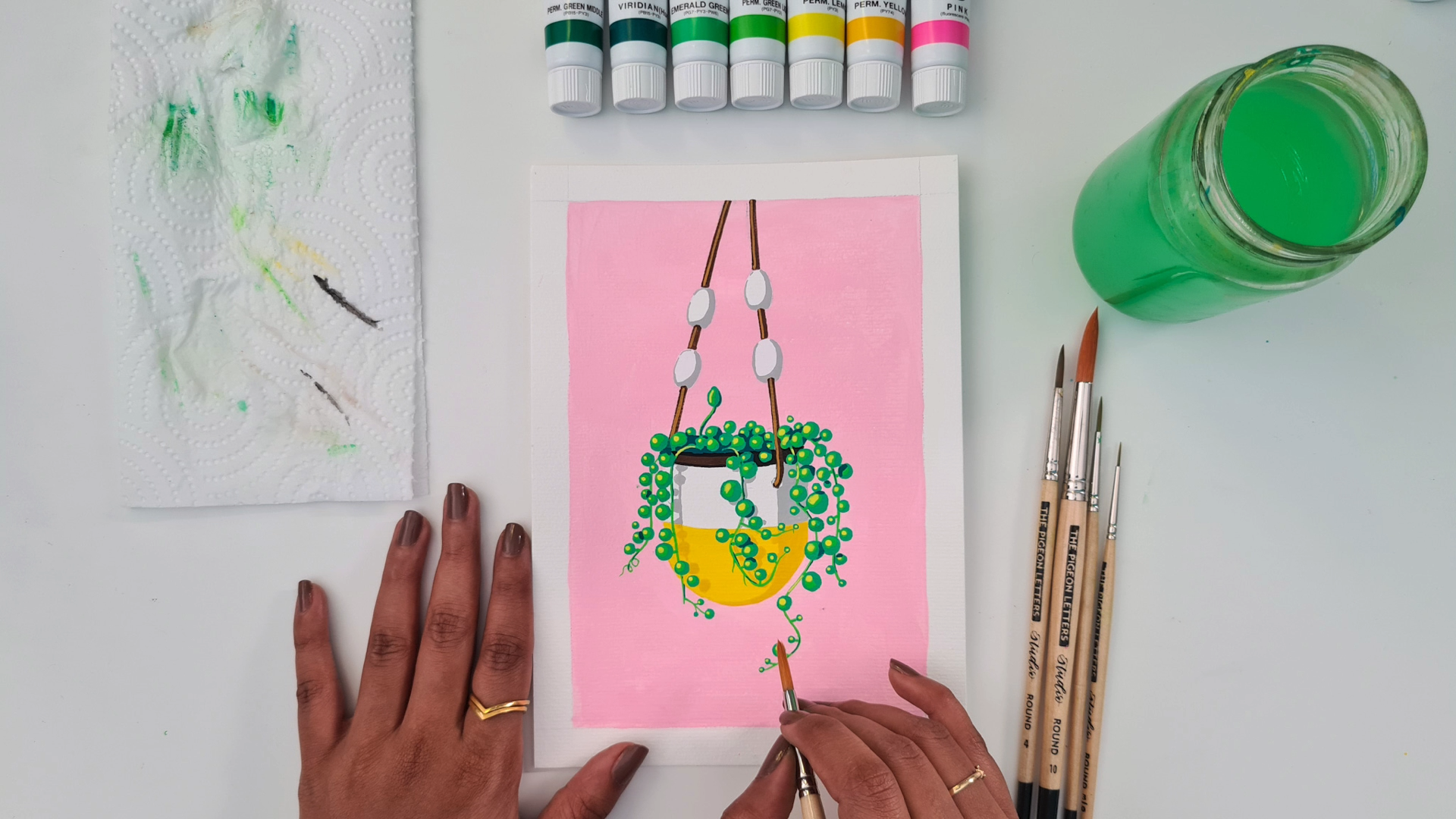
5. Painting the Background: Okey doke. So let's
start painting. We'll start by picking
out our colors and picking a bunch
of different greens, some pinks, some browns, and then black and white
to adjust the values. Now, depending on what
paints you have at hand, your colors are likely to
be different from mine. But you're welcome to try and recreate the colors I'm using or go for a completely
different color palette. So that's up to you. We'll start with
painting the background, which I want to do
with a pale pink. So I'm just squeezing
out some of this fluorescent pink
paint to my palette, adding a ton of white to make it a lot
lighter than it is. And then I'll mix it up with a wet brush to see what we have. I think it's a nice pale pink, but it's just a tad
to nonage for me. So I'm going to add
in a tiny bit of this crimson to dull this
pink down just a smidge. So it's not like a
super fluorescent pink. So that looks about right, and the consistency
looks good, too. So I've loaded my
brush with paint. I'm using the size
ten round brush, and I'm just going to go for it, starting from this
corner over here. And I wouldn't bother
painting around the sketch. I'm going to just go
over all the lines except for the planter itself. Cool. So here we go. Just getting it right
into the corner here. And dragging it out like
that to spread the paint. Okay? It might be a bit streaky, especially when you do
larger areas like this. But personally, I
don't mind it at all. In fact, I feel it adds to the whole handmade
quality of the painting, so I choose to
embrace the streaks. Alright, so we're
just going for it. You can get away with
being even less careful if you're using masking tape
instead of the pencil borders. It's going to be
difficult to paint around each of these
blobs accurately. So I'm just going to
go right over them. Just wherever there will be the pink background
showing through, I'm going to paint
over all those areas. And as I paint the parts
right next to the pot, I'm going to go a
little slower and be more careful because a
pot is going to be white, so it's just easier if I
keep the pink off of it. So we can still see most of the pencil marks
through the paint, which is actually good for us. It will help us paint over with our other colors
with much more ease. Alright, so that's it. Just finish up this
corner as well, and we're done with
the background. Now we need to wait
for this to dry. And remember, especially if
you're using acrylic wash, you want to wash your
brush right away to keep your brushes
nice and healthy. If the paint dries on the brush, it's gonna be very
difficult to remove it. In the next lesson, we'll start painting the different
parts of the planter.
6. Painting the Planter: So this has now dried up, and we'll go ahead
and paint these beads here with white next,
just like that. It's a bit too thin, the
consistency of the paint. So I'm gonna pick
up some more paint on my brush and continue. Basically, we'll fill in all four of the beads
with white like that, starting with the outlines and then filling up
the space inside. Now, while that dries, we can paint the bottom of the pot. I'm going to go with
a bright yellow here, just straight out of the
tube, not mixing a new color. And then with my size
four round brush, I'll just paint this area. Again, starting with
the outer parts more carefully and then filling in the inner areas more loosely. This time, as well, I'm just painting right over
our strings of pearls because it's not worth the effort of trying
to paint around them. Now, some dark brown for
our inner plastic pot. And this time, since
it's quite a dark color, I'm going to take
a little effort to try and paint around our pearls. Again, I'm not being perfect
about this because I know these paints are opaque enough to cover up any imperfections. We just need to be able to see where our blobs need to go, which if we painted right over all of this
with the dark brown, we will not be able to. All right. Now with my
size zero liner brush, I'm going to pick up
the same brown paint, and we're going to
carefully paint our ropes. For little details
like this curved part, we use just the tip of the brush very lightly
for better control. Again, just very light pressure with just the tip of the
brush for the outlines, and then use more pressure for the larger
areas of the line. Similarly, on this side as well. So that's all the base colors
of the plant are done. In the next lesson, we'll
add some shadows and highlights to add dimension
and definition to our piece.
7. Painting Shadows and Highlights: Okay. So now while this dries, we're going to
paint some shadows. I feel capturing some
of the shadows in our image really adds
interest to our illustration, makes it more dimensional and
adds more visual contrast. So for the shadow areas, what we do is arrive
at a color that is slightly darker and duller
than the base color. When we think of shadows, we automatically
think of gray, right? But with opaque paints like the acrylic wash
that we're using, using gray to create all of
the shadows does not work. Instead, whatever
the base color is, we go slightly darker and
slightly duller than that. Now, in this case, I'm
going to start with the shadows on the
white part of the pot. So because the base
color is white, a darker and duller version of that would be a light gray. So I'm using some lamp black
and using a teeny bit of it to mix with a lot of white
to get a nice light gray. Now if you look at
our reference image, the light falls from this side, and all the shadows are
towards the bottom right side. On our pot, as well, this entire side is a little bit darker
than the left side. So I'm going to go ahead
and just block out this entire area with a gray just to
simplify things a bit. I'll start somewhere around
here and fill up this side. I'm stopping right
where the white ends and the yellow begins
because we mixed this gray color exclusively for the shadows falling
on the white areas. And then on this side, we have more defined shadows cast by the shape of
the plant itself. So we'll draw an
offset line like that and then add some blobs to it just
next to the pearls. And similarly, on this side, we add some more
defined shadow shapes towards the bottom right
of our string of pearls. There are shadow areas
on these beads also, so let's do that as well
with a gray, again, on the right side
and on the bottom. And because it's
a rounded object, we'll connect these two
shadows with a curve just like that and then do the same thing on
the other three beads. For this entire process, we're essentially observing
our reference image and simplifying it
as we paint it. Because we're not
trying to create a realistic replica
of the image. We're trying to use the image as a starting point to
suggest some ideas to help us place our shadows and highlights and everything
in a more believable way. But in the end, we want a
stylized illustrative piece. You can also add your
own little things to it. Like here, I'm going to do a
slight shadow on this side too to just define the shape better against
the light pink background. Now using my liner brush, I'm going to use
some yellow ochre to paint some
highlights on the rope, again, to just add
some definition to it. So we'll add the highlight
line slightly to the left on the ropes since that's where
the light hits it. So that's done. Now there's a black line here
on the plastic bot. You can choose to not
do it if you want. You don't have to
include every detail, but I like how that would
add some more contrast to the whole painting with
such little dark details. So I'm going to do it. So
the same lineup brush, just add a nice thin line
along the edge of this spot. Now, remember, we still have the shadows on the
yellow part of the pot. So for that, let's
mix a new color. So we already have some leftover yellow from painting the pot, and we said we want a darker, duller version of it, right? So we'll use some of
this yellow ochre that we have here and mix it with a bit of the yellow so that it makes it a little
darker and duller. Maybe some more yellow. And yeah, I think
this should do. Now, here we'll paint on
this side of the pot, continuing from where the shadow ends on the white section. And we bring it down like that as the pot curves
towards the bot. And again, on this side, we extend the more
defined shadows that we created previously down
to the yellow section. Similarly, here as well. I'll just bring this
down a bit more and taper it out
right at the bottom. So there we go. See how much
more visually pleasing this is for the simple highlights and shadows that we just added. And now all we have left
is our actual plant. Let's tackle that
in the next lesson.
8. Painting the Plant: We've reached the most exciting
part of our illustration, our hero element,
the plant itself. For this, I picked out a
couple of paint colors. We need a very dark, deep color like this viridian for the darkest shadow areas, a medium to dark green
for the darker parts. I want to mix these
two for that, then a lighter green for the
mid tones to lighter parts, and a yellow for the
brightest highlights. Okay. So you can stick
to just three greens, dark, a medium, and a light. I was unhappy with using either of these
colors by itself, which is why I'm going
to mix these two. Alright, let's start off
by mixing that medium, dark green, which in my
case, is a mix of these two. To get something
like this green. I'll also take some of
my light green out. I'm going to use a
smaller liner brush. This is a 200 to paint our vines with this
lighter green color. Just carefully trace over all
the vines we sketched out. If we don't do this
at this point, we'll have to get in between the pearls and draw
the stems later on, which would be a much
more complicated task. So it's best to get these
all done at this point. We'll finish off this step
with our little swirl. And, of course, our odd ball
guys sticking out here. And now with our darker
green that we just mixed, I'll go in and paint
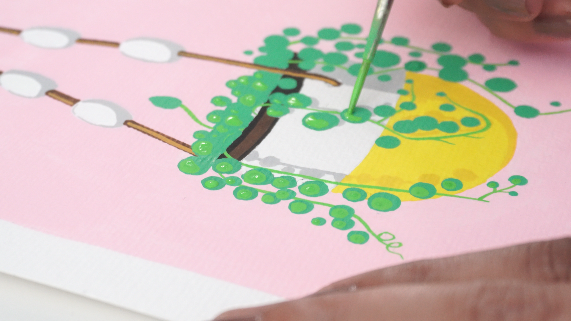
each of the pearls. So just basic circular blobs of paint over each of our peels. Now, as we get to
the top of the pot, there are a lot of these spots just right next to each other, so it might be difficult to tell them apart, which is okay. We'll just paint them
all one flat color at this point because once the shadows and
highlights come in, they will not look like this
big blob of paint anymore. Once that layer is fully dry, we can go in and add
some highlights. We know that our light is
coming from this side, so most of our pearls are going to be lighter towards
the left side. So we'll use our lighter
green and paint smaller blobs inside of our darker blobs slightly towards
the top left side. You can check the
reference image to place each highlight if you want to
be more accurate about it. But at this point, to me, the reference image has
served its purpose, and I'm just going
to take it from here based on my intuition. As you can see, the
parts where we've added this simple
touch are already looking more defined and just brighter and more
cheerful overall. Now here, you can't really see where our circles
are, which is okay. It's just a big cluster
of pearls anyway. So just go ahead and
place them roughly towards the left side of
some imaginary circles, and it'll eventually
come together. So just keep going. Since we're working with a string
of pearls plant, we have a lot more
individual leaves to paint, but the technique
is so simple with these blobs that you can't
really go wrong with it. And it even begins
to get meditative as you do these repetitive
bits over and over again. A few of these pearls here were supposed to
come over the rope, so I'll just use the
highlight to bring them forward like
this. Very simple. Guache is very forgiving this
way, unlike watercolors, for instance, you can easily paint over things to
adjust them as you go. Now for this little
guy here also, we'll add a little
highlight right here. And then we'll go in and add these little
connections to some of the pearls that look
detached from the vines. But you don't have to
connect all of them. I like to leave some
of them like this one, just floating around it adds a nice touch of fun and
whimsy to the illustration. Again, don't forget to
clean your brush after every step to keep them in tip
top shape for a long time. Now with our yellow, we go in and add some
brighter highlights, which are even smaller blobs, again, on the top left
side of each pearl. These are essentially just
tiny little spots on each pod, but they are so
effective in bringing in both dimension and
brightness to the piece. And then we'll
also go in and add some highlights to some
parts of the vines. Like this one here, there was getting lost in between
all the pearls. I'm just drawing very
thin lines along some of the parts of the stems that I feel need some dimension. And now it's time for
our darkest shadows. So we have our dark
viridian here and we'll use this to create
some intense shadows. And this is what's going to
bring everything to life. Most of the shadows, as we know, will be on the
right side, right? So we'll just find
the bottom rights of our pearls and add some shadows underneath
them, just like that. And we can put some
of the smaller pots like this entirely
in the shadow area, especially when they
are next to a big one. I'm going to paint this
entire area darker, so it brings out that
hanging vine even more. And unlike the previous steps, we're not going to add
these harsh shadows to every single pel. We'll use it just sparingly for it to have the maximum
dramatic effect. Now, as we do this,
you'll start seeing these random shapes actually form into more visible circles, which is exactly what
we're trying to do. I'll also add some shadows
over here and on some of these pearls that
are touching each other to just
define them better. And finally, just like we highlighted some
parts of the stems, we'll also add some shadows to the stems here and there
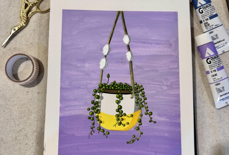
to add some definition. A tada, our hanging pot or
string of pearls is done.
9. Final Thoughts: We've reached the
end of the class. I was rather short, wasn't it? I feel like I could use some
more time chilling with you, but I hope you had as much fun following along with me
as I had teaching you, and I hope you're very
proud of yourself for this stunning piece of art you've created from
scratch today. I believe you now feel a lot
more confident to paint with acrylic wash and to create a stylized illustration
from a reference photo. Although your project was to recreate the same
piece alongside me, like I mentioned earlier, I want to challenge
you to take this an extra step further
by picking out a different houseplant
photograph or reference and creating a new gouache
illustration based on that. You don't have to do it today, but maybe set yourself a
reminder for tomorrow. Doing this sooner rather
than later will help you really reinforce what you've learned with
me in this class. Either way, I cannot wait to see what you created
with me in this class. So do not forget to upload your projects to the
project gallery, both the String of Pearls
piece and the second piece, if you went ahead and
did that as well. If you want
constructive feedback from me or your fellow students, please mention this explicitly in your project description. This way, you'll ensure you
get the feedback you're looking for without any
unsolicited advice. Also, remember to check out the projects by your classmates
and show them some love. It's a great way to
learn from each other and build a supportive
community around you. If you have any questions or need further clarification
on anything, please use the
discussion section of this class to reach out
to me. I'm here to help. If you enjoy this class, I would really appreciate if
you could leave a review. Your feedback means
a lot to me and helps other creatives like
you discover this class. And don't forget to
follow me here on skill share to be notified right away when I
publish a new class. In the meantime, I have
an entire portfolio of classes that
you can check out, ranging from
watercolor lettering, fun brocre projects like
Illustrating using dots, mastering the symmetry tool, drawing botanical
illustrations, creating seamless repeat patterns
to lettering practice, and mastering lettering
compositions. I also share new work as
well as behind the scenes, process videos, and
tutorials on my Instagram. So if you want to be in on what I'm up to, that
would be the place. Thank you so much for sticking with me, and
for doing the work. It's been absolute pleasure. So until next time. Bye bye, and it'll be amazing.
 Vinitha Mammen, Illustrator | Lettering Artist