Transcripts
1. Intro to Grounding Abstract Art: What are you doing?
Turn off camera. What class? This is not a class. I'm just making
my grounding art. You think this might
be a good idea to share with people how I pick my one little word
for the entire year to guide me through and then make a composition and abstract art with it and visualize how I'm going to spend my year
being productive. Okay, let's just share them. Look, there is a
microphone here. So what Jack is
talking about is this. I've been working on
my grounding art, and he thought that it might be a good idea
to share this with you, putting three
different classes that I made before putting all
the skills together to make what I call grounding art to pick your one little word to
guide you through the year, and make an art piece
guided by that word. And while you are
making that with every pattern with
every brushstroke, you visualize the obstacles and struggles you will
have to go through, but you're going to be patient and determined and you're
going to see through. This is what I'm doing, and I can show you how I'm
doing that as well. In this class, we
will brainstorm to find your one little
word for the upcoming year. Think how your art piece should look like
based on this word. Create a layout and
make a composition. At patterns and colors while visualizing
our obstacles and success and see this project through just like we will see things through in real life. You don't need any experience or prior knowledge
to take this class. So if you're interested,
see you in the class.
2. Class Project: For your class project, I want you to make your own grounding abstract
art like this one. What do I mean by
that? First, you're going to pick your
won little word. I'm going to explain you
what Won little word is. Basically, it's a word you pick instead of making
New resolutions. You pick one word to guide
you throughout the year. This is not my idea. It
is a well known concept. It belongs to Ali Edwards. If you want, you can search Ali Edwards and find
out more about this. This is what I do
with this concept. So I also I've been using this wonderle word for
quite some time now. Every year, I pick a new word to guide me
through the year. And then what do I do with it? I turned it into an
art piece like this. Yeah. So we're going to
talk about this later. You're going to pick
your wondertle word, and after that, you're going
to compose your piece. You're going to think
how this word could be represented on a page like
this with pen and paper. Mine is guiding me through
this road leading to my goal. Then you're going to
complete your artwork with patterns with colors and
paints and everything. And so you're going to
do these three steps and make your own
grounding abstract art. This will be a great
reminder to keep on your desk to keep you
align throughout the year. This is the goal. This
is your class project. I'm going to see you
in the first lesson. We're going to talk about one
little word. See you there.
3. What is One Little Word?: Okay, welcome to class. What is one little word? One little word is
concept, not mine. This is a well known
idea. Many people use it. I'm sure around the world. It belongs to Ali Edwards. If you want to know more about Olittle word
and Ali Edwards, you can go and search for her. I even didn't hear from her. I got this idea. Like, I first time heard
this idea from my wife. She was doing it, and I've been doing it
for a decade now, and I've been using different
words every year instead of coming up with New
Year resolutions like go to the gym
five times a week and I lose five kilos by March or draw paint every day and this kind of very specific tasks and what we call New
Year resolutions. I sit down, do a brainstorm, think what I want
out of this year. That's also arbitrary. It
doesn't have to be for a year. It doesn't have to be the
beginning of the year. You can start this in June
as well. Doesn't matter. But usually, I think as people, we are used to think in terms of months and years and people like to do this. So
let's go with that. So for this year,
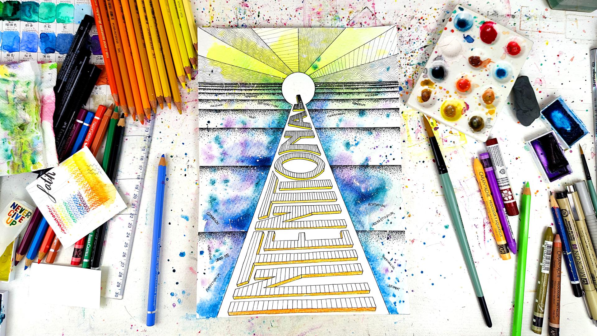
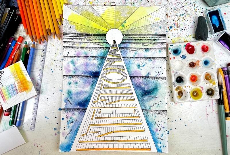
I picked the word intentional for myself.
How did I do that? I sat down with my phone and I use this time
for the first time het GPT. Of course, I take
everything that comes from hPT with
a grain of salt because things can
be inaccurate and I don't want to be guided by AI. However, what het
hPT is really good at is making a word salad. Like if you are lacking words, vocabulary and you need some
inspiration in that way, at the end of the day,
you are the boss, but you just need
a bit of extra. Chat chiPIT is really
good for that. What I did, I first made sure that ChachiPT knows
what I'm talking about, ask about one little word. And then just ask what do you think my word should
be without saying anything to see what it's
going to come up with. This is also
something you can do. But like I said, I'm the boss, not the AI. So after that, I said, I wrote what I expect from this year, what
I want to achieve. Therefore, what do you
think my words should be? This way, it just brings
you lots of words, and then you can just look at those words and choose
and make up your own mind. And that's what I
did with ht GPT. I brought me lots of words, and then I just look at them, compare them, and then I
settle down on this one. Intentional. I really like the sound of it and
how I could use it because I don't
want my life to be all about productivity
and I have to keep doing things all the
time and non stop now, that I want a bit of everything. I always believe in 50 50. If you're doing 50% work, 50% should be for fun. Intentional contains
that as well. It's really important you think how you're going to
use this word, for example, I often feel guilty when
I feel like I should rest because I
feel like I should be doing something
and I'm being lazy. And intentional also means that I will intentionally
go and have rest. I will say that, Okay, next half an hour, I'm not
doing anything else. I'm just watching my
TV show or whatever, laying back and not
doing anything. And after that, I will go
intentionally start work rather than go to work and be miserable and just procrastinate
while I'm trying to work, but I'm actually
scrolling my phone. So that's what intentional is for me. That's why
I pick this word. This is what one little word is, and now you're going to
do a little brainstorm. You can use hatchiPT
the way I did. I'm using ChachiPT for free. You can just sign up with your Google account or
whatever and use it for free. Describe what you want
out of this year and ask Chachipit to bring
you a bunch of words and you're going to have a look and pick your own word. If you want, you can just do this old school
way pen and paper, little brainstorm, write down your ideas, make a short list. Feel free to start
your class project at this point and write
down your short list. I would be happy
to have a look at that and leave comments and weigh in and help try to help you
come up with something. Then later on as you start
drawing and painting, you can update with the
pictures and more ideas. You can basically endlessly
update your class project. There is no end to
that. Um, yeah, so this is what
wonderful word is. Now do your brainstorm
and come up with your ideas and after that, we're gonna think how this
word should be visualized. For example, in mine, I imagined that this is like a road and leading me to
my goal that is here. And the way I paint it
was also coming from this where I wanted the middle to be nice
and clean and white. But out of these
intentional acts, I'm going to take
throughout the year, that the colors and
creativity will flow. That's why I did wet on
wet and just applied the color to the edges and the rest just did its own thing. That was the idea for
this composition. That's how I wanted it
to be from this middle, this intention that
the creativity will flow and good things will happen and I
will reach my goals. The color choice was the same from cold
colors, cold tones, that's where I will be working and going through my
tasks and everything, I will reach the warmer yellow, which is a happy color form. Yeah. This is it and I'm going
to see on the next wand, which we will start
the artwork basically. And while I'm doing the artwork, I will talk you through
lots of things. I will see you on
the next esson. I hope you were recording. Jack, This is all
because of you. I was just going to
make a YouTube video, put everything
together, speed it up. But, okay, maybe
people will really get a kick out of this and make
their wwng grounding art, and it will help them
throughout the year. That's a good idea. I know. I said an idea of yours was good. I can't
believe it either. You know, some people
said in the survey we are doing that
I'm bullying you. Do you think I'm bullying
you? You can tell me. Okay. Smart choice. Okay. I'll see on next one.
4. Making a Composition Based On Your Word: Welcome to my grounding
abstract art class. This will be at
different class than my other classes
because usually I like making my classes real time because I want you to create
your art alongside me. However, this is a
different class because what I'm creating is
not what you're going to create one on one because this was my
vision and my word. You're not going to pick the
same word as me probably. But you can if you want to. And because you're going to
choose a different word, probably your art
will look different. For my word, I'm going to explain my process so you
can do it for yourself. At the moment, in this part, I'm making the layout
and the composition. And this is coming from
the word I picked. I picked the word intentional, and I wanted everything
I do on purpose. And I don't want to end
up scrolling my phone, losing hours anymore, and I don't want to watch
mindless things on YouTube. And I just want to
when I do things, I want to do them mindfully. So that's why I
picked this word. And this word gave
me the idea, okay, this is like a road, like
going to some distance, and I wanted this wasn't just how the lines are going
to be on the paper, but also the way
I'm going to apply the colors and which colors I'm going to use,
it's all part of it. That's why I picked
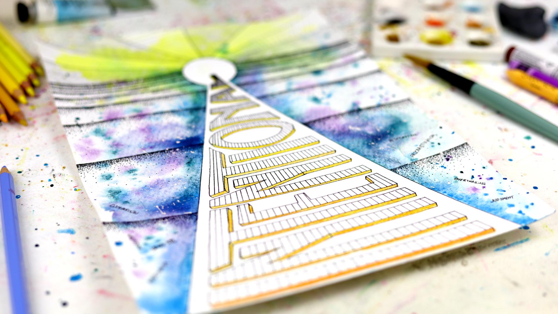
this. Later on, I realized this a bit looks like pyramid with the
sun on top of it. But I have nothing to do with
illuminate, I promise you. Only later on I realized
that this is supposed to be kind of a road
going into a distance. And I wanted to put, kind of a goal at
the end of it as whatever I'm going
to reach, I imagine. And and I wanted to leave
some space in the middle, that's where the word
intentional is going to be. Later on, I decided, Okay, this is too empty. I'm going to add some
lines alongside the road, and how am I going to give the feeling of depth that this is a road is
going into distance? I decided I'm going to make some lines that's going
to increase in intensity. What I did was, I think, every other line
from the bottom, I made it 1 centimeter shorter. So they get closer and
closer towards the goal. So it's like when you
look into a distance, that's what you would
see that things are getting closer and closer to each other as
they go in distance. Also, this is going to help
me in my abstract class, abstract watercolor
escape classes, I have many designs like this, I need some spaces to
fill with patterns, so I needed that, and this is the meaning
I attach to it. This is me going into distance
with my intentional acts. So those are the
lines I'm adding now. And after that, I
decided that this go, when I reach, it's like
a big moment, yes. Let's think end of the year, and I did everything
intentionally. I even have a little tagline for this, nothing by accident. I like it. And so, as you can see now, how
it's going to distance. And for the end part, I could have left it open night that and filled
with something, but I wanted some rays
coming out of this. I like it feels big. It feels celebratory. Fireworks going off, yes. And I'm going to fill those
with patterns too later. So this is how this
composition came to be. And for the colors, there's also part of the
composition which will come later because I like
to fill the patterns first. I decided I'm going to pick colder tones for the bottom
part, the intentional part. And then where I reach
the goal is yellow. That is a happy color for me. So it's going to be
yellow at the end, but at the bottom, old colors, I say, but I picked
my favorite colors, actually, the turquoise blue, k turquoise green, and some
I think imperial purple. We will see later in
the color parties, those specifically. Yeah, so this is my
composition and layout. That's what I meant by the word. The word I picked
one little word kind of led me to this design. That's why also it's important. So you should pick your word and then decide how it's
going to look like, and then we will move
on with the rest. S on the next lesson.
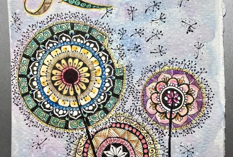
5. Patterns, Visualization and Attributing Meaning: Welcome back. In this part, we will cover the patterns. But before we move on to that, I'm already doing the
patterns I started. But I'm going to say about a little more about
the composition. The way you pick your word is
going to determine, I said. So this is what you really
should think about that if it's a very powerful
word like I don't know, success, even the
word power, maybe, that you might want to have a totally different
looking layout. Maybe you will think
of something like a lightning strike kind
of thing going on, and you will put the wording
in between, or like, you're going to put the
word more in the center, and it will be exploding
outwards from the center. Like, that's what I meant that your word should guide
your composition. And that's what I did with mine, and you should think
yours the same way. Again, I feel free to leave it in the class projects
with your words, and I'm happy to tell you what I think and how your
composition should look like. If I can help, I'm
happy to help. So this part, we will
do the patterns. And as you can see, I start to dots. That's one of my favorites. I use it a lot in my
abstract paintings. Um so the thing I want
to say about this part, the most important part, as
I was doing the patterns, I find this is the
most powerful, and that is attributing meaning. Meaning, you need to assign meaning to everything
you do in this part, that you have some goals, yes. What I imagined as I
was doing this part, that it is painstakingly slow. As you can see, it
is already sped up. It's in three times
speed at the moment, that I imagined when I
was doing this pattern every dot represents
something from my to do list. I know that to reach my goals, I have to do
gazillions of things, and I imagine with
every thought, Okay, I'm taking care of another
thing from my list, another one, another
one, another one. I know that as I go
into the distance, there will be more
and more of them. But as you are doing this, imagining that all
the things you have to do, another email sent, another comments
left on Skillshare, another class is written down. Another shooting is done. Whatever it is on my list, I imagine with every dot
I'm putting on the paper, I'm taking care of those things, and I'm taking care of checking off another
thing from my Toto list. So attributing meaning,
assigning meaning to what you're doing is very important because this is the
visualization part. You are visualizing, maybe you would call manifesting what's
going to be in your future. Try to imagine as much as
you can while doing this. This is the mindful
part that you are kind of preparing
yourself for what's coming. And, uh this was also part
of how I picked the colors. They also had meanings
that I picked the cold colors because it's
going to be a struggle, and towards the end, it will be rewarding for me. That's
why I picked yellow. There was also meaning in there. And the way I'm going to apply later color that's going to
radiate from the intentional, that there is no
color in the middle, but the colors will be
radiating outwards. There was also a meaning in
there. So everything you do you need to try to
find meaning in them and keep doing your art, creating your art piece
with this in mind, please. This is, in my opinion,
the most important part. So now, as you can see, I'm edding the dots, dots, dots, dots, edding them. And I have to say, this is a very relaxing
pattern to make. You can in my abstract
watercolor escape classes, I use this pattern a lot. Usually in more
circular objects, I fill them in or out, and it takes a bit of a time, but the results are
usually really good. And this part for you guys, I put in real time, just
to show you, it's okay. It's going to take
time, but do this. Imagine everything you
have to go through. Every time you have
to clean the kitchen. Every time you have
to hang the laundry, pick up the kids from school. Those are things on
your to do list. They are getting
done with every dot, it's getting done,
it's getting done. So we are slowly and slowly getting there
towards our goal. Look how close I am
now to the top part. So we are filling our page
with patterns this way. This is one pattern I use. You can use any
other pattern that I taught many of them on
my abstract classes. You can find out or check out my fobs ten favorite patterns, PDF, and you can use
any of them from there. So this part is now done. As you can see, it really gives the feeling of
going into distance. For the top part, I decided
to go with the wave pattern. That's another favorite
pattern of mine. It doesn't require a lot of brain and it's very
relaxing to do. But the meaning I attached
to this was it's aus. It's going up and
down, up and down. So I was reminding myself, Look, everything will be up and down
sometimes, and it's okay. You just you need to keep going. That, for example, I was
thinking the US dollars. I live in Poland, so in here, we have our own currency
polished water, and the dollar goes up and down, and that really affects
how much I earn. From Skillshare. But I was
telling myself, it's okay. I go up, it will go down. I will go up again.
It will be fine. So you can not you can. You should add your
patterns with this kind of mindset and find meaning in them and
think about your future, think what you want to achieve, and with every single pattern with every single line
you put with your pen. That's one thing
getting taken care of, and you are one step
closer to your goals. And then I thought I want
to change it up a bit. I started adding these, stripes, and these were the things I imagined the
obstacles I need to go through. Oh, extra tax needs to be
paid. Jump over that one. Oh, I forgot to take care of something
before exporting my videos. I need to go and do it again.
Jump over that one, too. Keep jumping over
your obstacles, and eventually you'll
reach your goals. Or in this case, I
will reach my goals. And I'm m I like when I feel these kind of
abstract drawings, I like to switch up. I don't like making
things very symmetrical, but in this case, it
is quite symmetrical. But still with the top pattern, I want to do them a
bit unexpectedly, so they are not symmetrical. So I switch in between, and I'm going to leave
some of them empty too. So this is another wavy
pattern filling the ray. I hope you are enjoying
this as much as I do. Feel free to press pause or pull me back
and start over again. And while you are doing
your own art piece, I'm happy to play in the background if
it's okay with you. And this is the
last one, I think. I'm looking at the
one on my desk. Yeah, and I decide to add another stripes again
jumping over the obstacles. Oh, I need to pay the
tax double this month. Okay, I will do that. These kind of things.
So with that, the lesson is done,
I'm gonna see you on the next
one. See you later.
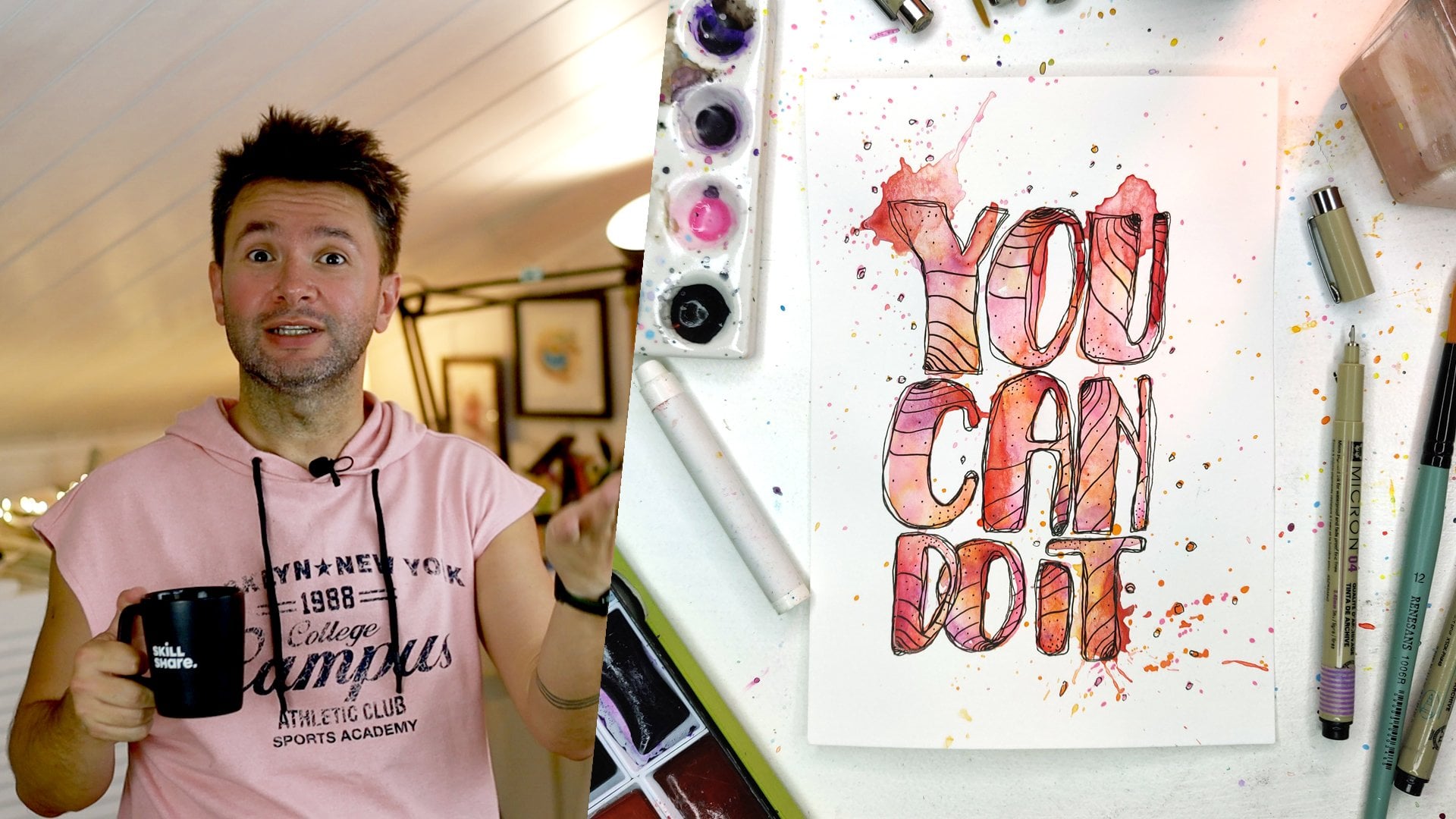
6. Hand Lettering Your One Little Word: Welcome back. Now it's
time for hand lettering. I want to say my favorite part, but I also really
like the coloring and also the patterns as well. So I guess every
part is my favorite. But lettering, I don't
get to do that much. That's why maybe I really
enjoy it for this. So this is straight out of my everyone can
draw letters class. You can go and find out how
you can do all sorts of different hand letterings
easily in that class. This is like I said, straight out of that
class that in there, I was showing how you can
actually take a simple, very normal looking font just
by changing the diameters, like the height and the
width of the letters and adding a bit of a stylizing
on the top and some three D, you can end up with
totally different and classy looking
letters and fonts. This is one example of that. If you want to do for
your differently, something different
for your own word, you can check out those from everyone can draw letters class. In this one, This part applies to everything,
all the lettering. As you can see here, I'm
writing down my words before I wrote down and checked
how many letters I have 11. And first, you need to
find the middle of it and put in the middle of
the space you have. Otherwise, you either come short or you don't have enough
space at the end, so you need to squeeze letters. That's what you want to avoid. That's in my opinion, most
important thing, yeah. But then, if you noticed, I wrote the letters
down one more time, and the thing you
need to be mindful about is in this world, I have two eyes, intentional, the first one
and the seventh one, I think. I and I and they actually take half a space as
the other letters. This will actually make a
difference in your spacing. I decided to tack some
letters underneath the T to give it a bit of interesting look and
also use the space val. I actually end up
using the 11 letters. I'm using more like
nine letter spacing. And so I had to
arrange that I put this T at the end in
tent part in the middle. And then space, I'm now sketching the
rest of the letters. What I try to do with this
specific font I'm using. I'm trying to I didn't want
to be too obvious writing. Like, I want to be also look
like part of the design. So I wanted to look it look
like a pattern as well. So before that, I try to keep the distance between
the letters and the thickness of the
letters the same. So if you look, they just become a bunch of parallel lines going
into a distance this way. And that's what I'm doing now, spacing them out even
the light like this and placing the N part
of the N and E under the and then there will be
another N and T usually, you know, my approach from my other classes like no effort. Classes, I go without the
pencil sketch and just dive in. But sometimes you need to
sketch because at the end, you want this to look
nice and even, yes. So that's what I'm doing
here. I'm sketching out. First, I checked where all
the relatives is going to be. Now I'm making them bold. And after I'm happy
with how it looks, I will move on to the pen. In that part, for example, you can also use I could have used the ruler
to do all the straight lines. But I wasn't bothered
with that because if it's a little bit wonky, my straight lines, I'm
not too worried about it, but I would like to have the letters spaced out
evenly and laid out nicely. Otherwise, after that, I'm okay with little human mistakes. For example, in
here, you can see, I made the T long and tucked
the O underneath as well. But after looking at it, I decided, I'm not sure if
this is the right choice. I decided to make the O
bicker and test it this way. And I think this was
the right decision, and just chop the end of
the T in line with O, and I thought this looked out very interesting
and I like that look. And just adding the
last two letters A and L. When it
comes to letters, like I was telling you
in my other class, I say, it's basically all
about the three parameters. They were you can
change the dimensions. You can change the style. And what was the
last thing? Oh, I don't remember my own class. It's been a while,
though. I think it was three years ago. Um, anyway, in there, you can play even letter
Yahtze that you just throw dice and it decides for you what you are picking
and what you are changing. In this one, I decide to
make kind of triangle look. So the beginning of the word, the letters are tall and then it's getting
shorter and shorter. This also gives a
very interesting look to your word and lettering. And then later on, I'm going to I decided to
make this stand out even more by adding a pattern
on the top of it and also decide to
elevate this from the rest. And of course, I attach the
meaning to those as well. This is, again, what I was
saying in the previous lesson. You need to attach a
meaning to everything here. This is the goal of this art.
That's why we are doing it. Yeah. So for a while, I will just let you watch. Like I mentioned before, I didn't go with the ruler
here. I'm doing by hand. If they are not perfectly straight lines, I'm
okay with that. As I sketched out earlier, it goes much easier. There is no guesswork here. I'm already just executing
what I already decided. I think it was a very good idea to tuck the letters under the T because I usually don't like the letter T because when you put
next to each other, there's always this
gap between them, and that always disturbs my eye. But here, the way
I tuck them in, they are all kind of very
snug and close to each other, and I'm happy with that. Even I'm not very
happy with O here because it's round and there
are those gaps between them. At the bottom and at the top. The T is a bit coming closer
and closing that gap, and that's why I think it
was good use of space. You can see in here, I bend the knee towards O to
cover those gaps as well. You can also do
something similar if it bothers you,
these kind of gaps. And same goes with A. I wish there was no space there. But, again, this is
the word I picked. I can't pick a word that's
going to guide me through the year just because
how it looks. And the last letter. And with that, we are
coming to the end. Styling the letter
will be later. I'm looking forward to which words you picked and
how you're going to embody them in
your art piece. Getting rid of the
pencil marks now. It's already looking
pretty good. Like, I could have
even left it here, but there are more meanings
to be attached and practiced. We'll do that in the next
lessons. See you there.
7. Coloring With Watercolors: So, here we go. Coloring. My favorite part. I think I said that
about lettering as well. Anyway. But I remember in an
articles saying that I think I put up with drawing only that at the end I have
something to paint. Yeah, so painting is
really my favorite. You can see my color chart here my KuretakiGanze
Tambi watercolor set. And in here, I was thinking, like I mentioned before, I'm going to use yellow
for the top part, and that's where
I reach my goals. And for the bottom, I'm going to use cold colors. Those are turquoise green, turquoise blue and purple. Just for colors. I decided
I don't need more. This is good enough
and I always like the combo of these turquoise and purple that looks always
very interesting to me, and I use often. I also made sense that
I'm making this art to look at it whole
year to inspire me. I'm going to use
some colors that I really enjoy that
only makes sense. With my spray bottle, I wet the but my paints. And this part, the next
part is a bit boring. I have to admit, because
there is not much to look at. If you are wondering
if you haven't watched any of my other
watercolor classes, what I'm doing right now
is me watering my paper. I'm just adding water
to the parts that I'm going to use
my watercolors on. I'm just putting water on them. And as I'm doing
this, this big space. I'm only working on an A four. The other side is
already drawing. And that's why I will go back and wet
those parts as well. The reason I'm doing this
is because I want to paint this with wet on wet technique. What is wet on wet technique? You apply your wet watercolors
onto already wet paper. This way, they just dissolve into the water that is
on the paper already. You can see my paper is bending, so I'm unbending it or
bending it other way around. Because at the moment, there
are no colors on them, I can mess with my paper. I can just pick it up and
there is no risk involved. So I'm adding more water to the first site,
as you can see. And once I'm satisfied, okay, things are not
drying so quickly, I will start adding the colors. Like I said, the reason I do this is because I
want the colors. This was another
meaning I attached that through my intentional acts, I want the colors to flow out. That in the middle,
I'm not going to use these colors later on
there will be some colors, but I will get to that later. So for the goals part, I edit the yellow,
like I mentioned. Again, in the
center, there is no I want that part to stay white, and the rest is coming out
because the paper is wet, that's why you can see how it's spreading outward, and
that's what I wanted. From my intentional acts, everything else will flow
outwards. That's the goal. And now I'm going to work the intentional
part, let's call it. I'm adding some turquoise
green and holding my paper one side up so that paint and the
pigments will go outwards. You can see it's already
making its way through, and now I'm going to add more. As you can see some pigments
are heavier than the others. When I added the blue one, it
already started coming out. And I will just add some
purple and some splashes, and it will all dissolve
because it's already wet paper, and this will be it. Like I said, I didn't want to
fiddle with this too much. I want the colors to
do their own thing. I will do my intentional acts
and the rest will follow. The arts and creativity
will flow from me. This is the meaning. Find your own meaning
in your own colors, pick your colors accordingly, and I will see you
in the next lesson.
8. Lettering Style: Welcome back. Now
I let my paper, my paints and my painting dry. As you can see, it all went outward and covered
almost entire space, but there's still lots of white, and I wanted it this way because I wanted
colors coming out. I wanted that to be visible
out of my intentional acts, the creativity and artful
flow. That was the goal. That was the vision.
And so as you can see, I already did some work off camera because I could have
left it here this part. I feel like it's
already somewhat done, but I decided I'm going
to add some patterns, and you can see I'm going to
add some three D to elevate the letters as well to make it look a bit more
especially a bit more done. And the pattern I
picked for this, again, is stripes,
one of my favorites. But I decided I'm
going to do this. Again, I'm attaching meaning,
attributing meanings here. Like I said, you should
keep doing this. I decided I'm going
to add the stripes. I think next to
the first letter, I, I marked half a
centimeter gaps, and then, but all of
them are going towards the center of the circle,
which is my goal. So all the stripes I'm drawing, they are kind of converging
towards the end. It means, and the meaning I attached to this
was in my mind, things I do they eventually a pattern will appear from my intentional acts. And this pattern,
towards the end is getting more and more intense and getting actually
more and more solid. You will see now
towards the end, letter A and L will
really stand out because the lines are converging there and getting
really close together, and they will look almost black. And so this was the reason why I chose
to do this pattern. This was the meaning behind it. And then I went on doing it. You know me, I don't
usually use ruler. I just go with my hand, but it's a tool. And in this instance, I need a tool to make this nice and evenly because this
will make a difference, in my opinion, that
this pattern had to be done perfectly. You can see already
the top half is standing out so much more
than the bottom half. And however, holding the ruler this way for so many lines
one after another, for almost this took me
like 40 minutes, I think. It was making my hand ache. This is again sped up to not to bore you to death
while I'm doing this, because like I said,
you are not going to do the exact same thing as I do. I'm just giving you the
mindset and the ideas for you to create your own
grounding abstract art. And as you can see, with this pattern and it's getting more and
more intense sis, it's just, it looks
so much better. This worked out way better
than I thought it would be. And I was very happy with this. So, but this wasn't enough. I decided I also want to elevate this lettering
more from I'm on the road. Yes, this is the road
leading me to my goals. I want to elevate, and again, I attach the
meaning to this as well. The meaning I attached
to this was through the intentional acts,
I'm going to take. This will elevate me
from what I usually do. This is the road
I'm going to take, but this intentional word, these intentional acts
are going to elevate me. And these are like the
kind of turning into a stepping stone that it
will lead me to my goals. And this way, with
this idea in my mind, I was adding three
D to the lettering. As you can see, at the end, they are a bit inwards. They are not directly down, but on the right, it's a going to the left
and on the left, going to the right
because that's how something standing in front of you would
appear actually. And again, I'm using the ruler
for these longer letters, I decide to add them
with the ruler. And even with this, now you can see already the letters are
standing out so much, and I'm very happy with
how this is turning out. There is something
beautiful about having a vision and seeing
that coming into life. I hope you also have this joy. And this is part of, I think, why I make art anyway. You imagine something
and then you are able to sit down and create it. After all, I decided I'm going to do the rest by hand because first of
all, they were curt. I wouldn't be able to
use a ruler anyway, and then they are getting
shorter and shorter. So I can I think I
can handle that. Um so now my intentional acts are elevating me from the ground and leading
me to my goals. I I'm already loving
how this looks. I'm getting rid of
those pencil marks I edit off camera when I was imagining what
else should be there. And I decided, this
is not enough. I need to add some colors to this tree to show even
more this elevation. That we are going to get. I on the site made all these colors, put them next to each other to see how they are
going to progress. I decided I'm going
to towards the end, it should be yellow because
that's the gold yes. I want to use that yellow, but I decided not to
do all of them yellow, that there should be some
progression towards yellow. But I didn't want to go with
the cold colors here either. I started from orange
and went towards yellow. You can see immediately that the elevation that's happening. And the reason, again, another
meaning I attach to this, I will tell you, I
picked crayons here yes. Normally, I don't use
watercolor crayons. I have them, but I go with
my usual karate and brush. The reason I used this
was me thinking to reach my goals through these
intentional acts that I'm going to try
different things. I'm going to use all the tools
that are available to me. I'm doing this was kind of, this was kind of a sign for me to do those in
real life as well. So I used a different
tool than usual. So now, everything is leading towards the goal that we start turning more
and more yellow. And this way, it's
already very much done. But I decided to check what
would happen if I add water to it and you can see how much more intense the colors get. At this point, there
was no other choice but to go with it. I'm going to add
colors to this part. You can see immediately how much more intense the color
is more saturated. So I will, of course,
go with that. I'm adding in here, I'm
not adding anything else. I'm just picking some
water with my brush, and I'm not even
cleaning in between because the colors are from
one lettle to another. They are very close. I'm not
disturbing anything here. If anything, I'm
making it better, merging into each other. And with that, I think I'm done. However, at the end, I decided to add
something extra. And this will be
the next lesson. We'll talk about
the final touches. Of course, there are meanings
attached to that as well. And we will see that
in the next essen. But I could have left it here. This I'm already pretty
happy with this. So see you in the final
lesson in the final touches. Oh, this looks good.
This looks good.
9. Final Touches: Welcome back to the class. In this part, final touches. It's going to go very fast, that I decided I'm going to add some words and the
meaning behind this through this road I'm going to take and I'm
going to reach my goals. I want to leave something behind that I'm I'm
struggling with. The first one was
perfections you saw. The second one is overthinking. And I'm going to add some words that I
want to leave behind. Those are at the
beginning of the journey. And judgment was next and self doubt and validation seeking
validation from others, comparison, comparing
yourself to the others. Procrastination is the
biggest one, probably. And hesitation. I hesitated writing the word
hesitation. I find it funny. And then, towards the
end of the journey, I'm adding some words
that I want to gain. In there, there was
presence, trust, commitment. And momentum. I want to keep this momentum to gain momentum and keep
that momentum going. Discovery, discovering
new things, and openness and satisfaction. I think this is going to be. And, as you can see, it doesn't really
disturb the overall. I wrote them very little. Those are some of the words, some of the things I want to leave behind and some of
the things I want to gain through this journey
I'm embarking upon. And the final final
touch is this. I added some white acrylic
paint to my palette, and I'm going to water that
down a bit with my brush, and then I'm going to
do some white splashes. I'm covering the middle for
this part because I want these white splashes
to be on the sides. And the reason I'm doing this, you might now by
now know and ask, what's the meaning behind this? Meaning behind this
is that as I imagine that me doing everything intentionally,
nothing by accident, and the creativity and
art flows outwards, these white sprinkles,
white dots, I imagine them that
this will be the luck. I need some luck as well. So every white dot is
like, I don't know, my class getting a stuff
picked or I'm getting a tax break from the
Polish government or dollar is going up just before the payday
or these kind of things. I need some luck, and I imagine that this
will be the lack those white dots on the art. And I also like how it looks, but this was the
meaning behind it. So with this, our artist
complete my art is complete, my ground in abstract art. I hope you will do yours. I'm looking forward to seeing which word you
picked and how you imagined it to look and what colors you picked and
what meanings you attached, please write everything
you can think of. I am looking forward to
hearing and reading those. I hope you like this class. It was Jack's idea. If you didn't like it,
it's all his fault. So don't blame me.
It was Jack's idea. See you on the next one. Bye.
10. Conclusion: Art is a tool. Use it!: So the conclusion. First of all, congratulations on
finishing this class and making your own
grounding abstract act. I hope you enjoyed this process. I hope it was inspirational for you as much
as it was for me. And I hope throughout the year, you're going to look at
this painting and you will remind yourself what
your goals were at the beginning of the
year and you're going to stay aligned and
reach your goals, be productive, and be happier. I hope. Whatever your goal
was initially, I don't know. You can share those
with me if you want. I guess one takeaway from
this class would be that art could be very useful tool for better mental
health and aligning ourselves and it can
be it can be fun, but it can be a
useful tool for life. And this is one example how
I use my art for my benefit. So I hope you will also see
and start using art and creativity on a daily basis to benefit yourself
in your life. What else? Usual
conclusion stuff, please follow me here
and everywhere else. Don't forget to leave a review. Those are very important. And please share your class
projects, very important. This is the end of the class, actually, somewhere in
between, I should say that. You can just start your
class projects and continue updating them as you progress through the
class for example, you do the brainstorm and just
start your class project, write down your ideas, short list for your words, so I can comment
on them and we can come up with an idea together. And then as you
make your layout, you can share the first of the
layout and what colors you are thinking of then
as you paint and draw, you can share the
complete project as well. So you can keep updating your
class projects this way. It doesn't have to be everything finished and then start
the class project, and you can just keep
editing and updating it. I thought I would say that
in case you didn't know. And, yeah, I hope you
enjoyed this class. Let me know what you
think about the beard. Keep it or lose it. I'm in between.
Still in the mirror, I feel like I'm looking
at someone else. Yeah. As always, stay creative. This was one way I was
keeping myself creative, and I'm looking forward to seeing your grounding
art projects as well. Hope to see you on
the next one and until the next time,
stay creative. Bye. I'm very happy
with this one. Yes, you are very observant. I have a beard now.
Oh, my God, Jack. I forgot to shave this
morning. Yes, that's true. If I don't shave one day, this is how I look.
The struggle is real. I'm basically a Wolfman. Wolfman. What was that? Wolf. Werewolf. Not Wolfman. Werewolf. I'm
basically a werewolf. It reminds me again
that Seinfeld episode. I know I keep talking
about Seinfeld, but there was this episode that he was shaving and
the girlfriend didn't know and that one day he couldn't shave and he was
turning into a werewolf. It was a fun episode. Yeah. So I think did I say
everything I should say? Maybe. Anyway,
we'll have a look.
 Fatih (fab) Mistacoglu, watercolor storyteller