Transcripts
1. Intro: Hey there!: Hey, there, and
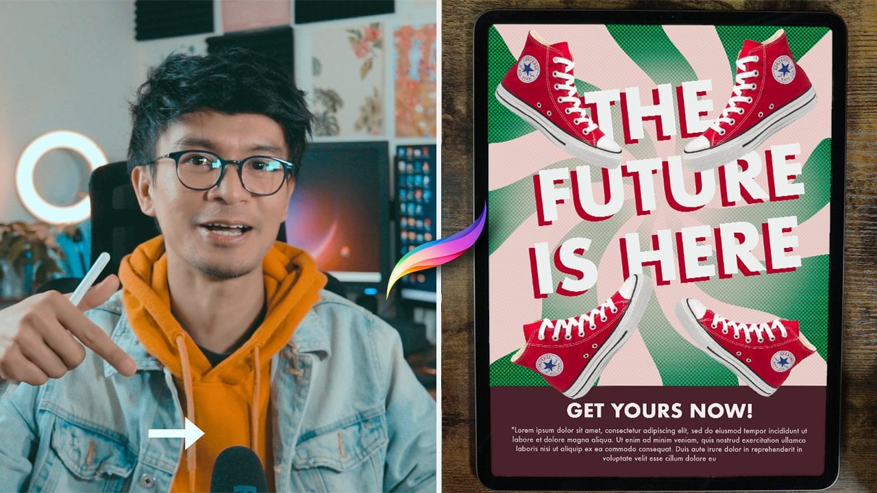
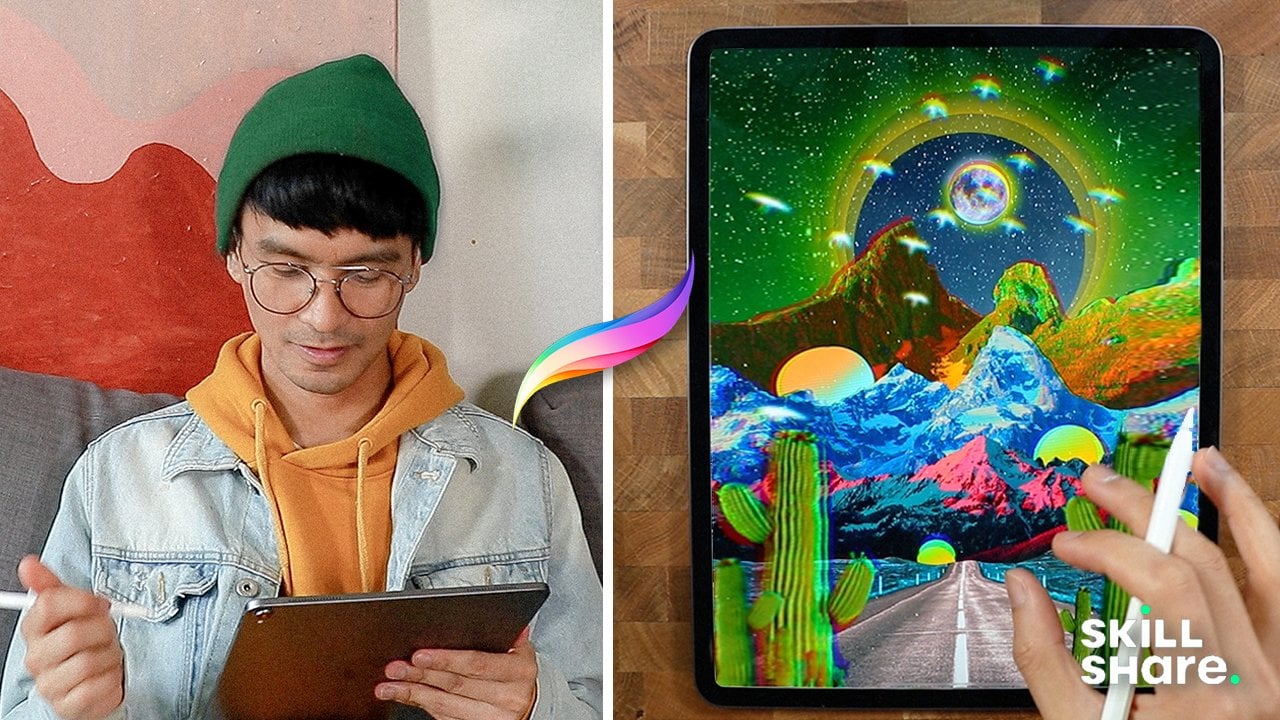
welcome. In this class, we're going to create
stunning poster using Procreate app. You learn how to design, bring your ideas to life, and add your unique touch
to every composition. Hey, guys, my name is Brian, and I'm a graphic designer, web designer, and a video editor currently live in Montreal. Most of my works are creating poster website, and
editing videos. I'm really passionate
about poster. So in this class, I will be showing you
some of my past work. So basically, I have this
obsession about making poster, it doesn't really
matter what poster. And my main goal is
to develop my skills. So I mostly focus on
poster for social media, auto manipulation,
different digital collage, and I challenge myself to create a poster
for the whole year, making hundreds and
hundreds of poster daily, help me become a good
designer and deeply understand design principles
like composition, topography, color theory, and
a lot more exciting skills. So I challenge you
to be as creative as you can and have fun
with this course. And this course is specifically
created for beginners. All we need is the
iPad with Procreate installed and an Apple
pencil, and good to go. And I can see what
you come up with, and I'll see you
on the next video.
2. The Class Project: For this project,
we'll be designing a poster from scratch
using the Procreate app. Together, we'll
start with sketch, build up the composition, add colors, textures
and final details. We'll also dive
into adding text, styling it to enhance
the overall design. Once you completed the guided
project, it's your turn. Using everything you've learned, I want you to create
your own unique poster. Be sure to share
your final design in the project section, and I can wait to see what you call and I'll see you
on the next video.
3. The Gallery: I will just show you some of the beginner's guide
of Procreate app. So Procreapp is actually just available on the iPad
or in Apple store. So it's actually currently number one as a
graphic design tool, and it's very popular
with digital arts. But it's not just
limited to digital art. You can actually do some
photo editing here. You can do collage and all that. Once you download it, you can
just open it right there. So I'm already here
in my Procreate so the icon of Porcid
is this one right here. All right, so this
is the gallery. This is where you can find
all your previous artwork, your work previously
and currently working. So it's going to
be automatically saved once you created one. So let's go in this
part of the interface. So if you click this one, you can see the
version you're in. On the other top right part of the screen, you
can see the select. So like, pretty much
that you want to select. You can see I did some kind
of pattern in the past, so I can just group
them just like that, and they're in a separate group. And you can rename them, click the name and you can
rename as as you wish. So just like that, and
you're good to go. And if you want to ungroup it, you can just, you
know, go back select. Do this one and you
click the pattern, the R right here, you can
just put it right there. So Import is just
importing some from your iPad or in the
Cloud Procreate file that you download
from the Internet. And then the photo right here, you can straight up
access your gallery, from your iPad and
you can just put it. And take note that
when you do that, the dimension of the canvas will be based on
the image itself. So just be careful on that one. You don't want to do some effort and you realize that the
canvas size was too small. On the plus icon right here, this is where you
want to customize or you want to
create your canvas. So to starter, I
would recommend to just go with the screen size.
Let's just take a look. So screen size is
just the exact size of your iPad screen. Pinch it just like this. Yeah, you can just play
around, but let's go back. Well, there's a
pretty much built in canvas sizes in
here, so like square, especially this is
for social media or Instagram post or
any square canvas. You can also
customize your canvas by clicking this plus
sign again here. Dimensions or your units here. I usually use inches. I do prints, you can do pixels as well and
all the units here, but I want to print it out,
I usually go for 300 DPI, but if you want to I just
like a simple digital R, it could go 150 or
you can also go for if you're making a web based
images, you could go 72. So the higher the DPI, it's actually the file size
is a little bit larger. Higher DPI or larger
canvas size your layers. Max layers will
decrease significantly. So be careful on that. And yeah, CRL profile,
you have it here. So RGB is for screens. Just the difference is RGB has a larger color gamut or color
range compared to CMYK. Well, depending on the printer or you have a specific printer, they usually tell you
what type profile, so you can just select
those one right here. I just go with the generic
CMYK profile unless I know. You also use RGB for printing. Nowadays, printers
just use RGB as well. I'm just going to
go cancel here. I'm just going to use screen
size here. And here we go. We have our screen size here. We're going to discuss
the central tools here on Appropriate on the next video.
I'll see you there.
4. The Brushes and Tools: Going to talk about
some essential here. I'm going to briefly explain them the best of my abilities, how I understand them correctly. But yeah, we're
going to start here. So if you want to go back to your gallery or see
some of your artwork, you can just click
this one, the gallery. And if you want to go
back to your artwork, any of these, you
can just click them. That's pretty much it. And let's take a look at this
part of the tools. So these are the brushes. All the brushes Procreate comes with the pre built
brushes that you can use. The brushes I usually
use are online and mostly the sketching and the
colligraphy and airbrushing. These are the most common
brushes I use when I was starting because I was trying to figure out
what's best for it. But on the later part
of what I'm doing, I actually started buying some interesting
brushes I saw online, so you might want to do
that, too, but first of all, I just have to you know, I'll learn what you want to do, but these are all
the pross can find. Smudge is kind of
like in between, so it does not paint. It does not erase, but
it just, you know, blend your Um, your paint
brushes or any images, actually, you just
blend in and all that. I don't really use them, but it's there for you
to use if you want to. And the eraser is technically
is definitely a eraser. You can customize
them, actually. Even the Smudge tool here, you can customize
it to your liking. You can use different
brushes to erase. So it might give you some interesting stuff
or interesting result. You can play around with
it. And the layer here, um layer is kind of a lot here, but I will try it
piece by piece. So the layer, you can rename your layer by just
doing this right here. So you can rename
it to first layer. This is when you're working
with a lot of layers, you might want to rename them. Also, one trick that
I want to show you is you can rename it using
your iPad right here. But to do that, you can actually go
to your setting. Apple Pencil right here. You want to go scribble,
you can just turn on the scribble right here. Layer, you can rename your
layer just like this. So you want to name it label. It should go label just like. You can erase it just like this. And you can just put
it whatever you want, but I don't really
use it because it's kind of like I don't
really like to use it. Let's go back to setting, and I'm going to just turn it off. I like to use it just, you
know, my keyboard right here, but it's there when
you want to use it. So yeah. And right here,
besides renaming, you can click this
part or any part. Actually, this part right here, you can rename select clear
the layer just like this. G Alpha lock, mask,
invert reference. And if you click
the end right here, it's actually the blending mode. So on the first one
is the opacity, so you can reduce
the transparency or the opacity of This will give you some
good result as well. These are all the blending mode. This is kind of not
a beginner's guide, but it's there for you to, you know, play with
it, learn with it. But that's pretty much it. To add layer, you can just
click this one right here. And you can add as
much as you can, depending on the layers that you saw when you were
creating your canvas. And you can select layers
by swiping to the right. You can group them by this
here. You can delete. And also, you can merge them by, you know, pinching like this. Let's say, let's just do
some real example here. I'm going to delete all
the layers just like that. I'm going to just create a
circle. I'm going to do this. And let's take I put
some branch right here, and ooh, I'm going to make
a new layer. Stay here. And if I want to combine them because I'm
running out of layers, I can just pinch them right
here and I can delete them, duplicate them or lock
them if I want to. Also the background color, you can select your
background color here. So it's pretty much kind of easy way to change
your background here. You can also tuggle
to different colors, but that's the background
color right there. This is pretty much you
cannot delete this. It's just you can disable it, but you cannot really delete. It's not a layer, but
it's just there forever. And for the color palette, this is kind of
interesting here. So this is the disc, like a color wheel you could play around.
So this is the hue. You can change the
hue right here. And once you change the hue, it changes the tint or the saturation and all that
good stuff right here. So that's just pretty much it. You can also get your
previous color here. So if you want to change that, and then you went
to different color. Just like this, you
go back to color. You can always go
back just like that. And you have your history here. You can clear that out, and you can, this are your palette. Let's go to here before
I explain the palette. So if you want to go classic, this is just the hue here. So you change the color. This is the saturation. So it just goes like this to
unsaturated, to saturated. This is the lightness. So it goes to the brightest
and to the darkest mode. So that's pretty much it. Harmony is where you find a good interesting
contrast of the color. So if you want to
go complimentary, this is usually the
one that I usually use because they always go hand
in hand with the color. They have a good contrast
with each other, so I just use complimentary, but you can change the
mode to, you know, analogous, like they have, like, pretty much similar tone. So if you want to go here,
this is kind of a warm tone. If you want to go
here, this is kind of like the colder tone colors. So that's pretty
much all you can do experiment here if
you have a good. I just go with the
complimentary most of the time. And then for the value, you can pretty much have
the value if you have a specific color from
specific projects. So I usually get
the hex code here. It's pretty easy.
You can just tap and paste compared to
when you have your RTB. You have to input all
of it about one by one. I just get the hex code
and I'm good to go. And for the palette,
this is interesting. So you could create your
new palette right here. You can also get the cards here. It gives you some kind of
name Procreate names it. So yeah. For the compat, I usually create my own palette right
here, create new palette. So if you want to use
this here, you can add. You can stop right here. You can pretty
much add anything, basically, and then
you can share, duplicate or delete them. So this one just kind of
delete this one just for show. And another one here is you can get some interesting
color palette. Let's say example Oh,
hold on 1 second. Let's say example, you have
your camera right here. I'm gonna take this actually. Gonna get this plant right here. And I'm going to get some interesting interesting
color palette just by tapping. From this plant right here. So I can just, you know, tap and it goes
directly right there. So that's just one of the
nice feature of Procreate. This is kind of a recent update or recent features that they just put in,
which is pretty nice. You can also get it from a photo, maybe this
one right here. It gives you also all
the color palettes. So it's pretty much
auto generated. It's kind of freaked
me out sometimes, but it's there for you to, you know, use it if you want to. So that's pretty much
this tool right here. Yeah, let's end the video
here, but on the next part, I'm going to explain this part right here, the adjustment, the selection, and
some of the actions or these tools on the
left side of Procreate. So I'll see you guys
there, and thanks.
5. The Procreate Essentials: In this part of the video, we're just going to
talk the left side of the Procreate app. Let's use the
monoline brush here. So I'm going to create
some circle right here. So if you hold just like this, it will just do a
perfect ellipse. And if you tap one
of your finger here, it's just going to
get into full circle. And that's a good shape. You can just strap
a color right here. And sometimes you encounter
kind of this one right here that you have those lines
there that you don't want. And to fix that, let me get another
circle right here. Yeah, just like this
one right here. You can fix that. You can
just drop a color right here, and don't let go. Just you can see the color
drop threshold right there. So this is the original
one. You can still see. And once you increase
the threshold, it gives you you
know, good result. There's no more like the
weird lines in there. So that's just how to fix that. Okay, so let's take
this circle again. Let's make it perfect circle. So let's use some of
this one right here. So since we're on
the first layer, we can use the transform here. So this tools right here, especially the three right here, it just affect per layer.
Use this one right here. This is actually called
Transform tool or moving tool. And so you can move
around with this. You can do free form. You know, it's just a, you control how it is. But if you want to uniform it, this is usually the
one that I use, just to make sure that
the proportion is good. It's not weird and all that, especially for circle
and square objects. So if you want to distort it, you can just
play around with it. This is actually good
if you're drawing, doing some kind of different, like, three D
dimensional and stuff. So you can do the distort, but you can also use
warp to change it to different interesting shape. So yeah. You can even change the color
of this one right here. You get interesting,
kind of abstract. Flow, I guess, flow shape. So now you have abstract stuff. And you can also flip
it horizontally and also use kind of the advanced
mantra here to just, you know, do some stuff. Get some good example. We'll get back to that, but
kind of this one right here. And since I'm working
with this one, I will I'm going to
get to the layer, the layer first, which
I want to target, so I could use the warp I could, you know, maybe
extend it to, like, flowing leave, so I can just and also the advanced mesh could make it a little
bit more control. So just know that it
exists just right there. And let's go back to our
main specimen right here. So I'm going to get rid of that, and I'm going to just
move this one right here. So you can use your
fingers or your pencil. And, okay, one side note here. Also, by default, you can also draw with your
fingers right here. And sometimes it's
kind of annoying, especially where you want to be precise with your drawing, and then you kind of just, like, do this run right here because everything like skin, it register into your canvas. So if you want to
be like, you know, precise and doesn't
have this annoying, you know, extra paints in here. Usually, it's off, but
if that happens to you, you can just go to the enchi. You go to preference. You go to gesture control, make sure that you
disable touch action, and that should make
your life a little bit better because you don't want your
hands to also paint, also, so everyone can
just paint around, so it's not really that good. Okay, to best demonstrate
the selection because usually it's good
for selection for images. If I'm doing collage, I could just use
the selection here. This is going to be
a combination with layers and all the
transform tools. I'm just going to pack it in. I'm going to do selection here. I could definitely use
automatic for this one, but the shape, if the colors are not
even or not the same, I just I usually use freehand, so I can just pre
hand this one right here. Just like this. And I could move it with this one right
here, just like this. Or I can do uniform. I
can move them around. I can even Oops. I can get even to go to my layer here and I'm going to
select this thumbnail here. I'm going to go mask
and everything will go. So that's just a
quick way to get rid of the background by
using the selection. But since I use mask, I can always disable the mask and it should always you know, I still have the copy. So mask is one of
the powerful tool here inappropriate because it's just kind of like
non destructive way. On working on some of images or object that
you're working on. Let's say I want to
get this part as well, but kind of like
smoother that blends with the art with the image. So I can just do
this one right here. And I could go feather it out, so it has a smoother blending
it has a smoother edges, so I can just go copy paste, and I'm going to go
to transform tool, and it should give
me a nicer you know, result because it's kind
of like feather out. So do rectangle. Maybe you want to get
this part right here. And copy and paste and you
can want to move around here and also mixing it with the selection and the
adjustment selection first, and then let's go automatic. So I just hit kind
of just the yellow, and then you can
just go adjustment, and then you could change the
saturation of the yellow. That was selected. So this
is one way if you want to work pretty pretty fast.
Want to change color. Especially if you're just hitting yellow,
that's pretty good. Something like this
and color balance it. So let's say you want to
change the color of yellow, and you can go
specific with this. You can go for the shadow. So shadow is like the
darkest part of the image. So you can just do that
something on here. You get a good result as well with this one.
You can play around. You look at this
image right here. So let's go check out the
adjustment right here. So for the adjustment, you
can use the liquefied tool. If you want to, especially, I use this for photos. If you want to do
something else, so you This is kind
of like experiment. So if you want to
use this, it's. You want to try
it for fun first, so I'm going to use the push. So I want to push
the lips right here. I go crazy, make
the lips a little, you know, bigger.
Probably like that. So this is kind of
a way to do some, you know, retouch of your photo. Make sure you do it correctly, but that's just a good way. You can also expand, probably, expand the eyes right here if you want
to do some good stuff. Something like this. This
is kind of a fun way to I don't know, to
experiment around. But that's the power of liquefy. And sorry, Olivia. Another good thing about
this adjustment here is, let's say example, I'm working with this
image right here. So I could just select
this part right here. Just meant here, I could change the brightness or the saturation of the color of the image. So this is a fun way to, you know, change the
color of some image. So it just gives
you a good result. This part right here before
we get to the ranch here. So this one right
here is kind of like your control
of your brushes. So you can just go
probably like that, but you could decrease or increase the
brushes right here. This is just the opacity
of your brushes. So the lower the opacity is and this one is like the undo, redo so I don't really use this one right here
because I use my fingers to, you know, undo and then redo. So two fingers for undo, and then three fingers for redo. So that's one of
the trick as well. So you can also use your fingers here to put select a color. So let's say example let's see. Let's get some image right here. So let's say example, you want this color right here, just, you know, do this one. Tap and then press, and you see this color wheel here that gives you
all the colors. So that's good, and it will register in here as
well in your history. And then this one here, use it, and it will register
directly here as well. You can clear it out, and
then you can start over and it will just give you
the history of your color. And that's pretty much it. I will continue in
the next video while we explore the actions.
I'll see you there.
6. The Actions: Going to go to Ranch. Like
this is kind of like the file or the settings of
the Procreate app. You can darken your
canvas right here, which I don't really like
to use during the day. I usually use this layer
interface during the day. But if I go to the bed
and do some stuff, I just use the dark mode. So if you're left handed, you can just turn
this pretty much. If you click Add right here, you can pretty much insert
file photo and all that. You can add text right here, which we'll get into later on this video for
the canvas here. You can pretty much
do crop and resize. So if you want to
change your setting, like if you want to go
a lower DPI because you're running out of layers, you can always
decrease your DPI. You can resize it
pretty much like this or from the
setting, pretty much. So animations, this
is actually one of the interesting
feature of Procure recently because now you can do some minimal animation per
layer or frame by frame. So if you want to
add more frame, you can just do this runner here and you can
create another one. So let's just do it a
couple of times, probably. Add frame. So you can see
the possibility here. So now you can do the setting. I probably do slight
frame by frame, and you can start playing it, and you have a good
animation just like this. So you can get so
creative with this, but it's going to
be layer per layer. So it's there for you to try. Let's just clear this out. So see, it gives you a created
couple of layers here. So if you're working on this
kind of Jiff animation, make sure that your DPI is very low and you have
a lower canvas size, so you can maximize all
the layers or the frames. Oh, let's just do that. I never use pages, but drawing guide, I did use, and this is pretty interesting. So it gives you all
the grid right here. If you're working on, like, a building or you're looking on working on kind of
a perspective drawing. So you can use the
drawing guide. You can customize it, change the color here, make the opacity
very, very, like, super opaque and visible. But I usually use, like,
probably kind of like that, but you can use that. You can also use the grid size. If you want to make it so
specific with the grid, you can go I usually go inches, probably five, and
you get a division. So you can use this probably
if you're making stickers, it can there for you to use. So another thing with the
drawing guide is you can get creative with
probably symmetry, radio. Because this is
one of the kind of therapeutic way to do some
creative stuff as well, so I can go done. So make sure that it is
drawing assist turn on. If you click on the layer,
you can now, you know, do some interesting kind
of pattern stuff here. So you can get
creative with this, and yeah, it's there
for you to try. One of the good thing
about Procreate is they added this reference
feature right here. So if you click the
reference here, enable it just there, you can actually import
an image like here. Kind of probably we're going
to do this one right here. You have a reference here. Do some drawing here. I don't know, this
is not a good draw you can drop colors right there. And you can select the
color as well from there, so you can just do
the color picker here and you can you know, you get the idea
that and you can probably mess around with it
and all that crazy stuff. And you can always clip it. So it just goes on
the main image. And if you want to
share it to the world, let's say, I'm going to
go back to my gallery. And I'm going to share this one pretty much here,
this one right here. If I want to share
it, I'm going to go back to that trench or action. Going to share it. And actually, there's kind of a lot of
format here. Do that. Also, as PSD is in Photoshop, but definitely the standard one, PNG or JPEG and all that.
Good stuff right there. Let's go to the video,
and also for the action, you can see procreate,
record your artwork. Guys, I'm going to
end this video now, but hopefully you pick up some new tips and tricks so far, and I hope you're
enjoying this video, and I'll see you on
the next one for more.
7. Gestures and Shortcuts: I'm just going to
address some basic procreate shortcut and gesture. So I'm going to create
a new file here, and let's say I'm going to go draw some let's say
the circle right here. I'm going to add
the shape, circle that, duplicate this one. New one here. This is
supposed to be Sherry, but there's kind of a
couple layers here. So if you want to merge
these two layers like this, you can just do
that right there. And if you want to zoom in, you can just do this
one right here. And if you want to
undo your action, you can just do
your two fingers. Like this, and it gives
you the, you know, undo. And then if you want to go
back to your latest work, you can just do two, three fingers just like that. And if you want to erase
or clear the layer, let's say, I want to clear
the first layer here, I can just three fingers and just kind of scrub it
and it should delete it. But you can always undo it. And yeah, pretty much that. And if you want to go to let's say you're
doing this here, or here and you want
to make sure that you have the exact you know, size of the screen, you can
just pinch it just like that. Pinch and let go, and you get the full screen or the size the actual
size of your canvas. And if you want to
have a full screen, like just for show, let's say example and done with my artwork like this
one right here. And I want to make sure that I want to show it
in a full screen. I can just do four fingers and I can just do this,
and it just, you know, blows all of the
extra menus here, except for this one right here, but it's kind of
not that visible. I want to show all
the menus and tools, you just do the same thing. So four fingers, and then
that's pretty much it. And if you want to
cut cope and paste, you can just your
three fingers here, you can swipe down
and you get all this, you know, copy and paste. And again, if you want
to merge your layers, you can just select all of it, and then you can
pinch just like that. I'm going to explain Alpha
lock in a quick way. So Alpha lock, you can just two fingers right
here, you can swipe it. And you can see this
like a checkered board behind the artwork. So you can just undo it so do. So Alpha lock is a way to
get some color right here. It's a way to draw without, you know, not spilling
the paint all over. Because if it's not Alpha lock, you can just you get all the
color spill, let's say here. You get color spill over
the artboard or the canvas. And if you want
to alpha lock it, let's say, I'm just
going to go back. So, let's say in this
layer right here, I want to alpha lock it. So I'm going to
swipe two fingers. It's not going to spill
all over the artwork, so I'm just going
to merge this one so it's not gonna
spill everywhere, compared to if it's not off a lot, it's just
going to spill. So it's a quick way to do it. If you want to precise
with your, you know, if you're doing some
shadows and good stuff. So that's how it
works with this one. Also do it here Afalot. Io's everything that
we learned today. Hopefully, I covered it out, everything, and I'll see
you guys on the next video.
8. Texts and Styles: We're going to create a
new canvas right here. I'm going to go for square, and that's pretty good. I want to show you some of
the tricks that I learn. You want to have a split screen here and you want to have a
reference on the other side. So I'm just going to
use my thumb here, so slide it in, browser here, it should give you this kind
of like a box here. You want to put it on
this side right here. And let go and you get
all this split screen. You can just, you know, use this border right
here and you can adjust it to the way you like. So I'm just going to
do this right here. I guess that's the
minimum minimum size. So if you want to draw, I get this one right here, top it, and then save image, and you should have the
image in your gallery. So you can just
import it right here. So add Otto, and you have the strawberry here,
just like this. Reference. So I'm
going to go reference. I'm going to go get
the reference here. I'm going to put it here. And now you can close this one since you
don't need it anymore. But if you want to
leave it there, it's kind of nice to leave it
there and you just have to go here and you can do
some other stuff here. Like you want to check
your email and stuff. But that might distract you. So let's get to kind
of example here. So I'm going to
create a new layer. I'm going to get the
brush right here. I'm going to do
some sketching here because I want to
sketch the strawberry. Probably I'm going to use
the mod line for this one. I'm going to get the color, so I'm going to sample
the color right here. And I'm just going to, like, trace it just like this. I'm going to fill up with
color just like that, and then I'm going to create a new layer and I'm going to get another
sample of color right here. So probably going to do some abstract drawing here since that will
be easier for me. So I'm just going to do
this kind of like this. And I could turn off
my sketch right now, and I just trace it and
draw it at the same time. Go to one of the projects
I was working on. I'm just going to group
this one here so I could actually move them pretty easy. So I'm going
to group them. And so when you group them, you can move them all over the place just
once instead of just, you know, moving piece by piece. That will be not the greatest. Okay, let's go let's
add some texts as well. So say banana, banana leaf, and there you go.
There's kind of a text. So it says text
layer right here. If you see like A, if you
want to dit your text, you can just go to your layer
right here or you can just, you know, click this
one right here. You can select. You can change
your font size right here. It kind of, you know, customize it to your liking. And especially if you have, like, probably two
lines of text. That's where this goes
more interesting. So I'm going to go. You can
also change the leading here, the base, if you want,
and the opacity. You can change the attributes
or the alignment to here. You can put underline, but this is not a good kind
of font. So let's go aerial. You can select all of
it, select all there, and you can underline them.
Doesn't seem to work. You can outline also
your text here. You can also text vertical
here. Never use them. And if you want to if the font has the
Okay, let's go back. Now it's line, just
kind of Let's go back. If you want to Okay
let's if you want to make all your letters in kind of a capital or capital mode, capital letters, you can
always turn it on just like here instead of deleting and putting it into capital letter. You can do some
interesting stuff with the letters or the type. If you rasterize them, now it's not a text, so you can pretty much
do anything with this. You can now, you know, liquefy it, something like this. You can even twirl it like this. So you have this good
effect with the banana, so you can just
pretty much do it. You can also, let's say, select and then color
fill with this one. So just one way of doing this color fill,
something like this.
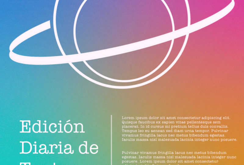
9. Project One: Planet and Type Poster: The poster is going
to be very basic. We're just going to play
with colors and gradient, some text and some simple
illustration like this. So we're going to recreate this. So what I like about this
poster is it's very simple. I like the gradient texture
or gradient background. I've been seeing it a lot
on those creative project. So we're going to go
back to the gallery. We're going to hit
this icon right here and we're going to use the screen size just to
benefit from the screen, full screen preview
of what we're doing. So screen size, that's I like to pinch it quite a bit so I can see the edge of my canvas. Basically, these
are your weapons of design, something like that. So what are we going to do? I'm going to check
the layer first. We're going to do the background first just to set the tone. Well, there is a
background layer by default in procreate. But the thing is, it's
just for solid color. I don't think we can actually do a radiant background here. I don't think so. Let's do it. On the layer one, I'm just going to rename
it to background, especially if it's a complex
project, but you can do. And we're going to start. I'm going to select
my brush here, color. So hue is basically like color. This inner circle is going to be the saturation of the hue. So you can make a darker
blue or whiter shades of blue or like white to the max. But I like to go maybe this one. We're going to experiment
as we go along. It's not set in stone. So I'm going to get
my brush and, like, start doing some
coloring painting. I'm going to make my
brush a little bit bigger so I could, you know, maximize my time
Okay, so that's blue. We're going to do a little bit of technique here,
technicalities. We're going to do a
complimentary color shift. So what is a compliment the opposite side
of the color wheel, which is this side here. You can see I'm pointing
on that direction, so that's orange or yellow. I'm going to get
that part there, and then we're going to go like like a triangle set of colors. From here, I'm going to go here. I'll pick this te. I'm going to make it darker
and then put it right here. I'm not sure what happened, but a selecting tell
but it does not. We'll go back to tell,
which is this one. And probably brighter
tail, something like that. Then what's the opposite
the tail on the triangle, it's going to be a kind
of pink or magenta. I'm going to just put
it something like this. And yeah, that's pretty much it. We can modify the color in one of the I just
met effect later. But what are we going to do now? I'm just going to gosh
and blur it first. So it has a smoother
transition of colors. So you can do pretty
much any transition, but I like a
smoother transition. I think this is quite good, and I'm going to modify
the color because I think it's been washed
out with the transition. So I'm going to go with hue
saturation and brightness. So I could lower down the
brightness or I could also, shift the color as I wish. With the hue,
something like this. They're not moving. They
look like they're moving, but it's just changing the
hue, which is awesome. All right. I guess I like that. Maybe I'm going to bump
something like that. I think it's a
subtle so it's not overwhelming for this first
project that we're doing. We can do the brightness. Since we're using
white color text and the illustrations is
also going to be white. The darker the background, the more pop it gives with
the text and all that. We can always adjust
it and why not? And if you want to add
texture because it's kind of like super static.
You can add a texture. You can add some noise. For this one, I'd like to add some layer just because
I don't want to ruin, you know, that layer. So we're going to
work smarter here. We're going to add probably
noise if you want to make it. With the texture,
and then we can just make the blending mode. So when you click this layer that we just created,
you can click this. There's a kind of a letter
here that you can see. You can just click that
and then scrub through it. It's actually it blends depending on what type of
plant. There's quite a lot. I usually just experiment
what feels right, depending on the
project I'm doing. And if it's too much, you can always go
with the opacity, so it does not ruin
your design anyways. So probably dodge color will
give you a nice texture. And also, there's another
also different texturizing that I usually like to do. Probably won't work,
but we'll try. So I'm going to just fill it up. I just made a layer
and then fill up with white or any color. I can go for, like, half tone maybe. And then it gives
you these print, different texture to
your composition. So it gives you all this
texture. I like that. It looks like when you like to if you want to
read a newspaper, you can see all
these dots into it. It's not really prominent, but if you have this
special magnifying glass, you'll definitely
see that newspaper printed works with
different dots of color, and then in a very, very small tin, you
won't even notice, but if you do get a newspaper,
you will notice that. I like the texture I get. It gives less digital
feel. Two choices. You can go for this
one or a noise. That's pretty much it.
We're going to remove it for now because I don't
want to get distracted. Add some margin because we're starting to put our
text and illustration. Usually, you can do
it also first to set your margins and
grids and whatnot. You can go to the ranch
icon drawing guide, edit drawing guide, and
you can see there's, like, a grid of square
grids, if you may. Don't mind this
stuff right here. We're just going to
go for grid size, and we're just going to make it make. I think this is good. If you like what you see, and we only need this, actually, the line
that goes here, just to make it like a margin, just to make sure that
everything goes in a proper way, so it doesn't look messy. So this is pretty much
what we're doing. I'll just hit done. Yeah, we can start putting our text
our illustration. It's going to do some very
minimal illustration here, so it's not overwhelming
for our first project. Right? So I'm going to
use the brush here. I think I'm going to
use moonine brush. It's in calligraphy,
calligraphy and Mn aline. I'm going to use that. So we can do any illustration here. It depends on what
you're trying to do. I'm going to just
make a layer first, and I'm going to use this as. I'm going to write it like probably illustration.
I'm not really sure. Illustration. And I'll
probably do a couple of illustration and make sure it's white so it has
a good contrast. So I'm going to just, you know, make it like this. So it connects pretty well, and I'll just leave it like that. I'm going to do it again. Don't worry, but that's
the first one that I did, and we can we can do it again. So all you need is to
make sure that you're on a brush, you have
your colors right, and then you can start it could also be,
this is pretty good. You can hold it like this
so it becomes a circle. Otherwise, if you don't
tap it like this, it's just going to go
depending on how you did it. It could be like this. Also, you can make animation. But if you tap it, it's
going to be circled. That's just pretty much.
Also, it goes with the line, so you can just make it. Maybe we can make
a circle like this and then we could put it. Oh, okay, so my bad, we should make a different
layer for this one. So it does not algo is, like, on that illustration layer, so it combines everything.
I don't want that. So yeah, sometimes I do that and then I
realize it sound good. So I'm going to go here. I'm going to make a circle, so you can just put a circle. If you're not sure if
it's pretty circle, tap and it's going
to be super circle. And then we could just
move it like this. And, um, I think
that's good enough. And if you want to if
you want to select both, and then you can put
it in the center, I guess, that's good. And I think that's pretty good. I just want to adjust
the illustration layer. There's different
adjustment here you like. You can have free form, which is pretty much, you
can form it like this. It's pretty good.
I use it a lot. This store is all the points like this you can
pretty much do. It's all you have to do is to try it so you
know how to use it. War is pretty much different
section that you can move. Something like this. That's
not what I want to do, but it's also crazy good. Look at this result
that we just did. It's giving Apple vision P, but that's not what
we're trying to do. I'm just going to I'm going to use my two
fingers to go back and I'm going to just
use freeform and yeah, I just I just want to like
I'm trying to do a planet. And, oh, I think I did. Yeah, I'm going to do a
planet, I think, probably. So I'm switching between the Apple pencil and my hand because it's
also good hands, which makes my workflow
so sometimes messy. But we'll see. And if you get annoyed or if you don't like
those snapping thing, and if you have a
precise rotation, you can go to snapping. Oops. Snapping, turn it
off and then you have more precise if you want to nudge it like a couple of
pixels or whatnot. But it's nice to
know that you have that snapping mode here so you
can just boom, boom, boom. That's pretty cool. That's
a lot of information. What I'm going to do
here, I'm going to try to erase this part. So yeah, I'm going to make the brush
a little bit smaller, so I don't really
erase everything. Yeah, so that's pretty obvious. It's like a Jupiter planet. We could duplicate it, so I have a double ring
or something like that. Yeah, so I'm going
to erase that too. That part is not
part of the plan. Alright, that's pretty much it. I'm going to draw a little
bit more illustration here and I'm going
to use the same. I'm just going to
draw square square. There you go. You have options. And I'm going to use
a transform like a warp tool so I could make it a little bit
more interesting. Like a star, you know. It's something I don't look
doesn't need to be very nice, but free form and
then I could put it can just put it maybe
here or whatever or there. You can fill it up also with some color, something like this. It looks and also you
can fill this up. You could probably try that. I'm going to combine the two
illustration and then I'm going to close it here because if I don't close it,
it's going to be a mess. I'm going to close it here. You won't even notice
it once I fill it up. Yeah, so I'm going to close it. Now it's close and
here and here. That's awesome. Probably you'll just
duplicate this. Oops. I'm going to duplicate this and just put it smaller, not free form, but uniform. Uniform is there too, just to make sure
that you, you know, and I'm going to turn
off this snapping here so I can move it
pretty well, duplicate it. Probably there. I think
it's a good contrast, I think pretty good. I'm going to group
this actually. I'm going to name it
the illustration group. I think that's too much. I'm going to duplicate it because I'm going to
resize the first one. Duplicating it, it means
I have the backup just in case I don't really
want it anymore. I'm going to slant it a
little bit, just like this. I think that's awesome. Yeah, I just like
the simplicity of it and maybe a little bit
bigger, just like this. And I'll try to put text here just to
give it more context. So I'm going to go add E text. I'm going to add this
ranch icon here. I'm going to go add text, which is, if you
want to go, like, have those text options, you can click the A here. I'm trying to find a nice
one that I really like this morning while I was
trying to see all right, so I'm going to go with
the font that I was liking and it's called
American typewriter. So this is very nice. I liked it because the
text it's less digital, but I'm going to go poster of the day, something like that. We're going to fix
it a little bit, probably maybe fix
the alignment. So I'm going to click that.
I'm going to put it at there. I'm going to pinch
it up quite a bit. And I'm going to put
the text right here. We still have the margin, but I'm pretty sure that it's okay. And we're going to put something
here. Poster of the day. Probably we'll adjust the canvas because I think the
margin is too much. I'm going to just adjust it. Pretty. Yeah, that's fine. We're going to adjust it later. Anyways, I'm going to adjust the poster of
the day right here, and then we're going
to have a subtitle. This is the main title, and then we're going
to add more text, which is on to add text here. And we're going to just,
you know, limit the text. I'm going to just
make a placeholder. I'm going to go to, like, Lori Mepsum copy this here. And I'm going to paste it
here, something like this. Allow paste. And I
have, like, select all. Probably will make the text. Probably I selected
all, I think. I'm excited. Okay,
now it's to me. Yeah, that's good. Yeah. And then we're just
going to break the line, so it's easier to read, and I'm just going to go
enter and a little bit more. You can put all your
texts here. Pretty much. I'm just using a
placeholder and I don't know why it's acting
up. Procreates acting up. Okay. So that's the text
of what I'm trying to do. It could be any text, but I think the
title is pretty big, so I'm just going
to maybe do that. So our main, it has a good
amount of also reading. Can add a little bit
of text right there. I could probably remove the
drawing guide right now, so you can see it pretty clear and I could put I could just, you know, duplicate this
and then put it here. Actually, all the text. We're going to put poster. It could be anything poster, poster design. All right. So you can put it
there. Actually, you can do the snapping right now. We really need it, so it has
the margin of this one here. So I can just put it there. It will probably
make this bigger. So it's easier to read, probably align it pretty well. Then I'm going to duplicate this here and then put it
on the other side and probably put I don't know if it's put what number
of your design. I'm going to put one ops. I'm going to
duplicate that again, put it on the other side and we're going to put
one out of maybe five. Of the poster that we're making. So that's the serial
number or whatnot. I'm going to put it
here. I think it's fine. And so far, it's been very good. We're just going
to make sure that the illustration and all the text here we're going
to move it a little bit. Lower? Yeah,
something like that. And the text here, we're going to put it
down a little bit, and I could put it. We're going to go for maybe sketching and we're going
to go Narender pencil, maybe add a new layer, and then we can Yeah. That's what I wanted.
Put it right here. And also, maybe we could put something here. Yeah,
something like that. Just to give it division
and probably want to make this smaller and you could pretty
much do the same. I'm going to make a new layer, and then we could add a divider here. Something like that. It gives it more a division of you can also if
there's a mistake, you can always erase it. I notice. Yeah. It
works pretty well, and it's the poster of the
day if it's our first poster, so it's not too complicated. We can turn on our
texture if you want, it gives it more less
digital feeling. And, yeah, that's
pretty much it. We just utilize
degrading features, some mini illustration. We use the text
features of Procreate and we design it
like like a pro. I think this is pretty good. You can put your name
or initial here. You can sign it probably look
nicer. I can put your name. Oops. Um, yeah, you can put your name here
or signature or whatnot, and then you can put the date probably when you finish it. So today is March
10, March 10, 24. And yeah, that's our first poster
today and hope something came up or came up that you are interested and I'll see
you on the next project.
10. Project Two: The Polaroid : Project will be similar to this. I already made this
a long time ago, and I still like the
simplicity of this poster, even though it's just a text
and like a shape combined, and then I clip the image, it still look very
timeless to me. It's one of my favorite
poster that I did, and I'm going to show
it to you how I did it. Before I show you, I'm just going to
discuss something here. So this is basically a shape, a text layer, and some texts, and then I just
modify the pictures and make it more
like a polard vibe. And we're going to go
back and we're going to go with screen size just to show you the entirety of the project. Let's go screen size, and I'm just going to pinch
it a little bit just to see. Why now we go into
the basic one Canvas, drawing guide, edit
drawing guide, yeah, we're just going to create a drawing guides
right here so we're not lost with our shapes
because we're making a shape. I just want to make sure
that it's perfectly shaped, and I think this is pretty
good. I hope you see it. It's in two degrade. I think I'm on pixels, and it's 84, and I'm just
going to quick done, and then we could
start doing it. This is just a quick
kind of poster, but it's very impactful of depending what
pictures you put, but I'm going to go to actually, we're going to go to
our pen tool or brush, and I'm going to go for calligraphy monoline
and I'm just going to create a quick square. I'm going to try that so we can just make sure you have a
good color for the base, and then we're just going
to one, two, three, four. Okay, don't worry about that. Not sure if I made it right. We can always go
back. Okay. So I'm going to just make a trace
here and here. Okay. Two, three, four. Okay. Let's see, rectangle. I think that's fine.
We can fix this. It's pretty easy. Just connect this one here
and then erase this part. I'm still not good
at making shapes. I'm pretty good at circle, I'm just going to fill
it up with color. We can modify this shape. We can go free form here, so you can just fill it up. Those grid lines that were those grid line
that we created, so going to quickly do that. Probably I'm good with this. As you can see, I just snap it. We can actually turn on
the snapping guard here. It's to me more precise,
as you can see, I just gives you more Let's see. Okay. I think I'm good. That's pretty good. And
that's our first step. And now we're going to get
our text editor or a text. We're going to just put polroid. You can put anything,
but this is the one that I've seen in
the museum before because they were kind of showcasing polaroid and
this is the poster of it. So I just try it and see
what I can do with it. I think that's a good
font for this one. It's the built in font from Procreate or I will just
make it super bold, like just bow right
here, the style bowl. And then I'm just going to
make it bigger that fits into the shape that we
just built or created. Trying to make sure that
it's pointed to the right. I think that's good
for that side, and I'm just going to
make it even better. And then put it up
like that carefully. Probably will turn off snapping, so I'll be more
precise with the edge. I think that's pretty good. This one I need to nunch
it a little bit, I guess. Okay. That's good. I like it. Free form, I guess. Okay. And I'm just
going to Oops. Yeah. I think that's good. I think it's still readable
the pold word. So I think I'm going
to leave it like that. We can turn off our canvas or drawing guide to see
how beautiful it is. I think it's pretty
it's perfect. We could merge this. I'm just going to
do a backup first. I'm going to duplicate this one, duplicate it, duplicate it. And then put one here and then I'm just
going to disable them. It's just a backup just
in case we mess it up. I can always go back. Now I could see if I could I think it's
a little bit short. I will put the word polroid. I'm just going to turn
on the snapping here. I'll be more precise
with then this one here, I just not frees, but, it should be free form, so it won't matter. I could just push
it here, I guess. Not a little bit, perhaps. Oops. Okay, I think I
merge it pretty good. It's just super high, I guess. Okay, I think
that's pretty good. Still good. And now we can
merge it just like that. And we can go to, like, splash to
get some pictures. So I'm going to be just going for New York because
I love the city. So I'm going to go
to New York and get some epic pictures
from New York. Probably this one aiming
for maybe I'll search a filter because I'm
aiming for a portrait. I think Portit will be
best for our composition. This is pretty
good, but I'm just going to stick with the original composition I created before, so I'm going to select this. But you can select anything. You can even name it. You can put the text like the name of the city or the name of someone else that
you're giving it to. So that's pretty good. I'm going to go back to
Procreate and then just go add insert file because it was downloaded in our
download folder. So I'm going to go
select this one. It should, so we're good. And that's pretty good. Now, I'm going to clip it. So since we have one shape, we merge the shape
and the polid words. So it's just one shape
now or one layer. So it's just going to
clip it into that, and it just clipped
just like this. And I think I like
how it looks like, and you can put
any type of words or anything if you visited some, you know, you can make
a poster out of it. I think this is pretty good. And now we can I think I'm
going to move it a little bit. So it looks more like a polroid space
because most polaroids polarid film has big space here that you can write
something and I still love it. We're just going to put text in here and just to give
it some perspective. So I'm going to put New York. Yeah, that's pretty good. I'm going to change the font to something like Serif maybe. I have a favorite font. Probably but Done 72, and we're going to
put it right here. I think that's good. It aligns it pretty well, maybe smaller version and I could change the color of this font. Going to select it. Go to the color and
probably select this one. Yeah, I think
that's pretty good. I don't really need
to change anything. We're going to duplicate
this here and then put it on the other
side and probably put the cereal of or any numbers
or date that you'd like. I'm just going to put 40 30, I guess. It doesn't
really matter. It's just to fill up some space and so it looks
more interesting. I'm just going to duplicate
this one here and put a handwritten text here, just to center it a little bit. That's pretty much I'm going to put Empire
State Building. Sunset, something like
that. You can put anything. It's not just
that's pretty good. We can actually put it here. Maybe it looks better if
I put it right there. I think that's pretty
good. Kind of like that. Yeah, that's pretty
good. What do you think? We will just export it as we
always do share JPEG or PNG, and then we just
have to save it, and it should be okay. We're going to go to
our Dummy Instagram and see if fit and blah
la. There it is. So you can try it out, print it or make it post. And I hope you enjoy it
and learn a little bit. It's not like complex, but thank you guys. I'll
see you on the next one.
11. Project Three: The Pineapple Band: Guys, thank you for tuning in. And this part of the class, we're going to be spontaneous. So what we're going
to do is to create a m a concert of some band that we're going
to make up. Let's dive in. I've been seeing this kind of style everywhere, so I'm
just going to do that. So I'm going to go up here to create a new
canvas screen size, and we're just going
to pinch that a little bit so we can see
the edge of our canvas. We're going to go for,
like, margins first. And Drawing Guide. I
think that's okay. At least we have some
margins here and there. So our plan is to, I'm just going to
make a sketch here. This is going to be the title
of the concert, so title. So we cannot substitute
the title with anything. We can just use the text
or something like that. And we're going to put
maybe the subtitle here. This is the title the
name of the artist, title of the off the concert. And this is going to be like
a subtitle and whatnot. Like, maybe the
date or the venue. How much is it going to be? So we're going to put
a different picture. So whenever I see this, that's a picture,
and this is a text. So this is called it's
like a language in design. So if you see like this,
that means, it's an image. If you see like this,
it's going to be a title. So that's, like, but this one doesn't say anything,
but I know that's title. And we can put
more picture here. So we're going to be using
like a short clipping mask for this masterpiece and
probably more picture here, but it's like different
pictures of the artist and probably probably this is going to be the
price or something. Like, let's just put 99. It's like a startup concert, so it's not a big, big one. And this is going to be
probably more tex or whatever. But probably these
are going to be the sponsor of the concert, so different logos
and stuff like that. So we're going to be applying different graphic design
principle like hierarchy, the tile needs to stand out
some pictures and yeah, different hierarchy of text. So the tile is the biggest one. The sub tile is going
to be less big, but it's still there
and some logos. We're going to put effects,
going to put textures, make sure we get a good
contrast in the images. So let's dive in our
guide for our piece. So I'm just going to make
it maybe less obvious. I'm going to lock it
so it does not move. And we can start I'm going to turn on
our alignment first. The drawing guide that
we just established. I probably would make the opacity because
right now it's very, like, distracting, so we're just going to make
it less distracting. You can even change,
I guess, the color. But yes, from here, you can go driving
assistance and you can check what
color you want. I guess you can just
switch it like this. And if you see the opacity
here, it changes to red. So I guess red is
the universal color of margins. I can still see it. It's not just obvious, but it's just nice to know that we
have alignment on the side. Okay, it's time for the text. We're going to go for maybe, like, a fruit kind of band. So I'm going to go
for, what fruit? Pineapple, apple grapes?
Maybe pineapple. I think pineapple
is cool. I like it. We're gonna look for a nicer
font, compared to this. Maybe some kind of cringy
font, something fun. Oh, yeah, this is amazing. Okay, let's try. It's not readable. I guess we could switch to Pine. Yeah, I think this is good. Pineapple. I like the text. I think it's it's
something kind of fun. I can still see my
alignment here so I can I can not guess. I could make sure
that it's all good. I think that's a
good fun to start. We can change it
in a little bit. We're going to start with blue, and we could start
also making our shape. Oops. So I'm going
to make a new layer. I will just We're
just going to use, like, square or rectangle. And I think I'm going to go utilize my
drawing guide here. I'm going to put the
opacity to, like, 100%, so I won't miss anything. And I'll change my brush
to, I think, monoline, and we're just going to
start probably oops. Yeah, something like
this. And I could just reposition it
somewhere I want to. And I can even do,
freeform and alter it, something like this.
I think that's good. And I could, you know,
fix the error here. Yeah, that's good.
We're going to fill it up with some colors. And from here, we could just duplicate this and then
put it everywhere. Like literally
anywhere we want to, we can enable our snapping guide here just to be more precise. So it snap into all the
grids that we created. That sounds good. And I
could duplicate this again. I'll just keep duplicating until I got the good
result that I'm looking. This part is text, and
I think that's good. Just make sure that we have
our alignment snapped. I mean, our margin here. I want to be professional. I probably will make this
a little bit smaller. So it has more dynamic to it. I'm just going to make
this a little bit smaller. These two here, I'm
going to move it up. These are more text. I think that's all
for the pictures, and the rest is
going to be text. There's more pictures here, but we'll figure it out. We cannot use the same
font here because I think for smaller font,
this is not readable, so we're going to use a
different more standard font, and I could probably make
our drawing guide smaller. I mean, the opacity to be like that because we don't
need it anymore. We're going to use a text first, and we're going to use add text. I'll see if it's still readable
and we'll stick to it, so we're going to go, Oh, that sounds good. World Tour. And in 2024, we're going to fix the alignment first because I don't like that. So we're going to
select or that one, and we could just
click the font and we could make the attributes
to left align. We're going to fix the leading, so it's closer to each other. Oops, that's not a good. Yeah, so I think
that's pretty good. Probably we'll make
something like this. World Tour 24 maybe instead. World Tour. Okay. And we're just
going to make this world. I think that's pretty
good. I like that. I think that's That's good. It's a little consistent
with the theme. I think it's readable, so
I'll just stick with it. And probably the smaller
text, we can modify that, but for here, going
to make it free form and make it a
little like this. And we could start
looking for images. So we'll just pretend that we have a band that
we're promoting. So I'm going to go
quickly to Pexels, ready type singer here or band, and that's going
to be our focus. So I like this one here, so I'm going to
download it quickly. I'll make sure it's like
maybe medium or large. So it's not too much
file size and download, and it should be in
our download folder. Yeah, this one. I
think they're good. It's more consistent
with our branding. Download, maybe this. We have a little bit of
color in our composition. Download. We'll try that. We're gonna go
back to Procreate. I'm just going to rename it
because it's easier for us to put the clipping mask of
that image so bottom, and this one is Oops. So this is top.
Okay, so the top, we're going to insert file. We're going to go download and we'll find the pictures,
I guess, this one. And we could put it maybe
maybe here's the big one. We're going to put it
on top of the bottom, and then we could
just like clip it. And I think that's pretty good. We're going to insert
more photos like insert file, maybe this. And we could put it at the top, like, just above the shape
that we build, so top. And usually will clip it. We can clipping mask hoops. The clipping mask and we can
actually move the picture. Since it's clipping mask,
that's pretty good. We are going to insert
the last picture, the one that looks
fun. Yeah, that's it. We're going to put it on
top of the side shape. Oops, we could clipping mask it. Think we could switch the color to this pineapple here,
the layer of the text. We can make the color black. I think black is better. Yeah, you can see it's better. Even the other text here, the World Tour text, I'm just going to
put it like black. For the brand, it looks
like black will be better. And we could add style
for the pineapple. I think we could use we can just duplicate
this as a backup. We're going to rasterize it
so we can apply some effects. We could go for maybe half tone. You can see here
there's a special thing that happens to the text. I think that's pretty good. I don't think this is going to be good as what
I'm expecting. I'll go back to
images and look for more something that
goes with the feeling. I think this is way better. It's still black
and it still looks like in the same kind band. Let's go back to procreate. We're going to insert a
file. Yeah, that's one here. We're going to put it
on top of the side. So I'm just doing this here. Think we could delete this one. Looks way better. With the theme, I think
this looks better, and we could start putting
some dates of the tours. We're going to put the location, and I think I'm going to put
my drawing guide for now, and I could put
probably a shape. I'm going to just
duplicate this. It's just a last minute
changes. Not that one. Um, now, I'm just
going to move it here. And we're going to use a free
form, something like this. But I'm going to
put it like black instead because I'm going
to put some text there. I'll probably put the
date of the concert. So we're going to
use a text feature, and I'm going to use
I'm going to put it on top of everything. Oops. And let's see if this text
will give us some justice. We're going to make it white. Oh, we're gonna put June 2024. Let's see if that works. And then we're going
to put the venue here. So we're going to duplicate
this and put it here. We'll color it black, just to be more consistent. I'm going to put the
city where it's going to be we're going to be where
they're going to play. I'm going to put Montreal. Okay, there you go. I just don't know
about the text. Probably we'll change
the text at some point, but I think the text
is kind of too much, so we're going to
use a standard text. So it's not
overpowering the title. We're probably going to
go for Area for this. I think Area sounds fantastic. And we're going to
fix some issue here, the leading is. Not so good. We're probably going
to make it all caps. Okay? I think that's
even that's good. We're going to fix this. We're going to go aerial aerial. And probably Munch now, we're going to change
it to aerial too. And Okay, we're just
going to fix text here. I think I'm going
to go for all caps. And probably probably make it bold instead. I think
we're going there. I'm going to make this
also like super bold, so it's stand out a little bit. I think it's a little
bit better now, and we could put
more details here, like a little bit
more texts and stuff, and I probably will duplicate the Montreal text
and put it here. $100, something like that. We're going to duplicate
it again, maybe here. We're going to duplicate
this too and then put it here and we're going to put
the location of the concert. So maybe re auto theater. We're going to expand
the text, so it fits. Actually, we're going to make
the text a little smaller. Something like that.
So it fits in there. Okay, that's good. We're going to fix some alignment
issues here. We're going to snap it on
our grid that we created, that's the good thing
about the grid and we could also put the
location here. If you're having a problem
with zooming in and out, we can also canvas
and then reference. We can have a reference here, so if you still have hoops, you can still view
your composition, even if you're doing
here and there, because sometimes it's a lot of stuff to do when
you're doing this. So it's nice to have this point of view of
what you're working. And it also gives
you a perspective if it's readable or not. So that's quite cool. And we could put like maybe
black slab in at the bottom, just to give more information. We're going to make
a new layer and put a black slab here, like a shape, and we're just
going to put it right here. And so it looks more official. We're going to put
like maybe text, final details or
something like that. We're just going to put it here. We could still see, and this part right here
is kind of live. So you can see what
you're doing in real time and you don't
have to worry about it. We're going to
select everything. I'm going to go click that, and just change the color to white. We're going to make
it regular text or maybe italic, probably regular. We're just going to insert, like, a placeholder text. So I like to go to, like, La Mpsum and that usually
is my text generator. I'm just going to copy
some part of here. Going to copy that, and, like, just copy it, and then
we're going to put it in the text that we created. So paste, and that should
probably do the rest. And it looks more official.
Okay, so we're good. We just have to make
a little bit of, like, personality to it. I'm going to make
a new layer here. I'm just going to test out
if this is going to work. I'm just putting
some emphasis to all the stuff that we're going to put with
a new layer here. We're just going to move it, probably duplicate it again. And we're going to remove the drawing guide that we
created so we can see, oops. Whoa, whoa, whoa,
whoa, flip make this a little higher.
The text here. Okay, I think we're
pretty good here. I think the poster
looks amazing. We're going to disable
the reference so you can see the entirety
of our composition. Like maybe a texture
of some sort, like a paper texture at
the bot like a background. We're going to insert, like a texture for our composition. Let's try vintage and
just put it here. And hopefully that will help. We're going to blend it.
Okay, let's see, it works. I want to make it
like grungy kind of texture, probably normal, and then we're just
going to decrease the opacity or increase
it as we want. And I probably would add more
emphasis to the picture. I will add maybe,
like, monoline, and we're just going to start, you know, tracing the picture. Like, it doesn't really matter
if it's straight or not, kind of handmade feel to it. Yeah, I think that's good. I think it's going
to make it better. Yeah, I think this
is super good. We got it, right? We have
the title that stands out. We have the subtitle and
some other stuff here, the ticket prices and stuff
and what the band looks like. And I think I'm really
happy about it. It has a very
consistent branding. We're just going
to export this and see how it looks
like on real life. So, JPAG, we're going to post
it on our Dummy Instagram, so I'm just going to
save it quickly here. We can even add filter
from Instagram, I guess, so it's even better. And this is our poster
that looks like. But that looks good. Thank you guys for watching
and see you on the next one.
12. Closing: Thank you!: Hey, guys. Welcome back. This is actually the end of the class, and thank you so
much for spending the time with me and
watching this class. I really appreciate it and I hope you learn
something new. I hope you had fun
creating your poster and learn new techniques
along the way. We covered everything from
sketching to adding colors, textures, and styling text to
bring your design to life. Now it's your turn.
Take what you've learned and create your
own unique poster. Don't forget to share your project in the
project section. I love to see your work. Thank you for joining
me, and I can wait to see what you create, see you in the next class.
 Bryan C'ngan, Graphic | Web Designer