Gradient Background Effects in Adobe Illustrator - A Graphic Design for Lunch™ Class | Helen Bradley | Skillshare
Search

Playback Speed


  • 0.5x
  • 1x (Normal)
  • 1.25x
  • 1.5x
  • 2x

Gradient Background Effects in Adobe Illustrator - A Graphic Design for Lunch™ Class

teacher avatar Helen Bradley, Graphic Design for Lunch™

Watch this class and thousands more

Get unlimited access to every class
Taught by industry leaders & working professionals
Topics include illustration, design, photography, and more

Watch this class and thousands more

Get unlimited access to every class
Taught by industry leaders & working professionals
Topics include illustration, design, photography, and more

Lessons in This Class

    • 1.

      Gradient Background Effects in Adobe Illustrator - Introduction - A Graphic Design for Lunch™ Class

      1:04

    • 2.

      Pt 1 - Radial Gradient Background

      4:11

    • 3.

      Pt 2 - Adapting Built in Gradients

      4:19

    • 4.

      Pt 3 - Multi color gradients

      5:15

    • 5.

      Pt 4 - Using Multiple Gradients

      5:15

  • --
  • Beginner level
  • Intermediate level
  • Advanced level
  • All levels

Community Generated

The level is determined by a majority opinion of students who have reviewed this class. The teacher's recommendation is shown until at least 5 student responses are collected.

525

Students

10

Projects

About This Class

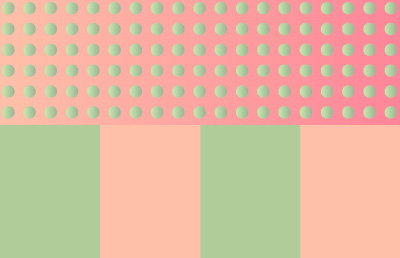
Graphic Design for Lunch™ is a series of short video courses you can study in bite size pieces such as at lunchtime. In this course you'll learn to find, adapt, create and use Gradients in Illustrator. You will see how to use custom colors for you gradients, easy ways to work with gradients and how to make multi color and stripe gradients. You will also see how to use gradient filled shapes on top of a background gradient to create varying effects. Here are two of the gradient effects we will create:

More in this series:

10 Adobe Illustrator Layer Tips in 10 minutes - A Graphic Design for Lunch™ Class

10 Adobe Illustrator Pattern tips in 10 Minutes - A Graphic Design for Lunch™ Class

10 Illustrator Pen tool and Path Tips in 10 Minutes - A Graphic Design for Lunch™ Class

10 in 10 - 10 Adobe Illustrator Align tips in 10 minutes - A Graphic Design for Lunch™ Class

 10 in 10 - 10 Adobe Illustrator Type Tips in 10 minutes - A Graphic Design for Lunch™ Class

10 in 10 - Ten Top Adobe Illustrator Tips in 10 Minutes - A Graphic Design for Lunch™ Class

10 Interface & Workflow tips for Adobe Illustrator - A Graphic Design for Lunch™ Class

20 Adobe Illustrator Appearance Panel Tips in 20 mins - A Graphic Design for Lunch™ Class

20 Adobe Illustrator Color tips in 20 mins - A Graphic Design for Lunch™ Class

20 Adobe Illustrator Recolor Artwork tips in 20 mins - A Graphic Design for Lunch™ Class

20 Illustrator Gradient tips in 20 mins - A Graphic Design for Lunch™ Class

20 Illustrator Reflect and Rotate tips in 20 mins - A Graphic Design for Lunch™ Class

20 Path, Crop & Cutout tips in 20 mins - A Graphic Design for Lunch™ Class

20 Things New Illustrator Users Need to Know - A Graphic Design for Lunch™ Class

2022 Calendar from Scratch in Adobe Illustrator - A Graphic Design for Lunch™ Class

3D Extrusion Effects with Text & Shapes in Adobe Illustrator - A Graphic Design for Lunch™ Class

3D Perspective designs in Adobe Illustrator - A Graphic Design for Lunch™ Class

3D Y Shape Pattern in Adobe Illustrator - A Graphic Design for Lunch™ Class

4 Exotic Patterns in Adobe Illustrator - A Graphic Design for Lunch™ Class

4 Handy Patterns in Adobe Illustrator - A Graphic Design for Lunch™ Class

4 Illustrator Shading Techniques in Adobe Illustrator - A Graphic Design for Lunch™ Class

5 Cool Text Effects in Adobe Illustrator - A Graphic Design for Lunch™ Class

5 Hexagon Patterns in Adobe Illustrator - A Graphic Design for Lunch™ Class

Abstract Ombre Background in Adobe Illustrator - A Graphic Design for Lunch™ Class

Add a Background to a Pattern in Adobe Illustrator - A Graphic Design for Lunch™ Class

All you need to know about Brushes in Illustrator - A Graphic Design for Lunch™ Class

Banner and Award Badges in Adobe Illustrator - A Graphic Design for Lunch™ Class

Bends and Blends in Adobe Illustrator - A Graphic Design for Lunch™ Class

Blends and Gradients in Adobe Illustrator - A Graphic Design for Lunch™ Class

Block and Half Drop Repeats in Adobe Illustrator - A Graphic Design for Lunch™ Class

Braids, Rick Rack & More in Adobe Illustrator - A Graphic Design for Lunch™ Class

Cacti with DIY Brushes in Adobe Illustrator - A Graphic Design for Lunch™ Class

Circle Based Patterns in Adobe Illustrator - A Graphic Design for Lunch™ Class

Circles with Brushes, Blends & Transformations - A Graphic Design for Lunch™ Class

Color Schemes to Sell in Adobe Illustrator - A Graphic Design for Lunch™ Class

Complex Patterns with MadPattern templates in Adobe Illustrator - A Graphic Design for Lunch™ Class

Convert a Sketch to Vectors with Illustrator Live Paint - A Graphic Design for Lunch™ Class

Create a Plaid or Tartan Pattern in Adobe Illustrator - A Graphic Design for Lunch™ Class

Create Radiolarians in Adobe Illustrator - A Graphic Design for Lunch™ Class

Create with Blends and Brushes in Adobe Illustrator - A Graphic Design for Lunch™ Class

Creative Half tone Effects in Adobe Illustrator - A Graphic Design for Lunch™ Class

Curly Frames in Adobe Illustrator - A Graphic Design for Lunch™ Class

Custom Corners for Pattern Brushes in Adobe Illustrator - A Graphic Design for Lunch™ Class

Custom Organic Patterns in Adobe Illustrator - A Graphic Design for Lunch™ Class

Custom Project Backgrounds in Adobe Illustrator - A Graphic Design for Lunch™ Class

Cute Furry Creatures in Adobe Illustrator - A Graphic Design for Lunch™ Class

Cutout Text Effects in Adobe Illustrator - A Graphic Design for Lunch™ Class

Design in Black and White in Adobe Illustrator - Create Positive/negative images

Designing with Spirals in Adobe Illustrator - A Graphic Design for Lunch™ Class

Designing with Symmetry in Adobe Illustrator - A Graphic Design for Lunch™ Class

Diamond, Harlequin & Argyle Patterns in Adobe Illustrator - A Graphic Design for Lunch™ Class

Doodle Flower Design & Pattern in Illustrator - A Graphic Design for Lunch™ Class

Doodle Style Heart with DIY Brushes in Adobe Illustrator - A Graphic Design for Lunch™ Class

Draw a Hot Air Balloon in Adobe Illustrator - Fun with 3D!

Draw a Retro TV in Adobe Illustrator - A Graphic Design for Lunch™ Class

Draw a Vintage Birdcage in Adobe Illustrator - A Graphic Design for Lunch™ Class

Draw Safari patterns in Adobe Illustrator - A Graphic Design for Lunch™ Class

Drawing to Pattern in Adobe Illustrator - A Graphic Design for Lunch™ Class

Easy Isometric Art in Adobe Illustrator - A Graphic Design for Lunch™ course

Export File Sizes & Resolution in Adobe Illustrator - A Graphic Design for Lunch™ Class

Faux Tissue Paper Collage in Adobe Illustrator - A Graphic Design for Lunch™ Class

Flat & Dimensional drawing techniques in Adobe Illustrator - A Graphic Design for Lunch™ Class

Floral Alphabet character in Adobe Illustrator - A Graphic Design for Lunch™ Class

From One Design Make Many Variations in Adobe Illustrator - A Graphic Design for Lunch™ Class

Fun Effects with Graphic Styles in Adobe Illustrator - A Graphic Design for Lunch™ Class

Fun with Scripts in Adobe Illustrator - A Graphic Design for Lunch™ Class

Gradient Background Effects in Adobe Illustrator - A Graphic Design for Lunch™ Class

Guilloche Designs in Adobe Illustrator - A Graphic Design for Lunch™ Class

Hi-Tech HUD rings in Adobe Illustrator - A Graphic Design for Lunch™ Class

Ikat Inspired Pattern in Adobe Illustrator - A Graphic Design for Lunch™ Class

I'm Seeing Stars - Shapes in Shapes in Adobe Illustrator - A Graphic Design for Lunch™ Class

Isometric Cube Pattern in Adobe Illustrator - A Graphic Design for Lunch™ Class

Knockouts in Illustrator - Holes in Shapes - A Graphic Design for Lunch™ Class

Large Scale Repeating Patterns in Illustrator - A Graphic Design for Lunch™ Class

Layered Paper Style Collage in Adobe Illustrator - A Graphic Design for Lunch™ Class

Let's Go Steampunk! Draw Gears in Adobe Illustrator - A Graphic Design for Lunch™ Class

Live Trace (Bitmap to Vector) in Adobe Illustrator - A Graphic Design for Lunch™ Class

Make a Lace Pattern Brush in Adobe Illustrator - A Graphic Design for Lunch™ Class

Make Art Brushes in Adobe Illustrator - A Graphic Design for Lunch™ Class

Make Art with Stock Images in Adobe Illustrator - A Graphic Design for Lunch™ Class

Make Complex Art in the Appearance Panel in Adobe Illustrator - A Graphic Design for Lunch™ Class

Make Ditsy Patterns in Illustrator - A Graphic Design for Lunch™ class

Make Retro Shapes in Adobe Illustrator - A Graphic Design for Lunch™ Class

Make Scrapbook Papers to Sell in Adobe Illustrator - A Graphic Design for Lunch™ Class

Make to Sell Printable Grids in Adobe Illustrator - A Graphic Design for Lunch™ Class

Master Masks in Adobe Illustrator - A Graphic Design for Lunch™ Class

Meandering Hexagon Pattern in Adobe Illustrator - A Graphic Design for Lunch™ Class

More fun with Scripts in Adobe Illustrator - A Graphic Design for Lunch™ Class

Multi-Color Faux Pattern in Adobe Illustrator - A Graphic Design for Lunch™ Class

Neon Effect in Adobe Illustrator - A Graphic Design for Lunch™ Class

Nighttime Cityscape in Adobe Illustrator - A Graphic Design for Lunch™ Class

Organic Spiral Pattern in Adobe Illustrator - A Graphic Design for Lunch™ Class

Pattern Design in Illustrator Masterclass - A - Graphic Design for Lunch™ class

Pattern in Pattern & Irregular Patterns in Adobe Illustrator - A Graphic Design for Lunch™ Class

Pattern in Pattern in Adobe Illustrator - Doing the Impossible - A Graphic Design for Lunch™ Class

Pattern Know-how in Adobe Illustrator - A Graphic Design for Lunch™ Class

Pattern of Lines and Dots in Adobe Illustrator - A Graphic Design for Lunch™ Class

Patterns in Adobe Capture for Illustrator & Photoshop - A Graphic Design for Lunch™ Class

Perfectly Overlap Rotated Shapes in Adobe Illustrator - A Graphic Design for Lunch™ Class

Piping Effect in Adobe Illustrator - A Graphic Design for Lunch™ Class

Pop Art Star Pattern in Adobe Illustrator - A Graphic Design for Lunch™ Class

Rainbow Gradient & Text Effects in Adobe Illustrator - A Graphic Design for Lunch™ Class

Real Time Mandala Design in Adobe Illustrator - A Graphic Design for Lunch™ Class

Real Time Mirror Drawing in Adobe Illustrator - A Graphic Design for Lunch™ Class

Retro Landscape Illustration in Adobe Illustrator - A Graphic Design for Lunch™ Class

Road Trip! DIY Brushes & Live Paint in Adobe Illustrator - A Graphic Design for Lunch™ Class

Roaming Square Pattern in Adobe Illustrator - A Graphic Design for Lunch™ Class

Seamless Repeating Texture Patterns in Adobe Illustrator - A Graphic Design for Lunch™ Class

Seasonal Designs - Chalkboard Wreath - in Adobe Illustrator - A Graphic Design for Lunch™ Class

Seasonal Ornaments in Adobe Illustrator - A Graphic Design for Lunch™ Class

Semi Transparent Flower Brushes in Adobe Illustrator - A Graphic Design for Lunch™ Class

Sharing and archiving files from Adobe Illustrator - A Graphic Design for Lunch™ Class

Sketch to Vector Art in Illustrator - Saleable Digital Assets - A Graphic Design for Lunch™ Class

Sketchy Image Effect in Adobe Illustrator - A Graphic Design for Lunch™ Class

Something's Fishy! Appearance Panel Tricks in Adobe Illustrator - A Graphic Design for Lunch™ Class

Stipple Texture Effect in Adobe Illustrator - A Graphic Design for Lunch™ Class

Stitches & Needles & Sewing Elements in Adobe Illustrator - A Graphic Design for Lunch™ Class

String Art Inspired Designs in Adobe Illustrator - A Graphic Design for Lunch™ Class

Stylish Doodles to Make & Sell in Adobe Illustrator - A Graphic Design for Lunch™ Class

Terrazzo Patterns Made Easy in Adobe Illustrator - A Graphic Design for Lunch™ Class

Text over Busy Backgrounds in Illustrator - A Graphic Design for Lunch™ Class

Textured Dot Pattern in Adobe Illustrator - A Graphic Design for Lunch™ Class

Triangle Based Patterns in Adobe Illustrator - A Graphic Design for Lunch™ Class

Type on a Path in Adobe Illustrator - A Graphic Design for Lunch™ Class

Understanding Bounding Boxes in Adobe Illustrator - A Graphic Design for Lunch™ Class

Use Photoshop Objects in Illustrator - A Graphic Design for Lunch™ Class

Vector Halftones & Houndstooth in Adobe Illustrator - A Graphic Design for Lunch™ Class

Vector Textures in Adobe Illustrator - A Graphic Design for Lunch™ Class

Warp Shapes & Text in Adobe Illustrator - A Graphic Design for Lunch™ Class

Watercolor Stripe Seamless Pattern in Adobe Illustrator - A Graphic Design for Lunch™ Class

Watercolors with Type & Brushes in Adobe Illustrator - A Graphic Design for Lunch™ Class

Wave Pattern in Adobe Illustrator - A Graphic Design for Lunch™ Class

Whimsical Designs with DIY Brushes in Adobe Illustrator - A Graphic Design for Lunch™ Class

Whimsical Diagonal Line Patterns in Adobe Illustrator - A Graphic Design for Lunch™ Class

Whimsical Scrapbook Paper Designs to Sell in Adobe Illustrator - A Graphic Design for Lunch™ Class

Whimsical Text Effects in Adobe Illustrator - A Graphic Design for Lunch™ Class

Whimsical Tree Design in Adobe Illustrator - A Graphic Design for Lunch™ Class

Wreaths & Floral Designs in Adobe Illustrator - A Graphic Design for Lunch™ Class

Zentangle® Inspired Pattern Brushes in Adobe Illustrator - A Graphic Design for Lunch™ Class

Meet Your Teacher

Teacher Profile Image

Helen Bradley

Graphic Design for Lunch™

Top Teacher

Helen teaches the popular Graphic Design for Lunch™ courses which focus on teaching Adobe® Photoshop®, Adobe® Illustrator®, Procreate®, and other graphic design and photo editing applications. Each course is short enough to take over a lunch break and is packed with useful and fun techniques. Class projects reinforce what is taught so they too can be easily completed over a lunch hour or two.

See full profile

Level: Beginner

Class Ratings

Expectations Met?
    Exceeded!
  • 0%
  • Yes
  • 0%
  • Somewhat
  • 0%
  • Not really
  • 0%

Why Join Skillshare?

Take award-winning Skillshare Original Classes

Each class has short lessons, hands-on projects

Your membership supports Skillshare teachers

Learn From Anywhere

Take classes on the go with the Skillshare app. Stream or download to watch on the plane, the subway, or wherever you learn best.

Transcripts

1. Gradient Background Effects in Adobe Illustrator - Introduction - A Graphic Design for Lunch™ Class: Hello, I'm Helen Bradley. Welcome to this Graphic Design for Lunch class, Gradient Background Effects in Adobe Illustrator. Graphic design for lunch is a series of classes that teach a range of tips and techniques for creating designs and for working in applications such as Illustrator, Photoshop, and Procreate. Today we're going to look at creating gradient backgrounds in Illustrator. As we create our backgrounds, you're going to learn a little bit about using the gradient panel and how to set up and configure your own gradients. As you're working through these videos, you might see a prompt which lets you recommend this class to others. Please, if you are enjoying the class, give it a thumbs up. These recommendations help other students to find my classes so that they too can learn more about Illustrator. If you'd like to leave a comment, please do so, I read and respond to all of your comments, and I look at and respond to all of your class projects. If you're ready, now let's get started creating some backgrounds using gradients in Illustrator. 2. Pt 1 - Radial Gradient Background: I'm going to start in Illustrator with a new document. I'm just using a 1,000 pixel by a 1,000 pixel document in RGB color mode. You can make your document whatever size you like. I'm going to make a rectangle exactly the same size as my document. I'll click OK. I'm using the align panel here. I have show options enabled, and I'm just going to make sure that I'm aligning everything to the artboard so I can click here on horizontal align center and vertical align center to align the shape directly over the top of the artboard. I don't want it to have a stroke, but I do want it to have a fill, and I want the fill to be a gradient. Here in these three little icons underneath the color swatches for fill and stroke, is a gradient options. I'm going to click it and I'll apply the default white to black gradient to my shape. This is a linear gradient. There are two types of gradients in Illustrator, linear and radial. But let's settle for linear for now. If I don't like the order of this gradient, if I want black over here, white over here, I can click here and that just reverses the gradient. Here on the gradient slider, this is the white swatch, and this is the black swatch. If I don't want black, if I want another color, I can change it. I'm going to double-click and just choose a different color here, for example, a blue. This middle point slider here adjusts where the 50 percent transition between these two colors occurs. By default, it's right in the middle at 50 percent. I'm just going to get roughly there. The transition between white and blue, the 50 percent point, is right down the middle of this shape. But we can push it to either side, which gives us more blue and less white, and a steeper transition between the two colors. That can go over the other side as well. It just depends on the effect that you're looking for. I'm going to create a radial gradient here. But what I want to do with this gradient to create a usable background, is I want to pull this center point all the way down here. Now, there's no option in here in this dialogue to move the location of the center point down to here, but there is a tool to do it with and here's the gradient tool. The gradient tool shows the exact same color stops, blue here, white here, as we have in the gradient slider up here, and here's the midpoint. We can adjust it here, and when we do that, we adjust the exact same slider up here. This is another way of manipulating gradients. In particular, this will help us move the center of this gradient down to here. There are two ends to this gradient. This one is the end that you use to rotate it and to shrink its length. But this one here is the one that you use to move it, and so I'm just going to pick it up and drop it down into the bottom corner of my artboard, and that gives me a transition of radial gradient that is now off the edge of the artboard with still filling our shape, but we've got a light burst in the corner petering out to the standard blue as we get past the edge of this gradient. Now, if I want to extend this center point out further, I can do it. What I'm going to do is drag on the end of this gradient to make the gradient larger so that we got this transition point that's happening further out. So that's a really nice gradient effect to use as a background, just a simple slight color change in one corner. Typically, you would actually use a blue color for this, so you probably wouldn't do it using a white. Let's just go and sample a paler blue for this. Well, that's a greeny blue. But you get the idea, that transitioning from one color to another, where the colors are pretty close to each other, can give you an interesting background effect. Just a little bit of variety for your backgrounds. 3. Pt 2 - Adapting Built in Gradients: Now in addition to creating your own custom gradients, you can also use gradients that are shipped with Illustrator. So I'm going go to the swatches panel. Just bring that out here. I have my shape selected. I'm going to drop down the flyout menu here, choose open swatch library and then gradients. I'm going to start with the top most one, the brights. What that does is it opens up a little swatches panel with the brights gradients visible because I have my shape already selected and because my fill is in the foreground here. I can click on any of these gradients to apply it immediately to the image that you can say that these gradients are bringing with them not only the colors, but also the type of gradient that they are. These are linear gradients they have been set up as linear gradients, but they don't have to stay that way. I'm going open up the gradient panel and just turn it into a radial gradient. Then I can go and get my gradient tool and I can just bring it down to the bottom corner. So you can see that there's a lot of flexibility with the gradients that are built into Illustrator. If you like them, they can help you quick-start your projects. Now, if you don't find what you want in the first gradient panel that you see, just click here to see the next swatch library and then apply that one to the image. Of course, if you want it to be a radial, then you can just click to make it radial. You will see that some of these stripy gradients have interesting effects on your image. Every time you click to apply one of these gradients to a shape in your current image, the gradient itself is added to the swatches panel. Not all of these gradients are added, just the ones that you select to test out. There are a lot of gradients shipped with illustrator and some of them are radial, although of course you can convert those to linear if you wish. Others of course, are linear, which can be converted very easily to radial by just changing the type. These gradients can be either a finishing point, so you can just click on them to apply them to a shape and then be done or else you can use them as a starting point for creating a different gradient effect, and of course, at any time you can change the colors that are in these gradients. You can do this a couple of ways. You can double-click on a gradient stop to open up the panel here. So you can select a color this way or you can select it from your current swatches. When you select it using these sliders, I'm saying RGB because I'm working in an RGB document. But one of the better options to use often here is HSB or hue saturation brightness that allows you to take a color that you've already got and make it lighter or darker according to your needs by just adjusting the brightness. So just having access to that brightness slider can really help you quick start adjusting the colors and the gradient perhaps it's not light enough or not dark enough. Now you can also drag and drop colors. I'm just going pickup this pink color here from the swatches panel, I'm just going to drag it on top of this color stop here. When I let go, the existing color is replaced with a color that I just dragged and dropped onto the color stop. You can also use the eyedropper. I'm just going to click on this color stop to say that this is the one I want to adjust and I'm going to the eyedropper tool. I can shift click with the eyedropper tool on any color in this document to make that the color of this stop here. Say, I want to make it pink color. Well, as soon as I shift click on it, the color at this color stop changes, then you don't have to sample colors out of the existing shape that you're working on. You can sample any color from the illustration that is in front of you. It's a really nice handy way of getting the colors from your document into your gradient here. Of course, once they're in the gradient, if you want to adjust them to double-click on them. Here is a hue saturation brightness, and I can say, well, I really like that, but I'd like it to be a slightly darker version of that pink. So I am going to adjust it to make it a bit darker. 4. Pt 3 - Multi color gradients: One of the reasons why I created this gradient class is because one of my students asked about creating multi-color gradient backgrounds and we're going to do that now. I have a document 1,000 by 1,000 pixels in size of course, yours can be any size you like. I have a rectangle already over the art board here and it has the default settings. I'm going to turn off the stroke. I'm going to focus on the fill and just apply the basic gradient to it. I'm going to open up my swatches panel, just drag it over here because I want to access some of the colors from my swatches panel. To create a multicolored gradient, all I need to do is to locate a color in my swatches panel and drag and drop it onto one of the color stops here. Now, it doesn't have to be dragged onto a color stop, you can also drag and drop it just anywhere underneath the gradient slider to add a new color stop at that place. Of course, you can also double-click on an existing color stop, go to select the kind of color mode you want to work in for example, hue, saturation, brightness and then you can go and adjust your color stop to suit. It's going to take down the saturation on this. Perhaps darken it a little bit. But you can see that you can adjust the colors to your liking. Now, you can add multiple stops here, so you can add plenty more. Let's go and add another one in here, orange one. Of course, then you can adjust the midpoint between the stops to control how the color transitions from one color stop to the next. If you want to rotate this at this point, you would go to the rotation tool and if, for example, we wanted this on the top, we would want to rotate around in a clockwise direction, which is minus 90 degrees. That minus 90 just sits that at the top here. Now, when you're working with this multi-color gradients, I'm just going to put this back to zero, you can also create distinct stripes. We're going to look at that now. I'm just going to pull off most of these colors and let's just settle for this orange color and the green. I've got one green and one orange and I'm going to create stripes across this gradient. To do that, I'm going to start by duplicating this green. I'm going to hold the Alt or Option key as I drag another green stop away. I'm going to set this at 25 percent so that it's the 25 percent position. That means that I'm going from green to the exact same green. Now I want to bring in an orange color stop so I'm going hold or option drag on this. I'm going to bring it up really close to the existing one. You can see then that we get a soft transition because the point of transition between these two stops, I'm still going to drag this out so you can see it, is so small, we're getting a very quick transition between green and orange and we're getting a soft edge here. Now, if we don't want a soft edge, we can make it harder. I'm going to click on this one and I'm just going to bring it back to 25. That places these two color stops immediately over each other so we get a very, very strong transition from green to yellow. If we want to continue this pattern, we would Alt, drag on this and create a color stop in this yellowy orange color at 50 percent. Then we want another green one. Well, we can come here and borrow this green one. I'll drag it away and I'm going to position it right on top of the orange one, so I want it at 50 percent. Now, you might encounter this situation occasionally, and it has to do with how you place these colors stops down, and if it happens to you, all you need to do is just move this one away and then just bring it back just making sure that you bring it back to 50 percent and then it will work perfectly. Now we need another green one for over here. I'm going to borrow this green one, I'll drag it over. You can see that you can pull those color stops behind each other, 75 is the next position for this and we finally want a yellow one here to make this strong transition. I'm going to Alt, drag this away and I'm just going to place it at exactly the same position, 75 percent. Here we have a gradient that is a very, very harsh gradient. It is just vertical stripes. We created that using the gradient tool us by placing each color stop on top of the previous color stop. Of course, the midpoint markers here are just meaningless because we're going from one color to exactly the same color. It's transition point is a meaningless quantity, so you don't need to worry about the midpoint markers, but you just need to make sure that the color stops are on top of each other. There's another approach to use for gradients in Illustrator. Of course, you could do this with more colors than just the two that I've created here, but just making sure that you've got color stops at either end of your stripe that are exactly the same. 5. Pt 4 - Using Multiple Gradients: One of the really interesting things about gradients is how they can be offset against each other to create dimensional looks. I'm going to start again with a new document, File, New. Again, I'm just doing a 1000 pixels by 1000 pixels RGB color mode. I'm going to make a rectangle that is the size of the artboard. I'm going to center it using exactly the same techniques as I used earlier. I'm going to turn off the stroke and I'm just going to select the fill and fill it with the default gradient. Now for this, I need to use a more colorful gradient, so I'm going to make my own. I'm going to double-click on this color stop and I'm going to use a couple of the colors that I already have sampled here. I'm going to use these greens. Start with this green and at this end, I'm going to use a slightly lighter green. I have light green to dark. If it's not light enough, I'm just going to double-click on it and just adjust it using the hue saturation brightness adjustment here. I'm just going to click away from my shapes so it's deselected. Next up, I'm going to put some dots in my image and I'm going to start with some big dots. We're going to shrink them down a little bit lighter. I'm going to hold the shift key as I drag them out so they're quite a large dot. Now, because this shape here was filled with this gradient, Illustrator is defaulting to filling my circle with the exact same gradient. Coincidentally, that's exactly the effect that I want to get. I want this shape to have this gradient in it. I'm going to repeat it across the document, so with this shape selected, I'm going to choose Effect, Distort and Transform, and then transform. I'm going to turn preview on, and I'm just going to adjust the horizontal value here. Looking at a nice spacing, a 100 pixels is nice round number so I'm going to choose that. I'm going to increase the number of copies until I get all the way across the document. You can see that this is giving us a really interesting effect. This is the exact same gradient all the way across. But when the gradient starts to appear on a darker end of this underlying gradient, it starts to look lighter. We're getting really interesting effect just from applying the exact same gradient to this circle. I'm going to click "Okay", now I'm going to repeat it down the document. Effect, Distort and Transform, Apply New Effect. We're going to use the same 100 pixel value here, so I'm just going to adjust that to a 100 pixels, let's turn preview on. I'm going to start increasing the copies so I know that these are all neatly spaced out. They are not quite filling the document here, but I can move them in more centrally in a minute. I'm just going to click "Okay" Now, everything is associated with this one dot up here. I'm just going to move it a little more centrally in the document. Now, that is another possible background effect, but it doesn't have to be as big as this. I'm going to select this circle. Again, everything is associated with this circle and I'm going to shrink it. Now we get lots of little bumpy dots. We're getting a different effect again inside this background, so that is a usable background effect. But what if we say, we've got green on green. What happens if we use green on something else? I'm going to open up the layer panel here and I want to make sure that I have selected this rectangle, because I'm just going to change the colors in this gradient. With the rectangle selected, I'm going to the gradient and I'm going to double-click on each of these colors and this time I'm going to use some pinks. I'm going to replace the light green with a light pink, and then the darker green with a darker pink. Here too, you can see this really interesting interplay of gradients when they're layered on top of each other. If you thought that this was too big, you can shrink it down even smaller and get this really cute background effect just from some dots and some gradients. I'm going to leave this with you now and suggest that for your class project that you create a background effect like this using two gradients in Illustrator. They can be gradients that Illustrator provides you with or you can go and make your own gradients. Try it out with a radial gradient if you like rather than a linear gradient. Post an image of your background in the class project area. I hope that you've enjoyed this course and that you've learned something about using and creating gradients in Illustrator. If you did enjoy this class and if you see a prompt to recommend it to others, please give it a thumbs up. This helps others to identify this as the class that they too might want to take. If you'd like to leave a comment, please do so. I read and respond to all of your comments and I look at and respond to all of your class projects. My name is Helen Bradley. Thank you so much for joining me for this episode of Graphic Design for Lunch, and I look forward to seeing you in an upcoming episode soon.