Transcripts
1. Introduction: Painting landscapes is for me, one of the most relaxing
activities to ever exist. I am instantly transported
to beautiful places, away from the busy city and working all day in
front of a computer. I just let myself playful, painting organic shapes, testing colors, adding textures, marks, and not focusing on
mistakes because the best landscapes are the
ones that are expressive, colorful, full of depth
and certainly imperfect. Hello. My name is
Claude de Melchor and I am an architect
and artist, originally from a
beautiful island in Spain called Teneri. I currently combine my
architecture career with my art practice and teach
classes on sculpture, as well as workshops,
collaborating with other clients like the
Swiss stationary brand, Karen dash because I currently
reside in Switzerland. Where I really enjoy looking at the breathtaking nature
that surrounds me. But in order to get
to the point where landscapes became second nature and truly enjoyable to me, I had to do some digging
and get to know myself, what I like, and how I
prefer to depict the world. And I invite you to do
the same with this class. Throughout seven days,
you will develop your own personal
painting style by creating a unique
landscape using wash. I will guide you
through a week of sketchbook practice in
which we will really, I mean, really, really,
really, get to know ourselves. You will learn how to
analyze, reinterpret, reference pictures, sketch
organic and stylized shapes. Find a color palette and textures using mark
making techniques and how to bring it
finally all together into a beautiful and
expressive composition. This class is for
everyone that has previous artistic experience
or actually none at all. I want you all to have fun, so I will give you all the tools you need to just focus on painting and not on the
technicalities connected to it. The end of this class, you
will have a sketchbook filled with references
to your favorite colors, to your favorite
shapes, textures, and compositions that you
can always look back to whenever you feel a little
bit stuck or uninspired. By setting aside just
30 minutes every day, you will notice improvement. Creating landscapes
will eventually become second nature in a way of
unwinding after a busy day. I'm very excited to embark
on this journey with you, so let's get started. Let's get painting and
testing and creating. See you in class, guys. It's a week, so be ready.
2. Project Overview: Welcome to our seven
day Skillshare class on creating a unique, colorful and personal landscape. And by doing so, finding
your artistic voice and creating a little
bit of space for enjoyment and
definitely relaxation. So by the end of this course, you will have developed
your own unique, personal style by exploring your artistic preferences
through daily prompts. Each day we will focus
on one core topic. I have chosen this topic
specifically to help you concentrate on one aspect of the creation
process at a time, to give you space
and time to explore your personal preferences in peace at your own pace
and with no stress. We'll start with a bit of a
theoretical introduction, but don't worry,
it's not boring. We will be analyzing the
style of other artists and how landscape look in
their different styles. This will definitely help you realize what your
own preferences are. Kind of colors you
like, what styles, what types of composition you naturally gravitate towards. We will then actually proceed
to start our own journey, learning about our
sketching abilities, creating compelling
color composition, investigating the
shapes found in nature, creating and recreating them. Using some color blocking
and some thumbnailink to finally put it all together into our own
little masterpiece, also having a very
full sketchbook. So you're welcome to actually
extend the week project and work it into your
schedule as you see fit. You can even repeat some
lessons two or three days in a row if you
feel like you need a little bit more
time to practice. So I actually would
recommend you to set aside around half an hour to an
hour for each lessons. I sometimes may take more or less time depending
on how inquisitive you get, but it should never
feel like a burden. This is a fun
exploration that will help us develop our
own artistic language, and it should always remain fun. That is the most
important thing. In order to follow this class, you just need to be
curious and ready to dig deeper into
your art practice. And definitely be ready to have fun and do lots of testing. We will do color tests. We will do shape tests. We will do mark making
tests and composition test. So I really hope you like to test things out
because this class is definitely meant to be taken by test happy people, if
you know what I mean? I have also prepared
a Pintresbard for you with references, and I encourage you
to do the same. So collecting all
of these references in one place is very good, especially for
those days when you feel a little bit uninspired,
let's say it that way. Even some fans have printed out said references because I like to look at
them analogically, and through then
when I'm painting, I just can look at all of them as a sort of collage altogether. You can also actually
just work with your own pictures and
your own references, and that is definitely
highly encouraged. As you will be
depicting a place that you already have
memories attached with. As a final project, what
I will be looking for is a beautiful painting
of a landscape that is inspired or that has
inspired you in some way. Maybe you have already made
some great memories there. Maybe it is a place that you
want to visit in the future, or you simply think that
the landscape looks dope, beautiful, relaxing, amazing.
You want to be there. I would also love to see the work that you do
on your sketchbook, especially the shape, color, composition, test
test, test, test test. So you're welcome to
also share a link to your own Pinter sport so that
we all can get inspired. Also posting your progress along the way will help
you in many ways, especially because I
will be able to give you feedback and help you keeping
track of your process. Maybe everyone joins and, like, cheers for each other
during this week. While looking at your projects, I will definitely be on the
lookout for expressive, loose, unique paintings,
nothing correct. Very nice strokes, how
you use the colors, how you highlight something
in your landscape, how you uniquely interpret
the nature around it, how you reinterpret the nature. And I'm definitely not looking
for realistic landscape. So I want you to feel free to create something
quite unique, expressionistic and not feel like you have to depict
everything like it really is. In general, I just want to see your personality and your
style shined through your art. Cannot wait to
witness your journey, to find in your unique artistic
voice because I want you to feel as free and as relaxed as I do when
painting landscapes. So now let's get started. Firstly, I will show you what
materials we will be using, and I will quickly
guide you through some basic uh
painting techniques so that you're not completely
lost in the beginning. They're very easy,
so don't worry. Let's get started. Hope
you're as ready as I am.
3. Materials: So let's start our
exploration week or journey by getting some of the
admin work out of the way. So first of all,
as for materials, we will need sketchbooks. I have three
different ones here, some of them are
full, some are not. I would recommend
you 240-300 grams. But the sketchbooks I'm
currently using all have around 100
grams thick paper, and it is totally fine. The paper should, however, be suitable for mixed
media or watercolor. Anything actually works, something a little
bit more durable. So these sketchbooks
that I have here, the square ones are by a German brand I bought them in Munich
where I was living before, and I actually really enjoy the square format because
then it's actually very easy to translate whatever you
do here into social media, like Instagram, which might seem like a silly thing to think about when
choosing a sketchbook, but it actually saves
you quite a lot of time when trying to
post on social media. And I am quite lazy with this. So in the end, you
will have less editing to do because it's already
layout in a square. But if you have any other
size or layout laying around, then you're welcome to use it. We are going to try to fill them up as much as we can with all our testing and painting and trying again
and experimenting, so just bring them on. So we will actually,
apart from sketching, need some sketching tools, a pencil, HB or H or
B or softer better. An eraser, a sharpener, maybe a black pen, some transparent paper for sketching or a light box
or a window is also good. And then also for making
some textures and marks, we will need some various
other artistic materials. Like, for example, pens, wash itself can also be used. I have here some oil pastels, very messy, the oil pastels, some pencils and some neocolors
which are wax pastel. I recommend you to
use just whatever you always wanted to try out, whatever seems like fun for you. So gouaches actually acts a
little bit like watercolor, but there is two
different types. There's the acrylic quash and
the normal standard quash, which is actually the only
one I have right now. You can actually use it on wood. It's a material that is kind of like in between
watercolor and acrylic. And the normal guash acts a little bit
more like watercolor, meaning you can
reactivate it with water. It never really dries up. You can even, like,
pick the color up from the paper
after you've painted. However, it is not so easy to layer with because the
colors tend to mix together, and then you cannot do
gradients or layers so much. You have to be very careful. So if you're doing lots of layering on top of each
other, lots of gradients, then I recommend
the acrylic wash, which I don't have
any here right now, so we're going to have to
work with what we have. About brands, if you're
thinking about brands, there is a big difference
between the more or less expensive.
I've used them all. The ones that are a little
bit more expensive tend to be easier to work
with, actually. However, let's be real. When I was beginning
to work with gouache, I just bought six euro pack of 12 tiny tubes from Talents, I think they were,
and I used them for months, and they
work just fine. So I wouldn't focus too
much on this for now. Just take the gouach
that you have, or even if you have
acrylic paint, we can also work with that. So as for brushes, I recommend you not to buy too many because with a
few, you're good to go. We have here five different
shapes, as you can see. One of them is a
big round brush 16. I like it because it
takes a lot of color and absorbs a lot of water. This one is a square one. I like it sometimes
to make clouds with it or some
specific shapes that are not as easy or easy to
achieve with a round brush. The number eight, that's
my favorite brush size. It's very versatile. You can do anything and
everything with it. Actually, it's it is the
best brush to ever exist. So this angular brush, I haven't used it
much, but I thought, why not experiment
with it today? So we will try it out together. And this one, which has a very, very long tip, I
actually really love. It's a very fun
brush to do, like, thick thick, long
long lines with. So just take a few as you can
see I have a lot of them, but I end up always
using the number eight. So don't go out buying any new brushes because you
really don't need them. We also will need water to
mix everything together. And some palettes for mixing, I didn't clean mine because
as I told you before, wash acts like watercolor and you can reactivate
it with water, the normal wash, not
the acrylic wash. Remember that. However, I
did bring a clean palette for you in order for
us to mix colors from zero. Isn't it nice of me? I also brought some kitchen towel you always needed around. So let's get now
that we've reviewed all the materials
that we need into some wash sketching techniques.
4. Gouache Techniques: Now let's quickly review some basic techniques
of painting with gloss. This will help you
get head start with painting and teach you also
what wash can actually do, what it is capable of. So some gouache
paints tend to be, as I said before, less
opaque than others, and it is good to have actually a very big tube of white on hand because the
more white you add, the more opaque the paint
gets interesting, right? However, the color will lose
a little bit of intensity. So you will have to balance between the amount
of color that you mix in the amount of
white that you're using. Tricky situation, but you will figure it out. We
will figure it out. So let's dive in into some basic wash
painting techniques. Let's get our little
what's it called palette. Here with us and
put some paint on. Why not this ultramarine paint? So the first technique
we're going to review is the wet on wet. So we are going to start
painting a surface with water, and this will create
some soft edges. It will allow the colors to blend together a
little bit easier. Oh, it seems like I had some
paint already on my brush, but this will just help us
demonstrate what we're doing. We wet it, and then we add
a little bit of the paint. And you can see wet on wet. Oh, how it defuminates, how it mixes together. Beautiful. Now you just let
it stand like this for a bit. We can try again. Next to
this, we wet the paper. Then with the wet brush, we apply a little bit of color just a little bit and you see how it starts diffuminating. So I love a wet
on wet technique, but it takes a lot of patients, which I normally don't have. The next technique
we will actually be trying out is called layering. For layering, thankfully,
I have already a little bit of
tests here because guash is actually a great
color for layering, creating gradients, and also blending depending on what
type of guash you use. So we will start
with this light wash and we will let it
dry completely. That's why I did it
before. And then we will add another layer. This will add dimension
to the painting. But be mindful of what
type of quash you're using and how they will mix together because acrylic
paint will not mix, but normal paint will mix. So we layer it together,
and as you can see, because I'm using the
normal type of squash, they start actually
blending together. See, this paint was
here years ago, but you can still
blend it together. Another technique we can
try is dry brushing. So for this, we're using a
dry brush with very, very, very little paint, and this will create a little bit
of texture effect. It's great for creating
things like foliage, hair, other organic shapes. Let's try it out.
Amazing. Isn't it good? The less paint you
apply, the better. The technique that I wanted
to show you is a little bit of the opposite of dry brushing. It's more of a thick brushing. Take a bit of paint and you
just, like, layer it on it, and you can see how it still has some texture of the
paint on the sides. I really like it. It's also using a dry brush,
and it creates like, kind of like three
D. So when painting, keep always actually in mind
that I'm doing it like this to start on the opposite
corner of your dominant hand. So for me, I'm a
right handed person. So I will start on the
left upper corner, and this way, I will never
get in my way of painting. Also, remember that
you don't need to buy all the colors and 1
million tubes of paint. You can mix colors together. Go get the ones that
you specifically like, but don't feel like you
have to go and buy. All of the colors that
exist in the universe. I have a little bit of a tip for you when mixing colors
together, actually. So as you can see now, this was a very, very opaque
color, not this blue. Like, you didn't really need
to mix it with anything. But let's use one that we have
already mixed around here. Let's take a clean brush. So for example, this
very light green. We're mixing, mixing,
mixing, mixing. And as you can see, it's
a little bit transparent. No, we want to make
it more opaque. As I told you before,
you can add white. Oops, I just lost a
piece of the lid. We add a little bit of white
if it wants to come out. And while adding this, it will automatically I
put a little bit too much. It's okay. But as you can see, it will automatically
be more opaque. You can see it here, maybe.
What we or what I like on quash is to have it always when mixing in
a more creamy texture. Like if it was one of the sunscreens thick sunscreens
that you put on your face. I don't like it too watery
because as I said before, it takes ages to dry. You can see this one, this
is already dried out. The ones that we
really applied thick. Is like let's call it
the pasting technique. The ones that we
put a lot of water, the wet on wet, not dry at all. So you have to wait
ages for them. So you can keep experimenting a little bit warm with squash, but these are some
basic techniques. Mixing, dry brushing,
wet on wet, the layering and this very
thick painting technique. Get yourself maybe a
fluffy companion like my cat Casimo who is actually sleeping
there on the corner, maybe a warm cup of tea, and let's start our
landscape exploration. So in the next lesson, we will
be choosing the landscape. We will be basing our
whole painting on. Not a big deal, I tell you. So let's get choosing.
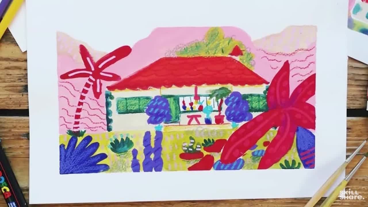
5. Choosing Your Landscape: I'm excited to share my tips and tricks on how to
make this process a little bit more fun and
effective than just mindlessly scrolling through
Instagram for hours on end. We are mostly going to look at real life references
because they are, in my opinion, the
easiest to interpret. As you can sway away from
it as much as you want, and they will not inform
your painting style at all. So you're free to create
whatever you want without having any preconceived notion of any style or color or
kind of shape to it. First and foremost,
when selecting a reference image for our
expressionistic landscape, you want to actually
consider the mood and emotion that you want to convey or that you're
trying to show. Ask yourself, what
kind of feeling do I want this
painting to evoke? Do I want it to be
serene and peaceful or dramatic and
intense? Wow, scary. The reference image
should reflect the mood in some way
that you want to convey. Maybe it's because you are already thinking
of a place that you have visited before and you have already those
emotions attached to it, or just because this
certain reference image has already kind of mood in it that you want
to really bring out. For example, for me, I went to Ticino in
Switzerland and I spent some lovely summer days
there with my partner, and it just brings
me joy to think about this sense of
tranquility I had there. So I just painted it very
bright and with flowers. Another factor to consider when choosing would be the
composition of the image. I like to look for
images that have a strong focal point and
a clear sense of depth, meaning the background
and the foreground are differentiated because it's a little bit more
engaging visually, also a little bit more
interesting to work with. So we're looking for images with defined elements like rocks, trees, the ocean, the sky, maybe some architecture,
jungles with 1,000 plants and flower
might be a little bit trickier and
overwhelming to start with. So I would stay away from them. Also when looking for
reference images, you also want to consider what colors are already
present in the scene. I like to look for images
with a wide range of colors or maybe also some
interesting color combinations. This will kind of give you a little bit more
options when it comes to choosing a color palette
for your own painting. But of course, you can just reinterpret it anyway you want. One great place or resource to find reference
images is Pintres. They have a wide range of photograph and landscape images that you can get inspired by. I have actually made my
own Pinterest board, and it is linked in the project Info for you to take a look. I would love to see your
own Pinterest board as well to find new things. You can also find
inspiration on Instagram. I have them also safe there, and it is a little
bit more messy, I feel like than
the Pinterespards. You can also just go
on a hike or a walk on nature and use your
own images as references, or you can do it out of
imagination, actually. Reference image that
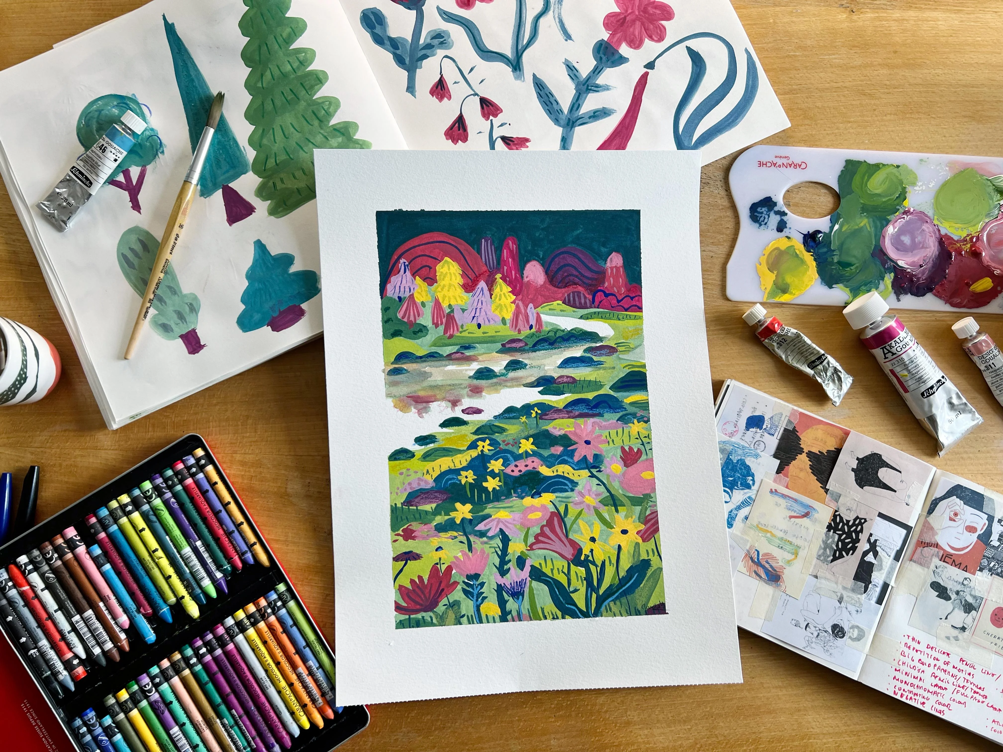
I personally chose is this valley with some water,
flowers, and mountains. It is here in
Switzerland, I think, and I like it because it's actually a pretty standard one. So I want to test and
challenge myself to see how unique I can make it look like by the end of
our whole week. Actually, the only thing that is important
to remember when choosing is that the
landscape reference is just a starting point. You don't need to replicate the image exactly or even
replicate it at all. Instead, just use it as a jumping off point in order to create your own
unique reinterpretation. So, finally, don't be
afraid to experiment and take risks because
expressionistic paintings are all about letting go
of control and allowing your emotions to guide you your brush strokes and guide
you through the process. Little cheesy, but
it is so I just really want your painting
to speak about you, about your creativity, about
how you see the world, so that you really feel relaxed and in tune when
you're painting it. Please post it in the
gallery down below because I would love to be able to compare your reference and
your final piece. That would be super interesting. The next time we see each other, will actually be the one of
our seven day challenge. And we will start with a bit
of a theoretical lesson, but not a boring
one. Don't worry. We will be analyzing the
style of other artists, and we will be looking
at various landscapes. Is going to be
fun, entertaining, and you're going to learn a lot. If I dare to say, it might be the most important lesson of the whole seven
day challenge. So get ready to it. Let's do it.
6. Day 1: Landscape & Style Analysis: Welcome to day one
of your challenge. Analyzing an art style
can be a challenging, but very rewarding task. We will gain a little
bit more insight on the work of other artists, but actually also on ourselves. Well, analyzing, we should
actually always ask ourselves if we like this thing that we're
looking at and why? Does it make sense to us or does this painting make us maybe feel a little bit uncomfortable, maybe excited, maybe happy? So by breaking down the
elements of a landscape and kind of examining how they are rendered by
a specific artist, we can gain a little
bit of insight into their unique approach to the
genre of landscape painting. How fancy of me. I will
provide you with some examples of paintings by contemporary and maybe not so
contemporary artists. And we can actually
go through them together and look at them. However, I highly encourage
you to find some artists and paintings that
you personally enjoy and analyze
them all by yourself, writing down some notes for each one of the paintings and
each one of the artists. So at the end of the analysis, I will actually give
you a little bit of a questionnaire.
Very easy one. Don't worry to fill out
in which you will write some keywords about each
painting that you looked at. And after that, we
will proceed to make a big list of
all these words, and my idea is that the
words that come out the most will kind of
symbolize your interest, what caught your
attention the most, what kind of interests
you the most. And hopefully this
will actually help you visualize what is important
for you in a painting. So you can apply what you have
learned about yourself to your own creations to help you
create very personal work. Like, kind of
finding your style. Let's go through this
very easy step by step guide to analyzing the
style of a landscape painter. I will also give it to you in sort of a booklet format so that you can look at it if
it's too quick for you. So before you start at
all, observe the painting. Take a moment to
observe it as a whole. Look at the composition
from far away, the color scheme,
and the brushwork. Try to identify the
main subject and take note of how the artist
has chosen to depict it. Consider the moon
of the painting. Is there a happy? Is
there a sad painting? How is it conveyed? Is it
conveyed through the use of light and shadow of color? Is the painting,
in your opinion, realistic or fantastical? What catches your
attention the most? Is it subject matter? Is it how the
composition is laid out? Is it the colors he's used? Is it the brush work? Is it the mood? Is it
the use of light? This will help you get
a first impression on the painting and
take it all in. So let's observe it and look at what types of landscape this
artist has already painted. Like, what is in
his body of work? What kind of details do
they normally include? What have they included
in this painting? For example, do they tend to paint rural or urban landscapes? Do they include
natural elements such as trees, mountains or water, or do they focus mostly
on man made structures, such as buildings,
maybe bridges, try to answer the following. Which elements have caught
your attention the most? Is it maybe the vegetation, the sky, the ocean, the architecture?
Is it the people? Is it the flowers, is the
animals or anything else that has really caught your
attention from the get go, try to pinpoint it. In the second step,
we will try to analyze the characteristics
of the painting. So once we have a
general understanding of the painting of the subject
matter of what we like, of how it works of
the artist itself, we start paying more attention to the individual elements. So for example, we start paying attention
to the brushwork. How has this painting
been painted? And what kind of texture
has the artist used? Is it loose or tight?
Is it thin or thick? Is it precise or
control painting style? Do they use thick
or thin layers? How is this texture created? Is it creating more interested? Is it creating more depths?
Do you even like it? Then we take a
look at the color. We can observe the colors
that the artist has used. Are they more bright colors? Are they muted? Are
they warm or cool? Is there a dominant
color at all, or is there a color
scheme that he's using? Is there any specific
color that you personally really enjoy
in this painting? After we start looking
at the composition, we analyze the arrangement of the elements
in this painting. Is maybe the subject placed in the center or maybe
off to one side? Are they arranged in a balanced way or in
an asymmetrical way? Is there many leading lines or vanishing points
in the horizon? How is the lightning? Have you seen a concrete light source? Is it come from one
direction or is it diffused? Lots of things to
look at. I know. But in the third step, actually, we're going to
compare and contrast. Now that we have
analyzed and look at the different elements of this painting and
taking it all in, it is time to take it and
contrast it to another artist. So we're going to look
for similarities. We're going to look
for differences, differences in the brushwork. Differences in the color scheme, differences in the composition
and the lightning. And this will help you identify the unique qualities of
each artist's style. And you will see a
pattern of what you start liking more and less. So as an exercise, I want for you to
analyze a painting. I would like for you to fill out this little questionnaire
that I have prepared for you. You can find it in
the class resources, put it in your sketchbook, in your journal,
maybe making an app. This will actually help you just recognize what
is important for you. This will give you a big, big insight into what
you like as an artist. Hard to recognize what we like until we have seen
it in other places. Until then, we are
really, like, clueless. But when we see it,
we know what we like. So once you fill out
the questionnaire, compare your answer and
compare your answers of many different
paintings and make a list of the most
common answers. Do you think they might accurately depict what
you actually like, or is it totally wrong? I also actually used
to do it like this. So I would just take my
sketchbook and print out lots of, like,
little images. And from there, I
would just say, What these all images
have in common. Make kind of like a collage. So you can either do it
this way that I have here, like doing a collage
with all of them, grouping the images together. You're more of a visual person. Or you can write down the
questions as a questionnaire, like I have prepared for you. So let's go and analyze
some of the artists together and see what
we can identify. Let's start analyzing together some of the artists
that I have selected. You should definitely
also do it with some artists that you
select on your own. For me, example number one
is, I think, Peter Doy. I hope I'm saying
his name correct. His work is actually
known for his dream like atmospheric paintings and
landscapes with figures. Also, his use of color
is pretty particular. He normally uses a palette that plays a lot with warm and
cool tones like oranges, pinks, and icy blues. He often uses also thin layers of paint and superposs them. He creates a sort of
depth and luminosity. As for composition, he often places us the viewers in some sort of
unusual perspective, maybe looking up
at a tree or down into a body of work
or mid of the action. His work, I think has
been pretty influenced by artists such as Eduard
Monk or Paul Gugan. Here we see all of these
tropical colors and very bright
expressionistic things and paint that overlaps
and different textures. Actually, I really like
it from the get go, let's see what catches my
attention, the first thing. It is the subject matter. Is it the composition, the
color or the brushstroke. I think it is, first
of all, the color. Here I would say it's color. So we write down
color, for sure. So the element that
I like the most was, I think the landscape. So let's say this point is
like the landscape itself. As for the strokes, do I
like them? Yes, I like them. Yes. And I think they're
very expressive and loose. And I will write them
expressive and loose. As for the color, I
love the colors, very, very high intensity
colors, so saturated. And definitely I like
the contrast between the orange and the black
and this green here. Let's see, also, as
for the composition, do I enjoy the composition? Yes, I enjoy the composition. I like that it's asymmetric. I like, however, that it has, like, difference between the
foreground and background. Yeah, I like that it
has different parts, you know? It's very nice. I would like having it
hanging in my house, even though it seems to be children playing,
I'm not entirely sure. So the use of light and shadow, love the use of
light and shadow. Seems like the sun is
reflecting on something. Seems like a bright
day, but there has been also pretty dark color
used for the sky. So it could be
actually nighttime. I like the contrast,
contrasting lights. This is our example
number one, Peter Doy. Our second example
would be David Hockney. He has started doing
some landscapes lately, and he's a well known painter and actually also printmaker, who has done in his lifetime
a wide range of landscapes, and lately he's been also
doing them digitally. He's known for his
bold use of color and often emphasizing the graphic
qualities of the landscape. He also many times
plays with perspective, flattening the landscape out
and compressing the space. So making it look like things
are on top of each other. This creates a sense of
vibrancy and energy. He has been greatly influenced
by other artists such as Mattis and probably
also Pablo Picasso, especially for his use
of colors and shapes, depending on the era
of Picasso, of course. You can see very vibrant colors. There is a sense of perspective, but there is not really
because everything is flat. It is divided in two
through this road. It still has some
asymmetry to it and it's definitely very organic. From the get go, I
have to say the use of color makes me a
bit uncomfortable. I don't know why, but
I think it's too many. I would have kept
it to less colors. So let's see what caught
our attention the most. I think it's the composition. In this one, I really
like the composition. I think it's very
important for me, and I think it's the same
thing as with Peter Toy. It's also kind of
the composition. As to what element
I like the most, the vegetation, sky ocean
or the architecture, I like the vegetation. And why I like it, I think it's because of the use of
mark making in it. So let's also write mark making. So then we see the strokes and
the mark making come here. Do I like it? Yes, yes. I
think they're very graphic. Graphic and contrasting. What do we think
about the colors? Too many. Too many. And the orange, I really like. Again, I like the
orange and the blue. The contrast with the blue. Oh, we're running
out of space here. We go here. Do I enjoy
the composition? Yes. Yes, I like the asymmetry, but also the division
in the middle. And how organic it is. As for number six, the
use of light and shadow, there's none here, I would say. There is some darker
places for the road, but there's not much
play of dark and shadow, rather more saturation
and not saturation. So I do like the high contrast. So for our next artist, we're actually going
to talk about Monet, which is one of my
favorite artists. Claude Monet is characterized by more soft and delicate
brushstrokes that kind of blend together to create dreamy and more impressionistic
atmosphere and effects. One of his most famous landscape paintings,
the water lilies, which is one of my favorite feature soft pastel
colors that kind of blend together and create a very peaceful
and serene scene. This is why I like him so much because he just brings me joy, especially if you go to the
Must de angerie in Paris, there's these big paintings
of the water lilies amazing. So I have chosen
one of his garden. You can also find
references to his garden, also in my Pintresbard
that I prepared for you. Beautiful with the bridge. So what caught my
attention the colors, the colors and brush
strokes, actually. And then what else do we have? What is the element
that we like the most? The vegetation, definitely
the vegetation. Love vegetation. This
one's an easy. Strokes? Do I like them? Yes. They are
very thick, thick strokes, and they're very expressive
and not detailed at all. As for the fourth, the color that pop the most is
the purple and green, and I love all the hues
monochromatic no, a little bit. As for five, let's say I enjoy the composition,
love the composition. It's very centered. It's very symmetrical. But still organic. As for the use of light and
shadow, it's pretty decent, but there is some
little gradient, but it doesn't really strike me as something more
plain, let's say. Olinol I would say that
this landscape uses more of the brush strokes
rather than just light itself to create depth. It's more about the saturation
of colors and there is, of course, some
shadows for the trees. But nol, it is pretty
homogeneously lit, I would say. I love it. In
general, I love it. For our next artist, actually, we're going to be looking
at Georgia O'Keefe. God I hope I'm saying all
of these names correctly because some of them struggle with
pronunciation, actually. Georgia O'Keefe, her
style is characterized by more bold and dramatic
compositions you can see here that often tend to focus on one single element
in the landscape. Or multiple of the same. One of her most famous ones is actually the black Mesa
landscape in New Mexico, and it features a
very stark black mesa rising up against
very bright blue sky. What I like about her
painting style is definitely all of
the colors that she uses and her strong sense of composition and how
ambiguous they kind of are. Also, like all of this blending and the gradients, amazing. Love it. So let's see. Wh caught my attention the
most is definitely colors. And composition, like,
really. No doubt. The second is, what is the
element that I like the most it's I think the
mountains in this sense. I love the mountains
and the reflection. The reflection on the lake, pretty good. Really like it. So the strokes, they
are not really visible. They're more of like a gradient, there's not that
much mark making, but I do enjoy the gradient. This is something
that I would do in my own painting,
probably not. So let's say as brush stroke, it's a non existing. For me, even though it's
like this nice gradient, but it's not something that
I really gravitate towards. But let's just write it.
Maybe we try it out. So as for colors, which one popped up
the most the purple. Definitely love the
purple and love these jewel colors and the
contrast between them. The composition, I
love the composition. I love, love, love,
the strong division. The asymmetry. And I love
this very visual line. As for the use of
light and shadow, there's almost none use. So but it doesn't bother me. It's okay. Let's just write. Okay. So the next artist
that we have is Emil Not, and we have this landscape. So he's known for his very
expressive brushstrokes. They tend to convey a self
of movement and emotion. One of one of his most famous
paintings is Moreland, which actually features very bold and
sweeping brushstrokes that evoked like this kind of rugged and untamed landscape. The use of color is
very noticeable. As you can see here, everything
is not really defined, but it is intense. It's very intense, even though the brushurs are kind of
bold and expressionistic. But the use of color is just so imperative. I really like it. What I like about this the most from the get
go is the color. Definitely, I can tell you
it's the use of color. Like the greens, the
oranges, the blues, like how it goes from
dark to very bright. It's very good. So also what element caught my
attention is the mountains, actually, mountains
and the architecture. This very, like,
tiny house there. It's very cute here. Strokes, I love bold, the bold, very undefined. Color popped up the most
against the orange, but in this case, I think
the orange and this blue. I really love this
blue, very delicate. Let's write delicate
blue next to it. The composition, I love when
it has a lot of sky and very small island and also very asymmetrical
with these diagonals. And lastly, the use
of light and shadow. It is striking to me, I like that the
house has a shadow. So some elements that have light and shadow play
in a very small place. This is what I like
about this painting, I think, in itself, it's very, like, bright
and kind of aggressive, but then it has some
sort of calmness to it, especially when you look at, like, some of the pieces by
themselves, like separately. So our next artist is
going to be Julie Mertu. Her landscapes are pretty
abstract and also layered, and they incorporate
multiple perspectives and elements in one, and it kind of
creates a sense of chaos but also movement. So her compositions
often feature pretty bold colors and
somewhat geometric shapes. Which she uses to create a sense of energy and probably
also tension and chaos. So it's not your typical
landscape painter, but why not define
it as a landscape? In the end, you can define whatever you want
as a landscape. So for me, the first thing is the shapes and the
composition that I see. What is it? Like
how full the whole The brushwork, also, the chaos. Let's say the chaos is
the first thing I see. As to what element
catches my attention, is this like bandarins? They are the ones that
catch my attention. They kind of create some
sort of perspective. So let's say also
the perspective. Strokes, what do you
like about them? They're not very varied
the strokes themselves. They are kind of
all the same shape, but I like the
juxtaposition of them. So as the color, again, the orange loving the orange, the orange and this blue here, the orange and the blue, and also this light gray. I love the composition. I like that the composition
has movement. That's what I like
about the composition, composition, the movement
and the asymmetry. And there's no use of light
and shadow, in my opinion. They're darker and kind
of lighter places. And here you can see
these like white strokes. Actually, I like the
directionality. Of the strokes. Also here, Directt if
that's even a word. As for light and shadow
doesn't catch my eye. And now we're going to do a
top words that we've used. So let's now analyze just all the words that
we've been finding mostly. So we started saying
color, composition, color and composition, color and brush stroke, color and chaos. So let's say color and composition are my most
used for question one. Second would be the
elements I like to move, the landscape, the vegetation, and the landscape, the
vegetation, the mountains, and the reflection, the
mountains, and the bondarins. Let's say vegetation
plus mountains. Are my top searched terms. As for the brush strokes, what I like the most is the expressiveness and
how loose they are, how thick and
expressive they are, non existing because
they're more gradient, bold and undefined, a position of brush strokes,
overlapping directionality. Let's say I like when they
are expressive and graphic, bold, expressive and bold. But actually, I use many
more words for them. As for the colors, I mean, the color always depends on the pictures you're looking at, but I guess at this time of day, I'm pretty fixated
on the orange. But saturated, contrasty, orange contrast,
purple and green, monochromatic, monochromatic,
purple, jewel tones, orange and blue,
orange and blue. Let's say we like colors. Yes, we love colors. So orange and blue and purple. And saturated. I also like contrasting
and monochromatic as well. The composition,
asymmetric movement, asymmetric directionality. Let's say asymmetric,
organic and movement. For the last question,
use of light and shadow. I like the contrast. I
like the high contrast. Plain, it's okay. It's okay. So I like contrast. So from the four pictures
that we looked at, I think it's not that many, so we should do a bit more. I tend to fixate on the color and the
composition of a piece. I like vegetation and mountains. No wonder. That's why we're doing a landscape
painting today. I like expressive and
bold lines. Very true. As colors, seems like
I like all the colors, but mostly the
orange, the blues, the purple, saturated and bold colors with a lot
of contrast but also monochromatic
color palettes. So I like all the
colors, technically. As for compositions, I
like them more asymmetric, but with some touches of organic stuff and
lots of movement. And I definitely like contrast. So in light and in color. As you can see before, um, when I started
to analyze my style, I actually printed
out some paintings, and I put them in groups
in a kind of collage, and then I tried to define them. This is also another
way to do it. You can kind of
just, like, arrange them by the things
that you like. So now, all of the ones that
I actually really liked, I would put in the group
that makes the most sense. For example, all of
these ones go under both colors and contrast
price or price, kind of architectural shapes and the repetition and
negative space, and some texture and pattern. For all of these ones.
Then we have this page here where you can see that there's also
bold contrasting, but also monochromatic colors. I did this five years ago. Nothing has changed.
Wow. Also, repetition, the overlapping of shapes, apparently, and how it's layouted with negative
space as well. I also has to do with
the composition, bold and white outlines,
bold brush strokes, interesting, movement,
interesting as well, and how the composition
is sometimes centered. Or not center, so asymmetry. And then I collected more and
more inspiration pictures, and apparently, I
wrote a lot of things. So this is like kind
of self reflection, self reflecting on
what is what you like, what is what you don't
like, and categorizing it. Also putting them together with things that are
similar and that you like. I think this has
helped me before a lot in order to recognize patterns and colors and textures and shapes
that I've really liked. So I would recommend you
to do kind of the same. Here, you can see I did
after all this analysis, the same thing that we're
doing now as a result, and then I did kind of
a scheme of what am I? What is it that you like?
Claudia. I'm an architect. I like design, I like
fashion, I like furniture. I like animals. I
like traveling. I like the sunshine,
the beach and the sky, and I like positives yoga,
empowerment and mindfulness. So in the end, I also
did a mind map of me personally to also learn about the topics that
I wanted to paint. Today, you don't need to
do this because we're going to be doing landscapes. You don't need to get so
deep within yourself. But as you can see,
there's a lot of work into finding your style. And I looked at a lot, a lot, a lot of paintings. The ones were more like
kind of illustrations. Today, we've been looking
at more landscape painting, but any type of looking at references will
inform what you like. They will help you
identify your own style. So look at the paintings, analyze them with
the questionnaire I have given you, of course, add more points or
subtract some that don't make sense for you
and make it your own. So now go on, do it yourself. Analyze at least ten
of these artists, artists that you like
or you don't like, even more if you can do more, even better, keep them in
your journal or in an app or maybe make a pintersb of
this, but write it down. Fill out the questionnaire.
It's very important. So that's your
exercise for today. See you tomorrow where we
will be doing some sketching. This is where it starts
to get interesting. We're going to be using
our hands, finally. It's not all theory.
Don't worry. We're done with it. Now we
get on to do the real work.
7. Day 2: Sketch & Stylize Shapes: Hello, everyone, and
welcome today too. You have made it
very far already. We only have five plus
today days of work. I mean, you will manage.
You will manage. In today's class, we're
actually going to be focusing on learning
how to sketch, how to have a more loose hand. So we're going to be sketching
loose and stylish shapes, and we're going to learn how to reinterpret elements in
order to develop them into our own personal and
artistic style, I guess. So to start, we will
actually be covering some basic sketching
techniques and exercises that will actually help us to loosen up our hand
a little bit and gain more confidence in our mark making and
basically just sketching. So first of all, grab
your sketchbook. I have this one here. Open
up on one empty page. And let's get you see, I've been doing a lot
of sketching, also. Let's get to it. Grab a pen. I'm going to grab a thick pen, but you can also
just do a pencil and what or let's
write here at one, and let's call it
Cs line drawing. So this technique basically
involves drawing an object or a subject without lifting your pen or pencil
from the paper. This exercise, I think,
helps you to train your hand to eye
coordination and encourage you to also trust your
instincts when it comes to drawing because whatever lays on the paper is what
you have to draw. So I'm going to start looking
a little bit at the sketch. At the reference image I
have of the landscape. As I told you, this
beautiful landscape with a nice background
and foreground. I'm actually going
to start just loose continuously loose
sketching a flower. Let's start with this
flower, for example. I'm not going to lift my pen. Oh, it's gone. That's it. I have to do it
from imagination. You know, I need to learn how to make the screen last longer. But basically, this
is the flower, how I have it in my mind, and now we need the stem. And maybe it has a leaf as well. And, you know, by
varying the way you pressure and don't
put pressure on the pen, you can also kind of create
thicker or thinner lines. So she looks a bit lopsided. Let's try her again, and
let's do her quicker. I'm putting lots of pressure, and I'm doing it very
quick and very loose. This one's a little
weird. Doesn't matter. Connects with this
one. All right. So I'm going to do some
rocks because why not? They're easy to do. I
look at the subject, I look at my hand and I
continue doing rocks, and I glue one rock
next to the next rock, next to the next, next
to the other rock, and we continue doing rocks. In the end they don't look like rocks, but
they're very fun. As you can see, also, I don't
know if you have noticed, but how I'm holding my
pen is very specific. Because if I was holding it
like I would normally do, I actually know that I don't
hold it very correctly, but I should hold it like
this, but I hold it like this. And if I was holding
it like this, I would be controlling
my hand way too much. So I would be literally
just doing like this and see how it's not
the same. It's not as loose. But when I'm doing this one
continuous line drawing, I'm actually holding it,
like if I was Valdemar saying I'm giving myself space. That's why in some
other classes of mine, we have actually extended the pen so that you have a little bit
more looseness over it. But now today we're going in it, you're holding it at
the back and you're doing a one continuous drawing. Look, there's other flowers that actually look a little bit like they have more petals,
we're going to try those. And don't be afraid to,
like, make them big. Like it's nice to have
big drawings as well. I'm doing this one here. Look. And also, quick, do them quick. Oh, I think here,
I lifted my pen, but it was unintentional. You can go back and even make it darker if you want
the stem to be darker. And now we continue with some grass, and we
do another one. Painting flowers
is very good for this loose sketch line because they're
actually very organic. Now, we do a tiny one? And a lots of
flowers. We love it. But if you think, of course, flowers are kind of easy
to do with one line. Why don't we do something else? Let's try just to paint
something that I have here. For example, the
squash bottle in length in one hand with one hand, of
course, with one hand. With one line. We're trying
to paint it with one line. So we do the cap, just like this, and maybe even
we make it darker already. And if we want to do the label, we also do the label. Para. And also, we seeing
my cat who's, like, laying down
there in his hammock. So we can also do
a one line cat. My one line cat wears
glasses and has a mustache. He looks like he's on the beach. Basically, I would
like for you to just keep trying it
out with flowers, maybe even with trees. Do them very quickly. Just do like 50 of them
like super quick, super, super, super quick. Does it look like the plant? No, we try again. We don't worry about. There's no mistakes.
Happy accidents. That's probably copyrighted. And this is kind of training our eye to hand coordination, but also the way
that we draw things. It kind of helps us get a little bit more free
of how we always have tried to draw things
and see how things could also look if they were
a little bit more free. So what we can also try to do is instead of continuous
line drawing, also continuous line drawing but actually something
called blind conter drawing. This kind of involves
drawing an object while looking only at the
subject or at the object and not at your paper.
Kind of scary, no. But this techniques helps
you actually develop your observatorial skills
and teaches you to focus a little bit
more on the shapes and forms of your object or subject rather than trying to really create the perfect image of it. So blind contour drawing. And let's see what should
we blind contour draw? Should we try with
this plant here? Well, it's a little bit nasty
the pot, but it's okay. So I'm not going to
look at the paper. And this doesn't mean that you need to do it with one line, but if you want to do it with one line, you technically could. But I'm not doing it with one line just because
I don't feel. This is very fun. Where are we placing the
leaves? We don't know. I'm not cheating as where
I peaked a little bit. It's okay. It's okay. I'm not mad at myself. And now the pot. You know what? She's interesting.
She's interesting. I do I do like it. You know what I'm
going to try to do? Just these mountains
and the trees, I'm going to try to
do them blindly. Gonna do it here
because why not? Oh, I peeked again. Oops. If you can see noise
in the background, do you know what this is? The cat. Casimio are you are you he's playing with
the whole setup. He's getting into a bag. So now onto the trees? Narrow tree here.
Maybe we do the water. And some hatching. Hopefully,
this is the mountains. Would this be a
cloudier class if the Casimio the cat
wouldn't come in? Out. This is the Cassie cat for those who don't know him.
You go to stay here? Hmm? Okay. Now that he's here, if he would move
for a little bit, we can try to blind paint him. For from here, I
just actually see This was literally
just a squiggle line. Let's try and paint him again. And this has to be quick
because he's going away. Oh, Cassie, you moved your head. Now it's never going
to look the same. See, he has two heads. That's why. He's a little
bit skinny around here. Something else that we
can try is something called a gesture
drawing technique, which involves basically
just drawing very quickly, which is what I did
now I've been doing, and this actually
helps you improve the speed and accuracy
of your sketching. It's called gesture drawing. So it's basically
a combination of everything we've
done just in quick. And does it sound exhausting, it might be exhausting
because this already looks pretty exhausting. Let me I'm going to try again. But this time, combined with the gesture drawing,
so very quick. It's not getting better, is it? Drawing a cat without
looking at the paper? Oh, now he's scooching down. He's scooching down.
Did I do a tail? I mean, they're kind of fun, you know? They're very abstract. I would recommend you
to do them. Why not? Let's try painting a few flowers very quick, gesture drawing. One with more petals.
Itally 3 seconds. No. Let's do one, a little
bit more complex one. I'm seeing like a plant right there that has
a lot of leaves. Let's do that one. I'm looking at it because gesture drawing doesn't mean that you
cannot look at it, right? Beautiful. Now, let's try to paint our whole
landscape, but very quick. Let's do it here. One, two, three. We can try again in a
little bit bigger. I think this is
actually going to help us to see what's important
in the landscape already. So this is an exercise I would definitely
recommend you to do. Like, just 2 seconds, you know, no more. That's it. Nice. So you see with all
of these exercises, we've actually cut in a little
bit of a more loose hand, as you can see here,
it's less strokes. Are they beautiful? Maybe
not entirely beautiful, but we are getting warmed up. So I would like for
you to do a few of these exercises as many as
you feel like you need, and as long as they're fun. And then we continue
with the next thing, which is going to be start to simplify the things that we actually see
in our landscape. We've already started
with the gesture drawing, but now we're going to go a little bit more
in depth, actually. So now let's explore how
to actually incorporate basic shapes and lines into a little bit more stylized
and expressive sketches. We will start by breaking down the objects in their
primary geometry, and then we will
actually experiment with different stylization techniques,
such as, for example, when you exaggerate
things out of proportion, that will make them a little bit out of context and funnier, or we can also try
distorting the shapes, making something
that's triangular, a little bit more organic. And we'll also try to play a little bit with negative space because that's
always kind of look. And this is cool, I mean, this we will always try to do while looking at
our own landscape. We will be actually using the reference image
as inspiration, but won't rely too heavily
on how the elements look. Instead, we will re interpret these elements from
the reference image, and then we will
incorporate them into our own personal artistic style. So let's start with this flower here and we're going
to, first of all, try to make it into
its primary shape, which would be like a circle
and some ovals, right? Kind of looks like
a sun, but this is basically its primary shape. Now we can test out how to
put it out of proportion. For example, we can
start with having a very big center and
tiny little petals. This makes for a
little bit more of a comical flower, maybe. We can also try to
distort it a little bit, so the center is not
completely round. Maybe it has, like, a pear shaped pear shape, and then it still has
some petals around. Does it look like a
flower, maybe not. But why not? In our
imaginary world, I could. If we work with negative space, we can say that we paint
around the flower. So in this case, what we're seeing is the night sky
maybe with a cloud, and the flower itself
is left out white. As you can see now, from
what someone would draw, which would basically
be almost, like, really concentrating on
creating a very, like, distinct image, they would be trying to make it look
as real as possible. So they would be maybe, like, painting something
that looks like this. But, you know, I'm not
saying that it's not okay, but it's just of this one
thing that is already there, you can create so many
different variations. So taking this flower and just using these three
stylization techniques, which is the aceration of the
proportion, the distortion, and the use of negative space, you can already create
so much more variety in what you're drawing
compared if you're just trying to depict
exactly what is there. So let's try it again with
the same flower, even. We just take this round shape
or the basic shape of it, and we make it very tiny, but we make the petals very big. And we use also the sketching
techniques that we learned before to just make a little
bit of a juxtaposition. Now let's distort the
petals this time. So we make a little bit
of a fluffy center and we distort the petals to make it more of a droopy
flower, maybe even. You can try that again
with pose very tiny center with very long droopy petals. So look at these
other flowers here. If we were trying to
make it look as it is, we would just be
doing like this. No, like it's like
a kind of trumpet. So, this our trumpet. Now let's try to make it maybe the trumpet
itself is very tiny, but the stem is
very thin as well. But the leaves are huge.
That's kind of cute. Now, let's see. If we distort
the leaves a little bit, we do the tiny little
petal like this. And we distort the leaves. And they kind of
look like wings now. Let's try the opposite. Let's do this very big flower. Now, let's just say we do only
leaves all around leaves, but they kind of
shape the trumpet. So we're actually
only painting leaves. I'm trying to use negative
space in this one. Negative space is hard to do when you're just
sketching, actually. Et's try, for example. In the background,
there's these trees. So actually, this
one looks very long. So we can just play with that. And then we have a very, very, very, very long tree. But maybe the tree is
just very not so spiky. Instead of spiky, it's
maybe more bulbous. He looks very 70s this tree, or maybe he's really
just a triangle. Maybe he's more organic. He's just like it's kind of
the casting of this one. Or maybe he has a very big vase, like base, and then he just
goes and it's very flat. He has a big foot
like this. He's cute. Maybe he's also mostly
round but has tip. Okay, this one looks
like an apple. An apple tree,
also kind of cute. Or maybe they're
really just like this, like, very organic shaped. Or like someone has
eaten out of them, like, taking a bite. The apple tree took a
bite of the other tree. As for the mountains, instead of making them really realistic, we can just say that the
mountains are semicircles. Why not? And they can
be semicircles in any shape or form or combined
semicircles or just, like, very steep semicircles or heart shape or bush
shape, semicircles. They can also be
just like waves. So in this sense, we're
stylizing even rocks, you know? Like this rock actually is like, kind of geometric like this, and then it has like
a shadow around. Nah our rock looks like a bunny. Why not? Bunny rock. And actually, I would even think about this rock formation as something that goes together. So using our
sketching techniques, we should just put
it all together. And this is our big
rock formation. Then we can, of course, add some mild details if we
want in later stages. But I would really like, look at them as
if they were one. You can even not have to do
all the time organic shapes. You can also do more
geometric shapes. But sometimes
looking at things in another way will help
you reinterpret them. Just think about
all the variations that you want to do
or you could do. Instead of painting
the rocks, of course, you can just paint around, like what is around and
painting the grass, and then here comes, kind of the rock formation. And then I just paint
the grass around it. And this is like
the water, maybe. If we would put all the
landscape elements together, maybe, like, all of these
different elements, it would be something
like maybe this is like a big bowl and all of
this island with the trees, the trees are just like this. Now we're playing a
lot with semicircles. We're doing this
part, let's say. And then we do
something like this. Then we see stones, they're
just little circles, or maybe they are
together on the coast. This, and then in the back,
we have other mountain. And more stones
here in the front. And actually, you see,
you have already, kind of reinterpreted this just by altering the shape that
you see in the reality. And it doesn't mean
that you're lazy for not wanting to do reality. It's just that you
are reinterpreting in a way that looks good for
you or that is fun for you. For me, doing the
shapes is very funny. I love it. My wrist
is just like, da da, da, da, da. So actually, I feel very good
just by painting flowers like this and making
them loose and very, like, abstract but
still recognizable. That is a very big
challenge, actually. And now I actually
have a little bit of homework for
you. Don't be Mad. It's fun homework. It's
basically doing what we already did together
here, but by yourself. So I would like to actually
challenge you to draw at least 20 to 50 of
these small sketches. 60 is a lot, I know,
but you can do it. And they should be like
random objects that you find around your house or some objects that you
see in your landscape. And you can do 20 or
50 different objects, or you can do the same
object various times from different angles, from
different perspectives. This will actually help
you push your skills and develop a little bit of new sketching techniques
loose in your hand. And please challenge
yourself to just spend maximum two to 5
seconds on each sketch. So the idea is actually
to quickly apprehend the main shape of the object and simplify
it and reinterpret it. As you can see, we did a lot
of sketches just in a very, very, very quick time. So don't spend a long time
observing the object, like, try to quickly grasp it and just paint
whatever comes. Don't forget to post
whatever sketches you do you don't have
to post all of them, but the one you like the most. I've done the sketching
part and see you tomorrow for another fun class
on actually colors, then we will start defining our color palette
for the landscape. And that's very exciting. So see you tomorrow
for lesson number two.
8. Day 3: Test Colors & Define Palette: Hello, you guys and welcome to day three of our
seven day challenge. Today we have something
fun ahead of us. Yay, we will start testing out color combinations and defining our very own color palette, which means we're defining
the colors of our painting. It's very important. This
step is very important. First, I will give you a quick
rundown of color theory. So you have the basics on you for when it's time to
choose your color palette. Color theory is the study of color and it's
interaction with light, as well as it's
emotional and maybe also psychological impact on us. As humans. In art, color theory is
normally used to create a sense of balance,
harmony, and cohesion. In any painting, basically, there are several color
schemes that can be used to create color
harmony and some of them, but definitely not all because I don't have time to
explain all to you are, for example,
complimentary colors. Those are colors that are opposite each other
on the color wheel, such, for example, as blue
and orange or red and green. They tend to create
a vibrant contrast and can be used to create bold and energetic
color palette. For example, if the
dominant color in your landscape image or your
reference image is green, you should consider maybe using red or orange as
an accent color. This will make your
painting a little bit more vibrant and more interesting. Another color palette
would be analogous colors, and those are colors that are adjacent to each other
on the color wheel, such as, for example, red
and orange or also yellow. They create a sense of
unity and can be used to create harmonious and
soothing color palettes. For example, if your color dominant color in the
reference picture is blue, consider maybe using shades
of blue or purple to create somewhat of a
cohesive color palette and maybe more sin
color palette. Other color palette could
be monochromatic colors, and those are actually shades and tints of one single color. So you have blue, for example, and all the different
shades of blue would create a monochromatic palette. They tend to create a more sophisticated and
subtle color palette. So when choosing actually a color palette for a
landscape painting, it's actually
important to consider the colors that are
already present in the reference image and how they can be used to create a
pleasing composition. Of course, if you choose to work with the colors that are
already in your landscape. You can also just be a
total rebel and forget about them and just
kind of like wing it. We can also do a combination
of the two of them. First, we analyze the
colors in our landscape, and then we go rogue. What colors do you normally
gravitate towards? Are they nowhere to be
found in your landscape, but you would still
like to add them. So you should you should
definitely. No problem. Then just just really
add them anyway. This is your painting,
so you should actually use the
colors that you like. And you can actually also
just choose to ignore all the rules that I just mentioned and just go
with your gap filling, mix and match the rules, up the colors that you like. Ignore the colors of
the reference image, make the sky pink. That is my favorite part. If the color palette
looks good to you, then you actually nailed it. You don't need to start pinpointing what is
right or what's wrong. If you like it, then
it's probably good. So if you're actually
super confused and not feeling any of the colors that are present
in your painting, you don't know how you start your color combinations
or what you can do. You can actually just draw inspiration from
other artists work. Like what kind of
colors do they use? What colors are
found in your home? Is it always green maybe? Then maybe you should
use green or you can try the dictionary of
color combinations, which is this tiny
swifty little book. Japanese book that shows you a lot of very pretty
color combinations, and this could be
a starting point if you're feeling
a little bit loss. So now let's all
experiment and let's start experimenting a little bit
with the variations of colors. And let's try to find
the perfect balance, the perfect, palette, adjust
a little bit the hue, the saturation, and
let's try to create a very unique and
personalized palette that really reflects our
style and what we like. I trust that we will
be able to do so. So let's take our
sketchbook and let's commence with all what we've learned today,
let's try testing. In order to test colors, I would recommend
you to have already some ready to go
colors with you. I mean, not that you have
to mix all the time, then the colors with guash. So for example, I have a
ton of these neo colors here that I'm actually going to use to test the color palette, and how I'm going to start is just by simply
putting colors together. We can just start by
seeing which ones are the main ones and
then the accent ones and then go from
there at variation. So first, let's
choose some greens. Greens are kind of
difficult to use. I used to have a teacher
that said that no green from the pop was ever good that you should
always mix it yourself, but we are a little
bit too lazy for this. So let's just see which
greens we have here, and probably we will find
one that we sort of like. So let's see. We have
all of these one. Some of them are more
yellow than others. I think I would really
like the olive one. So let's start putting one. Green could be the olive. We need a little bit
of a darker one. So darker olive maybe. We already have two shades. Let's start with this two
and then add as we see here, we're going to do a color palette vary based
on the picture. So we do maybe the yellow of
the flowers and the pink. Which pink could it be? It's more like a purple, actually. So maybe this? No, it should be more. If you don't have
the exact purple, then it's going to have
to do with what you have. So we're going to
add this purple and maybe magenta, actually. Then we see some gray for the rocks and maybe some very
demure blues for the lake. This could be one color palette. I have to say I'm not
feeling it so much. This gray and the blues. You know, they say what
the landscape is saying, but do they speak my language? They don't. They don't. Let's try maybe with
some other greens. Actually, this one
I really love, I already know that
we're using it. I don't care what you all say. This one we're using.
But maybe we go with a little bit more of
contrast green. I think two shades of green are good because we
have a lot of green. Of course, when we're
starting to paint, we can deviate from
these two shades and create a lot more variety. But for setting the
color palette now, it's good to have a
little bit more of a tight like palette. You don't want to
do 20 at a time. So with this, actually, I think a purple
would look good. But what if we do some
red instead? Like this? This is vermilion red.
Canada does need a yellow. And a little bit of blue. Never bad. Midnight blue. Why not? Then maybe
another shade of blue or another shade of green. We try another shade
of green. Okay. Let's use it. Okay, let's reorganize them because
actually I made a mess now by not
organizing them. I'm going to just repeat the
same color palette okay? But reorganized with greens on one side and everything that is not green
on the other side. Okay, we have three
greens, very green. And see now I know the
purple doesn't work. The purple sadly doesn't work. The combinations are endless. You could be sitting
here for ages, I tell you. You know what? The magenta looked
extremely good. I shouldn't have done the red. So we know this is like,
you know, like the lottery. You start getting some numbers right, and then you change, and then it's like
or like like a. So we're gonna make it
very green, apparently. Let's change this blue
'cause I'm not feeling it. And then magenta. Ooh, but this is a different
magenta, but I like it. I like it, actually. Oh,
let's do first the yellow. Maybe the gray does
have a place here. You're doing a little
bit of analogous colors and a little bit more
contrasting colors, but I'm still not
really feeling it. Let's try again. Can you see how they are shifting
all to one side actually? So these ones, I actually
really like all of them. And this, what is this ochre? Maybe it is an ochre.
Is it, though? Maybe it's not. I always love a
little bit of pink. So Oh, so maybe it's
actually analogous, analogous that are contrasting.
This could be something. Let's try it again.
Think these ones we're going to keep
have the feeling that. Yeah, we will keep them. And the magenta, you always
have to keep the magenta. I don't know, but so
let's try with the pink. And then maybe what is it?
Does it all look the same? Yeah, let's try something
completely different. Let's start with just blues. So we do dark blue.
This other blue, Why not? Then we do the yellow, the magenta also stays, and the pink also stays. They're very
contrast the colors. We're not going to use greens. Okay, let's analyze
them a bit because we've used we've
done a lot already. So we did this as a base. It's okay. We don't need
to look at it anymore. So this is the original one. Actually, it's pretty nice. I would change this color
and maybe this one. Maybe without this one is even
good or without this one. These two clash a little bit. Feel like we can rework this a little bit and maybe
change also this yellow. Not feeling this one at all. Oh, this yellow for
me is not doing it. No. This one is nice. This one is also kind of fun, but I prefer the upper one. Without green is a nogo. So we say, I say, I've decided that I
like this one here. And this one, but we
changed a bit the color. So let's try this one again. We said we didn't
like that yellow, so we use the other yellow that we prefer the gold and yellow. We still keep the purple. And instead of this,
we use the magenta. Is this one, I think. Okay, I'm sorry this is boring,
but this is how it is. You have to try. You have to
try and you have to sing. If you don't see,
you don't know. So, let's see. This one sounds pretty
solid to me, Mm hmm. And this one it's a
little bit more funky. We're going with this one.
I really like this one. So this is our chosen
color palette. Of course, it's not all the colors that
we're going to use, but I will base my painting around these
colors and then build from it. And now we need to
organize all of this. We This is a big job, actually. And I like it. I like it. It has already some many greens, so we know that my painting
will include a lot of green, which in the end, the inspiration picture
has a lot of green, but not exactly
this type of green. And it also doesn't have purple. So I think I'm not going
to use any purple, and I will just stick to
more warm versus cold tones. So it's more like an analogous
colors against each other. These ones do contrast and
these ones work together. I think it's going
to be fine. I think it's going to look very good. So actually, now I have
an exercise for you, you know, the daily homework. I would like for you to try out at least ten different
color palettes with different color variations. And then as we did
here together, choose your favorite one. You can try crazy
combinations like we did, but keep in mind
the color should represent you and what you like. So don't hesitate
to deviate from the original picture and just add the colors
that you actually like. Like, see, for me, the
pink one was a win. So Have fun and see you guys tomorrow where we
will start breaking down the element in your
landscape and learning a little bit more how to reinterpret them in
your own unique style. So we're starting to build our landscape slowly but surely. Let's get going. Have
fun with the colors. And don't spend too much
time just feel them.
9. Day 4: Topography & Mark Marking: Hello, you guys, and
welcome to day four of our seven day journey or challenge into
landscape painting. I hope you're doing
right. We are actually midway
through the week, and today we are applying all our gain knowledge
to a simple matter, which is actually just rocks. Well, in the background itself, you know, like mountains
and trees and water. So we will be working with the topography of our landscape, meaning basically the background
of the whole painting, and I want you to think
of it as not just, like, a plain color with nothing else, but more of an intricate weave of elements
intertwined together. The background will
set the scene, the tone, the mood, and it's actually
the main scenario where all the action or well, where the landscape happens. So in landscape painting,
the background is actually the most
important part. So we will be deep
diving into this. And for me, painting
the background is actually the most relaxing part of the whole painting process. I like to reinterpret shapes, put them back together
like a collage, basically. And this is exactly what
we will be doing today. We have a few steps to follow. They're pretty simple and we've actually already
done them before. The first step would actually be to look at the landscape,
observe the landscape, look at your reference picture and see what shaves
and what textures, what elements you can find, and which of those you want to incorporate into
your own artwork. Make then little quick
sketches of those elements, try to make them
quick and simple. Just focus on the rocks, on the mountains, on
the water bodies. Are there volcanoes, trees? Basically, everything that you can find in the background. For me, it would be
this mountain range, all of these little rocks, the body of water that
you can see here, maybe even those trees. And as you can see, there's
different elements. So there's something
in the background, which is the mountain range. Then a little bit more
in the foreground is this kind of island. So we will be working with this. After you have identified them, you have to simplify
the elements, breaking them down
into their shapes, the most simple
shapes and lines. And actually, this will help you identify the structure of the landscape and
make it a little bit easier for you to reinterpret
in your own style. So we're not going
to copy, like, every little nook
and cranny that we find along the mountain
reef or every single tree. We're going to be a little
bit more loose with it. We're going to just paint
with simple shapes. And, of course, we're
going to try to make it a little
bit like a collage. So we're going to see
these different elements, and we're going to try
to put them together. After we have actually sketched
all of these elements, we're going to start
applying some of the sketching techniques
that we learned before. So we're going to start
experimenting with stylization. We will try the different
stylization techniques, such as exaggerating the
proportions as we found before, also distorting the shapes, and we will add a
little bit of texture. This will help you to develop your own unique interpretation
of the landscape elements. Let's get to it. I will show
you how we do it on mine, and then you can follow
along with yours. So actually here we are starting our little catalog of elements. So while doing this experiment, you will find that you
have your own you start to see your own distinct
language pop through. So I would recommend you for the sketching phase
to use a pencil, but you will not be able to see it if I do it with a pencil, so I'm going to be using
a very thick marker. So let's start, for example, with this part right here,
this background line. So I see mountains
in different shapes. So I'm going to
start reinterpreting just this reef back here. So I like mountains
that are rounded. So we're going to
just do semicircle. And then this one is also kind of round. There's
this part here. Then we might do another bubble. And just like this, we
have a cloudy landscape. You can see there's maybe
one that breaks through. This ones are more
in the background. This ones are more
in the foreground. Maybe even add another one
to the foreground like this. We could also try now doing them a little bit
more geometric. So we're just trying to do some geometric triangle
shapes, not so organic. Interesting, interesting. We can also try a
mixture of the two, and at some point,
I will stop looking at the reference and I just
look at my own reference, so I'm reinterpreting
myself kind of. And at this point,
I'm not even looking anymore at my reference image. This is fun. They're
kind of fun. After looking at mountains, we can also start
looking at this part here with the island
and the lake. And then there's also
these little islands, patches of land around the lake, of course. Let's try it again. Let's start with the
rocks this time. Maybe even though
rocks around here, they're very abstract
rocks, as you can see. Let's put the horizon
in. Not entirely sure. I like the rocks like this, so we will continue trying. This, you have to think then in combination with our mountains. I'm not entirely sure I
like the wrong pebbles. They look a little bit
like rabbit poops. We try again. So this island, I think let's just simplify it a little bit more like this. And then maybe all
of these parts we do also a little
bit more rounded. Like So this is the earth
and this is the lake. And now as for the rocks, Maybe it's a
combination like this. Maybe it's a little
bit more like this, but with less scalloping. So let's do it again. Yeah, this looks fun. This looks fun. We also have in our background some trees. Before when we were sketching, we already kind of
reinterpreted them. I think I liked I like our very long trees.
They're pine trees. So I think we can make
a differentiation between very long trees and maybe more sort,
but stumpy trees. And we can maybe also
throw in some just very hot dog shaped trees
or some roundish ones, or even maybe some that are a combination of a hot
dog and a round one, even though these are
not really there, but I think a little bit of
mixtures will look like fun. Yeah. We can also try
to do some rocks. I like the rock simple,
like semicircles. But if you want to
add a little bit more of like this
could even be a tree. You know, it could
be rock, tree, could be both of the things. So for me, it's all about
rounded shapes, I think. I like when you reinterpret the landscape in a very
simple little comical way. So all of these also
rocks around here. They could be done a
little bit like this, like, round like two
semicircles kind of together. Or you could also go
like, all geometric. Could also make a
mixture of that, or you could look
at it together. This is the same practice
as we did with sketching. I'm just looking at the picture and trying to define some
shapes for the rocks. And I think this would be the
perfect point to introduce you to some hatching or
texture making techniques, mark making techniques
because this will make your landscape painting a
little bit more realistic. First, we could try hatching, which is creating
sort of a series of parallel lines that can
add shading or texture. Especially, I would like it here where this is in the back, so we can just add some
hatching, some lines like this. And we already create a
little bit of depth here. Then if we do cross hatching, which is basically to put some hatches in the other direction as the
ones in the back, we create an even
darker surface. Here, it's more in the back
than here you can see. You can also just
try the hatching not diagonally, but
completely horizontally. We can also try something
called stippling, which is creating a pattern of dots to shade to add
shade or texture, you basically just,
very quickly. For this, you can use any tool. As I said before, I would
prefer to be sketching with a pencil because then we
can start adding color. But I'm sketching now with the pen so that
you can see it better. You can also try using irregular strokes to
add kind of texture. I don't exactly
have name for this. Let's just call it
irregular stroke shading. Or it can even be
directional like this. You could also try
maybe blending, like diffusing things
to add shades. So especially well
done with the pastels. Blending. Or we could
also try speckling. This is a little bit messy. So you just put a
little bit of paint, and normally you would tape
everything off that you don't want to have
speckles on it. Yes. Or we could do,
as I said before, some very thick layers of paint. It's called impasto,
and this really, like, creates like a rough surface with lots and lots and
lots and lots of texture. This can be done with paints that are a
little bit thicker, maybe the oil pastels
or with the quash. Definitely not with
a pencil or a pen. You can see it
creates very thick. Some of these techniques
you will not be able to actually use with
some materials, of course, like this in pasto will not work
with a pencil. And I would recommend
you to repeat this process multiple times, looking at the reference
image and creating a little bit catalog of the
elements in your landscape, trying it over and over again, seeing what works for
you, what you like. And this can actually
be done by sketching or already painting with color
the individual elements. Let's try out to do a whole
kind of background setup. Let's do it on this side.
Where are the colors? Where are the colors? See, it's good to have them all together. Yes, we had chosen
this one green, magenta, a little bit of
pink, and some yellow. So magenta over here. Maybe some of this ochre
Sienna I mean over there. And the greens, it's stuck. So we're actually going to mix our own green because the
green I had is a little stack. So this is a good
moment also to show you how to make some of the colors. It depends on the
base that you have. It will be more towards blue
or more towards yellow. So we wanted actually some
sort of like olivi green. Right now, it's very mucus like. If you add a bit of
the contrasting color, you can create a more
interesting blend. See now it becomes
a little bit more of that olive green that
we were looking for. So let's say we have this green, and then we're going to
take a bit of white. We take a bit of
this and we mix it. Then we have this green here. Very good. With a
little bit of white. We created a new green. And now we had this blue here that actually
already dried up, but we tried to reactivate
it with the water, and it's going to be
like a more darker aqua green Very good. So now with these
three green shapes, we're going to start shade. I mean, we're going to start
maybe creating our backdrop. Going to do a very light one
for the mountains, probably. Let's just paint some mountains. It's also good if you
sketch directly with the paint because you're
not swing control, going to first
just paint a base, then we can add
some more details. I like when we were doing this kind of mountain
range like this. And we can also say
that in the front, there is, like, one
that is very low. One where it was more angular. I'm going to do one test here and one test down
here just to see. And again, some angular. You can actually
never do completely like geometric because you're using a round brush or that you should use a
more flat brush. Actually, this is also fun. Let's see when we
add a little bit of texture, how it looks like. Here we're going to try just
tracing it very lightly. Let's make like this so that the lake is kind of roundish, and our land can
just, like, hug it. Basically, this is actually
a pretty good option with rounded mountains, a little bit more
of a pointy island and some in general,
more rounded shapes. Now, for this one, let's write a little bit more detailed and maybe more
triangular shapes. So I'm actually just winging it. But like you see, this is more has a little bit more
I don't know, detail. Yeah. As you can see, we have used all our stylization techniques. We have basically
distorted the shapes. We have played with
the proportion, what is bigger, what is smaller. Yeah. And you can see it
already just by doing that, changes the landscape
quite a bit and makes it a little
bit more unique. So now that they're
kind of dry, I think, we can start with
maybe some little bit of mark making just to try it out how it definitely
changes the landscape. You will see. We had a
little bit of this blue so. I just want to make it
a little bit darker. So we have a little bit of
contrast with the hatching. By this point, you
could be using any colors you like
we're just testing up, you're not doing
the final painting. So for this, I want to do
some irregular hatching. As you can see, my stroke gets a little bit fatter
and then thinner. This is very good
because it gives it a little bit of liveliness. Change the pressure that you put in the brush. That's
very important. I'm not a big fan of the splattering because it's
very difficult to control. And the dots, they take too
long and I have no patience. The dry brushing
also looks very fun. And remember, 'cause I have a very big problem
with this, actually. You don't have to fill
everything up with mark making. It's going to look crazy
if we do it on everything. This is borderline
too much, actually. Now, we can try to, like, do some rocks with this. And I'm doing them very regular. This actually looks funny. It's also a sort of
hatch, a rock hatch. Here we can try maybe with some other
material to make, like, very thick rocks all
along the coast, like we were trying
to do before. But in the end, maybe it's
this color that I chose. It looks just like
the water, actually. So here we see two variations
of mountains and landscape. This is a little bit
messy. I have to say I should have waited
until it was dry, definitely. And I do think that I
like when the rocks are separate a little bit more than when
they're together. It's not my thing, you know? We could also then test also the trees, how
they look like, but we can try that out
in our next segment, actually. Hands are so dirty. So after you're done with this, you should actually keep
repeating this process multiple times and slowly but surely build a catalog of elements
and things that you like. Create a reference collection of the landscape elements
that inspire you. This can be done either by just sketching them
that like we did here or by painting the individual elements or
by painting them together. You can always, like, pinpoint the elements out
of the landscape. You can see here we started
doing different things. And, the best thing would be to practice and practice
and practice some more. The more you practice to
reinterpret the landscape and the elements in your own style and in a way that feels
comfortable for you, the more natural it will become. So keep experimenting with different techniques
and styles, and yeah, you will start finding
what works for you, what you really like, and what makes you
different to others. For me, apparently,
it's very round shapes. So while reinterpreting
your elements, start actually using the colors that you chose for your
color palette. If you want. You can also start
experimenting with some textures and some hatching, and definitely don't
be afraid to test anything and use anything that you feel like
you should be using. So I actually want to propose a little
exercise for you today. It's a little bit of homework, but nothing hard, just fun. So I would like for you to fill at least four pages of
your sketchbook with different iterations of
the background elements in maybe different colors
with different shapes, and painting them in
different styles, using also different sketching techniques and mark making techniques that you
have learned today. You can also apply texture with different materials,
and when you're done, creating a cohesive painting, you can start choosing
your favorite elements. You can overlap them, put them together, put
them next to each other, put them around each other, experiment with how
they work together, and painting itself doesn't
have to really make sense. Maybe some elements might be even turned around
or upside down. They don't work, but at least you're trying to see
how they work together. Like, for us, we started
making a real background, and then adding some elements, we left the lake white. Why not? We can also work with a
little bit of negative space, and you should keep doing
this with all the elements. So for tomorrow, we will start
painting some vegetation. The steps will technically
be the same as today. But we will be
focusing a little bit more on the elements
in the foreground, like the plants, maybe
also even the trees, a little bit more, you
know, of the vegetation. I know we already
sketched some trees now, but we will then start painting them and adding texture to them and we will
continue filling up our catalog of
elements together. So see you tomorrow
for day five.
10. Day 5: Vegetation & Reinterpretation: Hey, you guys day five, and today we will be focusing on vegetation and everything
that is in the foreground, basically, which for
me is mostly flowers. So we will basically follow the same steps that
we did yesterday, which if you remember correctly, hope you remember, and you
wrote them down where to start observing the landscape
observing the elements. Basically, in this case, the
elements in the foreground, identify them and sketch them by breaking them down into
their simple shapes. In this case, we will
be doing flowers, so it's the petals
and the leaves. So the elements could belong actually to the
following categories. In this case, flowers,
leafy plants, trees. They could be pointed trees, round trees, trees made out
of more than one crown. Could there also
be square trees, maybe star shaped trees, potted plants, animals,
maybe insects, fruits, will use our different stylization techniques that
we have learned before, like exaggerating,
distorting the proportions, and playing with
a negative space. We will then also apply the mark making techniques that
we learned in the class before to the
elements that we have drawn to make them a little bit more interesting and
have texture to them. This time we will, however, mostly just focus on the shape of the leaves and the
texture of the bark, the growth pattern
of the plant itself. And in case of animals,
maybe their fur, their shape, their
head, their tail. I don't have any animals, thankfully, because
they're a little bit hard. We will try to reinterpret
the shapes and make them unique using different
iterations for each plant, and we will see what
ends up working best. For us, what we like the best. So by the end of this class, you will have created a little
catalog of elements and different types of
vegetation that you can always refer back to when
you're struggling a little bit, and you can always
start completing when you see new elements
that you want to paint. So let's get started filling
up those sketchbooks. For me, I'm going to
start with the flowers. This time, I'm going to go directly like last
time with paint, going to go with color. I'm not going to do any
sketching this time. Just I'm going to make
it very free hand. So I'm going to focus, we always focus on
this little yellow, and I'm going to start painting different types of this flower. So we start with a little
bowl for the center. Then we make it a semicircle. Then why don't we
make it very small? Then we maybe make it
like little bubbles. Just like that. What
else could we try? What if it's triangular,
los we square. Let's just make it
an empty circle. Maybe it's just made
out of very different. Now we're playing a little
bit with the negative space, or maybe it's spiral. Let's see what
comes out of this. Now let's play with the
leaves a little bit. Of course, there's million combinations because
you can combine all of the leaves that you paint with all of the
types of flowers. And as you can see, because I'm painting without sketching, this is all could
all go very wrong, but I'm just going with
the She looks pretty. I like the separation
between the inside, between the inside of the
flower and the petals. Now, this one, we're
going to try to do more like if it was together. Looks like a fried
egg, actually. And this one, I
feel like it has to have very exaggerated leaves. Center is so tiny, she deserves some exaggeration, just to make it a little
bit more contrasting. Only four? Only four. This one will have
very tiny petals. And look, if you
want to make like this teardrop shape with a round brush, you
just put the tip, and then you press
down on the brush, and it already almost
automatically creates the shape C. You have it almost there. Have to perfect it a little bit. The tip, and then
this looks like a cloud that is
crying, but it's okay. This one, I'm just going
to do little lines. Square center. I mean, we had to try it, but I doubt
it's the best decision. So now we have tried
some different shapes. Now let's do a little
bit of mark making. For that, we can already, like, maybe use another
type of material. So let's use maybe let's
take a few of these colors. Let's try them out. Let's
maybe use this red for now. Just to test things
out. Let's see. They have to be really dry in order to be able to use this. So maybe this one
might be dry enough. I'm going to do for the petals, a little bit of hatching. And remember, not
everything has to have marks because sometimes
it looks crazy, so we're not going
to do any marks on the tiny little
middle of the flower. That's always my problem. I
always keep doing, doing, doing, doing and then
I'm like, I ruined it. This doesn't even
look like a flower. Well, some of them dry. We can also try
some dry brushing. For that, we need a
dry brush, definitely. Oh. Oh, took too much color. Who wants to get some dry
brushing? I think you should. Doesn't look half bad.
Maybe these little petals get a little bit of dry hen. Here, maybe we do a little
bit of line like this. So we have used some different techniques
to make the flower itself. Now I think I'm going to choose maybe this one and this one. They are the ones
that I like the most. Maybe these top 31, see? The best ideas come
at the beginning. And now we can try doing
some stems for them. Let's do it here. Let's make, like, a little collection
of some of them. You can even look a little bit at our reference
picture to see some other flowers
and how the petals of other flowers look like. Nice. So now let's
get to the stems. Afterwards, we can actually
add some of them mark making. So let's choice a color. They all look very pretty. Very fun, very fun.
But we can start, like, adding some details. This one looked good
with the dry brushing. Oops. Ah, it's dry brushing. Don't put water cloudie. Nice. You can actually just also use Guash for
the details here. And if we want to add something
else around here, we can. So let's do the
last mark making. And that's it. You have to
be careful with mark making, 'cause sometimes
you go overboard and there's no turning back. Maybe here, we can
do some texture to the stems and maybe to the
leaves even a little bit. You can do it with all the
elements of the landscape. For example, here are these flowers that
we've done together. I have also tried
already some trees. You can see different shades
with different colors, also with some different
mark making techniques. Other flowers,
these are more like little bells and
different iterations. And then also more flowers. You can see here
it's a little messy. But actually, for you, the exercise I
want you to do now is also to fill at
least four pages of your sketchbook with
different iterations of vegetation and also trying out different mark
making techniques. Maybe also even try different
color combinations, different shapes, and you
will see that soon enough, you will have a
sketchbook filled to the brim with tests like this, this page glued together. We then one day when you're
not feeling so inspired, you can just look back into it and just take
inspiration from there. So now that we're
actually approaching the end of our filling
up our catalog. We are ready to take
one of the last steps tomorrow and we will
work on the composition. We will start creating
little thumbnails and start trying to put
our final piece together. But for now, just concentrate on filling up your sketchbook
with beautiful flowers, vegetation, animals, and see you tomorrow for a little
bit more thumbnailing.
11. Day 6: Thumbnailing the Composition: Welcome to Day six, you guys. We are almost there. This is the day where we're going to start
putting together all the elements of our painting into a
compelling composition. So firstly, let's talk about what composition
means, actually. Composition is the arrangement of elements in a work of art. It's about creating a
balanced harmony and interest that will attract
and hold the years attention. So to start with it, we will be using
little thumbnails. In these thumbnails, we will start testing
out the composition. They are like kind of
small sketches that allow you to quickly explore and experiment with
different compositions. And they are a great
way to work out the general layout and the
placement of the elements without having to paint the whole painting
and having already sketch it on a big
piece of paper. So when you're
creating a thumbnail, it's important to consider
the rule of thirds. In the rule of thirds,
is a guideline that suggests that dividing your
composition in thirds, so three parts, both
vertically and horizontally, and placing your
focal point in one of the intersections
will actually make the placement of the most
important elements more balanced and a
better composition. So ask yourself, what do
you want to focus on? Is it a tree, is it a
flower and place it in the intersecting points
basically like this. This is a good guideline
for when you're trying to think of general placement, also for deciding where the sky ends and where
the land begins. Another important
technique that you could consider is the use
of leading lines. What are leading lines
you might ask yourself. They are something that draws the viewer's eye into
this composition. So they could come from
anything, like, for example, from the road from
the shape of a tree, from a river, for example,
this could be a road. You can actually
use them to guide the viewer's eye through
the painting, into, for example, the horizon, and to create a sense
of depth and movement. In this small scene, we see
that through this road, you are focusing exactly
on the horizon and you're creating a sense of depth and movement through them. Another thing we're looking at is also the contrast and color. So by playing with
light and dark values as well as warm and cool tones, you can create a
little bit of a sense of depth and atmosphere
in your painting. Use colors when creating
your thumbnail, as well. This will help you out a little bit with
where to place them. First, we will start just
sketching them, and afterwards, when we have the composition
a little bit down, we will start adding the colors. It will be very
important, you will see. Finally, you need to be aware of the importance of
simplification. Often, less is more, especially when it comes to creating a successful
composition. So by simplifying and reducing the elements that you're
using in your painting, you can create a more powerful and a little bit
more focused composition. You don't have to fill
it out with lots of things because if you
want to create chaos, well, whatever, you
can also create chaos. But when you are filling
it out with things, it's a little bit more
complicated to just focus on the important
parts of the composition. So let's start placing the background elements and
the foreground elements using these little
thumbnails and using the composition rules
that I just taught you, we will test
different things out, and in the end, we will
look at what do we like? What do we gravitate towards? We will squint your eyes, look at the composition, and from our GAT thing,
what feels right? What could be improved?
Let's start trying that out. We will start by basing it
on our reference image, but we can deviate from it. It's no problem at all. Let's place it right here, and I am actually
going to work also in a vertical way so my little thumbnails are going
to look kind of like this. I'm going to quickly
just sketch them. They are not the
right proportions, but they are just very
quick thumb nails. You just more or less need to represent the size of the paper that you're
going to be using. I'm going to just start trying to divide it in three sections. And this time around, I normally prefer to
leave a lot of sky, but as you can see here,
there's not that much sky. So the sky we're going to
place here in the upper third. Only there, and it
will be a little bit invaded by the
mountains actually. Let's start trying to figure
out what zones we have. We have the mountain zone, the little lake plus stones
and stones and vegetation. I like that this is
triangular because it already is implicitly
a leading line. So let's try to do a
triangular shape here. This will be our flowers. Here on this upper part, we will put our mountains. The lake will also do sort of
like we will do this here, and the lake will also follow
this triangular shape. So we have here this the lake follows it, and then here we will have our stones along
this line as well. Of course, you can
deviate a little bit. So we have stone here, and
this is pretty important part, we will place our
trees around here. So we have important trees, an important stone,
triangular line. This is where all of the
vegetation is going to be. And maybe around here, we can also place some bigger flowers. So this is one very
inspired by this. Now we can try something
totally different. We can try just to make
the mountains here, and here we do this a
little bit more elongated. Then the flowers will all
be in this down third here, and this bottom third, and the lake will just
come in like this. And we can do stones
around. Also interesting. Now I need to I want to try to exaggerate these leading
lines more, even. So we're going to do this part
a little bit more slanted. And the mountains are also going to be a
little bit in an angle, and the lake will just be
in the negative space. So we're actually
going towards here. So let's do here
are the flowers, and here are the rocks. And maybe this is
also like this. And here we can just
play some flowers. This looks a little bit chaotic, I have to say, pretty chaotic. So now let's just say
horizon with the mountains. Then we have horizontal island, horizontal island, and
pretty diagonal flowers. And then pretty diagonal,
as well, rocks. And this is flowers. And the rest is basically
the trees, water. I think I preferred
it when it went up a little bit
more the triangle. I do like to keep
this pretty clean. Maybe we can just do
like this, you know. Then we do our triangular shape. With the flowers, and
here are the rocks. Here's also rocks, and
here are the trees. Let's just try something crazy. Let's just switch the
mountains to down here, and here we maybe do some clouds and we squeeze everything. So here are the flowers, and the lake will come here. And these are the stones. Let's look at them.
What do we prefer? So, this one is actually
also pretty nice. I like how diagonal this is. So these two I really
like is that the flowers go very high up
into the landscape, and it really creates,
like, sort of a division between the two parts. And this one I actually also really like that
there's a lot of sky. It's pretty nice.
We could do this. We could actually then
let's try another one. We could say that the mountains
finish at the skyline. So we have a little
bit more sky. Not as powerful as
this one or this one. I'm having a hard time deciding between these two or
actually the three. But I think we're going to go with this
one so that we have a little bit more space
to paint the flowers because that's what we have
been training for, actually. So let's just draw some of these thumbnails and start
testing out the colors. You can see they're
all different sizes. It's a little bit
weird, but it's okay. So let's quickly just sketch it. If you can see while
we were sketching, we have actually simplified
the shapes a lot and also the elements that
are in our painting. I'm just replicating the
things as best as I can. They're not all the same all
the time, but it's okay. We keep perfecting it each
time that we paint it. The rocks and the flowers. Maybe we do here the
trees. So let's see. Let's start with the mountains. I'm going to do them
first in a dark green, as well as maybe the rocks. Then in this scenario, I'm going to make the mountains
pink because why not? In this scenario, I'm going
to make them light pink. I mean, before I did
the magenta, actually. Here I'm going to
make the sky pink. Actually we have no
color for the sky, but we will have to
find that color later. Maybe the sky's yellow, as
well as some of the flowers. Why not? And here we can try to make the
lake actually pink. It's also a little
bit of color testing. So this is going to be the more conservative
one, let's say. Some greens around here. So this one has a lot of green. And the darks and light values are actually
pretty dispersed. So we have some dark in the background and some
light here in the middle. And we leave a little bit of
white for the, in this case, we can paint all
of these colors, and we bring a little bit
more light to the foreground. Maybe this one has
a very dark sky. Maybe this one also
has a pink lag. No, let's leave it also white. I think there's something
nice about leaving it white. From here, the sky is magenta and it's all
pinks in the background. It's all pinks and yellows, maybe some light or
some dark green. They kind of work together. Maybe the lag is like a crazy color ochre Might end up using
blue. We don't know. We will see. Wait, this
is not looking very good. As you can see I'm
doing them very quick. Maybe we do need a
blue for the leg, 'cause everyone always
keeps them saying, but it doesn't look like
a leg. What can we do? Sometimes these things happen. Let's keep this one
dark in the background. As you can see, I'm
actually randomly trying out some colors. There's not much plan
to what I'm doing. Right now, I just tested out a little bit. What color could the leg be? I'm testing one with a little bit more limited
color pad, would see. So we could keep doing
this actually all day. So these are just some
tests, and I have to say, I do like when the lake is blank because it gives the painting a little
bit of room to breathe. It is kind of in the middle of things that are pretty
filled with color. So I think I prefer it
when it's like this. And I have to say, from
my cat feeling when I look at them, I
do like this, too. I don't know if it's
because of the of the lake. But no, I think it's also
because of the colors. Either this or this. I think
I would like this one, but maybe with the
green also up here. We can try it out. Let's see. It was a very quick
sketch. Very quick. So let's see. We have this
dark sky, the pink mountains. Green this green here as well. By the way, this is just a
very simple color testing. When we're actually
applying them, we can add a lot more nuances and variations of the
colors, of course. Actually, yes, I think I
think this is the winner. So we're going to be basing
our color palette onto this little thumbnail
here. Very good. So it's going to be a
combination of kind of the two with a diagonal
going up there, maybe a little bit less lake. I'll try to squeeze
the lake a little bit. And as for the colors, we're going with dark on the top and a little bit more
light on the bottom and using the negative space
of the lake. Very good. So today's exercise for
you is basically this. Start by sketching around, I guess, 12 different
thumbnails. Don't use color yet
that we did here, analyze the composition and choose the six that
you like the most. Then redraw those six and add colors from the color palette that we have chosen
in the beginning. Then look at how
the placement of the color changes the scene, squint your eyes a little bit
when you're looking at it, and choose the one that
basically you like the most. This will be a reference for
our big painting so that we know how we vaguely will
put the colors on there. So tomorrow is the big day. We will start painting. We will start our big painting. I hope you had fun
during this process. Now it's time to put
all our knowledge together and create a beautiful, beautiful painting that you
can hang in your room. Maybe.
12. Day 7: Putting It All Together : Hello, you guys.
Today is the day. It's the last day. Welcome to Day seven. This is the day when we see all our hard work come to life. We'll put together our knowledge and create our
little masterpiece. You. So happy. So we will start by lightly
free hand sketching our chosen thumbnail with the composition that we
chose on a piece of paper. Preferably a little bit
bigger than an A four. It can be any format
that you like, and it should be a little
bit thicker paper, 240 to 300 grams. It bit thicker than your
sketchbook, at least. Your sketch will, of course, not be identical to your thumbnail or to
your reference picture, but it doesn't matter
because it's supposed to be a fring and
dtressing process, so it doesn't have
to be perfect, and you should not
strive for perfection, but for uniqueness and fun. No, it sounds cheesy. But it's true, you have
to keep it in mind. Don't try to copy. So first, we will lay down the
colors for the background. It will be like kind of
opaque colors with gouache. We will then work on
the foreground colors. And remember, not everything
has to be painted. It is good and it's nice to
leave some blank spaces, sometimes to let the
painting a little Breathe. That's why I think I'm not going to paint the lake, for example. We will see how that looks like. We will start then
by doing some mark making onto the background
and also on the foreground, but we will try not to overdo
it because less is more. And if you're unsure about
how the marks will look like, you can refer back
to your catalog or make some additional testing and see how that works for you. Don't paint anything that
you are not sure about, refer to the catalog or go back to a little
bit more testing. We will also try to make the elements in the
background fun and simple. And when we're done, we will look at the
painting from far away. We will squint our eyes. Do we see there's
something missing? Are we feeling like
it's not correct? Should we just start over? More tests? Probably not. There's always a way
to salvage a painting. So let's start first by
lightly sketching our scene. I'm referring to
my thumbnail here. As you can see, I have taped it. So where I'm going
to be painting is inside the taped borders. Normally, I would just,
like, free handed, but today I felt like I
wanted crisp lines around it. But you can also just
do an organic border. That also sometimes looks good. And my rule of thirds, I'm just also like
eyeballing it. There's no need to
be precise in this. And let's start by
doing the mountains. I'm going to look
at our catalog. How did we do the mountains? Gonna do a big round one. And we're going to do maybe, maybe, maybe, maybe, maybe. These ones are the same size, maybe one like this, but then one smaller. And we can add more
layers, actually. So this is for the mountains
in the background, they kind of look like
trees, but it's okay. Then we will do this, the
island in the foreground, and now we will try very good, and now we can do the rocks. And we will do some trees. They're in the background,
so they shouldn't actually have a lot, a lot of detail. And I'm just really
lightly sketching it. Maybe you will not
see it so well, but it's good to somehow know
the placement a little bit. We have a little
bit of a reflection actually in the water as well. You can try to replicate that. And along the coast, there's
also, like, the stones, and you'll see how that looks and some rocks
along here as well. And then we have flowers. So we can look at
the ones that we had tried to reference them. The smaller ones, we can
actually also just do in a cluster. Very good. We do a lot of different
flowers, whatever we imagine. And of course, there's also little flowers all around here that we can do that with
mark making afterwards. So I think this is basically
the sketch of our painting, and we are ready to start. Let's have the colors
as a reference here. You can see we have done a
lot of testing, testing. I'm going to use the
clean palette for you so that you see everything
nice and clean. So I also have here, by the way, a little bit of paper
to test out things. I had previously sketched on it. We had tried the techniques
on there, but it's okay. So we're going to start
trying to mix a dark green. We put a little bit of
blue and some yellow. Let's see how it looks like. This is for the
background and some of the stones, some water. It's pretty good,
but it's too blue. It's a delicate balance
to find the correct one. And then remember that when
you're like, mixing it, you should mix enough so
that you don't have to, like, remix it all again. But you know what?
Let's go for it. I think. Let's go for it. We're painting the background. Crazy. Don't feel nervous. You can always just start again. This is actually just for
relaxation, remember. It doesn't have to look
extremely beautiful. You just have to have
fun while doing it. Remember what I
said to start from the opposite corner of
your dominant hand and then continue so that you don't get in your
way when painting. Okay, now that we have
the background is going to be a dark
day in our painting. We can also do some
of the stones. I'm not going to do
all of them to some. Maybe even some here
along the coast. Very good. Very good. So now let's try to mix a
little bit of a lighter green. You can actually just come with this color and
add some white. Can add a blot of white here. Wow. That was a very big
blob of white, definitely. Let see what color we get. This is a very tedious process. If you don't have that many
colors to start mix mix, mix mix mixing because you have to test out
a lot of things. Okay, this is a cute color. We can try to work with it. So let's try painting
a little bit. Actually, you know
what I'm going to do. I'm going to change the brush because this one is very thick, and we're going to do a
little bit more detail now. So let's change the
brush to a thinner one. The number eight,
which I said is my favorite one,
the reversatile. We're careful around the trees, but not to focus because
we can paint over. But of course, the
more delicate we are with the painting
of the outlines, the better. Very pretty color. Now, we might also use
it for some parts here. But actually, this,
yeah, let's do it. If you go over the lines, actually really
doesn't matter that much because when we're
putting the flowers on top, we will just make very
opaque paint to cover up any of this overlapping. I know I paint very fast. It's training. You don't have to paint this fast
from the beginning. You take it with patience. So now we kind of have
achieved this dynamic line, triangular dynamic line.
I think it's very good. So we will leave it
like this and do another green for a little
bit of the other part. So let's make a little bit
more of a vibrant green. And this is where we
deviate a little bit of what we had painted before. It's okay to just try new things out and see
what actually works. Continue with the background, but with another color. We can even add more different colors to all of this intricate landscape
that we have here just to add a little
bit more variety because the grass
is never one tone. So what we're doing is sort
of a grass collage, I guess. So now we're looking for
a bit of a darker shade. Hopefully different
than this stones. That actually doesn't matter because we needed more stones. So maybe it's even good
that it's this shade. And as you see, we're not
really now differentiating so much what is stone and
what is landscape. We're kind of
weaving it together. And maybe this part here
now looks a bit plain. So we might want to add a little bit of brighter
green once again, maybe even with a little
bit more yellowish in it. For doing this, we will
just actually go in, select a place where we want to start and paint over the
paint that already is there. And if it mixes, then it's okay. Then it will just add a little
bit of layering effect. I'm just adding some stripes
of this new color around. See if it was, like, kind of
pieces of yellow flowers. We can make these
patches bigger or smaller depending
on what we like. We'll do the same also
around here actually, there's also hills around here. And this is where you just
let yourself go and start mixing things and trying other things out and seeing
what comes out of it. That's the most fun part
of the whole process. You can even paint on top of things that are wet and
then they will mix. Okay, but we should also
think about not overdoing it, but it's so hard when
you're having fun. Aah. Okay, I think right now it looks pretty intricate already. I'm going to add some last stones that
I missed around here. Also, like maybe on the
lake water, like this. Maybe even a stronger color. Defining them better. Um, very good. I think we are done
with the background. Oh, we're missing,
actually, the mountains. Let's see. Very magenta. Extremely magenta. I don't know exactly what
color I'm trying to achieve, but I will know when I see it. Not this one, definitely. This is good for some of them, so we can add it to
maybe something. Actually, it's a
very good color. And we're improvising.
It's okay. You have to be able to adapt. So now we have this. Actually, I wanted it a little
bit more pink, but it's actually a very
good color, I have to say. I can try more with the magenta. It looks very good
with the green. Better than I expected. Is this even a different color? Yeah, it's a little bit
of a different color. That's not careful with the hen. It's not very opaque. To make it more opaque, we could use some white. You can even leave some of them out since white, actually. Let's try to do a darker one. Trying to do some darker ones, darker mountains, just
to add some depth. You know, maybe look
silly, you know. If you just really do
a darker, darker one. Okay. Beautiful mountains. Beautiful. I would even, you know, incorporated
add some of this purple to our
existing landscape. Because I think it's
going to be very nice. Nice. Maybe some of the magenta also that we can probably just start by
doing with the flowers. This one is magenta. Because actually, we're
done with the background. Maybe the trees we need to do, but apart from that,
we are kind of done. Do another one here. O. We can actually also try to make
some light pink. For some of the flowers. Even maybe for some of
the trees, why not? Beautiful pink flowers. Maybe we even paint
some patches. Let's try also to
make a light purple. And at this point, I would just stop looking at our
reference at all. Just to cover some of the
white spots that we left, I'm just doing like the
sort of flower patches. Afterwards, when we're
doing a little bit more of the mark making, we will start with making them a little
bit more textured. Little break to see
how it looks like. It's pretty cute. It's
very psychedelic. Let's use some yellow. I want to create
a warmer yellow, so I'm adding a little
bit of red to it. Now we can paint
some of the flowers. Making a lot of little flowers just to represent the
little blown flowers, smaller flowers, all types of little flowers,
flower flower flowers. Maybe even some trees
are yellow in the back. And finally, we're going to
try doing some of the stems. Was this flower here
in the foreground. Let's take some of the
color that we already have. Stems and leaves,
actually, we're. With the stems, we are referring a little bit to what we learned
in our sketching classes. Just mixing different types of cream to make different stems. So they all look a
little bit different. We add some dittle leaves
to get a bit more delicate. Some of them were
missing the center, the you can see I'm already starting to do
a little bit of detailing, but it would be a good
idea to let it dry before. Let the base dry. Yes, we should
definitely let it dry. Go to look at it from the
distance for a second. Oh, it's looking so pretty. Yes, we're going to let
it dry for a second. So a little break to let it dry, and then we will start
with the mark making. Now that it's semi dry, we can start doing some
light mark making. For that, we can use other materials or we can
just use quash as well. So I'm going to do some mark
making for the background, like, where the mountains are. With this very long brush, I'm going to do some lines. I'm using different pressure. Also here, we will do
some of these lines. It's okay if they're
not perfect. Mountains are not perfect
and maybe even in the front here. Just like that. Then for the trees, can do a little bit of
dry brushing on them, especially in the pinky ones. Also maybe some details
on some of these ones. In which ones, I don't know, like here, for example, nine. Maybe even on some
of the stones. I'm just doing random
lines on them. And for some patches of grass, we can do little points
or little lines, especially where there's
high grass, maybe it's here. Maybe here there was also grass. Just doing some random lines around just to make
it a little bit more interesting to add some
different textures to the field. And then we can also add some lines to the
plants themselves. Just to define them
a little bit more, but not all of them
have to have, remember? We don't want to go overboard. I'm really trying not to.
But it's very difficult. Not to signify that there's
little, like, plants, we can also just do
little dots all around. Maybe they go even around
here or around here. And there's little flowers to Maybe here, we have some horizontal lines just like that on some
of the mountains. Other ones really plain and others have just
some random lines. Then we can do the
same for the trees. Maybe not with that color
because you can barely see it. Cute. Then we do
the little trunks. Now, maybe with this kind of
yellow, we do for this one, there's also some marks, three, three, three marks. And we give them
a trunk, as well. I'm just adding now
some brndom marks. We can try to add some
other little colors, little textures with
maybe some crayons. This is good to add
some texture around. You can see maybe around
here or around here, maybe even in between spaces. For example, here, we can do a little bit of light
shading around the stones. And with the mountains, I can also try to do some light shading for the ones that
are actually behind. And even maybe some of them have snow try to give a little bit of dimension
to some of the stones. The good thing about
this crayon is that it shows what's
underneath pretty nicely. Let's see that we're
not doing too much. Actually, I would love to do a little bit of
reflection on the water. So we can maybe even do a very, very light wash of this
green, like, very light. Maybe I'm doing something
bad here. Maybe not. We're doing, like, the wet on wet technique right
now, sort of. Actually looks kind of cute. Are you gonna leave it like
this before it gets worse. And apart from this, we
can do maybe some yellow. Just to make more
texture around, we do some yellow patches
or even on the stones, we can do also some texture. I know it's getting
a little chaotic, but it is a landscape, so it should be a little
bit chaotic, at least. Maybe I want in
the correct color. So actually, I don't
want to add more because I noticed that I'm
no getting in the flow, and I think we better stop here. So actually, I think we're done. I think we're done. Let's look at it from the
distance, Squinter out, ice. It's pretty cute.
It's pretty cute. We will take away just
the masking tape, reveal it, and we will be done. Congratulations. You made
the seven day challenge. I hope you're very
proud of yourself. You deserve a big big, big big pat on the back,
and a very big. Congratulations, then.
Congratu, Congratu. Congratulations. You did
seven days of challenge. You filled a whole
sketchbook and you made a beautiful painting
of a landscape. And now you are the
master of landscapes. So congrats. And let's
get to wrap this up, and I'll give you
some tips on how you can continue your practice so that you're really even
better than Picasso. Or or so. Hope you're proud of
yourself, and hoo, you made the whole week, a whole week of working for this beautiful piece. I
think it was worth it.
13. What now?: Congratulations, you guys.
You've made it to the end. I hope you're very
proud of your painting. You have signed it, like the
true artists that you are. You have removed the
masking tape from around, and you're very proud of
all your achievement. You have officially
made it to the end, and now you might ask
yourself, what now? How does my journey continue? So I want to give you some
inspiration going forward. Like, for example, you could, well, try some other prompts, for example, get inspired
by other artists, start looking at what they
do, studying their work. Study the work of artists whose style you actually
admire closely, and then try to maybe incorporate
some of the elements of their techniques and
styles into your own work, into your own painting style. Try to put your own spin on their techniques to make them
a little bit more your own, incorporate random
elements you find in these paintings to
your own paintings and to your own
catalog of elements. And why don't you also try just painting
cats for a while, or just focus on
painting only flowers. Maybe some scenes from
inside your house. You can also try
like topics like this instead of going
for the landscape. You can also try playing with determinate color
palettes to create unique atmospheres and
mood for your landscapes. You can also try just
experimenting with complimentary or on the
analogous color scheme. You can also just try using completely monochromatic
colors for a more dramatic effect. And of course, you
have to keep updating your catalog of colors with these unique combinations
that you try. If you find a color
that you really love, you should just put it
down on your catalog of colors for when you're
lacking inspiration. And you should definitely get comfort zone and try
painting landscapes in maybe different
weather conditions at different times of
the day when it's sunny, when it's dark, maybe even
from unusual perspectives, looking from above, from below. This will help you develop a
diverse range of skills and styles that you can always refer back to when
you're feeling like, Oh, you want to paint something, but you don't really
know what, but you have already tried it, so
it will be easy for you. And finally, just try
to paint to relax. Landscapes are very
relaxing, at least for me, I hope from now on
also for you and you just should try painting
for the sake of it. So I want to
encourage you to keep an inspiration board
on Pintres or on Instagram or whatever
you want to keep it and keep updating
it with references. Keep updating your
reference journal, keep updating your sketchbook, keep updating your
catalog of elements. You can also try and look at my sketchbook or other people's
sketchbooks on YouTube. They post them a lot maybe
you see something that you like and that you want to apply to your own sketchbook. So just keep trying,
keep testing. In the end,
developing a style is all about seeing and trying out. So I hope to see a lot more
from you in the future. I'm very excited to witness your artistic voice
come to life, and let's conclude this
challenge in the next chapter. See you at the conclusion. And again, congratulations.
14. Conclusion: Congratulations again. You have completed the seven
days sketchbook, journey, challenge, something like that, and you have managed
to create your own unique, beautiful,
amazing landscape. I really hope that you
are very, very, very, very proud of yourself because I truly am proud of what
I've created here. I hope you also enjoyed
the process as well. Mine is certainly very colorful. It has a lot of texture. I just had a very great and
relaxing time painting. It definitely speaks my very own unique
artistic language. Help yours does, too. Or at least it shows the beginning of a
very unique style. Let's do a little recap. In this class, we began firstly
by analyzing landscapes and work of art by
other artists in order to learn a little
bit more about ourselves, about what we like, and how we like to apply it
into our painting. We also learned about
sketching techniques. We learned how to create loose and stylized shapes and
how to reinterpret some of the element from a
reference image into our own unique
language and how to develop them in a
way that we like, basically, distorting them and making them a little
bit more unrealistic. From there, we started
exploring color theory, and we did a little
bit of color analysis, learning how to choose the perfect color palette
that reflects ourselves, our style, and how we observe and interpret
the reference picture. And the elements
found in this life. We also delved into
mark making and texture techniques and
how to apply them to vegetation and to the background landscape
like the rocks and the mountains in a
way that we created a little bit more dynamic and
interesting compositions. We discussed the importance of composition and the use
of thumbnail sketches in order to help you to create appealing and well
balanced compositions. Finally, we brought it all
together, all our knowledge, all our expertise to create a very beautiful and
unique piece of art. Hall. Beautiful, very proud. Now it's time to put
all of these skills together and create your
very own landscape. I hope you've been
following along, and now you're ready
to wrap it up. So don't be afraid
to experiment with different techniques,
with different materials, different approaches,
and remember to have fun because the most important is not the end result. It is the process. So I wish you lots of fun while
creating your landscape. Don't forget to post your
progress in the project gallery so that you can share it with
your colleagues, with me. Also remember to
share your workflow. Your fellow students
would love to see it, and I will for sure, give you feedback and
encourage you to keep practicing and develop your
skills. You'll be amazed. Practicing how far you
can go in your journey as an artist and how much you can develop your own personal style, how much you start to enjoy painting whatever it is
that you're painting. So keep practicing, keep
inventing and keep using your sketchbook as the place to host all of your creative ideas. It will be a very useful
tool in the future, especially when you want
to paint just to relax. And you can actually
just self reference your own sketchbook when
reinterpreting landscapes. The steps you have learned
here today during this week, you can apply them to
anything and everything. And actually, the
more you practice, the fuller of ideas, your sketchbook will the
easier it will be for you to start developing your own style and just to start
painting, actually. I really hope your
next painting session is very relaxing and it helps you to be transporting to another place very,
very far away. I would love to
see your creation, so please do not forget to post them on the
project gallery. You can post all of your weekly prompts and maybe also your test and
your reference picture. Definitely, we will
all love to see it. You can follow me on Instagram at Underscore Cloud
De Mertor and also find my work on my
website, www.cloudemtor.com. Looking forward to seeing
your very full sketchbooks and how you start developing your own unique artistic
voice while also having a relaxing and enjoyable time painting what I love
the most landscape. So see you in my next class
and have lots of fun.
 Claudia Melchor del Rio, Architect and Illustrator