Transcripts
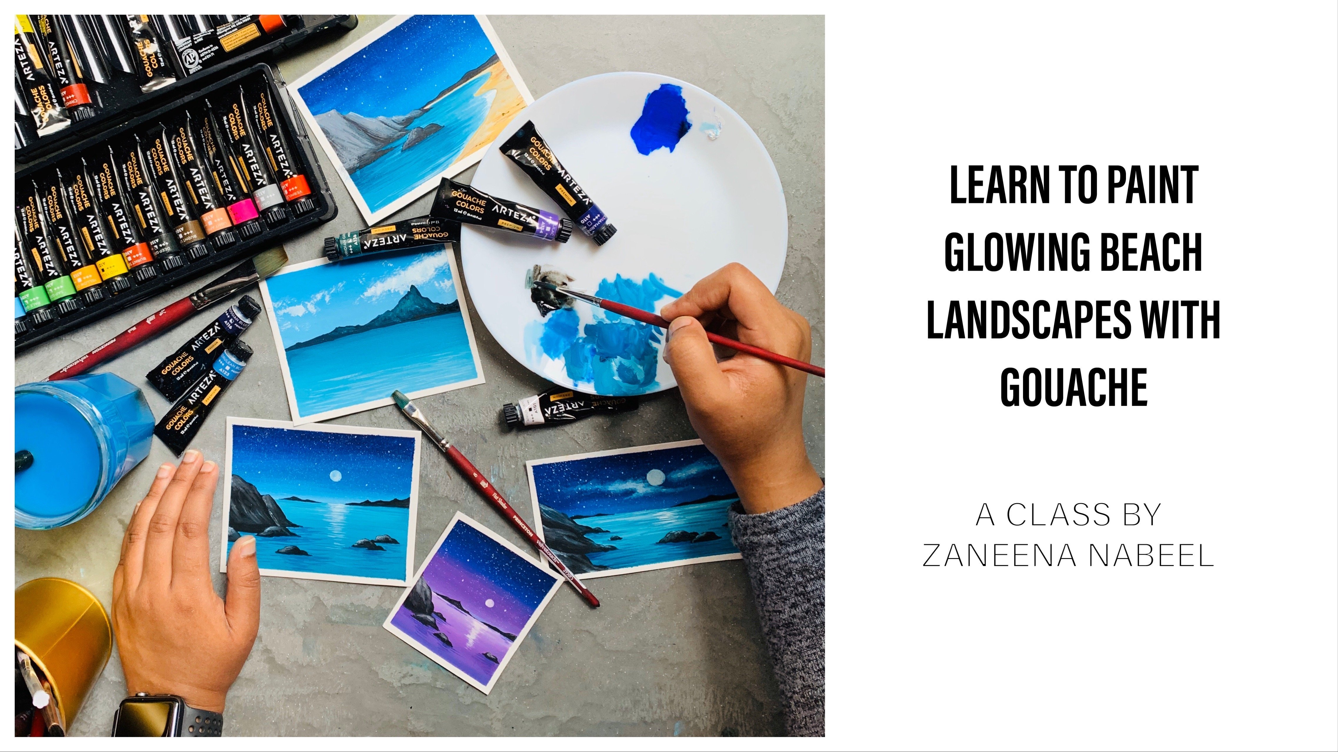
1. Hello & Welcome back!: Sunsets are so magical, no matter whether you're enjoying it from your window or from a moving car. It just makes us smile and instantly fills us with so much of energy and positivity there is nothing more peaceful than inhaling the quiet beauty of the setting sun. When the sun is close to the horizon, the game begins, the sky itself becomes a huge canvas and creates a gorgeous piece of art. Hello everyone. My name is Zaneena Nabeel, I'm a mother, an artist, and an art instructor. Today I'm here to take you all through a wonderful journey. where we're going to paint a series of glowing beach sunsets using Gouache In the past year Gouache has gained a lot of popularity and it has become one of the most favorite medium of artists It is a medium which is so easy to handle and you can fix any mistakes that you make. The best part of Gouache is that, unlike watercolor, you don't need an expensive paper and expensive artist grade paint to create a beautiful result. Even a student grade paint and a normal paint will work just perfect. If you're new to the medium, don't worry, I'll be explaining about each and every material you will need in detail, we will explore some techniques first so that you will get comfortable with the medium and it will be really easy for you to follow the class projects, I'm super proud to say these are my first ever collection of beach sunsets. And I guarantee you can also create your first and best collection if you join this class. This class is going to be a magical experience, watching the sun take a dip in the water and turning the water into a molten gold. From golden yellow to royal purple will be working with a stunning range of colors. All right, so join me right away to witness the most gorgeous sunsets you have ever watched.
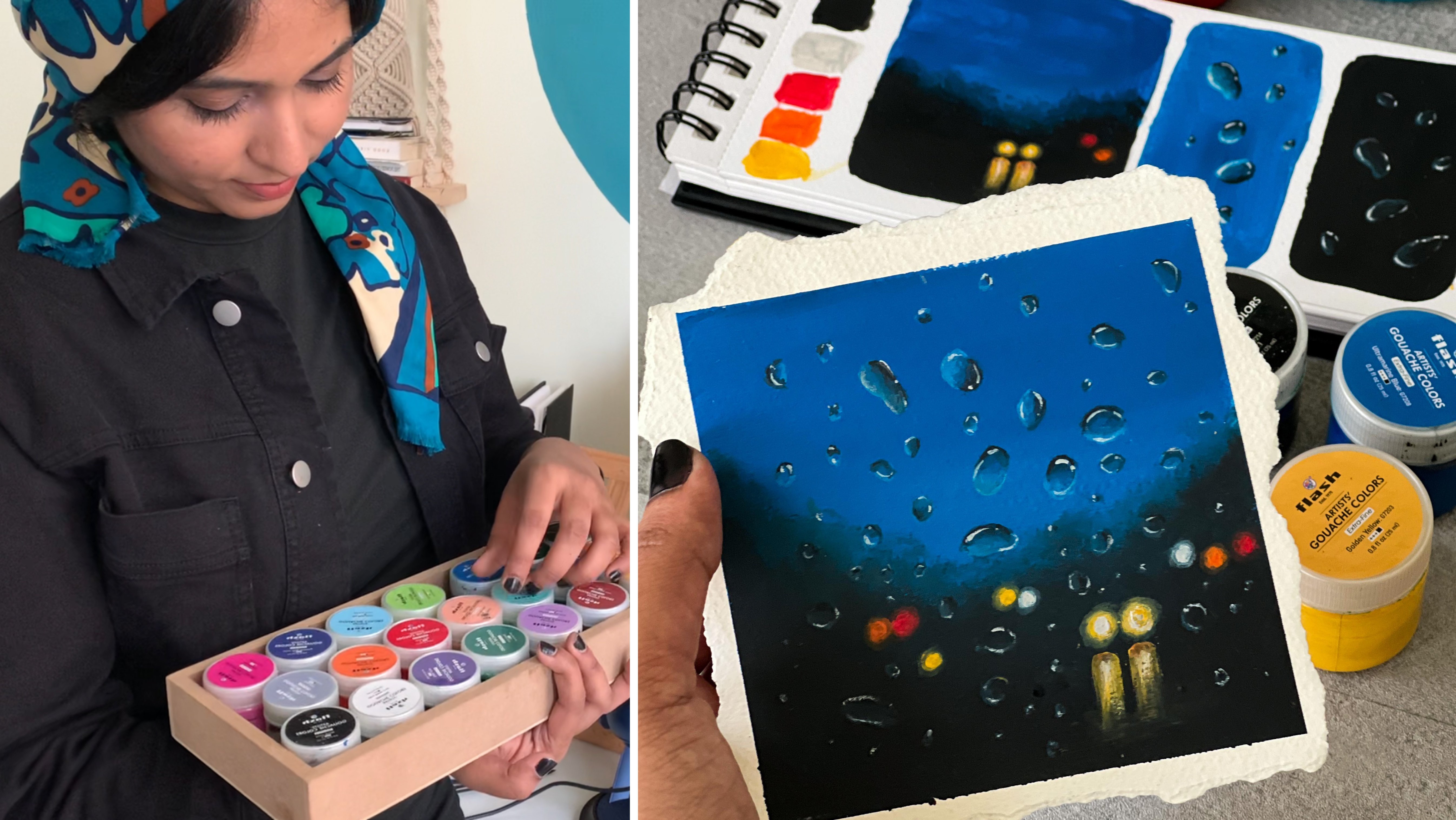
2. Materials you'll need: If you are someone who work with watercolor in a regular basis, you have all the other supplies with pill already. So the only thing you will need an extra as obviously quash pink. So I will start with gouache colors. The one I'm using here is from the brand and products drew. This is an Indian brand. So if you're someone who's not from India, you won't be able to find this particular brand, but the brand doesn't matter. Here you can go with any of your artist grade are student grade gouache pins and the best part of Galatia slide, you can use your student grade paint and still manage to get a beautiful result. It doesn't really need to be an expensive artist grade paint. So Google AdWords is available with you, will be using some basic colors. We won't be going with any fancy sheets, so don't worry about that. What do you have? The deal will perfectly work. I'll be talking about the colors at the beginning of every painting so that you will get an understanding which alkalosis you would need for that particular painting. Okay, so that is all about gouache paintings. The next material you will need it as a mixing palette. I'm using a ceramic palette. This one doesn't have any devotions. It's selling dish. You can either use any of your plastic or ceramic palette, or you can grab a dinner plate, kitten or a piece of plastic sheets. Literally anything will work. It has to be non absorbent so that you can mix that creamy buttery paint. The next thing I'm going to talk about is the brushes. I'm intentionally not talking about the people because quash really works on any kind of paper. Glass has got a little behavior, not like or to color. It really can work on any paper which doesn't have much Texas. I'll talk about the brushes then I'll come back to the paper. All the brushes that I'm using for today's class is from Princeton. All of this off from their velvet touch cities. This is the particular series that I allow for my quash paintings because the bristles are quite strong. Edison that solved gouache is an opaque paint and it's really creamy. So to get that opaque result, you have to work with thick creamy paint. So I don't really prefer using a very soft brush for my gouache paintings. I'm using three brushes for this, enter your class, and this is the first and the main brush I'll be using. It's a three by four inch wash brush. You can see it is quite wide. I'll be using this brush to apply the background washes because it's quite wide. It is easy to get that clean blend. I can cover it up a lot of IDA in a single wash. So if you're using a smaller size brush, something like this, you will have to run your brush multiple times to get a clean manner. So you'll have to choose a dress according tos psi. So few people. If you're working on a very small size, a smaller brush would work. But if you're working on a bigger size, obviously you will have to cope with that because I trash. Otherwise, it will be very difficult to blend the colors. So if this is the size, the brush I showed earlier, the smallest size, flat brush, it will really work. You can see that proportion TO. So using this size brush, you can get the clean blend on the smallest size of paper, but Northerner because size. Okay, so that is the first brush. I'll be using a three by four inch wash brush. Go with any of your medium two because sized flat brush. The brand doesn't matter. It is just the size and it should be flagged. Trish. The second brush I'll be using, so three by eight inch angle shader brush. Just as the name says, the brushes slightly angling, which makes it really easy by applying the paint. I really love this brush. You can see that angle on the top. If you're someone who use squash and law, does precious a great buy. Otherwise again, go with your flat brush, any of your smaller size flat brush, we'll be using this brush to apply the details from the water. And the last brush you will need a saddam Krish. We need a smaller size for the brush, the one I'll be using a size number 6, you can go with psi symbol five or six or four, no matter what size you're going with your pressure Kaplan nice pointed tip, which is the most important part, will be using this brush to add in the sun the reflection, the waves, and all those little details. So it is really important that your pressure tap appointed to. Okay, so that is what about the brushes? Now you will need a jar of water. Unlike watercolor, you don't really need to charge. So Bordeaux, Grenache can handle Doty water to a certain extent. But if it is getting really don't need to get up from your seat and change your water. The next thing you will need a set people to whom instead of a People tab. And you can also use so-called and plot. Finally, I'm talking about the people forever gouache birds eggs, usually for all of my class, I start the material section explaining about the people. But I wanted to give you that confidence to work on any kind of paper. It doesn't really need to be an artist grade or a 100 percent cotton. This matters because you are applying that opaque paint. So in order to get a clean bucket free people, you will have to go with a thick paper. So the paper I'm using here is from Canson. This paper is from 40 LB, which means it is quite thick. I believe this is 25 percent cotton. It is not a 100 percent cotton. This paper I never used to work for my watercolor paintings, so I have kept the sketchbook aside for my quash painting. I wish the exercise directly on the sketch book, I'll be dividing one sheet into six equal divisions using a masking tape. For the paintings we'll be doing in this class. I'll be clean with the Polaroid style. And is it the science I'll be you think that you can grow the size of the similar proportion, or you can go with a smaller or a pico size, or it can go with a landscape orientation. It's totally up to your choice. I'm pretty sure there might be one or two people pride you have kept aside because it didn't work for your particular paintings. So it's time to take them out. It will really work for your gouache paintings. Will need a people which doesn't have much texture. So to get a clean blend, it is better to go with the hot pressed watercolor paper are it doesn't really need to be watercolor paper at all. Any thicker paper, maybe you can try dispatching the colors on a scrap piece of people and understand whether it is working for your quash painting. And the last thing you will need some masking tape. I'll be fixing my people directly on my table. If you would like to use a backing board to fix your people, you could do that if you don't prefer having this clean bottle, if you prefer an irregular border like this one, you don't need to fix your people using a masking tape. You can directly paint on the paper, but it is one no good reason to use masking tape rather than getting a clean Bardo. It will grow and your people from buckling to an extent. Okay, so decide on what kind of border you want for your paintings. Now there's one last thing I want to talk about before we start with the wall paintings, you will require a lot of white paint, not just for this class. If you're someone who's planning to use clash in a regular basis, you will have to buy a big jar or a big tube of white paint. Other than any color in your set, you will be first finishing off your white being. So it is better to get a white separately, which is quite big. You can see the condition of my white tube here. I believe this is a 60 ML tube. Looking at the stoops condition, you can clearly understand my love for this medium. This is nearly over and it's time to get a new one. Okay, so that's all about the materials you will need for this class. Now in the next section, we'll try out some exercises so that you'll be comfortable and you would have a better experience when we are painting the main projects. So quickly go grab all the materials and join me in the next section.
3. Practice - Part 1: How my sketch for Kriti here, I'm a jar of clean water on my palette. Now I'm going to apply masking tape and divide those people under six equal deficient. And it's tricky. So for us, we're going to try a simple blending exercise. I'm going to close on Prussian blue and white onto my palette. Go with any color of your choice. This is just a symbol blending exercise to understand the technique before we started with the project. So I have taken out the colors on my palette. These are the three colors are used, clean, white and flushing. Now, I'm gonna go with my flat brush. As discussed in the material section, I'm using my three by four inch wash brush. This is the same brush I'll be using for the war paintings as phones. So you'll have to go with any of your meeting to be precise practice, depending on the size of your paper. Now I'm starting with Prussian blue. I'm going with the creamy consistency and I'm adding that on the top of my foot section. You can see the paint is really dry so I'm dipping my brush and it's low water. Just that top reasons I'm not dipping my enter your brush in water. And now I'm going with the second color with this deal. And I'm applying that close to pressure in blue. You can see the way I'm running my brush. I'm running my brush from left to right in a horizontal manner. This is the only direction I'm following. I'm not adding the paint in any other way. So keep running your brush in a horizontal manner. I'm going to get a clean blend. If you feel like your paint is dry, you can add a little of water. Now I'm adding some guage to make the color lighter. So when we are using water glow to make the color lighter, we add some water and we dilute the color and make it lighter. That is the way how we make the color lighter with watercolor. But with gouache. To make your color lighter, you have to add white instead of water. This is the reason why you will finish your white gouache before you finish any other color. Now just to make the color lighter, you've loved to have to add details using white. So why does the first color you will finish from your whole set. Okay, now I'm going to keep running my brush in a horizontal way until I get to clean blend. If you feel like a band is too dry, don't be afraid to dip your brush in level of water. But make sure you're an entrepreneur enter your brush. Just make that top prisons enter to bed. Okay? So keep running your relational horizontal minor, dawn running version any other direction. Okay, So I have got a clean blend here. This is our first exercise. All the paintings we're trying in this class is based on a simple blending exercise. For the background wash for the sky and the water will be going with a simple blend. Then onto that, we'll be adding more details to make it look realistic. So blending exercises really important. Give it a try and understand how it works. What are two things you need to keep in mind to get a clean blend? The first and the most important thing is you should only be run in your version of horizontal wing. Don't add any other kind of fresh movement. And the second one is if your paint is too dry, don't be afraid to dip your brush in underground water. This will help in getting a better blend. You'll be able to blend the colors much easily if your paint is little bit okay. So those are the two things you need to keep in mind. Now let's move on to the second exercise. For several paint the background. In this one we are going to try the first type of reflection. So I'm going to Prussian blue. I will apply a taco DOF crushing blow on the top and the bottom. Or to the murder, I will apply white and make the color lighter. I'm going with the very doctrine of Prussian blue. Adding that onto the top of my people. That's a call just color. Now I'm adding that onto the bottom as well. Okay, so I have added blue on the top and the bottom. Now onto the center, I'm going to go with white, just like how we did in the previous exercise. Keep grinding oppression horizontal. Wait until you get a smooth blend. On the top and the bottom, we need a darker turn off Google at Old Dominion, we want the color to be lighter. If you feel like your paint is too dry, gently touch your brushing water. Now I'll keep running your brush in a horizontal way again until you get a small planet. But make sure not to add a lot of water. If you add a lot of water, you will lose that OP character of your quash paint. Okay, they have got a beautiful blend there. Now I'm going to switch to my round brush. This is a size number 4. You can go with any brush that has got a pointed tip. To add them more than the deflection, I'll be using white and I'm going to pick the y directly from this little jar. Okay, so take out some white. And to your question, but clean white. Now let's add the moon. Added a teeny tiny silicon. So that's the moon. Now we need to add the reflection. Here we have paint the sky and the water together. So imagine a horizon line and imagining back to the homework here. And I'm starting the white lines from here. Right now, I'm going to slightly be quite being, which is really opaque. And you can see the lines I'm adding, they are kind of dry. I haven't had much of water. I will add some more dry lines. For this first reflection, we're going with the combination of dry brush lines as well as some clean lines. So again, see you right now. I'm adding some clean lines. And clean lines are more wider than the dry brush lines. So make your clean lines more wider and your dry brush lines more shadow. And the dry brush line should fall right underneath your more. Don't add it in there. This is what will make your water look as if it is shining and glittering. So don't add the dry brush patterns in girls. Focus on the center, which is right underneath the moon. You can see how easily we created a glowing deflection hill. So you just need to play with dry brush lines and clean lines. It's a very simple technique and is the easiest way to add a beautiful reflection. You can use it in any of your painting whenever you're adding flexion. Now onto the horizon line, I will add some more wider lines to make it look more defined. Right now that horizon line is not defined. So I'm just extending that vita put more outward. Well, that looks fine. So that is elastic. An exercise. We created a beautiful background. We created a blend of Prussian blue and white. And onto that we added the more and it's reflection. Now it's time to go with the third exercise. News type of the variegated wash off violet and jewels. Start with Crusade, the colors onto my palette. You can go with any other colors. This is just an exercise. So the colors really doesn't matter. Feel free to go with any of your periodic color combination. Okay, so I have the colors ready here. Now, I'm going to switch to my flat brush. First, I will paint the sky, and then I will paint the water. First. I'm going with violet. I'm adding that onto the top of the section. After this, I will add some rules and blend that with violet. Then what's a horizontal line I will be adding on the floor while to make that together lighter. So the process of the same, you need to keep on running your brush in a horizontal way. And if you're being just too thick, you can add a little water. And to make the color lighter, you should be added right? Now, create a clean blend off those three colors. That's this guy. Now for the water, I'm gleam at them making tonal violet. I'm just adding some more white into that mix. Now I will apply a flat wash of that color onto the anterior water. Adding that along the horizon line. Now I'm pulling up that Ada and the shade. The background washes John, now I'm going to add in the MOOC. I'm not sure if you guys noticed this. The water was looking at large, lighter when the paint was wet. Now it is looking a lot darker when it dried. So this is one thing with guage, the lighter colors when they dry, they look taco. Now I'm just adding little blonde white along the horizon line to make this ADR lighter because this is the EDR valuable, have your more light hitting the water. So compared to the rest of this area has to be lighter for all the buildings will be doing in this class, we'll be following this method. For us. We will paint the sky and then we'll paint the water. The best thing about gouache is that you don't need to read for your sky too dry to paint the water. You can paint them together because we're not playing with lot of water. And also it tries out pretty quick. Now let's add more details onto the water and pleasing them out a bit more wireless. I'm using the same brush and I'm adding some lines from either side, just dragging the paint from left-hand drive towards the center. See that? If you bend us to take and don't be afraid to add a drop of water. Now when I'm adding these darker dawns, you need to focus on the left and the right side. Don't add a lot over the middle. We need to keep that area lighter. So when you keep the center light to where you have your reflection and then you add more darker tones on to either side. This will automatically inevitability of your painting. Those reflections will really stand out. Now, our indigenous not to get a clean blend TO, it doesn't really matter at all. But they do. Our colors are looking smooth orbital. They are having a game plan and that's not at all important because we'll be adding more details onto those. So we'll be adding some ripples and waves and mode reflection. So whether you have a clean blend or not doesn't really matter. Everything will be covered in those details. So don't worry about that. For the next step, we will need some black. We've been mixing black with that lateral wireless. We don't need a lot just to lift off black is all you need to add the details on the water. I'm going with my round brush and I'm adding a few drops of water. So to answer the bulls and the waves, I'm going with a slightly watery paint. I'm not going with that. The creamy paint. When you go to slightly watery paint and then you add a line. So using that watery paint runs, it drives, it will look release up to and it will make your water the more beautiful. So this is the kind of consistency I'm going, but you can't see it is not at all. Pick, it is kinda of altering. Now using this watery paint, I'm going to add some lines on the water, just some random lines. I didn't ask many lines as you want and make sure to go with that watery consistency that looks really dark. So I'm adding few more drops of water. So they're using a darker tone of violet, which is a little watery. So we're told me the color that you'll use for your water, whether it's blue or red or pink or violet, add some black to that and add some water and go with that light watery paint and add some lines. You can see the lines I'm adding here, they are generally messy. I'm not really going with any particular pattern or shape or size. I'm just randomly adding as many lines as I can focus more on the left and the right side. Don't add a lot over the middle where we have that lighter tones. So that is only thing you need to keep in mind. Now go ahead and I didn't ask me fantastic want. Now I'm going with a slightly darker tone and adding some lines in between. Just few here and there. I'm not adding a lot. Okay. So Titus it now it's time to add the reflection of the moon. So I'm switching to write cleaner brush properly and switch to white. Now right underneath the moon, starting from the horizon line, I'm adding some lines. You can see the lines I'm adding killed the unaltered dry. So I have added two more water to my white. And I'm clean with the newest version of white. For this reflection, I want more of a small team of satin finish, not like that, dry brush lines. And that is a reason why I'm adding a little water. So this is the kind of consistency I'm going inward. It's not at all. Try. Now keep on adding some lines using that watery white. This will give us that small, tiny glossy finish. So yeah, just go with the watery white and keep trying. You'll crash back and forth and add into lines. I added the line towards the right that it's not falling at the centre. So I'm going back and adding some lines. I'm making some of the mind to move wider. So our integers to make the reflection asked more time glossy as possible. We don't want them to stand out. We want a very subtle looking reflection. And you can clearly see that hill, the lines are not very prominent event in with a slightly watery paint. Now I'm going with a little more opaque version of white and adding a few lines right underneath the moon, starting from the horizon line and bringing them down. But I'm not going to add a lot, but just a little trite and I need them all. So once you have added some opaque white lines, dip your brush in water, and it games on your brush back and forth and make them smarter. So depending on the kind of Phoenician look you want for your painting, you can go with different kinds of reflections. So we explored two of them right now. For the first one, we've entered with the combination, I'll try and clean lines. Now we're going with a little watery paint and yanking them look more small time-step two. So both of these can be done with any other color. If you want to go with the orange reflection or yellow to flexion, just change the color and go with yellow or orange instead of light. And with the same. I'm dragging my brush one more time to make that reflection of the tomato, tomato. So I have taken a watery white. And as you could see here, I'm simply running my brush back and forth to make it look more smarter. All right, So that is that we have tried to different types of reflection. Now, I think it is good to try few projects before you call the next exercises so that it won't be that all of them before you.
4. Before we begin!: I'm 40, Polaroid style for the cluing be t6 we are painting in this class. The main reasons that I created this collection for myself to keep it on my Tia boat so that I can stare at them, but I'm looking on my table. I have a stand with me. I wouldn't stand. So I chose the size according to this tanned otherwise also, I really love Polaroid style. I wanted to add a quote underneath. So that was the first thought than I thought I will use this asset display on my tipo. So you didn't go with any kind of starlight to fulfill your paintings. It doesn't really need to be following style. If you want to go for a smaller size, maybe as choir or a bookmark size that is totally up to you. So go with any kind of style that you prefer. So water was tiling, fooling for your painting and see we'll have to fix your people to get that clean border. If you are someone who don't like that clean border, if you aren't an irregular border, you can't do please keep adding the masking tape because gouache is not like watercolor. It's an opaque medium. So there are no chances that your paint will float into each other and create a mess. It is a much easier medium to handle. So decide on whether you want to apply your masking tape or not. Now, if you're applying masking tape and if you're going with the programming style, here's how you do it. Along the bottom line, you would need a deco Bordeaux if you're following your Polaroid style. Now for the rest of the three sides, I'm going with a half a centimeter border. So depending on the size of the border you want, you can change the way you place your masking tape. After you have applied your masking tape, just run your fingers to make sure there's no gaps in between. So I'm using a very normal masking tape here. And this one is bought from a stationary shop. It started a Hayley do detail work or it's not a strong team. So unlike watercolors, you can use any kind of masking tape for your quash paintings. Because we're not using multiple layers of water with quash, we are cooling with an opaque paint. So the chances that the paint can seep into your border is really less compared to watercolor. Paper would really work. You don't really need a heavy duty expensive paint those to you. Next I will talk about peeling off the masking tape, which is a tricky thing for many artists. So the key rollers, whatever medium you're using, you will have to retool your painting to dry completely. Once you are painting has completely dried, gently remove it at an ankle. You can see the way I'm doing it here. So there are two things. You will have to wait for your painting to dry completely, then peel off the masking tape very gently at an ankle. All right. So we discussed about two things. First one is applying your masking tape, which is what do you do at the beginning of every painting. Then we discussed about peeling off the masking tape, and that is what do you do when you're finishing off your painting. Now it's time to deal with that intermediate process, which is the actual painting. All right, let's dive in and start with the buffaloes predict.
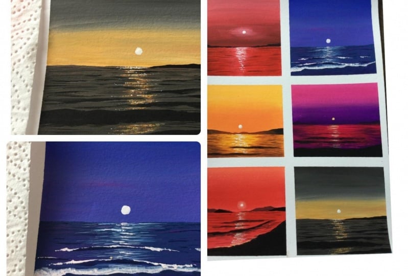
5. Day 1 - CRIMSON Sunset: Here's the first growing beat, Sense8, be up being different, the whole CDs. It's a really ECR. Okay, Let's give it a try. I have fixed my people. Now let's pick the colors for our first painting. You will meet three colors for this glowing beach. Amdr chromosome, black and white. So these are the three colors you will need for this painting. Now, let's take hard to close on total palette. For this painting. The main color we'll be using as crimson at some places will be making a darker by adding black. And at some places will be making I do by adding white. So you can go with any other color of your choice. If you want to go with blue or purple or violet, It's totally up to you. You just need to follow the technique that I'm using here. And you can alter the close. Okay? So I have taken crimson and black here. Now you would link, right? All right, we have the colors ready here. So we have fixed trouble people heredity. Now, I'm going to grab my three by four inch flat brush. This is going to be the main brush we'll be using throughout this course. Okay, so grab any of your medium to be good-sized flat brush and pick some crimson. First I'm going to add the horizon line. So on the top I will have my sky and over the bottom I would have my C. This is just a reference line we are drawing for ourselves to understand the split up. How much is your water and how much is your sky? Now, I'm mixing a little of white with crimson. I'm creating our light pink. We can see the color here. It's a gorgeous bring. And I'm starting with this color. I'm going to apply this onto the top of my paper. So we're going to go with a graded wash of crimson. We have a lighter tone on top, and as we come down, they are making the color taco. So we have already applied a light total of chromosome from the top. Now I'm going to add a little more crimson or to the same mix to make the color more darker. So pick a little more chromosome and extract with that. Thank you had created and applied that right where you stopped your pink. Now blend them well. If you feel like your brain does to try and thick, just dip your brush into the water. Just a gender lip is all we need to loosen up the paint. Don't add a lot of water. If you add a lot of water, this will affect the opacity and you bring into a look more transparent. So don't add a lot of water. Keep that in mind. Now go with the green crimson. And from that remaining area, you can see how gorgeous that blend is looking. On the top you have a lighter tone of concern. We just added some white into Clemson and make the color lighter towards the horizon line, willing to make the problem more darker. So I'm adding a bit of black and Tecumseh to get a darker tone. Not a lot, just to see that. So this is the color you should be getting now and that along the horizon line to make that ADR more darker. So on the top we have a lighter tone. And as you're coming towards the horizon line, you're making the color darker. You can see how gritty of us guys looking already. Whenever you feel like your brain is too dry ethic, don't be afraid to add a drop of water. So that's a base layer of our sky, will be adding some more details onto this. But this is the first step. Now I'm going to show the paint from my brush. Clean your brush, dab it on a paper towel and keep it aside. Now we need a smaller brush. I'm going to squeeze out some more white. We need some clean white. And I'm going to do smaller size factor inch. This one is a three by eight inch angle shader brush. Now pick some white. Now at that, a little about the horizon line, somewhere over here. So this is where I'll be adding the moon. So to create that glowing effect, I'm adding some white and I'm making this video a little lighter. You will have to do this the right way after you have finished painting the sky so that your background is still slightly better and you will be able to blend the color into the background much easily. If it has completely dried out, it will be a little difficult to blend the color. So if you're not feeling confident enough to go with this tip, skip that completely. It is absolutely okay. N2 are white color or do your sky, you can simply adding your moon directly on the sky without adding those, right? Okay. So again, see how I have got a lighter tone over that area. This is exactly where I will be adding the mole. Now we can add them all for that. I'm using a long brush, just gonna size number 6. You can go with ties number 6 or any other smaller size pressures. Now, adding a white moon, try to undo the middle of this white patch we have added. You can see how instantly our moon is looking like asymptote is blowing. This is a recent by the additive white tone and the background. You can try out the same thing with any other color of your tiles. I really wanted to try the same with the purple. Maybe once I'm done with this, I have my triangles with Bobo. Even a black and white would also declines. Have to go with two layers to make your more look really vital a pig. Otherwise, you will have to wait for your background to dry completely, like 100 percent try. Mine hasn't dried completely and that is the reason why the wider looking at you feed it. When I added the post, so cool. So I abandon with another layer on the top. Now we're just looking fine. Our next task was to paint the water. For that, I'm switching to my flat brush and I'm going to apply a medium tone of chromosome onto the anterior water. So do your Clemson. Adam lives love white and to make it a little pinkish. So this is the color you should be going with Nelson that enter your Ada and this color, just a binge or white is all we need. Don't add a lot of white. If you add a lot of Y to look really light, and you earned a medium to honor's council here. Now I'm applying paint along the horizon line. You have to be a little careful. We need to get to clean straight line here. Okay. So go ahead and fill that in a medium tone up Come, sir. All right. So the base layer of Stan, why should the paint from your brush? Next, we're going to add some details onto the water. For that, I'm switching back to my three by eight inch and color brush. You can go with eating off your smallest size flat brush. I'm squeezing out some white quash. So first we will make that ADR right underneath the bowl, a little lighter. Okay, so the first step is to make this ADR lighter. And at the end we'll be adding motor Friction lines over there to make up a painting look more interesting. So go with 80 Orfeo, medium to smaller sized flat brush and add some white right underneath the moon and blend that into the background. We need to make this area lie to, to get that cooling effect. So the right and the left side can state acidosis. We just need some light to turn over q. Now I'm dipping my brush in the water so that it is easy for me to blend the colors. Now I'm just running my vegetation on top of this and I'm trying to blend this into the background. I don't want this to look. Do sharp. Your brush has to be slightly wet. Okay? You can see how pretty it is looking at gritty, but we need to make it a bit more lighter to get that real clue. So I'm adding some more white and I'm repeating the same. First Adam, you're wide. Then run your brush onto either side in a horizontal way and blend that into the bat prompt. Okay, so that's done. Now, I'm going with the taco to an off-grid. If your paint is too thick, you know what to do. The filtration water, just agentive dip. You shouldn't be defile, enter your brush. So to add the reflection, I'm going to slightly watery paint. I'm not going with that thick, creamy version. So good. That darker red tone, which is slightly watery, uses need to add a pinch of black into your chromosome and get all the dark corner. Then add a few drops of water and go with the watery paint. Now from either side, simply drag your brush towards the Santo and add some darker dawns on either side. Now it is absolutely okay not to have a clean blend, TO don't worry about those lines, even if they are looking sharp and even if they are looking slightly beyond, that's absolutely okay. I'm going to take a bit more chromosome. And I'm going to repeat the same exercise. Now when I don't use Docker demons tried to read in this lighter area over the middle, we cannot get rid off this lighter tones over here. This is what we'd make up. A painting looks like it's glowing. So it is really important to retain that lighter tool to get that glowing effect in Apple painting. Now, I'm going to wash all the paint from my brush. For the next steps we will need to round brush. I'm going with the black and first Avenue, add a mountain in the background. Go to no line mountain. This is just to define our horizon line. Don't make it too huge. And that's done. You can see how instantly those mountains added up your digital painting. That Barb of Black made the other colors look really pretty. I'm really loving it. Now the last step is to add more details onto the water. We need to add some waves and truffles, and we'll also need to add some reflection. So I'm going to squeeze out a bit of crimson, just a tiny bit. This is just to add those reflection, we don't need a lot. Okay, So just a tiny bit of crimson mixed that with black, add few drops of water and make it slightly watery. So whenever I'm adding that affliction, I always go with a little watery paint. The main reason is that when you're dealing with the watery paint, then the background dries. It will look more subtle. So you really don't need to put a lot of effort and blending them are making them march bit of background. If you go with the very dark and bold line, it will really stand out and it means Paulina water. So this one has a slightly watery paint. I mixed a little love black but crimson. And I add a few drops of water are sp2 and I've made it into a watery consistency. I'm simply adding some lines on the water. You can see how carelessly I'm writing those lines. Some of the lines are wider and some of them are shorter. It doesn't have any particular shape or size. So simply adding some lines on your background. The only thing you need to keep in mind, the side you shouldn't be covering of the anterior background colors. When you are doing this, we need to see that lighter tones and medium tones of Clemson and the background. This is what will make your water look more beautiful. Now you can go with a bit of darker tone, add an, a fringe of black into that chromosome and add some lines using a taco. Don't ask for. When you're adding these lines, make sure not to add a lot of the center. We need to read in that lighter tone. So concentrate on the left and the right. You can see the consistency of my beat. It is not adults, they can creamy it as watery. Now wherever you feel like you need to add some more lines, just outlets and some of the lines can be thick and some of the lines can be 10. So go the combination of different sorts of lines. Just keep in mind not to add a lot of lines onto the center where we have those lighter tones. That has only thing you need to keep in mind. Otherwise, you can just say add as many lines as you want. Now, washer the paint from your brush, clean eternally. Now they're heading towards the last above this painting. And that is to add the reflection of the more water that is going to be the last tip and the most interesting stuff. So I'm switching back to white. I'm using my round brush. Now right where the horizon line is talking. I'm adding some light lines. Now I will bring in town until I reach to masking tape. For this painting, I'm adding the deflections like how we did in the exercise number 3. We use to slightly watery white paint to add the reflections and the added a softer reflection. There aren't going to dry paint here. I want a very small 10 closing reflection. I don't want them to stand out a lot. So that is the reason why I'm going with a little watery paint. So I added some lines using a slightly watery whitewash. Don't add a lot of water and turn that into a particular, even though we are going with the slightly watery consistency, we still need to retain that opaque characteristics of guage. So just a few drops of water. Okay, Now adding some lines living on cap in-between. So after every line you need to leave some cap, we need to see that background color in between. Then you can go with the second line. In a similar way, you can add bike lines until you reach the bottom most masking tape. Some of the lines can be a little wider and some of them can be short TO go with the combination of different types of lines, just like we did. Just like we added digital books on waves. Okay, so let's keep on adding lines. I'm convinced the bottom line. All right, my dear friends, and with that, we had under the first painting from the CDS, we do currently 15 minutes to paint this beautiful sunset. I just keep my brushes and keep them ready for the next painting. If I don't do this right away, I have the habit of leaving my brushes in the water overnight. I'm really bad with the brush chair, so I'm cleaning them right away. I would suggest you to do the same so that your brushes, but last long code. All right, now let's peel off the masking tape. It will have to wait for your painting to dry completely before you peel off your masking tape. Don't rush and turn off your paper. And here's the finished painting. You can see how simple you had car just a dislocation. It's a beautiful color combination. This kinda looks a little mysterious and the water looks pretty common today. I really enjoy the process as well as the enterocytes. I hope you guys enjoyed it to give it a try and tidy process and get ready for the next project.
6. Day 2 - VIOLET Sunset: It's a beautiful Violet Sunset. Let's quickly take a look at the colors you'll need. So for the sky and the water, the two colors that I'm going to use, our Prussian blue and wireless. These are the two colors I'll be using, Prussian blue and violet if you don't have wide and you can mix a little love crimson to your Prussian blue and create a wireless are again go with any other color combination that you prefer. Okay, So those are the two main colors you will need for this painting. Along with that, you will also need some white and black. So I'm going to squeeze out the colors onto my palette. I have already taken some white. Okay, so the columns are ready. Now I'm going to switch to my flat brush. Now, I'm going to mix blue and violet together to create more of a bluish violet. I'm not going to directly use it. And I didn't put a y to make it look more opaque. So this is the Colorado equipment. Excellent Love blow but your wallet, to get a similar color. Or if you prefer using violet and blue assets, you could do with that as well. Now using a flat brush, start a blank that bluish violet on the top of your paper. So you can see the color is quite dark now as I'm coming down, which means as I'm approaching the horizon line, I'm going to call it love white. And I'm going to make the color lighter. The oddity have some bluish violet on our brush. Now pick some white applied that tried to stop to your previous color. Blend that well. I'm dipping my brush in some water. The paint is quite thick. Now I'm a game running my brush in a horizontal manner to give it a clean blend. So you can see the way I'm running my brush. I'm just moving it from left to right and making the blend clean. If you want to make the color more taco logo pressured more color. Okay. I hope you guys are quite confident that the blending technique, no matter which will be the color, you are using granule machine horizontal wave from left to right and make it a clean blend. So the skies are some bird gradient wash of Wyandot, a bluish violet. On the top we have a taco tool and as we are approaching the horizon line, we have a lighter tone. I'm going to make the Ada. And on the horizon line, I love you more lighter. I'm picking some white mixing that with a little low violet. Now I'm applying that along the horizon line just to make this 800 and more lighter. Now I'm going with a deeper tone of bluish violet and applying that on the top of my people. So when you're working with gouache, especially when you're trying to create a background wash. That is one thing you need to keep in mind. Naval overdo it. The moment you feel like you have quite a clean, beautiful blend, stop it there. Don't run your brush again on top of it. This means POJO or clean blend. So I'm done with this guy. Now I'm going to wash the paint from my brush. The next step is to paint the water for the water as well. I'm using a bluish violet, but this time I'm adding very little violet to blue. Which means in your mix you should have more blue and less violent. So blue should be the dominant color in your mix. Now I'm adding a little white and I'm making it slightly lighter and OH, peak. So this looks like to a store to the Hebrew will get us know violet. And then I'm going to squeeze out a bit of wireless. Let's mix it again. You can see how large is this colors looking at is a bluish violet in your mix. You should have more blue unless violet, I add some light to do. And this is the color you're now applying that under the entire workflow will be uploading with the flat wash. Okay, so for this crime, the USTR gradient wash of bluish violet. And for the water we used a flat bush. But for this guy we used violet and blue and the same ratio. And for the water, we used more blue and less while let. The next step is to add more details onto the water. We need a deeper tone of blue and violet. So I'm squeezing out some wireless and some blue and mix them well and create a bluish violet. The stand we needed taco turn off bluish violet. Now tried to brush from either side towards the center. There's no wind tunnel from your wireless. That looks cool. Now I'll drag your brush from either side towards the center and add some deeper doors on either side. So in doing this, it doesn't really need to be a clean gland or a smooth finish. You can simply add some lines like this. It can be another route. That's absolutely okay. But as I explained in the practice section, as well as in the previous painting, over the center, you need to retain that lighter tone. You just need to add these deeper dawns on the left and the right end. Don't add a lot of lines or wood or metal. We need to read in that light to AD over there. Okay. So keep on adding some taco dorms on either end. You'll simply need to drag your brush towards the center and add some deeper tones on legal aid. Okay, now I'm going to wash of the brain trauma my brush. Now we can't keep up a flood brush aside and it's time to switch to Oberon brush. The brush I'm using pure size number 6. You can use any other medium-sized brush or a smallest size brush which has a pointed tip. Now I'm going with a taco, turn off that bluish violet. We're going to add more details onto a quarter, will be adding some leaves Sandra puts. So the first step is to add some random lines on the water, just like how we did in the previous painting. It is just some random lines. Some of them can be longer and some of them can be shorter. When you're adding these lines, make sure to leave some Kaplan between. Don't add them too close to each other. We want to see that back arm Kahlo's as well last 10 lines. So we'll make sure to leave some gaps in between, but you're adding these lines. The technique we are following your us more or less like the one we tried in the first painting. You need to go with the watery paint and add some random lines on the water. You can add as many as you want, but make sure not to add a lot of them are what do we do that you have those lighter tones. Our main intention is reaching those lighter tones. And also work with the competition of canton Long I'm shocked lines. Adding these lines is a pretty carefree task. You can add them however you want to. Just go ahead and add in as many lines as you want. As I mentioned earlier, at some places make your lines more pico, and at some places you can make it tonight. So this combination will make your water look more beautiful. All right, so I have added some lines. Now. I'm going to switch to white. First cleaner brush properly. Dab it on a paper towel and make sure those non-white or toenail brush. Now let's switch to white and add the setting sun. Go with some clean white and add a small circle. What's the size of the circle you're adding? It shouldn't be too big. You can see the size I'm adding Q. Go with the similar size. You might have noticed at the beginning for this painting, we are adding some waves. So we need to add a short line. I have added the sun. Now let's add the short line. Go with some clean blight, and simply add a line and irregular, curvy flowing line like this. So here are several shoreline you should be adding the lightness and the way you don't make it too straight at some curves in between and make it a smooth flowing lines. I used a clean or big light hill. I didn't add any water to it. You can take it the line is very thick and opaque. So normally I had a lot of water to your paint when you're adding which line? It has to steep prominence. So we'll go with the thick, opaque white. Now take out a piece of paper towel or a cotton cloth diaper shown that people who tell well and starts merging this byte beans into the background. Yeah, creating a wave here. So the outer line to be a very clean line and towards the inside you can spread the colors into the sea. Keep doing this exercise. I'm going to finish to entail a line. So right now I'm just watching that tripe beans into the background to create a wave. So that's a foosball brush and some water or go to more watery paint. And against much that to bite into the background. So the system may go or be used look more small time for me, we are not leaving the mass of dry brush buttons. So apply assured line first, then smudge that color into the background. After that wl versions of water and go with the vector fresh. And again tomorrow, Hello, to make it look more smarter. The left side is looking a little dark. So I'm going back with some fresh white and I'm fixing that line. We are going for a more small 10 glossy finish for the C. So that is a recent why I'm not really quite dry brush patterns. I will be marching the color using a bed pressure so that it will look more small time for me. Okay, now I have my brush and some water, and I'm switching the color using a FET crush. It is just a wet brush that has nothing on my brush. Simply smudge the color into the background and make those waves look more smooth. Now would it be this underling finished to enter your line? So I'm just using a vector shell. And using that butt brush, I'm simply smudging the color to the background. You can see my brush that has no paint on my brush. You can either go with that brush or you can go with a watery white. Our idea is to get a more smooth than for me looking wave. And that is the reason why we are running a pen pressure on top of this. I'm adding some more white to Washoe. And I'm dipping my ambition, some water. Dabbing my ambition of people tell them now running that that brush and I'm making that Ada look mostly water. So it's a very simple technique. First you need to add the short line using a thick white paint. Then swipe side color into the background and it creates some dry brush pattern. So William, after that, dip your brush in some clean water and wet brush on top of that to make it look more smarter. Now, I'm going to add it a flexion of the setting sun. I'm going with a slightly watery white. I just dipped my patients of water and I created a watery white. Now right from starting from the horizon line, I'm adding some white lines using a slightly watery white paint. You can see the lines I'm adding CIO at a slightly watery. Know when you're adding those white lines, make sure to add them on the background color. So first we added a flat wash of bluish violet onto the anterior water. Then onto that be added some lines to create those ripples and waves. So we're gonna atoms wide lines, make sure not to add them on the light to have added. It should be on the background color. So if you're a white lines this way you will automatically have some gap in-between your white lines. And those gaps will be taken over by the dark violet lines we have added earlier. This will add a lot of beauty to your water. You can clearly see those white lines in between. Okay, So go the slightly watery white bean starting from the horizon line, add some lines on deliveries to the short line. You can see the way I'm running my brush. I'm just dragging it back and forth and making those lines look mostly water. But we don't want any solid, sharp white wine seal. We want to make it as soft and subdue as possible. That is a recent why I'm going with the watery paint. Okay. So that was a full step off the reflection. Now go with a slightly thicker white paint. Now, I'm going to add a shelter line using the thick wide onto the center of all the lines. We have added a hill. So I'm focusing on the ADI which is falling right underneath some. So overkill had some white gouache lines. They don't need to be as long as the previous funds out of Lady short line right underneath the sun. When you play with different values of white, it will make up a water look more beautiful. It will make it look like asymptote is really glowing. A lot of you have adam, that chalk white lines that they feel brush and some water. Now just extend some of the larger hepatic show, especially towards the horizon line. They want to make this look more lighter. So I'm just using a better brush. And I'm extending some of the liars to make a vaccine of more cautious. Just pick some random lines. It will need to do this for all the lines we have added here. As we are using a bed brush, the lines you're adding will have a much smoother look when it dries. If you go with a very thick white paint, they will stay buddy prominent and you won't be able to get that smooth glossy finish. So make sure to use a watery paint when you're adding what affliction. Next, I'm going to add Bono two ways for that. I'm going with a very opaque white paint. I'm not adding any water to it. We want that base to look really prominent. So go with a very thick opaque white paint. And I one, 10, two waves like this. Now when you're adding a week at some places make your line a little thicker. And at some places make it thinner. So you can see over the modem, I went in with a buddy decline and onto either end I made the line with a thin. So this will make it look like your way. It was rolling over. In a similar way. I'm going to add one more view. As our paintings quite small, don't add more than two waves. I'm adding the next 10 will heal. Just extending back to bite reflection and making it look like or view. So towards the center, That's Ryan this thick and onto either end or how might the line thinner? Okay, so we have added two waves there. Now I'm going to wash all the paint from my brush. And I'm going with some black though and decode a lot of pain too. We just need a tiny bit of black. So we're going to add some deeper tones and shadows using black to make over waves look more prominent. To do this, to go with any of your smallest size brush or any other brush recess appointed tip. First, we will add some shadow for this week. You don't need to do this for the entity online. Skip some Ada and between, and add some darker tones like this. Don't add a bold black line continuing from the left to right. Skip some Ada and between an added only at few places. Now wash out the paint from your brush and switch to alignment. And try that among the black line you have had and heal. So this would make those shadows with most mealtimes septum. We don't want them to look too prominent. Be just one of a subdued shadow underneath the waves. Again, fill up that Antonio Ada environment. So following the wave, you just need to add some black lines in between. After that, you'll need to wash the paint from your brush and switch to a darker tone and wireless. First add them closer to the black labs, have battered and make them look more soft. And after that again, for the rest of the IDA and a darker tone a while it just like I'm doing ETL. You'll get to see how beautiful that Vegas looking manly added the deeper tones. Now what is looking really prominent? And you can almost see that fall me small to weigh up there. Now the last step is to add some deeper dorms onto the other two waves as well. For that, I'm going with that taco to an environment mixing the lives of black to wireless. Now I'm carefully adding some tuple dorms. Aren't they need a way to make it look like it is rolling over. So focus on the idea that you have those stucco white line underneath that way, you might have automatically created some pockets and like this, or they're add some darker tones. Don't add it as a continuous line, added only at few places. We can see how predictable be just looking. We wanted to create that waves drooling or what effect. And that is why we added those deeper tones. Now we can add some multipotent on either end. But make sure not to add them as a continuous line at it as a broken line. All right, So that is the second painting. I'm a little quickly peel off the masking tape and I will show you the finished painting and share your cool shores of a wireless channel. I really love that glowing effect we have created here. Give it a try. If you haven't tried it yet, I'm shining it back to tribe and expertise.
7. Day 3 - GOLDEN YELLOW Sunset: Today we opinion cause is called linear lucency. From the painting itself, it is quite obvious that we'll be using question out of the ALU. So first let's pick the colors for our painting. You believe the yellow? I'm using curators media law, you can use gamboge yellow or any other warm yellow. The next color you will need is born Sina. Then you will need 1 million or Scotland or any other orange. And finally, you will need black and white, okay, So those are the five colors you will need for this project. Now, I'm going to squeeze out all of them onto my palette. First one is yellow. We need quite a lot of yellow. Then we lead a pinch of warmly and our scarlet. Then you will leave a little white. So these are the three colors you will need for this guy whipping the sky first. After that, we can squeeze out the rest of the columns. Okay, so I'm going with my flat brush. This is my three by four inch flat brush. And I'm starting with yellow. First I will add the horizon line, some digging some yellow and adding a little bit of the center of the people. So almost three-fourths of all people who would be the sky, and 1 fourth will be the water. Now, I'm going to pick more yellow and I'm going to add a little white to it. And I'm making it more opaque. So if you go with the yellow asset, if you don't add bite it a slightly transparent, what is to make it a 100 percent opaque? They're adding white to it. Now, apply that yellow almost to half of that section. When you have reached almost half of that section, add a little of 1 million to your yellow and create a light orange. Just a little over a million. This all we need is more like a yellowish orange. Know, I played that until the rest of the IDA and blend that with the yellow. So it's a pretty simple sky. Almost half of that section you will need to add Hello. And for the rest of the EDL, you need to introduce a bit of yellowish orange. You can simply add an unavoidable into urea law and criticism, the orange and blend those colors bot. So that's your sky. If you want to make it more dramatic, you can add some over million and make the orange island more brighter. Okay, now I'm going to wash out my brush. Our next task was to pin the water. So I'm going to squeeze out some bone Siena and black onto my palette. We'll be using burnt sienna to add the medium and the deeper tones. And we'll be using black to add the final details. We'll be adding a lot of brown to it. We won't be using black as such. Okay, so we have the colors ready. Now I'm going to apply a flat wash of yellow onto the entire water. This is going to be the base wash will be adding more details onto it. So the first step is to apply the law or to your entire water. If you use the same brush for the previous paintings, make sure to clean it properly. If there is some blue or violet or plaque or anything on your brush, you won't get this clean yellow. So clean your brush thoroughly before you're going with this painting. We need that fresh and clean yellow. Now I'm going to switch to orange. So just like how we added the depot dawns in the previous Violet Sunset, I'm going to drag my brush from either side towards the center. And I'm going to add some medium tones using orange. I'm not using when we indirectly and mixing that with yellow. And I'm going with a yellowish orange. Now I'm just dragging my brush from either side towards the center to add some deeper tones. So you don't need to add a lot towards the center. Just focus on the left and the right side or will heal. We need some lighter tones. This is barely be adding the sun and we need to create that glossy reflection over here. So we'll make sure to add a lot or whether center. Now I'm going with the ground and I'm adding some deeper towards over the bottom, closer to the masking tape. If your paint is too thick, just dip your brush in some water and make it a little loose. So we need to add some deeper dunes over the bottom. And also on either side, I simply use Bowen Center. And I'm dragging my brush from either side towards the center. You can see I don't have a clean blend here. I'm just dragging my brush from either side towards the center. I'm not at all worried about getting a clean and smooth blend TO we just need some deeper tones on either side and also over the bottom. Now, I'm going to pick a love black, and I'm going to mix that with bonds Sina to get a deeper tone. Just a pinch of black, don't add a lot. Now, again, to be the same exercise, simply dragging it from either side towards the center. Make sure not to add a lot of black. We need a colorless, more brownish. So that is the first layer of details. Now I'm going to wash the paint from my brush. Now we can keep our flat brush aside and switch to your round brush. The one I'm using here, a size number 6 round brush. I'm going with born Sina. Slightly watery emotional bonds signal. So just like how we did in the previous answer, we're going to add some line to underwater. For that we're using a watery version of bond sooner. Now keep adding some lines on the water. But these ones are not like the previous lines. This time we're going with very short lines. We're not going with those lengthy lines. So keep on adding some short lines, especially on the brown ADRs. So these are the areas where you should be focusing on the left and the right and also the bottom where you have those and brown tones closer to the horizon line very hard, that yellow. Just either the two. We don't need a lot of lines over there. I will focus should be on the EDR has barely have those deeper tones. So I have added enough Depot two arms on the problem, Katie. Now, I need to add some on that yellow shading. I haven't done that portion. So let's add some lines. They are as you can see, the kind of lines I'm adding cure their body shot. Don't add LinkedIn lines like the previous trajectory. This time we are going with very short lines. Now you can clearly see them. They're really short. That's allergic to go with some thin lines. Never mind. Then we add the reflection, we can cover that up. So I'm going to quickly add as many lines as I can. Okay, I have added line to almost everywhere. So firstly painter the enter Yossi using yellow. They applied a flat wash of yellow. Then onto that we applied some deeper tunes for us. We went in with the watermelon. We mix well within the PLO and added some deeper tones using an orangeish tone. Then on top of that, we added some more deeper tones using burnt sienna. Then using a slightly watery motion of Brown, V added some lines or the water. So that was the last of rigid. Now we're going to repeat the same exercise using a slightly darker tone of brown. I'm going to mix a little bit of black to the same mix, and I'm creating a darker tone of brown. Now I'm going to repeat the same exercise. I'm adding some lines in between, especially on the left and the right side. We have, we have those deeper tones. I'm now going to add them. Over the middle of that we have data yellow tone, leave that area acids. Again, we're going with short lines. We're not adding long lines. So it is exactly the same way how we added lines or LEO. But the only difference here is that we're clear with that taco don't right now, only we went in with a medium tone of brown. The standard image more darker by adding some black. Now focus on the area, but you have those deeper tones and adding some lines. You can add as many assay born does not limit. Okay, So this is how our painting has gone down. Now, I'm going to add two waves using a taco. Don't have Chrome. Makes a little black Latino bonds and create a darker tone of brown and add a thick line like this. Again, I'd rarely you want to literally go take your line to the other end who can't stop at Summit on the meadow. In a similar way, I will be adding one more line and thinking whether I should have it on the top, over the bottom. I think maybe we can add it on the top. There is no much space left at the bottom. So that's how to do a hill. Again, this Nashville, I'm not taking it on the other end. I will excellent it a bit more and have a stop but somewhere at the middle. So it is just a simple thick line using brown. I used a darker tone of brown and I added up the client. You can see the way I have edited. It does predict symbol. Go to the very organic shape. It doesn't need to be a straight line. In fact, the children be a straight line. Okay, So that is several waves. Now we need to add more details onto this. Right now it is just looking like mine. We need to turn it into a wave. Here's a much closer look. So this is how I have added those lines. Now for the next step, we need a walking motion of the same paint. So I'm dipping my oppression some water and adding some drop of water to the same paint and I'm making it watery. You can see the consistency of my feet. It is quite watery like watercolors. Now you see that watery paint, I'm going to add some more lines closer to these two declined to have added here. So to add some Mayans close to that away, this is reduced that sharp and prominent look of that line. We want to make it look more subtle. Otherwise it wouldn't look like a wheel. So God, the watery version of your brown paint and add some lines close to that whale. Alright, and that's two. So as I said earlier, we are doing this exercise to make up obeyed look less prominent. Otherwise it will look like a sharp and strong line. We want always to look more sub2 and we want them to go very seamlessly with the background without really standing out. So that is a recent why we did this exercise. Next time we're going to add some mountains on the horizon line. I'm going to Brown for seven core with a slightly watery wash. And Devin add the shape of my mountain. So Georgia Center, I'm reducing the height of my mountain and I'm making it taller as we progress towards some masking tape. So over here, I'm making kilowatt. Now. I'm increasing the height. Okay, so that is a base Bosch. Now I'm going to switch to black. You don't need to wash your brush just because I love black. Just a teeny bit. Now, I'm going to add some darker tones on the right side under this corner. So where the margin is darkening towards the center, you have a lighter tone. We just use brown or what they're now on, either side will be adding some darker tones. So this would make it look like the sunlight is hitting the ADR or what the center. And we have some deeper dawns on either end, which means it is far away from the sunlight. I've been going already feel that glowing effect from the first mountain. So towards the center, when you're mountains closer to the sun, you should be calling with brown. And then your marginal is going away from the sun. You can go with darker tone of brown and also black. Now onto that fertile end, I'm going to add some more black to make it a little more darker to get that real cluing effect. You can see how gorgeous our fingers turning out and really letting the colors we have used here. It looks like a molten gold, right? I think using the same brush, I can add some deeper tones on the waves. As for just a little, I'm not taking it throughout the length of the wave, adding some more color here. Now I'm dabbing my approach and I'm launching pad color into the background to make it less prominent. Maybe you can add some teeny-tiny lines close to that. So these things will make it less prominent. We don't want that strong line. All right. Now in a similar way, I'm going to add one more mountain on the left side. Okay, so I have added a mountain on the left side. Now using them brown, I'm going to add another tiny piece or Washoe. I'm not going to add any target on top of it. I'll just use brown. And I will add a very small mountain or shell. So we'll be adding of a sun almost to the center. So that is a reason why I used brown to add the mountains over here. We shouldn't be using any t put on top of a hill. Use some deeper dawns, you won't get that glowing effect. So towards the center that you're going to add your son, go with medium to lighter tone of brown. Towards either end, towards the left and the right end, you can go with black and a darker tone of brown. Okay, and that's done. Now the final task is to add the setting sun and its reflection. For that, I'm going to squeeze out some white onto my palette, will leave some fresh and clean or peak white source quiz out and vital onto your palette. We need a pinch of yellow as well. Okay, so the colors are already clean your brush properly and get rid off dad, brown and black tone to have on your brush. Now I'll mix some white and yellow to get a lighter tone of yellow. We'd a light or big portion of your law. Now using this color, I'm going to add my setting sun. Depending on the color of your sky. If it's too light, you will have to use more white to make it more visible. Otherwise, you can go with white directly if it's not at all visible. So here I have orangeish drawn for this guy. So it's kinda visible. Now using the same color, I'm going to add some lines on the water or does it reflection. So I'm starting from the horizon line and I'm taking it down. So all here you can see the lines are not really visible because we have a lighter tone of yellow here. So what we need to come back with a more lighter tone, we need to add more weight into your law and tonic more later. Otherwise those reflections one reversible. So I'm going to add a little more white into the same mix to make it more lighter. Now I'm again adding some lines no, the other subunit. So the lines I'm going cure as kind of dry. And I'm not going to add a lot, just a little. So go with a lighter tone of yellow and add some dry brush line starting from the horizon line ticket and down. Now, along with those dry brush lines, you can also add some dots using the same color. It doesn't need to be a perfectly sheepdog. Just keep on pressing the tip of your brush and add some random thoughts along those lines. So you need both the lines and the dots. This is to make our Walton look more glittery and shiny. So along with the lines, add some dots as well. You can already see that effect TO so to keep on pressing the tip of your brush and create some random dots, especially towards the center, which is right below your son. Now I'm going to divide to make it look more prominent. And I'm adding some dots. So of course we added some dry brush lines using a medium tone of yellow. Then under that, we introduce a lighter tone of yellow because I'd have some trailing visible. Then onto that, we added some dots using that lighter tone of yellow. Now we are going with white and adding some more taught to make it look more glittery. So depending on the colors you have in your background, if the reflection is not really the civil may get lighter just by adding some white into it. Okay, and with that, we're done with our third project. For this project to create the reflection, we booked with the combination of Dr. Trish lines as well as our dotted line. First add some dry brush lines. They don't double dotted and add some random dot using a lighter tone. It can be either a lighter tone of yellow or white. In the coming projects will be exploring the shimmery and shining water in a more detailed manner. So this is just a tad. So here's a closer look. You can see those messy dots. So yeah, it does just some random dry brush lines and some messy dots. So altogether will be Carter shimmery, shiny, effective, good to try and join me back then, explicit.
8. Practice - Part 2: Alright, now let's have a look at the second part of our exercise section. We tried three more different exercises to explore some older techniques that we can use in the coming weeks. I have taken out terms, cotton it onto my palette so you don't need to follow the same colors I'm using Kyoko with any calligraphy ties. Just full of the technique that is what is more important. Now, I'm going to apply an intense tone of scarlet or whether bottom half, which is a water. So I'm just applying a flat wash attack. Hello. I hope by now you guys how God confident with your background washes, especially the blending technique for the water. I'm just going with a flat brush. I'm not going to add any other color and wicked a gradient. Just a simple flat wash of scarlet. Okay, So that is done. Now onto this, we'll need to add more details to make it look more realistic. So let's keep the flat brush aside and switch to non Pro. The one I'm going to think you're resizing before you need any small to medium sized round brush. And I'm mixing a little of black but Scarlett, to get a deeper door. So it's more like a dark red. And I'll just like how we did in the previous exercise. I'm going to add some random lines onto the water using that taco Donald trade. So I ended up being junk Blackboard Scotland to create that taco tool. Now I'm just running my brush back and forth and adding some lines. Now let's paint the sky and we can come back to the water after that. So I'm squeezing out some yellow onto my palette. This one is media law. You can use any yellow you have caught. It can be gambled yellow or yellow ocher or any other warm yellow and mixing that with Scotland to create an orange. I don't have months BY select on my palette, I was too lazy to clean it. So use any clean area, otherwise your color will look a little muddy. You can see my colors a 100 and in that throws at us just because I was too lazy to clean my palette. Now do the same color. I'm going to add up, put a white. Right now it is looking a little transparent. So to make it opaque, I'm adding some white. So this is one trick you can follow whenever you feel like your paint is looking to transparent. This happens mostly with the lighter she is like yellow, light pink, light green. Are those colors. So whenever you feel like your paint is still transparent, you can add a pinch of white into it to make it look more opaque. Okay, So we have painted the sky and the water. So for this little exercise, I printed the water first. And how white paint to this guy? This is what I love about gouache. There is no particular order that you need to follow. You can apply light over dark and dark over light. You can go with any harder. Such a forgiving medium. It is not like watercolor. You can come back and fix anything. Right now. You can see I have missed out a little portion here. Now I'm adding some lines who were there to fix it. You can cover up and fix all your mistakes. Other than you, nobody can make out what happened in the underneath layer. The more you use this medium, the more you would love it. I think by the end of the scores, you all will become huge fans of, gosh. Anyway, that's done. Now I'm switching back to yellow. I'm adding a little bit of white into this to make it a little lighter and also to make it opaque. So that's the color I'm going, well, now using this color, I'm going to add up a sub k for this looking to lighten dull, you can add some more white into it. Okay, So if we agree to alter your colors according to the intensity of your background. So now it's time to add the reflection. For this one, we're going to use the dry brush technique to add the reflection. Dry brush technique simply means using try paint on a try people. Our backbone has already dried. Now, I'm going to dab my brush on a paper towel to remove that watery condensed from IP. Now using that try paint, I'm going to add some lines right underneath the sun. You can see the lines I'm adding Kim. They are really try, I'm not even able to finish mine single line. So those are the kinds of lines you need to add. It's more like a pattern, then align. It is because we're using dry paint on and try people, they're not able to create a clean line. At this, it looks like a line, it looks more like a pattern. This is exactly what you should be adding on your water. This will make it look like it's glittering and shining. If and background colors more darker, it will make a lot of impact. Right now that trade is not that dark. I think still you can get that fully love a glittering water. But if you want again, try this on a darker shade, maybe something like that purple or that darker blue hat on the top. And you will see that in fact a lot better. So again, see here when I'm adding these dry brush lines, I'm leaving some gap in between. This is intentional. We need to see that background reading between this is what will make your water look more beautiful. So don't add your reflections lines too close to each other and fill up that entail red background. We need to see that red in between. Now I'm going to slightly that to be gained. And I'm going to add some brighter tones applied to the middle of all these lines have added here just a little. So focus on that center part, which is right underneath the sun and add in some bolder tools. It really made a huge difference. Now it looks like up a water's really glowing. So you can try the same technique with any other colors. Maybe interrupt yellow. You can use white or you can use orange and titles seen it. You can't change the background color and covert. Awhile it water or a blue water, go add some darker dawns on try the same technique. I think it's high time, we need to change my water. I'll quickly go to into water and come back and we try the next exercise. All right, so I have changed my water. Now. Let's go with the fifth exercise for it. So Lasswell, I'm going with an orange sky. I'm going to squeeze out some scarlet and a bit of yellow onto my palette. So as I said, Oh Leo, good. Any of your favorite color choices, you don't need to follow these colors. It can be any color of your time just for the process and the techniques. And you get applied that onto any of your favorite color combination. Okay, so I'm going to quickly be in the sky. I'm mixing Scarlett and yellow together to turn that into an orange. Now, I'm going to apply this on the top of my sky. As I come down, I'll be introducing a bit of white to make it more lighter. Okay, so go with any of your favorite color, apply that onto the top of your paper and as you approach the horizon line, make it lighter by adding some white. All right, so that's this guy. I'm going to wash the paint from my brush and I'm going to add a flat wash of Prussian blue. So this is the first layer onto this will be adding more details. You can see here, I'm going with a darker tone of blue. It isn't battle right? Now. I'm going to fill this entire section. And the stone of blue. You can go with any blue of your choice, a destiny to be Prussian blue, you can use cerulean blue or ultramarine blue, but God, a darker tone, don't add a lot of white. We need to bring in that contrast and this reflection. So it is very important to go with a taco, don't have blue for your water. You can also use purple or violet. That also goes well, but orange sky or gifts or just any of your favorite color and apply a flat wash of that onto your anterior water. Okay, so we have the base layer ready now to add the reflection, I'm going to switch to my size. Now onto the same blue. I'm going to add a pinch of black to make it a taco blue. I will first step is to add some lines on the water, just like how we did in the previous exercises. So I'm just grabbing some black mixing that with blue. This is a slightly watery paint. It's not too thick. Now randomly add as many lines as you want. It's the same process how we did earlier. The techniques will change only while we are adding the reflection. So the bass technique is the same. Either you can apply a flat wash or creating wash of blue. And onto that, adding some lines using a darker tone. To create that taco tune, you can either add a little of black or you can use indigo if you have it. Okay, So aren't as many lines as you want, but make sure not to fill up your entire background. We need to see that blue color in between those lines. So that is one thing we need to keep in mind. The sort of thing for all the other exercises pitted whenever you're adding the lines on the water, don't cover up that entire area by adding lines too close to each other, you should be leaving some cap in between. Okay, so you can see here, I went in with the company Chanel's thick and thin lines. And they are very messy lines you can clearly see, I haven't put much effort into it. I simply added some grant and lines. Now it's time to add the reflection. I'm going back with Scotland. Before you switch to adding deflection, you have to totally clean your brush. The more all that blue tones from your brush. And I'll go with Scotland. I haven't added the sun, but I'm going to start with the deflection, starting from the horizon line almost at the center. I'm going to add some orange lines. I will continue this to light recently bought a masking tape. Now when you're adding these orange lines, the area between those black lines, you can see the warning I'm adding kill. I have added the orange line EPO. Then I have a blank line in between. Now I'm adding orange after that black line. So this is how we shouldn't be adding them. Leave those black lines and add your orange lines on the blue background. Now gives loans doesn't need to have any political length or thickness. You can randomly add them. Some of them can be a bit longer, some of them can be shorter. But you're adding these orange lines. You don't need to deliberately go and cover up that blue background. My integer was to make you understand that you will need to leave a little of cab when you're adding these lines, you shouldn't be adding them too close to each other. That is why I asked you to pick the blue areas so that it will automatically leave a gap in-between. So that was just my intention. If there is some blue seen in between, that's absolutely okay. Don't worry about that. Okay, So this is the first step. Add some orange lines. Now we're going to make this reflection more glowing. Shining. For that, we need to make the color lighter. I'm taking autumn white. Maybe we can add the sun first. So I'm mixing that with some leftover. Yeah, look, I have on my palate. Now using that light yellow, I'm going to add a sun. All right, now let's go back that the reflection. So for the next stage of reflection will need to make the orange a little more lighter. So pick out some more yellow. I'm excited that the same orange you applied volume. We need a golden yellow. Okay, So that is that color. Now onto the center of all these orange lines have added hill. I'm going to add a short yellow line. It doesn't need to be lack of proper line, we just need some yellow tone toward the center of all these orange lines. You can see the way I have adding them. It should fall right underneath the sun. So start from the horizon line and add some yellow door onto the center of all these orange lines we have added here. Again, for these long task will let us know particular length or thickness. You can add them probably you want to. So just follow the orange line to have in the background and add the yellow lines accordingly. You can already see how predictable workloads looking at literally glowing. You can make it even more glowing. We just need to go with one more round of lines. Let's give it a try. So to the same color, you can add some white to make it more lighter. So first we went in with orange, then we added a yellow into it to make it lighter. Now we are adding some white to make it again lighter. Now with that lighter tone of yellow, I'm going to add another tiny line off to the center of those yellow lines. You have a longer orange line. Then towards the center of data you are medium-sized yellow line. Now onto the central, that yellow line, we're adding another line with the lighter tone of yellow. I hope I'm making sense. So technically we created this glowing deflections using three set of lines. First we added lines using orange. Then onto the central that we added another set of lines, you've seen yellow. And finally we added a third round of lines using a lighter tone of yellow onto the center of all of those lines. The full set of lines we created using orange where more wider. And as we made the color lighter, you reduce the length of Damascus. Forgive, so Dido was the fifth exercise. I hope you all enjoyed creating those glowing reflection. It is really easy. You can apply the same onto any of your favorite color combination. There are some color mixing along the horizon line. I'm going to quickly clean that. This is exactly why glasses, my fibrotic meeting, you can fix any of the mistakes you create. Unlike what the globe. Imagine if it's watercolor, you cannot go back with another layer on your sky. If you do the same thing with workload, that brush line will be visible and integrals boils into your painting. So it's better not to touch. But gosh, it's a different game. If I wish to, I can even change the color of the sky. So cool, right? Anyway, so that was all for exercise. Now it's time to go with the sixth and the final exercise of this section. For the sky, I'm going to use a base to orange. I'm going to be Carlton, well Mullin. And into this, I'm going to add some white to make it a base machine. I'm now going to add any yellow. Okay, So just makes vermilion and white and greater base worksheet and apply that onto your sky. As you're approaching the horizon line. Go with a clean wall Mullin and make it a bit brighter. From the horizon line. So what Georgia top, you will have a lighter tone and as you're approaching the horizon line, you'll have a brighter tone of orange. Okay, so that's this guy. Now I'm going to wash out the paint from my brush. For the water, I'm again going with crushing brutal. And for the base layer, I'll apply a flat wash of crushing rule, just like we did earlier, go with a taco tone. It can be a Prussian blue, violet, or purple, which will be the Columbia, you think, Oh what a darker shade. And playa flat wash and fill the bottom part from that color. All. So we have fainted the base layer of the sky and now it's time to add their dictator. So just like the previous exercise, we need to add some lines to enter the water. First. For that, I'm going to go directly with black. The standard blows a bit more darker. So I'll just use black directly and I'm using my round brush. Now let's add some lines. So you will have to go with the combination of the Canton lines at some places go with a thicker line. You can add 10 to tickle lines like this and that it will resemble the waves. And you can add some thin lines in the background. Okay, so adding a company shut off the Canton lines. Some of them can be wider and some of them can be shorter. That is no particular length or thickness for these lines, you can simply add as many as you want. Okay, so that's not wash of the paint from your brush. Of a next step is to add the setting sun and the reflection. I have taken some white on my brush. Now I'm mixing this but the GMO to create lighter turn off the handle. And using this shade, I'm going to add the setting sun. Okay? So we have added the sun for the reflection. I'm going to follow the same steps we did earlier. But for the previous exercise we use some green lines that asks for this one. We're going to use some dry brush lines. Okay, Let's give it a try. So I'm taking some orange on my brush. I'm not adding any water. Now using that dry paint, I'm going to add some lines. Make sure that us know much water on your paint. It shouldn't be watering like the previous one. We need some dry brush lines like this. So the process is the same, leaving some gap in-between. You need to add some dry brush lines using orange. In the previous exercise, we created a growing deflection. And for this one we're going to create a glittery and shimmery reflection. So that's the main two friends. To get that good tree and shimmery effect, you would have to use some dry brush line, insert off clean lines. So if you're not able to create the stripe dashed lines, just WB shorter people that are low. So the paper towel absorb all the water from your brush, links and try paint on your brush. And you will be able to create these kind of patterns. So that is one trick you can follow if an A2. Sure about the consistency. For the previous exercise, we added some lines using orange, diverse and clean lines. Whereas for this one we added some dry brush lines using orange. That's the first step. Now for the next step, you will need some yellow. Take out some yellow and mix that with a live lab woman in Scotland to create a yellowish orange. Our next step is to add some darks using that yellowish orange onto all these orange vitamins we have created here. So just keep on pressing the tip of your brush and add some teeny tiny dots. It doesn't need to look too perfect. It can be a broken line as f2. So simply keep on pressing the tip of your brush and add some darker too close to each other. When I didn't get dogs. You need to contemplate on the ADI have added orange, don't add a lot on the blue. Okay, So this is how I want to do three water has turned out. For the previous one, we used lines, we went in that some clean lines. For this one we're using drivers patterns and some dots. Now I'm going to go with a lighter tone of yellow. I'm adding some white into it and again adding some teeny tiny dots. So for the last two exercises we played with the same color palette. For the previous one, we use clean lines, but as for this one, we are playing the tribe brush technique. So that's only difference here. First we apply the solid color or to the water. Then we added some lines on to that using black. And finally we added the deflection for the reflection. We used three different colors. We started with orange, then demanding that the yellow. And for the final touches, we made the yellow more lighter by adding some white into it. So you can see how easily degraded to a different kind of reflection by tweaking the same technique. Give it a try on a smaller piece of paper and understand the technique. We'll be using these techniques in the coming weeks. So it'll be really easy for you to follow the class projects.
9. Day 4 - PURPLE Sunset: Okay, so let's start with our next project. This one is going to be a beautiful public beach. And to create the reflection little bit using the dry brush technique, it's going to be quite simple. For this painting, I'm going to use violet and tools. They're using the same colors for the water and the sky if you don't have it all so you can use chromosome, so don't worry about that. Okay, so these are the two colors I'm going to use for the sky and the water. Along with these two, you will also need some white. So it was close out those colors onto your palette. So I have taken all the colors while it rules and white. Now I'm going to switch to my three by four inch flat brush. First we will go with rows. I'm going to mix a little of white to make it lighter. And I'll be applying this glow onto the top of my paper. Use any of your medium to bigger size flat brush and mix a little of white withdrawals or crimson and make it a lighter tone. Now, apply that onto the top of your people. So half of the people who will be your sky and the bottom part would be the scene. As you can see here, I'm applying this pink sheet on the top of my people. And as I'm approaching towards the horizon line, either be switching to wireless. If you blend is too thick at anode drop of water. And repeat adding your thing. Okay, So this is the color I'm going with. It's a beautiful grows. You can do the same, but the crimson mass will just add it into this long white and make it lighter and apply that onto the top of your paper. Okay, I think now it's time to switch to wireless. I'm taking a bunch of wireless. First I will add a horizon line. It's just a straight line. We have a reference line there. So towards the bottom it's going to be the sea, and towards the top it's going to be the water. Now blend those colors well. To blend the colors, keep running your brush back and forth and sundry minor. And if you're being just to tech, just depression some clean water. Okay, So that's this guy. We have got a clean blend. Now. It's time to paint the water or should the paint from your brush? Now for the water, I'm starting with rules. I'm going with a pride tone. I'm not adding any white. Okay, so start from the horizon line and bring it down. You get a plant is bright tone of roles almost in half of that section. Apply a clean line along the horizon line. Now take it down to half of that section. Now, I'm going to switch to wireless. I'm not adding any white. I'm going with the taco, don't know violet. Using violet, we're adding some deeper tones. So just drag your brush from either side towards the center. So towards the center you will have that bright rose and on either side you will have a violet tone. Now you can feel that on the rest of the EDI you have over the bottom. We don't need a clean blend here, so don't worry about that. We're the center. We need that brighter tone of pink. And on either side and over the bottom, we need some violet. So that is the only thing we need. If it's a small blender, nor doesn't really matter. Okay, so we have applied the base layer. Now, we can washable flat brush and keep it aside. For the next steps, we will need your round brush. The one I'm missing. Curious, size number 6, you can go with any of your medium to small sized drawn crash. Our next task was to add some lines on the water. This is going to be the beliefs or the repulse. So go the watery version of violet and add in some lines. It is just like how we did for the other projects. You can randomly add in some lines. Focus on the left and the right side. So just like I mentioned in the previous predicts, there is no particular length or thickness for these lines. They are very random. You can add them. How will you want to add in some lines? All right. So I have Adam enough lines. You can see how I have added him. I didn't add much of them towards the center, I focused more on the idea that we have applied violet. Now we need to add waves to R3 and doesn't need to be due. If you want. You can call a tree. So I'm limited taco. Don't know why I love it and I didn't do declined, which is going to be the waves. Some starting with the first one. It's just a simple decline. Don't think too much about it. Simply add a PICC line. It's an irregular line. Don't add a straight line. That's only thing you need to keep in mind. A very natural irregular line. So that's the first one. Now I'm going to go the second one. I will add that to untried below this one. So make it as organic and natural as possible. Don't go with the straight clean line. For this painting. We are going to show the shore ASL. We'd be this one can be a little short line. So the area below this line, I will be filling that in black. That means we need to add one more. We'll, I will add that a little about the first one. As the videos quite small, it will be good to stick to do our maximum three B's, not more than that. Okay, so let's have the third one here. For this way, I'm making the line a little shorter. I'm not extending it to the right and the left-hand. I'm just adding it to auto center. Okay, so we have added the waves now binded to make them look a little less prominent. Right now they're looking like lines. So just like how we did in the golden yellow side. So I'm going to add some line to close to these waves using rules. So I need to squeeze out and Bruce onto my palette. Just let us now add some drops of water and go with a slightly watery paint. Now just add some more lines using rules right next to that waves we have added hill. You can see right now those waves are looking like lines. They are looking very sharp. So we are adding these lines to get rid off that chart look. Okay, So without putting a lot of effort and without worrying a lot, simply atom blind to sync our watery wash off rules. You can see how if living cultured on that shot and a cough those lines. And also these lines we are adding those invited. John Rawls will add some depth or whatever. The looked like that or some shadows for these waves. So took simple trick, but it has a lot of impact on your painting. You can add these lines until you feel like that sharp blue coffee or waves has gone. Okay, so add how much ever you want to actually are satisfied with yourself. Okay? So now we need to add the setting sun data collection. I'd also some final details. So I'm going to take out some black onto my palette. The first being the shore and ultimately add some finer nutrients, articles, waves. And often that began add I was sitting on its reflection. Okay, So I'm gonna take out a lot of black on my brush. First, I will add some black tones onto these waves. Just a little towards the center of all those lines. You can see the way I'm adding them. I'm not falling that anterior line and I'm not adding in the same thickness. I'm adding some black tones towards the center of those lines. Now we can paint the bottom. So just follow the bottom wave you have added and fill up that bottom, Ada and black. This is one of my most favorite color combination from the seven feelings we are doing in this class. I really love how that while a tendrils is going to get 0. Everybody Brighton pretty color combination. But again, try the same thing with any other color combination of your choice. Maybe you can call it blue and violet. Are we began tried red and orange are you can call it blue and turquoise blue like a Persian blue and turquoise blue. It's a great competition. I really loved that companies can also be sold. Try this out with any off fuel fugitive color combination other than while at Andrews fewer surely a child. Alright, so how clean that bottom part, I'm going to wash of the green from my brush. And I'm switching back to that wireless, a watery emotional violet. And I'm adding some more lines are what HIO. I'm feeling behind those lines are looking to prominent. So it does just to get rid off that strong look of these lines, I'm simply adding some lines. So if you're satisfied with the way your paintings looking right now, you don't need to add these lines. Sometimes I have to have enough overdose details. Johanna anti used to spoil my paintings. So be your own best critique. Evaluate your painting. Take a look at your painting and understand whether you need to add more details or you're happy with the result. Now using that same watery violet, I'm going to add under width heel. That's a very small thing where you just to give that impression, there are some waves in the background which are quite far from you. Okay? So Adam does one arc tool. You don't need to use black or anything or whatever. Just go with all watery Windsor violet, I'm adding two waves. Now that when with the final step, we need to add the setting sun and the reflection. For that, I'm going to use yellow. This one is media law. You can use any of the formula you have got. It can be gamboge yellow or yellow ocher or another yellow. Squeeze out a bit of yellow onto your Padlet. For the sine ofs, Well, we're going to use yellow. First. We will add the setting sun. So go with yellow. Use any of your brush which has a pointed tip and add a teeny tiny, so cool. You may have to go with one or two layers to make your yellow look opaque. So in your first layer, if it's not looking oblique, that's okay. Go with one more layer. I can add up into white to make it local peak in generally in Louisa transparent color. So even if the medium is ecliptic or oil or quash, yellow has a slightly transparent property. It is not a 100 percent will peak. So we are at this ominous not looking for a week, either add a pinch of white or go with one or two more layers. Our next step is to add the afflictions. We're just going to be the last tip. I'm going to use the same yellow and I'm starting from the horizon line and I'm adding some dry brush lines. I haven't added any water onto this pain and the background has completely dried. So you haven't tried paint on your brush and you're applying this line toner try background. This is exactly like the food exercise we tried to create that she mody get affliction, leave wind in the dry brush technique. So it is exactly the same technique, but you need to apply Hill. Okay, So starting from the horizontal line at some dry brush lines using yellow and continue with that on Daniel recent book, I'm short line. Again, see how pretty it is looking on pretty, it truly looks like gold and reflection. We can make this reflection more per day by calling with a lighter tone of yellow. So I'm mixing other low white with yellow. Supposed to have an ad and let you off that you are to the sun to make it some more pride too. Now using the same color starting from the horizon line, I'm adding some more try pushback. So greater likely to not be alone by adding some white into the yellow you're using. Now, add in some more patterns right at the center of all these photons we have added heal. We don't need a lot just to letter, especially towards the center. So this is the ADF, which is falling right underneath the sun. Okay? You can clearly see that difference. That is looking more pretty. Anna does looking more going right now. I'll ride and forth painting. If you want to make it look more glowing and more shimmery, you can go with one more layer. Uganda be the same exercise using white, but that has to be a little more smaller patterns. It shouldn't be as Y to ask these ones. So if you would like to go with one more layer and make your restriction more glittery. Now I'm going to feed off the masking tape. And here is the finished painting. I think they took less than 15 minutes to finish this entail painting. It's an easy one. You just need to get that dry brush technique right. The rest is quite easy. You already know how to create a beautiful blend of, you already know how to add those waves on two lines onto the water. So the only tricky part is getting those dry brush lines for ICT, which is also quite AC, if you get the hang of it. So give it a try and let me know your thoughts.
10. Day 5 - ORANGE Sunset: Our next project is a really pretty orange sunset. It's a quick and easy one. Let's take out the colors first. For this guy, I'm going to go with the blue and the orange combinations. So you will need vermilion or Scotland or any other orange. And you will need Prussian blue. And along with dieting law to need white. I have didn't do part of why you can't see that heel. We're going to be going into light to turn off Prussian blue and 1 million for this guy. So albumin single-byte the water, close it as a recent why I have taken them as two different sections. Okay, so we have the colors ready. Now I'm going to switch to my flat brush. Now let's mix a little low byte with Prussian blue to create a lighter tone. It's going to be more like a basal turn off blue and volume that we're going to use for the sky. We're not using that indents, blue acidosis. So it makes a little white. If you want a more lighter tone or a more taco to add in your wallet accordingly. Okay, now, apply that on the top of your people. That looks to dry. I just dip my brush in neutral water. Okay. So whenever you feel like your paint is too thick, don't worry, just dip your brush in some clean water. Don't add a lot of water that may affect the opacity. So just having one or two drops and that is all you need. We don't need a lot of blue on the top. I think this is fine. Now I'm going to wash the paint from my brush and I'm going to switch to a 1 million. Blue and orange is not that an ISI color combination. So you have to be a bit careful when you're using these two colors together. Cleaner brush properly before you switch to a woman in dab it on a paper towel to make sure there is no much of blue on your brush. Okay, Now let's go with formalin. Just like how we did with blue and mixing it at low white to make it lighter. Now I'm adding that tried to where I stopped the blue. We need to blend these colors together. So if you want to go with any other color completion, that's totally your choice because this one is not a really easy color combination. When you're blending these two colors, there might be a little muddy color in between. But Tolkien, maybe you can give it a try if it's not working. Maybe you can go with a safer color combination. You can see the area where I mix these two colors together. I got a gray sheet, which isn't that had actually. So maybe you can try the same color combination if you're confident enough. Now, along the horizon line, I'm going to try to Dawn of War million. So that's my horizon line. Now I'm blending that with the orange or how a power. So they use more like a piece of dawn of Prussian blue and warmly for this guy. Now as you're approaching the horizon line, make it more intense and pipelines. You can see that in dense tonal warmly and going along the horizon line, you will need touch a color. Now give it a good blend. I will just add these leftover will Molina Washoe. And I'm going to wash the paint from my brush. Under the clean brush, I'm going to give it a blend. So my brushes clean. I'm dabbing it on a paper towel. Now I'm running that's likely that professional horizontal way and making it a clean planet. All right, so that's the sky. Now I'm switching to my round brush and I'm adding few streaks of brighter orange to this guy because I'm not really happy with the blend. That is the reason why I'm doing this. So when I add these art and streaks, the focus wouldn't be really on that blend. Okay, So this is a trick. If you haven't got a cleaving blend on your sky, you can use the strike, which will be the color you're using for your sky. If you are using red and orange, you can go with some good streaks if you haven't got a clean planet. So we are done with this guy now and it's being the scene for the C, I'm going to use a bit of yellow closer to the horizon line. So I'm going to squeeze out some yellow onto my palette. The one I'm using here as media law. I need some vitaes for mixing that leftover vermilion, yellow and white. So that's the color. So it's more of a yellowish orange. To make it opaque, I have added some white. Now let's add that along the horizon line. First. Let's clean up that horizon line. Let's make it straight. Now we can bring in town. We won't be adding a lot of yellow just a little along the horizon line. Now, I'm going to switch to 1 million. So right where I stopped yellow, I'll be adding more Mullin and I'm going to blend them well. Now just drag your brush from either side towards the center. Make sure you're reading that yellowish area or water middle. We don't want a lot of orange over there. So carefully drag you perform either side will be item that reflection onto this yellowish area. So that is the reason why we kept that either in a lighter tone. Now, I'm going to wash the paint from my brush and I'm going to switch to Prussian blue onto that left toward Asia at the bottom, I'm going to add blue. So why should the paint from your brush clean it properly, and switch to Prussian blue? This time, don't add a lot of y two, we need a little more darker than the sky. So good the darker tone of Prussian blue and add that over the bottom. Then blend that with the watermelon. Know when you're going with a darker tone of Prussian blue, if you don't make it into place to shade, when you blend that with the warm limb, you will get a muddy green over there. You can see that here. But that's absolutely okay. Don't worry about that. Udacity. Just blend them any way you can pick a little more room million or other small blue to make the blend and humourous mortar. But it's absolutely okay to have a rough plan TO, they're not looking for a clean and smooth plant, will be adding some drawbacks and some shadows and some reflection. So the blend doesn't really matter. I'll run my brush one more time and I'm going to leave it there. I'm not going to put any more effort and blending them. Okay. So that's my water, That's a base layer. You can clearly see the way I have let the water I haven't got to clean blend here, but that's absolutely okay. You will see how I am going to cover this up and sometimes so it just made for that. Now we can keep a flat brush aside for the rest of the detail to they're going to use a lot on crush, the one I'm using pure resizing and 06, I would need a little more blue to add the remaining details. And a bit of flow million. Now, I'm going to mix these two colors together and I'm going to create a Docker problem. You can see the color show. Using this color, I'm going to add some lines on the water, just some random lines. So I'm good with some declines along that blue color we have applied when an item that will delight to ADR, which is that yellow and orange, you need to go with something. I'm going to get lines for that lighter area. We need a lighter tone. So I'm just adding some drops of water and I'm making the color into a loose consistency. Now using this color, adding some lines. So over the bottom you have a darker tone. Over there. You can go with the Docker tool and you can add some decline Task2, but along the horizon line, but you have to lie to Tools, go with a loose consistency and add some thin and delicate lines. We don't need a lot of line 2, we'll hear your concentration should be on the bottom media that you have those darker tones. Okay? So keep that in mind when you're adding these lines. The thumb rule is variable. You have light 22, you should be adding something on do you get lines? And it shouldn't be adding a lot of mind to what they are. And wherever you have a Docker tool, you can go with some thick and bold lines with a darker tone. Okay? So add them in. So to add that taco to own time expression will enroll million according to the amount of colors you use in your mix, the color may vary. If you need a more brownish tool, you need to limit the amount of blue and use more vomiting. Okay, so that is a first layer of detail. Now I'm going to squeeze out some white and we'll start with that affliction. So using white, I'm going to add a little sun that I did the same time. I'm going to add a tiny circle. You can either use a light yellow or white. Now starting from the horizon line, I'm adding some lines, just some random lines. You can go to slightly watery consistency. Don't go with a thick white paint, bring them down. So this can be really random. So this one doesn't need to be a dry brush line or a clean line. We just need some Phyton to what here. We are going to leave them like this onto those. We're going to introduce some yellow and we'll make it a little more light over here. So squeeze out from the ALU. Now using yellow, just run your brush on top of the white you have applied. Okay? So simply keep running your brush. You can see how it is looking right now. We are not clearly seen that 2 by 2 once we have applied two alleles. So that's the first step of adding deflection at invite first. Then on top of that you can go with yellow. Again, go to slightly watery consistency and keep running your brush back and forth. So you have a very smooth subthalamic glossy reflection. Now onto this we're going to add some tiny dots. So I'm picking some white and I'm randomly add in some dots and some tiny in mind Tokyo I missing by directly, you can also use a light to turn off low. This was more like the sixth exercise. We tried very creative doors, gluten-free and shimmery reflection. So keep pressing the tip of your brush and add some dots close to each other. You can add these dogs until you're happy with the rosette. So DKA step back and have a look at your painting. If you feel like you need to add more, Go ahead. There was no problem. I feel like you have added enough. Leave it there. Don't add thought. All right, so that's the water. They have added the reflection. For the next up, you will need some black. We are going to add some mountains and drugs using black. So first I will add a mountain along the horizon line. We're adding these elements to bring in that sense of distance in your painting. So to make it look like does really far from you, you need to go the smaller size, don't make it too big. You can see the size I'm going word. So good, similar size. Don't make it too big. I'm adding them only on the right side if you want, you can add that onto our left side has food. Now I'm adding a big grok. So this one is quite closer to you compared to the mountain. So you can go with the bigger size. This is how you bring in that sense of distance in your painting. I'm adding another one. This one is slightly smaller than the first one. I'm taking back to the masking tape, so I don't need to add a selection for that. So if you notice, I'm not really finishing that anti OCI, I'm leaving some gap on the left side. Over here we're going to add some deflection, will be adding some orange tools to make it look like the sunlight is hitting on the rocks. So we just need to take out some watermelon and add that onto the left side of all these shapes you have added here. You can add illusion onto the top sofas and also under the left side. So these two are falling right underneath the sun. So you'll need to add a little more orange terms onto these two. Foucault with some clean formula. And add that onto the left side. Now blend that with the black. We can already see that glowing effect here. Now we can ask me rocks as you want. I think I will add one more. Focused on the idea that we have added that Prussian blue adult rocks over there. You can go with three or four or five. How much of what you want? First add the shape using black, leaving a little off cap onto the left side. Then onto that left side you can add some warmth to create that glowing effect. You can also use bonds in R if you want. I'm going to add one more. So I'm switching back to black, adding that base sheep. Now I'm going to vomit in and directly begin on it from the pin tool, adding back onto the top so forth. All right, Now the last step is to add the deflection for these drugs. For that, I'm going to go with a slightly watery consistency of black paint and adding some lines underneath the rocks. So choose to add some zigzag lines using a slightly watery consistency. Don't go the ball donors black. So baiting the sun keystrokes are quite easy. You just need to add that orange or brown sheet onto the top surface or onto the left or right wherever the sunlight, hey team. It's a very simple technique. You can easily create that sunlight glow in your painting. Whenever you're painting a sunset, some frogs and use this technique to make it look more beautiful. And we are done with this project. I'm going to quickly peel off the masking tape and I will show you the finished painting. I'm sure you go look at that beautiful sunset. I'm really loving that sunlight glue on the rocks. Give it a try and enjoy painting this gorgeous sunset.
11. Day 6 - RED Sunset: Our next project is a ball and you work for fury read sensor for the staining the leaf color, you will need a Scotland or you can use well million or any other red. So I'm going to pick the colors first. For the sky, I'll be using scarlet and maybe yellow. You can use any other yellow have caught along. What does he would also need a little more white. So I'm going to squeeze out the colors onto my palette. That yellow. Now you will use carpet. We lead quite a lot of colored for this painting. It's a totally read painting. Okay, so the colors are ready. Now I'm going to grab my two-by-four and flat brush, go to any of your medium two because size pride, trash. I'm going to start with the yellow. I'll add I love yellow onto the top of my people. So this is where I'm going to imagine my horizon line to be. So on the top I will have a more of a orange color. And as I come down, as we approach the horizon line, will make the color into a bright red. So I'm starting with some yellow. This one be the color of the sky will be turning us into orange and we introduce Scotland. Okay, So add some yellow, then switch to Scarlet or woman in that fight where you stop to allow blend them well. You can see how I turn that yellow into orange. I wanted to, and the topmost ADR of our sky, a bit more lighter. So I have given some white on my brush. Now I'm mixing that with a yellow. Now I'm applying that on the top of my people. This is just to make this a little lighter. Otherwise, the bottom on the top that look the same. So over the top we need a lighter tone. And as we are approaching the horizon line in an intense tone of scarlet, now we can differentiate that color. On the top we have a lighter tone, or the bottom, we have an intense storm. Earlier it was all looking the same. That's a recent via added to white. Okay. So that's your sky. We have created a beautiful blend tool. Now. I'll just make that horizon line straight wing with some more Scotland and just adding some more paint here. Okay, so that's this guy. The next step is to add the sun. For that you will need some yellow. To add the sum, you will need your round brush. Grab some yellow on your brush, and add a circle. So they're going to create a glowing effect TO they're applying their yellow directly on the PET background. You can see the way I'm doing it. So first we will add a blurry yellow circle and onto the central dark, we'll be adding our sun using white. Now let's add in some white and make it a bit more lighter. Right now it is not really visible. So I'm grabbing some white, mixing that with the yellow. And I'm again adding that gray circle. So keep running your business. So color movement and make that outer shape blurry. We don't need a clear definite shape here. We want this to look more blurry and bleak. Okay, So add in that circle and along that auto ship, keep learning your freshness of la mano. Now I'm dabbing my brush on a paper towel. And I'm again running my brush in a circular manner to make it look more blurry. See that if you don't have much paint on your brush, it is easy to get that blurry look. So W Bush 10 people toggle and make sure you have removed all the excess paint from your brush. Now I'm going back with white and adding some at the center. This will make it look like it has a glowing. Now, again, making the outer shape glory of that white circle. You can see that glowing effect here. This is what we mean. Okay, I hope that is clear. So you just need to add the shape. And once you have added the sheep, keep tapping ambition or paper towel to remove that excess amount of paint. Then renumeration circular manner one more time to make that outer shape blurry. And we have our gluing sand there. Now it's time to print the c. So for the C, I'll start with the prior tool. Then as I come down, I will make the color lighter. So I'm going to go back with my flat brush and I'm pulling with a very intense tone of scarlet. Adding that along the horizon line. We can see it's a very intense tool. If you're using a bigger size flat brush, it is easy to apply the color. If you're using a smaller size brush, you will have to run your brush multiple times to get a clean blend. So golden made him too because it's flat brush, a three by four inch and one inch flat brush as a great size. Okay, so we have added scarlet. Now I'm going to switch to yellow. Mix some white with your yellow and add that onto remaining area. Blend those colors well. So keep learning aggression and back and forth movement and a horizontal manner. This will give you a clean blend. If you paint us too thick, you can do compression, some water. So for this guy, we started with the lighter tone and as we approach the horizon line, we made the color more intense. Now for the water, they did the opposite thing. We started off with a brighter tone and as we have coming down, we made the color lighter. But I have used the colors in a way I can clearly differentiate the horizon line. So Golda, similar tonal value for your colors when you're starting the water, you should go to much more pride to two and then the sky so that you can clearly defined that horizon line. So that's done. Now I'm switching back to my Ron Fresh. The next task was to add the mountains. After that we'll come back to the water and they add more details. So I'm consequence out some black onto my palette. Now, I'm going to mix and there's no black with Scotland to create a brownish door. You can either use bonds, are bonds and moderately, or I can just mix some black with the R1 will be across Scotland to create a brownish color. Okay. So this is the color I'm going what? I'm going with a slightly watery abortion. I don't want that to bright and opaque color. So I've been through drops of water and rundown of color into a nose consistency. And using that color, adding your mountain, I'm going to add one mountain on the right and on the one on the left. Which is true. All right, So would the mountains are in. Next, I'm going to add some lines on the water using the same color. So it's a watery wash and on brown. Now I add in some random lines on the water. It is just like how we did in the previous paintings. Go the watery motion and add some lines. They can be long or short. The Canton, we can be of any kind. So simply keep on adding some lines. You can focus more on the area, but you have those darker tones. Towards the bottom, we'll be adding a short line. Okay, I'm going to repeat this again. Go the watery version. We don't want very bold and prominent lines. We want some subdue and solve looking lines. That looks fine. Now using the same brush, I'm going to add a whale. First, I will add the wave using brown. And once I have got that CI haven't switched to black and I will make it look more prominent. So that's a way, it's a fairly decline. On the left side. I took that line until the masking tape and alter the right side. I elected in between. I didn't took it to the other end. So this will make your waves look more natural. Now, I'm going to grab some black and I'm mixing that with Scotland and the data codon. Let's make this a bit more prominent. So I'm adding that taco shade. You can see it's a very dark dawn, more or less close to black. At some places I'm making the line Tico. That's a little post. We'll actually, we don't need a clean sharp line like this. In between. You can smudge the color just a little here and there, especially on the bottom line, you don't need to touch the top line that can stay as a clean line. So simply smarter color in between. All right, so that's the wave. Now using the same brush, I'm going to add a short mine. So adding that line first, if you want to use a Benson and add a reference line first, do that, then you can simply copy that line using your brush. Okay, so once you have atom that line, simply fill up that ADR and black, Which is true. Okay, and that's done now using black, I'm going to add another set of mountains. These are really small ones. First, I will add one on the right side, closer to the end. So you can see here, we have added Morgan to think to close. First, we added one mountain using a lighter tone of brown, and now we're adding another worn using black. So this will bring in that sense of distance in your painting. So it's a very simple tool to capture depth in your painting. Play with different tonal values and play with different lighter and darker tones. Let's get automatically elevate the purity of your painting. Okay, so I have added the mountains. Our next and the major task was to add the remaining details onto the water. So go back with that water emotional Brown and Brown be created by mixing black and Kotlin. Make that into a loose consistency. Now using that watery paint, adding some lines next to your waves as the same way how we did in the other paintings. This is to make that line look less prominent. Because we don't want that to be seen as a line that was a recent why we're adding these tiny lines using this brown tone to make it look less prominent. Okay, so I simply added some lines using brown next to that baby have added, now I'm adding some random lines. We don't want a lot of them, just add them in a very random manner. Okay, now using the same color, I'm going to add another. We'll write about this one. I'm not continuing the line to the other end. I'm just adding that towards the right side. I'm really loving the way this one is focusing. Our next major task was to add the reflection. So our next task was adding the reflection. Before I go with that reflection, I'm going to slightly modify that shoreline. I'm not really happy with that CI. So I'm slightly altering that. I'm just getting rid of this material and I'm going to take the line and a Coby way. So this is one thing I love about, Gosh, you can go light to dark or dark or light, and you can fix all your mistakes, or it can modify something which is already there. With watercolors. We don't have this luxury, so cautious and much more forgiving medium. All right, so I have fixed threshold line. Now I'm going to squeeze out some white. First I will add the sun, that center of world we have created there already. I'm going to add a teeny tiny white circle. Now you can really see that cluing San Hill. Now I'm going to mix a little yellow with white and I'm creating a lighter tone of yellow. And I'm going to add some dry brush line to underwater starting from the horizon line right below the sun. Now I will bring this down until I reach the shore line. So just keep on adding some dry brush lines. If you feel like you're being too watery, just dab it on a paper towel. You shouldn't be going with a dry paint and apply that on a dry paper. So you will get nice, shimmery, good reflection. Amanda waves that tried below that whale against it. How creative that bill for bringing the fracture. I simply add some dry brush lines using a light total offer yellow. Next we can add some dry brush patterns along the shoreline as well as along those waves. Go with the dry paint, don't add a lot of water. Now run your brush along that short line and absent drive wish patterns following the line. Right about the waves will be adding some white on task. So first let's finish this. If you don't want what exercises they did, they created a nice shimmery closing reflection just by using some dry brush buttons. We are applying these techniques hill. You can keep adding them until you're happy with the result. I'm thinking of adding underweight or will heal. This Ada is looking quite empty. So I'm going to go back with brown. I'm mixing some black and scarlet to create that count sheet. And I'm going to add a wave or Hill. I'm not going to take it to the other end. I'm just dropping that in between. You can see I added a thick line. Now right next to that you can add some teeny-tiny lines so that your wave doesn't look too sharp and prominent. So you don't need to add this wave. There is no much empty space in your painting. Because my beanie hard, quite a lot of empty space over here. That is a reason why I added this wheel. If he also is looking okay, you don't need to add this. Okay. Now I'm going back with that light yellow and I'm going to finish up the waves. So I'm just running my brush along the shoreline. And I'm adding some tribe fish pattern tool here. There are some yellow here. So I'm just adding some black and I'm fixing that. Okay, that's done. Now I'm washing the paint off from my brush and I'm switching back to white. Now writable all the waves I have added here, I'm going to add some white tune. Go with a nice thick opaque white paint and add a thin line. It can be a broken line. It doesn't need to be a continuous line. At some places you can make it a little more tick and at some places make it 10. You can see how predictable buildings looking RDD. Now continue that white until you reach the other end of your wheel. So it is this white tones will make your wave look more pretty. Right now it doesn't have finished look, but when you add the white to a look complete, we need a very thick opaque white, so don't add a lot of water. So pick that creamy white paint and add in the sparklines. You can see here, I'm adding a broken line. I'm not adding a continuous line. This is how you should be adding them. You don't really need to follow that exact same line. You have had it there. It can slightly vary. Now, I'm adding that along the shoreline asphalt. That's the last step. Now along the shoreline you can make the slide as multicore so that it will look like there is a forming water over there. Whenever the wave hits the shore, that will be more for me water there. So that's what I'm trying to replicate here. Okay. So for the other waves, you can go to ten lines and along the shoreline you can go to tickle white line. Okay, So we have finished our painting. Now, I'm going to quickly peel off the masking tape. Before you peel off the masking tape, make sure your payment has completely dried. Otherwise, it can drop off your people. All right, so here's the finished painting. I really loved that closing sound and reflection. I think I missed a spot adding a thin white line over a hill. A very thin white line because this wave is quite far from. You. Again, add a broken line, don't add a clean straight line. All right. So that's about six project. I hope you all had a great time. Payment was fiery red sunset.
12. Day 7 - SEPIA Sunset: And here we are with the last and the best sensor from the CDS. We're going to paint a beautiful sepia sunset. It's a very unique color palette from the other paintings be DID. It's more like a brownish gray or a sepia brown. That's a major colonial be using for this painting. All right, so I have fixed my people. Now I'm going to squeeze out the colors onto my palette. So for the spending, it will lead burnt umber if you don't have burned up, but don't worry, you can mix a little of black would been seen on and turn that into a darker tone. Okay, So the flow state is burnt umber, then you will need black. We are working with a value different color palette for this painting. So I have taken some burnt umber that next color you will need is black. Along with these two, you will also need white. Then you will lead bonds xenon on your local color. Okay? So those are the five colors we'll be using for this painting. And I'll, for this class, we'll be going with a brownish gray sort of a color. So to create that, I'm going to mix a little bit of black with burnt umber. You should be using less black and more burnt umber. If we wrote how burnt umber, you can use brown now mixing with low white, but that seems like there is no much point on Boren that I'm going to squeeze out some more. Now I'm mixing that again you so the Columbia creating cure as a brownish agree it should have blue brown and less plaque. We need some more bond on burrow. Now I'm mixing that again. Okay, That looks fine. Now I'm going to apply that on the top of my people. You will see that color now. So that's the color I have created. See that as a brownish gray. It's a very different color pallet. It isn't that you show, but you're going to allow the receiver. So that's a color I'm using for this car. Now. I'm adding some white and I'm going to make the color lighter. Now as you're approaching the horizon line, I'll be adding some yellow ocher asphalt. So first I will add some white and I'm going to make the color lighter. So here you have a week. So she'd now I said come down, I'm going to switch to yellow ocher. So if you're trying to blend yellow ocher and this brownish gray together, you will end up getting a might be coloring between. So to avoid that, we have introduced by two in between. Now I'm going to Warshall the paint from my brush and I'm switching to your walker. Now we're blending that yellow ocher with a white non directly with that brownish gray. So we won't create that muddy colored in-between. You will get a nice yellow shade here. It's more like a golden yellow. I'm adding some white and I'm trying to blend that color with that light too great. Or how will the medulla I'm not going to take it much towards the top because I don't want to, you know, to trust the query. You can see that it's pies my yellow over there. That's a reason why I told you not to vertically blend your collaborated query. I didn't some white and make that color lighter or with the middle and blend our yellow ocher with that lighter tone of gray so that you can avoid creating a muddy color in between. All right, maybe we can introduce a bit of a problem on aspirin just to make a sky look a bit more interesting, just a teeny bit. Will k, So taxable sky? Give it a clean blend? I'm pretty happy with this guy. Next we will add the base wash of the water. So I'm starting with some bonds. You know, you won't directly see the bonds does is just to give some brown tombs or what, a horizontal line. So put some bonds Siena and add in a straight line. But to horizon line. Now I'll go back with that brownish gray and fill up the rest of the EDA. So we really don't need to see that clear brown along the horizon line. Just some brown tones are all we need. We can see the color here at slightly brownish. Now, I'm going to go with that gray color I have created and I'm going to fill the rest of the EDA. So we just need some slight brown tones towards the horizon line. You can see I haven't added buoyancy now, acidosis. So that's a base Nao. Now they're going to add more details onto this. We will add some waves and some storming reflections. Now I'm going to squeeze out some black. First we're going to add some leaves onto this. Then along with that, we'll also be adding some lines in the background just to show the ribose on the wheels far away. So squeaks out some clean black. Switch to your Von Crush. You can use a bold version of black. And I'm going to add a thick line and irregular line. See that it's quite thick. And I'm making it really it is just a simple, thick, irregular line. It doesn't need to have any particular thickness or any particular shape. It can be just a random decline. Okay? Now, I'm going to add another one slightly below this one right now and maybe we weren't I'm doing cure men aren't making sense to you, but trust the process. You will slowly start seeing that gigs for me. So I'm gonna go with the second one. That's also a decline. I'm not going to take it to the other end. I just left that in between. So right now you can see the Botha looking like a line. It doesn't look like wave at all. So to make it look like, we'll We need to add some random lines next to that. Some simple irregular line, go with a slightly watery paint when you're adding these lines, don't use that to black. So this will bring down that strong character of those lines and we'll slowly start making it look like a wave. Okay? So again, see the lines I'm adding here. They are very messy. And there's some random lines. It doesn't have any particular thickness or any particular shape. You can simply add some lines. So once I've added lines close to that view, you can add some in the bathroom. And I spoke to the slant also doesn't need to have any political or thickness or size or shape. They can also be very random. You can clearly see how carelessly I'm adding them. I'm not putting much effort. I'm randomly adding some lines. The only thing we need to keep in mind is that links them Cavalier into adding these lines, we need to see that background color as well. Don't cover up that enter your background color. I didn't know you can feel that rushing waves. So the only added to the client, the restaurant, and they're slightly thinner than that. It's rightly realist thinner than that. And that is a reason why those two leaves our release time to come out. Okay. So this is where we have reached. Now, I'm going back with black and I'm adding some tuples in between. This time I'm using a creamy and the Guassian of black. I'm not adding a lot of water. So go with that opaque black and add in some shorter maybe my intellect. We just need some in the background. We don't need a lot of them over the bottom. So closer to the horizontal line at two lenses. Now I'm adding a mountain and what she's already know, lying mountain. I'm using black and I'm carefully adding a low-lying Morgan along the horizon line. I'm just adding this onto the right side. I'm not going to add this over the left. I didn't wanna make it too symmetrical. If you would like to add them on either side, you could do that. Or if you don't want to add them at all, that is also up to you. Okay. Before we go with the reflection, I'm gonna make this a bit more darker. So going back with the intention of black, and I'm just adding that onto the screen to make it a bit more darker. Right now we're just looking at a little dull. Along with that, you're going to also add some lines. If you feel like any of your lines are looking really dull, you can go with that very dark and intense runoff lab and add some more tiny lines in between. There's just some random lines. Some of them can be Tick and some of them can be written. And it can be of any random length that is no particular size or thickness or length for those lines, you can add them however you want to are integers to make lots and lots of lines of different 10 values on the water to make it as realistic as possible. You can see how pretty our c is looking already. Thick wave was looking like it is rolling over. Our major focus was on this view. And you can clearly see how beautiful Augusta and out. We didn't really can't handle the rest. We simply added some messy lines. For us. We've ended with some lines using a watery wash, not that grey. Then we added some tuples using a taco tone. Okay, so I've added enough lines. Now, I'm going to dip my brush in some water. She is giving it a STR. Okay, so I have washed the paint from my brush and my vicious bread. It's not really clean. You can see that there are some lighter tone of gray on my brush. Now, I'm going to randomly on my brush and add some more lines using that watery Cree to make my border look more extra so you don't need to run your brush throughout the painting just at some places. This will add more drama values to your water and it will make it look more realistic. So you can see I'm focusing more on the left end. And the similar way, I will add some more lines on the right end as well. We don't want to solve it. The creamy paint, make sure to go with a watery consistency. If you're happy with your C, you can completely ignore the step. This is just to make a water look more expressive. Adding some more lines on the right side. Okay, so data set, this is hub or a painting us to round out. Our next task was to add the sun and the reflection. I'm already loving the receiver. Clean your brush thoroughly and switch to white. We're going to add up the sum using flight. Add in a teeny tiny circle, right at the same time, slightly above the horizon line. And that's your setting sun. So this painting is a lot more explicit than the other ones we did. Looking at the end result may make you feel like it was really difficult, but then it is really easy. You just need to follow step-by-step. To me, I feel like the only tricky part here is getting that clean band for this guy. The rest is quite easy if you follow step-by-step. We started off with adding two thick lines, which are the weights. Then we added some random lines on the water. And you can clearly see how beautiful it has to point out. Okay, so that's a sun. Now let's add the reflection. For this one, we are going with the shiny sheen party and glittery deflection. First, let's take out some yellow. This one is media law. You can use any of the ALU opcode. Or again, you can use yellow ocher. I think by now you all know to get that shimmery reflection, you should be using dry brush battle. So yeah, we begin with the company shop dry brush technique and some tortured baton to get that shimmery reflection. First I'm going to mix some yellow with brown to get the light to washed off brown. And using that color, I'm going to add some dry brush line right underneath the Sun. This is the base Leo. I'm going to be adding more and more details on top of this to make it look literary. So create that lighter version of brown. It's more like a yellowish portion of Brown. Now add some dry brush lines, I guess by now you all know you should be adding them too close to each other. You should be leaving a gap in between. And wherever you have added that Diego black line, you can skip those and add them on that grayish background. Okay, so keep adding some dry brush lines using that yellowish brown until you reach the first wave. You can see the way I'm adding them. You simply need to ask them dry brush lines. Some of them can be vital and some of them can be shorter. That is no particular size or length or any particular pattern for this. Simply add them in until the ratio. First way, you shouldn't be adding Amy off those dry brush lines onto the way has to stay acidosis. Now I'm mixing some white to yellow to create a light and opaque version of yellow. Now using that color, I'm going to add some dots onto this dry brush patterns we have applied here. Use in your field smallest size brush or any other pressures as applying to two. And you need to keep on pressing the tip of your brush and add some darker pattern close to each other. It doesn't need to be a clean and forth adopt. It can be some darker lines as well, but keep on adding them close to each other without lifting your brush. The size is quite critical. It shouldn't be too big. So go to smaller size, okay, so focus more on the size. Carlos, not really visible, adding more white and make it more lighter. Right now you can see the yellow I'm using qr, it's not really that light. So I'm going to add in some more white to make it lighter. And also just notice here, I didn't add any of them on the waves. I skip those waves and I added that and those in-between spaces. Now, again, adding some more dots. So don't add any of them onto the waves. They has to stay in that black sheet. That is what brings more beauty to your painting. You can add them along the top line of your week and also on those in-between spaces. All right, Let's look at those shimmery reflection. Now to make it an abortion, Marie, we need to go with one more round. And for that, I'm going to use white. I'll be doing the same exercise. I'll be adding some more tortured pattern. But this time I'm gonna go with white. So keep on pressing the tip of your brush and add in some more dots using white. So it's the same stood. Focus more on dot in-between spaces, don't add any on the waves. So bringing different tonal values as one prints that literally look to your painting. First we added some tribe dashed lines. You're seeing a brownish, yellow or yellowish brown. Then on top of that, we added some doctor baton to sing a lighter tone of yellow. Mix some white with the yellow. And we created a lighter tone, which was a very opaque and lighter wash of yellow. And using that colonially added some darker buttons on that dry brush batons be applied. Now we're going to divide and we're adding some more dr. Patton to make it look more color tree. You get add them directly on the yellow dots and that brownish tone chart applied there. And also again, extend that a little into the water, just a little wider. Do they get to the left and the right end? Because we just need this glittery pattern right underneath the sun. This is only where it will be the subunit. So focus more on the ADI, which is right underneath the sun, and add more grocery pattern or what have you. But to make it more realistic, you can extract some of the lines a little into the water. So that is the technique of creating this beautiful glittery reflection. I hope you all are able to follow the technique. Okay, so I'm done with that top ADR, which is closer to the horizon line. Now I'm going to do the same thing over the bottom onto those in-between spaces. I'm not adding any on the waves. You can see that thing gaps between the waves. I'm adding those daughter button over there. All right. And with that, we're done with the last sunset from the CDS. I give the best time for the last. I'm really, really happy with the way this phenomenon tout admin quickly remove the masking tape. And it is, I cannot tell you how much I love those glittery reflection. When I started off with this painting, I thought that's not going to look do I imagined it to be, but I trusted the process. I'm glad that I drove through the process and I stick to it. This is one of the best Center to have ever painted.
13. Thank you!: Thank you so much for joining this course. I cannot tell you how much it means to me. I'm really thankful for investing your valuable time watching my class. If you enjoyed my class, I would really love if you can leave a review for me, which will help my class race to a wider audience. And also I would love to see who's clothing bit sensitive have created. So don't upload them to the project gallery. Alright, thanks again for joining and happy painting.
 Zaneena Nabeel, Top Teacher | Artist | Author