Transcripts
1. Welcome to the class: [MUSIC] Lately, I have been playing around with gouache, trying to figure out how to
paint raindrops and rain. I always thought
painting rain was an impossible task
but to my surprise, the first rain painting I
did turned out pretty well. I decided to delve
more into the subject, painting rain is as meditative and common as
listening to the rain. If I had the right medium, the process will be
even more satisfying. Hello, everyone. My
name is Zaneena Nabeel. I'm a mother, an artist, an architect and a
Skillshare top teacher. Gouache is my most favorite
medium and honestly, it is such a joy to
work with gouache. The major reason for my loud towards this medium is that
you don't need to have any expensive brushes or paper and also you can easily
cover up your mistakes. In short, it is an absolutely incredible
medium that anyone can master. I'm here today to spread the
joy of working with gouache. I will show you in detail
what materials you will need then we will
try some techniques. Incorporating the
techniques we learned, we will paint a
beautiful rain painting. This is a short and
crisp class with well-described
sections for those who like gouache
and enjoy painting. If you feel inspired and would
like to try this painting, quickly go grab your
art supplies and join the next section.
I'll see you in the class.
2. Class Overview + Class Project: [MUSIC] Before we
start, I want to give a quick idea about how the class is organized and
what are you going to learn. It's a very short and
crisp class that were going to try this
gorgeous rain painting. We only have one class project and here's what we're
painting in this class, you can either go the
same color or you can try and choose a
different color for your sky. Instead of blue, you can use
a purple or even a gray. It's a beautiful painting and
it is quite easy as well, but it might take a bit of
a time as we need to add all those raindrops and need to add all
those fine details. That's something which
might take a bit of a time otherwise it's
a very easy painting. Before we start with
the class project, I will walk you through
the color palette. Then we will try out
some techniques. We learned how to
create the background and then we learned to
create those slides and the reflection will be using the exact same background for
our class project as well. This way it would
be very confident when you're attempting
the class project. Now from there we will
try these rain drops. You can see I have tried two
different raindrops here. The first one is how you can add them on
a blue background, which is a lighter background. Then we'll try the same thing on a black background,
which is the bottom. A class project is
a combination of this background as well
as these raindrops. Technically you
will just need to learn to create those raindrops. We will be going with different shapes to make
it look more natural. But the technique is the same. It is just a matter
of adding that raindrops on a
blurry background. Once you have mastered
those raindrops, you can try the same painting
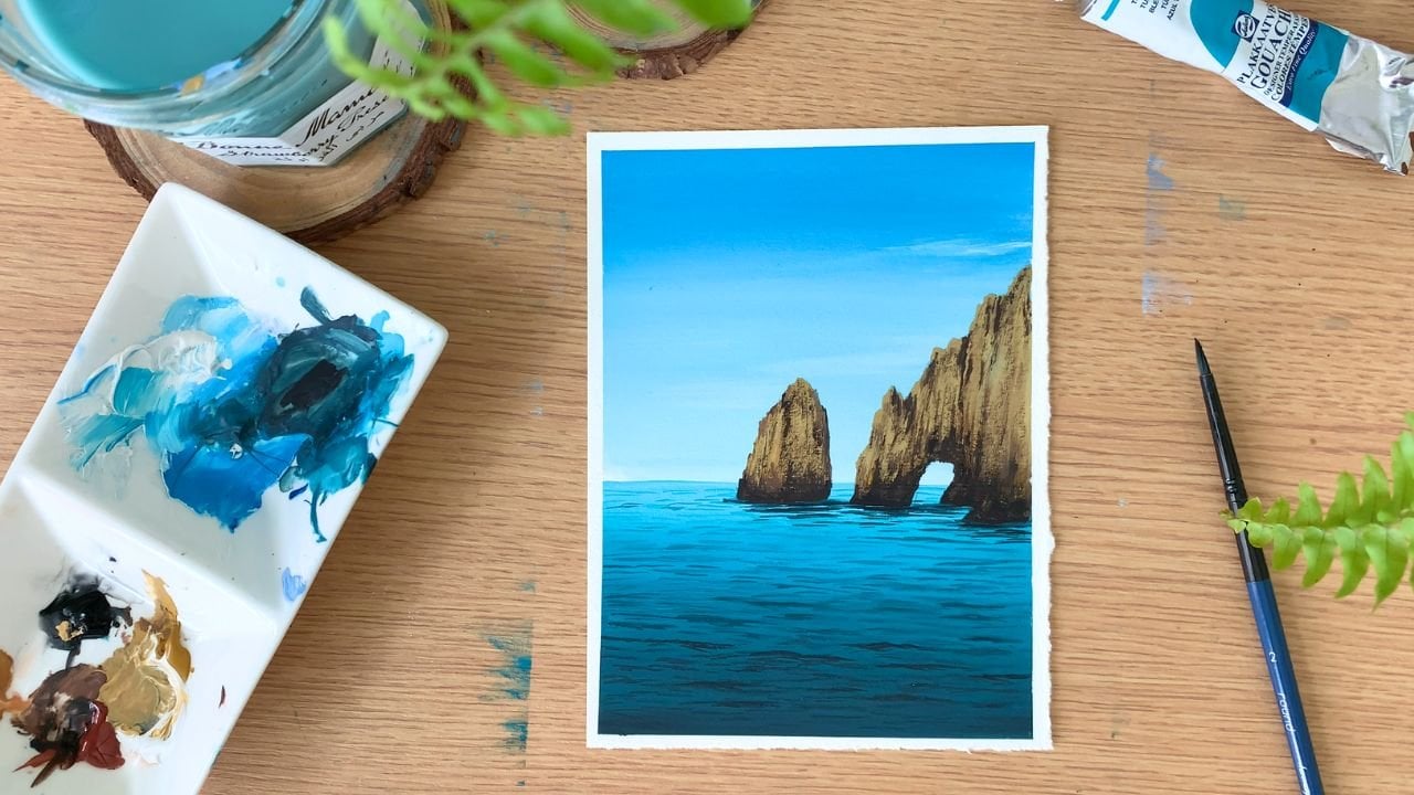
on a different background. I will show you another
painting I did, incorporating the same
techniques. For the backroom. I have used a much
more complex subject. Here's the painting. Once you have learned
the techniques, you can try them on
a different subject. You can make it more complex
and more interesting. That's all about the class. It is just a matter of creating a blurry background and adding those raindrops on top of it. If you're a beginner,
there's nothing to worry. I'll be explaining
how you can paint these raindrops and a
very detailed manner. If you're up for this rainy
adventure time me right now, and let's get started. [MUSIC]
3. Gouache Overview : [MUSIC] Gouache combines
the exciting properties of watercolor and
acrylic paints. Most people refer to gouache
as an opaque watercolor, which is more or less correct, but gouache is beyond that. It has some amazing properties
that are absolutely unique and that no
other medium can match. I'm very sure you can find all the information you need to know about gouache on Google, so I will not make it too long. I will briefly explain
what gouache is. Gouache is an opaque
medium, as you all know, which is made from natural
or synthetic pigments, gum arabic, and water. It's a combination of all these. Gouache sits somewhere between watercolor and acrylic
paints and has some of the amazing properties
of both the mediums. Gouache is a water-based medium, meaning you can add water to your paint and use it
much like watercolor. Gouache is only opaque in
its original consistency. If you add a lot of water, your paint will lose its opacity and it will appear transparent. If you add a lot of
water, your gouache will appear more like watercolor and if you use it in its original consistency in
a thick and creamy washing, your painting will look
more like acrylic or oil. In this way, it is
a very versatile medium and you can use it like acrylic paint or watercolor according
to your requirement. Now, there are
different types of gouache available in the market. There is paint that
comes in a tube, which is the most common kind of gouache and then
there is paint that comes in a jar and
there are jelly cups like the one you
see on the screen. No matter what
form they come in, they all can be reactivated
by adding some water. But when you
reactivate the paint, you won't get that creamy
and thick consistency back. To get the best results, you should always work with
freshly squeezed paint. The opaqueness of gouache comes from the white pigment or chalk that is added along with
the color pigment and binder to make the
paint less transparent. This is where it differs
from watercolor. With watercolor, you have a pure pigment and only a binder. The main advantage of working with gouache is that it dries quite quickly compared to
acrylic or watercolor paints. Another great feature of
gouache is that you can blend the colors just
like acrylic paints and because of the
opaque nature, you can use light colors
over dark colors. For example, if you're
making an illustration or a painting which require some lighter details on
a darker background, you can easily do that
with your gouache paint, which is not very easy when
it comes to watercolor, which also means you can
easily cover up your mistake. You can apply a layer on top of your painting and make it
an entirely new painting. I can tweak some area and add some detail to give
it a more fresh look. [MUSIC] That was a really
quick overview of gouache, but there's a lot
more I want to talk about this amazing medium. I plan to do this as we
paint and learn techniques, so you have more real
practice in front of you. This way, you will be able to understand the
medium much better.
4. Materials you'll need: [MUSIC] Before we
start, let's have a look at the materials
you will need. I will start with
the gouache paint. I'll be using gouache
in this little jar. It's from an Indian
brand called Flash. Now for our class project, the major color I'm
going to use is blue. This is the color I'm
going to use for the sky. If you don't want to use
blue you can use purple or violet or any other
color of your choice. This is the major color I'm
going to use for the sky. Now, if you want to go
for a monochrome painting you can just keep using blue and just use a lighter
gray or a darker gray for your sky. That's a major color. The blue, I'm going to use
this ultramarine blue. Along with that you will also
need some black and white. We'll be using black to
add the taco tones and white to add the highlights as well as to make
the color lighter. Then to add some light and some reflection we'll
be using some red, then some yellow
and some orange. Those are the colors you
will need for the painting. It can be any gouache, whether it comes in a jar
or a jelly cup or a tube, it doesn't really matter. You can go with similar colors from any brand
that you have got. That's all about the paint. Now let's talk about the paper. Gouache is a very
forgiving medium, it actually works
on almost all kind of paper and all
kind of surfaces, which means you
can use any paper that is available with you. I would recommend
going with a thick paper because when you apply multiple layers of paint there are chances the
paper will buckle. Here's the paper that
I'm going to use. It's a Bockingford block. It's actually a paper
made for watercolor. This one is a 140 LV paper
which is cold pressed, which means it is quite thick and it has got
very minimum texture. The paper that you're using for your gouache project doesn't need to be an expensive artist
grade watercolor paper. It just needs to
be a little thick, preferably with less texture so that it can easily
blend the color. This is the size I have
chosen for our painting. It's a square shape which is
approximately 12 centimeter. As you can see here,
I have just torn off all the edges to give it a more rustic and a different look. That's something which
is totally up to you. You don't need to tear
off your edges like this. If you prefer having
clean straight edges you can just cut your
paper using a scissor. That's all about the paper. Also if you want to
try the same painting on a different surface, this one is actually MDF board. As I mentioned, gouache
works on almost all surface. If you want to try
the same painting on a different surface
that's totally up to you. Here's another one. This one
is under the empty of board. Or if you prefer doing the
same painting on a sketchbook, even that is awesome. You can go with any kind of
surface or any kind of paper. That's all about the gouache
colors and the paper. Now coming to the brushes, I will only be using three
brushes for the painting. You will need a
medium-sized flat brush, obviously medium-sized because
the size of the painting, I'm going to go with
this quite small. If you're planning to go for a bigger scale you can make
it a bigger flat brush. These are the three
brushes I'll be using. The flat brush I'm
going to use is actually angle shader brush. It just means it
has angled edge. You can see that but that
doesn't really matter. You can go with any of the
flat brush you've got. That's the first
brush you will need, we'll be using this one
to paint the background. Now, the second brush you
will need is a round brush. This one is a Size
number 4 round brush. You can go with any of
your medium-sized brush. Now, the last brush you will
need is a detailing brush or any brush that's got
a fine pointed tip. This one is detailing
brush again from an Indian brand
called Brustro. A detailing brush are any of your smaller brush
with a fine pointed tip is really important to add
all those key details. Just grab any of your medium
or bigger size flag brush, then a medium-sized round brush and also a detailing brush. Those are the three
brushes you will need for this painting. The next thing you will need is a mixing palette to
mix your colors. I'll be using the small
ceramic mixing palette. You can use any palette
that you've got with you. It can be plastic or ceramic. You will also need a
jar of clean water. Unlike watercolor, you
don't need two jars. You just need to have one jar. If you feel like it's
getting dirty you can just go change the water. Next to fix your paper
onto your board or on to your table you will need a washi tape or a masking
tape or a clear tape. It can be anything
that you normally use. Finally, you will
need a piece of paper towel or a
cotton cloth to dab your brush and also to remove the excess amount of
water from your brush. That summarized all
the materials you'll need for today's
painting session. Now it's time to deep dive
into the lessons. [MUSIC]
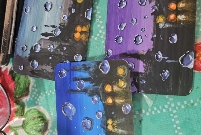
5. Essential Techniques: [MUSIC] Before we start with
a little class project, let's have a look at some quick techniques which are going to be really helpful when
we do our main painting. Here's the painting
that we're going to do. In this section we'll try how we can create that
blurry background, then the lights and reflection and most importantly,
the rain drops. In short in this section, we're going to try
all the elements that is needed for
this painting. Obviously the interesting part of this painting
is the rain drops. We'll try how to paint them
on a lighter background, which is blue and on a darker
background, which is black. The technique is the same, it is just a matter of adjusting
the color a little bit. Let's try it out. I have all the
colors ready here. As I mentioned earlier,
if you want to go for a different color for your
sky, you can do that. Instead of blue, you can use any other color of your choice. First I'm going to
pick some blue. I'm using the same
colors that I'm going to use for
the class project, but feel free to experiment
with different colors. First I will quickly
swatch all the colors, so that it can have a look at your similar colors
from your collection. This one is ultramarine blue. You can go with any other blue, you have caught or you can
go with a different color. That's the color I'll
be using for the sky. Next you will need some black, which is the color we'll
be using at the bottom. We're going to paint
a night scene, so we need some black. That's our second color. Next, we will need some white. Obviously when you
work with gouache, you don't add a lot of water
to make your color lighter. Instead, you add
white gouache into any of the color that you want to turn into a lighter shade. We'll be using white for
some details as well. Next, you will need some
red, orange and yellow. These are the three colors
we'll be using to add the slides. This one is red. Next you will need some orange
as well as some yellow. If you don't have orange,
there is nothing to worry. You can just mix a
little of red into yellow and create a
beautiful orange. Those are the colors you
will need for our painting. Now let's start trying
the techniques. During rains, you will know
the visibility will be less, so everything will appear
a bit blurry and wage. Our very first step is to
create a blurry background, this one is a very simple one. You can see that blurry
effect I have made here. Let's try that out first. Then on top of that, we'll be adding our rain. First I'm picking some blue. I'm just going with
the flat wash. Maybe we can add a
little of white. That's the color I'm using. Now I'm applying
that onto my paper. I will just create
a solid wash and towards the bottom
I will apply black. Then where are these
two colors are meeting, I will create a blurry effect. That's what I'm going
to do right now. We just need a very blurry
and a wage background. It doesn't need to be perfect. You can simply add any color, so I'm just going for
a solid wash of blue. If you want to make
it more interesting, you can go for gradient wash or maybe you can go
with two colors. You can start with the
darker blue and make it lighter or you can go with the combination of blue and purple or
anything that you prefer. I have just added some blue
on the top, which is the sky. It's a beautiful blue. I will add a little more
blue towards the bottom, then I will switch to black. Just in case you feel like
your paint is too dry, right now you can see
the paint is a bit dry. What I'm going to
do is, I'm going to dip my brush in a
little of water. Just a gentle dip. I'm just dipping the
tip of my brush, not the entire brush. That is all you need to make
your paint a little loose. Don't add lots of water. If you add a lot of water, the colors will appear
transparent and you won't have that
opaque matte finish. Don't add a lot of
water if you're looking forward to a opaque and a matte finish.
That is blue. Now I'm going to pick some
black using the same brush. We need an opaque black. Don't add a lot of water. Now I'm applying
that at the bottom. But you can see the
paint is quite dry, so gently dip your brush
in a little water. Only the tip of your brush. That is something you have
to be really careful about. Don't add a lot of water. Now let's fill up the bottom. Right now I'm just
trying to show you how we're going to create
that blurry background. You can either watch or we
can choose to do it alone. On the top, I'm
just going to add some irregular shapes just to give it a feel that there are some landscape or some
trees over there. Just add some irregular shape. It can be any shape. We're going to make
it blurry later, so there is no need to
put a lot of effort here. Now I'm going to finish out the shape and after that we can make it
blurry right away. If the background is a bit wet, the process might be
a little more easier. Once you have added the
paint onto the background, we can turn that into
blurry right away, especially the area where
these two colors are meeting. You can see that over here, we're going to make
this area blurry. For that, I'm picking
my round brush. This one is a clean brush. Simply keep running
your brush in a circular way to turn this
idea into blurry wage one. Just keep doing this. Again don't add a lot of water. If you add a lot of
water, you'll be picking paint from
the background. Which means you'll be
lifting up the paint from the background and it will
distort the background. Just go with a dump brush
which is not too watery. Keep running your brush
in a circular way or however you want to. We just want to
turn this area to a blurry and a wage one. It shouldn't have
a proper shape. You can see the way how
I'm running my brush. It is quite messy, but that's totally okay. The background doesn't
need to be perfect at all. Over here you can see how
I've picked up some paint. I'm just putting that
back onto the background. I'm adding black.
Again I'm running my brush in a circular
way to make it blurry. Now I'm going to repeat
the same thing on the other side and I'm going
to finish up the background. For our class project as well, we'll be using the
same technique. At this point your background might not be looking that great, but that is totally okay. We just need a blurry
and a wage background. That is the base layer
of our rainy painting. This is it. We're going to use the same technique
for our painting. You can see that clearly here. The next step and the major step is to learn
to paint those raindrops. To try that out, I
will quickly paint a blue section as well
as a black section. Then we can try the raindrops on a bigger scale on
those background. We'll be using the
same technique on our main painting
as well. [MUSIC] [MUSIC] I have painted a small blue section as
well as the black section. Now let that dry then we can try the raindrops
on top of them. Meanwhile, we can try adding the lights on this background. You can see those lights
on our main painting. We can try painting
one or two lights as well as reflection. I just want you guys to have the best rain painting that
you have ever painted. That is why I'm trying all
these little elements. It's a simple step, we just
need to add a small circle, it can be either red
or orange or yellow. Then we need to make
that outer shape blurry. So I'm starting off
with the yellow. I will first add that
vehicle light to the center, which
is the major one. Once your background has
dried completely pick some yellow and add two
small yellow circles. Go with a similar size because the painting that we
are doing is quite small, so just add a small
yellow circle like this. Now in a similar way,
I'm going to add a red one and an
orange one as well. Once we are done
adding all the circles we can make it blurry. I'm picking some red
and I'm going to add a red tiny circle
onto the right side. In this section, I'm
trying my best to explain every little detail
that will help you in our main painting then
we will put them all together and we will try our
gorgeous rainy painting. That is the red
circle. Similarly, let's pick some orange
and add another one. You can add that
wherever you want to, I'm just adding that right
next to the red one. I have added all the circles which is actually the lights. Now we can make it blurry, [NOISE] so I'm
cleaning my brush. Now to make the outer
shape blurry you can either go with a damp brush, which is not too watery, or we can pick a
little of paint with that damp brush, we
don't need a lot. We can see the way how
I'm picking that paint. Now using that damp brush, I'm running my brush
in a circular manner around that circle. See that? This way you can
make the outer shape blurry. It's a very simple technique. Now we can use the same
technique on other circles. That is how I'm
putting the paint. My brush is just damp and there is a little of yellow
on my palette. Now with that damp yellow brush, I'm making the
outer shape blurry. Now we have a red
and orange circle. Using my damp brush
I'm going to pick some orange, so that is orange. I'm adding a tiny bit of water. Now using that damp brush I'm making the outer shape
blurry for the orange light. Now we have one more
left, for that, I'm picking some red
and in a similar way, I will make that
one also blurry. Picking some red paint
with the damp brush. Now running my brush
in circular way around that light to make it blurry. No matter which color
you're using for the light, whether it's yellow or
orange or red or white, this is the same technique
that we are going to use. In case if you feel
like those lights are not looking prominent, you can pick a little more paint and add that too at the center. Right now I'm picking some yellow and I'm
adding that too at the center to make it more prominent, only at the center. I'm leaving that outer
blurry effect as it is. Similarly picking some orange, adding that at the center. We can do the same
for the red as well. This way the light will be more prominent and it will
have a glowing effect. Just in case if you feel like your light are not
looking too prominent, you can repeat the same step. You can do this for all
the lights you have added. Now the next step is to
create this reflection, which is also a very easy task, but then there are
multiple layers to it. First, we will start
with yellow then we'll add some orange
and then some white. It might sound a bit tricky, but it is not. I'm picking from yellow. We want some clean yellow. Using my size Number 4 damp
brush I'm taking some yellow. Using that brush, I'm
just going to add a small arc shape right
underneath the line. So right over here, I'm adding an arc then I'm
going to push my brush down. See that? Simply create
a shape like this. This is the first
step. Right now it might look a bit weird,
but that's okay. It is part of the process. Now in a similar way, I'm adding a shape on
the other one as well. I'm starting with an arc shape then I'm just filling that out. Yellow paint is not
100 percent opaque, if you want to add one
more layer on top of this, feel free to do that. You can see that color, it
has a transparent film. What I'm going to do
is I'm going to pick some more paint and
I'm going to add one more layer to make it
opaque. It is looking better. That is the first step, we
have added a yellow shape. Now, I'm going to
clean my brush. [NOISE] I'm just dabbing that on a paper towel so that
it is not too watery. I just need a damp brush. Now, we need to create the
outer border a bit blurry. So using that wet brush I'm just making the outer border as well as the bottom part a bit blurry. Just put that down
using your damp brush. See that? We have really
bright yellow on the top, towards the bottom, and
towards either side, I'm just making it blurry
using a damp brush. It doesn't need to be perfect, just keep running
your brush around the outer border as well as at the bottom to give
it a big effect. Next, I'm going to pick
a little up orange with the same brush and I'm going to add that towards the top
along that arc shape. Just add that and you can smudge it into the background.
That is the second step. Now there is one more step left for which we need
some white paint. I'm picking some white. Just ignore the
mess inside my jar. Anyway, I have taken
some white paint, it's an opaque white. I have taken that on
the tip of my brush, we don't need a lot of
paint, just a little. Now, using that paint I'm going to add a line
at the center. Just drag your brush
down and add a line. You don't need to push
it till the bottom, just stop it when you reach
somewhere at the center, then you can make that
either side blurry. That is how it has
turned out. See that? We started off with yellow, we added a very rough shape, then we made the outer shape
blurry using a damp brush. Then we added some orange
on the top and finally, we added a white
line at the center. Now I'm picking
some more white and I'm adding a tiny
circle at the center of these lights to give it a more glowy feel just
like the reflection. So that's our lights
and reflection. I'm pretty happy with it. I think this turned out
better than my main painting. It is not that difficult
when you try it, I'm very sure you will
get that in one go. In case if it didn't
turn out well, there is nothing to worry, you can just apply
another layer of yellow and try the
same steps again. This is one main reason
why I love gouache, you can keep fixing and
modifying your painting. Anyway, that was the
background and the lights. Now we can try painting
the raindrops. First, we can try them
on the blue background, it is really fun and exciting. I'm picking some water and I'm creating a light blue here, which is not too opaque. I already have some
blue there so I'm adding some white
and a bit of water. I'm turning that into a
slightly loose consistency. You can see this is not watery, it does not floating, so it just needs to
be a little wet. Now, using that paint, I'm going to add some
random shapes like this. That is the first one. On one side we can
add a thickness, on the other side, it
can be just an outline. Similar way keep adding
different kinds of shapes, which will be the kind of
shapes that you are adding. Add a thickness onto one side. That the class can be
either on the top or on the bottom or on
the left or the right. Just add a random shape first, then add thickness
onto one of the sides. Also, go with different
kinds of shapes, don't make all of
them look the same. Some of them can be
a little longer, some of them can
be a bit roundish. So just call different shapes to make it look more
natural and interesting. Look here I have different
kinds of shapes, some of them are bigger
some of them are smaller. Next, I'm going to pick some black and I'm adding that with blue to
create a darker blue. Again, I'm using a paint
that is not too opaque, it's a little wet. See that color? It's just a
mix of little blue and black. Using this color,
I'm going to add a darker tone on the other side. Just the same way
how we did earlier, add a thickness on
the opposite side. It doesn't need to be perfect, just simply keep adding
that darker tone. See that? You can see how
messy we are looking, but that's totally okay. This is just part
of the process. Keep going without doubting the process. That
is second step. Now, I'm going to clean [NOISE] my brush and I'm going
with the damp brush. I'll quickly dab my brush on a paper towel just to be
sure it does not too watery. The brush just needs to be damp. Now using a damp brush, I'm just going to
smudge the colors. Right now you can see the
colors are quite strong, on the top we have a darker tone and at the
bottom we have a lighter tone. They are looking like
two different sections. We just need to
smudge the colors. We can either pick some paint or just go with the damp brush. However, we are just
smudging the colors to give it a more smoother
and softer look. Again, it doesn't
need to be perfect. You can see the way
how I'm smudging it. I'm not putting a
lot of effort here. Just keep pushing and
pulling that paint into each other and smudge it. Now, we have few more
left at the bottom. If you want to pick more
paint, you could do that, there is no problem
because when you do this, there are chances
you might end up having one single color
for that raindrop. You might feel like
there isn't enough of lighter tones
or darker tones. For example, this one here, I kept matching the pain and I don't have any
lighter tones left there. I'm going to pick some
lighter tone and I'm going to add that towards the
bottom. See that? In a similar way, if you feel like there's any color missing, you can add that back
onto the raindrops. Now, the next step is
to add the details. Right now it is just
the base layer. For that, we need a detailing brush or
a smaller size brush. I'm just keeping this
one aside and I'm picking my detailing
brush. See that? It has a very nice pointed tip. For this step, you will need either your detailing brush or any brush that has
got a pointed tip. First I'm picking some black, a really opaque
portion of black, not a lighter one. Now our task is to apply
this darker tone onto the area where we have
applied those medium tones. Over here we have applied
that medium tone earlier. Onto that side, I'm applying
some black as well. I'm just enveloping that shape
and adding a bit of black. Similarly, we can do the same for all the shapes
we have added here. It's, again, a simple step. We're just making
that shape more prominent by adding
a darker tone. Use a smaller size
brush or a brush with a pointed tip and keep adding that darker tone along
the darker side. It doesn't need to have
any proper thickness or it doesn't need to
be perfectly shaped, you can add them
however you want to. We have added the base layer
as well as the deeper tone. Now in case if you feel like
they're super prominent, you can just match it, just the same way
we did earlier. This isn't really
important only if you feel like it is too
prominent, you can do that. Otherwise, just
leave it as it is. That's how it has turned out. Now, our very last tip is to add the highlights using white. Clean your brush and
pick some opaque white. We need a thick and
creamy opaque white, so don't add a lot of water, just a drop or two, not more than that. Now what I'm going to do,
using this white paint, I'm going to add
some highlights, just watch it carefully. We have the darker
tone on the top side. Over there, I'm just adding a thick white line and a dot. See that? Similarly, we can add another one
on the other side. We have added a
line and a dot on the darker side and on
the lighter side as well. Now let's try the same on another raindrop.
We have one here. See that? You can see how
gorgeous it has turned out. I think this one can be
a bit more prominent. You have to go with a really opaque and creamy white paint. Don't add a lot of water, it has to be really prominent. Now for the smaller ones, you can just add a
tiny dot and a line, you don't need to
add lot of detail. We have few more left. Depending on the size, you
can keep adding more details. All I'm adding is just
a line and a dot. We have two bigger ones
and a smaller one. Over here, I'm adding a
line and a dot. See that? I never really knew it
is this easy to paint a realistic raindrop
until I tried. I'm adding another
line and a dot, and that's it. See that? Now, we have a tiny one here. Those are our raindrops
on a blue background. We're going to try the same
thing on our main painting. You can see how pretty
it has turned out. I cannot believe my eye, they're looking super gorgeous. Here's our painting. We're just going to put them
on that background. Now in a similar way,
we're going to try them on the black background. The technique is
going to be the same. It is just that we'll be
tweaking the color a bit because we have a
lighter background on the top and a darker
background on the bottom. To make our raindrops
a bit more realistic, we need to adjust the colors. That's only difference,
the technique is [NOISE] exactly the same. I'm switching back to my
size number 4 round brush. Earlier, we started out
with a lighter blue. For this one, the blue has
to be a bit more darker. I already had that darker
blue I created earlier. Into that, I added a bit of white and that's the
color I'm using. Now just the same way how we added those raindrops earlier, we need to add this shape. Using this darker tone of blue, I'm adding some random shapes. They can be of any shape. Some of them can be bigger and some of them can be smaller, so just add them in. You can see how quickly
I'm adding them. There is nothing to worry here, simply add some random sheets. That's the first step.
Now, on one of the side, we can add a thickness just
the same way we did earlier. Using the same color, I'm adding some more paint
onto one of the side. The base step doesn't require a lot of effort and attention. You can simply drop
in that paint. Now I'm picking a
darker tone of blue. Some things lead to
the same color we used earlier and I'm adding
that on the other side. The color I'm using right now is a mixture of blue and black, the same color we used earlier
for the blue raindrops. Now just add that
on the other side. For this last one, we
will be using black, so just add that too. I have one more left at
the bottom, and that's it. Now clean your brush. Using that brush, match the paint to give
it a more smoother look. This is what I said earlier, the step is exactly the same. It is just that the
background color and the color we used is
slightly different. The technique is the same. Now it's time to switch
to a smaller brush. This one is my detailing brush. Now I'm picking some black, adding that onto
the darker side. See that? This is what I said, the techniques are
exactly the same. Keep adding black
on the darker side. Then if it's too
prominent, just match it. When you're doing your
main class project, add your raindrops in
different shapes and sizes. Some of them can be really big and some of
them can be small. Right now we only
have a few here. When we do our class project, we'll have to add quite a lot to make it more interesting, otherwise it will look empty. There's some paint missing here, I'm just filling that up. That's done. Now it's time
[NOISE] to switch to white. Clean your brush and pick up
some opaque white. See that? Now, just the same
way we did earlier, we need to add a line and a dot. First we can add
that on this one , now on the other side. It is this highlight that
makes all the difference. You can see otherwise it
is looking quite flat. It doesn't look like
a raindrop at all, but when you add that
little white line, those shapes are feeling more three-dimensional and it
is looking more realistic. This is the most important step. The major thing is to go with the paint that is
100 percent opaque, don't add a lot of water. If the paint is transparent, you won't get this effect. That white has to be really prominent and just
add a line and a dot. I have few more raindrops left. Add to them as well, I'm
adding similar lines. The summary, fun
and exciting step, you can see how easily we created those
gorgeous raindrops. We can try the same
technique on any background. You can add some
buildings, or a car, or a street light, or any background,
just make it blurry. Don't go for prominent lines, just blur it out. Smudge the paint and
make it a blurry background and then add the
raindrops on top of it. There you have your
beautiful rainy painting. It's a combination of these effects that we're going to try in
our main painting. Actually, we tried
all the elements. You can actually
paint it right away. The only thing I want
to say is go for a smaller size because if you go for a bigger scale painting, it will take a lot of time
to add all those raindrops. Because it is for
the rain painting, it is better to go for a
smaller scale so that you can detail all of them very well and you'll be really
happy with your result. Otherwise you will end up hating the process because
of the time and you might get frustrated in between and you might not
finish the painting. Just go for a smaller
size so you can take all the time in the world
for your next painting. You can go for a much more complex and detailed subject for your background and you can take your sweet time to paint
and add all those details. Now it's time to try [MUSIC]
this gorgeous rainy night. Grab your colors, keep your paper ready and join
me in the next section.
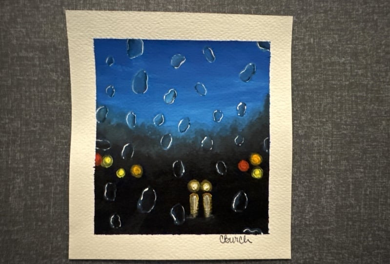
6. Class Project : Rainy Night - Part 1: [MUSIC] I hope you
guys have your colors, your brushes, and
your paper ready. I have everything ready here, so I'm going to start by
fixing my paper onto my table. I'm using a clear tape and I'm going to fix
four sides of my paper. This one is a very
normal clear tip I picked from a
stationary store. I'm not really sure
about the brand. You can use any masking
tape or washi tape or clear tape that you normally use for your
watercolor paintings. Just fix the four
sides of your paper firmly onto a drawing
board or onto your table. [MUSIC] My paper is all ready. Now I'm going to
prepare the colors. The first step is to
paint the background for which I'm going to
use blue and black. The blue I'm using here
is ultramarine blue. I had some blue
paint on my brush, so just ignore that
blue paint that came out of my white jar. Anyway, I'm just
mixing some blue with white and I'm starting off with that blue on the top of my sky. We just need a flat wash here, a solid wash. You can use any of your flat brush and simply
apply that onto your sky. Don't add a lot of water. Just in case if you feel like
your paint is really dry, you can add a drop of water. Don't make it too
loose and transparent. That's the color I'm using. I has said in the
technique section, you can go with any other
color that you prefer. Maybe you can use
purple or violet or even a combination
of gray and black. That's my sky. You can see it's a very
simple solid wash. I have just added a bit of white with ultramarine blue so
that it is really opaque. Now, just onto the top, I'm going to add a
much more darker tone of blue so that we have a little of lighter tone towards the bottom and a darker
tone on the top. Right now it was more
like a flat wash, but I felt like it is nice
to make that tone darker on the top. That's the sky. Now, I'm going to wash
all the paint from my brush and I'm
switching to black. I'm picking black
with the same brush. This one is my
angle shader brush. Now I'm simply applying
that onto the background. I'm just trying to create a landscape in the
background here. You can either go with
the similar format or you want to add your
landscape in a different way, that's also totally up to you. I'm just adding that. I just added a very
irregular shape. On the top of your landscape, just add a simple
irregular shape like this. Now fill up the bottom. Simply fill the
entire area in black. We just fill that up. Now after we are done with this, we need to blur
out the top part. We don't want a perfect shape, we want the top
part to be really blurry so as to bring
in that mood of a rain. For that, I'm going
to clean my brush and I'm going to smudge this
area using a wet brush. The step that we're
going to do right now is a very simple step, which you don't need to
put a lot of effort, you can just do that in
a very careless way. But this step is
really important to create that rainy
mood in your painting, which will be the brush
that you're using, clean it properly and use a damp brush and
smudge the top part. The major idea here
is we don't need a prominent outline
for that landscape. If you're going with buildings or any other subject
for your background, we don't need a clear
prominent outline, we need a very weak background. I think it is better to
switch to my hand brush. I'm just making it a bit damp
by dipping in some water. Now using this brush, I'm just smudging
that outer area. If needed, you can
pick a little of paint and smudge it if you
feel that is more better. Otherwise you can
simply use a wet brush. By wet I mean it just should be damp, it
shouldn't be too watery. If your brush is too watery, it will distort the
background layer. Gently dip your brush in a little water and
using that damp brush, just smudge that outer area. If there's a lot of water, be sure to damp your
bush on a paper towel. As I said, if you feel it is good to go the
little off paint, you can deep your brush
in a little off paint. I'm picking a little of blue
and I'm smudging that area. You can go with any method, we just need a
blurry background. That's the only
thing that matters. Keep running your brush in
a circular way until you feel like you have got a
blurry and a weak effect here. The outer shape
of your landscape should be weak and blurry. Keep smudging the
paint until you feel like you have got
a blurry effect there. A damp brush is really helpful when you're
smudging the paint. All you have to do it right
away after you have applied paint onto your background without waiting
for a lot of time. Your paint is still
a little damp and the step will
be really easy. If it does dry it out,
there's nothing to worry, just go back with a damp brush and keep running your brush in a swirly circular way and
keep smudging the paint. See that? I really like
the way it has turned out. The only thing I'm not really
happy with is this area. I think there's some
paint missing here. I'm picking a little of black and I'm putting that
back on the paper. I'm just adding some
black over here. I'll be adding those
lights somewhere here so I want the background
to be a bit dark. I have a little more smudging
task left and with that, I'll be done with
the background. Maybe we can drop in some black on this corner [inaudible]. The center, we have
a little lower area and on either side
it's a bit higher. It's just to bring
in some interest in our painting and doing this. Otherwise, you can just go with a flat line or anything
that you prefer. As I said, all we need
is a blurry background. It can be some buildings
or any other subject. That's our background.
Now we can leave this for drying.
Let it dry completely. Gouache dries out very quickly, so you just need to wait
for a minute or even less. I haven't washed my other brush, so I'll just make
use of the time and I will wash this also properly. I'm very bad in keeping my
brushes and my paint clean, so that is something you
should not learn from me. When you're working with
gouache or acrylic, you have to clean your brushes
right away, otherwise, the paint that is left on the brushes can
damage the bristles. Be sure to clean your brushes
right away after use. Anyway, this has
dried completely. Now we can go with
our next step. Our next step is to add those blurry lights
in the background. I'll be adding a couple of them. You can either go with the same arrangement or you can treat them in your own way. To add the lights, I'll
be using some yellow. This one is golden yellow. You can use any
yellow you have got. Then I will need some orange
and also some red color. If you don't have orange,
there is nothing to worry, you can just mix your yellow with red and create
an orange color. Along with these,
I'll also be using some white to add the lights. I'm picking some color onto
my palette that is yellow, now some orange and
a little of red. The colors are ready. Now we can start to add those lights. You can either go the
same way how I'm adding the lights or you can add
them how you want to. I'm starting over the yellow. First, I will add two
headlights of a car. I'm not going to show the car as we have a very
dark background. You can assume it is
from a car or from a building or some
other light source. I'm just adding two circles
using yellow color. Just add that in
wherever you want to. You can follow a similar size. Don't make it too big.
That's the first step. Now, I'll randomly add two
or three more yellow lights. I already have some
paint on my brush, so I'm planning to add
the next one here. Now maybe one more
towards the bottom. As I said, you can go with
any other arrangement. You can add your lights
wherever you want to. You don't need to
follow the same layout. Now I'm picking some orange. Again, I'm adding few more
lights in a very random way. I decided to add that
on the right side. That's my orange light. Maybe I can add one more. After orange, I have a larger
light using red as well. My only suggestion is not
to add too many lights. The painting that we're
doing is pretty small. We just add few here and there. I just decided to
add my next light over here. That's orange. Now I'm going to pick some red and have allowed two more
lights using red as well. First-time adding that over here next to the orange light. Maybe another one also
next to the orange here. I have added two lights
using red as well. That was red. Now.
I'm planning to add few lights using white as well. I'm going to clean
my brush properly, then I will pick
some white color. I already have a little
paint on my palette. [NOISE] Let's pick
some white color and add one light
next to the yellow. Just type that
small white circle. For now, you don't
need to worry a lot. Just add that in. We can fix it later. That's the first white light. Now I'm adding another one. Maybe we can add that
next to orange over here. Picking some white, making that circle prominent. That's how it has turned out. We have added enough of lights. Next, we need to make
the outer shape blurry despite running a vibrational
circular movement. That's our next task. This is not a complicated step. You need to clean your brush, any of your own brush. I'm using the same brush and I'm dipping my brush
in a little water. We just need a damp brush
for this technique. Just the same way how we
tried that blurry background? I have cleaned my brush. It is just damp. Now I'm going to run that damp brush around
the white circle first. Just gently run it around that circle and give
it a blurry outline. Now we need to do the same thing for all the other circles. It became really dull. I'm picking some more paint
and I'm adding that back in. Now that looks fine. Now in a similar
way, we can make all the other circles blurry. We have one more white here. I will go with that next. After that, we can switch
to the other colors. My brush is just damp and I ran my damp brush around that white circle to
give it a blurry effect. I'm just dropping
in some more paint here to make it more prominent. That looks perfect.
Now in a similar way, next, I'm going with the yellow. My brush is already damp, and I'm picking a little
of yellow as well. Just a teeny tiny bit. I drop some paint here. Again that is fixed. Now I'm running that
damp brush around that yellow circle to
give it a blurry outline. We try this in the
technique section. It is exactly the same
way I'm doing it. You can either go the damp brush or I can just pick colors of paint on your brush to make
that process more easier. That is the yellow light. I have two more yellow. Once I'm done with this,
I will go with him. Then I have two orange lights
as well as to red lights. [MUSIC] This is how it has turned out. But in case if you like, the colors have become dull, you can pick some more paint
and add that at the center. Right now I'm picking
some yellow and I'm adding that to at the
center of all these lights. This will make the
lights a little more glowy and prominent. Same goes for the
other ones as well. I'm picking some orange and I'm adding that
to at the center. The blurry outline has
to remain the theme. Just add the paint
to at the center. Now some red paint. The white lights
are looking okay, so I'm not going to touch it. Anyway, this is how
it has turned out. Our next step is to add the
reflection of the light, especially for these
two at the center. To add [NOISE] the reflection,
I'm starting with yellow. I have cleaned my brush
properly and I'm picking some yellow. It shouldn't
be too bright. If you feel like your paint
is bright just dab it on a paper towel and add a curvy
shape on the top like this. Simply add that curvy shape
on the top using yellow. Do you see that?
That's the first step. Now you just need to
push your brush towards the bottom and add
some paint like this. Just drag it down. There
is nothing to worry. Just push the paint down and
add some paint like this. We try the same thing in
the technique section. I hope you guys were
able to follow. [NOISE] That's the first step. Now I'm dipping my brush in some clean water and
using a damp brush, I'm just merging
that bottom part. I only want that strong and
prominent yellow on the top. Towards the bottom, I
want a blurry feel. Now I'm going to do the same thing for the
other one as well. Starting with that
curvy shape on the top and dragging
the paint down. Now with a damp brush, I'm just matching the paint at the bottom to get a blurry feel. Then I'm adding some
lines at the bottom, which is to even it out. That's the first step. Next, we are going to pick a little
of orange, very little. Just pick a little
using the tip of your brush and add
that on the top. Don't add a lot, just a little on the top of
that curvy shape. Do the same for the
other one as well. See that? It doesn't need
to be too prominent. We're just trying to create
a glowy effect here. Just add a little
along that curvy part. Now we can add in
some more yellow. Yellow paint is not
100 percent okay. To get that bright color, we might need to
apply a second layer. That's why I applied yellow again to make it more prominent. Now if you want to
smudge the paint again, you can do that right now. Just use a damp brush. It shouldn't be too watery. Just slightly damp. Now using that damp brush, just match the color
at the bottom. On the top, we want
that prominent color. Towards the bottom we
can just match it out. Now to make it more glowy, there is one last
thing we have to do. For that, I'm picking
a little of white. This has to be really opaque. Now using that, first
you can add a tiny dot at the center of these
two yellow circles. This will make it more glowy. Just pick some white using
any of your medium or smaller size brush and add a white circle towards the
center of the yellow light. Do that for both the lights. Now we need to do
a similar thing for the reflection as well. Pick some paint, don't
add a lot of water. Go with a slightly dry paint. Now, just add a line. Drag your brush from top to bottom and add a
line at the center. Do it for both reflections. Now we just match it. [NOISE] Clean your brush
and go with the damp brush. Now, just match it out. We're just trying to create
that glow more prominent. We started with
the yellow then we added a little of
orange on the top. Then we added some white
towards the center. That is how it has turned out. I'm really happy
with the result. I hope you guys are happy too. [NOISE] [MUSIC] This
is our base layer. Now we need to add all those
raindrops on top of this. As I mentioned in the beginning, we don't need a
perfect background. We need a blurry and
weak background. That's the background. Now we can start adding the raindrops. [MUSIC]
7. Class Project : Rainy Night - Part 2: We have created a
beautiful background. Now the only task and major task left is to
add the raindrops. It's the same technique that we tried in the technique section. I'm starting off with
the lighter blue. You can see the color I'm using. It's not an opaque paint,
it's slightly watery. Now using that color, I'm going to add the basic
shape of the raindrops. I will take out a bit of blue
and a bit of black so that we can add those darker
tones so that is blue. I will take out a bit
of black as well. This way we have all
the colors ready on our palette before we start. [NOISE] Now I'm switching
back to that lighter blue. Maybe we can keep all
these colors aside. We don't need them right now. We only needed some white, blue, and black. That is ready. Now using my size
and the four brush, I'm picking some lighter blue. See that? That's the
color I'm going to use for the raindrops. Now let's keep adding those
basic shape of the raindrops. We already tried the same
in the technique section. You can add them
however want to. It doesn't need to be in
a specific shape or size. Some other raindrops
can be a little longer and some of them can
have a rounded shape. Some of them can
be a bit smaller, and some of them can be
a bit bigger as well. Adding all kinds of different
shapes and varieties, this will make our painting
look more interesting and natural. See that? Once you have added
the basic shape, you can add some more
paint onto one of the side and make
it a bit thicker. No matter what is the
shape that you're adding, add some extra paint on one of the side like I'm
doing right now, and make it thicker
compared to the other side. On the other side, we'll be introducing
some darker tone. Now I'm adding a smaller one. You can see how easily
I'm adding them. There is nothing much
complicated here. You can add them
however you want to and also you can add them
anywhere you feel like, you don't really need to follow the same location
that I'm adding here. Just go ahead and add in as many raindrops that
you want to add. If you have tried the
technique section, you guys already know
what is the next step. Onto the other side, we're
going to add the darker tone. If you haven't watched
the technique section, maybe I will quickly show
you what is the next step. For that, we need a darker blue. I'm picking some
black, adding that with blue to create
a darker blue. Again, this paint also doesn't
need to be 100% opaque. Now, I'm adding that paint onto the other
side of this rain. On one side we have
a lighter tone. Now similarly, I'm adding some darker tone
on the other side. Just add that in. See that? Quickly fill up the other side of the raindrop
in a darker tone. I wanted you guys to be really confident when you are
attempting those raindrops. Because that is a major
element of our painting. That's why I showed
you this earlier in the technique section in
a much more larger scale. Anyway, that's the second step. Now, just dip your brush in
a little water and make it damp and match the paint where these two
colors are meeting. See that? By just
making it a bit softer. We don't want that
rough patches. Using a damp brush, gently smudge the
paint. See that? Now, I have only added
a few raindrops, but we need to do
the same exercise for all the raindrops
that we're adding. Generally, dip your
brush in a little water, then dab it on a paper towel just to be sure it
is not too watery. Using a damp brush, gently smudge the
paint to give it a more softer look.
That part is done. Next, we need to add more
details on to this to give it a more finished
and a realistic feel. But I think before that we can
add the rest of the drops. Maybe for this one, I will add
a little more lighter tone towards the bottom.
That is done. Now, I'm going to add the remaining raindrops
on the lighter side, which is the blue background. Once we are done adding
the raindrops on the sky, which is the blue part. We can add them on
the black side. Right now, I'm going to quickly
add some random shapes. For now, I'm just
adding an outline. I just want to get an idea of how I want to add the raindrops. For now, I will just
add an outline. Then later, once
I'm done with this, I will go back and add some more paint onto
one of the side. As I said earlier, go with a
variety of shapes and sizes. Don't make all of
them look the same. You can see the ones I'm adding right now, they are quite small. It is the varying
shapes and sizes that makes your painting look more
realistic and beautiful. That's how it has turned out. I think I will add some
more on the left side. Then I think we can start
adding the deeper tones, the ones I added right
now, they're quite small. I'm not going to put
a lot of effort. The other ones I added earlier, they're quite big, so for that, I took a bit of effort. The ones that I added right now, they are very small
compared to the first ones. We can try to go with
the darker tone. I'm picking some black, adding a little of blue
to create a darker blue. I'm going to add that
on the other side. Then gradually we have
to blend the colors. I mean, to match the colors. It doesn't need
to be a proper or a clean blend. See that? I think I'll just add
some darker tone. Only for the bigger
ones I'll smudge it. For the smaller ones, I'll
just leave it as it is. To smudge the color,
go with a damp brush and gently run your brush where these two
colors are meeting. We just want to
get a softer look. It doesn't need to
be a clean blend. Now let's keep adding
those deeper tone for the smaller ones. Now for this one, this
one is a bit big, so maybe we can add a
little lighter tone at the bottom and smudge it. That's a big slayer
of our raindrop. We have to do the same for all the other ones
we have added here. We have only added outline. Once we are done with this, we can come back and
add the highlights, which is what makes our
raindrops look more realistic. I'm going to quickly
repeat the same step for all the raindrops
I have added here. You guys also go ahead
and do the same step. [MUSIC] Alright, so this is how it
has turned out. I'm very happy with it. I
haven't had a lot of raindrops. It looks quite nicely composed. Now I'm planning to add
the remaining raindrops on the black background before
I add the highlights. First, I will add
a quick outline using a darker tone of blue. I already have some blue here. I'm mixing a little of black. Now using this color, I will just indicate the rough shape. Then we can add the deeper
tones and the lighter tones. You can add in as many as you want or as little as you want. You can add them
wherever you want to, feel free to compose your
painting in your own way. That's the color I'm using. Now using this color, I'm
going to add the rough shape. I think we can add
that thickness on one side along with this, so while you're adding the outline, add a
thickness as well. This way we don't
need to come back. Anyway, I'm not planning to add a lot of raindrops over here. I wanted more of
them on the sky. Over here I will just
add few here and there. Also just like I said earlier, go with different
shapes and sizes. Some of them can be a
bit rounded shapes, some of them can be
a little longer. Then we can have few smaller
ones and some bigger ones. Adding in a very random way, I don't want to make it too
busy so I'm not adding a lot. I will just add few smaller ones and with that, I'll be done. Adding these raindrops is a
very fun and exciting task, but it is also time-consuming. That's the reason why I
told you at the beginning, it is better to go
with the smaller size, especially considering this
is your first rain painting. Once you get the hang
of the technique, you can compose your
painting on a bigger scale. You can work on a
complex background and add more details to
make it more interesting. Right now I have just added
a few tiny raindrops. I'm just adding a
tiny dot, see that? Maybe we can add few
more and after that, we can start adding
the deeper tones. That looks fine for me. But if you want to
add more raindrops, it is totally your choice. You can go ahead and add some bigger ones
or smaller ones. Now to add the deeper tones, I'm going to pick
a little of black and onto the other
side of the raindrop, I'm adding some black
color. See that? Your background and
the color that you're adding will be more
or less the same. But just don't worry
about that, add that in. It might not be
completely visible, but just don't worry about it. Keep adding dive deeper tones. When we add the highlights,
it will all make sense. Once you have added
the deeper tone, just like we did earlier, we can blend the paint, only for the bigger ones. For the smaller ones, just add that black paint and
just leave it as it is. There is no need to
put a lot of effort. We have few more bigger ones on the top. There is
another one here. The rest are all smaller. There is one more here. I
have added the deeper tones. This is how it is
looking right now. You can see how dull and flat the raindrops are
looking right now. But that is part of the process. But now comes the fun part
where we are going to use black color to define the
shape of the raindrops. After that, there is
one more task left, which is adding the
highlight using white. Those are the two things left, which is going to make a huge
impact on these raindrops. To do that, I'm switching to my detailing brush and I'm
picking a little black. For this step, you
will need a brush that has got a pointed tip. Go with any of
your smaller brush or any brush that has
got a pointed tip. Now using that
opaque black paint, add a darker tone
on the darker side. On the raindrop, we have a lighter side
and a darker side. The black needs to be
applied on the darker side. Just envelope that shape. Do the same for the
other raindrops as well. Now I'm going to pick my
other brush, it is just damp. Now using that brush, I'm
just matching the paint. This needs to be done only
for the bigger drops. These ones are quite
prominent, they are quite big. For the smaller ones you
don't need to smudge it, you can simply apply
the paint and leave it just as it is. I have another one here for that also, I'm
doing the same step. First, I'm adding some black. There is one more
bigger drop here. For all the bigger ones, first I'm adding
that black color on the top side or the
bottom side there, where you have applied
your darker tones. Then using another brush, I'm just matching the paint. I have few more bigger ones, so I will apply
black onto all of them then I can
smudge it together. It's just a matter of adding that taco tone to define
the shape of the raindrop. It's again a simple step. Go one by one. Don't
miss any raindrop. This one is going to make
an impact on your painting. It will really stand out when
you add that deeper tone. If you don't add
the deeper tones, the raindrops will look
quite flat and lifeless. To make it look
realistic and prominent, you need to add these taco tone. Now switch back to another
brush and smudge the paint. That's that. I have finished adding darker tone
onto the bigger raindrops. Now I have quite a lot
of smaller ones left. For those ones as well,
I'm adding a deeper tone. I'm just adding that
taco tone onto the area that I have applied that
taco tone to our view. I'm just adding a line, a slightly thick line. But for these ones
I'm not smudging it. I'm just adding that
paint and that's it. No more extra effort because
these ones are quite tiny. The other ones we did earlier
were quite prominent. They were bigger in size. Pick all the smaller ones and just add a black line along
the shape of the raindrop. There you have the deeper tones. Only for the bigger ones, you can put some extra
effort and smudge the paint. I have few more
left at the bottom. For those ones as well, I'm adding a deeper tone. You can see as we have a
darker tone in the background, it might not be really visible, but still just add them in. Just take a quick look. Maybe you might have
missed one or two. I think I have covered all
of it. That part is done. We have added the
deeper tones and all the raindrops are looking
more prominent right now. They have a much
more definite shape. Now the last step is to
add the white highlights. [NOISE] Clean your brush thoroughly and pick some
clean white on your brush. It has to be opaque. Don't add any water. This has to be really prominent, so we need an opaque paint. Also go with any of your
smaller size brush. The paint is ready. Now you see this
opaque white paint, I'm going to add the highlights. That is going to make
all the difference in this painting. Just watch out. If you have watched
the technique section, you might already know the
impact they're going to make. Anyway, let's give it a try. I'm starting with
this one and I'm adding a line along
the darker side. It is just a line
along the sheet. Now a dot, maybe on the smaller line along
the shape at the bottom. You can already see a difference here compared to the
other raindrops. This one is looking
more prominent. Now let's do the same thing. I'll go with this one. Adding a curvy line
along the shape. Now a small dot. Now on the line. Now let's add another
line along the top. I'm adding another curvy line. See that. You can see how gorgeous they are
looking right now. In a similar way, we
need to add highlights for all the raindrops
we have here. Just follow the shape and
add a small curvy line. Along with that,
add a dot as well. See that. You can see how
beautiful they are looking. They are standing out from that background
compared to the others. The others are looking
quite lifeless and flat. Now for the smaller ones, you don't need to
put a lot of effort. You just need to add
one or two dots or a smaller line because they
are super tiny. See that. Just a curvy line or a dot is all we need
for the smaller ones. See that. Once you do
one or two raindrops, you will get the hang of it. You will really understand
how to approach it. It isn't that difficult. It is really easy. Take a step back, get
up from your seat, and have a look
at your painting, then you will really see those beautiful raindrops
floating on your painting. I hope the idea is clear. We have quite a lot
of them to cover. I'm going to quickly
finish thing. The only major thing you need to watch out is the
thickness of the line. Don't make it too thick. You can see the thickness
of the line I have added here, it is quite thin. That's the reason why
I told you to go with the detailing brush or a brush that has
got a pointed tip. Especially with
the smaller ones, it is really important not to make those lines
really prominent. We just need a thin line
with an opaque white paint. It's a combination
of a line and a dot. You can add it
however you want to. Also don't add it along
the entire shape. We need a broken line. See that. You can see the way
how I have split the line, add it
in a similar way. Don't go for a continuous line. I really hope you guys
are getting a hang of it. If you want to try it on
a scrap piece of paper, go ahead and try it out and come back and add them
on your main painting. It is really easy. It is just that you just need
to get a hang of it. Once you try one
or two raindrops, you will understand
how easy it is. Don't be scared at all.
Just give it a try. Even if you make any mistake, you can apply the
color on top of it again and you can fix it easily. There is totally
nothing to worry here. You can see that curvy line and another small curvy line because this one
was a big raindrop. Now we have few more left. For those ones as well
I'm doing the same stuff, a curvy line and another line. Now, another tiny line at
the bottom along the side. You can see how I
have split the lines. It's not a continuous line.
Do it in a similar way. Now we have few more
bigger ones left. Let me finish those then
we can go to smaller ones. Technically you just need to
learn to paint one raindrop. That is all you need to create
standing rainy paintings. You can just change
the background. You can go with
different backgrounds and add some raindrops
on top of it. See that raindrop.
Gorgeous, right? If you have the patience, you
can add in more raindrops. You can start with
a basic shape, with that lighter blue then
add some deeper tones. Then the black, you
can define the shape. Then finally you can
add these highlights. There are some space
left on the corners. I like this arrangement so I'm not going
to add in anymore. I'm pretty happy with it. But if you want to make
your painting super rainy, you can add more raindrops wherever you feel like
there's some empty space. You can see for the
smaller raindrops, I'm just adding
one line or a dot. That's it. Not more than that. There is no need to put a lot of effort for the smaller ones. But for the bigger ones,
yes, you need to be careful. You need to smudge the paint
and add those highlights in a little more careful way because those are the ones
that are really prominent. But for the smaller one, you just need to add
a line or a dot. Just add it along the
shape of the raindrop. Now I have some more
left to the bottom. For those ones as well, I'm repeating the same steps. [MUSIC] No matter whether you're
adding the raindrops on a darker background or
lighter background, adding the highlight
is in a similar way. For these ones as well, I'm
adding a line and a dot. See that. Just add it along
the shape of the raindrop. For the smaller ones, you just need to add a dot
like the ones we did earlier. I have few more left, very few. That will be done
with our painting. There is one here and
there are few tiny ones. I think there's a lot of
space left at the bottom, but I think I will
just keep it as it is. But if you guys want
to add more rain, just go ahead and add them in and you can make
it super rainy. That is our rainy night. I'm just adding
few dots here and there to make it a
bit more interesting. I will just add few more dots
at the bottom part because over here I feel like we don't
have enough of raindrops. I'm just adding few more
dots and with that, I'll be done with the painting. Actually, before we wrap it up, there is one more
thing that we can do. For that, I'm picking
some more white paint using the same brush. I'm going to add a tiny
dot right at the center of these lines to make
it a bit more glowy. [NOISE] There we have our
rainy night painting. I hope you all enjoyed this process and you liked
your rainy painting. Now it's time to peel off the masking tape and have a look at our beautiful rainy painting. I cannot tell you how much
I love these raindrops. To me, they're looking
very realistic. I think it was easy. I just want you guys to try
it out if you haven't tried it and you are going
to love this painting. Anyways, now it's
time to peel off the masking tape so that we can have a closer
look at the painting. [MUSIC] Here is our gorgeous
rainy night. Look at that details. Beautiful, right? [MUSIC]
8. Thank you for joining: [MUSIC] We made it to the end. Thank you so much for joining. I hope you all had a great
time painting with me. Rain is a beautiful subject
which you can explore with gouache in a
very interesting way. We already tried some
incredible techniques. Just by changing the background, maybe you can go for a building
or a road with some cars, or maybe some other landscape or anything that you want
to try in your background. Then add some
raindrops on top of it and create some styling
rainy paintings. If you have tried
the rainy painting I taught in this class, I would love to see that. Please upload them to the
class project gallery. If you like the class, don't forget to leave a review, it will help my class
raise to a wider audience. If you're ready to try
the class project, just give it a try, and I'm very sure you will enjoy painting this
beautiful rainy night. Thanks again for joining
and happy painting.