Transcripts
1. Introduction: Do you find yourself
drawn to geometric art, but feel unsure where to start with creating
it for yourself? Maybe you're a little
nervous about using construction tools
such as compasses. Or perhaps you're a
complete beginner artist intimidated by the thought of decorating and
adding color to your. Well, this might just
be the class for you. In this class, you'll
be learning to construct the iconic flower of life grid inside a circular medallion or
mandala arrangement. And then we'll be
coloring it with a beautiful watercolor
gradient two ways. The flower of life
grid is a pattern that particularly
lends itself to being colored with a gradient
effect because it's built up from concentric layers
of overlapping circles. It's a pattern I find
joy in returning to again and again
in my own practice. And indeed, it's a
pattern that has fascinated humankind
for thousands of years. Essentially, it can
be thought of as the perfect arrangement of geometric form on
a two D surface. And it's often seen
as being symbolic of the universe of creation and of the interconnectivity
of all things. Hi, I'm Clarissa. I'm a geometric artist and experienced teacher
based in the UK. My absolute passion is introducing people
to this meditative, enjoyable, and truly
rewarding form of art. Join me as I take you step by step through
everything you need to know from the materials you'll need to
complete the project. The basics of using a compass and ruler to construct
the pattern. How to use a compass
pen attachment to outline the pattern. And how to carefully select your colors using a color wheel. Finally, I'll also
be showing you some further design ideas to try out with your new found skills. Join me and let's get started.
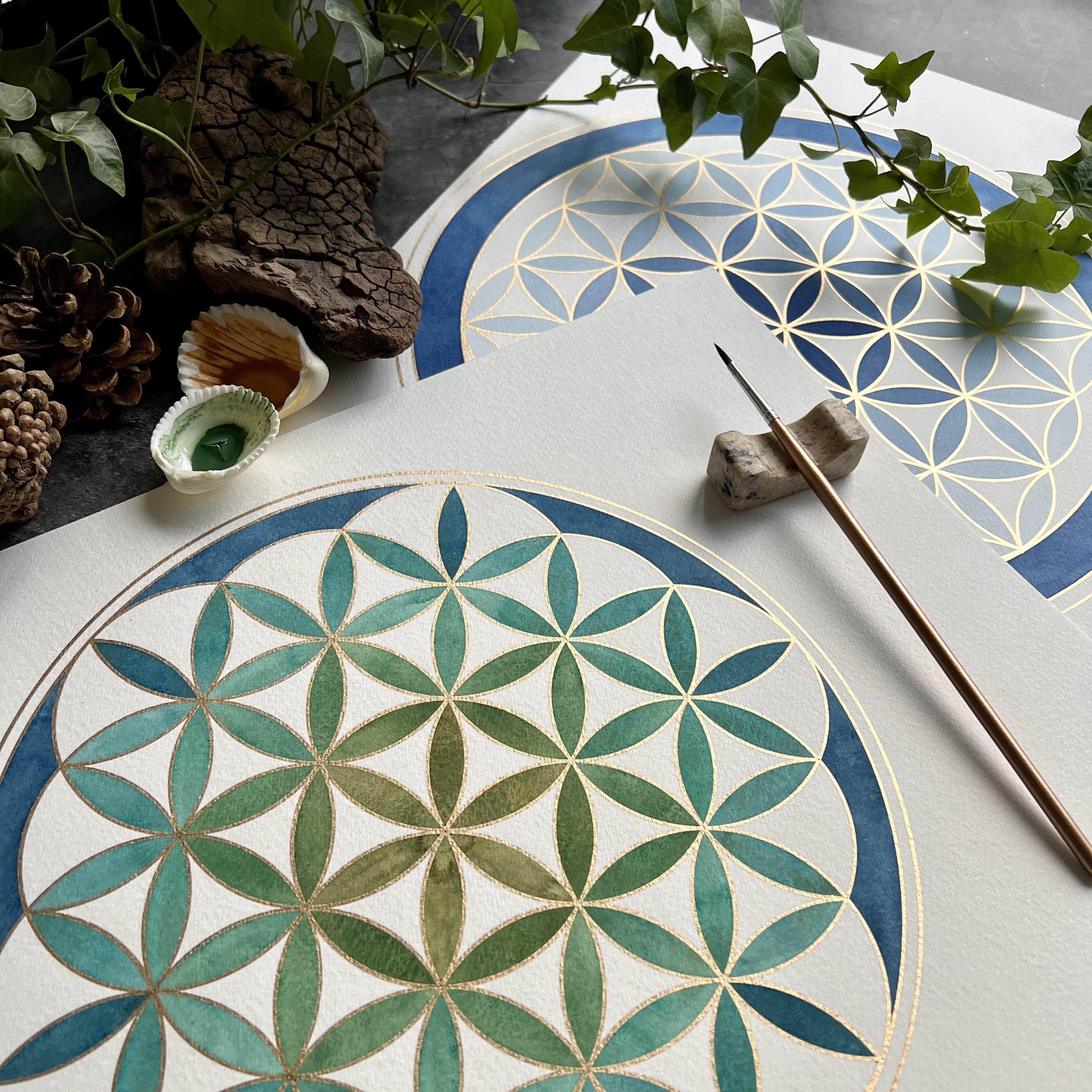
2. The Class Project: The project in this class is
to construct the flower of life pattern as a circular
design or mandala. And then to color it with
a water color gradient. We'll begin by looking at the materials you need
to complete the project. I'll then carefully
demonstrate step by step, the process of using a compass and ruler to create the pattern. Next, we'll outline the pattern together using your pen
attachment in your compass. And if you don't
have one of those, you can just do it freehand. I'll be demonstrating the use of an oil based metallic pen to outline with because
as you'll see, this makes life much easier when you get to
the painting stage. Finally, I'll be
demonstrating not just one, but two simple
watercolor techniques to create a pretty
gradient effect. And which you might
want to try alongside me when you finish your project, do share a photo to
the project gallery. The best part of what I do
is seeing my students work, and your fellow students
will love to see it too. See you in the next video, where we'll be looking
at the materials you need for the project.
3. Materials for the Project: In this lesson,
we'll be looking at the materials you need
to complete the project. First of all, we'll look at what you need to construct
the pattern. Then we'll look at a selection
of pens you might want to use to outline your
pattern before painting. Then finally, we'll look at the materials you need
for the painting stage. If you wish to try out the
water color gradient effect. There's a handy reference
list of everything you need in the downloadable
notes that accompany the class to construct
your mandala. You're going to need a ruler. 12 " or 30 centimeters
is a good size. You'll need a pencil
and an eraser. Now this is a rather neat
little eraser called the Tombo mono zero eraser. Which is a little bit
like a propeller pencil, except it's a propeller eraser and it's great for getting
into small places. It's lovely for geometry. You're also going to
need your compass. Now they come in various
shapes and sizes. Ideally, it will have
a pen attachment. Very often, the pen attachments are the right size for pencils, but not necessarily for pens. If you have a favorite pen that you're planning
on outlining with, just make sure that
you can fit it into the pen attachment that
comes with the compass. Because of the point
of the compass, you will also need a surface
to place under your paper A, to protect your table
from the compass point, but to give a slightly
soft surface with a bit of give that the compass
point can grip onto through the
paper and stop it. Skipping a cutting
mat can be really useful for this or the
back of an old sketch pad. The cardboard is perfect. If you don't have
either of those things, then just a few sheets of printer paper under your
page will be perfect. Then of course, you're going
to need your paper to work on if you're not
planning to use paint. If you just want to
use colored pencils or your marker pens to color in, then use paper
appropriate for that. I would recommend something a little bit heavier
than printer paper, though A good cartridge paper or the paper in your sketch
pad would be perfect. I wouldn't go any smaller
than a four or letter size. And ideally, you'd be going bigger three or tabloid size or anything approximately 12 by 16 " is a really nice
size to do geometry. Now I really would recommend that you outline your pattern. It really makes
the geometry pop. But if you don't have a pen attachment,
that's no problem. You can always outline freehand. One thing I would recommend though is that if you're
planning to paint using watercolors
that you outline in the metallic pen that
uses oil based paint. Now this is a selection of my favorite pens and they
all have their uses. The top four are oil based, and I'll discuss each
of those in turn. Then I've got my Sharpie
and my Uniball Signo. The thing about using
an oil based paint to outline a pattern
before you paint it is that the oil based
paint is hydrophobic and it repels the water
from the watercolor paint. Which means it
encloses the paint beautifully in the
different sections of the geometric pattern. And it helps prevent you
going over the edge. It's a really pleasing
experience to paint into an oil
based pen outline. These are the ones I use, although there are probably
lots of others on the market. I'll put the details
for these four into the downloadable
class notes document. The first is the
Sakura pen Touch. The next is the Pebio
four artist marker. The two millimeter
nib is the one that usually fits in
compass pen attachments. This one is a new addition
to my little family, the Deco color pen. And I really like it's really shiny but quite a pale gold. Then I do love this one, but it's a thin line. This is the Uni paint,
extra fine marker. These are the four I would
recommend you try to outline your paintings with before you use water
colors on them. Just to experience the effect, I've laid down a line in each pen onto this
sheet of paper, and I'm just going to put a layer of wet paint
on top so that you can see what I mean by the hydrophobic effects
of the top four pens. I hope that you can see
quite clearly there how the top four lines
have repelled the water. Whereas the paint
actually covers certainly the Sharpie and to a
lesser extent the signal. I highly recommend trying
one of these four. Finally, you're going to want to decorate your finished mandala. You can use any color
medium you prefer. You can use your colored
pens, your Posca pens. You can use color pencils
or water color pencils. You can use your alcohol ink
markers, anything at all. But I would recommend that if you're not going to
use water color, then you outline with your
gold pen if you're going to choose to do that after you've finished
coloring, not before. If you would like to try the water color gradient techniques that I'm going to demonstrate, then you're going to need
some watercolor paints. I am going to use my trusty little set of Cohenour rounds, which are just a
lovely basic set with lots of nice colors. And they've served me very well. Of course, you can use any
water colors you wish. You might have tubes or
pans, either will be fine. You'll need a couple
of paint brushes, a larger one for
larger sections of the pattern and a smaller
one for the little petals. And it's quite handy
to have something to rest your brushes on as well. You'll also need a
container or two of water if you have one. A pipette is really handy
for adding water to our paint mixes to make it paler or simply
give us more paint. If you don't have a pipette, you can use a teaspoon or
simply a large paint brush. You'll also need a
container to mix the paint in a paint palette
or a little dish. I like these little
ceramic ramekins. I use these a lot then for testing out your
paint colors as you go, just to make sure you've got a good enough contrast between the concentric layers
of the pattern, you'll want a piece of paper. Ideally, a spare piece of watercolor paper
would be useful, just so the paint behaves
in a similar way on the paper that
you're testing it on it as it will do
on your artwork. Then you'll also need
something handy to clear up any spills
or accidents. I find a cotton bud really
useful to have next to me, and also a roll of
kitchen paper handy. You'll also be using
kitchen paper to block your paint brush to
remove excess water from it. Finally, of course, you'll need the paper you're painting on, and I would recommend watercolor paper or
mixed media paper for this 250 GSM at least heading
up to 300 GSM and more. You can choose to use coal
pressed or hot press. Whatever is your preference, I prefer using coal press paper. I find it a bit more
forgiving in terms of size three or tabloid size, or 12 x 16. ". That size is a lovely
size to work on. Take some time now to
gather your materials together and then I'll see
you in the next lesson, where we'll make a start on
constructing the pattern.
4. Constructing the Mandala Part 1: Now you're all set, we're
going to make a start on constructing this grid of perfectly arranged
overlapping circles, often called the flower of life. If you wish to try out the
watercolor technique later, then you will need to construct the pattern onto
watercolor paper. But it might be an
idea to practice first on simple cartridge paper
or in your sketch pad. Finally, you might find it
useful to have a copy of the step by step instructions
next to you as you work. And you can find these in the
downloadable class notes. To construct the pattern, you're going to need your
pencil eraser of choice, your compass with a lead. In whether that's a pencil
or the lead that comes with the compass and a ruler. You'll also need the paper
you're constructing on, whether it's your first
try, practice go, and you're constructing on cartridge paper or
in your sketch pad. Or whether you are
going to go for it straight onto
watercolor paper. You'll also need your
surface to press. Now the Flower of Life
pattern has two orientations. It can be oriented with its longest diagonal,
vertically or horizontally. For the purposes of our mandala, we're going to orient
it vertically. We're going to
need to start with a vertical line running down
the center of our page. To do that, we're going to measure two small
marks in one in the top half of the
page and one in the bottom half of the
page that are halfway in. You'll need to know the width
of your sheet of paper. And then you're going
to measure from one side half of that width, and make a small pencil mark. My paper is in inches. It's a 12 by 16 piece
of watercolor paper. I've got my inches ruler, and I am going to
put the zero on the left hand side and
make a small mark 6 " in the lower half
of the page 6 " in. I'm then going to line my ruler up between
those two marks and put in a vertical line that's about the same length as the
width of my sheet of paper. Mine will be about 12 " long. I'm going to place
my pencil on one of the marks and move
my ruler up to it, that helps me be a
bit more accurate. Then I'm going to line up the
ruler with the second mark. When I'm happy, I'm going to
draw my straight line in. Keep yours nice and light. Mine's a little heavier for the purposes
of the recording. Then finally, we want
our pattern to be centered right at the
center of the page. To find that point, I'm going to measure up halfway up my page and place
a small pencil mark. My page is 16 " long, so I'm going to measure
up 8 " from the bottom of the page and make
my starting notch. Then our next job is to decide on the radius that we're going to
open our compass up to. That depends on several things. It depends on the size
of your sheet of paper, but it also depends on how
much of a border you'd like between the edge of your mandala and the
edge of the page. I would like a border of 1 " between the edge of my pattern and the
outer edge of my page. My page is 12 ", but this procedure works whether you're working in
centimeters or inches. My starting width is 12 " because I'd like a
border either side. I'm going to subtract
2 " from that 12, leaving me with 10 ". That 10 " is the
width of my pattern. The next thing I need to
know is that my pattern is approximately eight rages wide. The flower of life section is
exactly six radiuses wide, because it's six petals wide. But then I'm adding a border, which is approximately another
petal width each side. In total, my pattern
is eight rages wide. In my case, it's also 10 " wide. I'm going to divide my 10 " y eight to get my
starting radius. That gives me a starting
radius of 1.25 or one and 4 ". When you've calculated
your starting radius. We're then going
to measure it out. You're going to open
your compass up using either the quick release bars or if you don't have any
quick release bars. Just the center cog. And then when you've
opened it up a little, we're going to
place the point of the compass on the
zero of your ruler. Now if you've got
a plastic ruler, you can press in
and actually make a little indentation on your zero line for your compass
point to find each time. Then you're going to use your quick release bars
or your wheel to adjust your compass radius so that your pencil tip or your
lead tip is at the measure. You need one and 4 " for me
and then you're good to go. We're going to start by
placing our compass point at this central notch with
geometric constructing. The most important step, and the step that you need
to take the most care over is placement of
the compass point. If you can get that
on accurately, the rest of your pattern
aligns into place. When I place my compass point, I hold the leg with the
point with my dominant hand. Sometimes I steady the
compass with my other hand. Then really carefully,
I place that point as accurately as I can
onto the intersection. I, you might even find that a small magnifying glass can
be useful for this stage. Then I support my compass
with my non dominant hand. Move my dominant hand up to
the top, to the twizzle, placing a little bit of pressure through that leg with the point. Then twist my twizzle. I'm left handed, I'm comfortable
going anticlockwise. If you're right handed, you might prefer clockwise
Because I'm working under a camera and I'm concerned that my drawing might
not be very clear. I'm just going to go over
my circles a couple of times to make them a bit bolder. You don't
need to do that. That leaves me with
two intersections, one at the top and
one at the bottom. We're going to start up at them with a column
of five circles. I'm going to start by placing a second circle at the top and then a third at the bottom. Placing my compass point. Nice and carefully you can check that your pen lead or pencil lead rather is going through the center
where it needs to, when you're confident,
spin circle number two and the same
circle number three. Just checking your two circles are kissing and not overlapping. Now, all that remains is to add a further circle at the top, and then the final
one at the bottom, checking that your circles
are kissing or tangenting. Each time what a
row or column of five overlapping
circles gives us are four of these almond
shapes in the overlaps, and these are sometimes
called vesicas, fishes, bladders, or mand, which
is Italian for almond. These have left and
right points or tips. And each of those tips we're
now going to use to place four circles on the left and
four circles on the right. You can check for
accuracy using a few of the intersection
points on the vertical. I've got one here that I
need to be going through. One here actually
ought to be going through the lower
mandala tip as well. When you're happy circle on, move your way down,
checking as you go same on the other side. Finally we now have
three mandorlas or vesco pics in the overlap
of our four circles, giving us three
points on the left, three points on the right for two more columns
of three circles. Actually this is quite a nice place that you could leave it. We have a central
circle with its flower, and then we have six
circles surrounding it. And each of those six has got their own full set of petals in. But these circles around
the outside don't have their petals in and act as
a frame for the pattern. This is quite a nice
place to leave it, but we're going to plow on, and we're next going to add more petals
around the outside. We're going to do that by using these intersections around
the outside of our pattern, from these angled sicopiss
or mandala shapes. Now you'll note
that there are some positions, if you like, at the corners or vertices of the hexagon arrangement that don't have intersections
yet where we need them. But if you work systematically,
starting at the top, you'll create the intersections
needed as you go. I'm left handed, I'm
going to start at the top and work down around the
left hand side first. If you're right handed,
you might prefer to start at the top and work
down around the right. We only want partial circles, so I'm going to contain my arc within this hexagonal frame of circles and not extending
outside my pattern. I'm then going to move
down to each point in turn and add that inner arc, performing little checks
for accuracy as I I think I'm a little bit off there and you can see I've just created
the intersection I need on this vertex
of my hexagon. When you've got to
the bottom, you can decide whether to
carry on round in the direction you're
going or start again at the top and work
down the other side. I'm just going to
carry on round Note that each time I
place my compass, I move my dominant
hand down to the leg. Carefully place
the leg the point, and then move it up to the
top again to twist it. Okay, Again, this is a rather lovely stage at which to leave the pattern. And I often leave
it in this way. But I'm going to show you one last set of petals
that we can add, which also give us an intersection point
on the outside of the pattern that it's lovely to put a proportion
to frame through.
5. Constructing the Mandala Part 2: I would now like to add some
petals on this outer edge. To do that, I'm going to
need a compass point, intersection outside the
pattern to draw the arc. Now we can find that
intersection point that we need by extending these circular arcs to where two arcs would meet
outside the pattern. But we don't need to draw
the full circles on, we're just going to put
little pieces of arc. We're going to go back
to using this set of holes that we should already have around the outside
of our pattern. Make sure you find the hole. Then I'm going to place a
little bit of arc opposite my flower center
so that it would become the tip of the vesicopiics that's
sitting at an angle. I reckon just about there it is. A bit of guesswork and if
your arcs aren't long enough, you can simply go
back and extend them. I'm then going to move
to my next door point and cross that little
section of arc. Now this little
intersection will then become the compass
point position to place this final
set of petal. I'm now going to create all my little
intersections first, and then I will add my
final set of petals. You can draw two arcs at
once. I drew this arc. And then I'm going
to do its partner, which is opposite the
flower next door. Now here I haven't quite
got a firm intersection, so I'm just going to go back
and extend this little bit of arc so I can see clearly
where the cross is. Now I've got my set of dancing crosses around the
outside of my pattern. And I'm going to use
each of those as the placement for
my compass point for my final set of arcs. Okay, the last thing
I'm going to do is I'm going to use a
pair of these arcs as the intersection points to create an outer frame
for my mandala. Now it might be a good idea to erase these marks,
except for the two. We're going to use, erase
these marks from the outside. But do make sure that
at the center of each, there is a definite hole
from your compass point. Because we'll need
those holes when we outline the pattern
with our gold pen later. You may also want to erase
your starting vertical line. Don't worry too much about
erasing the petals as well, because we will be re outlining those with
our gold pens later. And all that we really need to remain are the pin prick
holes for the compass. Now I'm going to use
these neighboring crosses to put on two frames. And I'm also going to
add a third frame that encloses my Flower of
Life hexagon perfectly. To do that, place
a compass point back at the center,
finding that hole, and use the quick release
bars or the wheel to open up to the north or
south of your pattern. Quick check on another measure. I'm checking down at the bottom. When you're happy you can
pop on an enclosing circle. Then you can open up your
compass a little bit more to meet the
first of the crosses. When you're happy that you're going through the intersection, pop on your second frame. And finally, extend a little bit further to put on your third. The lovely thing about using these two intersections
to create this frame is because
these intersections are created using the
proportions of the pattern. Our frame is proportional and harmonious with the
rest of the pattern. We've got a lovely
flower of life mandala, ready to outline and add some color to your
flower of life. Mandala is complete.
In the next lesson, I'll be showing you how to use your compass pen attachment and perhaps an oil
based metallic pen to outline your circles
and your frames.
6. Outlining the Pattern: In this lesson, I'll be
showing you how to use your pen attachment to
outline your circles. Now this is the
nerve racking stage. Remember to take it slow and breathe if you're not
going to outline freehand. Then for this stage you'll need your compass with
a pen attachment. You'll need the pen you're
going to outline in. I'm going to use my deco
color a small piece of scrap paper just to test out
your pen and to use to re, ink the nib if it runs dry. While you're working,
I'm going to show you a little technique using
a scrap of tracing paper. If you've got a bit handy, then that's useful too. But if not don't,
The first thing I'm going to do is attach my pen attachment
to my compass. So I'm going to
unscrew the leg with the lead pop in my
pen attachment. Tighten that back
up nice and tightly and just give it a
little wiggle to check that it's
stable and secure. I'm going to pop
that to one side now and turn my
attention to the pen. If your pen hasn't been used for a while or if
it's brand new, you're going to have
to reactivate the nip. The first thing to do is
to give it a good shake, and that just helps the ink mix together nicely and it means you get a nice
sheen on the paint. Then I'm going to
carefully remove the lid while the pen
is facing upwards. You probably don't want
to be doing it over your precious artwork while
it's still facing upwards. I'm just going to press down
on the nib with a piece of paper just to release any air that may have
built up behind the nib. Then last of all, I'm going to test out the ink
flow on the nib. I've got a nice lot of ink flowing out of
that, I'm happy. But if you notice that
it's dry or scratchy, you will need to press
on the nib a couple of times to give the ink time
to drain into the nib. And you'll have to
do that if the pen is brand new as well. Then when you're happy it's time to insert the
pen into the compass. To do that, partially close your compass so that when
you insert your pen, the point of the compass and the nib of the pen are closely aligned so that you can make sure that they're
level with each other. Then the pen, just
open that up a bit, tighten the pen into
the pen attachment, give that another wiggle when it's nice and secure.
You're good to go. The next thing we need to
do is remeasure our radius, and this is where
this little piece of tracing paper will
come in handy. I'm going to place it
over the central circle. Then I'm going to place my
compass point in the center, open out to where I
think the radius is. But to test it out,
I'm actually going to dip my pen down and just see by putting a small piece of arc
onto the tracing paper. Does my inked arc sit plumb on top of the
pencil line beneath mine? Doesn't. So I can see that I need to open
it out a bit more. I'm just moving my tracing
paper over a bit so I've got a fresh section on top
of the pencil line. I'm going to try this new. I'm much happier with
that when you're happy when you've
tested it out a few times and you're happy
with where your radius is, You can put your tracing
paper to one side and you can take a deep breath
and swing that first circle. Now, because I don't
want to smudge my work, I'm going to work from the center to the
left of my piece. And then I'm going to turn my page round and
do the same again. If you're right handed,
you'll want to work from the center to the
right of your piece. I'm going to do my
central line of circles. I'm going to move up and each time I'm looking for
the little crater, the little hole from where I previously placed my
compass when I was constructing the
pattern that will keep me accurate if I find
the same hole each time. I'm also working slowly
because these gold pens, the nibs can run dry if
you spin them too fast, finding the little hole each
time with the compass point, and taking my time
spinning that compass. What you'll notice is it
doesn't matter if my pattern is incomplete in places where
I erase that central line. Because I'm just
going to go over those lines with my pen now. Now, because I'm left handed, I'm going to move to the left. If you're right handed, you'll
do the right hand column. Next, again, locate the compass hole
and spin nice and slowly, systematically
working all way down. Now I can feel that my nib might be
running a little bit dry, which is an indication
that I need to give it another pump on my scrap paper. So I'll do this last one in
this row and then do that. Now I've finished the left
hand side of full circles. I'm now going to work
round my left hand side of smaller arcs to do that. If you remember, I'm
going to start at the top so that
I'm working down. And if you're right handed, you'll start at the top and
work down to the right and round that way I'm not in danger of smudging
any still wetting. I'm first of all going
to do the set of arcs whose centers are placed on these circular arcs at
the edge of the pattern. I need a little bit of
pen control because I don't want to extend
outside of the pattern. Taking it slow, locating that
previous hole each time, making sure that my compass
is firmly inside that hole. Working nice and slowly so that I can stop when I need to. When I get to the edge. This takes a little
bit of practice, but you develop your
compass control over time. I've now got this outer set, now I'm going to
have to look very closely to find those
original holes. I can just about see them in the light or can I,
oh, there we go. You can figure out
where they ought to be. Then just hunt
around in that zone. There'll always
be one sitting on the inner ring and one
sitting on the outer ring. And they'll alternate
between the two rings. This is one that sits
on the inner ring. My next one will sit
on the outer ring. And then actually this
is an outer ring, one inner ring. Okay? And now I'm going
to turn my page upside down and I'm going
to do the other side. Now that the flower of life
grid itself is all outlined, all that remains is to
outline our frames. We're going to need to
remeasure our radiuses. Again, you can either use your bit of scrap
paper or you can just judge by eye
compass at the center, open it out using the quick release bars or
the wheel at the center, and then keeping it nice and low to the page so that you can
accurately judge. I'm going to pop
my bit of tracing paper underneath one more time. That looks good to me. I might try a little
bit over the edge of a circle to make sure I'm not encroaching into the circles.
I'm happy with that. I'm going to put
this first ring on, then just two more to measure
out and put it in place. Actually, I think
I might thicken this outermost frame by
just opening my compass incrementally so
that there's no gap between the line I've just put down and the next one
I'm going to draw on, just laying down another line
next to the one I've drawn, gives it the effect of
thickening that final out. Okay, I think that's
looking good. You could leave it just
like this, Ashley. It's really beautiful,
but we're going to add some color now that you've got this new
skill under your belt. In the next lesson we're going
to be adding some color.
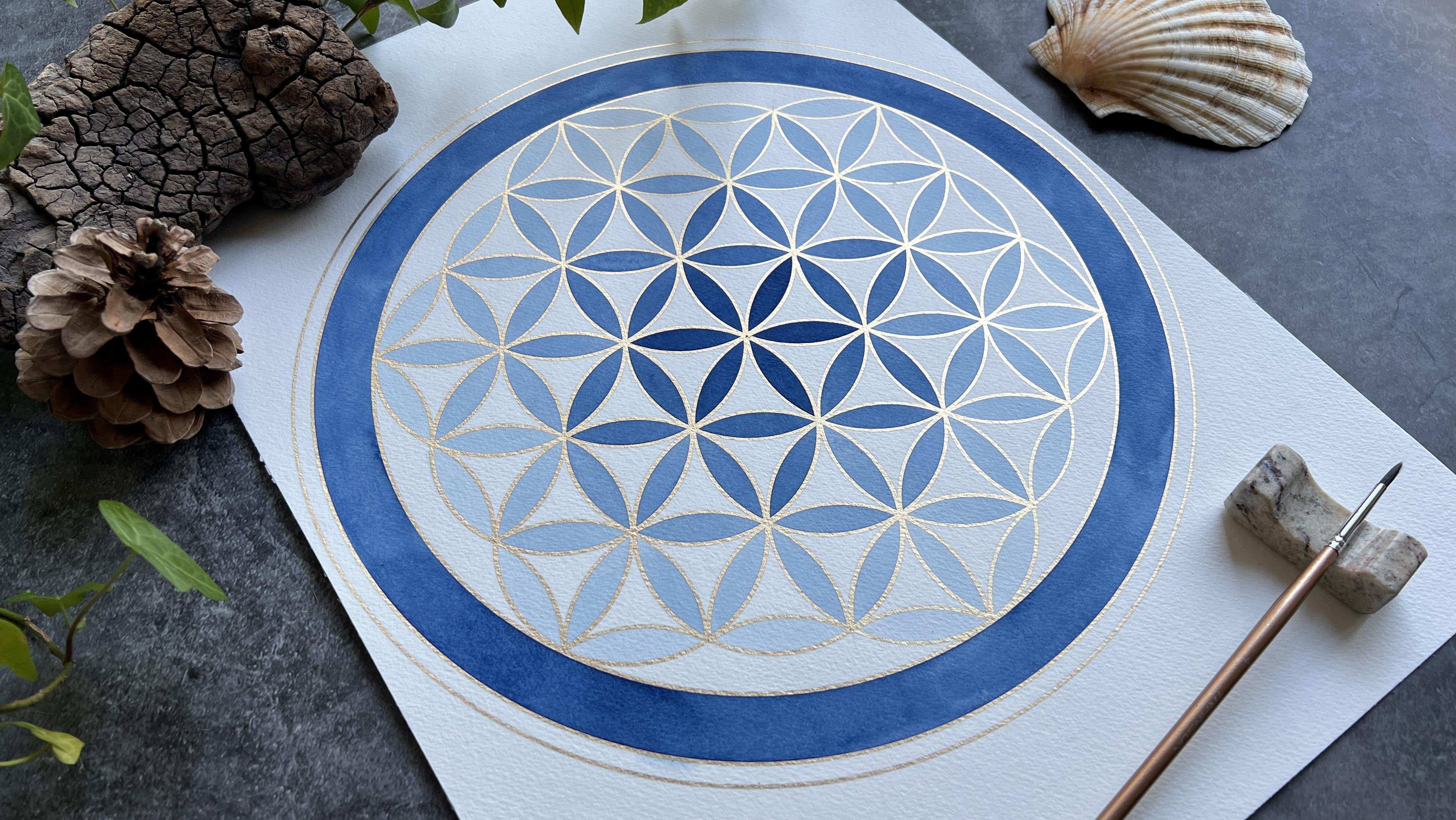
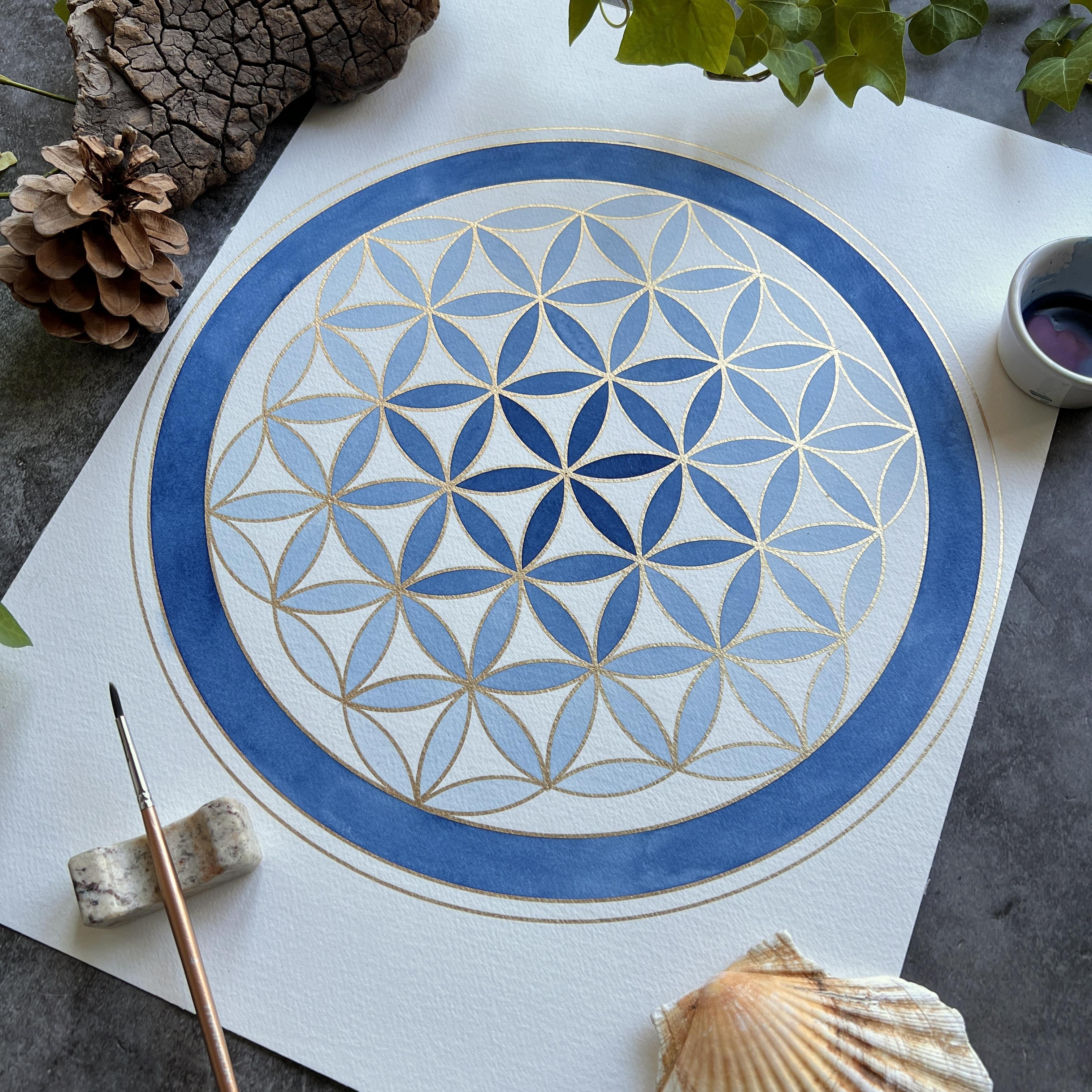
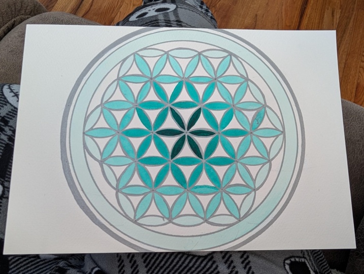
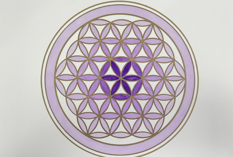
7. Monochrome Gradient Part 1: This is the first of the
two lessons in which I'll be demonstrating the water
color gradient techniques. I'm really excited to
share these with you and I can't wait to see how
you're going to use them. Okay, it's the exciting section. Now we're going to
start adding color. So you'll need your paints. We're only going to be working with the single color first, because we're doing
the ombre effect. Choose a color that's
quite dark to start with. I'm going for purple,
you could go for an indigo. A dark brown. A color that starts
dark so that we get a nice contrast as we
work out from the center. You'll also need your
glass of water, a pipette, if you've got one really
useful for adding the water as we make the
paint paler and paler. But if you don't have a pipette, you can use a teaspoon or
a large paint brush to add the water to
your mix as we go. You'll also need a palette. I've got these little
ceramic ramekins. I'm just going to
use one of these. If you don't have a paint
palette or something like this, then just a saucer is fine. You'll also need
your paint brush. I'm going to use this size for my petals just for comparison. The brush is a round brush, has a decent enough point on it, but it has a thicker belly to hold a bit of pigment,
bit of paint in it. And this one is about the
length of my thumbnail. I'm going to be using
this one for the petals, and then I'm also going to paint this wide band
around the outside. For that, I'm going to be using a thicker brush
just so I can work a bit faster and avoid tide marks from my paint
drying out too quickly. You will also need
a little piece of, ideally, watercolor paper, but if not just any
paper you have, because we're going
to be testing out our colors as we go, just to make sure that we've
added enough water to get a color change each time as we work out
across the pattern. Always a good idea to have
some kitchen towel to hand. I'm going to have a
piece down here on my left so that I can dab my paint brush
on it if need be. If I have too much water on
my paintbrush, that thing. And I'm also going to
have a role close to hand for cleaning up any
disasters that might occur. And I've got a little
paint brush rest as well. This is just a chopstick
holder, but that's quite handy. Just have somewhere to
put your paint brush. Don't leave them in the glass of water because you'll
ruin the little tips. Then I've also got
this little cotton bud again for clean
ups, if necessary. Then the next thing you
must make sure you've done is that you've
primed your pan of paint. You might be using a tube, in which case that's
a bit easier. No need to add water first. I've added a few drops of
water to my purple pan. It's had a little bit
of time to sink in now. Hopefully when I mix it,
I'll get a nice lot of pigment to start with. Then we're going to mix the darkest color for
the central flower. We're then going to work
our way out ring by ring, and we're going to
get paler as we go. The lovely thing about
watercolor is that you don't add white to go paler, you just add water to go paler. If you did want to do this
in a different medium, such as guache or acrylic, then you can achieve
exactly the same effect, but by adding incrementally
more white paint each time. I'm going to use
my larger brush. Now to get this paint mixed then I'm just going
to tip it into my Ramakin. I think this is a good
amount to start with. I've got enough to paint a purple flower
right at the center. And then I've got some pigment
left over to add water to, to create my next ring of
slightly paler purple. Because we keep adding
water as we go, you're not likely to run
out of pre mixed color. Now, I'm going to use
my smaller brush. I'm just going to dampen it a little and then dry that off. From now on while I'm
working on a section, I'm not going to dip
my brush back into the water because that will then change the consistency
of the paint I'm using. I must remember when I'm working on an
individual section, that all needs to be one color. Just to pull my paint from
my palette or my ramikinow. I'm just going to test it
out on my little bit of scrap paper just to make sure it is a good level of
darkness to start with. I'm happy with that.
Also, it gives me a record to compare
with when I add water. Next time to get a paler wash, then I'm going to
start to paint. I've got a good amount
of paint on my brush. If you feel you've
just got too much, you can always apply a little
bit in the next door petal. But what you don't
want to do is let, let the edge of your
puddle of paint dry out. I'm working from
this puddle outwards and I'm always trying to
keep that leading edge wet. Then before this
puddle dries out, I'm quickly going to
start working it and make sure that it's
leading edge is wet. Now that you'll start to notice the wonderful
effect of having an oil based pen outline
because you don't have to concentrate
too hard on staying in the now you've got too
much water on that. So I'm just going to offload
a bit of water next door. But just not let this bit
dry working quite quickly, You will probably want to move your painting
around as you work, just so you're always working at a nice angle for your hand. But I'm, we'll see how we go. But I'm going to try
and keep my painting in this orientation just for
the purposes of the video. I'm always working out from that wet puddle and giving
my paint a good stir each time essentially we're just moving a puddle of water
colored water across your page. Now if you're aiming for
a nice flat consistency, then there are times when
you might sense you've got too much paint pulled up
on one end of your petal. And then you can just
give a quick dab on your kitchen towel to dry
off your brush a little. And then just carefully
pick up some of that excess pigment
that can sometimes gather towards one end
or other of your petal. So there's our first
purple flower. I'm now going to add a few
drops of water to my paint, and then I'm going to
test it out just to make sure I've got a slight
color difference. So I've added four drops. I think I can sense a very
slight color change there. If I wasn't sure, then I'd leave that to dry. Water color always
dries slightly paler than when you
first put it down. I'm going to do this
ring of petals. Next I can feel I've got an accumulation of paint towards one
end of my petals. I'm just going to dry off my brush and pick some of
that pigment up with just some light dabbing because
I'd like to go for a nice flat wash consistency. Right? So I've done
my central flower and my first ring of petals. I'm now going to do the next
circular ring of petals. If you think of it as the next three petals
in each flower, I'm going to do these in
my next palest purple, because it's a much
larger section. I just need to make sure
that I've got enough paint. If I don't think I have, then I might need to add a little bit more pigment
as well as water, just so that my pigment doesn't
get too pale in one go. The first thing
we're going to do is add some more drops of water. I'm adding five or
six there because I want to make
sure that I've got enough paint to
do the full ring. I'm just going to test that,
see what it looks like. A little bit too much
on my paintbrush, that's definitely
quite a bit paler. I might add a little
more pigment and then a little more water
and do another test. I think that that's okay. It's definitely
slightly paler than the layer before, but
it's not too pale. I've got a good
teaspoon or so there. I think that I will have enough
to do this larger ring of petals working quickly so
that my puddles don't, if they dry, you get a bit
of a tide mark. That's all.
8. Monochrome Gradient Part 2: Now I've made a boo boo here. What I'm going to do
is I'm going to use my cotton bud to pick
up some of that paint. Then I'm going to come
back a little bit later with some
fresh clean water. Just run that water
over it and dab down to pick up any last
bit of purple there. In fact, I might do
that now, clean water. I've got a clean brush. I'm just going to tickle
this little section, being careful not to put
any water in this petal, but I'm essentially re
wetting this little section, tickling it with a paintbrush to lift the color off the section
I don't want it to be in. Then I'm going to
use kitchen towel just running along the
edge and pressing down. Be careful not to press
it onto the petal. I don't want to remove
paint from my petal. Probably it would have
been a better idea to wait until that petal had dried. Okay. And I might do
that one more time. A little bit of clean water just tickle the
surface of the paper. You can't do this too often, so you don't want to damage
the surface of the paper. You can always leave it
to dry and then come back again afterwards if there's
still more to collect. Okay. That's much better. And I think when it dries it, you're not going to be
able to notice it at all. Okay. Where was I was
painting purple flowers. Notice I haven't put my
paintbrush back in the water because I don't want
to add any more water to this consistency. I want to keep this paint at this consistency for the
whole purple ring of petals. One thing that it
can be quite nice to do is to actually let the paint gather towards one
end of the petal on purpose, so that you get a darker edge, a darker end, and a paler end. That can be quite a nice
thing to do as well, but for the purposes
of this painting, I'm going to try and go for a flat time, to go even paler than
the next level is this ring of single petals,
this hexagonal ring. A few more drops of water. The larger your pool of paint, the more drops of water you'll need to effect a color change. Keep testing. Oh, yes, that's definitely
paler now. It's okay. So this is just this single
ring of petals next, right? We need to
go paler again. This will be quite a
large section next, because it's this
set of petals that are emerging from
the flower centers. We're going to need a
fair amount of paint, but we also want to go, adding water is not an issue. Let's see where we are. I think I can even get away with adding
a little bit more. Even a bit more too. I think I've only got
two more sections left. I've got this section
with lots of petals in, and then I've got the
final outer ring. I think I can go quite
dramatically pale. Let's put a couple more in. Yeah, that's definitely
paler. Right. Now for the pale
list final ring of petals to add quite a few drops. Because I've got quite
a bit of paint there now to lighten it considerably, you're going to need to
add quite a lot of water. I can't really see
much change there. Yeah, I think that's paler. Okay. So that's the
flower of life painted, looking very pretty and now I've got decision to
make about the frame. I could just leave it as is, but I think I'd like
to paint this band. And then I think I'm going to leave this outer band white. I think it should
definitely be purple. But it's what
consistency of purple? Am I going to choose a
dark band or a pale band? You know, I think I'm going
to go for a pale band. In my exemplar piece
that I did in Indigo, I chose a dark band because I wanted to balance
out that center, but I quite like the fade out. I'm just going to continue with this very
pale, lilac color. I think I've got enough
to do the whole band. If you don't feel
you've got enough, then you may need to add either some more pigment
or some more water. If you do want to go
with a dark outer band, then I would make up a
fresh amount of dark paint. Start again from scratch, but yeah, good enough. What I am going to do is
I'm going to work with a larger brush and that's because I really want to make sure that I avoid tide marks. I need to be working fast. A larger brush will
help with that. What I'm going to
do, I'm going to work both sides of my puddle. I'm going to be working from
left to right as I work on my band because I don't want either edge of my puddle to dry out and
cause a tide mark. We'll see how I go to dive straight in with
this very pale wash. I'm going to start opposite me. I'm left handed, I'm going
to start at the top right. If you're right handed,
you might want to start at the top left
and then I'm going to work out and down.
Let's have a go. I've got a nice amount on my
paint brush and you can see, hopefully you can see that this is a large
puddle I'm working with. I'm pulling out
from the puddle as I go where it's a bit
tricky round the edges. I'm mindful of both
sides of my puddle, switching side to keep that
outer leading edge wet. At the same time, I'm
hovering my arm above my painting so that I don't smudge any
remaining wet paint. I'm going to add a bit
more into my puddle, madding my paint into my puddle so that the
pigment has a chance to just spread out nice and
evenly across the surface. Drawing that puddle out and round and then switching sides before the
other side dries. Must remember this side,
the finished piece. I'm really happy with this. I love the subtlety of
the lilac at the edges. I am wondering whether to paint this thin band in the
dark purple or not, but I think I'm
going to just leave it to one side and mull
that decision over. I'm really pleased
with how pretty it is. Let's have a look
at some gold glint. Hopefully you're happy with your ombre flower
of life gradient. In the next lesson
we'll be looking at how to blend two
colors together.
9. Duochrome Gradient Part 1: In this lesson, I'll
be demonstrating the two color duochrome
gradient technique. I'll also be showing
you how to use a color wheel to select
your pair of colors. You can find the color wheel in the downloadable class notes. In this lesson,
we're going to look at the second technique, the two color gradient. You'll need essentially all
the same equipment as before. You might want a
second glass of water simply because we're working with more than one color now. You've got one glass to
clean your brush and then a second glass
to get it properly cleaned before you dip
into a different color. Also, make sure you've
got your piece of scrap paper to test
your colors out on. You may also want to
print off or simply read on a screen
the color wheel. In the downloadable class notes, I'm going to use the color
wheel to explain to you the best way to select your two colors for your
duochrome gradient. If you're not familiar
with the color wheel, essentially at three equally spaced
positions around the wheel, we have the three
primary colors, yellow, red, and blue. Then between them, you
get the colors that emerge when you mix
those two together. Between red and yellow,
I have the oranges. Between red and blue,
I have the purples. And between blue and yellow, I have the greens. Now we're going to be
choosing two colors to blend from one to the other as we
work out of our mandala. What we want to avoid
is muddy colors. Now, muddy colors come when you mix colors that have yellow, red, and blue, all three
primary colors in them. And when we select our colors, we're going to try
to keep those colors to within one third
of the color wheel. For example, today I'm feeling in the need of a
little bit of sunshine. The weather is rather
wet in the UK. I've decided I'd like to work in the lovely, warm,
sunny spectrum. Now in selecting my
reds and yellows, I want to ensure that I'm
not using a purply red or a green yellow in
with my selection. Because if I use a purply
red or a greeny yellow, I'm bringing in some blue that will muddy my
colors up a little. I am just using colors
from yellow to red. And in between, once you've had to think about what two colors you'd like to choose, might be an idea to have
a quick test just to make sure you like the color
that they create in between. The first thing we need to
do if you're using pans is to add a little bit of water to your chosen color pair. I am going to choose my pipette. You can use your teaspoon. I'm going for this
slightly orangey red and this warm yellow so that I can be sure I'm in the same
third of my color wheel. Okay. Just going to leave that to sink in
for a few moments, then I'm just going to
add a little bit of each color to my sheet
of paper just to see what sort of
shade they mix into. In the middle, a little
bit of orange, orange, red mixed with a little bit
of this yellow. And then I'm just going to bring them to meet in the middle. I've got a little bit too
much water on my brush there. But yes, I'm rather happy with that lovely fiery orange
they combine to make. Then you've got to decide
which color you'd like to start with and which one
you'd like to blend out too. I think I'm going
to start with my fiery red right at the center, and then add more yellow, yellow at the very edges. Now what you'll
notice is I'm using a slightly different
design than last time. I'm using the version of
the mandala where I didn't add those final arcs
around the very edge. That meant I didn't have my
little intersection points on the outside of the mandala
to put in my thicker frame. Instead I've just put
in a thinner frame. I'm going to use
these outer sections here to add a little bit of
enclosure to the whole shape. Okay, our next job is
to prepare our paint. I am going to start
with the fiery red, So I'm going to mix
up a little bit of the fiery red as I did in the previous
lesson with my purple. Okay, I think I've got enough
in there to start me off. Complete my inner
flower and leave me some left to add
some yellow to. I'm going to use
my smaller brush because I'm working
in my petals. And what I'm going to do is
I'm going to log this color by placing a little bit of
it onto my piece of paper. It's also a chance to test out whether
it's intense enough. Yes, I think that's fine. If I wasn't happy with it, I might add a little
bit more pigment just to make it a more
intense starting color. Okay, so now I'm going to have
the pleasure of in filling my little petals and I
sort of paint on my brush, moving that little puddle across the surface and drawing my brush off to
pick up any excess. Each time I return
to my Ramakin, I give it a little mix
just to make sure that the paint is the same
consistency, concentration.
10. Duochrome Gradient Part 2: The next stage then, is to
add a little bit of yellow into this starting color. Now, because we're adding
pigment and not water, we may find that our
reservoir starts to run low. You may find you need to
add a few drops of water as well just to keep
your paint stocked up. The first thing I'm
going to do, of course, is clean my brush because I'm
now dipping into my yellow. There's a little bit
of change there, but I might like it. A little more dramatic thing
is we only really have six. Actually, I think in this case, because I don't have
the outer section, I only have five sections of the Mandala Central
flower first ring, next set of petals, next ring, and the
final set of petals. Although I may use these
very outer sections on the outside of the
circles as my sixth section, I'm just going to
add a little more yellow rinsing my brush again. Okay, let's try that one. Yes, I can see clearly that I've gone from orangey red
to more of an orange. Okay. Next step, then clean the brush
and add more yellow. Okay, I'm just going
to test this mix out. I think it's because I mixed up quite a bit of red
to start with, so I'm going to need
quite a bit of yellow to effect the color change. I think a bit more. What I might actually
do is some of this pigment away just a little, so that the yellow
that I add will have a greater effect because it's being added into
a smaller amount. Let's see what we've got now. Yes, this is much
more tangerine. Okay, let's get our
tangerine petals on. Well, it's looking lovely, and fiery and a little
bit more yellow. In next, I'm running
very low on paint. I may need to add
a little bit of orange that I saved
from earlier, back in, and then
add more yellow. Let's see what this looks like. That's certainly more yellow than what I've previously used. I'm happy with
that. Let's do it. One final set of petals, and there's quite a few of them. I have got a fair
amount left over. Adding quite a lot more yellow
now should help with that. And I can always add
a drop more two of water just to refill
my reservoir. Okay. That's definitely yellow now as opposed to
orange, I think. Yeah. Ready to go. Okay. So the only
section remaining now is this outer section
with six pieces. I'm wondering whether
I might be able to take my yellow
straight from the pan. So I'm just going
to test that out on my little test sheet
and see if it's the right color to merge with
the gradient I've already. Yes, I think that
works quite well. Now I'm going to work
straight from the pan, which is possibly a
little dangerous. Let's give it a go. Okay. My very sonny mandala. I think on this one
I'm actually going to reuse my central color
around the very edge. I think that might have the
effect of balancing it out. I'm intrigued to see
what will happen. I'm going to finish off now by adding some of the
red directly from the pan into this little barrier I've got between my two circles. The difficulty here is that
I have two leading edges, one on the left,
one on the right, and I need to keep
them both wet. I'm using the very tip
of my brush because I'm painting into a thin space, I'm remembering to go back
and forth between two ends. When I do add more paint, I add it into a wet paint, and there we have it, a lovely,
cheery, sunshiny mandala. I really hope you're
happy with how your two color Mandala
has turned out. In the next lesson,
I'll be sharing some more design
ideas for you to try.
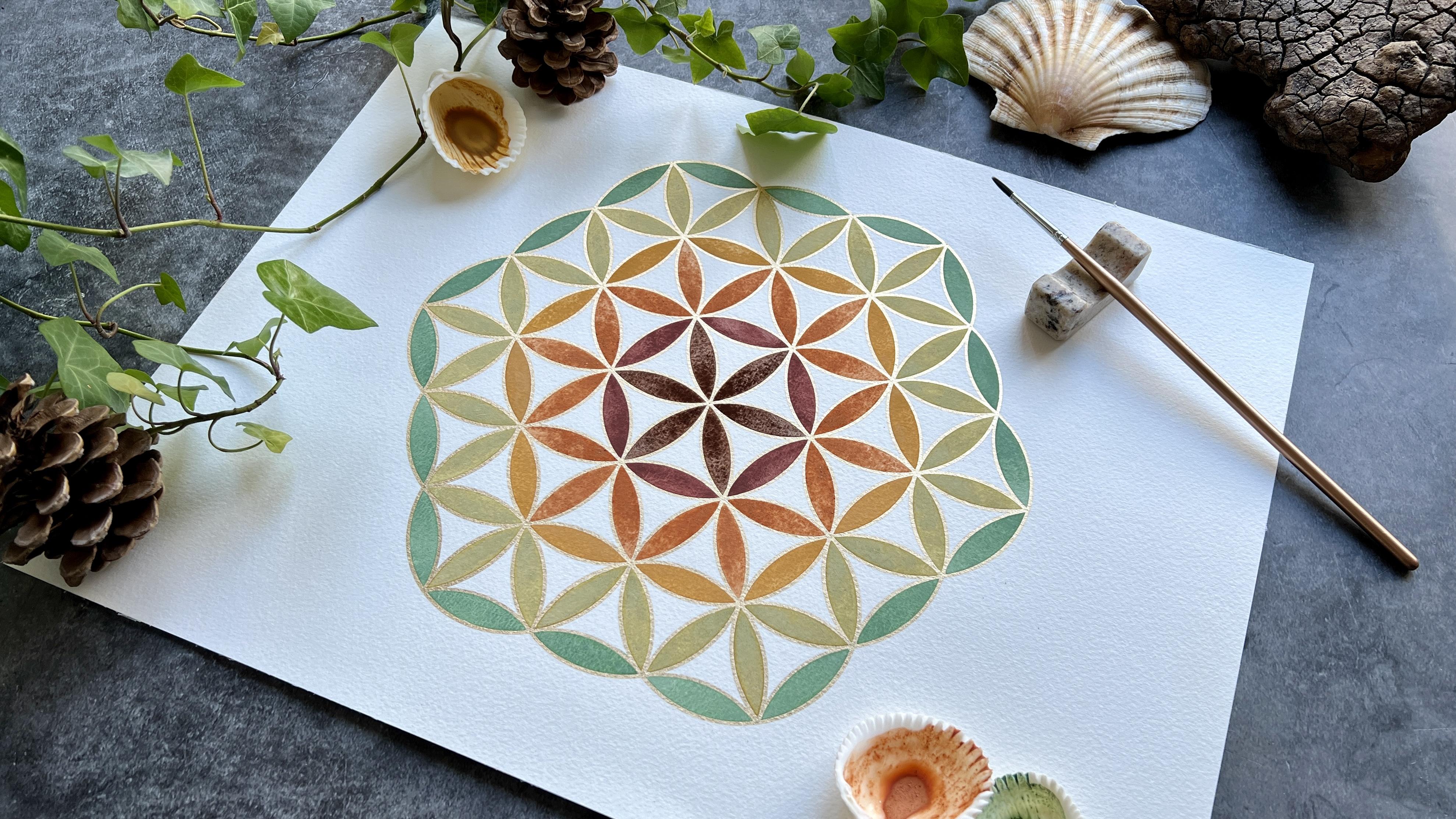
11. More Design Ideas: In this lesson, I'll
be talking you through some more ideas for coloring your flower of life, mandala. I'm going to start
by showing you in a little more detail the two exemplars I
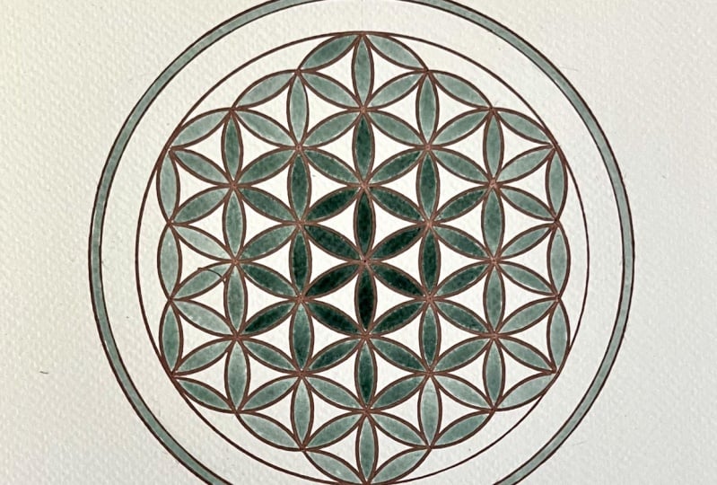
made for the course. This is the first one, the
monochrome ombre effect. Here you can see I started
with the dark indigo blue, which then I faded out with
the addition of water. In contrast to the one I
demonstrated in the lesson, I chose to paint my outer band in a color
to match the center, rather than the pale
color at the edge. While I do rather like it, I think it loses a little bit of the delicacy of the lilac. One thing you will note
is that I forgot to take into account the width
of the extra frame. And so I encroached very close to the edge of
my sheet of paper, which I wouldn't recommend. Now, this piece was outlined in gold pen first before painting. However, when I
painted this one, I experimented with outlining
in gold pen after painting. Now it meant that I had
to paint very carefully, keeping to the edges, because I didn't
have, if you like, the protection of the barrier
of the water repellent pen. What that did mean was that
when I painted one petal, if I accidentally touched the wet paint of
petals next door, I got these bloom effects from wet paint entering into a
section of paint that's drying. You can see those
effects in a few places, and that's because I didn't have the protective enclosure of the gold pen while
I was painting. The other difference between this one and the one I just
showed you is of course, this one doesn't have the
thick frame around it, but what it does have is these little sections
painted in which I think acts as a frame in a
way and highlights the hexagonal arrangement
of the circles. This next one you can
see first of all, that I haven't framed
it in a circle, I'm just making a feature of
that hexagonal arrangement. You can see I've achieved
a rainbow effect. I used hand ground, hand collected earth
pigments to create this slightly earthy
organic rainbow. These came from a
wonderful retreat center in Northern Spain called
Flores del Camino. You can see I've used the same arrangement of
concentric sections. The central flower
is the darkest, the next ring of petals out
becomes slightly redder, and then that arrangement of three petals in each
flower is the orange, then the ochre ring again, and then a pale green ring of petals and the final
ring of single petals. A rainbow color scheme is
definitely recommended. You'll need six colors
for this arrangement. 123456, I would pick
your six colors first and test them out on a
sheet of paper just to make sure that they're harmonious
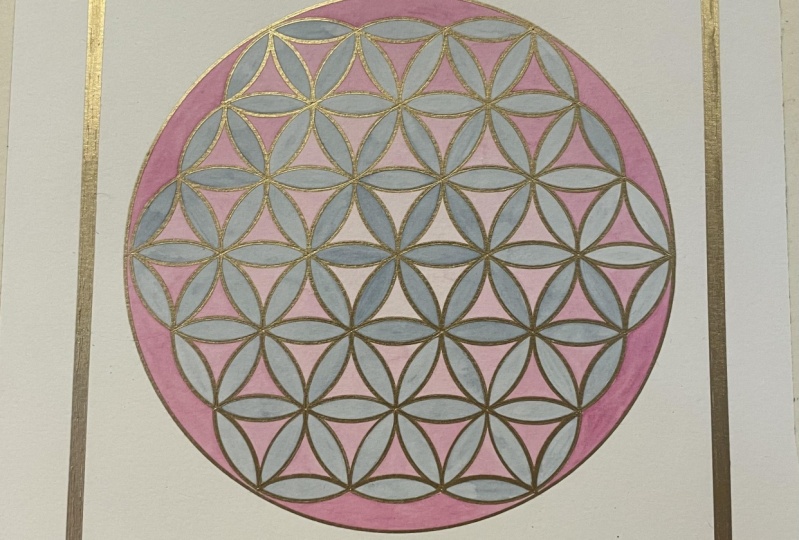
together with them. Now, this next one is
very bright and punchy. It's another rainbow version, this time done in my acrylic
markers, my Posca pens, I opted to include the
inner sections between the petals as part of the
rainbow color scheme. We can see my flowers red, but then the inner
sections are orange. Then the flower
petals are yellow, but the intersection is green. Flower petals blue in
the sections purple. While I think this
is not a favorite, it really serves to
accentuate the way the pattern is built out
of concentric sections. It's quite nice for that
reason I colored it in first with my Posca pens and then I outlined it with my gold pen. Then this last one I really
love, it's ultra simple. I just painted every petal in a very pale wash of,
I think it was inks. And then I outlined
in a thin gold pen. I don't know how well
you can see that. Then finally, I really
felt it needed more. I used a paper
stitching technique. I pierced holes in all the
intersections and stitched using copper thread through those intersections to
make a triangular grid. Then I created a little template with tracing paper in which I had my set of
holes pre punched. And I use that template over each of the
petals in turn to punch the holes to create this stitched
leaf effect as well. And how it's turned out, I'm really, really
happy with it. It's one of my favorite pieces. Simple, but just rather lovely. If you're interested
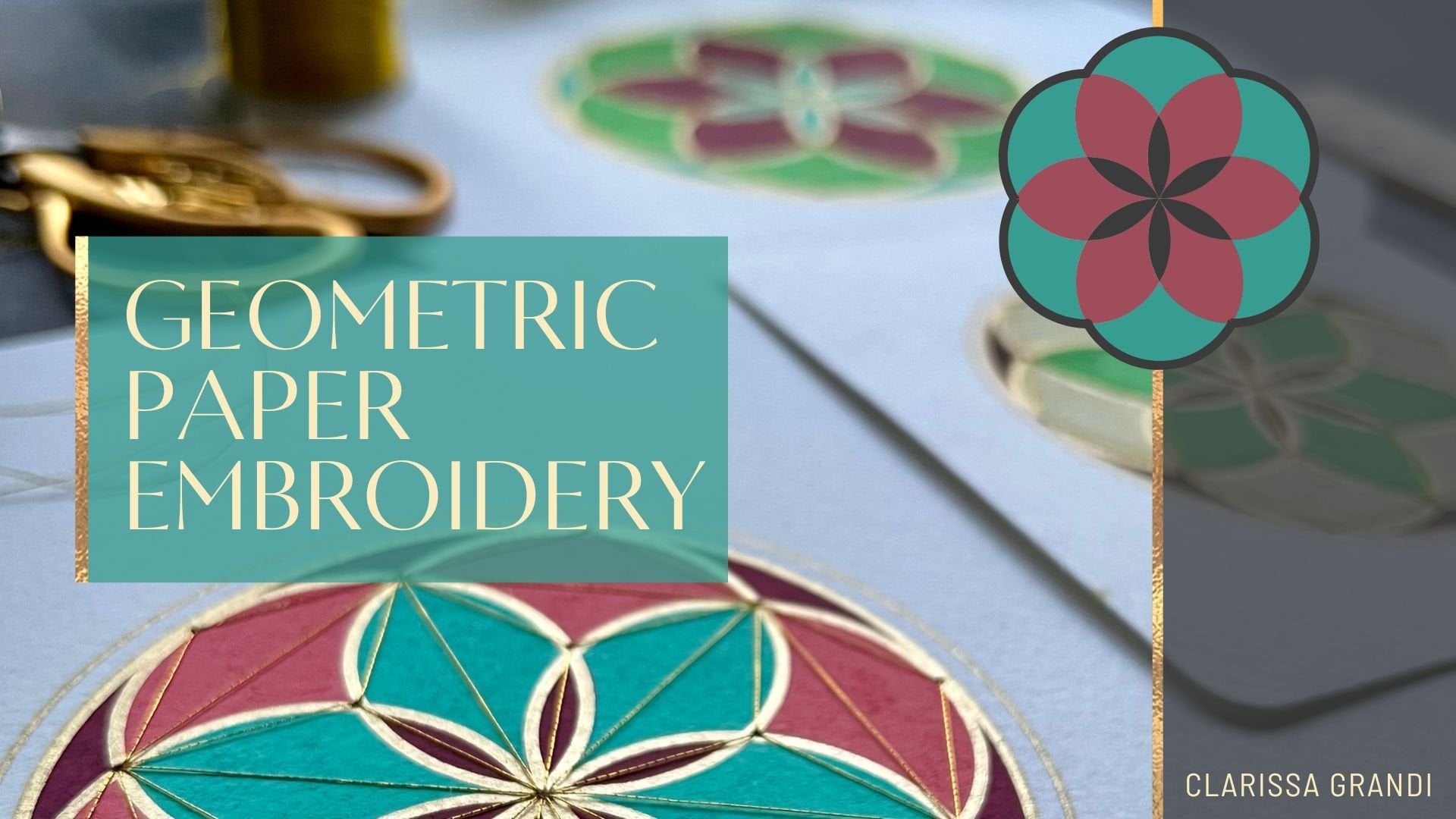
in trying out paper stitching as a way
of enhancing your artwork, then you might be interested in my geometric paper
embroidery class.
12. Conclusion: Thank you so much for
joining me as I've shared the construction of
this iconic pattern with you. I do hope you're happy with your mandalas and that perhaps
you feel more confident about the geometric
construction process and perhaps more confident
with your watercolors too. Remember to share an image of your completed work in
the project gallery. I can't wait to see them. And you can also tag me if you share your
work on Instagram. I'm Clarissa Grandy. If you've got any
questions about the class or anything else, please pop them in the
discussion section. I'll keep an eye on it and I'll be sure to get back to you. Furthermore, if you're
interested in learning more about my favorite art
equipment, the compasses, I'd recommend my
favorite gold pens, my favorite erasers, and
the paper I like to use, and so on and so forth. You can find an
affiliate link to my Amazon storefront
in my Skillshare bio. And you can also sign
up to my newsletter there and find links to
all my social media. Follow me on Skillshare to keep up to date with all
my new classes. I have loads of ideas. I just need more time. But I'll get there and finally, I'd so appreciate it if you were able to leave a short
review of the class. It means that my class will get shown in search
results more often. Which means that more
people might discover the joy of geometric car
making for the first time. All that's left to say is take care and happy compass spinning.
 Clarissa Grandi, Artist | Educator | Author