Transcripts
1. Welcome: Hi, my name is George, and in today's course, you will learn how to make this very, very simple landscape. In this course, you will learn that it doesn't have to take a lot of time to make a beautiful illustration. This landscape seems like it has a lot of trees, but they are all clones. So you take one and you make many of them. And with slight changes, you will create a forest that looks very diverse. You will need the Apple pencil, the iPad, and the procreate app. Would all of that being said, Welcome to this easy course.
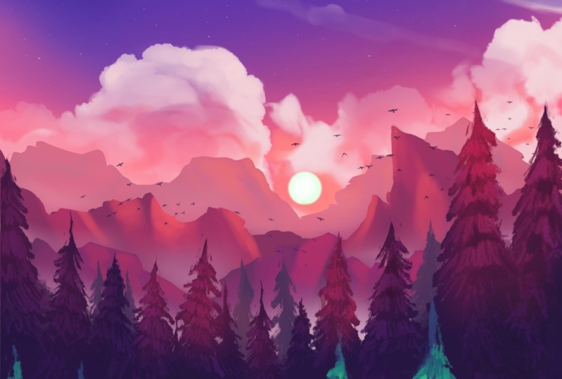
2. Gradient and sun: For this illustration, you will need a canvas size 4 thousand by 6000 pixels. This will give you seven beautiful layers to work with. Once you have that, you can go on the project resources page and download the color palettes. Let's drop in this beautiful blue as a background color and then select the most beautiful orange, as well as going into the airbrush and soft blends, making it quite big and lowering the opacity start by drawing a very straight line Onto the middle lower section of the sky, lowering the opacity even more as you go up in order to create a beautiful gradients like that and going a little bit lower as well. Once that is done, you can grab another beautiful orange that you will find in the corner on the color palette and start layering a little bit of this color as well, going in and selecting the second to last on the color palette, and going into drawing for the pencil. First adding a new layer and calling it the sun. And then going into the mechanical pencil brush circling just about here and holding down the pencil to make oval. And you can go ahead and put a finger on the iPad to make a perfect circle, going and clicking on the arrow tool to make the circle a bit smaller. Trying to find the right size that feels about right. And of course, you can move it by just clicking on the side and start positioning it quite close to the center. And let's make it a bit smaller. And once that is done, you can grab the color and drop it in. That looks wonderful. However, it needs a little bit of Guassian blur. You can find it on the Magic Wand Tool thing. And then just by sliding pencil to about 10 percent or 7%, it will look quite good. Let's go on the layer and alpha lock the layer. Going back to artistic and to the airbrush in order to add a little bit more mass to the center of the sun. Just positioning the sun a little bit higher in the sky. And then there you go. This step is done super simple.
3. Mountain lines: For this layer, you will need to select a beautiful brown, orange color, go in and add a new layer, call it mountains by renaming it. Just like that. Once you do that, you can go into the brushes and select under inking the brush called Syrup. She can make it quite big. Start drawing in some mountains, going and making some interesting edges. Keep in mind those mountains need to be quite angular. The difference between distant mountains and distant clouds is that the clouds are a little bit more fluffy, more round. So try to make these mountains just a tiny bit more angular. Once you've done that, you can go ahead and add a new beautiful color that you will find on the color palette just right next to the orange. And add another layer of these beautiful mountains, keeping those outer mountains in the distance still visible and go a little bit higher if you want in some places, but also keep them visible so that you can have them nicely shell up. Finishing the line of new mountains. Super nice and beautiful. And of course, going and adding a new layer of mountains with this new found color, you will find it on the color palette and trying to make them a bit smaller in size, Let's start to make those mountains on top a little bit more angular, just so they seem more like mountains or cliffs. Okay, going in selecting the first color that you used and starting to add a little bit more angles to the mountains and a tiny bit more what the second color, and now they look more like rocks. Okay? Just like that. Adding the color to the color palette and starting to add some more angular mountains at the bottom, just over here, finishing the line to the right and to the left, adding some small ridges, going and finishing the mountain on the right in the middle section is going a little bit higher, adding some more tall section to the metal part, selecting the purple once again to add a little bit more refinement to the bottom half of the illustration. Okay, and there you go with this layer, the mountains are done. Look at how beautiful data look, super simple to do.
4. Tree layers: For this step, you will need to create a new layer and rename it to 3s. Once you've done that, you can go onto the color palette and select the darkest blue. And with the brush called hertz, making it quite small and zooming in on a corner just like this, it can start to create a beautiful tree. This tree is very easy to make. You just make some small steps just like this, going further along with the brush. So it's quite straight, and then it goes and bends and has this small little increments of color just going on the outside, adding some more branches on top. Okay, this going ahead and adding some more thickness as you'd go down, going and creating some more ridges and a more organic looking edge. Okay. Adding some more runaway branches, a little bit smaller, just to focus in on those smaller branches. And just like that, the first three is created. Let's make it a bit bigger by using the arrow tool and position it a little bit more to the left. Once you've done that, you can duplicate the layer and duplicate it once again, select it, flip it around, and use the beautiful tool to make a bigger three just like that. Once you've done that, you can go on to the eraser with the same brush that hurts and make it quite small and start erasing some of the edge of the three just to make it more interesting and quite different than the outer one, okay, going around the edge and making it quite different than data one. Don't forget about the second three. Once you've done that, you can go into the wrap tool and change this tree quite a bit more. This time using a different technique, going into the hue saturation and brightness, and making the brightness a little bit higher, just so it looks much better. Go ahead and merge the two layers with the darker trees and duplicate them once again and move them to the left, flip them around. Once you have flipped them around, you can make them a little bit smaller and position them just in front of the lighter shade three, okay, going and using the eraser just to mix and make a different kind of a tree, making the edges a little bit more interesting and different, also going into the brush and making a more rough contour of the three, adding some new branches and sections. Once you've done that, you can duplicate, merge and duplicate the trees once again, move them to the left side, flip them around and position them just next to the outer 3's. Let's zoom in and erase some of the tips as well as some of the branches to make it seem different. Just small differences that will trick the eye into thinking these are separate trees. Let's duplicate the last layer. Let's drop it down into the last position and change the color to match the outer three and the background. Once you've done that, you can scale them a little bit down and position them in between the outer threes. Let's flip it around just so we can find a better position. Once you've found a position where they fit perfectly. Okay, duplicate the single tree just from here. Let's merge the two layers in order to have another layer to duplicate. And then you can just put it in between those beautiful trees, make it a bit smaller. You can go ahead and duplicate the layer on top. Once again by first merging the three layers and then duplicating it so that you can flip it around and move it to the left. Okay. Making it a bit smaller and then moving it to the left. Trying to find a position where it fits quite nicely. Using the wrap tool to bend those trees a little bit more and make them seem like they go into valley. Just like that. Going and grabbing the Hertz tool in order to create a beautiful bottom layer of this blue, just filling it in very nicely. Once that is done, you can start to create a beautiful new, new wrap tool with the trees and just position them a little bit higher. As well as going ahead and doing the same with the lighter trees, making them a little bit taller, finding a position where they fit nicely in between the outer 3s. Once you've done that, you can go ahead and play around a little bit more with the trees making I'm a little bit more curved at the bottom, revealing more of the mountains. This will give a little bit more of a dynamic feeling to the composition. Let's lower the other ones as well. And once you've lowered them, and you can also go ahead and duplicate the layer, and this time, put it on top of the darker trees, grab the layer and put it on top just so they show up quite nicely, and these will be in the foreground. Let's go ahead and go into the hue saturation and brightness increase a little bit of the saturation. And just a tiny bit, make them a little bit more towards the teal. And let's make them a bit bigger and position them a tiny bit lower. Just like that. Making some beautiful trees in the foreground make them quite a bit bigger and lower them down, trying to find a position where they fit nicely and they look organic. Let's try to flip it around and see if this is better. Quiet, a lot better. Once that is done, you can merge the two layers in the background and duplicate the lightest trees and position them a little bit to the left, giving you a few more trees to work with. Perfect, Let's merge the lightest layers and start erasing some of the tips, just revealing new shapes into the trees so that they don't seem like exact copies to the background. Threes, just a few changes. And there you go with this step as well, such an easy step, Let's go into the next one.
5. Color balance last step: So close to the finish, go ahead and go on the first layer with the sunrise and select the color balance tab, and start playing around with the highlights, making them a little bit more pink. Just going and dragging those beautiful sliders to make the sunrise a bit more pink, as well as going into hue saturation and brightness increasing a tiny bit of brightness and a lot more Ration playing around until we find a happy medium. Once you've done that, you can go ahead and select this tiny bit of blue, the darkest one going to airbrush. Soft blends, increase the size, decrease the flow even more, and the size a bit more just to add a little bit more blue to the top side of the sky. Okay? Adding another beautiful layer of blue. Just to make it more interesting, make the colors a little bit more interesting. This is just to play around with colors and different variations, same illustration. Once you've done that, you have finally completed this super easy and simple illustration. Congratulations. And of course, if you are gracious enough, you can always leave a review as well as share a photo of your illustration with the world. Thank you so much for being part of this community and see you in the next course.
 George-Daniel Tudorache, Together we will create amazing things.