Transcripts
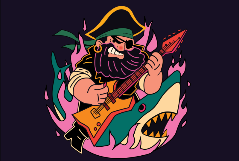
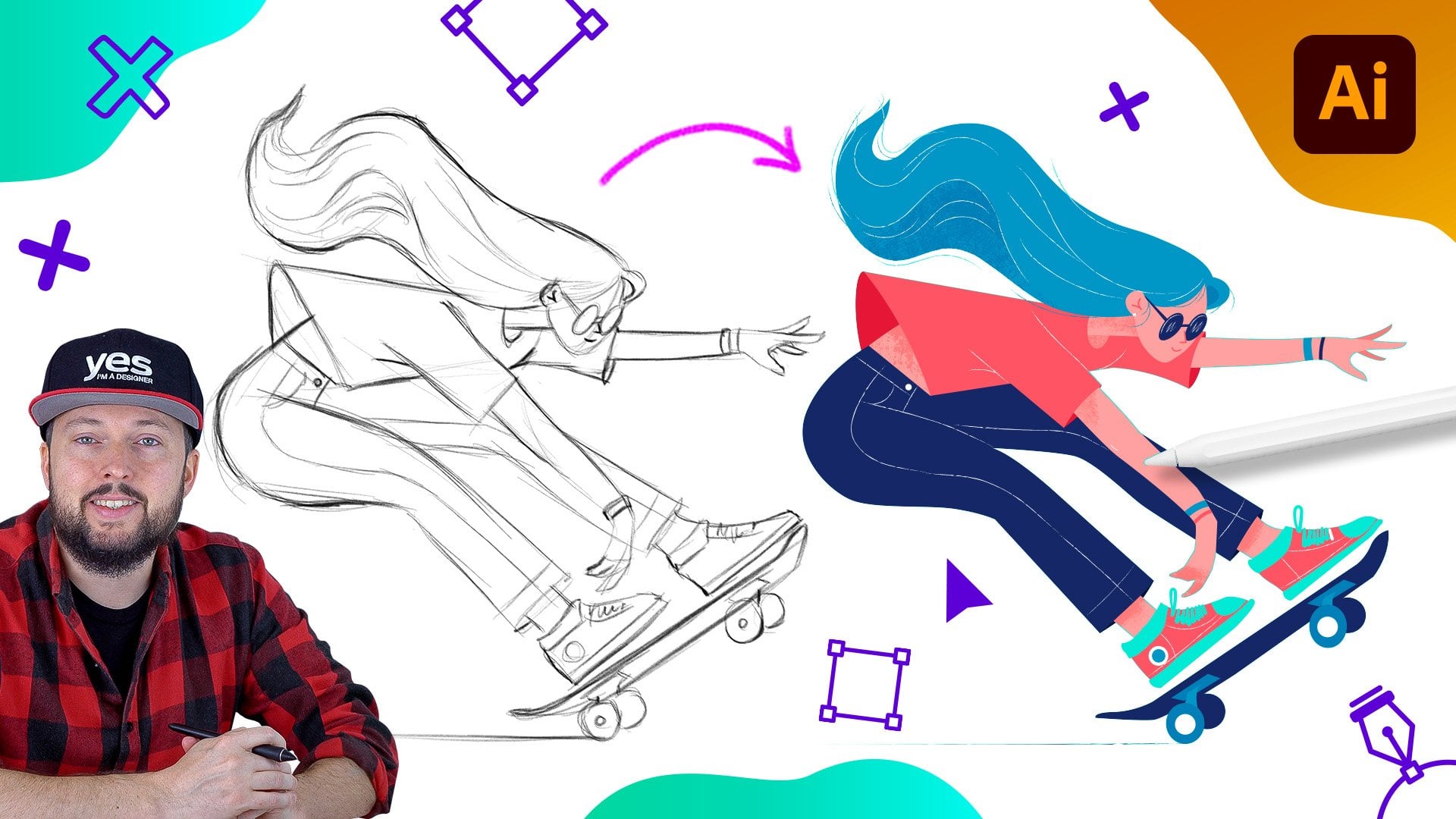
1. Introduction Rocker Pirate: Do you want to get
good at creating awesome vector illustrations
using Adobe Illustrator? Well, you came to
the right place. This time, we will be working on a cartoon ish illustration, creating a hmsical,
exaggerated character. In terms of the style
of the illustration, I wanted it to resemble
a sticker or decal aesthetic with a touch
of retro rock influence. Whether you are an
aspiring illustrator, digital artist, graphic designer,
photographer, marketer, or simply someone with a passion
for visual storytelling, Mastering Illustrator
provides you with the tools to turn your ideas into
stunning vector art. I will be guiding you
through every step of the process from the initial
sketch to the final touches, giving you a comprehensive
understanding of Adobe Illustrator's incredible
tools and features. This course is perfect for you if you are new
to illustrator, or if you are self
taught and aiming to get more confident
and effective using it. I am Martin Perini, a certified LOB professional, and instructor with
a design background spending over two decades. Throughout my career,
I've collaborated with renowned clients
such as Disney, Mattel, Cartoon Network,
Nickelodeon, and BBC. Leveraging this
extensive experience, I have carefully crafted
this course to help you navigate OB Illustrator like
a seasoned professional. I am not just
teaching Illustrator. I am empowering you
to express yourself. Tell your story and create illustrations that resonate
with your unique style. This is your chance to
create work that is truly personal and worthy of your professional
creative portfolio. You can follow along and
replicate my illustrations, or you can use the
workflows and techniques I show you and create something completely different than need. There are at least two
additional compositions you can choose besides the one I
am using in my examples. And roll now and
let the fun begin. Your creative adventure with
Illustrator starts here.
2. Drawing the main shapes of the head: For this type of illustration, I like to concentrate
on certain areas. And since it's a
really fun character, I'm probably going to
start with the head. Once I have the head illustrated
and detailed enough, it's going to encourage me to continue drawing the
rest of the details. So it's always good to motivate yourself and work
on something that you're very excited about and then move on to other areas. I also keep in mind that certain details,
like, for instance, in this case, the shark, is probably the
furest away from us. So maybe that's also makes
sense to concentrate on. And instead of just
drawing the head, I would draw already the
tail together with the body. And then later on, the
additional details will be added on top of
it, like the guitar. Now small details like the skull or these tiny little
details on the guitar, and maybe even the
tattoos on the arms. I will probably
leave till the end. So these are like final
refinements that I will only work on once I'm 100% happy with all the
rest of the details. Without any further delay, let's get started on the head. What I'm going to do first
is to draw the beard. So for the beard, I am
going to draw the outlines, and I'm going to
use the pen tool, click and drag, click, and I will already set up the color that I was
planning to use. I'm going to use a thicker brush maybe around. Five points. And then I will also zoom
a little bit closer, so we can see it better. So at this point, I just
clicked one more time on this anchor point to make sure that it can
start as a new curve. Just to see this again, I'm
going to click and drag, define this next curve. And if I don't click again here, it's going to try to
continue and make this into a smooth transition
between the two curve segments. So I'm just going to click
one more time here and then continue creating
these little curves. There's one more there.
Another one here. And at this point, I already can see that the guitar is most likely
going to overlap this detail. But still, there is no harm
in just finishing it off, just adding a few
additional curves here. We need one more here. And then another one there. And the last one
here, click and drag. I can hold down the space bar to reposition this point if I'm not happy with
its placement, and then come up to here. Now we can go down and follow
the beard line this way. Then we can go under the nose because the nose
will be added separately, then go up here. Again, create a nice smooth
curve going down the ear, probably around there and then
just connect it to there. Again, maybe we can just go a little bit
further out this way. And then connected together. And here at this point, I also want this to
be a smooth point. So I'm using the direct
selection tool selected, and then click on the
convert selected anchor points to smooth option. And then I'm just going to
drag this out a bit and align these handles to make sure it creates a
nice smooth transition. That. And we can maybe even get rid of this
anchor point here. If we use the minus
keyboard shortcut that takes us to the remove
anchor point tool. And holding down the shift key, we can try to remove this. I felt like that wasn't
necessary there. Maybe even this point here, we can remove ye, to simplify things a bit. Feel like the rest of the
points are necessary yet. This one can't be removed. Maybe this one can be removed, no, even that one is necessary. So I feel like this
is the minimum amount of anchor points that we
will need for the beard. And I might actually
change the color of it just so we can see
it better for now. So then we will also need a few lines to define the shape. So I'm going to click and drag draw this command
click to start a new line. Click and drag here. Command click, click and drag. These lines should lead
into those details below. Again, we can click and drag. Click and Drag. Another click and drag. Command click or Control click. Here's another beer detail. And one more. And maybe we can have one more
up here as well, even though I didn't
have that in the sketch. And then we can also
have this one here. Okay. I feel like these
are looking good. Now we can probably
draw the hair line. So for that, I'm going
to come out this way, come down here, and
then go up this way. That's going to be the hair, which will be hidden
behind the ear. We can already draw
the ear for this. I'm going to again use the
pan and just draw that shape up and then come
down and close it. So the ear is going to
be behind the beard, but in front of the hair line. Then let's draw the mouth. This, again, I'm going
to start with the lips. I'm just going to
draw the lower lip. And it's probably not even
going to need the upper lip. I feel like it's going
to work quite nicely. Just going up here. Come back down and
then continue drawing this way, like that. This point here can be set
to a smooth point and just refine its position. Like so. Now we can draw the teeth
which is actually the mouth. We'll just use the pen try
to do this from one point. If I click and drag up here, I can go down all
the way there and then create a nice
transition here, and then I'll just
fill this in below it. So as you can see, I
already think about what's going to be in front and what's going to be behind. Like with the nose as well, I can just draw
this coming around, going up, maybe just curve
it up a little bit that way. Again, this is going
to overlap the beard, so it will come in front of it. Then we can also
draw the eyebrow. I want this to be
nice and thick, so it's going up that way, holding down the shift key, can drag it out, just like that. Then for the eye, we can just draw a circle. And then I'm actually
going to have another line underneath it for
the lower eyelid. Even though I didn't
have that on my sketch, I think that looks good. Now, the eye patch, using the pen tool, let's
draw over it. Click and drag. Yeah, that looks good. And then this detail here can be drawn
with a single path, and we are just going to
add thicker stroke on it. So we hold down
the shift key and add the stroke size
probably around that much. And maybe just continue drawing a little bit
this way as well. Now, of course, the
stroke can be set to cap. Which is going to
round it down a bit, and that's looking
better already. We can press shift X
on this detail and also on the eyebrow and the eye. So we swap those colors around. I'm already using this dark
purple that's going to be our dominant color that will be used also
for the background. But for now, I'm just using
it for these details. And then we will need to also
have a shape for the skin. So that's the face, essentially. So that's going to
come down here. I'm just going to draw
around this section quickly. And I'm going to use
this color for the skin, so I will fill this in already. And I'm using command left square bracket to move this
behind the other shapes. So it's actually going to be almost all the way
at the bottom. In this group. We
can already select these few lines that we created here and
group them together. So we need all of
these together. And I will already apply the color that I was
planning to use on them, and even the outline of
the beard can be the same. It is this pink color, and I will use
round cap on them, round joints, and
that is looking good. Now, all of these smaller lines, I will group together
commando Control G. And I can drag that
all the way to the top. Now, what we can do is to have these shapes
filled in as well. I will press shift x and then change the field color
to also skin tone. So that's the lower lip. And then this detail here, I will fill in with
this brighter color, which is going to be
used for the teeth. This shape can be
behind the lower lip, and the lower lip actually
needs that outline. I will use the five point
stroke size like this. And then we can now have
the beard selected, and let's have that filled
with this dark color. And that's looking
already more interesting. It's starting to come together. This one can be also dark or
shift g to swap it around.
3. Drawing the ear, ear ring and headband: The ear can be the same
appearance as the lip, so I would want to
have the skin tone and dark outline around it. But here is one thing that
you can't actually use the y dropper tool to
sample a color when you're using a sketch on
top of your illustration so that template
layer that we have here have to be turned
off temporarily. Have the ear selected and
then use the y dropper tool. The shortcut for it is I, click on the other shape, and then there it is. It's already sampled. Now, this needs to
go behind the beard, but in front of this hair
line, just like that. I'm actually going to
refine the shape of this move it down a bit. Also this part here
can be a bit rounder. That detail as well
can be a bit rounder up there, something like this. And I was actually planning
to draw a line in here, so I will just draw that
before I forget like this, and I don't need a
feel color on this, but I want a round
cap at the end of it, and this should also go behind the beard but in
front of the ear. Like this. I can also see a few additional lines that should have round caps on them. So I just turn those on. And then for the nose, I want to make sure
the feel color is the same as the skin tone. So this way, it comes
in front of the beard. And then I'm just
going to select one of these lines that I already created just so I can
draw another similar one. I would like to have one
additional line here. And then also maybe
one more here. Just to define the
expression a bit more, and maybe we can even have
another line underneath there, just to make it look like there
is also the lower eyelid, even though it's covered
up by the eye patch. And we should also have some
lines here for the lips, just to define it a
little bit better. As one line there could work. And let's take a
look at the sketch. I wanted to have the lines
here for defining the teeth, very simple lines, a few
additional lines like that. And then of course, we want to make sure
that these lines are also behind the lower lid. I'm going to select
all three of them. We can even group them together commando Control G and then drag them down in
the layer spanel either using the shortcut
or the layer spanel itself until they go
behind the lower lip. And then that one I
can just refine a bit, have a better curve
here on this side. Okay, I'm going to also extend
this line a bit this way. I feel like that is
looking quite good. Let's zoom out a bit. And now we can focus on
the rest of the details, so we will need the hat. That's part of the heat. And also, I was planning
to add an ear ring here. So for this, I'm actually
going to use the ptol let's draw this
quickly, like that. But what I will do
here is to change the fiel color to this
more golden color. And I actually will use two
strokes instead of a fiel. So I'm going to remove this feel because I feel
like it's going to be easier if we
have two strokes. So former the appearance panel, going to add another
stroke value, and I'm going to set that
to be the cold color, and I'm going to
increase it a bit. So actually, this needs to be the dark color and the one on the top
needs to be the gold. And let's just increase
it a bit more. There you go, is looking
much better already. I can be more
accurate here using ten point stroke width and 20 point stroke width
for the one below. This way, there is exactly
five point thickness on both sides for
the dark outline. Since this path is centered, that 20 point is divided
between these two. So the one that is
being overlapped by the brighter color is now exactly 5.5 point
on either side. But I want this path
to be interrupted. So for this, I'm going to
use the scissors tool, and I'm just going to crop it. Here and drop it
there or cut it. And then we can just select
that path and delete it. And then this remaining path we can create a round cap for. But when you are setting
the round cap, by default, it will only apply to the
selected stroke attribute. But we actually need to select
this other stroke as well, since we have two
strokes on this path, and also set the round cap That one. So now it is
looking much better. And this detail here should actually be hidden
behind the ear. Now, one thing
that you can do in these cases when
you have an object, in this case, the ear, and the ring that is supposed to come at one part in front of it, but another part behind it
is to use an opacity mask. So we select the ear, copy it, commando Controls. Then select the ear ring, and then add the opacity mask from the transparency panel, click on the button make mask. By the way, if you don't
see the transparency panel, just go to the window menu
and open it up from there. So now that we have
the opacity mask, we just have to turn
off the clip feature. Click on the mask,
this white square, and then press commando Control
F to paste the shape in, which is the ear. Now, while this ear is selected, we have to make sure that both the stroke is set to black. And also the fill
is set to black, so just adjust that quickly because black hides white
shows in an opacity mask. And notice how immediately the ring is hidden
away completely. But what we didn't want to do is to hide away this side here. So for this, simply, I'm just going to
use the eraser tool, hold down alter option key and cut away the part that
we don't need to affect. So we only are left with
this small shape here, which is literally just hiding
that section of the ring, the left side. Going
to put this back. But you can see as
I move this around, it's used to hide
the details now, since it's set to
completely black. So this is a simple way of using two objects,
in this case, the ear and the ring and
still be able to create an interaction
between them where one side comes in
front of the ear, the other side seems like
it's going behind the ear. But that's just simply achieved by using the opacity mask. Going to click back here
on the other thumb nails, so we are exiting the mask, and then we can click away and zoom out just to
see how this looks. Now, the good thing
about this method is that we can still go back
and easily make adjustments. So, for instance, if we wanted
to make the ring thicker, we can increase the values, maybe go up to 15 points, and that way, we can also
increase this by five points. And I feel like that looks
a little bit better. It's just more noticeable
from a distance. Let's just turn off the
sketch. Take a look at this. I like the way this looks, and now we can just go
back, turn on the sketch. And let's just finish off by drawing the additional
details that we need here. So we need first of all, this ribbon or band
that's around the head. I'm going to draw this way, and I will go back to
five point stroke size. Just reduce that down quickly. And it should be
running across here, so this can be done a single
curve using the penol. Then click on this point here, come up a bit and
then go in Go up. Click again on it, and
here's another big curve. Feel like it can be
one with a single one. Just use the command
key and drag it over once it's ready. Now, for the feel
color of this one, I wanted to use this teal color. I think that's going
to be a nice contrast, and it works well. I actually wanted
this line to be running across that band, so I bring this forward. I wanted the eyebrow
to go under it, so I'm going to drag
this up a bit like that. That completely runs into it. This detail here as well
can come a little bit further in be around there.
4. Drawing the hat: Now it's time to draw the hat. So for this, I'm going to
start drawing the first path. Then again, the stroke size for this should be five points. So we click here in
this corner point, then we click and
drag. Click and drag. Click and drag here. We can just hold down the
commando Control key, drag this back a
bit that handle. Then click and then
click and drag. And we can just close this
off here behind everything. This is going to go
behind the head, so it can be created this way. And I think we can set this
up with a feel using yellow, and we won't actually need
a stroke color for this. So just that yellow. And then we are going
to draw another shape. Similarly to this, but
still slightly different. So I don't like to use the same shape for this
because I want to add a bit of variety and make this
feel a bit more unique. So we have this secondary shape, and this one can
be filled, again, fill color with the dark purple. Now, I can select these
two, group them together, Comando Control G, and then send them all
the way to the back. And let's just turn
off the sketch. Just to judge what we created. I'm going to adjust this
shape a little bit. So drag it out, make it more
continuous. Like that. So this point here can
come out a bit and down. And then this side can
go down a bit more here. And I feel like that is
looking quite good already. I can select this shape, and I will probably add a
bit of round corners on it. I don't want this
to be too sharp. Yeah. Something like that
feels better. Same thing here. Just add a bit of round corners. So those details
are not so sharp. Actually, like these
corners the way they are. I'm not going to
round them down. I like them to be
slightly more curved. Maybe they can be reduced in just a tiny bit like that
using the corner widgets. So I used the direct
selection tool and selected these four points, just rounded them
ever so slightly, like that, and I can still move this up a bit just to adjust it. Now what I want to
do also is to have this point drag down
a bit this way. This actually needs
to go behind the ear. So let's see if we can do that. There. And then the
eyebrow has to go behind the band like that. And then I'm just going
to draw a few lines here to divide this detail up. I use the y dropper tool sample that path that we
already created. This can be dragged up
a bit more and aligned. And let's draw another line starting from here,
coming to the left. Yeah, that is looking good. Now I'm going to have a
skull here on the pirate at, but I'm going to add that later. That's a bit more time
consuming detail. I'm not going to
do that right now. I am quite happy with how the
head looks at this stage. Maybe one small touch
that I wanted to do is to make the nose
look a bit more red. And for this, I'm
just going to draw a circle here on the
tip of the nose. Like that, and I'm going
to use this red color. But I'm actually going
to blur this out. So I go to the effect menu, choose Blur GaciM blur, and we just need to
reduce the amount on this probably to
around this much. And let's click. So that's
one way of doing this. But whenever you
use roster effects, you have to also make sure that you check the effect menu, document roster effect settings, and you want this
resolution to be at least 150 points or 300 PPI. And that's going to
make these effects much more subtle or softer. But one other way to do this is to use a gradient instead. So we can remove
the gaussian blur. I'm just going to
show this quickly. So we have this
shape already here, and I'm going to open
up the gradient panel. So from the window menu, let's get the gradient panel, and I'm going to click
on radial gradient. And here we get the controls. If I press G on the keyboard, I can also see these colors
directly on the illustration. So the center point, I want it to be red, and then the point
on the outside so that swatch can be
changed to the skin tone. And this is a much better
way of doing this because here we are relying
on roster effect. And we actually have
better controls as well. We can control exactly how
far we want this to go. We can also change
the shape of it. But, yeah, we can drag
it out like that. And of course, we can also
change the size of this shape. But what I'm going
to do to avoid having a harsh transition
is to make sure that this outer swatch is kept within the shape of that
ellipse that we created. Increase the size of the ellipse if I want to
something like that. So let's take a look at
this from a distance. That's looking quite good. Now, one other thing
that you can do is to also have this
gradient selected, either from the
gradient panel or from the annotator and reduce the opacity to 0% on
the outer gradient. And you can actually drag
that out all the way. So this way, no matter
where you move this, it's not actually going to have that additional color
on the outside. And we can drag this
point further out if we want to
intensify the redness. Something like that, drag
that a little bit closer. So the transition
is less visible, but this works quite well, and we can take a look
at this from a distance. Yeah, I feel like that
is looking quite good. And we can always refine
this later if we wanted to. But for now, I'm just going to drag this line out
a bit this way. Yeah, I am happy with
how this turned out. So now let's select
everything that we created so far and
group this together, Commando Control G, and this
is going to be the head. So let's rename it. And let's turn the
sketch back on just so we can see where
we are at this point. Now, like I said, we have one of the most
exciting details ready. Now we can move on to maybe do the second most
exciting detail, which would be the Shark. So let's work on that one next.
5. Drawing the shark: For the chart, I'm going
to use the pen tool again, and this will be easier
compared to the head. There's not as
much details here. So we will only need
a couple of shapes. So let's just start
drawing maybe up here. I always like to start
with the corner point. So click there and
then click and drag. Click and drag again. And then we can come
all the way down here, click and drag. And even though there
is the mouth here, I probably will do this
as one single curve. I think it makes more
sense to do it this way. So I can click and
drag this point out. Hold down the space bar, maybe. We can reposition it. So yeah, that created
a nice curve there. We can adjust this
curve a little bit more just to make it
even more smooth. And then come up here, create a straight segment, then click and drag to create the tip of the nose. Like that. Then come down and click and drag here
for the next curve. Again, I'm holding
down the space bar. Looks good, and then
we can come up here. I think most of this
will be covered, so we won't see much
of these details. But still I'm just going
to draw the line here, then click and maybe
drag down this a bit. Click and drag. This line out, again,
this will be covered up, but still I'm going to
click there to create a sharp point and then click and drag to
define that last curve. Okay. So that is the outline for the
shark that we needed. I'm just double checking if
everything is looking good. But I think it's
going to work well. So now I can already draw the segment that needs
to be cut from this. So I'm using another
shape to create this. Click and drag. Click and drag and then come out this way and close the shape. So we can select
these two parts and then use the shape builder
tool that's shift. Hold down old option
key and cut into it. So even though I could have done this
with a single shape, I sometimes prefer
to work like this. So this way, I get a very
nice continuous line up here. I know it was made of
a single curve that is making it more continuous and adds a bit more
flow to the shape. I can still refine
these, of course, if I wanted to just to
make sure it looks good. Yeah, I like the way that looks. And we can draw this
other line here. But what we can do
is already have that drawn inside the
main shape of the shark. So I will switch to draw inside mode or just press the shift on
the keyboard twice. And then again, I'm
going to start drawing out here, click and drag. Click and drag. These are
all going to be curves. Coming down this way.
Going down there. Then again, most of this is
not going to be visible, but I just keep drawing it out here and then
coming up this way. Maybe this can be
dragged up a bit, can be dragged up as well, and this can be dragged out, and then we can just
close this off. Coming all the way out here. Okay. So that's going to
be a shape that we need. And we can also draw the I now. So the I we can start with a circle more like an ellipse and then
use the rotate tool. Maybe also drag this point
down a bit like that. And then we can draw
another ellipse for the i. And then we can just rotate that as well do something like this. And then maybe we can drag
this again a bit that way. Okay. This looks good. And what we can do is
to already color these. I'm just going to remove
the draw inside mode, go back to just
drawing normally. And these shapes
actually for the eye, I can drag outside of
this clipping group. They don't have
to be part of it. Just makes it easier
to select them. So I'm going to press shift
exxon to swap the colors. And for this, I'm going
to add the color. We have here as the feel. Maybe we can make
this slightly bigger. We can adjust this
later, of course, but I think that is
looking quite good. Now, for the main shape, which is our clipping path. I selected directly
from the layer s panel, I would like to use this
feel color, the teal. And then for that
additional shape that we added inside it, I'm going to use this
bright cream color. So, let's click away. And let's take a look at
this without the sketch. Yeah, is looking good. So let's turn the
sketch back on. Now we need a couple of additional details
like the teeth. These I am actually going to
draw with a single shape, at least the ones on the top. I will add a little
bit of curve. So they won't be completely
sharp at the end. Just like this. And
more down this way. And then we can just close
this up here on the top. And to make this
color differently, I'm going to use yellow
or this golden color and then set it behind the
other shape like that. Let's use the penol again. And the reason I'm doing
this in a single shape, both on the top and
the bottom is to reduce the amount of shapes that we have in the composition, but also to make it easier later on if I change
my mind about their color or the roundness
on these top details here. And I'm going to again just set this back behind
the other shape. And then we need one more shape, using the pantol, just going
to draw this up quickly. Here, going up this
way, curving down, click and then create a shape
that is closed like that. And this one just simply needs to be filled with
the dark purple, no stroke needed, and set this behind also all the other
shapes, just like that. So that is looking really good. Now we just need these
three lines here. For this, I'm going to turn off my sketch layer and just sample, maybe this line here. That's exactly the same style
I want to use for these. Let's bring back the sketch. Use the pen tool, command, click away, start a
new line, Trow it. And then one more click here. Maybe hold on space bar, drag it out a bit.
That looks good. Now, maybe these can be
actually thicker a bit. I'm going to use maybe ten
point thickness on these. Feel like they are working
better if it's a bit thicker. And I can just adjust
them a little bit more. Okay. Yeah, I feel
like that looks good. Let's take a look at
this without the sketch. And at this point, I'm happy with the
way this looks, so we won't need to
do anything else, so we can already group
all of this together. I'm going to just lock the head layer so that won't
get accidentally selected, and I am going to
select all and then control or command G to put
it together into a group, and let's call it Shark. So we have our
second detail ready. We can also lock this, and then we can move on to
maybe draw the guitar next.
6. Drawing the electric guitar: To draw the guitar, I'm going
to start with the body. So again, I'm going to use the pen tool and just define
this first path here, then this can be a straight line on the
straight line straight line. Then we can click and
drag and come up here. I can reduce that a
little bit this way. And then I am going to continue with another curve
coming down this way. Actually, this can
be a straight line just to make it
symmetrical to that side. Come down here and then
come out this way. Okay. So that is going to be
the body of the guitar. And we can just draw
the bridge quickly. I will actually draw
this with a rectangle. And then we can
just add a bit of curving on it using the
direct selection tool, I can access the corner widgets, and that creates a
rounded rectangle for us. I'm going to add two circles
for the tonne controls. Since this is an
electric guitar. Yeah, something like that. We'll refine these later. And I actually would like to have this object a bit wider, so have a bit of a
three D effect here. I'm going to draw the
depth for the guitar. So I'm going to
draw it down here. Just come all the way down
here, like on my sketch. That. Then come up here, I'm going to keep it
mostly straight like this, straight line, straight
line, straight line, and I will actually go also here and then
connect up to this point. Actually we will
connect down here. Like that, and then
go up that way. Okay, since this shape is going to be behind
the other one, I can just close
it up like this, and I can already place it
there where it's going to be. But maybe we can already
start adding the colors. So this field color, I was planning to
use the yellow. For this other shape. I wanted to use this
red or pinkish color. I'm going to move this behind
where it's supposed to be. So that is looking
already interesting. Now, for this shape,
I'm going to go into the stroke settings,
which is down here. Let me just bring that
up so we can see it. I would like to use round caps. So that way, it's not coming out so much
here on the corners. And maybe for this
other shape as well, we should use round
caps and round joints. Yeah, that looks
better. Now it's time to draw the
neck of the guitar. So for this, I'm going to start here and go up all the way here. And I'm actually going to
draw this together with the head because it
will be the same color. So I go up all the way here, then come back down and maybe add the bit of
curve here at the bottom, bit of curve there as well and come down
all the way here. And close it off.
And by the way, if you're not familiar
with how a guitar looks. So if you're not
playing a guitar, you probably won't be that
familiar with the parts of it. It's always good to
look at references. So I just find a reference
image or a few of them, and then you will be able to find the details
that are important. And of course, stylize it. So since it's a very
stylized illustration, you don't need to show
every little detail, but the most important
characteristics of the guitar you should
be able to capture. So we have this ready. And for this, I wanted to
also use this yellow color. And just to create
some division here, I'm going to draw
a pick up detail. So this, again, I can
draw with the pano. I just draw over it like that. And this one can
have this pink fill. And maybe we can have one
more of these down here, and this can be a little
bit smaller, like that. That looks good. Now, the
tone controls can also have the same fill
color. That one. And for the neck, we
will need the frets, the horizontal lines, and
of course, the strings. So while I have this shape selected that we
created for the neck, I'm going to switch to draw inside and then
use the pen tool. And then we can just
draw these lines. Or in some cases like this, you can actually use
the line segment tool. It's not something that I use often because you can draw
them with the pen tool. But one advantage with this tool is that you
can just draw and then automatically
starts a new line completely independent
to the previous one. So I can just draw them like
that.'s keep drawing them. There should be equal
distance between them. But again, I am doing a
stylized illustration. So I don't try to be so
accurate with these lines. The hand is going to
cover this part here, so I can just come up this
way and then draw one there, and also just draw
the final one, which is called the nut in
case you are interested. And now we can draw the strings. I will actually draw the strings with five point thickness. And it should start
all the way down here, and then go up all
the way up to there. Now, this should actually not be inside this clipping group, so I'm going to drag it out because they need to go
all the way down there, and I'll turn off the
draw inside mode. And I think with the strings, it's easier if I
just duplicate it. So I hold down t option key, drag it out, drag it
out one more time. Now, there's only space
for three of the strings. But obviously, there's
supposed to be six of them. Maybe what we can do
is to cheat here a bit and just maybe add
one more down here, and it's just lined up to
the edge of the guitar. Maybe we move this down a bit, and that one as well
can come down a bit. At least this way, we
have four of them. It looks better
here at the bottom. But on the top, we just have to make sure that this is lined up and it disappears into
that line on the guitar. Maybe we can actually
have this neck dragged down a bit this way and
then aligned there as well, just to distribute them better. And then these lines can
also be aligned up here. Drag it all the way up there and this line last string
also can go up here. Yeah, that's looking a
little bit better now. Okay. Like that. And then we need
the tuners here on the top. Maybe this point can
be a bit rounded down, so it's not so sharp. But before I do the tuners, I'm just going to do
a couple of lines between the top and the
bottom of the guitar. One there, another one here, maybe another one there as well. And I'm just going
to draw a few more. For this, again, I can use
the line segment tool. Draw one up here, maybe a bit closer. Set round cap is already. Just to make it a bit
more interesting. We have some lines here
on this side as well. Some on this side. And maybe one more here. Okay. Yeah, that looks good. So now I think the
final detail we need are the tuners
here on the top. And for that, I'm
just going to draw a very simple object rectangle, fill it in with yellow again
for the stroke, the fill. I want to apply it
and then rotate it a. And then also have another
shape that connects it, that could be just
a simple line. Let's just draw that
line from here out that. And then let's place this line behind everything
that we created, group this together,
and then let's just drag it out to
create four of them. We can have them following
the shape of the like that. Again, they're supposed
to be six of these, but I feel like four will
be enough in this case. And then these strings are
supposed to be connected. I'm just going to do a
little indication of it by adding these
little circles here. Maybe we can reduce
the thickness on these down to five points
just like for the strings. There is one here,
just align it. Then click and drag. Next one, supposed to be up
here. Again, drag this out. Next one, old click and drag, drag it up here, and then
maybe drag one more up here. And then align this
and that using the direct selection tool. Okay. I feel like that looks good. Let's just take a look at
this without the sketch. Yeah, maybe we can just
extend the neck a bit more to allow space for
it for all the strings. Looks good. This side
can come down a bit. This path again. Okay. Now we could also add a
bit of depth for the neck, and maybe this shape here
can be dragged down a bit. I like that was not the best, but now it looks a
little bit better. Maybe we can add a little
bit of depth for the neck. I'm thinking, but might
introduce that later. However, since we are already
here, let's just draw it. Just going to draw this
again as a separate shape. I'll come up here. And replicate
what we've done before, go up, and then go
behind. I like that. And then let's just move it down until it reaches the point
where it's supposed to be. Five points thickness is
going to work better. And then the color for this, maybe I can use this other color just to add
some more interest to it. And we can, of course, move this point out a bit
more just so it shows, and then here on the top again, you can align this
better like that. And have a bit of curve there and then come
up all the way here. Okay. I feel like
that looks good, and now we can just
select all of this, and since the head and the
shark are already logged, I can group all of this together
and then call it guitar. Let's take a look at
this as the sketch. So this is what we just added. It looks quite good. We can refine details on it at the end, but for now, let's move
on to draw the arms.
7. Drawing the arms: In some cases, like here, it might make sense to
hide certain details like the guitar to be able
to draw the hands better. Since I know these will
be on top of the guitar and there won't actually be a direct interaction
between them, I can draw it without seeing it, so I can zoom closer, and let's start with
this hand here. We'll start drawing
it out like this. It can be one long
curve coming this way, then we can draw this. Finger. And I'm already going to turn off the field color
that's not needed. And I noticed that here I
created a bit of a mess. So let me just go back
and draw this again. I will drag this back this side, commando Control
drag, and that way, I won't have that
interruption there. So coming this way, maybe all the way up there
creates the first finger. Then we come up here, we
can draw the next one. It's a bit similar to what
we did with the beard. Next one. Then let's draw
the next one up here. For this, I'm going to
draw the center point. Come down here. And then come up here to
draw the thumb. Click there. I want to keep this sharp or straight and then come down
here and finish this line. And then what I will do is to continue drawing
this side, come up. And maybe around
here it's enough, so we can then
click and drag and draw this other
path around there. Now, this line here
is not necessary, so I'm going to use
the shape builder tool and alter option click on it. So I remove it and it will
line up exactly to the edge. And now if I select this and assign the skin
tone as the fiel, it's going to be an open path because this point and that
point is not connected, but this works really
well for us in this case, so it's not an issue. And we can actually set the
points to ten point for this. The outline can be thicker. And then I'm going
to use the pen tool, remove the feel now and just
add these details here. So for the finger detail, I'm just going to
draw in this way and another line draw there.ther
line, draw this way. And we can also have a
little indication here. Division between the lines. Then we can have this knuckles represented with a simple
line going down like that. Let's just draw this again. Yeah, I think that looks good. Now, the tattoos I am
going to do later. For now, I'm going to
stay away from that. But I'm going to draw the pick that he's using for the guitar. And this can be set to
five points thickness, and the field color for it, I think I'm going
to use this purple. We can send this
behind the hand. Like that. So that's actually
the hand ready, but I'm going to also
draw the sleeves. So let's just draw
this first one here, going up, wrapping
nicely around like that. And then coming back
this way, going down. And then the field color for this is going to be
the cream color. Yeah, I think that looks good. Maybe this can be aligned
a bit more to the hand. Like that. And then that
one come down here. And then maybe we can adjust the angle of this a bit more, so it wraps around
the hand better. Yeah. I feel like
that looks good. That can be smoother
as well there. Now we just have to change the stroke thickness here
to ten points on this. I might change this later, but now, I feel like
that's a better thickness. I'm going to draw
the next shape. That's just going to be a
quick one, coming down here, close it, send it
back behind the other one with the command
control square bracket. And then another
one going up here, like the folds of his shirt, coming down this way. And close it. Again, send it behind
the others and also send this one
behind the arm. Okay. That looks really good.
Maybe just add a couple of lines here to make it
look like there's creases. So let's do one here
with no field this time. And we can maybe break this
up with the eraser tool. I'm just going to
cut into it twice, and then let's draw another
line up here as well. We can also break this up with the eraser just to make it
a bit more interesting. Yeah. I like the way that looks. So I'm going to select all of
this together and group it. This is going to
be the right arm. Okay? And let's lock it, and then let's
draw the next one. So same process again, I'm going to start
with this shape here. I will just draw it
down going around, here it is going to
be behind the shark. So I can just come up here, maybe extend beyond that path. And even though this
is not visible, I'm just going to drag it down, then I will continue
drawing on this side here, and I will come all
the way down here, curve it back up. I want to make it round here. First finger detail. Nother one.nther one. And the last one. And then come down and do the final
curve. That's it. Now let's select
this horse shape, and then use the
shape builder tool. We want to remove this bit here. So alter Option, click on that. Should remove it. Yeah. That looks good. Now we can draw the
lines for the fingers. So first one, come in this way. Next one. And one more. Click away. We could have an indication of the thumb here
if you wanted to. I think that might help. Not sure if that's
necessary. We'll find out. But I'm going to also draw
the knockle line here. Let's just a bit
closer to adjust this. Mm hmm. That looks good. I feel like that's all the
details that we need here, so we can already start
assigning the colors. So we have these two shapes. So this one needs
to be skin tone. These needs to be
skin tone as well. This can go behind, and this actually needs to
come in front. Like that. And that's already looking good. I actually will
remove the thumb, I don't think it's necessary. I feel like that goes behind the neck of
the guitar anyway, so that doesn't
have to be visible. Maybe this line can move
down a little bit this way. Yeah. And then just like before, we need to draw the sleeves. So I'll draw the first one. This is going to
overlap the hand. So this is going to be the
one defining this curve here, and then we can go
up and come down. And the field color is
this, just like before. And then I think that's enough. I don't think we can see more of the sleeve from this angle. So that should be
it for this hand. So we can select all
of this together, group it, and then let's turn off the sketch just
to see how this looks. Yeah, I like it. Maybe this
pick can be adjusted a bit, just to make sure
it's more visible. Just going to drag
that point higher. Drag this out as well
a little bit. Yeah. Make sure it's
noticeable enough. And now let's see the guitar. Yeah. It looks perfect, so the hands are in front of it. The only detail is that this is supposed to be behind
the guitar already. So we might need to
adjust this slightly. It's just easier this
way to adjust it down, come this way, and maybe
put another point here. Let's just drag it down. Make it look like it
goes behind the guitar, like that. Okay. Yeah. Maybe this point here can
also come out a bit further, just so it connects to the
arm a little bit better. Okay? Now we can lock
these two objects as well, and don't forget
to save your work. So I always press commando
Control S while I'm working. And one thing that
I noticed is that the s the outlines of the
shark is not thick enough. So this path is actually
supposed to be ten points. Going to increase that. Maybe even the
teeth can be set to ten points and maybe even the eyes can be
set to ten points. This division line
here can be thinner, but these rest of the details, I think work better this way. Although I like these
sharp corners here, I feel like maybe we can add a little bit of roundness
on them like that. And maybe even the same
here for this path, we can just add that bit of
roundness and even this one.
8. Drawing the body: Nice time to draw the body. I'm actually going to
start with the boots here, so I will draw that first. This is a very simple,
quick little detail. Using the pen tool and
draw it up like that. There's the boot ready to go. And we will use this, I think with the cream
color as the stroke. And here actually, I'm going to use something similar to what we've already done
with the earring. So I would like to have
two strokes set up. So I will add an
additional stroke below. This is going to be using that dark purple and
set it to 20 points. Maybe even thicker. So if I want to have ten
points on each side, I would need this
to be 30 points. Yeah, I think that looks good. But we would also need a feel. I will use that dark purple
for the feel as well. And that's looking perfect. Let's see this
without the sketch. Yeah. And also, let's
move this behind the guitar just so I
can judge it better. Now I can draw a line here, starting from here,
running up there, I was planning to have
a line which just needs to be no field stroke
set to ten points, and cream color, just like that. And then we can maybe
have another line here. And this line can be
adjusted slightly like that. Yeah. The boot is done. I'm going to select
this shape that I created before because that's what I would like to use next. Here, all we need
is just a triangle, and that probably comes
all the way out here. Let's just bring back the sketch so I can see what I'm doing. Yeah, it needs to be coming
out all the way here. Just move this point up here
and then run down this way. So I will turn off the sketch, use the hydroper tool, and sample this other object, and then send this all
the way to the back. I wanted this to be looking
the same as the boots, the trouser, but this
actually needs to be above the shark. I just noticed that
the left side needs to be in front of the shark
because that leg comes over it. While this detail is
supposed to be behind it. Like that. So again, what we can do
here is either use an opacity mask to create this
transition or just simply, in this case, divide this shape. So I will use the
scissors tool and cut it somewhere here where
it's not going to be visible and then
cut it on the top, we just need to define an
additional point there because the scissors can't cut into a shape if there
is no anchor point. So I just use the pen
tool there quickly. And so this side is
going to stay in front while this other
side can go behind. So now we have the right setup. Okay, so we have these shapes
ready as looking very good, starting to come together, spring up the sketch. Now, we will need the
details for the coat. For this, I'm going to
start drawing here. And let's just draw
these details up. While I'm drawing,
I just noticed that it's 30 points
thickness, so that's too big. I will just reduce
that come up here. And go up and then go
around all the way here, can be a single line like that, going down to here, going down to there. And then it can come out here. Let's just draw a little
detail there as well. And then close this up. Okay. I'm going to sample again that other detail we
did earlier here. But this time, I'm going to
change this stroke color. I will use this yellow color for the jacket just to have
something different. It will be easier to
differentiate what we are seeing. I'll send this all the way to the back and let's
see how this looks. Yeah. I think that
defines it well. The only thing
again, that this is supposed to be in
front of the shark. So we might need to cut
into the shark here. So that shark tail. I'm going to select
these details here, and put a new point
here with the pen tool. Another point here. And then I can just remove these points. And then maybe click
on this and then drag this one up a bit more
align it like that. So sometimes it's just
easier to cheat a bit, make it look like
these details go behind that object while
it's actually just aligned. But it just keeps the
leer span a bit tidier. We don't have to
divide up the shark. I feel like that will work. And there's one
little detail here, I can see this supposed to be coming behind like that
just to fill that area in. This is something you want to avoid these tiny little gaps. Here, I don't want the gap to be visible while
here on the top, it's actually good
to have that gap. And then let's take a look
at the rest of the details. I think the head can be
unlocked a bit here. Just going to drag that
detail in a bit more. Like that, and the i patch
can come down a bit, maybe round it down, and then drag it
out this way a bit. Yeah, that feels better. I'm just going to add one
more detail here because I remember I wanted to indicate some additional
details here. I'm just going to
dw this quickly. And for this, I'm just going
to use the yellow set it to ten points and round
caps and round joins. And then maybe just add one
more little detail here another similar detail
on this side. Okay. So these are just tiny
little details that makes the code look
a bit more detailed. And this can go behind the code. I had to move it. And the good news is is that
that's all that we needed. So I'm just going to make sure every finalized detail is loged. And then we can tidy things up. So I'm just going to
select these decorations. I will group them together, and then we can combine these with the other details here. So I select the jacket. We can even include the boots
since they are connected. Although the boot
could work on its own, so I'm just going to
select these two instead, group them together
and call it a body. Let's see, without and
call this path boot, and then these are also
parts of the body, so I will group them
together body details. It's actually makes
sense to call this one body and the
one on top body details. Now, let's just see, so that's one side
and the other side. Yeah. I think that's good, and then we have
the boot as well. However, these lines here, I think ended up being
in the wrong group, so I'm going to drag
those into the boot, which can be then
grouped together. Now we can call it boot. There it is. Looks good. So now we are ready
with the body. Once again, it's made up
of a couple of objects. We can turn them off and on, but it's nicely aligned and still very easy to
navigate the layers panel. So even though we
are starting to have quite a lot of objects, it's still easy to go back
and make changes to them. One thing I notice
is that the beard here is a little bit too
close to the guitar. So I'm just going
to drag this down, hide it behind the
guitar detail. I don't want to create these little details that don't lead anywhere or just too close
and clash with other details. Either hiding it or making
it more visible like this. I feel like maybe making it
more visible works better. We can just refine these
lines a bit as well. Again, you don't have to
stick to your sketch. Sometimes you have to
refine these later on. Yeah. I feel like that
looks already much better.
9. Adding the flames: It's time to add the final
details and refinements. I'm going to start
with the flames. First of all, let's start
here with this shape. I'm going to use the pen tool and drag it out and
then go around. I think this can go
all the way here. Following similarly the
shape of the shark, but still slightly different. I think we will have to go
with this one further back. Let's just drag it
down like this, and then click and
drag, curve it around. I think I will bring
it up here and then out a bit like that. Maybe this one can come
further out this way. And let's just change this to have stroke for now and no feel just so we can
see what we're doing. I'm going to set this
up to ten points. I'm not going to
stay entirely true to how these lines
were drawn originally. Just get close to them, but doesn't have to
be exactly the same. Going all the way
up here come down. And probably that's all
we will see from this. To be honest, we can go all
the way up here as well. Let's just keep things simple and keep them
together as one shape. Like that. It's a bit too long. Let me adjust this here. I'm doing this quickly
because by now, if you followed
along this tutorial, this should all make sense. Let's just continue going down
this way behind the body, and I think we can come
out here like this. We have another flame detail
here, just like that. Curing back. Corner
again here. Coming up. I want to make sure I
don't create tangents. So for instance, if I were
to create a line like this that almost perfectly
follows that other line, it wouldn't be obvious, whether it's in front
or behind that detail. So I'm coming over
it more confidently, giving it more space. And then curving back like that. Let's create this here. Then go up here. Another curve. Then we can go up this way and then close it off
at the end of there. Now let's take a look at this. So if I turn off
the sketch for now, we can press shift x to swap
the stroke to a field color, send it all the way back, and then bring it forward. I think that is in the right place apart
from the body up here. So if I move this
back again down one, then it goes behind the shark. So let's just try to select this object here.
This is the body. So just because I already set
things up in a certain way, I'm going to divide
this object here. So let's just use the scissors tool and cut
it out maybe here and here. So that way I can move
this in the background and that one can stay still
in front of the shark. And yeah, that's looking good. Now let's bring back the sketch. I'm going to draw
the next shape. This is going to
start from here. Let's just draw this out, and by the way, before
we go any further, this one also needs that stroke, the ten point stroke
that we used before. So that's the same should
be applied to this as why I'm going to use the
hydroper to just sample that. Probably also use round cap
and round join on these, since we already
used that before. Now, coming back to
this shape here, which I started drawing, let's just continue drawing up. So we create these curves. And let's press shift x to swap the field and stroke
colors and then go down. Create the shape. And then close this off. And then this one, I'm just going to press shift x and send all the
way to the back. That looks good. Now let's draw this shape here. This is going to be
just a simple tear drop shape like that. Then let's draw this other one. Okay. Looks good. Now, let's draw this one. Send it to the back. Then
let's draw these quickly. Okay. That's it. Let's draw this one. I want to make it look like
it's coming from behind team, so I will come all
the way down here, but then send it to the back. Since there's this outline here, it's not going to blend into it. Let's just continue
this other shape. Like that. And since these are so
close to each other, I'm going to merge
them with the path, find the unite option. So it becomes one shape, and we can send it all
the way to the back now. So that's done, and then we need just one more shape here. To be honest, you can start
copying these if you want to. We can reuse some of the shapes
like let's say this one. I'm going to reuse here. Just going to make it
a little bit bigger, rotate it, and then maybe
use this shape there. Just going to use the
reflect tool to turn it around and then drag it up down. Maybe adjust this path a bit. Yeah, that's a good fit. And then I'm just going to
draw this one. Quickly.
10. Refinements to details: And now, I am going to
actually create a new layer, and I like to keep my
background in a separate layer. It's just going to
be a big rectangle. So I will fill in the whole
artboard with this rectangle. And this is going to
be this dark color. So I don't need any
stroke on this, just this feel and
set it to the back, and I'm going to
lock this as well. And now if you turn
off the sketch, we can start to appreciate how I imagined the colors to work. And it's easier to spot
that, for instance, these two should use the same
outlines as those flames. Why these other ones,
they don't actually need the outline because there's
nothing around them. However, I just noticed
that since we will have this dark background
on the guitar, I will have to update
these details. So these lines, I'm just
going to select them. Instead of having the
dark color on them, I'm going to use
this color instead. And on these shapes, we can just remove the stroke. Again, we don't need them. Yeah, they were just getting
lost on the background. And let's just take a look at all of the details
that we created. I am not happy with
some of them like here, it wasn't smooth enough. This curve. Maybe this one
can come down a bit more. Like that. This
could also curve, maybe a little bit more here. And then let's take a look. The other curves look
quite good all around. Maybe here I can see a little detail talking about
this little detail here. I'm just going to
hide that part there. Let's go back, take a
closer look at everything. Maybe this one can have a
nicer curve on this side. And then go down and
is looking good. There is a tiny little
detail here showing up. So we can either make the
foot come out a bit more or maybe just drag this path
up until that disappears. And this is also too
close I feel like here to that division between the teal and
the cream color. So I'm just going to
separate that a bit more. This curve also needs a
little bit of refinement. Maybe this point
can come out here. And then this site here as well needs a bit of refinement, make that more into
a smooth corner. And then this point here
maybe can go a little bit higher just to have a better separation
between the two flames. Yeah. Let's keep it there. This flame can go up here. And I feel like we are
in a good place now. Most of the details feel
connected and in place, and it's probably time to
put these all together. So we have a flame here. Then we have some flames
in the background. And then we will also have all of these other flames
here in the foregrounds. I'm just going to lock everything and then select all the remaining details
and group them together. So just to check, those are the smaller little details
flames. I'll call them. Maybe floating flames.
We can rename this. Floating flames. And then I call this
one more flames. And yeah, I feel like we are
in a very good place now. So if I turn off the illustration and
then bring it back on, all the details are in place
apart from one detail, which I forgot to add. And that's these two
floating parts of that scar or headband
that he has. So I'm just going to bring
back the background now, actually, without the background because we won't be
able to see otherwise. So I'm going to have
the panto selected, and let's just
draw this quickly. Come down this way, go up, then come
back and close it. That's it. I will sample
this detail here, and then bring back
the sketch again. Use the panal one more time, go up and draw the parts one to and close. Yeah. That's looking good. Now we can send these all the
way to the back. And we can decide
whether these should be behind the
flames or in front. So let's just see how it feels. Should they be
behind the flames? I think so. I think it makes more sense for the flames
to be in front of it. So even like here the flame, I'm not sure whether
it should come in front or behind the shark sail. Let's see. So this is that's
the flame at the bottom, and then we have these
more flames up here. If I wanted to bring it in
front of the shark sale, I guess we could draw an
additional line there, or we can see what happens
if you bring it higher. Yeah, so the body
gets in the way. If I move the body
above the shark, I think that's
actually fixes it, and we just have to
move these back. So I'm just going
to unlock this and select these flames and
drag them below the shark. So we have some flames on there, and then some additional
flames underneath. So we can also group
these together once more and call it more flames. And I just noticed that this leg actually needs
to go behind the shark. So for the body, I will have to separate that and move it under
the shark there. So this way, I will have, again, two separate objects. I'll call this one upper body. And this one I'm just
going to call leg. Okay, so these ribbons, I'm just going to add some
more details on them. So using the pantol, I'm just going to make sure
there's no field color, and I can just
draw these shapes. Maybe I'm going to select
this and draw inside it. That way, these lines won't
show up outside only inside. Like these two, maybe another
one coming down here. Yeah, that's a good crease. Then I'll go draw inside
this other shape, and maybe we can
just draw one here, and then maybe one
additional line. A. Okay. Let's turn off draw inside, and I'm just going to turn
off the background layer just so we can say how it looks. Yeah. I feel like that
looks quite good. And now let me just
adjust this shape a bit. I feel like this can
come higher like that. Also this one can curve
a little bit higher. I have a bit more confident
shape there like this.
11. Skull on the hat and tattoos on the arms: And now it's probably time to
add the detail on the heat. So we want to have a skull here. If I open up the sketch, we can just about
make it out there. But if I turn off the head, we can see this better
and also the background. So there's the detail
that I wanted to create. I'm just going to draw
this without the sketch. I don't think it's needed now. Just going to make sure
that everything is locked, so I don't accidentally
mess things up. And by the way, these two
details that we added, the head band details. I'm going to put
into a single group. Call it floating head
band and lock it. So let's come back
up here to the hat, and let's just draw
this with the pen tool. I'm going to draw a bone detail, and we will actually reuse this three times or
three more times. That's it. Like that. Let's just refine this a bit. I want this to be wonky, but not too wonky. Yeah, that looks good. I
think I'm going to use pink, and we don't actually need
a stroke around this. So that looks good already. Let's just use the reflect tool, that's all on the keyboard. Click here, and then old click and drag this to the other side, and then select these two, and then use the
reflect tool again, click in the middle of first, and then old shift click and
drag to put them on the top. And now, just to make
a bit of variety, I'm just going to move
these points around a bit just so they don't
look exactly the same. And this one as well. Let's just move some of
these points around. And maybe also this one. Yeah. Just to have
a bit of variety. Let's draw the skull
and once we have that, we can start
adjusting the bones. The skull will
come out this way. Then go in here and
go down like that. A. Come out a bit. And let's
just fix this corner here. I actually don't want two
additional shapes there. So I will use the minus
tool, remove this one, or remove the other one, and then I feel like
that's looking good. Bit more rounds here. Now we can draw the
eyes with the pen tool. We just want to come
down. Go around. Let's fill this with
the dark purple at the corner on that side, maybe another corner here. Yeah, and we can make
it slightly bigger. And then let's use reflect
and drag to the other side. Can make this slightly smaller,
slightly different shape. Again, I don't want
it to be so perfect. Let's draw the nostrils. Again, let's set a bit
of roundness on these. Just slight one like that. Use reflex tool same technique
as before. Like that. Select this shape,
and I will use draw inside and then
using the pen tool. I'm going to do the
division here and use this color and set
it for maybe two points. And then we can just copy
this a couple of times. So let's just duplicate it. I'm using the old
or option click and drag and then
reposition it a bit. Yeah. Something like that.
I think that looks good. Now we can move
these a bit closer. And what I actually want to do is to make sure that there is a division between the
skull and these bones. So the skull is supposed
to be on top of them. I'm just going to drop the additional details
inside it as well. So the nostrils and eyes, they can all go inside
this clipping group. So that's one object there. If I select this, and if I assign a stroke on it that goes on the
whole clipping group, and I'm going to set
this stroke outside. Then the problem with this
applying the stroke on a group is that it's
going to apply it to all the objects
inside as well. So that's not the solution
that we need here. So instead, what I'm
going to do is just select this shape that we
created for the outline, copy that, paste it, and drag it outside
of the clipping path. We're going to drop it here. So now we have a
duplicate of that shape, and just so we can see it, I'm going to change the
color of it to yellow. So yeah, that's the shape. So I will keep it
behind the other one. Now I can just simply apply
the stroke on it with ten points on this
duplicate shape. And as long as this shape is on top of these
other bone details, now I should be able
to move them closer, and I can just see here, this path is
actually not closed. So we have to make sure that we connect these points here. That point with
that. And maybe we can just turn this into a
smooth corner like this. So now, coming
back to the bones, you can move them around freely, and there will be that
outline that we needed. So this is looking perfect. And now we can obviously
select all of these together, group them and call it skull, and then just oom out
and see how this looks. It's obviously a bit too small. So I'm just going to resize this make it bigger like that. Now, when you're
resizing things, you have to remember
that you might end up resizing the stroke
values as well. So that is something that you can check when you have
something selected, go to either the
X Y W or H values and make sure the scale strokes
and effects is turned on. Otherwise, you will end up changing the thickness
of those as well. So I want this to be
around this size. Maybe we can rotate it a bit, rotate it this way and set
it up there. Bit higher. Yeah, that looks good. And now, finally,
I wanted to add some tattoo details on the arms. I'm just going to
select this, unlock it. I will go in here and select the main shape that is used
for the arm or forearm. Use draw inside, and
then select one of these lines just so I
sample that detail, and then I can start
drawing over this. I essentially want
something abstract here, but maybe we can start
drawing I don't know, like a little monster head
here and come down that way. And I think I'm going to use five point thickness for these just to be able to add
a little bit more detail. So that is looking good. Maybe I'm just going to
just shape slightly. This can be removed.
Wasn't necessary. And then let's just add the
circle here as well for the e. Yeah, like that. And then let's continue drawing
some additional details. Command click whenever I
want to start a new line. I just noticed that
this didn't go inside the shape and
that we started drawing. So I go back in there
and draw this again. I select that shape, choose draw inside, and
then I can start drawing. I can draw some
additional details here. Again, five point
size, and no feel. We don't want any fiel applied
Just draw some spikes. And I will probably
speed this up a bit. I don't think you
need to watch me drawing all of these details
because I'm just going to keep drawing the same lines within this clipping mask
and then on the other arm. So let me speed this up.
12. Alternative background version: There is one final
detail that I just realized now that I was
working on the tattoos. The forearm actually here on the left side
of the character. I was planning to have that
behind the shark's head. That would make more
sense, in my opinion. So to be able to do this, it's a little bit
actually tricky because of the layering. So the guitar is
definitely has to be in front of the shark
or on top of the shark, and the hand has to be
on top of the guitar. But then this detail here should still go
behind the shark. So, in this case, I think
the easiest thing to do would be to use
opacity masks, and we could actually fix
this area here as well, which I was cheating earlier on. So if I just drag
this sleeve detail back a little bit
higher like that, we will be able to fix that
as well at the same time. So this is the left arm
for which the whole group, I am going to add a mask. So first of all, in the
transparency panel, make mask and then turn
of the clip option. Then we will have to
select the shark, first of all, let's
select that path, copy it, command or Control C, come back to the left arm, going into the
transparency mask, and then commando Control
F to paste in that shape. We have to make sure
that it's set to black. So both the stroke and the feel should be set to black,
completely black. Like that, and that's
already fixed, as you can see here, without the mask and with the
mask, that's looking good. Now we need to do the same
thing for the guitar. I'm just going to copy
the whole guitar. I go back to the
normal editing mode, so switch back from the
mask and unlock the guitar, copy the whole thing, and then
come back to the left arm. Click back into the
mask and then come on the control a to
paste the guitar. I will actually merge
everything together, so I will use unite
so that creates a single object
and set this also to black feel and black
stroke like that. But we have to remember that we want steal the arm
to be in front, so we can see that
without the mask, this is how it looks
with the mask. That section is perfect
now around the sleeve. But this part here, we
don't want to hide. What we can do is to use the
eraser tool and just erase out holding down the
alter option key We can cut into this, and maybe we can even use just free hand eraser tool
paint over that section there. And if we click away, we can see how this looks. So once again, without the
mask and with the mask, now we fixed the
depth of the object. We can switch back
to the normal mode. So get out of the
transparency or opacity mask. We can lock everything just
to see what we achieved, and we can check the
original sketch. So let's turn things off. There's the sketch.
There's the drawing. There's the background. Even without the background,
it looks really good. Of course, that
was my intention. I wanted to create
the illustration so it could work either way. But if I wanted to use this
without the dark background, I would probably create outlines around the
flames as well. So that is one thing
that you can do is to have a separate version. And you could even have this in the same board. If
you want it to. What I would normally do is to use the artboard
tool that's shift O and then hold down
the old or option key and duplicate the illustration. But of course, for this to work, you have to first
unlock your layers. So let me just go
back, unlock these. So let's try this again. Old, click and
drag to duplicate. And then I'm going to turn back the background
layer on the left. And for this version
here on the right, what I would like
to do is to have everything placed on a
separate layer, first of all, so I will cut all of this out, create a new layer
for it and call it illustration we outlines. L et's paste them back there. So we have it on
a separate layer. Again, separate artboard
separate layer. It just makes more sense, make it easier to make the
adjustments and changes. So in this case, what I
wanted to do is to have a thick outline around
the whole thing. So what I would do is to
select all from this, I log the other layer, so it doesn't get selected. Select all this copy and
paste one more time. I'm just going to
move this duplicate out here just so we
can see it better. Now, from the path finder panel, if I just use the unite option, it might make a mess. Because if I go back, you might recall that we used
a couple of shapes that extend outside of the clipping mask like this
one here at the bottom. And once again, if I use Unite, that's going to cause
a problem there. So what I normally do
to avoid this issue happening is to first
use the divide option, which is the icon here. That usually gets rid of the clipping masks and
then choose the unite. So we should get a
perfect outline now. And the reason why this
was important is that if I now move this back
behind the other object, so I will align it
here perfectly, then we have to make sure obviously this goes
underneath it. Now we just have to switch or swap the field
to a stroke color, and then we can increase the
thickness of the stroke, maybe up to 20 points, have round corners, and that's already
looking quite good. It's probably not
perfectly aligned. So if I go into outline view, we can just drag one of these points and align
it with the other one. The outline view is
commando Control Y. So let's just go back. And then we can
select that detail and maybe just go
down to ten points. Let's see how that looks. Maybe go up to 30 points just to see how it feels with
even thicker outlines. That's probably a little
bit of an overkill, so we can go down to 15 points. I think that's
going to work well. So without this is
how it would look on white background or any
different colored background, while with the
outline, obviously, it's going to much
better already. So that is fixing the
problem that we had there. I think 20 points is necessary. Now I'll thought about it, because that is going to make it feel equal around the edges. And in case there are already shapes like this detail here, where there was already
a thick outline. What we can do is to go back to that detail that we
created for the outline, and we can just
drag these lines, so we can move this
point up here. We can also remove
these anchor points. Let's just delete these quickly. And we actually
don't need any of this because here the
outline was working fine. Same thing around the shark. We don't need that outline. And we can keep
deleting all of this until we reach this section
here where I can see already, that would be thinner lines. I'm just going to keep
this on already here. So it can go behind and
that looks much better. Now, I actually feel like all of this detail is not
necessary here, so I can just use the
eraser tool delete into it, and then let's click away
to see how it looks. And without this
group and with it. Yeah, I feel like now we have the right amount of outlines. Going beyond the
existing outlines, but adding outlines on the
objects where was necessary. So once again, looking
at it side by side, now we have a version for the original background
color that we wanted and having one version where it's going to
work on any background, whether it's white or not. So the good thing
is that we have the separated in two
separate layers as well. So this one here can be moved and placed on
any other colors. And just to test this out, if I add a rectangle behind it, maybe fill it in with yellow, We can check how it works, then we can check another color again and so on and so forth. And we can see it would work with pretty much any color now.
13. Conclusion: Well done for
finishing this course. I hope you had just as much fun going through it as
I had recording it. And of course, don't forget
about the class project. Because remember,
practice makes perfect. I can't wait to see your work, so make sure to submit it. And in case you
like this course, and you would like to
learn more from me, then there's plenty of other courses that
you can find here. Go ahead check them out now. I can't wait to meet
you in the next one.
 Martin Perhiniak, Graphic Designer, Illustrator & Educator