Transcripts
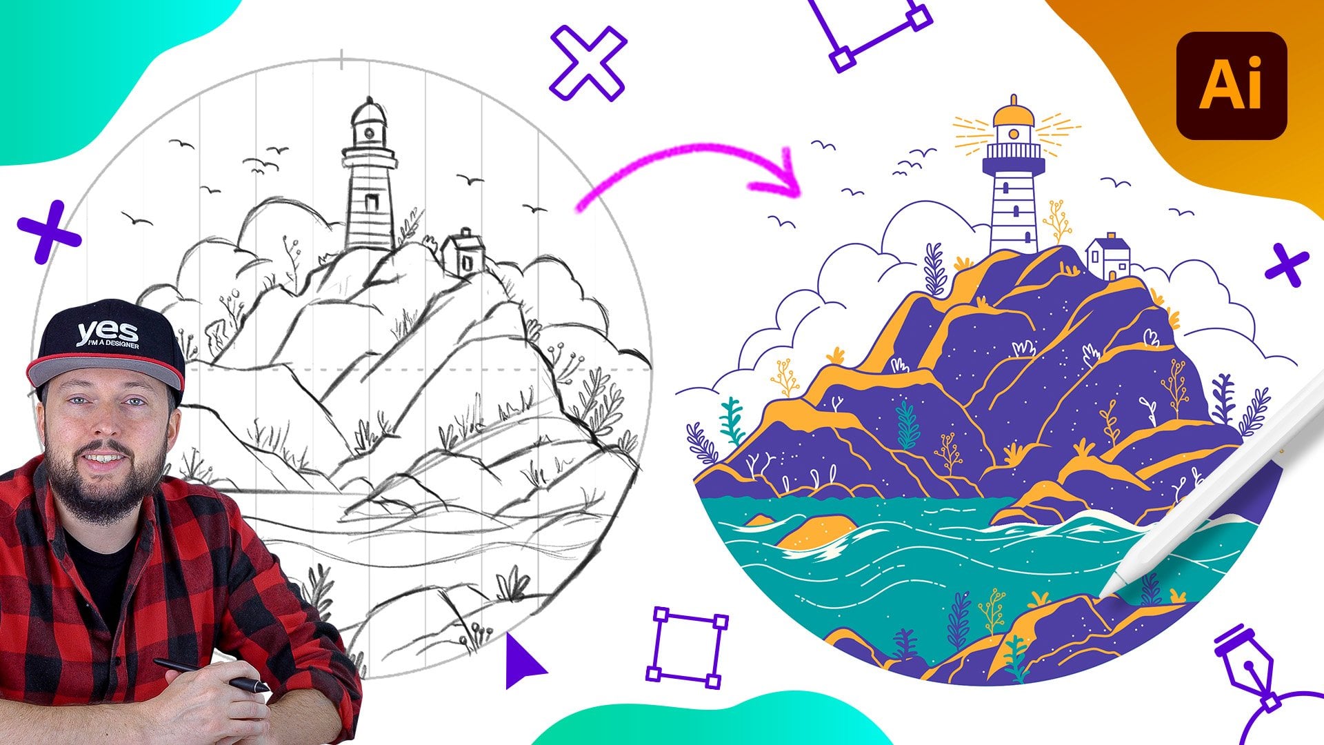
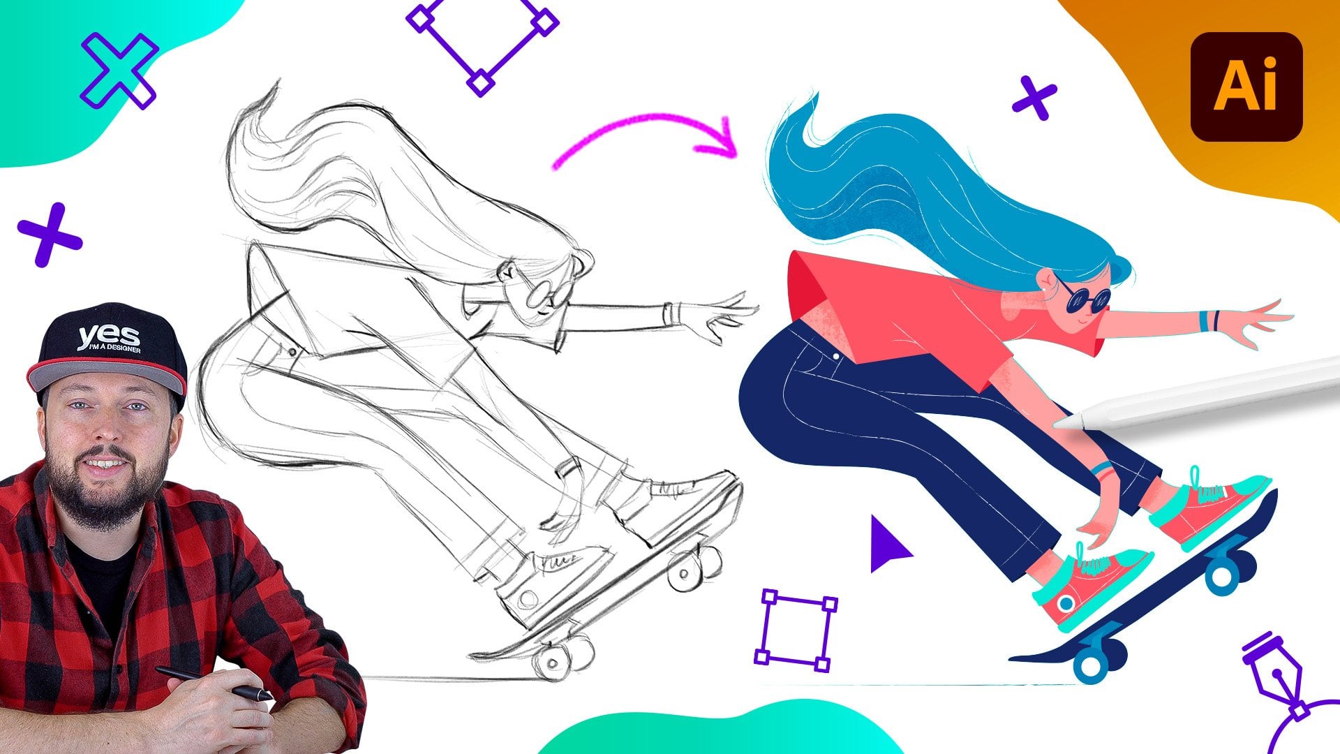
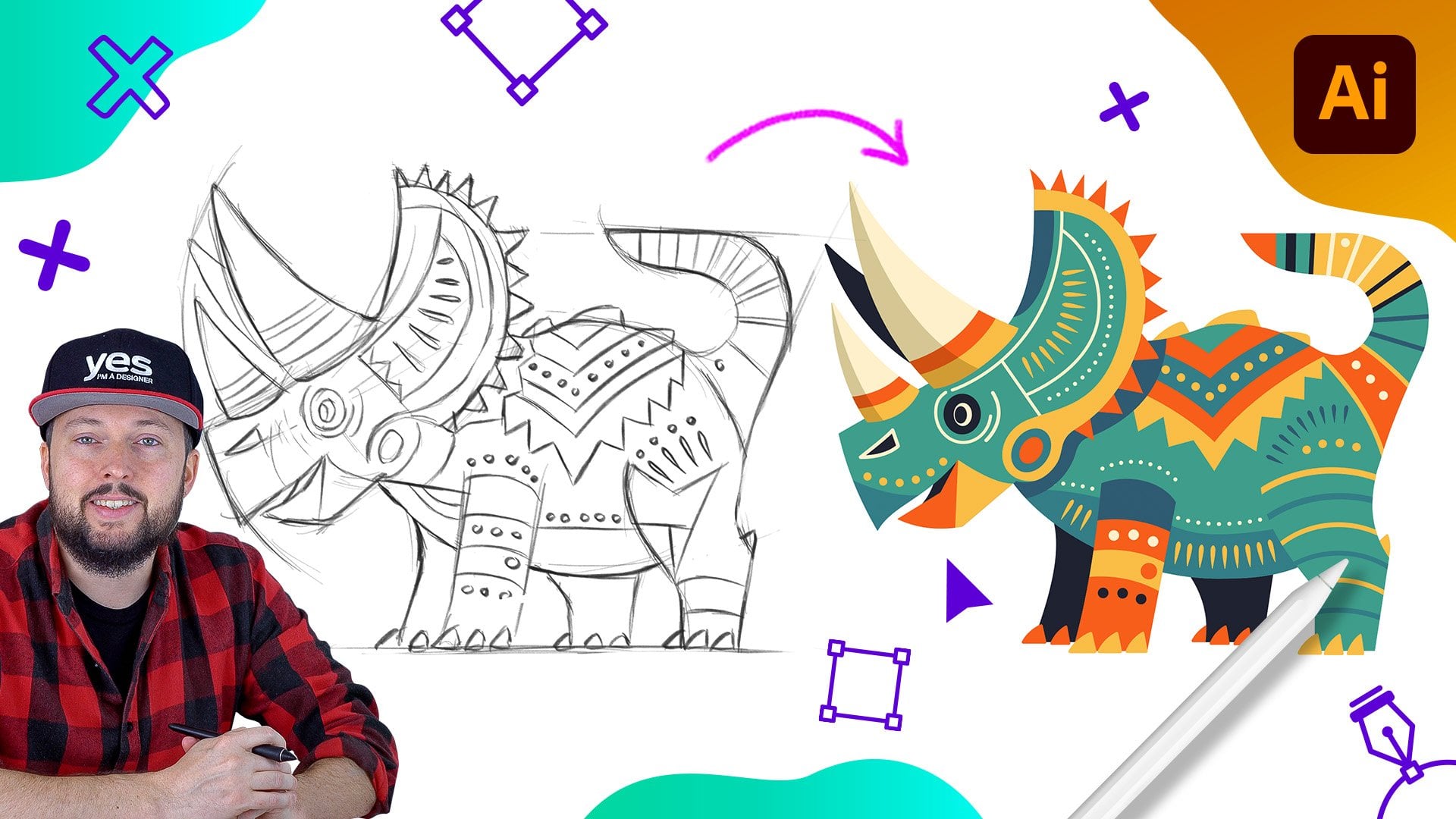
1. Introduction: Do you want to get
good at creating awesome vector illustrations
using Adobe Illustrator? Well, you came to
the right place. I wanted to make an
illustration for this course that could be
used for the cover of a book. I decided to go
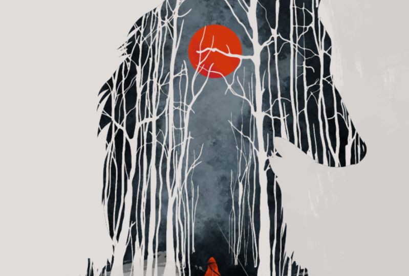
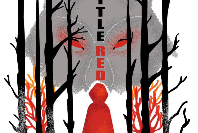
with a fairy tale, and I chose little
red writing code. My aim was to utilize negative space and the
figure ground principle. These are both terms I cover in great detail in our graphic
design theory series. If you are interested to
learn more about them. But in a nutshell, using these methods
can help you to make your illustrations more
compelling and intriguing. I ended up using the
head of the wolf as a background framing device and align its nose with the
hood of the little girl. This is the figure
ground detail, which can be seen as
two different things, depending on how you
are looking at it. I wanted the style of
the illustration to be reminiscent of woodcut
or linocut art, and also to have a
Japanese asthetic. Whether you are an
aspiring illustrator, digital artist, graphic designer,
photographer, marketer, or simply someone with a passion for visual
or storytelling, Mastering Illustrator
provides you with the tools to turn your ideas
into stunning vector art. I will be guiding you
through every step of the process from the initial
sketch to the final touches, giving you a comprehensive
understanding of Adobe Illustrator's incredible
tools and features. This course is perfect for you if you are new
to illustrator, or if you are self
taught and aiming to get more confident
and effective using it. I am Martin Perine, a certified LOB professional, and instructor with
a design background spanning over two decades. Throughout my career,
I've collaborated with renowned clients
such as Disney, Mattel, Cartoon Network,
Nickelodeon, and BBC. Leveraging this
extensive experience. I have carefully crafted
this course to help you navigate OB Illustrator like
a seasoned professional. I am not just
teaching Illustrator. I am empowering you
to express yourself. Tell your story and create illustrations that resonate
with your unique style. This is your chance to
create work that is truly personal and worthy of your professional
creative portfolio. You can follow
along and replicate my illustrations or you can use the work flows and
techniques I show you and create something completely
different and unique. There are at least two
additional compositions you can choose besides the one I
am using in my examples. And roll now and
let the fun begin. Your creative adventure with
Illustrator starts here.
2. Little Red Riding Hood's cape and hood: First of all, I am
going to focus on drawing the little red
riding hood character. So it's obviously a
very important detail, and I like to have
it already in place. So when we start working on the wolf silhouette
in the background, it's going to work
well together, since her head is describing or showing the detail for
the nose of the wolf. So this is a fairly simple
illustration detail, but still I am going to apply a couple of
interesting techniques here. First, I am going to start with the pen tool to draw the cape. Now, for the cape, I'm going to draw something
very simple here, starting with a straight line coming up here,
and at this point, I'm already going to apply red stroke just so we can
see what we are doing. And then let me
just come up here, click and drag, just like that. Come down on the side, click and drag, and then
another straight line. And then to create
these folds or something that looks
like folds on the cape. I'm going to draw a curved line, then click, and
then go up a bit. Then curve the other direction. Click, come down a bit, curve the other direction again. Click, go up, curve
the other direction. Click go up a bit curve
the other direction, and then one more
time, other direction. So as you can see, I created
this alternating pattern, and it's going to
make more sense once we turn this into a fiel. So now that we have
it set up as a fiel, we can select it and switch
to draw inside mode. So that way, this shape
turns into a clipping mask. But this time I'm going
to use the pencil tool. So I have the white color
selected for the stroke, and I'm just going to
draw the lines here. Let's just draw up first
line and the second one. I'm just going to
redraw this more here and the one there,
then one last one. Okay. Yeah. That looks good. Let me turn off the sketch just so we can see better
what we created. Now, these lines
should be perfectly aligned with those
folds in the cape. So I'm going to make
sure that's the case. I'm going to select them, and in this case, drag it here. That looks good. We
have another one here. Again, we have to just make sure it's aligned. Looking good. That one's already good. And once again, we make
sure this is aligned here. We can also adjust
the direction handle, just so it curves better. And then we can just align
this one as well right there. Okay, so that is looking good. But let's select these again. So I'm just going to select
all that's command A, then shift click on that square next to
the clipping path, just so making sure that on
these lines are selected. Or of course, at this point, we can also use the
magic W selection tool and just tap on these lines
that should only select them. And I want to change
them from being uniform. To probably use this
width profile five. So just adds a little
bit more interest to it, or we could even try
the width profile four. That's probably even better. And since I was drawing
them from bottom to top, this already works quite well. So it's like a transition from a thick line to a
thin line in the end. We just have to make sure
that they are aligned better. So like here, that's
the better alignment. Again, this one should be a
little bit more out there. And I feel like the rest
is looking already good. Okay, so that's a nice
little detail there. Now, let's switch
back to our sketch, and I'm going to turn off
the draw inside mode. You can just do this by
simply clicking somewhere outside or go back
to normal mode. So draw normal. And then
let's draw the hood. So for this one,
again, I'm going to switch back to the pent tool, and I'm just going
to draw shape that I believe is going to work well for both the hood and the nose. So we have to remember that this acts as two different
things here. So it serves two purposes. Both needs to look
like the hood, and also as the nose. I will set it to red
fill and nose draw. So let's take a look at this. Yeah. I feel like it looks good. If we turn off the sketch, obviously, that's not
going to tell us much. But to be able to separate
this better from the cape, we will also need some shading. And I think on the cape, we could use some shading. And for this, we are going to use an interesting technique. I like to use noise brush. For this particular
illustration, that's the style that I
would like to go for. And in the file that I created, you will already find this if you go to the brushes spanel. But if you drag and drop
this onto your artboard, you will see how
it's been created. So it's a brush that just
has simple little specks. They are irregular, so
they are not round. They are all just
irregular shapes, but they all are rounded down. There are some sharp
corners in them, but generally they
are more smooth. And there is also a randomness in how they are spread out. But generally, there are more of these shapes towards the
center of the brush, and that they start to disappear or be less dense
towards the edges. So that is the brush pre set. But if I double tap
on the icon for it, we can also see the
settings for it. So most important
thing that this brush was saved with a black color. And when the colorization
is set to tints, that will allow us to
apply any color on it, whatever we want to use with it. The settings that we will
see here is that there is a maximum amount of randomness
assigned to the rotation. So each time this is used
on our brush strokes, there will be always
a rotation applied, so that's going to create a really good randomness
for these little specks. And we will be able to control the size and the
spacing later on, but these are the default
settings that are used. And I actually don't use
any scattering on this, even though this is
a scatter brush. So if I click okay, I can just demonstrate
how this looks. If I use the brush tool
and have that selected, I can just draw with
whatever color I choose, and this is how it looks. So it's looking
really interesting, and it's going to work
really well for shading. Now, how will I use
this for shading? Well, I'm going to go back
to my original shape, the cape, have that selected, and go back into
draw inside mode. Then I use the brush tool. And I'm just going to use yellow for now just so we
can see how it looks. And as you can see, when I start applying these colors here, it's going to create
that shading effect. So we are drawing inside, and we can build this
up really nicely. Now, here I actually would
like to use a darker color. So I would like to create
something like a shadow effect. So I'm going to
add a new swatch. And this is going to be based on the red
color that we had, so I'm just going to select that first new swatch and
then set this to HSB, make it darker bit, and maybe drag the hue value and the saturation
value around as well. You can use the
same settings 860. And then with this selected, I'm just going to place
that here on the left. I can start adding the
shading and build it up. So I'm doing a couple
of brush strokes. I'm concentrating the brush
strokes closer to the hood, and then I can go maybe down
as well on the sides a bit. So that creates a
nice little effect. We can also maybe add a bit
more at the bottom, like so.
3. Little Red Riding Hood's legs: Now we can repeat the
same thing with the hood. I'm just going to select that, turn the drawing mode back to normal and then draw inside. So we switch the clipping
onto this shape. And then here again, I'm going
to use the dark color that we just created and just add
a few little specks here. Now, one thing that
you can do is if you want to draw smaller specks, you can actually change
the stroke settings. So I'm going to draw the first line just so
you can see what happens. If I select this path with
the direct selection tool, I can go on the
stroke settings and reduce the thickness of it. And immediately, you can see
that we get smaller specs. So this looks great, and if I draw now, it's going to remember
that setting. And I'm just going to apply
a bit more around here. Once again, remember
that this is going to work both as the
nose and the hood. Just trying to
make it feel a bit like there are nostrils here
on the left and the right. So I'm keeping that in mind. If I have the sketch, we can see that will work quite well as the nostrils
or the nose, but still looks like
it's also the hood. And since we have this setting, I am also going to use a
brighter orange for our strokes. So let me just
select the stroke, brighter orange and just draw a little bit over
here on the top as well. That's more like highlights that I would like to have there. Okay. That's looking quite nice. Now let's switch back to
the other shape as well, and add some
highlights there too. So I switch back to draw
normal and then draw inside. Just make sure that
this shape is selected. You can, by the way, use shift D on the keyboard to switch
between these two modes. And I'm making sure that we are using the same orange color. And again, maybe we can
reduce the thickness of these lines to 0.5 points. And now we can just draw
a little bit more of it. Here on the right,
and then some more down along the cape as well. Okay, so there's
some nice texturing going on here already. But I want to make sure that these white lines are
actually on the top. So for that, I'm going
to find the lines. There's one, two,
three, four, five. I group them together
just to make it easier to select
them later on, commando Control G, and then drag them all the way to the
top of this clipping group. Right there, I would
just call them white lines. That's it. Then the rest is
shading in here, and we can call
this one the cape, and that's the hood. It's always good to name our layers and objects
that we are using. Now, if I'm not happy with the
shape that I created here, I can always go back and redraw the edges with
the pencil tool, just make sure that
with the pencil tool, the settings that you're using, we'll have the keep
selected option on and also the edit
selected parts on. If you want more accuracy, you can drag it
closer to that side, or if you want to have
more smoother details, you can bring it more
towards on the right side. And so, for instance, here, if I wanted to add a little
bit more detail on the top, I can do that, also on the side, just make it a little
bit less sharp. Generally, I just want to have a little bit more
interest to this, make it less geometric,
more organic. Yeah, I feel like
that is looking good. The only detail
that I'm not 100% sure about is this part here. The way there is an empty
part on the hood here. I actually want that to
be also a bit darker, so I'm just going to go back, select the clipping path. Use draw inside once more. Select the brush tool, choose the darker color and
just paint over it there. Again, I'm going to use the thinner brush and
then draw one more time. By the way, these settings
are easier to reuse if you use the graphic style panel
and create a graphic style, like for this one, I can create one and just
call it shading. That way, I can easily
come back to it and reapply it. Okay. That looks a little bit better, so we build it up a little
bit more shading there. Let's just take a look
at this from a distance. I'm going to go back
to draw normal. Okay. That's looking
a bit better. Let's see our sketch,
how it's going to work in context for with the
rest of the details. Yeah. I like the way
this looks. Okay? Now we need to draw the
boots and the legs. So for this, I'm going to
keep my sketch on quickly. I will actually use
the blob brush tool here with black
as my main color, and I will use the
draw behind option. So that way I can start drawing, and it will automatically
go behind the cape. And I'm just going
to draw it down. And we will be using the blob
brush tool quite a lot in this project because
I'm planning to use it for also the trees. And by the way, I'm
using the stylus here. But of course, you can
also work with the mouse. It's just a little bit
more intuitive to draw, especially with the
blob brush tool when I use the stylus. That's why I prefer to use it. So that's 1 ft, and
then the other one. It's more similar to
painting the way I build up these
details or inking, and then we have the other foot. I want to make it
look like there are some folds on the
boots she's wearing, and we can even make
it look like there is actually the edge of the
boots here, the edge there. So we create a
little detail there just to indicate that
there's the boots. And I'm not using a different
color for the trousers. I think it works well with
being black both of them. Now, the advantage of the
blob brush tool is that it also creates two simple
shapes in this case, so we can just very easily find the things that we created
here in the layer spanel. So there's one and
there's another one. And I'm just going to
make sure that they don't have any gaps in them. And like here, I can
see a little gap. Yep. And then also, I will select both
of them and use the eraser tool that's shift E, just to erase a little bit from the bottom to keep the
bottom more straight. Yes, that looks good. And then select both
of them and then go to object path and simplify. I have a custom keyboard
shortcut for that. F five. I recommend setting
that up because we will be using that quite a
lot in this project. So we can see that with this, we can simplify the amount of shapes that we used here or anchor points
that's been created. And that looks quite good. So let's see before and after. I like it. Maybe we can
also apply smoothing path. Smooth. Again, that's something I have a keyboard shortcut for a very minimal
amount here, maybe 3%. Let's see before and after. I feel like that looks good. Now, that's actually all we needed for little
red riding hood, so we can see
without the sketch. This is what we achieved so far, and obviously we have
still a lot to add, but one of the main details
is already in place.
4. Wolf head silhouette and shading: Now it's time to work on the wolf head silhouette that we will have
in the background. And in this case,
maybe we can save some time by drawing
in symmetry. This is a very simple technique. All you have to do is to start drawing with whatever
tool you want. In this case, I'm going
to use the pen tool, and I will use this bright
gray color and no feel. So if I start drawing maybe with an increased thickness
on the stroke, I will probably just
start drawing down here. What you can do is while you
are drawing with the tool, go up to the object menu
and choose repeat mirror. Once you do that, you can set up where you want
the center point to be, so you can drag the
center of symmetry. Let's say here, and then
we can continue drawing. Let's just continue
drawing these details. Going to already start
adding corners here. Like so making it look like
there's fur and going up, curving the ear a bit and down, and then can just finish
here in the center. Now, if you go over
the center point. I'm just going to drag this over just so you can
see what happens. I'm using the direct selection
tool on that last point. If I drag it over
the center point is going to perfectly align it. So there's already a mask
applied to the shape, so it doesn't go
over the center line or the center of symmetry. I'm just going to keep
it somewhere there, and I'm going to do the
same thing at the bottom. So here we can use the pento
to continue this point. I'm going to go around and come up here and click
and drag. Okay. So that is looking like
a nice silhouette. And we can probably keep
everything the way it is. Yes, I think it looks good. And what I will do is to
double click outside. So we disable temporarily
the repeat function. But by the way, whenever I
want to come back to it, you can see it is
a single object here in the layers panel. And all I have to do to go back to it is to
double click on it. So it's a type of isolation
in this case as well. And then you can
continue drawing. So of course, we can
draw additional lines. We can even use different
tools like the pencil tool, and everything will be added
in that same special group. So we won't be able to see the objects unless we open
that little line there. And as you can
see, everything is created within that
mirror repeat group, which is a special group. Now if I double
click outside again, I can get out of
the drawing mode. And what I wanted to do here is to change the stroke to a fiel. So I will select this
and press shift X. And what I will actually
also do is to take off the color from the stroke, so we don't need the stroke. And let's turn off the sketch. Okay, so we have this outline, and it looks quite good. But maybe we can go back and just select it one more time, and then also use the same
techniques as before. The path simplify, I think
is going to help here a bit. That looks better. So closer, so that was before and after. Definitely simplified
it a bit more. Now, what I want to also do here is to draw
inside this shape, similarly to what we've
done with a little red. But unfortunately, the repeat feature cannot be combined with the
drawing side technique. You can see it's disabled there. You will also not be able to
use it as a clipping mask. So what you need to do is to
expand this drawing mode. So if I choose
expand, click Okay, then now we will have a group with these
couple of objects here. To further simplify this, I like to press
command or control shift the G a couple of times until we have
less objects visible, and it's starting to look a
little bit better already. But I am going to also
delete these clipping parts. There's one there, select that, delete it and another one there. Now we can again, remove the unnecessary groups and just see these two
objects next to each other. So there's one, and
there's the other one. I select these two, I can go to the pathfinder panel
and just unite them. So now we have a single object. That's just to simplify things. So drawing in symmetry using the mirror repeat technique
can save you time. But later on, it's
just easier to work with a solid
shape like this. And I might actually need
these a couple of times, so I'm going to make a
duplicate of it already. So Command or Control C, command or Control F to
create the duplicate. I will turn of this silhouette. I just call it Wolf, and I will call this
one Warf as well. Okay, so we have the duplicate available in case we need it. But for now, I have
my outline here. And what I would like to do is to add some interest to it. Again, I would like to introduce
some textures for this. Now, first of all, I am going
to add the shading on it. So I will use the
draw inside mode. I switch to my brush, which still uses the same scatter brush
that we used before. But this time I'm going to
use it with a darker gray. So let's see how that looks. Yeah, and that looks good. But to be able to see
what we are doing, I will also turn on the sketch. So that will help me to see
where the eyes will go. And that's obviously
important because there we want to introduce
darker details. So I'm just going to draw over that section a couple
of times like that, a bit more here, then down next to the nose. We can also add some shading, then we can also add the
shading here, around the edges. And actually, for this, I can even turn off the sketch. So yeah, it looks good. Maybe around here. I want this to be quite subtle so I don't want it
to be too much. I wouldn't use black, for instance, for this. Okay? That's looking
quite good already. Let's turn the sketch
back on again. I want some glow
around the eyes. So for this, I'm
going to use a red, and I'm just going to actually, instead of red, I will use a brighter color
like this orange. I will just draw a little
bit around the eyes there. Again, without overdoing it, it can go and extend out a
bit to the sides like that. And then I think
that is going to be enough of this color.
5. Adding details on the wolf head: And now what I would
like to do is to utilize this brush also for masking
the shape or the silhouette, because I want the silhouette to be a little bit
more interesting. So what I will do is to
go back to draw normal. And we will need the
transparency panel. If you don't see this, go to the window menu and then
choose transparency. What we will need
to do here is to select this clip group
that we created, and I'm going to apply a
mask on it, so make mask. Then turn off the
clip option and then click on the opacity mask, which is this one right here. It's important you
have to go inside it, and you will see that
you are inside this once the opacity mask shows
up here in the tab. Now I'm going to switch
back to the brush tool. And this time, I'm going
to use black as my color. And what happens if
I start drawing with this is that it's
actually going to start eating away
from this object or this group because it's
hiding those details. So let me show this
without the sketch. I'm going to switch
back temporarily in the transparency panel to the normal check,
the object itself. Here I can turn off the sketch, then come back to
the opacity mask, and again, continue drawing
with the same brush. As you can see, we can start
to introduce this fact, which is taking away
from the silhouette. Now, what I want to do here is to actually increase
the stroke size. So just like before, we have to do this after
we already do one line. And as you can see, this is creating bigger specks, and I can draw around the edges. Now, the good thing about this technique is that even if I decide to use a different
background color later, this is not actually white
spots or dots that we create. This is transparency. So I can maybe reduce
the size a bit around the edges and a bit
smaller specs there. And just to demonstrate
this to you, I'm going to show this quickly. Once we have all the
details in place, I feel like that looks good, and we could even
apply a bit more over the whole thing just
to have some interest. Just going to try this. It's
a little bit too intense. Let's see what happens if
I increase the brush size. Almost would feel like snow. I think it's quite good, but maybe the settings that I'm using are a
little bit too strong. Yeah, I'm not going to change
these settings for now. I'm happy with the
way they look, so I'm going to
say leave strokes. Instead, I'm just
going to show you, like I mentioned before, what happens if we put
something behind this? It's important to switch back to again drawing in the
actual object mode, not in the mask anymore. So here if I create
a rectangle as a backdrop and fill this
in with yellow fill, for instance, and place it
below the details we created. You can tell this
is what we created, so there is that effect being able to see through
the shape that we drew. So that's quite cool. For instance, if we had
this as a black fill, this is how it would look
and so and so forth. So, I like to use this
brushing both for texturing, but also to create a
textured outline or mask. And one other thing that
I feel like we could do here is to go back
to the main shape, which is our clipping
mask, by the way, that silhouette, and
apply an effect as well. I like to use this distort
effect called roughen. So I would choose that one. And of course, I want to
reduce the intensity of this. So I will increase
the detail actually. Reduce the size down to 1%. And even 1% is a bit too much. Maybe if we also reduce the
detail to something smaller. Yeah, I feel like
that's getting better. Maybe we can do 0.1%. And then increase the
detail a bit 0.5%. Yeah, that's a good one.
Let's click. Click away. So you can see around the edges, instead of having that
very like solid line. Now we have a more
interesting outline. Again, more organic. I feel like that works
really well for the wolf. Now, we still need
to have the eyes. I intentionally didn't draw that inside this shape
because I didn't want to overlap it with any of the noise or texture
that we created. So I'm going to draw
this separately. I will use the pantle, And actually start
drawing from here. By the way, for this,
I'm going to use the red color as my fill
and no stroke, like that. Let's also use the
repeat option for this, so we go to object, repeat mirror, and then we can just
drag this in the center. Just make sense to keep
this also symmetrical. We might also add a
few additional lines using this new repeat object. So that is looking quite good. However, I'm going to
smooth it out a bit. So you use the path smooth
option and then also simplify. I use F four and F five, the two function keys, so I can very quickly apply these every time
I draw something, and that is looking
much better already. But I would like to also
have some outlines here. So for this, I'm going to use the blob brush tool
with black color, and I will draw some
outline here for the eyes. This is like the eye lid. By the way, we are still in
the dro symmetrical mode. So this is going to
show up on both sides. Let's see how this looks. Let's to come down a
bit further that way. Yeah, I'm happy with that. Maybe we can just create a little extra
detail here like that. And then I think we can also do just a little bit more detail further than there as well. Just to define the eye better, and maybe just one small
line here as well. Okay these look good. Maybe that one little detail can go up a bit
higher like that. I'm going to select all
of these together and then use the smooth
option first. Smooth out the details and
also probably merge these. Use the pathfinder unite, and then I will also use
a bit of the simplify. Maybe something like that. Mm hmm. That's looks better. I'm just going to refine a little bit this using
the block brush tool, smaller brush, fill in that gap. What we need to do here is to simplify this a bit because
there's two points. One of these is unnecessary. We can just use the minus tool. So let's delete anchor point tool and click on one of those. And then this other one, we can maybe just turn
it into a smooth point. So go up here, convert selected
anchor point to smooth, and that's looking
already much better. Yeah. I like how this looks. So let's zoom out,
see on both sides. And then if we double
click outside, we can go back to seeing
everything together. Let's just turn off the
sketch for now just so we can judge what we created and
look at this from a distance. Now, one thing that I
feel at this moment is that the wolf head
is a bit too dark. So I am going to go
back to the main shape, and I will change
the field color. So I used the one that
I saved in the swatch, but I feel like it needs
to be a bit brighter. So I will shift
click on this arrow here and drag the brightness up. And I feel like something like this works
already a bit better. Yeah. I want the eyes
to really stand out, so maybe even even brighter,
something like that. Now, one other thing that might need to change now
that I'm seeing, this is the shading. Since I increase the
brightness of this, we might need to change
the shading as well. So one quick way of
doing that would be to use the magic one tool and click on one of those lines. And then we can go to the recolor artwork
option here on the top and choose
advanced options, which is going to show us the different brush strokes
we use with the same brush. This is the color I
would like to change. I want this to be brighter. Instead of CMYK, I will use
hue saturation brightness, and let's just increase
the brightness on them. We're toning down the shading
to something like this. I feel like this is
nice and subtle. I don't want it to
be too intense. That works. Let's click
Okay, double click outside. And I just realized that
the duplicate layer that we created for the
original silhuette of the wolf is still turned on. I'm just going to turn that off. And this way, we can see the masking effect that
we created earlier. So that obviously needs to be turned off to
be able to see this. So we have the white dots
that are the mask details. So if I just move this again to the side outside
of the artboard, we can see how that works, whatever is behind
it is showing. And then we have our
shading details at it. We have the eye in place, and I think it's coming
together really nicely. So let's just take a
look at the sketch. Once we have the
strong black lines of the trees and also some of the nice orange details on
the trees that I planned, I think it's going to come
together really nicely. And in the end, we will also
add some type in the middle, which again, brings
everything together nicely. At least that's what
I'm hoping for.
6. Drawing the forest: Time to draw the trees. And for this, I'm going to
use the blob brush tool. So we will just
start drawing here, maybe a little bit
thicker brush size. I'm using the square
bracket keys to increase this density or
the thickness of the brush. And I'm going to start drawing this first tree here
in the foreground. And the way I imagine this
is that it's going to create a very strong contrast and hide certain parts
of the wolf head. So I want the wolf
head not to be as obvious as it is right now. I want it to be disappearing
in the background, something that's
lurking in the forest. A menace that is there, but right now it's not
visible completely. And one thing that
I want to achieve here is that some
of these trees will go and extend beyond the
silhouette of the wolf head, while some others will actually end exactly at the same place. Now, for this, I'm going to
probably use a clipping mass, but for now, I'm just going to concentrate on creating
the tree shapes. So I want a nice
randomness to them, but still we have to
keep in mind that plants grow and try to
reach for the sky always. So all of these branches
need to go upward, and let's just create
another one here. And one good thing
about the blob brush is that it's going to
connect these together, even if I'm starting
drawing them separately, once they reach each other, it will join it
into a single path. Let's just create that
line a little bit longer. Of course, I can increase, decrease my brush size as
I'm drawing these details. So I'm just going to reduce the brush size now since I'm reaching the smaller details, just I think some more
varied brand sizes here, maybe another one here this way. Come out. Again, I'm not following exactly the
sketch that I created. That's just a guideline. But this is looking quite good. I will use the smooth option
and the simplify as well. Simplify it down to
something like that. That looks really good. I like the way this looks. Now, this te, for instance, I already wanted to end exactly where the outline of
the wolf head is. But remember that we used this roughen effect
around the edges, so it's not just that
simple clean outline that we originally had there. So I'm going to have to use
exactly the same effect. And the easiest way
to achieve this is to really use the same object. So I'm going to copy that clipping mask
that we have here, copy it and paste it on
top of everything else. So that was commando Control C, and then Commando Control F. So here we have
the same exact thing. If I turn it on and off, we can see it's exactly the
same outline that we need. And now that this is on top, I can just select
the tree that we created the two together. So both this new outline or silhouette of the
wolf head and the tree, and then press commando
Control seven. And that way, we have the
tree inside that outline. However, because
this is an effect, the clipping mask is not actually cutting
it out properly. If I press command or Control y, we can see it's actually
following the original edge, the edge without
the roughen effect. So that is a problem. What we need to do is
to go back one step. So before we apply
the clipping mask, and we actually have
to expand the effect. So I'm going to select that duplicate shape
of the valve outline, and then go to object menu
and choose expand appearance. So what this is going to do is that from the appearance panel, the rough and effect
will disappear. And now we can check the outline is actually using
that rough outline. That's Comando Control y to switch between this
view and the other. And now if I select
these two shapes again, the wolf head that has been
expanded and the tree, now we can press
Commando Control seven. And although we are going
to get this warning, that this is a little
bit too complex. We can just go ahead, and it's doing exactly
what we wanted. So we can zoom out. And see how this is now
clipped inside that outline. Now, one thing that we need
to fix though is that I don't want these details to be
clipped at the bottom. I only want them to be
clipped here on the top. So what we need to
do is to go back to the actual shape that is used as the clipping mask and draw a big rectangle at the bottom. Something like that, and then select this and the
clipping mask together, and then unite them using
the path finder panel. But when you do this, the
clipping mask is released. So we have to turn this
back into a clipping mask. Select these two
shapes again and then press commando
Control seven. And now, as you can see, we
achieved what we wanted to. So if I move this tree around, we can see that it's going
to be clipping on the top, using that nice rough
edge that we created. But whenever I move it down, like here, these details
obviously are still showing. So this is exactly
what I wanted, and I can align this
tree back to where my sketch had the
original tree like that. Now I noticed that
some of the branches are also being clipped, but that's not a problem. Yeah, something like
that works well. And now if I want to draw
inside this clipping mask, I just have to select it and
then choose draw inside. So now, going back
to my block brush, I can start drawing here on the top again with
a thick brush, and you can see it's already drawing only inside the outline. But when I come down this way, I can go and extend out the details from the outline
because at the bottom, we have the mask
extended as well. I am going to probably
speed this part of the tutorial up because
I'm just going to draw a couple of trees here and using the same
techniques and methods. So I draw them with
the blob brush tool, and then when I'm happy
with the details, I use the simplify and
the smooth effects on it, and then just going to keep building these up until I have enough details here
the way I imagined it. And you can see that some details I'm trying
to keep symmetrical, like these two branches
without being too obvious. But I will also try to make
them still look different, so this one can go
out a bit more. So yeah, I'm just going
to select this and apply smooth and then simplify. And then if there's any
details that I left out, like this one here
in the middle, I'm just going to fill it up. There's actually
one important thing worth mentioning here. If you don't want to
accidentally join up multiple trees when you are
using the blob brush tool, which can easily happen. For instance, here, if
I just draw this line, immediately, these two
became a single object. We can see it here
in the layer spanel. So even though they were two separate objects,
now they became one. And that is because I'm
using the same color. Two black objects connected with the blob brush tool
automatically unite, similar to what you would get
with the path finder panel. And normally, it wouldn't be an issue if it's a single tree. We want to keep things
tidy in the layer panel. But to be able to move these
trees around independently, we don't want multiple trees
to be merged together. So to avoid this happening, just remember to lock your
trees once they are ready. Before moving on
to draw new ones. So, for instance, now, if I draw another
line these objects, you can see it's not going
to merge them together. It's going to start
as a new shape, and if I draw another shape, this is going to still
be the same path, and still it's not going to
affect the existing trees. But now that we discussed this, let me speed things up a bit. Let me draw some
more of these trees, and then we can discuss
what to do next. Okay, so let's just take a quick look at what
we created here. We have these trees that we added and some
details at the bottom. I'm just going to rename
this dirt or rocks, some additional details there. And then obviously,
we have the trees that are clipped to the outline. I will actually name
this trees clipped. And then I'll just
this one more trees. Turn that on as well.
Nice and dense. And then behind this, we have these two
additional trees, which I will put
into the same group, and I will call
these orange trees. Actually, let's just
call them red trees. I'm using a gradient on them. Nice transition on the top, it's more orange and the
bottom, it's more red. So that's just add some
depth to the illustration. I didn't want everything
to be too dense. So if I were to use
black on these, just going to show this quickly, it would be too dense. It would be hard to
see what's going on. While with this more
softer color that is obviously in harmony with the rest of the colors
used in the illustration, it looks already much
more interesting. Now, what we still
have to do is to add some additional
final touches and refinements mainly
on the Wolf's head, but also maybe some additional
details in the foreground. And finally, we will also
add the text or the title, since this is a book cover, and I kept this part here in
the middle free for that.
7. Adding the title and final touches: First of all, I'm going to add some additional details
on the wolf head. And I'm going to use the object that we
created for the eyes that's still in symmetry
mode or mirror repeat. And if I double
click on one side, we can enter the drawing mode, and then we can
continue drawing. I'm going to use
the pencil tool, and I am going to draw a
line for this detail here, and I'm going to assign
white stroke on it. And I actually will
use that style that we used earlier on the cape. So down here, you might recall, we use these lines. I'm using the same style here, so that's this width
profile up here. I had it saved as
a graphic style. I think that is
working quite nicely. And we can use the
pencil tool and just draw this a little
bit further down. It can come all
the way down here. I feel like that looks good. Then let's draw another
line. Coming up this way. Again, I'm going to
choose the graphic style, and then one more here. These are for the nose. And then I want to also have
some detail for the ears. So for the ears, I'm just going
to draw a few lines here. And I'm going to make
sure that these also have the same style assigned to
them. That's looking good. And then one more
detail under the eyes, I would like to have this
area filled with white. So I'm just going to
fill that in with white. Like that. By the way, this automatically went under the eye because I still had to draw behind option selected. And let's just see how this looks if I double click outside. We can go back seeing the
whole illustration together. And I feel like that is
looking really good. I am not 100% sure about the
highlight under the eye. It might feel a little
bit too strong. So I'm just going to
go back select that. So if we just select this one, maybe I can reduce
the opacity on that. Make it a little bit
see through or maybe we can use a gray color instead, or even can introduce
an even brighter gray. So instead of completely white, I'm just going to use maybe just a very subtle gray color
there with 100% opacity. So let's see now, yes, I feel like that works better. Felt like white was a
little bit too strong, but this works better. And those few lines that we added are just very subtle
additional details, but it helps to bring
everything together. And finally, I would like
to add the type tool. So I'm going to use the
vertical type tool this time. I'm going to click
here in the middle and type in little red. Let's just select this. And for the font, I'm going to use something
very thick and solid for now, like Azo San looks good
for what I have in mind. I'm going to increase the size. And we'll make sure that this goes all the way on the top. Let's align it here
in the middle. Could even overlap the nose, but I think it's going to work better if
we drag it up here. Yeah, that's a good alignment. Maybe this tree detail can
come a little bit further in. I'm just going to use the eraser to erase from that just
so it doesn't overlap. That looks already better. And then the word red, I definitely want to use the same red color as the
rest of the design like that, or it could even be
using the darker red. Let's see which one
stands out better. I think darker red is better. But there is one
thing I don't like about this one is that the width of the characters
quite different. It varies quite a lot. So it's better to find
a different font, where that's not
going to be an issue. And here's a font called Spirit, which already looks
more interesting. So we have the width of the
characters very similar. And I also like the
serifs on this. So let's just move
this up a bit, maybe make it a
little bit smaller, something like that,
line it in the center. Feel like it needs to
go a bit to the left, and it can come down
a bit more this way. And I feel like this has a good connection to the
way the trees look like. And maybe with this one, I would also change the font to have the other red used on
it instead of the dark red. So the brighter red
might look better. And one additional thing
that I feel like would work well is if we
added a stroke. On this and set it to white. That's just increase
the thickness. And here's a useful technique. If you drag the stroke below the characters in
the appearance panel. So under the characters, then the stroke can be
sitting behind the text. So then it will only
show up outside of it. So the original characters
will be still fully visible. And I feel like that creates a really nice style.
Let's just oom out. We can potentially
make this a little bit bigger now that it has the
white outline around it. And again, I feel like it
needs to go slightly to the left to be more
aligned to the center. And then taking a look at
this from the distance, I feel like maybe it can
go up a bit more this way. Just thought of one
additional thing that I think would help. Again, looking at the
artwork from a distance, it's always good to
zoom out and have a better understanding how it looks in this thumbnail size. You can judge certain
details better. And I feel like
the bottom part of the illustration is a
little bit too dense. There's too much dark details there because of all the
trunks of the trees. So to break that What I
thought of doing is to utilize the masking
technique that we used on the wolf head. So for this, I'm going to select the trees that are
without the clipping. So there's a group of them here. There's also the other
trees behind them, and there's also the red
trees behind all of them. Those can actually come all
the way to the top here. And then let's select these
three groups of trees together and group them
together once more. That's mano Control
G. So they are in one large group. S like that. We could potentially even
put the rocks in this group. So I just drag that in there, and then we can call this
one trees and rocks. And the reason why I group
them together is to be able to assign to this whole
group an opacity mask. So from the transparency panel, I click on M Mask, and then here I'm going to
turn off the clip option. Select the mask itself. And then using the brush
with that scatter brush, the stroke color set to black. I can start drawing over these. And you can see, essentially what I want to achieve here is make it look like there's
some snow on the trees. So normally you would have a little bit more snow built up closer to the
bottom of the trees, where the trunks are larger. And I feel like that
is going to help us to make the composition
in general more balanced. But instead of using one point, let's just see how it
looks with two point. I think that looks better. So thicker and bigger
brush strokes will help. And maybe we can go a
little bit even higher. Let's just see what happens
if we go higher, like that. I don't have to be worried
about drawing over a little red in the middle because she's not in this group, so I can paint over
the center easily. Yeah, that is
looking quite good. I'm just thinking
maybe further up, I can use a smaller brush. So let's just go down to
one point and maybe apply that more around the edges
like that on the top and here. Yeah, I'm not sure if I should use it on top of the trees. I feel like it works
better at the bottom. Going to use some smaller brush strokes here
at the bottom, build it up even more, make the snow feel a
bit heavier there. Maybe add some here on
these trees as well. And yeah, I feel like this is quite an effective addition. So if I shift click
on the opacity mask, we can see without it. And we can see it
together with it. I feel like that
really helped to add some more definition and
interest to the illustration. Yeah, I feel like that
looks really good. So I'm going to click back on the normal view in the
transparency panel. And then we can see how
everything is built up. We have obviously
our original sketch. Which is right there. And
this is our final version. But to see how
everything's built up, there's the little red, the wolf head, some
details for the wolf head, and then the trees, and then the title. And the reason I like to
look at all the components independently is because there's also something that
I just spotted. The details on the eyes
and these lines that we have here are just very rigid compared to
all the other details. So I'm going to have
all of those selected, and then I will apply
the same effect that we used before
from this sort Ruffin. And I'm going to use
0.5% just like before. Maybe even 1% on these
details would work. Yeah, I think that's good. The detail level can
be increased a bit, and let's just go down to
0.8 or 0.5. Let's try. Yeah, that's good.
And detail level can go up a little bit higher. So that's great. Let's
see before and after. Yeah, it was just too refined. Now it works much better. Yeah, I like how that looks. So let's zoom out. Once again, we have a
finished illustration.
8. Conclusion: Well done for
finishing this course. I hope you had just as much fun going through it as
I had recording it. And of course, don't forget
about the class project. Because remember,
practice makes perfect. I can't wait to see your work, so make sure to submit it. And in case you
like this course, and you would like to
learn more from me, then there's plenty of other courses that
you can find here. Go ahead check them out now. I can't wait to meet
you in the next one.
 Martin Perhiniak, Graphic Designer, Illustrator & Educator