Transcripts
1. Introduction: Bouquets are more than
just floral arrangements. They're a symbol of love,
happiness, and beauty. They are also
perfect subjects for watercolor painting
as they allow you to express your creativity and preserve a memory
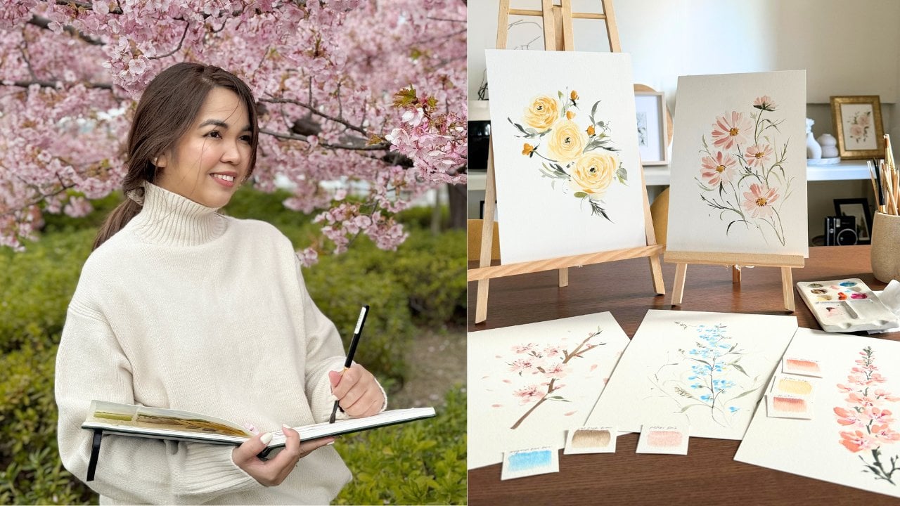
of a special moment. Hi. I'm Jenny Flores. I'm a creative coach, an artist, and a Skillshare talk teacher
from the Philippines. I've been painting for
about eight years now, and I love exploring different
styles and techniques. My favorite subjects
are botanicals, especially bouquets, reads,
and floral arrangements. Since 2017, I've taught thousands of students both
in person and online, and I enjoy seeing their
progress and creativity. I believe that anyone
can learn how to paint, and I am here to help
you along the way. I have over 76,000 followers on Instagram
as date of publishing, and this is where I share my painting process
and progress. I am excited because I am
sure that all of you has the potential to create
awesome and inspiring art, and I am here to guide
you in unlocking your creativity and experiencing the beauty of life true art. In this class, you will
learn how to paint floral bouquets in watercolor
from picture to painting. You will learn how to choose the right supplies
for your project. I will show you the
best watercolor paper, paints and brushes to
use for your paintings. We'll also learn how to select the reference photos
for your painting. I will teach you
how to find, crop, and edit your photos to make
them suitable for painting. We'll also identify
the focal points and main subjects
of your bouquet. I will help you analyze
the composition, shape and color of your
bouquet and decide what to emphasize and what to
simplify on your painting. We'll also learn
how to understand the importance of color
palette and how to prepare it. I'll demonstrate how to mix
and match colors to create a harmonious and realistic
palette for your bouquet. Of course, we will learn how to paint. Beautiful bouquets. I will guide you step by
step through the process of painting them from sketching to adding details, and
finishing touches. This class is suitable
for beginners and anyone who wants to preserve a
memory in a very unique way. So what are you waiting for? Pick up your brush,
and let's get started.
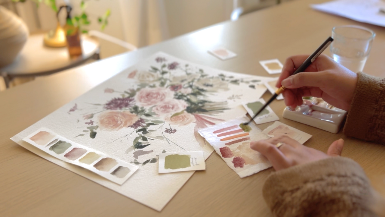
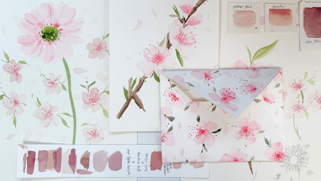
2. Supplies: Whether you're painting
your own bouquet or you're doing it as
a commission project, using a quality
supply is a must, especially on paintings
that you want to preserve for a very
long period of time. We only have three
essential supplies when creating a
painting project. The paper, the paint
and the brush. Let's begin with paper. While, you can use any paper that's currently available
with you at the moment, using a high quality, 100% cotton
watercolor paper will really help you get a high quality result that
you definitely want. I love using this paper from Bauhgs 100% cotton cold
press watercolor paper and 300 GSM. This is a cheaper yet
quality alternative to other brands like
arches and fabriano. If you're just new and would just want to practice
and explore, you can check out the less
expensive alternatives like the Fabriano 25% cotton, Canson Montval and more. Next is brushes. Brushes plays a
very important role in your painting journey. A right brush can make your painting process
so much easy, especially if you're
painting in a loose style. If you'd like to know
more about brushes, I have separate class here on Skillshare that
focuses on brushes. But today, I'll share with you the brushes that
I'll use for this class. First, are round brushes. I'll be using my
silver black velvet round brushes in size two, four, six and eight. I use this for most of my paintings because it
has a nice pointy tip, big belly, and soft bristles. That is just perfect
for my style. Another must have for
me is a filbert brush. I use filbert brushes for
round tipped flowers, like anemones, camo
Mls, and more. Later, you'll see more
of this brush in action. So I'll specifically use the silver crystal pointed
oval brush in size 3/4, and the silver silk 88 oval
crescent brush in size 3/8. Last is my detail brush. This brush is what I use for small details like center of the flower, small dots, and all. I will use my silver
ultra mini design a round brush in size for. I hope you guys are not feeling overwhelmed
at the moment. So these supplies are
just what they use. Of course, if you
are just starting, you can definitely
explore the medium first and use whatever supplies
that you have with you. The next big thing that
we need are the paints. For this class, I'll specifically use the
following colors, Potters Pink, lunar red rock, shell pink, Mocha,
Petersburg Ochre, perylene violet, under
sea green, shadow green, green Earth, van **** brown, Titanium gray, royal
blue, and titanium white. I always use professional
grade water colors in shops because they
contain more pigment, which is really good in
preserving the color and quality of your work
even after years. In painting using any medium, it's important to
have some tissue paper nearby as well as a couple water so you can clean your brush easily
when changing colors. Last, is a mixing palette. I use a ceramic palette
because it's easier to clean, but a plastic palette will do. Again, don't feel pressured
with the supplies. Explore the medium first and invest in quality materials
when you're ready. Let's go to our next topic.
3. Preparing Your Reference Image and Colors: I'm sure you guys are
very excited to paint. But before we start dipping our brushes into
our water colors, let's go through the
three simple steps you should remember when
painting a bouquet. First is together as many photos of the
bouquet as you can. Having more than one
high quality image of the bouquet will help
you have the options, which angle you
should prioritize. Let's admit it. Some
photos just don't give justice to the beauty
of the actual bouquet. So having options is essential
for creating an accurate, well balanced and
meaningful painting. It helps you make
informed decisions about the color, composition, and details, resulting in a more successful and
visually appealing artwork. Second step is to identify the main subjects
or main flowers. When you already have chosen your furred reference image
with your fiverd angle, you now have to
identify which flowers should be the most visible
ones in your painting. Of course, not every flower
can be the star of the show. Usually, these are flowers at the center of
the composition. Take this bouquet as an example. In this bouquet, we will
focus on these flowers because we want the viewer's eye to move just around here. Plus, the colors in this area are just more vibrant
than the others. So this is just perfect. Next step is identifying
the color palette. Before we begin painting, we have to prepare our
color palette first. Colors play a very
important role in this kind of painting. It doesn't matter if
you weren't able to copy every detail
of the bouquet as long as the colors are nearly the same as the
ones on the photo. You'll be able to
capture the essence and beauty of your bouquet
easily when you do this. But of course, if
you're painting the bouquet just for reference
or just for yourself, you're absolutely free to alter the color of
the whole bouquet. As long as the
colors that you will choose compliments each other. This is also a good way to add your personal touch
to your painting. Okay, I think we are
more than ready. So let's start painting.
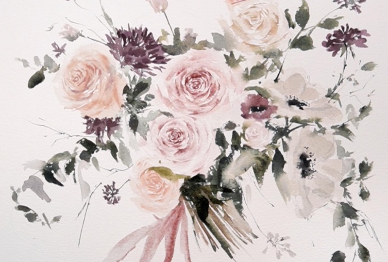
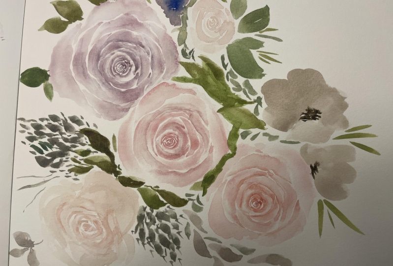
4. Bridal Bouquet Part 1: Before we dive into painting, let's quickly talk
about focal points. It's crucial for our painting to have focal points
also known as subject because it guides our eyes to the most important
part of our painting. Without it, viewers
might get lost, confuse, or worse,
lose interest. The focal point should be
the standout flowers to ones that immediately catch
someone's attention when they see your painting. Let's take a reference
image as an example. I'll choose these flowers. Those flowers marked with red as our focal point because they
really grabbed my attention. And obviously, they also grabbed the attention of those
who sees this photo. Okay. So this two, this one on the side
and that one and the upper part of
our composition, even though they are not in
the center of the photo, they are big eye catching, so I'll add more detail
to them as well. I'll add them to
my main subject. So focal points or subjects are what your
art is all about. The other elements
will be less detailed, especially that we are just
painting in a loose style. They are there to create contrast and keep things
visually interesting, guiding eye towards the
main focus of the painting, which again, are the subjects. If you're struggling to find the main subject
of your painting, remember that it's usually the ones in the
middle, or if not, they are typically the biggest, boldest and most attractive
flowers in the bouquet. I guess we are more than ready
to paint our bouquet now. So what I'm going
to do first is mix a concentrated mixture
of my first color, which is potters pink. This will be used for
the center of my roses. So I'm going to paint one of the roses in the center
first, this one, and I'm going to
use a small brush, which is a small size
two round brush, and I'm going to paint
the center of my rose. I am creating small
C strokes here. And as I go out of the first
stroke that I've created, I'm making it bigger and bigger. Now that the center
is complete already, what I'm going to do is
get a clean wet brush, and I'm going to soften the edge of the last
strokes that I've created. This will create a
very nice soft effect on the center of my rose, which will also prepare my
rose for the next few petals. So now I am using a size for round brush and I'm creating
bigger petals for my roses. By the way, guys, I'm still
using the same color, which is potters pink, and I'm just creating
bigger C strokes while adding a little bit of
ten strokes on my roses. If you are still unfamiliar
on how roses are painted, I have classes here
on Skillshare that focuses on painting roses
that will really help you. You can check out
about me page of this class to check on what
classes you can attend to. Now, we are done
with the first rose. Now it's time to add
the second rose, which is just below
the first one. It's nice if you have a copy of our reference image
so that you have a guide on where to
place or next subjects. Still doing the same
procedure here, I painted the
center of the rose. This time, I used a peach
color, which is mocha. And again, I'm
softening the edge of the last strokes that I've created for the
center of my rose, and now I'm going to create bigger C strokes to add
bigger petals for my rose. One of the important things
that you should remember when painting a bouquet is
that all the subjects, especially if they are
closer to each other on the reference photo has to be close when you're painting it. You have to make sure that there's no awkward space between the flowers because
it's hard to fill in those awkward
spaces with leaves. So make sure that
the two flowers that we're painting
at the moment, which is the pink
rose and the peat rose are very close
to each other, so you don't have to add
leaves in between them. Now it's time to
add our third rose, which is on the upper
part of our painting. So I am going to add the
center again and this time, I will be using waters pink. If you notice, I'm
not yet adding the details on my
first two roses, and that is because
we are going to let those layers dry up first
before we add the details. So for now, we are laying up all the base layers
for our painting, and then later on,
we're going to go back when they are
ready to be painted on. Again, I'm putting this
rose very close to my first one so that there
won't be any awkward space. Also, if you don't have
the same exact color that I am using at the moment,
that's totally fine, feel free to use
whatever you have, and then you can also mix some colors as long as they
complement each other. Good job on painting our three
subjects, which are roses. Now it's time to paint over these roses to add some details. Make sure that your
rose is already dry. The baser is already dry
before doing this step, because if not, you're just
going to create a big blob. So I'm using a
concentrated mixture of put mortum for the
center of my rose, my first rose here. Again, I'm still using
the small brush, which is size four round brush, and I switched up to size six. So it will be easier
for me to soften the edge of the depth
that I am creating. Make sure not to overdo this
step because adding a lot of depth on your rose will
make it look awkward, and also it will just depict
the purpose of the depth. Instead of creating rose, you might end up
creating noncus. So make sure to be careful when adding
depth to your roses. I'm going to extend the
edge of my roses so it will look bigger compared to the other roses
that I've created. I Now, I'm going to add death
for my peach roses. So I'm using mocha for this one, very concentrated
mixture of mocha. In now reference image, you'll notice that this
rose is actually a little bit covered
by the first rose. But since our first rose
is a little bit light, I'm going to cover this
instead with a leaf. T you notice I'm not adding depth on the upper
portion of this rose so that I will have enough space to add
my leaves later on. Adding more depth in this
area. Time to add the leaves. I'll be adding a leaf here, and also a few
darker leaves beside my first rose,
using shadow green. The first one that I added is actually using under sea
green by Daniel Smith. So the next ones, I'll be using shadow green mixed with a little
bit of undersea green. Again, feel free to mix
your own shade of green. You're not required to use
the same color as I am using, but make sure that the colors
will complement each other. As you notice, I
just dab my brush, and it's already a leaf. You don't really need to elaborate your stroke
when creating a leaf. As long as it's green,
the audience will always see that
stroke as a leaf. Now, time to add death
on my third rose. I'm using pot Mortom for
the center of this rose. This adding C strokes as usual. And of course, I'm
softening the edge of the strokes that I'm creating
using another brush. I'm going to extend the rose just to make the
shape even better. Time to add the leaves while the last few petals of
my rose is still wet. This will create a nice
bleeding effect on my rose. Time to add our side view rose. We are looking at a reference
photo at the moment. And as you notice, this is in the same shade as one of our roses that we
painted earlier. So I'm using MCA here, and I am painting
the center of my rose using a six round brush. But I'm just painting this
one as a guide, later on, I will add a more detailed
center for this rose. I'm going to define
the body of the rose. Make sure you have enough
space for the body. We're painting over it using
a very light mixture of MCA. Later on, we will add
more depth to this rose. But for now, this is the general shape of
our side view rose. While my base is still cold, meaning not too wet
and not too dry, I'm adding a little
bit of depth on some areas using a small
size to round brush. I'm adding the first layer of
depth on this base because this will create a softened look for my rose and for
the depth of my rose. But later on, we
will add more depth. When the base layer
is completely dry. So as you can see now, the rose is looking
like a rose already. I'm going to add more softened
depth on these areas. If you accidentally consume all your highlights with depth, you can lift the color up using a clean brush or a clean tissue. Now I mix my pot
mortum with mocha and adding a more darker shade
of pink on this rot. This will create a and will
define our ros even more. While waiting for my side
view rose to dry up, I will add leaves
that will connect my side view rose to
my first few roses. I am using a mixture of shadow green mixed with a
little bit of undersea green. And then I will also
use lighter shades of this same mixture on
some of the leaves to create different
variation of leaves. This will give our
painting an effect as if there are some leaves at the back part and there
are some leaves in front. We'll add a few more here. No need to fill all the spaces. Later on, we can add more leaves as we
progress on our painting. Our side view rose
is finally dry, so it's time to add more depth. I am using the same shape
that I mixed earlier, Mocha with a little bit
of pot mortum and I am adding more defined
depth on this rose. Please don't overdo this
step because as you notice, the rose is already looking
like a side view rose. You don't really need to define all the details because we're
painting in loose style. There are a few dark dahlias
in our reference image, and I am painting it
using Perin Moon. I'm painting the
base layer first. And as you notice, I'm not
really defining the base of this flower anymore because this is not part of
our main subject. They are just added
details on our bouquet. We have finished
our main flowers earlier, which are roses. So now we don't have to exactly define all the details
of this flower anymore. I'm going to add a few
darker details so that it will blend while the
base layer is still wet, but later on, we will
add more details. Again, even though I'm adding more details on
this flower later, it's not going to be
as defined as osis, because again, this is not
part of our main subject. While waiting for a
base layer to dry up. What we're going
to do now is paint the upper left
portion of arboqu. As you notice, there's a small rose and a
small dallia flower, I think, on a reference image. So what I'm going to do
now is just add stem. And using a very light
mixture of pink, I will be adding the rose. Again, this is not going
to be as defined as our first three
roses because this is just extra detail on arboqu. We're just completing
the general look of arbuqu but we don't have to
define this area anymore. I'm going to add the
flower here as well. Using peridin violet also. I'm going to add
depth to our Dalia. This time, I will be using
my small filbert brush, which is an oval crescent brush, and I'm just going
to dab a little bit of darker shade of perdin
maroon on some areas. This will create an illusion
of depth on my Dalia, and I'm also going
to do the same on the one below my sides. But we're going to leave
the one at the upper left because we don't have to
define that area anymore. Our leaves look flat again, so it's time to bring them out. I'm adding a darker
shade of green, and I'm adding it on top of the first leaves that
we initially created. Using my detail brush. We're now going to focus on the lower left side
of our bouquet. I added an extended stem, as you can see here, and I am mixing different
shades of green, so I'm adding a little
bit of sepia on my initial green
mixture and also be using green Earth under sea
green and shatter green. Feel free to be creative
on this part and also use two different
shapes of brush. You can use your round
brush like this one. And you can also add
a few leaves using your fillber brush,
create different shapes, use different shades and
use different intensity of colors so you can create a nice variation of
leaves on this part. Be careful, but also be
careful. Don't overdo this one. We're going to finish the
left side of our bouquet now. So what I'm going to do next is add the leaves
here on this part. You'll notice that there are a few rounded shape leaves here that looks like eucalyptus. So I'm using my
oval crescent brush to create that effect. I am adding also the small
dark violet flower here. But again, I'm not adding
details to this flower anymore. I'm slowly moving to the
right side of our bouquet, but this center is covered
with a lot of leaves, so we have to put on
the leaves here first. I am adding a lot of different
shades of green here to create depth and
highlight for our leaves. Hope your bouquet
is looking great, and I hope you're
enjoying our process. This is quite a long
painting session, but I'm sure that
once this is done, you'll be proud of your work. So let's move over to
the small rose on top. I added a stroke, which will serve as
the stem of the rose. And using a very light
mixture of pink, I will be adding the body
of the side bros. Again, you don't have to
define this one anymore because this is not
part of our main subject.
5. Bridal Bouquet Part 2: We are now on the right
side of a bouquet, and it may not be very obvious, but there's one more
rose on the right side, which is close to one of the roses that we
initially painted earlier. So we're going to
paint that one. But again, this is not
part of our main subject, so we don't have to define
this rose that much. So I'm going to
paint a small rose here using a very light
mixture of potters pink. And I'm also adding
a lot of leaves because as you notice
on a reference image, there's a big chunk of
leaves on this area. Now, next is another
maroon flower on top of the rose
that I just painted. It is not very obvious what
type of flower is this, but I'm just going to
create it as if it's a small anemone in red color. So I use a mixture
of lunar red rock or pat moortum and a
little bit of sepia. And I added also sepia on the center of this
flower as its core. Again, we will not define
this flower anymore. Time to move to our anemones. These are secondary subjects, which means they are going to be defined but not as defined
as our main subject. I am using a big filbert brush to paint the base
layer of our anemones, and I am using Petersburg
cre for the color. There's another one on top, which is a little bit
smaller than the first one, so I'm going to
paint it over here. Just dragging my brush to
create a very nice stroke. And I think this is good
for the base already. So what we're going
to do is let it dry first before we
add another layer. So while waiting, we will be adding a few leaves to create bleeding effect between
our leaves and our anmony. Adding a few darker leaves
here to add dimension. Now, I added a few titanium
grade to my Petersburg cer, and I'm adding depth to
my base layer of anemone. It's not yet fully dry. I will be adding sepia at
the center of my anemone so that the color will slightly
bleed to the petals. If we go back to a
reference image, you'll notice that this
area is full of leaves, and there's two
small dahlia flowers or dark violet
flowers on this area. So we're going to prepare that
flower by adding the stem. And now I'm going to focus
on adding leaves here. So again, just like how we
did it on the left side, we're going to use
different shades and shapes of leaves for this part. So feel free to express
your creativity here, use different sizes of brush, use filbert brush,
use round brush, and also combine different
shades of green. Add a few sepia, use different tonal
values of the shades that you're using so
that there will be different look for your leaves. I personally love adding leaves. So I add a lot of leaves even on those areas
that don't really have leaves on my reference image because you'll notice that when you add a lot of greens or especially
leaves on your painting, it will be more. It will look pier, it will more bushy, and it just creates a nice
effect on your painting. So yes, add a lot of leaves. Time to go back to the purple flowers that
we prepared earlier. So what I'm going to do
now is paint the petals. I'm using oval crescent
brush and perliin violet. So again, we're not going to
define this flower anymore. But it's also nice if
you'll add a little bit of depth by mixing dark shade of
Berlin maroon on some area. I'm adding leaves. Also, you'll notice that there's a few leaves on some
areas of this flower, so behind it, there's a leaf. And on the stem, there's some leaves also. So make sure that you add
those details as well. Adding more strokes. We're almost done, guys. So I hope you're still
there watching this class. Okay, we're going to
add a few greens here. And then we're going to add the leaves behind this flower. So I'm using my size
eight round brush. I'm just adding it
here and there. Love the greens. Super love it. Okay, let's go back
to our anemone. So remember, we
let it dry first, and now that it's dry, we're going to add the
center of anemone. There are some few dots and
lines that we should add on the center to mimic the
actual look of an anemone. And I'm using Sepia
for this one. So we're going to do the
same on the smaller anemone. Using a mixture Petersburg
Ochre and titanium gray. I'm just going to add
some lines like this. This will create a shadow effect between the petals
of our anemone. This is optional. This is just a style that I want
to add on my painting. So if you don't want to add this one, that's totally fine. I'm going to go back
here and just add a few on this flower. Just a few, not so much that it will attract a lot of
viewers and audience. Just a few so that it
will not flat. Okay. If you take a look at
the reference image, just one more main subject. That is the white rose on
top part of our bouquet, and we're going to paint it
now using Petersburg cher. This is a big rose, so
we're going to have to extend it up until here. I'm just going to
add a few leaves here so that there
will be bleeding effect on my white rose while I'm waiting
for it to dry up. Okay. Another one here. I think we can now add
the details for our rose. So I'm going to use a
concentrated mixture of Petersburg cher and I'm going to add depth on this white rose. Adding more depth,
and I'm going to soften it using a clean brush. It's just amazing
how depth can add a lot of soul to yours. I love adding depth, and I hope you do also. Time to add the last
rose, hopefully. The last rose on this bouquet. We are going to use
MCA for this one. This is a side view rose, but it's not as defined as the one that we
painted earlier. So I just painted the core, and then now I'm softening
it to create the body. To complete the look
of our bouquet, we need to add the stems. I'm using different shades
of green to add our stem, and I'm just dragging
my brush like this. And guys, I'm using
different shades of green because it creates an ion that there are some stems at the back part
and some are in front. I also add a little bit of brown because flowers
have brown stems. Aside from stems, it's
also nice if we will add the ribbons on our bouquets. I'm using potters pink and
my oval crescent brush, and I'm just tracking
it here to create a very soft look of our ribbon. Add depth to your
ribbon by using a concentrated mixture of
the same color that we use. Now, I was just going to add a few finishing touch to cover some empty spaces and add more depth to some
areas, and we're done. So it depends if your painting
looks empty on one side, you may add more
leaves on that area, but if you think that your
painting looks good already, I think you can put
your brushes down. And we are done. Congratulations for
finishing your first. I'm very excited
to see your work. So please upload it on the project and resource
section of our class. I'll see you on our next topic.
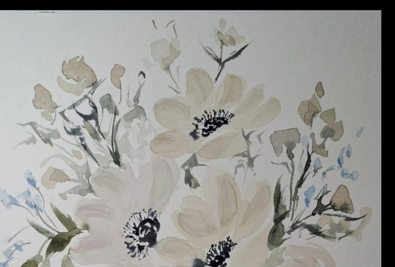
6. Anemone Bouquet: In this part of our class, we are going to
paint this beautiful white bouquet
comprising of anemones, ranunculus, and some
pretty fillers. This beautiful bouquet is
based on this photograph by floral designer,
Trill Floral Onstagm. And before we start painting, I just want to share a
brief lecture on how you should choose your reference
image for your painting. First and foremost,
make sure to gather as many reference image
photos as you can. Having more than one
reference image is better, so you can choose which one has the best angle
for your bouquet. Take our project as an example. I was able to get
three photos of the same bouquet that
we are going to paint. This first photo is beautiful. Most of the flowers
were facing forward. However, the general shape of the bouquet in this
photo is a bit odd. The fillers were also heavily focused on the left side as
compared to the right side. This second image, on the
other hand is more balanced. The details are well scattered and the focal point
is more highlighted. This third photo
that we have here is an example of how you can
still paint a bouquet, even if not all the
details were captured. Look how the image was
cropped in a way that the main focal point,
which is the anemone, is highlighted and how it
was supported beautifully by the fillers and
secondary flowers like gnoculus and sweet peas. As you paint more in
your cave journey, you'll get used to looking for the best angle to
paint or better. Learn how to shoot your
own reference image, because by doing so, you'll be able to customize the images to precisely
what you are looking for. For today, we're going to use
this image as a reference, and I know you're excited, so let's start painting. Just like our usual practice, we will start our project by
painting our main subjects. If we take a look at
the reference image, we will see two
beautiful anemones in the center of our bouquet. As we paint, we will ensure that these two flowers
will ultimately capture the attention
of our viewers, so we have to make
them big, defined, and bold compared to the other flowers that
we will paint. I am using my silver crystal filbert brush and size 3/4 here. And for the color, I use the
Daniel Smith Titanium gray. I did some flat strokes using a light
mixture of my color, and as you notice, I didn't make it too dark yet
as this is our first layer. Later on, we will add more
details as we move forward. Adding a little
bit of pink here, using potters pink to mimic the blushing effect
on a reference image. I only painted a
portion of the anemone as I will create another
flower on top of it. We will attempt to give
an overlapping effect. So while waiting for
the first layer to try, I will add a few leaves
around this base first. For the color, I used undersea green and mix it with a little bit
of shadow green. Adding some more flowers in some areas just to make
it look more full. Now, we will paint
the second anemone. I will be using the same
brush and the same stroke. But this time though, I will be using Petersburg cher for a more creamy white look. I'll also make this
few petals a little bit angle just as the ones
on the reference image. Going back here to complete
the missing petals. Painting bouquet really takes
a lot of time and patience. You have to go back and forth on some areas to carefully capture the details of your
painting while ensuring that you don't
overdo some parts. The base of our
flowers are done, so now we are going to paint
some more leaves since our bouquet is
really filled with different leaves in
between flowers. I'm using different
shades of green on our leaves to give a nice
effect on our bouquet. Using a darker tone
of great titanium, I'm adding shadows on the
petals of my anemone. Be careful not to fill the
whole petals with dark tone. Just a few petals enough to
be considered as shadows. Time to add the center
of the anemone. I'm using sepia here and
just my round brush. Notice that I'm leaving a bit of white space on some
areas as highlight. Back to my second anemone, and adding a darker tone of
Petersburg ker as shadow. This is just optional, but I also decided
to add a bit of concentrated white paints to
elaborate some highlights. Now, I'll be adding
some more details on the center of my anemone. I love using this brush called silver ultra mini round
brush in size four. This is a very pointed
tip brush which helped me create very
small clean lines. I'm going to add the center
of my second anemone, just the same as the first one. Then I'll be adding some
leaves and fillers. Just play around with different
shades of green here. Adding some more greens. This time, I want to create
some broken steam for the small blue fillers that
I will be adding later. Let's go and add
the blue flowers. These are just fillers, so they don't have
to be very defined. But as you can see,
they're so cute, and they added a lot of
beauty on our composition. Now, I'm twisting my paper so I can properly add my next flower, which is a ranunculus. I am using a size eight black
velvet brush with this one, and I am just creating
lots of c strokes. This is just similar
to creating roses, but the C strokes here
are thinner and actually, it has more c
strokes than a rose. Let's add one here. I am adding leaves now
here while it's still wet, so the color will
bleed a little. Just aside, no, I've been using the same paper for more
than four years now. And because of that, I know
how this paper behaves. I already know if it's too wet, too cold, dry, and so on. So my advice to you guys, if you're just starting is
to stick to the same set of supplies if those supplies
work for you already. You'll be able to focus more on developing your style
or learning more about the craft when you already know how your paper
behaves wet water. So now I added another
anemone on the lower side. And then I also added
some leaves here. I can finally see one side of our bouquet slowly being shaped. So I hope yours is looking
like a bouquet as well. Adding more leaves and
filler on this side. This is just similar
to the other side. We are just going
to imitate the flow of the filler space
on a reference image. Now I've turned my paper, and I will be adding
some shadow on the n. I am adding shadow in one side only
since we wanted to create an angled
effect on this flower. Now, we're going to
do the same process with our other anemone. We're gonna add some shadows, and we're going to add
it on one side also. Now, I'm also going
to add some greens at the center of the noncus because that's actually how a ranunculus looks
like in real life. Now I'm going to go back
to my main subject. I'll be adding more whites to the petals to emphasize
the highlights. Now, let's do the sweet
peas on the side. For me, sweet peas are one of the hardest flowers to
paint in a loose style. They look so delicate
with very few details, so it's so hard to
imitate the shape and fs by just using shadows. I also added the stems, so the greens will
bleed a little. What I love about
painting bouquets is that they usually have the
same set of flowers. So you get to practice the same botanical
element over and over again while being able to build a composition
at the same time. Time to add the center of
the tiny anemone here. Now, I'm going to add
the lines and dots. I love adding this part so much because it really gives
life to the flower. I'll be adding a mixture
of gray and white on this area just to give
a little bit of that. Adding a bit of details. Now, let's turn our paper
to its original position and let's start working on the upper portion
of our bouquet. So here's the anemone and also be adding some sweet piece. And won't give much
details for this area anymore since they are not
part of our main subject. But as per usual, I'm going to add the center of our anemone. Let's work on supporting
details of our bouquet. This one is a small ranunculus on the upper right
portion of our bouquet. I'm painting it in
a very light shade, so it won't overpower
our main subject. Let's go add the stem. There's a bunch of sweet
piece in this area, too, so let's work
on that as well. Let's turn our paper and work on the lower left
side of our bouquet. This time, we will focus on the noncalus hanging
on this side. As you can see on
a reference image, it's stem is covered
with leaves, so let's add those as well. We will wait for this to dry and then add more
details later on. While waiting, let's
work on this part. Since this is an
upper portion of ok, all the elements on this area are just supporting details. So basically, we already have
the shape of our bouquet. I hope yours is looking
gorgeous as well by this time. And now it's time to complete
the details even more. I will continue to
add some more shadows on our Of course, we should not forget the
green death in the center. Okay, time to complete
the look of our bouquet. We will add the blue ribbon like what we did on
our previous project, we will use a lighter shade
of blue firs and then add more concentrated mixture
on one side as shadow. We are basically done. I'm just going to add
a few finishing touch. If yours is good already, no need to add this step. And finally, we are done. That was a long
painting session, but I hope you were
able to follow along, and you're able to paint
your bouquet beautifully. Here's a small version
of this painting. I painted this one last year, and I loved it so much. It's a simpler version
of what we did today, and this is just a
proof that you can use a reference image and capture just the
details that you like. Hope you had fun, and I hope to see your project on
our project section. See you on our bonus project.
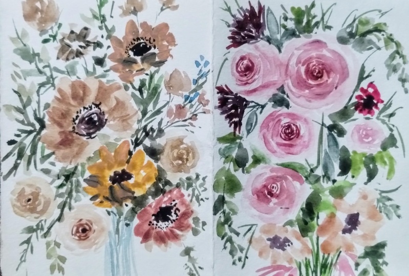
7. Bonus Bouquet: Okay. I'm so happy that you guys are able to paint two beautiful bouquets already. I'm so excited to see your work. However, for those who
still want to practice, there are painting skills, especially those who want
to exercise their hands and paint more complex
flowers like roses. I added this bonus
bouquet lesson, and I encourage you to paint this beautiful
bouquet with me. This one is another
beautiful composition made of different roses. Some are in front view, some are inside view, and a few rosebuds and
lots of leaves as fillers. I can't wait to see your
work, so let's begin. Let's start by painting
a rose in this area. As usual, we're going to
create small C strokes, and then we're
going to change to a bigger brush to create
bigger C strokes. For this one, I am using lunar red rock or capa
mortum as you can notice, that I use a darker shade of
the color in the center of my rose and then switch to a lighter shade as I
go out of the center. Now I'm adding darker
shade again to create depth and I switch to a
smaller brush once more. Let's blend it a little. Now let's paint our second rose. This one is going
to be inside view. I'm using Petersburg ocher
and a small round brush. So I started with the
top part of the rose, and now I'm blending it over, and I'm going to switch
to a bigger brush to create the body of our rose. While my rose is in cold state, meaning not too wet
and not too dry, I'm going to add some depth. So using a darker shade
of Petersburg ocher, I'm going to add some shadow
on some areas of my rose. Our first rose is already dry, and I think that this is the perfect time to
add depth to this rose since the initial depth that we added is already light. I'm going to add another
rose in peach color, so I'm going to start by adding the small sea strokes for
the center of my rose. Switching to a bigger one here. I'm putting my rose close
to the other roses so that there won't be
any awkward space in between these flowers. Make sure you do the same
so that you won't need to add leaves in between
our three roses. Let's wait for that one
to dry off for now. Let's add another cream rose. So I use again my Petersburg
ocher for this one. Time to add the shadows. Okay. I'm going to add it on some parts to create
some top metal effect. Going back to put and let's add another
rows on this side. Again, remember to put
your rows close to each other so that
there won't be any awkward space
in between them. As usual, we're going
to add some shadows. Let's add small peach roses in this area. I'm
going to add tree. So it's like our usual rose, but we're just going
to make it smaller. One more here. And let's add another one here. My base layers are
drying up already, so I'm going to re establish
the shadow on this rows. Same procedure, we are going to use darker shade of
the color that we used and just redo the
shadows of our rows here. Let's create two small
rose bud in this area. I'm going to use the
same peach color that we used earlier. This is so easy. All you need is a
bigger brush and just create down strokes
like creating a leaf. You don't need to create a
lot of details for this one, because this is just a filler. I'm going to add
another one here. This time, it's in
color Petersburg Oak. I guess it would be
nice if we'll add lunar red rock rose
buds in this area also. So I'm going to add just one. So now let's go back
to our small roses and add some shadows in them. Again, these are just fillers, so you don't need to really add a lot of details on
the small roses. Let's go add some base leaves. So I'm going to use a
very light mixture of green earth for this
one so that there would be background
leaves representing those leaves that are in the back part of
our composition. So now I switch to a
darker shade of green, and I'm adding stem
for this rose bud. I am using darker
shape because these are leaves that are in
front of our bouquet. Now it's time to add
some more leaves. I am just going to add it in different areas to spread
the greens on our bouquet. So leaves are simple, but they add a lot of
beauty on our composition. So make sure to add those leaves around your bouquets and
fill those empty spaces. When you add leaves, it doesn't have to be perfect. They don't really
need to look like perfect leaves because
as long as it's green, the audience or the viewers of your artwork will always
perceive it as a leaf. I would also suggest that you mix different
shades of green. You can add a hint of
sepia or Vande brown to your green so that
there would be different shades and variations. I'm going to add a bit of
shadow on my rose bud. So I used a darker shade of Petersburg ocher here and just adding shadows just to create and define our rose bud here. I'll also do the same
for peach roses. You don't need to
make this perfect because these are
just small flowers. The focus of your
audience will always be drawn to the center
or those big roses. So no need to overdo this part. Our bouquet is looking good, and it's almost done, so it's time to fill those
empty spaces even more and add some more fillers
like leaves and stems. To make it an official bouquet, we are going to add the
ribbon in this part. So I'm just using green mixed
with a bit of Petersburg ocher and I'm just going
to add a little bit of torquer shade later
on to create a shadow. Oh. It's a little bit try already, so I'm going to add
the shadow now. It's okay to touch your paper to check if it's try already because it's better to touch it than to ruin
your composition. Now I'm going to add
the stems of my flower. I'm going to use
different shades of green for this one to represent different stems
in different positions. Some of the stems are in the
back part. So are in front. So it's nice to use different shades of green
to represent those. I also added a
tape so that there would be a clean line at the bottom part
of our composition. But if you weren't able to add tape on your
painting, it's okay, especially if you
have big paper, don't need to copy exactly
what I'm doing here. I also want you to express
your own creativity and explore different techniques while painting our composition. We are almost done, so I'm just going to
add a few more touches. But if yours is
looking good already, you can now put
your brushes down. So if you want to add more
fillers, that's also okay. But again, if you're done, no need to add extra details. I just added a few fillers and some leaves at the bottom
part of my composition, and I'm finally done. I hope to see your work on the project and
resource section, so I hope you can
upload it there. And also, if you
like this class, I hope you can leave a review. There's one more
video on this class, and I hope you can
watch it also. So I can guide you and how
you can leave a review and how you can upload
your final projects. Thank you, LC on the next video.
8. Final Thoughts: Finally, we are done
with the class. Thank you so much
for joining me and well done for
finishing the lessons. I hope you learned and
enjoyed it as much as I did, and I hope you discovered
how to transform your bouquet photos into
beautiful paintings. Just a reminder if you think your work doesn't look
the same as mine, or you feel like you
still need to redo your project, that's
totally fine. It took me years of practice and a lot of mistakes to
be where I am today, and you are so much ahead of me when I started,
so don't give up. Keep on trying and
keep on painting. No matter what, I'm very excited to see the projects
that you have created. So please take some photos
of your paintings and upload them into the project
section of our class. I would love to give some
personal feedback on your work. If you find this class helpful, I hope you can leave a review
in the review section. Let me know if this class
met your expectations, what you enjoyed the most, and what can be improved. This is so valuable and helpful
to me as your instructor, so please don't skip this part. Also, don't forget to follow
me here on skill share so you'll get notified about my upcoming classes
and giveaways. You can also follow me
on Instagram to get instant updates about my
latest works and events. Lastly, feel free
to share your work on Instagram and
Instagram stories and tag me at Jenny Flores R and SkillShas Instagram
at Skillshare. I will surely share your
work with my community. I hope that you love this
class and learn something new. Thank you so much for joining, and I'm very excited to see
you in the next one. Bye.
 Jenny Flores Art, Top Teacher | Watercolor & Gouache