Transcripts
1. Hi There!: Hi, my name is Carlyle Azar and I'm an illustrator who does editorial work and
also enjoys to explore and play using both traditional
and digital media. When I started doing my first
commissions for magazines, I was all about using
markers and colored pencils. I just love the soft and delicate texture that you
can create with them. However, when I started
to get tighter deadlines, I decided that working digitally was a faster way to
go around that issue. But I didn't want to give up on the textures that can be
achieved with analog media. So I started to play around
with procreate and I not only discover that I in
fact can work much faster, but that also
procreate comes with amazing default
brushes which can help you replicate that
lovely analog feel. In this class, I will
show you how to create analog looking artwork using
procreate default brushes. I would like to share with you the default brushes
that I consider have amazing textures
and that can help you create beautiful
analog looking work. We'll explore techniques
that can help create depth and make your pieces
look more engaging. By the end of this
class, you'll be able to create artwork with
different textures, giving them a warm analog feel without having
to spend an extra. As a final project, we'll create a few simple
illustrations using the techniques and brushes
discussed in this class. This class is designed for procreate beginners who want
to start using the app, but are unsure on
where to begin. Because I get you working
digitally, can be overwhelming, since there are loads of
options for color sizes, formats, and of course, brushes. For this class, you
will need your ipad, procreate your Apple
pencil or Stylus and a template that I will provide for this
class. And that's it. We're ready to start. I'm
super excited to teach this class because Procreate was a game changer for me
as an illustrator. It allowed me to experiment, play, and work no
matter the deadline. And I also felt time to
continue working with similar textures that I
already love so much. And I hope that this
class also makes you feel excited
and inspire you. See you in the first lesson.
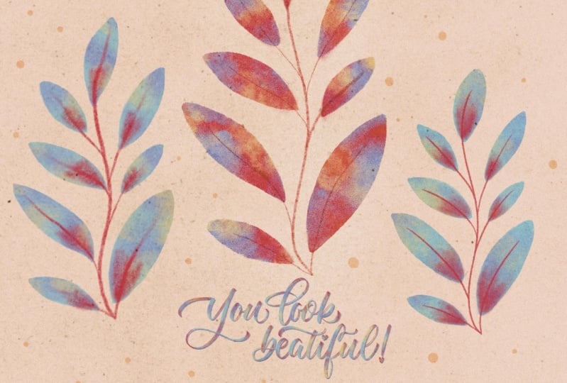
2. Class Project: For this class project. All you'll need is your ipad, your Apple pencil or stylus, and a simple illustration template that I've
prepared for you. You'll paint over
the template using your favorite brushes
or a combination of brushes and techniques
shared in this class. I thought we would use a
template because it's way easier to see how
all the techniques and brushes work together. Also, the template provides
a level of structure and consistency that can really help when you're
trying out new ideas. Plus, it's pretty
cool to see how different artists can
take the same template and put their own spin on it to make something completely
unique and original. To access a template, simply head over to resources. I'll walk you through the
painting process and show you the brushes and techniques we'll be covering in this class. You can paint along with me, but if you'd rather
take your time to play and experiment on your own, once a class is over,
that's perfectly fine too. The ultimate goal of this
class is to help you develop your skills and feel confident applying these techniques
to your own artwork. If you're feeling up
for the challenge, why not create an original
illustration of your own using the brushes and
techniques we'll discuss today? It could be a scene from your
favorite book or a movie, a portrait of a loved one, or something entirely
from your imagination. I would love to see
what you come up with. Please share either a painted template or
your original work, or both in the project gallery
to get feedback from me. Or if you can also tag me on Instagram so I can share
your work over there. Okay. To sum it up for
this class project, all you need is a template
that I'll provide your ipad, your Apple pencil or Stylus, and of course, procreate. You can find the template
in the resources section. You can paint along as I share with you the
brushes and techniques. But also feel free to work on your project once
a class is done. If you feel more
comfortable that way, upload your painted template
to the project gallery. Or if you prefer, upload an original illustration
also to the project gallery. It'll be so interesting
to see how you apply these brushes and
techniques to your own artwork. Feel free to take your time and experiment with different
colors and textures. Don't be afraid to
train your things. This is your chance to have fun and let your
imagination run wild. Okay, so let's grab our template and start going through
the brushes we will use.
3. Brushes: As I shared in the intro before I got my
hands on procreate, I was all about markers
and colored pencils. I was so drawn to the softness and subtle textures that
I could create with them. And to be honest, I was
quite reluctant to try digital painting because
I always thought that I could never get those
textures digitally. But then I started using
procreate and noticed that the results you
could get with it looked pretty analog
looking already. And that got me analyzing
what was the reason for that, and came to the
conclusion that for a digital piece to look more
analog is all about texture. I thought to myself,
let's try to replicate those
traditional media fields and textures even more. So I started doing a
lot of studies to try and understand what
kind of textures I was drawn to and how
could replicate them. And there was a huge benefit
that with digital painting, I could experiment and
make do overs without worrying about
wasting art supplies, paper or anything like that. In a really helped me to keep exploring
the app a bit more. And that's how a whole
journey started for me. And I want to share some things I discovered with you today. To create traditional
looking artwork digitally, we need to consider a couple of things in order to
create texture. The first one is technique and the second one is the brushes that we will use to paint with. We'll cover both of these
elements in this class, but for now, let's
focus on the brushes. There are a few qualities
that I look for in brushes. Default or not to help my
work look more analog. The first one is
pressure sensitivity. In procreate,
pressure sensitivity refers to the ability of the brush to respond
to the amount of pressure applied by your
pencil on the screen. Basically, the harder you press, the thicker or darker
the stroke will be. This feature makes it
feel as if you were using traditional media
like paint or markers, because they work as if you were depositing more ink or
paint into the screen. In this class, we will use two pressure sensitive brushes and two non pressure
sensitive brushes, so you can feel the
difference while you paint. Second thing, edges or
the shape of the brush. When picking a brush, one of
the things that I consider very important is how the
edges of that brush look like. Now, some brushes have
very clean edges, which I personally
prefer most of the time, mainly because I'm so used
to markers which have that quality and I want to keep replicating that
look in my digital work. And also because
clean edges usually means that I can achieve
clean silhouettes, which stylistically
I do really like. However, sometimes brushes with messy or irregular edges can add more texture and can
make your artwork look more analog and even
more interesting as well. Using brushes with defined edges or not is a personal preference. And finally, the texture
of the brush itself. Each brush has its own
particular and unique texture. Some are flat and some have a specific texture
design, so to speak, already in the brush,
that texture will make the brush look wet or dry. Some may be more opaque and some will have a certain
transparency to them. I hope that these aspects can help you identify what
to look for in a brush. Let's say that you are
used to watercolors. Perhaps a more
translucent brush with a paper texture and wet feel could be a good
choice for you. Or if you use acrylics, a drier, more opaque brush
with less texture and perhaps more rugged edges
could be a good match for you. The brushes we're
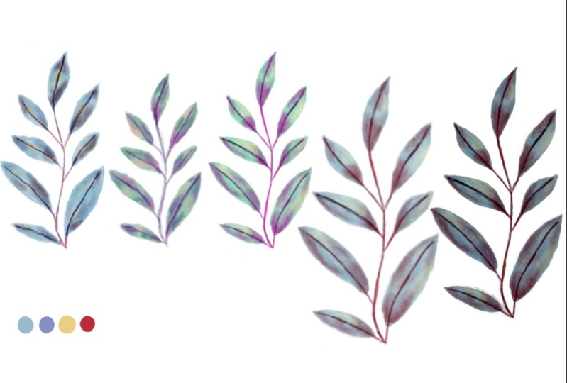
using today have varying levels of
transparency and texture. To make things simpler, I have created a set of brush combos with similar levels
of transparency and texture for us to work with. We will start with a more transparent softer
looking combo. We will then try to medium one and finally a more opaque one. The brushes that we will use today are combo one gloaming. This brush gives a
soft textured effect and because it's
quite translucent, it's similar to water color
or even alcohol markers. You can find that
brush over in drawing. I decided to pair
with willow because these two brushes have more
or less the same level of softness and work
very well together. You can find it in charcoals. Combo number two, Eagle Hawk. Although this is
also a soft brush, it has a more rugged
texture than gloaming, which can look a
little bit more like wash. You can find
it in drawing. I decided to pair it with two, be compressed, you can find the brush in charcoals,
common number three. For this combo, we will use
three different brushes. The first one is milla,
the more opaque one. This one resembles
acrylic paint. I decided to pair with Oberon, which is another
strong opaque brush. Both are located in drawing and I pair
them with peppermint, a soft texture brush that will help you to create a bit
of texture contrast. You can find it in sketching. We will also use a
few other brushes not to pin with but to merely create texture with
are the water sponge, but we'll use it to create color smudges and
enhance texture. You can find these in
water. Noise brush. This one creates a
very nice texture that might resemble
grainy paper. You can find it in
materials bonobo. This brush also
resembles paper a bit, but it's much softer
and delicate. You can find it in sketching. There's a guide on where you
can find these brushes and a little swat sheet available in resources in order to keep
everything in one place. I would suggest you
to create a section of brushes specifically
for this class. You can do this by clicking on the little brush icon and scroll upwards until
you'll find the plus sign. And then you can
name your brush set. And then just simply drag
and drop your brushes. Or you can just go
over the brushes that we will use and these will appear in the recently
used brush section. To recap, texture is key to replicate the
analog look technique. And brushes are what will
help us to achieve texture. What I personally look for in a brush are pressure
sensitivity, the edge or the
shape of the brush, and the texture of
the brush itself. The combos of brushes
that we will use today will go from transparent
to medium and opaque, and these are the ones
that we will use. We will also use
additional brushes to create texture with, and these are the brushes
that we will be using today. Okay, so now that we know which brushes we will
be working with, let's go ahead and talk
about how we will use them.
4. Technique: Sometimes I get asked what brushes I use
for my illustrations, and I really have no
problem sharing that. But the truth is that
in order to achieve a certain look how you
use those brushes, a KA technique is very
important as well. I just want to
mention that a brush alone can't magically
do all the work, but with some creativity
effort and your own twist, you can make something
truly unique and special. So let's think of
digital brushes like we do traditional media. We may all use the same tools, but I'm sure we'll end up
with very different results. As an illustrator,
I have found that digital painting is similar to traditional
painting in many ways. Now that we're talking
about traditional media, I think that one of
its main features is that it can be a
bit unpredictable. You know, certain smudges
a blotch here or there, maybe some patchiness is
just all part of the game. When I started
working analogically, I used to be scared of texture because I wasn't sure
how to control it. But then I realize that it's precisely that lack
of control that can make an illustration
look more playful, embrace them, so to speak. I am mentioning this because I think that it is important to allow a certain level of playfulness in our
digital painting as well. For it to look analog, it's so easy to fix mistakes digitally that we might be
super tempted to do so. But I think that
it's important to embrace what you
might consider as imperfections because
to some degree is what it will give that traditional
look to our artwork. And it will even make it
more look interesting. Again, it's all
about the texture. Personally, I use more or
less the same techniques on procreate as I do when I use
markers and colored pencils. So I would like to share with you what my technique
looks like. The first thing is the use of color in traditional painting. It is important
that we start with a base color and then
work our way up. We usually work
from light to dark. Picking darker and lighter
colors in painting helps to create depth and
contrast in the artwork. It makes it easier to
build up textures and shadows and adds more visual interest
to the piece as well. In other words, for this
particular technique, we want to avoid colors
looking a bit too flat. Instead, we want to
create a combination of dark medium and light shades
to add depth to our piece, I would suggest that for your paintings, traditional or not, and to create a color
that feels just right, a medium shade of the color
you would like to use. By starting with a medium shade of the color and
then working with the darker shades for shadows and lighter shades
for highlights, you can achieve a more
cohesive and dynamic look. This applies to both traditional and digital painting techniques. For example, if you
want to use brown, I would suggest to
envision a darker shade of the color that you want
to use for your shadows. And then a lighter shade of that same color for
your highlights. And see if those tones would look cohesive in
your illustration. Then I'd like to use this much
tool, this one right here. And I like to go over the colors to get rid
of that flatness, to give a little bit of depth
and dimension to my piece. What I personally really like to do is that
you could also use a darker or lighter colors that are different
from your base color. For example, if you use green, you can use a
complimentary color, but a darker version of it. Or you can use an analogue color like yellow and pick a
lighter version of it. And you will get
something like this. Then you could combine them
together and see if you like the combination or if they make sense for
your illustration. Now let's grab our ipad
and let's pick the colors. For our class project. We'll use a base color, a highlight, and a shadow. We will also pick a color
for details and texture. You can pick any colors you like or you can use
the same colors. I'll use for this class project, I will use blue as
the base color. So I'll pick this blue shade that I consider is
within medium range. For shadows, I could
use a darker blue, but I will pick a
dark purple instead. To create higher contrast that will be more visible on screen. For highlights, I will use yellow to also create
higher contrast. On screen for details, I will use red mainly because I like the contrast
against blue, but also because it will help us to appreciate the
texture a bit more. You can find the
exact color swatches I'll use in resources. Now, back to technique. The second thing to
consider is layering. When I work with markers, I start by creating a base layer and then
I go over it again, creating spots with
more concentrated in. Once I'm happy with the original
base texture and color, I go over the base with a
darker color to create shadows. As many times as I consider, I have achieved enough
depth and texture. Basically, these
are analog layers. Doing this digitally can
look a bit different. As we've seen before,
certain brushes are pressure sensitive
and they will deposit more color on certain areas depending on
the pressure you apply. Very similar as markers do. One of the reasons
why I really like pressure sensitive brushes is that depending on how much
you press on the screen, they will really
give you a shadow, a base, and highlight. Some other brushes create a
more even or flat finish. But in both cases, if you want to add more
color to your base digitally and if you do
it on the same layer, you are likely to lose some of the brush original texture. You can also lose texture if you use much, certain bits as well. This is my way around it. Grab your ipad and
let's do this together. Make any shape you like,
in any color you like. This is our color base. What I like to do is to
create a new layer which gives me more control over the color I apply over the base. This allows me to make
changes in color or opacity without interfering
with the original color base. Then I set the new
layer to multiply. This does two things. It enhances the color
applied on this layer a bit, and it also makes this layer
a bit more transparent, allowing the original texture to remain no matter how
much color you deposit. Finally, I turn the new
layer into a clipping mask. This keeps all the changes and colors applied
in this layer. Within the layer below, you won't have to erase anything if you color
outside the lines. Clipping masks in
procreate are used to limit the area of a
layer that can be edited. By creating a clipping mask, any changes made to
the layer will only affect the areas that correspond
to the layer below it. This is particularly useful when adding high lights
and shadows as it allows for greater control and precision in applying
these effects. Clipping mask can
also be used to keep certain layers organized and
separate them from others, making it easier to work
on specific elements of a project without affecting
the rest of the image. Lastly, I try to create additional texture when
I work analogically. One of my favorite ways
to add extra texture is by using colored pencils and tilting the
pencil a little bit. This will give you a very
soft grain, a finish. Luckily, your pencil or your Silas works the same digitally. You can try until your pencil
to get different textures. Also, when working analogically, it is important to consider
what kind of paper you will use because this will affect the final look of your
artwork, amongst other things. Personally, I like to pick paper that has a
soft grain because markers are a bit translucent and allow that texture
to show a bit. Since we're not working
with paper and procreate, we need to add paper
texture to our final piece. This can be done very easily
by going over with a brush, importing a paper texture, or adding noise to our drawing. We'll see how to do that
in the next lessons. So to recap. Brushes themselves
may not give you a certain look how you
use those brushes, AKA technique. It's
also important. Playfulness is important in digital painting to achieve
a more analog looking piece. The techniques we will use for this class are use of color, layering, and creating
additional texture. Now that we have an idea on
how we will use our brushes, let's start painting and put
all of this into practice.
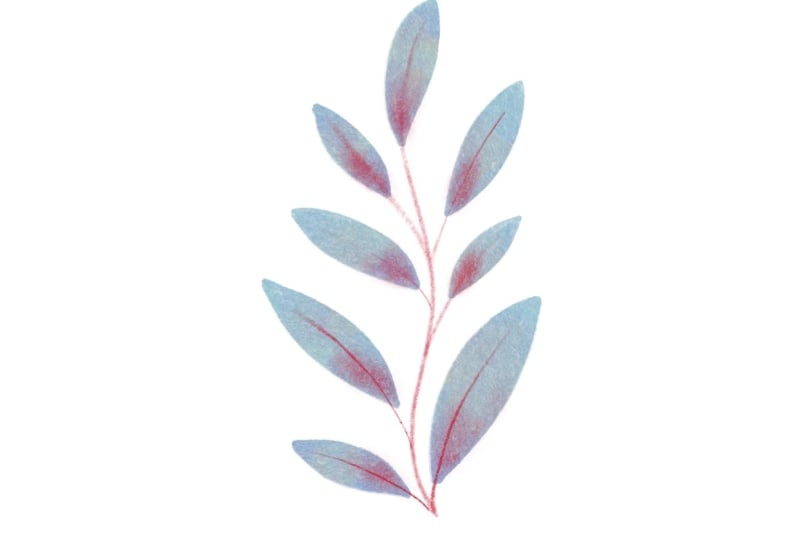
5. Combo 1: Gloaming And Willow: Let's start with the first combo and my favorite brush, gloaming. I love this brush because
it reminds me of markers so much and it is
so rich in texture, but in a very demure
and subtle way. For this class, we're
going to be working with a combination of technique
and different brushes. So the technique
will remain more or less the same in the
next three lessons. But I want us to have
that consistency so we can see the different results
using different brushes. Okay? So we're going to start by getting our template ready by lowering the opacity down enough so we
can still see a bit. Now we're going to start
with our color base. And although this is not a
pressure sensitive brush, I would suggest to not lift
the pencil from the screen. If you do, you'll add more
color where the edges meet. And if you smudge it to
try to make it even, you'll get rid of the
brush original texture. To make coloring easier, I like to do the outlines first and then I
color in the rest. I do the same. Whenever
I work with markers, we're going to keep
coloring all the leaves. And again, we're not trying
to make it look perfect. So it's okay if you have a
little smug here and there. Remember that we're
trying to make you look playful and more importantly, analog looking also take all the time you need
while you paint. I just like to paint quickly. Okay, so we're just going to
finish up the last leaves. Just one more and that's it. Now let's select a new color, create a new layer
and a clipping mask. We are still using gloaming now we are going to add color
whenever we want our shadows. We can also do this to create
more texture and contrast. You can place these
color spots whenever natural shadows would occur or whenever you'd like
to see some contrast. Now we're going to select the smudge brush and direct the color
whenever we want to. You can direct the color
as much as you like, but you can also add a little bit more color
in the spots that you think it has become too
muted or colorless. In this part, I
would suggest you to experiment and be as
playful as you can, keep dragging the color as if you were working
with watercolors. And of course, keep adding color in the spots
that you consider. It needs a little
bit more of it. I would also
recommend you to zoom in and out just to see
how it looks overall. To create highlights, we are going to create a new layer and then clipping mask
for high lights. I will be using yellow and
repeat the process we just did with the shadows and we're going to
smug them as well, just as we did before. We're going to smudge the color as if we were playing
with water colors. If you need a little
bit more of color, of course, feel free to add it. Just try to experiment and
how thin as much as you can. In this part, I'm going
to quickly show you what it looks like
without any effects. This is with the shadows
and with the highlights. Now we can start
adding our details. Let's change color
and pick willow. As you probably noticed, I didn't create any
clipping masks. The reason for that is
because I really don't want this part of the texture
to look perfect. A little bit of color
smudges here and there would actually enhance the
analog look I think. But of course, if you rather have something that is a little bit
more put together, you can create a
clipping mask here. And of course, you can also compare and contrast and
see which one you prefer. For this part, I'm
just creating strokes. You can do circles, you can do whatever feels
better or right for you. This is what we got so far. Now for the stems, we can just trace
over the template. Again, I'm not entirely sure why the template is not
showing on screen, but I promise you it is
there for this part. I just downsized the size of the brush as
much as possible. I can create the thinner
lines for the stems, but if you prefer, you can
totally have thicker stems. Or perhaps you could create a mixture of thicker
lines and thinner lines. This brush is actually
quite versatile when it comes to create those
lines thicker and thinner. With this brush, if you tilt it, you can create thicker
lines as well. Let me show you the texture. I really like this
set of brushes. Stages look so natural. They do really remind
me of alcohol markers, They're just super
soft and nice. Let me zoom in again
so you can see the subtle paper texture and I'm super happy of
how it turned out. I'm just going to show
you a quick time, lapse of what we just did. And I'm also going to show
you the final illustration.
6. Combo 2: Eaglehawk And 2B Compressed: Okay, now let's try
our combo number two. These set of brushes are super fun and have a
sketchy feel to them. Let's go ahead and
select Eagle Hawk. Okay, so just as
we did previously, we're going to go softly around the edges and then color
the inside of the leaf. I think this also makes the process of coloring
a bit quicker. Ego hook is a non
pressure sensitive brush, but just as we did previously, we're not going to separate the apple pencil from
the screen in order to maintain the same level of texture and even
color all around. We want to avoid very rough
textures for this exercises. Also, I will encourage you to
try different brush slices. Okay, I want to talk really quickly about the
tips of the brushes. Now, let me just draw a little leaf here and
show you what I mean. Still a little bit of color. Okay? Some brushes, a thicker
etch, or tip to them. Again, this is
personal preference, but I personally like to have my leaves a little bit
thinner at the end. I like to erase that little bump that this
particular brush creates. That little bump
usually happens when you apply a little bit of
pressure to the brush. As you can see, certain leaves don't have that little bump. I'm going to try this one. See, let me try this again. Now you can avoid this if you
try to apply even pressure, or you just can't erase the bits that you don't
particularly like. Now we're going to create
a new layer and create a clipping mask so we can
start adding our shadows. As we did previously, we're just going to play with the contrast
and the shadows. You can be as
playful as you want. I'm being less careful
for this particular set of brushes because I think it's way more fun just to move your hand and let
it do what it wants to do, and we're going to
smug everything and it doesn't really matter
how this lines turn out. Okay, just a little bit more of smudging and I think that we are ready to start
with our highlights. So we're going to
create a new layer and create a clipping mask. And we're going to change
the color to yellow as well. Well, I'm using
yellow, of course. Feel free to use any
color you prefer. We are of course still
using Eagle Hawk. I'm just going to quickly place the yellow color in the leaves and start
smudging immediately. Now, I don't know
what you think, but personally I think that this particular brush has a dirty quotation
mark finish to it. I really like that. It just makes it look a
bit more playful. Now, let me show
you quickly what the illustration looks
like with the shadows. Now, with the highlights, it does change a bit. But
this is what I mean. I think that the texture is very rich in comparison
with the previous set, that it was very soft. But okay, now we're going to
start adding our details. So we're going to
create a new layer. I'm just going to name
it to be compressed, which is the brush
that we will be using for this, for this bit. I would like us to experiment a little bit
with blending modes. Right now my blending
mode is Screen, and as you can see,
I'm using red, but is showing up as pink. And I would totally encourage you to play
with blending modes. I don't want to expand on blending modes in
this particular class, mainly because I think
that's a class on its own. Definitely try new things. I'm going to stick to my traditional normal
blending mode. But feel free to
experiment and use the blending mode that you consider works best
for your artwork. Again, I'm not using any clipping masks
for this new layer. I'm just coloring with strokes. As I said previously, you can use circles. You can use different shapes, creating shadowing
to some degree. You can try perhaps, adding highlights with
this particular color and see what feels
right for you. I'm using the smaller size for the stems or to
draw the stems with. But for this one as well, I encourage you to
try different sizes. I am going to stick to this one just because I think it creates a nice balanced contrast between the strokes I created before
and the little stems. And I also think that the color base is actually
quite strong in texture, so it does create
this nice balance. Okay, so this is our
final illustration, and I am adding a time
lapse here so you can see the process and all
the steps we went through, and this would be
our final result. Now I'm pretty happy
with the texture here, but what if we wanted to add
a little bit more texture, Perhaps some texture that
would resemble paper? Okay, so this is
what I like doing. I will select the
background color and then we'll
create a new layer. Now it's time to use those extra brushes that I mentioned at the
beginning of this class. And we're going to start
with the noise brush, now we're going to paint
over our final piece. This technique works
well if you have a very plain and simple
background like we have. In this case, that's just, the illustration also works well if you just want to add
texture to specific bits, we're going to paint
over the illustration. Don't worry too much if
you're losing intensity in the base colors because we're going to play
with the opacity. Now again, this gives
the illusion as if the ink was being
absorbed by the paper and those paper textures were
coming through the ink. It gives a really soft
feel and look overall. Once again, I would suggest you play with the different
blending modes. I usually tend to go
from multiply or normal. I'm going to try a few
different ones and see if they enhance the
illustration as I would like to, or perhaps I would just
stick to what I tend to do, but experimenting is
always a good bit. I am now going to change
the background color, and I will select
that background color and I am going to use that
same color for our texture. With this particular color, I think it's a bit more visible. What I mentioned earlier about the paper
absorbing the ink, I really do think that helped my illustration look a
little bit more analog. Now let's go back to
our original colors. Another way in which you can
use this brush is to create shadows or create more
depth in your detailing. Now, since this brush is a little bit more
difficult to control, I would suggest you to use
it as a clip and mask. If you're going to use it for
detailing and foreshadows, everything stays
within the color base. I'm using red here, but of course you can
use any color you like. But I'm using red here, so it can create a little bit more depth in the detailing that I did previously. Because we're not smudging
this particular color. It will look quite intense in comparison to the other
colors that we did smudge. I know that I probably
sound like a broken record, but try experimenting
using different colors. Perhaps colors that you would never use, like this
one right here. I just find it
fascinating that all of these effects were created
by just using a noise brush. Definitely experimenting
has its rewards. Okay, back to the
original illustration. Let's try this brush
to a texture again, We're going to
create a new layer. As you can see here, the previous texture
is not selected. We're just working
with Bonobo here. The difference
between bonobo and the noise brush is basically the thickness
of the particles. I think that bonobo has
way larger particles. And it reminds me a bit of
cold pressed watercolor paper. Okay, we're going to play with the opacity and I think this
is looking good so far, but I think it's always good to see that before and
after adding the texture. You can totally see
there's a difference there. I quite like it. I am just really drawn
to really soft textures. But yes, for this one, we're going to do
the same experiment we did with the previous
texture and we're going to use red and we're going to go ahead
and play with opacity. As you can see, it's a
totally different result. Even when the brushes look
quite similar in a way, both are very different in the way they create
additional texture. I do think that they enhance the color below the
illustration that we created. Now, bonobo can look
a little bit harsh. Definitely play with opacity, even blending modes
if you prefer. Personally, I like to
use this technique to add paper texture
to my illustrations, but it could be a
good alternative if you want to add
more color contrast to your illustration whilst adding a bit of
extra texture grain. Using this brush as a
paper texture or as a contrast in color enhancing
is a personal preference. I'm going to show
you both so you can decide which one you
prefer for your final piece.
7. Combo 3: Moorilla, Obleron And Peppermint: Last, but not least, let's go ahead and
try our third combo. In this combo, the colors
look a little bit more vivid, I think, than the previous ones. They really remind
me of acrylics, that intensity and evenness as well when it comes to color. Basically, we're
going to proceed with the same technique
we've been using. We're going to
start coloring over our template and once again, take all the time you need. I just got used to paint really quickly because
this is something that I got used to or with the time when I
used to paint with markers. Yeah, I don't feel any pressure. If you're painting along, feel free to pause the class or this section as long
as you need to. I really wouldn't want
you to feel that you need to rush through your process
or anything like that. Now, as you can see, this brush also creates a little bump. I'm not going to
erase anything for this particular
set just because I want to keep that playful
look. So it's fine. I'm just going to
leave it as it is. But again, if it bothers you, you can totally erase it
or try to play a bit with the level or the
amount of pressure that you apply while you're
creating the outlines. Okay, we're done. So
let's sum it out. And zoom in a little bit so
you can see the texture. You can see it's a
pretty even base color. But don't worry that's
going to change in a bit. Now let's go ahead and
select our second brush, Blon, and we're going to start adding the shadows with
this particular brush. Remember that we
created a new layer and we also created
a clipping mask. For this particular step, as we've done previously, we're going to keep
adding the shadows. This brush that we're painting over with is going to create a nice additional texture to that color vase that
we previously painted. Once again, we're going
to match everything. I think I'm pretty happy with the way this
is looking so far. Now let's create a new layer and a clip in mask so we can
start adding or highlights. We are still using oblone
for this particular step, you can immediately see how the textures
are being enhanced. With this two brushes
paired together, we're going to keep
smudging the highlights. This is what it's
looking like so far. Now we're going to
go ahead and select peppermint and change
the color to red. If you're using the
same palette as I am, now we can start adding details. Now for this bit, I'm actually tilting my pencil
to create a thicker look. This is because peppermint
is a sketching brush, which means that by default
tends to be a thinner brush, but you can create
this softer effect. But just tilting the
pencil a little bit, I just love how soft it looks. Look at the texture once again, for this particular layer, I didn't create any
clipping masks. It's okay if you color outside
the lines, so to speak, but I'm going to erase
certain bits because I think that I color a little bit too much
outside the lines. But again, you don't
have to do this. It's a personal preference. I like a little bit of smudging, but just a little bit now we're just going to draw the stems of a little
plant right here, just following the template. Again, as a little reminder, feel free to add thicker
lines and thinner lines. Create a mix and match. It's up to you. I'm going
to keep adding the stems. I really like how strong the mark making is using
this particular brush. This is our final result. We could say that this is
the combo with less texture. To me, it really
does remind me of acrylic paint because the
colors are so nice and bold. But what if we wanted to add more texture to
our illustration? We're going to try now
a different method. Now, go ahead and
select a gray color. As you can see here, the hue and the saturation is zero and the brightness is
right in the middle. At 50, the RGB settings are
all in the middle as well. Now that we have this color, we're going to
create a new layer. And fill that layer
with that great color. Now go ahead and press this
magic wand and go down to Noise Now if you move
the sliders right here, it's just not going
to do anything. But if you slide with your
finger over the working area, you're going to see
that this grain appears on the screen. Once it appears, you can actually play with
the scale of it. How concentrated you
want your grain to be. These other three
options that we have at the top, Clouds, billows, and ridges are going to make our noise look a little
bit lighter or darker, depending on which
option we select. I prefer clouds because
it's a lighter one, and to me it looks a
little bit more subtle. But again, it's up to you and
your personal preference. I'm going to just go
ahead with clouds now we're going to go
ahead and play with different blending
modes and capacity. This way of adding texture
and noise to our illustration works well for pieces that
have more complex backgrounds. If you want to achieve a more cohesive or even result
in your final piece, let me zoom in so you
can see the details. Now the reason why I am using
gray to create this effect, it's because its values
are right in the middle. But of course, feel free
to experiment using different colors for
your noise texture. Now I'm using pink and I'm using a different
blending mode. I actually quite like it. I think that perhaps for a more complex illustration
would work wonderful. Let's say a sunset. Maybe if there are a lot of characters and you
just like to create that even light in your piece,
I'm just going to zoom in. It looks more delicate. If I use pink again, it depends largely
on what are you working on and what effect
you want to create. Now, certain blending
modes are just not going to work for
this particular color. Again, I would
encourage you to try several ones and see
which one fits best. Using different colors for your texture can help create
the illusion of paper. Perhaps use a brown color, could look like craft
paper or this pink one that we've been
using may look like those old school writing papers, which ones I'm talking about. As always, color will play a very fundamental
part on deciding what mood you want for
your illustration. Now, just for the sake of it, let's just experiment
with a darker color. There's just something about darker paper that makes me think of ink being absorbed by
it. I really like that. Now let me try this purple one, which I definitely think that changed the overall mood
of the illustration. But now let's go back
to our original gray. Let's just see the difference. Let's just try to play
with the opacity a little bit because I do want to create a soft look since
the combo of brushes that we use are quite
bold and vivid. And this would be
the final result. This is without, This is
with the additional texture.
8. Paper Texture: I think that it's quite
common that you were on the lookout for a
paper texture image. Our first thought
is to go on Google. My advice here would be that if you see an
image that you like, please click on the website
like this one is from Unsplash.com Although most of the images you can get for free, it's really, really
important that you take the type of license
this images have. This one for example,
it's okay to use for commercial and
noncommercial use. But they're also very specific on what you can and you
cannot deal with it. And each website is different. Like free Pick.com Yeah, you can also get them for free, but attribution is required. And they're very
specific about the kind of attribution they
require for the image. Like you can use it for video, for games and stuff. But it's really important that you read all of this stuff. If you want to use those
images for your artwork, if you have a bit
of money to spare, I would definitely
recommend you visiting Gumroad.com This
amazing pack back Maxoligny is quite
affordable and has amazing paper textures and
it's also royalty free. Another alternative is
True Grit texture supply. They have amazing options. The summer here is $10 as well. It has 16 different textures that you can add
to your artwork. You can read about the
commercial license and use right here. Now I would like
to show you how I personally add paper texture
to my illustrations. And we're going to
be using this image I show you first
from Unsplash.com One thing that I do not
recommend doing is to stretch out the image because
it's going to look very, very pixelated. But we'll go ahead and use it for demonstration purposes only. I would suggest you to activate
magnetics just to make sure that the image is placed perfectly on top
of your artwork. The first thing that I
personally like to do is to place the paper texture
image on top of my artwork. For a long time, I placed the paper texture
below the artwork. Now I do it differently because I think that if you
place it on top, it gives the illusion
as if the paper is absorbing the ink or the
colors of your illustration, and I think it
looks more natural. Then I like to play
with blending modes. This one right here is multiply. I really like it because it darkens the colors quite a bit, but you can still see
the paper texture through the ink, so to speak. Now I'm going to show you what the paper texture looks
like below the artwork. As you can see, the
colors almost seem as if they were floating over the paper. Well,
that's how I see it. Yeah, the difference
may be subtle, but I do think that
it makes it look quite organic if you
play the image on top, but if you still think that
the image is too dark, you can play with
different blending modes. You will get different
results based on the paper texture
image that you're using, the colors of your illustration, and the blending modes
that you're using as well. Besides multiply, my
favorite blending modes are dark linear burn
and darker color. I think the fun part here
is to experiment and see which blending mode suits
your illustration better. As a little rule of thumb, the blending modes above normal are going to
make the colors darker. The ones below
normal are going to make the colors a
little bit lighter. I'm going to experiment now
with darker color and change the opacity a little bit and see if I like
the colors or not. They actually look
pretty nice to me. Perhaps I'm going to
leave it like this. I think the yellows
are coming through. The paper texture is
also coming through. But I'm going to go ahead and experiment with
multiply again and opacity and decide which one will be best for
this particular illustration. This one's darken, it
also looks pretty nice. The color look way more
vivid and multiply, even if I play
around the opacity. This depends largely on what
effect you want to achieve. This is our illustration before
adding any paper texture, then I'm going to
show you how it looks with multiply and paper texture. Then I'm going to
show you how it looks with darken and paper texture. My advice would be to experiment with different
blending modes and different paper textures
and see which one feels more organic or more natural to you
and your artwork.
9. Final Words: Congratulations on
completing this class. We covered quite a bit. We talk about exploring
different techniques for adding texture to your artwork using
procreate devel brushes. We talked about
those brushes and I shared with you what I
look out for in a brush. We covered layering and
the use of clipping masks, a bit of blending modes and enhancing brush texture
through smudging and applying additional
brushes to our artwork to create more depth and
make it look more analog. I hope you had fun
and that you feel inspired to keep experimenting and adding texture
to your artwork using the brushes that
already come in procreate. Or if you like to purchase external brushes that you feel a bit more confident
on what to look for. If there's one thing I
really hope you get from this class is that being curious and trying
out different media, whether it is digital or analog, and exploring with it can lead to some pretty
cool results. I hope that exploration
can inspire you to feel more connected
to the work you create. So yeah, don't be
afraid, experiment. Don't forget to upload
your project or projects in the project
gallery and please leave a class review that
will really help me to keep doing more of what you
enjoyed in future classes. Also, this is where
you can find me to stay updated and
congratulations again. Thank you for being here. I hope to see you soon, bye.
 Karla Alcazar, Illustrator and Teller of Tiny Stories