Transcripts
1. Intro: Welcome to eight ideas to help you loosen up and
paint more expressively. If you are tired of
painting stiff, rigid art, this is a great class
that will teach you some simple techniques that
you can apply to any subject. In the class, I will be using acrylics and some mixed media, including charcoal, crayon and some different
drawing mediums. But you can use your
medium of choice, whether you're a pastel artist, oil, acrylic, water
color, whatever it is. Feel free to use what
you're comfortable with. If you want to
explore some simple, effective ideas on
how to paint loose, then let's get
started right now.
2. Materials: All right. A few thoughts on materials before we get started. I'll show you what I'm using and then you can go,
we'll go from there. This is heavy body acrylics. I prefer that. We'll be using some whatever
brushes you have, I use synthetic brushes
for my acrylic paint. A large medium
should do just fine. Some of drawing medium. This is graphite. Okay. And these are some
compressed charcoal sticks. So these work really well too. And then, if you have, you know, prisma color, pencils, whatever, something sturdy
to draw with should be fine. You can even use crayon. So these are artist
grade Karina crayon. That's fine. Flash paints. I may use some of
that. As far as paper, I would use just
something sturdy. This is 140 pound cold press, but like 100 pound,
110 pound paper. Nothing doesn't have
to be archival. It can be the back
of old paintings, it can be an old canvas. But again, if you're
using acrylic, you don't want to use
70 pound drawing paper because it'll probably
just tear as we do this. So again, something sort of
sturdy there should be fine. Then the obvious thing,
some brags, paper towels, some water reservoirs, things of that nature.
Anyway, that's that.
3. Two Simple Exercises To Help You Paint Loose, Abstract Style Art: Time to get loose.
In this lesson, I'll work with basic shapes. In this first example, just going to paint or
indicate rather a square. Real loose with it here. I'm not trying to
impress you with my beautiful square,
and there you go. If I wanted to incorporate
some mixed media with this, then I can even go a little bit loser with
my basic square shape. Now, in example B. I'm not going to take
these kind of chances. I'm going to paint everything
almost where belongs. We have a shape here, a nice tight square. I'm going to go around that
square with my charcoal. So you get the point. The
idea was to indicate a shape. This gets the point across for loose artist for someone who
has developed their vision and has let go the idea that things have to be
perfect or tight. You see pretty clearly there that if you want to be
loose and expressive, then you have to go outside
those lines a little bit. You have to push things to the point where
maybe it falls apart, but give it enough
structure that it just holds together. A. Here is my circle. Of course, we have Example two. Painting and indicating
that circle. There you go. Loose free expressive. Tight type. And understand this. It's a very simple concept. But I promise you, there's
a lot to be learned here. Practice here. You
can do triangles, rectangles, whatever
you want to do. Simplifying it. Makes
the learning easy. If you're trying to paint
a finished piece, well, you're not going to
be successful if you don't understand the basic
idea of painting loose. Well, stop right
here. I'm giving you enough information
for this lesson, have fun experimenting with it, and I will see you
in the next one. All right. Let's talk about edges. Edges are very
important because you have lots of them
in your artwork. And unless you're dealing with a building that's square
or rectangular in shape, then you're going to be
dealing with curves. Now, I'm going to continue
with using the coffee cup as my example because
the coffee cup has some nice straight
lines on the sides, and then we're dealing
with a lot of curves. This first example, let's say we're dealing with a round
shape like that on top, and we have our straight line
on the bot or on the sides. And then we have
this sort of thing. And I'm going to
interpret the logo two here as just a square. All right. So lots of
curves. It's okay. Now, in Exhibit B here, I will give you an
alternative way, and I think this reads a little bit stronger
than the curves. But again, you can make
your own opinion on that. Okay. So as you can see, my curves are made up of lines. And I can even get
into the logo here. This has a very
jagged look about it. You got all these
nice angles going on where this reads
really smooth. I feel this works a
little bit better because the angles can play and they do play off the
edges of the paper. We have a lot of these
right angles here, and the angles of my shapes
are playing off that. And over here, you don't
really get that benefit. If you practice, and again, you feel like this is
really where I want to be, that's okay. It's
not a big deal. But I think you'll find once you start breaking your shapes down into lines like this that the object
you're painting, the shape you're painting has a little more character
to it and it just sits a little bit better on a square or rectangular
piece of paper. All right. So short and easy here and you can practice this
drawing as well. So if you just want to
use a pencil or charcoal, whatever you want to
do to understand this, that's fine, and then you can
move into painting as well. All right. I hope you
enjoy the lesson, and I'll see you
in the next one.
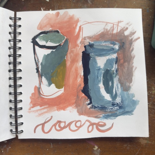
4. Discover the 3 Main areas and the Art of Exaggerating: Really small round brush here. In the coffee cup, we have the actual
edges of the cup. If I were to outline
the cup, basically, it would look, let's say
something like this. I'm not going to do the
whole thing because I want to demonstrate
the other areas. Now, we also have
the object itself. If I were to take
a little bit of white, little blue mixture. Let's say I start here
and I'm painting the cup. And of course, I wanted to put the logo in there.
I can do that. So basically, painting within the space of the object
in this case, cup. So let's do a quick recap
the edge of the object, and then inside the object. So the body of it, right? The third area will
be background. So let's say, I want to use the background to
indicate that edge, and maybe I can come in and
indicate a little edge here. So you can see how I've used the three main areas to
create this quick sketch. And for now, this is what
I want you to understand. The edge of your object, and I'll do it again
real quick here. So I can create let's
see I do it over here, the edge of my object. So I can come in here and
start painting my cup. Then we have background. You got it. I can use that
background. Quick lesson here. But again, it's
really these basics, these little things
that are going to help you down the road.
Thanks for watching. I like representational
qualities. I think it's important
to include some of that. But we don't have to stay
in the lines all the time. You have to actually learn
to go outside the lines. It's okay to go out here
with some of these strokes. It's okay to make the coffee
cup a little bit quirky, if that's what you want to do. In this example, I will show
you how you can do that. Okay. So let's say I come over here. I get nice and loose. So notice right away how
expressive that brushwork is. So I'm not doing following
the edges of my cup. I'm having some fun
because I know I can shape this up a little
later on if I need to. And you'll be surprised how
much you can start to get away with once you start
taking these liberties. And this is really where the work starts to
become expressive. Over here, You know, it's like, I want to get
there, I want to get there. How come my work isn't loose. How come it's still tight. Well, I mean, this is why you're staying in the lines here. Now, let's say, well,
that's pretty wild. I want to bring that
in a little bit. We can come in here and put some areas where that cup could be and shape
it up a little bit. But it's really the bones of let's say the overall
tone of this painting, we're set here in the beginning. You want that to breathe. You want the strokes in the beginning to live
in the final painting. This has a lot more
of a chance and becoming loose and
expressive than this. This is a great lesson
for you to work with a lot and get this looseness and how
you shape your objects. Once you start to
get that freedom of going outside the
lines a little bit and knowing that you can
come back later and create these edges that will tighten things
back up again, then you'll start to take more chances, and
that's what it's about. And I do feel that if you want your artwork to become
loose and expressive, then you really need to
understand that you have to get outside of this paint within the
edges type of thing? You have to let things
breathe a little bit. I encourage you to work
with this a little bit, break it down some?
Keep it simple. Don't try to paint
complex scenes. Work with basic shapes, which is why I'm
using a coffee cup so that you can focus
on the exercise. Another quick
little exercise you could do almost is
just painting circles. What does a circle
have to look like? A square. What if I
want to do a square? Can a square be This, a square doesn't have
to be type of shape. Hope you enjoy this lesson,
practice practice, practice. You don't want to take
this thing lightly. If you are a tight painter, you're going to have
to work extra hard and understanding this idea, this lesson. Have fun.
5. It's In The Details: I like to do with all of my subjects is explore
the details a little bit. I think it's important
to spend time here because you discover things about your subject
that you wouldn't ordinarily see by just glancing
at it and then painting. Now, I'm just going to
start with the logo. Let's just put down
some good old color and I grab a little
bit of yellow, a little bit of teal
through it down. I like that. But maybe I'm like, I want to really see some
orange in there, that's fine. Now I'm looking at different
areas of the painting. This will eventually
represent the logo. Now I'm looking at something
else and I like the top, how the shadow is
on the left side, and again, I'm feeling colorful, so I'm going to take
some risks here on color and balancing around. I notice that this little dark area right here on that lid. Is darker than what I'm seeing
over here, an observation. Maybe I want to include that. Maybe I don't in
the final painting. This isn't about a final
painting right here. This is the complete opposite. I don't want to create
a painting right here. I really just want to
explore and do and play and try to find the things that interest
me as an artist. What do I want to do here? And how can I do it that
makes it interesting for me. I like the act of
applying medium. How you apply your medium and how you interpret
your medium on paper and how you interpret your subjects is what
sets artists apart. If you stay confined in a very representational
area all the time, then you don't
really get a chance to paint freely because you're stuck within these blows you can't branch out because
you don't know how to. You've never allowed yourself to go places and to experiment. Therefore, physically, your
body is not going to do it. I won't do it naturally. You have to go here and you
have to do it physically, at some point in order for your brain to say,
Hey, you know? What about this cool
thing we did, you know, a couple of weeks ago
where you really went crazy with the color
and all that stuff. So you're more than likely to go there again if it
was a good experience. So now, here, I just played
with light and shave I just had fun threw some color down that could
have been the shaved, started here, brought
it down in there. I had no intentions
of going there, but I was just doodling, letting myself explore
and play a little bit. And so now I just doing
some negative painting, painting around it, Now, maybe I want to come in
here with some shadow. I could care less what the true color is in
life, with the shadow. It could be blue or
purple, brown, whatever. I'm just going to get something that is dark enough
to say shadow. I'm going to put that down.
That gets the point across. I'm happy with that. Now, maybe I want to go back to this logo, since it's almost dry. Maybe I want to bring
in a few more details. I'm just going to play
with my liner brush here, let's see. It's a lot of fun
to paint without any pressure of creating
a finished piece. You know, when we
put that pressure on ourselves that we tend to revert back to what
we know. That's okay. There's nothing wrong with that. But I think if you really
want to branch out and to give yourself more freedom
of expression in your work, then you need more options. You need to give yourself this opportunity to explore because this is where you
learn, this is where we grow. Bring that idea of playing with these details
over in this area. I'm getting more familiar with
this logo, which is good. So if I ever decide to do a finished painting today or
get into it at some point, I've got a nice connection
with all this stuff. And knows how I'm just staying
loose, bouncing around, having fun with it, not trying to put a lot of
expectations on myself. At the same time, I'm playing
with my medium, right? I'm having fun
exploiting what I do. Now, getting back to this, of course, the logo
was white and green. So you can see
that underpainting of green and blue and yellow. Brown, that's all there. I like those colors. It
makes the logo interesting. Now, I can go back in here
with a little bit of white and my thin liner brush he
missed some of these things. Maybe I want to
bring out a little more of the representational
qualities of this logo, make it a little
more recognizable. If I were looking at this from a distance across the room, I'd be able to say, Oh, yeah, yeah that's a
Starbucks cup there and I'd have a connection to it. I would know what
it is. That's all I want to do for this
particular sketch, but I do have a little
bit of room over here. Now, maybe I want to break
out my charcoal again, just sketch this lid. I
really like that top. I like the shape of it. Maybe I want to put some
coffee in there. There we go. Little to go. And so there in that little exercise,
I found some freedom. I found some freedom
with my medium, found some freedom
with my subject, had fun doing it, and I
pushed my art to a level. That may allow me to paint
looser than I did before. And that's what these
exercises are all about. They're about trying to discover different ways you
can do things, ideas and techniques for
applying your medium? Color. I mean, would I have used a orange background
and came back over that with a dark
greenish blue color and play with this logo. If I had if I had started to
finish painting, you know, I probably
wouldn't have. I would probably go a little
bit tighter and started in an area or in a place that I was
already familiar with. So once you get into that
mindset that you're painting, we get comfortable doing
what we already know. Risk taking doesn't often
happen when you're painting. Whenever you're doing playing, experimenting, well,
this is discovery time. This is where we
find out things. We are exploring. Sometimes
the exploring process doesn't result in
anything but a hot mess. And that's okay too because
I always have fun doing it. I can tell you this for sure. What I demonstrated right here, you will see a lot
in my workshops. I will go over this type
of stuff again and again. It's how I spend the majority of my time in the studio.
I don't paint a lot. Painting bores me because
I know when I'm painting, I tend to go back to
what I already know. I like to discover. I want
to know what's next for me. Explore, take some
risks with colors, take some risks with strokes. Don't try to determine or have any really big
premeditated ideas on what you're trying to do. Let yourself be creative. Again, you're going to
see me do this a lot. This is the last time I'll
be talking about this. Until next time. Thanks for watching and happy
painting to you. Okay.
6. How To Develop Loose Brushwork: So, too accurate. Staying loose. Now, for the sake of just having something
here to go with, I will say I want my
background color. Let's just say and this
is true for both of them. We want that background color to maybe be in here somewhere. That's the bulk of
that background. Okay. Well, let's say we
want that bottle to be in there somewhere.
That works. So we have our background. I'll just put back our bottle, and we have our foreground. Those are the basic
colors I'm working with and those are the areas
I'm going to focus on. But let's say this is
ultimately where I want to be. In that kind of final stage, this is what I kind
of am after, right? So this artist over here too accurate kind
of starts to go there, go, Okay, well, yeah, yeah. I see what I want there. Again, I mean, this
is not in the image. Actually, if you
look at this color, it's probably more
like the background. But just for the sake
of this painting, we're going to put it
in the foreground. This artist goes, Oh, yeah. I nail that color, right? I've got it boom. He look at that background. I go, Oh, yeah. I see
that background color. Oh, yeah. I got you. Awesome. I'm basically
representing those colors on this very first layer, right where they should be. Let's go over here this one. Again, this is
where I want to be. I'm, well, that's fine. If I know I want to be there. I don't want to go
there in the beginning. More of a violet
type of color here. All right. Now, we've got the bottle. So that's where I want
to be with a bottle. Stick to maybe some
transparent yellow, little orange, maybe a
touch of the yellow. Good. Completely
different approaches for beginning a painting. And it's done
intentionally, right? You saw you witnessed it. And for a good reason. And I will share that
with you when I come back after this dries, okay? So I will see back shortly. And I will start over
here with this one. I'll just go back
to my square brush. And again, this is where the colors are going to
end up for both of them. That's the deal. You have to kind
of keep that mind as I'm painting here, right? So what this artist has
done is they've kind of painted themselves and
to a little corner here. So we can kind of put
another layer on Okay. There's not going to
be a whole lot of excitement in terms
of brushwork. There there's nothing there for that second layer to go
on to make it exciting. Because I went there in the beginning to wary and
kind of the same thing for that color there
for the this color, I can put another
color layer on it. Okay. Mac dag on it. I mean, it's it's not doing anything, but just simply adding
another layer to it. So it's making it a little bit stronger in terms of the color. But again, I didn't leave
myself any room to play. So basically, everything
I'm doing now, it's making a difference. It's certainly adding
a little more depth and meaning to those colors
and to the painting. But the brush work is stiff. And that's kind of what I really want to emphasize
with this lesson, how we can take brush work and make it a tool
for painting loose. Okay. So look now at how loose that brushwork looks.
And the reason. It looks that way is I gave myself that
freedom in the beginning. That background by
not going here in the beginning gave me some wiggle room to
showcase some brushwork. Of course, as I
put that layer on, I'm letting some of that
darker color show through. Okay, very important
to understand that part and we'll get down
here and do the same thing. You see how That is
showcasing the brushwork. I'm there. So I can
kind of come in here and have some fun. Leave a little bit of
that underlayer visible, but look how that
brushwork has an impact. Interesting, right? I think so. I love stuff like this because it's really
an easy concept. You have to be aware of it. The art of painting loose
right here, people, it is unfolding right
in front of your eyes. Painting loose. Brush work can be used as a tool to really
make it your own, to use it confidently and
then to start using it. In your own subjects, not just the wine bottle here. You want to develop that. And as you start to develop it, you start to get better at it, and then that tool really becomes a huge asset
for your loose artwork. Okay? I hope you enjoyed it. Thanks for watching. I'll
see you in the next one.
7. Coloring Book No No: Experienced artist will often
use their drawing material, whether it be in this case, I'll use the
compressed charcoal, but you may be
drawn with crayon, you may be drawn with
your paint brush. But what I typically see is artists start to
paint something, they get a little
bit of a base down. Then they go, I want to draw. I'm really inspired to put that really cool linear
interest in my work. I start to see the
coloring book. What that is is basically
tracing the entire object. In this case, I will be
doing a building and then also tracing the major
details and features. That's very predictable. It's very boring and
it's not very creative. If you want to merge or
mix drawing with painting, then we need to think a
little more organically, and that's what I
hope to demonstrate here in this first
particular demonstration. I will do two of these. I'm not going to
get too picky with colors and trying
to get it exact. I'm just really going
to do it in a way that will make the
drawing prominent, get a thin mixture
going at first. Again, I'm going to do this
in a way that it will really illustrate and show this
color and book type of issue I see all the time. I'm not trying to
represent the colors I see or anything like
that in the local color. I'm going to try to keep the
painting somewhat loose. Just going to dip in
some water right there. Let's go ahead and get
our little shrub in here. I just get a feeling of a
background or something here. I'll grab a small
detail brush here. And this is the shadow side. So maybe I want to even just add that feeling
of shadow. All right. So we pretty much have
our base building here. You know, for most
part, you know, for most purposes, I think
that's pretty loose, but I'm going to
let that dry now. Because when I use charcoal, I typically like to let this
base layer dry a little bit. And then I'll come back and
introduce the charcoal. And then, while this is drying, I'm going to sneak in
another one, okay? I'll leave the camera running
while I'll paint this one. I'll do it even the
same method here. So I All right. So you probably witness there. I added a few details, just a feeling of a sky there. I just simplified it, going to take the
camera and really zoom in on this
area as I draw it, and then I will simply talk
you through it as I do. So again, this is
the tight side, and this is the
common mistake I see. So the artists come in here and they basically
get caught up. And tracing, or in this case, I'll just say the
coloring book effect, and they go around all of these prominent
edges and details. You get the point there how lost my sh This would be a problem
because it's predictable. Now, this is our
lose side over here, I want to do it a little
more organically. I want to make these lines, maybe hit a few edges, but I also wanted
to flow better, get away from doing
every single edge. A really good way to do that sometimes is simply
look at your darks. Let's say, I have a
cast shadow here, so the lights coming in. This area would be a little bit darker and also have a
dark side of the house. What I like to do is look
for entry points and a good entry point sometimes is simply
getting into these darks. Also, keep in mind, whenever I talked about using charcoal about using pressure
pressure into the surface, also taking the charcoal
and turning it on its broadside and using this part as opposed
to just the point. So the point sometimes is okay, but it's nice to mix in some
really thick lines as well. What I want to avoid is getting all of my lines the
same thickness. I'll go back after
I do this and show you the charcoal sketch
I did in the beginning, so you are reminded of
what I'm talking about. Here's my entry point. I want to go right into here, so I can get a little
bit looser with it. Okay. And so I've got some
nice expressive lines there, and there's no fear in that. Now I can come in here and say, Okay, well, that was fun. Maybe I want to throw
some feeling of some trees or something and then use this as an entry point. Into my chimney. Now, let's say this
is all working good. And I just want to
maybe fill a feeling of any old thing there and tie that little thing
into the bush, okay? So now, I'll pause right here and we're going to take
a zoom back and look. I even threw a little bit
of energy into that window, but I didn't trace the window. I didn't go around it. I just threw some
energy in there. And then, you know, We'll see how that looks. Now we've got a
better perspective on how both of these
look together. Notice how the lines here
probably grab your attention a little bit more
because this sort of energy and getting
that intensity. Then also being somewhat
unpredictable and fearless, more of a carefree way of adding linear interest to your
work grabs your attention. Much more so than this. I didn't go around
every single detail. I was real loose with how
I represented things. Over here, even
though this is loose, these chimney stacks by a lot of standards, this
is much looser. I mean, these squiggles are
should really say scribbles. These are simply scribbles, and this is a scribble. Over here, this
artist got locked into the windows, a composition. If I were just to just draw
that window, Basically, the artist did this over here, you know, we got something
like that, right? The chimney stack, you know, we got this sort of action
going on over here. Okay. Have that action going on. This has a little more
personality to it. But I also want to bring to your attention something I did there that's very important. It's really as critical as just being fearless,
which is what I did here. I didn't care if I
ruined the painting. I just like, Hey, let's just
put some line in there, and let's be care free about it. But what I did though is
I found that entry point. That is so important because if you can't
find an interesting way, to introduce the drawing. It just doesn't blend well, it doesn't flow well
with the painting. Because charcoal is so dark. For me, I like to
introduce it from a dark. I try to find values and
tones that would look good. Then that way, like I did there, I can get in there. Scribble around a
little bit and then work my way into the painting. So I consider something
like that an entry point. Here, I just simply didn't
even think about that. I just went in there and started tracing the outlines
of my subject. Then that's kind of what
you want to think about when you start incorporating
drawing, in this case, charcoal into your paintings
because I think this will go really long way for you and will
certainly help you create more interesting lines and
more interesting paintings. Hope you enjoy this lesson.
See you in the next one.
8. Timid versus Loose: This side, I'll go ahead and
go with the timid first, Tid is just an attitude, it's how you approach it. I'm going to try to put that
energy into this as I do it. I'm going to zoom in on here. To this side, so you can get a better feel for
what's going on. Let's say you even understand the idea of having an
entry point at this stage. You're like, Oh,
yeah, the way Robert use those darks to
introduce a dark medium, which is still charcoal. Let's say you start in here, you're like, Oh, like, Oh, yeah, like those
scribbles he did. So I'm trying to put some
interesting strokes down here, but notice the energy. Notice how cautious
Everything is. Okay. So I'll pause right here. I really want you to
see the impact there. Now you can probably see
some of these lines, but it doesn't doesn't
take you grab you and shake you and
demand your attention. So here's my I want
to use this as my entry point,
very, very similar. I'm going to go intense
because that's what I feel when I look at that. Now I can back off that. I'll go intense
back off of that. And I'll go intense back
off of that, go intense. Okay. All that's working good. And fine. I mean, I can put feeling of
some letters here or whatever, little design. You make that a little
more energetic, right? We'll back away from it. You can kind of see
how these lines now pale in comparison to this. But this has enough, you know, variation You know
of these light lines and dark lines that it's not like totally
screaming at you. It just adds some energy and personality variety
to this piece. And we're over here, you can see the
line, it's there, but it just doesn't have
that same confidence, that same comfort
level that you feel an artist has with
their medium as this. In terms of using
line effectively, going for it and not
being too timid. I think there's a
drastic difference between the two of them. It's about building familiarity. It's about being
comfortable and having the experience to get
you there is key. You don't get that
in 10 minutes. Put yourself in a position where you constantly
practice these things. Work more than you
think you need with it and it will
benefit you big time. All right. I'll see
you the next lesson.
9. Smudging: Technique. The smudge
technique is a great way to showcase lines in your artwork. It can also showcase
brushwork or however you see it fitting in to
your creative process. What I will demonstrate
here is the concept. I will just use
charcoal to break down the overall view and what I want you to get
out of these lessons. Then I'll show you
a technique using Acryli then I'll show you how you can apply it
using mixed media. In this case, I will
use acrylic and crayon. The idea behind the smudge
technique is we want to put down a block
of color or charcoal. Smudge a little
bit, rough it up. We get soft edges. I'll go ahead and
demonstrate that. I'll rough that up. I think I'll go a little bit more here. Hey, we got all this space. Let's use up all of this. Why. Get a bigger
boulder line here. Okay. Now that I've got
mainly the soft edges. I mean, up here is we got a little bit of linear interest going on there or line work, but I use that to showcase line. This is a good technique, and you can even come in
here if you want and smudge a few edges there to make
it blend a little bit more. When I'm using
really bold lines, I really want to put this
energy into my work. I tend to not want to jump out and smack the
viewer in the face. Now, over here, I will give you more of a subject so you can put this in context
and see how that can work when you're actually
using a painting. Okay? All right. So I've taken the
liberty just to add a little a base here. I did that using
yellow iron oxide. Now, I've got a little
lizard and crimson here. I'm going to mix that with
my yellow iron oxide. Maybe a little touch
of blue for fun. And just going to quickly put
down my wine bottle here. Okay. A lot of division there. We got this kind of a
lighter yellow background. We got this darker
burgundy color. There's not much
opportunity to do this. We're going to create
the opportunity, right? So I'm going to take
the same burgundy color or the same two color
as the yellow lizard, maybe a touch of the blue. And we're going to just work
that around a little bit. Okay. I'm going to
obviously focus over here. In this case, I'll use a napkin just because I want
to continue to paint. I don't want to get
too dirty here. We can even make that a little bit darker so we
can come in here, play with some blues and just really go outside
those lines a little bit. I think to make a
really big impact. I want to allow that to dry because if I start
to go over it now, chances are it's going to blend into that
layer to the touch. Now, I am going to use a
number six outliner brush. These are a lot of fun to work with. I'm going to go in here. I'll go into that
background color there. Throw some white in
there and really get some nice clean pops of yellow. I'm just adding a little bit
of water to this mixture. That soups it up a little bit. It will just come off the
brush a little bit easier. Load it up. I'm going to work
from this background color. The idea here is I'm using this smudgy area
to showcase line. I can just balance that out. I'm going to use this one. This is this brush, I know, something like this
is more common. You guys probably have
something like this as part of your tools or brushes. I'm going back into that
lizard and crimson. I'm mixing a little bit of
this sap green in there. Again, load it up. Look at this smudgy area. How can I introduce this line? I want to create this
energy and bring it up. Look how that gave
that feeling of these Lines. And this is no different
than if I were doing that. So if I picked up
my charcoal and I did kind of what I did
there, that's using lines. So I'm not thinking I'm going
to block in the painting or draw or paint a
shape or anything. I'm thinking I want to
showcase these lines. Of course, it's a
little more obvious here because you're dealing
with a thinner brush. But in both circumstances,
that's lines. And we're using the
smudge technique. So if I wanted to develop
this painting more I mean, I could make it more believable. I mean, I could go in here, you know, add that
feeling of a label, and we can kind of get in
here and add some more body, you know, to this sort of thing. But, you know, as
I work it forward, I want to try to
keep in mind that those lines are part of the art. I don't want to
disturb it too much. Let's say, for example, we had this smudgy color. Maybe it's still
getting lost over here, the shape of the bottle. I mean, we can come
in here and maybe tone this yellow down with a little bit of this
kind of pinkish color, and we can kind of create
more shape and chisel n, some of the areas
if we feel like. But again, I will try to leave all those
interesting lines, those nice chunky marks and work the painting forward
but protect those as well. This is one way to think about using the smudge technique, and now I'm going to give
you another example of how we can do that using a
slightly different medium. Take the liberty again to add the little
block of yellow there. I'll do the same idea. I'll go ahead and grab
my wine bottle color. I'm just going to
be a little bit maybe a little more freedom
here with this one. I'm even going to take some
of this background color. I'm going to smudge that
in a little bit more. All right. So this time, I'll use the palm of my hand. So the back of my fist basically or whatever part that is. Now I'll add a
little more color. I'm going to go in
here to my lizard, little touch of the
blues and good. I'm just going to use that
and now I'll use my fingers. And that is how that really
kind of creates Okay. A nice blending look. I've set the table to
create these lines. Whenever this dries, that's what I'll do.
I'll come back in. We'll use some
artist Gray crayon to pop the line. D to the touch. I want you to say hello to
my little friends here. This is a C Artist Gray
crayon. I'll work with here. Look at what I have, think about my basic shape. See
how much fun that is. We can add a little
bottom right there, and we have our little
triangle, a lot of fun. Because this smudging kind
of set the table for that. It really took those
colors this burgundy, in that yellow, and
it kind blended. I gave us a real soft transition of colors so that the
painting wasn't so stiff. We didn't have a background
that was yellow, a wine bottle that was burgundy and was
really, really tight. We had that kind of
beginning like this, and then we can come
back in and use that line and give it the
form, just enough form. People say, Oh, yeah,
that's a wine bottle. I can look at what I have there. Maybe I want to start
with the shadow area. Okay. What do I have? What
am I looking at here? What does this thing need to make it a little
more believable. So I can come in here with that background color I had
originally come in here. Maybe add this shape.
I'm just touching. I'm careful not to cover
up a lot of those marks. We get hit the top there. So just kind of blending, almost smudging that color with those lines so
that we get Okay. We get the shape, but
it's not covering it up. Now I'm going to go in there
and focus on the bottle. I'm going to really pop
that burgundy color. Maybe add some of this
really in blue to it. And we have our
shadow going on here. Notice how I'm leaving
those yellows in that line. That's the key. We don't
want to put this in there and then cover it all up. Just indicate a little
piece of a label. I think that I'll
pretty much, you know, give you the feeling
of the wine bottle. One thing I do a lot in my studio is I doodle and
doodle isn't a mindless thing. I'm pushing my creativity. I'm trying to explore
how to do things, how to manipulate my crayons, how to get the most
out of my brushwork. These little techniques
like this have developed for me over time. Anybody can take these
ideas and apply them. That's why I'm sharing
them with you so that you can enjoy painting, working with mixed
Media as much as I do. I hope you enjoy this
series of lessons. Enjoy working with
the smudge technique. If you have any
questions. Let me know. If not, Enjoy experimenting. Bye.
10. Recap and Projects: Congratulations on
finishing the class. This has been a little bit
of a journey, I'm sure, hopefully you are
able to gravitate to a few ideas and techniques
that will loosen you up, perhaps explore mixed media, whatever the case may be. I want to thank you
for your support and remind you that
you can upload your studies that you created from this class
in a class project. I will occasionally
come in here to skill share and see what
you guys are doing, if you have any questions about what I've shared with you, or you need some
feedback or something? Just let me know in the class project and I will
do my best to help you out. Thanks again. Have fun and I'll see you in
the next one. Okay.
 ROBERT JOYNER, Make Art Fun