Transcripts
1. Introduction: Hi, I'm Fawn. I'm a nature
based painter from Fort Worth, specializing in small
scale gouache landscapes. I've been a gallery artist
for about three years now, and I've also exhibited my
work in shows around the US, including some more
prestigious ones like the Trail of
Tears Art Show. As a painter without a traditional
education in the arts, I'm a big believer that you don't need a degree
to be good at art. You just need to jump right
in and start creating. This class, we're
going to be painting a free handed tree
scene together. This means there's no pencil, no rough sketch, just going straight into the painting
with your brush and paints. This is a calm and approachable
project for beginners or really anyone who's wanting to work on their
perfectionism issues. For this project, we will be working from the
back to the front, starting with the background, moving up to the trees, and
then adding details last. I'll share a few tips on
how to paint loosely, as well as how to add details to bring your painting to life. By the end, you'll
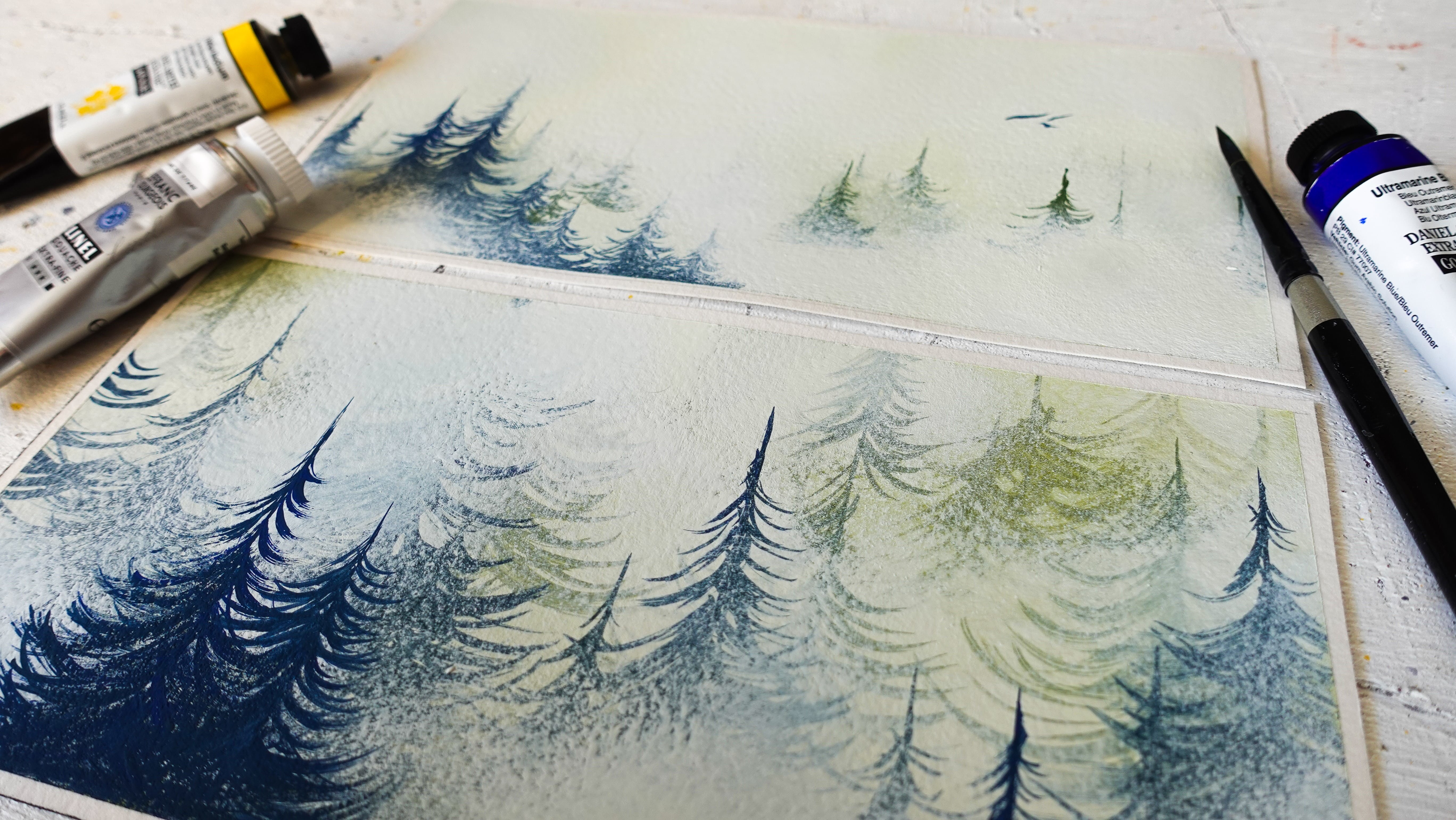
have a finished painting much like this one, and you'll hopefully feel more confident about creating your own gouache nature scenes
without a strict roadmap. I can't wait to paint with you. So with that, let's get started.
2. Supplies and Materials: Paint, we'll be using guash. I personally use the
brand royal talons, but if you have artisa, Maya, Heimi or any other type of non acrylic guash,
that will work just fine. For colors, you'll need white, Prussian or dark blue, cobalt or sky blue, deep or medium green, and black. If you would like, you can
also have a yellow on hand to mix into your greens to make them more natural looking. For our paint brushes, you're going to
need a round brush, angle brush, fine liner brush, and the crustiest oldest
round brush you have. I am not kidding when I say
the rustier the better. You'll also need
either a plate or a palette to mix your paints
on and a cup of water. I'll be painting on a
four by four wood panel, but you're welcome to
use watercolor paper in whatever size you're
comfortable with.
3. Color Blocking: Now we're going to
start on the painting. The first thing you
want to do is to get your paper
panel slightly wet. No stopping wet, just wet enough to have the
paint move freely. You can do this by either
using straight water on a paint brush or by spraying
with a spray bottle. If you're doing this on paper, you will notice that your paper is starting to
curl a little bit. But as long as you don't have little pools of
water, you're fine. If you do have pools of
water starting to form, you're using too
much water and will probably want a paper towel
to dab that water off. Next, take your ankle brush with a little bit of water
on it and start mixing that water into your blue
paint so that it has the consistency of a
watered down honey. Then we're going to
start color blocking. Color blocking is when you
look at the overall colors in an image and apply those
first without any details. Our sky is blue, so we'll take our angle brush and add
blue where the sky is. We're not using a direct
reference for this project, so I would recommend
that you block in blue for the top two
thirds of your painting. If you notice that you're
seeing too much of your paper or panel texture
through your paint, you can always go back and pick up a little bit
more paint a little thicker on your brush and add it back in like what
I'm doing here. The background behind
the trees will be green, so we'll do the same as the sky. But this time, instead
of using blue, add green to the lower
third of your painting. If you want your
background tree line to be straight, you
can paint it straight. If you want it to look a
little bit more natural, you can always do a little
bit of a wave at top. If you want your trees to
have a more natural color, you can always add a
little bit of yellow to your green paint while you're
working on this process. To add texture to the
top of the tree line, you can hold your brush upright and make slash
marks up and down. While the paint is still wet, take some white paint on either the tip of
your ankle brush or a round brush and dab
it into the wet blue sky. Working wet into wet
allows the paint to flow and look more
natural when it dries. You'll see here my paint was a little too dry when
I was working on it, so I took a spray bottle and sprayed just a little bit
of water on the blue part. That way, it would be a little more fluid when I
was working on it. I will add that if you plan on using a spray bottle
on your painting, be very careful about which
type of bottle you're using. You do not want a stream of water coming out
on your painting. You just want a
little bit of mist. Painting wet into wet is my favorite way
to make clouds. Even though most of these
clouds are going to be covered up by the trees
in the foreground, I still think it adds a little bit of depth to the
background that you do see. Once you're happy with
the way your clouds look, you're going to let this
background dry completely. We cannot move on to the
next step if it's not dry. In the next video, we'll
be adding our trees.
4. Painting Trees: Now we're going to
add our trees in. Take your round brush and mix a dark gray from your
black and white. Most trees don't have a
very saturated brown trunk, but if you would like
to add some brown into this mixture,
go right ahead. Starting with medium pressure, lifting your hands slightly so that the pressure gets
lighter and lighter, painting the trees from
the bottom to the top. Altering the pressure as you
paint will allow the trees to be thick at the base and
taper the higher up they go. As you work on each tree, clean up the bottom of
it so that it flares outward slightly instead
of tapering inward. I prefer a variety
of tree sizes, so I have a few that
are a little bit skinnier and then a few that
are a little bit thicker. As for the number
of trees to add, there's really no set number. Some days I add more, some days I add less.
It's really up to you. But for this project, I would recommend not doing too many. We will be adding
foliage in later, and I don't want it to
get too busy or too detailed that it
makes the project complicated instead
of being fun. I also like to vary how
spaced out my trees are. So usually, I'll have one skinny tree next to
a thicker tree and then keep the thicker
trees a little bit more spaced out or staggered. That way, it's not
too pin straight and it doesn't look like they
were all planted in a row. Using the same
pressure technique as we used when
creating the trunks, we're going to start
adding in branches. This will make sure that the branches are
thicker where they connect to the trunk and thinner going away
from the trunk. As a general rule of thumb, a tree branch should never
be thicker than the trunk that's on the further away
that the branch gets, the thinner more fragile that the branches
are going to be. The angle of the
branches can also change depending on the type of tree that you're painting. Pine trees tend to have more horizontal
sprays of branches, whereas some oak trees can have branches that hang down
instead of going up. The important thing to know is even if you mess up
one of your branches, nature is not perfect
and neither are we. Having some elements in your art that are organic will give it more charm than if every aspect
was perfect and sterile. When you're painting
a nature scene, having things be too
perfect can actually be off putting by making the scene
feel overly manufactured. Once we have our trees dry, we're going to mix a
slightly darker green with a little bit of regular green
and a tiny bit of black. We don't want it super dark. We just want it a
little bit darker than the green that's in
the background currently. This is where our
rusty brush comes in, and if you don't
have a crusty brush, don't worry, you can still use your regular
round brush for this. Take your brush
and that slightly dark green color we just mixed and slowly start dabbing it around the ends of
the tree branches. If the paint isn't
dabbing very well, add a tiny bit of water to
it and then try it again. If the edge of your foliage is translucent, that's
perfectly fine. We don't want it
to be too opaque or it's going to look
clunky and out of place. If you want to take
things a step further, you can take a yellow and add a little bit of it to
your green and then also dab directly in the yellow around the edges of
your green foliage. This will make it
seem like light is coming through the
edges of the trees. Once you're happy
with the amount of leaves on your trees, you're going to let
this drag completely, and then you're going to
go to the next lesson so we can start adding details.
5. Bringing things to Life with Details: Now we're going to start
painting in some details. This portion takes the longest
out of the whole project, but personally, it's
my favorite part. The first thing
we're going to do is mix some white paint
into our green paint. You don't want it so bright
that it's distracting. You want it just light enough to stand out from the
background slightly. Using your round brush, stipple in a few dots of the light green on portions of the green foliage
we painted earlier. Don't cover it completely. We want to imply that there are individual
leaves standing out. I tend to add the
lighter portions to the top of the foliage. That way, it indicates that the sun is coming
through the leaves. Now we're going to add
even more white to our green paint and
repeat the process, making sure that we don't entirely cover our
previous layer. While our leaves are drying, we're going to mix
some white paint into the gray paint that
we mixed up earlier. Using your fine lighter brush, take the gray paint and slowly start painting vertical
lines onto the trees. Be sure not to cover all the dark gray from the
previous layer. We want variation and
color to add dimension. If your gray paint
is too dark to tell the difference between the
base layer and the next layer, go ahead and add a little bit more white until
it stands out, so. If you find that
your paint is coming off in globs from
your fine liner, I would recommend that
you barely wipe off the slightest little bit on whatever palette or plate that you're using for
mixing your paints. This will remove any
excess paint as well as reshape the tip of your brush to be a little bit pointier. Don't worry if your lines
overlap a little bit. They're not meant
to be parallel. It's almost better if they're
a little bit squiggly, that way they look more organic and don't look like
stripes on the tree, but instead look like bark. When that layer dries, lighten your gray
again with more white and repeat the process. I tend to only cover
a few sections or I'll pick one side to
lighten more than the other. That way, there's
some implied shadow. You may have already
guessed our next step, but we're going to be
lightening the gray again and repeating the line
striping process. Again, all of these
layers help create dimension and really shape the tree so that they
don't look flat. Oh Now that our tree bark is done, we're going to be
revisiting the leaves. Add a little bit more white
to your green paint and create some highlights on the
very tops of your leaves. I would do this with your
fine liner as it has a little bit better control than a round brushwood
in this moment. And This part is optional, but I felt like our
green background could have been a
little bit darker. So what I'm doing is I'm
taking that Prussian blue, mixing with a teeny tiny bit of black and a
little bit of green, and then I'm thinning
it out with water so it's almost translucent. Then I'm taking little bits
at a time and dabbing it onto the background to create some
shadows in the background. Don't cover the whole green
background with this. You just want to do
it in a few spots to create some shadows. Once you finish up with those
shadows, congratulations. You are done with your painting.
6. Outro: That's it. Now you should have your very own mini tree scape
painting and the knowledge and confidence to go on and make your own version
of this project, maybe add different colors or paint different
types of trees. If you did follow through with this lesson and created
your own version, I would love to see that, make sure that you upload that below. If you want to see
some more art from me or view my portfolio, you can find that
at fonbrownart.com.
 Fawn Brown