Transcripts
1. Welcome!: Welcome to copy
paper Mixed Media, a process orientated class. Have you been wanting to
try some mixed media, but you're not sure
where to start? Because paper's
expensive, right, and that can put us off
before we even get going. Or have you been feeling
well and truly stuck with your art or uninspired, struggling with energy levels, or maybe you're heaping
pressure on yourself to improve and are starting
to feel frustrated. And I don't want you to
be feeling that way. Yes, we're going to be
exploring mixed media, but this could also be
helpful for any art approach as a really great practice to help you relax and loosen up. So I turned my own experience of being stuck into this class, which I'm hoping
will give you a way out and spark your
creativity again. Sometimes we just need a bridge. Hi. I'm Holly, and I teach from my studio in a very old house in the Lowlands of Scotland. As well as teaching
on Skillshare, my designs have
been selected for greetings cards,
wallpaper, and bedding. My inspiration comes primarily from my surroundings.
I love trees. Wildflowers are my passion, and living on the
coast is a real gift. I fulfilled a childhood
promise to myself there. So let me tell you
what I have in store for you,
starting with paper, and we're using copy paper
or any really cheap paper, as that gives us an
immediate stress free in emotionally
and physically. We're leaving judgment,
perfectionism, that feeling that we need to produce a finished masterpiece. At the door, they do not
enter here, not today. Most of all, this
class is celebrating process over productivity
and perfection. We're going to make
things really easy for ourselves by choosing
a limited palette. I went with essentially a
brown and a cool gray blue. The classic choice
for many artists is burnt umber and
French ultramarine. We're scratching in pencils. We're spraying and
splashing in water, smooching in soft pastels
with wet fingers. And we're going to be
practicing a type of trace print using deli paper to transfer paint
onto our study, and then scratching
into that with a pencil or again, our fingers. And we bit of semic writing scribbling
directly into wet paint. By the end of the class, my hope is that you will
have confidence in using this practice either as a daily warm up or to help
you out of stuckness. It really is very freeing. And don't forget you can
share your studies with the class and receive
tips and feedback. You can find out where to
do that in our projects and resources area and on the
right, submit project. Subtitles are available for my deaf or hard of
hearing followers. And also a full
transcript of the class. So are you ready to have
a good mess around with very cheap paper and any
materials that you fancy? Let's get started. But
2. Materials: Let's run through
materials together. And starting with paper, I have some deli paper, you could use tissue or a similar kind of semi
transparent paper. And then we have
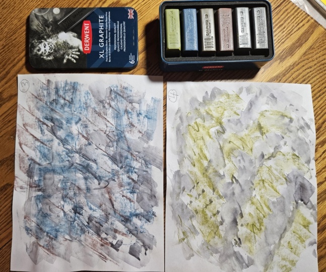
simple copy paper. I picked up some soft pastels, dark Umber, cool gray
three, and a green. I don't have a note
of the green one. Moving over to brushes, and I used mop brushes, and this is a size zero Raven. This is a 10/0. Happened to have this
fan brush close by, so we could perhaps use
that to create some lines. Very simple pencil. I've got a clay modeling tool. These are lovely for scratching
in to the surface with. Some more pencils. Again, just grabbed
something close to me. I have a dark charcoal pencil, which I may or may not
use, but it's handy. I have pink, white carndash
luminans and dark sap green. I also have a wash
brush close by. A water spray, and this
is a microfiber cloth. I find them very useful. Let's move on to our next lesson where I'll take you through
the colors that I chose, and we're going to have
a really quick warm up.
3. Palette Prep & Quick Warm Up: Before we launch into the class, let's do a very quick run
through of the colors, the ti chos, and they certainly don't
need to be the same. I chose Burnt Umber French
Ultramarine. Payne's Grey. A little Buff Titanium, although that's not necessary. So primary yellow
and rose madder. This is a combination of
watercolor and gouache. Let's go in really
freely and just add some water to these
little pockets of colour. Already, I know I can mix a peach with the
yellow and pink. Let's get that
burnt umber going. Pull out the French
Ultramarine a little bit more, and the pan's gray. So allow all the colors
to mix together. That's really what
we're going for. We can loosely aim
for certain colors. So starting off with a pink
and then Payne's Grey. And then I want a peachy color. So the yellow and
the pink together, mix a little bit of
Payne's Grey with that. We get these lovely neutrals. Now we know that obviously
having a blue and yellow, that we can also create a green That was just an extra
bit of Payne's Grey. And then I'm swishing
my brush around. I'm not thinking at all that I'm having to come
up with the color, adding water, putting
it down on the page. Then you can draw it
out a little bit with some extra water just
to see how that blooms, bit of French Ultramarine, a bit of Payne's Grey. Let's just splosh them in. We could also just
drop in water. Or we could use a spray. That creates a gorgeous effect. Beautiful starlets.
And then a pencil. Let's quickly scratch
in some lines. I picked up a carndas pencil there doing a little
bit of asemic writing. And then I'm going to grate in some dark Umber soft pastel. And then just mush that
around with my fingers. I've got dark sap green
here, Karadase pencil. And then I fancied doing a little bit of
rolling in of color, so a little bit of everything on the palette and just pulling
the paint around a little. I happen to have this fan brush close by, so I picked that up. I just wanted to
create some lines. And then let's pick up some
deli paper or tissue paper. And get some fairly pigmented
paint down on there. I want to show you a
really gorgeous technique. So some burnt tumba
and paints gray. And then we're going to scratch
him with our fingernails. Isn't that gorgeous? So we're just going to
let all of those colors mix together on the page,
and then let's move on.
4. Our Mixed Media Experiments Part 1: Let's start with
something really simple. Putting some pains gray down. I'm just gonna mix that up. A little bit of burnt tumbo. And let's just roll
our brush into the page to create some
really random marks. You could use a round
brush, as well for this. I find a mop brush is
just a little bit easier. It holds more water. It looks almost like
Japanese or Chinese writing. Quite like that. Yeah, again, I like the mix of the burn tumba with the cool paints gray. And then I'm going to splashing quite big drops of
water into this, just to get a slightly. Oh, that's lovely. That looks more like
salt has been added. Nice. And then I'm just going to draw
that out a little bit. Nothing much is happening because it's not
watercolor paper, so the paint kind of just
sinks in really quickly. But, you know, it's nice
to have a play around. I love this color Combi and how they've merged
together on the page. Love that. Look
like little stars. Let's move on to
our second study. And let's just keep that
free flowing movement going. So I picked up my dark
umber soft pastel gonna scribble around the page and get in there quick
with some water. Just moving that, pulling it out a little bit, splashing in some gray
and burnt tumber mix. I'm just going to see what that looks like to lift a little. That's not done a whole heap, but going in with some pencil. Want to do a few lines. I really love just working
with pencil and paint. So I'm doing broader
strokes there, some closer together,
changing direction. So, again, I want
to lift this area here 'cause I noticed at points, the palette looks lovely. So I want to see if
that does transfer. Let's gently push
that into the page. Um, it's not done
a lot to the page, but I have a feeling I'm gonna like that piece of paper later, scratching with
our fingers again. Not sure, but I'm just going to add a bit more burnt tumbo. Mix that with everything
that's going on, just want to darken some of these areas to add a
little bit more depth. Loving this rolling movement. Again, just working with that initial layer
of soft pastel. Bit of splashing. I like the movement in
this one. It's very free. Just areas of scratching. On to study three, and I picked up a
gray soft pastel, cool gray three
from Jackson's Art. Let's just make a
shape on the page. It can be anything that
you feel you want to do. And then why not add
some water to that? I like the way that this
combines with the pastel. It would be lovely
for clouds, actually. So dark Umber in a soft pastel. And I'm just grating
some of that in and then moving it
around with my fingers. I'm just going to spray
some water on that. I'm going to pick
up some deli paper. You could use tissue paper
as well or any fine paper. And what I want to do is transfer some paint
onto the page. This is a lovely technique, so let's use paint
gray fairly thickly. And then let's put it
down over this study. And what I like to do
next is just scratch in with a pencil or you
could use a stylus. And, oh, I love that. And whilst I've got this paper, let's just put a little
bit more paper down. I'm just going to rub it onto the page and get some texture. So as we're doing these studies, I want you to pay attention to any pulls that you
have in any direction. For me, just now, I really
wanted a kind of a peachy, rosy color to this. So I'm just mixing the rose madder primary yellow with a little bit of everything that was going on on the page. I I get this lovely
neutral That's gorgeous. I love that. I love
the warm and the cool, which is why French
Ultramarine and Payne's Grey, burnt tumba, all of these colors are absolutely
gorgeous together. I'm interested in seeing how
the Karndash pencils work. So I'm just kind of
scratching in some lines. I really like that.
Keeping awareness that we're working
really quickly, so I'm going to move
on to our next study.
5. Our Mixed Media Experiments Part 2: On to study four, and we're going
to mix in lots of water into the paints gray, which has a tiny
touch of burnt umber. And then let's just put in these really expressive strokes. Another reason why I
like using copy paper. It kind of goes all wrinkly
and creakly and also granulates quite a lot because it's really not designed
to be painted on. But that's what we're
going for with this class. And I'm just going to scrape in some of the gray soft pastel. And soon as my fingers are quite dirty and
interesting looking, I'm just going to add
some fingerprints. A quick spray, and let's just take a couple of breaths and let that
calm down a little. And I think I'll pick up my
arndase pink white pencil, and let's do some
asemic writing. Squiggles, circles. Little scratches, whatever
you feel drawn to do. And maybe add a little
bit of dark pencil there. And I was drawn to a
little bit of green, so this is a dark sap green. Again, carndash
Luminance, pencil. Back in with the
larger mop brush. Just splushing, move around. Some of that kind
of blush color, little bit of splattering. I'm just going to
reuse this deli paper. And I think let's go pink. So a little bit of rosemda All of these colors are mixing
together, which is lovely. Let's put some of that down. And then overver we go
smooth it out over the page. Oh, that is divine. I love that color. Quick spray, I
think. Just pausing. But I don't think
I'm grade to add any more to that.
So let's move on. So starting out
with that soft gray again in the soft pastel, putting down quite
pigmented Payne's Grey and transferring
that onto the page. Scratching pencil. Oh, nice. Yeah. Lots of texture there, but I just want to get
a bit more paint down. Be a bit more carefree. Get a little bit of dark
umber in there, some lines. And then I just want to
gently pull out the edges. This is just actually
water from my jar now. It's got so mucky. Nice. And dark umber pastel. And I feel it does have
the same atmosphere as the third study we did. And I'm returning
to it because I really liked the color Combi, the soft gray and
soft burnt umber, the texture that we can get from applying paint over the
pastel and the lines. So this is burnt
umber, watercolor. What an earthy kind of
central area to this. So gently just placing it, partially rolling the
brush just to get a feeling of movement from the top left of the page
to the bottom right. Going back to the
Caran dash pencil, freely creating lines. Literally putting
the pencil down without thinking about
where it's going to go, you following the pencil. And just because I can,
I'm going to add a color, and I don't know the
exact name of this, but it's like a dark warm green. And just pausing and seeing what it would be like
if I lifted a little area. Going in gently because I
don't want to change too much. And, yeah, I'm really happy. So I'm just going to wipe
away some of the yellow. Because I want to concentrate on the rose madder
for a short while. And I'm going to
start again with some soft pastel in that gray. And then some pink. I will remember this mix
because it's really lovely. I do like when a little
bit of yellow or gold is added to a red or pink. I want a little earthy
brown in there, so I'm just going to go
back to Burnt Umber. This is Jackson's watercolor. So just using again, you can reuse your deli
paper quite a few times. Adding some burnt umber, a little bit of the gray. And then let's scratch
some pencil into that. Let's have it in all
sorts of directions. Why not? So I'm aware that I'm getting a little bit kind of
bogged down with this, so I'm just going to go in
and do something different. And I picked up some
of the paints gray, burnt tumberV
pigmented, and then just squashing my brush into
the page and rolling it. Because this is
experimental, right? It doesn't need to look like
a finished masterpiece. So I've rolled that in, I sprayed in some water. And I think I'll just lift
that little bit there. I think I'm probably
overworking this, but I often find that's a
helpful thing because I often, when I'm experimenting
overwork a piece on purpose, just so I have more
practice time. I don't want it to be perfect. I want to learn from it. So I'm just gonna
get a little bit more of that dark
umber pastel in. And then just
moving that around, skimming the brush
over the surface. So good for a can of a, a rock faced stone look. And I happen to have some charcoal pencils
nearby. Any pencil? I'm just gonna create
a few jack Dy lines. I think because I was thinking
of stone and mountains and wants to go with
something like that. And then adding water along
the line of the charcoal. It didn't react as
much as I thought, so I'm just going to add
in a little bit of paint. And then I think just
a last flick of color. So I'm just gonna add
some more rose madder. I'm loving those soft
colors at the bottom right. Nice splosh of color. Can change the direction depending on how you're
holding your brush.
6. Our Mixed Media Experiments Part 3: So I feel like a little
bit of dark umber again. I'm going to start
with scraping that. So getting a few
granules on the page. And then I picked
up a wash brush. This is a Jackson's
brush as well. And then I'm going to
draw that through. The brush isn't sopping wet. And then just picking
up a little bit of watery paint and drawing
that along underneath. Giving it a spray, really experimenting
with texture. I think I might go
for a darker hue and maybe not push the
brush down on the page. Um, yeah, I'm just gonna pull that very, very loosely across. I'm hardly holding it, really. Trying side on with the brush, creates a nice, wavy line. Bit more rosemder down. I'm so happy to
have rose madder. I ran out ages ago and, um just kept forgetting
to buy some. And mixing that rose color
again with the tiny touch of primary yellow and following
that lovely curvy line. And then adding a
little bit more yellow to the mix there so that we
get a more of a peachy color. Bit of blue, bit of gray. All my colors are now mixed together really on the palette. So spray. And I'm going to go back to that technique that
we've already done. I'm putting down fairly
neat pines gray. I love the way the
deli paper kind of scrumbles up and
creates those cells. So pressing that in. And, um, yeah, let's
just do some scratching. Love, love, love. That's gorgeous. I'm definitely going to
remember those two colors. You can't really go wrong with pink and a yellow like that. And then something
that's quite balancing, like a gray or a brown, just to bring out capacity for more neutrals, if you like. I'm just gonna pick that up a little bit, do a little jiggle. Wipe the drips away. Let's see what happens. I find when a jiggle like that, just like certain
drips come down, and I wanted that. I think that's my favorite
color Combi actually, so far. Onto our next study. And I noticed how interesting
my palette was getting. And because I was
spraying the page, some of the spray went
into the palette as well, created some gorgeous
cells within the paint. So I just wanted to
try and lift that. I love that gorgeous, kind of rich ochre with
the dark paint gray. So it feels that I
need to maybe turn the page and that it wants to
come down across the page. So I'm just adding some water at the top to encourage
a little bit of flow. I don't want to lose that lovely blush ochre area at the top. And I'm just really going
out there with this one because it's a bit of
everything. A bit of a jiggle. And then what do I want to do? I want to try something
a bit different. That's dry now. I'm just going to pull some of that
gray pastel over this, place that down and do a little bit of
scratching with a pencil. Okay, not much happened
there, but I do like it. I want to echo the color of the rose madder and the
primary yellow at the top. So the rose madder is watercolor, primary
yellow, gouache. But it doesn't really
matter what you choose. A little bit more of
the rose madder down. And then I want to mix
all of that together. I'm approaching my colors
as I am the studies, so just be free with it and allow all of the colors
to merge together. And then let's splatter
some energetic spots in there and add some water
just to soften some of them. And I just love this area here, where I sprayed the water. So I'm going to spray
into the pallet again, just to see if I can
lift something similar. It's so gorgeous. I love all the cells
that start to develop. And this is tin. So it depends on what
your palate is, as well. You might get different results. And then I'm just going to
press in some deli paper. I've got some very
pigmented areas, some which are all
merged together. It's certainly a very
interesting study. I've learnt a lot
actually from this. And I actually fancy sploshing in a little
bit of a pinky color. So back to the rose madder. Add a bit of water to that. And of course, my water now
is quite kind of murky. But again, I quite like that because it creates
these neutrals. And then I'm going to actually just going to do a quick spray, and this is turning into something that I
really enjoy doing, which is a semic writing. I've covered that in
a couple of classes, and then I really want
to echo those lines. So I got the white pencil again. And this is still wet, which is why it's
carving into the paper. Being quite gentle because
copy paper is flimsy. But, yeah, I love that. It's very there's
a lot going on, isn't there, but
I quite like it. A little bit of a scratch. And just for our record, this is luminance
6901 pink white. So going back, 'cause I
really was interested in how the water and paint reacted
to the soft pastel. So I'm just gonna go in
and add water over that. Just really want to have
a deeper dive into that. And it's so gorgeous. I love the texture. What would it look like if
I added a pastel on top of the wet? Oh, love it. I love this pink in particular. So so I'm learning here that we can either
add water straight onto the pastel or put water down first
and then add pastel. So this is a really
good learning study. Splash a bit of gray in there. The texture is
absolutely lovely. Happen to have fan brush. I'm just going to
pull that through to see if I can create
some striations. And I did like that, so I'm just going to add a
little bit of gray. I wasn't keen on
those, so I'm just gonna add it to water
and break them up. And then finally just grate
in some of that pink. My eyes are singing. I really love this. Oh, I do like that. Um, mm, nice. So just pressing the brush
into the page there. I didn't really
stay as much there, but I think it wasn't
enough paint underneath. Yeah. Oh, stop it Holly. You lifting it now? Oh, yeah. I love that. And final
little bit of scratching, following those lines
or going against them. So it's almost like catching.
7. Using Fixative Spray: Just a quick snap it
here to show you how you can use fixative spray
to protect your work. This actually really stank, so you can also use hair spray. And there we go.
8. Thank You!: We've come to the
end of our class. And I thank you so
much for joining me. I hope you are taking
some techniques away that you can foster and take
into your art practice. We've used watercolor, pastels, pencils, and also tried
out a type of trace print. So I'm hoping that
you feel you can adopt that into your
work in the future. But most of all, I hope
that I've given you time to relax and a bridge from stuckness into
feeling creative again. And if you've enjoyed it, you may also adopt this
as a daily warm up. I know I'm going to, for sure. If you have any
questions far away, you can contact me
through discussions or over on my Instagram
page, Holly Tomas Art. Thanks again. Take care. Bye for now. Oh
 Holly Tomas Art, Watercolour | Gouache | Mixed Media | Scotland