Transcripts
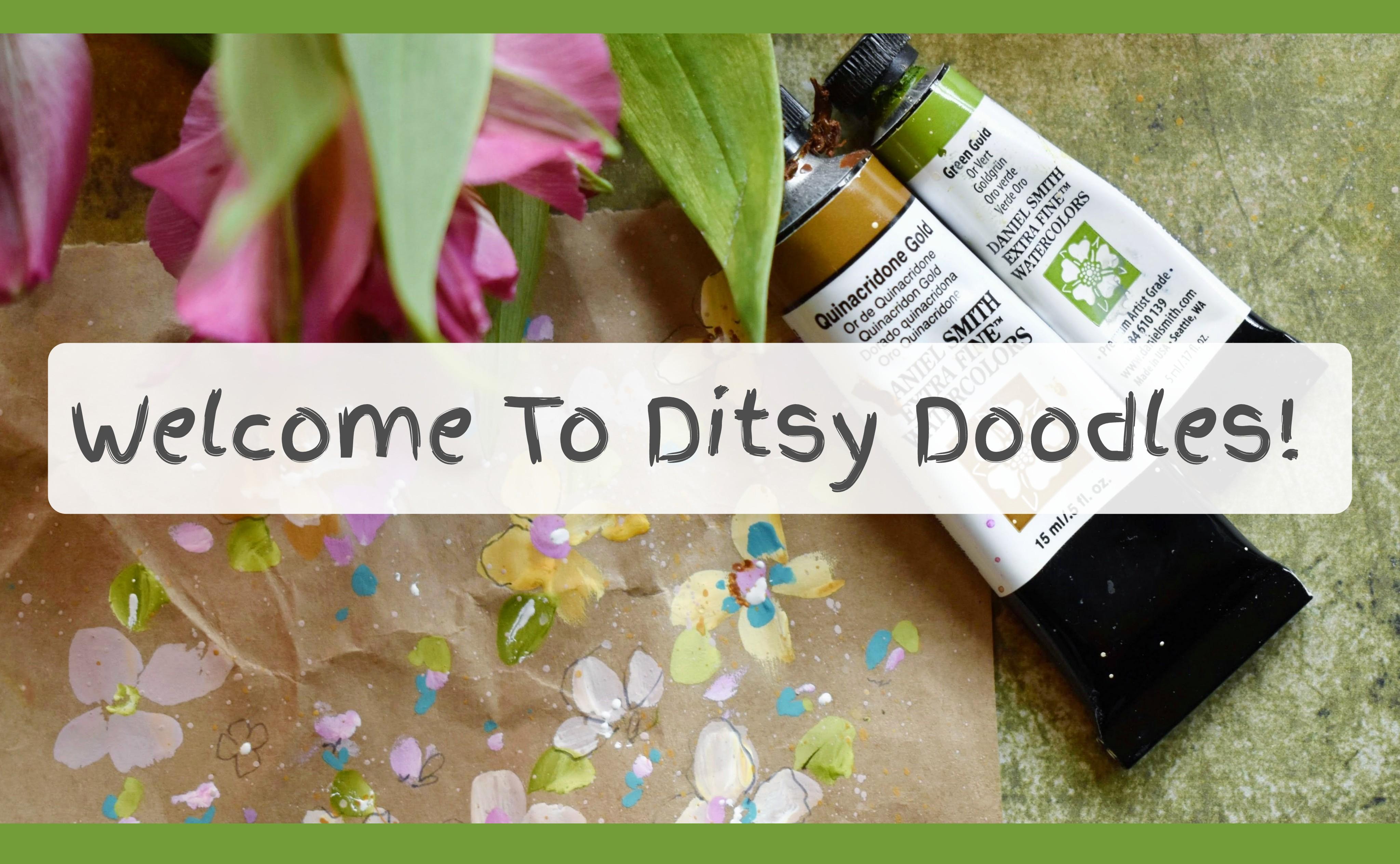
1. Welcome!: Welcome to Ditty Doodles. I'm Holly, and if you're new to my classes, a huge welcome. And to those who've
supported me over the last five years,
thank you so much. So what characterizes
doodles overdrawing? And I feel it's their
spontaneity and almost dreamy in the flow quality with no strict idea of how
things will progress. And that's certainly
the quality I wanted to capture in this class. I started with no fixed idea. I just loved the paper, and I knew I wanted
to start with a mix of peachy, pinky tints. I didn't see as far as
getting my fine liners out. And what's freeing
about creating simple brush strokes is that it allows our
brains to relax, as we're not having to
concentrate on precision or form, but more on a feeling
and an impression. Things we'll be
covering in class together is how to mix tints, how to use different values, mixing lighter and darker hues, using thinner and
thicker paint to assist in creating multi layers. How to utilize muted
and bright colors to add real depth
to your painting. How to use pendodling to create accents and subtle shading
in the flower centers. I'm going to take you
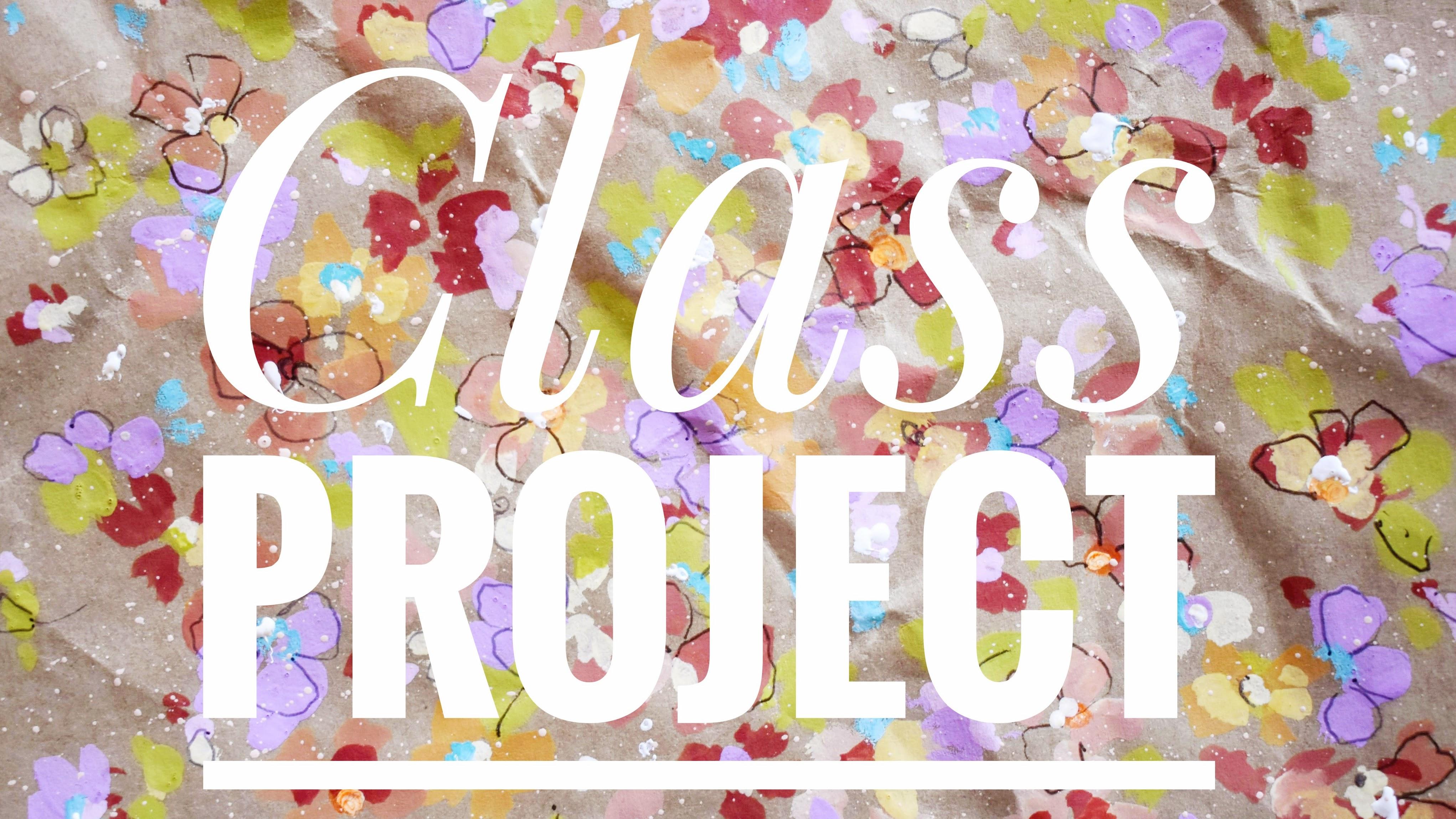
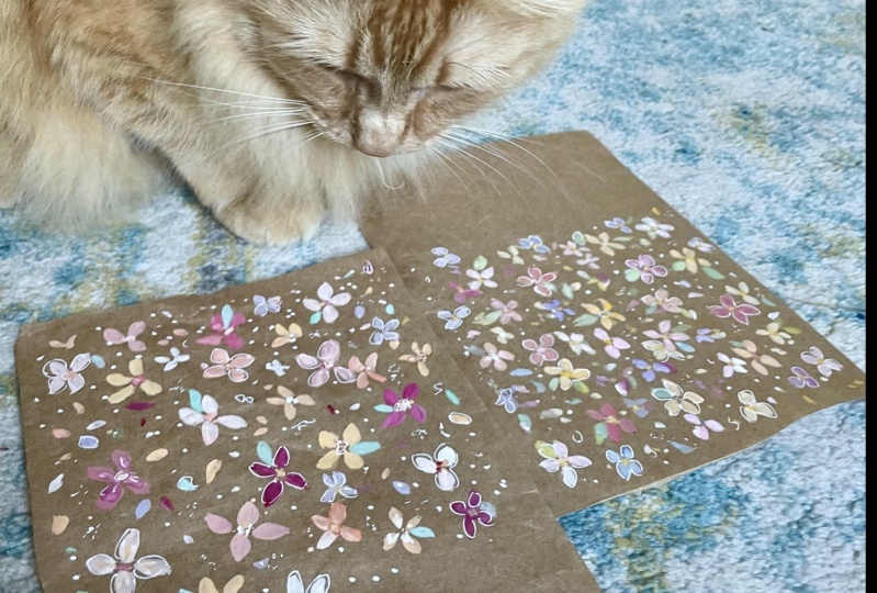
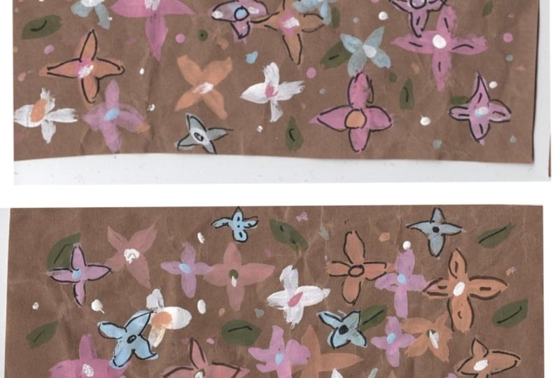
through materials. We'll have a little prep time for our paper and our paints. We'll then have a practice run and launch into our project. At the end of the class, you'll have two
sibling paintings, each individual, but also
working so well together. I've left details
of the class in our projects and resources area. And if you'd like to
upload your work, you can do this under my
project and submit project. It's a wonderful way
of feeling involved in the Skillshare community
and making connections. So when you're ready,
let's move on with our ditzy doodles. And
2. Materials: So let's go through materials. First, I have my
packaging paper. And if you don't have any, you can always use tinted
paper for this class. And this one has some
lovely crinkles in it. As to colors, this is a
watercolor, quinacridone gold. And I have cobaltiel
blue in gouache. I love that color.
Another favorite of mine at the moment is
Wisteria in gouache. My favorite green, green gold, or any light green that you like or add yellow to
your favorite green. And we have seven a moss rose, doctor PH Martin's
radiant watercolor. And finally, titanium
white gouache, but you could also
use watercolor. I'm using a size
five round brush, and this is a memory point. It's perfect for little florets. And I've picked up my pigma
micron for this class, and it's a 01 in sepia. I have a new to me pen
by Windsor and Newton, and the size is 0.1, and it's in cool gray. I have my handy
clay modeling tool and I'm going to use the
end to dotted paint. And finally, a fine liner, but only for the
bottom of the brush. Any small brush that you have, we can also use that to dot. And that's it. Let's move on.
3. Preparing Paints & Paper: So let's start off by cutting the size that you want out
of our packaging paper. If you're using tinted paper, you could always tape off areas. I've chosen this bit
because it's quite wrinkly, and I think that might add some interest to what
we're going to do. Trim this a little bit here,
and I think we're there. Before we start on paints, what we need to bear
in mind is we're going to be using the
colours quite thickly, so we don't want to add
too much water to them. And let's put the moss rose
down or your choice of bright pink and quinacridone
gold and green gold. White gouache. And I've put a line
of it there as well just so I can use it
to mix with other colors. So what we're going to
do is mix your choice of pink and gold or
yellow together, and that will get us
close to a peach. And then here's where
the magic happens. Just adding white to that
suddenly gets you peach. And I'm adding a couple of different variations
there as well. And mix up our green gold. And I'm taking some of the
quinacridone gold over into a new well and
adding white to it. And isn't that a glorious
color? I love that. And then just mixing another little variant over
here by adding some pink. And when you're
ready, let's move on to the next lesson. H
4. Practise Run: I'm just going to cut down a wee little page of
this packaging paper. So I'm just going to add a
few paints to my palette. That's the quinacridone gold. This is the cobalt teal blue, wisteria, quin gold, and white. And I'm just dotting
that around. Mixing some of the
quin gold with white, a little bit of the teal, a little bit of wisteria. And green gold. It doesn't matter which
colors you mix up, really, because this is a
practice on the brush strokes. So let's start with the flowers. And I'll do it slowly, and I'm just doing
a two stroke petal. I find it easier to
draw the third petal down towards me and then
out with the fourth. I just wanted to
make it a little thicker, so it's easier to see. So down little two
stroke movements. I just find that's
the most fluid way for me to paint these
little flowers. Getting a little bit of white there I'll show up
more, hopefully. And the more you do that,
the easier it'll become. Let's try it a
little quicker now. And like a half opened flower there with just three petals. And just showing you there, the little scribble movement that I like to do
with these flowers, and we've done that
in Eliana, I think. It's a cute little way of making lovely shapes
with our petals. So we can also then just add little centers to
the darker flowers. Basically the same brush strokes
just on a smaller scale. I've got my moss rose ink. The ink is runnier, so if you'd prefer you
could use opera pink, watercolor or gouache,
and it will stay thicker. I just like this ink because
it remains so vibrant. So these little inner
petals on some of them and here's one just poking out from
behind another flower. A little scribble
movement there. And basically just
using the two struck petals and scribbles
to create the florets. Whilst you've got
paint on your brush, you can always go around and add centers or add some little
confetti petals like this. Very simple movement
on the tip and then just pressing down a quarter
of the way of the brush. Little see curves
there for the center, and we can also.in little
centers. And I love that. I love those on that pale
kind of beige color. So effective. So
that's another option. And it kind of suggests
Narcissus, doesn't it? I love narcissi
narcissi, narcissisis. Some of the cobalt teal blue. Again, color doesn't
really matter. We're just picking up color and practicing our
flower shapes. I love to bring in
these little V shapes. We've definitely done
this in previous classes. They can either stay as
they are, or later on, we could actually
put petals to them and use them as little leaves. And I also just like to dot around simple swift movements. And whilst we have
the blue dots, let's add some pink. And what we'll do in class is every time we have a
different color on our brush, we're going to go round and just.in colors next
to other colors. And you see how cute those are, those little cobaltl s when
we add petals to them. Just dotting around. And let's now work with
contrasting colors. I think it's lovely just to throw different
colors together so we can use the bright teal in a center of the
very pale pink. Now just mixing up some
white with the green gold. And we're going to do
that little side sweep that we've done again
in previous classes. So we're not using the paint
brush in a straight line. We're putting the tip down, allowing it to fan out
just a little bit. And then up again. So we're really going down just to a quarter of the
brush, that's all we're using. Or you could also go down
to a size zero brush. This is my go to leaf shape because they just
always look so natural. So let's try that again. Tip down, fan out the brush, and move it sideways, and then up to a tip. And we can do that
going up as well. So just try out
different directions. Is this coming from the top in. And I like how the paint's mixed on my brush there as well, the white and
green. That's nice. So they're always going to
be slightly unpredictable, but it's my favorite
go to move for leaves. And again, whilst we've got
the grain on our brush, we could go round
adding more leaves or little dots to the
centers of flowers. And around these little
coboctial dots and vs I love this technique
of just dotting in colors. Now I have a zero bon, pigma micron, and we're going to do a little
bit of doodling. Ideally, you'd wait
until it's all dry, but I just wanted
to get in there. So we can do a little
sea curve shadow under some of the centers. That makes them
pop a little bit. This is my favorite
little flower on this page. So pretty. And the leaf doodle there that we have
done before as well. Just a little line
through and a dot. Now I'm trying out the
Windsor and Newton cool gray, fine liner. Slightly
more subtle. I've really enjoyed using this pen actually
for this class. So I think it's something
I'll definitely use again if I don't ruin it by
pulling it through wet pate. And we don't need to outline
every petal of every flower, nor every flower on the page. Just doing some extra little
pen marks, too little loops. Little flowers,
tiny little leaves. I think my favorite is this pen around the soft pink
and the soft yellow. All we need to do
then is some dotting. And I'm using my liner brush. It's one of the smallest
brushes I have, and I'm going to use the
bottom of the brush. So into neat white and then just dotting
into the centers, extremely easy to do. It's a little tacky and sticky, but don't worry, it will settle. And then let me show you
with my clay modeling tool. Perfect for the job. And we could also do little
dots around the center. What I do there is take up
just a little less paint, so I have a bit more control
and I can do smaller dots. I'm just pulling some little
lines out over the leaves. Have a play around and
see what you like. What I like about dotting with white is that it's very three D, so it stands out from
the page a little bit, and you get that
lovely kind of depth and last but not least,
a little splatter. And that peachy
white, by the way, pinky white is pink, quin gold, and white. And I'm using my
size five because I don't want the splatter
to be too big. I've done some of the pastel, pink, and now some
of the quingd. I have to be quite
restrained when I'm splattering I
could just carry on. But I think that's enough. So it gives you a little idea of what we're going to
be doing in class. So shall we move on?
5. First Layer Of Flowers: So let's start off with
that very pale peach. Adding a little bit
of the dark peach. And then because that
mixed on the brush, just putting down a few petals. And let's not forget
our crinkly page. Just those very swift scribble
or two stroke movements. And you can see I'm changing the colors just very slightly. Some are a little
darker than others. I'm keeping this very random. Now, I've picked up some
of the pale pink again, and whilst I have
it on my brush, I might as well just go around and maybe dot some in
the center of some of the darker peach flowers. Oh. It's always a good technique. Keeps everything very fresh. And now let's try some of
the quin gold and white mix. And some of these
I'm just poking out from behind flowers
already painted, and some whole ones. You can see all the variations
of hue that we can get by working between just these
two colors and white. Very swift with
these very random. I just love how these colors are starting to mix
together already. That kind of orangey
through to a salmon color. So I'm running out of
that darker peach. So I'm just replenishing
my palette, using the moss rose,
quinacridone gold, and leaving the white this time so that we get this
very deep raspberry color. And what we're going for
here is a deeper value. Again, just poking out
from behind flowers, dropping it in the
centers of some as well. Just use up that paint that
you have on your brush. Tiny little scribbly flowers
or fuller larger ones. I'm varying the
size just slightly, as well as the hue. I just love this color. The reason why it's so vibrant, as well, is the use
of the moss rose ink. I've started using it a lot more recently because it
goes such a long way, but it also keeps
its brightness, even when it's mixed. Now, let's add the
little shapes and dots. Nice and random. And these can be on
the outer edges and also dotted in the
body of the painting. Mixing a lovely pastel pink
with the moss rose and white. The ink is naturally runnier, so you won't need to add water when you mix
it with the white. Just dotting into
these little dots, we can start to build up an impressionist
feeling. Love this pink. Adding little petals
to some of those dots. I think one aspect
of painting diss is that it's easier to think of it as a whole as a flower bed, lots of flowers blooming, rather than worrying about each flower because
it is very much about impressionism and laying down colors next to each
other or just over. It's much more about the
emotional impression it creates rather than anything that is a
precise depiction of botanical florals,
for example.
6. Creamy Peach Flowers & Green Leaves: So let's add some of our quinacridone gold or
your warm yellow to white, and it creates this
gorgeous cream color. And then we could
add some centers to the darker peach flowers. I think this looks
particularly good in that dark peach raspberry color. And just remembering, whilst
you've got this color on your paint brush that
you can go round, create dots, little
florets, wherever you like. Little Vs now as we did
with the dark peach. H and placing little dots
next to other dots. I love that effect where you use different colours
in one little area. I now creating some
flowers in this cream. It looks gorgeous against
this packaging paper. Little scribbly movements. Going over motifs underneath, the overlapping effect,
I think is gorgeous. Now to our green, and I'm mixing green gold
with the cream mix. So it's a lovely, bright green. I can't go wrong with
green gold, really. Such a lovely spring green. Keeping things very loose. I'm not really thinking of anything in particular
and a placement. I'm just going round
a few of the centers, highlighting those and adding some very quick leaves
to some of the flowers. We're using in the
same movement as we did with the flowers, so nothing has changed
in that respect. That's really bringing
everything to life now. And doing as we've done before, just adding to
those little dots. So we have all the little
colors represented. Love that. I love the green in that
cream flower, as well. And let's move on to part three.
7. Mixing & Painting With Tints: So replenishing the white, putting that in
each of the wells. And then mixing these
lovely neutral tints into that gorgeous
moss rose ink, which creates this
delightful, bright pink. If you don't have the ink, an opera pink would
be lovely, as well. And in with the green gold. Run out a little bit there, so I'm just adding some. I love mixing tints. And finally, the quinold Lush. Good enough to eat, really. Picking up on round brush. And let's start with this
gorgeous yellowy cream. Starting off by
just placing them around the other flowers or some other dots
that we put down. Oh, my. I do love this color. I'm doing some little inner
petals on some other flowers. And we can afford to be a little bit more
impressionistic now. We have some flowers mapped
out that we can see. Then we can add centers. We can have them poking out and layering over the
underneath layers. Or we could create little
flowers in this color. This looks lovely on
all of the colors. Another little dot there in the center and some on
these little outer florets. And that's it. Let's
move on to part four.
8. Green Gold Leaves & Wisteria Flowers: So I'm watering down some of the white and just mixing up
a little bit more green. This is just the
green gold and white. And it's slightly lighter
than the previous green. And we're using that
same technique of displacing colors
next to colors. I don't even need
to be leaf shaped. Not forgetting our
little sister page here. And again, the leaf shapes are just the same movement that
we used with the flowers. This is the beauty of this project that we're not
having to change brushstroke. And it's all about
the placement of the color and the
overlapping of the elements. And why not a couple of floral
shapes with this green. So we're just
keeping an overview and checking that we've put green pretty much all over the
page just to keep balance. And we could also vary the size. So let's do some larger leaves
amidst the smaller ones. And this is where we bring
in a different color, and I've chosen wisteria. It's like a cool, pinky lilac. And as we've got a lot of warm colors there
with the peaches, raspberries and creams, this
is really going to pop. So doing as we did before,
creating new flowers, going into the centers
of some poking out behind flowers and
creating new ones. You can see how well warm and
cool colors work together. Wisteria. It's one of
those colors that I do tend to bring in when
I'm painting meadows. I'm just making
little florets out of these dots on
the outer edges. Quite difficult going
over these creases. Really starting to develop the overlapping and relying more on the heart
lead movements now. I'm really not paying
too much attention to what's underneath. And this is starting to
look really pretty now. I love this amongst
all the warm colors. So putting a few centers in I don't want to overdo it, so it's all about balance. 'Cause you can get
a bit carried away. I do. And then I
think, Oh, okay. And then I have to bring in
another color to balance it. So that's the only thing that
we need to keep an eye on here because it's so addictive once you start
that it's hard to stop. Just comparing the two. They obviously don't
need to look the same, but I guess I'm kind of trying to achieve a little
bit of a balance. May.
9. Bright Teal: Let's bring in a
nice bright blue. And I've chosen
cobalt teal blue. But you could always just add white to your
favorite turquoise, and you'll get a
very similar color. Just cleaning out a well there. Do like mixing bright
hues with neutrals. Strictly speaking, this is a tint because we're
adding white to it, but it's so vibrant that it keeps that kind of
kick of blue in it. And I'm starting by just adding some little shadows in the
middles of the flowers here. That's such a gorgeous
technique and starts to bring out certain elements so that the eye sees
things closer to, and then some of those flowers are going to be more
in the background. I've not used Wisteria next do or blue like this.
I really love it. Because with this project, we're really going for
contrasting colors. Lots of worms and
some cooler colors. But also now, we're starting to apply the paint more thickly. And that's another
technique to create depth. We can't forget our little
dots on the outer edges. Creating some new ones there. And little florets. Don't be afraid to apply
a lot of this color. Blue is very balancing. Let's look at it, sister. Picking up from
that paler blue and doing as we did with the other
and just adding centers. No forgetting the outer edges. Creating little dotty flowers. So the sea curves, the dots, and the
scribble movement. I love that we area
at the top, there. Very quick and easy. It does get easier at this
point because we've got lots of foundational
shapes to work with. We're just adding
little pops of color. I'm loving the
relationship between all of the colors and how that cobotal looks next to the cream or the
peach or the raspberry. So when you're ready,
let's move on.
10. Pen Doodles: So you know how much
I like a doodle? I think it's time to get
our fine liners out. So I'm using the 01
pigma micron in sepia. Let's just outline
some of the petals. I actually don't want
too much pen on this, so I'm just going to try and limit myself to a few
petals at a time. And certainly not on
all of the flowers. This is an opportunity to bring some of the
background flowers to the fore 'cause we started off with a
slightly wetter paint, and then we got
thicker as we went on. So this is a nice way
to allow them to shine. And as we did with the teal, I'm just going to do tiny little sea curves
in some of the middles, just to highlight the centers. And maybe a line and a dot
through some of the leaves. I'm moving over to its sibling. And, of course, you can use any pen that you like your favorite pen
or pencil for this. Watercolor pencils
would be lovely, too. Very cutesy simple lines. Very restful, because all
the shapes are down now, and all we're doing is
the embellishing part, which is always my favorite. I love that one with
the little teal center and the cream and peach. So quite minimal. Just
picking up some of the petals and certainly
not on all of the flowers. Highlighting a few centers. And some of the flowers
that are poking out from behind others. I am having to be
quite restrained here. I love this. That's so cute. So let's compare them and
see if they look balanced. They don't have to
be balanced with each other, but right. What next? Now, if you want, you could bring in
a different pen. And I'm using that cool gray
Windsor Newton fine liner. It's more subtle than
the pigma micron. And I think this might assist the layering effect that
we're trying to create. It's the first time
I've used this pen, actually, and I really like it. I think it looks so cute
around that wisteria. Oops. I went through some paint there. It's nice to know which
colors this works well with. And as with the pigma micron, we're being fairly judicious
with the use of the pen. There's so many lovely details that we don't want
the pen to take over. I've always loved a
creamy yellow with gray. I think it's just one of those kind of classic
color combinations. By 1950s. I'm considering a little bit
now where I'm outlining. We can afford to take our time. Bringing its little sibling over and making a beeline
for that wisteria. It's a very soft
experience using this pen. It's quite nice. So picking out some of the Wisteria ones and also creating some
little loops there. Some little dots on our
dots. Can't have too many. Maybe a few circles
and a few lines. I'm actually going right
round the centers of the wisteria flowers
rather than a sea curve. Having a look at
them both together. And also adding little
dots to these, as well. Little sepals and a
little stray pen leaf. It's getting a bit
windy outside. And it's an onshore wind. Lovely. Just some
finishing touches now. I just keep checking
my pen there because I'm picking up
a little bit of paint. I imagine all of
these will look so different for each one
of you doing this class. They'll all have their
own little personality, and I can't wait to see them. Little separate florets on
their own there in this gray, maybe little bees
or butterflies. Let's move on now
to our next lesson.
11. Dotting & Splattering!: It might be nice
to.in some white. And I'm using gouache, but you could use watercolor or doctor PH Martin's bleed proof. You could use a clay
modeling tool like this or the bottom
of a small brush. And then we're simply
just dipping that into the neat white paint. And I'm adding some
to flower centers. And then let me show you
with the clay modeling tool. And again, just a
random approach. Working quickly. These are particularly nice in the center of flowers where we've
done the shadowing. Bit of a blotch there, so I'm trying to lift a little bit. It's incredibly easy
and really effective. I'm just scribbling there just as we did with
the paint brush. Dots and scribbles. That's gorgeous
against that blue. Now, do it sibling. It's really nice over that
dark peach raspberry color. So in places, I'm
dotting, and in others, I'm keeping the
clay modeling tool on the page and doing
a little scribble. And you can use this very much
as you would a fine liner. I can vary the size of the dots actually quite
easily with this, so if you take up less paint and use it
slightly on its side, you can get really small dots. These also come in different
sizes and often in a set. So you can always move down
to a really small one. Back to our size
five round brush. And my favorite part.
So splattering. I love this kind of
blush, peach white. I think it's just the color to finish these little projects. And I have chosen or kept with my size five brush
because it's quite small, so you'll get smaller spatters. If we used a large brush, this would overwhelm
the painting. Maybe one last splatter there. And I think that's it. What a lovely afternoon's
painting. So cute.
12. Thank You!: Thanks so much for joining me. We've covered lots
of things in class, how to mix tints, using different values, and, of course, the
obligatory pendodling. And we finally found a creative use for all that packaging paper
we've had stored for ages. A dream come true for me. I think these vibrant ditzis
can be used for many things. A very simple idea for a gift card or for
framing as a gift. Thanks again, and I'll see
you over on discussions or on Instagram. Bye for now.
 Holly Tomas Art, Watercolour | Gouache | Mixed Media | Scotland