Transcripts
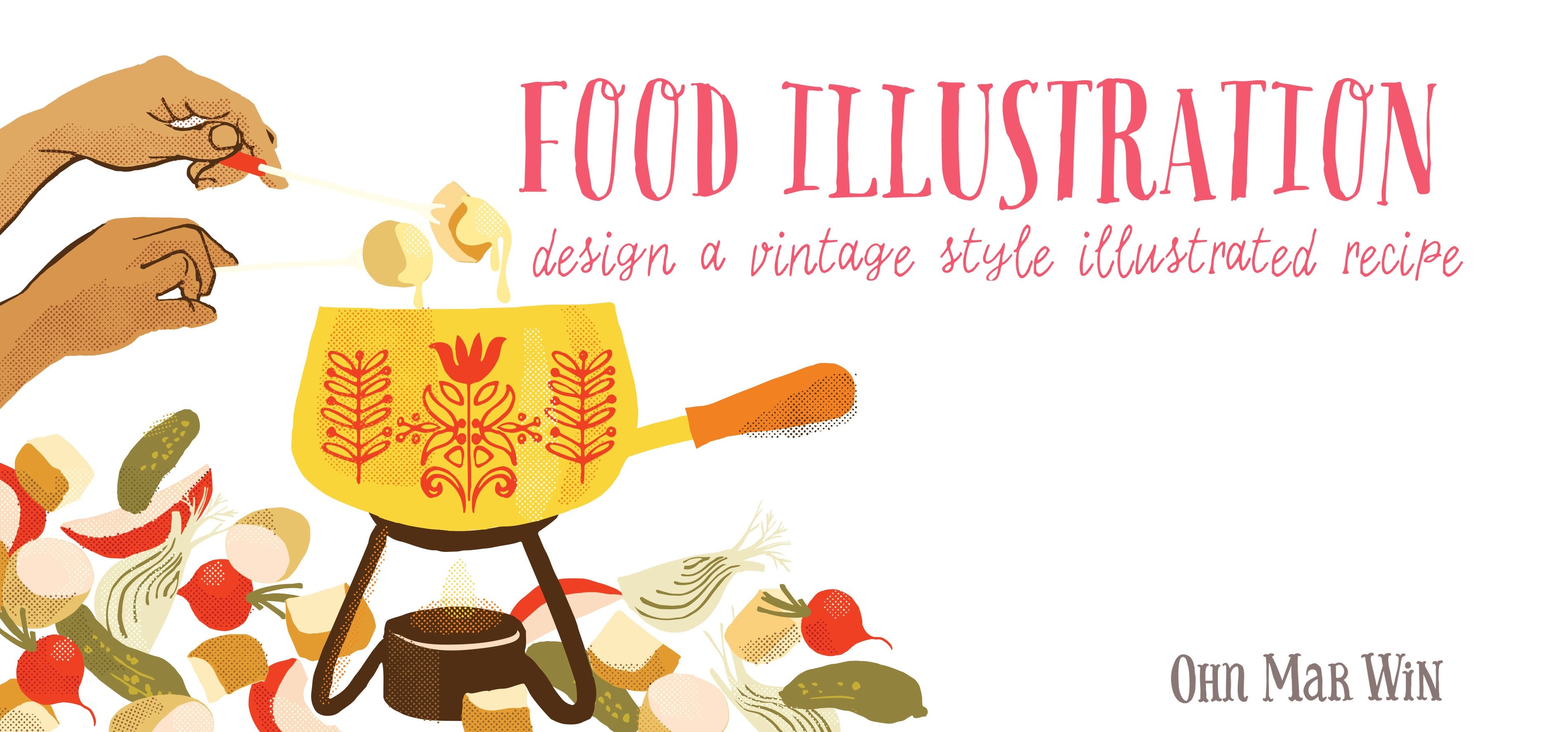
1. Introduction: Hello, I am Ohr Mar and I'm an Illustrator and surface designer. I'm best known for my food images which have appeared in magazines, books, branding, also some products and of course packaging. I am going to talk you through a really simple process for developing your own illustrated recipe. I have worked with They Drawn & Cook, and they were very kind to publish 30 of my illustrated recipes in a book earlier this year. We're going to look at finding ideas and inspiration, some simple layouts, considerations for hand lettering, and of course, drawing the food. Also you would be required to know a little bit of Illustrator and a little bit of Photoshop. But I'm hoping this is going to be a really fun and easy process. I'm really glad that you'll be joining me and I'll catch up with you soon.
2. Gathering Inspiration: I usually start by having a look through Pinterest or Google for any recipes that I feel really inspired by, or if there's a particular fruit or vegetable that I really have to draw, and will be included in the recipe. So I do have a very good look and to gather my inspiration in a mood board, which is what we're going to do now. One of the best resources for researching food is Pinterest. I have a huge Pinterest board food illustrations right here. I've got over 2,000 pins, and I have everything from cakes to dragon fruit, salami, tomatoes, beetroot, liam pairings with desi sauce, asparagus. As a food illustrator, this is a wonderful resource for me, but for the purposes of this illustrated recipe, we're going to type in fruit photography, and it will call up some beautiful images of fruit, and some really lovely close ups as well, which is what you need when you're trying to analyze the fruit that you're going to choose. That we've got raspberries and pears, watermelon, coconut, and there's so much here. I like you just to think about what you're drawn to in terms of shapes, or textures, and also colors. Pick a fruit that you really are excited by, so that we can move on to the next stage. I've chosen figs to do this illustrative recipe with you. I've never illustrated figs, so this is going to be a perfect opportunity. When I call up figs on Pinterest, this is what comes up. We have fig smoothies, baked figs, savory fig tarts. So there's lots to choose from here. The best thing to do now, is to gather the images that really excite you or you're drawn to and put them into a mood board. Here we have the mood board that I've put together with the fig images that I was really drawn to. One of the things that I'm picking up on is the dark background, which contrasts so lovely with the pale interior here of the fig. I'm going to make a note of this because there's something I want to bear in mind as I consider layout, and colors, and textures for the recipe. Another note that I'm going to make is some of the round repeating motifs here that's happening and also the overlapping fig slices. So when I'm looking for a recipe, it'll have to be quite simple because I like the figs to really shine out. I think it's going to be a fig tart, so I'm going to research on really simple fig tart recipes.
3. Considering the Layout: In this video, we're going to look at really rough layers that you can scribble on a piece of white paper. You can put the rough positions of your various ingredients or where the lettering will go and the actual area to put in your ingredients and recipe. It doesn't have to be glamorous. Now we're going to look at some really quick layouts and I just use plain print paper, draw out a rough guide of the layout. That's the guttering down in the middle. What struck me first from referencing images from the mood board was the lovely pattern that was forming when the figs are lined up in a certain way. I'm thinking, could I put the figs on this side so that it forms this pattern? Is it really rough? This is going to just give me an indication this is the center of the fig. Could we do the honey and fig tart lettering on this side with ingredients here and the methodology here? Moving on, another idea of variation of the one I've just done, how about if we could put the lecturing in the central area with the ingredients and the method here, and create a circular emphasis? Again, with fig placed so that they form this lovely pattern that I think that could look really effective. We're thinking pretty decoratively here. Moving on, perhaps we could have, one of this key with, a slice of fig tart I think on this side here placed on a plate, beautiful shape here of the tart and the figs that are set inside. Perhaps a suggestion of a spoon here. To emphasize the shape of that plate, I might try hand lettering across here to echo that shape. Ingredients we could put here, the space there with the method here. There's a bit of negative space here. We could fill that up with more whole figs, fresh figs. Obviously, you can do as many layouts as you like. I'm just exploring some themes that have just popped into my head. Could we have actual whole tart doing this? There's the fluted edge and the figs arranged like this. One thing I must point out is you can't have lettering that goes across here. Sometimes if you want the recipe published, the print company can't print along here. We can have the honey and fig tart across there. My handwriting is getting very messy. Ingredients here and the methodology here. That could look quite good too. So here we have the quick line sketches that I did for layout ideas and there's quite a variety happening there. I think this has got a nice feel to it and I like the lettering that's going to be at an angle on the side. So I think I'll consider the final one and base my work layout on that.
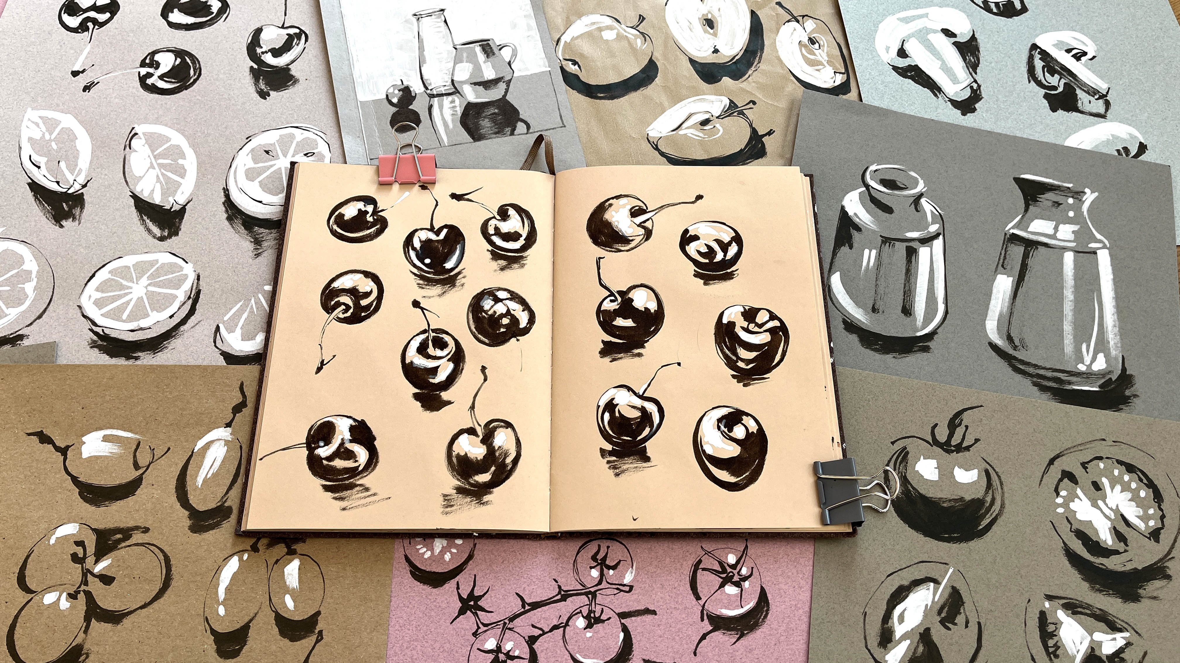
4. Drawing the Fruit: Now, we're going to get down to actually drawing the fruit and other ingredients that will be included in your recipe and I want to show you a selection of black pens that I use and just a really quick way of doing things, so that you don't get all flustered and the line work becomes a little bit labored. Here's a selection of pens of varying thicknesses that I use with good quality A4 paper. This is a very thin line, it's a Micron, I also have a lot of dot features in my work and that makes fine dots. This is the next one up, it's a Uni-Ball and again, it's still quite fine. This is just a basic Fountain by Fabric Style. This is the Pentel brush pen, which is my absolute favorite because you can create some amazing effects like that, which I'd scan in actually, as well as line effects like that, and you can fill in quite large blocks of black. Also, I use white Posca pen for negative work, I normally add dots or lines. I also have a Uni-Ball Gel pen, which is obviously finer. Now, I'm going to draw a selection of fruit for you to show you how swiftly I work. I do always have several versions of each fruit, although I'm just going to show you what I've got here. I have either a mood board or other reference in front of me especially, if you're given a food illustration brief. They do often send very specific reference because obviously, they want the food to look like, whatever purpose they need it for, so reference is important. In terms of using a brush pen, just please use whatever you're comfortable with. You can see that I'm moving very fast, I'm moving across the page and not overthinking it because I feel when the line becomes a little bit labored, you loose some of the spontaneity and you just get some better effects. When it comes to looking at the characteristics of whatever fruit you've chosen, you have to understand that it has to have some defining characteristics. With the pomegranate, it is the roundnes and this little frown at the top, and also the seeds inside. I'm not including every single seed either but I think you can see that it is recognizable as a pomegranate. I've just picked out the most relevant parts. I'm going to move on to maybe a pear here. Just looking at my reference. This particular pear, I'm going to switch pen, has these little distinctive markings on the skin, so I'm going to include those. They're only quite small, but I think it's really important to include this, especially to classify what type of pear it is. I think this is like a commerce pear and I can include this in the artwork, if I were going to artwork this. The lines aren't perfect but I do think that with some of these type of line work, some of these little mistakes are serendipitous sometimes. If you're able to pick up on it and include it in your artwork, it makes it quite unique, which is really important to always try and produce unique pieces of art that's unique to you. Again, I want to emphasize that these lines are not perfect, the angles of these segments within this line is just hand done and you don't stress about it too much there, here we are. If this was a real job or if I was doing another illustrative recipe, I would draw several pomegranates, like five or six different pomegranates, may be from different angles on the same again with the pear. So I'm just going to show you a quick video with some things [inaudible]. I also drew up cream jugs, cake knives, and pastry case for the figs.
5. Handlettering: In my illustrated recipes, I always include lots of hand lettering. If this is something that you're comfortable with, then that's wonderful. But if you don't want to include this, then please just use a font of your choice. Again, I'm hoping that this won't be too labored and it'll be quick and fun. So what we're going to try now is some hand lettering based on your own handwriting. It is really just a very elaborate form of my handwriting. We're going to try writing, honey tart, and you can see that I do this quite quickly so that it doesn't become too labored, it's more expressive that way. I'm going to try my brush pen now and I like all these little other marks that are being made as I move the brush pen across the page. Certainly, it might not be to your liking but it's something that I really enjoy seeing. Now sometimes what I do, is I mix uppercase and lowercase letters. I don't know how it's going to work out, but it's worth the go, that looks like "Loney". Let's try H, let's try tart here. So I've got a really nice selection and I'm going to scan these in and see if we can use any of this.
6. Vectorise your sketches: In this video, we're going to look at scanning in the line work and manipulating it really easily in Illustrator. There's a few tips and tricks that I can pass on. Hopefully, it will be a really fun process. Here we have the figs that I drew earlier with my brush pen, I have scanned it in at 400 dpi into 30 short Creative Cloud. It is a little bit gray and for the purposes of taking it over to image trace, later on, we need to up the contrast a little bit. So I'm going to press Command L, which will bring up the levels. We have a little sliding scales here. I'm going to use this one to just really up the black and the white contrast, which I think that would be great. I'm going to press Okay and now I'll save it. I will take it over to Illustrator. So now we're going to place the fig scan into an Illustrator file. So I do File Place. There it is. We can call up the image trace options either in this bar here, which brings up the presets, or you can go to window and image traces here. So you can call up this window here. It does have some preset options and you can play around with those. You can make your own version. I've got one here. If you do want to play around with it, one thing that is important is to click the ignore white box and I'll share you why that's important in just a second. So I'm just going to quickly show you what's going to happen with sketched art. There we go. We're going to go to expand. Let's see how it's done. I can see that it has missed some of the very thin line work here. But overall, I think that's a really nice effect and I'm just going to show you why it's important that you clicked the ignore white, because when you put a color behind it, there is no white interior here or inside here, which is going to be important when we start mucking about with the actual layout. Sometimes if the lines are particularly fine, image trace does have a bit of a problem. You can't quite pick it up. But what I'm able to do is call up the Pencil Tool, which is just press N and it changes to a pencil. I'm just going to draw an outline here. I'm going to do the Eye Dropper. Do it again here. I'm going to highlight that area, go to my path find box and we're going to use this section here and that merges all the parts together. If you do command Y, you'll see that it is now one path around the fig. Another useful tool to have to use at this stage is the Eraser Tool. There are some elements here which I don't think will serve any purpose like this particular line that's sticking out. So I'm just using the eraser tool there. Perhaps on this fig, I'm just going to define the bottom of that fig just to control a bit better so that it reads better. So what we're going to do now is copy and paste this into a new document, which will have the uncooked template.
7. Arrange the fruit: Here we have the template for the [inaudible] layout. This section here is the gutter, and there is just an indication of where you shouldn't put that lettering that I did mention when we were looking at the rough layouts. Paste my figs. There we go. I'm going to place the hand lettering in a new layer from the figs. Put that to one side. Now the milk jag again in a new layer. Finally, the cupcakes again in a new layer. I don't like yellow. It does not show up, so I'll do in light gray. Here I've also placed the rough layouts that we did and also the [inaudible]. That's there to help me refer back, and think about what original ideas I might have had going through my head. I've picked up that pie case and I'm going to add the center of it. That's a little bit too bright for a bit of a custard look. More for pale one, that's it. With Illustrator, you are able to manipulate the colors really easily. Now I'm going to look at the actual pie case. Again, I'm going to just press eye for eye dropper. The pie case, looking at this, is a really golden crusty color. Delete just the line, and maybe make that just a little bit darker for contrast. I think we've got enough going on there. If I enlarge that, I'm going to take away that background to that section there. We've got something that looks a little bit more dimensional. I think now we can start arranging the figs. In this sketch here, the figs are going round in a circle and is slightly overlapping. That's what I'm going to try to achieve. What I tend to do is copy and paste the figs so that I leave this original set as they are so if anything goes wrong, I have them to refer back to. I'm just going to turn that around. I'm going to arrange these figs fairly randomly in a circle. Now, then you place these quite roughly because I'm still undecided as to exactly how this layout is going to look. I have options and choices that I can make right now. I do like this arrangement, but what I'm noticing here is this overlap that's happening, which I think makes a lovely effect. It adds a bit more drama. I'm going to go back and slightly overlap some of this fruit. Here we have a more overlapped version of the figs, and I really like the effect of that. Now, we are going to add some color.
8. Adding the Colour: So here we have the tart arranged with the figs going around in a circular motion and overlapping. So now we're going to add the color. I'm going to highlight a fig and go to the color dropper and just pick something that I think would reflect what we've got happening on the mood board. I like that, so I'm just going to add a variation of that, maybe slightly darker. I'm going to do this to all the outlines and maybe this one. I think for contrast, I could do lighter, and I'm just going to go around all these figs and just make them, I think, slightly different. So now we've looked at the outside color of the fig. I'm going to have a look at the seed area, the inside, and it is quite contrasted to the skin. Sort of a warm raspberry, let's say. So I'm going to choose the color picker tool, going to change up stud and maybe that color, but I'm just going to go for it. I don't know how it's going to turn out, but we'll assess it afterwards. Now, that's not too bad. At this moment. I think it is working well, but it needs more color definition. So I'm going to call up my pencil tool, which is here, or you can press N. I've created another layer to go underneath the fig layer and I'm just going to draw a shape that roughly follows this fig here and fill it in. I don't want it to be as pale as the custard background there, but I think it keeps within the theme that's happening in my mood board. So I'm going to go around and create shapes for all of these. So now that we've added fig shapes to the background of the fig line work, I'm going to start playing about with the transparency of this. So if you go to Window and call up Transparency, and you click one of these shapes you got here, and I'm just going to show you this function called multiply. So you started to create this sort of effect. I'm just going to highlight these for you to see and it starts to create a see-through stain glass window effect, but it does change the vibe of the colors. So I'm not sure that that's quite going to work. I'm just going to go back and change this one up because I think that's just a big two orange and that's in the wrong color. I'm just going to highlight this layer. I've got the other layers locked, so I'm just going to highlight it to show you the effect it could create, but that's just a little bit too much for me. So I'm going to play around with these more. Now that we've looked at the background shapes and used the multiply tool there, I'm going to look at the line work of the outline of the figs. So that's what's underneath, and I'll take that away, and that's line work there. So I'm going to lock the layer underneath and just highlight everything and see what it looks like if I multiply the lines. It's a nice effect. I really like it but I think some aspects of this, here and here, the line is just a little bit too dark and I've lost some of the contrast, so I think I'm going to lighten them up. So I've changed the colors of some of the outlines, which I think helps to emphasize the fact that these figs are overlapping and I'm really pleased to this effect. So now I'm going to move on to the background.
9. Adding the background and hand lettering: Now that we've looked at the fig tart, I'm going to concentrate on the background elements. I'm going to unlock that background layer and draw a box that is the same size as the draw and cook art board. Bearing to the mood board that I've go here, the backgrounds are really dark and we'd like to complement that. I'm going to make my background a little bit darker and also that shows up the tart really, really nicely. One of the other thing that I've pick up, is there's a lot of texture happening in most of these photographs, I actually have a library of textures that I've scanned in. I'm going to call up one of these textures and place it right here in my working document. There we go, linen fabric texture, and just place it next to my tart and go to image trace and sketched art again. This is just a piece of linen fabric that I put straight onto my scanner and saved it as a JPEG. We're going to see in just a few secs the effect it's going to create. There we go. Expand that. I'm just going to change the color so that you can see the effect it creates and cut it so that I can put it on its own layer, it will be easier much later on, and paste. I'm also going to increase the size of it because I think the linen texture is a little bit too small and it's getting lost. I'm going to place on this side of the layer for now and maybe a slightly lighter shade of the background color. Let's say, like that. Now that does create a really nice effect. I'm really pleased with that. I'm just going to quickly save it. Now we can move on to the hand lettering. Remember, we place the hand lettering on the side here. I'm going to select the lettering that I think is going to work. I'm actually going to do command "R" to call up the rulers so that I can arrange it fairly neatly, but that is just the guide. I'm going to call up the eraser tool. Just look at this little bump here, I find the eraser tool is lot quicker in some cases than using the pen tool to take away points. I like that I and that G, I'll take them over here. This F I can work with. let's take closer look here. Again, I'm going to use my eraser tool and just define the shapes a little bit better. I'm referring to my layout sketch. I'm going to keep this as they are, just copy and paste them, in case something goes wrong I've got a master. Let's say. So I can put honey and fig there and choose a bit of lettering for the tart, and maybe this one, and maybe this one. I might be approval to Frankenstein. I call Frankenstein the type a little bit. I can take that part, maybe take that T. I'm going to just use the eraser tool to cut that bit off. Now we can take this over to our layout page and change the color up so that I can see what I'm doing. There's no actually that much space there but, we can look at but, I really like the way is at an angle there. Lock the other layers and move this over to this side. I'd like to change this linen texture now and move it over to this side. I would like it all the way behind the tart. So let me just copy it and paste it in front and then drag it over. I'm going to use the eraser tool and go freehand. If I bring that closer to the tart. You can make the eraser bigger by pressing either the "Right-Back Bracket" or the "Left Bracket". I'm going to lock the other layers apart from the texture layer, and I'm just going to create, I think a suggestion of perhaps the curve of the table, and that is going to erase for the linen there and I'm going to delete and then I'm going to use the Lasso to just pick up the other parts of the texture that I don't need. That looks much better. I'm going to bring in the recipe and place it here.
10. Adding other elements to completion: Here I have typed out the ingredients and the methodology and I have looked at the method to take out anything that was a bit long-winded so that I can make it a lot shorter. I'm going to copy this and we're going to paste it into our work document. I've actually pasted it onto a new layer so it would be easier in the long run. Well, I've caught something down this side and down the side and also the lettering here. I'm going to just quickly do apple white. Personally, I'm mindful of the guttering within a highlight. I'm going to bring to the front so that we can see where the guttering is, and I don't want any lettering of the typeface to go over this. Now bring up my type books, so it's Command T, and I've got a selection of typefaces here. I'm going to choose something that's quite thick. We'll I've got something in mind called Maiden Orange. I'm going to make the same cream as the tart and lettering. That looks much better. Let's look closely to make sure that there isn't any odd typography going on, this loose bottomed is not to my liking. Let's see if we can make that read better, so that looks better. That's beginning to take shape really nicely, but I think there is too much negative space happening here. So I'm going to go back to the figs and call up some of the shapes and see if they're going to work well maybe here. Let's change it to a different color, and maybe this one. That makes a really nice effect I think it still conveys the thickness of this recipe. So I'm going to carry on doing that and play around with it. Now, I'm mindful of this negative space that we've got here and here around the tart. I'm looking at the original mood board and there is this lovely picture of the tart with a slice taken out of it, so I'm wondering if I can bring down the cake slice that I drew, and just angle it so that it does look like it's underneath the tart. I'm just going to delete the inside of that cake slicer that it's become solid and maybe choose a color that would be suitable, so gray, that will do for now, bur I'm looking at the reference again and I think it would be really nice if I could take a slice out of this tart. I'm just going to go to my eraser tool, and I'm actually going to cut it out. I've locked the other layers so that only the tart layers will be cut out, it made the eraser tool quite big and, so that's the middle. I'm just going to make it a little bit more wobbly. It looks like it really has been taken out with a slice. Now, the tricky part is to highlight this section that has been cut out, and I'm going to move it away, so here it goes. Now we've created a lovely cake slice. I think I've moved it out too much, just try again. We only need a suggestion that it has been taken out. So I'm just going to move this out so it reads better as a cake slice, and maybe angle it like that. That's great, I'm going to take a look around, see what might be needed. There is some negative space here. So I can take one of these milk jugs, I think maybe this one, it reads better as, sorry, not a milk jug, a cream jug. I'll pop that there. So I'm going to create a colored background for this jug, just choose a different color there using my pen tool like we did before. I can see that this line work is a little bit too rough for what I'm after. So I'm going to use my eraser tool now to just clean it up just a little bit, not perfectly because I want to keep some of the rough and ready aspects of this. So at this stage, I'm going to take away all these other elements which we don't need now because we're pretty close to finishing.
11. Final Artwork and Upload to TDAC : Here we have the final piece. I have added texture to the figs and also changed the color of the lettering. I'm noticing down here that it's overhanging the out board a bit too much and we're going to be cutting off a piece of that slice. I've locked the other layers, I've also removed the Guttering guide and to reduce the size of the tart and the cake slice and move the whole lot up just a little bit. That's going to look much better, I think. We're going to export it as a JPEG. Go to File, Export as and you must click, use Art-boards, then it'll be precise. Export that now, RGB 300 and here the finished JPEG file. The drawing Kirk except 300 DPI in RGP and I'm just going to check the size. Make sure it is 500 pixels by 1875. So that's great. Here is "Draw and Cook." This is their website and we're going to go to this section here, which is "Submit a recipe". It asks for a title, so mine is Honey and Fig Tart and the description I'm just going to write in a wonderfully delightful recipe that's perfect for showing off a harvest of figs. In this section here, it says the rights. You can choose to have the drum kit display and perhaps go on merchandise including print sales or you can click "Display" only so that you can only display it on the "Draw and Cook". So I'm going to keep it at that setting. I'm going to choose my file, Honey and Fig Tart. That's the one. There we go. It's just uploading now. I'm going to click "Submit". It says here, your illustration was submitted successfully. Now Sally from the Draw and Cook will review your recipe, make sure that it meets their technical guidelines and you should probably hear back from her the next day. It would be wonderful if you could share your fruity illustrated recipe on social media like Instagram or Facebook. I'm so pleased that you've been through this process of illustrating recipe and that you feel proud of yourself because it's a massive achievement. I also hope you've had lots of fun, which is important and you've had a few insights. I hope that you feel inclined to illustrate more food because I do think it's a wonderful area to explore in art and I hope to catch up with all of you soon. Bye.
 Ohn Mar Win, Illustrator Artist Educator