Transcripts
1. Introduction: [MUSIC] I have never
filled sketchbooks so fast by adapting an old-school technique of using toned paper to produce
amazing results that pop. It saves so much time because
you won't be burdened with color and you'll let the
paper do the heavy lifting. Hello, I'm Ohn Mar. I'm a sketchbook artist, illustrator for food
packaging giftware, books, and I've worked
with the BBC and UNICEF. I'm also the author of Go With the Flow Painting for spontaneous
watercolor techniques. I'm a top teacher
here on Skillshare. In the last few years, I've had to level up my
understanding of value contrast, finding fun ways of
enhancing contrast in order to apply the key principles in commercial and
sketchbook projects. In this class, we will
carefully observe, then just use black and white to fill in the darkest
and lightest areas focusing on shapes and
contrast with the tonal paper acting as the mid-tones and using real-life
references of fruit, vegetables, and some vases. By the end of this class, you'll be able to break down their forms into their
central light and dark areas to better
understand the subject matter. Don't think you need to splash out on loads of materials, just black and
white pens and any tonal paper from craft
envelopes or even cardboard. As this way of working is quick, it's especially useful
if you don't have much time to fit in
a drawing practice. Or if you don't have
much experience and want a simple yet accessible approach
to understanding values. These types of studies are
going to be invaluable. If you've been in creative
wrapped then working on a surface other than white will lead to fresh exploration. For those who are really curious to create on tonal paper, I want to invite
you to join me for a simple class that will give
stunning results. [MUSIC]
2. Your Project : Thank you so much
for joining me. Working with just
black-and-white media on toned paper is a great way
to stretch your skills. I've really tried to break this class down
into easy stages. If I asked you to dive straight into sketching
a still life, there would probably be
overwhelmed and anxiety, especially if you've
never used toned paper. I want to give you the
tools to eventually tackle any subject matter
on your own terms. Let's start real simple. Even if you have used this
type of paper before, it's always good to revisit exercises like those that I'm going to demo in this class. When you're relaxed
and having fun, you are going to learn more. In this class, we're
going be working from three different live references of everyday items of fruit, vegetables, and a cup or vase. I really urge you to collect
your own examples of these. Then you will be able
to interact with them and make better
observations and judgments. The three projects
will build upon each other in terms of
skills and complexity. Your project for
this class is to use a white pen or paint
and a black pen with your toned paper to
create three studies using the techniques I'll
demonstrate in the videos. Please include 3-4 versions of your three references
from different angles. Your thoughts on the process with highlights and
lessons learned. It's okay to be honest, I'm not here to judge, I'm here to support you. It would be great to see your reference alongside
your drawings. Try to include a
photo of your fruit, vegetable, and mug. This is important,
particularly if you would like some constructive
feedback on your sketches, so I can see what you
have been working from. When you're ready to
upload your class project, head over to the
Projects & Resources tab and hit the "Create
Project" button. Here you can add the
contents of your project, adding the photos and text
to reflect on the process. Once you've added
the content there, you can give your
project a title and a cover photo to make
it really stand out. Don't forget to hit
"Publish" once you're done. You can come back anytime to edit or add more
to your project. I know it can be
really scary when you're putting art
out into the world particularly when
you're starting with a new way of working but
I would encourage you to be bold and share so I can give you feedback
and also take a look around at the projects
gallery and drop a few likes and comments on some other student projects too. Let's write that good energy as an encouraging comment has the power to really
make someone's day. In the next video, we're
going to go through the tools and materials
you'll need for this class. When you're ready,
join me there.
3. Materials : You're going to be sketching much quicker than
you may be used to as the tone paper is already
providing the mid tones. Let's begin with looking
at what is toned paper. Toned paper is simply paper that has a value
other than white, or in other words,
it's not white paper. It often comes in
shades of gray, brown, or tan, and also black. Let's start by showing you
a selection that I've used. This sketchbook is called the
cappuccino by Hahnemuhle, which is A5, hard backed with 40 sheets of paper which are really smooth
and easy to work with. It's not watercolor thickness, and fairly thin at 120gsm. You can see it's a lovely,
warm, light brown. Next up we have the
gray tonal book, again from Hahnemuhle, which is cooler in tone, which I filled with portraits of Skillshare teachers and also a few still lifes at the back. Also, I want to show you this, which is actually a pack
of different shades of drawing paper from
Strathmore called Artagain, made out of post-consumer fiber. It's got a nice muted selection of warm and cool
shades of grays, browns, even a pinky lilac, and there's 24
sheets in this pad. If you don't want to
spend too much money it's really worth considering pack of bog standard craft paper which can buy really cheaply. Or you can even cut up craft paper off a roll
like this one here. Now, I also think
you probably have tone paper lying about the
house without realizing it. Very surprisingly,
you can get away with using the inside
of cardboard boxes, which is pretty much
ready-made toned cardboard. This is an example. I cut up a box of
incense sticks, the inside of an
Amazon envelope, and the packing paper that came from our materials
that got delivered. I do know it looks wrinkly but it absolutely does the job. It's worth considering
all of these. We only need to indicate
shade and highlights. We will need those
black and white pens. First of all, we have the Posca. This is prefilled
with acrylic paint, and you have to
shake it a little bit to let that paint flow. I buy loads of these as it's got a really
convenient bullet-shaped nib. It's approximately
2.5 millimeters. The other Posca pen that
I've recently started using is the chisel-shaped, which is about eight
millimeters at its thickest, although it looks really chunky, it's incredibly versatile
if you want to turn it to use the different
angles of the chisel tip. Now, Posca also do a brush pen. I did start off using
this for my sketchbook. However, I found the
bristles did start to get clogged up quite quickly and
you have to keep washing it, which rather bothered me. Otherwise, it is a lovely pen. Next up is the liquid tags. Again, it's a chisel tip, and it's a little bit smaller
between 2-5 millimeters. Also worth considering is this Uni Chalk marker from the same company who
makes Posca pens. I do recommend that
whichever white pen you use get one with quite a
chunky nib for this class. Otherwise, it's
going to take you ages to feel pulse
of your studies. If you don't have any
of these white markers, white paint or ink, and a small brush will do. I've been using brush
pens for years, and for the type of
artwork I create they give such expressive lines. Starting off with the
Pentel Pocket Brush Pen, this is a pen that I
have used for a decade. It's excellent
quality and can give a variety of really
fine and thick lines. Now these two are from Pentel. They are the Fude Brush Pen. They come in a
variety of colors. My favorite is this CPM, and this is the black version. This last one is the
Kuretake Cambio Pen. It's actually meant
for calligraphy, but it is a wonderful pen. Under the Projects and
Resources tab along here, and then to the right, will be a downloadable PDF with a list of my favorite
black and white pens. These are reliable and
give good coverage. Please take a look at that list. Whatever title papers
you decide to use, I strongly suggest that
you try everything else so you have a good
idea on the coverage, and how the pens will react. Sometimes they behave
in quite quirky ways. It's always a good idea to experiment with
your art supplies. This is the test
sheet that I created. Some of them are really opaque. Some of them like the brush pen, just wasn't flowing very well. It's really important
to find out how your pens behave and
what coverage they give. You'll have a much better
experience when you come to create your
tonal studies. This one, you can squeeze the barrel to make the ink flow, and you can achieve a
variety of textures depending on how much you
squeeze on that barrel.
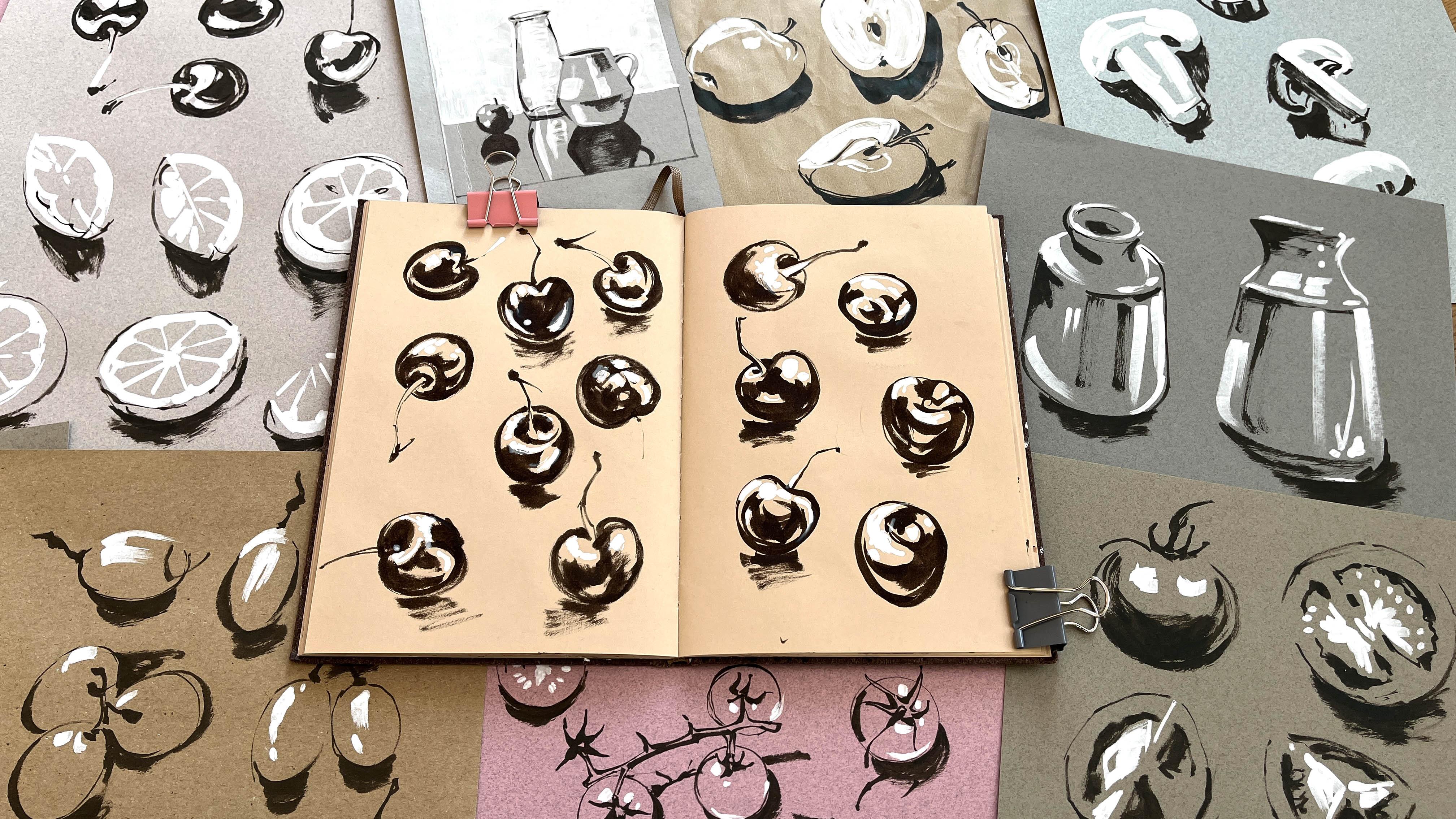
4. My Examples : Some of you may have seen this timeless video
on social media. As you can see, it's a
sketchbook with tone paper, and some people thought it
was something quite radical. In fact, artists such as
Michelangelo and Rubens created studies for the larger
paintings using chalk and charcoal
on tone paper, and I certainly had
hours and hours of lessons using
the same principles when I was in art school. At the time, I had no
idea what the point of those exercises were and I really didn't enjoy
those lessons. However, I do now, after filling this sketchbook. This sketchbook was
something that I created for my own sanity in the Summer of 2022 because I
was pretty close to burnout. I had just finished
writing a book, I was rushing off my feet
with client projects. Most of my day seem to be spent hunched in
front of Google Docs, so I really needed to fill a sketchbook with images
that I wanted to draw. That's why I chose sea life. I still have a great desire
to go scuba diving again. It meant that I didn't have to discuss anything
with an art director. I was in charge of
this sketchbook. These tonal studies gave
me enough space and time to connect with
my sketchbooks, again, using a playful approach. I also really
enjoyed researching all the different types
of sharks or turtles. This half of the sketchbook
was really just for me. It was 20 minutes every day. I wasn't following any strict tonal
principles at this stage. Being able to create
freely and quickly using expressive strokes really did wonders for my soul at the time. I keep returning to
the word playful because my strokes were getting very expressive and I was
really becoming looser. You can see in some of the white marks which is
ink at this time because I went through so many different
white markers trying to achieve the effects
that I wanted, I really learned so
much about embracing that joyfulness
because not everybody is going to want to paint
octopus or lionfish, I was solely doing
it for myself. I wanted it like a sketchbook snack so
that I had 20 minutes alone in the afternoon with just these dolphins and
my black and white pen. I did ask people, do you ever create tonal
studies or use toned paper? The majority of people said, "I've never really done
anything like this." When I presented
this sketchbook, they were quite amazed. Although the process
is so simple, it was something
that many people hadn't really seen often. It's also worth noting
how my confidence and my technique changed as I went through
the sketchbook, starting with the fish on
the first page and then evolving with those
oyster shells where there is a lot more contrast and a lot more gestural marks
with the black and the white. The fruit and vegetables studies I've got in this
sketchbook are a lot closer to what I was
taught in art lessons. We're using white to
represent the lightest edges. I will talk more
about this as I demo, but it's basically
breaking everything down to its absolute simplest
shapes and forms. This really helps in so
many different ways. You can see I've also
used negative space where I'm trying to
introduce the shadows. It really is a case of trusting the tone paper is there to
support you with your sketch. I know we want to fill in
all the missing pieces, but the tone paper is doing
half the job for you. It really helps in so
many different ways, and especially for me
as a food illustrator, it's very important for me
to keep studying like this.
5. Advantages Of Using Tonal Paper: If you're unfamiliar
with using tone paper, let's go through some
of the huge advantages. You'll really appreciate
the benefits. To familiarize yourself
with tone and value is worth painting a gradient
chart like this one. This is a chart for Van
**** brown watercolor with very concentrated pigment on one end and a range
of cones in-between. If we look at this
watercolor gradient scale, which has 20 values, and remove the lightest four, and the darkest four, only the 12th midrange
values are left. That tone paper provides
all the mid tones. Since that's already
been established, it does save a heck
of a lot of tone, so we don't have to fill in
over half the other shapes. If you want to know more about value contrast and gradients
studies then check out my skillshare class: Create contrast with Watercolor
and procreate. In that class, you will produce monochromatic
images incorporating watercolor and procreate to further your understanding
of value contrast. Here are some of the advantages
to using toned paper. Sketches can be completed
so much faster. One of the huge benefits
to drawing on tone paper, is the drawing can
be completed much faster when compared to
drawing on white paper. Because the mid values
are already established, the sketching process
is speeded up. As I'll show you in the demos, you simply have to focus
on the deepest shadows, some of the darker midtones, and then the highlights,
and then you're done. It's less intimidating
than white paper. Another less obvious benefit
is tone paper can help lessen the overwhelm of staring at a blank
sheet of white paper. I think it helps you
to ease up and get started by taking some
of the pressure off. It helps us to
unify our sketches. The mid-tones present
in the paper can also help harmonize different
aspects of the drawing. What we're doing
is basically using a very limited
palette by leaving the tone paper to
show through in the sketch to represent
the mid-tones. Then applying any
black and white, the sketches have a
really coordinated feel. It's easier to bring
out the highlights. I find the highlights
when drawing on tone paper have a unique glow. They really pop and
look fantastic. This means you can
really explore the way the light glances offer bars or shimmer on the
side of a face. It's amazing how we can
create more contrast and visual interest in our
sketches by using this method. Furthermore, this helps to
create areas that really stand out and leads the eye
in and around your piece. Working with tone paper also
encourages you to really observe when
simplifying what you see into areas of
black or white, you will have to be forced to
see the lights and shadows. This is of great
value when trying to clarify and distinguish shapes
and their relationships. The direction of the
light and the shadows are very helpful guides when moving into color sketches
or paintings.
6. Demo 1: Grapes and Apple: I know it's incredibly tempting to try and raise ahead and do a lot more complicated
stuff that fruit really has a
lot to teach us, learning more about
contrast and values. First of all, we need
to observe the fruit. I filmed this in front
of my french door, so the light is
coming from in front and pretty high up at
this point in the day. You can see where the
light has hit the skin to create a highlight and
it's cast shadows. That's what we're going to try
and catch in our sketches. Also, it's worth remembering grapes are basically spherical. They're just slightly
elongated and that's why we're starting off with
something this basic. Using the POSCA pen, I'm just adding
highlight on one grape. It's basically a blog. This is the first
thing that I see. Then on the outer edge where
the sun is hitting it, it's forming the curve which
is the edge of that grape. Now switching over
to my black pen, I've added the stalk and now this area here is
very much in shadow. Actually going to use the shadow as the
edge of that grape and leaving the paper in mid-tone as the
rest of the grape. The shadow marks the edge and the highlight is the
upper edge of this grape. I'm only using the
tip of my brush pen because I just want to
give myself a guide. I'm not outlining it. Although I've moved the
position of that grape, the sun or the light is still hitting it at that upper angle. I've used the POSCA to include as much of the
highlight as the eye can see. Again, using my brush pen to press harder to
create the shadows, to create that lower edge, which is very much darker. This next set is
actually a bunch of two grapes so it's getting that little
bit more complicated. The mark there is the edge of the grape that's
lying behind. That edge is darker. It contrast against the
highlight of the front grape. When they're
side-by-side like this, I still need to look for the darkest areas
and add those first. Now, the stalks. It is actually
difficult to see in this particular area without
overcomplicating things. If I were to add a shadow
in-between those grapes, we would lose the stalk. I've had to make the
decision to only add shadow under
that front grape. Moving on to the bunch
of three grapes, I'm going to start by adding
the highlights first. I'm only going to give myself really fine guidance lines using the very tip of my brush. Although I am going to make the storks really
definite because they're very dark against the
body of the grapes. You can see immediately
that I've created quite a dense shadow in-between the negative shapes
of the grapes. I might just leave it
like that because I really emphasize
the edges that way. All that looks really effective. I've quite surprised myself. I'm going to end with
fifth bunch of grapes. Immediately I am drawn to
the shadow that's being cast towards me so the highlights are then
at the opposite end, although I've run out of
room for the stalk there. But that one is still
really effective and clear. As I turn these plates
of green apples, see how the light
changes as they hit the different surfaces
from different angles. This is just that little
bit more trickier because we also have slices
of white inside, contrasted against the green, which is probably the mid-tone. The sliced interior
of this apple is very obviously the lightest
part that we can see. I'm filling that part first. However, in the center or
the core where the pips it, there's this soft diamond shape. I'm going to leave
the paper showing through there just to
emphasize that section. The darkest parts are the pips and the kind lacks that
tufty bit at the bottom. There's the mirror's
hint of green. I've drawn the skin in
with the thinnest line. Now I'm deciding how far
down the shadow comes. I'm not actually sure if
I've estimated it right. Maybe it should have been
a little bit fuller, but it's still fine
because it tells us where the bottom edge of this
half of the apple is. I personally find it a
lot easier to start with the lightest side of
an apple slice first. It is important to get
that edge in because it gives you a good
base to add the rest of the information
like that pip. I'm going to use the paper as the other side of this slice, which is in shadow. Then I'm going to establish
the lower edge by introducing the shadow
right underneath. Please do remember, these
are really quick studies and if you know my work and some of my other
Skillshare classes, you know I love repetition. You're going to learn so
much more from producing more sketches rather
than laboring over one, particularly in an
exercise like this. I've used the same principle
as the last quarter slice, where I've established
one side as the lightest, filling it in white. I've left the other
side just paper with the merest hint of the skin, then established the
bottom section in shadow. For this next piece, I have established
the leading edge, the lightest part so that is a shape that I can
fill in quite easily, and the pip to give
it some context. Now, the skin is in shadow. I think I've gone
a little bit wide. It's going to be
quite a thick slice. I don't think it's like
that in real life, but I've just made sure
that the shadow is there, at least to give you an
indication of that exterior edge. There's a bit of
space left here, so I'm going to fill it in
with just one more slice. It's the same slice pipe
just turned it around. This one is a lot
easier to create, I think because I've
drawn it twice. I really understood
that particular slice a lot better and that's another reason
why you need to repeat the exercises
quite often. It's always good
to give yourself a little carrying critique at the end so you understand where the parts that worked
out for you and maybe areas where it
was a little bit more challenging and something
you need to be mindful of.
7. Demo 2: Cherries and Lemons: I'm going to start
off by saying, I do find cherries
incredibly tricky to depict on tonal paper because of the high contrast between the highlight and
the body of the cherry. But I'm going to try
my best and show you what I turned up with. This is the cherry
on the bottom. I've looked at the darkest part, which is where the stalk goes into the body of the cherry. I've added that and
now using a Posca pen, I can see two bright areas
on the skin towards the top. The more I look at this cherry, the more I am seeing it's not
completely obvious to me at first glance where
the darkest areas are because the cherry
is almost entirely dark. I'm trying to make the
best of it by really concentrating on
very darkest areas and the very lightest areas. I'm building the layers
and the information up, that's the only way
I can describe it. I was feeling a little bit tense because I knew this was being filmed and I didn't
want to mess it up. I hope that gives you an idea
that even somebody like me, a food illustrator, has problems with
certain fruit items. The first fruit that I paint or sketch is always going to be quite involved because I'm trying to work out
exactly what's going on. Often the second, third, fourth versions are going
to be better because I've just had that
more information. I do think with
my second cherry, the confidence has grown. Also remember that
your muscle memory, the way that your hands
move and grip the pen, has to be built up with
repetitive exercises, especially when there is little
chance of rubbing it out. If you do go wrong
like I've done here, I didn't quite get the shape
of this cherry just right. Try to do the best you can. Instead of fussing
over it, just move on. I'm going to have to
do this here because I've decided it can't be saved, let's start a new one. I'm starting by adding the
highlights on the cherry, which is on the rim just
underneath the stalk. I can actually see some of the reflective light on the very bottom rim
of that cherry, which just gives me room between the edge and the core shadow. That's the shadow on
the cherry itself. I think this might be
my best cherry yet. Those strokes are getting much quicker and I'm not
laboring over them so much. That last line really sets it off and gives it that punch, it needs to make it stand out. This full version, there's just a hint of
highlight on the stalk, although the very tip of
that stalk is in shadow, so it's quite dark. Bulk of the light, I don't know if it's something
to do with the skin, but it's concentrated on the
upper half of the cherry. Most of it is in shadow, I'm trying to let some of that
tonal paper come through. I think that's
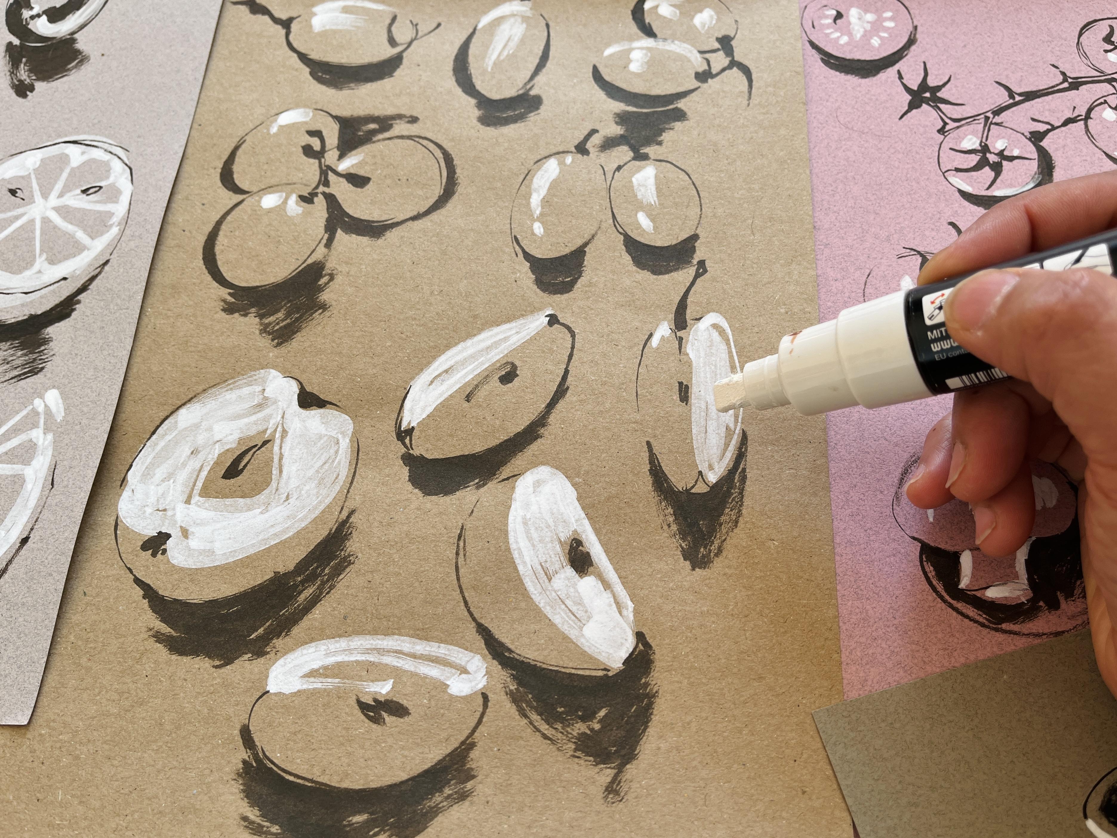
pretty good version. Moving on to lemons, I'm going to cut
mine up so we have some halves, some quarters. You can see that the inside
the pith is very white. The flesh is probably
a mid-tone and the skin in places could
be mid tones as well. I'm trying to draw
this wedge here. My posca pen is run out and let's give it
a little shake in a dab on a piece of scrap paper. Looking at this wedge, the pith is the lightest part, and I can see highlights on the very upper edge
of that slice. You could possibly use a white fine liner to
create the segments, but I'm just keeping
my posca pen. At this angle, I'm finding
it quite difficult to work out the values here because the side on
the left is in shadow, but I don't know how to
incorporate the pith. I have to say, I found
it quite difficult this first version that
just doesn't look right. I think I just gave up, I'm going to move on to a
second one. Let's start again. It is important you see me
try again if it's not right, it's perfectly fine to do that. Haven't messed up that
piece of paper this is only a study, I do feel ready this second one has been resolved far quicker. I've decided that the
flesh of the lemon is actually the lightest value on the left-hand half
of that slice. Because of the angle of
this particular slice, the shadow seems to be emerging
from right underneath it, so it goes in quite deep. A third version of this
lemon is the half, so the top section
is facing the sun, and underneath it's in shadow. Straightaway I drew it very skew with it's
just not right, and so I tried to save it by attempting to add
the pith like Bud Light little spokes coming
out and then adding that outer edge
using the black pen. But it still looks
really odd to me. What I seem to be doing
is just going over and over it using the white posca. Although adding the pips have helped to give it a
little bit more context. Even adding the cast shadow underneath the lemon
has not helped. I'm just going to
leave that one. Now I'm going to use
the same piece of lemon at a different angle. This is a little bit better, I've chosen a better
angle for me, but this particular side is
facing away from the sun. I do have to be mindful about how I'm going to use
that tonal paper to indicate that this side
is much more in shadow. Whilst I'm drawing in these
segments and the pith, I'm actually wondering
what is the best approach. My mind has wandered into the territory where
I have gone into slight stress because I still not happy with
this particular piece. I think the best
route for me was to indicate the car shadow and to use the tonal
paper as the zest, the body of that half lemon. It gives a bit more form and dimension and just
the merest hint of the outer skin the zest
indicated by that line there. Overall, I think that's a
much better version and I'm happy that I was able
to produce that result. The next one is a
thin slice of lemon. As with the other
lemon examples, I have left the flesh, the juicy part of the
lemon with toned paper, and I'm indicating
the segments using white small section of the zest I have left
using toned paper, and the rest is just the shadow. Now, that looks
really good to me, I've got space for one more. A sixth version, you don't have to
do a sixth version. But I was very keen to get this lemon it was
like a test for me. I had to get this
lemon right [LAUGHTER] because I wasn't overthinking it that last one
turned out great. It probably helped
that I had done five other versions in order
to arrive at this stage. Don't be dismissive of all the slightly dodgy versions that you might have produced. My carrying critique was, I learned a lot. If I did them again, I would try to
leave a bit more of the tonal paper like that
last cherry that I created. I need to practice
more lemons on tonal paper and
definitely introduce a white fine liner for the tiny white bits
between each segment.
8. Demo 3: Cucumber and Mushrooms: In this lesson, we are going to start looking at vegetables. Still think of them as basic shapes like
spheres and cylinders. Starting with the tomato, I'm going to cut mine open. You don't have to do it. You can just keep your tomatoes whole or half them on the vine. I just thought it would
be more interesting for me to show you. I'm still sat in front of my
French doors and I can see two large blobs of white which is the
sunlight coming through. This part of the tomato
I've noticed is really dark much more so than
the shadow it's casting. This is the core shadow
that the bulk of the tomato is actually darker than the chopping
board it's sitting on, so I've filled that
in quite readily. Now, I'm observing a little
bit further the stalk, the vine of the tomato
is also very dark. Moving on to the half tomato. This cross-section it reveals the areas where the seeds are. The technical term is
actually a placenta. You can see I just added the seeds and they
are not accurate. It's just to remind us that there is seeds
in there and also I can see highlights bouncing off the area because it's
very juicy in there. This outer rim is
really dark as well. I want to make sure that I leave enough room for the
tonal paper to show through because the wall of that tomato I want
to be the mid-tone. You can see at this point I'm having a few
issues where I've put the seeds in the wrong
place but that's fine, I'm just going to ignore
it, I'm just going to carry on and try and work out the edge
of these tomatoes. Like my other tricks
just use the rim of that tomato to add the shadow to let the viewer know
that is the edge. Moving on to the quarter
slice of tomato. Starting with the side that
is facing my French doors, the placenta part is
standing out for me and the area adjacent
to it is really dark. The skin from this angle, I was really surprised
because it was so dark compared to the shadow. I've tried to interpret
it the best I can. The side of that
tomato that's facing me is much darker so I'm just going to fill in these cavity sections
I'm not going to bother adding a bit
of white in there. Maybe I could have added
a little bit more shadow under there but I've left it. Let's take a look at this
little chunk of tomato. As you can see there is
three areas that are facing us and I have to decide
which parts am I going to add the most black and also where am I going to leave the tonal paper
showing through. I was actually finding
this piece really tricky because I didn't know how
to make the elements work. It wasn't until I kept looking
and looking that I realize the triangular section on the lower right is
actually the darkest. That's when I was
able to decide, oh, I can put a shadow there the key really is in the observation. It took me a while
to work it out but overall I'm really
pleased with this set. We're going to move
on to garlic next. They are still relatively easy. They're quite simple
shapes especially the cloves so you can just stick
with them if you want. This one that I'm
presenting first it's very bright even against that tonal paper so
I've filled that in first and the little squiggle
that happens at the top. My pen ran out a bit
so I just squeezed it. This section is in shadow
and I think I probably went a little bit too thin so the clove is a
little bit narrow. Looking at the shape of the clove and the
version that I've created I think it's a
little bit geometric, especially when I
added those lines. I just want to quickly
mention even though I have illustrated garlic for
major supermarket chains and I've painted it
and illustrated it so many times it doesn't always get easier it just means that I push through and I try
to resolve things. Just like I went back there, I realized the skin on that side could have been
a lot lighter so I went back with the second version
I feel like I'm much more mindful of the contours that I am seeing on the garlic and I'm
trying to add those in the way that I am
applying the POSCA. It wasn't until
as always you add the shadow that it
really started to take shape and that just
really sets it off, so pleased about that. You don't have to
sketch a whole garlic, I've had to illustrate
them before in the past and we went through so many different
iterations it is tricky but I just wanted
to challenge myself. I've drawn the outline
first instead of going for the highlights or
the lighter sections, I decided to add the
dark sections first, the interiors and then I went in with the POSCA and it's
looking pretty good like this. I realize the top of the bulb is also incredibly light but within that where it's been sectioned
off there are dark areas. I'm talking about the interior
underneath that skin. I didn't want to add individual strands of what
would have been the root so I just use little dots instead and I think
they work just as well. I do think that the
shadow underneath this particular bulb
is a little bit messy. If I keep looking, I keep seeing more stuff and this is just
now faffing now. Finish it off because I've
got this bit of space here and I like to fill up all
my space on the paper. Can you see how easily I
did that straight away? Straight in, no problem. Bosch. [LAUGHTER] I'm
laughing now because compared to that
first one this full version is just so much easier, and you saw that yourself. Believe me when I say this sheet of studies was
quite a stretch for me. I love that garlic
at the bottom, I'm looking at it and thinking, wow, that's my favorite. Also that first tomato
there is something so simple yet effective. Overall, great
learning experience.
9. Demo 4: Tomatoes and Garlic : Please be assured part
of your project is only producing one set of
vegetable sketches. I'm only doing a
lot more because I want to show and inspire you. First of all, a cucumber
is like a giant cylinder, and this slice here
is a simple round. It's a good place to start. It's not quite round, it's a little bit misshapen. However, most of the flesh is quite a light color
and the seeds in the middle are going
to be my mid-range. This is a great start. Now, I'm taking up
the black pen and the cucumber skin
compared to the rest of it really is
quite a dark value. In this instance,
I am able to add a few geometric touches because
it lends itself to that. I even noticed
these little dots. The skin of this cucumber
is definitely of a darker value so
I'm adding that quite swiftly using
my brush pen. I think I did a good job
with this first slice. Now let's try our hand at this chunky little
quarter cucumber. It's basically a triangle with curve at one end.
Got the shape right. Now I'm wondering how I'm going
to add the correct value. It's darkest on the left. I've partially
filled that in using my brush pen and I've left the other side
of the tonal paper showing and added a shadow so that it contrasts
against that edge. That's pretty
effective, I think. Now we are going to try for this little stump of
cucumber from the end. The skin is actually so
much darker than I thought. Although the sun
hitting the ridges of the cucumber looks
particularly tricky, I'm not sure how I'm
going to achieve that. In the end, it's
actually quite easy. I wasn't drawing heavy-handed
stripes all the way across. I decided to add
the merest hint, a scattering of the seed section and I think that is just right. This half slice of cucumber, create the shape, get the
skin on, add the seeds. This was so simple, I really surprised myself. I could have very well filled in the whole of
that skin which is facing away from the
light but that would have just been too
solid in my opinion. I love mushrooms. I have illustrated and painted them many different
varieties over the years. However, they are quite tricky. There are two different
elements to it, the cup and the stalk. The good news is
this is where we can really concentrate
on shape and bring that in to help us with our studies and through
our observations. If you can imagine, this mushroom slice is
really like a fat capital T. We fill that in. There we go. It looks just like a T to me. I have left a little of
that tonal paper showing, but now I can take
my brush pen to add a lot more layer of details. This is the gills. The left side seems
that little bit darker, so I'm creating the
shadow for that now. The gills on the other side, I had a little bit
of trouble with, they're a little bit lopsided, but hey, you can still
tell it's a mushroom. I was just finishing off the stem of the
mushroom when my cat, Kiki, decided to walk
in on the frame. I've had to stop the
video and I will start it again in just a moment. Now we can carry on with
this particular mushroom. This side on the right is a lot lighter because
it is facing my door. I'm going to leave a little
bit of room for the gill. I've had to extend it because it was just a bit too narrow and this section on the left
is that little bit darker. So I'm taking
alternate routes to fill in the gill
and then fill in the rest of the mushroom. You can see I've changed the
direction of my brush pen. I am letting a bit of that tonal paper show
so it's not like a solid section and
there's enough information there for me to add the
darker sections of the gill. Again, I have got
lopsided gills and I've tried to rectify it by
adding an extra stroke. I don't know if it
exists in there, but it looks better
from where I'm sitting. Because of the way the light is shining through that gap
underneath the stalk, I didn't fill in
the entire shadow. I'm now going to attempt
a whole mushroom. I've placed it on
its head, let's say, and the side that's
nearest me is darker. I've decided to add
that section first. It looks like the left side of the stalk and the
rim is the lightest, so I've also added them now. This is looking a little
bit out of proportion. Get the ring here. I don't know whether to
add shadow or highlights, but I've decided on
a highlight first. I've decided to leave it, swap the position
of the mushroom and try again but from
a different angle. This seems to be
working much better. I like the shape of that cap. It's a lot more
curved and I'm able to define the shape a
lot easier, I feel. I have left the majority of this particular mushroom with the mid-tone showing through. Accentuating that
shadow has really made the stalk much more of a focus. I felt it needed just a few more details so
I've added a few marks on the cap of the mushroom and the right side which
was that bit darker. I think often when we're in the myths of trying
to create something, the anxiety might be going and we're so focused on what
we're trying to do, we are not able to
take a step back until we finished and assessed
what's really going on. I actually really like this. At the time, I was not sure, but I think these
are good pieces.
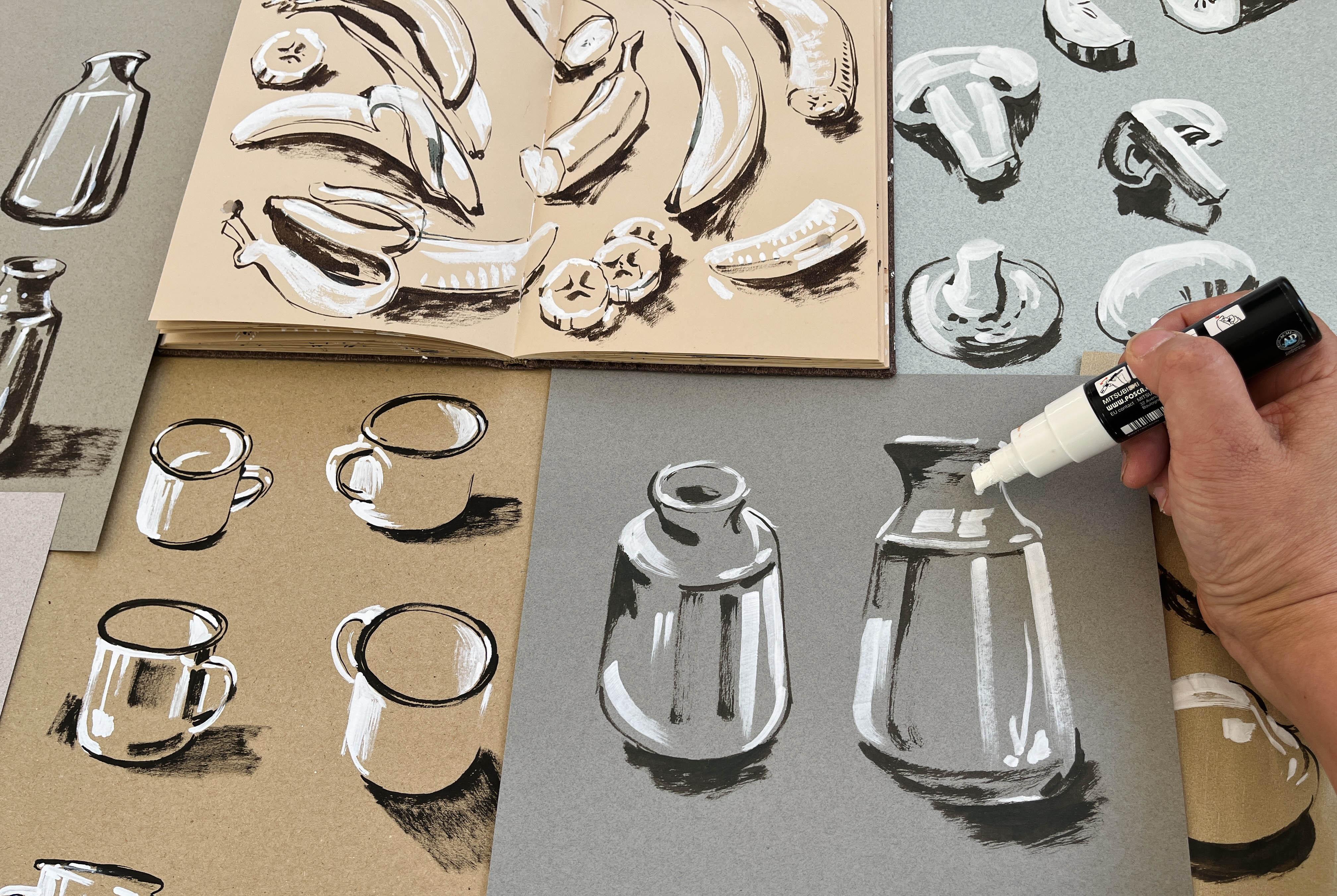
10. Demo 5: Cup and Vase : It's always worth taking a really good look at the
object in front of you. A couple of minutes just to
familiarize yourself and choose an angle that
is of interest to you. The darkest part of this vase is the inside and
just underneath the rim is also just the tiniest merest bit of shadow where the lip
of this vase is. It's quite complicated
what's going on up there, so I'm quite tentative. We've got the rim, the lip, and the interior. I'm just going to
leave that for now. I'm moving down to the neck of the vase and it's
okay to do that. Just take your time. A lot of it is just seeing. I'm not used to painting
many straight-sided objects. However, if we just
keep on looking at the lightest areas and the darkest areas and
filling those in, this will give us
reference points, and from that, we can
start filling in the rest. I feel like I have actually
passed a threshold here. I've got the basis in, and I'm now able to look a lot more at
the shape of the vase. I'm going straight in with this large beautiful area of white highlights
that I can see, which is coming from a window
that is also on the right. I must admit it wasn't until
I got to that point that I thought that maybe this
vase got a bit pear-shaped, but sigh of relief. I've added that lovely
shadow underneath, which just sets it off, so it looks like it's
actually placed on a surface. Next to it I'm going
to add the vase from a different angle this time starting with the
upper left corner, the tiny sliver
of highlight just there on the left or the
upper part of the vase, and the two bits of white
Posca I've added there or the French doors
reflected off my vase. Again, I just love
that fat white Posca. [LAUGHTER] The strikes it
makes and you have to be bold. This vase in particular really lends itself to this treatment. You can see the cat. Wait for the cat to disappear. There we go again. It seems like the base when it comes
to vase is so crucial. I really don't want to go into heavy-handed with the shadows. On this example, I'm letting the tonal paper
show through quite a lot and just adding the
minimum of dark areas. Otherwise, I think it would
just look a little bit too heavy and overworked. I love it when the shadow
really makes that item pop. One thing worth mentioning
is when you come to choose your bowl or cup or vase, do you make sure it's neutral? There's no pattern on it. Try to make it easy on yourself. Don't try to over-complicate it. I actually did two
versions of this vase. The one on the right
was a practice piece where I chose a few more
angles to learn from. I'm assuming small enamel vase, which is my daughters, is that step up more complicated because it also has an
interior that you can see. The fact that it's white means
that you have to be very careful about how you are
going to portray the edges. I'm trying to be
mindful about where I placed that Posca
because the interior of the cup you can
see in this shot as well there's a
little rim of white, so that has to stay white and the rest is going
to be tonal paper. Having said that, I know I felt very
uncomfortable at this stage. I just didn't really understand the angle, the perspective. That's certainly an
area I can improve on. When you're faced with a
situation where you know, oh gosh, this angle, this perspective
just isn't right, you can make a decision
to abandon it, just move on or you
can try and persist, and that's what I did here. I knew this was going to be part of the series of studies, so I was doing my best. It seemed to help when
I put that shadow in, and then it gave me a bit
of confidence to add a bit of shadow to that handle. By this date, I
was just faffing. I really think I
should have moved on, but part of me is quite
doggedly determined. [LAUGHTER] I just
go round and round this room hoping that it
will make a difference. I know it's really frustrating. You saw it happen there, and please accept that. It's completely normal, and it's just another way
that we can learn more. Moving on to a next version of this cup at a slightly
different angle. I'm looking at it so
that I can't see much of the rim and it is a very narrow ellipse.
There's the cat again. You're going to have to
forgive her because I just wanted to carry on
drawing this mug. The rim at this angle
is a lot easier, although it is incredibly dark, there is such a
lot of highlights, so I've left the
tonal paper showing. Although I can see the highlights go all
the way around this rim, I have only chosen a few
spots to add white Posca. I love creating these
strong downward strokes, it is so satisfying. Although the majority
of this mug is white, I have been very
mindful with the vase, I have not added too much black. I think this is just enough seeking out the darkest areas, that's all I need to add I feel. You can absolutely stop
after creating two studies, but I just wanted to make sure I understood this particular mug, so I dealt with the
cat and carried on. This the absolute side view, so I can't see hardly
any of that interior. In this position, the left-hand side seems to have the most amount
of sun hitting it, so I've got large area there. I've learned enough from the other two pieces
that I don't actually need to add that much white being a bit more
sparing with this one, and that is all it needed. I was really surprised
with myself. I thought since
I've got the space, let's do a fourth
version of this mug. I realized at this stage that I didn't have
room for the handle, but I just carried on anyway. I thought what could
possibly go wrong? That rim gave me
so much trouble. There is just too much
contrast between the dark blue and the highlights
that's hitting it. Thankfully, I thought I'm just going to change
the angle of that mug so the handle is facing a
little bit more towards me. I thought that would
be an easier option. [LAUGHTER] That left-hand side
is still much lighter than the other side and I feel like I should have filled it
out a little bit more. The handle, the light was actually hitting the
top of it a lot more. I might have gone into a bit of a panic state and I
wasn't observing. I just wanted to finish this
piece really. It's all good. It's all experience, and I have four more studies of an enamel cup I
didn't have before. This is the practice
version that I did before filming started. Even though I had
taken my time over it, the pressure we're
filming and just praying and hoping
that it turns out looking absolutely amazing is that extra layer that
I have to contend with when I present
these studies to you. That's a really important point. These really are studies. They are not meant to
be finished pieces, they are not meant to be framed. This will aid your
development as an artist, not just the muscle memory, but also having to contend with the emotional
side of things. Overcoming these little
hiccups is just part of the journey that we're
all taking as artists, so please take
heart that you have grown as an artist
because that happened.
11. Final Thoughts : Thank you so much for spending time using tone paper with me. I hope you feel like me that working on a
surface other than white paper will lead to fresh
and exciting exploration. You understand how tone
papers are creative, flexible, and an inspiring
ground to work on. If there's one thing that you'll take away
from this class, I hope it's the confidence
to define areas of lights and darks when you sketch whatever subject
matter in future, whether it's flowers
or landscapes. I just want to quickly recap. There are two extreme
tones or values which are black or very dark and
white, which is very light. Recognizing the tone or value of a color
rather than the hue, is important to
an artist because successful pieces
had tonal contrast to them or a range of values. Try to focus on the image
as a whole rather than paying attention to small
sections at an early stage. The key to successful
art work is often in simplifying the image and
emitting unnecessary elements. This is especially true when working on quick
sketches like these. This in turn will help
you sketch quicker as you only need to indicate
shade and some highlights. Please do remember that I've had quite a few years experience
of working with toned paper and I learned a heck
of a lot filling that 80 page sketchbook that I showed you at the
beginning of the class. We have all works in
progress so be gentle on yourself when you create
your initial sketches. The key is persistence
and practice. If you do this regularly, I'm certain that what
you learn will seep into your other art practice and you will start to notice
a real difference. If you share any of
the work that you've created in my classes
on social media, I would love to see them. Please tag me on
Instagram @ohn_mar_win. I need you to tag me properly like this in order to repost your lovely tonal
sketch on Instagram also mention that you took
this Skillshare class, tone paper, standing and
simple illustrations in black and white and use
#ohnmarskillshare. If you'd like to hear about my new classes, competitions, and giveaways, then make sure you're following me
here on Skillshare. Hit that follow button now
if you haven't already. If you'd like to
hear a little bit more about projects
I'm working on, freebies, and behind the scenes. Then you might enjoy
my newsletter. I also post lots
of free videos on my YouTube channel
several times a month so be sure
to check them out. Thank you so much for
being here and watching. I would really love for you to leave a
review when you have time and it helps me out so much and your fellow
students too. [MUSIC] I hope to see you in another one of my classes soon. Bye for now and stay amazing. You will also be happy
to know that there will be a follow-up
class where we will tackle more intermediate
subject matter using toned paper such as florals so watch out
for that. [MUSIC]
12. Behind The Scenes: [MUSIC] Kiki. [MUSIC] Kiki,
you cannot sit there. [MUSIC] Kiki. Giddy up. Kiki, I'm filming my darling. Kiki, you need to get off. [MUSIC] [BACKGROUND] [NOISE]
13. BONUS video: More Examples : In this bonus class, I want to show you
how being able to see areas of light
and dark can give you transferrable skills to try more complex art like portraits, landscapes and still lives. I'm going to show you a few more examples and how my height and understanding has really improved my watercolor
skills too. Please look out
for future lessons where we will be tackling
this subject matter. I really hope you'll enjoy this. This is sketchbook Number 34. It's [inaudible]
100 percent cotton. I started it in
December of 2022. These are time studies that I did following Katie Moody on Patreon and I was just
doing these in my own time, didn't share this
on social media. Then I finished that
tonal sketch book, and I was so enthused by it, I decided to start
creating tonal studies. I wanted to point out this page because although
the reference was, photographer had set
up this still life with quite distinctive lighting, I was actually able to
utilize what I learned from that tonal sketch book to really make sure that
the highlights popped. I know pairs aren't reflective. But even in the lemons, there is definitely
a sense that I have a greater knowledge
of light and dark. Moving on to these are just
really quick time studies. This next one I actually
did do a tonal study for. Here's the tonal version that
I did of the same image. I have slightly changed
the composition. Overall, the elements
stayed the same. Although I seem to pick up more information on
this tonal study, sometimes doing color versions. There's a lot going on. When you do a tonal
interpretation, you have to deal with
less information. I think I did a better job with this bowl in this version and also the glass is pretty good. I saw a few more bits happening within the
stem of that glass. I think doing studies
like this is so important to boost my
watercolor skills. On the next page we have
two landscapes in France. It's a region called Sisteron. I found these on the
landscape art club Instagram. I realized because of the
positioning of the sun, the houses here,
were actually quite a lot darker than what
I've depicted here. I decided with this version, I was going to do a tonal study. This is the version that I did. It's the same scene, but I remembered from this one that the houses
had to be much darker. I decided to fill a few of
them in using the black. It's really interesting to see them side-by-side like this. Same view I have obviously
simplified it a lot more. I'm just fascinated by how I can interpret the
same scene like this. These are, again,
still life studies that I did as part of Patreon. This version, you might
have seen the time-lapse at the end of the final
video in the class. I decided to do on a
very large envelope. I used brown ink. In retrospect, maybe
I should have used black ink to really
pop against the, well, orangey manila envelope. The same elements are there picking out the darkest darks. The background in particular, I think really could have been, darker to help this
portion in front pop. But it's so good to
do an exercise like this and also working
larger scale. That was a really
interesting exercise. These two still
lives are actually from fellow Skillshare teachers. Class called observing
is learning. I was really taken by, again, the slightly
reflective surfaces. These are from her
own reference photos that she took herself. I decided to do some
tonal studies of those. This one is on the back of a meditation pack and
that's the only other one. I love that vase. I wish that I hadn't mucked around
with that apple so much. This one, I left well alone. However I found it more tricky to add that highlight
on this tonal study. I thought it would have
been easier because I had to make a decision where
the darkest parts were. Maybe I should not have filled that upper section
of that vase black. It's fine. I really love the little dabs of highlights on the apple
that really sets it off. There's something very still
and common about this scene. Glass is really tricky. I think I did a better job
on the watercolor paper. Maybe I should have left some of the tonal paper showing
in this version. Although it has got
meditation embossed on that [LAUGHTER] I'll
know for next time. Two more still lives that I've
got in my gray sketchbook. I really enjoy doing these. These were quite a stretch
for me because I had to decide which areas
were going to be black and which were
again to be left gray. I think I did quite a good
job with the reflections on this bowl here that's
holding the satsuma's. The flowers here, they are
not completely filled in. I had to really think upon that. Are they really that light? In the end, I decided to leave a vast majority
of those flowers, just gray and I think
that works much better. Sometimes our eyes deceive us, even though they
were chrysanthemums and they were pale yellow. When I look carefully
I realized, actually, they are lighter
than the background, but I have to leave white
for the highlights. That was how resolved it. Now, this one was
also very tricky because the original
photo was very pale. Again, I had to make the decision which areas
were going to be gray, which was going to be dark. But I think I did
quiet good job here by only filling in some
of the leaves in black. Maybe I could have done
a few more overall. I think that's a really good
study of the still-life. You saw this gray Hannah
moonless sketchbook in the materials class. I said I filled it with
Skillshare teachers. That first page was
actually Sandy Dion Baker. I did a workshop with her
in Brooklyn and I had to do it twice because I was not
pleased with her left eye. If you look closely, I have actually patched over it. I've collaged over her left eye and I drew on top of it again, this version I do
think is better. These two are top teachers
on Skillshare too. This is Evgeniya and Jen Dixon. I took these photos when
we met up in May 2022. It's pretty much
the same process as what I have described
in this class. I am picking out the darkest areas and
the lightest areas. It might seem like, oh my gosh, this is
really complicated. It's just a little
bit more observation and more consideration. Some of you may know, I was an editorial illustrator
for 10 years. That helps but I haven't done enough studies of
people since college, which was like decades
ago in the last century. It was really refreshing
to paint people like this. It was really calming. I would do these in the evening. More Skillshare teachers. This is Dominic and Chris Dixon. Again at the same
London meet up. I do not draw guys very often. This is really tricky for me. Proportionally, some of their eyes are a
little bit wonky. It was a good try. I really like the expressive
stroke in that color. You have to pick up on the
things that you do like oh, Marina, wow, sorry, they're
not Skillshare teachers. I'll just trying something out. You can see where I've
pasted over rise again. I was just not happy, but I showed it to her anyway. She said, "Oh my God, oh my, you've made me look
so glamorous." [LAUGHTER] I think challenges of drawing straight onto
the paper like this. You can see where I've tried to scratch away at the surface. As you saw the other
two portraits, I tried to bring
in another tone. I'm not sure if it's
successful or not, but it's interesting. Now we have Faye, top teacher and Tiffany
who works at Skillshare. Faye has such a lovely smile and it's so lovely
to just pick up on the highlights on her nose and her cheeks
and most of the time, I find when I do portraits, if you can just add a little
highlight on the nose, it really just brings
everything together. I don't think Tiffany's chin
is actually that square, but I think she liked it
when I showed it to her. Now we have Dylan and
Nic also top teachers. These were taken from
photographs when I hang out with them in
New York a few years ago, I have done a little
bit skew with, but the same
principles are there. I have really, really
simplified things down. Nic has a lot of curly hair. I just picked out her features. Dylan has such a beautiful
face and her eyes especially. I think I got them right. These were abandoned. I did meet these two guys at Skillshare meet
up in Brooklyn. They didn't have very
good photographs of them, so I didn't feel confident
about finishing. Two more guys at work for
Skillshare, Nicea and Alex. I can't get over his eye. I did this a few
months ago and I'm still going on about it. This is one of the things that most artists are
able to relate to. You just become
fixated on one thing. But I'm just going to let it go. I think Alex's face
is a little bit wide. I did show both
these portraits to them and they did quite
seem to like them. Using still-life for landscape. Still-life and
portrait drawings has really improved my
artistic skills. The midtone background of
the paper allows me to focus on creating depth and
contrast in my sketches, which has helped me to develop a much better understanding
of light and shadow. I feel this technique has been particularly effective
for creating dramatic contrasts and adding a sense of mood or
atmosphere to the art work. Particularly when
applied a still life, it can add highlight to the textures and
shapes of the objects. For landscapes, it can emphasize the contrast between
light and shadow. For portraits, you
can add a sense of luminosity to the
subject's skin tone. Also, working with
a limited color has improved my ability to make intentional color
decisions when I do actually paint
in watercolors. Overall, it looks more harmonious and
visually interesting. Tone paper has really challenged
my approach to art work in so many new ways and greatly improved my skills as an artist. I hope it will do
the same for you.
 Ohn Mar Win, Illustrator Artist Educator