Transcripts
1. Introduction & What You'll Learn: Welcome to the Skillshare
class where we'll bring some hand drawn floral
elements to life by transforming them into
beautiful cohesive set of chits inspired
pattern in Photoshop. Hi, my name is Vinita, an illustrator and a
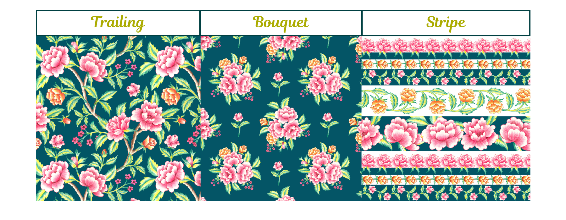
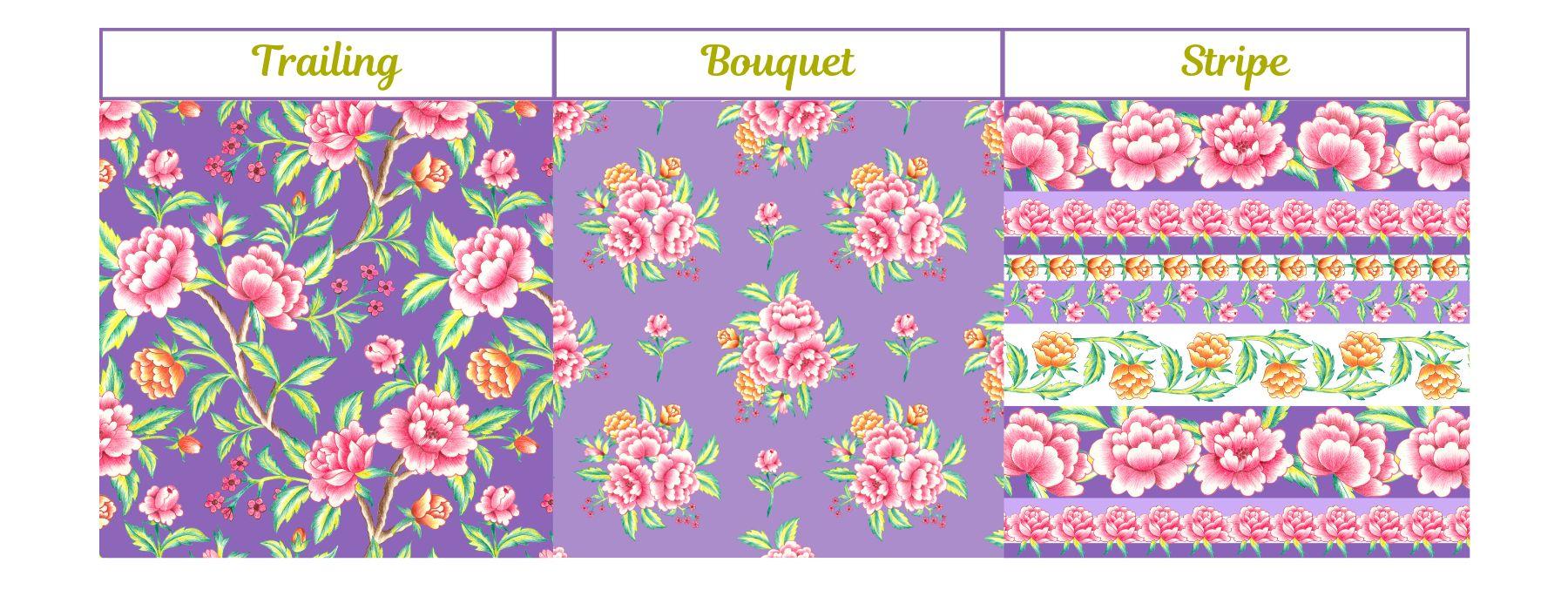
designer based in Singapore. In this class, we'll explore three distinct
pattern style, a trailing chits,
a bouquet style, and a str playout, each offering a unique way to arrange and showcase
your floral motives. You'll start by
learning how to refine and organize hand
illustrated elements, ensuring they seamlessly fit together in a repeating pattern. Next, we'll move on to Photoshop to create these
three pattern style, focusing on
composition, spacing, and flow to make the design
look neat and professional. By the end of this class, you will not only have
three individual patterns, but a mini collection that
works beautifully together. So see you in the class.
2. Class Project: For your class project, you can create your
own hits inspired pattern using the techniques
shown in this class. You can choose any flower
and layout of your choice. It can be a trailing, bouquet, or stripe or all three to build a cohesive
pattern collection. Start by sketching
your floral motif, refining them for a
balanced composition, and bringing them to life in Photoshop using seamless
repeat techniques. Try different color palettes and pattern size to see what
works best for your design. Once your sketch or motif or even the
pattern is complete, share your work in the project
section of this class. I would love to see
your unique take on this classic floral style.
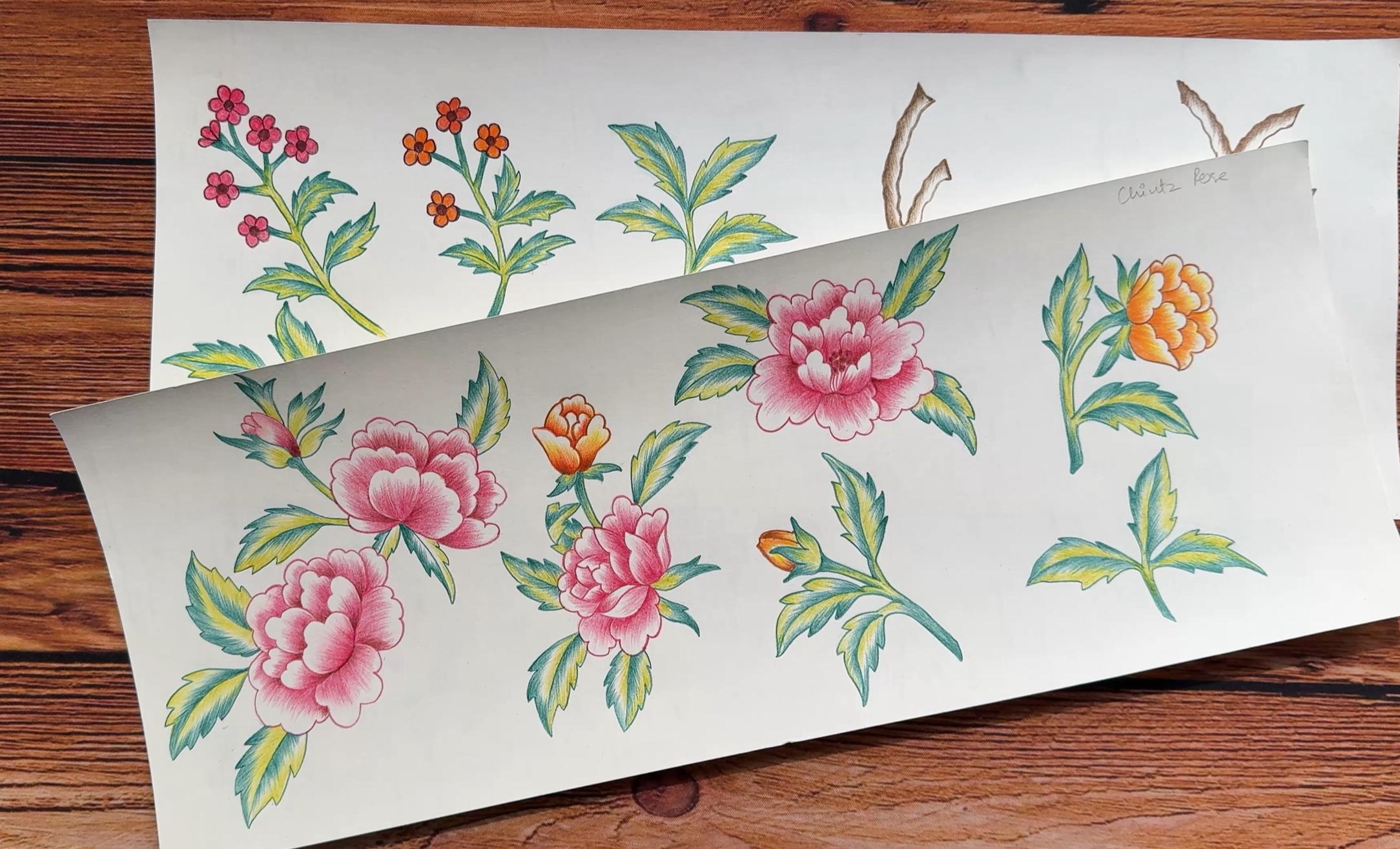
3. Sketching, Illustration & Refining Elements: Let's see some sketching
tips for these motifs. Before you start sketching, plan out your primary, secondary and filler elements to create variety and balance. Instead of drawing
a full composition, illustrate individual
elements separately. This makes it easier to
arrange them in Photoshop. Drawing larger allows for better detail and flexibility
in resizing later. Keep your pencil strokes
lighter and loose, so they are easy to
erase or refine. Sketch more elements than
you think you'll need. It is always better to have extra elements than to run out when arranging
the pattern. So this is what the sketching
looks like for my elements. Now let's move on to
some illustration tips. Plan a limited color palette to ensure a cohesive look
throughout the design. Using too many colors can make your pattern
feel overwhelming, while a well curated palette helps tie all the elements
together seamlessly. Consistency in
illustration style means maintaining
uniform line quality, shading techniques, and level of details across all motif. Maintaining a crisp outline can ensure an efficient editing
process in Photoshop. Makes it easier to remove
the background accurately, preventing any rough
edges around your motifs. It will also save time during post processing and result in a high quality
seamless print. So this is what my
finished illustration look like for these motives. Once your illustration
process is complete, the next step is scanning. One of the most important aspect of scanning is resolution. The higher the resolution,
the better the quality. To ensure crisp details, a minimum of 300
DPI is recommended. For even greater clarity
and flexibility, I prefer scanning at 600 DPI, which helps retain fine details and allow for easier
adjustments in Photoshop. I'm going to save and scan
this in a JPEC format. The next step is to remove the background from
these elements, which can be done
in multiple ways depending on the medium used to create these
illustrations. For this project, I am using Procreate because I am very
comfortable with this app. But this can also be done in
Photoshop with the help of selection tool or layer mask or manual erasing to separate the element
from the background. I start by importing the
scanned copy in Procreate, change my background color
to any darker shade, select a nice smooth brush
under the eraser tool, and carefully start erasing the background for each element. This can be a time
consuming process, but it gives me a nice crisp
edge for each element. Once my background is
removed from these elements, the next step is to carefully
inspect the artwork for any uneven areas or
unwanted marks or stains. Under adjustments, I will
select a clone tool, select a nice soft airbrush. This helps refine the elements before arranging them
into the final pattern. You can find a clone
tool in Photoshop two. Now, with the help of my
free hand selection tool, I will select each
element and cut paste them so that they are
all on a separate layer. H Now I can share this file in a PSD
format to my laptop. Now, before we start
with the next step, I want to show you what
my folders looks like. So I have this folder named floral Chads and
within that folder, I have two more folders, one for the patterns and the
other one for the elements. So when I open my
element folder, here I have saved all
my scanned copy and also the Photoshop file where I have all my
edited elements. So what I've done
here is I've got all my elements on
one big document. Here I'll start by editing
the elements slightly, like the brightness
and the saturation. I want to select all
the similar flowers and merge them into one layer. So when I am adjusting the
brightness and the contrast, it is done all at the same time. Holding my shift key, I've selected all my pink
flowers and Command E, that will get them all on
one layer, merge the layers. Next we'll go to
image, under image, go to adjustments, and under adjustments,
we'll go to levels. Here you can see there
are three arrows here. So I will be moving the
first and the third arrow. The third arrow helps
with the whiteness. So when I move that inwards, you can see the elements
getting whiter and brighter. Now when you move the
first arrow inwards, you can see it increases the
contrast and the brightness. And once you're happy with how the motif looks like,
you can click Okay. Next, I want to show you how
you can adjust the color. I will select this
particular orange flower and with my lasso tool, I'll select only
the flower area, the orange area, and I'll keep it slightly
away on the edges. Once it is selected, I'll go to this tiny
icon at the bottom here. Under this, you can
see feather selection. This helps to smoothen
the selection, the edges. I'll keep mine as 50, but you can experiment by increasing or
reducing the radius. Next under image
adjustments, color balance. Select color balance. Now my aim here is to increase the yellowness
for the flower. You can see the changes
to the flower as I move the arrow towards
the yellow color. Let me show you how it looks
when I try the other colors. Okay, now I go back to my
yellow and click Okay. I'll repeat the same steps for this particular flower, too. Next for these branches again, I will select both the layers, Command E to merge them, go to adjustments and levels. I'll slightly adjust
these arrows to create contrast and
depth to this element. Once I'm done with my editing and refining these elements, I have to make sure that they are all on a separate layer. So with the help
of my Lasso tool, I will copy paste or cut paste. So they are all ready to go when we start creating
our patterns.
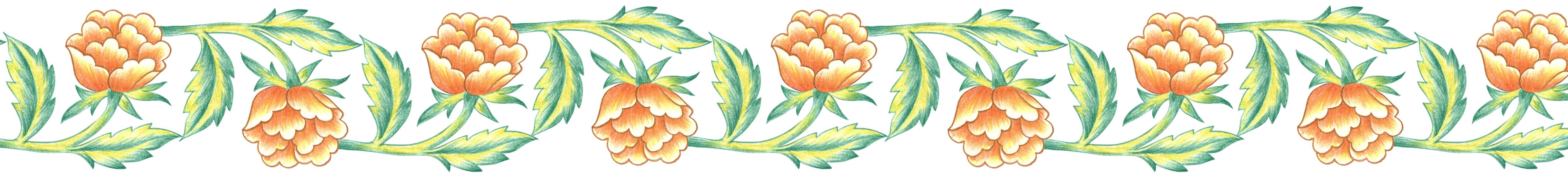
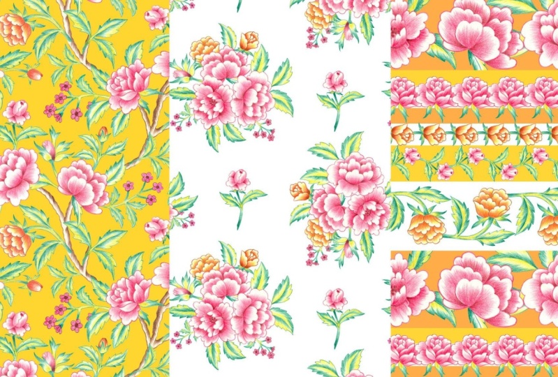
4. Trailing Layout: So let's create our first print. That is the trailing
chits pattern. We'll start by creating
a new document. I'll keep my document size
as 5,000 by 5,000 pixel. The document size can vary
depending on your project. The resolution will
be 300 DPI with color mode as RGB and the
background as white color. Our next step is to get all
the elements on this canvas. So I'll go back to
my element document. The final group we
have here on the top, I'll pick up this group, drag and drop it
to our new canvas. As you can see, the elements are going outside the canvas. So our first step
is to get all of these elements in the
center of this canvas. We will be doing this with
the help of the align tool. Click on these three dots. Here, make sure your
canvas is selected. This will help you align your elements horizontally
and vertically. I'll start selecting them and
get them all in the center. Once you have all your
elements in the center, I'll rename this
group as elements. And I'll duplicate this
group with Command che, so that we have an extra copy of this element on this canvas. I'll hide our first group, open the second group. We can rename this first
group as pattern or print. Now, before we start
creating our print, I'll hide all the elements
except for the two branches. We'll start with the print by
placing the branches first. Now, with just these two
elements on my canvas, I'll arrange these first. Let's switch to the
Pattern Preview mode. For that, we'll go to View and select Pattern Preview here. Now, our goal here
is to create this flowing interconnected and a
continuous organic layout. I'll select both
of these elements and make it slightly smaller. Creating this type of pattern
can take multiple attempts. You might need
several test layouts before achieving the
perfect balance. I have noticed that working with Pattern Preview in Photoshop
can be slightly tricky. But I also love how this tool helps visualize the
repeat in real time. Once I'm ready with the
placement of my branches, we can start placing
our hero elements. That is the big flows. I will unhide one
flower layer at a time. It is important to place them
in a balanced organic way. You have to make
sure they are spaced out evenly across
the composition. I'm working on arranging
these flowers along the branches in a way that it
feels natural and flowing. Hide my third hero flower. Now, here you can see while
I'm placing this flower, I'm also trying to
connect the other part, the other end of the branch. Here, if you see this tiny
branch looks very awkward. I'll select the branch layer, this particular branch layer. I'll go and select
my eraser tool. I'll make the eraser
size slightly bigger, and I'll carefully erase this tiny little
part of the branch. This can also be done
with the Lasso tool. You can select the
area that you don't need and Command X. Moving on to my fourth hero
element, the fourth flower. A so we are done placing our
hero elements here. Let's move on to our
secondary elements. I will unhide one element at a time and start placing them. These smaller
flowers and buds can help fill the gaps and add
movement to the design. These elements should
create balance and add visual interest without
empowering the hero flowers. Here on the stem, I can see
it slightly sticking out. I'll select my eraser tool
and slightly crop it. Now, I'll speed
up the process as I continue adding more
elements to the design. My goal is to carefully
arrange them so that they blend seamlessly without making the pattern feel too crowded. I'll adjust the placement
of each element to ensure a smooth
and natural flow, creating a visually
pleasing composition that feels effortless
and well structured. Come on, J, and I'll
duplicate this little flower. I want to repeat and
place it somewhere here. If you see it looks too crowded and there are
too many leaves here. So with my lasso tool, I will select one of this leaf. I'll cut paste this
element, Command X, Command V. This will paste
the leaf on a new layer. I'll place this leaf somewhere here and pull this layer
below the flower layer. Now I'll move on to
some filler elements. I'll add this smaller bunch
of flowers to the pattern. I feel they look too dark. So under image
adjustments and curves, I'll increase the brightness
slightly and click Okay. Also, I feel this
element looks too stiff. I want it to be slightly curvy. For that, I'll do
Kamante and you can see this tiny little
mesh option at the top. I will slightly try to change the shape with the help of
the tiny nodes on them. Next, I want to take out some of the extra leaves
on this element. I will be taking them out with the help of my eraser tool. Following the same steps for
this filler element too. There is this leaf here
that is overlapping. I will take it out
with the help of my lasso tool. I will cut paste. I will add and arrange some
extra filler elements. Now, before we move on to the next step, let's
save this file. I'll go to file, save a copy. I'll save it in the same folder we created for this
particular print. The file should
have been saved at the beginning when
creating a new document. This ensures that
all your progress is continuously saved, preventing any
loss of your work. After carefully placing and
arranging all the elements, I'm happy with the
overall layout and feel that the elements
are working well together. There should be this
continuous flow of these branches and the elements for the design
to look natural and cohesive. Et's try some background
color options. Go to the layer panel
here under adjustments. You can select solid color. This will open the color picker. You can select any color of
your choice and click Okay. Now to create another
background color option, click on the color fill
layer and Command J, that will duplicate the layer. Double click on the tiny square, the colored square,
and this way, you can give multiple color
options for your patterns. Now to save this pattern in your Photoshop
pattern library, we'll go to Edit under Edit, we'll click on Defined Pattern. You can rename
your pattern here, and you can do this
for each color ase. So we are done with our
trailing pattern layout here. Let's move on to the next one.
5. Bouquet Layout: Let's start with our
second print style. That is the bouquet layout. We'll start by creating
a new document. I'll keep my document size as 6,000 by 6,000
pixel with 300 DPI. My color mode is RGB, and I'll keep my background
as white and click Create. Our next step here is to get all our elements on this canvas. I'll go back to my
element document. I'll pick up the folder, drag and drop it on
this new document. Before we start
with our next step, let's rename this folder. I'll rename this as elements, or you can even say motif. You can see the elements are also falling outside the canvas. So with the help
of the Align tool, I'll select all the elements and get them all in the
center of this canvas. Once we have all our
elements in the center, I will duplicate this group. This is optional,
but I like to have an extra copy of all these
elements on the same document. I'll rename my new
folder as pattern, or you can even say print
or the working folder. Next, I'll open this group
and hide all the elements, and we'll start working
with one element at a time. I will unhide one of my hero element that
is this large flower. Our goal is to arrange these
flowers in a cluster format, which is similar to a
real life floral bouquet. So I'll arrange them in a format where they are all
facing outwards. There's this center
I'm trying to create. After I'm done arranging
these elements, I will remove any
overlapping parts that doesn't look natural. For example, there's this extra leaf that I want to take out. I will select this flower, select my lasso tool, select the leaf I don't need, and Command X, or
you can say delete. So here I'm done arranging
my primary elements. I'll move on to my
secondary ones. For this type of print, we
don't need these branches, so I'll delete these layers. So this is the flower
I was looking for. I don't need the stem and
the leaves for this flower. So what I'm going to
do here is select this flower, select Melasotol. I'll crop out the stem
in the leaf for this. Either you can copy
paste or cut paste. I will arrange this into
our composition until I feel it looks
natural and balanced. I'll unhide my next
secondary element, add it to our composition. Next I'll drag and select
all the elements that I can see on the
canvas and group them, which is Command G. So now I have all of these
elements in one group. Now before we move
on to our next step, I want to switch on my pattern
preview on this Canvas. For that, we'll go to view
and select Pattern Preview. So this is what our repeat
looks like right now. Now, for our next step, I want to change the
selection setting here. I'll change it to group
instead of layer. So instead of
selecting one layer or one element, it
selects the whole. I also like to uncheck my auto select option for
this particular step. So for this, you have to go to your layer panel and select
that particular group. I will select and
drag this group on the right corner
of our canvas. So what I'm trying
to create here is very similar to a
half drop repeat. I will duplicate
this whole cluster and place it in the
left corner here. So make sure your
group is selected. Command J, select
and drag your group. Before you drag
it to the corner, hold one corner of the group, and we will rotate it. This will make it look less repetitive and give more
variation to our pattern. Once you're happy with the
position of your element, I'll go back to my selection
setting and change it to layer and check the
auto select option. Now that we have our
main elements in place, we'll start adding all the
other filler elements. So this was one of our
secondary element. I want to place them in the empty spaces in
between these bouquets. I will select this flower
and command J to duplicate, and I will place this diagonally to the other empty space. Now let's move on to
the filler elements. I'll unhide the tiny flowers. This layer is below all
the other elements. I'll make it slightly smaller. I feel this element
looks too dark, so I'll select this element, go to jasmins and curves, and I'll make it
slightly more brighter. I'm trying to place this
in a manner where I can achieve this nice balance
and flow for our bouquet. I'll follow the same steps for our second
filler element too. Under adjustments
with the curve tool. I'll make it slightly lighter, make it smaller to match
our first element. Once you're happy
with the composition, I will select one
of these element, the filler element,
command j and duplicate, and we will be placing this
for our second bouquet too. One of the most important point to keep in mind for this type of print is the negative space
between these bouquets. It plays a crucial role
in defining this print. A So we are ready with our print here. Let's move on to adding some background colors
for this print. Now here under layers, I'll select this
adjustment setting. Select solid color. Double click on
the black square. This will open
your color picker, and you can select any
color of your choice. Once you're done, click Okay. Now to create another
base color option, Command J and duplicate
this color fill layer. This way, you can create some
color ways for your print. Now, after looking
at this print, I just realize I want to
remove one of the leaf here. I'll select my motif, select my Lasso tool, and I'll select the
leaf that I don't need, and click Delete. I can still see some
more edges here. I'll erase it with
my eraser tool. I'll repeat the same steps
for the other group too. A Now we are ready with our print here. Now we can save this file. You can even save this file before you start
the whole pattern. The moment you make
your new document, you can save this file. And I'll be saving this in the same folder that we created for this
particular pattern. Rename this as floral bouquet
pattern or floral bouquet. Next, we can go to Edit. Under Edit, you'll find defined pattern, select
Defined pattern. You can rename your pattern
here and click Okay. So here we are done with
our bouquet style pattern.
6. Stripe Layout: Let's start with our
third print style. That is the str layout. So let's create a new document. I'll keep my document
size as 5,000 by 5,000 pixel with 300 DPI
and RGB color mode, and the background
as white color. Click Create. Now, before we get all our elements
on the canvas, we can start with
the stripes first. We'll be creating some
stripes on this canvas. I'll start by adding a
new layer and I'll select this little rectangle tool and click anywhere
on the canvas. This will open this little
square with the measurements. I'll keep my width
as 5,000 pixel because our canvas is
5,000 by 5,000 pixel, and I'll keep my
height as 1,500 pixel. This will create a
rectangle on your canvas. Next, I want to place this
rectangle at the bottom of this canvas for which I will
be using the Align tool. Select the rectangle.
In this section, you can see there are
these three dots. Click on these three dots. Here at the bottom, you'll
see there are two options. One is canvas and the
other one is selection. Make sure your
canvas is selected. This little option
means it will move your selected object in
the center of the canvas. Next to move this
rectangle to the bottom, I'll be selecting this option. Now we have our rectangle exactly at the bottom
of this canvas. When your rectangle is selected, you'll get these
options where you can change the color
of your rectangle. Now let's move on
to the next step. I need few more stripes
on this canvas, so I'll follow the same steps. I will select the
rectangle tool. Click anywhere on the canvas, and this time again, I'll
keep my width as 5,000 pixel. But this time, I want the
height to be slightly thinner. I'll keep this as 700
pixel and click Okay. Next, I'll select this rectangle and I will place it
after a little gap. After I'm happy with the space in between
both the stripe, make sure with the align tool, the rectangle is exactly in
the center of the canvas. I want to change the
color of the stripe. I'll select the stripe. I'll click on this little
rectangle that says fill. I want the color to be slightly lighter of the same shade. I will lock both the
rectangle layers because when you have all
the elements on the canvas, so we don't accidentally keep
selecting the strip layer. This makes the process
easier and more organized. I will be adding a
couple of more strips, and this time more thinner. I'll keep the size as 5,000
by 300 pixel. Click Okay. I will position the
stripe and make sure it is in the
center of the canvas. Next, I want another
stripe with the same size. So I'll select this stripe
Command J to duplicate. And this last stripe, I want it to be at the
extreme upper edge. Now, before I lock
these stripes, I want to change
the color slightly. I will make this one as the darker shade of
the same mint green. Next, we can get all our
elements on this canvas. I'll go back to my
element document. I will hold and
drag this folder. And get all our elements
on this new Canvas. As you can see, all the elements are going outside the canvas. With the help of the align tool, I will get them all in
the center of the canvas. Next, I will hide all of
these element layers, so we can work with
one element at a time. Now, before we start, I will switch on my
Pattern Preview. I'll go to view. And
select Pattern Preview. Sometimes I feel it is slightly tricky to work with this
pattern preview mode. So let's see how we can
make the best use of it. I'll start by unhiding
three of my big flowers. I want to arrange them on
the most wider stripe here. What I have noticed is with
the pattern preview on, it is very difficult to
rotate your element. So each time I want
to rotate my element, I have to keep getting it in
the center of our canvas. Once I finish
arranging the flowers, I will use the Lasso
tool to remove any overlapping parts or elements that I feel
looks cluttered. This will help keep the design
neat and flowing smoothly. Command X to delete. There's another leaf
here that I don't need. So this is what it looks
like when you zoom out. Now my next step is to merge all of these
flowers into one layer. I'll hold Shift and
select all three layers. Right, click and
select merge layers. Shortcut for that is Command E. I will pull this layer and place it just about the strip player, just about the
thick strip player so that we can add clipping
mask to this layer. Right, click and
create clipping mask. Let's move on to our
second floral stripe. I'll unhide my yellow flower. That was one of my
secondary element. I'll select this flour, rotate, and I'm going to place it in between
this white stripe. Make sure it is not crossing
or going outside the canvas. Next to duplicate this element, I will command J, hold your shift and drag
it horizontally. Next, I will flip it vertical. I'm trying to arrange it in a manner so that it
looks interconnected. I will pull the second
flower layer below the first flower so that the end of the stem is
below the first flower. Once I'm happy with
their composition, I'll select both the flower
together and command J. So we have a duplicate of this. Hold your shift button and
drag it horizontally again. Now after looking at this, I want the white space to
be slightly more wider. So I will unlock the first two stripe layer
and move it slightly, and lock them again and
come back to our flowers. I'll move the second
group of flour closer to the first group so that
they look interconnected. Next, I'll select all
the four flour layer, hold it in one corner, and expand until they reach a point where they
look interconnected. With my Aoki, I'm slightly
shifting it in the center. Now, when you zoom in,
there will be one flower where the stem is overlapping
on the top of the flower. To fix that, you can use
eraser or the masking. Now to mask, I will click
on that particular layer. And there's this
little square icon at the bottom that will add mask
for that particular layer. Select your brush tool, and with the black color, it is the area that
you want to take out. So here we are done with
our second floral stripe. Let's move on to the third one. I will unhide the fourth
hero flower I had. I will rotate this element. And for this particular flower, I don't want the leaves. So I will take out the leaves with the help of my lasso tool. Okay, so we are ready
with our flour here. I'll make it slightly smaller, and I'm going to place
it on one of the stripe. Make sure it is not going
outside the canvas. It is slightly leaving the
boundary of the canvas. My next step is to duplicate
this element six times. For that, I will
command J six times, select the top flower layer, holding the shift
button, move right. Now go to the layer panel, shift and select all the seven
layers of these flowers. Once they are selected, we'll
go to the aligned setting. Here, make sure on the
right bottom corner, the canvas option is selected, and at the bottom,
press this little icon. This will distribute
your flour evenly. Now, I can see there's
a little gap here. To fill that gap, I'll
just expand this flour slightly until I feel
they are looking aligned. When I zoom out, it looks
something like this. Here we are done with
our third flower strip. Let's move on to the fourth one. I'll unhide my fourth
flower element. I will rotate and make it smaller and fit into
one of the stripe. My aim is to create this
nice floral trailing effect. I will start by duplicating this element that is Command J. Move it right, holding
your shift key. Next, I'll flip this
flower vertically. I will arrange them in a manner that they
look interconnected. While you're working
on these elements, make sure they are not
crossing the canvas. They are not going
outside the canvas. I pulled the second flower
layer below our first flower, so the stem is not on top of the flower and
it is below the flour. Next, I'll select both the
flour layer and Command J. That is duplicate, holding your shift key drag both
the elements on the right. Now here you can see the stem is showing on top of the flower. To avoid that, I will pull the layers below
the first group. I will repeat the same
steps two more times. I need two more sets of these flowers to complete
the whole strip. This can also take
few trial and error, depending on the flower
you are working on. Now, when you zoom in, you will be able to see one of the flower will have this
stem overlapping on the top. To fix that, either we can use the eraser tool or
the masking tool. I'll select that
particular flower and add mask to that layer, select my brush, and
with the black color, I'll paint on top of the stem. So here we are done with
our fourth floral stripe. When you zoom out, it
looks something like this. Let's move on to the last
stripe for the print. I will be adding that on this empty white space and
hide my fifth element layer. I will rotate this flower, make it smaller so that it can fit into
this tiny white space. Make sure you are
inside the canvas. I will duplicate this
flower seven times. That is Command J seven times. Hold the first flower layer. That is the seventh layer. Holding your shift button,
move it towards right. Make sure you are still
inside the canvas. Next, hold your shift button and select all the
eight flow layers. Now with the help
of the Align tool, you can see on the top here, I'll be selecting this one. Next, before you click
anywhere else, I will expand, hold in one corner, and expand until the
repeat looks consistent. I was not able to figure out
one of the problem here, that is the stems are overlapping on the
top of the flower. So the only solution
I had was to manually pull each layer
below the previous layer. As you can see, I'm
pulling the layers. The stems are now
below the flowers. But in the end, there will be one flower with the
stem on it that again, will use the same technique. Either you can erase it or paint it with
the masking tool. I am using a masking tool here. So we are finally done with
our floral stripe print here. Now we can save a copy of this file in the same folder that we created for this print. Now to save a copy in the
Photoshop pattern library, I'll go to Edit and click
on Defined Pattern. You can rename your pattern
here and click Okay. Let me show you the
steps I follow to add more color combination
to this pattern. First, I'll rename
this folder as pattern and delete all
the unwanted layers. We have some elements here that we didn't use in this pattern. So right now, I have
this group with the pattern with
all our elements, and below that are
these stri players, the three stri players. I'll select all
three stri player, Command G, and group them. I'll rename this group
as stripe option one. Next to duplicate this group, I'll command J two times, and I'll rename the other two as option two
and option three. So we have left this
wider stripe at the bottom here with the
clipping mask on it. I will also duplicate
this stripe two times, but we have to make
sure that we have clipping mask for each stripe. I will rename them to
avoid any confusion. I will add clipping mask for
both of them separately. So now you have three sets
with the clipping mask on it. We'll drag and drop one set
at a time in the folder. So this is what your
layers should look like, one folder with
the pattern on it, and others with the
stripe options. Next, I'll open one
group at a time and unlock all the stripe layers
and start recoloring them. The colors can depend on the season or the style or the pattern you
are working on. A this purple was my second color option. Now moving on to my
third color option. That will be in the shades
of yellows and oranges. So here we are done with
our third pattern style. That is the strip playout.
7. Final Thoughts: Congratulations for
completing this class. To recap we learn
how to plan and sketch hand drawn
floral elements for a chits inspired pattern, how to refine and arrange these elements to create three
different pattern style, a free flowing composition
that is a trailing layout, a clustered floral arrangement
that is a bouquet layout, a structured repetitive pattern, that is a striped layout. I hope this class has been
beneficial to you and has added value to your
pattern design journey. If you have any doubt or
question regarding the class, you can post in the discussion
section of this class. I will eagerly wait for
your beautiful hits inspired pattern in the project section of
this class too. Your feedback through
reviews helps me plan and improve
my future classes. You can follow me on
Skillshare to get notified when I
publish a new class, and for some behind the scenes, you can follow me
on Instagram two. Thank you for taking
this class with me. See you in the next
 Vinita Upadhya, Illustrator & Pattern Designer