Transcripts
1. Welcome to Class!: Are you struggling
to make your art stand out in the crowded
world of social media? Are you studying artworks, not getting the attention
data there online. Let's unveil the full
potential of your creations. Unlock the secret of high quality photography and showcase your creations in a way that captivates and
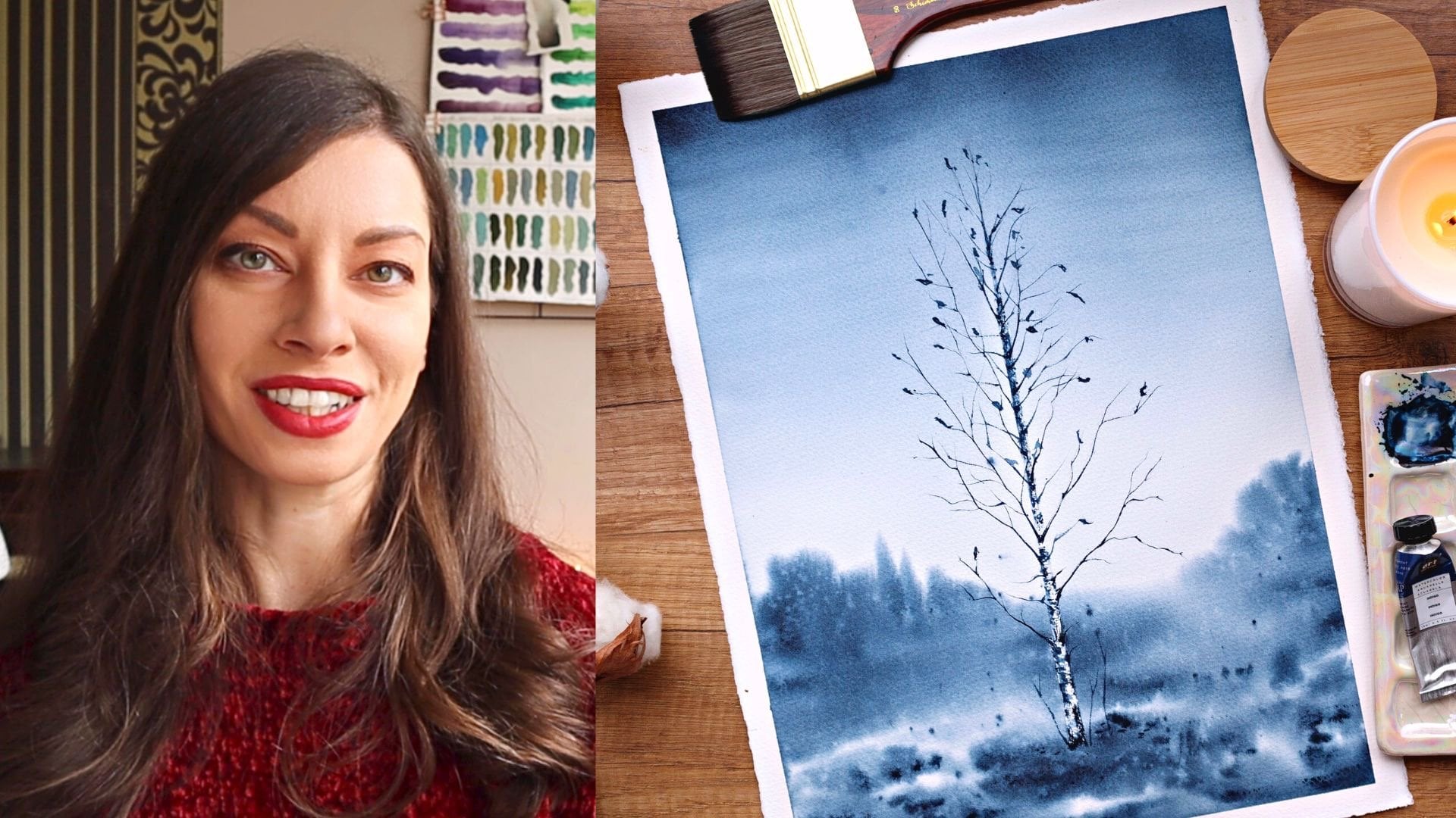
mesmerizes. Hello there. I'm Alina, a seasoned cal artist and fashion photography
enthusiast. Over the past six years, I've been consistently sharing my artistic journey
on social media. Throughout this time,
I've experimented with various tips and tricks trying
to find what works best. However, I reached a
point where I realized my photos didn't match the
brilliance of my artwork. Seeking improvement,
I enrolled in the best in person photography
course locally, completing both beginner
and intermediate levels alongside an entire module
dedicated to photo editing. There I had the
privilege of learning from some of the most
accomplished photographers in my country and reaching
my photography process with invaluable professional
tips and practices. I combine my love for painting
and presenting migrations, and today I'm eager to share
my knowledge with you. By mastering the art of capturing high quality
photographs of your paintings, you'll not only showcase your work more professionally
and effectively, you'll make a greater
impact on your viewers. Professionally
presented art not only establishes you as
a serious artist, but also significantly
increases your chances of attracting a broader audience
and potential buyers. Thanks to my high
quality photographs, I've been able to
attract more than 100,000 followers on Instagram
and sold many paintings, much more than I
sold on C and got the opportunity to
collaborate with leading brands in
the WCL industry. In this class we'll dive deep into the art
of photography, what call masterpieces
for social media. I'll share my best practices, offering insights into
capturing beautiful, brilliant photos using
just your smartphone. No need for expensive
equipment, just your phone. Well unravel the key
elements essential for an appealing photograph,
lighting, composition, and styling, and I will
share numerous examples from my practice that you can easily incorporate
to suit your style. By the end of this journey, you'll possess the
skills to capture striking photographs
of your paintings ready to be shared
with the world. Whether you're bidding
what call artists, eager to enhance your online
presence or a seasoned creative looking to breathe new life into your
artful digital sw case. This class is for you. If you find yourselves grappling with the challenge of
making your art and out in the saturated
landscape of social media, you're
in the right place. This course is designed for artists who are passionate
about their craft and ready to amplify their impact by mastering the art of
photographing masterpieces. Get ready to embark on
a visual adventure. Join me in this
comprehensive guide, and let's transform
your artistic vision into a captivating
digital showcase. In the next video, I'll give you a more detailed overview of the quest and
the final project.
2. Class + Project Overview: Welcome back in this video. I'll give you more details on what you will
learn in this class, as well as your final project. First, we'll discuss
everything you need in this class in terms of
equipment and props. I'll guide you through
the essential equipment, focusing on your smartphone, the artwork itself,
and optional props. We'll have a separate
video dedicated to the exciting world of
props and later on, we'll explore how to choose them wisely to enhance
your compositions. We'll then tackle the importance of setting up a
dedicated workspace, creating a consistent setup
considering natural light. Plus we'll discuss
the significance of background selection and
enhancing lighting on a budget. Now let's delve into the
heart of this class. Lighting composition,
and styling are the backbone of creating captivating flat
lay photography. Effective use of natural
light, thoughtful composition, and intentional styling can transform your artwork
into a visual masterpiece. Lighting enhances colors and details composition guides
the viewer's focus, and styling creates a
cohesive visual theme. Mastering these ments will
empower you to present your what call art in the best possible
light, quite literally. In the lighting
technique section will harness the power
of natural light. You'll learn its advantages
and how to sweep up your natural light
photography so that you capture your beautiful artwork
in the best possible way. Composition part is
where the magic happens. We'll explore composition
rules, k elements, placements, and techniques for creating depth in flat lays. I'll discover how to use visual flow to craft visually
standing compositions. As we transition into styling, I'll introduce you to the
world of automatic styling, minimalistic approaches
and the balance between props and artwork. Gain insights into selecting props and creating
harmonious visual impact. Now you might be wondering why we're placing special
emphasis on flat lays. They offer a unique
and effective way to showcase your art. By capturing your artwork
from top down perspective, you eliminate
distracting background, ensuring your masterpieces
take center stage. The clean focused and immersive visual
experience they provide is ideal for displaying intricate details
and vibrant colors. Now, let's talk about the
exciting class project. You'll apply everything
you've learned to capture standing photograph
of your artwork. We'll walk through each step
and by the end of the class, you'll have a digital
showcase that reflects the true beauty
of your equations. I can't wait to see the incredible artworks
you'll create. Are you ready to dive in? Let's get started.
The next video, we'll go over the equipment that you'll need for this class.
3. Equipment: Let's dive into the
essential equipment you'll need for this class. As promised, you won't
need a fancy camera. However, if you
happen to have one, feel free to
experiment and compare results to find what
suits you best. For this class, I'll
be using my iPhone 13, just a regular
version, not the pro. We'll stick to the
basic camera app that comes with it
and for editing, we use Snap a free app
available for both red and IOs. Of course, you will need an actual artwork to photograph.
The size doesn't matter. While my expertise lies
mainly in water colors, I found similar techniques
applied to guash, all pastels, pencils
and markers. However, I haven't worked extensively with
acrylics and oils, which may present
some challenges like glare, for example. For now, I recommend following along with the flat Mt artwork. One question that often
comes up is how to address word paper when
painting with what color. Since this medium involves using a substantial
amount of water, the paper tends to dry
unevenly and with the wavenss. Here's my trick for
strengthening the paper. I start by spraying the back side of the
paper with clean water. No need to worry, spraying the back won't
affect your artwork. Once I sense that the paper has absorbed an adequate
amount of water. It doesn't require much. I place it on uneven surface
and adds on weight on top. This could be a large
book or sketchbook. Typically, I use
my plastic board and for additional weight, I place my laptop
or canvas lamp, both of which are quite heavy. I leave it like that
until the next day. When I remove the weight, I'm left with a nicely flattened painting ready to
be photographed. When it comes to props, we'll have a
dedicated video where I'll share plenty of ideas. If you don't have anything
ready, no worries, I also provide suggestions for different backgrounds,
but the start, your table, kitchen counter top, or even the floor
will work perfectly. Gather everything and let's start capturing those
beautiful photos.
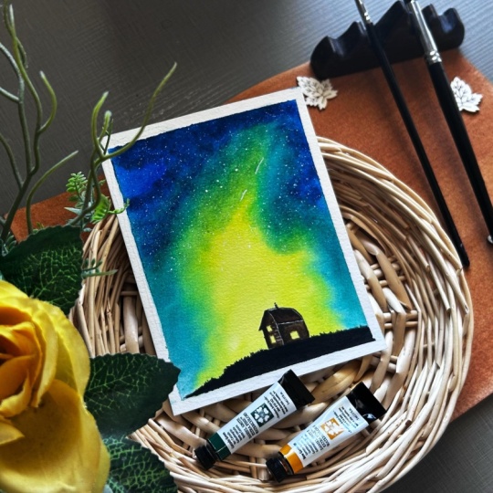
4. Props: In this video, let's dive in the captivating world of props. I find immense joy in
selecting diverse props, each time, aiming to find a perfect match for my
painting and enhance its mood. Now, a little heads up, I often indulge in
using numerous props, sometimes to the point
of feeling at crowded. We'll delve deeper into this aspect in the styling
and composition videos. For now, bear in
mind that you have the creative liberty
to make your props work precisely as your envision. Whether you prefer a
minimalist approach or a more elaborate setup, what time you'll craft
your distinctive style. Returning to our primary focus, I've categorized the props into six different groups and
we'll explore each one. First, of course, are
the actual supplies that you have used
for the painting. Let's start with the paints. No matter if you use paints
in tubes or in pants, pencils or markers, these are great prop to
add to your flat last. People want to see the materials that you have been working with. You can choose just a couple
of colors that will match the painting best or
add the entire palette. A great way to double paint as a probe is to
use the palette, but take out some of the pants. If you have a swatch card in the pallete, you
can use that too. A little trick I like
to do when using tubes is to unscrew the cap
off one or two of them. This way, you get an
additional elements, the cap, but you also add more
dynamic to the shot like. This is your actual
painting setup and you have just
finished the painting. One time I even pulled
a little bit of paint, and then I thought I
could use it in the shot, it adds so much to the
artistic to your vibe duchp. If you're using paints in
a custom made palette, definitely use it as a prop. It can oftentimes spark conversation about
the colors you're using and add a pop of
color to your flat lay. Currently, I'm using this
large ceramic palette and I love to include
it in my shot. It takes a lot of space. But I use just a little
bit of it in the frame. And even before I
got this palette, I love to include my
palettes in my flat lace. What the colors can create beautiful blands on the palette, plus the colors would match the colors of your
painting most of the time. This way, you add to the
color balance in the photo. Here is a trick. If the palette doesn't look very appealing, you can spray some water on it and let the colors
mingle for a while. After that, you'll have a
perfectly photogenic palette to add to your flat lace. Let's move on to brushes. In the rare case where I forget to include the
brushes in the frame, I feel like it's a huge miss. After all, they're one of the biggest symbols for
artists and create flife. Don't hesitate to include
them in your shots. There are some amazingly
beautiful brushes on the market, work of art themselves. You can choose if
you want to place them so that their log
is visible or not. But more on the precess and replacement in the
upcoming videos. Paper is a bit hard to include in a photograph,
but not impossible. You can use the cover of the block or the
protective paper, most brands put below the cover. You can also use
just a clean sheet from your supplies as a way to add another element or separate the flat
lay into areas. Some of the not so
popular supplies to include in a photograph
worked very well for me, like the water jar
or the paper towel. The thing with those is that
they're not always pretty, but when they are
definitely include them in the frame as they can add
a lot of visual interest. Okay. Other things that you
have been using like pencils, rasors masking fluid, or anything else that was
a part of the process. You can include as long as
it's not too distracting. After all, you want to keep a consistent vibe
throughout the photograph. This takes us to the next
props group, other supplies. By that, I mean
other painting or office supplies that you didn't necessarily use to
paint the artwork, but they match the mood and
the style of the flat lay. This can be painting, swatches, notebooks,
paper clips, brushhlders, palette
knives, scissors, and whatever else
you can think of. Just remember that
it needs to match your general idea
of the photograph. One of the best ideas that
I can give you here is to use paper that is different from the paper
you're painting on. It can be any kind of paper, but my favorite air craft
paper and rice paper. You can even use a baking sheet, it's cheap and easily available. You can crumple it for a
more authentic look or even stack a few different kinds of papers and use that
as a background. You can also use that to fill
an empty corner or to break the pattern of your
original background for more visual interest. You can experiment a
lot with paper and there are so many different
types of paper on the market. With that, we can
slowly transition to the next group of crops
and that is textiles. I don't use that a
lot for my photos, but the possibility
here is truly endless. You can use sheets,
scarves, pashmina, blankets, stable clothes,
sweaters, and whatnot. You can even go and search in
the specialized stores for some beautiful
pieces of cloth and buy just a small piece
to add to your setup. Textile gives a feeling of
warmth, coziness, and flow. You can shape it
however you like, and same as the paper, you can use it as a background
or to fill a corner. You can really let your
imagination wild here. In this group, I would also like to include ribbons or treads. They are perfect for adding dynamics and to fill empty
spaces around the paintings. The next group is the core. Usually, when I go to
a decoration store, I'm always looking for stuff that I can include
in my flatlay. There are tons of different
stuff that you can use. After all, this section can
include basically anything. But here are M favorites trays, one of the most used
props of all time. You can fill them with
paint brushes, food, like cookies or
sweets, pine cones, and any little trinkets that will match the mood
of the photograph. You can even stack them to add more dimensions and
layers to the flatlay. My favorite are
the wooden ones as they bring warmth
and natural look. But I also love ceramic ones, including play white trays that can match any style
or color harmony. Next are fat frames. You can use them as
actual foot frames as fillers or as a part
of the background. My favorite is this one because
of its gorgeous pattern, as well as this one because
of its choicy green color. Candles. Another prop you can use to a a filling
of form ten cousins. You can light them
or blow them seconds before the shop and
use the smoke instead. In this group, I will also
add any kind of incense. I love to use H and
Palo Santo at home. Sometimes I include
them in my shots. Of course, they often come with beautiful trays and
candle holders. The variety here is huge boxes. I have a few pretty
wooden boxes, and I love to use
them now and then. You can also use ceramic
boxes, jewelry boxes, or just anything that
you have at home or can get at an
affordable price. You can fill them with
paints and brushes or just include them with the lit on it gives a sense of
adventure and mystery. Not exactly a part of the decor, but you can also use books and magazines in your
flat lace as well. You can lay them open, place the artwork on top or just use them
to fill a corner. The next group is one of my
favorite things from nature. Here, the variety is huge. Starting with the classic
option, flowers and plants. You can use fresh
flower octes and place them in the face or
just cater them around. I sometimes pick up flowers
from the grocery store and they almost always end
up in one of my shots. Dried flowers and plants
are another option. I have the small
lavender bouquet and these dried flowers that
I got from a press. I have also ordered these lotus pots from
a local flower shop. One of my all time favorites
is this cotton branch, which I also got
from a flower shop. I also love to pick up different treasures from
our walks in the forest, like dried pots, pine cones, chestnuts, and tree branches. I have even used build tree bark and most for my flat laces. You can also use berries, jet leaves, and even your
indoor plants and sculan. Cells and stones from the beach. I love to keep the
exclusively for my seascapes. I'm lucky enough to
live by the sea, so I often get the
opportunity to go and search for some sea treasures
or pretty rocks. Okay. Here, I will also mention
the only crystal I have, the stist which is obviously
not from the beach, but it also wonderfully
complements some of my paintings. One curious items from my
collection is this piece of wood that I found on
our trip to Lake Como. It doubles as a brush holder. Same as this rock that my
husband found on the beach. All this to say sometimes
you can be surprised, but what you can
find out in nature. The last group I want to talk
about is food and drinks. This one is pretty
self explanatory, but some classic examples are your coffee or tea, cookies, doughnuts, chocolates,
pastries, fruits, cakes and anything
that will look good in a picture without
being to distract. These are the props I
use in my practice. I hope this gives you some
ideas and inspiration. We'll discuss tying
in upcoming videos, ensuring that you not only have a fantastic collection of props, but also know how to
use them effectively. In the next video,
we'll explore setting of photography space at
home. See you there.
5. Setting Up a Photography Space: In this video, we'll talk
about how you can set up a small photography space
in your home and what to do if this is not entirely
possible at this point. I'll give you some tips. I'll tell you about my space, and we'll also talk about the different
backgrounds you can use. Why it's important to have a
specific area designed for photography is the same with having a space
to paint or draw. You need a corner in
your house where you can minimize distractions so that
you can focus on your work. You need to make it convenient
for you to work there to have your supplies ready so that you can
minimize attraction, and it will cost you less effort to actually sit and do the work. If your table is in this room, the supplies are
in the other room. If you use the space for something else and you
have to clean it up f all this will take a lot
of time and effort to set up so you won't be as
motivated to work and create. Each year I
experienced this when we move to a place in the
mountains for the winter. My husband is working there, and it is super hard to find a nice place where
dogs are allowed. So each year, it's a
challenge to set up my space. It's never convenient
and it leads to my motivation to paint
and shoot dropping. On the other hand, my
home studio is amazing. It's large and spacious, even though it's
in my living room. I have enough space to store all my stuff and it
has a nice light, perfect for filming or
making nice photographs. It's convenient when
your painting table can be used for photography too. This is actually the
ideal case because this way you don't need to move
stuff to another location. You just have all
your stuff there. Bottom line, easily, you'll have your photography
space where your painting space is and that should be a place
with good natural light. We'll talk more about light in the next video, but for now, just know that natural light is the ideal light
source as it gives you vibrant and true
to light colors. When you use diffused
natural light, you get even illumination, which means no hard shadows. Don't take photos
using artificial light except if you have professional
photographer lighting. Now let's talk
about backgrounds. Ideally, you'll use
as a background, your drawing or painting
table so that you won't have to most from
one place to another. But of course, that's
not always an option. So here are a few ideas for you. If you don't have a
painting table or its surface is not suitable
to be used as a background, You can use paper as we've already discussed
in the previous video. The good thing about that is that it's
relatively cheap and you can change it
as often as you want or if it gets daint. Another option is to go to a hardware store and look
for these vinyl stickers. You can stick them on
your tabletop and again, change them as
often as you want. Some of them are really
nicely made with texture and colors that look like
real wood or marble. In harder stores, you can
also find all kinds of fold surfaces like these
plastic panels, for example. If you feel craft tea, you can take a simple board
and some paint and make it. Just remember that background
should be neutral this way, your painting and the
props will stand out. My favorite solution
for when I don't have a nice table surface is
either to shoot on the floor, which I've done many times or to buy one of these photography
background veils. You can roll them up and take them wherever you like place them next to a window and then remove them after
your photo session, take them to a place
your temporary stain or place them on
top of your table. This way, you'll have
a nice consistent look for both your reels and photos, and you won't have
to move it around. So as we prop the opportunities here are a lot so
check your options. Take the ones you like the
most and see what works best. You can also switch between
two or three backgrounds. But remember that it's better to keep it consistent so that your visuals become recognizable and you don't confuse
your audience. So to summarize idea
you have a table, clear space on the floor, or a countertop
next to a window. You should be able to keep your equipment and
materials nearby. If you don't, you
can always opt for some of the background
options we went through and either upgrade the
convenience surface or use the background to create
your own portable studio. Now our next video we'll discuss lighting
techniques. See you there.
6. Lighting: Okay. Welcome back.
In this video, we'll have a more detailed look at the first of
the key elements, and that is the lighting. As I already suggested
in previous videos, it's best if you can shoot
your photos in natural white. It gives the best
results when it comes to bringing out the true colors
and details of your work. It's also the cheapest option. Professional lighting
equipment is quite expensive. Regular days clamps or smaller options just
won't provide you enough quality and
quantity of light to shoot good looking polished
and professional photos. If I already persuaded you that natural
light is the best, let's discuss the
optimal times of day for capturing artwork
in natural light. You might have heard
already about golden hour. Golden hour refers to the
period of time shortly after sunrise or before sunset when
the sun is low in the sky, resulting in warm and soft cold and tones in the natural light. This phenomenon creates a flattering warm glow
with long shadows. It usually spans
more or less an hour after sunrise and an
hour before sunset. While the golden hour provides a beautiful warm
quality of flight, that is often desirable for
certain types of photography, including landscapes
and portraits, it may not be ideal for
capturing artworks. The warm tones
during golden hour can indeed alter the
colors of the artwork, potentially shifting them
towards warmer shades. Another time of day
you may want to consider to avoid
is the blue hour. The blue hour is a
period of the day that occurs shortly
before sunrise and after sunset when
the sky takes on a deep blue hue with a mixture of colors such as co and purple. These lighting conditions
can significantly impact the way artwork
appears in photographs. The colors might
appear cooler or more neutral than they would
under natural daylight. Additionally, the
lower light levels during the blue hour
will lead to under exposed or dark photographs which will then make the editing complicated and will most probably lead to
unsatisfactory results. What is the perfect time of date to capture your artworks? For accurate color
reproduction of artworks, photographers often prefer more neutral lighting conditions such as during the day. The optimal times for
capturing artwork and natural light are typically during the morning
or late afternoon. During this period,
the snow light is softer and the tangle helps
minimize harsh shadows. This soft diffused light enhances the artwork
details and colors, providing an ideal
setting for photography. Another thing to consider when shooting in natural light
is the light quality. When it comes to light quality, consider whether it's
harsh or diffused as it significantly impos
the overall mood and texture in your photo. Harsh light may create strong
shadows and highlights, while the fused light offer softer more even illumination, particularly beneficial
for showcasing the subtleties in your artwork. Here a lot will depend on the
direction of your windows. North facing windows
often provide consistent diffused light
throughout the day, making them an
excellent choice for capturing the true colors
and details of your artwork. On the other hand, salt facing windows may introduce
more direct light, which can create harsh shadows. There are some
tricks that you can apply to diffuse harsh light. You can use short curtains or cover the windows with a
thin white patch sheet. Lastly, let me give
you a quick tip for achieving a more evenly
lightened setup. You may have seen
these things on potshots or inside
photography studio. They're called
reflectors and are usually used on the opposite
end of the light source, as to bring back some of the
lights to the main object. It reduces the shadows and
creates more even light. They're relatively
cheap, but you can also use just a large
white sheet instead. Making sure that it is
snow white so it reflects more light and place it as close as possible
to your setup, but outside of the frame. With this inside, you are equipped to harness the power of light to showcase your artwork and the best possible light. Meet me in the next video where we'll discuss composition.
7. Composition: Welcome to the
composition video. In this lesson, we'll explore a variety of
techniques to elevate your flotlay game turning your works into stunning
visual stories. Let's dive in and we'll start right off with some
basic composition rules. Start from the main piece. Every composition should have a focal point, the hero piece. Begin building your flotla
around the painting, ensuring grabs attention and sets the tone for the
entire composition. Start from the largest item. After we have decided on
your artwork placement, it's time for the props. Begin with the largest
item in your collection. This helps establish
a framework and allows for easier placement
of other elements, ensuring a balanced and
visually appealing composition. Use out numbers. O numbers create a sense of
balance and harmony. Incorporate elements in groups
of trees or fives to add visual interest and avoid symmetry that might make
the composition static. That means three
pans, five, two, seven chestnuts and so Now
let's discuss visual flow. Visual flow refers to the
weigh elements within a composition guide
the viewer's eye through the artwork or image. It's about creating a path for the viewer's gaze to follow, leading them from one
point of interest to another in a deliberate
and engaging matter. Here are some main
principles and rules for achieving effective visual
flow, leading lines. Use lines within the
composition, such as brushes, pencils or edges of objects to lead the viewer's eye toward the focal point or main subject. The call is to make the
viewer's gase travel around the photo and then come back from where it started. Start again and keep him
engaged as long as possible. This also means
we shouldn't give them an easy way out
of the photograph. For example, leading
lines that leads to empty space or just straight to the edge
of the photograph. Depth layering. Arrange elements
within the composition to create depth and dimension. This can be achieved
by overlapping, arrange objects in a way that they overlap
each other slightly. This overlapping
creates a sense of spatial relationship between the elements
in the flat lay. Size gradation, Arang
objects are varying sizes within the flat lay.
Framing element. Introduce framing
elements like the edge of fat frame or a sheet of paper to enclose the composition
and provide the sense of theft within the
confined space contrast. Utilize contrast
in color, texture, or size to make certain elements stand out
and attract attention. This contrast helps guide the si toward specific
area of interest. Repetition and rhythm. Repetition of objects
or colors to create a sense of rhythm and continuity throughout the composition. This repetition can help guide the viewer's eye from
one area to another. As we've already discussed, if you repeat elements, make sure to use
numbers, balance. Strive for visual balance by distributing elements evenly
throughout the composition. Balance can be symmetrical
or asymmetrical, but should create a sense
of stability and harmony. There is no specific measure
of checklist for that. It's more of a
matter of feeling. Try to look at your
photograph p distance, ignore the small details, and ask yourself if there's anything that
makes it a bit of. Maybe there's too much color in one corner or too many
objects on one side. Maybe the painting is too tilted or you have a large
empty space somewhere. If your eye keeps on coming to the same
area again and again, try rearranging the elements
more evenly and check again. Remember, achieving
visual balance is not just about following
a strict set of rules, but also about trusting
your instincts, and honing your eye
for composition. Take a step back,
assess your composition from a distance and
make adjustments as needed to ensure that every
element contributes to the overall harmony and
impact of your artwork. With these principles in mind, you're well equipped to take your white color art
photography to the next level. Join us in the next video as we delve into the
art of styling, where we'll explore how to
enhance your compositions, trough strategic prop selection, thematic styling, and more.
See in the next lesson.
8. Styling: Welcome back creative
friends in this video, we're diving deep into the
world of visual aesthetics, exploring the transformative
power of styling. From selecting the
perfect backgrounds to strategically placing props, we unravel the
secrets to creating visually cohesive and
captivating flatlay that showcases your artwork in
the best possible light. Let's get started. Before
diving into styling choices, it's essential to understand
your own artistic style. Your unique creative
voice should guide your decisions whether it's
through color palettes, themes or subject matter. Embrace your personal flare and integrate it into the visual
presentation of your art. Here are some tps on
understanding your styling style. Reflect on your preferences. Take some time to reflect on your personal preferences
when it comes to aesthetics. Consider the colors, textures, and themes that resonate
with you the most. Your styling style
should align with your personal taste
and artistic vision. For example, I prefer natural background
with organic texture, I love to use pros
that come from nature or such that bring warmth
and gentle aesthetic. I love to scatter them in
a seemingly random manner, instead of arranging
them in a grid, and I usually love to use a lot of them compared to sticking
to a minimalistic work. Draw inspiration
from other artists, photographers, and stylists
whose work you admire. See what visual
styles excite you. Imagine what would bring
you joy, and of course, what would match
base the style of your art while still staying
true to uronic style. Experiment with
different styles. Don't be afraid to
experiment with different styles
techniques and aesthetics. Try incorporating various props, backgrounds and
compositions into your photography to see what
resonates with you the most. Keep track of what
works well and what doesn't and use this feedback to refine your styling style. Second inspiration.
Trust your instincts. Ultimately, your
styling style should be a reflection of your
creative instincts, and artistic intuition. Trust your gut feeling when
making styling decisions, and don't be afraid to
experiment and take risks. Your unique perspective and creative voice are what will
set your photography apart. Okay. Let's get
more practical now. If you're not sticking to the same background for
each of your fat list, the first thing you need to consider is which
background to use. When selecting
backgrounds for your art, consider options that complement
the colors and themes. Texture surfaces,
neutral backgrounds, or a thematic
backgrounds can all enhance the overall
composition providing context and visual interest without overpowering
the artwork itself. Here are some examples from my work here because the
work is so bright and flashy and I decided to use a soft natural background to
balance the bright colors. Here I used the contrast between purple and yellow to make
the work stand out more. Here I complemented
the moodiness of the artwork with this
plain gray background, which is actually the seventh
floor of our living room, which was exposed because we
were making sow innovations. I match the theme of my painting by using this bamboo
mat as a background. Here my background is basically a book and this goes
well with the artwork, which is actually a bookmark. Here, most of the
background is my trade, which matches the postal
color palette of the artwork. Let's now move to the props. Props can play a
significant role in enhancing the narrative and
mode of your artography. However, it's crucial
to select props that complement rather than distract
from the main artwork. Additionally, props can be used strategically
to add pops of color or create visual interest without competing with
the main subject. As we already discussed strategically
placing props within the composition can help guide the site and highlight key
features of the artwork. Thematic styling can add depth and storytelling to
your art photography, Aliign your styling choices with the subject matter or
style of the artwork, creating ahesive narrative
that engages the audience and enhances their understanding and appreciation of your work. Achieving harmonious
balance between props and the main
piece is essential. Avoid quarter by
carefully curating your props and ensuring they complement rather than
complete with the artwork. Keep the focus on the main piece while using props to
enhance its visual impact. Minimal styling can offer a
clean and sophistic look, emphasizing the beauty of otical art without
overwhelming the composition. Embracimlicity in
your styling choices, allowing the artwork
to speak for itself while maintaining a sense of
elegance and environment. Since styling is best
demonstrated through examples, in the next video, I'll be providing practical
demonstrations. You'll witness firsthand how different styling
choices, in fact, the overall composition of photograph as a
guide you through my Tough process while styling different
artworks. Statement Okay.
9. Demo #1: Desert: Hello. Welcome back
in this video, and in the next few videos, I'll do practical demonstration, a little workshop where I'll
arrange different flat lays. I'll take some photos, and
then we'll dit them together. You'll be able to
see my process, how I pick the props,
how I arrange them. I try to pick
different paintings so that you can see
different scenarios. So take what works for you, make it your own and have fun. We'll start with this
desert landscape. It's a relatively
small painting. The way I see things. When the painting is small, we need to include in the shot a nice portion of
the space around it. Otherwise, we'll include
just a little bit of the objects around it like the tip of a brush or
a small part of a palette, and we're losing the context. Whenever I need to include
more of my table surface, I'd like to introduce
some kind of separation just to
make it less boring. The way I'll do that now is
by using this craft paper. I've crumpled it so that
it looks less pristine, more natural vintage, even. I didn't bother cutting
it with scissors. I think this uneven edge is
giving it even more charm. I'll go step further in adding more interest to the background by using one of my photo frames. And this is not a
photo frame that I bought specifically
for my fat list. You see that it
has a photo in it. This is me and my husband at
one of our friends wedding. It sits on a shelf, and whenever I need it, I just take it, and then I
return it after I'm done. I'll place the painting like that. You see what I did there. First, I place the
paper tilted like this, then the frame is tilted
in the opposite direction, and then the painting is
again tilted like that, but it follows its
own diagonal line. If I were to place them all following the
same diagonal line, it will be a little
boring, I think. We're creating a
dynamic by arranging the elements to follow
different diagonal lines. Now that we arrange the painting
and the larger elements, let's start with the supplies. I painted this with the tropical palettes
by art philosophy, and here I have the swatch card which I can use in the flat. I'll place it here for now. Um, And so here I have some mixes from my last painting
with this palette, and obviously the
colors are different, so I can't use it, but if it was from the
same painting session, then I will definitely consider
showing the palette too. In this case, we'll include
some separate colors. For example, I can take out the colors I used for the dunes, and one more. Let's see. How about this beautiful
pink for pop color? I'll close the lit and
I'll place it here. We want to cover the photo
inside the frame, of course. Okay, and these I
want to separate, so I'll have two
of them up here. And the pink here below. Let's include some brushes too. But first, let's
wet them this way, it will look like I've
just painted this piece. When they're fluffy like that, it's more obvious that
all this is staged. I mean, we all know it's staged, but let's make it to believe how they do
it in the movies. So I wet them, I
shape them a bit, and let's arrange them so that they point
towards the painting. Now, this pan here
looks awkward, so we'll find another
place for it. Like here, for example, or here, even better. When we repeat the same
elements in a composition, the viewer's eye can't help but track them around the shot and make this visual connection between them and
what's between them, of course, our painting. That's nice little trick. Now we need something around
the left edge of the photo. Let's try with this box. Its color is matching the color of the d
and it's adding to this vintage vibe that we created with the paper and the natural looking phot frame. And lastly, for a touch of
romance and fair tail vibe, I add some dry rose petals. I have these forages
and honestly, I don't remember
where I got them, but it's always nice to have some small objects scattered
around the flat lay. I think I'm happy
with the composition, so now I'll take a shot. I'm getting as close
as possible without cutting too much of the
objects around the painting. Here I have the leg of my
tripod, so I'll remove it. And I'll take a shot. Let's now open in the
snaps tab and crop it to see if we need to move
some of the elements around. This one is going to be square
because it's a landscape, and if I cut it in four by five, which is now the
recommended format for Instagram photo pos, it will look a little awkward. So I'm cropping it by
dragging the corners, and I'm leaving some space
around the painting. I'll also make sure
the elements around the painting are not
cropped in a weird way. Like leaving just a tiny part of them visible or
getting a brush hit, cut in half, such things. In our case, we see that the
object on the left is a box. We see a good portion
of the brushes, the palette, the swatch card. It's clear what each of
the objects is and none of them is cut from the
frame in an awkward way. So I like this shot a lot, and now I will max more. One from the site.
One detailed shot. And one more creative
like I want to include some of the supplies
in a more artistic way. Basically, these are
the four types of shots I make for my Integra
pos, and that's it. We'll edit it together later, but first let's photograph
the rest of the paintings. You in the next video.
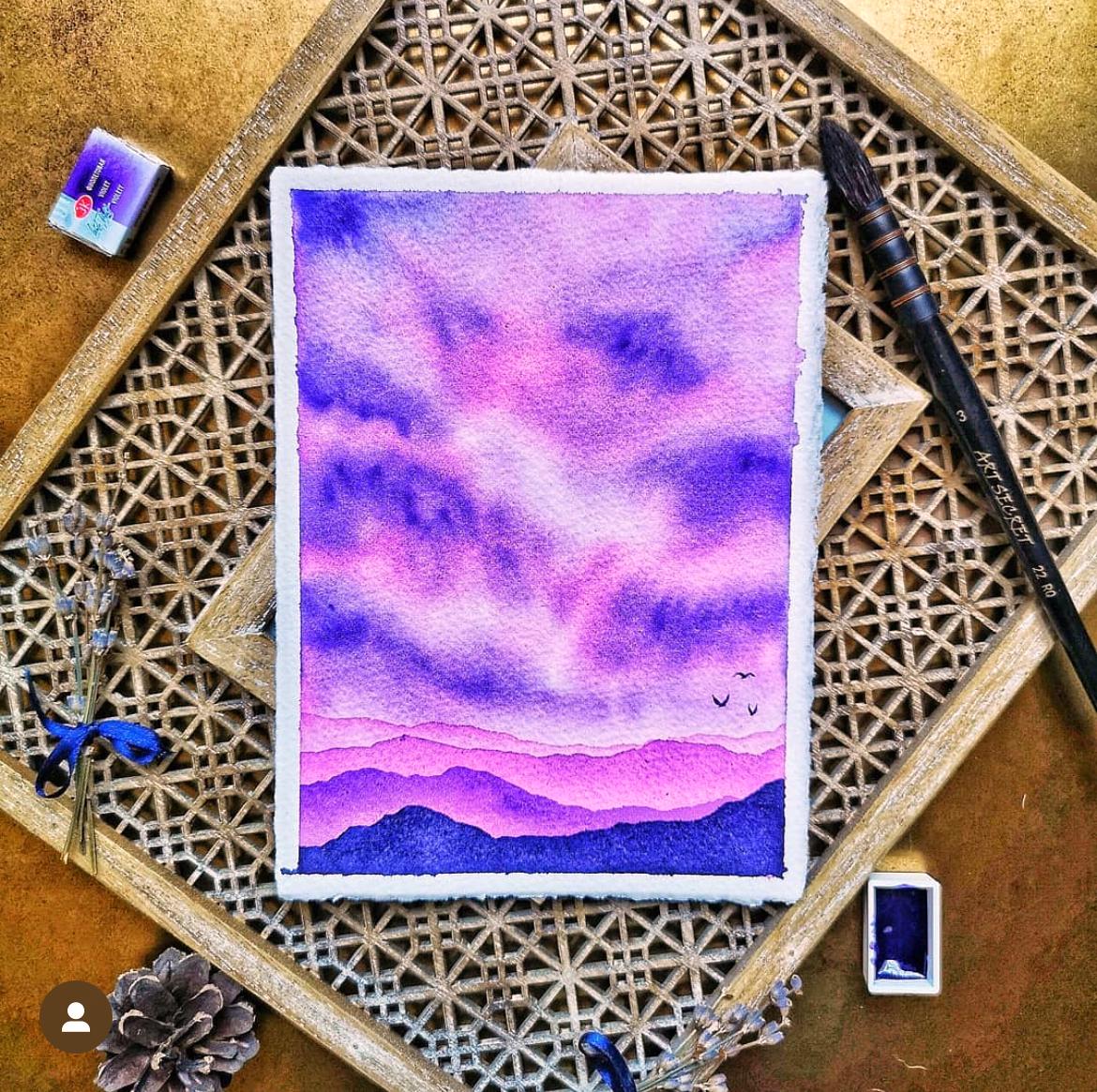
10. Demo #2: Pastel Sunset: Welcome to the second
demonstration in our workshop. In this video we'll tell a flat lay for this
pastel sunset. It has this light and
dreamy vibe about it, so we'll have to emphasize
it with our props. My plan is to use the props
in pastel colors as well as wooden objects that will match the table surface and the
warm brown in the distance. Let's start by checking how
this wooden tray would look. This painting is a bit larger
than the previous one, but it's still a
landscape format, which means in a square crop
will have more of the space above and below exposed,
so we need to fill them. As for the sites, the edges of the shot will
be pretty close. So I fill the bottom part. Now I need to add something
to the upper part. Let's try with this brush rest. And by the way, whenever you're using more than
one wooden object, it's nice if their
color is the same. Like this brush rest matches very well the color of the tray. Unlike this box, for example, which is more light brown. Now let's add a brush
to the brush rest. Okay, now that the larger
elements are sorted, we move on to the supplies. Here's the palette I
used for this painting. And again, it has the
swatch card inside, so I'm going to use it. Overlapping the objects
to create dimension. Again, I have used
this palette for another painting so I won't
be able to include it open. I'll have to take out
some of the pants. Let's see. I'll take the yellow. The purple. They complement
each other very well. And one more, maybe this pink. Here I have this patel
pink brush raised, and now I'll use it. It matches very well the
colors of the photo. Let's give it a brush. But not pointing
outside the frame. This is better. As we said here on the sides, there will be less
space visible, but it's still nice to have something to frame the painting. And because the colors
are soft and light, I think my favorite
cotton branch will be a good match
to the overall vibe. I place it here. The edges of the shot
will be pretty close, so there will be
just a small part of it included in the frame. And now we need something here. Oh, I know, let's
try with my purple. It matches the color very well. Let's take. This area here is too busy, so I'll remove the swatch card. And place it here. Now, I feel this
area is too empty, so I need to add
something there. Let's try with this brush. Yes, that's better. Let's take the other photos,
one from the side. One that focuses on the
supplies, and the detailed. For that, I need to
remove some of the props. And we're done. In
the next video, we'll try something
different to you there.
11. Demo #3: Monochrome: In this video well style this beautiful
monochrome painting. It's pretty minimalistic
and delicate, so we don't want to distract the viewers with too much props. We'll keep it simple.
Because this painting has cold and winter vibes, I think would be nice to bring a little
coziness to the flat lay by adding props that
peak warmth and coziness. But let's start
first with the tube of color that I used
for this painting, this indigo bird philosophy. I'm leaving it here.
To add some coziness, I'll use again my
favorite cotton branch. Now, let's add some worth. I have here this white candle. It's very minimalistic looking, no logo, no patterns
are lighted. And the lit is wooden and
simple too, so why not use it. Time to add some brushes, one here on top,
and these two here. They point slightly towards the painting and then
to the cotton branch, so if the viewer follows
their direction, the gases will stay
inside the frame. What else can we add? Since it's winter
and this is a tree, we might add some pine cones. I have three pine cones here, each is different size, which is a nice variety. I'll turn this one on the side to make it more interesting. And this one here on top. Let's take shot. This painting is in
portrait format, so we can it in four
five Instagram. So now, I'll crop it and snaps just to check if I need
to correct something. I think it's perfect.
Let's take the rest of the shots. Side view. Focus on supplies. And the detail so. And that's it.
12. Demo #4: Leaf: While come back in
this video will create a flat lay for
this leave illustration. For paintings like this where you have an object on
a white background, you can get more creative
and overlap more. You can arrange your props
all around the object. For example, in my case, I want to hide this
much over here. Let's get started. This
one was painted with these liquid we colors which
I keep in this wooden box. And since the box is pretty,
we can use that too. Let me just pick some of
the colors that I use. This painting is in
portrait format, so we'll focus more on
what we put on the sites. And by the way, I'll leave the past of my canvas
lamp in the frame. It's pretty enough,
but it's also heavy, so oftentimes I
leave it as a probe. Okay, so I'll place
the box here to cover the smudge here I have a small sketch book where I swatch these liquid watercolors. So let me just find
where exactly. And you can just make some
swatches on a piece of paper. It's not necessary to be in a
sketch book. Here they are. So I'll leave it
here on the side. Since this is an autumn leaf, I think it's appropriate
to add some dried leaves. I have these dried pots here, so I'll arrange them
around the painting. Another here for more dynamic. Let's use a palette this time. I'll put a few drops
of the paints on it. I love to use palettes as prop. It's just hard to do it when you have already washed it
after the painting session. But for this painting, we can easily add some
drops of color to it. Okay. I'll just pray them with some clean water. Cut. Okay, let's see. Great. Now let's
arrange the potles. In this area here,
I'll cover with my hand holding one
of the droppers. Okay. I'll just place this bottle over here. And whenever you include
your hands in the shot, make sure that they are
in a natural position, it would have been
nice if my nail polish matched the colors of the
painting, don't you think? You can also add some rings
to make it more interesting. And let's check how it looks
in four by five format. Great, let's take the
rest of the photos. For the detail, I need
to put some things away. And there you have it. We have one more demo and then we are
going to edit those photos.
13. Demo #5: Autumn Landscape: Our last demo will be
this autumn landscape. It's a rather large painting
41 by 31 centimeters. And because the
painting is large, it will be better
if we could find a couple of large
props to complement. Otherwise, there would be too much space around the painting, and we'll need to use a lot
of small props to fill it, which will make the
flat light too busy. Again, I will leave
the base of my lamp. I'll use my large
eramic palette, which I used to paint this. The colors here are from
another painting session, but these here in the well were exactly the same colors
I used for the painting, so they will match it nicely. And here, I have a jar with a very nice collection of chestnuts and a
couple of lot spots. I always use them for my
auto themed paintings. I'll arrange them here
in the upper part. Some more here. For this painting,
I use this brush so now I'll find it
a nice presh rest. Like this neutral one. And again, some dry leaves. I'm so lucky to have this
growing everywhere in my city. This way, we create a nice little frame
or under painting. Here below, I need
something more. I'll move the
palette on the side, and here I can add this pretty wooden bowl and
fill it with some paints. Some final touches. Time to take some photos. And because this one
is rather large, we can take two detailed shots to show it in all its beauty. Okay, now that we have some beautiful photos,
it's time to edit them. See you in the next video. I.
14. Editing: Okay, now that we have
our beautiful photos, it's time to edit them. I'm using Snaps to edit
the photos on my phone. It's free and easy to use
without being too overwhelming. So clicking the icon to open it. Now we need to open the
photo we want to edit, so I click the plus button. Here we have the options
to open from the device, open the camera up, or
open the latest image. Som taping open from the device, and here I see all
my photos or I have the option to see the
albums I have created. Here I have created an
album for all our photos. Let's find our photo.
Tapping on it, and now we can start editing. Here below, we see filters similar to those we
have on Instagram. My recommendation is to forget about them and edit
the photos yourself. The first thing will do
is we're going to crop the photo in the way we want
to share it on social media. I tap tools, and here we see
all the tools that A offers. I'm tapping crop Now we see
some recommended sizes, and I'm going to tap
on four by five, which is currently the
recommended format for photos on Instagram. I can adjust the crop by
dragging the corners. When I'm ready, I tap
the check mark below. This is how it looks in four by five and it's
actually not too bad, but I don't like the empty
spaces above and below. The distract from
the painting and make it look small
and insignificant. So I'm going to the crop
tool again and this time, I'll choose square format. In this format, the
empty spaces are eliminated and the painting
takes the central stage. But now I don't like how the box is almost
out of the frame, so I'm tapping the
x button below, and I'll go to the
under button here. I'm doing my last action, and we're back to the
original format of the photo. Now I can go back
to the crop tool. Pick square format,
adjust it a little bit. And this instantly
looks much better. Now let's work on the colors. First I'm making sure my phone's brightness
is set to maximum. We'll start by correcting
the white balance. This means that we'll try to make the white in the photo look really white because now it has this blue gray greenish t. The white balance to offers us three options
for fixing that. First, we have the
automatic adjustment. You can already see
the difference. When you press this icon here, it brings the photo back
to its previous state, so we can see clearly
the difference. Another option is to use the eye dropper
and bring it over an area of the photo that in real life is absolutely white. For example, I can bring it here over this part of
the label or here. The thing is that these two
options are not very precise, so I prefer to set
the white pant manually using the
third option here. We've got two settings
temperature and t. Moving the tint to the right gives
the pinkish look and to the left he
gets a bit green. Adjusting the temperature
to the right warms up the photo and to the
left ear cools it down. I keep tweaking until
the white looks normal, checking the old version to make sure I'm not going too far. When I'm happy with it,
I click the checkmark. Now I'll go to tune image. Camras often fail to capture the true colors
of the painting, so we need to bring
back the color and vibrancy while still trying to make the
colors as close as possible to how they
look in real life. Here we can try the
magic ones too, which will tweak the
photo automatically, but I prefer to go through
each of the settings manual. In this case, I want to
start with the highlights because I feel they're still
a bit dark and grayish. By sliding it to the right, we make the highlights brighter. Then I'll go two shadows which allows me to work only
on the darkest areas. I'll slide that to the right, which will lighten
the shadows and bring back some details there
as now they're too dark. You can see how this changes the plaque pit box, for example. Now, I'll turn the
brightness step a bit. This gives the photo
an overall brightness. Now, the saturation makes the colors bright and
vibrant when you slide it to the right and takes out the color when you slide it in the
opposite direction. What I don't want you
to do is this turning it up to the max and making
these absurdly flash photos. I'm going to slide it way down trying to match the true
colors of the painting. Something like that.
Dambio setting also work on vibrancy and it also gives the entire
photo this warm glow. If you slide it to the left, it gives us this supermod. I use it very sparingly. And with the warm setting, you can make the image
warmer or cooler, but I've already said the temperature of the photo
with the white balance, so I'm going to
leave it at zero. Now let's check how the photo looks with the current edit. Very subtle changes as I keep saying we don't
want to overdo it. Now I want to go back to
highlights and tweak them a bit as it was the first
thing that I worked on, and with all the other
edits after that, I may find a better
setting for it. When I'm not sure what to do, I just light it back and forth until I find
the perfect spot. I click the checkmark Great now, let's work on the details. Here we have two settings
structure and sharpening. I usually give my
photos on sharpening. It helps bring out the details and makes them look
crisp and clear. The structure gives the texture, so I use it very carefully. I never go over ten. Okay. I want to also show
you the vignette tool. When you open it, it
instantly darkens the corners of the photo and says the outer
brightness to -50. Here we have this
blue circle and we can move it to where we want
the lighter part to be. I'll just turn it down to -100 so that you can see better. It's like a spotlight
for your photo. We also have an inner
brightness settings which allows us to work on the
area with the blue circle. But of course, this is too much. If I use this tool,
which is not always, I stick to a very gentle
darkening of the corners. This guy is the viewer's eye to the lighter area of the
photo where our painting is. Okay, and the last thing I want to do is I'm going to add my Instagram
handle to the photo. So I tap the text icon
and it brings out a sample text which I can
edit by double tapping on it. I'm writing my handle, adding your Instagram
handle to your paintings, ensures proper
credit and promotes your account, and tapoke. Now I can move it
around and change its size. Let's put it here. You have some
options here below. You can change the opacity. You can choose between
different phones and formats, and you can change the color. I usually leave it white. Here we have it. We can
see the before and after. And now we want to save this
new version of the photo. I'm tapping port, and here
again, we have a few options. We have the save option, which will save the edit directly in the same file
you've been working on. But whenever you open it in the Snaps you can edit changes. Then you have save a copy which saves a new file in
your phone gallery. And the last option is export, which also creates
a new file, P, which takes more
space on your phone, but if you have an iPhone, I recommend this option. The other two options give
me some weird results where the photo looks somewhat different than what
I see in the app. So I'll tap on export. You can choose the option
that workspace for you. I get identification that the photo is exported
successfully, and now I can move on
to the next photo. I'm taping open, and it
asks me if I'm sure. Now I can select the next
photo from my gallery. Here it is, I'm crop it first. Again, using the square format. And now we have this option
here where the filters are. It says last edits, and it just applies all the edits we did
in the previous photo. By using this option, you'll save yourselves a lot of time, but you can also ensure that all your photos
look cohesive. Keep in mind that because of the different angles and how your phone adjusted the colors, sometimes you'll need
to tweak things a bit, but usually it will still be better than starting from zero. I feel this one is a bit
darker so I can tap here. Go to view edits, and now I see all the edits that are applied to this photo
from the previous one. I can go to tune image tab here, and now I can make
the changes I want. I'm going to make the
highlights brighter. It canceled all the
edits after that, so I'll tap on the last one
to activate them again. I'm tapping the arrow I'm happy with how it
looks, so I'll export it. Let's do the same with
the rest of the photos. I want to have the
detailed ones straight, so I'll go to the rotate tool. It automatically straighten it, so that was easy.
Now let's crop it. I want to crop out the
white border on the sides. Now I can apply my last dates. That's too bright
and a bit dark. I can correct that by directly
going to the tools too. I'll give it more
over our brightness. I'll make the
shadows lighter too. I'll turn down the
saturation of it. I'll export it. We
have one more photo to edit. Cropping it first. Applying our settings. This one is pretty good,
so I'll export it. Now you can open them from your gallery and
just flip through them to see if they look good together and if the
colors and light are. I'm happy with how they look so I'll just leave
them like that. I edited the rest of the photos
following the same steps. Due to variations in colors and lighting captured
by my phone, I adjusted settings
individually for each painting while maintaining
a consistent workflow, beginning with white
balance correction, followed by color and
lighting adjustments, refining details
and concluding with the addition of text featuring
my Instagram handle. You can watch the full
editing process of two of the paintings in the bonus
videos after the next one, and with that, you have
completed the class. Let's wrap it up
in the next video.
15. Wrapping Up the Class: Congratulations. You've made
it through the entire class, and I couldn't be
prouder of you. Over the course of
our journey together, we've delved into
the intricate world of capturing standing
photographs of your artwork and
I hope you found the experience both
enriching and inspiring. Throughout this class, you've learned invaluable
techniques and insights that will elevate your photography to new heights. From mastering the
necess of lighting to crafting visually
captivating compositions, you've acquired the
skills needed to showcase your creations in
the best possible light. By incorporating
thoughtful styling and selecting the perfect props, you've transformed your artwork into captivating visual stories. Now, as you embark on the next chapter of
your artistic journey, I encourage you to put your new found knowledge
into practice. Take the time to
apply what you've learned to your own artwork, experimenting with
different techniques and styles to find what
resonates most with you. Remember, your creativity
knows no bounds, and the world is waiting to
be enriched by your vision. I urge you to share
your projects in the project
section of the class. I can't wait to see the
incredible photos you'll create. If you decide to
share your projects on instagram don't
forget to start me, so I can admire and celebrate your achievements
alongside you. And while you're at it, why not give me a follow on
skill share and YouTube. That way, you'll stay updated on future classes and tutorials, ensuring you never missed out on the latest
tips and tricks. For those of you who are looking to take your skills
to the next level, I also offer personalized
one on one sessions where we can dive deeper into the
world of art and photography. Whether you're seeking guidance
on a specific technique or looking for personalized
feedback on your portfolio, I'm here to support you
every step of the way. Once again, congratulations
on completing the class. I do not doubt that
your artistic journey will continue to
flourish in the days, weeks, and years to come. Thank you for allowing me to be part of your creative evolution. Until we meet again, keep
creating and keep exploring.
16. Bonus Video: Y. A. A. Yeah. Y.
 Elina Zhelyazkova, Watercolor Artist