Transcripts
1. Introduction: There's no better way of making
sure that people purchase your fiber gig than by having
an amazing fiber gig image. Hi. My name is Santi, and I've been a seller on
fiber for over five years, and I've gotten to understand
what works and what doesn't when it comes to making a
perfect fiber gig image. It's the first thing that people see before they
purchase your service, so it's important to
make sure that we have a high quality and
efficient fiber gig image to make sure that whatever
you're selling gets purchased. In this course,
we'll go over what makes a good fiber gig image, how to find inspiration
for your fiber gig image, and how to actually
make your image while also making sure that your
potential clients love it. Let's break this
process into step by step guides and make sure that
at the end of this course, you have your very own optimized and efficient
fiber gig image.
2. Lesson #1: Class Project: The class project for this
course is quite simple. All you need to do
is go on Amba and make your very own
fiber gig image. The only stipulations
is that you cannot use any of ambas
pre made templates. That way, we challenge ourselves to make
the best thing we can without using any of
the pre made resources. You can share your project
and get feedback by going to the project and resources
section under this course. Then go to the M Project
section and submit it there. I encourage you to try
this project as it will be a true demonstrator of
what you learned using the resources that you
get from this course.
3. Lesson #2: What Makes a Good Fiverr Gig Image?: Lesson to, what makes a
good fiber gig image? I usually divide
fiber gig images into one of two categories. One is gig images that clearly convey what you do through
small amounts of text, and two is fiber gig images that show a high quality
example of your work. Depending on what
your fiber gig is on, you're going to have to choose between one of
these two options. For example, if you're
an illustrator, you want to show
the best piece of illustration that you've ever done in your fiber gig image. But if you're
something more trade related like a voiceover actor, you want to make
sure that people know that your service
is for voice acting. And that's not something
you can clearly convey through a simple
image or graphic. Therefore, if you fall
under this second category, you're going to have
to strategically implement bits of
text throughout your image to make
sure that people clearly understand the service
that you're providing. Now, what note is that
Fiber recommends that we use as little text as
possible in our gig images. So we need to make sure that whatever text you do include in your image is strategic
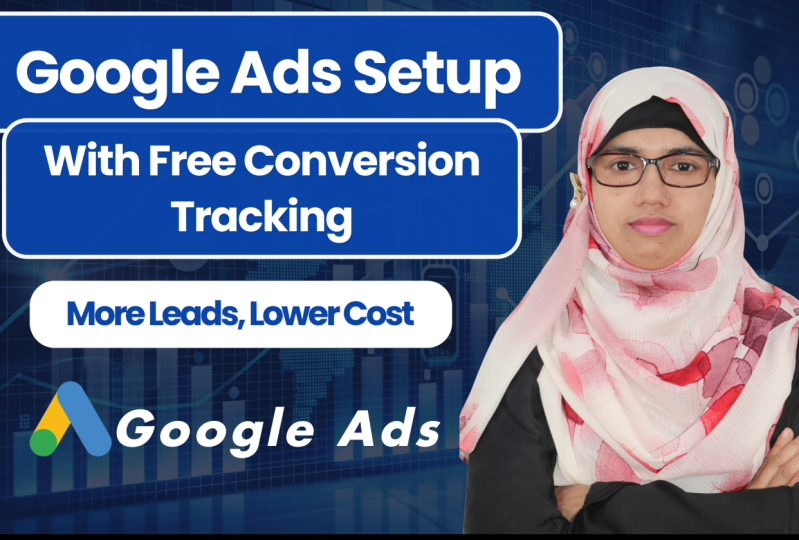
and not over excessive. Let's take a look at this
example from a voice over artist that is performing
really well on Fiber right now. Can see that the seller
has over 1,000 reviews, clearly indicating that people are purchasing his service, and since he has five stars, we can assume that his customer
service is really good. By looking at his
fiber Gig image, we can see that he is a
trade related seller, meaning that he has to use
text in his fiber gig image. We can see that he
does this very well. Using a combination of small graphic elements like the microphone that we
see in the picture, as well as the studio that
is in the background. Both of these
elements are subtle, yet they convey that this
person is a voice over actor. We can also see that the text is used in a very
professional way. There isn't text
all over the screen describing every possible
service that he could do. That would be way too much. Instead, there's five
simple words that are bold and bring out your attention immediately
after seeing them. These words describe
exactly what his services and give you a clear idea
of what his profession is. A combination like this is perfect because the
graphic elements and the textual elements combine to merge into the
perfect gig image. We can see and know exactly
what this man does just by looking at the image
itself without even taking a look at the
title and description. It also shows his face, which is pretty important
for us sellers, as it shows our
buyers that we are real people and not just
brands, pumping out content. By having a face in
your fiber gig image, forming a more
personal connection. So I would personally recommend
that you put your face in your fiber gig image if that's something that
you're comfortable with. Usually, the top sellers have their face because it
forms a connection, and it makes sure
that you're not just talking to some
random person online, but you're talking
to a specialist, someone that knows
what they're doing, and isn't afraid to
show themselves. So let's summarize what makes
a good fiber gig image. First, it either shows an
example of what you do or suggests what you do through text and
graphic elements. Two, it looks professional. Three, if it does use
text, it's strategic. It shows the face of the seller. Let's move on and
see how you can find inspiration for your
fiber gig image.
4. Lesson #3: Finding Inspiration: Lesson three,
finding inspiration. Before we actually create
your fiber Gig image, we have to go in your market and see what is already
working for sellers. No, you shouldn't be copying
anyone's fiber gig image. Instead, what we're going
to do in this lesson is go over what is working
for other sellers that get good ratings
and a lot of reviews and combine those elements to form
a unique piece of imagery. This part of the course
takes inspiration from Austin Clean's book,
Steel like an artist, where he talks about how we
should combine elements from other great artists to make
our own piece of unique work. I want you to open
an incognito tab, then go to fiber.com. In the search bar, search
for what your niche is. Put yourself in the shoe of
someone who would purchase the service that you're
offering and ask yourself, what would they look for? Take your answer and put that
in the fiber search bar. That is probably what people are looking for when
purchasing your gig. Then once you have that, search it and see what the top sellers include
in their fiber gig image. Take a look at the specific
graphical elements or important text that they use in their
fiber gig image and see if there's a general trend
among all the top sellers. When you're looking at a
particular seller's gig image, ask yourself, what
makes this so special? Why have so many
people clicked on it? Why does he have
so many reviews? Now jot that down in a spreadsheet or in
your personal notes. Do that for five to
ten other gig images. What you'll have at
the end is a list of five to ten golden
characteristics that the top sellers in your
particular Niche use to highlight their
unique services. With this list, you
can start making your own fiber gig image because you'll have
the inspiration of the already established
sellers and what they're already doing to go off on
when making your first image. Let's summarize this step. First, open an incognito tab. Second, go on to fiber.com. Third, look up what you think people would look up when
searching for your gig. Fourth, look at the
top selling creators. Five. Look at five to
ten gig images and write down the characteristics that you think make them sell. At the end of this process, you'll have this list
that you can use for inspiration when you're
making your own fiber gig. Now that you have this list, you can use the inspiration from these other artists
to make sure that your gig images has all the characteristics that made these sellers sell
in the first place. This list will make sure that your gig image isn't one
of those that just gets lost in the thousands and
thousands and thousands of other people offering
your same services. Instead, it will stand out. It'll have the characteristics of what those sellers
that went through all the trial and error
and had failed gigs and went through 500
different iterations of their gig images. But instead, you'll have
this in your first image. You'll take those golden
characteristics and morph them into something that is personal
to you into your brand. Keep this list as it will be helpful when we move
onto Lesson five, where we'll actually create
your first fiber gig image. Before this, we need to learn what dimensions we're going to use for our fiber gig image. Let's go on to Lesson four.
5. Lesson #4: Dimensions for your Fiverr Gig Image: Lesson for the dimensions. Before we hop on Canva and
make your fiber gig image, we first need to understand what the recommended
dimensions are for our gig image as we
want to make sure that it is optimized for
fiber's algorithm. Fiber recommends that
your gig image is 1,280 by 769 pixels. On Cava, we can input these
exact dimensions by clicking, create a new design. Then clicking custom size. Then put in 12 80, where it says width and
769, where it says height. Now we're ready to make
our sample design. Let's go on Cava and actually put these lessons into practice.
6. Lesson #5: Making a Fiverr Gig Image: So, right now, we have a pretty blank canvas,
if you were to ask me. We have absolutely
no images here. So, do you recall when
we said that one of the first things that we want
is an image of ourselves? Well, let's pull that up. So right here in
the upload section, I had previously uploaded a
picture of myself, this one. Now, there are two ways
that you can remove the background for this photo because we do want to
remove the background. It'll make it look a
lot more professional. The way we can remove
the background if we have Canva premium
is by going to edit image And then clicking
background remover. This tool will completely remove the background
of our photo. However, if we don't
have camba premium, we can use free
alternatives like the website remove dot bg. So now that we have our photo, let's place it on
the left hand side. I'll tell you why in a second. So the reason why we want our photo on the left hand side, instead of on the
right hand side is because on the
right hand side, fiber places different tools that we can use to
navigate our gig. Those tools are placed
over top of our gig image. So when someone
hovers over our gig, instead of seeing our face, they will see a
checkbox icon used to differentiate between
different tools in the fiber system. So if we have our photo
to the left side, there will be absolutely
no obstructions that will impede the
viewer from seeing us. Now that we have our photo, we won't really have
to move it much. So let's go ahead
and click on it. Let's right click,
and let's click Lock. This will keep ourselves
in the foreground, and it will help us
not change it at all. So when we click Lock, we can no longer move our image. But now let's search
for a background. And the way we can do this
is by going to elements. So let's click on elements. And if you recall in the
example that we looked at, the voice over
artist used a photo of a voice over studio
in his background. So let's try and do the same. Let's look up Voice over. And let's go over here
to where it says photos. This table will give us loads
of free options when it comes to looking up images that are related to voiceovers. Let's find one that is free
and fits our specific ones. I personally like this
one with the microphone. Let's click on it.
Now, let's make sure that it fits the
frame of our photo. We can do this by
dragging the corner to the upmost corner and then
clicking on the bottom dot. Then we enlarge the photo until
it fits the entire frame. Personally, I want to make
sure that the microphone isn't as much behind me as it is on the
side that is empty. So let's move this a
little to the right. And then let's make the image larger. Perfect. Just like that. We can even move it
a little more down. Now, you may notice that this photo is taking
over the entire image, and we can no longer
see our face. The way we fix this is by
clicking on the image, then we right click once more. Go to Layer, and then
we click Send to Back. This will send the photo
to the bottom most layer, which in this case
is our background. Perfect. Now we have
ourselves and the microphone. But we want a little
more separation between us and the background. So let's make sure
that we can add a little bit more color
to this background image. The way we can do this is by removing our previous
search result, and then going to this tab
right here that says shapes. This will give us a lot of Canvas free options when it
comes to determining shapes. So let's click on in this
case, the square shape. Now we have a square
in our image. You may be wondering what we're going to do with this,
but let me explain. We're going to drag this to the uppermost corner like we did with our
background image. Now we're going to
make sure that this covers the entire image. Now, the color of this square is going to be the color
of the microphone now. So let's make sure
that we choose a color that makes us pop. We can go here, where it
says color, click on it, and it will show us all the
different color options that there are for this square. I would like to go
with the gradients. These make you pop more and give yourself a little bore
of a professional tone. Let's click on this one, the
blue and black gradient. This will change
it to this color. Now, we can no longer
see ourselves once more. We want to make sure
that we can see us, but that this image doesn't go behind the background
that we already set. The way we can do this
is by clicking on the gradient, right clicking, going to layer, and then clicking send backwards
instead of sending to B. Send to back, sent it
to the Bmost layer, which would be behind our
microphone background. If we click Send backwards, this will only send the image behind ourselves,
which is what we want. Let's click Send back. Perfect. And now you're wondering
how we're going to make it so we can still
see the background. Simple. The way we're
going to do this is by clicking transparency, and we're going to move it until we can see the microphone and until we have a good mix
of background to gradient. I think at 59, it looks good. If you want to get a
little more specific, you can select this and
change the number manually. But I find that this arrow works perfectly
most of the time. So now that we have this
cool graded out background, we need to add some separation between myself and
the background. Way most people do this on fiber is by putting an
element behind them. It can be a geometric figure, or if you're a little
more abstract, you can put in a
splash or a blob. Let's try the ladder. Let's look up blob in the elements feature. Now let's look for
a free graphic that'll separate us
and the background. We can click C A, and then this will bring us to this page. I like this one. So let's click on it.
Let's make it large, so it'll fit behind us. Remember, this is going
to go behind us to give us a little more
separation from the background. Let's make it large. Let's put it over here. Remember, you can click. You can select this image, and if you want to rotate it, you can click on
these two arrows and change where it's going. So, let's put this behind us. Let's make it a little more big. And now that looks about right. We can send this behind us by right clicking layer,
send backward. Now let's just give
it a little more a couple more adjustments. I think right there, it looks just about right. Now let's change the color because I don't really
like how this looks. Let's go once more to color. But this time instead of
selecting a gradient, we can pick a solid color.
Let's go with white. And that looks perfect. We now have a clear separation between us and the background. If you want to get a
little more creative, you can add a
shadow to yourself. So let's do this by
unlocking ourselves, then click edit image, go over here where it
says effects shadows. Click on that. Next, I find that the best shadow
is usually the drop one, as the other ones look a
little weird when it comes to changing the perspective
of a human being. So let's click on drop. Now we have a shadow. The way we can change this is by looking at
all these settings. Let's make it so that the shadow is to the other
angle of ourselves. We can do this by
dragging ourselves over the shadow just like so, and then we can
modify the distance. Let's make it so it's closer
to us. Just like that. Now, let's add a
little more blur. Perfect. Now, we can just drag ourselves over top
and make ourselves larger, because for some
reason on Canvas, when you add a shadow,
it makes yourself small. That is, I still have not
deciphered why that is. But we can fix ourselves
just like that. And now we have a nice
little shadow separating us between the blob that we
added and the background. But now we have to indicate
what it is that we do, because assuming that we
are doing a voice over gig, we fall under the category
of trade related artists, meaning that we
have to add text to imply that we are
a voiceover actor. We can do this by going to text. Let's click on Add a Heading. Now, what do we want to
add in this heading? Let's find a trait
that would apply to a voice actor that would narrow our market to a
more competitive. So let's say we're looking for an American voiceover actor, and let's say that that is our
particular characteristic. We are an American voice actors. So Let's change
this to American. We want to remove
this other heading that we added by accident, and now we have this
one that says American. Perfect. But we
can't really see it. So let's change the
color to the same one of the blob,
which would be white. We can also change the font by clicking where it
says Canvas sands. This font is a little too basic, and it doesn't really stand out. So let's try and pick a boulder
font like League Spartan. Perfect, like that. Now we can make this bigger. We don't want to make
it too big, however, because this is not going
to be the main text. Let's click American, and let's drag it right about there. Now, we want to add
another characteristic. And right now I'm noticing that this blob is taking a
little too much space. So let's click on the blob, and let's drag it backward
by dragging ourselves down first and then
dragging the blob downward. We can pull ourselves
back up by clicking on ourselves and pulling
ourselves back up, like, so. Now we can make this
a little bigger because we have a little
more real estate. Let's make sure this
is in the middle. You'll see this dotted arrow that shows you when
it's in the middle. So now, if we want to
duplicate this text, we can click on it. Click command C if you're on Mac or control C if
you're on windows, and then control V if
you're on windows, and command V if you're on Mac. This will duplicate our text. Now, what is the most
important characteristic when you're finding
a voice actor? I think it's knowing that you're looking for
a voice actor. So let's make this say voice
actor, just like that, and let's make it
slightly bigger than our previous text to add a
little bit of separation. Now let's make sure
that this is centered. So we have American voice actor. Now, let's add a couple of qualities that would make us
stand out as a voice actor. We can duplicate the text once again by
clicking Command C, Command V, and let's
add some qualities. So let's say we are quality. Then we can space
and make sure we add a bar to separate,
just like that. Let's also say we
have quick delivery, if that is a service that
you offer, of course, and let's add
another bracket that says experience, just like that. Now, let's select all of
it by clicking Command A. And now we can make the font smaller because this
looks really ugly. So let's make it around 14. That's a little too
small. Let's make it 16. Perfect. Now, we have this. It's a nice piece
of text that shows us what we are and describes
who as a voice actor we are. So let's go ahead and lock
in our background first. We can do this by clicking on the background and
clicking lock. Now, let's select our text. We can make this text into a solid unit by clicking
this part that says group. Now this text will
behave as one unit, which will make it
easier when making it bigger and when
adjusting its position. So let's make this
a little bigger. And let's make sure it's
centered, just like that. So now we have
American voice actor, and it's a big text, and it doesn't really impede us from reading it because
of the background. So now, let's try and add
a little more symmetry. Let's combine this blob, and let's put it
over here to add a little bit of continuity and make sure that we can add a little more
symmetry to this design. So let's grab another blob. Let's make sure it's also white to match the one
that we already have. Let's click white, and let's put it in this
top corner over here. Remember, we can
adjust by clicking this arrow and changing
the position like so. Let's make it a little bigger. And I think it looks good. Like so. Right there. So now we have a
little more continuity between here and here. But now let's think
of what we can add to this part to make it look a
little more professional. I think that adding an icon always helps insinuate
what you do. So let's look up
a microphone icon in the elements tab.
Let's try this one. Of course, right now it doesn't
match because it's black. So let's make it
a little smaller, and let's put it smack in
the middle of our text. Just like so. Now,
let's make it white, by clicking on it, going to color and making sure
that it says white. Now, if we want to make it look a little more symmetrical, we can do this through
the use of lines, which is something I recommend a lot of beginner designers do, because often it looks like
it's missing something, and arrows often
add that something. So let's click on shapes, and let's click line this time. And let's make sure the
line has no angles. That way, it remains consistent throughout
the whole design. There we go, just like that. Even if it has an
angle of negative one, it is not really going
to be noticeable. So we have this line, but now we need to duplicate it. Remember, we can do
this by clicking on it, clicking command
C and command V, and that'll duplicate the line. Let's make sure that it is even. Canva will tell you when
it's even because it'll show you the lines that
we see right there. So let's make sure
that the line is hitting the same place
for both of the lines. This often takes a little bit of work because Canva likes
to make it tricky for us. Let's see if those are aligned. I think they are. If
it's not perfect, it's going to be all right
because most of your clients aren't going to notice these
slide imperfections anyway. But to me, that looks
pretty symmetrical. But now that we have
this, we need to center it again because we've
added another element. Now, let's select this text. Let's group it once more, so it moves as a collective. And now we can drag
it to the center. We have here a
perfect fiber image because it says what we are, and it also has a little
bit more graphic elements. The only thing I'd change is
I'd make this text a little smaller because it's getting a little too close to the edges. And when it gets to the edges, there is a higher
chance that some of the texts won't appear when you show it on your fiber image. So you want to make
sure that all the text fits the necessary requirements. Let's make it smaller,
not too small, but not too large, either. And there we have it,
a fiber gig image that shows that you are
an American voice actor. It also shows your qualities. It has a photo of yourself, and it looks professional. It makes you stand out amongst the thousands of other voice
actors that are on fiber. And by using a design like this, you will get more clients, and you will make
sure that people know that you mean business. But now we want to export this. Let's click share.
Let's click download. And a little hack that I want
to show you is that if you go and you grab this dot
where it's that size, and you pull it up
to the maximum, what's giving you a
higher resolution without you having
to pay for anything, and it will keep the
exact same dimensions because it is training
it as a proportion. So this, even if you
make it 4,000 by 2403, it will still fit
Fiber's requirements. So now we can click download. It might take a while
because we turn it into a larger file.
But there we go. We've made our fiber gig image. Now let's go on and see
how we can use this and upload it to Fiber to see how we can share
it to the world.
7. Lesson #6: Uploading Your Image to Fiverr: Congrats, you just made
your first fer gig image. Now we need to figure out
where we actually place it. Go to your Gig on
fire plag on gallery. And drag and drop
your image there. You can see that there's
two more slots available. You can use these
two available slots to detail more about your gig, show more examples,
or talk about yourself and the credentials that you have to be
performing this gig. For example, I see
a lot of people on Fiber that are in the
Niche of essay editing, use these two extra
gallery slots to talk about themselves, the awards that they've gotten, the English credentials
that they have, and what essays they've
edited in the past, and what universities
they've gone into. Use these two gallery spots, as they can be important when your customer is
determining if they're going to choose you or another fiber seller
to do what they want. We can also make these
two images on Campa. We can take the template
that we already made and have some
changes added to it. That way, your two other
images are still on brand and match the same colors and graphics that you use for
your fiber gig image. Just make sure that
these two slots are also high quality
as people are also going to take a
look at these when deciding if you're going to be the seller that they go with. Now that we have our gig image, let's go on to Lesson seven. Where we'll learn
how to make sure that this image is the
best for our service, and if we need to change it, let's figure out
how we can do that.
8. Lesson #7: Testing Your Design: Congratulations. Now you have
your finished fiber gig. Although fiber gig images aren't the only determinators
for success on Fiber, they are one of the
key driving factors that lead customers
to your service. Therefore, we need
to make sure that this image works for
your particular gig. You may have a
really good image. However, your
customers may not be attracted to it for a
variety of reasons, and those are out
of your control. But let's make sure that we can learn from what is
working and what isn't working to potentially
change our gig image, to make sure that it is more
appealing for our customers. The good indicator of
this is if after a week, you don't have anyone
clicking on your gig You might want to change
the fiber Gig image. To do this, go back
to what we did on Lesson three and look for
some more inspiration. Perhaps your list wasn't detailed enough or
perhaps you looked at the wrong characteristics that made these gig
images successful. Maybe you didn't
pay attention to a particular characteristic
that was really important, or we need to work on your
design skills on Camba. All these things can be
fixed, so don't worry. Once you've remade
your outline on fiber gig images and the characteristics that
make them successful, you can apply all the other
steps that we went over in this course and create a new fiber gig image
and test that one out. That one, too, doesn't work, then we can rinse and repeat this cycle until we
find a gig image that is effective and leads
customers to your service. Once you found the
gig image that works, that is the best feeling
as a fiber seller. Seeing people happy with your service and driving
customers towards what you love doing is ultimately the goal of a good
five er gig image. And once you've found
the fiber gig image that works, you're done. You can focus on your customer
service and on making sure that your service itself is
as polished as possible. Congratulations on making your very first successful
fiber gig image.
9. Outro | Thanks for Watching!: Success on FR can be one of the most fulfilling
things for us creators. It can mean finding
something that allows you to quit
your job or makes you a little more
money to purchase those things in life that
you've always wanted. Hopefully, by completing
this project, you've taken your first step in your freelance journey in the most effective way possible. I wish for your success on Fiber regardless of the
service that you're selling. Thank you for watching, and I hope that you learn
something new.
 Santiago Burgos, We Are Lifelong Learners