Transcripts
1. Introduction: Welcome to this class. This is the third in the
series on drawing with a pen. We've done five steps
and we add a two steps. And now we're going
to add the last step. We're going to add some
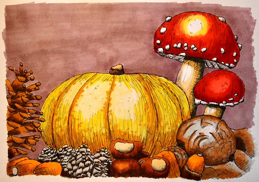
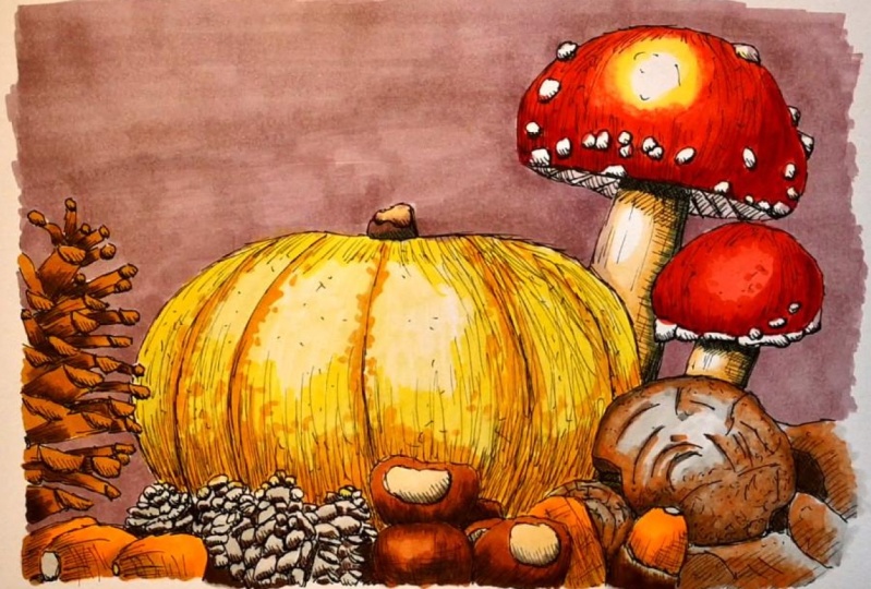
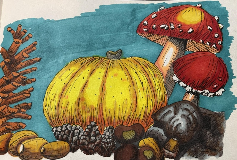
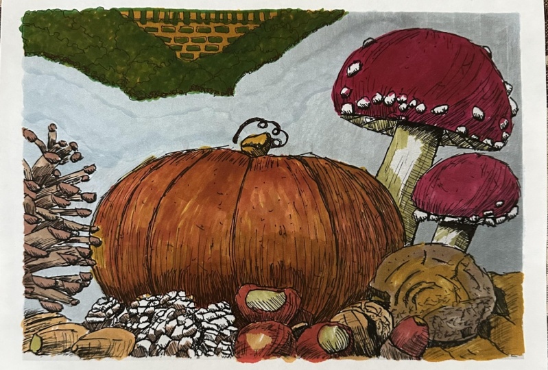
color to our drawing. Last class, we made a beautiful autumn
drawing of pumpkin. Pumpkin, just one
pumpkin and acorns, pine cones, and some great
toadstools, subordinates. And O'Connor creates
a lovely drawing with that with alcohol markers. In this class, we're going
to explore outcome markers. Add color to our ink drawing. Now if you have not done
the previous series, you could of course, go back
and make, create a drawing. But drawing is provided
with this class too. So if you want to catch up this way and you know
how to draw ready, and I would say
create a drawing. And you can start coloring
into the alcohol. Markers are great to work with, to give great color,
great effects. Nice ball, strong colors, nice blends, mixing gray colors. You can do some lovely
things with it. And in this class we just want
to explore that together. So I want to take you
on this journey in alcohol markers and
create for Autumn Joy, fitting this season perfectly. Now I'm going to explore two
kinds of alcohol markers. The class mainly focuses around really inexpensive alcohol
markers anyone could afford. But also in the project, I'm going to demonstrate
using some way more expensive alcohol markers and show you the difference. And let me give away
a secret right away. There's not much
difference in it. The difference is really
in the paper you use. So in the first lesson, I'm going to explore
what materials you can use and how we can
get the best results. And then we just
start having some fun with these alcohol
markers together.
2. What do you need for this Class: Let's start with what
you need for this class. Of course, you're
going to need some. You see me waving
it around already. Some alcohol
markers, some paper. But let's go through a little
bit other things first, the first thing you're going
to need is this drawing. Now, I made this the last time. And if you follow the classes, you already made this too. If you haven't made
this drawing yet, you will find attached to
this class two versions, one with only the outlines
and one completely shaded so you can draw them and if you only want
to use the outlines, that is pretty much yeah. Okay. To depend on what you use, we're going to use the
shaded one, the shaded one. The next thing, what
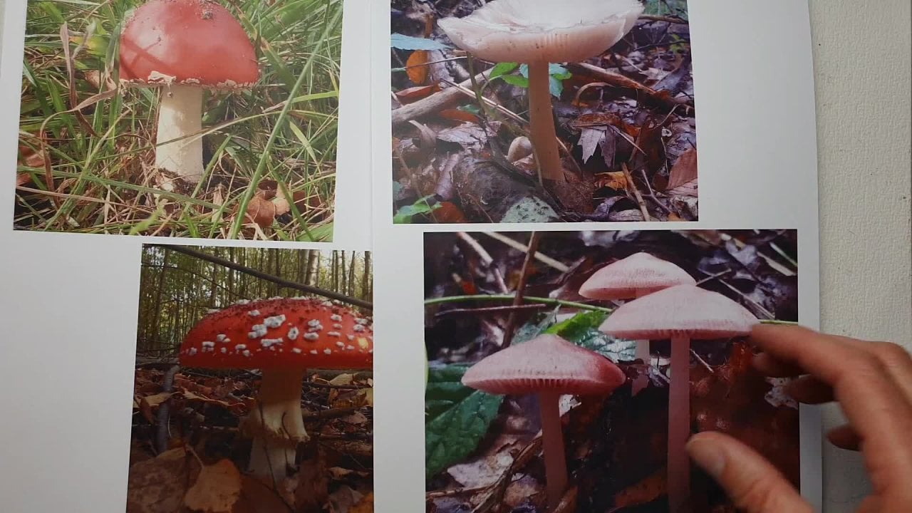
are you going to need is this photograph, this is attached
to the class too. You may want to use
that for your colors. Let me put that aside
again and the drawing two. And when I'm moving
the drawing aside, the next thing you see is paper. Now, I'm working on the spectrum Nawab premium market pad paper. That sounds really
great and interesting. But what it really is, It's great for markets, but it is really
a Bristol paper. So you could use the same
pattern if you don't use it. Any kind of Bristol paper
like this one here, just a simple
Bristol paper block. Or let's see, I've
got another one here. Sample paint on multi
Techniques, smooth collapse. It says in German that
one will work great too. The paint on series
by Claire from ten will work great
for Martha Stewart. Very nice paper to
use with market. You want to make sure
you have at least 200 g or more than 50. Now, B is this, I'm not sure what
200 g is in Albee's. Probably around 100 somewhere. Make sure you have
a nice firm paper. The next thing you're
going to need is some piece of scrap paper. We're going to put that
in-between the pages of the market to make sure that if there's
any bleed through, it's going to bleed through on the paper and not
on your next page. That's paper. The other paper you could
use if you have that, is some marker paper,
especially marker paper. But Mark paper is really thin. This is really
special marker paper. And as you can see, that
is really thin paper. What it has a special
coating on the back which prevents bleed through
trade for market paper. But since we're inking, I've used the Bristol paper. And the last option you have, It's something like this. Again, multi techniques. This is really mixed media paper that has a little
bit of a texture, is kind of a smooth tube, but you can use it for
all kinds of things. And Marcus work good on it. But I would recommend getting some smooth Bristol paper,
not the thallium one. You can get Phelan one, get the smooth one that
looks like paper. Now I won't use
watercolor paper. Some people use watercolor
paper for the markets. But for this class, I would not recommend it
because the ink doesn't flow as nice on watercolor paper
because the water color paper, it just drains, drains
the market pretty quick to just takes in all the
ink. Bleed a little bit. While if the Bristol
paper is nice, smooth on the paper and
you can mix the marker, the ink of the
market, a lot nicer. So don't use watercolor
paper for this class. Bristol, or special alcohol marker
paper you could use to, or if you don't have
that mixed media, bit smooth mixed
media paper too. Alright, Let's continue. The next thing. Of course, you're going to need markers. Now. Marcus. Marcus, now you see
one mark laying around. I got these markets
laying around. These are called touch soft, touch, soft head Marcus. And they're very nice
when it's going to use, we're going to use this
tip is nice soft tip. You could use these ones. You could use a little
bit of a box here, the famous capex, whatever
you have laying around, you can use what
I'm going to use, what you will see me Using, not in the class, but in the, the extra added spectrum. Noah's Marcus, very nice Marcus Do you can get various
one you can get. These are the older ones with the bullet tip on this side. And the newer ones
are with the null. That's not the bullet tip again, are with the brush tip. But I'm not a set, I'm not going to use
these for the art class. I'm actually going to use
quite inexpensive markets. So let me put this
stuff all sides. Let me find them. Well, there's
somewhere around here. While looking for those markers, I came across another box. These are the chameleon Marcus. If you have chameleon markets color tones, you could use them. But I'm not going to use
these mixing chambers. What you use is just simply the little brush
tip on that side. So if you have chameleons, just use the regular
marker and not that special mixing chamber. But if you want to, of course you can use it, but
I'm not going to use that. So that's another option
you have if you want to. But what I'm going to
use are these guys. Now, here is the box, empty box, twin markers. Very inexpensive set. You can buy for. This was ten, €15. Have a nice set like this, with a nice range of colors. You can get different
colors of this. I'm going to use the
range here and I'm going to use debt
for the drawing, the painting, what is it? The coloring? Let's stick to drawing. For drawing we're making
with the alcohol market. So these are 61 in a set and
they're very inexpensive, so you don't have to run out and buy very
expensive stuff. Inexpensive stuff, just add a, something like $1
store would work too. And I'm going to demonstrate
how nice you can see, how nice this actually works. How you can create something
beautiful with these. I think that's it. That's
all you're going to need. You're going to need
some Bristol paper, some alcohol markers, obviously. And the drawings, you don't
need to print them out. You can put them
on your phone or your iPad or a
tablet or computer. You have fungi and watch on
the screen for the colors. Now in the next lesson,
I'm going to show you which colors I'm going to use. I'm going to call
out the color name. But of course, you need to
translate that a little bit to the markers you have
because I don't have every market on the market. I'm just stick to mine
and show you to call us. And I will attach the color
sheet too so that you can compare your colors
and get the right Marcus. Alright, well, let's start
drawing in the next lesson.
3. The Pine Cones: Well, let's start drawing them. Yeah, coloring, painting. What do you do with Marcus? I'll stick to drawing. Let's add some color
to our drawing. That's the best thing to do. I've got my mark is ready. But the first thing
I need is to know which colors I have
on my markers. So what we're gonna do, first of all, we're
going to make swatches. Now. I'm not going to
demonstrate swatches. I'm just going to show you my swatches simply what
you do with those. Okay, Let's start with that. Now you see the drawing here. You see that I've got two of them you don't need
to do to, of course. And if you have
followed the class, you probably only
have one of them. I'm going to demonstrate one with the inexpensive
mark instead I here. And I'm going to demonstrate one with the more expensive Marcus, just to show you a little
bit of a difference. Alright, the first thing
what you need is swatches. Now, I've already done
that on some marker paper. And I've just called
everyone there is. So I've got them on
a certain order. The order they came in, I didn't change the order they came in. You could rearrange
them, of course, get the colors that
belong together, put them together,
but I didn't do that. I just left them SDR
and a swatch them out. So then I know which
color I'm going to use. When I'm drawing, I'm going to call up the color I have here. I will also call out to
color for D spectrum Noah's. If you have spectrum
knowledge, you can compare. If you have different markets, then you may see If that
are the same colors. But what I noticed with all these cheap markets
like these two, actually, the cooler colors
are really comparing a lot. And I think most of them
exactly use the same ink. So they might have a
different name on it, but the numbers often correspond to whatever colors they
have in the different sets. But I'll make sure I
get a photograph of this so you can compare a
little bit the colors here. Alright, well, we're
going to start drawing. We put some of this
stuff site I don't need. I assume then that
means you can't see my markers which are here. I'm just putting them aside, picking the colors I need. We want to focus
on this drawing. I'm putting my
swatches aside to, and I might pick that up
once in a while to show you which color I am actually using. Alright, so we've
got this drawing. Of course we need
the nice colors now the photograph set is supplied. So what I'm gonna do, I'm just going to look at the photograph. I'm putting the photograph aside and I'm going to just
look at the numbers of my solid the swatches and the numbers I'm calling them out and see which one compares. Now you might have
slightly different colors, like I only have
some pale yellow, not really a bright orange. I'm going to just use
an orangey color, which is actually here, deep yellow, golden yellow. We've got great names for that. More on ocher color actually. I'm going to take some colors which I can get as
close as possible. But if you want to use a
nice bright orange for this, of course, go ahead,
deeper colors. I'll leave that up to
you if you want to change the colors a little bit. And with the spectrum
Noah's later on I'm changing some
of these causal, though I'm trying
to stay as close to the original colors of the set. I've got. Alright, well, let's start. Now. The first
thing I'm gonna do, if you have it in your pad, make sure you put a paper on it and I'm gonna do that too. Because if there's any
bleed through out, just want to make sure it doesn't bleed through on my mat. No, but it bleeds through
on the paper on it. Especially if you
work in a sketchbook, you may want to
really put a paper on there to make sure you
don't mess up the previous, the previous, the next paper, not the previous
one. The next paper. All right, let's start.
We're going to start here with the acorn on here. Now I want to have some light
brown on the lighter parts. I want to have
some dark brown on the darker parts.
So a light brown. I'm going to just
look at my chart and we'll say which one would
I pick? There's some here. I'm going to pick this
one a little bit of an ogre color number 32. And let's check, I've got a second list I'm
going to check now number 32 is G, B7, B7, B7. And find that for a second. Here it is G B7 on the spectrum. No, Are these are comparable, a little bit of
comparable colors. Beforehand, I checked
all these colors and made sure I have a list
so I can compare the two, of course. Alright, Good. Make sure I'm getting
the right mark. I'm going to go for
really cheap marker. Now what I'm gonna do first, I'm just going to color simply all of the lighter
parts with this color, 32 GB for T2. And that will be here. There. The nice thing about
these markets I think, is definitely they have a brush and I really like
Marcus with a brush. I'm okay with the other
markers bullet tip too. But this is really
nice to work with. Now it has a disadvantage. If you don't watch out,
you're going to bleed. And basically what we're
gonna do is I'm just going to not do gonna do anything
special with this. I'm going to color all
of these lighter parts. And there you go. I want to do those first because
I know with these parts, I'm actually not going
to mix any colors. And women leave this
color, basically, as is this one behind there. Now with a marker, do not press really firm the
new ruin, the tip. You don't want to ruin the tip. That is really a shame. So try to have light and if you want to do
some bigger areas, use it as a paintbrush
bit on its side. Alright, I've done those. Now I'm going back up. And what I'm gonna do, I'm gonna get my second color with it. I need a darker
brown under there. And I'm going to use, let's
see on the chat again. So I have this color, I'm going to use the
column next to it. Let's use the colon next
with the darker colored and 92.92 would be on spectral
know what RB for, RB for 92 called chocolate here. And I'm going to leave this one, I'm going to put this one ready. I'm going to have two
of them the same time. What I'm gonna do is I'm
going to first of all draw in a couple of them and I'm
going to need to make sure that my ink
stays nice and wet. And I think I can do this. And then I'm going to swap. I'm going to put some of this
darker color at the bottom. And the next thing
I'm gonna do is going back with
this light color, blend this in a little bit, and let the ink do its thing. And let it blend a little bit. Alright, keep on going here. And I'm swapping them around, coloring it with the
dark color and make sure it doesn't get away. I'm leaving this to dry. We are going to the point where it's not touching that one. Definitely down here I can do and I might just
do this one too. They're not going to
bleed over in each other. If you do a large
area like here, the ink might bleed
from one to the other. Let's do a little bit there. So everywhere where we've decided that the darker
parts are going, I'm actually putting
in that dark color. And now I get, if you
look really well, I'm getting free tones, the light color there,
the first color, the dark color there,
and the mix right there. If you keep on mixing
with darkness, with dark is with markets,
see what happens. As long as it's wet, it's
going to melt into each other. So if you don't want to have all these colors are blending, melting into each other. Don't go over it too often. Let me check that I got the
right pen, the right marker. Let's see, I can
go up here again. Alright, I'm gonna
do this one here, 2.1 go and this one, they're not touching each other. And there we go.
Add some dark here, add some dark there. Add a little bit dark there. Might pull this up. Just a little bit more and get that light color
and blend it in. And there we go. Now under here, I only want the
light color I think. And let's continue this. I didn't do too
nicely. Alright, Good. Let's do this one. This one. And this one are definitely
not touching each other and this one isn't touching
any of them either. And just to prevent that, one color bleeds
over into the other, we're doing that only
a little bit there. So that's basically the
technique we're doing today. We're going in with one
marker, the lightest color, then going in with the dark
color and then mix it in a little bit with the
light color again. And as you can see here,
if you keep on mixing, you get actually a
totally different tone. Let's see, this
one I can do too, but makes sure I've
got the light color, almost at the dark color. There you go. And I might
as well do this one. Alright, let's do
this one down here. It's not touching anything. I'm going by cliff that dark
color here to let's see, and down here, I did. Let's do some of their
two on the here. And now I'm going to
mix in. Blend that in. And if you've got the right
paper and it's smooth enough, you can blend them
in a very nicely. So if you don't like
this harsh line here, you just add a little bit more
ink and just work it away. Let's see, I go back up
here with the right color, please do this one. And I've touched
just on that one. Now let me finish out here.
There's a little bit there. Alright. Now do this one with a dark
color. A little bit there. Good. And that's it. Alright, now I can go, this is still D. I set the icon, but
there's not an icon. That is a pine cone. We're doing the pine cone first, the acorns redoing later. Alright, I haven't touched. This one is not
touching that one. This one is not. And I
can do this one too. Let's shoot state line of wet. A little bit here. This one, pretty much all of it. A little bit there. And
down here we did do. Alright, and that's it. Let's see where did we do here? Extending here. Alright, good. I'll continue with
this one. Here's one. And there's nothing there. Let's put a little
bit in-between there. And there you go. I
think this one, sorry. Pine cone is fine. Like this. Alright, good. And I
would be the pine cone. We're going to do
the other pine cones right away to while
we're on pine cones, but I'm not going to use
the same colors for that. So I'm going to put
this course back in my books so that I'm not
creating a mess on my desk. These ones now on the
photograph, these are different. We're going back
to the photograph. Let me show you that.
These are brownish. These are more gray tones, so we need some gray and brown
in these different colors. And that's why I'm
swapping colors. And let's see where
are we gonna do? We're gonna do a gray tone. I want to have a
nice light gray. I'm going to go for
this lightest, WG 0.5. And if I put a double G as the lightest
in their spectrum, Noah would be, I can check my
list and I have to find it. There won't be a G, G, G, G one. So the hair, so do we
WG the warm gray 0.5? I'm using a gray, green gray here for one because spectrum no one
doesn't have in this set. I have at least not a warm gray and I've got
the whole set of the spectrum towards
the older classic, none of the classic one, but whatever, once I
got the whole set, 200 and something of them
and there's no warm gray, so I'm using the
green gray instead. Alright, I'm using that. Let me see. And then I need another
color that's for the gray and then the brown. Let's check the
brown around here. I would use the same chocolates. I'm sticking to that
same chocolate. So the same dark colors here. I'm sticking to that
92 or the R before. And let's see. So mixing a third color, probably mixing a little bit of a different
color around here. We're going to mix
in a second grade, but we're going to use the
blue-gray, the blue-gray one. And in this text from Nova, that would be the PG R1, blue-gray one, PGY1, a blue-gray one I'm using that
is actually this color. So I'm using this
light gray, this gray, and I'm mixing a little
bit of brown in it too. Alright, I'm starting
with Duke grace, alright, the lightest gray. I'm going to find that,
that is this one. What I'm going to do is
I'm going to just color all of this with the light gray. And you should see
that just enough to get a nice tone.
There you go. Since this is not a huge area, I'm just coloring
in the whole thing. And if I'm not
completely accurate, I might color a little bit. That doesn't really matter
if in the other parts, because this is such a light
color, it's not a problem. Just make sure
it's nice and wet. I want it nice and white. And then the next
thing we're gonna do. All right, Good. Put this one aside for now. I'm going to get to that blue
gray and I'm going to wet the shadow is I'm going to
add the blue-gray color. So everywhere where
put in the shadow. I'm just adding this
darker gray color. But now you say, well, now these acorns are really gray and that's why we have
that Brown in a minute. We're going to add that brown to it to get a nice extra tone. But first, make sure it's
got all of the gray. Yeah, I do. A little bit there. Good. I'm gonna go back to that very light color
and just really quickly mix it in a
little bit. There you go. Alright. Now we're going to pick
up that brown color. Now I need to make sure I've got the right column because
now I made a mistake. I put them the wrong cap. I'm not sure if this
is the dark one or if this is the
light one we use. And I'm going to
say that this is the dark one because I know for sure because
that cap I didn't change. So I've pulled up the wrong cap. And this is the 32. But I want to have that 90 to one and we're going
to use the brush. I'm going to use debt, find
that bullet tip on this side. To just add some dark brown
excellence here and there. Especially in the
really dark apart. With a line there. You go. Just get some brown in here. So as you actually see, these are still the pine cones and not some gray,
whatever thing. Alright, Good. Little bit there. At the bottom. So I don't want this brown
to overpower the gray color, but where it is really dark
like these places here, under here, under there. I wanted to have a
hint of brown hair and they're under there two, good, That's good. A
little bit of brown. Alright. In-between
all the gray, I'll think I'm okay with that. Alright, if you wanna do more
brown, That's up to you. Of course, you could mix
in that lighter color. We have just one
way that 42 might just add some spots
at just randomly. A little bit of
that lighter to get the dare to. A nice effect. Alright, good. We'll leave that like this. I'm okay with that. I'm gonna go back one more time to do a really light gray. And especially where I've done the lighter
brown and mixed it in a little bit
and let the ink do its work and let it do some blending while
I'm keep on working. When it's wet, it's
still keeps on blending. I think I've got all
the pine cones now, the next step would
be the acorns. Now we're really going
to do the acorns. I said we're going to
start with the icons, but the pine cones were first. And now the next step
we're gonna do the acorns, so we'll do that in
the next lesson. If you have done
these pine cones, and I'll see you in
the next lesson.
4. The Acorns and Chestnuts: We've got a small part of
our drawing ready now, it looks like a small
part, but this is actually the most
intensive partners, all the little details. The rest will go a lot quicker. So let's go to the lot quicker. Acorns, and let's do them. Alright, good, the acorns, Let's start with
the icons and we might do the chestnuts
in this tube. First of all, I'm going
to put back that color, those two colors I have, make sure I'm not mixing
up my set 40 acorns. What we're gonna do is I'm
going to need a light brown. So I'm going to get
this color here. I want to use a
really light one, almost a yellow one. And it's called here, fresh yellow is
nothing fresh yellow. This is closer to
the acorns or 44. And in the spectrum
that will be a GB free. And we're going to
use a darker color. Of course, Let's see which
one do we pick a dark brown? This one, this one
isn't that those two would go really nice together. 101, and that's actually
called a yellow ocher, although I would say this
is more yellow ocher, this is a very dark. Okay. So an hundred and one, I'm going to choose for that. And in the spectrum
normal asset, that is an envy-free. If I'm right, Let's
check Yes, and be free. These I'm going to
use for the acorn, but the little end of the acorn. So let's see this one. I think I might just make a little bit more grayish again. Yep. I'm definitely
going to do that. Let's see, um, the same
gray or different gray. Now, the same, the
same light gray. I'm going to pick that
light gray again, this one for the end. And then we have
one here, the hood, the hood, I'm gonna do a
different color again. I'm gonna actually
mix up two colors. And let's see. I'm gonna
do the warm gray there, and I'm going to pick
this color here. I'm going to pick that brown. That's called The only bronze. Bronze 99. 99 isn't E B6 in
the spectrum NOR. Alright, I'm gonna
put this ascites, lets me start with
the gray ones. And I'm gonna do the ends here, just this gray color. And let's see, there's
one and the other one's actually there's
an acorn here too. But those don't have that
color, so that's it. And what I'm gonna do
with this, let me see. I might just do this
with debt color to, let's start with this one. I'm gonna do this one. Lift up color. And then I'm gonna
go to that 99, that the bronze color. Add some shadow, nice
dark color here. But I'm leaving this more light and now I'm going to go back
to that warm gray. Makes sure right, blend
this in a little bit. There you go. And I
want to blend this in really nicely so
that at the bottom, we're getting a dark
color and at the top, a little bit lighter color, but I might have moved
slightly away too much. And there you go. Now I can
put these two way again. I'm not going to
use this anymore. I'm going to go to that lightest
almost yellowish color. We're just gonna do the acorn. I'm going to start here.
That's a nice acorn color. So I would say you check your
swatch and see if you can get something that is
nicely close to this. I can do this one to
here. The rest of them. Again, leaf to dry. Alright, put out. There you go. Just want to get that second
column that 101, the brush. And I'm going to add just the
color where the shadow is. There you go. Gonna do the same here. Where the shadow is. My put just a little
bit around there. And this one a
little bit there to get some difference between
the other one in a minute. Blend this in a little bit, but I'm not going
up there again. So I'm getting actually
free tones, Same here, blending and then 11, I'm going to leave
that color alone. I'm letting them blend in. So I get a nice blend a
little bit more here. There you go, good. Now we can do this one. And see that goes a lot
quicker than the previous one. Has a lot less details. And now let's do this. And that's the nice
thing about having done a drawing first on red. I know exactly where I want
those light and dark cost. Let's keep this very light. Just mixing a little bit better. And now I can go to this one day. You go little bit on the dare, get that dark color and blend that in a little bit. And nice. This is too much gone. Let's do one more at the bottom. And let's this again. That was a little bit too
much gone. Okay, good. And that are
basically the acorn. I'm going to put those colors
back again right away. I think I've done all of them. These are all chestnuts, so I should be fine. And while I'm
mentioning chestnuts, chestnuts, but I gotta go back. I see, I missed one. So let's do the 44 again. Let's not forget
this poor guy here when he needs some color too. Alright, 44. Missed a little spot there. Go back to that hammer
than one. The dark color. I wouldn't do it carefully
around there too little bit. I'm going to leave that lighter. They're now going
to blend it in. They go good. And that's it. Alright, now I can
go to the chestnuts. Chestnuts has a nicer,
deeper brown color. So let me see what
we're gonna do. But this is light in a chestnut and this is of
course darker and we're going to need some tones in here to let's see for the light. Yes, I'm going back
to that light gray. I'm going to mix that in here. Yes. Why not? And that is a C, G, a G, G one on the
spectrum, the last set. And here it is a double G, 0.5. And we're going to mix that
in with a color on here. Let's see which color do I need? That's a good question. A bit of this color would work. 134, it's called raw
silk, hundred and 34. And I'm going to mix it in
with the gray a little bit. And 144 is A0 B1. So I'm going to use that
for this Ds and these two. And then the rest of them, I'm going to use, see
what? We're going to use. Brown. This brown is nice
for yeah, I like that. It's going to be some
Brothers and Rose Beijing. Yeah, Rose Bayesian
numbers 97 and that will be t and
for inspecting ANOVA. And then I'm going to just
mixing. Yeah. Why not? Do these two college students
would go nicely together. 92 again, that is the
chocolate or EV-1 or RB. No, not EB are before
in spectrum Noah. So here it is, 92 chocolate. And inspect to know
what our before. Let's start with this one. We'll start with this
nice light color. What does it call
flesh now raw silk. Okay. Well, apparently they think raw silk looks like this color. Well, I have no clue. So they can tell me anything
they want. With that. I'm going to put
this here with the gray and a nice shadow. Same here. Get that nice shadow. Go back to this color. Just a little bit over the gray and let it blend
in a little bit. Alright, nice. I don't think
I need these two anymore. For now. That goes quick. Then the next step would be
to 97 is the lightest color. Yes. So let's see who
might need some down here. Start with this one
and pick that one. Back here. That is a
nice chestnut color, isn't it? Alright. I like that. Okay. And then I'm going to
have a very dark color. Let's not do all of it. Here. We definitely
all but let's leave a little bit
lighter color there. I'm mixed it in a little
bit. Alright, good. Um, let's see, can I do
this one right away? Yeah, I can. Color it nicely. Good. And I'm going to
go for that dark color. Shading a little bit. Add some spots there. A
little bit on the Darr. And now I'm going
to blend nicely, this alumna blend in nicely, and this blends in, again, I'm not
touching that middle. I want to keep that
nice light color there. Okay, Good. We're going to not do that one. Let's do this one.
Now be careful. Alright. Starting to look
pretty nice, isn't it? Then the shadow,
again, I'm doing dark. I'm not going there
all the way with the shadow, becomes really dark. That's blend this
in a little bit. Let's give this just
a second application of the same color. There you go. That looks nice. Missed a little bit there. Now the last one. All right, It's good. We're almost there
for these ones. Let's do it like this. Let's blend that in. Just a tone. There. There you go. Good. You're
starting to look really nice. And that would be D, acorns and the chestnuts
were coming along nicely. I'm going to put
these colors away. I'm not sure if I'm
going to use them again. The next thing would be
working on the root here. See, we're gonna do
it as in this lesson. We're gonna do that
in this lesson two, I think we easily, Yeah, why not pick those three acorns, chestnuts, and the boat? And then in the next lesson, we're gonna do either the
pumpkin or the toadstools. But for now, let's
do the root doubled. Let's take the
photograph of the world. In the world, there's
various colors in it. You go, I'm seeing some
browns and some gray tones. So I'm going to use some
brown and gray tones in here. Let's see. Let's
pick a few calls. Put this aside
again so that I can see it and decide which
colors we're going to use. Let's see. Do moods. Want to pick my color? We're not going to use debt
really light gray anymore. We've used that quite a lot. Now, let's see how we
are going to attack, attack, tackle this one. I want to use at least that
blue gray, this color here. Yes, this color
we need blue-gray or BGR one in petrol Navarre, MPEG-1, blue-gray one in here. We're going to use
that to draw that, and then we're going
to use a warm gray. One of these CDs are
nice, not brown. We refuse these browns. So we want to keep
some difference between the world
and these colors. So prevents using
these colors again, at least not too close
to the icon for now. And what we're gonna
do is warm gray five, and then we'll be
in the spectrum. Nawaz said, I would use
a brown gray freebie G3, and then a warm gray seven. We're going to use
that one to here. And that would be a B G6, brown gray six for now. And then later on we might actually mixing a
little bit of brown. Let's make sure this is
still nice and folks, because I moved
around a little bit. Alright, I'm going to start with the blue-gray one. Let's see. I'm gonna do this
part here first. All right. We're gonna do this
here on the main part. We're gonna do in
the next round. All right, good. Let's
do a little bit more here so that we get
nice application. Alright, That would be the gray. And gray, isn't it? Okay. I do this here on the hair
too. Let's do that too. Alright, good. The next thing. What I'm gonna do is I'm gonna
get that warm gray five. This is the seven
warm gray five. We're going to add some
warm gray to these parts. I'm definitely gonna
add that here. Most of this C and now you get a nice contrast between
these two rounds. This is a warm gray
and that acts as a brown a little bit instead of using a really strong brown. And let's do here. Definitely in there. And they're definitely there. All right. Let's do a little
bit more here too. Okay. Alright, Good. Now I'm gonna go to that
very dark, warm gray seven. And I'm definitely
want this part to be dark spot to be really dark. And is there anything else? No, maybe maybe around the edge. They're a little bit but
that's about it on here. Let's do this to shadow
on the dare, very dark. And now we're going
to go back to that lighter color,
the blue-gray one. And I'm going to mix these
colors not at that dark. Let's leave that
alone a little bit. But definitely these
colors blend them in. And especially here
I want to blend this in a bit nicer than now. Create a nicer
transition. There you go. Alright, let's leave
that to dry for now. Good. Now we're gonna do
exactly the same. Or while I have it on this here. That is pumpkin behind there
and that's not touched it. Now with this, you could follow the photograph exactly with the colors are just
improvise a little bit. I think I'm going to
improvise a little bit. Um, let's see. Come there. Yeah, alright, good. Let's get the warm
gray five, this one. Let's see. One
definitely of course. Had the dark part around here. Somewhere around here. The bit at the top, going all the way around, right around there. Good. And since I scrambled
most of that, let's add some color here too. Alright, good. The next thing we're gonna
do is that really dark, warm gray that goes on there. Might do. Pod really dark. And around here a little bit. Okay. That's good. Alright, and I'm going
back to that blue. Let's not touch that part. At least as little as possible. So we can get free tones
in here of two tones, at least off the gray. Good. Alright, we're going to
leave this to dry. For now. We're going to come back
later to it and won't forget. We're going to add
some brown to it. But for now I'm going
to leave this to dry. Alright, good. Let's see. I'm going to put this aside. I might need d, so keep those
three colors for that one. Let's keep that. Let's see
which one do I want it? I'm going to add in some
brown here later on. Let's keep the blue, the blue gray or the VRB G, R1 at the spectrum of Noah's. Let's keep the left,
let's keep that one, put the others I'm
putting back in. Alright, we're gonna do
this a little bit too here. Let's do that. Let's see what calls
do we need for that? Alright, some light
colors and dark colors. Let's see, I want to use, let's see this color. But I want to do the
light color first. Let's go for 130, that's silk. Yet that row, so
hundred and 34, EV-1, I'm going to use,
then I'm going to add some brownish color to it. I'm kinda Which one? Not once I used here. Let's see. Or should we go for this? Let's go for this one. A little bit of lilac. Yeah. It's called gray lilac, yeah, 79 then that's an Alpha-2
in the spectrum, Noah. And so we have these
two colors now and we're definitely going
to need some gray tone, some shadow in it. That would be this one. The blue-gray fee free, BG free, or the blue BGR free at
the spectrum, no assets. Yeah, I'm going to
use those three. Let's do that. Alright, the light
color is this color, of course, the raw silk. And let's see what to do the whole thing with
this color first. We're going to keep that
as the light color. Might not be total
list of photo, but this will work. Then the next thing,
what we're gonna do, we're gonna get that
lilac color and I'm going to use that
actually as more of a shadow. And let's see, when do the
whole thing was that here, here shadow and this,
the whole thing. And then I'm gonna
get that blue. This blue, I'm going to use
as the shadow for this one. Nice. Let's see, I don't think
I'm going to mix this in. I'm going to leave
it like this except for up here perhaps. Makes that a little bit. The rest. I'm just, oh, I'm fine
with this. Alright, good. Now, that probably should
be pretty much dry by now. But let me first put
these colors away. What we're gonna do
next is we're going to mix in some brown out. This is definitely too gray now, so we're going to add
some brown to it. And we're going to decide which brown that is going to be. This one probably is best. Rows, beige, 97 or a t and four, I'm going to use this to Brown. I want to mix that in a
little bit now, not too much. I don't know. Let's see. I just added a little
bit as to brown. And then we're going
to work it away with the gray again to get a nice blends here too. Yeah, that's
definitely add some of that color. That looks nice. Not everywhere. Just pick some spots. Here everywhere, but
here, around there. Wow, that looks pretty good. Let's do a little bit nicer. All right, good. Now I'm going to go back
to the first grade. We had the blue-gray one. I don't want to mix this in
a definitely a little bit. Let it blend right here too. I wanted this to be a little
bit less brownish, good. One to keep some of
those light spots. So let's make sure we're not
working away all of that. All right, Now it blends
in nicely. At this edge. A little bit. There you go. Now it's more brownish. More like, well, I like
that a lot better. And now I think we're
done with this part. Alright, We're getting
there two more. And that is D, toadstools. And we're going to
need that pumpkin, Of course, that's
for the next lesson. Alright, catch up with me. I want you caught up with me. I'll see you in the next lesson.
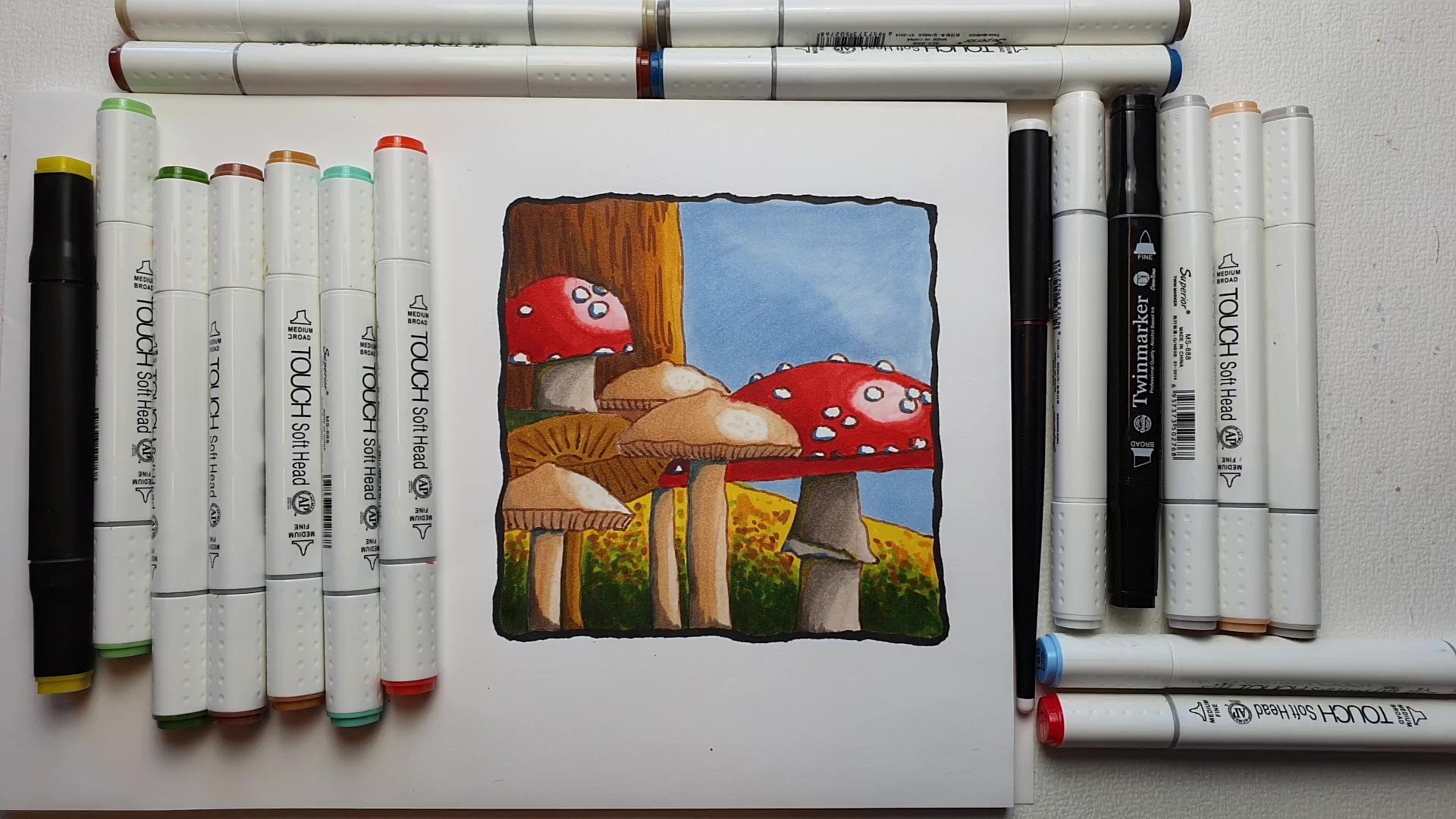
5. The Toadstools: Let's leave the
pumpkin till last. Go for a toad stool now, now these are the attraction
together with that pumpkin, this will catch you to tension. But because of all the blends of the nice colors
complementing each other, we get a nice composition
this way, toadstools. Well, let's go for that, right? I got a problem with
these toadstools. Well, and I don't have a
problem with toadstools. I really liked toadstools, but I haven't problem
with the colors. I do not have really red,
red, reddish colors. I got this, this, and this go for red. And that is not read, read, read, read as toadstools are. But I think we can
still get away with it by doing slightly
little trick. Yes, we're going to use
a little bit of trick. Now for the spectrum, nor was I. I would pick definitely different colors
for this bright colors, but for this, I don't have that. So I'm going to play
a little bit with it. What I'm gonna do is I'm
going to put down a layer first at the bottom to make these red colored, reddish more. I'm gonna do the one, the large totes to want
to play a little with. We've heard this one
can stay darker, a little bit muted, That's fine. This one I want a bit brighter. So what I'm gonna do, I'm
gonna put a yellow under it. And I only have one
real yellowish color and that is this one
is not even yellow. It's called a nice
hundred and 64. I would like a bright
yellow, but okay. For the spectrum, Noah, I would pick for this color, a C T, C T citrus, yellow. I don't know what is a C21? It is. Let me see if I can
find that somewhere. See T1, if you see the cap, almost same but this is a little bit more
greenish yellow. So CD1 for this one
I'm going to put D and this yellow I'm
gonna put under it. Then I'm going to blend
in some of these rats. We're going to pick up this red, of course, all the
rest of the race, the 214, that is called
a bright Africa. And for spectrum nowhere
I would use a orange, red OR free, OR free for that. I'm going to use this number
14 as the nice bright red, and that is actually is a red, familiar is a red color. And in the spectrum, Noah, I would do a CR that is unread. Nice red color, red, orange, bright color CR. And then the next
thing I'm going to use forces this one for my dark one, and that is called
French familiar, right? Nice color, 22 spectrum, Noah, I would pick for
that one the C R 11. And then I'm going back to the different colors back again, but we'll see how that works. Alright, let's go for that. What we're gonna
do first up here, I'm going to just
make it yellow. Bright yellow, isn't it? Not a knife? Bright yellow but it is yellowish.
Yellowish enough. Let's see. Let's go
for the whole thing. We could leaf spot, they're white, but let's
not do that. Let's go. Drove. Get this all nice and yellow as make sure we're not touching the scales. Want to keep the scales, if possible, nice and white. All right, good. Right. What we're gonna do
is we're going to try not to ruin this, all of this. So let's put this aside and
we're going to go in width, which is the next one to 14. So this one, yeah, the apical, the epic go to 14
bright apropos or the, OR free in spectrum who are on. This was the C21
and spectrum Noah. Alright, now this is a
completely different color. It's not an orange, but it will do for orange. I want a bit of an orange red
normally on the toadstools, but it will be this color. Let's see. I'll make sure I don't want
to touch that part. Keep that yellowish.
That would be okay. Could do it slightly rounder, but I think I'm okay with this. Alright, now we're getting
interesting color on this one. This is still a bottom layer. We can use a couple of
layers with alcohol markers, since they are hardly
damage your paper, you can do quite
some layers on it. All right, Good. Mr. Little bit there. Alright. Putting that aside, going to the next color,
that would be the 14. Yes, I got them in line. That is nice. 14, CR1. This is going to
be a lot redder. So let's see. We do want to have that of
course of there now see, now we're getting some nice
reds there too, but not, not all the way to work
around that. Good. Alright. Don't think
you can hear it, but the wind is howling here. It's a beautiful day. The wind is really,
really strong today. Careful with those white spots. Not going terribly. Well. I'm sitting at a little bit of a distance from it
for the camera, I'm hoping you will
be slightly closer to the drawing so that you can really make sure
you're leaving that, those nice scales as
they are supposed to be. I would need to hover more closely to it, but
I can't do that. Then you're not going to see much except for the
back of my head. And I don't think the back of my head is really
the educational. Alright, the last thing we're
gonna do want to add some nice strong red with that 22, that French familiar
CR 11 on the spectrum. Noaa, at some of
these points where I want some really dark shadow. I want to add that, especially here at the end
and at the bottom. Now we're getting
a nice toad stool. All right, Good. More here. Okay. Great. Now we're going back to
yellow or let's see. Yeah, I'm gonna come back
to that yellow and I'm going to blend this in here. See if we can blend this
in a little bit better, not touching the middle,
just the edge here too. And that's the nice thing
about alcohol markers. Nice and wet C. And now we get a nice
transition or blending away some of those
colors here to create a bit more of a light
effect. Even in the middle. There you go. Good. Alright, I like that. And now I think I wanna
go blend in that 14. Where is that, that familiar
that red color CRT. Definitely with that dark color. Go over it with
this color a little bit here to get that nice. Let that blend in. And
that's nice. See, good. Right? I like that. Alright, I might have taken
away slightly too much there. Add that in and let's go for that apical one more
time. That's 214. Alright. That will
blend in nicely. Since it's still wet. Should work pretty well. Look away the edge slightly. There you go. Alright. I'm going to leave this to dry. It looks like a nice TO, to go back to code
is to distort. So I'm not gonna
do the yellow one, this one pulling that
yellow away for now, I'm starting with the
214, the bright apropos. And I'm actually going to do the whole totes too with that. All right. This one only has a couple of spots, so that makes it easier. Right. That's the first one. Missed few spots down there. The next one, I'm going
to just go to the 14, that same color set up
the 14 or the C or C ten. And I'm gonna go Around here. Please. Don't think I'm going to touch
a little bit less large. Don't think we're going
to touch that part. Leave that a little
bit under the shadow, in shadow of the
large toad stool. So less bright colors. All right, Good. Now, for the last one
that really dark one. The the 22 or the CR 11. There you go. Alright.
That's it for now. And I'm going back to that
first color because I want to make a little bit nicer
blend around these edges. All right, and let
it do its job. Okay, good. Now, if you have a
colorless blender, see if I can find
one. Here's one. What you could do is right here, lift some of this
color carefully. At some there and let's shoot, lift some of that yellow. And we can do a
little bit there. And now let us do it work. Just leave it alone. And that will lift out the color as you
can see slowly but surely see some of the
widest coming back here to. And what we could do is here. This a little bit around here to get some nicer edge is if you don't have that,
don't worry about it. Just leave it as is. Alright, good. Will be
that part of the toe too. But that's not the whole TORC2. We need its stock, of course it's stem. We need to do something with
that to complete that light. Alright, let's do that. Alright, the stem, okay, I'm going to look
at my colors again. And this might be slightly tricky with
these colors I got. What I'm gonna do is I'm
going to use that raw silk. We can have it on
Thursday for the IBI one, that would be a
nice light color. Let's see, I'm going to need
some of the shadow with it. So I'm going to use this as
a base color plus white. I'm not going to do everything. Let's see which one would I
pick this one? These two? Yeah, then then we get a bit
of a cold fruit pink, right? It's pinky, pink
28, fruit pink 28. Or in these spectrum and a y, that will be T N2. If you have that set,
use the T and T2. I need some gray, some use this, this one, the blue-gray numbness, That's a baby blue. Let's
pick this one. Pg free for that, or the BGR in 32. Pg free, that is blue-gray
free or BGR free. And the spectrum no asset. I think I'm going to
use dose as the colors. And of course we need
something down there to write. Just one color will do. Let's see, one got this one. Let's pick this 111. I got to find that here. That is called much
easier TO hundred 11. And in spectrum real
world that would be Dp1 picket Dp1 for that one. Okay? Alright. Start with this one. I'm going
to just color down here. I'm not going to
regard any shadow. Just give this a
little bit of a color. And eye color works fine
as a shadow on his own. Alright, create a little bit
of a distinction between the stock and the
white of these scales. Right? Now this one,
what we're gonna do is I'm not going
to do everything. I'm going to leave some white in it to really make it nice, we should leave a
spot of white in it. Yes, we should definitely
this one would be tricky. I'm going to start with that
light color. What is that? 234 or the EV1 and started back, draw everything and
give it a line here. I leave that spot white or
that sport we'll do white. The next color. I'm
going to mix in some of the shadow with
that pinkish color, fruit pink number
28 or the T N2. Back here up down but
you won't see much. Yeah, That's not go any further
than that. A little bit. Very carefully, data's good. And I'm gonna get that gray, that blue-gray free
or the BGR free and add definitely
some shadow back here. That's not do up there. That's not only do back there. And now I'm seeing that my
color is bleeding through, but since that is a
light color, I'm okay. Let's pick the
lightest color again. Do 134 or silk. Mix it in. Just a little bit nicer. And while I have it, Let's see, I want to do the same here. Color debt and not cover that. Last quite a large part. Why we can do that? And the rest we're
going to color in. All right, good. This side, we're going to
need that later on again. Now I'm going to go for debts, or does that that fruit pink 28. Do all of it. I'm going to do a little
bit of a line here. A line here. Definitely do all
these shadows here. And there we go. Alright, and then lastly, we're going to get
that blue color. That's not blue,
blue, gray color. Bgr free. Okay, and we're going
for shadows around here. Shadow slightly
around their shadow up here a little bit,
and shadow back. And I think I might do
a little bit there. Alright, and I'm going to
work that out more or less away with that raw silk that
hundred and 34 or the EV1. The edges, I want to
blend in. A little bit. Nicer here too. Alright, and I'm just going
to touch that anymore. I'm going to leave
that like this. Good. That looks good. Alright, We've got
two more paths left. Yes, D, pumpkin, and of course, we've got a background. Let's do the pumpkin first, but we're going to do
that in the next lesson. Why shouldn't be a huge problem? We've got most of it already. Sort of pumpkin should
go really quick. Alright, see you in the next
lesson. For the pumpkin.
6. The Pumkin: The pumpkin, We're getting
there two more paths, the pumpkin itself
and the background. For the pumpkin, I'm only
going to use two colors. You see me holding them. For the yellow. I only got
one choice that will be that 164 and Nice color and I've got no other choice
for the spectrum. No audit will be LG1, but I'm going to mix
two colors there. And we're going to
use an, what is it? C T2 to a, C T2 to C2 to yellow costs. If you have two yellow colors, I would play a little
bit with that. And then for the orange, I'm going to use a two to
two that is called here, golden yellow, but it's closer to the orange
on the spectrum, the one that would be a
BOT-2 and bright orange too, I think that is well,
I'm not totally sure. So that will be the
colors, two colors. Let's go spectrum Nawab, three colors on this 12 colors. And we're gonna
do a really easy, I'm going to just do the
whole thing in one go. I'm not going to regard
light, shadow or whatever. Just go for the whole thing. Make sure I'm not going to blend in other columns in that. If you have more than
one color on yellow, I will do this darker. But since we've got
only one color, we need to play a
little bit with that. You could live and white, but then it gets really wide. I don't think I want that on
the pumpkin now under TORC2, I'm fine with a little bit
of a white spot on it. So she is trying nicely. Can I move that booklet away and down there to
allow it that color? So this will be my
pumpkin yellow. Again, if you have
different colors, one a bit brighter colors,
you could do that. Here a little bit. What I'm gonna do next is
I'm just gonna go again, but I'm not going to
touch those spots there. The really bright,
I'm going to leave. Really, really bright. But this I'm gonna do again, hopefully to get a bit
of a second layer on it. On top there. Alright. And C, That should
work a little bit, get it a little bit
lighter than the rest. Let's move this a little
bit in a nice shape. They you go. Now the orange. Just look a little bit of the photo and give
it some orange. Definitely. On these lines. I'm just going to start there. Alright. It looks
like a pumpkin. A little bit better, doesn't it? And the rest, what
I'm gonna do is I'm just going to call
up certain spots. Now you can follow the
photograph exactly or just do a little bit. Random ones some more down here. And up here, I'm
okay. Let's see. I want might not be on
the photograph that much, but for contrast, I really wanted to down
here a little bit. Alright, let's see. I'm going to do round here
to do this two down here. Not because it's
quite dark orange. Don't worry. Want to make sure this will get slightly lighter
as it is now by going, oh, who with that yellow again. Alright, I like this. Let's see. I'm going
to add some spots. Get it a little bit more. Pumpkin like I think
I'm okay with this. A bit more here, probably
slightly more here. Carefully, add a few
spots here and there. Okay, Good. I'm there we go. That looks nice, doesn't it? Now what I'm going to do
next is I'm just gonna go back with the
yellow. Go for it. Try to mix it in a little bit, tone it down a little bit, and hopefully get it not
as strong as it is now. Now if you have a
nice bright orange, How would say definitely? Use that to create even more
contrast in this image. Alright? Not drawing
all of that. Only where I've
done those spots. And there we go. Alright, and that is my pumpkin. Looks pretty nice, doesn't it? There? Right? I want it down here. Just a lay a stronger good
there goes my pumpkin. I'll leave that to dry. Well, that wasn't
too hard, was it? The pumpkin? Now the next step,
the background. Now in the photo, the background is more
of a Tuscan red color. I don't want to go get strong. I want to mute that
down a little bit. So let me go through
my list and see which color I think fits
on this drawing. I don't have much choice left. I don't want to use a
color I've already used, but I want to use
some contrast in it. So I'm going to take a look. I'm not going to go
for this pink ones, these lilac, There's
all way too strong. I do like perhaps a
combination of these two or this is too dark. But yeah, could work. Something like this. I'm
gonna go disappear on here. This one that is a nice color, hundred and 97 and Spectrum know why that
would be a DP two, I think let's pick that with it. 197, where is it?
It's right here. It is called a light old rows and that is well,
they don't compare, but as you can see, probably that color
and that color fit. These are way closer.
Alright, good. Right. And if you need again, I've kept the photograph in it. And if you need to compare them, just compare these colors
with what you have. This color could go to, but it would make it
really, really dark. And I don't think
I want to do that. I'm going to stick to one
color only for the background. I'm going to make it
myself really easy. I'm just going to paint
in my background nicely. Then I'm done basically it. Well, that's not
for this lesson. I'm going to do that
in the next lesson. I'll let you catch
up first again. Do the pumpkin,
create a nice orange, whatever colors you have in your set, create
something beautiful. And then once you're done, I'll see you in the next lesson.
7. The Background: Welcome to the last lesson. We're going to do background. And I said, I just
pick one color. You hundred and 97
light all rows. And we're going to do
my background proof that shouldn't be
too hard, should it? I just want to get
a nice background. I don't even care if
it is totally even. I can have some effects in it. I'm going to just start at
the easy part down here and color this in nicely. Some background there.
Yes, and I actually, I really like this color. Now you can do two things here. You can go really slow or
you can go really rough. And depending on what you do, if you go rough, you get
a more patchy background. If you go slow, you get a nice and
even background, but you can also
combine the two. So I'm going nice and slow. There you go, get a
nice even background. But if I go really quick, I got a totally different than if I go back over it again. Of course, you get some darker. I'm think I'm going to stay too. Let's see. Nice and even and
let's see how it dries because that's the thing
with a large area. It always dries
differently than you think because you just don't put an even amount of pressure
always on your marker. So you get a different
thing and if you go over it a lot of times like
here, you don't see that. But if you only go over
it once, like ASC, this is already drying up
with a difference in it. Lighter spots, darker spots. That's okay because that
gives a nice effect. Now I'm noticing something. I forgot. One spot there. So bring that in. All right. Let's continue here. Alright, good. But they're definitely there. I did all that. Alright, now let's do, let's do this first. Mock careful there. Now if you have a small, very small bullet point, you could actually use
the back of it that has that large tip. Just not a bullet tip. I just can't think of the name and this moment. I'll show you that. But I want to keep them going
before this old rise up. Spot forgotten there. Let's see. I'm going to create a transition here and
not do the whole thing. Need some there somewhere
while it's wet. I'm not going all the
way to the edge either. Careful here. Draw
around it first. Alright, how forgot
a little bit there, but I don't mind. Let's see. Can I extend? Just a little bit? Alright, good. Mom, I'm
going to leave this to dry and should it try nicely. Alright, chisel tip,
that's the other one, the spectrum noaa has a
chisel tip on the other side. I'm not a fan of the chisel tip, but it works for
a large area too. Alright, good. If you want or you can
do the whole thing. Of course, you can
do this part too, or just leave it like either. I think that is a nice little
bit of a transition there. Okay. Might add. Do
I wanna do that? No, I don't want to do that. Just most likely
might not blend in. We'll see what happens. There you go. Alright, good. We should be okay.
It's got some spots. They're touched them
up a little bit. And I think I'm
okay with the rest. A little bit here.
Still white there. Now that is the one
I have white spots. Now I'm done.
Alright, Now you can do this whole part
here if you want to, or just leave it like this. I will conclude this drawing. Now. The only thing I'm not
sure about his debt part, so I can touch that up. Let's see with the
base color to 14, I think to 14, where are you? The Africa. Let's see if I can touch it up. Just a little bit better. Alright, now I want
to go back with that. Bright red. Since this is wet slightly
here. And let it dry. Okay, good. I liked that better. A bit
nicer than what we had before. Okay. I'm putting them
all back and that's it. Now, we're going to
remove this one. And we'll see if we bled
through here a little bit, see, and I would have gotten onto my other paper if you had another paper on the rate and you have colors
on the right, and you just don't
want that better is to use a paper on it that is a little bit of
protection for your drawing. And that concludes this
lesson to next up, is the project, the final part? I'm talking to you
about the project and then this hard class system. Alright, see you
in the last part.
8. The Project & Demonstration: Welcome to the project. And now you're probably
saying, hang on. There's part missing. You said you do this twice. Yes, I'm gonna do this twice. I'm not going to walk you
through what I'm doing again. I'm just going to
draw the second part with the other markers
and compare it. Once I'm done, That will
be after this project. The project simply is yes, to create this and
please do post it. I would really love to see what you create with this and
what you come up with. Even use color variations.
You could do that. Different colors, the colors you like to make this
drawing really pop. I really like mine. And even though this wouldn't be the colors I might have chosen, naturally, they do work
and it's a nice set. So I would love to
see what you create. Let's go into the
spectrum no apart now. Alright, so what I'm
gonna do is I'm simply going to turn this
paper over like this. There is my second drawing that you don't have
a second drawing. You don't need to do this twice. I'm gonna do this twice. Put it nicely on the camera. There we go. And
I've got a list of colors and I've got
spectrum, no Rs. And here our day, what I'm gonna do is
I'm going to just color and do exactly the same. I'm going to speed that up. Once I'm done, I'm just
going to compare the two. Well, that's debts. I finished my spectrum,
Noah drawing, coloring with the
alcohol markers to what I wanna do now
is the last thing. I just want to compare
them so that you can see the difference
between the two. I picked all the colors as
close as I could as set for the pumpkin and the toads to make them pop a
little bit more. At least that's what I tried. So let's see what the result is. And here they are, both of them. I numbered them. Number one is the one I did in the class. Number two is to one
with the spectrum Noah. And as you can see, they
both look beautiful. Pick your pick whichever
one you like better. Some deeper reds in here. There's some bright
reds in here. But pretty close. Perhaps some of
the colors not as strong as you can see here. Like on here that D spectrum Noah blends
a little bit more. So what you could do with
something like that, use even a third
color in it too, like I've done here. Use three colors and make a nice gradation
with all the colors. I would say the
inexpensive ones are not even overpower that much
by the expensive ones. Yes, I've got a larger
color range here, so I can play a little
bit more of the colors. But these are great too. And the price difference
between these two, well, it's night and day, and these aren't even
expensive as the capex ones. Those are even far
more expensive. Thank you for being
with me in this class. I really enjoyed creating these drawings with
the alcohol markers, really great medium
to work with. And that also ends this autumn
series for the next class. Well, it's got to be winter, so we know something when
tree, I don't know yet. We'll see what
happens with that. Well, if you want to
do some more classes, there's plenty more classes I
do have here on Skillshare. So I do hope to see you
in another class of mine.
 Benjamin A, Art Teacher, illustrator Art by Benjamin