Transcripts
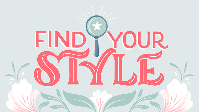
1. Intro: We, as human beings, are deeply driven by our sense of identity. It's how we define ourselves, and often how others define us. As creatives, our unique style serves as our artistic identity. It's what helps to define you as an artist. Speaking of identity, hi, my name is Gia Graham, and I'm an illustrator, hand lettering artist, and top teacher here on Skillshare. My creative identity or my creative style is rooted in the way I combine hand-lettering with lush floral illustrations and well-curated color palettes. The beauty of having a defined creative identity is that it's more than just a visual calling card. It can also help you build a thriving art brand. Once I developed a style of my own, my lettering and illustration career truly started to flourish. Clients and art directors began to seek me out because they thought my creative aesthetic would be perfect for their project or products. My artwork has appeared on a variety of products from greeting cards and apparel to book covers and even accessories. As most established artists will tell you, there's no magic formula for developing your style, and consistent practice is the key. But when you're a beginner learning a new skill, it's sometimes difficult to know how to practice. As beginners, we often look to other artists for inspiration or mimic what we see, but that doesn't get us closer to tapping into our own style journey. Now, this class will not give you a style, but we're going to take a very practical, beginner-friendly approach to style development, and I will show you how to practice your lettering in a logical and intentional way that will help you reach your goal of finding your own aesthetic. In the first half of this class, we will take stock of your visual influences and how you internalize them. Then in the second half of the class, I will show you how to observe your influences with intention and how to explore and push your creativity, so you can remix and reinterpret those influences rather than just mimicking them. Although the project will be lettering based, this class is not just for lettering artists. The principles can be applied to any creative focus, whether that's illustration, painting, or fine art. I will be working digitally on the iPad Pro, using the Procreate app, but you're welcome to work in whatever medium you prefer. An iPad is not required for this class. Please note that although this is a beginner class, the focus will not be on lettering technique. If you're not familiar with hand lettering or the basics of Procreate, I recommend starting with my hand lettering in Procreate class. Now, if you're ready to set forth on the journey towards finding your style, let's take that first step. I'll see you in class.
2. Class Project: The project for this class, is to create your own version of the sample artwork provided by following the step-by-step process outlined in the class. If you'd like to dive deeper into your style development process, I've also included a fun project in the form of a five-day Mini Drawing Challenge; where you can recreate five different lettering pieces in your own emerging style. You can work on the bonus project at your own pace. The goal is to practice not to achieve perfection. Please be sure to upload your artwork in the project gallery. You're also welcome to share your sketches or whatever notes you'd like to include. I love seeing your thought process. To share your project, go to the Projects and Resources tab, then click on the "Class Project" button. Name your project, and upload as many images as you would like by clicking the image icon here where it says, add more content. You can also type notes or ask questions within the project area. Don't forget to upload a cover image, because that's what will appear in the gallery view. Here in the resources section, you can download all the sample artwork you need for the practice assignments. If you have any questions for me, you can type them here in the discussion area. I can't wait to see how your style journey evolves. But before we get to that point, let's talk a bit about how your influences can affect your style. I'll see you in the next lesson.
3. Input & Output: I want to reiterate that developing your style doesn't happen overnight. Just like it took time for your personal identity to take shape, your creative identity also needs to be nurtured and developed. Also before we get started, I want to clarify a couple of things. When I refer to style in this class, I'm referring to a signature style. One's artistic aesthetic. It's your unique creative expression and the distinctive way you approach your art. That's not to be confused with lettering styles. When I refer to a lettering style, I'm talking about the specific look of the letterforms you use in a piece of art. In terms of art, your signature style emerges when you consistently make the same choices in your work. This could show itself in the colors you gravitate towards, or the techniques you repeatedly use, or the subject matter or content that repeatedly appears in your work. Lisa Congdon is a great example of an artist with a very recognizable style. Her palette is consistent, almost always incorporating blue, pink, red, or black. Her lettering has a very playful hand-drawn feel, and she often uses bold, simplified shapes in her work. By the way, on a related note, Lisa has written a book called Find Your Artistic Voice, which is all about establishing your identity as an artist. I recommend it if you'd like to take a deeper dive into this topic. I bought mine on Amazon and I'll leave a link for you in the resources section. Belinda Kou's work is an example of how content correlates to style. Much of Belinda's work centers around food and you'll often find fun flying ingredients swirling around her lettering. Jill De Haan is an example of an artist whose work takes many forms, but her own unique aesthetic still manages to shine through, whether it's her intricate leafy layouts or the way she tells stories with detailed letterforms. Her illustrative lettering is easy to recognize as distinctively her own. The age-old question is: How do you get to the point where you have a distinct and recognizable creative identity? How does one develop a style? Believe it or not, style development actually happens long before you put pencil to paper or Apple pencil to iPad as the case may be. Although we aren't always conscious of it, the visual information we consume or our input often informs the work we create, which is our output. It all starts with what we observe or ingest every day. There's an interesting documentary called The Creative Brain on Netflix, which explores creativity and how the brain works. One of the insights from the show that I found particularly interesting is the fact that inputs from the world around us are constantly colliding and remixing in our brain. We, as humans have the unique ability to take ideas from one place and apply them in a completely different context. For example, I grew up in a very colorful country. Everything is vibrant in Barbados. Not just the bright blue beaches or the pink and orange sunsets, but it's very common to find houses and even buildings in the city painted in almost shockingly bright colors. Each year, our Crop Over Festival welcomes an explosion of color in the form of ornate costumes. All of this colorful input has been present in my brain since childhood. It makes total sense that my creative style is so heavily influenced by and rooted in color. Along with these kinds of visual influences, another powerful input is your collection of creative influences. The artists you admire, the accounts you follow on Instagram, the creative content that you look at every day. All of this seeps into your mind, mixes, and collides with what's already there. Although you may not realize it, these things can in some way resurface in the art you create. The first step on this style journey is to take stock of your inputs. Here's your first assignment. List three visual influences you remember from your childhood. Were you surrounded by the hard lines of a cityscape or the organic shapes in nature? Do you have a memory of bold patterns in your household or was the decor more neutral? Did you see lots of vibrant colors every day or were your surroundings more muted? The next step is to list three artists whose work you love. Who are they? What draws you to their work? Also, note if there's anything they all have in common. I've provided a worksheet for you to write your findings down. You can either print the PDF file or you can download and import the Procreate file to make notes on your iPad. The last part of the assignment is to identify any other skills, hobbies, experiences, or habits that have become part of who you are or the way you think. Do you have any hobbies other than art? Can you list three skills you learned in school that you still use? Or is there something you've learned at your current or previous job that might be helpful? I've already done this exercise and I'll share my notes. For my visual influences from childhood, I noted lots of vibrant color as I mentioned before. Nature was another visual influence for me. There were always plants, flowers, and trees everywhere. I especially remember all of the fruit trees. The serenity of the ocean was another influence, a view of the ocean was never far away. Here are three artists whose work I love. First is Caroline South. I love how she plays with color and composition. The second artist I listed is Dana Tanamachi. I love the graphic nature of her artwork and how clean and precise it is. The third artist I chose is Kelly Ventura. The movement in her work is really appealing to me. It's very lively and expressive. Once I put their work side-by-side and really paid attention, I notice that all three artists incorporate nature or nature-inspired elements into their work, even though it's in very different ways. As for my hobbies, I wrote gardening. Three skills I acquired in college include design layouts, how to critique, and visual presentation. Three skills I learned from my previous day jobs include photo styling, art direction, both giving art direction and receiving it, and project management. Now, we're not going to take these answers then add some special formula, and then poof, immediately identify your style. The point of this exercise is simply to bring awareness to these things that you might not even realize have influenced you. Up next, we're going to take a look at my style journey as an example of how all these inputs can manifest in one's artistic aesthetic. I'll see you in the next lesson.
4. A Style Journey: I know I've already said this but it bears repeating. Style development does not happen overnight. It's a process. Even if it appears as though someone has found their style quickly, the truth is what you're seeing is more than likely the culmination of a long, steady build. I'd like to take you on a little trip down my career path as an example to show you what that steady build looks like. My creative career actually started in graphic design. I did lots of corporate design like these brochures and marketing materials. Most of the visual input I was receiving during that time was focused on typography and how to arrange information in the most appealing layout. I left corporate design to start a wedding invitation business and while immersed in the wedding world, I started playing with color palettes. Blogs were really big at that time and brides were always in search of style inspiration for their weddings. I started curating these color boards which I shared on my blog and on Pinterest every week. At this time, a lot of my input was color curation. The first real iteration of the work that I do now started when I launched my collection of greeting cards and stationery back in 2014. At the time, I still wasn't doing any hand lettering but I started to explore my floral illustration style and I would experiment with the interplay between the florals and typography. By the way, just to clarify, typography refers to the use of fonts in print and design. It's not the same as hand lettering. In January of 2018, I downloaded the Procreate app and decided to really give this lettering thing ago which put me on the path to my current style. At the time, I was only focused on learning and practicing. I had no expectations for what it would become. I created my current Instagram account and I used the drawing challenges to keep me motivated. That first year was really experimental. I tried a little bit of everything. I started following lots of lettering accounts and I looked at hand lettering every single day. I was really consuming lots of different lettering styles. By the end of the year, I took stock of the body of work I had created and I made note of which pieces I like the most, which pieces I enjoyed creating the most, and which elements kept recurring in my work. Around 2019 is when my style really started to emerge. After my end-of-year artistic audit, I realized two things. I wanted to make color a central part of my work, and I really enjoyed adding floral illustrations to my lettering. With that knowledge, I became more intentional about what I was creating. In hindsight, I can see that my stored inputs had been remixed and expressed in these new ways. Those wedding color boards I used to create were the genesis of the monthly limited palettes I've been creating and sharing for the past couple of years. My graphic design layout experience is the foundation for how I approach lettering layouts now. These inputs merged with the new lettering knowledge I was gaining and various lettering styles I was observing and it sparked to creativity of my own. With consistent practice, my style soon began to take shape. I also think it's important to note that you don't create your style by taking all of your inspirations and copying bits and pieces from each. A style becomes unique to you when you're able to remix and reinterpret your inputs based on your own perspective and experiences. For example, in the last lesson, I listed three artists whose work I love and look at often. They are a big source of visual input for me. However, my work doesn't look anything like any of theirs. Here's how I think my inputs have been reinterpreted. I mentioned that I really like the movement and energy in Kelly Ventura's work. I think this shows up in my work because I tend to add a lot of movement to my floral illustrations. I just do it in a different way. In Caroline South's work, there's a fresh modern approach to the way that she uses pastel colors. I tend to use pastels in slightly unexpected combinations as well. The graphic designer in me really loves the structure in Dana Tanamachi's work. Although my work tends to be more loose and flowy, I do find myself gravitating towards more structured, symmetrical layouts once in a while. As you can see, there's never a one-to-one comparison. My work can be influenced by other artists while still being unique to me. Now, let's get back to focusing on you. After the last assignment, you're now aware of some of your inputs. These may or may not come into play as your style emerges but it's good to be aware of why you might be making certain stylistic choices. Now, what about the practical part of developing your style? We'll focus on that in the next lesson.
5. Three Steps To Style: The remixing and reinterpreting of inputs we talked about in the last lesson usually happen unconsciously. I have an art school background and many years of design experience to pull from which helps the process happen a little more intuitively for me. But even if you're a beginner, you can absolutely still do this. My goal is to break down that intuitive process into actionable steps which you can use to help train your creative mind. The real magic happens when you practice your lettering regularly. But how you practice can make all the difference. There are things you can do to help you practice in an intentional way. I'm calling these the three steps to style: observation, exploration, and consistency. First, let's talk about observation. I touched on this briefly in lesson 18 of my hand lettering in Procreate class, and I think it's worth further discussion here. In order to truly benefit from all the visual influences you're constantly taking in, it's important to observe with intention. Zombie scrolling through Instagram doesn't quite do the job. As I said in my hand lettering class, it's important to observe with attentive eyes. Let's say you're scrolling on Instagram and you're looking at lots of incredible art. You come across a hand lettered piece that really inspires you and you're completely enamored with that person's style. You've already liked the post and gave it several heart-eye emojis. This is where I think many beginners stumble. What often happens is that a beginner will see a piece of artwork they love, and rather than doing the deep observation needed to understand why they love the artwork, they immediately want to replicate the look. They go straight from input to output with no remixing, which results in simply copying someone else's style, rather than taking steps towards discovering their own. Quite often, I'm tagged on Instagram post where someone created a piece of lettering but has copied an exact layout of mine or the exact florals I've used. There will often be a sweet know in the caption saying how they were inspired by my work. The thing is that's not quite inspiration, it's imitation. Although this can be frustrating to me as an artist, I do understand that it is a very normal and expected thing for beginners to do. Aristotle wrote that, "The human being is the most imitative creature in the world. Learns at first by imitation." It's something we all do from childhood and continue to do well into our adult lives, especially when we are learning a new skill. When giving advice to beginners, most artists will say that you should only gather inspiration from artists outside of your medium. Or that you should never look at the work of another lettering artist when you're trying to create your own work. I'm sure I've probably given this advice in the past. But what I've come to realize is that most beginners cannot relate to that advice, especially if they haven't been to art school. It's very difficult to know how to intuitively and inventively re-mix inspiration if you haven't had the training to do so. The fact of the matter is that most new artists are scrolling Instagram daily trying to learn by imitating those they admire. The challenge is to reshape how you imitate. Imitation with integrity and intention can actually be a great way to add new information to your creative vault, which you can unconsciously pull from and reinterpret when developing your style. Copying with integrity means that you're doing it only for your personal practice. It is never okay to copy someone else's work, then post it as your own. That's art theft, plain and simple. There's the idea of floating out there that if you change a few things in your copied version, perhaps the words or the colors, then that's okay. The truth is, it's not okay. Remember that all of the established artists you're inspired by have put in the hard work required to develop their individual style. When somebody copies their work or elements from their work, it's hurtful to that artist you admire so much and it's hurtful to their brand. When you copy with intention, it means that you are being mindful of what you're doing and how you're doing it. The point is to dissect the work you're imitating, try to figure out what about it inspires you? What resonates with you? How is it done, and what specific choices were made? When you copy in this mindful way, you're soaking in much more knowledge than you realize. Those inputs start to bounce around in your brain, ready for remixing. Later in the class, we'll dig into a practical exercise on how to copy with intention. Stay tuned for that. There is a third part of the observation process, and that's self observation, where you'll observe your own work. In the last lesson, I mentioned that I did a year-end audit after my first year of lettering practice. I think it's important to step back and take stock of the body of work you're creating and make note of any recurring themes, subjects, colors, and so on. Taking a moment to reflect in this way also helps you see the progress that you're making, which of course can be a great motivator to keep pushing forward. How often you do this art audit will depend on how often you practice and how much art you're making. But I would suggest doing this at least once every two to three months. Now, onto the second step towards style, which is exploration. You found that piece of lettering art that really inspires you. You've done your mindful observation and you have a clear understanding of why you like the artwork. Now, you can think about how to use that input to push things further. In order to push things further, you need to explore. Take key features you observed from that inspiring artwork and try new ways of approaching them. Try lettering style you feel more comfortable with. Try different embellishments on the lettering. Rework the layout, or incorporate elements you love, like your favorite colors, a flourish you really like to use, and so on. Push past your comfort zone and try new things. Don't be afraid of failure. Even if the result is not good or not what you hoped for, there's always something new to discover about ourselves as creatives if we give ourselves permission to explore. Also, remember that every piece you create doesn't need to be posted on social media. Take the pressure off yourself to create something worthy of people's approval. The last and most important step towards style is consistency. There's no getting around it and there are no shortcuts. Consistent practice is the only way to develop a signature style. Now how much you practice will be different for each person. Daily practice might not be feasible for everyone, but I do recommend that you practice your lettering at least three to four days a week. It's best if you can build structure around your practice to help keep you motivated. This can be in a form of a project you create for yourself, or you can participate in an online challenge. For example, once a year, the Instagram account, 36 Days of Type, runs a month-long challenge for lettering the alphabet. Of course, you can also create your own project. Belinda Kou, who I mentioned earlier in the class, has done this a couple of times. With her Hungrily Ever After series, she created 18 hand-lettered and illustrated book covers that were food-inspired spoofs on classic fairy tales. Before that, Belinda created a series called What's Not Cooking, where she created 15 pieces with one central theme. Lauren Hom famously launched her lettering career while unearthing her style by creating her daily dishonesty project, which documented the little white lies she told herself every day. Ohn Mar Win isn't a lettering artist, but she's a great example of someone who regularly participates in 100 day challenges which have helped her master her style. Ohn Mar is also a top teacher here on Skillshare, and she has a class on daily art practice, which has helpful insights on mindset and the approach to consistent practice. If finding your style is a priority for you, you'll need to make the time to practice. Also, keep in mind that practice shouldn't feel like a burden. Yes, we have those days when we don't feel like doing anything. But if lettering is something you're truly passionate about, practicing should feel more like an indulgence rather than a chore. To recap, the three steps to style are observation, exploration, and consistency. Observe others' work with intention and integrity. Push your creativity by exploring and trying new things, and practice consistently in order for your style to take shape. Up next, we finally get to draw. We're going to start putting all these things we've talked about into practice, starting with an observation exercise. I'll see you in the next lesson.
6. Observation Exercise: Let's get started. I'm going to walk you through how I approach the observation practice I outlined in the last lesson. As a reminder, the goal is to observe with attentive eyes, copy with integrity, and copy with intention. My source of inspiration is this Chill Out piece, created by one of my lettering friends, Jane Wongjirad, better known as cottonwood312 on Instagram. Born in Thailand and based in Chicago, Jane is a graphic designer by day and loves to experiment with lettering after hours. She's really skilled with script lettering and delicate flourishes. That combined with the rich dark colors she often uses, adds a real elegance to her work, which I love. When I first saw this piece, what immediately drew me in was the calm, relaxed feeling it gave, which of course works perfectly with the phrase, chill out. I love the mix of the soft pink with the strong grounded colors. The script lettering is precise but still feels relaxed and almost windswept with the addition of the subtle drop line. I also noticed that Jane used a loose textural style of inking the leaves and florals, which adds to the relaxed vibe of the piece, and the way she's layered the florals with the large blooms upfront and the smaller blooms in the background really helps to create dimension and draws you into the piece. Jane has given me special permission to recreate her artwork for this class, and I have no intention of re-posting the copy I create on any platforms, online or otherwise. This part of the exercise is purely for personal practice. Don't worry, at the end of this lesson, I will provide artwork for you to use for your observation practice. Please, do not imitate Jane's artwork without permission. Now, I'm going to attempt to recreate this piece intentionally, trying to figure out how it was done and what choices were made. The first thing I notice is that the lettering bounces, it's not on a straight baseline. There's also this great interaction here where the word Out just tucks into the space left by the curve of Chill. Script lettering doesn't really come easily for me, so I'm going to have to focus on the shapes and figure out how these letterforms are structured. As usual, I'm going to start with a rough skeleton sketch just so that I can get the placement figured out. I've got the lettering down, so now it's time for the flowers. These two stems curve inward slightly, almost creating a frame around the lettering, so I'm going to start by positioning those, and then I'll just fill in from there. My sketch seems about right, so now it's time for the inking. The first thing I'm going to do is just make my reference window larger here and use the eyedropper tool to select colors within the piece so that I can make the palette. Let me turn my sketch off, and just start pulling colors. I created a new pallet and saved all those colors for easy reference. Now I can start inking, so I'm going to reduce the opacity here, start a new layer. I noticed that the inking on the lettering here is really crisp and clean. I'm going to use the monoline brush, and this lettering is in the brown, so I'll choose that. So Jane's lettering also included an inline detail and a really subtle drop lines, so I'm going to add those next. Now in contrast to the lettering which was nice and crisp, the inking for the florals is very loose. It has a lot of texture to it. It's like a dry ink texture, so I think I'm going to use a brush from this dry textures set, and I'll add a link in the resources section for where I purchased this brush set. The thick dry brush should work well here, so I'm going to choose this dark blue, which is what Jane used for all of the leaves and stems, and I'm just going to keep this nice and loose because all the imperfections really add to the texture. Not sure how well you can see it on screen, but there it is, slightly lighter blue lines and details in each leaf. So I'm going to add that now. For the flowers, I think the best way to approach it is to build layers of texture. So I'll start with a large loose strokes for the petals and then go from there, and then there are also these tiny little yellow dots in Jane's piece. So I'll add those to each of the flowers as well. Now one thing I noticed during my attentive observation that I actually didn't notice when I first looked at this piece, were these tone on tone leaves in the background. They're subtle, but they really do add to the depth of the piece. So I'll add those and finish up any remaining details. Here's the result. It's not a perfect replica, but I think I managed to capture the essence of Jane's piece. What did I learn from this exercise? Well, I've never tried this particular style of script lettering before, so recreating this helped me understand how the letterforms were structured. Using a drop line the way Jane did is a great way to add subtle movement to lettering, and that's the technique I'll keep in mind for future projects. The tone on tone leaves in the background is another technique I've never thought of. It's a tool I could potentially implement on another piece in a slightly different way. Now here's your assignment. I've drawn this piece for you to recreate. If you're working digitally, the JPEG file is available in the resources section for you to download and import into Procreate. Just as I demonstrated in this lesson, practice observing with attentive eyes, lists the things you notice and the things that you like about the piece, then copy the piece with intention, paying attention to the details and choices made. Also, remember to copy with integrity, please do not share your copied version online as if it is your own artwork. This exercise is strictly for your personal practice in this class. Once you become more experienced, this imitation step won't be necessary. The more you practice, the more seamless and intuitive this process will become. But for now, it's a great way to build the observation muscle, especially if you're a beginner. Up next, we're going to push this further. I will explore ways to re-interpret the mood and details of Jane's piece, and I'll give you an assignment for you to do the same with my piece. I'll see you in the next lesson.
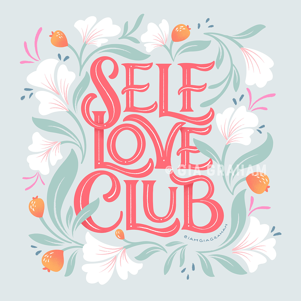
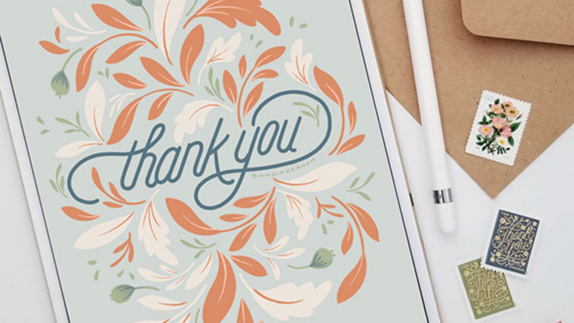
7. Exploration Exercise: The observation assignment in the last lesson was all about looking outward, examining someone else's creative choices. Now that we've taken in all those details, it's time to look inward, start exploring and try to pull from your own creative vault. The goal is to bring parts of yourself into the work. Start by revisiting the notes you made in the last two assignments. These are the highlights I pulled from my visual input notes. The inputs I recognize and connect to are color, nature, serenity, clean, precise, graphic work, and movement. Here's what I highlighted from my observation notes when I studied Jane's piece, the lettering style was relaxed but still crisp and refined. I also noted that texture and dimension. My goal is to reinterpret this piece, keeping those things in mind, I want to keep the relaxed yet refined vibe, and the texture, and dimension from Jane's piece. But I want to incorporate the things that resonate with me, such as color, movement, and precise, graphic quality. The most logical place to start is with the lettering. I don't want to use exactly the same script style, but I do want to keep the same casual and relaxed feeling. I'm going to try chilled-out uppercase lettering style. By the way, this wide brush I'm sketching with is the block pencil brush by Cynlop Ink. Cynthia was kind enough to offer my students a coupon code for her shop, so I'll leave the link and code in the resources section for you. I really like the way the word out is tucked into this curve created by chill, and the way the crossbar of the T also fits perfectly in this little nook. I'm trying to bring that same feeling into this lettering. So I've tucked one L into the shape of the other. This little curve that the L is making here seemed like a great place for the crossbar of this T. I actually think I can also make this O feel like it's tucked into this space a little bit more too. Now, as we saw in the last lesson, there's a lovely subtle drop line used in this lettering. I'm not going to do a drop line, but I think I'll use a drop shadow instead. Now for the florals, I like lots of movement in my florals, so rather than anchoring them to the bottom of the canvas, I think I'm going to have them surrounding the lettering. I'm going to keep the leaves large like Jane did, but I'm going to use shapes that just come more naturally to me. That'll be another way to separate my work from hers. In the last lesson, we talked about how the leaves here are layered to give the piece more dimension, I'm going to add a little dimension by having some of my leaves overlap the lettering. Of course, I don't want to affect legibility, so I'm just going to have them cover just small areas of the letters so that we can still read everything. I'm pleased with the layout and I feel like it looks different enough from Jane's piece. I'm going to close out this reference and now I can move on to color. In her piece, Jane combined these really soft tones with really deep grounded colors. I tend to combine soft tones with more saturated colors, so I'm going to shift this palette a bit to something that feels a little bit more like me. I'm definitely going to keep this pink and this coral, but I want to lighten up this blue slightly. I also want to keep a lavender color, but I wanted to be a little bit lighter and maybe even a little more pink in it, and I actually think I want to add a nice plum color as well. For another pop of color, I think I'm going to brighten up this deep red. I've adjusted all the colors that I wanted to adjust and I've added a couple extra options for shading and highlights and so on. Now that my colors are all set, I can start inking. By the way, if color selection is a challenge for you, I have a couple of helpful resources. For a quick fix, you can sign up for my once a month email newsletter to get access to my archive of palettes, I'll include a link in the resources, or you can take my color palettes class to learn how to create palettes of your own. If you've ever watched my time-lapse videos on Instagram, you'll know that I usually ink in black first, it's just a personal preference. If you'd like, you can check out my live encore class on illustrating a thank you note for an explanation of how I approach inking in this way. Now, I don't want to use the same embellishments that Jane did so rather than doing an inline, I think I'm going to outline each of these letters. I think that will add a similar polished feeling to these relaxed letterforms. I just made a clipping mask over the purple letters. That way I can just go in and create the outlines without worrying about staying within the shape. Now, for the leaves and flowers, rather than starting with a very textured brush like I did in the observation exercise; I'm going to start with mostly clean shapes and then add texture afterwards. I like to add some subtle shading in my leaves, so I'm going to use my gouache shader brush here. I'll leave a link in the resources section for where I got this brush. Here's the final result. As you can see, although my final piece was heavily inspired by Jane's work, the two look nothing alike. After the observation assignment and imitation practice, you should now be very familiar with this artwork. Now it's time to stretch yourself and see how you can reinterpret my piece. To be clear, the goal is not to copy my piece, change one or two details, then call it your own; try to push further than that, alter the layout, change the style of the letterforms, or try something different with the florals. The point is to experiment and bring more of yourself into it. If you're new to drawing flowers, watch my fun with florals class, where I break down the process and show you how you can create your own imaginative blooms or you can replace the flowers with something you feel more comfortable drawing. Remember, although my artwork is serving as the inspiration, your finished piece should not look like mine. I asked a couple of my lettering friends to join us in this exercise, so they also drew this piece in their own style. Jane and I traded places, and this time, she has re-interpreted my artwork and made it her own. As you can see, we both incorporated florals and similar palettes, yet the artwork is quite different. Jane's skill with script lettering really shines here. I loved the way she drew the words, Self Love. There was a connection between the S and L in my piece. Jane has re-interpreted that connection by creating this gorgeous ligature between her S and L, rather than having the letters overlap the way I did. While my piece creates a square shape, Jane has opted for more of a circular layout. This artwork clearly represents Jane's beautiful style. Now, here's another style comparison. Cynthia Lopez is another one of my lettering friends. I mentioned her custom procreate brushes earlier in the lesson. There's an easy, effortless quality in Cynthia's work. She often incorporates big bold blooms with her lettering, which stand out against the dark backgrounds she often uses. Another calling card of Cynthia's work is the way she plays with texture. In Cynthia's version of the Self Love Club piece, she used her signature dark palette and casual script style. She decided to change the format from square to vertical and she incorporated lots of that yummy texture she's known for it. This is 100 percent Cynthia's style. As you can see, there are various ways you can re-interpret the artwork. Remember to tap into your inputs and try to re-mix your influences to come up with something that represents you. Up next, we're going to look at a few ways to create structure around your practice, including a fun bonus project. I'll see you in the next lesson.
8. Consistent Practice: Now that you've worked on a couple of pieces and you've got some practice under your belt, let's keep the momentum going. Consistent practice is where progress really starts to happen. To help you build structure around your practice, I've set up a bonus assignment for you in the form of a five-day mini drawing challenge. Here's how it works. I've created five lettering pieces for you to use as inspiration. Your assignment is to re-interpret each piece in your own emerging style. Since the phrase for the main class project was self-love club, we're continuing that self-care theme, so as you can see, each phrase is related to self-care in some way. You'll also notice that the complexity of the artwork changes with each day of the challenge. The first piece is fairly simple with just one word and a minimal layout, while the fifth piece is more detailed, don't be intimidated though. It's perfectly fine if you get to the fifth piece and you still don't feel confident enough to tackle a more complex layout. Simplify it, make it work for you. After all, the point here is to tap into your personal aesthetic. Although I'm calling it a five-day challenge, there's really no time limit. Whether it takes five days or five weeks to complete the challenge, just go at your own pace. The goal is simply to be consistent and to have a collection of five completed pieces by the end of the project. You will find the prompts and inspiration artwork for this bonus challenge in the class PDF guide, which you can download in the resources section. There are two ways you can approach this challenge. You can either use visual prompts or word prompts. The visual approach is essentially what we've been doing throughout the class. Much like what Jane and Cynthia did, you would use my artwork as the inspiration, but you will explore and try new themes so that your piece isn't simply a replica of what I've created. Of course, if it's helpful, you're welcome to first start with the observation and imitation exercises, as long as you imitate with intention and integrity like we talked about. But don't stop there, push further and try to reinterpret the artwork. If you have a little more experience with lettering and you're more comfortable with the process of remixing ideas, you can set aside my examples and just use the list of word prompts to guide your practice. I've actually included a few extra phrases in case you'd like to extend the project beyond the five days. With the word prompt approach, read each phrase and see what images or concepts it conjures up for you. You have complete freedom with this approach. Once again, I've relied on my lettering friends to provide a few examples for you. As you can see, they've all taken completely different conceptual approaches to the same phrase. Sonia style is simple and graphic, and she usually incorporates sweet character illustrations to help relay whatever message she's lettering. True to form, Sonia took a very imaginative and graphic approach to the prompt. She incorporated the words self-love into a heart, and the letters reveal an image of one of her signature characters. It's almost as if the character is looking through a self-love window. Now, Roselly style is bold, colorful, and fluid. She's really skilled at combining illustration with lettering in a way that draws you into the composition. In her piece, the stems of the flowers create a heart-shape and seamlessly turn into hands cradling a heart. Again, the word that comes to mind is fluid because of the way all of the elements flow together so beautifully. This is Kevin Adams' work. His signature style includes bold, three-dimensional, and very detailed lettering with a little bit of a retro pop art film. Kevin's interpretation of the phrase is exactly what I've come to know and love about his style. It's graphic, bold, and filled with sleek details. I can't wait to see how you approach these prompts. Please share your completed series in the project gallery, and if you post any of your pieces on Instagram, be sure to tag me so I can see your work. Up next, we'll talk about how to review and audit your work once you've completed the project. See you in the next lesson.
9. Project Audit: Earlier in the class, I talked about doing your own art audit to observe and take stock of the work you've created. I encourage you to have one of those audits after you finish the five-day challenge. Review your artwork from the challenge individually and as a group, then ask yourself these questions. Which piece do you like the most? Which piece did you enjoy creating the most? Do you see any recurring themes or elements? Does the collection feel cohesive or disjointed? If you were to do it again, what would you change? In order to intentionally make steps towards pinning down your style, perhaps consider the following. Whichever piece you liked the most, maybe try doing more of that thing or use that piece as your own inspiration moving forward. For the piece you really enjoyed creating, think about what made it enjoyable. Perhaps incorporate more of that into your work. After all, developing a style becomes more effortless if you're enjoying what you're doing. If you're seeing recurring themes, as long as those recurring elements are original to you, this could be an indicator of your emerging style. If your project feels disjointed, that's okay. It just means that you're still in the exploratory stage. Think about how you could potentially bring some signature element into your work moving forward. If your collection feels cohesive, then that's incredible. It means you're well on your way to having a signature style. Think about what you can improve on and be mindful of making those changes in your next piece. Being intentional about improving is the only way to successfully hone your skill and get yourself closer to establishing your own style. Remember, it's an ever-evolving process and it won't all click into place after just one challenge. But doing this self-audit will definitely help you get there a little faster.
10. Thank You: Thank you so much for taking this class. I hope that it's given you a few new insights and new ways to think about developing your style. Of course, this class won't eliminate all the frustrations and growing pains of finding your artistic aesthetic, but I'm hoping it will give you a handy roadmap to follow as you start along this journey. Remember that everyone's path is different. You might find yourself gravitating to more than one style or even come to the conclusion that you don't want to limit yourself to any particular style at all. All options are valid. You're the artist, so you get to decide. Please don't forget to share your work in the project gallery. Sometimes it can be difficult to see your own work objectively, so I'm happy to give you an outside perspective and I encourage you to do the same for your fellow classmates as well. Also, don't forget to tag me @IAMGIAGRAHAM if you post your projects on Instagram. If you've enjoyed this class, I'd love it if you would leave a review. Your reviews not only helped me improve my classes, but they also help prospective students know what to expect. Also, you can click the follow button so you'll be alerted whenever I post a new class. As always, it's been a pleasure to share this creative space with you and I look forward to seeing you in the next class.
11. BONUS! Interview with Brooke Glaser: Hi again. I have a little treat for you. Now, many of you might already know Brooke Glaser, who is a fellow top teacher here on Skillshare. Now, Brooke also has a class on finding your style. In this bonus lesson, I will be chatting with her about her approach to the topic. If you're not already familiar with Brooke, she is an illustrator and surface designer. Her work can be found in places like Target and on products like kid's apparel, greeting cards, gift wrap, and more. Brooke has helped to nearly 200,000 artists level up both their art and their creative careers with classes on topics like how to draw and making a living as an artist. Hey, Brooke, it's good to see you. Thanks so much for joining us to share some of your insights on style development. My first question to you is how do you approach developing your unique art style? For me, style is about more than just the way that your art looks, of course, it's about the vibe and the feeling and the themes that you use. It's nice to examine, okay, what are the things that I want to show in my art? I think of that being like how a businessman or a skater is; it's not just what they wear, it's also the slang that they use, or the language that they use, or the music that they listen to, or the places that they go. But while those things are important, it is really the way that your art looks that is the foundation, the most important part of developing your style. To that end, I like to examine my style through the lens of the elements of art. You've got like, how do you draw shapes? How do you draw lines? How do you use color? There are actually specific different ways that you can approach those. For example, when we talk about the elements of art and shape, you can either draw things in a geometric style or an organic style, or you can do a variation in between those two. In my class, I use an example of let's draw a mushroom. If you have the mushroom, the top of the mushroom can be like a perfect half-circle, and that's a very geometric way of representing shapes. Maybe the circles on top of that mushroom are perfect circles, maybe you've even got the shading from the top of the mushroom to the stock, maybe that shading is in the shape of an actual triangle, and that's a very geometric style of drawing. Whereas if you do an organic drawing, this might be much more of a realistic drawing of the shapes and it's lumpy and it's bumpy and it's not smooth, it's a very organic way to approach that. Of course, there's an endless variety of ways to draw shapes in-between being organic and geometric, but it's this practice of, okay, how do I get down to these nitty-gritty details of actually what are the elements that my art is made of and how can I play with those elements? For example, another way of looking at that is if you look at lines in cartoons. The way that a Marvel comic might be drawn might be completely different from the lines in anime or in Calvin and Hobbes. You could have a completely solid, thick even line that is drawn really thick, or you might have really sketchy lines that taper from one end to the other. My approach in the class is really to examine these different ways that you can draw and how do you bring what you like into your own art? Right. Yeah, I love that approach because it's so hands-on and practical. It's a great way to even mix and match and figure out what resonates with you and what speaks to you the most. Yeah. Now, your class is very focused on illustration. A lot of my students are lettering artist or they combine lettering with their illustrations, do you have any specific insights on developing style specifically for letterers? Yeah, totally. I think the most important part for us is understanding the fundamentals of lettering, and of course, you've got a lot of great classes on that. Once you understand the fundamentals, then you can start to experiment and explore and take your own unique take. When I am drawing lettering, the big part of that is creating form and how do I create shading? For example, you use this beautiful self-love club lettering for students to emulate in your class. You have this really beautiful, very fine stippled gradation. That creates where the letterforms cross, it creates a shading so that you can see, "Hey, part of this is in front of the other," that's the shading. In that case, one way that you could experiment with that is you can take instead of using a very fine stipple, you could maybe do line work, you could do hatching or crosshatching, you could do a totally different kind of texture, you could use just solid block so where the letterforms meet instead of having a gradation to create that sense of shape, you could have a solid block of color that says, "Okay, here's what's in front and here's what's behind." It's, again, examining those really nitty-gritty details of what are the elements of what your art is made of and how does this change the look of what you're drawing. I totally get that and I agree with you because those choices can really make a huge difference in how the piece turns out overall. It's nice to examine these in isolation and say, "Okay, let's just focus on form and the way that we shade form, let's just focus on color." But in the end, all of those things mix and they aren't isolated by themselves, there's always texture inside of color, well, almost always, or there's a lack of texture, which is also an intentional choice. But hopefully, in my class, we can examine those individually and then see how they integrate all together. But yeah, it's all those tiny little traces that you make in your lettering that make your lettering unique. I love that you go into that level of detail in your class because it's a perfect segue for my students to go from this class to yours because they can take the broad picture suggestions that I offer and then get into the real nitty-gritty details with your class, with techniques and how to try different things and different ways of approaching a piece. I love that. What was interesting about the difference between our classes is that I start my class saying, "Hey, you really need to be paying attention to what other artists are doing because yeah, you can get into these nitty-gritty details, but you really need to see what other artists are doing to understand that." I think that your class really gives a good perspective on, "Here is how you look at what other people are doing, and here's how you integrate it into what you do." Because it's much better to build upon the shoulders of giants around you, that's probably not the same, but you learn from the amazing people around you and you build upon what they do. I think that's a really great way to approach art as well. Now, that's really a great segue into my next question because part of developing your style is observing other artists, and you talk about that in your class and I talk about that in this class as well. But the challenge with looking at other artists is you could fall into that dreaded curse of comparison, and it's sometimes easy to feel as though we can't match up to the artists that we admire, those giants that you've talked about. How do you approach or deal with comparison? Yeah. That's such a big one and such a big deal too. I think that comparison is a double edged sword because comparison can be really good. When comparison is good, it's inspiring you to be like, I love what this person does. I want to level of what I'm doing. I want to try something new. I want to do what I do better. That's when comparison is good. But it's not so good if you get stuck, and when you feel like, I'm never going to measure up. I'm never going to be able to be as good as this person. That's very easy for me to get overwhelmed and intimidated, and that's really hard. I wish that I could say, oh, well, when you get to a certain level, that's going to go away and you'll just be absolutely confident all the time. Never. But that's not true in my experience. It's not true in my experience, it is not true in many artists that I know at whatever level they are. You're always learning and striving from other people and comparison is part of that territory. I have developed quite a handful of ways. I'm certainly no expert at dealing with comparison, but I've developed many different ways to deal with this. I talk about a whole bunch in the class. But a couple of them I would say that being mindful about passive consumption, and when I think about passive consumption, I think about in passive and active consumption. There is a difference between, you're just scrolling on Instagram or the internet and you're just seeing this stuff and you're feeling like I'm no good, you suddenly start to feel bad about yourself. The difference between not an active consumption is when you are actively using that comparison in action and doing something with it. If you are actively trying to figure out, how do I draw a waterfall really well, and so you go and you look at how another artist draws a waterfall. Because you are in action mode. Well, because I am in action mode, I should say, I have a lot more of an easy time saying like, I find what this person does inspiring and I'm going to try and imitate this way of drawing, falling lines, falling water. It's because I am active, that helps me not feel that sense of comparison. It's when I'm only just passively, just seeing something and not doing something that I feel a lot worse. Yes. Bringing that intention to the comparison. Yeah. I think you talk about the zombie scroll. Yeah. In your class. No good. Yeah, that's exactly it. What you're describing is exactly the zombie scroll, you're just going and going and going, but you're not intentional about looking at other people's work. Actually, I think it is fair, we all of us do need time for a zombie scroll, we're all humans. We need time to chill out on the couch and veg out and not do anything. What I found that is really useful for me to help me avoid that comparison trap is to find inspiration in media that is different from what I make. I don't mean like oh, I got to listen to music and podcasts. I mean, I still take inspiration from visual media. For me, I like to play video games or take inspiration from interior design or from movies. These are things that I take direct visual inspiration from because I draw scenery and I like to draw interior design. But the difference here is that I think the reason that this works so well for me and helps me not feel that sense of comparison is because the measures of success for a Studio Ghibli movie maybe is, it's an Oscar and I'm not trying to go for an Oscar, so I'm not comparing myself to this stunning work of animation. I am probably more likely to compare myself to another illustrator who is going for the same clients or who is, I'm looking at my Instagram likes and I'm comparing somebody else who has more Instagram likes to me and that makes me feel bad. If I'm looking at media that has different measurements of success and that's a little bit different, it's still useful to me, but different from what I do. That's helpful for me. I like what you said about when you compare one-to-one like another illustrator who does very similar work, then that really ramps up that feeling of comparison and competition. But you can still look at another visual artist. But if they're doing something different from you, that's a great way to still be inspired without having that knot in your stomach feeling. Yeah, I think that's a great way to approach it. Yeah. I go in depth in with a lot more techniques, but I think the third one that I would maybe just leave here is that, I like to compare myself to myself as well. I think you talked about this about doing an audit of yourself. For me, if I look back on work that I have made, a year ago, two years ago, three years ago, I can feel a lot of pride in the growth that I have made myself as an artist. Yeah. Replacing that emotion of I'm not there and saying like, Hey, I'm running my own race here and this is the progress that I am making for myself. At least helps me. Absolutely. Center my vision again, at least change that emotion so I'm not feeling I can't measure I'm like, no. Yeah. I've made some progress. Yes. I love that you are running your own race. That is absolutely it. No one can say how fast it should go, how slowly it should go, what form it should take it because it's your race. I mean, honestly, you probably don't even get to say that, life takes its own terms and you do what you can, but you don't have much control over the race to begin with. That's so true. Good point. Yes. Well, thanks so much, Brooke. A huge thank you to Brooke for joining us and sharing her perspective. Be sure to check out her class, which is called Find Your Style: an Actionable Guide to Develop Your Illustration Style. If you aren't already doing so, be sure to follow Brooke here on Skillshare, so you'll be alerted whenever she posts a new class. I'll see you here again soon. Let's do it one more time. Yeah. 1, 2, 3. Am I frozen? Can you now hear me? Yeah. No, you're frozen. Let's try that again. I can't tell if you're frozen or if you're talking.
 Gia Graham, Illustrator & Lettering Artist