Transcripts
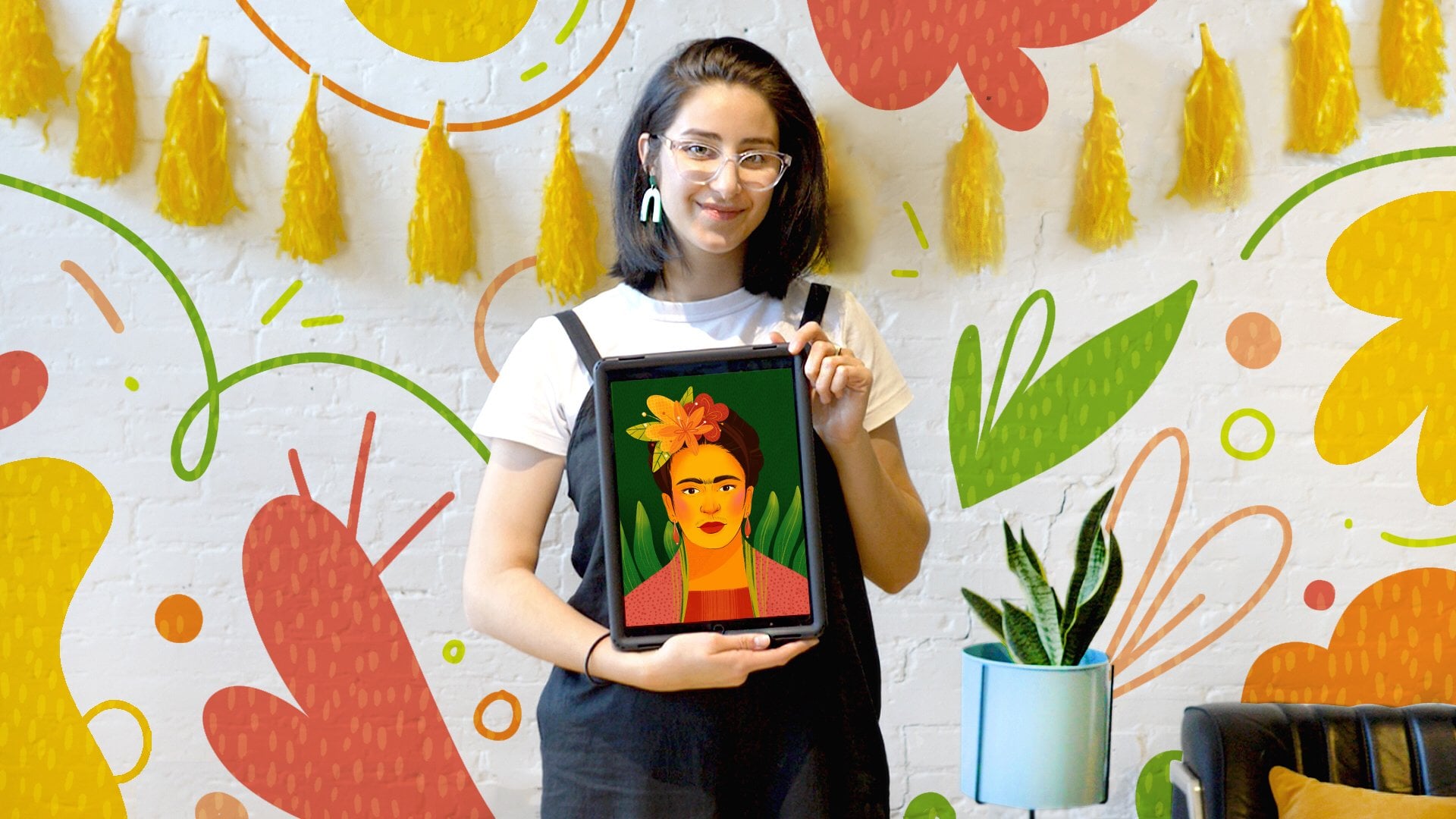
1. Class Intro: 2020 was a crazy year for all of us, even hearing ECAN, Iowa. Living through the pandemic and in quarantine made me realize that I needed a creative scape. And thanks to Skillshare, I was able to discover my passion of creating digital portraits inspire by fictional characters. Hi, Welcome to my class. Throughout this class, I will teach you the tips and tricks for coloring portraits inspired by fictional characters, by understanding the basic techniques for shadowing and highlighting. Also, you will learn tips and tricks for using Procreate, such as importing a color palette from a picture, using different brushes and brush tools for amazing color effects and working with layers to ease the coloring process, you will use these skills to color the skin, air, eyes, and closed for your own portrait. My name is Brother you of ES, and I am from a now when he cut out my previous Skillshare class, I went over the steps for creating the line art for this portrait. So please check it out. I am an arc hobbyist and teacher and I am convinced that anyone can learn how to draw with enough practice. I was self-taught through Skillshare and I've developed my own techniques for creating my own digital portrait inspired by fictional characters. This class is recommended for beginner and intermediate levels students who wanted to take their digital coloring into a whole new different level. One of the things that I recommend you studying is the basics of human structure and understanding the different shapes and shadows of a human face depending on the angle there. Looking at. This class is great for any concept. Our creator, cartoonist, or even hobbyists who wants to take their art in a whole new different level. Because I will teach you the basics for creating and coloring digital portraits. So do not wait any longer to start creating your own beautiful pieces apart. Let's get started.
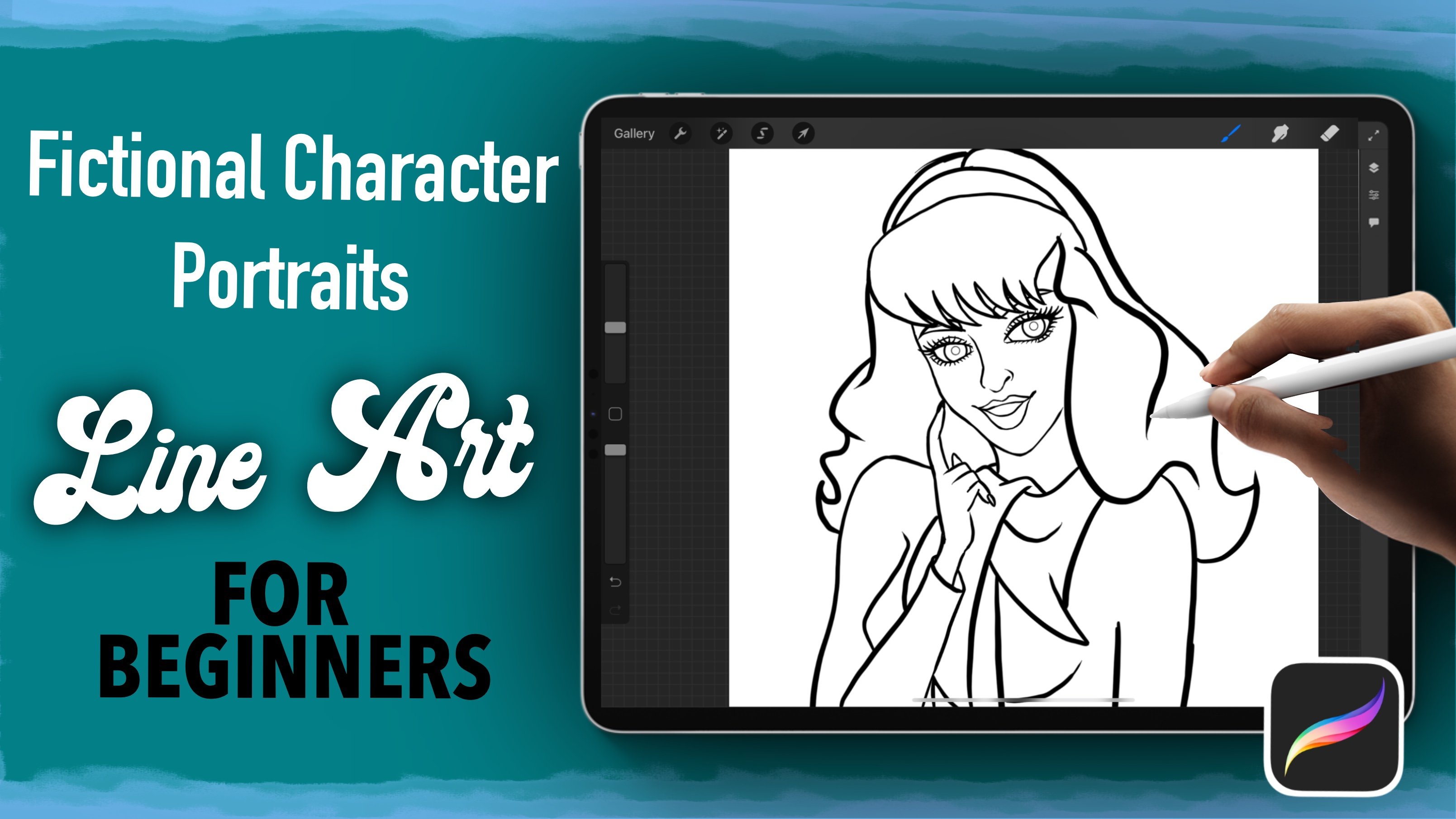
2. Project Intro: For today's project, we will be adding color to the liner drawing inspired by the Kitty K LOL remix dot, which we created in my previous class. This project should be a bloated in the project section of this class as a JPEG image so that we can take a look at it. If you want to include a 30-second time-lapse video of your work That's also welcome to. I chose this project because I have developed a passion of re-imagining fictional characters and imagining how they would look in real life. This doll is a really good place to start with. Because even though she looks complex hair accessories and here don't have much detail and are pretty straightforward to be successful when creating digital portraits, I recommend you studying faces and check where the shadows and highlights spoke. To tell you a little secret. I tend to look at myself too much in the mirror because of ice. Make sure you have ready all your reference image so that you can follow. It could be a face or a body part, or even an accessory that you want to recreate. Also decide what you want to emphasize and spend the most time on. In my case, I always choose the hair. If you need to familiarize deeper feces, you can watch a real break is character illustration, groin field portraits in Procreate. Also check my previous Skillshare class. If you want to create your own drawing or you can find a Procreate file for the QDK aligner portrait. If you want to follow this exact picture, make sure you have your brushes, you like them almost ready and download the ones I provided in the project resources section. And lastly, make sure you have the reference images ready and save under Pictures app. So let's begin to see you on our next lesson.
3. Tools and Techniques intro: Hi everyone. In this lesson, I want to go over a few tips that I follow whenever I color my digital portraits. The first trick I want to show you is that procreate allows you to import any image into the pellet section so that you can import any color palette. So you open up your images and then drag the image you're using this reference into the pellets. And that will create automatically a color palette with all the colors of the images. Make sure you're rename it and set it as default. Do not forget that procreate allows you to use an image as a reference also. So make sure you select the image you're going to be following for your coloring. I want to show you that I only use three brushes for the whole coloring process. I use the medium airbrushed with streamline, a soft brush, and the GP ink brush with streamline that it's included in the resources section of the class. Part of the coloring process ease using the blending tool. I use the overlay brush for blending. And then as an eraser, I used a flat GP ink brush. Remember that they are included as links in the resources mainly. Before we begin, I want to quickly demonstrate the shading I'm blending process to create depth. So let's go over this process by drawing a nose using the lightest color and my GP ink brush, I will draw the lines that I want to follow. Then with the blending tool and the overlay brush, I will subtend the lines by dragging the color inwards, making sure I leave the lightest areas towards the center and the dark as ones towards the edges as this will help me Find the lines and the different parts of the. Once you are ready to add more depth, you can create a new layer, select the multiply option, and then select a darker color. And this will create a darker shade for the base color you've set. One of the things that I like to do is that I like to set the clipping mask so that I do not go outside of whatever I'm hollering. And I just blend inwards. This time. I tried to make sure that I leave the darkest color towards the edges and I don't go as deep as I did with the previous color. So to show you how this would look On a regular skin tone, let me add a base color and multiply first layer I had created. And you can see how we're starting to add depth by adding shades. So I usually like to repeat this process three times by selecting three different shades. And every time I create a new layer, I need to make sure that I clip mascot and then select the multiply it option. Once you're happy with the shapes you have created, you can now start adding the lighter areas of your page. So by creating new layer and then selecting the Add option and a very light color. We'll start adding light areas, so we draw the light and then using the blending tool, we will blend in and just make sure that we highlight those areas where the light would hit the shape. So in summary, what we add is three layers with three different sheets that are darker to the color that we have. And we multiply them. And then we add a fourth layer and we select the Add tool just to add highlights, shape. And you can keep blending and adjusting the different layers so you have 0 that the shapes look a lot smoother. And this is the whole process. And you continue doing this until you feel happy with the shape you have created. Here.
4. Coloring Skin: So the first step is to clear the skin where you going to create a layer below the line art. And we're going to lower the opacity of the lightener. Remember tools, have your reference ready. We're going to set the color palette as default and we're going to be using. And the first thing you're gonna do is color the skin using a base color. So what you can do is draw the lines of the general shape following the liner, and then drag the color from the color palette into the area that you've been coloring. This will fill out the entire shape. Once you have your base color ready, you can create a new layer, clip mascot and then select with the multiply option and select a shape that's a little bit darker and you're going to create lines to start setting up the colors of the shadows. And we are going to be using the blending tool to blend these colors. A little tip is to go into the preferences section of the menu and make sure you have select the cursor. This will allow you to see the size of the brush while you're blending and make sure you have selected the right size. So the general idea is to soften the lines that you have created and make as moved transition between the two colors, base color and the shapes. And to pretty much erase the lines that you've created, you're going to blend them in and make sure that wherever there is a line, that you are not really seeing a line, but rather shapes creating those different areas. So we're going to repeat the whole process for the whole figure. And whenever we have a line, we're going to draw that line. And then using our blender, we are going to suffer him up these lines and make sure that we can only see a shadow rather than strong lines. As you can see, you can actually add details with the shadows. And just by setting up the spaces where shadows are going to be and just blend a bit them in. You can define all the areas of the body like the inner parts of the year. A little tip is that if you've added too much shadows are too many. You can erase a little bit of the shadows each has created and using the blending tool, blend in whatever light UV rays. When it comes to the nose, we're going to leave the nose trills dark. And we're going to sit the lines of the rest of the nose and we're going to smooth them out, all those lines. And again, remember to leave the nostrils dark, but everything else, all the other lines reaches going to define the shape by blending in where you're going to repeat the whole process for the rest of the phase. The bottom part of the mouth and around the eyes. So we're going to repeat this process of creating shadows. And we're going to create two more layers, one on top of the other, in order to create this darker shapes for the skin. Each time we go up, we're going to select a darker shade. And we're going to repeat the process. One thing that you have cara, is that the darker you go, the closer you are going to stay to the edges of the shape. So whenever you have the darkest color, you're going to make sure that that blending of that color stays closer to the edges of the shape. Trying to leave the middle part of the shape with little shapes. And again, we're going to repeat this process. And since right now we're using the darkest tone, we're going to make sure that we stay close to the edges and not go as deep into this shape, are going to make sure that we are the lightest areas in the middle of our shapes. As you can see, just by adding very little lines, we can add enough details with these darkest shade that we're adding, since we have a lot of shapes already defined. Now, we're going to add the highlights to those. We're going to add the top layer and we're going to select the Add option. Make sure we clip mascot and was it like a very light tone of this kinship. So now we're going to add all those areas wherever there's going to be a highlight. And pretty much is all the spaces that we left clear that we did not add any shadows. And this is going to add volume to our skin. As you can see by adding these highlights, we're able to add volume and usually the areas where we add these highlights here to be closer to the image. And all those that are darker seem to be further away. So this is what's going to keep the volume to our are true. So on the next lesson, we will add color to the mouth.
5. Coloring the Mouth: In this lesson, we're going to color them mouth. But before we continue, let's organize all of our skin layers. In one group. We're going to create a new layer on top of the scheme group. And then we're going to select as default that Kitty cake color. And we're going to repeat the coloring process by outlining and following the lines from our liner with a base color. And then we're going to add a new layer on top of it. We're going to clip mascot, and we're going to start adding the shadows by multiplying. So again, we are going to repeat the same process as we did with the scheme, where we're defining highlights and shadows. So we will begin with the shadows. And as a general rule, we will add shadows, Joel, the parts that are indented. So in this case, it would be the parts of the mouth that are closer to the inner line of the mouth. And the very, very bottom part of the lips. Everything that it's in the middle, usually it's very key when it comes to the lips. So that's going to have a lot of volume. That's where we're going to add our highlights later on. So we're going to do the process of adding two layers. When it comes to the mouth, we add two layers of shadows and then one layer of highlights. In order to create the mouth, whatever you're gonna do is we're going to add a new layer on the bottom of the lips, and we're going to color that in black. Then we're going to add another layer on top of that one. And we're going to add the white. And we're just going to draw them using a general line and then color it in white. And we're not going to add too many details to the teeth. When we're going to care for East to watch shadows. I've noticed that whenever you try to the fine teeth, they tend to look very weird. So for me it looks a lot more natural, even in drawings, to just draw a general line of teeth without much details. And then just add the shadows you seen. Some great color with the multiplier optional. And add the darkest areas of the shadow near the corners, off the mouth and on the areas that are touching the lips. And then we're going to add a highlight in the middle part of the lips that are closer to the center of the mouth. So as you can see, using a very dark color on the top, multiply layer for shadows, we are able to define the corners of the lips and those lines of the lips that separates the top and the bottom lip. Once we have defined our shadows, then we're going to add another layer with the Add option, and we're going to add the highlights. Remember to also clip mask this layer. When it comes to the lips, the areas that are usually recent are the two peaks from the top lip and then the middle part of the bottom lip and the sides of the bottom lip are usually very voluptuous, so they will have a lot of volume and highlights will show there. So one of the things that I like to do is you're seeing the medium airbrush. I like to add a few lines. And this airbrush, as you can see, is very pressure sensible. So usually these lines, I draw them very slightly with very little force to prevent strong marks. So now that I have drawn the lips, I like to go back to the skin layer, to the shadows. And I like to fine tune the corners of the mouth so that the shadows are we have created look a lot more natural. And lastly, what I'd like to do is I like to go to the highlights layer and just add some highlights, some strong highlights on the top part of the lip. And on the nose shows to have all those highlights. So we can actually see on our skin, as you can see, all the small details that we're adding, depth, volume, and realism to the pieces that we call it.
6. Coloring Eyes: Now we will color the eyes and the eyelashes for our portrait. But before we continue, let's group all the layers for the mouth in one group. So we had created a new layer into both everything and using our 900 as a reference. We'll start by drawing the wide part of the eyes and filling that in with white color. Once we do that, we're going to use our medium airbrush and with a very dark skin tone, we're going to draw the bottom inner eyelid for our ice. Usually these eyelid is where the bottom eyelashes come out. And you can actually tell this part of the eyelids whenever you look at, and I make sure to also add some highlights to these bottom part of the eyelid. Now we're going to create a new layer on top of everything and using our medium airbrush on this smallest setting where you're going to draw the eyelashes for our adult. And again, remember that this airbrush is very pressure sensitive. So I usually like to draw these eyelashes using very light pressure. And then this will allow me to add more volume. So I always tried to go little and then just add more details. Si, go. Remember that because this is pressure sensitive, it's better to go soft at the beginning and then just keep adding to it. This will allow you to add more realism, so we will continue to add eyelashes, and I like to add eyelashes all over the eye. And just leave very minimum space between the top eyelashes. And usually right in the middle we have a middle I allege that goes upwards. And then the eyelashes change orientation from that middle eyelash. And we will do the same process for the bottom eyelashes, and we will also repeat the same process for the other eye. Once we create the two sets of eyelashes, I like to duplicate it. And on the second set of eyelashes, I like to use the Gaussian blur to add volume to the eyelashes. Now we'll create the irises. So we need to do this. I first select one of the color palettes for the eyes that I've provided you in the class resources. And I like to draw the circles of the eyes. Once I have created the outer part of the irises, I then duplicate it to make sure that they're both on the same size. And then on a layer below this one, using the soft airbrush, I like to add, using a lighter color, the base color for the eyes. I will then erase everything that went outside the lines and then create a layer on top of that one and clip mascot. And using the same soft airbrush using darker colors, I will start adding shadows on top of the irises. This will allow us to have more depth. And then for the pupils, I like to use a dark color under the same color palette to create the pupils. Then, after I'm happy with the eyes I've drawn, I like to erase everything that is on the base color that is outside of the eye that I do not want to see anymore. So then to finalize, what I like to do is on the same layer where I have the outer circle of the eyes using my medium airbrush, I like to add some little highlights to the eye. A layer on top. I will then add the tear drop area of the eyes. Those are the areas right outside the wide part of the eye where we have our two dogs. And then I will also add a layer on top using the multiplier option with some gray, I will start adding some shadows to our eyes, usually on the areas where they touch the islets. These will definitely make sure that our eyes look more three-dimensional and add more depth because there's usually a lot of shadows in our eyes. And whenever we add them, we add some level of death. Then I will add a top layer on top of everything that, and I will add the tool I highlights one of the things that I make sure is that they are on the same level and I would add some light right on the bottom part of the eyes. These will often show as tears. And remember to flip your image to make sure that everything looks nice. And even now that we have created our eyes, I like to go back to our skin layer, and I like to use the soft airbrush on the top shadow layer to add the lines of the second eyelids that we call the outer lines of the eyelids. And this will add more three-dimensional depth to our eyes. Remember to also use the blending tool too soft. And these lines as the main objective is to have these lines being defined by the shadows.
7. Makeup and Skin Texture: In this lesson, we will be adding the final details to the skin just as we did on the previous ones. Let's group together the eyes. So we're gonna go back to the skin layer and we're going to add a top layer on top of everything. And we're going to add the eye makeup using the soft brush and the rouge on the cheeks. So with this soft brush, we will start adding the eye makeup, making sure that we press very lightly. Remember that pressure sensitive brush. So a little pressure goes along way. Then we will change the color to a router tone and we will add to rouge for the cheeks. And this will definitely keep our Dolan little bit more of life. And I also like to add some color to the chin, the nose, and the forehead. So our character has two small beauty marks on the sides of the mouth. So we will add these using the medium airbrushed using a very dark skin tone. Since we added the I make up, some of the lines for the eyelids might have been hidden, so we're just going to redraw them. Now in order for us to add some skin texture, we're going to duplicate the skin layer and then we're going to merge these new layer as one layer. And then what are we going to do is we're going to use the noise tool on these new layer and we're going to add very little noise to our skin. This will add texture to our skin. And then we're just going to lower the opacity. So these new layer has to be on top of the previous one. And lastly, the final detail for our HDL is the nails. So I like to go to the same layer where we have the mouth. And we're just going to draw the nails use in the same tone. Once we're very happy with the shape we've given to the nails. We're going to go to the shadow layers and we're going to add some shadows to the places where the nails meet the skin. And then right in the middle of the nails at Deanna on the highlight, the highlight layer, we're going to add some highlights to add some light and shine to the nails of our Dole.
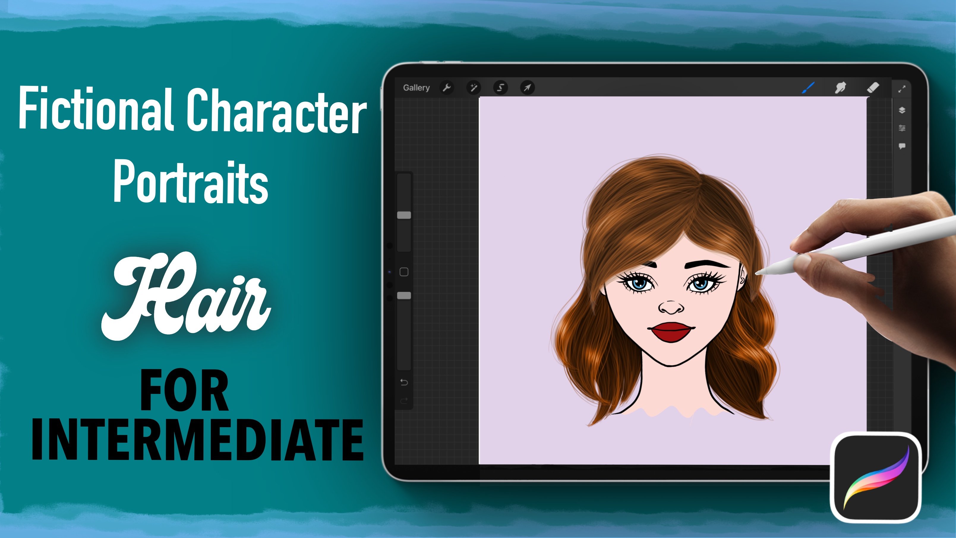
8. Coloring Hair: Hi everyone. Now I want to show you my technique for coloring care. So let's create a new layer on top of everything and select the medium airbrush. So the first step is to set the base color using a dark color for the hair. And we're going to outline the shape of all of her hair and then fill that out using the brush. So usually I do this with a brush size number 6 for the medium airbrush. And then I am going to fill out the entire herpes. What I like to do is that I like to select the hair that it's on top of the skin and do that on a layer that it's on top of the skin. And then to whatever hair is behind the skin, I create a new layer beneath the skin and fill that out with the same method as we previously did. This will facilitate my coloring and we'll make sure that everything that is behind our character stays behind the skin and everything that he's on front of her character stays in front. And one less thing I'd like to do is that I like to do a general outline using a white pen, show that I can see where the strengths of my hair. So this stance on top, this is going to stand on top of all my layers. And it's just going to be a general reference. And I'm going to lower the opacity of these white reference. And he's just going to be a guide because my line art is dark, I might not be able to see it. So I only outlining to use the asset value. Then what I like to do is that I like to create a new layer on top. And then I select a color just a shade lighter of the one I have just selected and still having my brush on six. I'd like to start creating this trends. And one of the things that I like to take care of is that I do it very softly because this is a pressure sensitive brush. So I completely fill out with trends each section of the hair. And I do it very slowly and safely, making sure I follow the direction the natural hair will follow. So I continue to fill that out until I'm satisfied with how that looks. And then I select a shade of color that it's a little bit lighter. And I start doing news trends and I lower the size of my brush to about a four. And I continued filled this out, trying to cover as much space as possible. And again, I do it softly and slightly. So the main idea is that each time you add a new shade, you lower the size of your brush and you lower the shape. Before I continue, one of the things I do is that I go back to my base layer and using my brush in the smallest setting possible, I start doing trends. Very small strands of hair that come out from the bangs. And this will allow us to have a more natural hair wave. Uneven ends. So we'll continue doing this. I usually select five tones of hair. So five different types of colors each time I go lighter. And the lighter I go, the smaller the size of the brush. So I usually start with a six, then a four, then a three, then a two, and then a one with the lightest tone. And these will allow us to create all the strands of the hair. And this is a work of patients. I must tell you, as I told you in my introduction video for the project, this is a place where I spent the most of the time when I create my characters because I really find this process very enjoyable. So I will continue filling the hair out and making sure that all of these trends cover the hair. And be very careful because these are very small. And if you make any regular stroke, this will definitely show up. When it comes to the hair. I do all these trends in one layer. And then every time I go to another section of the hair, if they are going to be on a different area, there's where I changed layers. So for these back part, I do it on a layer behind the hair because it's real facilitate whenever I started doing the shadows. So I only changed layers whenever. One because of hair needs to be a whole section of hair needs to be behind. Another way. If not, I will stay within the same layer for all the strands of the hair. Just like we've done that in the past, we're going to create a new layer, clip mascot and select the multiplayer option to create the shadows. And we're going to select a dark tone for the color of the hair. And usually wherever we're closer to the roots, that's where we usually find shadows and all this trends that are behind and others trend or a piece of clothing or a piece of jewelry, or even a part of the body, all of that will have a shadow. So using the same method as we previously did, we're going to blend these shadows to soften them. And it seems we have different layers for different trends of here. Remember that on top of each layer you need to add a shadow and then do the same process. When it comes to the highlights, I like to create a layer right on top. And I like to clip mascot and select the Add option. And then I will draw a line and then select the Gaussian blur and slowly blur the lines. This will create the highlights for the hair. I will now continue growing eyebrows for our goal. Using the same process, we select a dark color to set the base of the eyebrows and then you sing to lighter colors. I will do this trends of hairs with, in this case, I will only select two strands of colors and to brush sizes one in about a 311, and these will create the eyebrows. The final detail that we will add to our goal to make her look more realistic is creating loose trends of hairs. So on a top layer using the lightest color and the smallest size for the brush tip will create a few loose strands of hair all over. The goal here. Adding these loose strands of hair will definitely marked difference and make your hair look a lot more realistic. This process applies for every single type of hair. The only thing we have care for is to follow the flow of the hair whenever you start creating your strands. I hope you enjoyed these processes as much as I do because favorite part, drawing, portraits and this is the process where I spent the most time on.
9. Coloring Clothes and Accessories: Hi, Welcome back. Now in this lesson we will color the clothes and accessories. So just as we did in the previous lessons, let's organize the hair into a group so that it stays organized. When it comes to the close, we're going to actually make use of many of the skills that we have already acquired. We're going to set a base color for the close. We're going to do the outline and then we're going to fill it in. And just as we did with the skin, we're going to set highlights. But when it comes to the clothes, I like to do only two layers. One base layer to set the shadows and then one other layer just to strengthen the shadows that we did. So remember to clip mask your shadows and select the multiply an option. One of the things that you can experiment with in the clove is trained different textures. So in this case, her clothes looks a little bit at like if it's a little latex. So what I'm gonna do is that I'm going to use two colors, little teal and then some purple. And I'm just going to blend them in with the blending tool. And then on top of that, I'm going to start adding the highlights. And this will allow me to create this very rubbery texture on her clothing. And I will continue doing this for hair, middle centerpiece. Now we will do a little bit of jewelry on hair color. She has some Ryan Stones. So what we're gonna do is we're going to do a gray base color and then we're going to do one layer with multiply option to do some dark shadows, and then one layer on top of that to do the highlights for the rind stones. And this is how you can make metallic accents. You do one base color than one very dark shadow and then one very light highlight. And this will allow you to create a metallic surface. And one of the things I like to use whenever I do metallic surfaces is that I like to go to the luminance brushes and select the flare one to create flares on the jewelry. I will repeat the same process adjusted with the Rolling Stones, with her ring and her earrings and her head bent, said a base color, a DRE base color, then add a gray, very gray shade and then some highlights. And if you take notice, her rights, tones and earrings and ring have a little hues similar to what we did with the clothes. So I will add a purplish and bluish little hue to her jewelry just Give it that pearly finish. And this will allow us to decorate better the jewelry for our door. But again, just take your time in setting up the shadows and then the highlights. And after we've set the highlights and we've set the pearly finish on on her jewelry. I will go and use the flare brush again on all her jewelry to create the accents and the general flare that you can find on your MRI. So when it comes to the crowd, I will just take a little bit more of time to the fine pearlite finish and then find the shadows on top of that per leaf finished that we have created because crown has a few details like the indentations on the ears and the rein stones throughout the head been and throughout the ears. So just apply the same method that we did previously where we use shadows to the fine shapes and then put, put on some highlights on top of those shadows to add some volume and depth into our shapes. And again, the last step, because this is jewelry, please. I will put some flare on top of each of the Rhine stones on the headband and on the ears, just to give it some flair and shine. So just continue adding some details until you feel very satisfied. However, I did not spend too much energy on adding too many details for her head bend. Again, one of the things that I love to add details most on is on the hair, and that's where I will usually spend the most time on. I will often rely on creating textures on the accessories and the clove and not spend too much time on it. So after you've added all the flare, you can continue to another piece of clothing and just apply all the same techniques that we've been applying so far. Just outlining coloring and Eve, you ever need to erase some of the areas that you've created, just make sure to lower the opacity to see what you have underneath and whatever you need to see. So repeat the same process of adding shadows, adding highlights to your pieces so that you can define different areas. Remember that something that is behind will have a shadow and something that isn't top will have a highlight. And when it comes to the clothing, I usually make use of the different brushes that we can find on Procreate to just create some textures. So for example, on the ribbons that we have on her wrist, I used a special brush in the luminance area where it creates particles throughout the entire piece. And this allows me to create all this particles out we can find on her ribbon, on her wrist. So continuing on a plane, all the techniques that we've been using a plane, some highlights and some shadows to the find some of the spaces. And again, use and explore all the different brushes we have in Procreate, I will usually create a new layer and put the multiply mask and select a dark color to just set the texture of the fabric using different brushes in Procreate.
10. Background and Final Details: Hi, welcome back. You've been doing such an amazing job. In this final lesson, we will do the background and some finishing touches to our drawing. Just as we did previously, grouped together all the clothing and accessories layers to have everything organized. So we're going to start by creating a base layer behind all of our drawings and we're going to set a base color. Now, procreate offers a series of brushes that you can experiment with. And you can have as much fun as you want with these brushes. In this case, I am experimenting to see how to create some bubble shapes similar to the ones on the reference image. And I will create several layers and experiment with the different brushes that procreate offers to add some highlights and fun colors. The main idea is to just create something fun and organize and something similar to any of your reference image and just have fun with this process. One last final thing that I like to do to add an extra level of depth is to duplicate all my layers and then start merging them down from the bottom up. So the main idea is to end up with one image that we will put behind our lowest layers. So I will continue merging all of my layers and combining them into one picture. But remember that your first duplicating the layers. And then each time you duplicate this layer, you merge it down into your picture. Once you finish merging everything up, bring this image down all the way down on top of your background. And then we're going to use a Gaussian blur to create a glow behind our HDL. So this will create some background, some flashlight and some deaf into our picture. And the last thing I like to do is to just add some final highlights to the nose and the cheeks of our dole just to make sure that there is some glow. So this way, we make sure that all the highlights have been considered and taken care of. So this is the whole process we're done and congratulations on finishing your portrait. You did an amazing job.
11. Class Outro: Congratulations on finishing your digital portrait. You made it remember to keep practicing so that you can create breathtaking portraits. We covered everything from using procreate more efficiently and using different settings and brushes to be productive while coloring our portraits. If there is one thing that I hope you take away from this class is that nothing is perfect the first time we must embrace your mistakes for improvement. That's what coloring and creating art is all about. Do not forget to upload your project in the project section of this class, remember to upload a JPEG or any other image format so we can take a look at it. Also, if possible, at a 30-second time-lapse Procreate videos so that we can all see your process. If you liked this class, please remember to leave a review. Also follow my profile so you're the first to know whenever I publish a new class, if you publish your work on Instagram, make sure you use this hashtag so that I can take a look at your work. Thank you so much for joining me. I cannot wait to see your work. See you next time.
 Rodrigo Diaz, Skillshare Teacher and Art Enthusiast