Transcripts
1. Welcome to Fearless Oil Painting II: There's only one
thing you need to do to level up your
painting skills, and it's something
that anyone can do. Practice. Hi, my
name is Amy Plant. I'm a multi passionate
creative and I've been painting with oil since my dad taught me at the age of eight. Most of the skills I've picked up over the years
were self taught, and more than anything,
I've learned that practice is the only
way to improve. If you've already got the
basics of oil painting down, but are looking for
some exercises to improve your technique,
this is the class for you. Specifically, I'll
go over how to approach painting realistic
textures and fabrics. I'll give you my formula
for how to choose which brush to reach for and how to use it to
paint what you see. This is a companion class to my original fearless
oil painting class, which I recommend you watch first if you've never used oils before and are looking for material recommendations
and other beginner info. In this class, fearless
oil painting two, we're cutting right to the
chase to get you practicing. I'll cover how to set up a dynamic style life and how to paint a variety of
textures within it. As we paint, you'll
pick up tips on how to use the right brush shape to
achieve the look you want, how to use certain
breast strokes to do the hard work for you and how to imitate light and contrast to achieve
realistic texture. By the end of this
class, you'll be full of useful and practical
knowledge to continue your oil
painting journey. Grab a brush and
come paint with me.
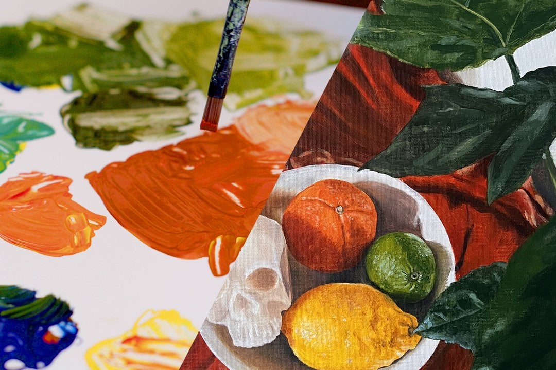
2. Class Project: Class project. In this course, you'll create an oil painting of the texture of your choice. This can be a simple sketch on Canvas paper or a more
finished painting. To really get the most
out of this class, I encourage you to try painting a variety of textures
and fabrics. Canvas paper is great
for this because you can practice without the pressure of creating a polished
final product. Just make sure you
buy Canvas paper specifically for oil paints. I'm going to be working
from photo references so it's easier for
you to follow along. But if you prefer to paint from life, you're
more than welcome. When you're setting
up your still life, think about getting the most out of your fabric with drapes and folds and make sure your subject is well
lit with natural light, or if that's not possible, a spot light like a desk lamp. You can put a bunch
of textures in one still life or paint
one fabric at a time. You can also use the
photo references I demonstrate within the class. You'll find these in
the resources section. Once you've painted
your texture, take a photo of it
and upload it to the project gallery along with a photo of your
reference or subject. Let me know if you're
looking for feedback or of any questions and I'll
help in any way I can. Coming up next, we'll jump
into painting Matt fabric.
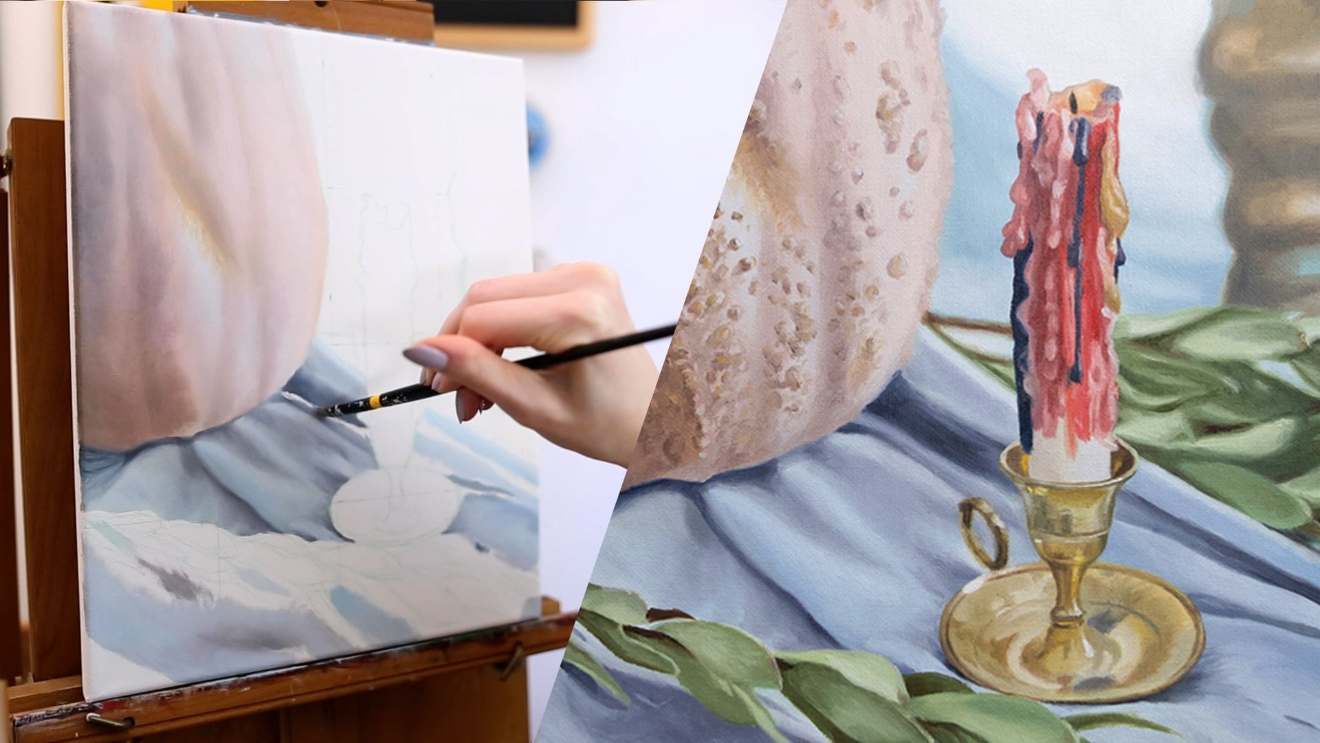
3. Cotton and Matte Fabric: Cotton and matt fabric. Before we start painting, I want you to get
used to looking at your subject through
a particular lens to really analyze
the texture of it. We know that your subject has
hue, value, and saturation, but let's focus on value or more specifically
on contrast. Contrast is a measure of the lights and darks of
a subject or painting. If something has high contrast, there's a big difference between its highlights and shadows. If something has low contrast, the different light
and dark variations or values will be subtler
or closer together. When we paint our texture, we're not only going to
look at the contrast, but also how these
different values transition into each other. Do the lights softly
blend in with the darks, or are there sharp
separations between them. If you can get this
right, your texture will really come to life. The type of value
transitions you see in your subject will tell you
which brushes to reach for. Textures that have soft
transitions of lights and darks will need soft brush
shapes like filbert or round. When the contrast is more sharp, you'll likewise need a
brush with a sharp edge, such as a bright or flat brush. In many cases, you'll need some combination
of these brushes to finish your painting. I like to have a bunch on
hand when I'm working. Also nice to have a
variety of brushes with soft and stiff
bristles as they can help you achieve certain
textures more easily. If you've taken a painting
class with me before, you know I like to mix most of my colors before
hand on my palette. This helps me get into
a flow asm painting, so I don't have to stop and
mix colors all the time. I'm not going to get into
color mixing in this class, but if you'd like
to go in depth, I have a whole class dedicated to it called fearless
color mixing. You've got your
palette, your brushes, and your game plan.
Let's get to painting. I'm going to demonstrate
a variety of textures, but let's start simply with
some mat cotton fabric. Okay. Right away, I can see that this fabric has low
contrast in its values. When we're talking
about the texture of the material itself, not the shadows
created by the folds, there isn't a huge difference
in its lights and darks. This is what makes the fabric
look mat or not shiny. I'll start by laying down the mid tone color
and then adding in slightly lighter and
slightly darker colors for the highlights and shadows. Because the value
transitions are soft, I'm using a fiilbert brush
which has a softer edge. If I need to get a sharper line for the edge of the fabric, I'll switch to a liner brush. I'm not getting bogged
down in the details yet. I'm just working on my tones. If you're having trouble
seeing past the details, squint or blow your eyes down when you look
at your subject, and you'll find it makes
the lights, darks, colors, and contrast
easier to prioritize. Once I'm happy with
my lights and darks, I'm going to start adding
more detail to the texture. I Make your brush do the work for you. I'm starting to recreate these small oval tuffs by making light brush strokes
in the same shape. You can see in this photo
that the camera has picked up the individual
fibers of the fabric, but I don't want you to try and paint individual threads here. We want to convey the
overall feel of the fabric, which is soft and squishy. The general pattern of the
quilted texture is a grid, so I'm following
the direction of these horizontal and
vertical lines as a guide, but then adding the individual
oblong shapes using that brush movement I did before to create a squishy
irregular look. Then I'm adding
more dimension by re adding the shadows
in certain areas. As you add details, keep checking in with your
lights and darks by using the squint method and adjust your
colors as needed. If your colors are blending
together too much, switch to a clean brush. Here is my finished sketch. Let's recap the tips for
painting Matt fabric. If your fabric has low
contrasting values, paint the dominant color
first, usually the mid tone. Focus on getting
the highlights and shadows right first
before adding detail. Use the direction of
your brush strokes to create accurate
detail with less work. Check the accuracy of
your lights and darks by squinting or blurring your eyes down to look at your subject. Now that you've got the
hang of Matt fabrics, let's tackle something shiny.
4. Satin and Shiny Fabric: Satin and shiny fabric. Now let's get a little advanced by painting a shiny fabric. You can see that compared
to our mat fabric, this texture has a much
higher contrast with obvious highlights and shadows
within the fabric itself. However, from value to value, the change is soft and smooth. I want to mix my colors
with high contrast, but I should also choose
a filbert brush to paint with so I can get well
blended flat planes of color. Unlike with the mat fabric, the highlights and shadows in
the satin are very obvious, so I'm going to lay those in first before I start blending. Next, I'm going to fill
in the values in between. You can blend as you go or go back in to blend once
you laid in the colors. I'm doing a mix of both here. I want to pay particular
attention to the edges of my brush strokes because
with the exception of the folds of the fabric,
they should be soft. Using a round or filbert brush
will help a lot with this. As you observe and paint, pay attention to the direction
of your brush strokes and try to paint in
the same direction the light is hitting
the subject. This will make it easier to get a realistic effect
in your painting. Every time I lay in a
new color and blending them in to create gradual
shifts in contrast. For the most part,
I'm using light, medium length brush strokes in the same direction the light
is falling on the fabric. As always, keep checking in with your subject and
notice variations and shifts in tone and color. Here's my final
sketch of the satin. Let's recap my tips for
painting this shiny texture. Paint in the areas of
highest contrast first, the shadows and highlights. Fill in the values in between, making sure to blend for
a gradual transition. Paint in the same direction the light falls on the fabric. Pay attention to any subtle
color or tone shifts as these will add detail
to your painting. Next, let's get a more
advanced and paint velvet.
5. Velvet: Velvet. Now let's try a more difficult
texture like velvet. Velvet is fairly
complicated in texture. It has high contrasting
values like satin, but it has a soft and
slightly fluffy finish rather than sleek and smooth. Since there's a lot going on, I'm going to break
it down section by section so we don't
get overwhelmed. I'm starting with
the mid tone color to guide the basic
shape of the section, then switching to
the dominant color, which is a very dark blue. If you look closely at velvet, you'll see that the colors
appear to be layered. So to mimic that, we're
going to layer our paint. A filbert brush is
ideal for this texture. I'm going to choose a brush with soft bristles for the
highlights and use a light touch so that
I can lay them on top of the darker color without
them blending too much. When you're adding highlights, make sure to dip back into
your paint often to prevent your painting from over blending and muddying your colors. Now, I'm going to do the same thing with
the next section, layering my colors and
adding the highlights last. Because we're working with
high contrast colors, you'll need to pay
attention to blending as sharp lines will
look less velvety. I find that using a
dabbing gesture or making very small circles
with a light touch can blur your edges effectively
for this purpose. To get the texture of the pile, I'm using the broad side of my brush and very
short brush strokes. Again, don't get hung up on painting every fiber perfectly, but pay attention to the lay
of the land so to speak, or rather the angles
and direction of the colors,
highlights and shadows. Physically move your brush
at the same angle or in the same direction
and you'll find it easier to recreate
what you see. I'm working through the
painting section by section. I find it helpful to have multiple brushes each designated to a different color so I can switch between them
without muddying my paint. My velvet painting
sketch is complete, so let's recap the
best practices for painting those texture. Start with the dominant color and add the highlights last. Layer your paint, paying attention to subtle
color shifts. Use dabbing brush strokes with the broad side of your brush
to create a pile effect. Focus on getting the
angles right rather than painting each detail in
exactly the right place. We've got one more
texture to go. Let's get ambitious
and paint some fur.
6. Fur: Fur. Let's move on to fur. The fabric in my
subject is fo fur, but you can use these
techniques for painting real fur like in a
pet portrait as well. Fur itself typically does not have a lot of
contrasting values. However, often has a lot of variance due to the
different colors within it. It's these subtle shifts
of color along with strategic placement
of highlights and shadows that will bring
this texture to life. When you approach a fur texture, you need to think ahead
about how you're going to layer your colors
and in what order. Imagine you can see
through the layers of fur that are closest to you
right to the very back. I can see here certain colors and shadows peeking through. So I'm going to first paint
those in in sections. We want these nice dark areas to peek through
our future layers. Flat brushes work great
for painting fur, but once you've covered
your surface and paint, you can get good results with
filbert brushes as well. After you've laid in
these background shadows, you need to consider the order in which to paint each section. The top left section
is the furthest back, so I should paint that first. This section and here is also behind a lot
of the first trans, so I should paint that before painting this section
and this section. This bit here looks to fall in front of the
rest of the fur, so I'll paint that part last. I'm using a filbert brush here because of the
softness of the lines. M. When painting fur, breastrok direction is
especially important. You don't need to overthink it, simply paint in the same
direction as the fur. It's very tempting to get
caught up in the details, but resist the temptation
to make yourself crazy by trying to get
each strand right. If you focus on direction, light and shadow, you'll get the realistic look
with less effort. Before adding the
highlights to this section, I filled in the white space with a slightly darker color to
help with the layered effect. At this point, I'm finding my flat brush to be a
little bit too bulky, so I switch to a small filbert brush so I
have more control. If you're working wet into wet, you should be able to
get some nice fur like brush strokes with the
edge of the fiber. Remember to dip back into
your paint color often and switch to a clean brush if necessary to prevent
muddy colors. If you find you're
really having trouble building up layers
without over blending, try letting the paint
dry for a day or more so that it's less
wet for your next layer. Just remember that
this will make the old paint less blendable
with your new paint. This reference photo
complicates things a bit, but in general,
when painting fur, you want to layer the
strands from the bottom up. Once you train your eye to
see your subject in layers, you'll be able to intuitively know where to start and
end with your paint. I Ideally, we want to not overdo
it with the tuffs by covering up too much of
the background shadows. But if it happens, you
can go back in with a liner brush or flat brush to add some color
variance back in. Here I'm filling in
the white space with my dirty brush just to create some color and value variation. This helps to give
the effect of layers. Even though we can loosen up by not painting each
strand perfectly, we should still be paying
attention to light and shadow to give our subject
realistic dimension. When I'm painting in highlights, I like to start my brush at the brightest point and
then move from there. So as the white blends with
the paint underneath it, it mimics the fading of the highlight I
see in my subject. Here is my completed
first sketch. Let's recap my tips for
painting fur texture. Find the sections
of darkest shadow and paint those in first. Analyze the different
layers you see and make a plan for what order
to paint each section. Pay attention to
the direction of your brush strokes to mimic
the direction of the fur. As you build layers, dip
your brush back into your paint color often to prevent over blending
and muddy colors. If you need to go back and re add shadows
with a fine brush.
7. Congratulations!: Congratulations on
completing this course. I know you're feeling
inspired to start practicing and improving
your painting skills. Over the course of this class, we covered how value and
contrast affect texture, how to select the right brushes to make it easier to mimic textures and how to use brush strokes and
blending strategically. As you move forward in
your oil painting journey, I encourage you not to get hung up on making a
perfect painting and instead focus on exercising your artistic muscles
through repetition, being brave, and
making mistakes. Remember to post a
photo of your work in the project gallery to share with me and your
fellow students. If you share your work
on Instagram or TikTok, be sure to tag me at which underscore so
I can cheer you on. If you have any questions, don't hesitate to reach out
in the discussion section. I'm always here to
help. One last thing. If you found value
in this class, please leave a review
of your experience so I can continue to make my
classes even better for you. As always, keep in touch
and happy painting.
 Amy Plante, Multi-Passionate Creative