Transcripts
1. Intro: Hi, my name is
Fiona Di Pinto and diamond Watercolor
artist based in Rome. I love painting portraits. In this class you're going to be bringing your
Watercolor Portraits to a whole new level of expressiveness by embracing
the hard edges and blooms. Colour and water
create organically as they interact
naturally on your paper. Follow me as I walk you through
the process step-by-step. And trust me, you
won't be disappointed
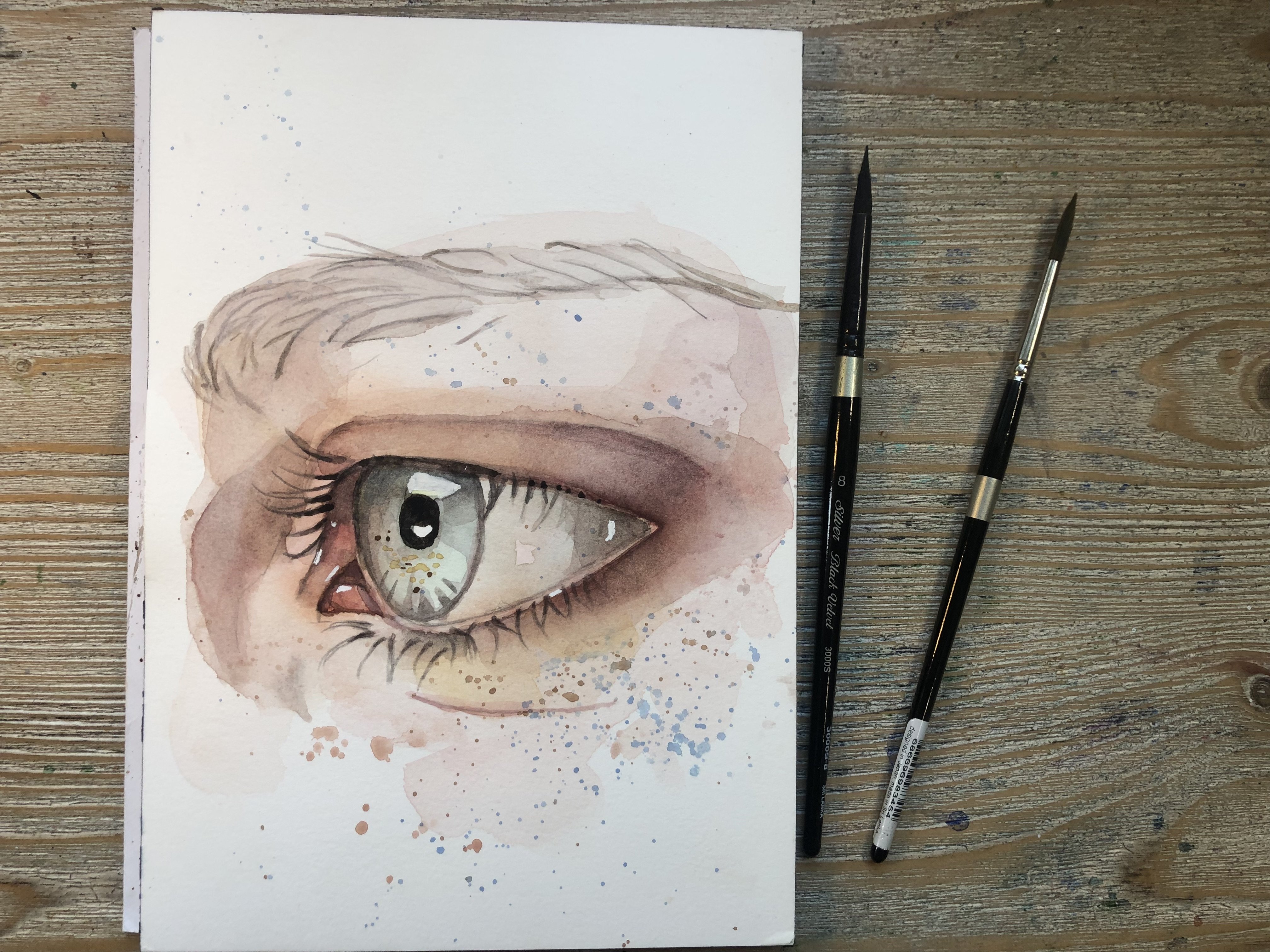
2. Materials I Used: Materials you're going
to need for this class. Good Watercolor paper. I'm using Winsor and
Newton hot pressed. It's 300 GSM or 140 pounds, and it's 100% cotton. You don't have to use
the same exact paper, but makes sure it is professional or a good-quality
watercolor paper. I'm using these
brushes and we have an Skoda number one that stands for one inches and
it's flat. As you can see. I have a trickle. Number six, I have a silver black velvet
three-quarters of an inch. I have a silver black
velvet round ten, and I have a small silver
black velvet number two for the final details. And you can use
different brushes, but try and get some large ones, medium ones, and some
small ones in there. Grab some kitchen paper. A palette, possibly a clean one. This is ceramic, but you can use the white plate from your kitchen that will
work just as well. A pencil, a jar of clean water. Your watercolour paints. It doesn't matter
which brand you use. However, you will find
the complete list of colors I Used for this
class in their attachments, as well as the
reference image and the sketch outline which you can trace if you
prefer to do so. Don't forget about those. White gouache, white acrylic, or of white gel pen
to add highlights. Are you good to go?
3. Painting With Puddles: Now I have my clean
sketch and using this large brush which
has any Skoda number one. I'm just going to
pre wet my sketch. Accidents happen. So I'm just going to remove that little piece of
fluff from my sketch. And I'm just covering the whole
area with a lot of water. So don't worry too
much of the water goes outside the sketch and just cover the whole
face and neck area. The paper shouldn't just be
damp but actually glistening. So when you tilt it, you
should be able to see Shane. I'm picking up some madder lake red light and I'm
starting to position that on the cheek just using this large brush that I have. And I'm going to bring
that into both cheeks. I'm just going to
let it flow because of course the paper is wet. The paint is going
to do what it Lakes. And I'm going to get it
into the lip area as well. I'm just going to
go over the lip with the brush in this fashion. Don't worry, this might look really strange to begin with, but actually it's a good way to get expressive when
you're painting and to get the
color in the lip to go beyond the lip as well. You'll be smoothing this
out using a smaller brush. And this is a silver
black velvet number ten. And I've picked up
some cobalt blue. And I'm going around
the eye area. Again, everything
is extremely wet. And this is what allows the
expressiveness to happen. I'm going into the
flight of the eyeball and I'm going around the
cheek area like this. I am then going to pick
up quinacridone violet, but it doesn't have to
be quinacridone violet. You can use any
color that you want. Any violet will do, for example, or any blue,
but we've just used blue. So I would suggest use violet. And I'm going to bring it
over here and to the side of the forehead in the corner, inner corner of the eyelid. And here I'm going to be
using the tip of my brush. I'm going to bring it into
the other eyelid as well. And at this point, really the more water you have
on your brush, the better. Because it's in those areas where the water pools
that we are going to get all those lovely hard edges and cauliflower effect
that so many people tried to fight in Watercolour. But that's totally
embrace because they are beautiful and show us what
the nature of watercolour is. And I absolutely love that. I'm reaching out for
some green and I'm bringing it under
the eye on the site. Again, there's a lot
of water on my brush. Silver black velvet is
a really thirsty brush. So I can be sure that
anytime I use it, I'm going to be picking
up a lot of water. I'm bringing it above the lip. Then I'm picking up more
water and going back into that cheek and dropping
more water in there. And again into the other
cheek because we do see quite a lot of pink
in our cheeks now, don't worry if the water, if the paint goes beyond
the Face and into the hair. Indeed, I very often
actually bring some of the colored from the
skin into the hair as well. So that is absolutely fine
and feel free to do that. I'm bringing a little
bit of orange by White Nights into the cheek
just to give it a little bit of a pop of color on both sides and a little
bit up into the forehead. As you can see, the
color is going to travel where there is water and a kind of dent has formed in the
middle section, horizontally in
the middle section of my sheet of paper,
but that's fine. You can to some extent move things around with your
brush if you want to, or you can just go
with a floor and let things be as they are. Then I'm going in with
them, burnt umber, and I am just adding that on
top of what I have put down. Again by doing this, not only am I adding more color, but I'm adding more
water as well. This point we have something
that is really sopping wet. I'm bringing some of that
color down into the neck. Next can be boring to Paint. So try and get that color in the neck as fast as possible, as early on in your
process as possible, so that you don't have
to worry about painting the neck by itself later on. Either use your
reference image as your guide and check where you think you might
see these colors. Or you can just go randomly and place them wherever you want. It's really an exercise in
creativity and imagination. We're almost painting a
skin that is radio-like. But at the same time, it's
important to remember that skins do a reflect lights that are the late
that's around them. So it's not too crazy to think that these colors
might be in the skin. Indeed, you will find
them in skin very often. I'm going to add some red to the lip because it came to float all over the place. Try to make it quite intense. You can move on to
a smaller brush. At this stage, I'm using
a tracheal number six. And I'm just using the
tip of that brush to help me move the paint
around certain areas. And when you've reached
this messy stage, you just let this dry, naturally selected air dry. Don't try and go in
with any heat tool. Don't triangle and would like hairdryers or anything or speedup the process
just leave it. Sometimes I have to
leave this overnight. And then in the morning
you will see what results you've got and how the
water has dried naturally. If you're in a rush
and can't wait, you can always go in and start
painting the background. I've mixed some
madder lake red light with some Naples yellow, which gives us soft,
fleshy, peachy tone. And I'm just going to go around the whole background with this. And the idea is that when I go in and paint the hair later on, I will get this nice
soft effect where the edges of the hair will
blend into the background. So just use a large
brush for this. I'm using a silver black
velvet number ten again. And I'm just going in
with us quite wet, wash and getting the background. And then to get some dimension watch would
do is just for example, pick up some madder
lake red light on its own and just add that
only to certain areas. While the surface is wet. You will see that these
colors will easily blend and create these
nice transitions.
4. Incorporating Hard Edges: What we end up with once
or painting has dried. It's something that
can look quite messy. And you should not
be intimidated by this and actually just
go with the flow. We all know that painting is
go through an ugly stage. And that is even more true
for this kind of painting. One important step
at this point is to revisit the sketch. Sometimes you can lose a sketch. As you can see
here, the features are not very visible anymore. So I'm going to go in with a
pencil and I'm going to try and outline them so that when I go over them with more paint, I want I will be able
to see them and I will be able to see where they are. So I'm just using this pencil and I can see the sketch
through the paint. But I know that if I go
over it with more paint, then it's going to
become less and less visible as we layer. So unimportant step
is just to retrace your underlying
sketch so that we don't lose any important pieces. Why am I saying this? Well, it's very easy to actually get something off
balance or to lose symmetry. Even if we make like the
eyelids slightly different, or if one is higher or there's more eyelid space showing
compared to the other one, it can make the
portrait look off. So it's important to
recuperate those lines. So make sure you do that. And then we'll come
back for the next part. Once you've got
those sketch lines back in and you can
see them clearly. Look at what you've got, where the hard edges are. I have one up here. I have one on the cheek. I have a hard edge
across the top lip. Of course it has some
going on in the hair and I also have one down in the neck. So you want to try and avoid painting over those
Hard Edges because that is what gives us Portrait personality and
what makes it different. So we will start zooming
in on the details. The lips, the eyes, the nose. I'm going to start with lips. And I have mixed
some madder lake red light with some Naples yellow. I'm using a tracheal
number six brush again. When you put your
brush into your well, be sure to roll your brush properly so that
you are picking up paint on all sides of the bristles are not
just on one side. This is called the
fully loaded brush, and it's very important
to be aware of this. I've, how much paint and water we have on our brush
when painting. And I'm just going to
go into that lip and start to fill it in
with this nice color. Make sure your mics is not
too watery at this stage. I'm just filling it in. We already have some
underlying color. And of course that
will show through. I know bringing some
burnt sienna into that mix and just dropping
it on the bottom lip. There are usually quite
lots of colors going on. In the left, we have
cold and warm colors. And then I'm also
wanted to pick up some of our quinacridone, violet. I'm going to use that to
go into the lip as well. Especially on the bottom lip. And we're not
painting wet and wet. So you can allow
the paint to bleed slightly and let it go where
you, where it wants to go. And then of course, you
can still timid with your clean damp brush and
go in and push the paint around and gently push it in a direction you want
it to go or bring it back in and clean up any
edges that you don't. Like. I've added some more of that madder lake red
light and I'm just going into the cheek because
her cheek is very pink. Cheeks are very pink. So I'm just adding that
pop of color on the cheek. And the technique I Used
to pay the cheek is to usually go in wet
and wet of course. And I start by adding some
color on that to that area. Then I just go over with a more, less diluted version
of that color. So maybe I'm going to go
into the side of the whale here and pick some
of that up and just drop it into the
center of the blush areas, so to speak, and keep
dropping it in there. I then clean my brush, dab it on some kitchen paper, and smooth the edges
out so that we get a natural effect and a smooth transition into
the rest of the skin tone. You can do this for us off as often and as
much as you like Just dropping war
of the mixture into the center of that wet area. And then cleaning your brush
and gently smoothing it out. In circular motion. Makes sure you are aware of how light
everything is going to dry before you decide how
much paint you want to add. In this case, I've decided
to go in with more of that pink to just get even more of a pop
on this other site. In my case, I have
this hard edge and it's already creating
a global blush. I do not want to get
rid of that hard edge, some kind of play around it. Now in your painting, you will see that
those hard edges, those cauliflower, dried
in different areas. So it's up to you to decide
which ones you want to keep, which ones you'd
want to get rid of. If you want to get rid
of them, basically, you really just have
to paint over them. And if you like them, then you just paint around them or trying to
integrate them into the painting without going over them with wet paint
or with water. Because that will
reactivate the Watercolour. And we'll basically just
smooth everything out, which might just get rid
of the cauliflower effect or even make your painting
muddy if the color is dark. So it can be quite tricky. But I think the magical thing about this kind of Painting is the result is
completely different. I'm going to go
in above the eye, into the eyelid with some roles during by
Winsor and Newton. I love this color. It is so pretty. I use it in almost
all my Portraits, some gently using the
tip of my brush and I'm bringing it
along the eyelid. There is quite a lot
of eyelid space in this portrayed in
this reference image. And I'm going to go over
the other eyelid as well. I have quite incredibly
mixture at this stage, so not too much water. And I'm just using, again, the very tip of my brush to get that color in that eyelid. Again, once I've done that, I am going to clean my brush
and I'm going to tap it on some kitchen paper just to
get rid of the excess water. And I'm going to smooth that out while the eyelids
dry and going in with some burnt sienna
into the nose area. Again, I don't have too
much water on my brush. Of course, it's not dry either. We don't want that
in Watercolour, but it's not super
Puddles either. So we kinda bring in that
nose forward and when we put some warm
color in an area, we're definitely going
to make it warmer. Yeah, of course. Stand out more. That is what it was
trying to get at. And we're focusing inward, zooming into the details of the Face and trying to
make them stand out so that the I is not only drawn to the hard edges that are
around the painting, but the eye is drawn initially to the details of the Portraits, of course, the eyes especially. And then it travels
around the Face and takes in the hard edges, which makes this
interesting and unique. Be sure to clean your brush and the color you
put down into your, into the nose, upwards, into the bridge of the
nose, and outwards
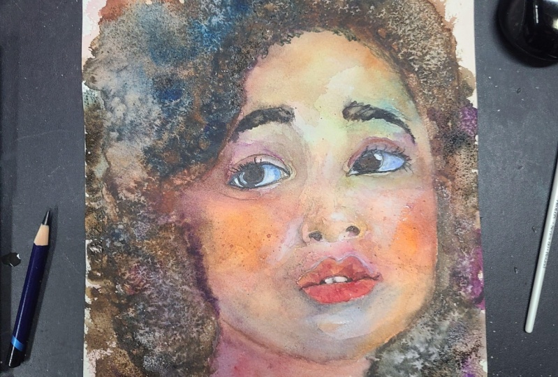
5. Shadows and Final Layers to the Face: I've mixed some
quinacridone violet and burnt umber into my well, and I'm going to go in to the shadow areas on
the side of the Face. At this point, everything
is dry in my painting. But there is, if you look
at the reference image, that there is quite
defined shadow on the side of her face. And we do want to get
that in there because it's still important
to get values. In the Face. Of course, even though
we're painting it in a quite abstract manner, we still need those shadows
and highlights and midtones. I'm getting that shadowing
very likely initially, I might darken it up slightly as we move on in our process. And I'm going to go into
the other side as well. I'm also bringing some shadow down into the neck area because we can see clearly and reference image that
it is in shadow. And again, I'm using that
mixture of quinacridone, violet and burnt umber. I'm not going to bring it all
the way down to where I had the hard edge because they
want to preserve that. I'm working my way
around it and darken it up as much as you feel
that it needs to be dark. I will probably add some
more allylic violet to that. Any Violet really will
do any purple color. Or if you don't have that, blue is also good option. I'm now using cerulean
blue to fill in the iris, but not just the iris, I'm actually filling
in the white of the eye as well, that eyeball. I see this in every
single tutorial workshop or class that I teach. The eyeball is not quite. So getting rid of
the white right off the bat is a good idea. And it's also easier to place highlights there and
have them stand up more. At the end of the painting. I'm filling in the whole area. And if you're wondering what
I am making the eyes blue, even though the
eyes are not blue. That's because very
often like to have a blue highlight in the dark. I, you can very often see that even when
you look at animals, eyes and highlights are
not always just white. They can select the
colors surrounding them. Before the next step, make
sure that everything is dry. Go in with your heat
tool if you need to do that or let it dry naturally. Know that the eyes are dry. I'm going in with sepia. And again, I'm rolling
my brush in that very carefully so that the
bristles are fully loaded. And I'm just going to go
in and paint in the iris. So if you see that your
mixture is a little bit too watery as usual, just take your kitchen
paper and let some of the excess dampness out and bring your brush back to the iris and start
filling in the iris. Using the point of your brush. Go in and very carefully. It almost looks like the iris is darker on the right side. So I'm doing that. I'm just getting that
darkness in there, making sure that also try not to distort the
shape of the iris. That's very important,
that can happen. You can make it wider, larger, bigger and that kind of
Shange's expression and the I. So try to avoid that
as much as possible. And as you can see, I'm
leaving that highlight there. Then I'm moving on to the other. In undoing the
same thing, again, just makes sure you
stay within the iris, that you don't change the
shape of it too much. In fact, try not to change
it at all if possible. And again, I see that the
inner side of the iris, the inner area a slightly lighter and are going to be leaving a little bit of
a highlight there as well. And we can also use the same color that's
on our brush now the same mixture to define
that upper eyelashes. I'm just going to go in
with a very tip of my brush and very gently hardly putting
any pressure on it at all. I am going to bring that line, the root of both eyelashes, down to the end of the I. Now don't make that
line too thick. If you think it's too thick, have your have your paper handy
and go in and pick it up, for example, in my
cases sits a little bit too thick in
the inner corner. Just go in, press a
paper down and lifted. I'm going into the other eye
and I'm going to enhance the eyelashes or the root of the eyelashes with the
same color as well. Over on this side, always remember to put
very little pressure on your brush. If you think the iris
and his darkening up, feel free to go in and do so. You can also use the same mixture to go in to
the crease of the eyelid in certain areas and
darken that up to something I would advise
you against this to just go over the whole crease. It can be deeper
in certain areas. So I would do that. I would only darken up
certain sections of it. If you darken up
the whole thing, it will end up looking
a bit to cartoonish. And of course, you can use the same color to go
into the eyebrows. The eyebrows are kinda
downcast at the sides. That is not because she's got a sad expression on her face
or anything of the sort. But I think it's just because she's looking over to the side. Under eyebrows are raised. Again, go in extremely gently. Your brush barely touch
the paper when you reach the center
of the eyebrow or the area towards the top
of the bridge of the nose, change the direction of the hairs and go
almost vertically. And I'm going in with neutral
tint around the teeth. Era. Don't try to color in the teeth, just try to kind of get
the shape around them. So use negative painting. That means painting
around the shape rather than painting
inside the shape. The teeth already will not be quiet because we
went over them in the first layer and just try and get the
ship around them, suggesting, suggesting
at the teeth. Rather than trying to
exactly as I said, Paint them in inside. So that is enough for me. I'm not going to do anything
more about the teeth. I'm also going to use mutual tint mixed
in with Indian red, which is just kind of like a dark brick color dread to go into the nostrils
and define them. And for this, I am using
a small number two brush. Of course, it has to be
a very creamy mixture. I would compare it
to the consistency of toothpaste because we need all the control we can get when going
into the nostrils. We can also define a side
of the noise very slightly, as there is a shadow there. While we have this brush
on this mixture on it, we can go in and add a
few random eyelashes. They are not many eyelashes, so don't go crazy with a step. Just add very small, very fine. And again, don't add too
much pressure to your brush. I'm just going in and
suggesting these eyelashes. I'm literally not going
to have any of them. A lot of them in there at all.
6. Hair, Floral Element and Drips: I've mixed some browns in my well here it's
basically burnt umber, Mars brown and burnt sienna. And I'm just using this large three-quarter
inch brush to go in and drop some
color into the hair. The hair is going to be
very loose, very simple. And maybe we'll have some
more details on the outline of the hair where we have all these little curls
showing almost like a halo. But for now we're going to just drop this very watery mix
of paint into the hair, just using the shape of
our brush to fill it in. And just adding water and paint on top of the layer
that we've just put down. Then if you want to, of course have some
more defined shapes, you can go in with a less watery mixture
further on in the process. But for now to kind
of break the ice, I'm just going to use
this very watery mixture, get the shape in there so that it becomes less
scary, so to speak. And I'm just working my
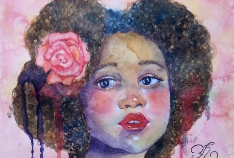
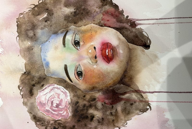
way around the head. Her hair is almost in the shape of a heart at the top here. And I've added the slower, which I plan to have it
melting into the hair. So it's not going
to be too defined. Just keep filling in that hair. I'm going in with
some darker color as well here and there
and everything is wet. So it's just going
to blend by itself, which is exactly what
I want it to do. I do want to fuss
about where this to match the shape of the head over here and
more or less here. So try to keep within that area and just drop the darker color
around the hair. Not all over the
place, of course. Just a certain spots. And let it do its thing. Try and get some darker color close to the neck,
close to the Face. Of course, make sure
everything is 100 per cent dry in the face
area at the stage, or the color from the hair
will bleed into the Face and that will be hard to lift
with your kitchen paper. I'm going to drop some
big dollops of pink. You can drop pink or violet
or even blue into the hair. One thing you've got to do is
just make sure that there's lots and lots of water
in these dollops. That is why I'm using
this brush that holds a really huge amount of water. It's a very thirsty brush. And then what I do is I simply tilt my block of
paper to get Drips. This adds to the overall
expressiveness of the painting. Of course, we're not done yet, but I like to get this done
in early on so I can paint a rounded decide
whether I want to add more Drips are different colors. For example, I think a violet
or blue, as I said earlier, would look nice
next to this. Pink. But I also plan on
getting this flower and here and possibly have some
Drips going from that too. So let's jump right
into that now. Now I'm using the tip of
this large brush just to add in some little
curls here and there. And then using that
mixture of neutral tint. To do this, I'm just using the tip of the brush
which has half dry. It's still damp of course, but it's not too wet. It's not dripping wet. And I just use that to
create these little curls. You don't need to do
it all over the hair. Because just by being able to
see a few of them that will suggest that the hair
is indeed curly. It's now time to go into the
flower and I'm going to make this Loose because
the whole painting is very expressive
and very loose. So it's only makes sense for
the flower to reflect that. But you can make it as
detailed as you want to go into every single leaf
and painted carefully. Whereas I'm just
going to lay down this first wash of rows Doran. And then I'm going to go
in with some Indian red, which is just again a dark, dark red brick color. And I'm going to start
dropping it into the center of slower. I don't even have a
reference image for this. I just pencil the end. Quite basically creating
a sort of spiral shape. And I'm just adding some shadow areas to
give it some depth. Don't go all around. You do go all around to
create the shadow area, but don't just create circle
after circle after circle. Try and make it more. Let's say, with less
of a balance in a way, try to make it
more asymmetrical. You can pull some of the
shadows out when your brush is clean to bring them into
a section of mid tones. Just under the rules, I'm going to place some purple. Again, it's going to
be extremely wet, extremely partly because I
plan to create another drip. So we have a lot of water. And make sure you
have coarse enough Painting there to have
colour and the Drips. And again, I'm just
going to tilt it. If you stop the tilt halfway, let's say you can easily
create a half-day trip, which adds a bit of variety and you can add this many
of these as you want. You can actually go
in and create a green one next to the leaf that
would make next to the petal, that would make sense
because we have them. We would have the greenery
surrounding the petal. You can have another one over
here. You can make it blue. We have blue and the
Face. So it's nice to kinda keep the Painting cohesive and have the same colors going on around the whole Painting. Note, let's dive into the
final touches for our piece.
7. Highlights and Goodbyes: And then going with
white acrylic gouache, I find acrylic gouache or acrylic to be better
than simple gouache, because gouache
reactivates with water and it tends to be less opaque and to allow the underlying
layers to show through more. I'm using this small
number two brush. I'm picking it up just as it is. I'm not adding any water. And then I'm going to add
a highlight into the eye. And in the same
and the other eye. And this is a moment that I absolutely love because adding those highlights really
brings the portrait to life. You can also add some
highlights under the eye. You can see in the
reference image we have sunlight just on the
rim of the eye there, and also in the tear duct
and over to the other side. Here. Again, even though
there are no freckles, who am I to take away the
funnel body, a few splatters. So just by using some browns, I'm going in and tapping
the back of my brush. I just added the freckles
and you can see that they really add more interests and make the portrait portrayed look really cute
and interesting. So this is the end of our class. I really hope you enjoyed
it as much as I did. I hope to see you again here on Skillshare that you will
visit my other classes. On here, I have
two more classes, once more suitable
for beginners. And another one
is a Watercolour. I please, please share
your projects don't below, I will be sure to
give you feedback. You can also share your work
on my Instagram handle, drawings in a drawer, all in one word. You can also find me on YouTube. And again, I'm Fiona Di Pinto. It was great being here with you and having this the Paint along. And I hope to see you very, very soon. Bye for now.
8. Portrait 2 - Rainbow skin pt1: Welcome to this bonus
section I added on so that we could practice
with another painting. Of course, if you didn't take the previous part of my lesson, I suggest you go back to the beginning and
do that one first. Otherwise, you will be
painting this with me today. You will have the
sketch out line and reference image
linked below. We will be having a lot of
fun together with this. Again, I want to thank in
advance all of the people who shared their work with me on
skill sharing the projects. But a lot of you
also shared them by tagging me on Instagram. I loved your work, and a lot of you had questions about obtaining puddles
and hard edges. So I'm going to a little bit
more in depth in this one. As you can see, I am
using a lot of water. I'm using a silver black
velvet 1 " flat brush. But that's not important, Just use any brush
that you want. I'm using this
brush in particular because it holds a lot of water. I painted this in the evening. In fact, you can see
the artificial light shining off the
water on the paper. The reason why I did this
is because I usually leave the painting
to dry overnight. I went in with some cadmium
red, very diluted again. There was a lot of water
in my mixture as I started off because it's a matter
of adding water on water. It is not predictable. You don't know what
you're going to get. You don't know where
you're going to get your hard edges or your blooms. You don't know how many
you are going to get. But one thing is for certain, if you don't use a lot of water, you are not going to get those hard edges
and those blooms. Then I went in with burnt umber. I had changed my
brush at the stage and I was using a
quail brush and I just started dropping more
water and added that darker color up on
the forehead area. Mint is a color by
white nights that I did not use in the previous
portrait this lesson. But I wanted to bring it into this one because I think
it adds a little bit of interest as it has a certain coverage that water
color usually doesn't have. It probably means
it contains white. I'm just laying that down on the cheekbone area and adding more water by splattering
my brush over it. So you can see we have
a lot of water here. And I will show you in a moment how the water is puddling
in the specific area. And by tilting my
block of paper, you will be able to see the actual flow of
water and paint. That is what you
are looking for. As you can see,
everything is very wet. Not just damp, but very wet. I'm just bringing some burned timber down in the jaw area. It's important to keep your reference image
printed out or on a tablet by your side so that you can check
where all the values are, the darker areas, the mid
tones, and the highlights, which are always so
important When we are working on a
painting or a portrait, or anything literally,
that we want to represent. I'm dropping some ultramarine
blue just above the eye, in a shadow area. And you can see that
there's so much water on the paper that it's
spreading by itself. And I'm allowing it
to do its thing. I'm also bringing it down
below the jaw line on the neck where of course we have a shadow
cast by the chin. And that is nearly always there. So you can take it almost for granted that you're going to have to go in and put a
shadow on the neck area. One thing I've noticed
with ultramarine is that it almost always
creates a hard edge. Some colors tend
to create probably because of the pigments
that they are made with. They trend to
granulate or create hard edges more
than other colors. And also darker
colors will dry with their cauliflower edges showing
more than lighter colors. Just because probably you can see them more because they are darker and dropping cadmium
red light into the lip. And as you can see, I'm just allowing it to flow
where it wants to go. And I'm dropping it into the
side of the nostril as well. And everything is
pulling over to the left side where
most of the water is. And I'm also bringing
some warmth into the ear. That is another thing you should always almost take for granted. We can see some warmth in
the ear almost every time. And I'm dropping
rose array over in the cheekbone jaw area because it seemed a bit light compared to the
rest of the portrait. You can see me pressing
my brush down. Now, what am I doing here? By doing this, I
am creating dents in the paper by pressing
your paint, brush down. It doesn't always happen, you're not always successful. But you can try to create some, well, some indentations
in your paper. By doing that, you will pull
the water towards that, well, towards that dent. Of course, that will help
you create cauliflowers, effects and get hard edges. In that area because basically
edges that are hard end up forming where the wet paper meets paper that's more dry. If we have a, well, if
we have a pool of water, then usually the edge
of that pool or where that pool spreads is where
we'll get a hard edge. Now using neutral tint, I'm going up with a fully
loaded brush into the hair and I'm not going all the way down close to the skin
which is still wet. Otherwise, the neutral
tint would just spread down into the skin
and ruin everything. As you can see, I
left that clean area between the top of the forehead and where the hair starts. I will go in later
to fill that in. When everything is dry, I'm going towards the
back of the head as well, and just lightly
dropping some of that on the eyebrow to start getting the idea of that darker area
where the eyebrow sits. And also between the
nose and the top lip, hinting at a bit of a
mustache, let's say. And also dropping
some into the cheek. And as you can see,
I'm also pulling down some of that dark
paint from the hair. By pressing my brush, I'm just adding burnt amber to the cheek area just
because everything was still a little bit
too light over there. And I'm also then
adding rose ray above that area to bring some
warmth into the cheek. Everything will still
tend to flow, in my case, towards that puddle
that's formed in the nose and in the forehead. And I will try to get more of a puddle on the other
side of the face as well. As I said, you don't
always succeed at this. Sometimes it's just the
way the paper is made. Sometimes there are some
defects in the paper that can cause the water to
flow more in one direction. But I just wanted to
get a good foundation, get a lot of color
going on in this one, so I wanted more kind of a
rainbow skin, so to speak. And then I picked
up some indigo. And I went in to the neck
area to darken up the shadow. So I went in on either side
of the neck to frame it. I'm going in with that
flat, silver, black velvet, large brush again
and using mint and swiping it across the cheekbone just because I want that
pop of color in there. I was leaning more towards
a rainbow kind of skin, as I said earlier, compared to the previous
painting we did in this class. So I wanted more color in there. And I sped the section of
the video up slightly, not because I want to make things too fast
for you to follow, but because it
really helps you to see how the water
moves on the paper. When you speed things up, I advise you to use
color according to what you have obtained
up till now on your paper. If you feel you've
gone dark enough, then be sure to stop. Otherwise, go darker in the areas that seem
too light to you. It may seem logic, but
sometimes we can easily overwork a piece by
ignoring these aspects. I've picked up some turquoise and gone into the
side of the face again and used more indigo to darken up the shadow
in the neck area. You can just see
by barely touching the paper with my brush
how that paint flows. Painting in this
way with watercolor really brings you together
with this medium. It really makes you
like one with it. I find it almost cathartic and I think it's a beautiful way to
paint with watercolor. This was what I had and what
I left to dry overnight. You can see there
is so much water when I tilt the
watercolor block. This is the end of
the first section of this part of the lesson, this bonus part of the lesson. I will see you once my
painting has dried. See you in the next section.
9. Portrait Rainbow skin pt 2: It's the morning after. This is how it has dried. We definitely have
some hard edges going on, as you can see. Also, I tried to dab up some of the water and paint that had bled beyond the head area. What I ended up doing was I tilted the block
of paper upwards, and I used my brush to push some drops outwards as I was tilting the paper
to create this effect. And I was thinking,
I will go ahead and do the same thing
over down here. Going up the way. Of course, it's never completely predictable what it will do, but I thought it would be a nice added extra element to do that composition
wise as well. I think it will look nice. As you can see, a
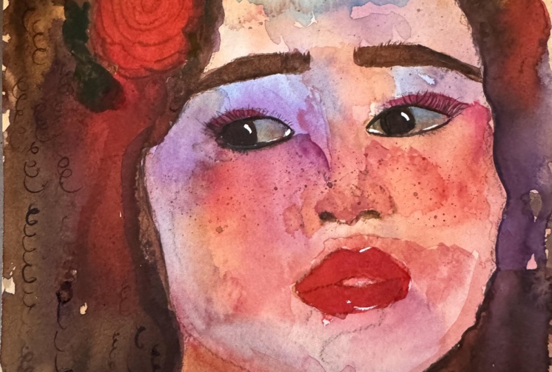
result is slightly more colorful and rainbow like
compared to our first one. We have a little bit more
of interesting colors going on as we did for
our first painting. I'm just going to go in and
start working on the lip. I have my palette over
here to the side, and I'm just going to mix some
rose ray with some purple. I'm going into the corner
of his lip where I can see this nice intense
and bright color. I really want to get that bright pink in
there on his bottom lip because it really adds pop
of color and intensity. Whereas everything is
quite hazy at this stage. By going in and starting to add this color in a more
precise and controlled way, we are bringing some
balance between a chaotic painting style and one that's obviously more controlled
and more precise. I'm just bringing
that color into the corner of his bottom lip. I'm laying it down. I'm then picking up some
of that violet on its own and dropping it into
the corner of his lip. Of course, at this stage, the paper is wet because I
just laid down that paint. The paint is going
to spread by itself. I'm gently tapping it, just with the tip
of my paint brush. I'm cleaning my paint
brush in clear water, tapping it on kitchen paper, and just smoothing it
out ever so delicately, bringing it over to
the other side of the lip and then back again. I'm going to keep
working on this. I'm going to go into the
top is a very subtle color. It's a dusty pink. I'm going to obtain
that by mixing this rose array with
some naples yellow, which really tones it down
and makes it look creamier. Mixing this in the
small plastic palette, and I'm going to go
into that top lip with this softer color and
work my way around it. If you feel that
you need more pink, just go and add that in. I really like the heart
shape of his lips. I'm trying to preserve that. Use the chip of your brush. When you get closer to
the outline of the lip, you can use the side of your brush when you're towards
the inner part of the lip. While it's wet, it's a good time to make
some decision making. I'm going in with my, this is actually permanent rose. It's Quinacridone rose and
some cadmium red light. I am going to mix them
together on my palette. I just want that
brightness to be showing a little bit more on
that bottom lip. I just feel it's not enough and that is very common
in watercolor. You think you're going to get a certain color to show up
quite bright in your paper, but then it doesn't and then
especially when it dries, of course you're going to
get a different result. I know right out of the gate that I really
want that to show. And also going in,
in the center, towards the center
of the bottom lip, close to the opening of the lip, I want that bright, darker skin where the skin of the lip goes backwards and starts to become the
inside of the mouth. That that makes sense. Like
the inside of the lip, it's shinier and
darker in that area. You can see that in your
reference image very well. There are also some
little lines coming down. Just use the tip of my brush
to move the paint downwards. Now the paint is quite
thick at this stage. Not too thick but quite thick. Make sure that when
you bring that down, you don't bring it down
in a straight line, but in a curved comma shape
like you see me doing here. I'm using that same color
to go up into his nose. There is some brightness
in the tip of his nose. I'm just going in there
and adding that there. Now we will all have come
up with different results. We cannot expect to get the same results when we
are using this technique, because water will go
where it wants to go. And it's not possible to, let's say, foresee exactly
what's going to happen. We've got to play
with what we have. I have some redness on the nose, pink or some kind
of earthy tones. Let's say I have this very
bright dot of red over here. I can try to reactivate
that with my damp brush. It will because water
color, that's its nature. It will reactivate if you
go in with a damp brush. If I want to make that
softer, I can do so. So I'm cleaning my
brush in my water, again, tapping it off
my kitchen paper. Let's always remember to
go through these motions. And I'm smoothing that color upwards into the
bridge of the nose. I have to be careful
here because of course, I have this mint color, and I'm not too sure that these two colors would
blend well together. I'm going in with small,
circular motions. If I press down too
hard on my brush, it's going to be very
easy to reactivate this mint and to have these
two colors spread together. When I'm not sure yet if that is something
that would work, I'm bringing some raw sienna
into the tip of the nose. Again, just dropping some
more paint in there. Again, cleaning my brush, tapping it on my kitchen paper. And again bringing that
up into the bridge of the nose without putting too
much pressure on my brush. And I feel that rosen
is a good color for the inside corner
of the eye as well. I'm just placing some there. I'm just checking around the picture if there's anywhere
else I want to have it. And I think I want
to have some up here that probably
won't show up much because I have quite a
dark area in that spot. But I'm over laying this
rociena on top of it. Maybe I have an area
that is pretty light here towards the temple. I'm going to bring some
rosina into that area. If you have any areas where the paint has not spread at all, maybe that now is
the time to assess those areas and
decide whether you want to go in there
and add some paint. I wouldn't go in and add
paint that's too dark, I would just start off light, or even if you want
to leave them blank. That's up to you that, let's say, a stylistic choice. That's up to you to make. It can help you discover
interesting things. I'm also bringing the
rosa into this blank area down on the cheekbone also because looking at
the reference image, I can see that it's
quite light over there. I want to achieve
the same result. Also, I have a blank area over here and I'm not quite sure yet what I will be
doing with that. I'm going in and just getting rid of the
white of the paper by dropping some rosen into it and just making it
more normal looking, something that I can decide what I want to do with later on. I definitely know that
I don't want it to remain white because
it would look too odd and too distracting while we
wait for things to dry. Let's look around our
painting and make sure we've not lost any of
that underlying sketch. I have most of it
still showing through. But I just want to go over that jaw line and make sure
I can see where it is. Maybe you can check if you can still see where
the eye lids are. The edge of the eye
and also in my case, the edge of the lip
is quite dark because the lips end before the
outline of the face. I have to be able to see that. Make sure that there's
nothing that you need to have showing through that is being
covered up by paint. I'm going into the ear as well. Just retracing that
underlying sketch. Just going into the
eyebrows as well. Getting the shape and definition
of those hairs in there, and maybe the outline
of the nose as well. I'm just using this very
small calligraphy brush to go into a mix of neutral
tint and Indian red. I don't like using blacks. I tend to mix stuff
colors like burnt umber, ultramarine blue, or Indian
red and neutral tint, or reds and blues. And get a dark value
by mixing these. And I mix it with
a larger brush, and then I go in
with a smaller brush because it's so hard to pick up color with a small
brush like this. It's really tiny, it just does not absorb
enough color at all. I mix that with a larger
brush and I'm going to go in to the opening
of the mouth to start get and get some
definition in there. I'm really paying
close attention to the reference image as I do this because I want to follow that opening of the lip
that I get it right, there always is a larger dot
at the corner of the lip. Just place that there
and then I'm dragging it in towards the
center of the lip. There's a little bit of a shadow on the outer edge
of the top lip, down at the bottom,
near the opening. Again, I'm just getting that in there just so that we
see where that lip ends, ends before the
edge of the face. Since in my case, that area is really quite dark. I really need that stand out. And I may go in there
with a highlight as well. Not in the lip,
but beyond the lip because there is some light
on this side of his face. Maybe I will bring some of that darkness into the
corner of the upper lip, over to this side as well.
10. Let's Wrap it up!: A good idea. Once
everything is dry, it is to go into the nostrils. It also helps us visually to get a little bit more of
definition as everything is, so let's say puddly and foggy. By getting those darker
values in for this, I am using neutral tint. It really helps us
see the whole picture come together and give us
more of a sense of direction. Just ready by placing
those nostrils in, things are starting
to make more sense. As you can see, I can use that same color to
start going into the eye. Now the eye is very dark, we can't really
see the tear duct. It's all like one
value actually, if you look at the
reference image you easily just use the one color to
go in to that tier duct and the iris if you
want you can leave the highlight blank
or you can go over it with your paint and just reintroduce it at the end of your painting with white
gas or white acrylic, I decided to leave it blank, which is something I
always do even if I always end up using white
acrylic at the end. Anyway, at this stage, your paint should
be really pasty of a very buttery
consistency because we don't want anything flowing around at all at this stage. And I'm going to use that color just to bring
it along the lash line, just barely touching the
paper with my brush. And I'm going to add in two or three eyelashes
as you can see. One, I can literally see, I think four in total. But for me, and I've said
this before, less is more. When it comes to
eyelashes and paintings, I am just going to have maybe a couple and
maybe a smaller one. And make sure that they are slanted in that direction,
if you know what I mean, because he's looking
over to that side, It only makes sense
that the eye lashes as well would be tilted in that
direction while we're at it. We can go in and start getting
the other iris in as well, with that nice, buttery consistency that offers
so much control. Again, I'm leaving
that highlight out. Make sure you get the
positioning of the irises right, or that can end up making
your painting look off. I have to pick up some
of that paint with my kitchen paper because I accidentally went over the edge. And again, just add a
few random eye lashes. Again, they're
almost horizontal. That's it when it
comes to eyelashes, the tear duct of this one, of course the iris is over
to the left on both sides. The iris is not close
to the tear duct in the left eye or in
the eye to the left. I'm just going to use that color to outline the shape of the eye. Okay, there is a little
bit of eyelid showing. We have a very slight crease, barely touching the paper again. Make sure you're
barely touching it. Remember you can
always go in again, But then it's harder to erase things and lift them once
they're halfway dry, or when you're using
darker colors again, just very delicately,
very delicately. And the more delicate we are, the lighter the
pressure of our brushes and the finer our
lines are going to be. Make sure you're observing. Make sure you're
painting what you see and not what you
think, you know. Look at the distance and the relationship
between the features. That is extremely
important as well, just as much as the shape
of the features themselves. Again, I'm using this
smaller brush to go in to the individual strands
of hair in the eyebrows, simply because it's
really hard to get fine hairs with larger brushes
starting from the center, which is always a good
idea because that helps to assess how thick the
lines are turning out. This brush is actually
perfect for eyebrows. I'm just looking at
the reference image, which you should
always have close by. By the way, don't think
you can open it once and then just listen to the
instructions of the tutorial, because that's not a good idea. Try and follow the
direction of the strands as you see them in
reference image. Some of them will overlap, some of them are
going straight up towards the beginning
of the eyebrow and the center of the
forehead almost straight. Some of them are curving
towards the top of the nose. When we reach the outer
edge of the eyebrow, you will see them go
towards the temple. You can allow your first
layer eyebrow hairs too dry, then you can go over them and make it slightly more defined. I see some random strands
down here as well, so I'm just going
to get those in. Then I'm going to hop over
to the other eyebrow, which just seems to be a
little bit more out of focus. We don't have to be as
detailed in that one. We can get away with being
a little bit more clumpy. Let's say it's more like
a clump of hairs rather than you can't really see the individual strands as much as you can see in the other one. Of course, make sure it's
clear that these are hairs but you don't have to
be as careful as you are. Wear with the other eyebrow. Make sure they are at the
same height. Use your brush. Actually the edge of this one, slightly lower
down and I'm going to lift it up in the corner here that it's at the same
height as the other one. I'm going into the eye and I'm adding some
put mort which is just a reddish brown in that
shadow area into the ear. Did I say eye, I meant ear. We can see it near the fold
and down at the bottom here. We don't want to go
into too much detail when it comes to the ear. Otherwise, it just attracts
a lot of unwanted attention, at least as far
as I'm concerned. But if you want to
attract attention there, that is fine, and it's
completely up to you. I've mixed some
ultramarine blue with neutral tint and I'm bringing it into the white
of the eyeball. I let it sit there for a while to allow the paper
to absorb it a little bit. I'm doing the same over
to the other side. Then I go in with my
kitchen paper and I lift, especially in the outer corner. I will maybe let it sit a
little longer in the inner, in the inner corner but
closer to the iris. Because if you check
your reference image, you will see that
there is more of a bluish hue close to the iris. Maybe you want to let
that sit there a while longer and then go in
with your kitchen paper. And lift it so that we
have some left behind, but not as harsh as it is now. Always a good time to go into the hair and just using
neutral stint again, I'm going in with quite a
thick and buttery consistency. I'm going down into this area closer to the top
of the forehead as well. As you can see from
your reference image, we do have that area
with hair in it as well. I'm just filling it in. I didn't do that initially
because I didn't want that to bleed into the
face at the edges. I'm just using the tip
of my brush to create that hair strand effect. Then I'm bringing it
down to the root of the hair like this, again, using the bristles to
create that effect, which makes it look like hair. Use some water to spread
some darkness there, but not do much else with it. Because one he has saved
on the side of his head. Not that I really
want to convey that, I just want to kind of get the idea of a darker value
on the side of his head. But I'm not going to go
into any details at a. We've now come to the part
where I'll show you how to create those, those
upward drips. I'm just pre wetting the
area with a clean brush. Of course, there is quite a
lot of water on my brush. I'm creating a puddle
into which I am then proceeding to drop
some ultramarine blue, and I'm just
spreading it around. Then I flick my brush, I use my watercolor palette, tin, to hold the
watercolor block of paper up to tilt it
downwards actually. And then I tilt it even further. And if you don't achieve
a drip by doing this, just load more water
onto your brush, position it onto the paper, and you will see that once there's enough volume of water, gravity will do its work and you will eventually get a drip. So don't fear then I'm just
adding some other color. I can't remember
honestly what I used, but I think it was just one of the pinks
or reds I'd used. But it got mixed with the blue. It changed it. It became more of a
purple, a cold pink. I did the same exact thing. I just added water till I had enough there
to create that drip. And if you don't get it, you can help yourself along
with your brush by creating a path
for your drip, as you can see me doing here. I spread that paint into the indigo in the neck and I achieved a
really nice effect. And I really liked
how this turned out. I'm getting near to the
end of the painting, I'm just going to be adding some highlights of my
white acrylic gas. This is pretty simple. Use a very thick to do this
and I added them to the eyes, the eyeballs, the
lips, the nose, and the outline of
the face to the left. Thank you so much
for having been with me for the tutorial and I really cannot
wait to see your work. I was so happy with
all the work you shared for the first portrait. So I would love to see you share work from this part of
the lesson as well. It should be pretty simple, but I am sure that if
you need any help, you can ask questions and I will be more than happy
to give you feedback. You can tag me with your work at the handle
drawings in a drawer, all in one word on Instagram. You can also find me on Youtube. I am called Fiona Pinto
drawings in a drawer. This time, not all in
one word on Youtube. Weekly videos on there with tutorials, reviews,
and everything. Let's connect, let's
make more art together, and let's share this passion. I hope to see you soon
because this is what I love doing and what I want
to do so much more of. And hopefully with you. Bye for now and
see you next time.
 Fiona Di Pinto, Watercolour and more