Transcripts
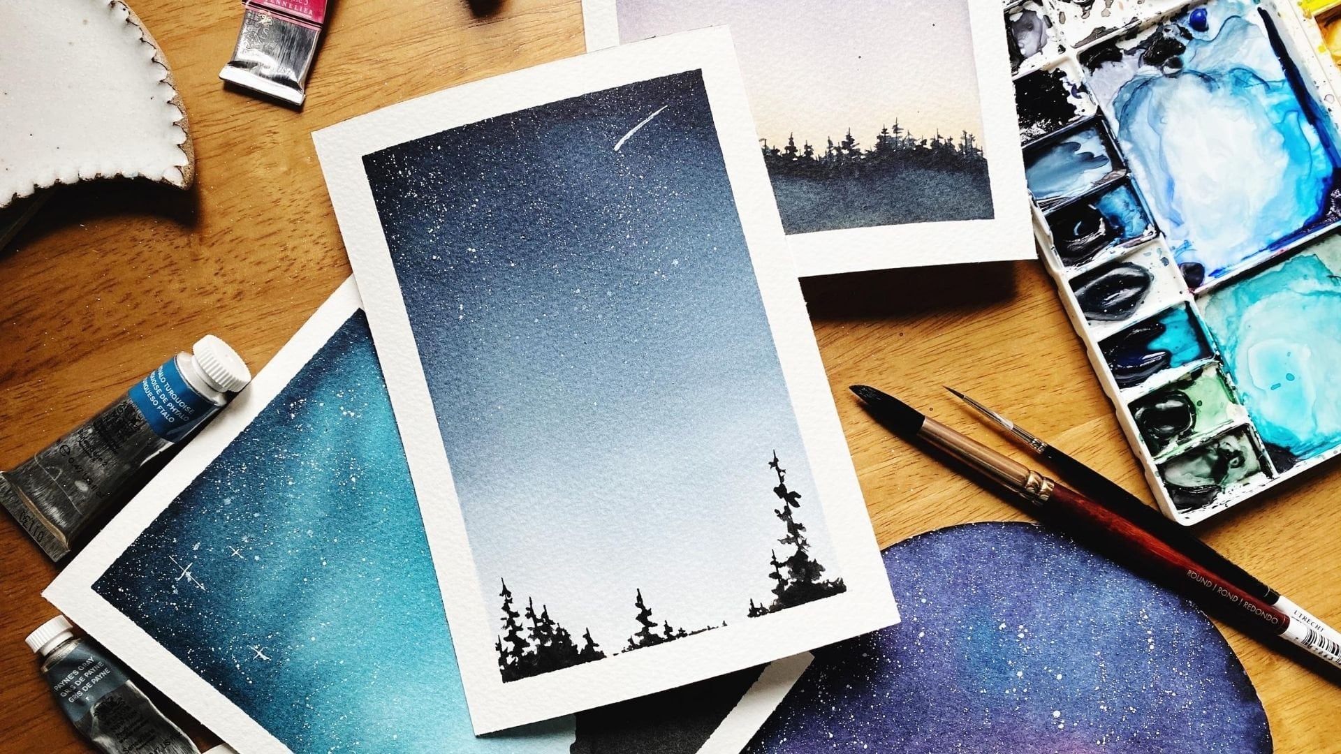
1. Five-Minute Watercolor Sketches: Paint Fun Projects Fast: Do you think anything meaningful can actually happen in 5 minutes and the time it takes to wait on your coffee order or
empty the dishwasher, can you really have a truly
transformational experience? You see that's the thing about
creativity and making art. There is no minimum amount of time required before it counts. Even if you only have 5
minutes, you can make magic. Hi there. My name
is Colby Bloom, and I am a watercolor artist, author, and online educator. I am also a mom and
a business owner, Which means that even though my entire career is focused on helping
other people make art, there is not always
tons of time or energy left over for my
own creative practice. Making art just for me, that's when I started
using sketchbooks. Instead of the blank page being a stage filled with expectation, a sketchbook became my
safe haven where I could really and truly explore
all of my imperfections. Even if all you have are
some random paints in old sketchbook and 5 minutes squished in between meetings, you can create truly meaningful creative
experiences for yourself. Don't worry. Before we
even start the studies, I'll help you break down
any painting into simple, doable steps by identifying easy shapes and textures to
help you anchor your scenes. And then using color values
to add depth and detail. Sketching with watercolor in particular can be really tricky, but we'll talk about that too. By practicing water control
and paint consistency, and preserving dry space on your paper to allow you
lots of room to play, you will be able to turn even complex subjects into a fun, doable, five minute sketch. Now I want you to remember, creativity is a tool. It's supposed to help
you elevate your life. To bring you more joy, and more happiness and
more discoveries. And that's exactly what
this class is for. It's not about disciplining
you into being, you know, qualified for
these creative experiences. It's about showing up, letting go of that all
or nothing mindset, and allowing even 5 minutes of your time to make a meaningful
difference in your day. So what do you say?
Let's get started.
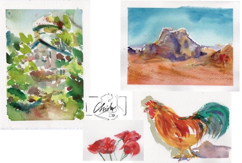
2. Projects: Hello my friend.
Before we dive in, let's take a look
at the projects we're going to paint
throughout this class. Now remember, the
main idea behind these projects is
simplifying our process so that we can make quick and
fun and exciting paintings even if you only have 5 minutes. Now, there are a lot
of ways that you can break this
down as a painter, but we're going to focus
on two main areas. The first is mark making, or finding simple shapes within the pieces that
you're trying to paint. So that it's really easy to get what you're
looking at on paper. As we are paying attention
to the shapes that we find and the simple
marks that we can make, we're going to create texture
and movement specifically. There are two main projects that focus on shapes specifically. The first is creating
texture and contrast with mark making in this really
cool crumbling castle sketch. The second is creating
movement and contrast with bold colors as we are painting a quick
sketch of a chicken. In addition to
focusing on shape, we're also going to
focus on color value, or the lights and
darks in a sketch. By breaking down projects
into color value, you can really easily know what you need to paint and
where you need to paint it. Two projects that
focus on color value. The first is an ink
and watercolor sketch, where we're going
to do an ink sketch first and then put water
color on top of it. It's a pair of scissors. And we're going to use
color value specifically, dark values layered on top of light values to create
depth and dimension. Then the last color
value project will be this red
rock desert scene. It's definitely on the loose
side on the abstract side, but the idea is taking
a complex scene and breaking it down
into color values so that you can really quickly, at the very least,
get a basic sense of the shadow and the detail that you want to
create in the scene. Then finally, one more bonus
project that combines all of the things that we've
been talking about into a really quick
and easy sketch. By the time you
wrap up this class, you will not only
have significant practice with mark making and identifying shapes and using color value to
simplify paintings, that you can sketch
in just 5 minutes. But you'll also have a bunch of new things that you can
sketch in under 5 minutes. And remember, these
projects are in real time, so that means you can paint
along with me or you can watch and then paint yourself after whichever
one works for you. Are you ready to dive
in? Let's get started.
3. Mindset Check: Hello my friend.
Before we get started, we're going to do a
quick mindset check. And I want to do this specifically
because the purpose of this course is not really
to teach you how to paint, you know, breathtaking
masterpieces in 5 minutes or less. Because, you know, while
I'm sure there are some artists out there
who can do such a thing, I am not one of them. The point of this course is
to teach your body to remind yourself that creativity does not have to be all or nothing. It's not only failure
or masterpiece, there's so much more in between. And also, reaching for your creativity doesn't
only have to fulfill the purpose of proving
to yourself that you have some kind of
worth or value, right? If you go into painting, if you go into any kind
of creative activity, knowing that your worth, your inherent value as an
artist is already set, It is already at infinity. There is literally nothing
that could diminish the value that your creative
energy brings to the Earth. You are going to
have a much safer, a much more peaceful and hopefully a much more curious
and thrilling adventure with your creativity. And that's exactly
what I want for you through this course, is I don't want you to go into these five minute
projects thinking great, now I'm going to learn
how to, you know, like get great at
watercolor fast, whatever. This isn't that kind of scheme. This is about
practicing courage. This is about practicing
letting go of all or nothing. Because even if at the
end of the day all you have are scribbles
in your sketchbook, that's still so valuable. It's still a gift that you
are giving to your body, that you are giving
to your creativity. And you absolutely can
start and finish something, even if that something is messy. That's where the practicing
courage comes in, right? If we're going to do quick
five minute sketches, we're going to be uncomfortable. It's going to challenge
your perfectionism, and a lot of people
don't love that. And that's okay. It's okay to paint something
and be uncomfortable. And also know that the gift you are giving to yourself
is so valuable and that your only reason for
painting doesn't have to be to prove you're worth as an artist, like I was saying. So with this mindset check, I want to just make sure that the intentions
that we're setting for this course are going to help
lift up your creativity, lift up your spirits. And orient toward
process, right? Orient toward exercise
and progress, not toward a very
specific product, toward achieving some
kind of perfection, or, you know, painting quick
five minute masterpieces. The point is we're going to stretch our tolerance
for discomfort. We're going to show
our body that we absolutely can get a lot
of value from painting, even if it's only for 5 minutes. We're going to practice
courage in starting something, even if we're not sure
we can finish it, even if we're not
sure that we're going to be good at it. Right? And we're going to give
ourselves the gift of painting just because
painting is really fun. So I hope that this quick little mindset chat was beneficial for you
and helps you to maybe, you know, set some
realistic and doable, and gentle and
self compassionate expectations before you
go into this course. And I will see you again soon.
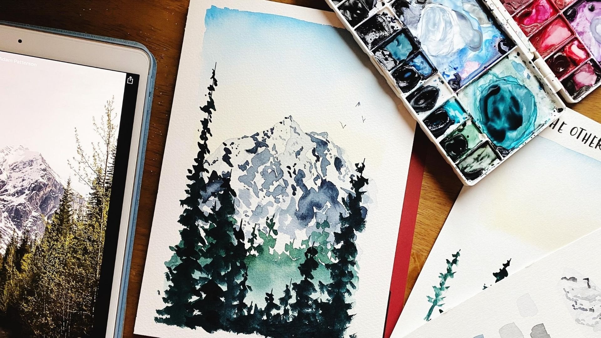
4. Supplies: A quick note on supplies before we jump into exactly
what I'm using. You don't have to use
exactly what I'm using in order to get a ton of
value out of this course. In fact, I would
encourage you not to go and buy a whole bunch of new supplies in order to
complete the projects. Because the point of this
course is to show your body, to show up for your creativity, no matter what that looks like. Even if you only have 5 minutes, even if you only
have $105 watercolor set from the craft store, right? It doesn't really matter what you're using when you're
painting these projects. What matters is that you
are painting, right? What matters is that you are showing up for these 5 minutes. So, you know, with
that quick note, you don't have to
use what I'm using. But I do want to show you what I'm using just in
case it's helpful. Okay. So let's take a look at the supplies I would recommend. And again, keep in mind these are not the exact
supplies you have to use. And throughout the videos, I am, you know, a bit of a
watercolor maximalist. And so like this is my
paint palette where I have lots of different
paint colors that I like randomly reach for. And I don't even remember what some of those
paint colors are. So it's not so much
that I'm saying, please use exactly what
I'm using as it is. Okay. These supplies
are going to give you a really
solid foundation, a really solid base for
any painting course, but particularly the
one that we're doing. So let's start off with paint. If you have a good set
of primary colors, red, yellow, and blue, that's going to be
very helpful for you. These three are
Daniel Smith brand, so Quinacridone Rose is
kind of like magenta, lemon yellow, and
then cerulean blue. These are really
good paint colors. They are not necessarily, you know, your only
option for primaries. Anytime you have a solid red, yellow, or blue, you can mix
lots of different colors. And then I like
to add a neutral. This is pains gray which is like a really, really deep blue. It's actually blue pigment mixed with a little
bit of black pigment. And when I use pines
gray at its darkest, like its darkest value, it almost looks black. So having a neutral
to mix with any color will help just widen the
options for you there as well. This is Windsor Newton brand. This is Daniel Smith brand. Again. These are
artist grade paints which I highly recommend, but you can use whatever you
have on hand and that will work just great paint brushes. I recommend getting round
paint brushes in size two, pi six and size 12. And all of these are
Princeton brand. This is Princeton heritage
with the red handle. Both of these are
Princeton heritage. This is Princeton Neptune with the like reddish
brown wood handle. And the differences
between these two series, they're the same brand but
slightly different kinds. Is the Princeton Neptune
is synthetic squirrel, which just means
it's a lot floppier, holds a lot more water. And the Princeton heritage
is in synthetic sable. So it's slightly more rigid. It's still pretty flexible, but just slightly more rigid. I like 6.2 my smaller detail brushes to be a little more rigid so that I can have
more control over them. And then the size 12, which is like a wash brush, I prefer to have it be
the synthetic squirrel, so it's a little floppier, holds a little more water and gives me a little more movement. But you really can't go wrong when it comes
to paint brushes. It doesn't even matter
if you have this brand, just the size two, the size six, and the size 12 in
the round shape. That's going to be
really helpful. Then. I like to have a mixing palette. Any kind of mixing palette. This is a ceramic palette. Ceramic palettes are by far
superior to plastic palettes. But you don't need to
buy a handmade ceramic or even like a palette. Exactly. You can also
use a dinner plate, and that would
work just as well. Then for paper, these are the two sketchbooks
that I'm using. These are both
handmade sketch books. The brand is in the
supplies guide, but the most important
thing with the paper that you're using is that you're
using watercolor paper. Because watercolor
paper is specifically made to make watercolor
easier, right? So both of these paper have like professional grade
watercolor paper in them. This has arches brand. This has a handmade
watercolor paper. But you don't need to use professional grade paper
if you don't want to. You can also use
student grade paper. Really, the most important
thing is that your paper is 140 pounds or 300 GSM. That's the weight. So you want your paper to
be fairly heavy. You also want it
to be cold press. Cold press means that there's a little bit of texture here and the texture just makes it so that the paint
will actually, like, sink into the
paper as opposed to just lay on top of it. I will say that if you
are going to invest in any professional grade art
supply, start with paper. Because if you start
with really good paper, it's going to change the way
that the techniques work, even if you're using
student grade paints or student grade brushes,
start with paper. And after that, there is one project where I use
ink to do an ink sketch. You don't have to do an ink
sketch for that project, but if you want to
use what I'm using, this is a pigma micron pen. It is waterproof, so
it says archival ink. That means it's waterproof
the way that we're doing it. We're going to do a sketch and then paint watercolor
on top of it. You need a waterproof pen if you want to do it the
way that I'm doing it. And then aside from that, make sure you have a towel. I just have like a terry cloth washcloth towel that I use. A paper towel will also
work, but, you know, I just have this and it's all stained and beautiful from
all the paintings that I do. And then I don't have as much waste that I'm throwing away. And then make sure you have
two cups of clean water. I like to use heavy
like ceramic cups, but a mason jar or a mug would also work using a heavier one. Just make sure that it
doesn't really tip over. So there are so many
other different kinds of watercolor supplies
we could talk about, but for this course
particularly, these main things will help you make the most of what we're going
to be learning about. And so why don't we get our
supplies and jump right in.
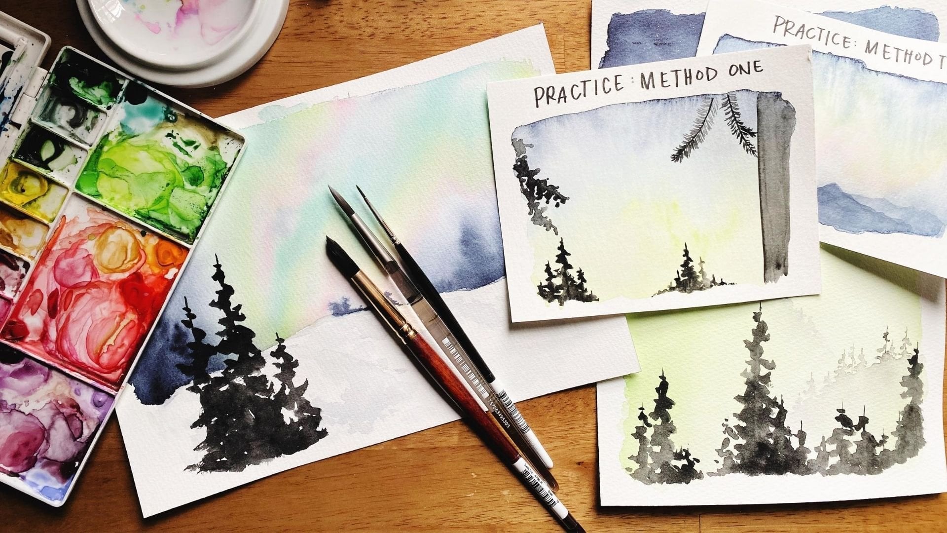
5. Simplifying Shapes: Let's talk about
shapes specifically. How to take like maybe a complicated reference
photo or an idea, some kind of subject
that you want to paint. And break it down
in a way so that it's simple enough to translate into a
five minute sketch. Breaking any subject
down into shapes or marks is one of the
best ways to do that. Basically what I'm saying is, instead of viewing
the world in terms of objects or
subjects that exist, try orienting your brain to view the world in terms
of recognizable shapes. For example, I could hold up this watercolor palette
and say to myself, oh, look, it's a
watercolor palette. But as soon as I try to start painting a watercolor palette, my brain kind of goes, does not compute. I don't
know how to paint that. And so in order to overcome
that overwhelm, right, overcome that freeze
that comes from, I don't know how the
heck to paint that. You break it down
into shapes, right? Instead of what I'm looking
at this in order to paint it. Instead of thinking to myself, that's a watercolor palette. I'm going to think to myself, what shapes do I identify that will help me
to paint this really fast, Or at least in a doable
kind of way, right? Okay, not a watercolor palette. Instead, I have a big
long rectangle with rounded corners and that has a lot of other
rectangles inside. And when I break
shapes down that way, not everything is as
simple as you just rectangles inside of rectangles. But complex subjects and complex scenes are actually
more simple than you might imagine if you can learn to
focus on what you can see and let go of the things
that don't really matter in terms of the
building blocks for the scene. A really simple process of doing this is first
identify the biggest, most recognizable
shapes that you can find that will help you
to anchor the scene. After you find the
biggest shapes, then you can find
the smaller shapes that will help to add detail and help to add movement
and character to anything that you're trying
to paint really quickly. For the purposes of
staying really simple, let's break shapes down into two different categories,
geometric and organic. Geometric shapes are the
shapes you've learned about since you are
just a very tiny human. They are recognizable
shapes like triangles, circles,
rectangles, squares. Any kind of shape that you
would use in geometry, that's like a
standardized shape. That's a geometric shape. Organic shapes are, for lack of a better term,
more like blobs, like when you're looking
at a scene or you're looking at a subject or
a part of a subject, and you can identify that, that subject forms a
specific shape ish, but you don't really
know what to call it. It's not any standardized
geometric shape. We're going to call it organic. And then for the
purpose of watercolor, we're going to lump in
texture with shape because, yeah, maybe it's not exactly
a very specific shape, but when you're trying to
paint something and you're trying to simplify
things really well, particularly when you're trying
to use mark making to do that right texture is an effect you can really easily
make with specific marks. And when we're looking at shapes and
specifically trying to break down a complex subject into something you can
paint in 5 minutes, we're going to use mark making, identifying shapes to
look for organic shapes, geometric shapes and textures. Remember, we're using
watercolor for these sketches. Specifically, watercolor
is a wet medium. That means dry paper is a hot
commodity in your sketch. So you don't want to
immediately fill up your entire sketching surface
with water right away. You want to identify shapes in part so that you can
take up as little of the paper as possible
while still giving yourself an anchor to
build out the scene. Since we're trying to do
these sketches in 5 minutes, you're not going
to have a lot of time for multiple layers. Two layers like at most is probably what
you're going to have. And so that makes
dry space even more important to preserve
as much as possible. None of this is going
to be accurate. We're not shooting
for perfection here. We're not shooting for accuracy. We're building courage, right? We're practicing showing up, even if it's only for 5 minutes, even if it is so, so
messy, and that's okay. And in fact, you might
even find that when you are just willing to let
go with your mark making. Let go with
identifying shapes and make those imperfect
shapes that you like, that kind of painting better. We're not trying to
paint a real life thing, we're trying to create
a painting, right? And so let yourself lean into the imperfection
because it might make your studies
even more special. So to recap, we're going to use identifying shapes
to simplify and break down subjects and scenes into recognizable,
doable building blocks. The shapes we're going to look for specifically
geometric shapes, organic shapes and textures, all of which we can try to
create with mark making. This is going to take
a lot of courage. We're not shooting for
perfection, using loose, simple, gestural strokes in order
to get simple shapes and enliven our study with movement is really
what we're aiming for. Oh, and don't forget to preserve
the dry space as much as possible so you
have lots of room for detail if that's
what you want. All right, that about sums up the lesson on shapes
and mark making. Hope this was helpful and I will see you in
the next lesson.
6. Contrasting Values: Something you may not know about painting is the unsung heroes of virtually every work of art
are contrasting color values. A color value is the lightness or darkness of any specific hue. And when you have
contrasting values, meaning you have lights, you have darks, and
you have midtones, Those contrasts are what allow your eye to identify shape, to identify depth, and that really bring
most paintings alive. Color value is also
going to be one of our most important
tools for painting. Quick five minute studies similar to identifying
shapes and mark making, like we discussed in the
previous lesson video, identifying color values is less about allowing yourself to see all of the different shades and hues of color that
you see in a painting. And more about simplifying the painting into
lightest lights, darkest darks, and easily
identifiable midtones. As a general rule, there are going to be more
midtones than anything else. And then you use high
lights and dark lights. Low lights, right? So like the lightest lights
and the darkest darks. To add dimension, to add detail, to kind of shape everything, and snap it all into
place with watercolor. Specifically, the way
that you change or alter a color's value is not by
adding black or adding white, like you might do
with other mediums. With watercolor, the way
you change a color's value, meaning like how dark it
gets or how light it gets, is by adding more water
to make it lighter. Or adding more paint, more pigment to make
it thicker and darker. Paying attention
to the consistency of your paint is going to
be really important here. The thicker and more
viscous your paint is, the darker the value
is going to be. The more liquidity
and water coloring, the more movement it
has, the lighter value. It's going to be. One really
helpful resource you can use as you're trying to gauge consistency is what's called
the T to butter scale. Basically it's comparing
your water color, the consistency of your water
color to tea or butter, and any kind of
liquid in between. So tea is going to be
really watery, right? Because it's basically water. And when your watercolor is that really watery, Tea
like consistency, it's probably going to
be the lightest it's going to be versus if your watercolor is more like butter where it's like thick, maybe it's like melted butter or slightly melted butter
where it's thicker, it's very viscous, right? And maybe it has a little bit of movement, but not really. That's going to be the kind of consistency you want
for your darkest darks. Now, watercolor is different
from opaque mediums in that instead of
slapping on highlights, last with some kind
of white paint. You have to think
ahead of time and really preserve the white
dry space of your paper. If you want to have
the brightest brights only using watercolor, Generally, we paint from
light to dark, back to front. Now, with quick
sketches like this, you can't always paint in
that exact order, right? Because we're not necessarily drying lots of
layers in between. We're trying to get a lot
of these paintings done in one or two layers and just let whatever it is dry
as it's going to dry. Generally, I would
say still start with your lightest paints and
then gradually grow darker. But just keep in mind that you may have to skip
around a little bit. Water control is going
to be very important here as we've discussed
at length already, right? Water and water control is how you determine the
tea to butter scale. The more water you add, the, the lighter
it's going to be. The more pigment you add
and less water you add, the darker it's going to be. I'm mentioning this again because as you
paint with layers, especially if maybe you have
a really wet layer at first, in order to add
your darkest darks, you need to have darker paint so that the paint not
only shows up dark, but also so that it doesn't get lost in the already wet paper. Using really thick butter like
consistency of dark colors is a great way to add depth
and shadows to any painting. You just have to make
sure that there's not too much water on your space or else the paint
might disappear. Generally, as you're using
watercolor and color value specifically to maybe organize
your layers a little bit. Before you get started on each of these five minute studies, I would identify where
the mid tones are, right? The midtones are going to be maybe right in the
middle of the t to butter scale where it's not necessarily super, super watery. But definitely not as dark as the thick butter like
consistency of the paint. You're looking for
your mid tones. And then you're also
specifically paying attention to any kind highlighted really bright white areas
that you might need to leave dry on purpose so that you have
the lights showing up. Right? So you look
for your mid tones, you look for the
lightest lights, and then you kind
of start painting and building it out that way. And then because the
darkest darks are, you know, I would always add
the darkest darks very last. Because you can always make a painting darker if you
need to with water color. But it's very difficult
to remove the darkness, remove the dark color value
once you've already added it. So the darkest darks are something that I
would say for very last and generally as
a general rule, again, not hard and fast, but
as a general rule, you don't need as much like really dark shadow as you think you do, but
you do need some. Working with color value
is going to be scary, especially when you do
get to the darkest darks because you're not going to
want to ruin your painting. And that's where I
have to come in and say, this takes courage. And the whole point
of this course is for us to practice
courage, right? The whole point of
these five minute studies is not to prove to yourself that you are a great artist who knows how to do this. The point is to
practice all of this, to give yourself
a nice contained, safe, virtually risk
free play space. So that even if you
do mess up one of your paintings by
adding too much dark or by making it
too wet at first, or it turns a little bit muddy, it's just paper, It's
all going to be fine. But by focusing on color values, it will give you
something a little more structured to
kind of, you know, organize your
layers and help you know where to put your paint and what kind of consistency
you needed at to recap. Color value is the lightness
or darkness of a color. With water color, you alter
the lightness or darkness of that very specific color by
either adding water to make it lighter or adding more
paint to make it darker. We're going to start
by identifying the dry spaces first that we need to leave
dry for highlights. And we're also going to identify any of the
mid range tones, right where it's not the whitest white or the darkest dark, but it's just somewhere
in the middle. And paint, play around
in that space first. And then we're going to add
the darkest darks last. And especially if we're working with wet layers and adding, trying to add dark darks on
top of an already wet layer, the consistency of the paint
is going to matter a lot. We want nice thick, viscous consistency
for dark, dark, so that they don't immediately dissipate in the wet layers. All right, that about sums up color value specifically
for this course. I hope that it was really helpful and I will
see you again soon.
7. Mark-Making Warm Up: Hello my friend. This is a quick warm up to
practice mark making. Specifically we're going to practice pulling
out mainly organic, but sometimes geometric
or textured shapes from objects that
are on my desk. It's pretty simple.
Basically, I'm going to take an object, I'm going to look at what
shapes that I can find, and I'm going to try to make that shape as best I
can with really loose, simple, gestural strokes
of my paintbrush. Remember, there is no
right or wrong here. This is a warm up to show you how much inspiration
you can take from really simple objects
and how much of the world you really
can build in a simple, doable way by pulling out
shapes that you recognize. With our 5 minutes, we're going to spend them
taking inspiration from objects that we see and making marks inspired by
what we're looking at. And I'm just going to
grab things off of my desk to make those marks. So just to remind our mark
making is basically just making random all sorts
of different kinds of marks and gestures with your paint and with
your paint brush. Right? So the first thing I'm going
to use for inspiration, this paint palette that
I have that has lots of dried paint on it from
a previous project. So I'm going to look at this paint palette
and I'm going to try to mimic all of the
different shapes that I can see. So shapes that
maybe are made with some of the paint
that I can see. So I'm going to try to
mimic some of the texture, some of the paint
that I can see, u, and the shapes that I can see within
that palette, right? So I'm trying to mimic the
texture that I get from dried, gritty paint or maybe from, you know, strokes that I've seen that are dried
on the palette. And there's no wrong or
right way to do this. This is a lot of practice
in paying attention to detail and noticing
things, right. Just noticing all
the different marks, all the different shapes
that I can see in the world. And a dried palette with watercolor is actually
a really great way, a really fun way
to notice because watercolor dries and
different pigments especially dry in
really unique ways. So most of, up to this point, most of the marks that
I have been making were water color paint that
was dried on the palette. Those two lines I just
painted were inspired by that little line in the palette to hold your paint brush
those two parallel lines, trying to capture the
texture of the clay. That's kind of like
skipping there, and I had a lot of
fun finding lots of different shapes
and trying to mimic those shapes from
that paint palette. So now I'm going to switch, I'm going to do the
exact same thing, but I'm going to
try to mimic some of the shapes or some of
the textures that I can see or that I get inspired to paint by looking
at this paint brush. So maybe I'm trying to
capture the shape of the little metal that's combining the handle
with the brush, right? Or I'm trying to capture a really loose gestural
idea of what the handle, what the handle looks like. Or maybe I want to capture the texture of the
actual bristles. Right, that's kind of what
I'm doing right there. If I kind of flick my
paintbrush upward, is that going to capture the
texture of the bristles? Or maybe instead of
trying to flick it, I want to actually
like try to capture the shape a little bit more of the bristles without much
of the texture, right? So there are lots
of different ways, lots of different shapes
that I can find with that. Here is another little palette. This is like a ceramic
pan full of pains gray. So I'm looking for shapes and I found a little circle that's in the middle of the palette. Right where I've presumably gotten a lot of paint and it's kind of gone
down to the end. I can use the shape
of the pan to try lots of different marks and lots of different shapes there. I can try to, you know, mimic the little
dots that are dried, the dried paint that's all
the way along the pan. One way that I like to
explore mark making is to make one shape like
that half circle, and try it in lots
of different ways. Like try to make that one shape in lots of different ways. That's a fun way to explore
with mark making too. So I have this wiggle palette
that's also really fun. That's like a little pan,
that's like a squiggle. And so using that
squiggly shape, it can be a fun way to
experiment with mark making. Also lifting up my
brush so that I can get some spaces
between the paint. Splotches can be a fun
way to capture texture. Here's a seashell that I keep on my desk from when
I visited the ocean. And trying to capture the various marks
like on the seashell, the various shapes on the
seashell that I can see. Like these are the
little dark marks that are around the
edge of the seashell. I can try to capture the shape or the ridges of the seashell. And this isn't about me painting the seashell
itself, right? This is about me
finding a shape, finding a color,
finding a pattern, isolating it, and
trying to turn it into a mark that I can
explore with my paint brush. It's super messy,
it's super loose. It's not supposed to
look like anything. It's just supposed
to evoke curiosity. It's just supposed to help me
practice noticing the world around me so that I can see these shapes and learn to
identify them elsewhere too. This can really help to hone
your painterly eye, right? So this is a mint that I
had on my desk trying to capture like that spiral of red that's going
across from the mint. Or the pattern between
the red and the white. That can be a
really fun thing to paint the shape of the mint, just that like rounded shape. And my 5 minutes are up. So I hope you had a
lot of fun watching me find inspiration
from different objects. And I hope that you can have
fun with this project too.
8. Project: Crumbling Castle: Hello my friend. We're
going to paint for our first project,
A crumbling Castle. Specifically, we're going
to focus on mark making and pulling out shapes from
a really busy subject. Architecture in general is
really difficult to paint, especially in under 5 minutes. But if we can practice identifying recognizable
shapes like, you know, rounded rectangles or easy to replicate textures like
dry brush texture, then it's going to be a lot more simple
than you might think. Remember, don't get too
bogged down by perfection. Don't get too bogged
down by the layers. Just try focusing on
contrasting shapes, right? Making the shapes different when you're working on
a different part of the castle and
you're going to be good to go. One final reminder. You're allowed to make this fun. It's supposed to be fun. So let's dive right
into it. Hello, hello. In this project we are
going to use marks. So we're just trying to use basic marks to follow this reference photo and
try to paint a really, really loose sketch
of this castle. We're going to pay
very special attention to all of the different
textures that we can see, while also being really self compassionate and
forgiving of ourselves. Knowing that the idea of doing this project is not
to paint a castle, it's to explore
mark making, right? And that's another
reason why it's sometimes a good
idea to use a timer, just so I can stop and know
that I'm trying to go fast. I'm trying to do quick marks to just get this sketch down, not to make this castle
look perfect by any means. So I'm just going to
start from top to bottom. I decided to start my timer over because because I
started it before, I actually was like
ready to paint. So I'm going to start
from top to bottom. Where if I was
doing this as like an actual painting like
that took me a long time. I would probably do the
layers a bit differently, but because this is just a
mark making study, right? I'm just trying to see all the different marks
that I can make. And the mark that I
see for the roof is just kind of like a broad
kind of sea curve, right? Like a little dome
with a line on top for whatever the
line on top of that is. And now I'm mixing
different colors. I used kind of like a cool gray for the top of the
top of the roof. And now I'm getting different
kinds of browns and grays to paint the
rest of the castle. And so on the side of that
castle that is sunny, I did like a light brown. Probably could have
added more yellow to it, but I'm not trying
to color match here. Right. I'm just trying
to get marks down. This is a mark making project. So, and because it's a
mark making project, one way to get this
sketch down is to notice very specific shapes and
the contrasting shapes. So I've noticed that the
texture of the brick in shadow, I can see individual bricks versus the texture of the
brick in the sunlight. I really can't. It just
looks like a line. And so I've tried to reflect that as I'm painting
the marks here. Especially on like that turret part right where you can
see I painted almost like individual bricks but then just a line for
the part in the sun. So I'm going down and I
painted the little roof, Tried to get the
individual bricks and the directions
that they were going, but it's okay if the
colors all blend together. And then I'm trying
to get the bricks on the side of this wall too. I've not, if I use really
light watery paint, then I get a lot of
that dry brush texture, which that dry brush
texture kind of, you know, implies the
crumbliness of this castle. And so I definitely want that, I want to use dry space to my advantage as I'm
making these marks here. And I had to pause for a second to answer the phone
or something, But continuing onward, I want to use dry
space to my advantage, so that I can see all the individual marks
that I'm making. I don't want to
just like hurry and cover up the whole space with, you know, huge
swatches of paint. I'm trying to do tiny
little marks to show and to imply all the texture and the individual bricks that make up the side
of this building. And then I did do
one long stroke just for like that wall. And then to try to
get the shadows, I can see that there
are tiny little shadows in between all of
the bricks, right? And so I got some darker paint. And again, I'm not trying to
make this look realistic, I'm just trying to
capture shapes. I'm just trying to capture marks and to explore
different marks. And so doing lots of thin little lines in between
some of these bricks, some of the bricks a line, you know, underneath the roof. This is the shadow. If I were trying to make this
look more realistic, my shadowy color would
probably be a lot lighter and I might even
like a lot thinner. But I'm not going
for realism here, I'm going for mark making, I'm going for exploring. And so I'm just trying to, you know, look at the picture
and allow it to be messy. Allow what I paint
to look really messy and really
even embrace that. And take a moment to see, hm, what do I like about
what I'm painting here? What unexpected delights am I finding by focusing
just on mark making? So now I'm going to try out
different marks for foliage, for the greens that are
in front of the castle. Obviously not
perfect because I'm trying to paint like
on top of the castle, so we might see some of the
bricks underneath the leaves, which is fine, but I'm
trying these like, you know, swoopy leaves for
the leaves on the left, maybe the trees on the
right that are kind of like on top of it almost looks like they're
like in the castle. I'm doing more of these, It's like a different shape,
right where I'm doing tiny, thin little circles almost right where I'm like
circling my paintbrush to see if that different
texture evokes different, like those different marks may imply a different
kind of texture. I'm going to add some
like yellow green onto my leaves over here. But again, not trying
to get it perfect. And sometimes if you very intentionally make a sketch
not perfect like you kind of mess it up in a way that gives you
free rein to just try whatever you want and to try moving your
paint brush in a, moving your paint brush in
a fun way as opposed to, you know, demanding perfection. It's okay if what you're
looking for is not, you know, making this scene look exactly like
it's supposed to. It's okay if your
goal is instead, how can I have the most fun? And that's what this mark
making unit is really for. That's what this
practice is really for. Not only so that you can learn to view the world and
see all the shapes, all the varied shapes
that you can find. But also to tell yourself, I'm allowed to make this
fun instead of perfect. And that is a totally valid way to have a creative practice. So hope you enjoy this one and
I will see you again soon.
9. Project: Plucky Chicken: Hello my friend. In this project we are going to paint a plucky, colorful chicken using
gestural strokes and simple mark making only. So obviously, this
is a project where we're going to focus a lot
on pulling out shapes. But I also want us to focus a lot on movement
in this project. Keep the dry space between
different sections so that you can maintain the movement
with the simple one stroke, you know, organic shapes that
you're trying to create. And just lean into what your body wants naturally
to make, right? It doesn't have to be perfect. It doesn't have to perfectly mimic the reference photo
that we're looking at. The idea is to make
it plucky, right? The idea is to make it whimsical and using fun bright colors, even if they're not
really realistic so much, that can be a fun way to kind
of take you out of this. Has to be perfect and pull
you into this is all for fun. So I highly encourage that
if that's what you want. The whole point
of these projects is to really let
yourself be loose, to let yourself be messy, and to let the time
constraints that you have help push you to
actually finish. Because it's okay if what
you paint is really messy. It's okay if what you paint only looks somewhat like what
you're trying to paint, right? The whole idea is we're
putting brush to paper. We're practicing discomfort so that we can teach our bodies. Hey, it's okay to try something
and have it be messy. It's okay to try
something and have it really blocky and disjointed, and to have the colors be off, and all of that is okay. We're also practicing
recognizing marks, and, you know, taking 5 minutes to do
something, that's really fun. So I'm going to start kind
of from top to bottom. We'll see I'm going
to start just making some, you know, quick, loopy marks for I
don't even know what the top part of the hen, the red part is called, but like the little hair and
then like the beard. Right. I wish that I knew what animal parts
were called, but I don't. I'm starting with a red
color with marks at the top and then that big
kind of circly thing, beard thing at the bottom. And then I'm doing a little
triangle for a beak. After I did the beak,
I kind of thought, well maybe I'll like fill
out the head a little bit. Make the proportions a
little bit you better. Not necessary, but just
adding another layer of the little top part
of the chicken. And as I'm doing this, remember that it's okay to
not use the right colors. It's okay to not be sure
exactly what you're painting. But one tip for using mark
making to paint subjects like animals or any
subject really is to find marks you can see. So like from the top of
the head down to the tail, I see a little swoopy
S curve, right? So that's what I painted just one swoopy S curve from
the bottom of the beak. Like down through the belly I
saw a more rounded C curve. And then to fill in the spaces in between the back
and the belly, I'm just doing more
like wavy stripes. Wavy strokes to imply the texture of feathers because I know I'm not
going to get it be at, I'm not going to
make it realistic. That's just not going to happen, especially in 5 minutes. So I'm just trying
to use texture and mark making to imply that
there are feathers here. And I'm also having a lot of fun varying the colors
that I'm using. I used like a red brown for those first big initial strokes, and now I'm using
turquoise and violets. And I can't even tell you the very specific
colors that I'm using. Because the point is not
what colors I'm going for. The point is that I'm
trying all sorts of different colors to just kind of see what looks fun together. Especially when we're
trying to use mark making to paint a subject like this that has
a lot of detail. Remember that dry space. Utilizing dry space,
it's really important to preserve the
dry space because wherever there is dry
parts on your paper, that's where you can
actually place detail. Right? As opposed to if you
just get the whole paper wet, all of your paint is just going to go all over the place, right? So I'm kind of being careful, but also using, you know, really kind of just
quick intuitive strokes, basic marks to try to
mimic what I'm seeing. So in painting that tail, I gave myself a direction
by painting that like turquoise swoop off of the back part of
the chicken, right? And then I painted the
feathers underneath it. So one kind of concept or strategy that you
can use to help you sketch, like this is like we
talked about finding big recognizable shapes that can help you form
whatever it is. Like give you a basic
outline or basic structure. And then paying attention
to the direction, to the movement and the
direction of the details. Even if you're
using the same mark but in different directions, that can help provide some detail and texture
that you might want to add. And then adding
small details Last, I painted the eye
very last in like a gold ochre color or last
for the top of the head. Anyway, in just the last few
seconds that I have here, I'm going to paint the feet and then the feathers connecting
the feet to the body. I'm being super, just blocky
with the feet, right? Just a few lines the
way that I see them, not really paying
attention if they're in proportion and then connecting
the feet to the body. And my 5 minutes are
up. There you go. So that's a real time painting of using mark making
to paint this chicken. I hope you had fun and I will
see you in the next one.
10. Project: Office Scissors: Hello my friend. In this project we're going to paint da da, a pair of office scissors. Now, I know this might seem like a boring project to
paint, but hear me out. It's actually a really
great project to practice color value specifically
with water color. So for this one, we are actually going to
start with a sketch, but it's going to
be really loose, really simple
identifiable shapes. And you can use ink like I'm
using or you don't have to. You can absolutely use pencil if that's what you have on hand. Whatever works is fine. But we're going to start with
the sketch and then we're going to break it down
into color values, right? We're going to leave
the whites that we need to create highlights
for the most part. We're also going to paint mid values for a
lot of the scissors. And then to create
depth and dimension, we're going to add
those dark color values on top of an already wet layer. The idea with drawing something with ink before
painting it with water color is kind of like giving
yourself an outline and also giving yourself
permission for it to be really like sketchy. Meaning it's okay if the
sketch is really messy. So especially when you're drawing really loose
quick sketches, you want to look
immediately for shapes that you recognize and shapes
that you know you can draw. So for me, I'm just identifying the shapes
that I can draw, which right off the bat are the two shapes of the
holes of the handle. Right. So I'm drawing
the shapes of the holes of the handle and then just kind of outlining one of the handles and then I'm going to outline the other handle. And as you are sketching, as you're trying to kind of like piece an object
together, you don't have to. The prompt for this video is sketch something
from your desk. So I just grabbed
some scissors, right? You can sketch
anything you want u, but especially when
you're trying to sketch something that maybe you
wouldn't normally paint. You want to let go of the idea that you need to
get all of the details right and just identify
basic loose shapes and let the shapes be okay, even if you get the proportions wrong, it's going to be fine. Once I have the basic
outline of the scissors, then I'm going to start
adding some line work to give myself like an outline basically for where I want the
detailing to go. So especially with the scissors, mostly the detail is going
to come in where I add shading or I leave behind white space for
highlights, right? So I'm just kind of adding
some lines around some of the handle areas where I think I might want to add some shade U. And also sometimes when you add detail line work with ink, it's not even so much like looking at the
object as it is. Letting your pen just
make random details, Have it skip on the
page a little bit. Do some light little strokes. And even if it doesn't exactly mirror whatever object it is you're trying to sketch, odds are it's still
going to look, you know, fairly cool because
you're adding some kind of little
sketchy detail to it. So once we have the sketch down, then I'm going to
start to paint. And as I'm painting, I started with this is carmine, which is like a deep red color. I'm starting with like
a mid tone color. And wherever I see
some white space, I'm going to try
to leave behind, like, leave that
white space dry. So I know that there are some
highlights on the handle. In some places, I'm not going to capture all of the highlights. I know that I'm not. And
that's going to be okay. Or some of the highlights
are going to be in different places and
that's going to be okay. I'm just going to try my best to leave behind some
highlights because I know that the shadows and the highlights are really what make objects like
this come alive. So the idea of starting with
more like a mid tone paint, like I'm doing right now, is I'm starting in the middle using white space
for my highlights. And then I can use water
to kind of just like a paintbrush full of water
to soften some of the edges. And then I can always
add dark paint after. So remember with water color, we start with lighter
paint and then we add darker paint after
to add the shadows. So that's what I'm
doing for the handle. The handle for the scissors
is like this, deep red. I'm not going to add
as many highlights on this side of the handle, but I am kind of leaving
behind just a little bit of white space to separate that one handle from
the other handle. Because especially, you know, with water color when
you're trying to separate objects or add
dimension, dry space. And shadows are really going
to be your biggest asset. So that little line of dry space between the two
handles that just shows they're layered
on top of each other. That is a detail that just
helps to add some depth. So then I mixed a
little bit of gray. So like I added, you know, just a bunch of colors all mixed together with a little
more blue in it. So it's like a cool
gray and it's very, very light, lots of water in it. For the metal part
of the scissors. Now I'm going and adding
in some dimensions, so I got some darker gray to outline that right
edge of the scissors. And then I got a
darker value car mine. So, and then I
added a tiny, tiny, tiny bit of blue
to it to make it almost like a violet or
like a burgundy color. And I'm using that kind of
burgundy color as the shadow. So I added a shadow like on
the left hand edge of that left handle and then on
the inside of where, like the finger hold where
it's going to go, right. So wherever on the object, wherever I see shadow, that's where I'm
just going to try to add some of this dark color. And again, adding shadow is one of those things where it's okay if you don't get it right. It's okay if it, if it doesn't exactly look like
what the object does. You're just painting
what you see. Wherever you see a shadow, just kind of paint
in a little bit of that shadow and then it
will add some depth to it. And then, like with
so many sketches like this to kind of add to
the artsy flare to it, I like to splatter on some paint because I think that
splattering makes it look, is fun, first of all, to do. And it makes it very clear that like this
is a messy sketch. The whole point is to
have a be fun and artsy. So I hope you enjoyed this
little five minute project. And I will see you
in the next one.
11. Project: Red Mountain: Okay, I have to warn you, this one might give you
the most frustration, if only because we
are focusing on color values and we are also doing it on a
mostly wet surface. So we're painting a
red rock mountain, you know, in a desert. And we're going to focus
on the mid values. We're going to focus on
easily identifiable shapes. And then we're going
to add the shadows. But in order to paint this
so it looks realistic, 5 minutes is really
not enough time. And so what we're going to do is still paint and under in
the 5 minutes that we have. And we are also going
to give ourselves, cut ourselves some slack, give ourselves a break and just rely on the darkest darks
that we add throughout. Like keep adding dark things. If we feel like it's, you know, just kind
of a big, muddy mess, we're going to use the dark
values to snap it into place and help our eyes
imply what's going on. Instead of forcing our hands to create something
that looks perfect. And at the end of the day,
if you're still like, nope, hate this
one, that's fine. Because we're
practicing courage. We're practicing doing
really hard things. And I know that you can do this. So let's do it. All right, let's paint
this desert scene. So I'm going to start my timer and the first thing that
I'm going to do is kind of, I'm going to start with like the lighter areas,
the lighter colors. To give myself a little
bit of a structure for the mountain and for the sand
underneath the mountain. I'm not going to paint
the sky quite yet. I'm probably going to paint that after I've painted
most of the mountain. So off to the side
on my palette there, I was just mixing some colors. I took some scarlet
lake and I added lots of yellow to it to make
this like a yellow orange. And then added lots of water, So it's like really,
really watery. I probably could have added even more yellow to it looking back, But again, this is just a quick
five minute study, right? So I'm doing the edge
of the mountain, like the top ridge of the
mountain, just loose, imperfectly trying
to get that like jagged peak and then I am doing some of the sand underneath it and
trying to use really loose, watery strokes so I can
capture some texture but still leave the color a
little bit more all over. At some point, the color, as you're doing
studies like this, you might lay down the color
and think to yourself, oh, not exactly the color that I want, especially for landscapes. It's okay if you kind of
think and change your mind because that maybe means that
some of the painting dries. But dried paint lines
actually add a lot of character and texture to
quick studies like this. So don't be afraid of
dried paint lines, don't be afraid of a
little extra texture. Just kind of let
your mind wander. Ask yourself, hmm, do I like this color or would I
rather something different? So now that I've
painted kind of like the bottom sand
and the top ridge, I'm going to start
painting in the shadow. And this shadow is kind of
like a violet shadowy color. So like either, you know, taking indigo or paints gray and adding just a little
bit of a red to it, or any kind of cool,
cool gray shadowy color. It doesn't really matter
what your color is again, but I am trying to find
shapes in the shadow. I don't just want to paint
like a huge swatch of shadow, especially on the edges of the shadow where I can
see it on the mountain. I'm trying to find shapes and mimic those
shapes imperfectly. I do not want to get stuck
on how my shapes measure up, right on how if they look exactly like they
do in the photo, because they're just,
they're not going to. But I do want to try to
capture some shapes that the shadows make in that rock, on the face of that
Rocky Mountain. Right? I used that kind of
cool violet shadowy color. And while it was still wet, I took some scarlet lake and dipped it like
directly on top of it, so I can still see some
of that shadowy color, but I also see some
red peeking through. Then I decided because especially because
we're using a timer, right, I have to decide what to do with the time
that I'm allotted. And so I did the shadow, and now I decided to
add some texture. I'm doing like a
grid, basically, like horizontal lines and
then maybe vertical lines crossed on top of that to try to capture some of
this rocky texture. It is not going to be perfect. And that's like, my whole
idea is not to be perfect. It's just to have fun and explore the different
ways I can move my paintbrush that might capture some of the character
of this scene. Right? So I tried to capture, imply some texture along the
top ridge of that mountain. I tried to capture
some texture in the sand with just some long, loose curves starting from
the mountain going down. And then I knew I wanted to get the sky in while
I still had a chance. So I started with
really, really watery. This is tallow turquoise. I started with really,
really watery, but still kind of vibrant
paint right at the top. And then I'm using water, a really watery brush, to bring it all the way down and just like lightly
outline the rock. So another way you could do this is you could
get the sky wet, not the mountain, just the sky. And you could start with the wet sky and then
add the turquoise. But if you have enough water on your brush and you
have, you know, nice paper, like, you can start with dry brush as long as
your brush is really watery. And then just use water to bring the rest of
the paint down. Then you can go back in
with more darker paint and darken up the top so that you really have that contrast
from light to dark. Because one thing, when
you're doing skies, especially like really dramatic
color contrast like this, like the contrast of
the orange against the blue sky is really cool and a really dramatic
part of the scene, right? And one way to increase that drama is to have
there be a gradient. So by starting with a wet sky that's a little bit lighter and then adding dark paint on top and just kind of like letting
it naturally blend down so the sky is lighter along the edge of the mountain
than darker at the top. It kind of just, you
know, boosts the contrast between the colors and
makes a really cool effect. So my time is
technically up, but, you know, I was having fun adding a little bit
of stuff here and there. So I decided to go back in. At this point, after
I did the sky, my mountain face was mostly dry, so I was able to go back and add just another layer of shadow with the kind
of that cool violet. Just with a few strokes
here and there. It didn't even really
matter what they were. They were just kind
of random marks. But I think adding some darker value there,
you know, was really fun. So thanks for painting
this desert mountain with me and I will see you next time.
12. Project: Poppies: For a final project, I wanted to do a fun, really simple
project that relied both on using values and using really simple
gestural mark making strokes to make something that will hopefully bring
a smile to your face. So we're painting some
really quick poppies just coming out
of a sketch book, and I think that you're
going to love this one. For this final project, we're going to paint these
really simple poppies, setting a timer for 5 minutes. The idea here, remember, is not to make these perfect, but to use this photo as
inspiration for a really fun, playful five minute sketch. I'm going to start
with basic shapes. I'm using a size ten brush with, loaded up with some
bright red paint. And I'm just going to look at the shapes that I see and try to mimic them as
much as possible. Now, with flowers, especially when you're
painting florals, especially when you're
sketching florals, remember, dry space is a huge
commodity because it's what really allows you to
give organic shapes, like these petals
definition, right? By allowing dry space to provide details that helps to give these blobs essentially
some kind of form. So when you're trying to intentionally incorporate
dry space into painting flowers based on organic shapes that you're looking at
from a reference photo. One thing that can be helpful is knowing that you
don't have to put the dry space exactly where it is supposed to
go on the page, you can just know to
yourself, okay self, I'm going to look around, see if I can identify some specific shapes
of these flowers. And then also note to myself, I need some kind of dry space somewhere in order to give shape and form to these flowers. And it doesn't have
to necessarily correlate exactly with
what you're looking at. It can correlate loosely, or you can just kind
of put dry space. Just practice putting dry space where you
think it's supposed, where you think it might go
or where it might look good. Either way, the idea is to
get painted paper, right? So as we're painting
these flowers, another thing to keep in mind, along with the dry space, is to identify shapes
that you can see, right? And that means instead of
looking at these flowers, these poppies as that's a poppy, try breaking it down
into multiple shapes. So like the poppy that
I just painted right, I did that little
bottom curvy part first and then I kind of filled
in the shapes around it. So if you can find kind of
an anchor shape, right? A shape that is pretty easy to identify and pretty
easy to paint. And then kind of
fill in the gaps, like fill in the
shapes around it, leave the dry space
around that anchor shape. It's a lot easier to approach
with stuff like this. Now, are these poppies arranged in exactly the same way
that they are on the page? No, absolutely not. Like they're a little
bit looser, right? They're kind of in the same
space, but not really. Some of those flowers
are overlapping, but I decided not to have
them overlapping in mine. And that's a really
important thing to remember with sketching, is that none of this
has to be exact, none of this has to be. Okay. I'm going to prove to myself that I know
how to paint this. I'm going to prove to myself, it's not about proving anything, it's about painting, right? It's about giving
yourself these 5 minutes to quite imperfectly put
shapes on a piece of paper. So we've, we've used
mark making, right? We've used shapes and
dry space to kind of add movement and
add some detail. And now one benefit of painting that first
layer of the poppies, like painting all of the
poppies all at once, as opposed to painting one
poppy at a time, right? Is that it gives this
wet paint that we use to paint the poppies a
little bit of time to dry. So parts of the poppies at
this point are going to be wet and parts of them are
going to be somewhat dry. So that gives us room
to add more pigmented, darker value shapes on top of this first layer of the poppy to add even more kind
of depth and detail. Right, This is where we're moving on from using shapes and mark making to incorporating more value to add depth
to these flowers. So I'm going to take some highly pigmented of that same
color that I'm using, this highly pigmented red color. And I'm just going to kind of
outline some of the petals, look to see where it's dark on the flowers. It's not exact. I'm not even really like paying much attention exactly to
where all the petals are. I'm just knowing, okay,
I'm going to use some of these outlines to add depth
and value to these flowers. And even if they're not exactly where
they're supposed to go, it's going to make a difference. Then I'm going to splatter
some paint because it's one of my favorite ways to finish
off a sketch and we're done. Thanks so much for painting
this simple project with me, and I hope that you
had so much fun.
13. What's Next?: Hello my friend.
You've finished now. What's next? What do you do
with all these sketches? All these five minute studies? Now that you're done, there are a few different
directions you can go. First and foremost,
you've taught your body, hey, we can do something in 5 minutes even if
we don't finish it. Even if we go a little bit over, even if it's not exactly
the way that we wanted, spending 5 minutes painting are never 5 minutes
that we're wasted. So awesome. Because the more that you teach
your body that, the more your body's
gonna believe it and the more time you are going
to make for painting. Because when you find 5 minutes to be as valuable
as entire afternoons, you're going to find
there's actually a lot more opportunity for creativity than you
previously thought. One thing I really love to do with these five
minute studies is to give myself a moment for
maybe emotional regulation. If I'm having a
high anxiety day or a high depression day or something really stressful
is going on in my life. I know that I can take 5
minutes and paint something. And it's not going to
solve all of my problems, but it is going to help ground my body in something beautiful. And that matters a lot. So what you've
learned throughout this course can
absolutely help you, even if you improving your creativity skills and your watercolor skills
isn't your main focus. That said, if you are
interested in taking these five minute
sketches into more of a complex or challenging
creative project, these are a great
place to start. Because as you're
sketching and maybe as you reflect on the
sketches that you've done, you can ask yourself,
what did I really enjoy? Was there any kind
of technique or any kind of subject that I
found myself really drawn to? That just like created
magic in my mind. You can be, you know, very in tune if you can
be really in tune with your curiosity and with the things that
really let you up. Five minute sketches
like this are an easy, doable, accessible way to
kind of test the waters, so to speak, so that
you don't sink a lot of energy that you might not have into a project that
you don't actually like. So my advice to you
after you've finished this class is to look over
your sketches and say, is this something I
would want to pursue? Maybe spend a little
bit more time on. Maybe is this a
style that I enjoy, but I would like to turn it
into a different subject? Is this particular painting
one that I want to try? Again, any of those
questions are going to be excellent starting places for your next creative adventure. Take it from me. When you have an hour or more to paint and you really want
to paint something, it's so helpful not to have
to start from scratch. Pulling out your sketchbook
and recognizing, oh, I had fun doing this one, I wonder if I'd
have even more fun, you know, building on
it or expanding it. It's such a helpful
thing so that you don't have to start
from zero every time. And that about wraps
it up for this class. Thank you so much
for joining me. I always have such
a fun time making these resources for
you on skill share. And if you want to share any of your projects for feedback or just for some moral support, please post them in
the project gallery. I would absolutely love to see, especially I would love
to see what you've done and hear some of
your reflections on them. So thinking about
what you've loved, thinking about what
you've learned, thinking about what you might want to take into the future. Share that and I would love to be in this creative
journey with you. I would really also so appreciate it if
you left a review. Reviews are the absolute
best way to get my classes seen by other people and to help other people who want to learn water color just as much as me and
just as much as you take advantage of this amazing place that
Skillshare has created. If you want to
learn more from me, I have lots of other
classes on Skillshare. Make sure to go check
out my profile and my classroom to see all of the other
options that you have. And once again, I'm just so
grateful that you're here. So grateful that
you spent this time with me and I will
see you again soon.
 Kolbie Blume, Artist