Transcripts
1. Welcome!: Hi, I'm Luz Elena. I'm a painter and
an illustrator. This is my studio. Welcome. Today I'm gonna teach you
how to create fun, easy playful figures
using watercolors, ink, or any other liquid
medium that you have at hand. If you ever wanted to
create playful figures without having to worry so
much about proportions. This is the class for you. I'm gonna be showing you
very easy to follow techniques so that you can
achieve the best result. This class is for all levels, some experience
using liquid mediums like watercolors or inks, is handy but not
absolutely necessary. These method allows you to create in a playful
and free manner. Above all, these figures
are quick and fun to make. we will also practice how
to create things using images for inspiration
without having to copy them. We would look at
this inspiration images just at the
very beginning, and then we would
just put them away. we will concentrate on the
elements that have tickled our inspiration from these
images, by doing this, just looking at something
and then putting it away, you can create something different, something you can
really call your own. What I want to
do in this class is to have fun with you, to explore the possibilities, to see what watercolor can do. It will boost your creativity. You will get so many ideas
while working this way. Call it watercolor doodling.
2. Your Project: By the end of this class, you would have created one or many of these fun figures, playing and experimenting,
going with the flow. You will also be confident about looking at the images for inspiration and not having to worry that you're
going to copy something, but rather just be inspired and create
something that is your own your project for this class
is to share at least one. But hopefully many of these
bold fun figures do not hesitate to use other
images for inspiration. For sure other colors
or other mediums. Please don't forget
to share them in the project gallery
for this class. I love seeing what you create it really
makes my day to get a notification from Skillshare
that I have a new project. You can also tag your projects
to my Instagram account, Luz Elena Caballero. In this class we will be creating
four different figures using different combinations
of watercolors and ink. Each figure takes
about 15 minutes from beginning to end to create. Once you have set up and
prepare your colors, we will start by creating
our first figure in profile using
watercolors and ink. I'm going to show you
exactly how to create your watercolor to the right
consistency using a tube. I will also show you how to make just your
basic skin color. On the second example, we're going to create
frontal view figure. And I'm going to show you
exactly how to make your colors using your watercolor pans. And we're going to play
with the idea of creating a gradient effect with a few colors that
we're going to choose. For the third example, we will be using
liquid watercolors and creating again
another playful profile. Our last figure
00:02:06.334 --> 00:02:07.790
We're also going to play with ink and see how
exciting this can be. It is a really quick
and easy way to work, to create wonderful,
delightful pieces.
3. Materials : In terms of materials
for this class, I'm using Princeton
Neptune number ten. But any round brush will do
I find them a very good, not too small, not too big. In terms of watercolors, I have used lemon
yellow in the tube, but like I said,
it's not necessary. I have in my pans
and I have here. All sorts of different brands
I have Winsor and Newton, Daniel Smith, whatever you have at hand because you can
choose your own colors. This liquid watercolors
are optional. I'll show you how
to prepare colors either with a normal
watercolors from the tube, or just
watercolor pans. This is a little handy
water bottle with a spray. You can buy them
almost everywhere and they're quite inexpensive
and they are very handy. to wet your watercolor pans. This is just black ink. So whatever you have
in terms of ink, or just use watercolor, some of the colors I
have used are cherry blossom pink, rose from
Winsor and Newton. Perylene red, alizarine crimson yellow ocher and
vermillion red. are colors that
you really need because we need just a little
bit to make skin color. And I also use a
perylene green. with the same vermillion
red to mix, a gray, almost black. Something very handy to have
is are these little bowls, mine are ceramic, but you know, if you have some plastic
containers or even lids, you can use them just
for mixing your colors. Of course, a jar with water, which you need to keep
clean in-between, paint and especially with ink. Of course, some rags or paper towels paper I have used for some of
them have used these. Canson paper. Have also use the
hahnemuller paper. It doesn't matter what you have. The important thing is that is at least 300 grams
or a 140 pounds. What this means is that your
paper is thick enough to handle lots of water
without wrinkling. It is also preferable to
use cold pressed paper. Since it has
much more structure. It has tooth that makes
it ideal for these wet on wet technique because it can handle
also much more water. That's it in terms of materials. Grab those supplies,
and let's get started.
4. Bright and Inky: I have created a special
Pinterest board for this class, so make sure to check it out, but those are just pictures
of things that inspire me. So make sure to create
your own with. Pictures or fashion
or whatever it is that sparks something in you. This is the first image that I'm going to
use as inspiration. I really loved the yellow and the sort of more geometrical contrasts
with the black. So let's transform these in something that we
can call our own. If my water, my color, I'm gonna be using lemon
yellow from Daniel Smith, but you can use
whatever you like. And what I wanted to
show you is how to create the consistency
you're going to need for this project. I also have some just
normal black ink. And this one is very
handy because it happens to have little pipette inside. But you can do the
same with a brush. Let's start by
mixing our yellow. I'm gonna put just a little drop of lemon yellow from our tube. This is easier than
with a pan because it has already a
cream consistency. And just with a bit
of water on my brush, I'm going to start mixing. All very straightforward. When I get closer to
the camera so that you see the consistency
that you need. So it is liquid. But there's still
a lot of pigment. So there's still a lot of
strength in the yellow. But you can use any other
color that you like. I just sort of like that yellow, black, and white combination. It's always handy when
you choose something that for inspiration
to ask yourself, what is it that
you like about it? And that gives you some clarity about what exactly
you would like to exaggerate from it or what would be
your starting point? I'm also going to
make skin color so that we're also
prepared with that, so to mix. The skin color. I'm going to take
some yellow ocher. I'm going to add just a
touch of vermillion red. Now I'm going to
test it on a piece of paper that I always
like to have handy. I think this is a
nice and warm color. If you would like to
have it a bit more pinkish just at a tiny
bit of vermillion red. If you'd like more
of a cooler hue, I would add a tiny bit
of alizarin crimson, which is a cooler red. I hope you can see
the difference between the three shades. This is the warmest and this is the cooler mixed with
Alizarin crimson. This is how you get
your basic skin colors. This is all I'm covering
today about skin colors. If you would like to have a more in-depth
explanation about how to mix them the different shades you
can mix and which colors. Make sure that you check out. Any of my other two
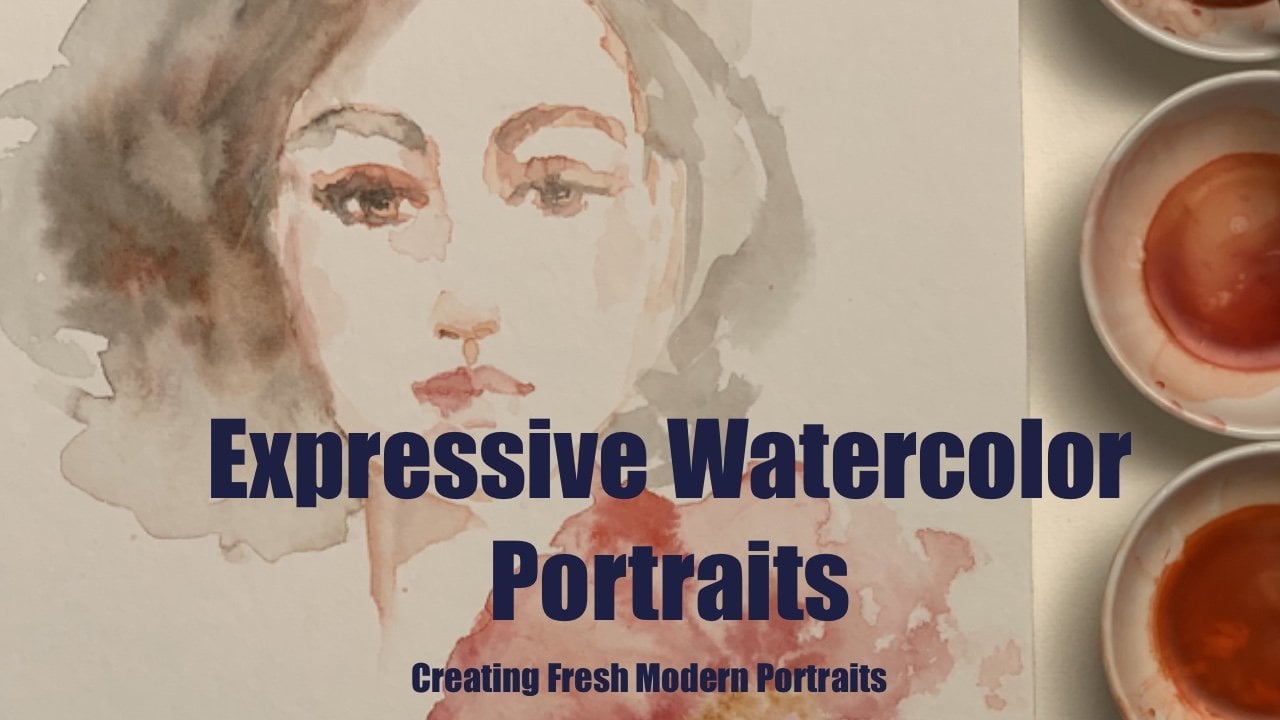
classes here on Skillshare, Expressive
watercolor portraits. I have changed my water. Make sure my brush is clean. And what I'm going
to do is I think I want to create a bit
more of a profile. I'm gonna make my paint a touch darker so that you can see it. But just start as
light as possible. What is important to
know about the figures. And I'm not going
to go here into proportions because this is
not the idea of this class. But make sure that you
have enough space. Roughly the waist is. Sort of the middle of the female body, make sure that you have enough space
going up and down. And just sort of visualize more or less where
the waist will be, but we won't start there. It's just so that you
have enough space. I like to always leave about centimeter
and a half or both, about an inch of space
on top of my page. Because I find that playing
with hair is so much fun. So you want to have space
in case you want to get wild with that. So a profile. I'm just going to create the idea of where her
face will be and that is sort of like a
half moon because she is in profile, so
here's my half-moon. And then I'm going to make a little inverted
C going the other way. That's where the
hair is going to go. It is skin color, But it doesn't matter. That is in the skin color
because it is just light. You can change it to whatever
you like afterwards. That's it. That's all you need to start. Now, I sort of create underneath the crescent moon going
inwards the idea of the neck. Then if you sort of
go a bit upwards, then just just a touch just to get the idea of more
or less in the head where that ear can be about halfway the top of whatever you have created,
that little circle. It's just to have the
space on skin color. When you come back to
have your hair in, you know, where your
skin color should be. Now I'm going to
switch her jacket. What I'm gonna do is
create the diagonal line. And you see the
watercolor is already running up because
this was still wet. But I really like that. If you don't like it,
you have to wait for your skin color to be dry
before you add the yellow. Let's again start very light. The we can correct ourselves. This is the area of
where the collar will be. I have a little diagonal indicating
where the collar is. Then we can go out in that provides the idea of
the back and let's decide to Create another diagonal slightly going in front of that one to create the idea of the sleeve or where
her arm would be at. Note that I say to create the idea, because
that's all you need. You just need the
suggestion or something. You don't need to be
absolutely accurate. The arm is always slightly
longer than the waist. I will just extend
it just enough. I'm going back with a bit of yellow to add some definition. To where her torso is. Now, hands. Everybody tends to
freak out about hands. But with this technique,
in all honesty, there's nothing to it
because you don't need to define that hand
with everything. The only thing you
need is to create, again, this
suggestion of a hand. I create a little triangle. Not a perfect one by no means. And then create again
the idea of the fingers. There is your hand. That's all you need. Now I'm going to wait for
these to dry very well because I'm going
to do this skirt. I'm going to use some ink to create those circular shapes. And I want to make sure that the black ink doesn't
run into my yellow. In the meantime, while we
wait for that to happen, for this area to dry, I see that this is pretty dry so I can do a bit of a hair. I want to give her dark hair. So I'm just going to create with some red, (vermillion) and perylene green. If you have seen my other class, you'll see that I love creating blacks like this because
there are so much richer. So you have some
sort of deep brown. Again. Start light so that you
can correct yourself. These little circle
that I had here, I'd say this is more or less
where my ear is going to be. So that's a good starting point. Then. Just say that this
is where her hair is, where it starts in the head. Just look back and
see if you like it. I'm gonna follow
this little curve. And again, you just
have to suggest it. I mean, you can go as dark or as specific
as you like with it, but I like to keep
everything sort of minimal. Then it stays fresh. Then I'm going to give her a
bit of a playful bun. That's it. Then we have our hair. Just go back in areas to create bit of shadowing
just underneath her bun. The light is hitting mostly
the top of the head, so there's not much
you need to do there. Let's check if this is dry. Yes, seems like it's dry. How do I do this? Well, the whole idea is
that you're basically playing with water,
wet your brush. And decide, you can
put, if you like, a little bit of just a
slightly drop of color, which I'm going to do
so that you see it. But you can just
do it with water. But I'm really just
having the minimal amount of yellow in here
and I want to give make that skirt exaggerated. So just put water
wherever you want. Paint go. I don't want the
paint to go here. So I stopped the
water right there. And I'm going to very
carefully don't touch the hand so that I don't
get ink on the hand. So that's the only thing
basically you have to make sure that you think
about when you're doing this. For the rest, just
play with water. Just make some spaces wetter
and some spaces less wet. I have now my water shape, which I'm going to sort of. Show you with the brush because I'm sure
you don't see it. Then I want to take my ink. This is just the most fun. There you are There
you are creating the circle of that first skirt. Here there was more water
so it's going to run. I just let it and then I'm
going to make hem of the skirt. You see why it's
important that you don't touch anything else. Ink also tends to run a bit
faster than watercolor. Just say it's more intense. Then I decide if I want to add another one of
these circular shapes. But I think I sort of like the simplicity of
this. Pretend that maybe you want to have
it be more definition here, just push the water. This is what I mean when I say play with the watercolor
or with the ink. Just play with it, work with it. Don't be afraid of it. Maybe I'll just make
a little swirl there. I am liking
this the way it is. Maybe I would like to add a
bit of yellow to the hem. To do this, you really
have to wait and make sure that it is completely dry. Then again, use a hairdryer. But be warned, if
you use a hairdryer, you might have
water moving upwards or to places
where you don't want to. I'm just going to wait. This one is now dry. So what I want to do is just add a bit of a darker yellow, I think medium cadmium, but just make some
shadowing here. Just to bit
underneath the sleeve. Maybe a bit of a playful
scribble here and there. Just underneath. Maybe just a touch of yellow. Maybe here. Just to make it a bit playful. That's it.
5. Red, Red, Red: This is the image
I'm going to use as inspiration for our
second figure. Although the dress is
beautiful, I am not, going to be so
concerned about it. And what I really liked and the inspirational aspect
of this, is this gradient, from pink to red to dark red that really
attracted me to it. So that's what
we're going to do. This. I'm going to show you how
to mix the colors with the pans. I think we'll use three or
four reds on here, and I have a color which
I want to use. But then again, you can use
whatever color you like. I'm going to start
mixing, of course, from lighter, which is my pink, to darker because that is
just the easiest with the water. You have that
consistency of water. But where the concentration
of pigment is enough, I guess these consistency is
a beat syrupy when you're syrup gets warm and it's just a bit thinner,
something like that. Going to use an in-between pink. And I'll tell you the name
of the pink I'll be using. Why this is so handy. The pink I'm gonna be
using is the rose. I'm going to go to the rose pink, one of my favorite colors. Just put enough, again, I have not added water, it was just that my brush was still wet. and I had pre wetted my pans, but
that's how you do it. I just want to make a bit more. I'll just add a drop of water. I added more pigment so that
I have that load of pigment, but I have then the movility
of having it be watery. I'm going to make my red. And this is my perylene red. But again, you can use
whatever colors you like. I'm going to keep
adding until I'm happy with the amount
and the consistency. So you can see you can make your liquid watercolors
just using regular pans. I think this is enough, but you see how little
color you need to do this. I'm gonna do one more red. And that's going to
be my darkest red. Alizarin crimson a
color I use a lot, still wet from the spray. This is a deep purplish red, which I really like. And that would be
my fourth color. And again, I keep repeating this because
I find that very important that you
choose your own colors. If you don't like red, if you like blues then you
can do exactly the same by using four different blues or greens or whatever you fancy. so here they are, the four reds is actually two reds and two pinks. Once again, we're
going to visualize in our paper more or less
where the middle is. Just leave some space on top. So then you have room for playing with the hair if
you like or, or otherwise, it's just pleasing
to the eye when you have some space on top, we again, are going to
start with the skin color. Just make it
as light as possible so that you can
always change things. I'm just going to
create the little idea of a face I can only say, think of sort of
like an egg shape, like an egg looking downwards. Then the round part on top. That is enough. The idea of this class
is not anatomy, but to have the
possibility of creating your figures without getting tangled up and all
nervous about that. So there you have
it is the inverted egg. That is enough. Then you make two lines on each side to give
the idea of the neck. And very often what
I do is I elongate the neck just because is
elegant and I like it, but you don't have
to. If you think of a clothes hanger that is more or less. What the shoulders are, which makes sense, right? this is the hanger and then it goes down
and those are the shoulders. I want to do maybe
a big skirt here. Just with enough
paint on your brush. Try to make shape. The upper arm to just
suggest it. You can see this is
just a suggestion. I have made a rectangle, round it up here and there
that it doesn't feel that way. So then it changes direction
for your lower arm. When you see You went out. Then you go in again and
just add here if you like, a parallel line to this. And then for this part, you make it more of
a cone like shape. Then I would just
with little paint as possible fill in the space here. And just as a suggestion
of the other arm, where I'm going to do
wish I'm gonna go back, make these just with water. Beat even on, go back over
it to make the collarbone. But this is all very light. So you can make changes. You can add, you can subtract, as much as you can subtract with
watercolors like here, I'm making this
shoulder a bit lighter, but everything is
so light that when I add, it will create that
idea of shading. This one is a bit more advanced than the other one because you need to
do the shoulders. We'll do it together. We can start playing with a
dress once this area is dry. In the meantime, let's
just do some hair because this is already dry. And let's see, I'm thinking
because is red that, I want the to contrast with I am my
self, dark haired, So maybe I might be
biased about that. But I think it would
look nice with the red I am going to play and
see where this takes me. If you have taken
my other classes, you know that I love just
playing with the hair and let it flow and just
make it undefined. I'm just going to make
more scribbles here. Doodles. I'm just making some sort of doodles
with watercolor. Now. I have a hairline. I think she doesn't
need much more. I'm going to add a
bit of Payne's gray, but, it is a sort of a black blue, which I really like
to mix in to give it a bit more of a
cooler shade to it. Or one side. The side is warm. Let's just say that the
light is coming from the side and then you have
a cooler shade there. These are all
decisions that you can make on your own for
whatever you would like. And I'm just sort of talking
out loud to give you an idea of how I make decisions
when I'm painting. How about we start with a skirt? I just put a little
bit of the pink on my brush so that you can see
the shape I want to create. So I just want a big skirt. The hand is going to be
behind the skirt. so it doesn't matter. don't worry about this. You can start with a pink or you can start just with water. and this one I'm gonna make completely wet, the whole skirt. The other one I had just made here and there
I've made wet spots. And I had defined sort of
the edges of the skirt. What I'm gonna do is we're going to start
from light to dark. So I want to make the bottom of the
skirt the lightest. I'm going to make. Then here on the top I'm gonna make it wetter so that I have enough time for my
paint to move up. This is always exciting
because I don't know how he's going to turn out. Show, Let's do it. I'm going to throw my pink. Just throw it, doodle lit. Then when I've had this pink, I can play a little
bit with that hem. And then I'm going
to add the rose. Just the same. just watch it go. Isn't that fun? I love it every time. This is my red here,
is mixing beautifully. I'm going to go back
and add a bit more rose, just because I like it. just define bit
more of the red. How fun is this? Let's make a bit of
waist idea here. So this is some
sort of bell shape. Then you make your waist. And I'm going to dry my brush and because I have a
bit of water here, but I don't want that over here. Very lightly. I'm just going to
play with the top. Let's just say some
sort of lace like thing. A heart shape here on top. And then go, this is a
bit wider than the waist. Then you just go in and
then you have your torso. What I'm gonna do is we're
going to gently here. And I have not wetted my brush because these
color I had pre-prepared, remember? it has that
syrupy texture. So I have here that darker, rich, alizarin
crimson red. Now I'm going to rinse my brush. Go back to my perylene. And there is a bit
of water here, so I'm going to push it up. Then the alizarin
stars also running down. Then something I really like to do is when I have
this wet spots, just make some splashes. just because, they look so good. They add to the
playfulness of the figure. These what I call
my first layer. And I have that degrade? And I really, really like it. And now I want to
let it dry a bit, want to push this down so
that it dries a bit faster. And then we're just going
to add here and there some extra details or extra
strength in the color. In the meantime,
I'm going to just with my skin color, create the idea of the
shoulder bone and that is from almost where the
shoulder starts going inwards. That's it That's all you need. And then I would just
suggest the neck on the side underneath the neck make that shadow that distinguishes
the neck from the face. and just add a bit more structure here. This is almost dry. They're still wet areas here. And I really like
the way these looks. So the only thing I'm gonna
do is just add bit of red here. And this is like I
mentioned, a bit wet. And I'm going to
create a bit more of this lace-like effect here, just on the top of her skirt. Because I loved
the way the blooms have been created and I like it. So I want to keep
that freshness. I'm not going to add beyond here because
I really like this. What I'm gonna do is
I'm going to make the side just a bit
darker because I gave on the side a bit
more of a shadow so just to keep that idea that the light
is coming from this side. This is all playful. There are no rules. Well, just a few
but not too many. You're the boss. That' it I think I'm pretty happy
with it. I hope you are too.
6. Magenta Fun: For this next one, we are just going to
keep it monochromatic. And I'm gonna do it with
liquid watercolors. Just because then you can see a little bit what
the difference is, but it's very minimal. I swear you don't need them, but they're just they're
just really fun. Again, we start like we always start with very
light skin color. And I'm gonna make this
one also a profile. But then we had the first
one looking this way. We're going to have this
one looking this way. Again, remember sort
of a crescent moon is also a good way to sort of
practice already the same idea, but then looking
on the other side. In this case, because
she is looking this way is just a C shape that we create. A crescent moon and a C-shape. Then you add the neck. And again, let's make
this neck an elongated one. And just give here, the crescent moon a
bit of definition. I dry my brush a bit and I can
do that and then once more, go up a bit and the
middle is the top of the ear. And then sort of
have that indication there where you won't
put dark color for hair. As you can see, C. And then the neck goes
into a curve in out and then parallel line from the chin into the chest area. Here. Pretend that she is
having that arm going backwards and then the hands resting somewhere in her hip. As you can see, all did, was Take this and elongated it
backwards and out. And in again in some sort
of triangular shape. And then the hand just make it again once more going
the opposite direction. And that creates that dynamic. And that's all you need as arm. Because we're gonna play
here with a voluminous. sort of top. I guess. Again, I'm playing with
water and I'm going to use a bit of skin color so that you can see it a bit better. But you can just
play with water. So this is the side and just making this sort of like if she
has a ruffled dress. So just to make it playful, it goes down and up. Again, sort of like
a triangular shape. I have something with
triangular shapes, is okay, but it's just the way
our body is constructed. Thus, those are the
best explanations. So I have this much and I think the waist
should be here. So as you can see, I'm going to exaggerate it
now so that you can see it. It's a triangle, except
the top part goes from here down and it goes up just because that
adds playfulness, now, ruffle it up a bit. Again. I'm going to add some
magenta liquid watercolor, and this one is
from Schmminke. It doesn't really matter. And see what happens. How cool is that? There you have your ruffles Again now that it's wet, you can go back with your brush and make those nice splashes. this is her exaggerated waist. I want to give
her a bit of a hip. Still from the side. There we have her torso. So I had originally a triangle
once I threw the color, I extended. a bit of a rounder
shape on both sides. And that is her hip. Now we can have a fun making
huge skirt for her. I'm going to keep maybe a bit of color from here so
that you can see it. And what I'm gonna
do is just sort of play with water like
this Flamenco dancer dress. As you can see, I'm
just throwing water where I want it, you can see it because there is some
pigment still. I'm now going to use Also a magenta, but
then from Dr. Ph. Martin's a beautiful
darker magenta. And you see that this one
has more pigment in it. so it flows. less easy. you have that with
watercolors depending. some colors have
more granularity in them. This is one of them, but that can act as extra texture which can
make it interesting. You can play a bit more with it. I'm just adding more
water because of the amount of a granulity
in this. I don't know if that is
even a word, but anyway, just to make it flow
a bit more, now just slightly wet your brush again. And again, this is
just me playing. I have no idea of how
big the skirt is going to get or how the colors
are, how is going to flow. But that's exactly what it is. Just go with the flow. Then. just make it.. and I'm sort of liking the way the granulation that is happening here
is very interesting. I find that we can push this up, make it a bit more grateful. There you go. Now, I don't think we
need that much more. I wanted to keep this sort of longer than this. so that you have that flamenco-
ish feel to it. And I'm just going to add, here are a ruby red
also from Shmminke. Just add a punch. You can see I love
reds and pinks. Now, you can choose whatever
you like for her hair. I'm going to go for a lighter
hair so that you can also see the other colors
that you can use. I'm going to start just by using the skin color because it is a good base for
light color hair. I think she has a
lot of volume here, so I think I'm going to give
her just some sort of of bun because there's so much going on here
that I find busy enough. I've used the skin color as
my base color for the hair. And don't forget, the top is always lighter than the bottom. Maybe to make it a
bit more interesting, we can do something like this. Just a little swirl in her
and her ear is somewhere here. So we'll leave that alone. I would then add something like either a raw sienna or here
underneath or a burnt umber, which is also another sort of basic color that I always use
for all sorts of purposes. Just make the shadows with it. Underneath and in the back. like that. Shall we give her an earring? How about we give her an earring? I'll pick up some of these
pigment that I have here and just make something playful like this. That's it. I like the simplicity of it, and I love that you
see the blooms. You see here the granulation for me is fresh and it
has enough information. I had a lot of fun.
I hope you did too.
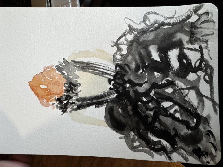
7. Black Lace: For our last figure, I got inspiration from these four different examples to create something different. I use the idea of the lace with the idea
of the back of this dress. And this also to
show you that you can actually draw inspiration from a few images or pictures and create
something different. We want to start again with the skin color we
are going to make, Again, that's inverted egg, of course is the back. And you were thinking, Yeah,
but that will be the hair. Yes. That is true. But that
doesn't matter because this is a good base
color also for light hair. And if it's dark hair,
you won't see it. So this is perfect
color to do the egg shape. This is the back of her neck. Again to lines going downwards and with the same skin color so that you can maybe see it. I'm going to pretend that
there's going to be a sort of collar here. But maybe I want to
see some of her back. So I'm going to make
a sort of cone shape. Also in skin color. That could be her back. Again, That's sort
of cone shape ends in what it will be our waist. I'm going to suggest it. I'm gonna be using black ink so it really makes it very easy. Again, the hanger,is the same in front
or the back: so neck, hanger. And I'm going to, because it's from the back, pull it downwards where the suggestion of the arm will be, I have not decided on the other side. But I can sort of make it
very light like that. Good is time to play with
what our skirt will be. Again, that bell-shape. And I think I want... I saw in one of the pictures. There was some sort
of big bow here, and I want to play with
that idea with the ink. So I've made it wet. But I'm going to take
here on there some of that wetness away so that
when I put ink on it, and I'm going to use my brush so that I have a bit more control... Never mind about control. it becomes some sort of a bow. You see what happens. I'm going to leave it in.
Because it was not dry. What I had done with the back. so the ink ran up. I'm drying it. I'm going to use a Q-tip to make sure that it stops
there and then I can just darken this with more skin color once
the bottom is dry. Actually, I would've liked to have a bit more control here. Actually, we have to
make it a bit less wet. But this is how you learn again. This has happened to me numerous times and I keep forgetting,
but it doesn't matter. Just also good to show you what can happen
on how to fix it. Then we're going to do the
same kind of effect here. as her collar like that. What I'm going to do is add just a touch of water to
my already inky brush. And I'm going to make a
bit of the shape of the dress, which is open in the back. That spill we had. You don't see it anymore. So just that you are
aware of how much you can still change if you make them or how much of it
is not so important. Those little mistakes. Just making this a
bit more playful. And ink is a bit harder. so be a bit more sparse with it, with the amount of
ink that you use. Takes much more effort to get the same sort of black
with watercolor. You can do this, by the way also with watercolor, but it will be a softer effect. Now let's have fun with
the skirt because is ink. We can do really wild
black effects and I just wetted my brush and
now I'm just adding ink. And see what happens and
where the water goes. Then you can sort
of decide where you want it to go blacker
and where not. And again, just doodle. I love creating this sort
of scribble like marks. I love this, for me not much
more needs to happen. Let's just make a
splash so that we can, we can concentrate finishing. The hair. The skirt has just
gotten bigger. you see, this is the nice thing about this technique! I need to balance it out on the
side. But then it's done. And I think I need a bit
more definition. On the skirt right there. Don't be afraid to be
bold is just paper. If it doesn't work out, you start again
and you take with you what you learned
from your mistake. I'm going to let it dry so
that I can work at ease. on the hair. You see how the ink has dried? Much lighter, but we'll go back to it and make it
blacker again. But I want to work on the hair. I think it's nice because we
have so much neutral it is all black, to give her maybe
bit of reddish hair. And what I'm gonna do is I'm
going to mix a bit more of my vermillion in that mix of skin color to make
it a bit more reddish. I'm going to sort
of start creating the idea of the head. I think it's nice if
we give her a bit of a bigger head, so that is
more into proportion. So there you see,
that's the beauty of starting light and starting
with the skin color. Because you have freedom
to change things. I'm going to give
her waves here so that we have some interest. and this is a nice contrast with that sort of lacy big neck that she has. And then I'm gonna
go a step further. And add some more of
that orangey mix, I'm going to just add a few
of just pure vermillion to. It Give it more oomph! So there you have red hair. What I'm going to do is go
back and maybe accentuate this one and bit, I have some old
actual skin tone here, which is made exactly the same way we made
the other one. Just add this other arm. That is enough as an arm. And this one I'm going to
want to make it bit thicker. so it doesn't look
just like a stick. I'm gonna take
some of this away. There we go. I want the arm to have
a bit more movement. I'm going to do a bit more
definition on this side. Maybe just a touch here. And now I'm just going to
add an extra layer of ink. To make these more exciting. What I want is to
create more contrast. I'm going to pretend that this side, because we also did
the hair here darker, is my shadow side. That always helps
when you want to create that feeling of depth is that you add dark to
one side of your work. there we go and here is bleeding a
little bit into that arm, but I actually quite like that. Now I'm going to
go ahead and add almost pure ink,
very little water. Make those scribble
shapes more apparent. Really define them. To give that playfulness
just a touch of water. I dried it a little bit and
continue with the scribbles. I like it like this here. So what I'm gonna
do now is I step back and decide how much
more of these black. I want to add here. If I want to make a
bold statement here, then again, that's
completely up to you. I'm just thinking
out loud so that you sort of also recognize
the process. I think I like that
boldness there and splash. I intuitively feel
like it's done for me. However it feels for
you is very personal. I you should always
listen to that voice. So I was looking into
it and I see that the arm looks kind of weird because I did
that correction. Now the beauty of this method is that you are the boss. What I do is I'll just
add more volume to that skirt, and wet my brush just a bit to make it gray as opposed
to completely black. Then add a bit more water to take some of that black away. Move it downwards so that it is harmonious I'm going to add
just to make it lighter. Just one more. That's it. Then you see how it works. You should not freak out. Just see the opportunity. And it looks beautiful. You had fun and it
was it was great. It was fun, right.
8. Thank You!: Congratulations, you have made it to
the end of the class. This class was a bit
different because I didn't go into it
very academically. And that is exactly
because I want you to follow this process as it comes. And that is the lesson
that you experiment. And that you really play with the watercolor and
with the inks and to let the material do it's thin and to enjoy the surprises. So please, please,
please, please, if you have any questions, something that was
not clear at all, please post it in
the discussions. I look into it. I am a completely delighted to answer any doubts or any
questions that you may have. I'm really excited to see
where this can take you. So don't feel like you
need to create and post projects that look like the things we made
through the class. You can post whatever
you create using your own colors and
your own imagination. By doing, you get more ideas. And that's how your
creativity flows by just doing, making, and enjoying the process of making a not be
so focused on result. I have enjoyed creating
this class tremendously. So I really hope that
you enjoy it and that you put what you have
learned into practice. I hope to see you also in
any of my other classes. If you follow me,
I will keep you informed of any new ones
that I might come up with. Thank you again for
taking the time and going into this
journey together with me.
 Luz Elena Caballero, Painter and Illustrator