Transcripts
1. Expressive Gladioli Flowers in Watercolors Trailer: Have you ever looked at tall, complex flower like
gladiools and thought, How could I ever paint that
in a loose expressive way without getting lost in the
details? You are not alone. But the truth is, once you understand how to
simplify the structure, you can paint any
compound flower in a free and joyful way without needing to draw
every petal first. Hello, I'm Nina, I am Wakala artist specializing
in loose style, art educator, and
certified art therapist. In my classes, we explore
not only techniques but also how to connect
with your creative voice, let go of perfectionism
and to enjoy the process. In this class we
paint sword lilies, gladiol flowers made up of many blossoms layered
along one stem. You will learn how to break down complex floral forms
into simple shapes, how to paint directly
with the brush, nosketch and how to create soft dreamy backgrounds to
make your flowers shine. This class is part of my
expressly what I call a floral series
designed to gently grow your skills one
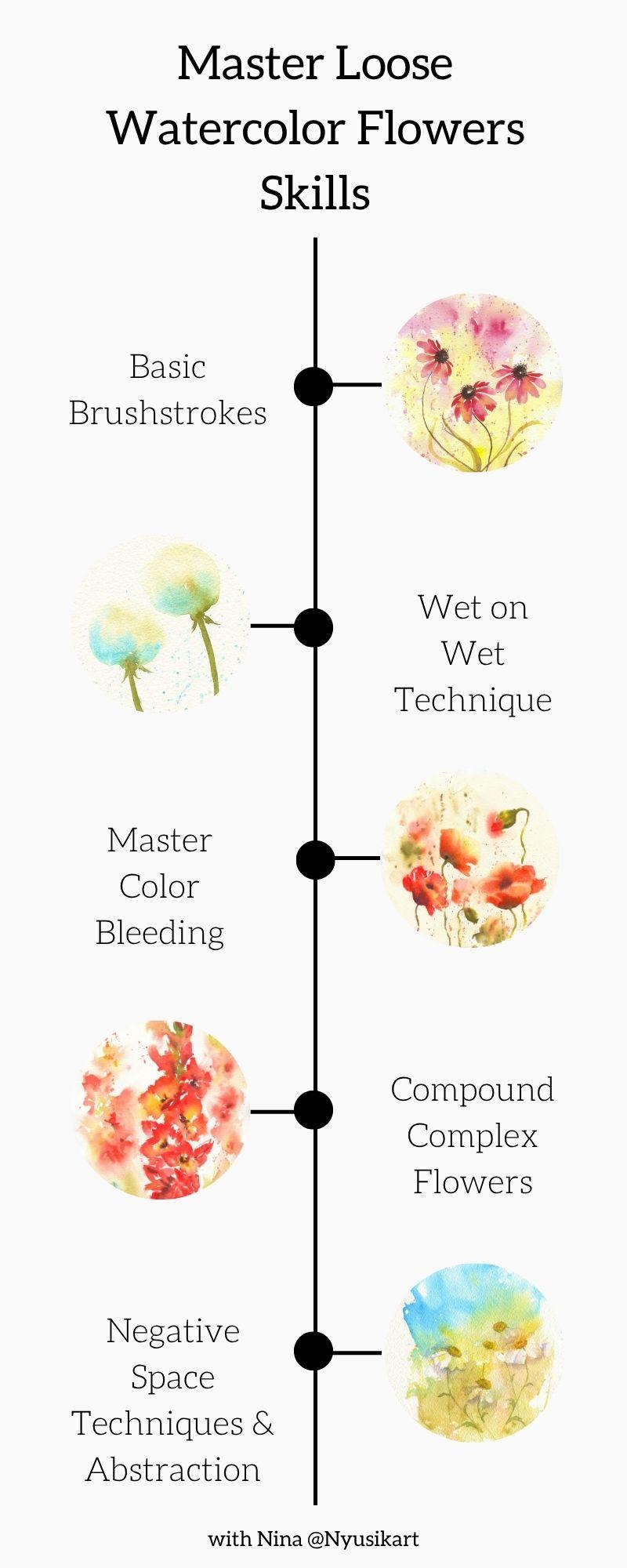
flower at a time. If you are just starting, you might want to begin with my cone flowers class where we explore basic brush strokes. Then you can continue
with dandelions for wet and wet practice puppies
to master color bleeding. And this is where we explore the negative space
technique and abstraction. Each flower offers
a new challenge, a new discovery, and
a new way to grow. So if you are ready
to lose enough to learn something new
and to surprise yourself, I invite you to paint these beautiful gladiol
flowers together, grab your brushes, and
let's dive into painting.
2. Supplies: For painting gladiolysis, I will use the following materials. Watercolor paper. That is A
four size of Arteza brand. Also, you will need
several sheets of just a normal paper for flower study or you can
use your sketchbook. What a colour paints, we are going to use
the following colors, hansa yellow light, quinacridon
gold, golden yellow. Pearl scarlet, bright red, Pian moti genuine, green
gold, and cascade green. If you have these
colors, that's fine. If no, just look
which ones you have, mainly we will need some
yellows and red ones. Check if you have
some cool shade of red and warm red.
So brown color. And some greens for foliage. Watercolor brushes, I will use several brushes for
painting with water. First, the outline and also another several
brushes number four and six for introducing the color. So just check the
ones which you have. Water pot is better to use two, one for cleaning your brush and another one
with clean water. Kitchen towel so that
just in case if you need to remove some extra
moisture from your brush. Good mood. And
let's get started.
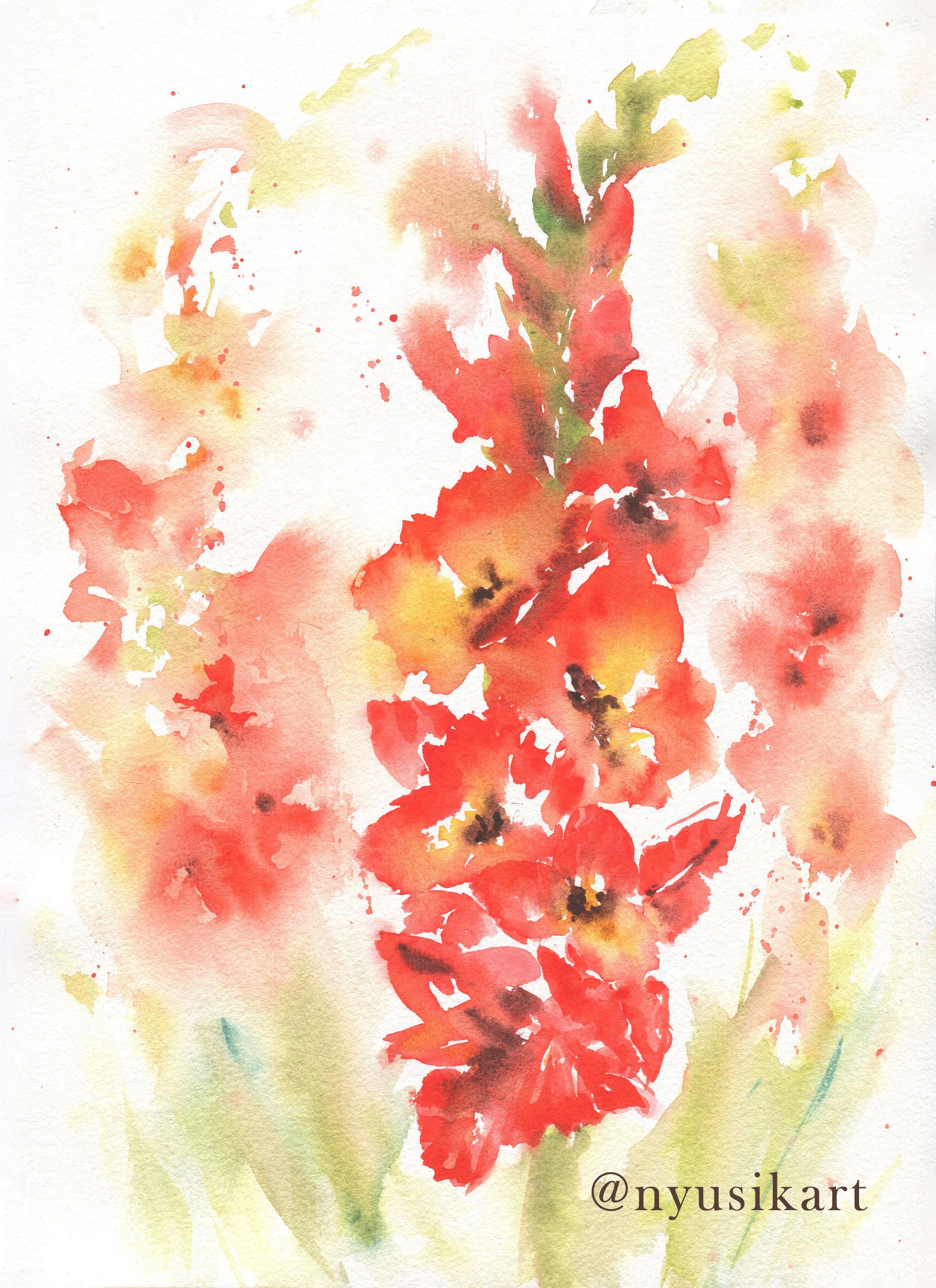
3. Flower Shape Study: One of the important things for painting flowers in
loose style that is very important to transmit
the shape of the flower and to create the illusion of
volume of the flower. So let's have a
look at gladiolus. The best you can understand
its structure when you are looking in this
front view flower. And you can see that actually, it's one triangular within
another triangular. So I will start with this
inner triangular this way. And then here is going to be the flower center
and the petals. So later, you can create
different shapes of petals. But the main idea
is that you need to keep them within this structure. And then the outer
triangle, it's like this. And you are creating
these petals. So it could be this
way, here a bit wider. Like this. Then let's have a
look at the darkest areas. Darkest areas is
the flower center. So that is what we need
to pay attention while we are painting in order to
transmit this volume. So here it is.
Another dark areas are in the lower
layer of the petals. So it could be for here, here, where they are touching other so just underneath this where they are
touching each other, the petals, it could be some
shadow from the top flower. Another thing if you
will pay attention here at the very edge, the texture of the petals. So let's say this way like this. So here we can also add this volume and the
texture to the petals. So now you can see
that it starts already to look
more like a flower, not just some kind of
strange structure. And also, it could
be some shadows from another flowers,
like in this case. So this petal is
going to be darker. So here we have the structure general
structure of Gladoolus flower. Let's have a look at side view. So side view, what we can see is also some kind of
triangular shape. Let's see. A bit more, let's say wide
triangular this way. Here it is going to be
also the darkest area, and then you can recreate the petals the way
you would like. But the idea is to find the
shape of this triangular and then the darkest place
in order to add some volume. That is one of the key
ideas about painting gladiolosis now let's prepare the structure of those
gladioloss which we are going to
paint in this class.
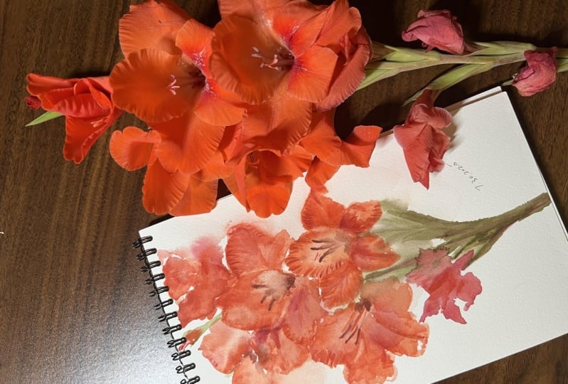
4. Gladioulus Composition: As we have talked before, that the key structure, the key shape of the dole
flower is triangular. And that is this reference
water which we are going to use for painting our class
project. Let's have a look. Our main idea is to
find these triangulars. So here we have one triangular. And then once you
will understand the structure for your hand, it would be easier to
make the brush strokes. Another triangular. So we
don't see it completely, but here it is. So this is another triangular. This flower, that is
another triangular shape. So here, here we have some. What else you can see
is to check this kind of spaces like negative
spaces between flowers, and that is going to
be another triangular. That I'm drawing quite
roughly, but, I mean, you understand the idea.
One more triangular. So this one is more this shape. One more from that side. We don't see it really well. So more or less this. This one is more like
front view. Yeah. This kind of triangular and then it starts already the buds. And that is really simple. So they go like this
in this pattern. And now let's have a look
here what is important. So we have some petals, one more petal, and we can see that here
is the darkest area. So that's what is important for us in order to
transmit this volume. We will make it really dark. And here there is
like one more petal, but, I mean, for us, it doesn't matter so much. What we will need here is to pay attention
to this dark area. Here, the darkest area. The same we'll have
to pay attention. In our flowers to
leave this area. You can see that here it's like inner three petals and then
the outer three petals. This flower we have
here, dark center, and also you can see how they're looking in which direction
the flower is looking, that also this helps to transmit while you're
painting in loose style. The same some inner petals, outer petals this way. This flower, we don't
see it really a lot. So here is the dark area, and then start some petals until we don't see really
many petals of this flower. So this way, this
flower is here, the darkest area, and it's
looking in that direction. And then there are also some interesting shapes of
petals like this. This way. Here is the front view of the flower and
also it's higher. So we don't see its flower center compared to this flower. So we see only some shapes, and here it's going to
be the darkest area. And with buds, you can notice that the darkest areas are here, where they connect to
the plant and from here. So from the lower part. And here we have then
it could be the trunk. And you can see
the leaves first, they are lower than the flowers and they are really white. So that's more or
less this level. So here we have the structure
of our class project, and now let's move to the fun part of painting
with watercolors. But I would suggest you to check this reference photo in the
resource section of the class and do the same drawing
which I have done in order so that your hand
will understand this uh, I mean, the theory is fine, and you understand the idea how to paint this gradlos flower. But once you will
make this structure, it would be much easier for
you than to turn and to paint directly on white paper
without any anti drawing. So let's move to the fun part.
5. Brushstrokes Techniques for Painting Petals: Before we'll start with
our main composition, let's do some warming up. Let's explore different ways
how we can paint petals. Just practice and find that
way which suits you more. I will use bright red. And one of our first exercises is just a load with a paint. My brush is quite
wet and like this. So try this way. Next one, we will turn this way. Now we'll try to make
the shape of the petal. So I'm turning like
this, my brush. Yeah. And here like this. In order to avoid this
really defined line, you can just with damp
brush, make it soft. Then you can add a bit
more concentrated color for here. So somewhere. And here. This way is nice
for the inner petals. And let's see what
else we can do. Another way is with lines, you are moving really fast your brush and trying to create live in
some white spaces, and you're creating the
shape of the petal. And then with another brush, wet brush, you are
joining some of them. So here also, you
can correct a bit the shape that is
just a wet brush. And for here. You can add a bit
more of contrast in these areas that is cadmium red. In these areas where it could be some folds or so add
a bit more of volume. That is the way how you create. Another way of painting petals, it could be also using two
brush strokes technique. That is you allowed
in your brush and then you're moving it like this. Then from another side, and then you can add some dark color in the
middle or somewhere here, the same at the border to
make a bit of texture. Now as we have looked at different ways of
painting petals, let's paint one flower. And we'll see which technique you find more
convenient for you. Another way, you
can make wet first, the area of the petals. So let's paint the simplest ones with front view. So here. And then I load my
brush with paint. And like this, I'm moving, creating this different more interesting like
wavy outer edge. Here. The next
one. And one more. Then we can introduce some
yellow color in the center. And some brown in
the darkest area. I have added Indian yellow, and this is burnt sienna. So that is another combination of colors which you can use. We have made the
inner triangular. Let's add now the outer petals. Let's apply different
ways of painting petals. For example, this
one with lines. So I have loaded my brush, and then I start just
recreating the shape. And then with some darker color, we will join here so that
they won't be so separated. You can make it smooth, just with wet brush. I would say that it's
missing a bit of volume. I will let burn Sienna
here at the bottom, where it joins with
the top layer of petals and you can add also some golden yellow to
make it a bit brighter. Let's try to make another petal two brush
stroke technique. This way and then
from another side. As well, you can add some more
contrast that is scared me in red to define the edge. This end here also, you can add some darker
center. Here we have. We are missing one more. Let's try the same with strokes or another way that also
without making wet, I'm just moving my brush. And then I add a bit more
of contrast at the edge. And also, you can add
these kind of lines. And let's add some
yellow because it will make it a bit alive and
brighter and here are the same. Just several drops. I'm
using Indian yellow. You can use also
quinacridone gold. That's fine. Yeah. So it
makes more like alive. The petals. Let's
wait till it will get dry and I will show you on this one what we are going to make in order to
create more volume. I have taken cadmium red, and then I just add some
more of these folds. To create the volume
that it's like here, it gets some kind of texture. And just with wet brush, I'm making it softer, so not so defined. This way. Now this petal has a much more volume and we can
do the same with this one. So just in several
areas where usually the flowers used to have
some folds with wet brush. Some of them, you
make them softer. This way. This petal also
now has more volume. What else you can do
with petals is to lift some color and to
create some highlights. For this, it's better to use some flat syntetic
brush to make it wet, to remove some extra moisture, and then you just pass it. You remove the color again, then you rinse your brush. And again, with clean water, you can make some more, remove the paint. And egging. So that is another
way how you can add some highlights to your petals. And one more thing is
once it has got dry, we can add some lines
to create more volume. So just that is cadium red. And then with wet brush, you're making them soft. So here, then, for example, this petal, it
looks really flat. You just add these lines and creating giving a bit of
volume and also the shape. And with wet brush, just making it softer. I like this to give more definition to the edge
and a bit more of texture. And with wet brush,
just making softer.
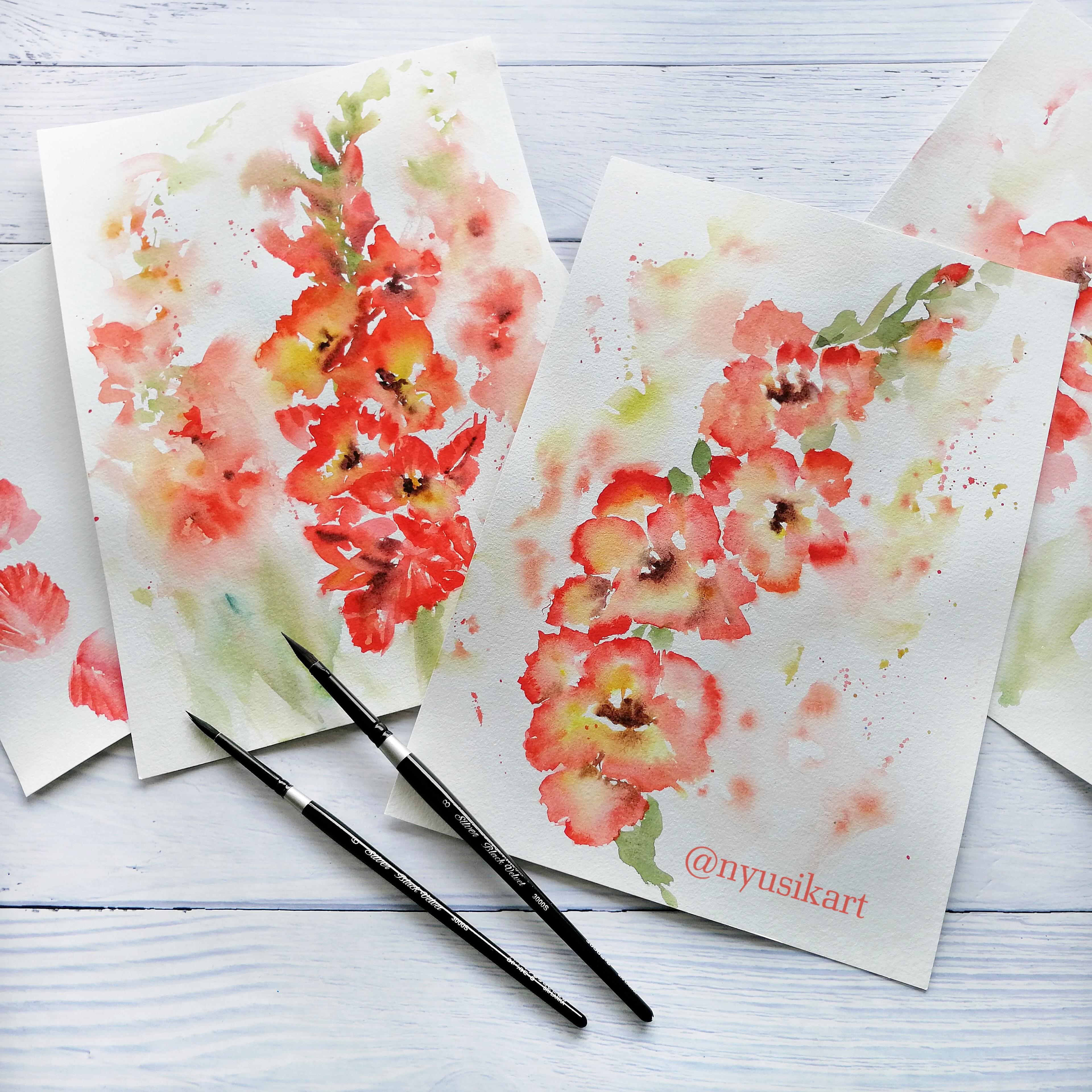
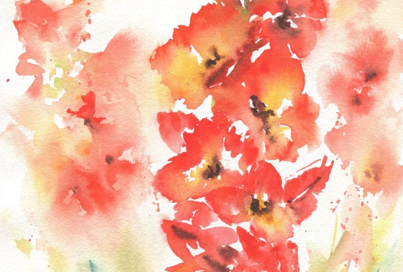
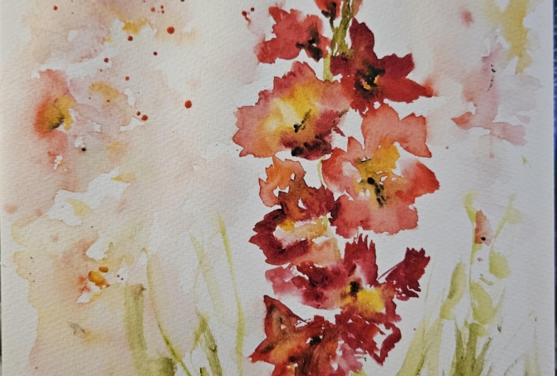
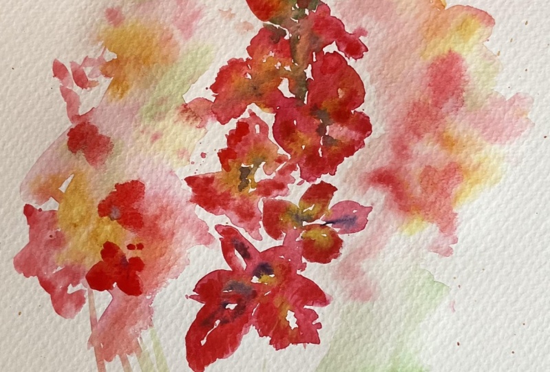
6. Gladioli Watercolor Flowers: Here I have the
scheme of our flower. What you can do to help
yourself is to make the limits of your painting so that you won't go out
out of those limits. So just make these dots
of those triangulars. But I mean, so that is
something really orientative. And to remember that the flowers
are getting smaller once they grow up going up, no. Like that is really complicated
to keep, but let's try. So here I have left some dots indicating these dots
of these triangulars. Now, let's start. We will start with this flower. So I will use brush number. See, I will use
two shades of red. One is bright red as a
cool version of red, and another one is
pearl scarlet red, that warm shade of red. And I will start first
with this cooler one, and here I have this lower
flour with some brush strokes, let's start to
recreate the shape. You see that this red
is quite cool red. I'm moving my brush with
a tip outside outwards. And for here would be some more. Also, you can make
petals this way. So I will show you
like different ways how you can create them. So that is also another way. You would be leaving
some white areas. Now, let's add some
nice, bright, warm red. So here, this is pearl scarlet, and it will create
really beautiful shades. So for here and it will give
more contrast to our flour. Here's the texture.
And with this one, from here, you can
add some warm shades. Here is the darkest shade. For the darkest shade, I will add PM moti
genuine this color. If you don't have this color, you can mix red with a bit of green or red and
with a bit of sepia, or any other brown which you have and see which
result you can get. So here we have. So that
would be our first flower. You can remove some areas. For example, if you
got them really dark, you can lift the color just
with a just with damp brush. And also what you can do, you also can create the texture with just lifting this color. You can create some texture
effects. Like this. And you can add also some
more concentrated color as well, in some areas. Let's move to the next flower. I will do a bit different way. So I will make wet my paper. The first, I will paint
three internal flowers, and I will bath my brush in bright red color and the tip of my brush with scarlet pearl. And I will move from
outer edge this way. Creating the shape. So just move your hand
and see what you can get. So like this. And then I will add a bit of yellow
to make it brighter. So here comes some yellow. That is Hansa yellow light. You can use cadmium yellow. You can also use Indian yellow, and this is Kinacridon gold. That is also really nice. I would also here some areas this Kinacridon gold that it
will make beautiful color. And now let's add some
outer petals, the same. So here what you can do to
make it more like this way. And then another side for here. So you can play actually many different ways how
you can create the petals. So you can make them like two brush strokes
towards the center and then to add some darker line towards the center.
So that is one way. And for here, we will
add a bit more of color creating the texture. And another way is that you are creating the border
of the petals, moving your brush outwards. So this way is also great
for creating the textures. The shapes of petals. Here are the same. First, I will make wet the area for inner petals. It can bleed. That is fine and a bit of bright red and pearl red
on the tip of my brush. And here we creating the
shape. Another shape. So I like mainly this
way. Also, it depends. For inner petals,
I find it better to use this approach of
your brush outwards. And for creating outer
petals, actually, you can use this two
brush strokes this way. And now let's add
a bit of yellow. I will use Hansa yellow here in the center this way and
a bit of kinocrdonGld. And now let's add a
bit more of pan moti. Here, we need to create
shadow this way, and I will make it a bit
with wet brush, soft edge. So here we have already the
volume of our first flour, and here we will recreate
the second flour. Let's add also some pia mootit or some dark brown which you have here to create the shade and one more petal
from this side. That would be some outer petal. What another beautiful
combination that you can mix pearl scarlet with some orange or if you have golden yellow, that is a really great color. So it will create really
beautiful shades. That my brush was a bit dirty. Let's move for more. Just have a look at the shape and recreate
the way you see. And for sure, you will
get really beautiful. Now I add just scarlet red. Really beautiful shades. So you can make
also some shadows just with brush strokes. Let's add a bit of yellow. I made enhanca
yellow. Yeah, here. So this one is really beautiful and bright. I really like it. And then a bit of piamoti from the area where there
is the shadow. So from this side. Let's add the next. And I will use the
mixture that is scarlet with some warm yellow. You can use yellow deep or
if you have golden yellow, that is really
perfect combination. And you will get. So
we got already to this side flower and let's yeah, let's create the shape. I got already dirty. That is normal thing. When you are painting and
but don't worry. That is really easy to fix. Here, really beautiful. And here, what we can see I'm
painting this flower that one of the flowers it
has like some this way. So we can make it like this. And from here, there
is one more Petal. Yep. So that was the mixture. I have mixed pearl
red with Piemott. And let's add now yellow center. Really nice. A bit
of kinacridon gold. That was Hansa yellow, now kinocridon gold,
and a bit of pima tit. So for here for the center
to create the volume. And now let's move to
create top flowers. So just with I have switched
to the bigger brush. And let's see whether it
was a good idea or not. Yeah, so I made in some more
concentrated pearl red, Scarlet Sorry, pearl scarlet. For here, some flowers, and I will add some dark pimutt just for here and for here. So that is one more. And then let's add some
bright side flowers. I will make wet this area. So here that is side flour. And as we have seen that
the darker area is in the lower part and a bit of
palmatt in the lower part. So to make it darker, we will use some brush
marks in order to transmit the idea of these buds. So just some So, like this. That is I have
used a bright red, so I can add pearl
red, warmer shades. Yeah. And as well, a bit of pin moti to give
it more the contrast. Just a bit and here
in this lower part. And now we need
some green colors.
7. Adding Loose Dreamy Background: For green, I will use
the mixture which I have of really bright green. That is green gold.
This colour is cold. But also you can use
some olive green, and I will mix it
with cascade green. And we'll add some
I think first, it would be nice to add
some water to join them. And first, I will make
just this green gold. So that is the light green to give it a bit more the light and life to gladiolus
and the top part. So here are just some
more brush marks. That is green gold. This color. And somewhere for here
in the center as well, we can just to transmit the idea that there
is a trunk over there. So here. And then let's mix
this darker version of green. You can use also some
normal green and to add there a bit of sepia
or a bit of brown. Then it's going to be also
quite nice shade of green. Okay. So really nice. What we are missing? We are
missing some beautiful blurs. So just with water,
where you feel, you start to add
the expression to your flowers and to make
this beautiful bleeds. Yeah. What I suggest to leave
also in some areas white area near the
flowers as for the trunk, I would make it the stem, sorry. I would make it a bit softer
and probably I will add some more like the idea
of the leaves here. But just really
something a hinge. Don't paint them
really, really detail. So just some hinge that for there there is something green. What we are missing is to add more flowers at the background with the same red
mixture which we have. And I'm adding them
in that pattern, how they usually grow,
that what we have seen. No, that one triangular has a
triangular, then some dots. Then I add a bit more
concentrated splatters. And that would be nice to
mix a bit of this color. That's what is yellow, golden yellow, that it creates this kind of really,
really beautiful shades. I think that kina gridon
yellow could be nice to add in some areas to
make them softer. With pearl scarlet, we
can make some shapes. Yeah, so that it will
look like triangular. Remember, here, some
parts would be brighter, no some of them side views, and we are missing
to it some green. I will use green
gold or you can use olive green just to create this top area and to
add here some yeah. So it looks already better. And from this side, the same. Let's add just this kind of illusion that there are
more flowers over there. So I'm using this
mixture which I have pearl scarlet that could be too concentrated for the background
flowers, some splitters. And what I'm missing
is some yellow. I will use golden yellow. The same some splitters. Probably here, it
wasn't good idea to add so many yellow splatters. Why? Because mainly, yellow, you can see the flower centers. So that's why, probably, as I told you that
it wasn't good idea, so we will add a bit
contrast with red. Yeah. And a bit of green
gold here in the top areas. And yeah, F here, a bit darker lives in this area. Oh, this is too dark. This was cascade green. So let's try to
remove with water. But just several lines. Again, to sick lines, so just remove with water. That's fine. You can add now that it will
get a bit drier. Let's wait till it will
get dry in the background. Meanwhile, let's add a
bit more of contrast. That is with some brown
I will use pimatGenuine, to add a bit more
of the contrast. So this way, so here
where there are the flower centers
that we will add a bit more not everywhere,
but just somewhere. Here we have what else we can add is more contrast
of pearl scarlet. I get it really concentrated. And what I will do is I will
add like this in some areas, and then I will spread
it with wet brush. I apologize, but I
have noticed that my camera was out of the
view of the painting. So you couldn't see these
parts which I have died. But that is this technique
which we have used of adding the texture to the petals
in the warming up exercise. You're adding just some lines with the kind of brush strokes. And some of them
you are making soft later with wet brush. So you are just making
them softer or some of them you are leaving like
this creating the texture. If you have problems
with getting some color bleeds or whatever, I explain and show
in quite detail in the class on painting
expressive puppies. So you can refer to that class and I dedicate
quite a lot of time showing you what could
be the problem and how you can get beautiful
watercolor bleeds. While painting loose style. So that's why I don't
show everything here in this class because you can refer to another classes
and to see more the basics. Okay, here is the same. Let's add some contrast. And probably for here somewhere. But actually, I
think that I'm quite happy with my flowers
with my gladolosis. By the way, this edge, it's better to make it softer
like this with damp brush. This way. And what I'm missing are some
splatters of pearl scarlet. Let's add some splatters.
And from this side. And here I think that I'm
missing a bit of contrast. I would create here
a bit darker color. So let's add a bit more of here. Yeah. And now it's going to be brighter and more beautiful. Yeah, now I like more. I have added this so that to add more contrast
so that it won't be completely so that the background also
will have some volume. So that's why it was my
decision to add there. And here, also, if we will add I will let even a bit here, so that it will transmit the idea that there is
some flower over there. And a bit of pie moti from
this side here and here. So I think that probably
here because it also creates the illusion
of another flower here. And that's all. I think that I'm really
happy with my gladiolosis. And I hope that also you
have enjoyed this class and happy with your gladiolosis and looking forward to see all that beauty which
you have created.
8. Final Thoughts: Thank you so much for
joining me in this class. I do hope that you
have enjoyed painting these beautiful Gadi oli flowers with me in loose
watercolor style, and you have discovered
something new in the process. Now, it's your turn. Please share your artwork in
the class project section. I would like to see what
you have created and to leave you my feedback
and some encouragement. Doesn't matter whether
it's a final piece, some brushstrokes practice or some happy accidents which
happened along the way. Everything counts because
it's part of your journey. If you decide to share
your artwork on Instagram, please do not
hesitate to tag me. It makes my day to see your creations there
out in the world. If you found this
class helpful, please, it will mean a lot for me if you can find a moment to
leave a class review. It really helps me to understand
what resonates with you and also helps as students
to discover this class. Thank you. This class is part of my serious expressive
flowers in watercolors. So if you are curious
to explore more, you can check out cone flowers, great for beginners and
brass stroke basics, Dandelins to play with wet
and wet and soft edges. Poppies for beautiful bleeds
and water paint balance. This is to try the magic of
painting with negative space. Each class brings something
new and different, and I'd love to have you
join me for the next one. Thank you again for being here, and I'll see you soon in
mine as a class. Bye.
 Nina Nyusikart Watercolor, Artist| Art Therapist | Loose Watercolor