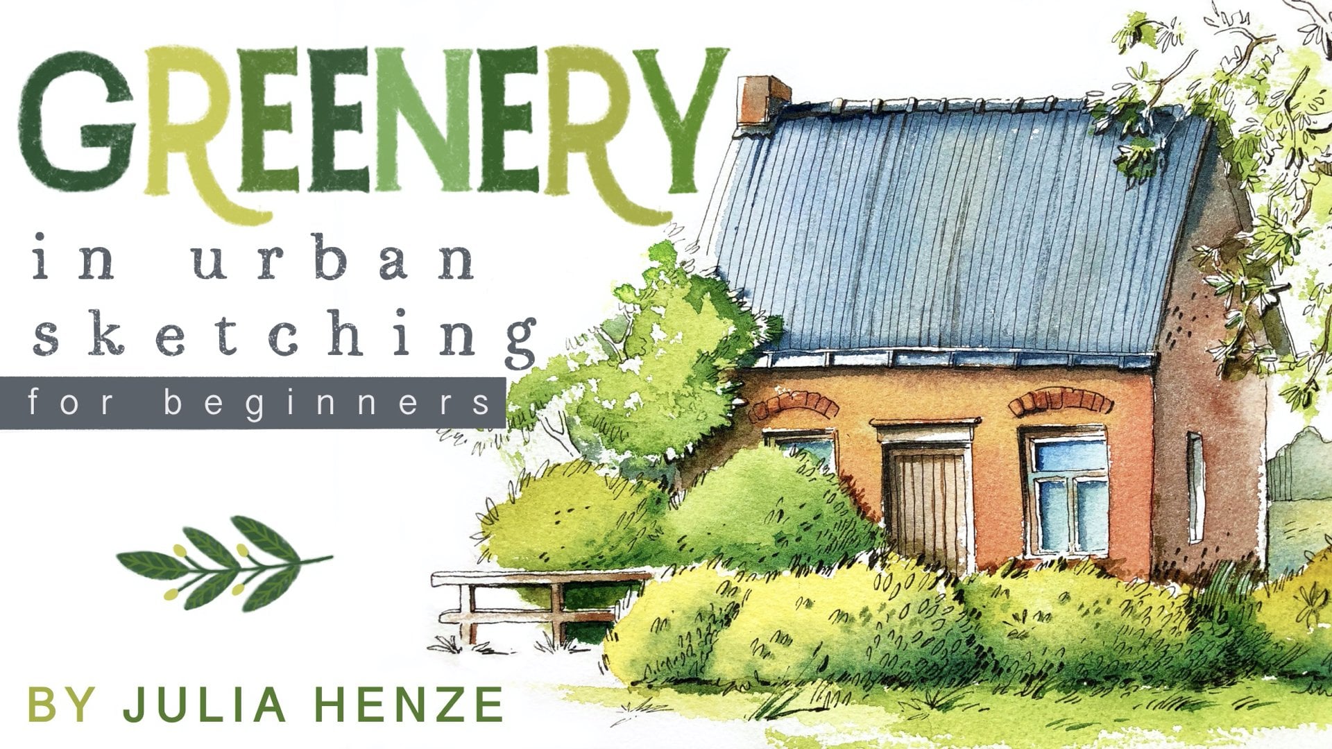
Transcripts
1. Intro: Hi, I'm Juli Henze an artist and urban sketcher based
in the Netherlands. I'm the founder of
Brad Brush Studio, a membership for amateur
artists in urban Sketches. I also have a blog
for Urban Sketchers and a YouTube channel
with weekly videos. My membership, my
YouTube videos, and my blog all
serve the same goal. To help amateur artist be happy. I want to help you make room
for art in your life and develop a consistent
practice routine so you can grow and thrive. I want to help you connect
with like minded people and equip you with tools to
develop your unique style. Thank you for stopping
by to watch my tutorial. Let me tell you a
few words about it. In this tutorial, I'll
guide you through a fun and expressive loose
watercolor technique. We will start with
a vibrant wash of watercolor and then sketch out the main shapes
with a pencil. Next, we'll define our
drawing with a fine liner, deepen the shadows
with a brush pen, and finally add vibrancy and textures with
colored pencils. This technique is perfect
for creating vibrant, beautiful sketches that really
shine. Let's get started.
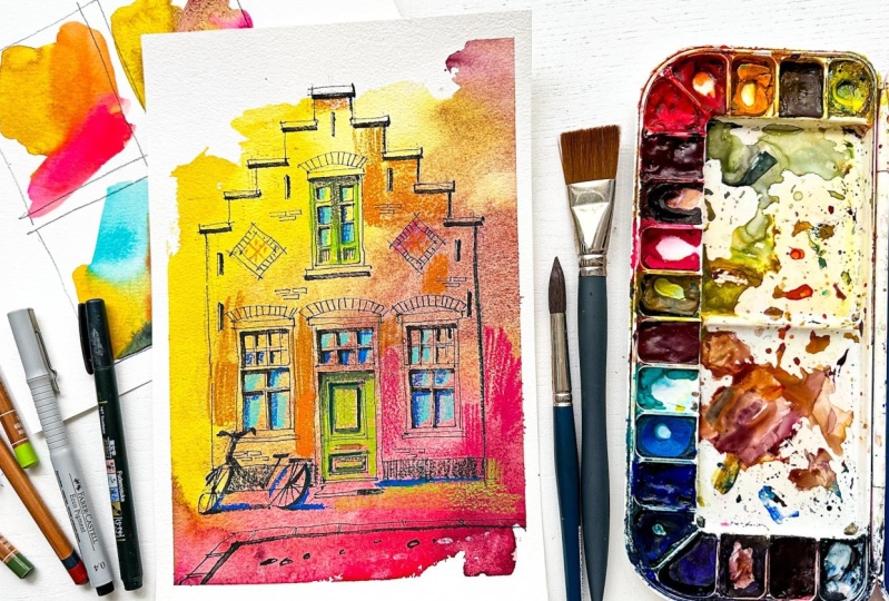
2. Step 1 | Thumbnails : So before we start to
work on our main sketch, let's make a few
thumbnails so we can choose the right
colors for our main work. I usually make two, three, or sometimes four
color combinations so that I have enough
options to choose from. Okay, let's start. So
here I draw four frames. Or let's make this one
a little bit narrower. So this is not about the
beauty of the primes. It's all about
changing the color. And the frame is not
important at all. Okay, so let's try out different options
which colors you like, which color combinations
you like maybe. If you have some color
combinations that you use a lot of
in your artwork, you can choose that and see how it will work
for this sketche. Let's try something like I think warm colors will work well here because it's
quite a warm picture. Let's do something like
this, maybe some orange. And let's do
something like pink. Pink is also a warm color. I think that would
work great actually. Let's try another option. Maybe something with a
different shade of yellow, more like a golden
color. I don't know. I mix different yellows
with each other. I have some green
here on the palette, maybe make it a bit greenish. Let's see. Yeah, it's more like
a golden color. Turquoise is one of
my favorite colors. I'm not sure if turquoise
will work here. Let's try a color. Let me see. I don't know. I somehow I would
like to try out this combination with Mm this potters pink. Yeah, it's not very cheerful combination,
but also an option. And if we add some
pink, for example, and maybe a little
bit of lasm crimson, then it will work a bit better. Why I wanted to try
out potters pink is because it has a very
beautiful texture. I think it's actually also
a quite interesting option. Let's try something different, maybe more a cooler
option with turquois. If you have turquoise, you can try this option. To otherwise, you can
do something different. Let's try maybe, I
don't know somehow I want to add some yellow
again to the turquoise. Here, it gets a bit
greenish because they flow into each
other and mix. I don't know, I'm missing a warmer color because
it's quite warm picture. The house is warm. So let's try to add
something like orange maybe. Oh, look at this. I think that's quite
nice combination too. Maybe we can add
just a little bit of paint gray at the bottom. Yeah, I think that's a
very cool combination. And let's see. I want actually to try out
something with purple. Purple is also quite
interesting color. Let's see. I'm not sure about this option, but we tried it out and we know that it
probably doesn't work. That's the power of making
thumbnails because you know if something works or not before you start to
paint the real sketch.
3. Step 2 | Painting with watercolor: Okay, now we have
our four thumbnails. Let's choose one
of them to create our final sketche and you can actually choose
the one you like. You don't need to do the same. I think it's even more
interesting if you choose another one with
your favorite colors, with your favorite
color combination. Okay, which one would I use? I think this one is actually
the most beautiful one. It looked a little bit
weird in the beginning, but I really like
the textures here. I will choose this one. What do we need for
this sketch for this part for this
coloring part? As you can see, I taped paper
down because we will use a lot of water and
it's important that your paper doesn't buckle. Also, I inclined my cardboard actually because we want
the water comes down, not staying in the same place. We don't want any pools here. I just use small box for that. We also will need clean water. If you haven't
changed your water yet, please do this now. We will also need a
large brush for wetting our paper, and let's
start with that. I use quite a lot
of water and wet my brush and I leave some
parts unwetted, dry. So you use quite a lot of water, but not too much
because if we have too much water on our paper, then we will create pools of water, and we
don't need that. That's not Beautiful. Okay, so now we need
a smaller brush, but still a very large one. I mean, don't use a brush
like this that's too small. And we will use the same colors as we did in this thumbnail. Okay, so let's start
with the yellow. I have some yellow
on my palette. Um, I want to make it a little
bit bluish or greenish, but not too much. So as you can see, I use a lot of water here. And then I paint in a very
loose way on my paper and can create some
beautiful little dry spots on the dry paper. Okay, the next color will
be our potters pink, very beautiful color,
very granulated color. Also here, we need
quite a lot of it. And then some pink. It's important that your
paints are with some pink. And let me see ism crimson
is a good color, dark red. And as you can see, I do it in a diagonal way to
create more tension, more interest in the picture. And let's add a dark color. It's my favorite
pearl and violet, a very interesting color,
very beautiful color. And as you can see,
the The bottom of my painting is not straight, and that's absolutely okay. I don't want it to
be too straight. Let's look at we can add just a little bit of
the same color here. I think it's very nice addition, a little bit more
potters pink here, and I think we can let it dry.
4. Step 3 | Pencil sketch: Okay, so our paper is dry. We can start the actual sketch. And now our reference is
actually quite important, and we will start with the pencil sketch
with a pencil sketch, and we always think
in global shapes. So in global shapes, and large shapes and we'll
start with the large shape, the main shape of the house
and with its middle line. So we know that it will be
in the middle of our paper. Don't worry if your lines
are a little bit shaky, that's not very important. What is important is that
you enjoy this artwork. That's the most
important thing here, and this will be the
top of the house. The bottom, the
sides and the top, this is our main shape,
the global shape. This is the middle part, and then let's draw all the steps and see
if it turns out well. It's not very important because
it's a very loose sketch. Maybe we need to make it a little bit wider. This part and this part a little bit smaller at the
top and this way. We make it look really great. Okay, now let's go over to
the windows and the door. I think that the top of the door is somewhere
in the middle. And let's throw the windows the door itself and the window here. Okay, so that's
actually all we need for this sketch for
the pencil sketch, we will do the rest with a fine liner and
call it pencils.
5. Step 4 | Adding Fineliner: Okay, I lighten up my lines. And just throw everything
I see here in the picture. We already have
the global shapes. We'll go at important parts, and we'll see how it will
turn out. Let's start. And I start with the shapes that I already know
how they look. So nothing special
in the beginning. Gain global shapes. No worries about anything
anything special. The bottom is very
important to throw. Let's add the top of the door and the windows. And ornaments are
always interesting to add because they make the
buildings look authentic. And more interesting,
of course. Okay. Here we also have an ornament, and I think it would be
a good idea to throw it first with a pencil. Make the lines parallel
to each other like this. Okay. I add some some details. Also, I love to add some small suggestions
of bricks. It always makes
makes the picture look or the house
look more authentic. You can see that. It's a
house built from bricks, not a modern house, but probably an old one. And it's also a nice
addition to the sketch. I'm not sure yet if I would add the bicycle,
I don't think so. But maybe I will. Let's see. Okay, here.
6. Step 5 | Applying Brush Pen: Okay, so we now have all the details done
with a fine liner. Let's add some shadows. And for the shadows, we will need an imaginary
light source. So the light source will come from they'll be placed
imaginary placed on this side. And that means that all
the shadows will be at the bottom of objects
and on the right side. Okay, let's start. So here
we will have a shadow, for example, on this side. So it's like a letter. It's very important
to do it consistently and you can see that
all the elements start to pop and that's
what we want to achieve the shadows. Also here. Here we will have
a larger shadow and it will look like this. Also here and inside the frame we will also
have some shadows. Okay, here all these
elements stick out, so we need to draw them. Okay, I would say
let's add the spice C. I think it's a nice detail. And let's throw it. Here. Oh And I will throw it or refine
it with a brush pen. And why is it so nice
to use a brush pen? Because we can use it for thicker lines if
we press harder on it, and the lines will be thinner if don't use that much pressure
or any pressure at all. Shadow under the
bike, very important. So it looks like an
object, a grounded object. I think that's a
quite nice bicycle. And let's remove the pencil
lines at the shadows here.
7. Step 6 | Finishing touches with Colored Pencils: Okay, so now the picture
is pretty much done, but I think it looks a
little bit boring now. So I would say let's
add some bright colors, even more bright colors here and textures,
especially textures. I really love to add textures, but I also want to add some colors to it
because I think that we miss here something like turquoise or blue
in the windows, I really like to add
blue colors to windows, different shades of blumT create this really recognizable
look of a window. And for the shadows, we can add some for the difference in the window so that they don't
look all the same. I add more or a darker color, a darker shade of blume Now, let's add some pink
to the house just to make the textures even more prominent would also define the shape of the house, maybe. I think orange will also
be a nice addition here, maybe a little bit
of orange here. It's also a warm color, so it works quite nice. Let's add some orange. Here. I don't know,
it just feels right. Um, the door is gray, but I'm not sure if
gray will work here, because I think gray is
quite a boring color, but you can see that it's
also a little bit greenish, so we can add a little
bit of green colour, maybe a bright green swell. We can also add some some yellow. And maybe a few other
colors you're in there to finish our sketch. A
8. Final Thoughts: Thank you so much for
joining me today. You now have a new technique in your urban sketching toolkit. It's one of my favorites
because it helps you create beautiful expressive
sketches quickly and easily without the pressure
touch you in perfection. I'm looking forward to seeing how you make use
of this technique. I'd love to see your
sketches in Instagram. Please tell me at Julia Underscore Hansa
and here's a hash tag. Julia Hansa score Learn with me. I would love to see
your artwork and feature it on Instagram stories. If you're interested in learning more about urban sketching, check out my courses
at Brad Brush Studio. I cover everything from
mustering proportions and line drawing to enhancing
your sketches with shadows, plus my other courses on perspective, composition,
color theory, creating stoning textures
and other great courses are designed to help you become a skilled and
confident sketcher. That's all for me
today. But I hope to see you again,
have the sketching.
 Julia Henze, Artist | Teacher | Urban Sketching Lover