Transcripts
1. Welcome To The Class!: Hello, everyone. My
name is Will Elliston, and today we're diving into the expressive world
of portraiture. This class is
designed to explore the dynamic and emotive
possibilities of watercolor, helping you to capture
not just the likeness, but the essence and the
mood of your subject. We'll be working on a
portrait that conveys emotion through flowing
colors and abstract forms. I've been a professional
artist for many years, exploring lots of different
subjects from wildlife and portraits to cityscapes
and countryside scenes. I've always been entranced by the possibilities of watercolor. But when I started, I had no idea where to begin
or how to improve. I didn't know what
supplies I needed, how to create the
effects I wanted, or which colors to mix. Now I've taken part in many
worldwide exhibitions, been featured in magazines, and been lucky enough
to win awards from well respected
organizations such as the International
Watercolor Society, the Masters of
Watercolor Alliance, Windsor and Newton, and the SAA. Watercolor can be overwhelming
for those starting out, which is why my goal
is to help you feel relaxed and enjoy this medium
in a step by step manner. Today, I'll be guiding you
through a complete painting, demonstrating a variety
of techniques and explaining how I use all
my supplies and materials. Whether you're just starting out or already have some experience, you'll be able to
follow along at your own pace and improve
your watercolor skills. If this class is too challenging
or too easy for you, I have a variety of classes available at different
skill levels. I like to start off with a free expressive
approach with no fear of making mistakes as we create exciting textures
for the underlayer. As the painting progresses, we'll add more details to bring it to life and
make it stand out. I strive to simplify
complex subjects into easier shapes that
encourage playfulness. Throughout this class, I'll be sharing plenty
of tips and tricks. I'll show you how to turn
mistakes into opportunities, taking the stress out of
painting in order to have fun. I'll also provide you with
my watercolor mixing charts, which are an invaluable tool when it comes to choosing
and mixing colors. If you have any questions, you can post them in the
discussion thread down below. I'll be sure to read and
respond to everything you post. Don't forget to follow me on skill share by clicking the
follow button at the top. This means you'll be the
first to know when I launch a new class
or post giveaways. You can also follow me on Instagram at Will Elliston
to see my latest works. So grab your brushes and
watercolors and join me in unlocking the
expressive potential of watercolor portraiture.
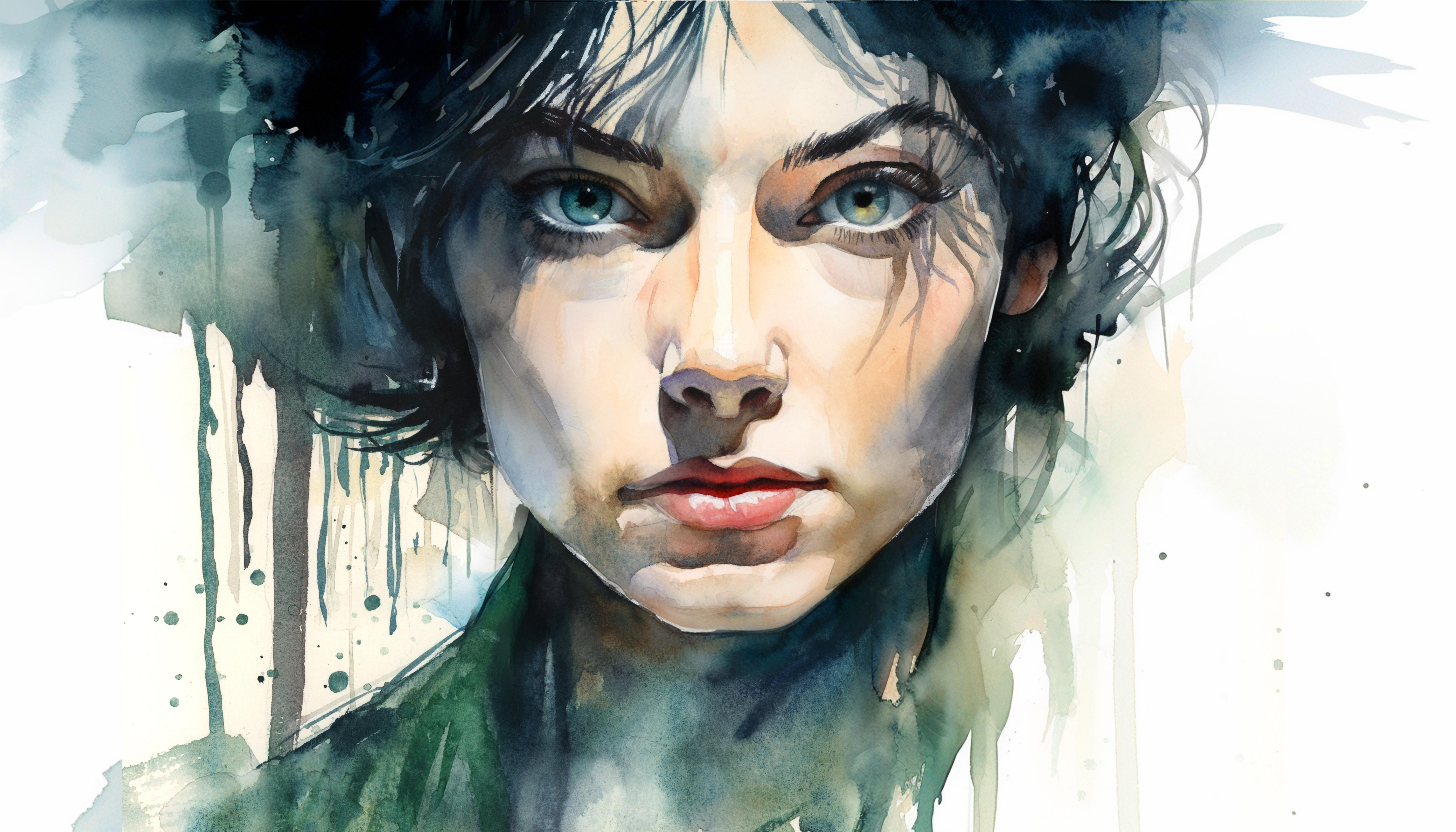
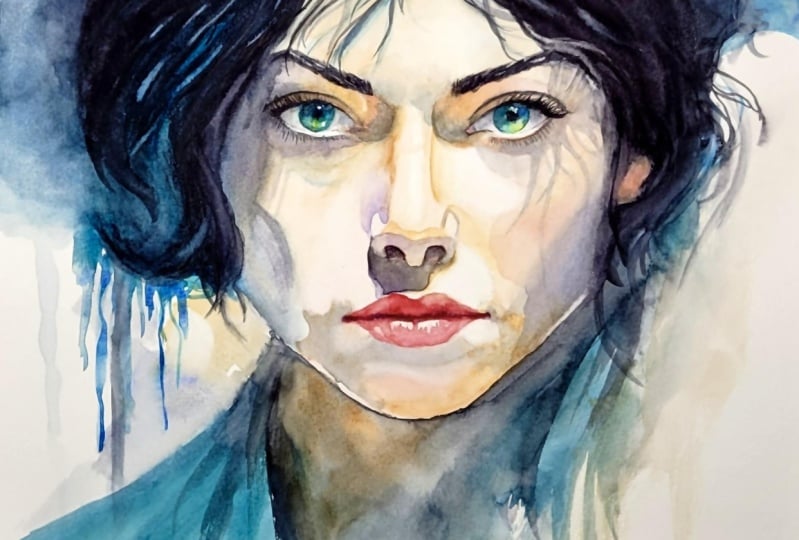
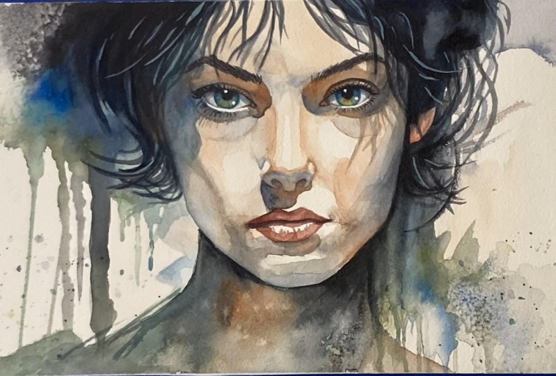
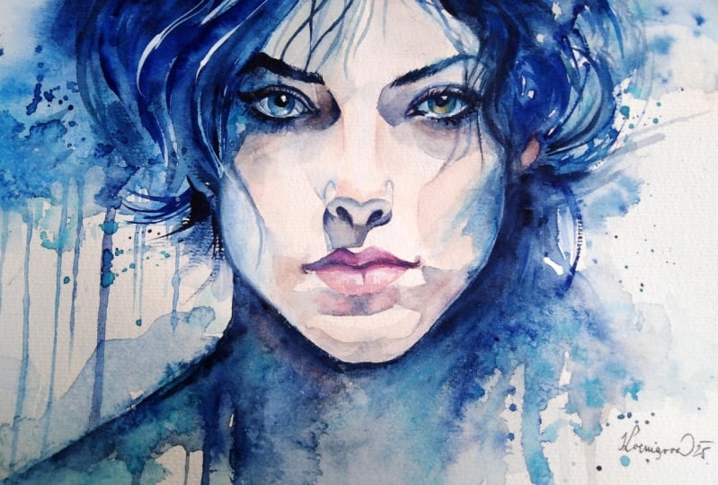
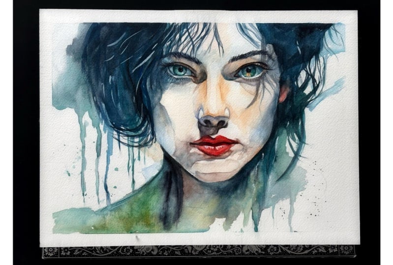
2. Your Project: Thank you so much for joining me on this artistic journey. So in today's session, we're going to be focusing on mastering watercolor techniques that bring out the character
and emotion of portraits. We'll explore how to use colour
washes, dripping effects, and detail brushes to add depth and
expression in the face. By blending spontaneous
watercolor approaches with controlled
detailed strokes, we'll develop a portrait that
not only portrays a face but tells a story through its
vivid, emotional landscape. In the resource section, I've added a high
resolution image of my finished painting
to help guide you. You're welcome to
follow my painting exactly or experiment with
your own composition. As we're going to be focusing on the painting aspect
of watercolor, I've provided templates
you can use to help transfer or trace the
sketch before you paint. It's fine to trace when using it as a guide for
learning how to paint. It's important to
have the underdrawing correct so that you can relax and have fun learning the
watercolor medium itself. Whichever direction
you take this class, it would be great
to see your results and the paintings you
create through it. I love giving my
students feedback, so please take a photo
afterwards and share it in the student project gallery under the Project
and resource tab. I'm always intrigued to
see how many students have different approaches and how they progress with each class. I'd love to hear about
your process and what you learned along the way or
if you had any difficulties. I strongly recommend
that you take a look at each other's work in the
student project gallery. It's so inspiring to see
each other's work and extremely comforting to get the support of your
fellow students. So don't forget to like and
comment on each other's work.
3. Materials & Supplies: Before we get started,
let's go over all the materials and supplies you'll need
to follow along. Having the right materials can greatly impact the
outcome of your artwork. So I'll go over all the supplies I use for
this class and beyond. They're very useful to have at your disposal and will make it easier for you
to follow along. Let's start with the
paints themselves. And like most of the materials
we'll be using today, it's a lot to do
with preference. I have 12 stable colours in my palette that I
fill up from tubes. They are cadmium
yellow, yellow ochre, burnt sienna, cadmium
red, Alizarin crimson, Opramarne blue, cobalt blue,
serlean blue, lavender, purple, viridian, black, and
at the end of the painting, I often use white gouache
for tiny highlights. I don't use any
particular brand, these colors you can
get from any brand, although I personally
use Daniel Smith, Windsor and Newton
or Holbein paints. So let's move on to brushes. The brush I use the most is
a synthetic round brush like this Escoda Purl brush
or this Van Gogh brush. They're very versatile because
not only can you use them for detailed work
with their fine tip, but as they can hold
a lot of water, they are good for
washers as well. They're also quite affordable, so I have quite a few
in different sizes. Next are the mop brushes. Mop brushes are good for
broad brush strokes, filling in large areas and creating smooth
transitions or washes. They also have a nice tip that can be used for smaller details. But for really small details, highlights or anything
that needs more precision, I use a synthetic
size zero brush. All brands have them,
and they're super cheap. Another useful brush to have is a Chinese calligraphy brush. They tend to have long bristles
and a very pointy tip. They're perfect
for adding texture or creating dynamic
lines in your paintings. You can even fan them
out like this to achieve fur or feather
textures as well. And that's it for
brushes. Onto paper. The better quality
of your paper, the easier it will be to paint. Cheap paper cuinkles easily
and is very unforgiving, not allowing you to
rework mistakes. It's harder to create
appealing effects and apply useful techniques
like rubbing away pigment. Good quality paper, however, such as cotton based paper, not only allows you to rework
mistakes multiple times, but because the pigment
reacts much better on it, the chances of
mistakes are a lot lower and you'll be more likely to create
better paintings. I use arches paper because that's what's available
in my local art shop. A water spray is
absolutely essential. By using this, it
gives you more time to paint the areas you
want before it dries. It also allows you to
reactivate the paint if you want to add a smooth
line or remove some paint. I also have an old rag or t shirt which I use
to clean my brush. Cleaning off the paint
before dipping it in the water will make the
water last a lot longer. It's always useful to
have a tissue at hand whilst painting to
lift off excess paint. Also, you never know when an unwanted splash or drip might occur that needs
wiping away quickly. I also have a water dropper
to keep the paints wet. When you paint, it's
important to have them a similar consistency to what
they're like in the tubes. This way, it's easier to
pick up sufficient pigment. A hair dryer is useful
to have for speeding up the drying time and controlling the
dampness of the paper. And lastly, masking tape. And this, of course, is just to hold the paper down still onto the surface to stop it sliding
around whilst painting. Also, if you plan on
painting to the edge, it'll allow you to create a
very crisp, clean border. And that's everything you
need to paint along with me. Now, let's get on and
start the drawing.
4. How to Sketch It Out: So faces are one of the most
difficult things to draw. So if you want to go straight to the template,
that's perfectly fine. And I'm going to take my time to make sure the drawing's
perfectly right. But I'll show you
how I started off, and I'll complete the
drawing off camera to make sure it's fully
refined for the template, so we can get onto
the painting stage with a confident
and clear outline. I'm going to start off
mapping out where I want the face to be
using a big circle. Maybe I'll even have the
face half off the paper. It's slightly off center, which is okay with me. We can counterbalance that by adding more weight
on the hair here. So it'll still feel balanced, even though it's
not in the middle, even though it's
not symmetrical. You can still create balance with asymmetrical compositions. The eyebrows. Just mapping out
general lines to begin. We have center line and rough thirds of the
face, the bottom third. I add two more almost
thirds, not quite. Now, I try and split this into fifths which is easier
said than done, but after a while, it feels a bit more natural. This is where the eyes will be. Doesn't have to be
detailed to begin with. When drawing figures, you want to try and refrain from thinking about
things directly. Don't think of eyes. Think about the shape you're
seeing and how it relates to other shapes because we all have an idea of
what an eye looks like, and it's not actually
what we're observing. A few wisps of hair here. Nose will be here. You see I'm bouncing around everywhere. I'm not zoning in on one section because
then I'll get lost. I'm trying to think
of a bigger picture. A few vertical drips
here, I think. Like I said, more going
on on this side than this side to make up for
that slight counterbalance. Now, usually the corner
of the mouth matches the side of the iris there and the top lip is
shorter than the bottom lip. And often, we can define
a face by the shadows. In fact, that's how we interpret the world through light and shade and the curvature of things and the
shadows they cause. So that's what I'm
looking at, actually. I'm not thinking this is a nose. What is the shape
of that shadow? So you can see how many
construction lines there are in order to
get this drawing right. So I'm not necessarily
expecting you to draw this out
yourself if you want to get straight to the
painting stage. I can see I've got a few
more corrections to do. But before I get to that, I'll just quickly show you how once I've mapped
everything out, I can go in and just commit to some
of these lines. And these harder lines that
I'm painting in drawing in right now will remain after I rub out the
lighter lines underneath. So the idea with drawing for a sketch is basically to
be as minimal as possible. We're only drawing as much as we need to guide
us with the paint. If it were possible to paint without a drawing,
it would be perfect. But unfortunately, we
need a visual guide. Drawing for the sake of
drawing is very different from drawing with the
intention of painting. You can see how on this side, I'm committing a darker line. Then when I come with my pencil, I can go back and
make it much clearer. So I'm going to do that all over the composition and make a
nice clean template for you. So, see you when we
start the painting.
5. Skin Tones: So to start off, we're
going to start with the lightest tones of the skin, and I'm going to use
cadmium red for that. Very pale and diluted
to begin with. We're just doing
the light underlay, and I'm going to take
a bit of yellow, cadmium yellow, maybe some
yellow ochre as well, and some burnt sienna. And these five colors at
the bottom of my palette, I've got cadmium red, camium yellow, yellow ochre, burnt sienna and sarin crimson. They make up all
different skin tones. I'm going to have
a warmer red tone, and just above, I'm going to make a brown or
burnt sienna tone. And you can see me apply it. And I've sped up the footage because it makes it a
bit more understandable. If it was normal speed, then you might not
be able to see the full context because it's just a bit too stretched out. So if you see me painting
the nose area, sped up, you'll know that that's
what I'm going for, and you can pause the
video and catch up. But if it's normal time, not only would the
class be much longer, but you wouldn't know where I'm planning
to go with that wash because a lot of it is
wet on wet painting, so you need to think ahead about the whole direction and
motivation of the wash, not just the first few strokes, because that's how we
connect it all together by incorporating all these
tones into a single wash, and you can see at
the bottom there, I added a bit more red. And so I have different colors on my palette
that I just mentioned. But really, I'm thinking
more of temperature. So where I want the warmer
areas of the skin to be, I obviously add red
and the cooler areas, it's more brown because
it's, of course, less warm than red, even though it's
still a warm color. And you can see me dabbing in a bit more pigment as
the water is wet there. And if it was normal
speed, very slow, you might not notice that and you'd have to re wet
the paper or the paper would be too dry and it would create hard edges,
which is not what I want. So even though I understand some aspects of
having the footage sped up, makes it a bit more difficult
to put into practice. Actually understanding
the direction, I think is actually
a bit more helpful. The bigger picture,
the bigger idea of what I'm trying to
achieve is a bit more understandable and
in context when you see it more sped up. Later on, we'll be very
bold with tones and colors. But to start off a sketch, I'm being a bit more cautious
and working my way from light to dark so that
even if there are errors, they shouldn't be that major. I'm just building
them up bit by bit, adding a bit of blue in
there on top of the orange, which is a complimentary color. Thinking about where the
shadows are even at this stage, even if they're very light. Got a tissue in my
left hand to dab up some edges so that
they're not all hard edges, and I can control the
tones a bit better. You can see I'm using
a medium size brush. It's obviously not
a very big brush, and it's not a fine
detailed brush, either. Although it does have
a very small tip. That's what I like
about these brushes. You'll see them using
most of my classes because they have
that very fine point. They're not expensive, and they can hold a lot
of water as well. A
6. Soft & Hard Edges: You can see, I'm
painting the nose here, and I'm trying to achieve a hard edge right on
the center there. So when following along
with the painting or even just watching this before you
attempt the painting, try and be aware of where I'm aiming to be soft
lines, soft edges, and where I'm trying to achieve hard edges and everything
in between between lost and found edges because that implies the texture
and the surface. So for this example on the nose, that sharp line going down
the middle that indicates the viewer that there's a curve
on the plane of the nose, and it helps add that depth and that
freedi sense of form. Same on the cheek. There's
some hard lines there, too. And everything c
is quite smooth. You can see just
subtle gradations these don't have to be
perfect, of course. You just need an
indication of that and the exciting thing about watercolor and art
in general painting is that the viewer fills
in those gaps for you. So as long as you indicate roughly what
you're trying to state, trying to imply it rather
than directly indicate it, then that should be good enough. So even though we're using
light tones at the moment, I'm still sectioning
it out a bit. So now I'm painting the
shadow underneath the nose, and I'm using yellow
with a bit of purple, and you can either use
purple directly from the tube or you can mix blue
and red to make that purple. I'm having a nice little
transition there. And, of course, I waited
for the paper to be completely dry underneath
before I painted this shadow. Whenever you're attempting
to paint a second layer on top of a previous layer and you want it to be
completely separate, you have to make sure the paper is completely dry underneath. So there's a bit of intricate
details here trying to save some of the whites on the nostrils on
the little bits at the top. When it comes to painting
skin tones for me, I generally just stick to reds, whether that's camium red or
zar and crimson, yellows, that's cadmium yellow or yellow
ochre, and burnt sienna. And depending on
how I'm feeling, I use those in
different quantities. There's no set rule
about which is correct. If you feel you want
a different mood, you can experiment with those in different
combinations, those colors. And then, of course, I have
to use their compliments for the shadows to make it
exciting and attractive. So as you can see, I've
just mixed a purple, which is a compliment of yellow. And there's blue in there, which is a compliment of orange, which is burnt sienna. And you can even if you want, add a touch of green because that's the
complement of red. And you'll see later, we do actually use a lot
of green in this painting, not necessarily on
the skin tones, but for the backgrounds, the clothes, the eyes. Oh
7. Painting The Nose: Now we're starting to
move on to the next stage because we've added a
lot of light tones, and I think I feel
ready to start adding some more details to
the nose with mid tones. So I'm using pure
black with a bit of blue mixed in there
to keep it exciting. I use neutral tint. I try to always use neutral
tint because as it says, it's neutral, so
you can influence other colors in there if you
want it cooler or warmer. So I start from the left
and move to the right, and like I said, I added blue to begin with, but then I incorporated
a bit of brown in there to keep it interesting
as it moves along. And you can pause the video or rewatch it as many
times as you want. You can use keybag
shortcuts to help maneuver the video in control
where you want to see so that you can
follow along exactly. There's no pressure.
You can take your time with this,
have some fun. You can see inside the nostrils, I'm adding thick pigment, and then I'm using water to activate that pigment
and create a soft edge. So even though it's
a subtle detail, you can see how the dark shadows inside the nostrils don't
really have a hard line. They softly blend out into
the shadow beneath the nose. Of course, you've got to think about how quick the
paper is drying, because like I say, in
most of my classes, the wetter the paper
is, the more it will blend out and create
a smooth line, and the edge might even
disappear altogether. But if it's dry, then
there'll be a very hard line, and the edge will
be very obvious. So I dried it completely, and I made use of tinting, which is when you completely
dry the paper and very quickly go over the whole thing with a layer
of whatever color you want. I used blue in that example. And that's another way
you can reactivate your painting because
like I was saying, if the paper is dry, then you're going to get hard edges rather
than soft ones. So what you can do is you
can dry it completely, so it's all evenly
dry, completely dry, and then very quickly with
a large brush strokes, fill in that area you want evenly without
agitating the pigment, and then it'll all be wet
again or at least damp, and you can start blending more tone because time does
run out with watercolor. One of the biggest challenges
of watercolor, of course, is getting the
consistency right and how that interacts with the paper
depending on how wet it is. And you can see, that's what
I do on my palette here. I'm not only thinking
about the tone, whether it's lighter
enough or dark enough, or the temperature,
what exact color it is, but I'm also thinking about the thickness or the
weakness of the mix. If it's too diluted, then as soon as I put
brush to the paper, it will spill out of my brush and if the papers already wet, it'll create a lot of movement that's actually
outside of my control. And in some cases, that's exactly what we want
when we're doing the abstract background or
big expressive textures. But when we're doing
the fine details, we don't want that. So we've got to have
a bit more control, and we have to have
thicker pigment.
8. The Mid Tones: When it comes to
considering how diluted or thick your pigment
should be and how wet the paper or how
dry it should be, it's a lot to do with
intuition in the end because for me when I started out and a lot
of students, of course, you have to think about it
consciously in your mind, and it takes a lot of time
and energy after a while, through doing so many paintings, if you look through
the student gallery, you can see that
students do pick it up. They have an
intuition. They know how the paper will react and how to achieve
different effects. For example, now, I just wet the top left corner of
the painting because I want to achieve a
nice smooth line where I'm going to apply
relatively thick pigment. But because the paper is wet,
it's going to blend out. And unfortunately, because I was concentrating so much on the painting and getting
that technique right, I forgot to press a
chord on that point. But you can see how I applied
it. It's quite thick. Hence why there's some dry
brush marks on the edge. But gradually, you'll notice on that left hand side
where the water is, it's going to blend out and now I'm going to agitate it with more wet pigment
with a bigger brush. So I do try and explain when I'm painting thin or
when I'm using thick pigment. But it's a useful practice to try and work it out yourself to force yourself to think about it because that's actually when you'll start seeing results in yourself and improvement
in your painting, because you'll have
an understanding of how the medium
works for yourself. Likewise, when it comes to
selecting and mixing colors, I had to look up
when I was starting, I had to look up exactly
what colors make what. But now I can look at any
subject or any painting and figure out how I can
mix that with these colors. I've got on my palette. So now I'm obviously doing
the hair or the background. It's quite ambiguous
at the moment because I want to create
some exciting textures. And my color scheme is
this turquoise green. So I'm going to use
a whole range of different greens
in this and blues. But you can explore
different colours. If green isn't the
color for you, you can try using purple
or blue or even orange, whatever color you want
to experiment pink. You can see that I've created some artificial
drips on the left. I would usually
try to create that organically by
tilting my paper and, like, tapping the canvas on the table to allow the
drips to fall down. But I couldn't get the camera angle right to
get it on camera on footage. So I painted them in myself. You can explore that
yourself if you want, and I'll be happy to excited to see your results if you do. Now you can see how
gradually we're building up the tone
from light to mid tones. We're still on midtones
at the moment. And I'm going to paint the
hair in layers as well. So we've painted the left
for its first layer, and we'll come back to that
later on to make it more dynamic and to give
it more definition. Now working down onto the
left eye from top to bottom. We're going to have to create
the illusion of depth, and we do that using shadows. But it's a bit too
wet, so I move around. So I add these few
strands of hair, swirly curvy lines, pretty much matching
the same tone as the rest of the hair, crisscrossing each other a bit.
9. 4 States of Paper Wetness: Now I can start working
on that eye again. Because I can tell if
the paper is glistening, then it's way too wet. So I need to allow the
water to properly absorb into the painting so it
doesn't have that glisten. But it still is wet. You can tell that there's
sit moisture there, but you'll have more control
when it's only half wet. Again, it's hard to put these abstract concepts
into words, really, but there's usually four
or five levels of wetness. Of paper, and each level
creates different effects. When the paper is
at its wettest, when it's fully
saturated with water, this allows colors to flow freely and blend into
one another with ease. So this state is
ideal for creating those smooth gradients and washes like I was
talking about before. It's perfect for laying
down the initial hues and setting the general
mood of the painting. However, control can be challenging as the paint
tends to spread wildly. Then the next level is
moist, which is, of course, slightly less wet than the
fully saturated state, but it still has enough
dampness to allow colors to blend softly while
offering more control. This level is excellent for
adding layers and building up colors without losing the
underpainting effects. It's a delicate balance, but very versatile for
in between layers. Then we have damp paper, which has minimal moisture. And it's usually consistent with a soft sheen without any water
pooling of water around. So if you look at your
paper from an angle, you can see that it's
a soft sheen rather than a full reflective
kind of surface. And this state is
perfect for adding fine details and subtle
textural effects, like I've been doing
around the nose, like I'll do around the eyes, the paint will only
spread slightly, so it allows for precision without the hard edges
that come with dry paper. And with dry paper, it obviously offers the
highest level of control. Dry brush painting allows for very texture to crisp
thin lines and details, and colors remain exactly
where you place them, which is obviously ideal for sharp edges and final detailing. You can see with these lines, the paper is damp and moist. So I think in between those
four lines because really, there's so many different
levels of wetness and paper, but to minimalize them
and to make it simpler, we can just think of them
in those four stages wet, moisture, damp and dry. And those are what
go through my mind. I break it down into those
four to keep it simple, so I can refer to
those in my mind, and I know what to expect
at each of those levels. As we paint, we move
through different stages. So we usually start
off, of course, with wet techniques to
establish a foundation. And then we obviously move
from moisture and then damp for more refining and
details as we go along. And then once that layers done, then we move on to
the second layer. Of course, some layers
like the hair on the left, the background, we don't
need to do much refining. So after that was
wet and then moist, we kind of let it dry by itself. And areas where you need large gradients and
large shadings. You can only do that
when it's moist. You can't really do that
when it's damp either because the pigment
won't move enough. Sometimes it's useful
to have a spray bottle. I have one here, and I've
used it occasionally just to re wet areas if
they dry too quickly. So observing the sheen on the paper will
help you gauge its wetness and better
predict how it will interact with new
layers and brushstrokes.
10. The Left Eye: I could explain to
you exactly what I'm doing line by line,
stroke by stroke. But I also think it will be
useful for me to explain to you my thought process so that you can understand
the way I think about how I interact with pigments and the
water and the paper. So that you can approach it in your own way and adapt what you want to
adapt into your own style. Because if I were to mention
that I'm adding a mix of neutral tint with cobalt blue onto moist paper with
a buttery texture, then I would like
you to understand what I mean exactly
by damp paper or moist paper and what you
can achieve with that or what butter like pigment is compared to a coffee
or tea like pigment. Because the colors that
I'm using are actually a very small part of
what it takes to paint. When I started painting, and I think I can see a lot of beginner students
thinking the same way is that mixing the colors is the
most important thing. Having knowing what colors an artist uses and
then how to mix a certain color takes a lot of focus for someone
who's beginning. But actually, tone and the
consistency is more important. So I think it would be more useful for me to explain to you the general nature of watercolor rather than the specific pigments
that I'm using. Because, for example, this
green that I'm using now, it could be viridian
green that I'm using. But I could also mix that
myself using turquoise blue, and a bit of yellow ocha I
have on my palette as well. Let's talk a bit
about the eyelashes. So you can see, I painted the shadows
of the eyelashes first, and the shadows fit the kind of angle of
that high cheekbone. They're slightly tilted. And I waited for that
to completely dry, and then I moved to
this small brush, where I can apply a kind
of dry brush texture, very fine lines, curved. And so far, it's one of the only parts of the painting where I've added that kind of detail. The rest of it's all kind of blending rather than
lots of thin lines. And then when it comes
to painting the eye, I painted the white
bits of the eye first. Of course, they're
not actually white. But I painted a kind of depth of them darker shadows on the edges and lighter
in the center. And I made sure that was completely dry before
painting the iris. And it's a similar
thing with the iris. I wetted it all and then dabbed in pigment around the edge
to softly blend inwards. And then I waited a bit more, and now I'm adding this
dark dark pigment. And this paper is
only slightly damp, so that will hold its shape. The pupil of the
eye, the black pit, will hold its shape, but I want it to be nice and
smooth on the edge. And in fact, at the top of the pupil where it meets
the top of the eye, I want it to blend
into that shadow. Patience is one of the most important things in watercolor. And that's something I've
had to learn to deal with because sometimes you
know what you have to do, but you just can't do it
because the paper is either too wet or it's too dry. So you just have to wait a
bit longer or you have to dry it out again or spray it
with the water spray two.
11. Starting The Hair: If you find that your
lines are too hard, you can always go back
and soft them back up, scrubbing them with
a little bit of water or pigment
like I'm doing now. I want the top half of the
pupil to be a bit softer. So I'm actually adding
a bit more pigment on the edge layer just
to soften it out. Now, I'm going to suck out a bit of pigment from the
bottom using a clean brush, scrubbing at the bottom,
just so that it's light at the bottom
and dark at the top. Adding a bit more shade above the eye and below the
eyebrow while it dries, and now I'm going to
take a little dab of white watercolor
or white gouache and very precisely add
a couple of strokes. And these white dots when
they're positioned well, they give the illusion
of a wet eye because they're reflecting
the sharp lights. We don't need much, those
two dots do the trick. Now I'm just softening out this edge to give it a bit
more illusion of a curve. Now we can start thinking about a completely different section. Let's add another layer to the hair on the left because
that left eye is done now. So I'm mixing some
very thick pigment, some black and blue. Well, actually, it's
more of a turquois. It's a very greenish blue. And I'm using the under layer to negatively paint
some highlights, actually. I'm going to blend this in
as we work further down. I'm using the point of my brush. To preserve some of
those background colors and working it into those little strands of hair
we did on the forehead, a few sprays from the water gun, just to ignite it, reignite it because it
was thick pigment dries faster obviously than
highly diluted pigment. So if I want to blend it in, I need to reactivate it with a bit more water, give
it a bit more life. Use some pure water on the left. I don't want to agitate
what we've already done. I just want it to blend out. So it's quite difficult to see with the reflection
of the light. But I use pure water there
just to create a soft edge, a soft transition from that
dark to the green below. And then, like I said before, as we wait for it to dry, we can take advantage of the
different levels of wetness. Now I'm going to
take a hair dryer to completely dry it off to see what we've got, what
we're dealing with. And there you can see how
the reflection's gone, how it's blended in while still maintaining
the flow and direction.
12. Details vs Abstraction: What really excites
me about painting portraits in watercolor
is the interplay between the precision and abstraction and how it
elevates the painting from not just a mere likeness to
a piece that actually has a bit more emotion
and resonates a bit more with the audience
or the viewers. And one of the most
striking ways to achieve this is
through the contrast between finely detailed features like the eyes and nose and
mouth we're doing later, and then the more abstract
expressive treatment of the hair in the background
like we're doing now. So this dynamic effect, this creates a visual depth that can really
captivate and engage. So now we're working on that expressive
hair at the moment. We're contrasting
the precision of the facial features and the
background and the hair, we're treating it with a
more abstract, loose manner. And this approach not only highlights the
subject's face by framing it within a fluid kind of dynamic range of strokes, but it also adds artistic almost eeeal quality
to the painting. So the hair and background, we're executing with this
wet on wet technique. We're allowing colors to
blend freely on the paper. We're using organic
shapes, and actually, we're using quite
unpredictable color mixes, even though it's all
in the realm of green. That's kind of core color, but we're adding
a bit of blue in. Later we'll be adding
a bit of yellow ochre, so we're really exploring and being adventurous
with the color. So this ex structured approach can suggest movement
and emotion. So it adds a layer of
interpretation beyond the literal. I just brings it more than
just a realistic attempt because even though
we're trying to add details in the facial features, my aim isn't actually to make
it a realistic portrait. You know, the precision
in the facial features only really serves
as an anchor point. And that's for any portrait. It draws the viewer in
first and allows them to connect with the subject
on a personal level. So the meticulous
detail in the eyes, the lips, and the skin tones, it catches the likeness, but also the subtle emotions and the personality
of the subject. So these details do require a controlled hand and a
thoughtful application. It's more of the thinking
side of the brain rather than the playful
side of the brain. Let me just interject
right here as I'm adding some white
gouache on there, but I'm keeping it very
diluted or slightly diluted. It's not very thick
so that it matches the same tone as
the under layer. I don't want it
to be pure white. So going back to what
I was saying before, the key to this
approach is balance. The sharply defined features
must blend seamlessly into the more fluid parts of the painting without one
overshadowing the other. The abstract elements
should enhance and not distract from the
vocal points to face. And this balance
can be achieved by carefully choosing
where to place detail elements and where to let the paint
flow more freely. The use of color, tone, and even directional
strokes can help guide the eye smoothly across the different
areas of the painting. A lot of the strands of hair are quite intentional
with the way that they flow like those
highlights there. Now we're moving on to the lips, and I'm using camium red for
that, the most vibrant red. I could use a pinch
of opera pink. We're not going to use a very vibrant red because
it'll look out of place, but you'll see as it dries, it'll be a bit more subdue.
13. The Lips: Painting the lips can be quite
daunting and challenging, but that doesn't mean it can't
be fun at the same time. It's like everything. We're tackling lots of
different subjects, and they all have
their unique qualities that are fun to express. A nice little test
and exercise, really. I'm trying to break it
down into smaller steps. So at the moment, it
looks quite flat. We've taken that
kind of orangey red, and we've just added subtle nudges of other
colors in there, especially around the edges. As it starts to dry, we can
start dabbing a bit more of a darker pigment around
the edge so that it starts to have a
bit more volume to it. You can look up some anatomy. I mean, I have never really actually studied anatomy
that thoroughly. But through painting and drawing
so many facial features, I kind of have an idea in my mind about
the process of it. The basic structure of lips. So there's obviously more to
lips than just the outline. We have to consider the volume, the creases, how they naturally curve around
the teeth and the gums. And this understanding
helps in painting them look more natural
and expressive. As I said earlier on, red is a complimentary
color to green, and green is the main color in this, the main
source of color. So I chose this red as it's quite a punchy statement that
contrasts with that green. Looks nice together,
but when it comes for you to choose a color
and your color scheme, you can think of
complimentary colors or other directions you
might want to go down. Choosing the right
color of the lips is is a very personal
statement, really. They're not just one
flat color as well. You got to think of the variations you
can include in there, whether it's red, pink, purple, even blue and oranges for contrast in
the darks and the shading. You know, for a natural look, you could start with
a lighter base color, like I did here
and gradually add darker tones to the corners and the line where
the lips meet. We're gradually adding
a bit more depth and realism as we carry on. There's definitely a
sweet spot when it comes to creating volume and
tone in watercolor, and it lies somewhere
between damp and dry paper. You could also it would
be a very useful idea, and something I've done as well, is to practice these features independently
of themselves. So if you're feeling too overwhelmed to do
the whole painting, maybe you can split it up, you can look at the left eye and just do a close up painting of that on a larger piece of paper or the nose or the lips. You could just create
a little border with masking tape and just focus on the lips and then
bring it together. I'm trying to add a
bit more structure around the chin now. Even though I still plan
on painting the lips. I haven't finished the lips yet. I need to do this underlayer first because it's
all interactive. It all blends somehow. There's a seamless connection. And I know if I do my
darkest darks from the lips, it'll be impossible to do
the painting underneath.
14. Technical Tips: So I can give you a few
technical tips that might help you when it comes to
painting these features. Of course, layering is a fundamental concept
of watercolor, beginning with a
light wash to define the general shape and
the fill of the lips. And as it dries, we add more defined shapes
for the dark areas, and this naturally builds up
depth and creates gradation. Now we can be quite
bold as we are now. Of course, the darkest areas are where the light
can't get to, like, the corners of the lips
and the mouth and where the two lips touch
in the middle. So the first part was
basically wet on dry, and we used it to create
sharp edges and more control. And it's useful for divining the borders and
adding fine details. We'll use it again
at the end to create a bit more detail
and subtle lines that can give it a
bit more texture, like the little
cracks of the lips, the reflections of light. And of course, we can use glazing like we did
with the nose before. The initial washes are
dry and apply quite thin. But because of the
transparency of watercolor, we can make it slightly darker. We can darken the tone
and add volume that way. Then of course,
we've got dry brush, which we can use to possibly add more
texture to the lips. The reflections on the bottom
lip because if you look, there's no reflections
of light on the top lip because
it's facing downwards, but the bottom lip reflects the light that's
coming from above, and we can possibly
use dry brush later on to create a bit more
texture there that appear on the lower the shape and curvature of the lips play a significant role in
expressing emotions too. The lips are just as expressive
as the eyes, really, because a slight tweak in
the curve of the smile or the pursing of the lips can convey a whole
range of emotions. So if you pay attention to
these little subtleties, they can dramatically change the mood and the character
of your portrait. So once I've added
the general tones, I always go back with
a clean damp brush, not a wet brush to smoothly blend the edges
around the skin tone. And this ensures that
there are no harsh lines unless the style that I'm
looking for demands it. Because we want to integrate the lips naturally
into the face. We don't want it to look
like it's stuck on there. So I'm looking for areas mainly, again, the corners of the
lips to blend out into there. Now I'm going to start painting
the shadow on the chin. And you can see how the light and tones
are quite dynamic. If you look at the top lip, you can see it's lighter, then it's dark in
between the lips, then it goes light again
on the bottom lip. Then there's shade
underneath that bottom lip. Then when the chin curves out, we've got the reflection
of light again. And then underneath the chin
right now we've got shadow, so it's going light,
dark, light, dark. And this all conveys
to the viewer the form of the face and gives the
illusion of depth and volume. And depending on
how sharp or smooth or how you structure or
even sculpt these shapes, changes the mood
and the character of the portrait you're painting.
15. Tonal Form: Now I'm going to start doing a bit more tonal work on the
right hand side of the face. And as we're doing this, I'm going to talk about the consistency of watercolor paint. Before we talked about
the wetness of the paper, and now the consistency of the paint significantly impacts how it behaves on the paper. And this is another
aspect that when you master can greatly enhance your control and
expression in painting. Of course, watercolor
can be mixed in various consistencies
from very thick, like a paste to very thin, like a light wash. And
each consistency interacts differently with the
paper and affects the painting's overall texture,
opacity, and fluidity. So starting off with the thickest consistency,
absolutely no water. Thick paint with little
to no water added, has a paste like consistency, typically straight
from the tube. But even sometimes
in my palette, it's even thicker than that. It's quite opaic and it can be used like we did on
the left hand side, to create strong dark colors, but also very vibrant colors. If we're using pure camium red, that'll be a very
bright, strong color. And it gives us high control over the strokes
because it's so thick. And also, it is the best type of consistency to use for
dry brush marks, too. And if you were to have this
paint on a tilted palette, this paint wouldn't even move. It would stick like glue. So this consistency is perfect
for adding fine details and dry brush marks and even
a bit of underlayer work. So I'm planning to use some of this thick consistency on the right hand side
for the hair later on. And the next one along
is slightly diluted. So slightly diluted paint has a bit more fluidity
than thick paint, but it still holds
its form well. It will only slightly move on a tilted palette
barely even that, if at all, it indicates
a more buttery texture. And this consistency is
ideal for applications where both color intensity and a bit of
spreading is desired, such as defining soft
edges or adding volume to objects without allowing the
color to run too freely. I hope it's not
information overload, and I know I'm not directly talking about what I'm doing
on the canvas right now, but in a way, I am because this is what's
going through my mind. I'm not necessarily
thinking about things as, Oh, I need to add some
burnt sienna right here. I'm thinking about the
wetness of the paper, I'm thinking about what
consistency I'm using. So that's why I'm talking
about consistencies right now because right there, I'm using a half tone. The brush strokes
I'm using right now. And what does half tone mean? Well, half tone
paint consists of a balance between
paint and water, obviously, and it flows much easier than the thicker
paints we just talked about. But it still holds a
good level of control. It would move slowly
on a tilted palette. It would have a
bit more movement. Unlike the other ones,
I would start to bleed naturally down if you were going to
hold it on a palette, it allows for broader
strokes that begin to exhibit watercolor
transparency. Before that, the pigment would be too thick to show
off its transparency, but now we're starting
to get into layering.
16. The Right Eyelids: So half tones are excellent for general washes that
require color strength, and they're useful in areas of painting that need
a medium level of saturation and
gradual transitions from one color to another, because we're allowing
the water to have a bit more say and less control, less direct control from us, and the water has
more of a control, we have to kind of surrender to the water the more we add to it. And then after half tones, of course, is quarter tones, which are again, much lighter and contain much more
water than paint. And this consistency will run
freely on a tilted palette. And it makes it ideal
for creating washes that cover large areas without the
need for saturated colors, underlayers like
the grayish green we've got on the
right hand side. Quarter tones are perfect for establishing a
painting's mood with subtle hues and mainly, yes, soft background elements. They don't draw
too much attention away because they are lighter. And a lot of the tones
on the face are also this quarter tone at the moment. Then after that, we
have the lightest, most diluted tones of
all and there aren't actually that many on here
because there's just so light. A lot of them are on the
skin tones at the moment. There's not many anywhere else. The lightest tones contain the highest ratio
of water to paint. They are highly
fluid and they would just fall off the palette
if you had it tilted. These washes are used
to tint the paper. So rather than
necessarily directly using them for a final finish, we use light washes
to tint, maybe, like I did with the
lips and the nose. We really use the lightest
tones for layering purposes. Let's say, I finished
the painting, and I think her face
is a bit too pale. There's not enough
color on there when I can mix a very light, a very diluted tone, use a very big brush and paint over the entire face in just three strokes
with a big brush. And that's what lightest tones and washes would be used for. But you could do this
outside of portraiture. You could paint a
whole sky using this technique using very
light diluted washes. It really enhances the
luminosity of watercolor paint. And it's the best thing
to use when doing layers. If you're planning to
do loads of layers, you can set up a good
foundation for further details. Of course, there's
a whole spectrum from thick paint to
completely diluted paint, much like the wetness
of the paper from absolutely saturated
to completely dry. So we set these five
different levels of consistency to give
us a better idea, an anchor, a benchmark
to think around. And that's what I think about in my head when I'm trying to come up with the
right consistencies, because they all have
different effects. For control or detail, I tend to go for thicker paints. For texture or volume, I go for slightly
diluted paints. For soft transitions, I go for half tones for atmosphere
and depth quarter tones, and then for lightness, airiness for tints for
conveying subtle light effects, then I use the lightest
most diluted tones. So you can experiment with these and I guess we can talk about putting
the two together now, putting what happens when you
put different consistencies of paint with different
levels of wetnesses of paper.
17. The Right Eye: Now I'm painting the iris and pupil on the right hand side. And on this side, I'm experimenting with this
yellow touch in her eye. So I'm using cadmium yellow to achieve that yellow and a
little dab of cadmium red. And I'm doing this not
only to show you how you can incorporate
other colors, how you can experiment with different tastes because maybe
you want to do this with blue or you can experiment with red or purple even,
whatever you want. But also on a personal level, I just feel like I want to
create a bit more interest, not keep the both eyes
looking symmetrical, adding this unique little touch of yellow in the eye there. It's the same approach
as the other eye. I'm just adding
yellow into the mix. So I start off of that yellow, and now I'm mixing that
turquoise blue that's being the main centerpiece and
focus theme of this painting. And the rest of the
painting is dry. The rest of the eye is dry. So you can see when
I add in this iris, it doesn't go bleeding out because I want there
to be a hard line. I don't want to go, of course, into the whites of the eye, just painting in
the general shape, and half of it's going
to be in shadows. That's why I've painted half of it green and then
left the other yellow. Then I'm filling in
around the edge on the other side and using the point on my brush to connect the two
ends of the circle. Let me carry on with what
I was saying before. So if we break it all down and acknowledge the five different
consistencies of pigment, thick consistency, slightly
diluted, half tones, quarter tones, and lightest
diluted tones, five. And then on top of
that, we consider the four levels of
paper wetness wet, moist, damp and dry, then actually put them together, and we have 20
different variations, and everything that
you do with watercolor falls within those 20
different variations. 20 sounds like a lot, but when you think that everything in all of watercolor
falls into these 20, then it actually
makes it a bit more comprehendb because
you can decide on what you want to
achieve and then you can figure out which
it falls into. In practice, these combinations provide a versatile toolkit for expressing a vast range of all the artistic visions
you want to achieve. Each variation allows for
specific effects that can be predictably reproduced once you understand how
they interact. And this understanding
transforms what could and would be, otherwise, an overwhelming
array of choices. And it's into a finely tuned
array of artistic options, enabling you to manipulate and explore the
medium, how you like. Now, of course, 20
is still a lot, and I can go over
them briefly today. But once you get an understanding of every
single possible mark you can do with watercolor, then life gets a lot
easier with painting. And then you can
look at any mark on a painting like I'm
painting my eye right now, and you can see
that the painting must be slightly damp but not overly moist because
the pupil has a dark edge. And now I'm completely
drying it, of course.
18. 20 States of Watercolour: It's a good idea. I have
done it many times. I've gone over these 20
different variations on paper just to see how
they react for myself. Just taking a separate
piece of paper, using the same pigment, whether it's neutral
tint, black, cobalt blue, or alizarin crimson, it really
doesn't matter. You could start with wet paper, and then with a
thick consistency, give a few strokes on the paper, then slightly dilute the paint. And then give a
few more strokes. Then reduce it to a half tone, again, give another stroke, quarter tone, light tone, and then that's the whole
range you can do of wet paper. Then move on to moist paper. Again, starting with
thick consistency, slightly diluted, half tone, quarter tone, and
then the lightest. You can see the difference by using moist
paper to wet paper, and then moving
on to damp paper, again, doing the same thing. You'll notice that the
damper the paper is or at least the closer it is to drying while still
actually being wet, the more likely accidents
will occur when you start applying half
tones, quarter tones, or light tones because
you're charging too much pure water into
a already wet paper. So it's these little
things you learn by doing these experiments. And then, of course, with
completely dry paper, you'll see that there's very hard lines because
there's no water on the paper, obviously to soften it out. All this information might seem intimidating depending on your
experience or skill level. But as you grow more comfortable
with these interactions, you'll start to blend and shift between them
automatically and fluidly and you'll expand your repertoire and refining
your personal style. So this depth of knowledge
turns the complex into a more intuitive
approach and it allows you to focus more on the
artistic intent and less of the mystery and
mechanics of the medium. Of course, there is the whole exciting thing about watercolor is that
mysterious ethereal effect, and you will learn
how to achieve those effects depending on
these different interactions. So even though breaking
down watercolor into rules, so to speak, we're doing that so that we know
how to break the rules and take advantage of every
aspect of the medium. They're more of gateways to mastering the
medium, I think. Because with these 20 states, you're equipped to tackle any
visual challenge that comes your way from the most delicate of details to the
broadest of washes, whether you're painting
a crisp, detailed, botanical illustration or a
moody atmospheric landscape, these combinations are the
building blocks that will support your creative
expression and decisions. Y.
19. Rightside Hair: So it's a good idea to
spend time mastering them. And basically, this is how I plan my classes and how I think about what I'm going
to paint in each class. Because once you
understand this, you aren't limited to
a certain subject. If you look at my classes, I try paint all different types of things in different styles. And the way I do
that is by trying to think about these
20 different states. And you can see right now I'm applying the thickest
pigment onto completely dry paper because I know exactly what
outcome that will have. If it was diluted, then
it wouldn't be right. And if the paper was wet,
it wouldn't be right. So it had to be dry and
it had to be thick. These 20 variations are only relevant to
water based mediums like watercolor or gouache. It doesn't really connect
with oil painting or acrylic. These are the keys for
manipulating watercolor. Everything else is
relevant to other mediums. For example, drawing ability. That's important.
Whatever medium you're painting in
color and tone, that's also relevant
to other mediums. A few other things
that are unique to watercolor is the speed
in which it dries. Oil and even acrylics, if they're used thickly, take
a very long time to dry. So you have to be aware and plan for
those kind of things. But watercolor allows for rapid layering,
fast adjustments, and it demands a
faster working pace and more decisive actions, which can be equally
exhilarating, but also quite intimidating
for people starting out. And, of course, one of the
things that I like most about watercolor is the
reactability of it. The fact that you can
rewet it once it's dried, rework it, and manipulate it. We can lift off color,
we can blend edges. Even 20 years after if we
ever wanted to do that. So now we've finished
off the eye, we've basically done
all the major details. We can relax and have
a bit of fun doing the hair on the right hand side and the neck and the shoulders. I'm trying to be a
bit more dynamic with these strands of hair. It's a difficult balance between overthinking and still
getting it visually correct. The goal is to capture the natural flow and
movement of the hair using loose and fluid
strokes that suggests the motion rather
than meticulously detailing each strand. That's why I I've clumped
together some of the strands. They're not individual hairs, and there's a range
of thickness there. Some of them are thinner, some of them are thicker,
some of them are darker, some of them are lighter,
some of them a bit grayer, some of them are a
bit more vibrant. And you can see how
I've layered them. I started off with a bit
more of a lighter monotone, subdued color, and now I'm going over with
a bit more vibrant. Because that creates
a bit more depth, a bit more volume, and a sense of movement
and liveness, as well. I'm trying to think about the
direction of where it goes, and I plan it in my mind
before I commit it to paper because I'm focusing on that direction of
where the hair falls, where the area of
light hits maybe. Maybe I'll come back
with highlights later where the
shadows might form. Y. I did a few
experimental sketches before this because
it's a good idea to have a complete idea of what you're doing before
you start a painting. I don't think many artists
are confident enough to go into a painting without having a full idea or concept of
what they want to achieve. And in the sketches, I work out certain details or
touches that I want. Do I want it straight hair? Do I want there to
be very curly hair, or do I want it
to be a bit wavy? I find wavy is the easiest
20. The Importance of Sketches: If you're planning to
compose a painting yourself or experiment with something
you're unfamiliar with, it's very important to do a few practice sketches before you actually
put paint to paper. It allows you to explore
different compositions, understand the
balance of elements, and address any potential
challenges in the layout. By sketching out
your ideas first, it can also help strengthen and visualize how the colors and
the shapes will interact, even if it's a black and white sketch
of pencil, of course. You can still have an idea. You can still help visualize
what you want to achieve. Because watercolor is
very unpredictable. So by having that understanding, we'll know where
we might want to have the damp paper or the
thick or thin pigment. And then those sketches
serve as a roadmap. They provide a reference, and they can keep you focus and prevent
common mistakes that, you know, might be made when diving directly into
a painting without a plan. They don't have to
be too detailed, either or time consuming. They just capture their
central forms and the basic distribution of values or any little
special elements that you want to include. And of course, this will boost your confidence and it'll improve the quality
of your final piece. As you'll have a clearer
sense of direction, you'll feel less intimidated
by the whole thing. And I felt throughout the years, I always fall into the trap of sometimes painting
without a sketch. One day, I just feel like I'm confident enough to give
it a go without a sketch, and I always regret it because I lose a sense of direction
halfway through the painting, and the painting just misses something because it
looks a bit lost. And it's just a natural thing
to do, even the masters, the great masters throughout
the age of art making, always did these
preparatory sketches. So it's a useful
fun thing to do. And at the end of the day, it improves your
sketching ability, which is fundamental
to painting anyway. So now moving on to the
left hand side of the neck. I'm applying kind of half
tone quarter tone wash. And I'm going to reactivate that thick pigment
we added earlier. The good thing about watercolor, of course, is the ability
to reactivate it. So that's how we're going to get a nice little
blended soft edge. Making sure I use the
tip of the brush, not going over the chin line and connecting it with
the right hand side. Agitating the pigment on there and adding a little
bit of burnt sienna, just a little influence
of burnt sienna. You can see, if you look carefully around my
painting right now, try and look for areas
where I've added little influences of other
colors into the main mix. So green is of course
the main color, but I might have added a bit
of blue or purple in there. At the moment, I'm
adding burnt sienna, and it looks quite vivid now. But as the paper is still wet, it'll blend out and it'll come
subdued and it'll mix in, and it won't be so obvious. I feel like I had to add a
bit of that burnt sienna because we're painting the neck, after all, and there needs to be a bit more of a
skin tone in there. But apart from that, this area is very abstract. I'm using lines to force the direction and a
few tones as well. But other than that,
it's quite abstract.
21. The Neck & Collar: Now, I'd say the neck at
the moment, is damp wet. And I'm just applying half tone on there, dropping it in there. And because it's half tone, there's quite a lot of water in there rather than pigment. So it's going to cauliflower
out a bit, a tiny bit. It's not going to add much tone. In fact, it's going to
make it a bit lighter. And you can see it's sped up, it's easier to see that. And when I add these
splats of pure water, you can see how that
really affects it, that pushes away the pigment. And creates a lot of texture. But because the paper
was already quite wet, even though splats are
going to fade out a bit, getting the tissue and drying this area so that I can paint a few more hairlines using the hair dryer
to dry it completely, really, at least on
the right hand side. Now, the paper is quite uneven
in how wet and damp it is. Some areas are completely
dry around the neck, and some areas are completely
wet around the neck, and that's going to
create a whole range of different textures and makes it quite interesting
and dynamic. Sometimes I do that. I use the hair dryer in the middle
of a wash so that some areas are wet and some areas are dry in areas where I
want it to be abstract. Of course, if I wanted
to be nice and clean, then it would look very ugly. But that's the whole
point of watercolor. We're taking the advantage of different states of paint and
water in different areas. It looks a bit like
the head is floating, so I'm adding a bit more
pigment to try and connect it to anchor it
down into the neck. I'm adding a bit more tone to
match the tones of the hair and the directional
lines of the neck. Now that the paper is
more damp than moist, the lines and shapes
will hold a bit more. The brush strokes will hold their shape rather than
completely fade out. U. So the painting is coming towards the end now. We're just adding these
expressive marks, drying it out completely to do a second layer of
expression on top. I'm using a completely
different type of green now, this kind of lime green, which is a kind of warm green compared to the other
green we've been using. The other green has been quite closer to blue
on the color wheel. Now we're using a green
that's closer to yellow. So now I'm painting
darker on this side. So it's a bit more
like a collar, a collar that's going
around the neck, and that helps ground it. Makes the head look less
like it's floating. Using very diluted water, pure water at the bottom to
help blend it out a bit. I'm not trying to be clean at
all at this stage, really. I'm trying to keep
the tones correct, but in terms of
edges and execution, I don't mind if it's
all a bit messy. I want the focus and clarity to be on the
details on the face. So I'm quite happy being a bit
more suggestive down here.
22. Finishing Touches: When it comes to being suggestive and
expressive like this, it's easy to get a bit lost because we're being a bit
more open to interpretation. So sometimes I just
take a step back, a few moments to
just dwell on it, dry it off completely, and just think about what
I'm going to do next. I think we've got a
lot of soft lines, so now I'm going back on dry paper to get a
few harder lines. But even with these hard lines, I don't want them to be
too clean and defined. So I'm going to rough them up
a bit with a few splats of water or a tissue or scrub
it with the brush a bit. Now I'm adding a few splats. I'm making sure there's
enough pigment and water on my brush and tilting it perpendicular to the paper, so it encourages it to
just fall off onto there. And I'm using a bit of tittoo to take away where
it's a bit excessive. Because it's diluted
with a lot of water, it looks like it's
darker than it is. But when it
evaporates and dries, they'll look a lot lighter. Depending on the pigment
you're using, of course. I don't want these splats
to be too distracting. I I like adding splats because
they're different sizes, and because of that, it gives an illusion
of space and depth. Now I'm using white gouache for the last step
of the painting, and that's going over,
creating a few highlights. In a perfect world, we
wouldn't have to do this. So I say that because I'm trying not to be excessive
with these highlights. I'm only trying to use
them in tiny little areas. I don't want them to
be obvious at all. Adding to certain
areas of sharpness. A few little dots and strokes. Just continuing and refining certain lines that I couldn't
achieve when we're adding the regular pigment or bringing back some of the lights that we lost by accident. And now we can
take the tape off.
23. Final Thoughts: Congratulations on completing this expressive watercolor
portrait class. I hope you found inspiration in the rich tonality
and versatility of watercolors to create a portrait that's a motive as
it is beautiful. We've explored advanced
techniques, color layering, blending, and creating textures that reflect the complex
nature of human expression. Keep practicing these
techniques to refine your skills and to develop
your unique style. Remember, watercolor painting is not just about technical skills, but also about expressing your creativity and
personal style. I encourage you to
continue exploring, experimenting and pushing
your boundaries to create your own unique
watercolor masterpieces. As we come to the
end of this class, I hope you feel
more confident and comfortable with your
watercolor painting abilities. Practice is key when it comes
to improving your skills, so keep on painting
and experimenting. I want to express my gratitude for each and every one of you. Your passion for watercolor
painting is so inspiring, and I'm honored to
be your teacher. If you would like feedback on your painting, I'd
love to give it. So please share your painting in the student projects
gallery down below, and I'll be sure to respond. If you prefer, you can
share it on Instagram, tagging me at Will Elliston, as I would love to see it. Skill Share also loves
seeing my students work, so tag them as well
at Skill Share. After putting so
much effort into it, why not share your creation? If you have any questions
or comments about today's class or want any specific advice
related to watercolor, please reach out to me in
the discussion section. You can also let me
know about any subject, wildlife or scene you'd
like me to do a class on. If you found this class useful, I'd really appreciate
getting your feedback on it. Reading your reviews
fills my heart with joy and helps me create the best
experience for my students. Lastly, please click
the follow button Utop so you can follow
me on skill share. This means that you'll be
the first to know when I launch a new class
or post giveaways. I look forward to seeing all the incredible
portrait you create, and thank you so much
for joining me with this class until next
time. Bye for now.
 Will Elliston, Award-Winning Watercolour Artist