Transcripts
1. Welcome To The Class!: Hello, everyone. My
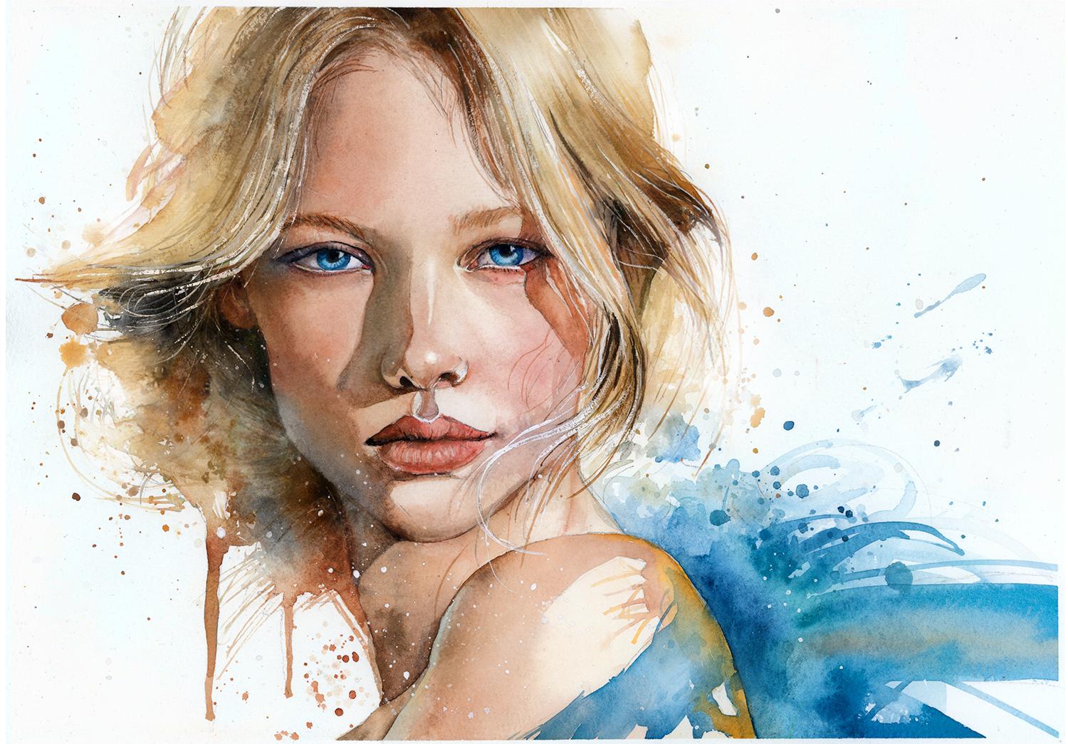
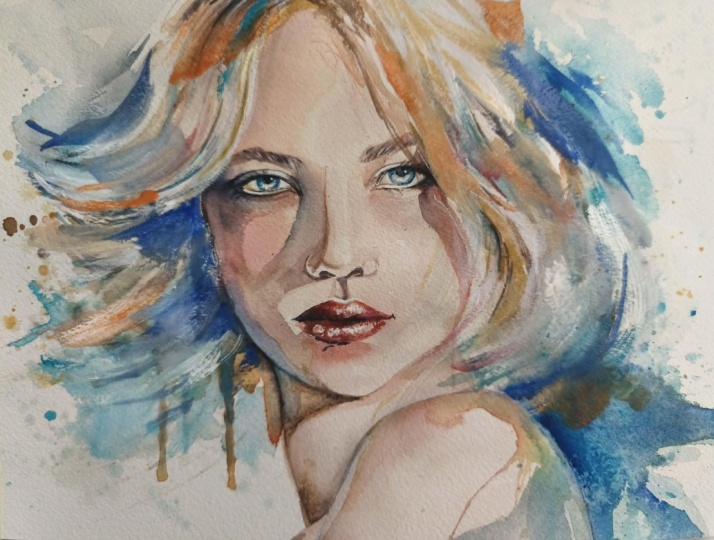
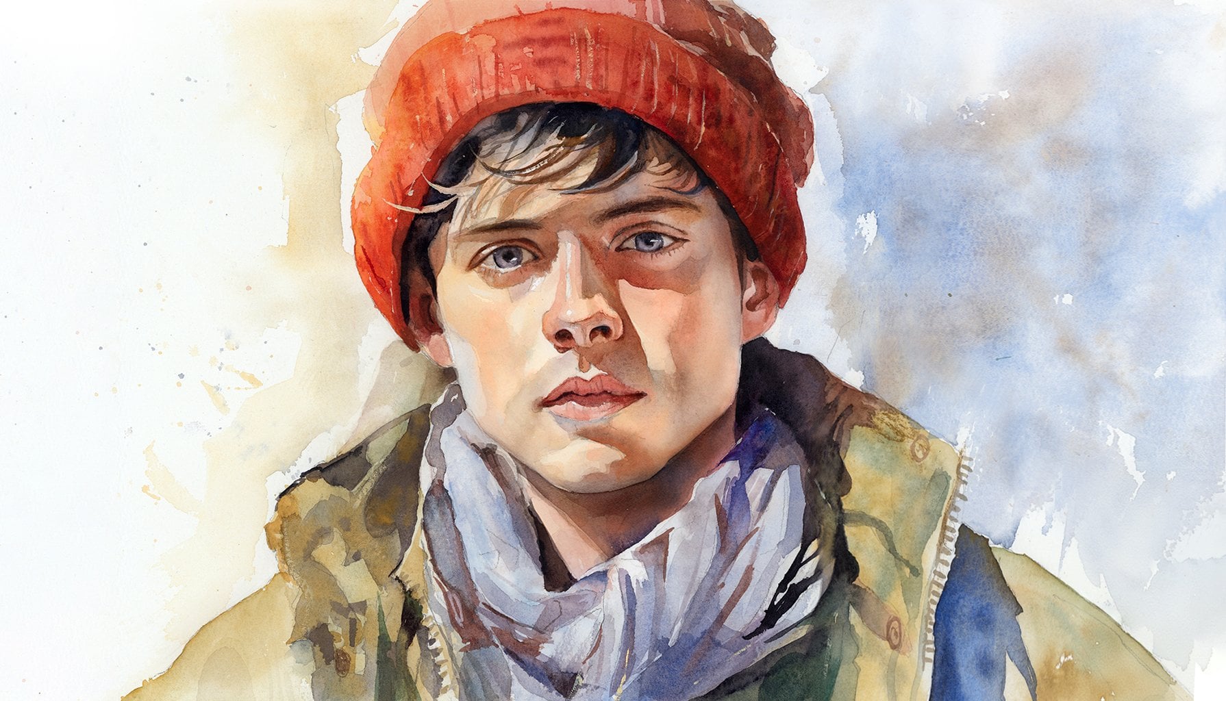
name is Will Elliston. And today, we're going to paint an expressive
portrait that combines carefully
observed details with loose abstract passages. The face and striking blue eyes provide a
clear vocal point, while the hair and surrounding space dissolve into
flowing washes, splashes, drips,
and gestural marks. We'll explore how warm ochres and earthy browns can balance cooler turquoise blues and how untouched paper creates light and freshness throughout
the composition. This class is about
knowing where to be precise and
where to let go, allowing control and spontaneity
to support one another. I've been a professional
artist for many years, exploring lots of different
subjects from wildlife and portraits to cityscapes
and countryside scenes. I've always been entranced by the possibilities
of watercolor. But when I started,
I had no idea where to begin or
how to improve. I didn't know what
supplies I needed, how to create the
effects I wanted, or which colors to mix. Now I've taken part in many
worldwide exhibitions, been featured in magazines, and been lucky enough
to win awards from well respected
organizations such as the International
Watercolor Society, the Masters of
Watercolor Alliance, Windsor and Newton, and the SAA. Watercolor can be overwhelming
for those starting out, which is why my goal is
to help you feel relaxed and enjoy this medium in
a step by step manner. Today, I'll be guiding you
through a complete painting, demonstrating a
variety of techniques, and explaining how I use all
my supplies and materials. Whether you're just starting out or already have some experience, you'll be able to
follow along at your own pace and improve
your watercolor skills. If this class is too challenging
or too easy for you, I have a variety of classes available at different
skill levels. I like to start off with a free expressive
approach with no fear of making mistakes as we create exciting textures
for the underlayer. As the painting progresses, we'll add more details to bring it to life and
make it stand out. I strive to simplify
complex subjects into easier shapes that
encourage playfulness. Throughout this class, I'll be sharing plenty of
tips and tricks. I'll show you how to turn
mistakes into opportunities, taking the stress out of
painting in order to have fun. I'll also provide you with
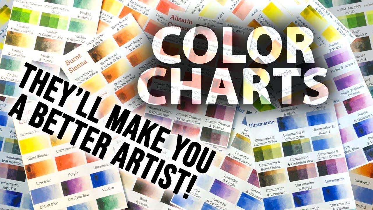
my watercolor mixing charts, which are an invaluable tool when it comes to choosing
and mixing colors. If you have any questions, you can post them in the
discussion thread down below. I'll be sure to read and
respond to everything you post. Don't forget to follow
me on Skillshare by clicking the Follow
button at the top. This means you'll be the
first to know when I launch a new class
or post giveaways. You can also follow me on Instagram at Will Elliston
to see my latest works. So, let's get
started and explore the exciting space between
portraiture and abstraction.
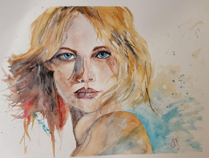
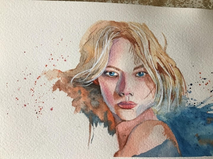
2. Your Project: Thank you so much for joining today's class. I
really appreciate it. This portrait is a
great opportunity to explore contrast in
more ways than one. Realism against abstraction,
warm color against cool, and crisp detail against
soft disappearing edges. The eyes, the central
features give the painting structure while the surrounding
shapes remain open, expressive and full of movement. Hair can become sweeping
lines and translucent washes. Clothing can dissolve
into broad color, and drips or splats can add energy without needing to
describe anything literally. The aim is not to finish
every area equally, but to create a compelling
balance between clarity, suggestion and the natural
freedom of watercolor. In the resource section, I've added a high
resolution image of my finished painting
to help guide you. You're welcome to
follow my painting exactly or experiment with
your own composition. As we're going to be focusing on the painting aspect
of watercolor, I've provided templates
you can use to help transfer or trace the
sketch before you paint. It's fine to trace when using it as a guide for
learning how to paint. It's important to
have the underdrawing correct so that you can relax and have fun learning the
watercolor medium itself. Whichever direction
you take this class, it would be great
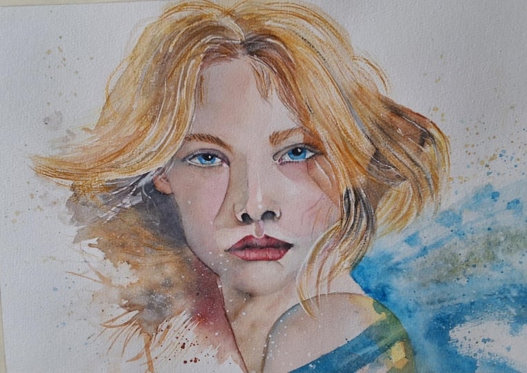
to see your results and the paintings you
create through it. I love giving my
students feedback, so please take a photo
afterwards and share it in the student project gallery under the Project
and resource tab. I'm always intrigued to
see how many students have different approaches and how they progress with each class. I'd love to hear
about your process and what you learned
along the way, or if you had any difficulties. I strongly recommend
that you take a look at each other's work in the
student project gallery. It's so inspiring to see
each other's work and extremely comforting to get the support of your
fellow students. So don't forget to like and
comment on each other's work.
3. Materials & Supplies: Before we start this port rat, let's go over all the materials and supplies you'll
need to paint along. Having the right materials can greatly impact the
outcome of your artwork. So I'll go over all the supplies I use for
this class and beyond. They're very useful to have at your disposal and we'll make it easier for you
to follow along. Let's start with the
paints themselves. And like most of the materials
we'll be using today, it's a lot to do
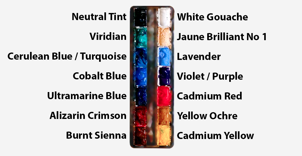
with preference. I have 12 stable colors in my palette that I
fill up from tubes. They are cadmium
yellow, yellow ochre, burnt sienna, cadmium
red, Alizarin crimson, Opramarne blue, cobalt blue,
serlean blue, lavender, purple, Vidian, black, and
at the end of the painting, I often use white gouache
for tiny highlights. I don't use any
particular brand. These colors you can
get from any brand, although I personally
use Daniel Smith, Windsor and Newton,
or Holbein paints. So let's move on to brushes. The brush I use the most is
a synthetic round brush like this scodaPurl brush or
this Van Gogh brush. They're very versatile because
not only can you use them for detailed work
with their fine tip, but as they can hold
a lot of water, they are good for
washers as well. They're also quite affordable, so I have quite a few
in different sizes. Next are the mop brushes. Mop brushes are good for
broad brush strokes, filling in large areas and creating smooth
transitions or washes. They also have a nice tip that can be used for smaller details. But for really small details, highlights or anything
that needs more precision, I use a synthetic
size zero brush. All brands have them,
and they're super cheap. Another useful brush to have is a Chinese calligraphy brush. They tend to have long bristles
and a very pointy tip. They're perfect
for adding texture or creating dynamic
lines in your paintings. You can even fan them
out like this to achieve fur or feather
textures as well. And that's it for
brushes. Onto paper. The better quality
of your paper, the easier it will be to paint. Cheap paper criinkles easily
and is very unforgiving, not allowing you to
rework mistakes. It's harder to create
appealing effects and apply useful techniques
like rubbing away pigment. Good quality paper, however, such as cotton based paper, not only allows you to rework
mistakes multiple times, but because the pigment
reacts much better on it, the chances of
mistakes are a lot lower and you'll be more likely to create
better paintings. I use archers paper because that's what's available
in my local art shop. A water spray is
absolutely essential. By using this, it
gives you more time to paint the areas you
want before it dries. It also allows you to
reactivate the paint if you want to add a smooth
line or remove some paint. I also have an old rag or t shirt which I use
to clean my brush. Cleaning off the paint
before dipping it in the water will make the
water last a lot longer. It's always useful to
have a tissue at hand whilst painting to
lift off excess paint. Also, you never know when an unwanted splash or drip might occur that needs
wiping away quickly. I also have a water dropper
to keep the paints wet. When you paint, it's
important to have them a similar consistency to what
they're like in the tubes. This way, it's easier to
pick up sufficient pigment. A hair dryer is useful
to have for speeding up the drying time and controlling the
dampness of the paper. And lastly, masking tape. And this, of course, is just to hold the paper down still onto the surface to stop it sliding
around whilst painting. Also, if you plan on
painting to the edge, we'll allow you to create a
very crisp, clean border. And that's everything
you'll need to follow along in today's
portrait class. I encourage you to
experiment with whatever colors or materials
you want to play along with. Now let's sketch out this
portrait before we paint it.
4. Preparing The Composition: Drawing a portrait
facing forward like this is actually one of the
easiest portraits we can do. It's still not necessarily easy, but out of all the
different angles, we can break it down into
familiar proportions. So I add that center line
vertical right in the middle, and then I break it
down into thirds. So the very top is obviously
the top of the forehead. The third down is the eyebrows, and then another third down
is the bottom of the nose, and then that final third
is the bottom of the chin. So that's roughly how we break
down the face into thirds. And then from the very top the forehead to the
bottom of the chin, halfway roughly halfway
is where the eyes are. And then, of course, we can use the center line for
balance and Smetricty. So I use a very soft pencil, a lead pencil to mark out roughly where these
proportions are before I go in with this finer lead pencil to add a bit of definition
to where the lines are, where I want there to be
hard lines in this painting. I don't really add pencil
lines to the soft transitions. Or if I do, I make
sure it's very light so that we don't
see that on the paper. And then I'm going to
use a rubber to rub away all these construction lines that are quite rough underneath. And I'll go back and
forth testing it to get a feeling of the likeness because it
might look right now, but if I disconnect
for 5 minutes, I'll see my errors
a bit clearer. I'm not drawing out
the abstract areas. I'll do that spontaneously
with a watercolor later. Unlike painting landscapes,
which can be quite adaptable and spontaneous
with the painting process. With a portrait,
we really have to make sure the
drawing is correct, please use my template.
5. Blue Eyes: In this portrait class, I
think I'm going to start with the eyes and there's no
real reason for this. We can start with so
many different things. I could leave the eyes
to last if I wanted to. If you've seen my other
portrait classes, you may in fact have seen that. The reason I'm starting now is because the eyes are the thing that really grab
the attention straightaway. If you're slightly uncomfortable with
the painting process, especially the ugly stage
that we'll go through, just having those eyes added
in there to begin with, at least the blue
underlayer of the eyes. We're not adding that
much detail yet. I'm using serlean blue for this. Straight out the tube actually. Just by adding these
irises in there, I find it already gives
it a grounding sensation. It gives it a bit of context. Painting a portrait when it's eyeless can just feel a bit off. It's not necessarily a problem
with the painting itself. That's why there's
so many ugly stages, what feels like an ugly
stage in a painting because there's important elements, but
we're not seeing it yet. I'm using a bit of a wet on
wet technique with this eye. In the center of it, it's quite light then
around the outside, I'm dabbing in stronger pigment, which you can see is
blending in naturally because of the wet
nature of the paper. I'm trying not to
agitate it that much, just encouraging it a bit. The reason I've gone with blue, even though the
multiple references I found didn't actually have
blue when I find references, I kind of make a
big mosaic of them, so to speak, compilation. I don't find just one
reference photo and directly, I have about five
different ones, and maybe I'm following
the lips from one, the hairstyle from the other, the eyes from another one, the general pose, the
light, the shadow. And to be honest, after
drawing so many portraits, I can kind of invent
my own elements. So the references are just
a very basic part of it. So often people want me to
share the reference that I'm following as if
I'm just following direct one reference,
but it's not the case. It's highly inventive and it's not so faithful to
one particular reference. So I finished with the
eyes for the time being, and I'm using a
large brush just to completely wet all
the skin area. So I'm leaving the hair dry
and everywhere there's skin, including around the eyes, not the eyes themselves,
but around the eyes. I'm just giving a
light layer of water. I'm going to go all
the way down the neck, the shoulders because
we're going to start to apply a very light layer, underlayer of the skin tones. Wetting the paper before, like I've said many
times in other classes, it just gives us a smooth
transition, low pressure. It lowers the stakes
for us because if we go direct onto dry paper,
it's intimidating.
6. Face Underlayer: So the classic skin tones that I use are alizarin crimson, burnt sienna and yellow ochre. So we've got a red, we've got a brown and
a yellow, basically. And then I'm using a bit of blue just for the shading
rather than using black. Using blue, I find makes portraits feel a
bit more soulful, a bit more alive than
just a bland black. And then from those colors, we kind of just turn
the dials a bit. Maybe we want a bit more red, maybe we want a bit
more burnt sienna. So starting off at the top, it's like a pinkish brown. It's very it starts off with that single kind
of warm brown color. But then we can drop other elements in to
make it a bit more exciting. I'm thinking
about the tone. It's not a flat wash, so the light is coming from
the right hand side, so that's going to mean there's shadows on the left
and it's going to be a bit lighter on
the right hand side. You can see already there slight lightness on the right hand side and
darkness on the left. I hope I got my left and
right correct just then, but you can see on the
screen basically where I'm subtly making bits
lighter and a bit darker. Also, the eyelids, I'm
basically leaving out for the time being
because I'll be going over those with
darker pigment later. I don't care too much about
the edges at the moment. One thing I will say, when
adding this first layer, I want to keep it
nice and smooth. Within the wash, there's
not many hard edges at all. The only hard edges
are the outline, the outskirts where it meets the hair or the cheek
or the eyelids. And because we pre
wet the paper before, we can get nice
soft transitions. If you find your paper
is starting to dry, you can just add a bit
more pure water like I am right now to increase it. Like I say, one of the
important things about this stage that can
get beginners or even intermediate
painters off guard is painting too
light at this stage. I know, every student has
their own particularities. Some students go too dark. But for me, I found I was always very hesitant
by applying pigments, and I think generally
a lot of students are more on the lighter side
than the heavy handed side. And you look at this
painting as it is now, and you might think
it's a bit odd. It's a bit dark. It's like she's glowing or got a bit
of sunburn, even. But I guarantee that once we've painted
the hair around it, the shadows, this might even look a bit too light once we've added the other
darks in there. So now we've added
that warmth in there, whilst it's saying wet on wet. I've added that blue
mix at the top, but that blue mixed with a brown has turned into
a gray all by itself. But on this left hand side, I do want to emphasize
a bit more of that blue call tone to
contrast with that warmth. There's a kind of
motif going on with that blue, the blue of the eye, the blue of the shadow, and
I'm going to use blue for a lot of the expressive
marks later on. I got an impulse to add a bit of bright red, Alizarin crimson. You can use opera pink too. I'm saying red as a
general statement. So you don't need to use specifically Elizarin crimson or cabium red or opera pink, whatever falls into
that family of hues. Likewise with the
brown and the yellow, maybe you want to
use cabium yellow instead of yellow ochre.
7. Neck & Shoulder: So I know I've painted it as
if the head is separate from the neck because there's
a hard line you can see from the chin, the jaw, and the neck
that I'm painting now. Also notably, the neck
is a bit browner. There's a bit more
burnt sienna in this mix than the face
that's a bit more pink. But despite that,
it doesn't matter because the face is little wet. I'm going to paint
straight over it and make a seamless transition. So when it comes to
painting yourself, remember that I'm not allowing the face to dry
before I paint the neck. I don't want any hard lines
where they're not intended. That's why I do suggest, and I think a lot of
students have found it useful following this advice is to watch the
video, the painting, the class, the whole way
through to begin with, because a lot of the things
that I'm doing, first of all, I change my mind on things as the painting goes
about and evolves, and so I might say
something that I'm doing at the moment and then completely contradict it later on because of the context
of the painting. But also, I'm setting things up now that might not make sense
until you see it later on. If you're following
along painting without watching the
whole thing first, you might be doing
something without realizing the
intention behind it. So just seeing the full thing. And I have slightly sped up the footage to try and get into that hour
and a half mark, it's it's about an
hour and a quarter of actual painting time sped up. But seeing that sped up
footage can sometimes make it easier to understand the process because
if it's very slow, it's hard to see how
the water blends. But when it's sped up,
you can see the kind of areas that I'm allowing
to blend before moving on. I hope that makes sense.
It's only slightly sped up. You will notice
the shoulder area. I allowed a bit of a hard edge
where the neck gets darker at the bottom and the shoulder
has that hard edge there. I'm using a tissue and scrolling it up into a little point and just dabbing
little highlights out.
8. Nose Highlights: So now I've completely dried
that with the hair dryer, like I just did in
the previous lesson, using the napkin or tissue to bring some of the
whiteness of the paper. On this edge of the shoulder, where it was white, I'm
adding a bit of blue there. You have to make sure it's white because if the blue goes on top of the orange skin tone, it'll just look gray, which
is not the end of the world, but I'm trying to emphasize
this blue orange contrast. Moving on to the nose here, I'm pre wetting areas
around the highlights. It looks like I'm pre wetting the whole area, but it's not. I've indicated with a pencil where I want there to
be some highlights. I painted around that and I'm now dropping in red pigment, zarin crimson pigment, cool red, not a warm red. A warm red could be more
of a yellowish orange red. This is more of a
purplish, pinkish red, and that's the purple
that I want for the nose because once you understand
anatomy a bit better, you'll recognize which
areas of the face, the facial features gather
the blood, the capillary. The nose is generally a bit more red than the
forehead and of course, the lips are usually red. So I'm bringing that wetness down to the bottom of the
nose where the nostrils is. And I'm using a
fairly small brush to blend out these edges so there's no hard edges apart from
those highlighted areas.
9. Nose Shadow: Pre wetting the left eyebrow so that when I drop
in this burnt sienna, it doesn't have a hard line. It's got a soft edge to it. This is underlayer. There's not much detail in this. This is just simplifying the shape and softening the
edge out even more really. Dropping in some muted tones on the right hand side of it. I'm finding it's too vibrant. So I'm just using a
tissue to splot it out to take away some of
that pigment while it's wet. And also taking the
vibrant away by putting a little bit of black in there or neutral
tint is what I use. Now I'm going to be
quite bold and bring this shadow down from
that wet and wet eyebrow. I was quite spontaneous
with that shadow colors. I used the clean blue
that I had in my palette and mixed it with
the brown that I had there and it looks a bit green. Maybe a bit too green, so I have to decide how to deal with that. And that's something that comes up very often in watercolor, being spontaneous and
impulsive and correcting and making decisions as you go. So I'm adding a bit of
that burnt sienna into there to cancel out some of that greenness to
neutralize it a bit. Then at that little
tip of the shadow, the tip of the nose, I
want it to be a soft edge. So I'm playing with
hard edges and soft edges because that tip actually connects itself to the shadow of the jaw line on the left hand
side of the face. So I just use a clean wet brush and paint far beyond the
border of that shadow, and it kind of
blends itself out. But on the right hand
side of the shadow, I'm adding I want to
emphasize that hard line, so I'm just dropping
in more pigment. And you can see it accentuates that hard line
on the bridge of the nose. I'm trying to connect
all these shadows, these shapes help simplify the subject and make
it more readable. And although it's a
complex thing to work out, it takes a bit of practice. The actual technical painting of it is not super advanced. We're just thinking of
abstract shapes, really. We've connected the eyebrow
with the nose shadow, and it's going to connect into the jaw shadow later on as well. When you paint a wash like this, it always starts out, of course, very wet and uncontrollable. But as it starts to dry, you get a bit more control, and it's around about that
middle area where it's damp, not heavily wet or almost dry, where you can really play with it the most and
get the most control. When it's super wet, it's unpredictable, and
when it's almost dry, it's very delicate and it
doesn't want much interference. So around that 60 to 40%
10. Left Shadows: So I've dried that area now, or I've allowed it to dry. I didn't use the hair dryer. I can just move on
to the next area without having to interfere
with it for the time being. Like I said, there's
so many ways or the procedure can be
taken anyway you want. I didn't necessarily have to paint this nose shadow first. Maybe I could have started with this left hand shadow on
the eye to begin with. I start off with a
strong muted tone. It can be a muted blue, any muted color, muted purple. I'm sticking with
that brown blue pairing with this
particular portrait. Then adding that brown, which gets a bit more diluted
as we go down the page. Defining that shadow
of the bottom eyelid. I refer to my pencil
line or the shadow to figure out where I want
this shadow line to go. I want it obviously
to connect from the eye area, curve down, connect to that nose shadow, and then eventually get
down to this lip area. But I want it to be
a wet on wet line. I don't want to be hard like the nose shadow because the
nose shadow is a cast shadow, so it's got a very hard edge. But the shadow of the jaw and the cheek is curving
against light, so it's naturally
going to be softer. And we can use that
to our advantage and accentuates the contrast between hard lines
and soft lines, which is always a beautiful
thing to do with watercolor. There is a way we
could have painted it all with hard lines, but it would look too sharp, and there's a way we
could have painted it with all soft lines, and it would completely
change the mood. So that's something you can play with as you get a
bit more advanced.
11. Left Eye: But if you're purely
following along, you can experiment
at your own pace. That's the beauty of Skillshare. You can follow along
with any teacher's class and take what you want out
of their lessons and adapt them to other teachers and then experiment with
what you personally want to change to it when
you feel comfortable. If you don't feel
comfortable experimenting, you can just follow as directly and as similar as possible. All the features on the face, I try to simplify into
easy reading shapes. I've studied basic anasomy but not enough to
remember all the names. So that little curvy bit
at the top of the lip, I'm not sure what the name is. I'd probably recognize
it if I saw it, but all I understand from it is the general almost
hourglass shape shadow it gives connecting
the nose to the lip. And you draw out 100 times and you don't
need to learn the name. You just recognize
how that shape can vary between
different people, what's similar about it, what's different about it under different lighting conditions. And eventually, you can invent or paint these things almost
from your imagination. You can use a reference as a subtle guide So moving
back to the eyes now, the left eye first. And the whites of the eye
are never actually white, especially when the lighting conditions give it
a bit of shadow. The eyes are really the
stars of this portrait, things that really draw
the attention in to get that glistening wetness feeling of an eye, that glossy texture. I want to include a few
highlights there, the pure white, and to really make that pop, I need to add, of course, the pure black pupil. So in this particular painting, I'm purposely painting
around the little highlight. So the little highlight that
you see is just the white of the paper on the right
hand side of the pupil. But if you've already got
enough on your plate, trying to work it out,
that's perfectly fine. Just paint the whole pupil
black, focus on the iris, and then later on
after it's dried, you could just add
a small dot of white gosh to restore
that highlight. That's what I do
many times, too. So you could see before when we added that shading to
the white of the eye, it looked a bit
strong, because we're adding pure black or
it's not actually black. It's very intensely
concentrated, burnt sienna. It
looks right black. We could also mix ultramarine in there to make it dark, too. If you look at my palette, the bottom three
colors on the left, that's ultramarine blue, Elysian crimson
and burnt sienna. And when they're concentrated, they're almost as dark as
the black up at the top. Especially when you mix the burnt sienna with
the ultramarine blue, they neutralize each other, mute themselves out to
basically make a very, very dark gray, almost
absolute black.
12. Lips Underlayer: So that eye is pretty much done. I don't need to try and finish it off completely
before moving on because I want to make sure
everything's well balanced. I'm going to start painting the other elements to get them all in line together because
if I over define one area, then it'll look a bit too overdone compared
to the other area. I just do it to approximate finish and if I feel like doing it up later, maybe I will. But most of the time, it's just a feeling that
it feels like enough. So now that we've
painted that eye and we've used the darkest
darks we all use the iris. In portraits, I always
try to make the iris Oh, no, the pupil, sorry. The pupil of the eye, the darkest part of
the whole painting. Because that's where
the most contrast is with the iris and where
the attention goes. But anyway, what I was saying is now that we've established the darkest
part of our painting, we can use that to reference
the whole tonal scale. So I'm going to use that dark shadow for
the nostrils, too, like I just did there and any
other area of dark shading. And, of course, we
know the highlights. We know the lightest area,
the whites of the eye, the little dots of highlights
on the nose as well. Now, when painting these lips, I made sure all the area
around it was dry because we want the lips to basically be a clean cut out silhouette
for this underlayer. And then later on, we can soften some edges consciously
by choice if we need to. Of course, we don't want the
lip to look just stuck on. We want it to feel
three D and connected, but when adding this underlayer, we need to make sure the
whole area is dry around it, and now you can
see I'm softening the corner there because there's typically a
little not dimples, but the corner of the lips create a kind of shadow
that softly blends out. And that's what
connects it to the face and visually gives it
depth and freiness. So I'm messing around a bit with that
corner on the right, free wetting the paper, and then dropping in some pigment
to blend it out. And whilst it's about 70% dry, actually more like 60% now, I'm dropping in some
thicker brownish red. It's not pure zi and cryb
and there's a bit of brown in there to
create some texture.
13. Lip Shadows: So now I've given that
time to dry a bit. The underlayer of the lips, created a bit of texture
so it's not flat. I've added a bit of
drops where I can see there's a bit of
darkness, a bit of lightness. I don't want them to look like completely clean perfect lips. I want there to be imperfections
to make it seem real. Give it a bit of life. And then adding the form to it, the Fred is a fairly
simple process. We start off with thick pigment right in the middle
obviously in between, and we've got to think about
how light and shadow works. So if light's coming
down from the top right across the top lip
blocking the light. On the left hand
side in the middle, then that's where the
shadow is going to be. And then on the bottom lip, it kind of curves outward. So there's not much shadow on the bottom lip at all because
it faces towards the light. And that's typical
with most lips because most portraits,
light comes from above. So when looking at references, you'll see that the top lip
is usually much darker. And again, once you paint
so many portraits or even sketch them or
just observe them, you start noticing
these patterns. Then I even though I'm not
going to paint it right now because I want to I
want the lips to dry first, I consider the shadow
area under the lips, where it connects the
chin part of the lips. So I'm painting a little bit of it now just to remind myself. Because the lips cause that shadow that curves
around the chin, and in most of my portraits,
I accentuate that. I try and use that even
if I don't see it in my references because it just helps makes sense of
the image a bit more. It helps make sense for
me when working it out, and it helps the viewer
makes sense when they watch it or they're
observing the painting. I'm allowing a little
gap because I think it might be still a bit
wet the lip there. It is. You can see
how it connected and blended there. That's okay. Maybe we can create
a soft transition. So at the moment, the
pigment is quite strong, but I'm going to use pure water to agitate it and spread it out and connect and further
extend that shadow. So in an interesting
kind of way, if you look at the shadows
we've painted so far, even though they're distinctly
different features, they're all connected. Even if we painted it
in different times, we painted the nose shadow quite a few minutes
ago, first thing. But because we blended them
out and connected them, they're all part of the same
facial package. So to speak. They're not overlapped
with hard lines. And this is something that
you can take forward into so many different subjects,
landscapes, still life, that ability to blend out washes to connect them
with other ones later on.
14. Neck Shadows: And whilst adding that shadow around the chin and the lips, you can see how that
brown is contrasting quite nicely with that blue
on the jaw line on the left. So that's kind of
color I'm going to go down here on the neckline. Still a bit wet,
so you can see how when I'm touching it
there, it's blending out. But I don't mind, actually. I want to keep some edges
elusive, dropping in some blue. Again, to create that
nice contrast with the brown This is one of those areas where you could quite
easily define where the jaw connects with the neck or rather separates
itself from the neck. I'm choosing to keep
that bit a bit more elusive because it's not
the center focal point. It's quite a insignificant
area of the portrait, and I'm more intrigued with
connecting the shadows. There's nothing wrong if you
choose to define that line. In fact, some people may
think it's a bit strange having a kind of weird
shaped shadow there with not knowing exactly where the jaw line connects
to the chin. But we're using guiding lines, so to speak, or implied lines. We might not be drawing
the actual jaw line, but we're kind of implying where it goes by allowing the viewer to connect
the dots themselves. And then of course,
I've added that deep dark brown where the
hair will be behind. She's a blonde lady, but the shadow areas
will be brown. On the earth side, we can
define that jaw line. I have actually added a bit of a wet and wet line
on both sides. Adding a little bit more pink just under the chin area there. Because even on the light side, there'll be a bit of shadow
underneath the chin area. Especially if there's
hair and basically painting the shadows of the
hair that we yet to paint. I don't like to keep my
shadows purely cool. I'm mixing warmth and
cool within them. Now I'm going to apply a thin wash going all over the left hand
side of the neck. I know I already painted that
little section at the top, and it's got a hard line there, but I don't think
it matters at all. I can paint over
it, and that line will pretty much stay there. I'm basically adding
a glaze to it. A glaze is just a kind
of subtle area of tone, just to help layer the piece. It's an extra layer. It's not something we could
have done in one go to have that hard edge at the top and this transitional shadow
coming from the bottom. Yet again, it's one
of those examples where I could have
easily painted this bottom wash
shadow first and then gone back with that
hard shadow at the top. It's very adaptable once you know the rules of watercolor. And also quite unpredictable, and that's part of the
excitement with it. I, for example, weren't
to know whether that hard line below the chin would disappear
if I reactivate it or not. Turns out, it's
quite high staining. So that means the pigment
stains the paper.
15. Right Eyebrow: Now it's time to move on to the right hand side
of the portrait, the right hand side features, starting with the eyebrow, I'm doing it a
slightly different way to where we did the
left hand side one. If you remember, on
the left hand side, we used this kind of wet on
wet technique to begin with. Whereas on this side, I'm
kind of blocking it out straightaway on dry paper and then just softening
the bottom half of it. And then following
a similar kind of procedure as we
did on the left. So when it comes to a
feature like the eye, which, of course, has a lot of intricate little
lines in details, probably more so than any
other element of a portrait, I have to really break it down, and that's useful
for you to see, of course, the only way I know how to do it too by
breaking it down. So I look at the general washes to apply.
That's what I've done now. And then as it starts to dry, I drop in tones to create the general
soft changes of tones. That's what I'm doing
underneath as well. You can see it's the larger
shapes I'm starting with. Then we can go back and paint
the folds of the eyelids and the different
lines they look like. Of course, actually, they're
just defined shadows. We've got some areas of skin that are facing
towards the light. For example, that light strip, you can see on the
left hand side. That's what I want
to try and define also on the right
hand side right now. The light curves up
from the bottom and then there's a little
light strip where suddenly there's a change in the
plane of the eyelid and the hard edge is
facing towards the light, so it's reflecting that light.
16. Right Eye: I've already painted
the little ear duct in that little
corner of the eye. But then we've got to
soften out, of course, the whites of the eye because
they're not pure white, much like we did on the left, you can see this time, the darkness is coming
from the eye duct side rather than, of course, the outside corner because
the nature of the light, it's not a pure mirror. It's not pure symmetrical. The light is different, of course, from a
different side. Then the top eyelid, I think of it quite
in an abstract way. I think of it as a kind
of stretched out sausage that has a dark line on
the bottom and the top. You can see on the left,
it looks a bit like that or a worm. Of course, it's just a fold. But I'm trying to
simplify it into just smooth gradients
and hard lines. Painting out the pupil, like
we did on the other side, and I'm looking at the pupil
on the left to try and match it so that the
pupil is in level. At the moment, it
doesn't feel level. On the right hand side,
it looks a bit too high. But we can come back
to that in a bit. At the moment, I'm painting that sausage kind of worm
like eyelid at the top. So by that, I mean, it looks a bit three D, so it's darker on the sides, and then in the middle,
it's a bit lighter. And of course, the eyelashes. I don't really spend a lot of time painting
the eyelashes, only on the corners where they curve outwards and
they're concentrated. But the middle eyelashes, I only slightly indicate them, sometimes not even bothering because they can be
easily overly done. And like I always do, I'm connecting that shadow
from the eyelid all the way down and it helps
define the curve of the cheek. Without that shadow, there
won't be that sense of free D. So emphasizing these shadows, even if they don't
actually exist, just understanding
how the curvature of anatomy generally goes makes
it a bit more believable. And of course, this
is the shadow from the hair we'll be
painting later on. So we don't have to make
it that loyal or accurate. We don't have to feel
like a slave to it. I don't have to think
that I need to now paint a strand of hair that
matches this shadow. It's too subtle for that. So we can kind of invent
our own hair later on. Notice how inside most
of these shadows, when there's a shadow area, I keep it wet on wet inside. I rarely have hard
lines inside a shadow. It's almost like
the shadow areas force everything to melt. And then everything outside the shadow is quite hard edged. That's what I try and think of in my mind
when I'm painting. If it's a shadow, it's blending and melting and moving and the watercolor
is doing its magic. Everything outside of a
shadow is usually much sharper naturally
because the light is causing sharper shadows. More details are seen. It's less elusive. Even the details seen in these eyelids, it seems like the
most intricate part, but they're actually
very abstract. They're just curved lines
compressed together. They're not that
accurate actually. They just seem to
visually make sense.
17. Painting The Shoulder: Notice how the nostrils
aren't exactly symmetrical again because the lighting conditions are
different on each side, so it affects the way they look. So they might feel wrong
when you're painting them, but if you end result because we're looking
at the portrait as a whole, it still feels quite cohesive. Now painting this shoulder area. I've added a drop
of brown at the top and transitioning it
out into the rest. However, I want this
blue reflection. I think it's a blue reflection. I'm imagining how
light can catch. It's almost like a highlight
on the tip of the shoulder. There's some secondary
blue light source. I'm imagining on the left, adding that blue glow. I don't know whether you
can say a blue glow. I guess you can because glow
you assume with warmth, but cool colors don't
necessarily glow, but that's what I'm imagining. Instead of adding a warm glow, I'm adding this cool
glow to give you a kind of bizarre kind of feel a unique kind of feeling that kind of is
not necessarily unsettling, but it's kind of abstract. But through my eyes, it somehow makes sense. I'm again, trying to combine hard edges
with soft edges here. So we've got the soft edges
on the left, as you can see, and then on this
right hand side, I'm playing around with some
abstract shadow marks here. And I'll later incorporate this section into
the abstract kind of element that we're
going to infuse. So everything so
far has been quite controlled or at least
representational. We're trying to convey a clear face with
understandable features. But now we're kind of
getting to abstract area where lines don't necessarily
follow the laws of physics. We're just purely painting for experimentation,
feeling, expression. A
18. Abstract Underlayer: Now I'm using the
tip of my brush. I'm not using a small
brush, as you can see, but these brushes
have very fine tips, and I'm just painting a few
wispy shadows from the hairs. I'm doing this even before we
paint the hair themselves. These subtle little touches that aren't technically
difficult to do, but they ground it and
add quite a bit of realism to it because we've got so many big
broad washes going on, and this is the polar
opposite to big broad washes. We're using long thin lines another idea of contrast
because we often think of contrast in
its most simplest form of dark versus light. We think of contrast
in terms of tone, but there's so many
different ways we can think of contrast, thin brush strokes, contrasting
with large big washes, cool colors like this blue contrasting with whole
warmth of her face. So some of this area is
wet and some of it's dry. And that's what creates this
unpredictable mark making. We're venturing into
the unknown here. I'm being very impulsive. I'm not knowing where
it's going to go exactly. I've got a few pencil lines to work out where I want
the visual weight to be. I know that on the right hand
side, in the background, I want there to be
a big blue splash that connects with
this blueness here, and then the hair on the left will be very abstract but using
the blond hair color, the yellow ochre color. So big wet splats here. To get good splats,
you really have to obviously overload the brush. If your brush isn't fully
saturated with water, you really have to
flick hard and that becomes quite difficult
to control your splats. They go where you
don't want them to go. So really scoop up as much water so that they're already dripping off the
brush before you splat. The brushes that I'm using now are synthetic and actually, they're not ideal for splats. If you really want to
get the best splats, use a very soft brush where the hairs are very flexible and inclined to just
flick off the water. This brush, you
can see, it's got a bit more resistance and
it's not ideal actually. But I'm taking the risk anyway. I have a tissue in my other
hand off camera, obviously, ready to pick up any splashes where I
don't want them to go. Starting with that
burn, not burnt sienna, starting with the serlean blue, and then combining
this yellow ochre, which will transition
into the hair above. Dropping some of the pigment so that there's a kind of organic natural
transition going on. This is, of course,
just the underlayer.
19. Abstract Hair: So we've started to play
around with abstract marks. It's quite light to begin with. I'll definitely go over it again later with a much bolder mark, but I'm just setting
the mood to begin with. I want you to counterbalance that abstract side with
this abstract side here. I start off with splats, but then manually kind
of drop in and make my own dots where I think they'll look
aesthetically pleasing. I always find splats help
with that illusion of death because it's almost like they are
particles in the air, and these particles
are the same size, but they look smaller because they're either closer
to you or further away. Of course, I'd have no clue what particles these
could ever be in reality. So it's completely imagination. They don't actually exist. Purely for expressive purposes. You don't have to
add splats either. Some people prefer not to. Oh it's a strange element to watercolor because splats when I first started painting, I always associated
it almost with children's paintings like
messy for the sake of it. But actually, when it
actually came down to applying splats in my
own artworks consciously, I realize how difficult it is
to actually get them right. And sometimes even now, I feel like I don't fully have control of where they
go or how they look. And it took a lot of time actually experimenting
on blank sheets of paper, cheap paper, just to figure out how to get the splats the
exact size that I want and how to aim them
properly and get the consistency of the
paint right with them. And this brush that I'm using right now is going to change to a
different brush now. The hairs on them are
very light and flexible, and that's one of the main
things to improve on splats. So now we've started the hair Osle and I'm using
a yellow ochre, but yellow ochre by itself
looks a bit too artificial. So a few drops of burnt sienna in there can
give it a bit more interest, get a bit more dynamic. But also adding now a little bit of
neutral tint or black. Actually makes it a bit more realistic because, of course, when we think of blonde hair and what color we
instantly go to, of course, it's yellow
ochre or cadmium yellow. But in reality, when you actually look at the
real color of the hair, natural blondes not pure yellow. It's actually quite ash like. I'm adding these muted tones in there to give it
a bit more realism. Down at the bottom, I'm being quite bold with
the burnt sienna. And then applying the serlem
blue into that brown to again get more elements of that blue distributed
around the portrait. Being very bold with
this black now. I'm thinking in terms of big
shapes, even with the hair. Of course, hair is made up with thousands of
different strands of hair, but you still have to break it down into big
shapes to begin with, and then break it down as you get deeper
and deeper into it. It looks very bold
to begin with, but this black, once it's dried, it'll lighten up significantly. I don't want to use blue for the main shadow areas
because that will make it green obviously with
the yellow ochre. Oh
20. Hair Washes: But blue is perfectly fine to
mix with the burnt sienna. It's just the yellow oka
areas that I'm trying to avoid that kind
of green outcome. Now, I've changed over to
this weird sword brush, I think it's called or
rigor brush that I found, which has a very fine tip, and this is where we can add a few of those tiny
little strands, and it creates the
whole illusion that all the hair is strands. Just a few little
edges that come out. These sharp little
lines tricks the eye into thinking the
whole thing comes from that when of
course, it's not. H. I could, of course, use the tip of my other brush, but this particular
brush allows me to be a bit more expressive because even if I apply
a lot of pressure, it's still a very fine tip. With the other brushes, the
regular brush that I use, although it has the ability
for a very fine tip, you have to apply light
pressure to achieve that. With this one, the brush bends with pressure and it
still achieves a sharp tip. The only issue with
this brush is it runs out of water very quick
because it's very thin. O. On the right hand side, I obviously decided to start with the thin
strands to begin with. But I know that I'm
going to go back in with bold washes afterwards
to connect them. That's why I'm not using
this brush in the main area. Now I can go back and use
that similar blond color, that kind of muted yellow ochre. I'm allowing some whites of
the paper as well to remain. Although it is nice to keep the white of
the paper when you can, it can be difficult to do it in a nice natural organic way
without it looking forced. So if I happen to overpaint and get rid of more white
than I ideally like, I know I have my white
gouache to come back at the end with full control as
to where it can go later. You can see on the left
above the eyebrow, the hair area, I've reserved some white of
the paper there too. But even then that looks a bit too it looks real and organic, but it looks a bit too thick
for it to be a highlight. I might have to mess around with that a bit later. Or maybe not. Maybe once I disconnect
from the painting, I can accept it for what it is, and it turns out because it is more organic, more natural, it captures that essence
better than if I were to force it into more realism and happen to lose its
spirit in the way. Although whilst painting it, I feel there's a mistake there. I learned to accept the
process a bit more, allow watercolor
to do its thing, disconnect from it
for a while and come back with fresh
eyes and usually, I'm glad I did do that
and not overwork it. Because even for
advanced painters, it's easy to trick yourself
with these things. On this right hand side, it's going to be
less bold because there's less shadows as where
the lights coming from. But I still want
to be broad with my brush marks just not
as dark or contrasted.
21. Adjusting The Tones: Now that this wash on the left hand side
is about 80% dry, I'm dropping pure water in
there to agitate it and create fun little spontaneous textures that I wouldn't be able to
do consciously or manually. It's something I have to
rely on watercolor to do for me. That's part of the fun. I don't exactly know
how it's going to go, but hopefully it'll create that classic ethereal
look of watercolor that creates the feeling
like it was meant to be even though I had no
control in actually doing it, just purely manipulating it or hoping for the best really. I have an idea about
how I want it to be, and I also have some kind of knowledge or
idea about how to achieve it, but at the same time, watercolor can be
unpredictable and deceiving. There's been so many
times when I thought, I've really got the grip
of this watercolor thing, and I think I know
exactly what I'm doing. And then for some reason, it just doesn't end up that way. And then there's
times when I try something overly ambitious
and I reach a point where I'm stumped
and I just don't know what I meant to do
or how to go forward, but I just take the
leap and go with it, and then somehow watercolor does it for me and figures out a way beyond my
conscious control and surprises me in a good way. So that's really what I
love about watercolor, how each painting
has its almost soul. Has its own way of
interacting with you. Or at least that's what I tell myself to make it
more interesting, to make the journey
more exciting.
22. Some Dry Brush Marks: Now I'm going to add a bit
more shadows to the hair. I've got rid of that rigor brush and go back to my regular brush. Trying to figure out a
general pattern to the hair, where the curves can clump together where there's little
shadows hidden beneath. I'm not going to paint the ear on this side because
it's going to be covered by hair conveniently. I can spend more time
painting a section like this, trying to make it
look right than some of the detailed
areas like the eyes, only to realize it looks
too forced and then scrub it out or paint over it in
a broad way afterwards. I find these little areas the most challenging part
of a portrait, actually. The eyes, I can break
down because I've practiced it so many times
on different subjects. I kind of understand the kind of general pattern of eyes
and how to break it down. But the hair in its
weird kind of pattern, it's difficult to break down into a believable form
that's not too distracting, not too abstract, but
not too detailed. Now, I'm trying to use some
dry brush marks because dry brush marks add
a bit more texture and they can imply more detail. Because at the
moment, the main body of the hair is quite
a simple wash. So adding a few dry brush marks can give the appearance
of more textured hair, especially when we need to imply a bit more shadow and
depth and volume. It's important to add
this shadow section here where the top of the forehead meets the hair because there's a big
fold of hair coming down, leaving a strong
shadow underneath, giving that feeling of depth. It's shadows that give depth and three
dimensionality to it, that illusion of free D. So I try to accentuate where
I can see those shadows. Because the skin totins
themselves are quite flat. That first wash we went over the whole of the face and the
shoulders with a flat wash. So it's really the shadows
that define the whole thing.
23. Playful Abstracts: Now it's time to
be playful again, and I'm using a
hard line to begin with to kind of map out
where that shoulder ends. That's what I'm going
for at the moment. I might play around
with that edge later. We already did that light
expressive area to begin with. Now I'm going to
be a bit bolder. And it can feel a bit
weird doing this. We've spent all this time
so far defining the face, the hair, making everything kind of organized and detailed. And now we might risk it with a few abstract marks at the end. So a lot of these abstract
marks that I'm doing come from practice as well on blank sleets of paper
where the stakes are low. Cheap pieces of
paper that is not even watercolor
paper, office paper. Just to mess around with
brush strokes, mark making, trying to find an
aesthetic way to use your brushes in a way
that isn't representational, if that makes sense,
you're not trying to convey an actual subject. You're trying to create
something visually exciting just using marks,
shapes, directions, and once you know
how to do that, then it actually helps
you when you paint the detailed things,
you have more control. So I am being spontaneous and I'm not really knowing where I'm
going as I'm doing it. It's more of a feeling, but it's a kind of learnt
practice with a feeling. So I definitely feel the pressure to get these
abstract marks right. But at the same time, they're not the center of
attention either. So we can always fall back and relax a bit with
that idea, too. These abstract marks aren't
meant to be super loud. They're meant to
compliment what's going on in the eyes, the
nose, the mouth. Because the human eye is automatically drawn to
things we understand, and you look at
the clouds and we can imagine faces
in them anyway, we can detect faces very well. So that's what our eyes
are naturally drawn to. These abstract marks
as loud as they are, kind of almost
obnoxious as they are, they don't steal
the attention away from those blue eyes
staring at you. Of course, the blueness and
the eyes unnaturally blue. They're purposely accentuated
like my snow leopard class. There's a lot of abstract marks
in my snow leopard class, but it's the eyes
that kind of ground everything and make sense
of the whole piece. For the ear, I'm basically muting it down all
the way in shadow, just adding a little light tone where the curve of the
inside of the ear would be. But I might even
make that darker. This ear is one of the areas where I don't want any
observer to look at. I don't want it to call
for any attention, but I have to paint it
because it's there, so it's keeping it as quiet
and subtle as possible.
24. Restoring Highlights: Now I've dried the
whole painting, and I'm going back
with some highlights. In the hair to
really make it pop. Because like I said before, although in an ideal world, it'd be nice to preserve the light of the paper
as we're painting it, you just can't
realistically achieve exciting expressive marks whilst also preserving very defined
highlights like this. So I don't consider it
cheating at all to use some light opaic paint like this white or even
you can see in my palette, it's called Quam E two, I think. You can check the
resource section to see which colors that
I've got and which I use these highlights just emphasize that direction of the hair ground
some of the chaos. I'm not going
absolutely crazy with them. A bit of texture there. Dry brush marks. And I now know that I'm about
99% done with a painting. And if I were to actually
finish it right now, not many people would notice
that much difference. So I'm in that territory
where I need to think, what is actually essential? I know there's no big elements. There's no big shadow on the cheek that
I need to correct. So I'm coming to an
area where I think I might disconnect it for
a couple of hours and come back with fresh eyes
because there could well be a shadow on the forehead
that I think needs refining, but I'm so used to looking
at this painting for the last hour and
a half or 2 hours that I can't see objectively
what is essential. So it's a wise idea to
disconnect for a while. Because all these strands
that I'm painting now aren't actually
that necessary. It's more I'm just kind of satisfying my curiosity rather than what's actually essential. There's a feeling to
try and get everything perfect and it's not
so black and white. You transition into this area. I start doing some things that I might regret like splatting pure white and then having to use a tissue to blotch
it out afterwards. Although some of
these white spots are quite nice in the hair area, as long as they don't
land on the face. And as long as
they're very subtle. So I'll disconnect
for it for maybe a day or maybe just
a couple of hours or even after a cup
of tea and then come back to see how it looks.
But that's pretty much done.
25. Final Thoughts: Welcome back and
congratulations on completing this watercolor class of combining portraiture
with abstraction. We looked at how realism
can be concentrated around the most important
features while surrounding areas remain
loose, open, and suggestive. Strong eyes, carefully
placed shadows, and a few clear facial edges
gave the portrait identity, while strains, drips, sweeping brushwork
and untouched paper can add movement and atmosphere. Contrast between warm
natural tones and cool turquoise also helped connect the figure with
the abstract design. Remember, watercolor painting is not just about technical skills, but also about expressing your creativity and
personal style. I encourage you to
continue exploring, experimenting and pushing
your boundaries to create your own unique
watercolor masterpieces. As we come to the
end of this class, I hope you feel
more confident and comfortable with your
watercolor painting abilities. Practice is key when it comes
to improving your skills, so keep on painting
and experimenting. I want to express my gratitude for each and every one of you. Your passion for
watercolor painting is so inspiring and I'm honored
to be your teacher. If you would like feedback on your painting, I'd
love to give it. So please share your painting in the student projects
gallery down below, and I'll be sure to respond. If you prefer, you can
share it on Instagram, tagging me at Will Elliston, as I would love to see it. Skillshare also loves
seeing my students work, so tag them as well
at Skillshare. After putting so
much effort into it, why not share your creation? If you have any questions
or comments about today's class or want any specific advice
related to watercolor, please reach out to me in
the discussion section. You can also let me know about any subject wildlife or scene you'd like me
to do a class on. If you found this class useful, I'd really appreciate
getting your feedback on it. Reading your reviews
fills my heart with joy and helps me create the best
experience for my students. Lastly, please click
the follow button Utop so you can follow
me on Skillshare. This means that you'll be
the first to know when I launch a new class
or post giveaways. I hope this class encourages you to be more selective with detail and more adventurous
with expression. I look forward to
seeing you all in future classes until then, bye for now and Happy painting.
 Will Elliston, Award-Winning Watercolour Artist