Transcripts
1. Welcome To The Class!: Hello, everyone. My
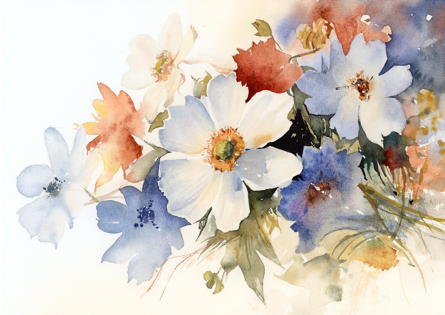
name is Will Elliston. And today, we're painting a floral arrangement that moves between softness
and strength. Rather than treating
every flower equally, we'll be creating a
gentle visual rhythm, allowing some blooms to emerge clearly while others
remain almost ghost like. The pale petals,
blue shadow shapes, earthy greens and
touches of warm orange create a restrained yet
expressive palette. We'll also explore how
overlapping forms and uneven areas of detail can lead the eye naturally
through the composition. This is less about coping
individual flowers and more about organizing
light, color, and movement. I've been a professional
artist for many years, exploring lots of different
subjects from wildlife and portraits to cityscapes
and countryside scenes. I've always been entranced by the possibilities
of watercolor. But when I started,
I had no idea where to begin or
how to improve. I didn't know what
supplies I needed, how to create the
effects I wanted, or which colors to mix. Now I've taken part in many
worldwide exhibitions, been featured in magazines, and been lucky enough
to win awards from well respected
organizations such as the International
watercolor Society, the Masters of
watercolor Alliance, Windsor and Newton, and the SAA. Watercolor can be overwhelming
for those starting out, which is why my goal
is to help you feel relaxed and enjoy this medium
in a step by step manner. Today, I'll be guiding you
through a complete painting, demonstrating a variety
of techniques and explaining how I use all
my supplies and materials. Whether you're just starting out or already have some experience, you'll be able to
follow along at your own pace and improve
your watercolor skills. If this class is too challenging
or too easy for you, I have a variety of classes available at different
skill levels. I like to start off with a free expressive
approach with no fear of making mistakes as we create exciting textures
for the underlayer. As the painting progresses, we'll add more details to bring it to life and
make it stand out. I strive to simplify
complex subjects into easier shapes that
encourage playfulness. Throughout this class, I'll be sharing plenty
of tips and tricks. I'll show you how to turn
mistakes into opportunities, taking the stress out of
painting in order to have fun. I'll also provide you with
my watercolor mixing charts, which are an invaluable tool when it comes to choosing
and mixing colors. If you have any questions, you can post them in the
discussion thread down below. I'll be sure to read and
respond to everything you post. Don't forget to follow
me on Skillshare by clicking the Follow
button at the top. This means you'll be the
first to know when I launch a new class
or post giveaways. You can also follow me on Instagram at Will Elliston
to see my latest works. So let's get started and paint a floral painting that
feels spontaneous, playful, and full of life.
2. Your Project: Thank you so much for
joining this class today. I really appreciate
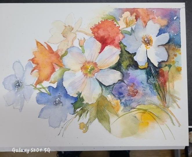
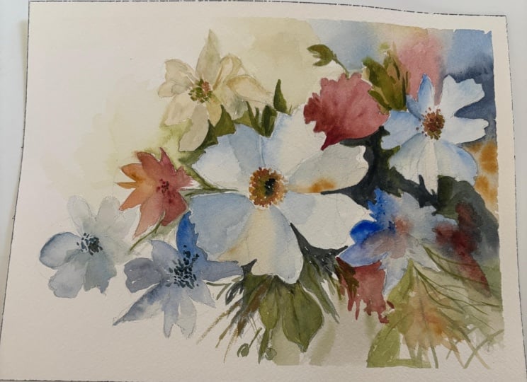
you being here. This floral study is
all about soft color, thoughtful placement,
and selective detail and seeing how they
can work together. With a balance of positive
shapes and negative shapes, the large central flower
provides a clear focal point, while the surrounding
blooms overlap, fade and merge into
the background. Cool blues are bounced
by touches of peach, rust, and golden yellow. We have a few quiet olive greens holding
everything together. White paper plays
an important role, giving light between petals and giving the composition
room to breathe. In the resource section, I've added a high
resolution image of my finished painting
to help guide you. You're welcome to
follow my painting exactly or experiment with
your own composition. As we're going to be focusing on the painting
aspect of watercolor, I've provided templates
you can use to help transfer or trace the
sketch before you paint. It's fine to trace when using it as a guide for
learning how to paint. It's important to
have the underdrawing correct so that you can relax and have fun learning the
watercolor medium itself. Whichever direction
you take this class, it would be great
to see your results and the paintings you
create through it. I love giving my
students feedback, so please take a photo
afterwards and share it in the student project gallery under the Project
and resource tab. I'm always intrigued to
see how many students have different approaches and how they progress with each class. I'd love to hear
about your process and what you learned
along the way, or if you had any difficulties. I strongly recommend
that you take a look at each other's work in the
student project gallery. It's so inspiring to see
each other's work and extremely comforting to get the support of your
fellow students. So don't forget to like and
comment on each other's work.
3. Materials & Supplies: Before we get started
with this painting, let's go over all
the materials and supplies you'll need to follow
along in today's class. Having the right materials can greatly impact the
outcome of your artwork. So I'll go over all the supplies I use for
this class and beyond. They're very useful to have at your disposal and will make it easier for you
to follow along. Let's start with the
paints themselves. And like most of the materials
we'll be using today, it's a lot to do
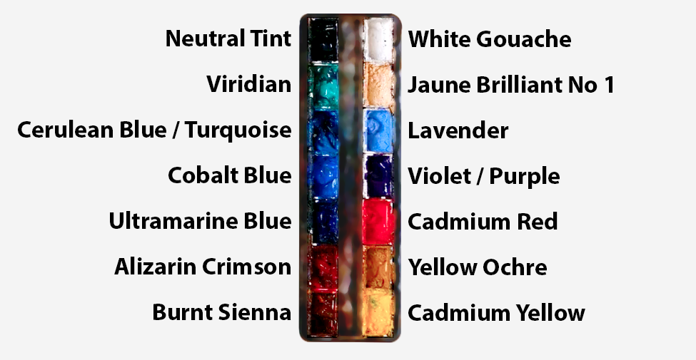
with preference. I have 12 stable colors in my palette that I
fill up from tubes. They are cadmium
yellow, yellow ochre, burnt sienna, cadmium
red, Alizarin crimson, Opramarne blue, cobalt blue,
serlean blue, lavender, purple, viridian, black, and
at the end of the painting, I often use white gouache
for tiny highlights. I don't use any
particular brand. These colors you can
get from any brand, although I personally
use Daniel Smith, Windsor and Newton,
or Holbein paints. So let's move on to brushes. The brush I use the most is
a synthetic round brush like this Escoda Purl brush
or this Van Gogh brush. They're very versatile because
not only can you use them for detailed work
with their fine tip, but as they can hold
a lot of water, they are good for
washers as well. They're also quite affordable, so I have quite a few
in different sizes. Next are the mop brushes. Mop brushes are good for
broad brush strokes, filling in large areas and creating smooth
transitions or washes. They also have a nice tip that can be used for smaller details. But for really small details, highlights or anything
that needs more precision, I use a synthetic
size zero brush. All brands have them,
and they're super cheap. Another useful brush to have is a Chinese calligraphy brush. They tend to have long bristles
and a very pointy tip. They're perfect
for adding texture or creating dynamic
lines in your paintings. You can even fan them
out like this to achieve fur or feather
textures as well. And that's it for
brushes. Onto paper. The better quality
of your paper, the easier it will be to paint. Cheap paper cuinkles easily
and is very unforgiving, not allowing you to
rework mistakes. It's harder to create
appealing effects and apply useful techniques
like rubbing away pigment. Good quality paper, however, such as cotton base paper, not only allows you to rework
mistakes multiple times, but because the pigment
reacts much better on it, the chances of
mistakes are a lot lower and you'll be more likely to create
better paintings. I use archers paper because that's what's available
in my local art shop. A water spray is
absolutely essential. By using this, it
gives you more time to paint the areas you
want before it dries. It also allows you to
reactivate the paint if you want to add a smooth
line or remove some paint. I also have an old rag or t shirt which I use
to clean my brush. Cleaning off the paint
before dipping it in the water will make the
water last a lot longer. It's always useful to
have a tissue at hand whilst painting to
lift off excess paint. Also, you never know when an unwanted splash or drip might occur that needs
wiping away quickly. I also have a water dropper
to keep the paints wet. When you paint, it's
important to have them a similar consistency to what
they're like in the tubes. This way, it's easier to
pick up sufficient pigment. A hair dryer is useful
to have for speeding up the drying time and controlling the
dampness of the paper. And lastly, masking tape. And this, of course, is just to hold the paper down still onto the surface to stop it sliding
around whilst painting. Also, if you plan on
painting to the edge, it'll allow you to create a
very crisp, clean border. And that's everything you'll need to follow along
in today's class. I encourage you to explore whatever colors or materials
you want to experiment with. But now let's get on and
sketch this painting out.
4. Preparing The Composition: So before we get into the paint, I just want to spend
a little time on the drawing because with
a floral piece like this, the sketch is really
there to organize the painting rather than
describe every petal and leaf. You can see how I'm
breaking it down into simple circles
just to begin with, because by themselves,
flowers can look complicated. And very quickly, we
can easily focus on all the individual parts because there's little petals
overlapping one another, little centers, stems moving
in different directions, possibly leaves,
disappearing behind blooms and all sorts of different small shapes
weaving in and out. So this stage, I'm deliberately trying to not
get pulled into any of that. I start off with simple
circles with a soft pencil, and now I can start going into those circles and
roughly drawing out petals. Still, it's a rough
stage at the minute. I want to keep the
drawing fairly light and simple and quite relaxed. The first thing I'm
really looking for is the overall footprint
of the arrangement. Where does the main floral
mass sit on the paper? How far does it extend
to the left and right? And where does it
feel a bit more dense and where do
I want it to leave? More of the open paper. So that's much more important
to me than one particular petal being perfectly shaped because we can just
organize that. And once I've got
it all drawn out, I'm going to use the
rubber to lighten it up even more so that
we can be flexible and maybe change the design
halfway through the painting because we might not
want to commit to this pencil line
during the paints.
5. The Lightest Flower: So as ever, we have watercolor. I'm going to start off
from light to dark, and I'm using yellow
ochre to begin with, but a touch of black just to mute it a bit because
I don't want it vibrant. The basic color palette of this whole painting is
green, blue and red. And we've got a few touches of other colors like
this yellow ochre, but it's very muted, subtle. It's not the main focus. So that's how I like to
deal with most paintings. I have a limited palette, maybe two or three main colors, and then just little
subtle colors like this. I know we're starting with it, but this, as I said, is one of the
lightest tones we'll be painting in this painting, starting with light to dark. So it's not going to
catch too much attention, and it takes the pressure off very easily
in the beginning. So you don't need
to go heavy at all. In fact, once this dries, it'll be even lighter, actually. Finally enough, adding
a bit of black or gray, just muting it down a bit makes this yellow a bit creamier because if I
didn't put it in there, it look too vibrant. And that's not what
I'm going for. All the colors will be quite muted in this
painting, actually, including the blues, the
greens, and the reds. I'm not going to use the most vibrant versions
of those colors. I'm going to tone them
all down and keep them in harmony
because it would look quite odd having some
colors highly vibrant and some muted in an
unorganized way. So I'm keeping
everything the same kind of level of saturation
and vibrancy. But you can explore with
your own preferences. If you generally prefer
brighter paintings, maybe you can tune
the whole thing to a more vibrant piece and
not mute down these colors, not adding those touchs
of black or gray. Touching in a little bit of
burnt sienna into this mix.
6. Starting The Main Flower: Now I'm going to
start incorporating some blue into this composition, which like I said, is one of the main colors
of this piece, starting off nice and light. It doesn't really matter
which blue you use. I've got three main
blues on my palette, Cerlean cobalt, and ultramarine, and I think I use a little
touch of each of them randomly just subconsciously picking at them in whatever feels right, rather than anything
logical or explainable. And then you can see I've
muted it down a bit, so it's not a
vibrant blue anyway. And this will be the main
central flower, the petals. But this blue is actually the shadows of the
petal, really. And if you look at the
reference painting, the reference of the
final completed painting, I mean, you'll see that I'm leaving some
little gaps of white. I'm not painting the
whole thing out. And I'm playing with a
transition from blue to brown. You can see on my palette
I've got a mix of that muted blue and yellow
ochre with burnt sienna. The tips of these
petals are more bluish and the center
has got that glow. Again, the mixture
is quite random. I'm not being overctroll. I do a few strokes
of the blue on one side and a few strokes of the warm brown on the other, and then I allow
it to mix itself. I'm going to have a
tissue in my hand to correct any mistakes. Trying to keep it
quite smooth, though. I'm sure some of you have watched many of
my other classes, but there's probably also some of you this is
your first class. I'd just like to
say that there's so many different ways
to approach a painting, especially in watercolor
and all of my classes, which have different subjects, all have a different process. The way we're
painting today is not necessarily the same process or strategy I'd take with portraits or a
landscape or an animal. With this particular painting, I'm breaking it down
into different sections. So it's like all my classes, it's very step by
step orientated. But we're not doing
any large washes in this class like we
would in a landscape, like a huge sky wash
or even a portrait, doing a wash over the
whole face to begin with. We are painting this in
lots of different sections, a bit like painting by numbers, but we're still keeping it
harmonized and creating a sense of unity by keeping
the color palette limited. So I'm not trying to use
every single color available. And if I'm going to use a
certain blue like I have here, I'm going to try and keep that blue for the rest of my painting now rather than use five
different types of blues. I'll keep them
balanced together.
7. Main Flower Underlayer: Thinking about a limited palette before you begin is always
a very important strategy, and it doesn't have to
be the same as mine. We can shift different colors
for your own preference. They don't have to
be scientifically complimentary either
because the nature of a limited palette automatically builds a relationship
between them. And it helps a lot with
a floral painting. Of course, we can do
it with portraits or animals or landscapes. But often with those subjects, we have to be a bit more faithful to the
colors in the subject. With florals like this, we can invent colors
and twist them to our own will and once we have a lot more flexibility with the colors we want to use. And in that respect, it does make floral painting
much easier with a limited number of colors
you allow yourself to use. Initially, that does
sound quite restrictive. But I actually find the opposite happens because when there are
fewer colors on a palette, I spend less time wondering
which pigment to reach for and more time thinking about the relationships
that really matter. If I have 20 colors available, there's a temptation to find a separate pigment for every
little variation I see, maybe a slightly different green gets a different
green altogether, or a warmer flower
gets another red or a cooler shadow,
a different blue. And very quickly,
the painting can start to feel fragmented because every area has been mixed independently or
with different colors. But with a limited palette the colors are
forced to interact. So the same blue that
appears in this flower, might also influence
a green or red. The colors are working together. The same earth
color that warms a petal might neutralize
a blue somewhere else.
8. Starting The Blue Flower: So that left petal is pretty much done now,
the central petal, and you can see have left little white gaps in
between the petals, and that will make
more sense later. Now moving on to the
second largest flower left on the right, rather. Again, using the
same kind of colors. It starts off looking brighter when it's wet like this before adding
any other color, but it's the same
family of blue. Once it dries, it will
be a bit more muted, especially when dropping in
this yellowy brown as well. It's the same family of hue. Because the mixtures
share the ingredients, they'll naturally begin
to belong together. It's a useful way to
think of color harmony, understanding that element of painting because harmony doesn't necessarily come from carefully planning a perfect color scheme. Sometimes it simply
comes from repeating and using the same small
family of pigments. You could still create
an enormous range from surprisingly few colors. You can see I have
classes that purely use primary colors and the potential of
those three colors, a different class on
using secondary colors. We're basically
doing the same here with three different colors. I'm just not defining them as primary colors or secondaries. They are
their own family.
9. Complementary Background: So I've used the hair dryer to completely dry what we've
done so far because I'm going to mix this
light muted red color to just paint around the
petals on the top here. You can mix. There's so many
ways to mix this muted red. I'm using cadmium red and then using a bit of that
black to muten it down, but you don't have to. You can use a bit
of burnt sienna because that'll get rid
of the vibrancy as well. Even green, which is
the opposite end of the spectrum will neutralize it because they're
complimentary colors. Green is an interesting
color because I don't use a pre mixed
green from a tube. I have Varidian there, but I find that's quite
an artificial color. So I might use it as a base, but I always have
to adapt it myself, maybe by mixing a bit of yellow, yellow ochre in
there, a bit of red. Sometimes I don't even touch
that varidian green at all. I just go straight to my blues and yellows to mix a more
natural looking green. That's also why having
a limited palette teaches you about
colors because if you always reach for a
pre mixed green, you may never really learn how your blue and
yellow interact. But if you make your
own greens repeatedly, you begin recognizing very
quickly how much blue creates a cool shadow green and how
much yellow creates a bright, fresh green, how a little
red or earth color can calm the whole
thing down as well. So a limited palette is not
only a stylistic choice, it's a fantastic
training tool as well, one that you can explore in this class as you go about it. And if you ever feel
overwhelmed by color, one of the simplest
things you can do is to use fewer pigments, think about the
relationships of the colors, and explore more mixing options with the colors that
you've already chosen. And often it creates a much
more unified painting. In this bottom corner,
I'm creating a green, but it almost looks
like a dirty yellow. Often when you mix black
with cadmium yellow, it creates a very muted yellow, but it gives the
impression of a green. So that's what I've
mixed in my palette, and then I'm creating some abstract marks down here because we're still painting
the light parts of the painting to begin
with. Nothing too dark. So we're going to layer on
top of this and it will just be the more expressive
side of the painting. We can have fun with
our brush doing a few slats here and there,
creating exciting textures.
10. Abstract Background Elements: I'm mixing more of
this yellow ochre and burnt sienna and scribbling
with the tip of my brush. Notice how it's not
a tiny little brush. It's a mid size brush that
has a nice fine tip to it. I'm using a bit of
viridian at the top, but I'm dropping it
into this brown mix, so it's not pure viridian. Agitating it a bit on
the paper with water. I like to create areas of expression by having
pools of water and sections of strong consistency pigment
and then merging the two and allowing them to mix themselves on the paper without
me interfering too much. Because that contrast between a very wet watery section and a stronger pigment
section creates a kind of reaction that is impossible to control or know
exactly how it turn out. But that's the magical
aspect of watercolor. That's what we're after that
effect that's so unique. We can somewhat
control where it is by choosing which
areas we want to be wet and which areas we want
to have a strong consistency. So it can be somewhat
predictable to a certain degree, but we don't know exactly
what the texture will be. Where the exact granules and
pigmentation will end up. So like we did on the top, with that, that muted red. Down here at the
bottom, I'm using this muted greeny
yellow kind of color. It's a weird kind
of olive green. You can say it borders
between green and yellow. And this actually
connects the two flowers, the two main large flowers, the one in the center and
the one on the right. Bear in mind, this is
still an underlayer. I will be coming back with
a stronger pigment later, but I just wanted
to make sure I've got some color laid
down to begin with, because we're going
to use a very dark, thick, almost black
pigment later. So I wanted to add a bit
of color beneath it. With a painting like
this, it's quite useful to look at my finished painting
in the resource section, maybe on a different device
or you can print it out even, whichever is easiest for you. But sometimes I'm talking
about things or planning things with the painting like an andelare that only
has relevance later. It's hard to explain
or see what I'm doing or trying to
do at this stage. But you can compare
it with the end, final painting, and that'll help you understand my mindset. Especially if you're following
along whilst you paint. You might be looking
at what I'm painting here and not actually know
what it is. Is it a leaf? Is it a stem. The truth is the thing itself
doesn't matter. I'm actually negatively
painting the main flower above. I'm trying to paint the
silhouette of that petal, the main light blue petal. And then creating abstract
marks that could be leaves, could be stems underneath, organic shapes and
mixing and merging that green and brown color because we've already used
it around the composition. So even though it's
a bit stronger, it's a bit darker now, it's still the same color.
11. Introducing Dark Tones: Just very ambiguous shapes
look a bit like leaves, look a bit like buds, and I'm going back to my palette
using the same colors, but mixing it up a bit. Maybe it's a bit more yellow, maybe it's a bit
more burnt sienna, or I take a bit more
of the green that I've got in that top pan. Because it's wet on
wet, all these colors emerge by themselves. It can be quite weird to
look at a section that's so abstract and doesn't
have much sense because there's not really
any high detail here. My main concentration
is to make sure that these abstract shapes
make sense somewhat. They're not too distracting. They can be very messy, but I have to balance this messiness with a
bit of detail later on. So as I'm painting,
I'm thinking, how far do I take
this abstract part? And then when do I have to connect it to something
that makes clear sense? So now I'm actually mixing a
dark pigment, you can see, using a lot of Vidian green and then burnt sienna to
make it a bit more brown or a bit more natural
Varidians not a very natural color
despite being green. And now I've changed
to a small brush. Starting on the left and
going anticlockwise around the clock around the
flower, the petals. I'm adding a very thick
concentrated pigment. This is what makes
that middle for pop. If we use a very light
diluted pigment, it wouldn't have that effect. Whilst it's still
a bit wet below, I'm using the tip of
my brush to paint the outline of this petal. Then we've got to
blend it out a bit. So in my mind's eye, I'm already aware of how
far I want this wash to go. So I paint, start with the edge, and then gradually add more water because it's
already a very thick pigment, so I can just use water to spread it out
and dilute it if I want. I don't have to make the
paint on my palette, the perfect consistency
I want for the painting. I can control a lot of
that on the paper as well. Especially in this area where
other than the outline, we don't need to
put much detail. I'm okay with expressive
abstract marks in this section. We'll have a few pockets
of detail at the end, like the flower heads, the middle parts, the clear
silhouette of the flowers, but everything in
between that we can have a bit more fun with. Now I'm dropping that
water in to lighten it up. And smoothing out that line because it looked
like a line when I was painting the
outskirts of that petal, but I don't want it
to be a hard line, so I have to agitate it.
12. Adding Cool Colours: Now it's time to paint
the third flower, and this one's going to
be much more abstract because it's underneath
the other flowers, and we don't want each flower
to be equally detailed. We want the main one, the center of attention
in the middle, and then the ones next to it, slightly less detailed
and the ones next to that, even more abstract. So at the top, we've got
a defined petal shape. And then at the bottom, it just blends and transitions into very
loose abstract marks. And this continues
that limited palette because we're using
that same blue. Even though it looks quite
vibrant at this stage, compared to the rest of it,
it looks quite striking. I'm going to incorporate colors
into it to tone it down a bit to neutralize
it and mute it. So this purple helps
that of course, when you think of purple, it doesn't initially make sense. It's not part of the
limited color palette, but I'm only using a
little bit as an accent, and it's blending
into that blue, so it's not super eye
catching or jarring. It somewhat makes sense. And then using that burnt sienna and the very tip of
the flower head, the center of the
flower head rather. Notice that I just added a big splash of that burnt sienna in the
middle of that flower. That's the only
bit so far that is pure burnt sienna
in the composition. But that doesn't mean
we haven't used it. In fact, even though that's the only pure
bit of burnt sienna, every single other color
has had a bit on there. We use burnt sienna
in the greens. We use a little bit
of burnt sienna in the little flowers that
transition into the blue area. Even that very light
yellow ochre at the top, that very faint flower at the top has a little
bit of burnt sienna, so we don't need to use colours in their
pure form all the time. We can consider using them to influence the
other colors in them. I'd actually say
that burnt sienna is one of the main
colors in this painting, despite not being used
in its pure form, we're using it as a
influencing factor.
13. Abstract Stems: So you can see how
that flower we just painted is even
questionable as a flower, so abstract, but that's okay. If we made that a
very clear flower, it would actually be very
distracting for the viewer because there'll be no
center of interest. It would compete with
the other elements. So we have to keep it a bit
more abstract and messy, and that takes the
pressure off as well. But again, the tricky thing
about abstraction and doing almost messy sections
is to try and do it messy in a way that looks aesthetically
pleasing and makes sense. That's where it takes
a bit of concentration because we have
realistic sections. You can just try and copy as accurately as possible
what you're seeing, but when you're being abstract, you're using your
own mental image to work something out without
having a direct reference. So it can actually take a bit
more mental energy to paint abstract than to paint the
more detailed sections. Coming back with
this brownish red. So it's Camm red mixed
with burnt sienna again. And see I've added strokes
of blue right next to it. And because it's wet on wet, these blue and red
sections are going to merge smoothly
into themselves. Eventually I'll extend this
to the top right hand corner. Dropping in some
pure yellow ochre. Sometimes I take
pure colors from my palette and go directly
onto the painting without even touching or
mixing other colors into it on my palette but because
there's already pre existing colors
on the paper, it mixes with those colors to create its own natural
organic kind of mix. So it's quite acceptable to mix colors on the palette directly, especially with wet on wet painting because
obviously the nature of wet and wet is that they combine and settle the pigments, interact together on the paper in their own interesting way. But, likewise, you can do it dry as well. You can layer it. You can paint a certain section one color, wait for it to dry, and then drop another
color directly over it to create a brand new color. So adding a few wispy
little stem marks there. I'm just tapping it, touching it with my finger to
see how dry it is, whether it's ready to move
on to the next stage. Using the side of my brush to create a bit of a
dry brush mark. Just freely exploring
abstract marks that feel plant like
and floral like.
14. The Darkest Darks: Taking some black
or neutral trint and doing a similar thing
to what we did down below. Using a very
concentrated pigment, using the tip of
my brush to create that contrast between
the darkest dark and the white of the paper. So these areas now are technically not that
difficult to paint. We're just literally painting
in a very obvious section, the border of the petal. There's no transitioning yet, just a solid black
color at the moment. But having this clean edge in a certain area of the
painting, the focal point, it's very effective because it contrasts with the loose
area we painted below, and it gives the
illusion that there's more detail or more complicated detail
than there actually is. When approaching a
section like this, you've got to think
about how large the wash is, where
it's going to end. And where it does end, is it going to be a hard edge
or is it going to fade out? So as I'm working across, I can see this blue petal of the flower below also
needs to be painted. And I've run out of pigment now, so I need to mix a bit more. But it's so dark, anyway,
it doesn't really matter. I've made this one
a bit more green. So when we dilute it, some of that
greenness will show, but as it is at the moment, it's so thick, it just
looks like black. Which is fine. This is why I added that green
underlayer beneath. So when we infuse it with
a bit of pure water later, some areas will be
highly diluted and some areas will keep that
concentrated pigment, and the bits that are a bit more diluted will show
that greenness underneath. But because I don't know exactly where those areas will show up because I'm allowing
watercolor to do it for me, I had to add that green
underlayer to begin with. Allowing a few areas completely untouched to allow that green
underlayer to show as well. I'm using a more diluted
color up the top here, and you can see
that I'm starting to transition some of it, lighten up some sections. So that it's not
all a solid black. And when it's dry, that black area will
look lighter as well. Tapping it with a tissue to
create some organic marks.
15. Abstract Layering: Now I'm going to mix
another green using that blue and cadmium yellow. I haven't even touched
the isarin crimson. It's a purely organic green, and then working down from the top of the
petal to the bottom, connecting it to
that section below. This is all negative painting. We are experimenting with positive shapes and negative
shapes in this painting. I think white flowers lead
naturally into a bigger idea, which is that in watercolor, we often create
light indirectly. We don't actually
paint the light. We might paint the
subtle shadows, the blue and the yellow. But really, we try and protect
the light. We surround it. We allow darker or richer passages like this
beside it to make it visible. And this is happening throughout
all this floral piece. The brightest petals
feel bright because of the blue and the
green darks around them. At the moment, that main central pattern has
only one side of it painted. So you can see the left side, it doesn't look that
vibrant because it's still got the white of the paper
covering it on the left. But now that we've
painted the dark side, you can see on the right how much it's actually popping
with that contrast. Little fragments of
untouched paper sparkle because they're surrounded
by stronger pigment. Light has that relationship, that context with the values. If something doesn't
feel bright enough, our first instinct
might be to add white guash or to try and
lighten the subject itself. But sometimes a better solution is to strengthen
what surrounds it. If a pale flower sits
against another pale wash, the contrast might
be not enough. So place one dark shape
behind it and suddenly that flower grows and nothing actually changed inside
the flower itself. That's quite a powerful
idea that you can move to all different
types of paintings because it gives us a much more intelligent
way to control light, tones, and values rather
than constantly asking, how do I make this
thing brighter? I can ask, What value
does this need beside it. So, yes, that applies
to landscapes, if you're painting
a distant mountain or something that wants to pop in the foregound portraits, still life, almost
anything, really. And especially with
watercolor because of the lightness of the paper.
16. Negative Flower Painting: And that's exactly what
I'm going to do with this top right hand flour. Now at the moment,
it looks fairly dark compared to the
whiteness of the paper below. But I'm mixing this
dark muted blue now, mixing enough of it as well so that we can fill the whole area. We don't want to
keep on remixing halfway through if we
run out of pigment. I'm aware of how
big this area is, so I'm mixing enough
what I think is enough. Because if you're
halfway through your wash and you need to
mix more of that color, then it's going to dry on your paper like this
and create a hard edge, and it will fragmented again, even though it's
exactly the same color. So as you're painting
an area like this, you've got to have
almost check marks. You paint a little
section and have to go back to the edge to
fill it out a bit more, then you can work your way
down a bit more and then go back and expand it evenly rather than constantly working from one section
down to the bottom, down to the bottom,
and further down, you've got to evenly go back and forth so that there's no hard line that dries. Now I'm incorporating that red, but it's a very muted red. It almost looks like brown and adding a few drops in there. I'm working quickly
at the moment, which actually helps with that spontaneous feel and encourages the watercolor
to create exciting, unique marks because I'm
not overthinking it. And it's at the edge
of the composition, so it doesn't need to
be and I think obvious, it's just a random
mix of colors, fairly the same tone and value, and it's making that flower
pop more importantly. So the flowers on this side are basically all described by
what's underneath them, negatively painting the flowers. But on the left hand side, we're going to paint
positive shapes, meaning we're actually going to paint the flowers themselves, and it's going to be
a white background. So it's nice to have that mix, the dynamics of having light
on dark and dark on light. We can practice both And I'm not saying that we can't use any white paint whatsoever. In fact, at the end, I will
use a bit of white wash just to pick out some highlights that have inevitably been
covered because for example, in this bit, I'm
more excited about this wash and creating
beautiful textures, spontaneous effects that can't be jeopardized by saving
a few precious whites. So in little sections like this, I can wait at the
end to restore them. But I don't tend to use squash for huge washes
or huge sections. Because opaq white paint like gouache and untouched paper
have different qualities. Guash, of course, sits on top, but paper seems to shine
through the color around it. I'm not trying to
protect every tiny light from the beginning
because that would make painting too cautious. But the important large lights
are worth thinking about. I think this idea changes our relationship
with blank paper too because blank paper can feel very
intimidating at first.
17. Light On Dark: Now we can move to the central flower again
and paint the top half, which is going to be
that strong muted red. This is where that flower completely transforms
into its own. At the moment, there's still
quite a lot of empty white. But once we realize
that the paper is actually really
one of our colors, we stop seeing it as emptiness. It becomes part of the palette, and it becomes the light. So that's quite a useful shift to have in your mind because then leaving something untouched becomes an active decision. I can feel a bit odd, almost like a failure
leaving something untouched. But it's not a failure to
paint, it's a decision. And I find that confidence to leave things alone is one of the things that makes
watercolor feel fresh, especially when it's
put to top extremes like this where you've got the darkest pigments
on the paper, the most concentrated
directly next to light whitest part of the
paper with no transition, just a hard line And I'm making sure that this height of contrast is only
in this main flower. All the other flowers, even though they're still
light on dark, they're not pure white. That flower on the
right that my hand was covering is
not a pure white, whereas the flower in the center has a little gap of white at the
edge of the petals, you can see that really
enhances that contrast. Another observation
you can make is that the flowers in which I paint negatively by painting the
background are cooler flowers. And these contrast to the flowers we'll be painting later on
the left hand side, which are warmer
orange kind of blooms. Because the blue
flowers will create a different feeling
to the warm ones, obviously, and they'll
contrast together. They bring that coolness
into the arrangement. That's quite important because
without that coolness, the blueness, it can easily feel overwhelmingly
warm otherwise. We have warm centers
of these flowers, I'm starting to add now a
little bit of yellow ochre, bit of rustiness, so to speak, that kind of muted red. Then we've got the
earthy greens, as well. And some creamy whites. Remember that very first flower that we painted at the top left. It looks very faint now with all that other
pigment that we've added. I don't want these center areas of the flowers to
be just stuck on. So parts of it, I'm just blending out using pure strokes of water that
will gradually transition out. I'm softening up with
my finger sometimes, scratching a bit with my nail. Try and fuse it in there rather than just
sticking it on top.
18. A Few Buds: It's worth exploring
how to connect things to keep it
unified because one of the easiest traps with
a floral painting is to immediately start
thinking flower by flower or leaf by leaf. We see one white bloom
or a blue flower, an orange flower, a little bud, and then suddenly the painting
becomes a collection of separate objects that all need
to be solved individually. And it's especially
tempting when painting this style where we're
doing bit by bit, section by section,
a very, like, step by step focused idea. But that's where we
have to even though we're painting these different
sections one by one, we're thinking of the
whole arrangement as one large design. At least that's what's
going on in my mind and why I might edit a few things, why I'm going back to
this main flower now to add a few more dark blues. Not just dark blues. I'm
adding a bit more of that yellow ochre burnt sienna. It's mainly to increase
that contrast of the white outlines of the petals again to make a bit more of
that white of the paper pop. And also, that's the main
flower in the center. So adding a few details and sharper lines he build that attention the
middle, the focal point. If I squint at this painting, especially as we're more
than halfway through now, I try not to see
individual petals, but the broad light shapes
running through the central, cooler blue masses around it. And then as we go forward, the warmer rusty ochre notes on the left will have
their part to play. These deeper greens that are the darkest part
of the painting. I knits everything together. That's really the structure
underneath the flowers. It's such an important way to approach florals and still life. Really, every painting,
even a landscape, you've got to think of the
major arrangement as a whole. But particularly with
subjects like flowers, it's an important
way to approach it because they're naturally
quite complicated. They have dozens of petals, overlapping leaves,
stems, centers, little gaps or irregular edges. If we try to account for every one of these
things straight away, it can very quickly
become overwhelming. Instead, I try to simplify where are the largest
light shapes? Where are the darkest masses? Where are the strongest
color accents. Where does the
composition feel dense and where does it feel open?
Where does it open up? And that gives me
something much more manageable and gives me
a direct a direction. And it allows me to
be abstract where I feel like it can be and where I want to focus a
bit more detail.
19. Abstract Flowers: I still have to paint
the left hand side of this flower or what's underneath the left hand
side of this flower. But before we do that,
I'm going to paint some little abstract stem mark. I'm using a smaller
brush now and mixing a muted green much like the muted greens
we've already used. I'm trying to keep it
fairly similar to that so that it's not just
a brand new green that's quite jarring
and distracting. Using that yellow ochre cadmium yellow and just putting
some blue in there is fine. It's a nice muted green
color that works well. Even though some random stems
seem like easy thing to do, I still have to plant and think about where they make sense. I'm also using a tissue
to thicken this pigment or at least take some of the
liquid out of it so that it's a dry mark texture. The directions of
these stems are facing towards the
middle roughly. They're not, of
course, perfectly facing inwards like
the arm of a clock, but they're not completely
opposed to the center. These are leading lines. I'm trying to view
these stems to help direct the eye
inwards to the middle. And then some of
them I'm going to blend out and have soft edges. So I've completely
dried that now, and now we can finish
off the outline of the main flower in the center using that
strong muted blue again. The stems we just painted are very subtle and to
the average viewer, they might not even
consciously notice them, but they definitely
have their plates because I'm trying to create
this sense of movement. If you look at the final image, hopefully there's that feeling of movement from the softer, more open left side
into a more denser, cooler right side that
larger flower in the middle. Acts as a bridge
between the two areas. Because around it,
the blue flowers create that cooler weight, whilst on the left hand side, later on, we're going to paint some orange rusty peak shapes that bring in bursts of warmth. And then, as I've said before, that dark foliage is especially important because it holds everything together. Some people shy away from using the pure dark
pigments like almost black because it feels
too potent and powerful. But when used in the right area, it really adds a lot of
depth to a painting. Without those darker shapes, between the whole arrangement
could start feeling like separate petals
floating on white paper. So the darks act
almost like stitching. They connect all the individual
blooms into one bouquet. This blue, I'm just trying
to create some organic, peti kind of inspired shape
there. So soft edges. Some hard edges as well. Darker, of course,
where it touches that central flower and
then gradually fading out. Even though we're
painting flowers, we want to think beyond flowers. I'm thinking about the shape of things, about the balance, the rhythm, where the eye
enters and where it rests. I want to think about where do I not need to say
so much as well? Because there are many areas
that are deliberately open. A lot of the left hand side
will be pure white paper.
20. Loose Cool Flower: A lot of petals are
also unresolved. They dissolve into the paper. They're barely
suggested as well. And that incompleteness is
part of the design and useful because it means
we don't have to obviously finish everything
with high detail. I think florals are especially beautiful when they have
that sense of openness. So if every single petal
is outlined and every leaf completed or every stem followed from one
end to the other, the painting can become
very overly descriptive. That's why you can see the
pencil marks from the drawing, I've used an eraser to make them very light so that even if I choose not to paint them,
they're not that visible. If you use a very
heavy pencil line, it doesn't give you the ability to change your
composition halfway through or leave some
petals unresolved. As I said, I'm adding
some rusty flowers, some muted red flowers
on the left hand side, but I can't just make one side completely red and the
other side completely blue, so I have to arrange them in aesthetically
kind of pleasing way. So this flower on the very left, I'm keeping a very muted blue. It's almost like a gray blue, and it follows the path of the other blue flowers going
around the bottom of it, and then going to have quite a potent deep
orange flower in between this one and the central flower because we've got
pockets of red on the right hand side that
aren't necessarily flowers. On the flower on the very right, you can see we've got
a red background, a lot of red colour used, even though it isn't
clear what it is. So we have to balance out that red on the
other side, too. Otherwise, it'll seem
overly warm on one side. And unbalanced on the other. But still, these
flowers that we're painting now are very loose and not very detailed at all
compared to what we've done. Of course, these are
the first flowers that are positively painted, so we're using that
light background now using the pigment to describe
the inside shape rather than painting around
the outside. A
21. Loose Warm Flower: I want the flowers to feel
as though they're emerging from the water pigment rather than being cut out
and placed on the paper. So that means I need to keep
returning to the whole. And if I spend a few minutes
working on one flower now, I step back and I have to think, how does this sit with
the one beside it? Is the value too strong? Does it need to merge
into a surrounding wash? This one that I'm
painting now needs a big pop of orange
of that rusty color. But I'm thinking about the
value. Is it too strong? Is it too weak? Is that petal really important or would the painting
actually be stronger if I left it alone a bit? Complexity doesn't have to
be solved by painting more. Very often, complexity becomes
more manageable when we group it into larger
visual ideas. One light mass, one cool mass. Here we're adding that
strong warm accent. We're using this flower as a
tool to create that warmth, that accent, one
connecting dark shape. And then from within
those big ideas, we can introduce just
enough information for the viewer to
understand the flowers. The interesting
thing is the viewer actually needs far less
information than we think. Just a few petals, the center, a directional change,
a few broken edges. Even the main flower,
which is a center of interest isn't
completely resolved. I haven't painted 100% all
the way around the outline. In those areas where I have kept the white as
the background, I've made the petal
a bit darker. You can see the very top
of that central flower is slightly darker because it's contrasting against
the white beneath. Suddenly, the mind says flower, even though we're not
adding intricate detail, and that gives us
enormous freedom because we don't have
to explain everything. We just need to give enough. Apart from the very
central flower and the one on the top right, the rest of them are very simple silhouettes,
almost abstract. In fact, if you look
at them individually, they're even
questionably flowers. They don't really
look like flowers, but because they're in
the context of the rest of the painting,
they make sense. As soon as we add the
center of the flowers, I don't know the
scientific name, but when you drop in
the dark centers, it completes the illusion. Even with this orange
flower where I'm just experimenting with
different tones and textures, a few drops of yellow, a few drops of that
rusty pigment. I feel like this light flower at the top needs a
few tiny accents. It's a bit too faint. I need to connect it to
the composition somehow. Adding a little stem there and then blurring
it out in the middle. Just on the bottom
of that flower, adding a few bits of shade.
22. Middle Of The Flowers: Now I'm going to mix
some strong blue. I use a bit of ultramarine and whatever dark pigment is left on my palette to mute
it down a bit. I'm just dropping it
in in lots of dots, concentrating those
dots in the center, maybe a few squiggles. And maybe dilute it a bit more that already looks a bit
more like a flower, even though it's a very
simplified version of one. Now I'm going to start adding
the centers to the rest of the flowers now using
a whole variety. We just did blue for that one. The one on the top
right, it was more of a brownish one
with dark touches. This one on the left, we're going to make
a bit more green. Just to create that variety. Similar idea of adding little dots concentrated
in the middle, maybe the occasional
swirly line and then using pure water to soften
some of the edges. Edge variety is
one of the things that can make a floral painting
feel incredibly alive, and you might be doing it
without even realizing, but it's something that
you'll definitely have to incorporate into your
own compositions because Flowers are
full of soft forms, but that doesn't mean
every edge should be soft. Some petals catch a
very clear light and simply stand out very sharply
against dark background, but others completely dissolve and disappear into
another pale flower. Also with leaves, maybe one side has a hard edge and the other side dissolves into a wash and that variety creates depth and it helps cantrol
the attention too, because a hard edge naturally draws the eye and a soft eye is much quieter and a lost edge allows two shapes
to merge together.
23. Finishing The Main Flower: So if I want one flower
to feel more important, I can give it a
few clearer edges. And if I want another
flower to sit further back, I can soften a few edges, blend or blur out to
reduce that contrast. And this is often much more
effective than adding detail. Edges can do the job of detail. We don't always
need extra lines. Sometimes we just need
one edge to be slightly firmer or one edge to disappear, and that alone can completely
alter the sense of space. I especially like the lost
edges in the white flowers. Because if two white petals overlaps and the values
are almost identical, maybe I don't need
to separate them. The viewer can still
understand the flower. And that little
ambiguity feels natural and unforced and quite elegant. Likewise, if a blue
flower fades into a dark or cool background wash, I can let that part disappear, and it makes the painting
feel more integrated. And then when one small hard
edge appears somewhere else, it suddenly feels more
significant on top of that. So it's a very useful principle. And then if everything is sharp, sharpness has no meaning. So there always has
to be contrast. If everything is soft, softness has no contrast.
So we need both. The most interesting paintings often contain a full spectrum of the most crisp edges to the most soft
barely visible ones or completely lost ones, they found again and that
movement keeps the eye engaged. Of course, with
this central flower being the focal point, I'm going to spend
a bit more time on the center than
the other ones. I start with that
orange ring around it, and then inside, dropping a
slightly greenish yellow. It's not pure yellow. And then integrating
it into that orange by adding a few
organic wispy lines, few touches of dark to again
increase that contrast. As the water and the paper
starts to settle in dry, I can drop in an even darker
tone to give it more depth. So I'm mixing some viridian and mixing that with the orange in color to neutralize it a bit. I don't want it a bright green, it's quite strong at the moment. So I'm considering it.
Something needs to be done. I'm going to get my
tissue and dab it a bit to pull away some
of that pigment.
24. A Few Final Touches: As the painting is
coming together now, you can see how the
composition has unfolded. And I like that this
composition is not symmetrical. The main cluster sits much heavier towards the right and the left side opens
into much more white space. And we have stronger darks
on one side and lighter, softer passages on the other, yet it feels natural. Flowers rarely arrange
themselves into a perfectly geometric balance. Even when arranging
them ourselves, a little asymmetry usually
creates more life. The important thing is that
asymmetry still needs balance and they're not opposites because balance does not
mean both sides are equal. It means the visual
weight feels stable. A dark blue flower
on one side may balance several pale
flowers on the other. A small, saturated orange shape may balance a much
larger neutral wash. Also a dense foliage cluster may be balanced by
open white paper. So I think in terms of
visual weight rather than actual physical quantity because darkness has weight,
saturation has weight. So does hard edges, detail, and large shapes. And even white space can have weight depending on
its shape and placement. So once we start thinking
this way about composition, it becomes much more flexible. We don't need to feel
obligated to put another flower somewhere simply because one side looks emptier. Maybe that emptiness is
exactly what balances the density on the other side. That's what's happening here. The open area gives the
bouquet room to breathe. If I filled more flowers
in the left hand side, I might make the
composition more even, but it would probably
make it less interesting. You can see we've barely used any white paint
white wash paint. We only used it for
a few little touches on top of some of the washes. The painting is basically done. I just feel like I need to darken these petals
just a little bit. It's not completely necessary, but sometimes you have these
urges just to fiddle around, and that is a sign to me
that the paintings done. If I'm fiddling with
nonsense things, and call the painting done.
25. Final Thoughts: Welcome back, and
congratulations on completing this class on painting a
loose floral composition. We explored how contrast
can guide attention, how repeated colors can
connect separate areas, and how unfinished
shapes can make a painting feel more natural
rather than incomplete. The pale flowers became stronger because of the
darker shapes around them. While the scattered
warm notes added movement and prevented the cool palette
from feeling flat. These principles can be
applied to bouquets, garden scenes, and many
other expressive subjects. Remember, watercolor painting is not just about technical skills, but also about expressing your creativity and
personal style. I encourage you to
continue exploring, experimenting and pushing
your boundaries to create your own unique
watercolor masterpieces. As we come to the
end of this class, I hope you feel
more confident and comfortable with your
watercolor painting abilities. Practice is key when it comes
to improving your skills, so keep on painting
and experimenting. I want to express my gratitude for each and every one of you. Your passion for
watercolor painting is so inspiring and I'm honored
to be your teacher. If you would like feedback on your painting, I'd
love to give it. So please share your painting in the student projects
gallery down below, and I'll be sure to respond. If you prefer, you can
share it on Instagram, tagging me at Will Elliston, as I would love to see it. Skillshare also loves
seeing my students work, so tag them as well
at Skillshare. After putting so
much effort into it, why not share your creation? If you have any questions
or comments about today's class or want any specific advice
related to watercolor, please reach out to me in
the discussion section. You can also let me know about any subject wildlife or scene you'd like me
to do a class on. If you found this class useful, I'd really appreciate
getting your feedback on it. Reading your reviews
fills my heart with joy and helps me create the best
experience for my students. Lastly, please click
the follow button Utop so you can follow
me on Skillshare. This means that you'll be
the first to know when I launch a new class
or post giveaways. I hope this class has shown you how much character can
come from restraint, variation, and
thoughtful placement. I look forward to seeing you in my future class until then Bye
for now in Happy painting.
 Will Elliston, Award-Winning Watercolour Artist