Transcripts
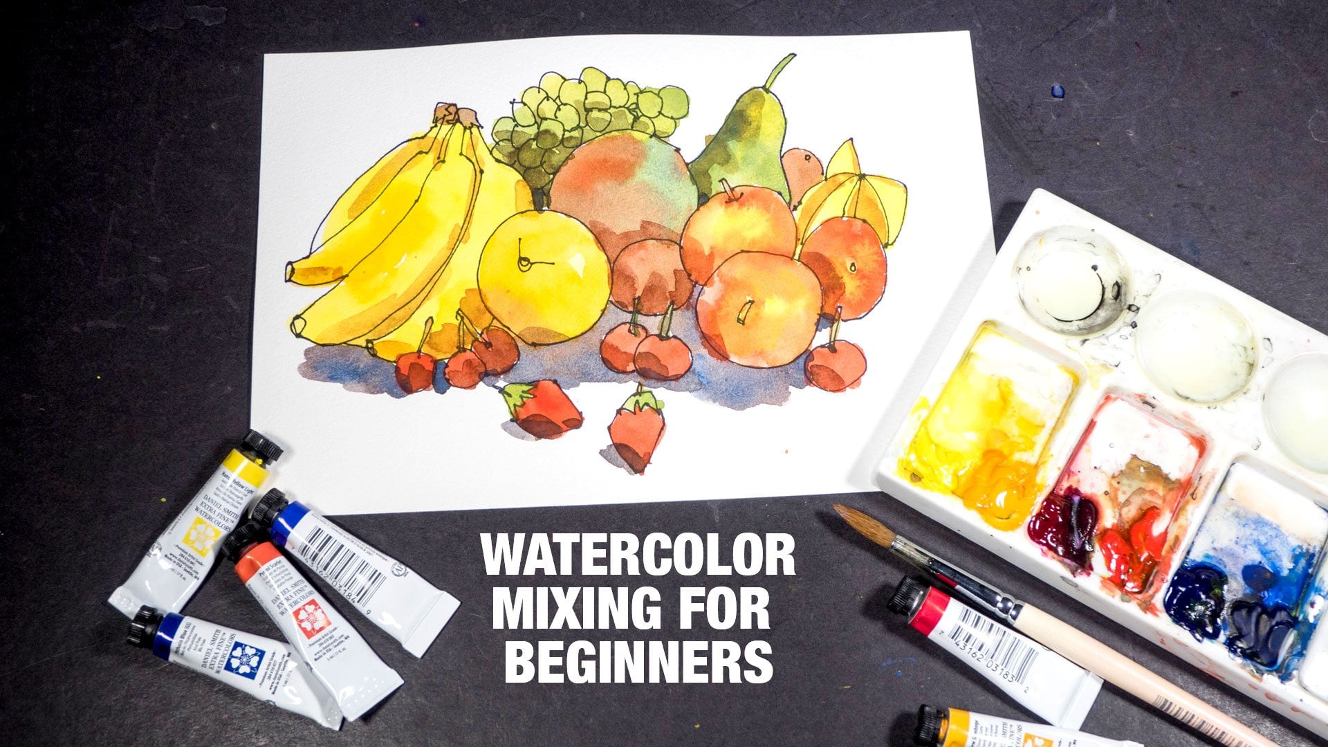
1. Intro: Hello, and welcome to this course on understanding and using the limited color palette. My name is Teoh, and I have been using water colors since 2009, mostly for urban sketching, for our sketchbook journaling. In this course, I want to share with you the tips and techniques to color mixing, basically, everything I have learned about color mixing over the years. We're going to start with looking at the color wheel to help you mix colors, to help you predict how colors can mix, and the type of results you can get. We can also use the color wheels to select colors or paint to include in your own palette. We are going to look at four limited color palettes, and see what are the color mixing potential they have, as well as the limitations. Using what we have learned in this course, I'm going to show you how you can select color to make your own color palette that is really versatile for color mixing. As a bonus lesson, I'm also going to show you the colors that I have in my own palette, and I'm going to end is course with some recommendations for books on color theory, color mixing so that you can learn more about colors on your own. If you have any questions, please write them down so that you don't forget them, and you can send them to me. I will try my best to answer them. Now, any resources like recommendations for supplies, books on paint will be available in the resource or downloads section. All right. one last thing, now you can help our other students by leaving a review for this course so that other students can know whether or not this course is any good, and that would help me out greatly as well. All right, let's get started.
2. Swatches Wheel and Colour Studies: In this lesson, I'm going to talk about the usefulness of creating color swatches. I'm going to show you more color wheels, and also show you some of the color studies that I have in my sketchbooks. I have already covered how color wheels and color swatches can be created in my other courses so I'm not going to repeat that here. If you want to learn how to create color wheels and color swatches, do check out my other courses, which I will link to in the Resource or Downloads section. Each time I buy a new color or new watercolor box set, I will swatch out all the new colors. This is a great way to keep track of the colors you have used, and also you can use these to compare against many different colors at a glance. Over the years, I have created hundreds of colors swatches for all of the colors that I have tried, and I would actually group them according to different brands, different manufacturers, so that it's easy for me to quickly look for a particular color or to compare colors across different brands. On my color swatches, I have the names of the colors, the brand or manufacturer at a lightfast rating, according to the manufacturer and color painted. I also have the color painted in gradation so that I know how the color looks when more water is added. At this corner here I have some characteristics of the pigment. In this case, well, this color, it's semi-transparent, though staining and non-granulating and the pigment that is used to create this color is PY3. When you have the color swatches separately, this makes it really easy to compare color swatches side by side. Let's say I want to compare these two color swatches with Shmincke's paint. At a glance, you will be able to see the differences if there are any. For example here, I'm comparing these two swatches because they happen to use the same pigment PY3, but they are actually called different names. Daniel Smith calls their PY3 Hansa yellow light, whereas, well, Shmincke, they call it lemon yellow. This is how the two color swatches look, and they look almost identical. When you buy colors, always look at the pigment that is used rather than rely on the names of the colors, because having the same name doesn't mean the color may use the same pigment. Both of these are lemon yellow, but for Shmincke, they use PY3 for lemon yellow, and for Daniel Smith, they use PY175. If you look at these two colors side-by-side, you can see some differences. I like creating colors swatches because they can also help me remember and keep track of the colors that I have used. For example, let's say I have used cobalt yellow before, many months or years ago. If I have not created this swatch, I probably would not have remembered using this color, and I don't like this color, and I may accidentally buy this color again. Having a record like this will help you keep track of the colors that you use. You can create watercolor swatches from watercolor tubes or watercolor sets that you already have, or you can actually buy watercolor dot cards from manufacturers to swatch out the colors. Buying watercolor dot cards to create swatches can actually help you save money because you get to sample many colors at once. It also means you don't have to buy watercolor tubes, like the 5ml or 15ml tubes, only to find out later that you don't actually like that color. On this dot card, you can see the name of the color, the product code, lightfast rating, and the pigment that is used. Some of the downsides of dot cards include, well, there is not a lot of paint, so there is usually enough paint for you to paint a swatch and you create a small painting, and sometimes the paint, they don't rewet well, which will give you an indication that if you are to squeeze the paint into pans to dry, they are not going to rewet well. Watercolor dot cards can be quite useful because you get to see the actual color on water color paper that you use. Sometimes when you look at color swatches online, they may look good, but in real life they may actually look different. I highly recommend you create color swatches separately like this rather than collect all the swatches in a sketchbook. Because with a sketchbook, you are going to be limited by the number of pages. Whereas if you have to color swatches separate like this, you can keep adding new swatches, new colors into the future. For example, here with this sketchbook, I actually wanted to have all the yellows from Daniel Smith on these two pages, and I quickly realized that I ran out of space, that's why some of the swatches here, they are so small. Do invest in good quality watercolor paper to create your swatches so that you can create color blends like this, have the colors fit very softly, from the intense color to the white of the paper. With lousy watercolor paper or with non-cotton watercolor paper, it's very difficult to create a soft palate lens. You can't create color wheels very easily using colors that you already have, and with have color wheels, you can tell, at a glance, the type of colors you can create with that specific limited color palette. For example, here we have lemon yellow and alizarin crimson. I know, at a glance, that I want to be able to create or mix a vibrant orange because here, this orange, it's quiet and dull. If I need to mix a vibrant orange, I would need a warm red, this is still lemon yellow, this is also lemon yellow, but when mixed with French vermilion, which is a warm red, I get a more vibrant orange. This is how useful color wheels can be. Here, at the bottom, I have some color swatches mixed using the colors here. These are color mixes. I also have color pencil swatches in this book, and these are color wheels from different brands. It would be good to have a sketchbook, a watercolor sketchbook like this with a lot of pages so you can create a lot of color swatches, you can record and document color swatches and paint in colors from many brands. If your sketchbook is too thin with just a few pages, you will need to have a lot of sketchbook. Having a lot of color swatches in a single sketchbook like this makes it easier for you to compare against different brands and colors. This schedule by the way, is the Stillman and Birn Alpha series sketchbook, which has a lot of pages. By the way, I will provide you with this template that I have, as a digital download of course, so that you can print out a template or maybe create your own template, and just place the template behind a picture so that you can create all those circles to create your own color wheel. This only works if your paper is thin enough, but your paper should not be so thin that it doesn't work well with watercolor. Color wheels are useful, but sometimes it can be difficult to visualize how that color wheel or that color palette will look when you apply that to an actual sketch or painting. So it's always good to use the limited color palette, not just to create a color wheel, but also to paint a sketch or create a painting. For example, with this particular limited color palette, which is Monte Amiata natural sienna, organic vermilion, and Indanthrene blue, it seems like I am unable to mix or create a vibrant green because I don't have a vibrant yellow. So in this case here, I actually had to add an additional color to this limited color palette. I have phthalo green here to paint the trees here. This is the limited color palette I used for this particular sketch. I can create vibrant orange, which I have done so for the roofs of this temple, I can create a vibrant purples, but once again I am not able to mix a vibrant green. So in this case, I actually used sap green. I introduce sap green in addition to this limited color palette. Here are some more examples that I have in this sketchbook. Always be sure to write down the names of the colors because you will not remember the colors after a few months. This limited color palette is quite interesting because these three colors, they are considered muted. So the sketch here, overall, you can see it's quite muted. It doesn't have that strong, vibrant color that you get with really vibrant colors like phthalo or quinacridone colors. There is no such thing as a perfect limited color palette, so it is actually through such color studies that you will be able to discover the limitation of certain color palettes, and also with that limitation that you discover, introduce additional colors into your selection to make your palette more versatile. For the next few sketches, I did not create the color wheel. Instead, I created color mixes for the secondary colors. In this case here it's yellow mixed with red, red with blue, yellow with blue and this is how the sketch looks with this limited color palette. This limited color palette, it's a bit more subdued, a bit more muted, which is great for this cloudy day seen. This is a more vibrant color palette. For the lessons later on, where we will create a limited color palettes, don't worry, we're not going to draw really complicated sketches like this because our focus, our objective is actually to study the colors, how they work together. We are going to focus more on understanding the colors rather than the technical part of drawing. That's how useful color swatches, color wheels, and color studies can be. I have one last tip for you. You can get more colors to swatch by exchanging paint with your friends. Ask around to see if your friends, see if they are using water color tubes like this, you can buy empty half pens like this, squeeze the paint into the pens and exchange with your friends. This is a really good and quick way to get more colors to try to experiment with.
3. Colour Wheel: In this lesson, I'm going to teach you how you can use a color wheel to mix vibrant colors. Now, this lesson is actually the condensed version of the full course that I have on basic color mixing using watercolor. If you want to learn more about color mixing, do check out that course. Let's take a look at our very basic color wheel. The color wheel I want to show you is this one that's found in this book, Exploring Color Workshop by Nita Leland. This color wheel is particularly useful because it actually shows you the name of the paint or the pigment. If you need some suggestions on colors to buy, you can actually use the names here as suggestions. This is a more detail color wheel with even more paint listed. Say for example, you want to buy a yellow, you can buy any of the yellows here but do some research first to find a characteristics of each color. For example, if you are using watercolor, you will want your color to be transparent. In which case you should get maybe transparent yellow instead of cadmium yellow or cadmium lemon because cadmium colors are opaque. I will provide you with a list to where you can find a variation of this color wheel online. You can download that list from the downloads or resource section. Let's talk about basic color theory. Primary colors are the most important colors because they are used to mix other colors. Primary colors are; yellow, red, and blue or cyan. For example, if you want to mix green, you can use the primary colors yellow and blue to mix green. If you want to mix a vibrant orange, you can use yellow and red. If you want to mix purple, you can use red and blue. If you want to mix the most vibrant orange, you should use colors that are close to that orange, so you should use like warmer yellows and warmer reds. In this case here if I want to mix a vibrant orange, I can use Indian yellow and pyro red. I will not use cadmium scarlet or cadmium red because these two are opaque colors. I use mostly watercolors, so I prefer my colors to be transparent, so I don't use cadmium colors for mixing. If you want to mix a vibrant purple, you can again look at the color wheel and look at which are the primary colors that are closest to purples or violets. In this case, you can use permanent magenta and French ultramarine to mix really vibrant purples. I'm going to show you how to do that exactly later on. Colors can also be considered warm or cool. For colors that are closer to reds, they are considered warm, for colors that are closer to blue or cyan or turquoise, they are considered cool. Now you don't have to worry about color temperature, you just have to remember that if you want to mix vibrant colors, glowing colors, just chose primary colors that are close to that vibrant color that you want to mix. If you are wondering why I don't just chose a vibrant orange and not mix the colors well, you can do that, but you won't to be able to achieve beautiful color mixes like this where you can see color separation. Here for example you can see the colors that were used to mix these color and you can see color blending which is really beautiful. It makes this wash look more interesting compared to, let's say this wash which was just paint up with almost a flat color, a single color. It's definitely more versatile to have primary colors rather than the mix colors. For example, if you have yellow and red, you can mix a variety of orange using those two primary colors. If you have orange, if you have the mixed colors, you want to be able to get yellow or red out of the color. But if you actually use or paint with orange fur often, then it's more convenient you have mixed tube of orange. Now, there are some limitations when it comes to mixing colors. For example, if you mix blue and red, sometimes you don't really get a vibrant purple or violet. For example, if you use phthalo blue, this phthalo blue is actually not that clear. This is how phthalo blue blue looks like. It's a very beautiful, vibrant blue. When you mix this with a one red, you are going to get a color that is not violet, is going to be a color that is quite close to black. Let me show you exactly what's going to happen when you mix phthalo blue with a one red. Let me add more paint. This is what's going to happen when you add one red to it. Notice this color, it's very dark. It's definitely not a purple or violet. If you chose the wrong red and blue to mix, you are not going to get a purple or violet. If you want to mix a vibrant purple or violet, again you can use the color wheel to help you. In this case, you should chose colors that are closest. Primary colors that are closest to the violet. I'm going to chose magenta and French ultramarine. This is magenta. You can see this is almost like a purple or violet already. When you add some ultramarine, you can see this beautiful purple. This is obviously more purple compared to this mix earlier. When you mix colors opposite the color wheels, the colors will neutralize each other to form a darker color or a more muted color. For example, if you mix new gamboge with ultramarine blue violet or a Hansa yellow with dioxazine violet, you're going to get a dull color. But dull colors doesn't mean they're bad colors. Sometimes you do need dull colors because dull colors can be used as shadows. For example with this fruit here, this is apple here to mix shadows for the Apple, I want the shadows to be darker, more muted. In this case here if I take a look at the color wheel, this apple is orange reddish. If I want to mix a shadow color which is a muted color, I will mix it with the blues here. For example, let's say I have this apple color, this red color, and I want to mix the shadow color, so I can add the color from opposite the color wheel, in this case a French ultramarine. Notice how the color immediately darkens. This is actually one way you can use the color wheel to mix shadows. If you want to mix a gray, you have to mix three primary colors together. That may not be obvious just by looking at this color wheel, but you do have to mix three primary colors together. Three primary colors that you choose will affect the type of gray that you can create. For example, let's say I want to use these two colors, phthalo blue and a warm red. I'm going to add a yellow to produce dark gray. This time I'm going to add a little bit of phthalo blue here, a little bit of red, warm red in this case. You can see this is not exactly gray, so now I want to add some yellow to it. You see this area here is almost like gray, but you can still see hints of warm red and blue. You can keep adding colors until you get the gray that you want. This here looks like a pretty nice gray to me. If you want this to be darker, you just have to add more paint to it. Once I add more phthalo blue to it, it darkens fairly quickly. Now it almost seems like black. You can use the color wheel here to give you an idea on the type of colors you can mix even before you buy those colors. On this page, this color wheel is even more helpful because it list even more colors. Since I use mostly watercolor, I will avoid opaque colors. If you are using gouache, it doesn't really matter what colors you choose from this color wheel. For example if I want to have the ability to mix vibrant purples, I will definitely want to include maybe permanent alizarin crimson or permanent magenta, or ultramarine violet as one of my reds. We want to include french ultramarine and cobalt blue because the colors here are closer to the colors here. If the colors are too wide apart, too far apart like this warm red and this phthalo blue, they are almost on the opposite ends of the wheel, I know the colors that I will get when I mix them will be something like this which is dark, very muted, very life least sometimes. If you are using a color wheel with the names of the paint listed, do not deal with certain manufacturers. They may actually use different pigments to create those paint. For example, we have a lemon yellow. It can be created with the pigment PY3 or PY175. There are going to be slight differences between this two colors, but both can still be known as lemon yellow. Choosing the specific pigment sometimes may not be that important. For example, if you want a cool yellow, you can choose either PY3 or PY175, both are lemon yellow, or you can even choose azo yellow because this color is still quite close to this cool yellow. But if you want to have a cool yellow, don't choose colors that are further away from the cool yellow line, new gamboge or Hansa yellow deep. These are no longer considered cool yellow because they are closer to red. This is basically how you can use a color wheel to help you with color mixing. I will talk more about color selection in a later lesson.
4. Before We Explore Limited Palettes: In the next few lessons, we are going to explore some limited color palettes, with hands-on color mixing exercises. While it is best to use the same colors that I use, I understand that it is not possible to have all the colors or to buy all the colors that are mentioned, so I'm going to suggest to use some alternative colors that you can use. Even if you don't have those colors, it's all right, you can still watch the lessons and learn about color mixing and the characteristics of those colors and use that knowledge in the future to help you select colors that you want to include in your own palette. While color selection is important, it is actually not that important unless you are going for realism, in which case you are trying to reproduce the exact colors that you see for the subject that you are painting. Hopefully by the end of those color mixing lessons, you will learn that actually you can just paint with any primary colors as long as they are yellow, red, and blue. Some colors can look quite similar, and may perform similarly. For example with cool yellows, I have Lemon Yellow and this is Hansa Yellow Light. This by the way are colors swatches painted with Daniel Smith watercolor paint. For Lemon Yellow, this was made with the pigment PY175 and Hansa Yellow Light was made with PY3. These two yellows they look really similar and will perform similarly. Even if you don't have these two colors it's all right, you can choose some other yellows that look quite similar to these two colors. You may not need to choose the exact yellow that looks similarly, but choose one that is closer to the cool yellow on the color wheel. An example is these two colors, Ultramarine blue and French Ultramarine, now both actually use the same pigment, PB29. A side-by-side comparison shows me that there is actually not much difference in terms of how they look, maybe French ultramarine has a bit more granulation, but the two colors they are quite similar, they almost look identical. Another example here is between Pyrrole Red and Pyrrole Scarlet, both are considered warm red. Now I actually have one of these colors in my color palette. So this color that I have here is either Pyrrol Scarlet or Pyrrole Red, but I cannot remember what that color is, so doesn't really matter because both are warm red, both we'll perform like warm reds. If you want to find color swatches online to help with your color selection, you can check out the website of Jane Blundell. On her website there are color swatches from many brands like; Da Vinci, Daniel Smith, Schmincke, Wistor and Newton, White Night, Mission Gold, and more. You will be able to find a lot of information regarding the brands, regarding the paint and pigment. There is just a lot of useful information over on her website, so do check that out.
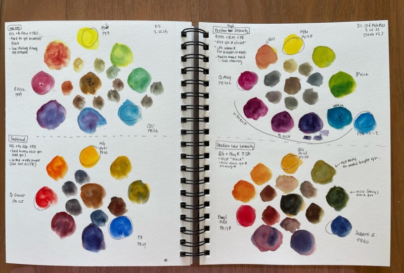
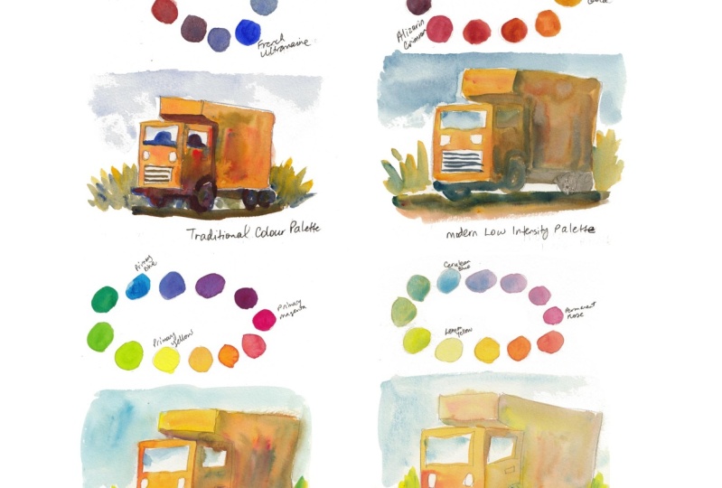
5. High Key Colour Palette: For the first limited color palette, we are going to explore the high key color palette. These are colors that are bright, that are light, and these colors usually do not have high tinting strength. The difference between high and low tinting strength is for paints that have low tinting strength, you need to use a lot more paint in order to create the vibrant, the intense colors but for paint with high tinting strength, you just need to use a little bit of paint and you can achieve very vibrant colors. For our primary yellow, we are going to use lemon yellow. By the way, all the paint I'm going to use are from Daniel Smith. For Daniel Smith's lemon yellow, it uses the pigment PY175. Now if you are using other brands, don't just look at the name also look at the pigment code because some other manufacturers, may actually use PY3 as their lemon yellow, so PY3 is an alternative to lemon yellow. In this case here, Daniel Smith calls their PY3 Hansa yellow light. If you don't have this two colors, you can use azo yellow, or any yellow that looks yellow enough for you, but don't go for yellows that look orange like this. Now, Aureolin cobalt yellow can be an alternative as well if you happen to have that color. But this color is not light fast, which is to say that if you expose this color to sunlight long enough, the color will actually fade. Now it looks beautiful, but when it fades, it's going to turn it into an ugly brown. When you choose colors to include in your palette, try to choose light fast colors. Try to choose colors that will last. For our primary blue, we're going to use manganese blue hue. The original manganese is a toxic color, so that has been discontinued and this is the synthetic version. If you look at the names of colors, sometimes you can see this word hue. That just means that this is a version of the original color, and this is made with an alternative pigment. This is made with the pigment PB 15. You can see this blue it's very beautiful, it's very light, and alternative that you can use is the cerulean blue chromium or cerulean blue. But you can see these two colors, they are not as vibrant compared to manganese blue hue. As for other blues, they look totally different from manganese blue hue. Try to use the same colors if you can, if you can't, then cerulean blue or cerulean blue hue. Or if you really don't have these three colors, chances are you are going to have Pthalo blue green shade, which is very popular, very common color. This is made with the pigment code PB15 3, which is a variation of this pigment PB15. In this case, if you are going to use Pthalo blue green shade instead of manganese blue hue, the effect that you will get is going to be different, even though both colors are using similar pigment, but it's actually different. With Pthalo blue, this is a color that has really high tinting strength, which is to say that if you use a little bit of paint, you can get really vibrant, intense colors, but with manganese blue hue, you do need to squeeze a lot more pain in order to get that intense colors. You can actually mix really dark colors like black with Pthalo blue, but you cannot do that with manganese blue hue. For our primary rate, we are going to use rose madder permanent. Rose colors are actually considered red even though they don't look like the typical hue red. Now, this is actually a variation of the original rose madder genuine, which is a fugitive color, which means if you expose the color to light long enough, it's going to fade. This is the permanent version, which is supposed to be light fast, and this color is made with this three pigments. If you buy rose madder permanent from other brands, they may use different pigments, but they should still look the same. Other alternatives you may use are quinacridone pink PV42, quinacridone rose PV19, and maybe quinacridone lilac or quinacridone magenta PR122. It is very useful to paint a color wheel because you can use this for reference. Here I have yellow and I'm going to mix it with a little bit of blue here to get the green. This looks like a bright yellow, green. By the way, this watercolor paper that I'm using. This is hot press watercolor paper which has smooth surface. Now if you want to you can actually add a bit more blue, just to make this green look more blue. By the way, my wheel is not going to look like a circle, is going to look more like a oval. Or maybe it's not going to have any shape. I've just washed my water color brush. Now I have is manganese blue hue, which I'm going to place here. With this manganese blue hue, I'm going to add a little bit of rose madder permanent. Here I will put more rose madder permanent and less of the blue. Now I have rose madder permanent here. By the way, to thoroughly clean your brush you need two cups of water, one to clean your brush and for the second cup, this is for you to clean your brush more thoroughly and also to get clean water. Now let's mix rose madder permanent and lemon yellow. This is the orange we can get. It's not a particularly vibrant warm orange. These are the possible colors and color mixtures we can get with this high key color palette. I actually like how the mixtures look because you can still see the individual colors that were used to create a mix. Let's paint this quick sketch with a high key color palette. This is just a very simply drawn truck. I have already squeezed the paint onto my plastic palette so that I can get the paint easily. I'm going to have this truck in orange. With a limited color palette, it's really easy to mix the colors because you only have three to choose from. With orange, you just use yellow and the red. In this case, it's lemon yellow and rose madder permanent. Now to achieve the most and vibrant colors, you should let the colors mix on the paper as much as possible, and try not to dab on the paper continuously. Try to paint everything as one wash and have the colors connect together to form this nice wash. Occasionally you may want to tap some colors into the wet wash to introduce color blending. I'm going to have the light source come from the left side of this truck. The area here will be the shadow side. To mix the shadow side, again, it's not that complicated, we've a limited color palette because you only have three colors. You have to use the three colors to mix the shadow side. For the shadow side, I'm going to have more water because this is a large area, and I'm going to use more paint to mix a darker wash. For the shadow side, it's going to be orange in shadow, so I'm going to just use all the three paint. Once again, try and have the paint mix on the paper as much as possible. If you go in and move the paint around too much, it's going to look muddy and the water is going to look quite lifeless. I need to make this part much darker. I need to use more paint. This is where the limitation of this palette really comes in. These three colors, the tinting strength is just not high enough, which means in order to get a really dark color, you have to use a lot of paint. If you use a lot of paint, the paint is not going to flow that well. It may look a bit patchy, which is what's happening right now. But again, as much as possible, I try to have the colors look as if it's painted in just one single shape. We need this part to be darker as well. We've a high key color palette like this, it's very difficult to create contrast because you cannot create dark colors. You just can't, because even if you add a lot of paint, it's very difficult to create that dark color, that black, or that very dark gray. It's just not possible at least with these three particular colors. Here we have the wheels at the bottom. Now the wheels are supposed to be black and this one looks green. I want to paint a shadow on the ground as well. When you are still able to see the individual colors used to create a mixture makes the wash look more interesting. This is the shadow on the ground. Now to make it a brown, it's yellow and red. This is the brown I can get. Now with this particular palette, the thing I like is you can create vibrant greens, so that's the highlight of this high key palette, so you can create vibrant greens really easily. The limitation is the orange, it's not that vibrant. As much as possible, I'm going to let these two colors, lemon yellow and manganese blue hue mix on the paper. This green, it's really vibrant, and when you have this color against this rather muddy-looking color right now you can see it creates color contrast. You can have a value contrast as in light versus dark, or you can have color contrast as in vibrant colors against not vibrant colors. I can use this to create the quills here, and maybe I can dab some blue on to the windscreen to get some of the sky reflected onto the windscreen. I accidentally painted over there. Bottom of the vehicle is going to be very dark. Now I'm actually using a lot of paint to paint at the bottom, and because I'm using a lot of paint, the paint is not flowing that well anymore because there's just too much paint, so this can look quite patchy. That's the downside, another downside with this palette. If you use a lot of paint because you want to create a contrast, you use that to paint, it's going to create that patchy look. This is the stage where I should stop if I keep adding paint onto the colors that I have already painted, it's going to make these colors even more muddy. Ideally, with this particular palette, you should not mix the colors too completely. Try not to use three-color mixers. Try to use just two color mixers, that's where you can get the most vibrant colors. Once you introduce a third color into the mix, you're going to get something like this, which can be quite muddy. Now, certain color combinations can still produce vibrant colors, but it seems like with this particular limited color palette, when you mix the three colors together, the mix doesn't look that good. Ideally, with this color palette, you should use the colors as they are or use a mix from two primary colors. It's difficult to use the mix using the three primary colors. You can get grays, but you won't get the really dark color. In order to make this color palette more versatile, you need to introduce additional colors into this color palette.
6. Traditional Colour Palette: For the second limited color palette, we are going to explore a traditional palette and the colors we're going to use are New Gamboge, Pyrrol Red, and French Ultramarine. By the way, this so-called traditional palette actually can have a lot of variation. If you don't have these specific colors, you can swap them out with similar-looking colors. This New Gamboge is a mix of two pigments, PY97 and PY110. Alternatives to this color would be Indian yellow, Hansa Yellow Deep (PY65), Permanent Yellow Deep (PY110), basically any yellow that looks warm, you can use it as an alternative to New Gamboge. Pyrrol Red is made with PR254. This is a warm red, so you can use any warm reds like Pyrrol Scarlet or Vermilion. French Ultramarine is a very common color and it's a rather distinct-looking color, so there aren't many alternatives. The alternative to this is actually its variation, Ultramarine Blue. Ultramarine Blue and French Ultramarine both used the pigment PB29. The differences between these two comes down to the slight differences in granulation, but otherwise, they look almost identical. Once again, let's paint a color wheel to see what this palette is capable of. I'm going to add a little bit of Ultramarine to New Gamboge. Since this is a warm yellow, it's very difficult to get a vibrant green with Ultramarine. This is with more Ultramarine and this green, it's really muted, very dull. But we wash the brush. This is Ultramarine, it's a very beautiful granulating blue. Let's add some Pyrrol Red to this. Once again, I have the colors mixed on the paper, and for the next mix, I want to have a bit more Pyrrol Red, perhaps too much. Now if you feel like your proportion of paint is used wrongly, you can paint again somewhere else just to test, just to find a correct proportion to use. This looks slightly better. This is Pyrrol Red, a very strong red. With a warm yellow and warm red, you can get a vibrant orange. Perhaps I've used too much paint here. It's all right to use more paint so that you can see the colors more accurately. Another thing I forgot to do with the first color wheel is to write down the names of the colors. This time I'm going to write down the names and also the pigment. This is what I would recommend if you want to refer to the colors, the mixes in the future. I've used too much water for some of these swatches, so you can see the bottom it's not dry yet. But otherwise, this is how the colors look, and the limitation of this palette is its inability to produce a vibrant green. Compared to the earlier palette, you can see this green it's very vibrant, very bright, but here it's very dull, very muted. The purples look all right. I really like this warm orange. Let's paint the same truck this time using the traditional palette. This truck is still going to be orange. The light source is still going to come from the left side. Now, bear in mind this time the paint, Pyrrol Red, French Ultramarine, and New Gamboge, these three colors have high tinting strength. When you add the colors, when you add the paint, try not to add too much paint because if you add just a little bit of red, the wash or mix may look too red. Be careful when you are using paint with high tinting strength. Oops, see that? Now it's too red. Just when I was talking about the mistake, the things to avoid, I made that mistake myself. Try not again, to dab continuously, constantly on the paper. The light source is coming from the left, we have to paint a shadow now. I'm going to use a lot more water and as much as possible have the colors mix on a paper and work quickly so that the wash can appear fresh looking. This is Pyrrol Red, this is French Ultramarine. If you mix the colors too completely, again the wash is going to look deep. If you take some practice before you can get a hang of how much to push the colors around and how much to let the colors work on their own. When it comes to painting shadows, all you have to do is make sure that the lighter side and the shadow side, look different enough. Here you can see the boundary. For the bottom here, the bumper, I'm going to use a lot more Ultramarine. You can see when I use a lot of Ultramarine this part here becomes really dark very easily. This palette, this so-called traditional palette, you can achieve really high contrast. You can get blacks. You can mix dark colors very easily. You can create color contrast, you can have vibrant colors contrast against dull colors, you can also create value contrast, light versus dark. This is the shadow beneath the vehicle. Shadows beneath vehicles are usually very dark, almost close to black so here with this palette, with this combination of colors, I'm able to mix that dark color really easily. Let's use this wash to draw the grills here in front, and I can also use this color to draw maybe the seats that are inside. In fact, you can even use Ultramarine on its own to paint shapes. This part here it's still wet, so unfortunately the colors are going to blend out, which is not what I want, so let me try and correct this. I should just leave it as it is right now. Do not touch that, it's going to make it worse. Let's have some sky reflected on the vehicle here. Maybe I can use Ultramarine to paint the sky as well. Let me pick up the excess paint here. With the earlier sketch using the high key color, I did not actually paint the sky. Let's mix some green. With New Gamboge and Ultramarine, unfortunately, this combination is not going to give us vibrant green. That's the limitation with this particular palette. You just can't get vibrant greens with this palette. If you need vibrant greens, then you will need to introduce additional colors to this color palette. This is a rather dirty green. The bottom of the vehicle is supposed to be really dark. This is a concentrated mix of Pyrrol Red and French Ultramarine. It seems like I have used too much red. The proportion of color that you use is important. With colors that have high tinting strength, if you use a little bit of that color it's going to shift the color of your mix quite quickly to some other color. You have to be careful not to add too much paint. You have to add paint bit by bit. This seems dry enough, so maybe now I can add the seat that is here. I may also want to make this part darker. I shall stop right here, I think I'm making it worse. I've actually painted this sketch three times and this is the one that you saw earlier. This does not look that good because this shadow shape here, it's not that recognizable compared to this shadow shape here, and the way the colors are blending here it's quite distracting. That's my third try, my second try, and my first try. All were painted using the same limited color palette, but as you can see, if your technique is not right, even if you use the same colors to sketch, the painting can still look way off. My second try was the best because the shadow shape is very recognizable. You can see this shadow shape contrast very nicely against the lighter side. However, this side here is actually supposed to be in shadow. I accidentally left out this. If I were to go in and paint another layer over this, it's not going to look good. My first try looks quite bad as well because I had the colors mix too completely on my plastic palette before I applied on to the paper. The mixes here look muddy, they look quite lifeless. Once you let the colors mix on the paper versus pushing the colors around with your brush or mix them completely on your palette before applying on paper is something you have to figure out on your own through practice and experience. I don't usually have purples in my sketches, so this particular palette works well for me. The only limitation for me here is the greens, they are quite muted. In this case, I may actually add a cool yellow, a Lemon Yellow to this limited color palette to make it more versatile.
7. Modern High Intensity Palette: In this lesson, we are going to explore the modern high-intensity color palette. By modern, I mean, many of these pigments are actually discovered or created in the 19th or 20th century. These pigments are incredibly light fast. Some of the applications include creating paint for outdoor use for example, paint as used to paint buildings or paint used in the automobile industry. These pigments are also highly staining in the sense that when you apply paint onto the paper, the tiny pigments will actually go into the paper. It's very difficult or almost impossible to clean or lift the colors after you apply them as compared to non staining colors, for example. If you get paint like this on your t-shirt, on paper, or on those adsorbent material, it is incredibly difficult to get the colors out so be careful when you're using them. Because these colors are engineered to be extremely vibrant, they have really high tinting strength, which is to say that, you just need to use a tiny little bit of paint and you will be able to produce really intense and vibrant colors. A 15 ml tube like this can last you for a much longer time compared to a color or pigment that has lower tinting strength. You definitely get more value for money when you buy synthetic pigments, however, some artist they actually don't like these pigments because the colors can be too vibrant. But that's just personal preference. In order to use the colors well, you have to know what they are capable of. That's what we are going to find out with this small and high-intensity palette. For this pellet, we will need a cool yellow or a mid yellow. I'm using Azo Yellow which is made with PY 151. You can also use lemon yellow PY 175, Hansa Yellow Light PY3. You can even use Nickel Azo yellow or transparent yellow PY 150. There is this pigment PY 154, which is also suitable. For the race, we can use quinacridone magenta. Daniel Smith's version uses the pigment PR202. For other brands that have quinacridone magenta sometimes they use the pigment PR 122. For Daniel Smith, PR 122 is actually called quinacridone lilac. I'm actually going to use this version as well because I find a color here to be a bit more vibrant or brighter compared to quinacridone magenta. For the blue, we are going to use Phthalo Blue Green Shade. There are two versions of Phthalo Blue. One is the red shade, one is the green shade. We are using the so-called cooler version in terms of color temperature. Phthalo Blue is a very common color, so you should be able to find that in your watercolor set. There are no alternatives through this color because this is the most vibrant cool blue you can ever find. Let's paint for our self a very simple color wheel again. This is a is Azo Yellow. You can also use Hansa Yellow medium, which is PY 97. The advantage of Hansa Yellow medium is it's actually a cheaper color but they look similar. That's how the green looks with Phthalo Blue added. This looks similar, so I'm going to add a bit more Phthalo Blue. When you add the Phthalo Blue, make sure to just add a tiny little bit when it's not enough add another tiny bit to it because it's really high tinting. Here I'm trying to pick up the excess paint. This is Phthalo Blue. A really intense cool blue. Let's add some quinacridone lilac to it PR 122. May not be that obvious so let me just paint another swatch here on the side. Let me add more quinacridone lilac. This is the purple we can get. Sorry, the light was reflecting off the wet surface earlier, so it was difficult to see how the color actually looks. This is quinacridone lilac. This is how quinacridone lilac looks with Azo Yellow added. It seems the limitation for this palette is once again vibrant orange, more specifically the inability to mix a vibrant orange. Let me test it again. This looks like a red. Let me add more Azo Yellow. By the way, when I talk about primary colors, when I refer to red, I mean the colors that are around the red area and that can include magenta as well. This looks more orange, this more red, and this looks like violet, purple, blue. This limited color palette looks good to me so far, but we'll get a more accurate impression by using it to paint. Let's paint the truck orange again. This is Azo Yellow. I'm using a lot of water and this is with lilac. The paint has very high tinting strength. Once you add a little bit of paint, you can see the color it shifts very quickly to what's lilac. When you are mixing the colors, just add the colors bit by bit. Otherwise, you're going to get something like this. Now for this truck, I'm going to paint the layer of shadow later on. I'm going to wait for this to dry and then paint the shadows side using glazing technique. This combination of Azo Yellow and queen lilac it looks really nice. I like queen lilac, it's a very beautiful color. While waiting for this wash to dry, we can paint the background first. The parts that are not connected to this area. This is Azo Yellow with a little bit of Phthalo Blue. Oops, too much Phthalo Blue again. Once you add too much phthalo blue, you can see the color starts to shift really quickly through the other side to the blue side. For the ground, I want it to be in brown, so I'm going to mix the three colors together. Let's test how they mix here on paper first. For this mix, it seems like I need more red and yellow. Let's go in and just test it out. Maybe a bit more blue. Depending on the color of paint you use, sometimes you may need more yellow, sometimes more red, sometimes more blue. It really depends on the tinting strength of the color that you are using. Too much green, sorry, too much blue and hence green. This is now dry. I'm going to mix the shadow color to paint over this area here. To do so, I'm going to need a lot of water because this is quite a large area. Ideally, you should use big brush to cover this area because if you use a small brush like what I'm using here, it's going to take multiple strokes and strokes may not look that nice compared to using a big brush where you can just paint with a few strokes. Once again, I'm going to test wash on my paper. This looks all right. Let's add a little bit of lilac to it and some phthalo blue. What I'm trying to achieve is a neutralized gray wash. This actually looks nice, maybe I can use this. So this is a mix of the three primary colors. I've got to say that painting shadows can be quite intimidating because you sometimes cannot tell how they are going to look when they dry. This is actually the correct way to paint shadows. Wait for the initial wash to dry and then paint the shadow on top of the original color so that you can see the original color through the shadow. But sometimes I like to mix the shadow at the first wash rather than painting layers because I'm lazy. I just want to save some time, but this actually looks much better. For the ground here, I'm going to use a lot of phthalo blue and lilac just to paint a shadow of the vehicle. Also the bottom part here. Now when your wash is not dry and you paint, the colors are going to blend, and you wouldn't be able to create those sharp edges that you may want. With quinacridone colors and phthalo colors, these are very high tinting colors. You can create darks, blacks, and shadows really easily. You can darken certain parts really easily. For example, if I wanted darken this bush here, I can add more lilac to it. So I've just added a bit more paint and using less water to make this wash darker. I can also paint this area here which is supposed to be darker. Looking at this sketch right now, it seems like I may you have to make the wheels and the bottom part darker because now this whole area, it's sort mid value, which is this whole shadow shape, which is also in mid value. Let's try and darken the bottom with a little bit more quin lilac and phthalo blue. I actually painted two versions of the same sketch. So I used a same color palette, but used different techniques. This one which was painted earlier, was painted using the glazing technique. So I added the shadow as a second layer on top of the first wash which was dry. But for this, I actually painted the shadow area at the same time I painted the front or the lighted side. Now both sketch they look similar, but obviously this one will look slightly better because there is more contrast. With this particular color pallet, the modern high-intensity palette, It's really easy to create contrast because the synthetic or chemical colors, they are extremely vibrant. They have really high tinting strength, so it's really easy to create very vibrant strong mixes. It's very easy to create strong contrast. You can get contrasts from the lighted versus the darker side, or you can get color contrast. Here I have orange against green or this bluish-green here. The limitation here with this palette is, it is difficult to mix vibrant orange, mostly because of the lack of warm red. Now azo yellow is a cool to mid yellow. So if you have a warm red, you can still mix a vibrant orange, but you can't do that with quinacridone lilac, which is considered a cool red. To make this palette more versatile for mixing, I will introduce a one red, either a phthalo red or a phthalo scarlet. This is what you can get with azo yellow and phthalo red. This is azo yellow with quin lilac. Side-by-side comparison you can tell straight away that is orange, it's more vibrant. Remember much earlier I mentioned that these pigments are staining pigments, so that makes them really great for glazing or layering techniques. When you paint a wash using staining pigments, when the first wash is dry and when you paint a second wash, it will not lift the colors off from the first wash. It's not going to disturb the first wash. Whereas if you are to use non staining colors to paint the first wash and when it's dry, you apply a second wash. You may actually disturb the first wash or if you want to lift the colors off, you can actually use clean water and scrub off the non staining pigment. To find out whether a pigment is staining or how staining it is. You have to find that information from the manufacturer's website because sometimes that information is not available on the label on the watercolor tube.
8. Modern Low Intensity Palette: The last limited color palette I want to show you is the modern low-Intensity palette. Here we have a side-by-side comparison with the high-intensity palette that we used in the earlier lesson. We can see straight away that the colors here, they are so called less intense. They are neutral or neutralized. The colors here are cleaner, brighter. I I want to swap this quin lilac out with pyrrole red, which is a warm red so that it's more comparable with this deepest scarlet here. By the way, there are also other alternatives you can use for the colors on this side. When we think of primary colors, these are definitely not colors that come to our mind straight away. It will be these colors which are more vibrant, cleaner. The advantages of having a low intensity palette is, you can actually use the paint straight from the tube and onto the paper and the colors they will still look quite natural. Whereas for the very vibrant, high-intensity color palette, you have to mix the colors slightly before you apply them onto the page. Because in the real world, in reality, we don't really see clean colors like this out there. The limitation for this palette is, with less intense colors, you will not be able to create more intense colors, but with more intense colors, you can actually neutralize them to make them less intense. For our modern low-intensity color palette, these are the three colors we'll be using. This is quinacridone gold from Daniel Smith made with the pigment PO48 and PY150. If you are using another brand, the pigment that's used may be different. This two also from Daniel Smith. This is deep scarlet PR175, indanthrone blue PB60. Alternatives to quinacridone gold can be some earth colors like raw sienna light, PY42, transparent yellow oxide, which is also PY42, yellow ocher, PY43. The reason why there are different names for the same pigment is because some of these pigments they are heated. Heat is introduced to heat up the pigments to create different colors. This can be alternatives, but I prefer quinacridone gold because it's easier to mix with this color compared to this earth colors. For alternative to deep scarlet, we can use quinacridone burnt scarlet PR206. If you are using another brand, it can be called brown madder or madder brown. Another alternative can be perylene maroon PR179. I like deep scarlet because I can still see that it's red, but it's a muted red. For our blue, we are going to use indanthrone blue PB60. You can also consider Prussian blue PB 27, or maybe even Mayan dark blue PB82. But for Mayan dark blue, you can see this blue it's not for obviously blue compared to this two. I would highly recommend you use either Prussian blue or indanthrone Blue. As usual, let's paint a color-wheel first to see what this palette is capable of. This is quinacridone gold with some scarlet red. This is more scarlet red. This is pure scarlet red. Let's add a little bit of blue to this. Let's add indanthrone blue. Did I add too much indanthrone blue? Let's add a bit more indanthrone blue here. Now, these pigments are highly tinting as well. This is indanthrone blue. The tinting strength for this pigments is very high. Once again, you just need to use a little bit of paint and you can create really vibrant colors. This is quinacridone gold mixed with indanthrone blue. I'm going to try and add a green here. This is with more blue. I accidentally reversed the color wheel here. For these three color wheels we have yellow at the top and blues on the right side but here we have the reds and the orange. Anyway, still color wheel. This is how this limited color palette looks compared to the three earlier ones. I can see the colors here, they are definitely a bit more muted. Quinacridone gold, it's definitely not as intense or as clean compared to azo yellow or lemon yellow. This red looks really nice. I like this red, but it's not as intense compared to pyrrole red. This blue, it's darker compared to phthalo blue and French ultramarine. Indanthrone blue is a deeper blue. At a glance I can see the limitation of this palette. It's almost impossible to mix a vibrant green because quinacridone gold, it's not like a pure yellow or mid yellow or [inaudible] yellow. It's also difficult to mix some vibrant purple and violet, because this red deep scarlet, it's considered one red. When you mix a one red with a one blue, this is the type of purple or violet you can get. Ideally, if you want to mix vibrant purple or violet, you should use a [inaudible] red with the warm blue. This is a warm red. Let's paint this orange truck again. This is quinacridone gold with deep scarlet. We're definitely not going to be able to get yellow. Now these two colors, quin gold and deep scarlet, they are considered medium staining. You can use these colors for glazing as well. Later when this wash is dry, I'm going to paint over with the shadow later. Next, let's paint the green. This is quin gold. Let's mix it with some indanthrone blue. On this side here maybe let's use more indanthrone blue. It seems like if you use more blue, it can appear to be more green. For the ground, let's have quin gold and deep scarlet. Let's mix these two first before we add the blue to make it darker. Now you can see it's brown already. Let's introduce indanthrone blue to it. This is with some deep scarlet added. I actually like this limited color palette. This is now dry I want to use some indanthrone blue to paint the sky first. You can see this tinting strength, t's really high, so you do need to use a lot of water to lighten the color. When you use these so called modern colors, do take note that some of them can have really high tinting strength. Let's paint some sky here and here. For this shadow side, I'm going to mix the three colors together. For this mix, I'm going to try and make it look like a neutral gray. It's not too yellow, not too red or not too blue. Let me test the wash on the side here. It looks a bit too brown, so perhaps I want to add a bit more blue to it. This looks all right. Let's go in and see what happens. Indanthrone blue is a dark color, so I can use that to draw the grills here. I can use indanthrone blue by itself to create the dark shadows on the ground here. I can use indanthrone blue to make certain areas darker. Painting this sketch felt easier because the low intensity colors are neutralized to begin with, so it's easier to mix more natural looking colors. Secondly, I've already painted this sketch so many times, so it's now easier to paint it. The limitation for this palette is because the colors are less intense, you won't be able to get really bright, vibrant colors or mixtures. That also is actually the advantage of this limited palette. Because the colors are less intense, it's easier or faster to get a particular mix. For example, if you want to mix orange to this color, quinacridone gold by itself is going to be too clean to use on its own. You just have to add a little bit of red to it and the mix is good to go on paper. Whereas if you use more vibrant and intense colors, you have to spend a bit more time to get those colors to look more natural, to neutralize those colors. Because these pigments have high tinting strength, it's easy to create contrast, especially with indanthrone blue because this color by itself can get pretty dark on its own. When you mix it with this red or any other red, you can get really dark colors, something close to black.
9. Comparing Limited Colour Palettes: Now that we have all the color swatches, the color wheels, and the sketches painted, we can compare the limited color palettes easily. Now when you paint color swatches using the paint straight from the tube, the colors are going to look really beautiful, really vibrant, even color mixtures that look muted and dull are going to look beautiful. The root hairs really comes when you use the same colors to actually paint a sketch or a painting. That's when you can find out about the strength of the color palette and also the limitations. When we paint, we don't always paint with full intensity. Most of the time we will actually add water so that a paint can actually flow and also to help us create lighter values. These are the four sketches we have painted. This was painted with Heikki palette where the paint has low tinting strength, so I had to use a lot of paint to get the colors to appear vibrant, intense. This was painted with the traditional palette where the colors are vibrant. In this case I have a New Gamboge and Pyrrole red, which are warm colors so we can get a really warm orange. With this, we have the modern high-intensity palette. Now this particular palette should appear as vibrant or as strong, as intense compared to this traditional palette. But here you can see the colors, they are not as vibrant, and that's because in my mind when I painted this, I know that the paint has really high tinting strength, so I actually held back at how much paint I used. As a result, this is not as vibrant. This area here is not as vibrant, but you can see this area here, the green, this is very vibrant. This area at the bottom, we see a little bit of red. This is also really vibrant, so here I use less paint, here I actually use a bit more paint. Here with this green, you can see it's much more muted. This is the modern low intensity palette. Compared to these three sketches, you can see here the colors they are more muted. All the mixes, all the colors are more muted. Green is more muted, the orange's similar to this but more muted. The only thing that is strong here is actually the shadows, the darker shapes because the pigments here, they still have really high tinting strength so it's really easy to create darker values with this. Looking at all the sketches and the color style used here, at a glance, if we want to mix a vibrant orange, obviously, we will need the colors that were used to create this, and that would be New Gamboge and Pyrrole red. This is a warm yellow, this is a warm red so, you get the most vibrant orange with that. If you wanted the most vibrant greens, you can have this or this. I will prefer this because you just have to use a little bit of paint and you can get the intensity, whereas here you need to squeeze out a lot of paint. Here we have azo yellow and phthalo blue, whereas here we have lemon yellow and manganese blue hue. Now, for the sketches, you may notice I did not mix a lot of purples. I do not have a lot of violet or purples for my sketches but if you use a lot of purples or violets, if you need the colors to be vibrant, in that case, you can use, let's see, what do I have here? This palette, quin lilac, basically a cool violet color to begin with, and phthalo blue. But ideally, you should use a cool red with a warm blue like French ultramarine, that will produce a purple or violet that is even more vibrant compared to what you can see here. Remembering which warm and cool versions of primary colors to use for mixing to create vibrant colors can be quite confusing. Don't worry about that. For example, earlier on I mentioned that to mix a vibrant purple, you need a cool red and a warm blue. Well, if you have no knowledge of color temperature, it doesn't really matter just look at the color wheel. To mix a a vibrant purple, you just have to use the colors that are closest to it from the color wheel. In his case, it could be permanent alizarin crimson, permanent magenta, quinacridone rose and you just mix it with French ultramarine, which is closest to the purple or violet. When you create color studies like this, you get to learn a lot about the colors, the color combinations that work well together. The strengths and limitations of certain color palettes, and also you get to find out what are your favorite colors. You will learn a lot from practice, from painting and don't be afraid to make mistakes, even for me in creating this course, I actually painted several versions of some of these sketches because some of the versions did not turn out well. I actually had to rerecord certain segments. For example, with this particular sketch, the mix here, it's very distracting. With this sketch, the mix here it looks very lifeless, it looks very beat. Sometimes I had to rerecord. But I don't want to present to you the perfect color study because you can actually learn a lot more by making mistakes, by experimentation. Even for me when I'm using a new color, I have to do some color studies, quick sketches, paint them with those colors just to see what those colors can and cannot do. The last thing I want to mention is the watercolor paper that you use can affect how vibrant your colors can look. The best watercolor paper is paper made with 100 percent cotton and paper that is sized internally as well as externally. Size or sizing is basically the process whereby gelatin or some substance is added into the paper or to make the paper work well with water. Now, if the paper is not sized, if the paper doesn't have sizing, when you paint water onto the paper, the water will just soak through the paper. The difference between watercolor paper and other types of drawing paper is watercolor paper is treated to handle water. With proper sizing, when you paint the paint and water on the paper, the paint will remain on the paper. We have lousy paper or paper with poor quality, the pigments will actually soak into the paper because of the lack of sizing. When light is reflected off the paper surface and the pigment is not there because it's inside the paper rather than being on top of the paper, the colors will look dull. But for this watercolor paper that I'm using, for example, it has proper sizing so most of the pigments are actually still on the paper. When light shines onto the paper, it gets reflected off the paper, it's actually reflecting through the pigments. That's why we can see the vibrant colors. Also with good-quality watercolor paper, it's easier to paint gradations like this where you're going to have the colors blend into the white of the paper or I have the colors blend into other colors easily. The thing about high quality watercolor paper is they are more expensive. Sometimes significantly more expensive compared to a non-cotton watercolor paper. If you want to do color studies like this where you are just painting color swatches, you're painting very solid shapes, you are not painting predations, you can actually make due with cheaper watercolor paper. The ones that I personally use are Fabriano Studio and Daler Rowney Aquafine watercolor paper. You can buy these two papers in bulk light as a 50 sheet water color palette. That can last you for a very long time for you to do color studies.
10. How to Create a Versatile Mixing Palette: In this video, I'm going to give you some suggestions on colors you can get so that you can create for yourself a color palette that is versatile for color mixing, or if you have decided to get a watercolor set, we will analyze some of the color selections in this set to see whether or not the color selection is any good. The theory of color mixing is such that, if you have to perfect yellow, red, magenta, or blue, you should be able to mix all the other colors from the color wheel. But in the real world, the pigments are not perfect. Each limited color palette will have its own limitations as well as strengths. The basics of creating a color palette that is really versatile for mixing colors is quite simple, just include as many variations of the primary colors as possible. Once again, we are going to use this color wheel to help us decide the colors to include in our palette. Simple way to choose colors is to choose a warm and cool version of each primary color. For a cool yellow, maybe we can include a Hansa Yellow Light or a Lemon Yellow. For a warm yellow, we can maybe include New Gamboge or Indian Yellow. Moving down this side, we can also include another warmer orange or a warm orange like a scarlet or vermilion. Moving down, we have Pyrrole Red, which can be a good inclusion as well. But personally for me, I prefer a Scarlet. For cool reds, we can consider a Permanent Alizarin Crimson, Pyrrole Crimson, Permanent Magenta, or even a rose color like cream colored rose, rose madder. By the way, if you cannot remember all of these names, it doesn't matter. I will provide you with this chart or this color swatches that I will scan and provide to you in the download section so that you can take a look at the names of the colors. Moving down, we have violets and purples, which you may or may not want to include. Personally for me, I don't use a lot of purples and violet in my paintings and sketches, so I don't include those colors. Besides, if I have a cool red like a magenta or a rose and French ultramarine, I can mix purple and violent really easily. By not including this violet and purple, this will actually save up some space in my color palette. Moving towards the blue side of cool colors, we have French Ultramarine, which is considered a warm blue. Moving up, we can also include maybe Cobalt Blue, Phthalo Blue Red Shade, Phthalo Blue Green Shade, Phthalo Turquoise. Turquoise colors are colors that I don't use that often as well, so I will not include them in my palette, but if you have the right right colors, you can actually mix turquoise color very easily. Going up here, we have the greens. I do have greens in my palette even though they are not considered primary colors because I use a lot of greens, so it's very convenient to have a tube of greens. If you want some ideas, you can get maybe Sap green, Hookers Green, Phthalo Green, Blue Shade, those are the good greens. Basically, what you want is to have colors from all around the color wheel. If you prefer to paint with warm colors, then you should include more warm primary colors, like warm yellows and warm reds. If you prefer to paint with a cooler color palette, you should include more cool colors like blues and cool yellows. Color selection is quite personal and definitely very subjective. Color that I like may not be a color that you like. Color selection will depend a lot on the type of subjects that you paint. However, if you have versatile color palette, then it doesn't really matter what subject matter you paint because you will be able to mix all the possible colors. Now, there are probably thousands of colors out there to choose from. Choosing colors can be quite confusing. For example, even with yellow, there are cool and warm yellows. Within the warm yellows, there are so many variations, and then there are the vibrant yellows and a muted yellows, and that's just primary colors. There are secondary colors like orange, greens, and purples, and within the secondary colors again, there are a lot of variations. For beginners, I recommend using a limited color palette so that you can get the colors to work nicely together so that you can achieve color harmony more easily. Even though the limited color palette will have some limitations, but the thing is, the colors will work nicely together. For example, let's say you have a limited color palette that cannot mix a vibrant green, and then you go ahead and include a really vibrant green and you use that in say, a sketch, that really vibrant green will stand out like a salt ham. That's why it's easier to actually learn basic color mixing and color harmony just by starting out with a limited color palette. You can introduce additional or more colors to your palette later on when you get more confident with color mixing and also with painting. Here are some more color suggestions and recommendations in addition to the colors that I've mentioned earlier while I show you the color wheel. Let's start with a cool yellow first. You can consider Lemon Yellow, Hansa Yellow Light. For a medium yellow, you can consider a Hansa Yellow Medium, which is PY97. Nickel Azo Yellow, PY150, or Azo Yellow PY151. For warm yellow, you can consider New Gamboge, which is a very popular color. You can also consider a Permanent Yellow Deep, PY110, or Isoindoline Yellow, PY139. Now, all the colors that I've mentioned here are my recommendations. They apply to watercolor. If you use watercolor, you will want to research all these colors to find out whether or not they are transparent. I usually create watercolor sketches with pen and water proof ink, so I need the colors to be transparent so that lines can actually show through the watercolor. This three here are so-called Earth colors. I have some Earth colors in my palette because I find them really convenient for mixing skin tones. You can mix skin tones using the three primary colors. Once again, yellow, red, and blue, but it's so much faster to include so-called convenience or convenient color so that you can get that particular mix that you want more easily. To make skin tones, I have Yellow Ocher, PY43. Burgundy Yellow Ocher is an option, an alternative, or you can use Monte Amiata Natural Sienna, which is PBr7. Moving to a warmer orange, you can maybe include transparent pyrrol orange. Now for warm rates, you can include pyrrol scarlet. This pyrrol scarlet is considered warmer compared to pyrrol red. Personally, I prefer scarlet, I've just preferred how this color looks compared to pyrrol red. For cool reds, you can consider a pyrrol crimson, permanent alizarin crimson, quinacridone coral. Now do take note of the pigments that are used to create those colors because the pigment will determine how the color look, not the name of the color. You can also include quinacridone rose, which is a very good option. For magenta, you can include either quinacridone magenta or quinacridone lilac. For Daniel Smith, they are using PR202 for quinacridone magenta but for some other brands, they actually call their PR122 quin magenta, so do take note of this. Both are nice, but after using quinacridone magenta for a few years, after using PR202 for quite a long time, I will say that I prefer PR122 because this is slightly more vibrant compared to quinacridone magenta and as such, you will be able to mix a more vibrant violet or purple with this. Oh, I actually have the cool reds here. For cool reds, you can consider getting quinacridone rose, which is a very popular color. It uses the pigment PV19. Now, do note that the same pigment can be used to create different colors. PV19 is also used to create quinacridone red, for example. The reason why a pigment can be used to create different colors is because those pigments can be actually heated at different temperatures to produce different colors. Alternatives to this cool red can be rhodonite, which is some mineral color. The thing with this so-called mineral color is the color may actually oxidize and the pink or the rose color here may look more muted when you expose it to light long enough. Another option could be quinacridone pink PV42. Now this pigment PV 42 is used to create this color called magenta from a schmincke. Schmincke's Magenta uses PV42, but for Daniel Smith, they call it quinacridone pink. For blue, I love cerulean blue chromium and also cerulean blue. This is PB36, this is PB35. I like these two colors because they have really beautiful granulation. I likely have the chromium version in my color palette. You can also consider manganese blue hue if you want something to be brighter. This can be a good option. Now these three colors, they have low tinting strength, which means you have to use a lot of paint to get the intensity. I use some of these colors really fast and I have to spend a lot of money to buy these colors. For warm blue, the classic choice is French ultramarine or ultramarine blue. They look almost identical. You can also consider, what is this? Cobalt blue and indanthrone blue, which is a muted blue. I would highly recommend you use ultramarine or ultramarine blue. This ultramarine color, It's really versatile. You can use this to mix greens like this. You can also use this to mix really vibrant purples with a cool red. The other blue I have in my palette is phthalo blue, green shade, made with the pigment PB15:3. There are different variations of this pigment, PB15 so make sure you get the correct pigment. I also have greens in my palette because I use a lot of greens. More specifically, I use this green which I use to paint trees, grass. I use a lot of green. It's more convenient to have a tube of green rather than have me mix with yellow and blue. Also, it's very easy to make yellow dirty by mixing. That's why I have this green here. This is considered a warm green. You may want to include a cool green as well. This is good for mixing darker greens like shadows for the trees. Let me just recommend to you to more popular cool green, phthalo green, blue shade. One alternative could be viridian, PG18. Viridian is granulating, so it's going to have texture. Phthalo green doesn't granulate, so it's going to be a very clear color. You can also consider amazonite, which is some mineral color, but it's actually cheaper to buy phthalo green, blue shade. Lastly, I have another earth color. This time I have a darker, more reddish earth color. I usually have burnt sienna, which I actually have not painted here. I actually should have painted it here. Anyway, burnt sienna looks similar to these earth colors. There are going to be variations, but it's still an earth color. These are variations of earth colors you can consider adding. The most popular choice is actually burnt sienna, PBr7. I've tried Italian burnt sienna as well, which is also made of the pigment PBr7. It's a good option to include. Other options you can try are Minnesota pipestone, which is again, a mineral color. That's why there's no so-called pigment. There is fired gold ocher, PR102, and this is burgundy red ocher, PR102. If you need a darker color, you can consider burnt umber as well. A burnt umber is made with the pigment PBr7. Let's say you are using a typical 12 pan watercolor box. You can, when you select 12 colors, there my suggestion would be to include three yellows, three reds, three blues, and three convenient colors. For the convenient colors personally, for me, I will include this light earth color for mixing skin tones. I will include this green because I use a lot of greens and I will include burnt sienna because burnt sienna is a very nice color that you can use when mixed with French ultramarine to produce a really beautiful gray. You can mix grays using the three primary colors but as you have seen in the earlier lessons, sometimes it takes a lot of time to produce that neutral gray. With the French ultramarine and burnt sienna, you can produce a beautiful-looking neutral gray very easily.
11. Analysing Some Watercolour Sets: You can choose the colors to include in your own box, or you can just buy boxes like this where the colors are already selected for you. If you choose your own colors you have more control over the type of color mixes you can get. If you rely on the color selection by the manufacturer, sometimes the color selection is not optimal. For example, let's take a look at this Schmincke set. There are a few things I don't like about this palette. First thing, this is cadmium yellow and this is cadmium red light. These two colors are cadmium colors so they are opaque colors. They are not transparent. Opaque colors are very difficult to mix with other colors. It's going to make the color mixture muddy. These two colors are best used on their own, best used with very minimal color mixing, best used when you just apply the color straight onto paper. That's the thing I don't like about this palette, opaque colors. We have a cool yellow, but there is no warm yellow. There is a cool red, this is permanent carmine, but there is no warm red. Permanent carmine is made with this pigment PV 19, which suggests to me that this is an alternative to Quinacridone rose. When you are choosing colors from different brands, look at pigment coat, the pigment number. Don't just rely on the names. We have ultramarine finest, Schmincke actually has three versions of ultramarine. There is ultramarine blue, French ultramarine, and this is ultramarine finest. I don't actually know the difference between the three. There is this Prussian blue, so ultramarine is considered a warm blue. This Prussian blue by comparison should be a cool blue even though I'm not sure whether this is a warm or cool blue. But ultramarine is warm, so this is definitely going to be less warm compared to ultramarine. There is no cool blue, no classic cool blue, Phthalo blue in this palette. When it comes to mixing a really vibrant green, you will have to use Prussian blue and lemon yellow. It's still possible to mix some vibrant green using these two. We have Phthalo green here, permanent green olive. This is an option for sap green or Hookers green. There is the one green and cool green. That's great. We have two convenient green colors here. Yellow Ochre, very nice. This is great for mixing skin tones and we have English Venetian red PR 101. If I remember the pigment correctly, this is an opaque color as well so it's not going to be that great for mixing. With opaque colors, they are just not good for mixing. Try not to include too many opaque colors unless you have a very specific use for those colors. Sepia brown can be an option and alternative to burnt sienna. You can use these to mix with ultramarine to get a neutralized gray but most people will use burnt sienna because it has the more popular color. Lastly, we have ivory black. Now it's best to mix a black yourself using the three primary colors but having a black can be convenient sometimes especially if you use a lot of black. But the thing with ivory black, or any other versions of black is the black can look quite lifeless if you use it beside the other color mixes. The reason is because, with this black, there is actually no color within this black. Whereas if you are going to mix blacks or really dark colors using primary colors you can sometimes see the color within the mix. You can still see the colors that were used to create that mix. That makes the color mixture more interesting, more lively compared to just using this black where there is no color within the black. Let's study a few more color palettes and use our knowledge of the color wheel to help us find out what are the possible color mixes you can get from these color palettes. Here is a box set of M Graham watercolor. Here we have Azo Yellow, Aureolin. Let's take a look at the pigment. This is really Azo Yellow PY 151, I say really because it has this bracketed name called Aureolin. Daniel Smith's, Aureolin uses the pigment PY 40. PY 151 is an excellent yellow or accrued humid yellow. Here we have permanent Alizarin crimson which is considered a cool red. With these two colors, we will not be able to mix a really vibrant orange. We can mix a red, but definitely not a vibrant orange. We have ultramarine blue here, so with these two colors, we can actually mix a green that looks very similar to sap green. They have a tube of sap green here so this palette is great for people who paint with a lot of green, and this is quite an easy palette to paint with. You can create color harmony very easily because for example, if you mix yellow and blue that green is very similar to sap green. When you use that mixed green with this tube green, you can get the colors to work nicely together. There is this burnt sienna which is great for mixing with ultramarine to produce a gray. This is quite a versatile mixing palette. The only downside here, or limitation here is you won't be able to mix like a vibrant purple or a yellow-green. This is a set made by Art Graf. I cannot remember the exact names of the colors or the pigments used to create these colors but that doesn't matter because this looks like a blue, this looks like a yellow, and this looks like a red. These are our primary colors, and hence you will be able to use them to create secondary colors like orange, purple, and green. The limitation here is these three colors. They are not particularly vibrant, these are actually low intensity colors. When you mix an orange, with these two colors, the orange is not going to be like extremely vibrant. But since this is a limited color palette, any mix that you create using these colors will work very well together. Daniel Smith have sells a lot of sets. This particular one is a signature set base of the palette from Alvaro Castagnet who by the way, is an amazing watercolor artists. Looking at color selection here, I can tell at a glance that Alvaro Castagnet likes to paint with a warmer color palette because there is no cool yellow. The only yellow here is Hansa yellow deep, which is a warm yellow. Without a cool yellow, you will not be able to mix like a bright yellow green. Alvaro Castagnet by the way, is a terrific watercolor artists. There are two blues here, ultramarine blue and cobalt blue. There is no cool blue. This is a mid blue. Cobalt blue is a mid blue. Ultramarine blue is a warm blue. There is no cool blue. There is no cool yellow, you will not be able to mix a cool vibrant, bright yellow, green. This selection here, this inclusion of viridian is a good choice because this is a cool green. There are no primary colors to mix a cool green. Actually it makes sense to include this cool green here. Burnt Sienna Light is just a variation of burnt sienna that's used here to mix greens with ultramarine blue or cobalt blue. The one rates are deep scarlet, which is color red with low intensity, and we have a more vibrant red, Pyrrol red. The other red or warm color is Mayan orange. He has yellow ocher as well. This is great again for mixing skin tones and neutral tint is great for darkening your mix. The thing with ultramarine is, it may have high tinting strength, but it's still quite challenging to mix, really intense dark colors. With fade blue you can mix blacks or really dark colors very easily, but not so with ultramarine, so the inclusion of neutral tint will help you make darker colors more easily. Here are two other watercolor sets from Roman Szmal. These are made in Poland. You may not be able to see the names of the colors, but that doesn't matter. At a glance, I can tell straight away that, the set on the right side is going to be more versatile for mixing colors, because this set on the left only has one rate. Remember the more primary colors you have, the more versatile your color palette will be. Here it has two yellows, two reds, and two blues, whereas here it only has one single red and this is a cadmium red. This is a cadmium yellow. These two are opaque colors. With opaque colors, they are going to limit the mixing potential. This palette has one red and it's an opaque. That really limits the mixing potential of this pellet. Whereas compared to the other set here, I mean this red is also cadmium, but it still has another red, so it's not too bad. Here's another set from Roman Szmal. This set is even more versatile for column mixing compared to the other two sets. Compared to this set with more primary colors because here, there are no cadmium colors. When I look at any watercolor box sets, I will usually look out for cadmium colors if there are any, I will not buy the set. With this particular set, there are two yellows, two reds, and two blues. That's quite good. It has one vibrant green here, and this is like a mutual low-intensity green. Not a nice choice here. Burnt sienna, very convenient for mixing with ultramarine. Then there is another earth-like color here Caput mortuum PR102. Not sure what this color is good for. There is a burnt umber which can be quite convenient for mixing darker colors with ultramarine. With burnt sienna and ultramarine, you can get a nice gray or mid gray to a darker gray, but with burnt umber and ultramarine, you can get a darker gray to something that is close to black. Here's a watercolor tube set for all QoR watercolor. This is how the cover looks and our sand mixing well is behind. This is probably the most versatile set of all the sets I have shown you. Let me explain why. Nickel Azo yellow and Hansa yellow light, Quinacridone Gold deep, we have a meet, cool, and warm yellow, Quinacridone Magenta, Permanent Alizarin Crimson, Pyrrole Red Light. We have a cool, meat and worm red. We have Phthalo blue and ultramarine blue. This selection of primary colors, it's really versatile. With these six colors, you can mix a whole range of yellows on to orange to a red. If you want to mix a vibrant purple, you can use quinacridone magenta with ultramarine blue. This is viridian green, and this is burnt sienna, great for mixing with ultramarine. Payne's gray and this is great for darker named color. Any color and yellow ocher, great for mixing skin tones. This is a really versatile set of colors, especially on this eight colors here. If there's anything I can change about this palette maybe would be to take up Payne's gray and include a cobalt blue, so that there are three blues, three reds, and three yellows. In the next lesson, I'm going to show you the color selection in my personal palates.
12. Whats in my Palette: In this lesson, we are going to look at my personal color palettes. Now this lesson is a bonus lesson, because everything that I'm about to say in this lesson I've already said them in the earlier lesson, where we looked at the different watercolor sets. This are the three main palettes that I use most often. This is the one that I bring outdoors with me most of the time. When I need to pack lighter, this is the smaller palette that I bring. This is the one that I use at home. In this palette, I have lemon yellow, new gamboge, yellow ocher, quinacridone red, quinacridone magenta, permanent brown, fatal blue, green shade, French ultramarine, cerulean blue, sap green, phthalo green, blue shade, and burnt sienna. Now this color here, I always swap it out to experiment with other colors. My main set is actually these 11 colors. I have two yellows, two reds, and three blues, two convenient greens, one yellow ocher for mixing skin tones, and burnt sienna for mixing with ultramarine. Also cerulean blue chromium for mixing race. Let me show you what this palette is capable of. I'm just going to paint a color wheel to show you the possible mixes I can get with this palette. I have new gamboge here. To mix a warm orange, I will use new gamboge and quinacridone red. This is quin red. This is pure quinacridone red, quinacridone magenta. To mix a purple, I will have quin magenta and French ultramarine. This is French Ultramarine, phthalo blue, and we can have vibrant green with lemon yellow and phthalo blue. This is with more phthalo blue-green. This other convenient colors that I have, this is yellow ocher. Maybe it's rose sienna, I actually can't tell, sap green, phthalo green, burnt sienna, and the other blue that I did not show you is the ceruleum blue chromium. To make my palette more versatile, I may actually include a mid yellow like a Hansa yellow medium, and definitely a warm red, just to be able to produce an even more vibrant orange. Let me show you some of the common mixes I usually mix with this palette. I have lemon yellow with ultramarine to produce green. This mix can look quite similar to sap green. Sometimes when I'm using sap green, I would actually add ultramarine to sap green. I would add ultramarine to sap green to make the green darker. This is sap green. When I add ultramarine, it can darker into green. Using sap green saves me time because I don't have to mix the green with yellow. Another common mix is burnt sienna with cerulean blue or with French ultramarine. This is burnt sienna with cerulean blue chromium. It's really easy to create a beautiful gray using these two mixes. This is ultramarine with burnt sienna. To mix a vibrant purple, I can have quin magenta and French ultramarine. The last color that I have here is the color that I always change. This time it seems like I have permanent brown PBR25 here. This is a low-intensity brown that I can mix with the phthalo blue to produce a really dark color. Let me show that to you here. I can use these to pin anything that is black or anything that is supposed to be really dark. Now let me show you my other palette that I use when I want to pack light. This is azle yellow. This is the orange I can get. Let's have more yellow. This looks like scarlet red. Pyrrol scarlet or pyrrol red, probably a scarlet. Sometimes I can't tell them apart unless I compare them side-by-side. When we have this red mixed with phthalo blue, which is my main blue. We have this muted purple. I mean blue is a phthalo blue. I have this blue so that I can mix dark colors. For the green, we have azle yellow and this phthalo blue. This can get me a bright yellow green. I also have another blue, this is cobalt blue deep PB74. You can consider this an alternative to French ultramarine. This has beautiful granulation. You can also use this blue to mix green as well. This is yellow ocher probably for mixing [inaudible]. I use this with a little bit of red to produce skin tones like this. I also have burnt sienna. This is really for mixing with cobalt blue deep to produce that beautiful gray. That beautiful neutralized gray. When you have the two colors mixed together on paper, it's really beautiful and you can see all of the colors used. Cobalt blue deep PB74 is actually a pigment with medium to low tinting strength. I do have to use a lot of paint if I want to paint or create a black or dark mix, which is why I included phthalo blue because I can actually use this warm red here together with phthalo blue to produce a really dark color. For light grays, I will use this, but for darker colors I would use this. The limitation with this palette is I am unable to create a vibrant purple, but otherwise I actually really like this palette because I can have a nice yellow, orange, red, blue, and green. The main palette that I use at home is actually just the expanded version of this palette. This has more colors. More specifically, this has a warm red. With this, I can paint or mix a warm orange really quickly. I do not have cerulean blue chromium, which is actually a color that I use quite often. Mostly because I have some random colors that I've added so that I can test the colors. Also some colors that I have added so that I can use those colors. Let's see what's this color. This is rose rose color and this looks like a warm orange, looks like a transparent pyrrole orange. You can actually use this to paint orange subjects. But I would probably add a little bit more red to it just to make the wash have it look more interesting. Seems like I have no sap green here, but I do have a Hansa yellow. I can mix green with ultramarine. This looks quite dirty because my ultramarine very dirty. Let me try again this time with cleaner ultramarine. Now it'll look slightly better. Why I don't have sap green here, even though it's color that I use very often is because I can make sap green at home at my own time. But when I am painting outdoors, I prefer to have sap green there so that I can work faster. But when I'm working at home, I have more time so I can mix my own colors. By the way, if you want to make some beautiful purple, consider cerulean blue chromium with a cool red. You may notice I have some full pens here which are twice the size of the half pens. All these full pens are actually primary colors. I use them up quite often. It makes more sense to use a larger penful of those colors. Most of the colors that I have here are high-intensity colors, except for maybe cobalt blue deep and cerulean blue chromium. Both colors have low to medium tinting strength, but otherwise, [inaudible] colors they are extremely vibrant. I try not to include colors that have a low intensity because with vibrant colors you can create or mix vibrant mixtures. If you start out with a color that already looks muted, you are not going to be able to make it look more vibrant. These are the two palettes that I use most often. Now for beginners I recommend not buying too many colors because if you have too many colors, it can make color mixing too confusing. Definitely start with a limited color palette. A good selection of limited colors is going to be more helpful compared to having a lot of colors. Explore your limited color palette first and find out what's its limitations and then add additional colors to make your palette more versatile.
13. Good books on Colour Mixing and Theory: In this lesson, I'm going to show you some of the books that got me really interested in learning colors and using colors. These are the books that inspire me. If you can learn just a bit from these books, it's going to improve the quality of your work by leaps and bounds. These are the books I want to show you, this is the Watercolor Artist's Guide to Exceptional color by Jan Hart, and this is Exploring Color Workshop by Nita Leland. Making Colors Sing by Jeanne Dobie, Color Choices: Making Color Sense Out of Colored Theory by Stephen Quiller, and lastly The Urban Sketching Handbook Working With Color by Shari Blaukopf. Let me start with this book first. This is probably the first book that got me really interested in watercolor. This was published in 2007, and unfortunately, it's out of print. However, the artist Jan Hart, she does provide the PDF eBook available for sale on her website, and this is one of the books that I highly recommend. This book talks about pigment properties, the characteristics, colors schemes, color harmony, color choices. Basically, anything and everything relating to watercolor and color mixing, you can find it in this book. For example, here it talks about how you can actually read the information on a tube of watercolor paint. This talks about basic color mixing theory, how to use the color wheel, pigment properties, and there are a lot of beautiful examples in this book contributed not only by Jan Hart but also by artists all over the world. These are the different color palettes. Beautiful examples in this book, so if you can, definitely get the PDF eBook. I've owned this book for more than 10 years and this is a book that I still refer to once in a while just to get inspiration, just to get ideas on using and mixing colors. These are some color schemes, analogous color palette, complementary palettes, and towards the back we have more detailed examples and analysis on watercolor paintings. If you prefer a physical book, this is a good alternative to Jan Hart's book. This is Exploring Color Workshop with new exercises, lessons, and demonstrations. This is by Nita Leland. The subject matter in this book is similar to Jan Hart's book, except with this book, you get Nita Leland's personal, artistic interpretation on color theory, color usage, color mixing. Many artists can publish books on color mixing, color theory, but each artist will bring along with his or her interpretation on using colors. So this book also covers the basic fundamentals on colors. This book actually covers more on watercolor, but it also talks about other media as well. Here are these few pages, they talk about the basics, like hue, value, intensity. These few pages are on the characteristics, on pigment, and there are many beautiful examples in this book as well. This is one of the books that I pick off my shelf to refer to quite often as well. There are some exercises you can follow along, step by step exercises. These few pages talk about color system or color schemes, and these few pages talk about the limited color palette; there are eight examples here. This is definitely one of the books that I highly recommend as well. I just love this book. If you want a book that talks more about the technicalities, the techniques on using colors, this is probably the one I will recommend. This is Color Choices: Making Color Sense Out of Color Theory by Stephen Quiller. This book is for intermediate artists, so you do need to know basic color mixing techniques in order to get the most of this book. It does cover basic color mixing strategies and techniques, but the bulk of this book is actually on analyzing paintings. Most specifically, it will tell you the colors that were used to create these paintings. Let me show you some step-by-step tutorials. For example here, it will talk about specific colors that were used. In this case here, this is actually a forest scene, however, it's not just all greens. Here you can see it actually uses a lot of magenta, and this painting still works, and this book will tell you why this still works. There are a lot of examples, a lot of in-depth, and now it's easy to do these examples. This is really for all intermediate artists. When I bought this book, when I read through some of the examples, some of the studies, I wasn't able to understand them back then, but now after several years, I can understand what's being written here. It takes time to understand what's being thought here, and that's a good thing because this book ages really well. You can still refer to this book in the future and still get something out of the book. Stephen Quiller's book talks more about the technicalities and techniques on using colors. This book talks more about the mood, the feelings, the atmosphere that colors can create. This is Making Colors Sing: Practical Lessons in Color and Design by Jeanne Dobie. This is a book for intermediate artists as well. This book goes deep into the thought process on making a painting. It has basic color theory, but the selling point of this book is actually the in-depth analysis into paintings. Once again, many years ago when I bought the book, I wasn't really able to understand the texts, and many years later, now, when I read the book again, I'm beginning to understand a bit more on why and how the colors were used. There are also a lot of beautiful examples in this book. This is also a book I can pick off the shelf to refer to, to get inspired, to get some inspiration. There is a lot of text, and there are some quick checklists as well. This checklist here tells you what can go wrong when it comes to mixing vibrant colors. Why are your colors not vibrant? Why do they look muddy? This is also a really wonderful book. You can get this book together with Stephen Quiller's book; they're books that are complimentary. As for Jan Hart's and Nita Leland's book, you can just get one of them. You don't have to get both. Let me just quickly flip through to show you some of the examples in this book. This book is really worth the money as well, and again, with this book, with the examples here, Jeanne Dobie also provides you with her own interpretation on the art pieces. I love this book as well. This last book is on how you can use colors when urban sketching or when sketching outdoors. The artist and author is Shari Blaukopf. She is an excellent artist at using colors. In this book, you are going to see a lot of her beautiful watercolor sketches, as well as sketches contributed by artists, by other urban sketchers. This book is a collection of brief tips on using colors, on how you can sketch quickly. It has some basic information on color, on pigments, characteristics of watercolor, but it's not as in-depth compared to the earlier books that I have mentioned. This book is, as the title suggests, a handbook. A book designed for you to really learn something very quickly. But if you really want to truly understand how colors work and why they work, I do recommend you check out Stephen Quiller's and Jeanne Dobie's book. There are many beautiful examples as well and all the artists are listed. If you want to check out more work, more art from the artists that are featured in this book, you can just simply do a search on Google. Many of them have Instagram pages, so you can check out their sketches, their paintings on Instagram as well. This is a book that I can recommend very easily. To conclude, if you are a beginner trying to learn art or if you are a beginner learning watercolor, this is the book that I recommend, Exploring Color Workshop. If you don't mind a PDF eBook, this is the one that I recommend. You can just get either one, you don't have to get both. If you are an intermediate artist, these are the two books that I recommend. They really go in-depth into the thought process on how to make an incredible, awesome painting. These are all great books, I hope you can get inspired just by learning from them and looking at the beautiful examples.
14. End: All right. Thanks for going through this course with me. I hope it's helpful and informative. I hope you have learned more about colors, pigments, and color mixing. There really is a lot to learn about colors. My course is just a very condensed version of all the color theory and techniques and color mixing strategies out there. You can learn more on your own. Lastly, remember to leave this course a review so that you can help our students. Thanks for watching. See you in the next course. Bye.
 Teoh Yi Chie, Sketcher, watercolour lover