Transcripts
1. Intro to Ink Wizardry: There is magic
anywhere in the world, it's definitely hiding
inside a bottle of ink. So many things were written and so many things were
created because of it. Many of us still associate with our grandparents writing
letters with feather quills, but I'm here to
break that spell. Ink and especially magic ink, as I call it, which
includes fountain pen ink, shimmer ink, and
duochrome ink and multi chroming feels exactly
like a bottle of potion. It has unique characteristics, especially compared to
classical art supplies like oil paint or gouache
because it shifts, it sparkles, and blooms, and it separates in
very unusual ways, and it rarely behaves
the way you expect it. But that's exactly
what makes it such a unique gem and the wild
child in the art world. Hi, I'm Poocorno. I'm a fine artist, illustrator, and you're professor of ink
studies here on Skillshare. In this class, our
curriculum will consist of learning what
these magical potions are, testing how they behave
on different papers, discovering how
they mix together, and learning how to create
beautiful textures, patterns and color effects. And as your final exam,
your class project, we will create a
full composition of different stones with
unique patterns. This class is perfect for students who love experimenting, playing with colors
and textures and who are not afraid of letting
new materials surprise them. And don't worry if
you're a beginner. You don't need any kind of special advanced wizard
license for this class. You'll need a few sheets
of paper or a sketchbook, a few brushes, at
least one ink color. I'll be showing six
different types of ink, but even if you only
have standard black ink, it will work
beautifully right here. So grab your magic on, prepare your potions,
and let's begin.
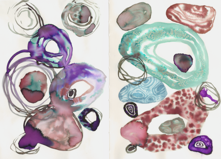
2. Your Class Project: Your class project. Thank you so much for
joining this class. I'm happy to see everyone here. For your project, you'll create one full composition filled
with different patterns. All of the videos will
be split into 1 stone, one pattern at a time. Along the way, I will suggest other pattern
options in case you would like to choose something simpler or something different. You can choose the size of the composition you
want to create. I will be showing you an A
five composition right here, but you can also choose an A four size or
letter size in US. You don't have to recreate this composition exactly as it is. You can experiment
with your own sizes of stones with
your own patterns, and you can add fewer or less
elements if you'd like to. If you feel that this
larger composition is a bit too much, it's
completely understandable. You can start by painting
just 1 stone per page, and that's already
a great practice. Most important thing is
that you're already here and you're ready to create
open to drawing something new. And when you're done, don't
forget to post your work in the project gallery so we can all see your
painting journey. It's also very exciting to see what unexpected ink patterns
effects appear in your work. What kind of magic will you be able to cast
on your paper? I'm so excited to see. You will find more
information to help you with the project in the project
section below this video. In the next vdio, I'll talk a bit more
about the materials I'll be using and then we'll
start drawing and painting.
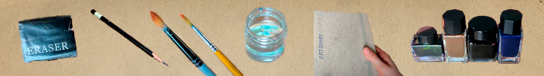
3. Materials & Supplies: Materials and supplies. Let's start simple
with the materials. You will need a pencil
and eraser, of course. As well as some pointed
round soft brussel brush. Minus size eight, and
all of my brushes, by the way, are synthetic. And you will also need one
small brush worton lines. I have lots of these
simple cheap brushes. There's no size written on them, but preferably they should
be size zero or one. When the brush is wet, it
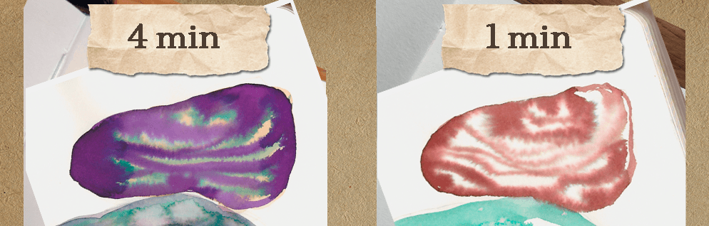
becomes very thin and pointy, which is perfect written lines. Then you need some napkins. Doesn't matter which kind, these will be used to soak up the excess ink on the paper. Wiping the brushes on them, you can get amazing
patterns that look exactly like tie dye. If you use fountain paintings, you can see how they separate into different dyes and colors. It's very beautiful. But don't expect to see such dramatic
results on paper, though. But these patterns
could still be go or collages or something
creative like that. We also need a jar of water to wash your brushes
and dilute inks. Now, choose your paper. You will see another
short more in the demo video showing how inks behave on
different papers so you can choose whichever
effects you like most. For this class, I'll be using
my trusty old Sketchbook. It's 100% solos
paper with a weight of 180 grams/square meter. Pages are cream colored
and the size is 14.5 by 21 centimeters or half
letter size in the US. The dickie pages give the ink paintings more
professional look, and that's why I chose
exactly this sketchbook. But you don't have to
have this type of paper. You can even use standard A four paper or US letter paper. It's G paper, and it's actually great for
practice because you are less afraid of wasting
it and nothing stops you trying
funky experiments, and I have made many paintings
using cheap paper myself. Then, of course,
you'll need some ink. First, the most important info
is be careful with things. Set up your space so that you don't knock
it down or spill. Since you don't have
magic powers just yet, it's painful just imagining spilling ink all over the place, especially in a white carpet. Oh, God. Also, be careful
with multiple rings. They contain strong
dye sometimes, which is how they create
multiple colors from one bottle, but they can stay in your hands and pretty much
everything they touch. This depends on the
specific ink you are using. Standard black inks
usually do not stain. However, every ink brand
is completely different. So I cannot tell you exactly which inks stain
and which do not. And it is safest to assume
that every ink can stain. Another important thing is
that ink can go bad over time. Different inks contain
different ingredients, so it's impossible
to say exactly how long each one will last. Many inks will slowly
change texture, color, or even develop
a bad smell over time. If they're stored poorly, this can happen in
less than six months. So make sure sunlight is not
hitting your ink bottles directly because this can
make them deteriorate faster. Unfortunately,
inks naturally age and usually do not last forever. Sometimes they last a year,
sometimes several years. It depends on the brand,
quality and storage conditions. The same thing can happen to
your paintings, actually. So make sure they
are stored properly. If possible, scan them
or take photos of them. For this class, you only
need at least one ink. Can even use just black ink and still get similar results. However, multichrome fountain
pen inks are perfect for this class because they are what I will be
demonstrating with. You do not need
these duo cromings, but if you already have
them, that's amazing. That just gives you more
things to experiment with. I call these things by
many different names, as you can notice, because they are still relatively
new on the art market. So there are no universal
term for them just yet. Unlike something like oil
pastels or watercolors. Because of that, you will see many different names used when
searching for them online, and I'll be showing you a
painting that uses six colors. Two things are simple, standard colors without
any special effects, blue and yellow ochre. Then there are three
duochrome inks. One is more reddish,
the other is black, and the one is kind of diluted, watered down, green color. And finally, one
especially in the ink, and that is dark purple
with the green humor that I consider multichrome
because it also contains an additional
green humor effect. On the packaging,
the inks that I call multichrome are labeled
as chromatographic inks. So throughout this class, I will refer to them as
chromatographic inks. You're looking for
a specific brands, I can recommend these
from the Blick store. It's Vers wheel, Brest
fountain pen ink, and Sailor USA State inks. There are many other
more interesting brands, but you have to
decide which colors, which brands you like the most. I would also recommend
trying these inks from EtS. These are octopus Shin ink and dllumTmd warm fountain pen ink. Hopefully I'm pronouncing
that correctly. But make sure the
ats sellers are not simply reselling inks from
Alli Express or Timo. If you end up liking these inks, you can often buy them directly from those
sites for less money. So check before you buy. Next, I will show you some cool effects you can
achieve with these inks, and we will test different
papers together. But if you already
feel like painting, feel free to skip ahead to the sketching step. So
I'll see you there.
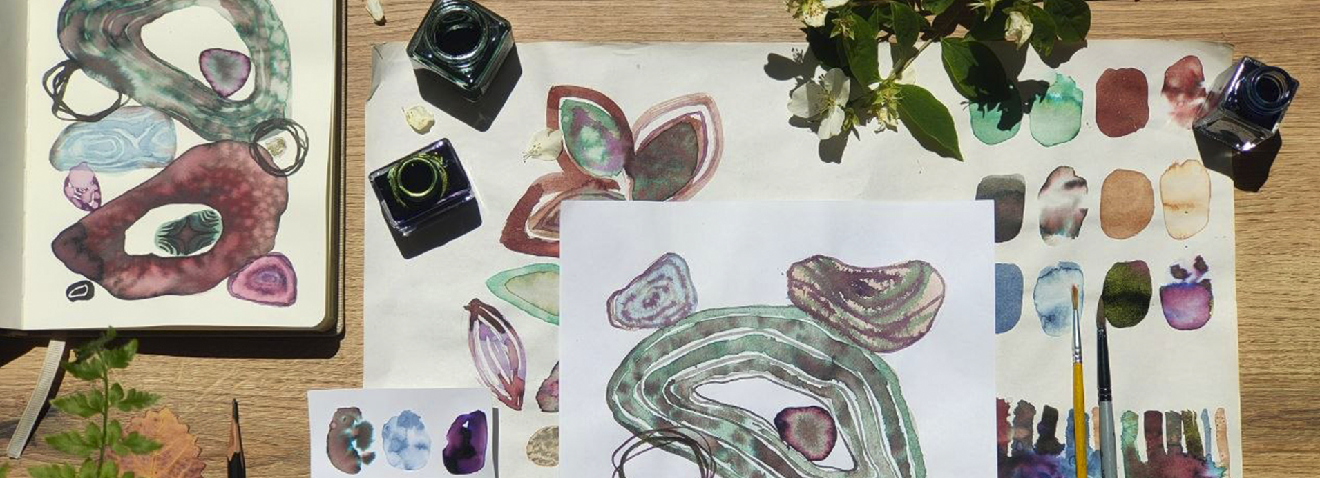
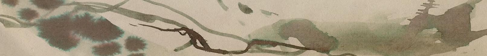
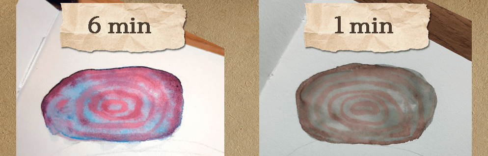
4. Ink Swatches & Creating Unique Effects: Inks watches and
creating unique effects. Here I will show you
some of the results and effects you can achieve with
these chromatographic inks, along with some experiments
that I created. I think the so of this art
material is experimentation. Most likely, all of us will
get different results, even if we religiously
repeat the exact same steps. So experiment as much as you
can with this medium and the colors you own by creating various watches
on different papers. You can spray water
onto these watches. You can mix all of
the colors together. You can add salt or
spray alcohol on top. You can try different
color combinations. Create watches with
water or without water. Here you can see
some of the works I created on different papers using the six colors that I own. I'm also showing you all
of these watches I made by combining the six colors
in every possible way. In total, I ended up with 15 different color combinations. I made these watches
in two different ways. On the left side, I mixed the colors
directly on dry paper, and then added drops
of water on top. On the right side, I mix colors together on a wet
area of the paper. These inks really need water and space to
bloom and spread out. And do these cool,
beautiful effects. So adding drops of ink onto what paper creates
the best results. You can also achieve
very beautiful effects by sprinkling some salt on top. Experiment as much as you can, and don't be afraid
to waste paint or paper because nobody
would swarm that. And here are some of my
drawings that I made on standard letter sized
printing or a four paper. One of the best things
about these inks is that they are perfect
for fast sketches. So use that advantage and paint as many sketches as
possible and have fun.
5. What Paper to Choose? (testing different options): What paper to choose? Testing different options. Now, on to the question
of which paper to choose. Exciting. For
standard black ink, the answer is usually
much simpler. But when it comes to
special inks like these, there are really no one
size fits all option. Sometimes you can
buy sample packs of different papers from
art paper suppliers. And if you can find one, it may be very helpful
for testing the inks you own on different paper
types available to you. Usually professionals recommend smooth heavyweight paper that allows the ink to flow freely without bleeding
or feathering. But here I tested many different kinds of
paper so you can see for yourself how these inks behave on
different surfaces. You can absolutely skip
this section if it feels too overwhelming right now and jump straight into painting. But if you stay, I will
satisfy your curiosity. The choice of paper matters
because chromatographic inks can create completely
different effects depending on the surface. For each paper, I may swatch
it by first adding water, then applying a few
drops of different ink. I also tested how the colors mix together and how salt
affects the inks, as well. So starting with market paper, it is thick and sturdy, but honestly, diorst
option from this group. It makes the colors
look dull and desaturated because
paper absorbs the ink too aggressively,
I would say. Most of the beautiful effects
disappear immediately, and adding water on top
does almost nothing. I personally would not recommend buying marker paper for
this particular technique. Next is 300 GSM watercolor
paper made from 100% cotton, so that's probably expensive. The color spread beautifully, but because the water
moves so freely, you lose some of the more unique ink effects,
surprisingly. It is also expensive and, in my opinion, not really worth it for ink painting alone. Then I tested thinner
watercolor paper, since it's also cotton based, the paper tries to evenly distribute every drop
of water and ink. So results look a bit
like tie dyed shirts, which can actually be
beautiful, but again, some of the more dramatic
ink effects disappear. However, the salt technique works wonderfully on this paper. And finally, another green
colored sketch paper. This was honestly one of
the worst ones for me. The colors spread too early and rarely react to
additional water. So the final effect
looks boring. I'm not sure why,
maybe because it's too thin or maybe because
it's cheaply produced. Not sure. Then there
is mixed media paper, which is the thickest
paper I own. Surprisingly, it turned out to be one of the best options. It does not react
as dramatically when I add water drops on top, but I would definitely be interested in making
larger paintings on it and experimenting on this
paper more just because it looks thicker and maybe
for display of ink paintings, that would be kind
of a good option. After that, I tested glossy
dry techniques paper. Honestly, this paper
feels like plastic, but surprisingly, the ink behaves in very
interesting bags on it. I expected it to be one
of the worst options. So this is exactly why
testing papers can be so useful because ink looks quite beautiful
on this paper. Then I dried textured
watercolor paper. I expected this one to
perform badly, too. But surprisingly, again, it
was not as bad as I thought. The texture makes it
slightly harder for the water and ink
to spread evenly, but the colors remain bright and the ink still reactivates
nicely with additional water. Maybe I like it because it's cellulose based and
not cotton based. Next is thin sketch paper. It performs fine, but it
behaves somewhat similarly to regular printer paper,
just slightly better. That makes sense because it's
a sketch paper, after all. Personally, I would not use
it unless it were cheaper than simply buying standard i four or letter size
printer paper. I tested 280 GSM dry
technique paper. It was not one of my favorites. It behaves somewhat similarly to cotton watercolor
paper or marker paper. It surprised me a bit because I really liked dry
techniques, paper for ink. And after looking it up, I realized it actually
designed more for markers and graphic work, which explains why it
absorbs some of the ink and slightly saturates the colors
and why I don't like it. Next is dry techniques, acid free paper, which is
great for preserving work. This one was actually
my favorite from the I love how the ink
spreads and blooms on it, and I especially like
how easily the ink reactivates when more
router is added on top. Overall, my favorite papers were the dry technique papers, and they take mixed media paper. The worst performers for
me were the marker papers, while watercolor papers landed
somewhere in the middle. My conclusion is
that you can really choose whiche paper
you like most. Just be prepared to get
very different results, and my personal favorite paper may end up being
completely different from yours simply because
we might be trying to achieve different
results and effect. And that's fine. Now grab your paper and let's
start painting.
6. Sketching the Composition: Sketching the composition. Let's start with sketching. For your convenience,
you can download either the A five or a
four sketch and start coloring it in on printing
paper, where you can trace it. Otherwise, you can sketch
the same composition in your sketchbook simply
by following along with me. The most important
thing is to add a few larger shapes and surround
them with smaller ones. So first, I drew one large shape balancing on
top of another. Then I added smaller
stones around them wherever I could fit them in to balance the rest
of the composition. I was fidgeting a bit with
the positions of the stones, which is why you can
see me redrawing them with darker and darker lines. I added a few shapes on top of the larger stone and
then one in between. After that, I
started filling all of the gaps with smaller stones. You can also see me adding one shape that
overlaps the others. Later, this will
become just a line I will not be filled
in with color. Little trick that
I like adding to my composition is creating a hole inside the larger shapes, where I can place additional
stones in the middle. But if you don't
like it, you can completely skip this step. But I think it makes
the composition feel more unique and
playful, doesn't it? Like a Tiny treasure or a iot. Once this sketch is finished, I begin raising the lines. First, I go over everything with a regular eraser to
remove unnecessary marks. And then I use my
soft kneaded eraser to speed up the process and
lighten the remaining lines. You absolutely do not
need this type of razor. A regular one works
perfectly fine. I just personally like
kneaded razors because they don't leave any
little crumbs behind. I'm lightening the
sketch because I drew the lines
with a heavy hand, and if I leave them like that, they will still be visible
underneath the ink later. So I raise them just now so they are barely
visible to me. I can still see the sketch, but now it will not overpower the ink that will add
in the next steps. After all the pencil lines are not the main
stars of the show. And now the sketch is finished. So let's start coloring
these shapes in.
7. Painting Stone No. 1: Painting stone number one.
Let's start painting. I will show you how I
paint these stones, but you might feel
that this version is a bit advanced or
difficult to follow. Completely understandable. For that reason,
I have also added a simpler version of each individual stone
which you can repeat, and you will see it in the top right corner of the screen. I recommend first watching
the full process and then repeating the version you feel most comfortable with. If you think you need
the simpler version, just wait for it to appear in the top right corner.
Happy painting. I will also show
you a close up of each stone and tell you
which colors I use, but feel free to use whatever
colors you have on hand. For example, here is almost
the same composition, but done only with black
chromatographic ink. So don't feel pressured to
match the exact colors. But let's begin. I'm starting
with the top left stone. I'm using my palette to
dilute the blue ink by adding water with the brush and then mixing in a
small amount of ink. Then I paint the
entire stone with the light blue wash. And add a few dots of very
water down purple. Next, I add small drops of clean water until I'm
happy with the texture. After that, I mix water with black chromatographic
ink and deepen the color by adding a bit more purple ink to make it darker and
more interesting. I adjust the color until I'm
satisfied with how it looks. You can also see a spot of
extra water on the stone, so carefully remove it with a clean napkin before
adding darker lines. I start from the Sandra ovul and draw more ovols around it, and the final outline follows
the edge of the stone. For the Es version, you can simply draw these
same circular lines without the background color. You can either leave
it as is or use a light wash water down black ink and then add
color on top of the lines. But going back to more
detailed version, this time I'm adding water
on top of the stone, and as you can see,
the lines start to shift in color
from dark to orange. This is the magic of these inks, and it's something
you definitely cannot achieve with watercolors. After that, I add
a few more spots of darker ink for my palette. Then you can do another trick. Gently leave the extra
ink with a napkin, and this gives a very
beautiful effect, and that's it for the first son. So let's move on to the second.
8. Stone No. 2: Stone number two. Now let's paint the top right
stone in the composition. I'm starting by
adding some water to the palette and then mixing
in yellow ochre ink. Then I fill the entire
stone with this color, giving it a beautiful
creamy tone. Next using the green ink, I add this pattern of line starting from
the top of the stone. Then with the same
darker mixture I use for the previous stone, I trace around it while the ink is still
wet on the paper. I also added a bit more purple to make the colors
more interesting. And After that, I decided to add another
set of lines in the center. While the stone was still wet, I also added more
of the darker color around the edges to create
a stronger contrast. And that is it for the
more detailed version. As for the simpler version, I started by filling the shape of the stone
with clean water. Here I'm showing with
the reflected light how evenly the water
layer covers the surface. Then I raised the shape using
reddish in and repeated the same line
pattern by dragging lines from one side of
the stone to the other. Closer to the top, I drew
these open shapes that create the illusion
that the stone is rounded rather than flat. And that's it. Much simpler
but similar result.
9. Stone No. 3: Stone number three. Now, let's
tackle the biggest stones. I'm starting by
creating a wash of black herrmatographic
ink mixed with water. Then using a small, long bristle brush, I begin tracing around the
shape of the stone. After that, I repeat the same line a little
closer to the center, and then again, even closer. Finally, I trace around
the center shape, excluding the center, of course. Next, I begin filling
the gaps with green ink until every section is filled
except for the centerpiece. I try to leave small
gaps between the lines, but it's completely
fine if some of them touch and merge together. And while the ink is still wet, I add drops of
darker ink mixture just to make it more
texture and interesting. And sometimes I also add
drops of clean water, and I keep repeating this process until the
entire shape is filled. As for the Es version, I start by filling
the entire shape except for the
center with water. Then I trace the shape
using a larger brush, so the process goes a bit faster filling it
in similarly to more detailed version just with lines around the
shape of the stone. After that, I sprinkle some salt on top while the
ink is still wet. Keep in mind that this
effect probably will not work very well on
standard printer paper, but in thicker paper, the ink separates and
blooms beautifully, and that's it for
the simpler version. For now, I'll leave the more
detailed version as is, but I'll come back
to it once it dries. But let's move on to the
stone number four. Oh.
10. Stone No. 4: Stone number four. Now let's move on to the centerpiece
inside this larger stone. I'm mixing some water with
green ink on my palate, and the chromatographic
ink that I own is really fairly
diluted in the bottle, but I want to make
it even lighter. With this color, I'm
filling in the stone, and then I'm adding a little bit of a water down darker color. Next, I add a few drops of
green ink in the center, and then using a thin brush, I trace around the stone
with dark purple ink. With a large brush, I
soften the edge between the two colors by adding a bit of water to help
them blend together. Mm hmm. Then using a clean napkin, I gently dab the paper
to lift some of the ink. After that, I once again go over the whole shape with
water down green ink. And again, I add darker
purple around the edges. But to be honest, I
probably could have stopped at this stage because it already looked
absolutely beautiful. Then last but not least, I add more green
ink to the center. I try to go over the
purple incons more, so it spreads a bit more. And finally, I place a small
dot of darken in the center. As for the simpler version, I start by filling
the shape with water. Then I trace around it with dark purple using a small brush. Next, I add a drop of
black cmatographic ink in the center and place a few
drops of water on top of it. As you can see,
the water and ink begin moving into the
crevices of the paper. So I carefully try to soak up
the excess with the napkin. Then I add a little more
water to encourage the ink to spread further and remove some additional extra ink
from the bottom area. After that, I decide to place another drop of black ink in
the center, and that's it. Our progress is
going really well, so let's keep the ball
rolling. Let's go.
11. Stone No. 5: Stone number five. Now we're painting the stone on the left side of the center
section of the composition. I'm starting with water down blue ink and adding a
few bean shaped forms. Then using a thin brush, I trace around the bean
shapes with lines. One of the bean
shapes, I decided to cut off at the
edge of the stone. Toward the third line, I connected it so it
travels from one side of the stone to the other wrapping around this in shape
in the center. Then I continue filling
the shape with more lines, and that's for the pattern. As for the simpler version, I'm doing basically
the same thing. I start with a few
bean shapes inside the stone and begin surrounding them with
more and more lines. Then I continue filling
the rest of the shape with additional bean shapes and bean forms where I can fit them, adding more lines
around them as I go. But back on the more
detailed version, I'm adding drops of darker ink onto the areas where the
surface is still wet. Then using the larger brush
and water down blue ink, I paint another layer
over the shape. For the easy version, once I finish drawing
all the lines, I simply fill the shape
with water, and that's it. Everything is
looking pretty fun. We're turning to the more
detailed version now. After that, I lift some of
the ink with a napkin in the center and in a few
different spots as well. I go over the shape
with blue ink once more to increase the
contrast of the line. Then I add water
again, but oops, I should have waited
longer for the lines to dry because they started disappearing under the
water straightaway. So once again, I remove this extra water with the
napkin, and at this point, the whole thing started
looking too pale, so I ended up repeating
parts of the process again. This is where my brain starts spiraling into
perfectionist cycles. So there is absolutely
no need for you to repeat all of these
extra crazy stops. Added more lines on
top of the blue ones, and instead of
adding more water, I simply lifted extra
ink with a napkin. My napkin happened to
have a textured surface, which left behind some
really interesting marks. But then with the
water down, blue ink, I added more ink to these lines and removed
some more with the napkin. You definitely do not need to repeat every step
exactly the way I did. I was constantly going
back and forth because of my perfectionism
and simply could not leave the painting
alone earlier. So maybe a simpler
version for the in here. But let's move on to painting
the Tiny stones now.
12. Painting the Tiny Stones (No. 6 & No. 7): Painting the tiny stones, number six and number seven. Now, let's fill in
these small stones, starting with the
smallest stone on the right side of the center
section of the composition. I'm picking up a
bit of purple ink from my palette using a brush that already removed the
excess water with a napkin. The brush is fully loaded
with ink but not wet, so it leaves bottles
of water behind. And using a dry brush
technique in circular motions, I fill in the little
stone with ink, which creates this cool texture. For this simple version,
you can simply fill the stone with purple
ink using a small brush, and then add a drop
of water or maybe don't just fill in with
purple ink, and that's it. But here you'll see one
of my mistakes now. I wanted to lift the excess
water ink with a napkin, but there was too much liquid in one tiny spot, and
I pressed too hard. So the ink escaped and spread out and it created
this weird shape, but that's fine.
We'll work with. Like watercolor, you
cannot always fully lift or remove the ink
once it stains the paper, so I decided to
leave it as it was. To help conceal the
mistake a little, I added circular lines around it using a
small thin brush. Now, for the next tiny towe, I picked up a mixture of dark purple and black ink for my palette and
tries around the shape. Then I added another
shape inside it. And then another
one in the center. To make it a little
more interesting, I added a few drops of water and left it alone
for the moment. For the simpler version, you can follow the
exact same process, but without mixing colors. Just use one dark ink to
trace around the stone. And then add another shape inside while leaving
a small gap. And finally, fill the
center with the last shape. And that's it as simple as that. So now let's move on to
stone number eight. Oh.
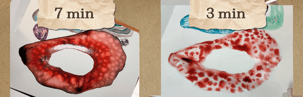
13. Stone No. 8: Stone number eight. Now let's fill in the last larger shape. I'm mixing red ink with
water on my palette, and then I fill in this
shape using a water down red chromatographic ink
with a larger round brush, excluding the center, of course. Next with a small brush, I trace around the
shape using green ink, carefully adding it to
the edges of the stone. Then I add blacking
to the edges as well and go over the area where the colors meet using a larger clean brush to
soften the transitions. After that, I let it
dry for a few seconds. And then using a round brush, I trace around the central
park with red ink. After that, with a small brush, I add tiny drops of dark
ink around the center. As for the simpler version, I first cover the stone
with the layer of water. Then I add drops
of red ink using a small brush until the entire shape is
filled with these drops. This effect only works well when there is enough water
on the surface. If the paper starts to dry, I simply add more water and continue adding
more dots of ink. You can also use
multiple ink colors for this technique if
you have them available, of course, but it's fine if not. And that's it. I then add drops of water, and look how cool the
effect turned out. I think this works
because there is enough water already
on the surface, and then continue adding
small drops of water until the entire stone fills in with this beautiful texture. So let's move on to sounds
number nine and done. Oh
14. Tiny Stones No. 9 & 10: Tiny stones number nine and ten. Now it's time to paint
these smaller stones again. Ya, let's start with the small stone on
the bottom left side. As for this one, I'm using black chromatographic
ink to paint a thick line around
the edge of the stone. Then I fell in the
smaller inner shape, leaving a small gap
between the lines. Since this one is pretty simple, there's no need for a
simpler version this time, so that's it for the stone. Let's move on to the next one. For this stone, I'm mixing purple and black ink
and watering it down. I repeat the same process
as with the previous stone. I draw a line around the edge, making it thicker in some
areas and thinner in others. Then I draw another line
slightly inside the stone. And by the way, for
the simple version, you can do the same steps, but just use purple ink
straight from the bottle. Then I draw another line, again, varying in thickness. For the simplified version, you don't need to
worry about that. Just add a line using water
with a larger brush and then drop in some ink while the surface is still
wet and that's it. Oh Back to the more detailed version, I add another line using an even more diluted ink
with a larger brush, forming a band shape
around the center while leaving the middle empty and just filling in
up to the edges. Then I add drops of water with a small brush while
the ink is still wet. You can also draw a line in the center of this
band, if you like, which is what I decided to do, or you can just play
some dot here and there. After that, I add water to the center to connect it
with the surrounding band. Then I draw another line
in the middle of the band. This is probably another of
my perfectionist decision. You can absolutely leave it as it is without adding
anything more. Then I add even more water
to the edge of the band. Again, thanks to my
perfectionism here. Finally, I take a clean
side of the napkin and gently dab the stone to
lift some of the wet ink. And that's the result. It turned out pretty interesting,
in my opinion. But let's move on to the
last stone, stone number 11.
15. Stone No. 11: Stone number 11. Our last stone, how exciting? This is the center stone of the largest bottom shape
in the composition. I'm mixing green
ink with a bit of black ink and
adding water to it. With this color, I fill
in the entire stone. Then using a small
brush and black ink, I draw a four pointed star connecting all four
sides of the stone, adding a bit more ink in places
to increase the contrast. And then I fill
in the empty gaps with these small arch shapes, repeating the step on all sides. As for the simple version, I start straight away
with the star shape. And then I fill in the
gaps using a small brush. After that, I go
over the whole shape with water using a larger brush. Finally, I trace the outer
edge with black ink. And that's it as simple as that.
16. Final Adjustments + Small Improvements: Final adjustments and
small improvements. Now, let's check if all
of these stones and shapes are finished before we
wrap up this art practice. First, I want to finish
the stone where we left a few drops of water because
it will take ages to dry. So I'm gently soaking
these drops of water using the edge of a clean
napkin very carefully, but that's it for the stone. Next, I promised we would come back to the upper larger stone. So let's finish that now, although you can absolutely leave it as it is at this point, so feel no pressure to continue. But now since the inks are dry, using a larger brush, I go
over it with the clean water. Wanted the inks to blend
together a bit more so the contrast isn't too harsh when looking at
the whole composition. So I also add a bit of water down green ink all
around this stone. And then I add a
few more drops of clean water using
a larger brush. And look at this cool
effect that we get here. I gently remove
some small pools of water from the surface
using the edge of a napkin, and that's it for this part, but I think it
looks amazing now. Another small adjustment
I wanted to make is to fix the center stone of
the large bottom stone. The ink spread a bit too much for my liking and my
perfectionist side, couldn't leave it as it was. So I go back over it with the
same lines using black ink. Then I add a small drop
of water in the center, and that's it looks much
better now, in my opinion.
17. Adding the Final Lines: Adding the final lines. Let's add a few final lines and shapes that I had planned. Feel free to skip
this part if you feel like you're already
done for the day. That's completely fine.
But I'm coming back to the upper large stone and
the empty area on the left. If you remember
from this sketch, there was an
intersecting line there, and now I'm going to add it using a small
brush and black ink. But at first, instead of
waiting for the ink to dry, I decided to dab the corner with the napkin to speed up
the drying process. And then I draw a free hand round the rectangle
shape or circle shape. Don't try to make it perfect. That's exactly what
makes it special. After that, I add a few
more lines around it and look how beautifully the ink blooms when it touches
the larger stone. Next, I repeat the same shape around the small
stone on the right, loosely circling it
with a small brush. So basically the same step,
but just one more time. I go over it the second time
to make the lines darker. Again, this is my perfectionism showing up and taking the spot, so feel free to skip it. But that's it. Great job.
18. Class Wrap-Up! Thank You :): Glass wrap up.
Thank you so much. So wonderful to see you here, my dear ink wizards at
the end of this class. We created a full
painting together, and I hope this process
showed you that one of the greatest kinds of magic
is simply practicing, experimenting, and having lots and lots of fun while painting, and then being surprised
by the results. And I'm truly proud of you for trying something new
because it's not easy. Painting something new
is always challenging. So it took quite a
bit of courage and patience and dedication,
but you are here. I also hope that in feels a little less
intimidating to you now. And that you feel more
confident in exploring its unique qualities and all of its unexpected to surprises. Don't forget to upload your project to the
project gallery. You can add your photos there. And please don't worry about taking a perfect picture
of your painting. This is not an art competition. It's a cozy gathering of
artists here on Skillshare, and I would generally love to see what kind of
magic you created. Thanks to your
support and comments, I'm able to continue
creating new classes. And if you enjoy this one, I would be very grateful
if you left the review. And don't forget to follow
me here on Skillshare you. Don't miss future
classes, updates, and occasional voting and
upcoming class ideas. Let's stay in touch.
Until next time. Bye for now my
fellow ink wizards.