Transcripts
1. Intro: Are you struggling
to find colors and color combinations that feel authentic to you as
a person and an artist? Well, in today's class,
we're going to explore colour palette and
color combinations that feel more personal, more impactful and
truthful to who you are. Hi. My name is Leah. I'm an artist and
creator in Canada. My art and teachings focus around using art as a
tool towards healing. I've been using
these colour palette explorations for a
couple of years now. Not only are they great for
helping me find colors and color combinations to express my emotions so I know
what colors to use, but it's also a
great exercise to just add some art into
my day because they're simple and easy to
do that they can take up to 15 or 20
minutes of a day. We're going to look
at inspiration. Colors that we
love and exploring our own emotions and how we can pick colors to reflect that. This class is for
anyone and everyone, whether you're using art as a tool towards
healing to distress, find peace in your day, or if you're using it to
expand your colors so that you can get better at being an artist for illustration, client work, it's great for
beginners and even those who are advanced at art and have been making art
for a long time. I hope to see you
in the class where we'll be exploring colors.
2. Project Description: Today's class, we're going to be creating several
custom colour palette, along with illustrations
or paintings, depending on the art supplies
that you've chosen to use that showcase those
colors that you've chosen, along with some
reflections where we're going to look
back at those colors, see how they work together, how do they make us feel and whether or not we
even like them. For the class project, what I'd like you
to do is select your favorite colour palette
that you've created and then add it to the
project section where you can share what you
feel about the colors, why you feel they work together. And we can all see some amazing artwork
that you've created. I look forward to seeing all
the things that you create. So let's just dive into
the class and get started.
3. Materials : Now let's get into the
materials that you're going to be needing for today's class so that you can explore your colors and hand in your class project. So first off is going to be something that you can do all your drawing or painting on. Personally, I love doing my color explorations in these
small square royal talons, but I want you to use
whatever you have on hand. If it's loose sheet
paper, printer paper, or whatever sketchbook
you prefer to use, grab that and we'll
use that for today. I'm also going to
recommend that you do have some loose sheet paper
that scrap paper. I'm going to be using some
just basic printer paper here. My reason for that is the fact that we want to
do two things with this. The first is to actually test out a color to see
if that's the right pink, for example, that
we want to use. And the other reason is that
at the end of our exercises, we are going to reflect back on what we've created and
how we feel about it. And we just want
somewhere where we can jot down our
thoughts and ideas. You're also going to want something that you
can write with. So you're going to need
a pencil or a pen. I'll be using the
pen just so you can see what I'm
doing on camera, just because I know
sometimes HB pencils, depending on how light
I write or anything, doesn't always
pick up on camera. And lastly, we need the
materials that we're going to be creating our
color explorations with. I have a lot of stuff. So I have No Color twos, which are water soluble
wax based crayons. I have a lot of colored pencils, as well as a lot of markers. But if you only have
a set of 12 or 24 of anything that you like to make art with, that's
perfectly fine. You can use that, as
well. If you'd rather do today's exploration
with watercolors or uh, you can do that, as well. This whole class is for you guys to find the right
colors for you. And that means using
what you have on hand. So please don't feel
like you have to have all these supplies that
I have here today, especially because
I've accumulated these things over the years, as I've been using art as a tool towards healing for
a very long time. Oh, and before I
forget, if you like, you can use a ruler if
you'd prefer to be more precise in your squares that
we're going to be drawing, but I just like to free hand it. So now that we've gone over everything that
you're going to need, let's head into the next class.
I'll see you guys there.
4. Examples : I quickly want to show you some examples from my
previous sketchbooks, where I did the
exact same activity that we're going to be
doing in today's class. Now, it all started with this little sketchbook
right here. I had purchased it,
and it ended up sitting on the shelf being
unused until one day, I saw a video on YouTube where an artist was using
limited colour palette, and that inspired me to try to limit my colour palette with
the materials that I use. And in the process of
going through that, I learned so much about
myself as an artist, my choices in color, why colors work so
well together for me. But also, I learned
that this activity is great for if you are low on time or you're
not feeling well, and say you're sitting on
the couch, laying in bed, and you want to create art, but you need something
that's low commitment. This is a great way to learn and create and explore
and let loose. But it's also great for taking
to doctors appointments because you sit in a waiting room for 45 minutes
for your name to be called, and you can create art to reduce your stress and
anxiety in that moment. Now we are here to
explore colors, to see how we ourselves can expand the colors
that work best for us and to learn our
colour palette to help us create art that feels more authentic
to ourselves. And doing this has
really taught me a lot about my
choice and colors. I really do lean towards really bright greens,
and cool blues. I find that after
filling two sketchbooks, a lot of the colors that I lean towards are considered to be tropical colors because
of how vibrant they are, the warmth of them themselves. But I also have
learned to really appreciate muted color
palettes as well. So I highly recommend that when you're working through
your colour palette to really explore the colors that you have and just test down colors to see if it works out for you because
this colour palette, I love it so much. And I reference back to
it time and time again. Now let's head into
the next lesson where we're going to talk
about color inspiration.
5. Inspiration : If you're currently looking at all the art
supplies that you have in front of you and you have
no idea where to start, taking a quick look at some pre made color
palettes might just be the kick in the inspiration butt that
you need to get you started. Now, you can easily just pick a color that you're
loving right now. Like, say, for example, you
are obsessed with blue. So select a blue and get
started and then go from there. Or if you are wanting
to express an emotion that you currently
want to put into your art or to express
through your art, you can think of
a color that you associate with that emotion
and start from there. But if those two
things aren't you right now and you're just
needing that extra spark, you can pick up a
colour palette book, like one of these two or
head to Pintrist and type in colour palette inspirations and scroll until you
see something that, like, sparks an idea. I love this book here
because it's full of so many colour palette
that you can expand upon. So, for example, here you can see that
there's only two colors in these palettes that are
options for you to work from. But if, for example, these two colors really
sparked it, I would be like, Okay, what do I have that kind of looks like these two colors? And I'd be like, Okay, this colored pencil kind
of looks like that. And this blue reminds me of
this No, maybe not that one. Maybe this neo color, too. And then after having
these two colors, if this is the one that
stuck out to me on this whole page, that
means something. That means that
these colors might just be my color preference. So then from there, I can then select other colors
that go with it. These color explorations
are really going to let you see what you instinctually
lean towards, but also how you can expand those colors to broaden
your palette range. If you're not ready to let your intuitive instincts
select a color for you, pick a inspired pre
made colour palette, and then come back here and we'll dive into the next lesson. I'll see you there
when you're ready.
6. Exercise 1: Alright, so let's dive into our first colour
palette exploration. Now, I really did love
these two colors. So I want to first
swatch it out. Yeah, I like how those
two colors look. So I want to expand this colour palette further
than just two colors. For the colour palette
that we're going to be creating in today's lesson, we're going to be using
a max of six colors. I prefer six for a
couple of reasons. One of them is the fact that it allows me to have a light, a dark muted colors, if I want to add muted
colors, vibrant, poppy colors to contrast, maybe some muted colors. It allows a variety of color options to be used
within the colour palette. If you want, you can expand it to more than six or
limit it to four. But I find for myself, six is like that sweet spot
for color exploration. And because these two colors, I have a soft, peachy color and
then a deep blue, I want to add
something else to it, and I'm thinking orange. I'm just going to let
my instincts guide me, and I like that a lot. But because I have a soft blue, a saturated pink sorry,
not pink orange. And saturated means,
if you're not aware, it's just a color that it is, like, say, for example, orange. This orange. And that's
its saturated form. If I were to mix it with
white, for example, then we're going to be
getting more of a muted, desaturated or pastel
version of it, like so. If you're using watercolors
or gouache, you can Well, watercolor specifically,
you can add just water to your
color to desaturate it. If you're using gouache,
you can add white gray, a bunch of other things
that you can mix. But for the supplies
that we're using today, which is our handheld dry
media drawing materials, you want to select
colors that kind of feel the same,
don't feel the same. Really, you just want to
explore and have fun. You can even pick colors that
you think don't go at all, and then you might be surprised that you love them together. Um, but yeah, let's
pick another color. So I got three here.
I need three more. What else should I use? Hmm. Hmm. You know
what I'm thinking? Maybe some red.
Yeah. I like that. Okay. Red, it is. And then I think I want
to add another blue because blue is my
favorite go to color. And use a light blue. Yeah, I like that. And
then one more color. Shall we go with a contrasting completely
out of the blue color? Or should we do something else? Hmm. I kind of want to
see what this looks like. It's a bright lime green color. Like, how does this fit
in this colour palette? Ooh. I kind of like that. Okay, that's what
we're gonna be using. These are our colors for today. So I'm gonna pull up a new page. And then I'm going to swatch
and then create something. So the project that you'll be handing in will be a photograph or scanned image of your colour palette and
your completed project. You can photograph
your sketchbook or scan in your loose sheet
paper that you worked on. So first, I want to
draw out my colors, cause I want to see the palette itself together in reference to what I create on
the side next to it. This color here is
from prisma color, and it's called salmon pink. Who, I would not call that pink. Whoever. I'm tilting
this so I can write. Now, I like to label the
color and the brand name. So that way, in the future, if I want to use this colour
palette for future artwork, I know where to find the
color that I'm using, what colors I can use
with it in the future. Just so I can reference back
to it and find them again. You may find that
after doing this, if you yourself
enjoy it, that you, too, will end up
having a collection of colour palette that you can
constantly reference back to. Over the years, I used to use color inspiration books
and websites like Pinterest a lot until I started creating
these colour palette. Now when I need
to create art and I'm not too sure what
colour palette to use, I'll reference back to these
sketchbooks so I can see the materials that I use and know that I have those
colors easily on hand. Dark kid. Orange. Oh, I can't write
and talk at the same time. I'm not sure if I spell
luminance right. E. It's fine. And then I'm
going to put this one here. Oops, made that box
a little too big. Again, it's fine. I'm sure some of you might be watching this and going, Oh, no. It needs to be a perfect
square or rectangle. But I'm cool with it
being a little messy. So this one's
called Scarlet Red, and it's made with a hit Artist pen Dual
brush pen. Faber Castle. What's with all the
tongue twister names? What's interesting
about these markers and why I really like them?
I'm not selling you this. I'm just stating
it in case you're interested because I
know what it's like to watch Skillshare classes
and wonder what are the materials the
artist is using Because I absolutely
love that color. Anyways, is that they
are made with India ink, so they're permanent once dry. So this is lime green
from ink tints. And then let's do the blues. Coval blue 5%. Ooh. And then the last one, our neoclor. This one is called night Blue. See, this is why I
tilt books towards me. I can't It feels so awkward writing with it straight
on, staring at me. My shoulders felt uncomfortable. Okay. Now, at this stage, once you swatch down
all of your colors, you want to take a
moment to really look at them
together as a group. It's very different from seeing them swatched down like this because now you're able to see them and then ask yourself
a couple of questions. Like, what color do
you want to be the hero color of the thing that
you're going to be drawing? Personally, I love doing
abstract landscapes when I'm doing
color exploration. You might love doing flowers, still lives, animals, portraits. You create what you
love to create. But now you want to ask
yourself a couple of questions. Like, what color do you
want to be in it the most? So what hero color? That hero color basically means it's going to be the
one that you see and takes up about 50 to more
percent of the final image. What color do you want
to be a minor accent? So this vibrant green to me right now feels
like it needs to be a minor accent
alongside the red. I feel like if there's too
much of these two in here, it might be too much because they're
very powerful colors. This is very, like, pop,
vibrant, fluorescent almost. Where this red, it's a very
strong eye catching red. So if there's too much of
it in my palette and, like, on my landscape, I feel like the eyes gonna
draw to it the most. So not too sure, not too sure. Okay. Um, let's. Mm. I'm I'm picking the color that I think I
wanted it the most, which is this soft color. I'm gonna put it in the
background and just, like, bring it into
the foreground. I think this is
going to be kind of like grass a grassy area. And then I want some
of this red to, like, Oh, it doesn't look
as dark from that side. Got to flip it
back over to here. What is to.in and out? Yeah. Yep. Okay. Feels like enough. And then for the blue,
I need to sharpen this. 1 second. I really like adding lines and
textures when I'm doing this. So I feel like the light
blue would be great for showing whatever this area is. It could be water, but I'm
really thinking it's more like a hilly area where the land slopes
a little bit more. Oops. Dan And then the green thinking. It's kind of like maybe
something in the foreground. Like Tak grass plants. And then we'll put some of
that here to balance it. And then the orange. I think I want it to be
'cause I'm doing grass. I want it to really highlight
that there's grass here. I want to add a little
bit more darker areas. E. And then I still have the dark blue to use. Where shall I put it? Let's make this
some, like, like, bushes that are Oh, trees. Yeah, this could be like a tree. That's at the end of the hills
where the grass meets it. Then maybe there's a tree
here and trees up here. Trees. And there we go. A color exploration
using these colors. Alrighty. Now that we've
looked at them as individuals, now let's look at them and
ask ourselves some questions. After selecting the green and
red to be the minor colors, does that still work
with the colour palette? Would we make any changes to the color ratio
that we created Um, is there a different color
that you think would work better now that
you've seen it in action? These are the kind of questions that you can ask yourself. Now that you've
created, you're trying. Now, personally, I feel
like the light blue, like, there's not
enough light blue. So I would do more light blue. And then ess red. And even though it's
still a small amount, I still feel like it might
be a little too much red. I like the amount of
green that there is, but I think the red still
draws too much attention. Hmm. What else would I change? Maybe a little bit more
of the dark orange. But the most important
question that you need to ask yourselves
now that you've done your first color
exploration colour palette is, do you like this? Does this speak to you? What do you feel when you're
looking at these colors? Does it inspire you to
make something more? After referencing back
to the color options, do you want to explore
it more and try to create something else
using these colors, but expanding further on it by trying it with
different color ratios? Like, should I do another
drawing with more blues, more of the light
blue, less of the red, and more of the dark orange? I think for the
purpose of today, I'm going to move forward, and we're going to do our next colour palette exploration. So I'll see you in that one when you're done your first one.
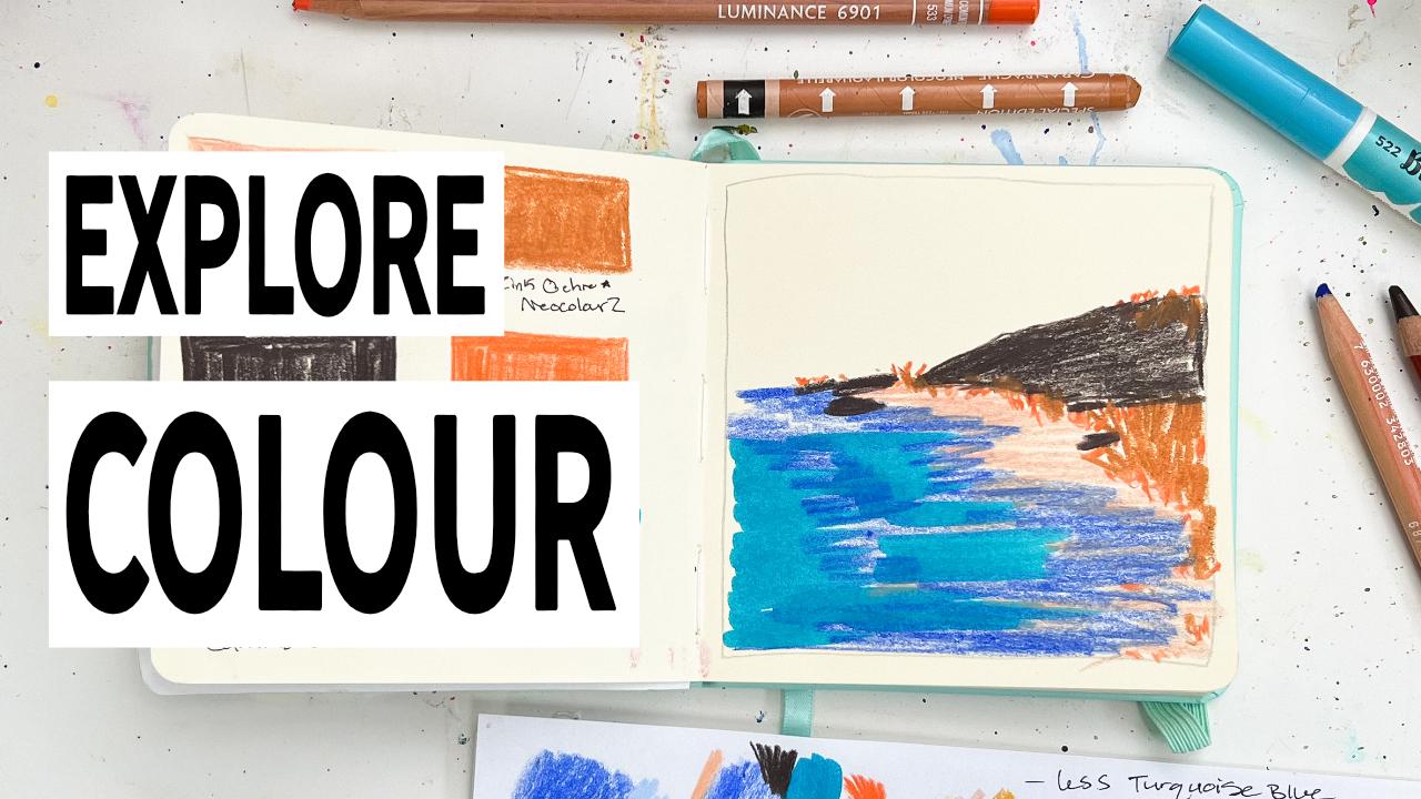
7. Exercise 2: For this next one,
what I want to do is select my favorite color. And I have a couple of them, but I am obsessed with
ultramarine blue, specifically this
one from Karndosh. It has this vibrancy to it
that I just love so much. And I want to find colors
that I compare with it that match the same
way I feel about this, a colour palette that
feels authentic to myself. Typically, I like to pair
it with my cobalt blue, 5% because I feel like these two colors just
really pop together. However, I want to explore
and try something new. I want to find more
colors that I can use. So I'm going to put
that blue back, and we're going to try to find some other colors that
I compare it with. Hmm. Ooh. This color kind of stood out to me amongst all the others. Not bad. I like it. Kind of a nice, neutral color. Mm Hmm. I wonder if this kind of color will look nice
together with them. I like these two
together. So let's see. I feel like this, turquoise blue goes really well with the
vibrancy of this ultramarine. And I like how it's balanced
by this neutral color, but I feel like I need
another neutral, like, a light color to go with
it because these are quite vibrant, like,
saturated colors. These two here. So I
need something soft to balance it to go
with this neutral. Hmm. What should I select? This seems like a soft color. And on the pink side, I like it. Okay. Two more colors to go. I'm thinking something orange. Ever since doing this one here with this cadnium dark orange, I'm really liking that color. So I see how it fits with this. Oh, yeah. I do like that.
I do like that a lot. And I did really like it
paired with the salmon. But is it too close
in color to that one? You know what? It might be. No. You know what? No, we're not gonna
go with that color. I just don't like how it sits next to the one I've
already picked. So we will pick another color. Something dark. We need a dark color, maybe like a dark brown. Yeah, okay. I like that.
I like that a lot. So what I'm going to do now
is swatch on all the colors. And for your sake, I'm actually going to speed
this up for you guys, so I'll be right
back in 1 second. Alrighty. Now that
everything's been swatched out and I'm taking a look at
the colors in front of me, this idea has popped
into my head to really lean into a abstract beach like landscape and really lean into the blue and
turquoise and then have these colors as a balancing to how bright
and vibrant these are. So what I'm gonna do is kind of, like, put my blue here. And, um, have it take up a
large portion of the page. And then I want to use the
turquoise now with it. Sand here. And I feel like this
needs to have some sort of I don't know. Structure here. And this can be kind of
like some sort of, like, grassy There it
is. Such one here. Now, I can't forget
my pops of orange. As you can remember, Ooh, where's that pink coming from? Oh, it's the paint on my table. Sorry. About that. I was like, Where
did that come from? So, I really liked it here, but I wanted more
of it in that one. But here, I absolutely
love the blue. So having having the orange take up a lot of space
doesn't feel right to me. But having it be like
an accenting color that just has some
pops here and there, cause maybe it's
some sort of, like, floral thing growing in the grassy area kind of works or it's where my brain is going right now with
this colour palette. Put some of it up here on the No. I actually feel
like I want to add some of this pink to add more of this neutral color in
here with the blues. See if I can pull in
a little more of it. Alright, and there we go. Just gonna set those there. And now we want to
take a moment to reflect on how the colors appear and do we feel like
we had the right ratio? How does this palette make me feel now that I've
put it into action? Do I still like these
colors together? Does this blue work
with these neutrals? What am I thinking? How
do I feel about it? Well, here are my thoughts. Here are my current thoughts. Now, my opinion may change six months from now if
I reference back to it, which is why I
like taking notes. I'll store them here in the sketchbook here
with everything, and then if I
reference back to it, six months from now, I may have a different opinion,
but that's okay. My thoughts now that
I've put everything out, is that the turquoise
blue actually takes up a lot of
the eye attention. Even though I wanted the blue
to be the star of the show, the hero color,
the turquoise blue does draw the eye in
a little bit more. So I feel like if I wanted
the blue to be the strongest, I should use less turquoise. Less Oh. How do I spell turquoise? Oh. Okay. Less turquoise blue. More of the light rust. The soft neutral color. I like the amount of
darkness that I put in here. I feel like if I was
doing any other kind of landscape or something, I would want to add
some more of it down here depending on what
the landscape is. But I do like the amount
that I put in there. I feel like this dark brown really does add to these colors. Overall, I think they
work well together. I do like it. I think that
little pop of orange is great. But yes, I want less
turquoise and more of the neutral to help balance out the brightness of the two blues. So if I were to do this for
myself and not in this class, my next colour palette would
be taking these colors, again, and then fitting
in a different neutral. So instead of this
dark zinc ochre color, I think I would
probably pair it with let's see if I can find
what I'm thinking of. Nope, that's not the
one I was thinking of. What color am I thinking?
Is it this one? Yeah, I'd probably
start playing with pairing it with
another soft neutral, more on the brown side. So what softer than what
I was already using? Maybe maybe more like a golden ochre or
yellow ochre color. To really lend into
that soft color. So I would further
expand on it and try these colors out with multiple versions
of soft neutrals to see which is the
perfect balance for me. But for today's class, I want to move on to
selecting colors based on our emotions and how we can build colour
palette from there. So after you've created
your colour palette, I will see you in
the next video.
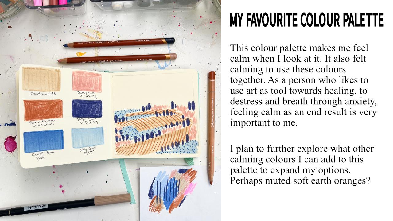
8. Exercise 3: For the next colour palette, I want to show you
how you can select colors based on your emotions. When I'm feeling stressed or anxious and I'm creating art, I want to use colors
that actually calm me down nearly 98% of the time. So I want to select colors that bring me peace and allow me to take deep breaths and just feel that soothing sensation
when I look at them. Now, if you wanted to
use colors to actually express the anxiety that you're feeling or the stress
that you're going for. You're going to want
to actually use colors that might have high energy to them or maybe dark
gloomy colors. It all is based on how you are feeling and what colors you associate with
those feelings. I just know for
myself personally, that when I am stressed out, I want to actually
calm myself down, so I want to use
colors that do that. And I know right off the bat, I'm going to select
a blue Because blue, to me, is a lively color, but it's also a soothing color. And I have this really
soft blue color here that I associate with calm. And so I want to select colors that will
really go with it. Hmm. I'm also thinking of getting
another blue out because I find that for me. Calm colors are kind of
on the softer muted side. So they're not so
vibrant and saturated. They have this
subdued look to them. So I like these two together. Maybe I want to try Oops. Don't know if that got picked
up on the came microphone. I dropped it. Might want to try. Something like this as well. I'm not sure. We'll see. And then maybe Yeah, I'm liking that. It's a pink color, which I find pink and blues
go great together. I really like how they look, but it's more on that soft muted side
versus a poppy pink, like like, say, this pink, which is a fluorescent
pink that I love when I'm being
joyous and adventurous, but it does not suit
for calm to me. However, for you, maybe bright colors are
your calming colors, but you won't know
until you experiment. And that's what these
colour palette are for. I think I might want to try. Nope, not that color. Yes, to this color. And now I need one more
color to go with this. And I'm actually thinking
of adding in a dark blue. Okay. Yes. Okay. This feels This feels good to me. Okay. So I'm going to quickly
swatch out all the colors, and then I'll come back to you once I've got the grid done. Alrighty. So we've got
them all swatched out. Now we can look at them and re get an idea of how these
colors look together. Off the bat, I can
tell you right away that the Delft blue
that I selected for my dark color and
the cobalt blue might be clashing
in the final piece, but I won't know until
I see them really used together because the cobalt
blue has a cool color, and it's cool because
it leans more towards the greener side of the color wheel versus
the red purple side, like the Delft blue, which is a warm color. So we'll see how it looks
together when it's done, but off the bat, I think these colors
look great together. This one looks like it might
be a little out of place, but we won't know until we actually try to
make something. So let's do that. Um, I think I'm going to start off with
the neutral color, and I'm just going
to literally do a squiggle and then
go from there. I have no idea what kind of abstract landscape I'm making. I'm not going in
with any intention. I'm just going to allow myself to channel the kind of
energy that I would need for calming myself
down post having a stressful day or feeling anxiety about an upcoming
event of any kind. I think I'm going to put
some light blue here. And then overhears well. Going into this,
I'm not too sure which color I want to be
the star of the show. I really just want
to focus more on the emotion aspect of it
versus what color I think should be the hero
of the story to take up the most and which ones I should use as accenting colors. I just want to follow instincts and see what happens here. In fact, my instincts
are telling me to use this burnt ochre to create lines within the and neutral area. Sorry, I was mid thought, and I just paused. I'm really liking how
these two colors look together by layering it on top. And what direction
should I do this one in? Sorry if you can't
see this 'cause of the way I'm
holding my pencil. There we go. I really like that. Like a lot. I feel like the blue area should
have, like dots. So as I work on this, I'm focusing on my
breathing, calming my mind, clearing my mind,
and just letting instinct guide my hand. And when I do that,
I tend to use a lot of lines and dots
because it's quite meditative to create art in repetitive motions like
that as a calming format. And then I have the pink here. Yeah, I'm liking how
this is looking. Now the last color I
have is the dark blue. And there we go. Now let's reflect on how
we feel what we think. So I can say off the bat, that I feel calmer now that I've finished it,
there's, like, a piece. So I definitely feel
like this was a success. I also really like how I
layered these two colors. So the combination
of the Tombo 992, which is, like, a sandy beige color paired paired
with the burnt umber. Oh, sorry, not Burn. I'm Bochre. Really? I just I like how
they look together. Love. And you know what? After seeing it in action with the amount of the cobalt blue that I used in relation
to everything else, I feel like that
cool blue actually does work with the warmer blues. I'm not too sure how
well it would work if I used this blue in
a larger format, but that's something I could
explore at a later date. But I really do
feel like this was a success for me for
a color combination. I feel I feel calm, rested. I have a clearer mind. Now I want you to
think of an emotion. Maybe it's something that
you're feeling right now, or maybe you are in need of getting some
peace in your day, or you want to
express love and joy, pick an emotion
and start looking at your colors and see which one of them
stand down to you. And once you're
done, come on back, and then we can discuss how
you can take all of this that little extra further and explore your
colors even more.
9. Bonus 1 Expanding Your Colours: Now let's just take a
look at how you can turn one colour palette
and exploration into many to expand
your color options for when you're
doing paintings and illustrations to give you a variety versus
just six colors. So, for example, in this
colour palette here, I absolutely loved the colors, how they relate to one another, but also the energy
that it gave me. Like, this feels
like a high energy, joyous colour palette to me. And I wanted to experiment
with that further. So, I then went into my new sketchbook because this is at
the end of that one. And I selected two colors from the original
colour palette, which is these two here. And then I said, What other
colors can I use with it? I absolutely love orange
and blue together. Now, these are
complementary colors. And so I thought,
What other blues could work with
these two colors? And if I'm not using pinks, can I use any neutral colors, some earthy, beiges,
browns, anything like that? Can that work with it as well? So then I added in a
couple of those options. And I saw how it really does work with expanding
that color option. I still have the same feeling
as I had with this one. It's still high energy. It still has this
joyousness to it. But now with the
added muted color, I have a slight softness to it. And then I try to expand the complementary
aspect of it again further to see what other blues that I have that
could work with it. And could I add in red? Now, these are oranges, but they are on the redder
side versus a yellowy orange. So would a red work with it? And I would say it does. So once you've started on one, you can expand it even further. So now let's just quickly draw those colors out on a loose
piece of paper so you can see it all on one page. And the reason for
doing something like this that I have
found the benefit to is the fact that
it allows you to get an idea of your lights, your darks, your values. So if you have a light
blue, a medium blue, a really dark blue, you know, it allows you to expand your
options even further. Ooh. Just dropping everything left and right. So beige color here. Got some of my darks here, too. No. The pink might not go
great with every color, especially when you're using
a fluorescent cool color when you're using
a lot of worms. But I oftentimes find that
extra pop of a let's call it a contrasting odd color can add a lot of flair and interest to a piece of artwork or
something that you're creating. Then I have this blue here. I put some of that light
blue back in here. And you can take this
even further than just the 612 or how many colors that you've done your
explorations with because if you have multiple
supplies like I do, again, you don't need to
have all these colors, but if you are like me
and you have several, you can then find related colors in other mediums and materials, and then have those options on hand depending on the
look you want to go with. For example, this
vermilion is close in color to the flame
the wild flame. Now, wild flame intense
is water soluble, but let's pretend that it's not. Let's pretend this is just
a regular colored pencil. And I wanted to create a watercolor effect
with the No Color twos, being a water soluble material, I can dilute it and
create different textures and appearances in my artwork
that I'm using and making. I say I really like
this dark blue here, but I don't want it to have that water marker
effect on the page. I want actual texture. If I can find a dark blue that's similar to it in
another medium like, say, a colored pencil, I can get a different
kind of texture. So this just allows me to
further expand my playing with my colors to find the right colour palette for
what I need to create with, but also for what I need
to express myself and to really just create
art that speaks to me.
10. Bonus 2 Colour Reflection : If you want to take the
reflective colour palette portion of today's class a
little further beyond just how you emotionally feel or how you feel the colors
relate to one another, you can always pull
out a color wheel and get a little deeper into color theory and why those colors that you like
together work together. Now, I know I didn't
say you had to have a color wheel in our
material section, and that's because
today's class is all about finding colors
that work for you that help you express
your feelings and emotions and that reflect you
as a person and an artist. But it doesn't hurt to
always get a little into color theory if you want to
take it a little further. And that's what we're
going to just do today with this one right here because I absolutely
love this colour palette, and I want to reflect
further into it as to why it works for me as
a cohesive final piece. So one of the simplest
ways you can do that is to whip out a printed color wheel. If you don't have
one of these on hand, that's perfectly okay. You can always use your iPad or your phone if you want to physically just lay
your materials on top like I am or look one up
online and then print it off. So what I like to do for
a quick and easy look at the colors is
to pick them out and see where I'd put
them on the color wheel. So the ultramarine blue
goes here in blue. My turquoise blue kind of
looks like this color here, but it's like a blue
green mixed with blue. So I feel like it
fits more here on the blue side itself because
it's not super green. And then we have our
orange, which is over here, which is a complementary
color to the blue because it's on the opposite side
of the color wheel. And then we also
have the zinc ochre, which is a brown color, but it's kind of like a
yellowy orange brown. So I put it kind of over here. And then for my light rust, it was a muted pink color. And because it's kind
of on that sandy pink, it's more over here
on the color wheel, which is now leaning towards
the reds versus a yellow. And then the brown
itself, personally, I feel like this brown is kind of a neutral color
because it doesn't feel like it's leaning too heavily in one
direction or the other. It's just a dark color. But I would say it's
probably a warm color. So I'm going to put
it on this side. And now we can see where
these colors relate to one another as a color
theory colour palette. As a color theory,
colour palette. It's an accented
analogous, analogous. I can never pronounce
that right. And that's because we have our main hero color,
the key color. That's what a hero color is
called in technical terms. We have our her color
over here and then all of the complementary
balancing colors on the opposite
side of the wheel, and they take up
more than one spot versus just being orange. It's also yellow orange and on the red side
and the brown. So there's more than
one of them here, which is why it's
considered to be that type of a colour
palette versus a standard basic complementary
colour palette or a split complementary colour
palette and that's because we have more than one of them here in the same general area. Doing this also
lets me know that if I wanted to expand upon this colour palette and explore more color options that
I could use with them, I have a variety of options. I could add in a red color here. I could add in more of a apricoti color because it's more on the
yellow orangy side. I could add in kind of
this, like, dirty orange. It's called saffron, and
that would work as well. So I could expand this
colour palette even further.
11. Conclusion: Alrighty. So we've
reached the end of today's class. I
hope you enjoyed it. And by now, you
should have created several different
custom colour palette that reflect you as a
person and an artist. I highly encourage you guys to continue on creating
more of these to explore your colors and
the options that you can use with your favorites and
the ones that reflect you. And don't forget to add your favorite color palette
that you've created in the project section
because I can't wait to see all the amazing
things that you've created. Thank you so much for
taking this class, and I can't wait to see
you in the next one. Bye.
 Leah Evergreen, Artist | Dog Mom | Healing With Art