Transcripts
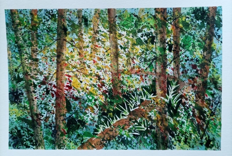
1. Forest Trail Introduction: I am a little wild today. We're going to paint the forest. And as you can see, it's a huge tangle. So I'm just gonna show you a really simple way to capture the essence of forced. Not gonna worry about making every single detail, every leaf, every pine needle. We're just going to pulling a lot of pain, have a lot of fun and produce a painting that really makes us feel the essence of light in the shadow forest. So let's get to the studio and get started. So supplies for this class, we've got our board £140 cold press, watercolor paper take down quarter and show all the way around the edge. We've a sort absorbent rag or Wantage flat and a couple of smaller rounds, and I might just use a masking fluid. You've seen my tips and tricks class. Then you'll know that I use speed so and there's a special way to prepare it. But you have to check out that class to find that out. I've got it in this bottle and we're gonna use that to mask off a little bit on. I've got my paint palette and I'm just gonna swing this over here. You can see I've got a rather large palette with lots of colors, but I'm not gonna use that many. And I'm going to tell you each colors name as I go to use it. Okay, so I think we're just about ready to get started. I almost forgot. Another thing we're going to use is our artists. Watercolor spray bottle. We can also use our fingers for flicking, but the spray bottle is sometimes easier for people. So you can see at the end of this exercise which one you decide will work best for you.
2. Draw and Mask : So the first thing we need to decide is where are set light source is going to be. It's going to be a backlit seen. So I'm thinking I want my main light source to be kind of around here, so just very lightly drawing a little bit of pencil there and then I know I want a little trail may be coming through, so I'm gonna just very lightly penciled, laddie, When you're penciling in things like trails that are going away into the distance, start with the first line and then in order to make the other edge of your trail, start very thin together together as you come around the corner gets further apart from your first line further and further and further report that'll keep your perspective more or less looking. Okay, so I've gone out to the garden and just grabbed a few firms and just had a really good look around out there. Got some meant. Oh, boy, that smells so nice. It just for inspiration. Sometimes it's a great idea to go out and really, really look at your subject Before you begin painting. I think we might want to put some firms in here. So these air just here for inspiration. All right, the first thing we need to do is place a little masking fluid, so it's gonna blow off a little bits from the finds that get on my paper. Um, great idea is to use a sponge. So I've got a little puddle of masking fluid here. I dip my sponge in it. I've wet my sponge, it's squeezed it out and then dipped in the masking fluid. And I'm just gonna dance it along here and see what kinds of shapes on getting. If you're ending up getting what I call popcorn, which is just big blobs, then you need to just keep playing with it until you get a nice shape. Think I need a little bit more masking fluid? Here we go. I just had to. That puddle you're here. Okay. Dipping that in? See, this is not a very good shape. Not bad, but not that great. So there we go, starting to get something a little bit more Lacey. So I'm gonna decide where I want to put the brightest brights. So I might decide. I want just a little bit of excess. Wait shining around my area where my light is coming through the trees. So I'm just gonna add little, very, very small little bits if you decide at the end. Oh, boy, that was just did not enhance your painting at all. No problem. You can glaze them over, but by doing them now gives you the option of leaving, having them white or deciding to glaze them over. Okay, so just a little bit there Less is usually more. With this particular masking fluid. I find I am not a big masking fluid fan, but sometimes it just adds to the painting. This happened to be a sea sponge, but you can buy those regular flat square kitchen sponges, and I've just ripped this one into a strip, and they worked just fine to rip them into an interesting shape, kind of open them up with your fingers a little bit and dip them in, and they'll make some lovely patterns on your page as well. So you decide whatever you can lay your hands on. Another thing I want to do is used my brush to put a bit of masking fluid on in the shape of ferns. Obviously, with the sponge. We can't get any definite exact shapes. So we're gonna use our brush here and dip it into the masking fluid. And just down here in the front, maybe I just put in a little firm shape. This is we're having the firms in front of you. Gives you a little bit of an advantage because you can stare at them and get the shape right. Hard to see. I know because my masking fluid isn't very dark, but I think you get the idea. It's gonna put three or four for any type shapes here, next to the trail. Here we go. Maybe another one over here. Have it bend over a little bit. Here we go. And then maybe a few grasses around them so they don't look too stark. When you take the Lasko, forget a few little sunlight grasses next to them as well. And again at the end, if we decide we don't want thes, we can just glaze them over with a bit of green, and it will be just fine. All right. I think we're ready to go. The paint
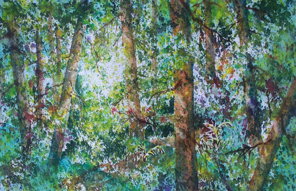
3. Let's Fling Some Paint!: So the first thing we're going to do is not used actually paint at all. I'm gonna take my spray bottle and in that area of light, just gonna give it a little spritz. If you don't have a spray bottle using your fingers, dipping them in your bucket, shaking them out a bit and doing this with them will just give you the same effect. We just want to add a little bit of water droplets to the main area. They're taking a lemony yellow that could be Oriole in or lemon yellow or even a cad. Yellow cadmium yellow will be fine. I promised paint flinging, so we're gonna do a little paint fling. But here's a couple things to remember about flinging paint. Don't have too much water in your brush. Otherwise, it's gonna whiplash back and hit you in the face, Um, or your neighbor's someone's painting beside you. Uh, the other thing is, hold your brush quite close to the paper when you do it, rather than coming way back and giving it a great big, huge flak flak because then that will also cause it to run all over the place. If you hold it quite close and just keep your just hit it gently against your fingers. You can get the idea of what's going on here. Okay, so we're just putting in whole bunch of yellow, put it all over, but I'm concentrating on leaving an area that's quite bright right around that area that I had laid that first little pencil market. You'll see this bright area will become more obvious as well as our colors get darker. Just look at the colors around. Go. If it looks a bit too polka dotty, that's the time for your spray bottle. It can get in there with that and just give it a little spritz, and it will cause those polka dots to get better shapes. Okay, They're gonna get better shape anyway, because I'm gonna add a little more different shaped little more color, different color. I'm gonna pick up a little bit more of my yellow, grab a little bit of turquoise. This is gonna give me a really bright, fresh, springy green Didn't even clean the yellow off my brush. There we go, doing a little more Slattery If you find your fingers get sore. Grab yourself your tape or anything you can use. Or you could put on a little pad on your fingers if you want. It doesn't seem to bother me too much, so I just fling away here. So the idea of putting the Clearwater spots on first is that when the pigment hits it, it doesn't just stay in a dot It kind of fans out into interesting shapes, and the same thing is occurring when I add the second color. It's hitting some of the wet areas and blending with the other areas. It's staying separated, so we want a combination of those things blurry and some sharp edges. All right, now I'm gonna take a little bit off burnt Sienna and added to that mixture with the turquoise burnt sienna yellow. So I get a slightly deeper green just again. There we go, doing the same thing. But now we're starting to see where I'm believing a little bit of light in here. Think I might want a little more moisture on my brush? I want my blobs to be just a little more a little bigger. Not quite well, that one shape of little polka dots thanks quite a while to get this background in, and at first you think, What is she doing? But I think you'll see it'll all come together in the end. E think I'm gonna take a little bit more. Trickle is just kind of real pure on my brush. Here we go. See, that's wonderful. And again, in some areas, the colors you're bleeding together in other areas there saying shortly apart, I definitely want some more yellow. So I'm cleaning up my brush back into and you just take a little moisture off. I don't want it to be too Slattery. There we go out of it, a little more pain back into my green. This point, you'll have all of the colors on your palate. You can just dip into whichever one you think you need a little bit more off. We want to try, and I'm a large of green because when you look into the forest, that's what you see. Just a whole bunch of different greens old lending together, it's almost impossible. Toe. Take it apart and paint it that this is just one simple technique you can do that will give you the essence of that forest. Okay, I'm gonna go a little darker again. Thanks, Bert. Santa Turquoise. Even a bit deeper. So a little more sienna in the mix. Which means that you get to see the slightly darker dream. Make sure you cool right up to your edges because they're part of the painting. You don't want a paint as if you're painting within the confines of your format. Here, you want to paint just a little chunk of forests. But you want your viewer to think the force goes on forever and ever. So you want to make sure you get lots of color, those edges. I'm doing the birth sienna turquoise thing again. He leaving this fairly light in here? I think they depend. Depression Blue pressure in blue is a very rich deep, dark blue. And I'm gonna mix it with my burnt sienna. Give me a lovely green, Really rich, deep green There it's almost a block. You see that depression burnt Sienna taking a bit of moisture off my brush before I begin to slaughter in. There we go. I definitely want a little more yellow in this forest because we want to suggest the sunlight coming through. So I'm gonna go clean my brush. I have to clean it. If it's been in a dark color and then you're gonna go into yellow again, you really have to clean your often. I don't clean my brush between colors, but if I'm going to a pure, bright light color, definitely give you brush a good cleaning. Here we go. You know, we're starting to get the idea of DAP with late in the foliage. People go on here because they say it takes a little while to build up this background. But it's so worth it. If you just stick with, it will be a point in time. And I think, What is this? It's such a mess. But hang in there. It's one of the few techniques and watercolors where more is more. You know, we try to be so quick and simple with water colors and keep it. You could fresh Well, this is fresh, but it just takes a little more a little more doing than some of the techniques that teaching in my other classes can I can start to see this sunlit area here getting to happen ? No, I think just for fun. I'm gonna clean up my brush. I'm gonna pick up some permanent rose. Got a nice bright pink that will do. I'm just gonna put a few splatters pink in there because sometimes, especially in the spring, you get red current in the forest. At least we do around here. That's really beautiful. So let's just put a little bit of that now. The beauty of this technique is when you flap on the the pink, even though it's complimentary to the green. If you mix them together on your page with your brush, you get kind of a gray or a black. But just by doing this technique, it stays quite red. I don't want them all the same line here, so I'm just gonna add a little bit more up there, get a bit more interesting. Another color that I just love is Violet and I might just a few. We go just little in there and again. The color stay quite separated. Fresh decisions, decisions more yellow. There's me telling you to cover in your edges and mine are covered in enough for more green. I think I'm going to stop right there now This has to be kept flat and it needs to dry. So I'll get my blow dryer, give it a puff and we'll see you back here when it's old, right?
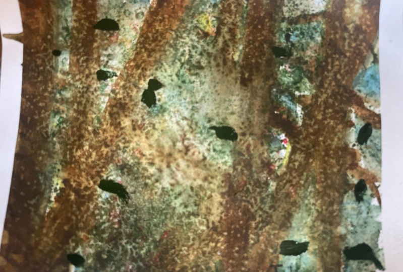
4. Tree Trunks : So we've kind of lost sight of our trail. We can place it in again with a little bit of birth sienna, and I'm not gonna make a thick swoop. I'm just going to slightly, I suggest by kind of patting with my brush. It'll get a burnt Sienna might throw a little bit of ultra Marine, and they're with it because it's a little bit orangey. No to my Children. Marie. Yeah, Trail is patting on not too much water in the brush. That way it doesn't leave a soul. It line just leaves kind of a bumpy line, cause trails in the forest or a little lumpy. Now, I'm not sure where I put my firms, so we'll just see how it all comes out when we take them off. Something I should mention is you could certainly do this exercise without any of the masking fluid. In fact, sometimes I think that's not a bad idea. All right, there's our trail. Now we need to glaze in tree trunks, so I laid in a couple of tree trunks just to give us an idea of where we're headed. I'm never sure you had to do them in a minute, but I first want to talk about placement. Um, here's a little tricky. Contrived? You're not just sure. Where am I gonna put my trunks if you cut some strips of paper? Mind just happen to be brown like a tree trunk. But it really doesn't matter. And then you can lay them on your page, and you can decide where you might want to put your tree trunks that way. And the things to remember are different distances apart, different angles and stopping and starting in different places. For instance, your trunks don't have to go right from the top of the page rate to the bottom of the page . They can just go part way, and then they disappear into a bunch of foliage, which is just fine. All right, let's see, Maybe I'm gonna have one. A fairly big one. Kind of leaning over through my son spot. You decided to put a big fat one right there. Things to watch out. Don't stick a big fat one. So right in the middle of your page. Don't stick anything right in the middle, straight up and down. Actually, they wanna watch that you trees are old parallel. That's another thing is sometimes challenging to avoid until you've already done it. And then you realize, Oh, shoot. But that's where these little strips can be handy. And once you've decided that you like your arrangement, we just had a little guy in there. When you've decided you like your arrangement, then you can take a pencil and just mark on either side. Approximately. Where you going to put your trees? So here we go. I'm just gonna mark lately. I want a tree in there. Maybe put this guy here. It's one. And again. If you decide you change your mind, that's fine. You can erase these pencil lines, your papers dry, so drawing on it with pencil is easily erase herbal. They'll be hard to see, even so when you take this off. But if you look very carefully, you'll be able to find them. All right, there we go. Now is to making these tree trunks a little bit of burnt sienna on your brush. Keep it very sin. I'm gonna do, uh, troubled this guy right here, and I'm just gonna glaze this whole thing in Burnt Sienna. Then, while that's damp, grab a little ultra marine blue. That's a kind of purple e blue and just run it down the shadow side. What would be the shadow side? So, for instance, your light sources here the light is shining this way. So this is gonna be the sunny side. This is gonna be the shadow side. My tree truck. I was making my brush a little thirsty there to take off some excess. So what we end up getting is all those splattering marks shine through sore trunks look modeled and interesting, and we can start and stop our trunks. This one I went right through from top to bottom cause he's kind of in the foreground here . But you notice here, I stopped and started them because, as I said before, you might have fully It's running in between the moral around here. Okay, lets try another one. A little bit of burnt sienna on the brush, not too heavy. We don't want it so thick that it obliterates what's underneath. Okay, So, for instance, let's try this guy here. Um, maybe I'll just have him start about there quite thin on the brush. Then I'm going to take my ultra Marine wallet stamp. Well, that CNN's damp grab a little ultra marine and put it on the shadows. I now the shadow side has changed because my light sources here shining that way. So now the shadow side is the left hand side of my treat, not the right hand side. So just dropping that on, and because it's wet, it runs around, makes it look round and plump. It will extend that up to there. Maybe we'll have it reappeared down here. Case. Let's start again. Sienna. A little too dark together first. And when you treat stop and start, you want them to stop and start with an unusual shape. You don't want to have a flat across. Okay, Now, where am I? A little bit of ultra marine on the shop side. Here we go. Okay. We'll just leave that to be foliage cutting off that tree. Now we're gonna carry on putting on many trunks, as many as fewer as many as you want. - So again, different angles different distances apart. A little ultra marine down the shadows not so thick that we lose all the texture that we laid on originally. Okay, there we put that big guy in here. I think we could try it. Maybe he's going to come in from the top here, and then it'll all clamoring on share. And I'm gonna have him stop here. You see? Even unusual shape cleaning my brush, grabbing my birth sienna. Pure but not too thick on the brush. Well, carry on that trump down here a bit. He's gonna go right over my trail. He's more in the foreground. That's what is so big. You may be right down here. Here we go. No. Well, that stamp grabbing my ultra Marine, dropping it in on the shadow side, maybe a little terrain at the base, as if it's getting into the deeper foliage of the forest. Okay, now, maybe it will just glaze a couple of really distant trees thinner because there in the background, I'm not gonna worry too much about the shadow side on them. Just put a few in here, maybe one, but here, I think I will put a little shadow on this guy. Now, I've created a bit of a monster cause I've kind of got 34 evenly spaced. I always say any meaning money and most So let's, um, change that up a bit. Here we go. I'm gonna just a little shadow over the side of those. All right, Let's take stick another guy in here to irregular rise it a bit. Here we go. I think I'm almost finished with the trees, but I feel like I want something right in here. So I'm gonna take my strips again and just do a little bit of placing. Now, I don't want it to be parallel to this one. Um, I think it's only gonna come partly down. So that's parallel. So let's maybe just shifted a tiny bit, something like that. So it's a little bit off parallel to that. I also don't want to create, you know, a tpe right in the middle here, like this. So that's to be considered, I think maybe right about there. Okay, Now we could market. We're not whatever works for you. Okay. Take that away. Pick up my burnt sienna gain. Quite sent on the brush. Nothing too thick. And let's just come down here. Here's something I wanna do that's gonna be a little bit different when I get to the brightest spot. I'm actually just gonna put the color on one side. Bring that right down, cleaning my brush, making it thirsty on my rag a little bit. Just softening that edge. I wanted to be as if the sun is so strong. It's actually obliterating the shape of that tree on that one side whenever you And then again, Well, that's old, damp. Let's grab our ultra Marine. I just put a little bit of it in there on the show. Maybe a little on the other side to especially down here, where it's a bit dark. Here we go. Yeah, like that. All right, time for some branches.
5. Branches : So when you're doing branches, I encourage you to use around. But, um, you don't have to go to small. You can certainly use a small around, but the larger one holds more moisture. So you have a better chance of completing your branch without running out of paint and therefore having to go back into your palate so many times. The smaller ones are great for little tiny branches. So by all means take your pick. Choose your weapon whenever you want to call it. I'm gonna mix a little ultra Marine and burnt Sienna together so that I get a rich deep, dark brown. I'm gonna start with my big brush going to pretend kind of, um, arresting my wrist on my fist here and that gives me a bit of stability instead of just hoping for the best here. And let's say this tree has a branch that's coming from way up here, but it's gonna cut across on a I find if you start with your brush, a little more pressure, and then as you get toward the end of the brush, lift off the pressure and that gives you a nice, thinner line, and then I kind of flick a little bit. I would say wiggle wiggle flick. There we go. All right, let's say this guy maybe has a branch here too. Maybe a shorter one. And let's talk about this guy. But like, here, the thing to remember is thes are farther away, so the branches will not cut across this tree. That is further in the foreground. Yeah. Go. Gonna make these guys a little blacker by adding a bit more ultra Marine to the mix can make a slightly darker color. And I don't know, maybe this guy could have some branches to Why not again? I want them a little bit darker, Some adding a little more ultra marine again. There we are. That's bitter. Okay, let's move over here. Some of the branches can start on the edge of the tree and promote as if they're on the other side. Some will start within the trunk if they're facing you. It's okay to have a bunch of them overlapping. Quite all right. More realistic, in fact. So starting with the brush pushed down and lifting up Asai, get toward the end. You know, I really recommend take a sheet of paper. I just have a go press down, lift up a she get toward the edge, press down, lift up If you get towards the end and then you can add the little extra bits. Using your brush perpendicular is a really good idea. You get a nice, fine line. Okay? Let's just carry on and add a few more. Be some on these guys back here. It could be on a little Have a little tiny brush for this, but I'm risk elastic with my big fat one. Okay, This one should be hopefully dry enough. Now that I can put a few branches on there. There we go. People just make a little bark on this guy. Here we go. Okay. I think that's enough branches.
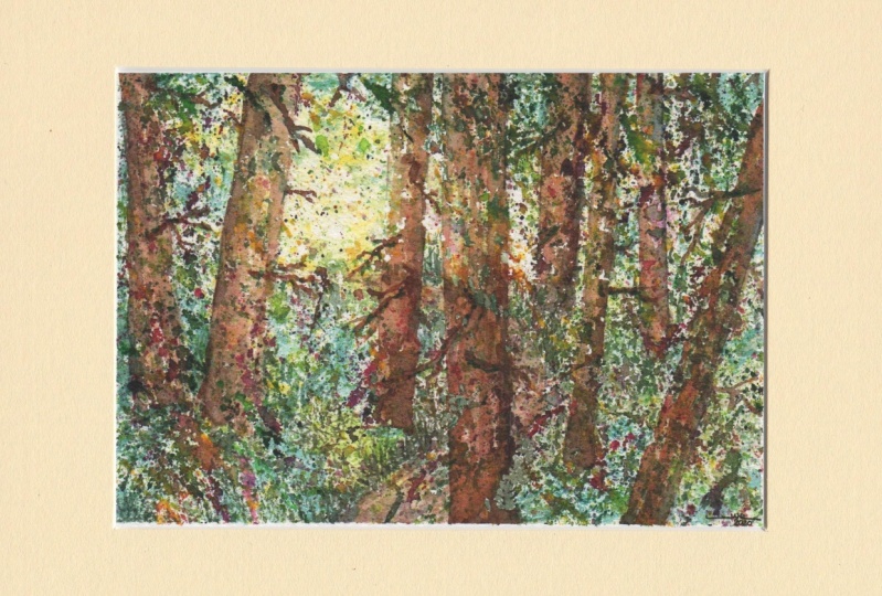
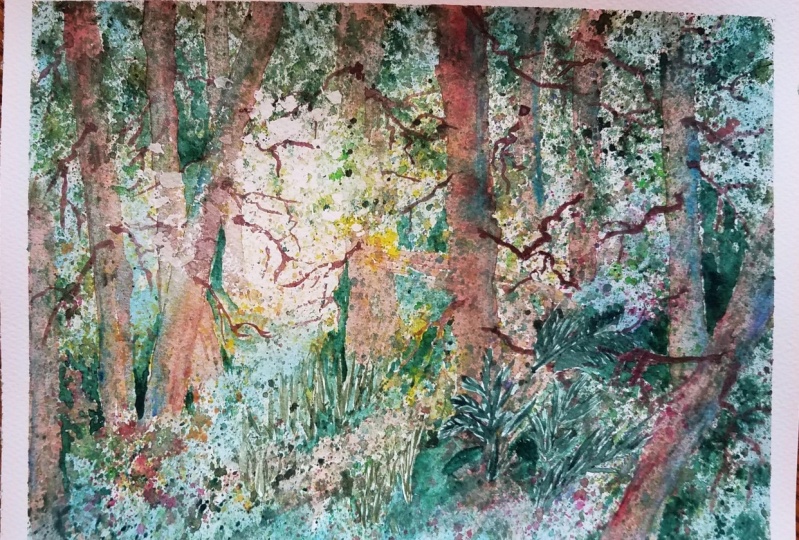
6. Glaze : So now we have quite a nice foreseen coming together, but it's a bit busy. So, for instance, all these bright whites that are left from our splattering around here are kind of competing with our center of interest, which is right here. So here's what I like to do for this. I like to do what I call blazing. So glazing is very thin paint with quite a lot of water put into it. I'm just gonna pull this over here so you can see what I mean. So see, very thin. Not a lot of pigment. I'm gonna use turquoise, cause it's just a beautiful color for blazing and so mixed a puddle of it. And I'm gonna cozy in some of these edges by just laying on some trick course, just like so. And what you'll see happens is it just creates much more of a central area here, make sure I go more to the center. Plus it cozies in the forest a little bit so mostly around the edges. But here and there within the forest to here we go. You don't want to stroke over the same place too much cause you run the risk of lifting up all the colors that you put on underneath. See, that just to me brings this to life. There we are. And turquoise is a lovely clear color. If you do glaze, I recommend picking just one color using it pure, rather than trying to mix a couple of shades to get what you want. Because when you mix colors, you automatically dull down the pigment. So it's nice to use just a straight one shade. Okay, now are light is more coming through here? I don't know if you could see that. I'm gonna add a little bit of glazing here and there. Back in here. Mostly. I want that sense of light coming through here. Maybe let's put a little bit of glazing across the trail here. It's if these guys were casting shadows across the trail. Here we go. Well, uh,
7. Negative Painting: So let's just talk a little bit about negative painting. It simply means painting around your subject. So if it's easier for you, just draw in your subject and then you can paint around it from there when you're first starting to negative paint. This is probably the easiest way to handle it, drawing in the item and then work your way around it like so years ago. However, if you decided to be brave, then you can just go at it. Let's see. We'll make some branches. Tree trunk now some foliage. You almost have to think in reverse because you're describing your subject by painting around it. So it's a lot about edges, always keeping in mind the shape of your edges. Here we go. Okay, let's do a little negative painting on our forest scene. We've kind of lost sight of our trails, runs through here, goes around there and there. If I wanted to make that stand out a little bit more, I could perhaps paint some grass is on the edge of that trail, but I don't want to paint them in positively. I'm gonna paint negative grasses, So what that means is basically painting around the shapes around the shapes of grasses Looks well, if you find an area that has a lot of light in it. So we got a lot of weight along hair so I can paint around the shapes of grasses and then I can just bring that dark up and paint around the shape of this bush the color I'm using of mixed Prussian blue and burnt sienna. And it makes a really nice, rich, dark green. You could throw a little extra yellow in there if you wanted. Now, the other thing I'm doing is I'm leaving a little slip of light along the edge of this branch. Here it's called Rim lighting, as if the light is hitting that edge of that and you just you see the edge of it really bright. But it looks almost like someone's taken a piece of chalk or something and drawn down one side of it. Okay, moving along here, just gonna do this a little bit more negative painting. So what happens is now I have some grass is in the foreground here, which make my path stand out a little bit more. I'm gonna zoom in a little bit for you, Alright? Zoomed in a little bit so you can see the grasses here that I've negative painted around. And then I'm gonna negative paint some of that right up into around this bush that we created. So here we go, painting around that bush around those grasses right up to the edge of my tree. But I'd also like to leave a little bit of late along the edge of this tree here. So what we can do is let's just make the shape of this bush because not only am I painting around these grasses been painting around the shape of this bush, so it's coming from the other side here, paint around the edge of this bush. But again, I'm gonna leave just a tiny little bit of light wherever there is a bit, because I think it helps it to stand out. Makes that tree look like it's got a really bright lights hitting some of the foliage. And I'm gonna leave a little tiny bit of rim lighting along this trunk as well. So here we go. Take that dark. Just not quite touching the brown. Just leaving a little edge, not a perfectly straight edge because the bark on a tree would not be perfectly flat. Here we go. And then I'm gonna negative paint around and create a branch here. So here we go to make it a branch. So you know, who knows what kind of branch that is hanging in there, but it just gives you a little more depth to your painting because you end up with more layers of depth, your darkest in the distance coming forward into the brighter breaks. Okay, let's see. Where else could we put some negative painting? Well, being as we brought it along this side of the trail publicly put a little bit on this side as well. Gonna take a little, do a bit of grassy thing here. This is kind of picky work. Some of you may love this. Some of you may just be frustrated by it, so, you know, I want to show it to you, but you certainly don't have to add it to your painting. Okay, Sam, painting around a little bush or something there. Here we go. Gives us just a little more depth in the forest. Here's our trail here. Perhaps we could catch them grasses along the edge of that trail, too. Now, once we pitting around the grass is, we have to do something with his top. So we kind of have to decide. Well, it's paint around another little bush. There's a bit of a branch coming down here. How about if we use that to create a branch? Here we go. Sometimes you can put a little water on your brush and just soften. If you don't know where to go or what to do with it, just soften it into nothingness. A bit of a brain bender, this negative painting because you have to really think about outlining your subject, basically. But then you can't just leave a line around it. You have to actually turn that line into something else, which generally has to outline another thing. So, for instance, here I outlined the grasses, and then I outlined the shape of this tree and then outlined the shape of this little branch. But you can see how it adds just a little more finish to our painting. It's some also a little bit addictive, because once you get going, you think, Well, I put a little there a little more here. Keep going around the edge of this branch. Say, Makesem grasses on the bottom edge there, Maybe accentuate the branch inside that late spot a little bit. Looks very sunlit this way. Okay, this is kind of a fun little spot here, too. Maybe we could paint around this little bit of red that we had put on in our original splashing. Create more of a bush. There we go. I think that gives the piece just a little more excitement. Kind of feel like I want to put some right up in here, too. Though, describe the edge of that tree with this dark, leaving a little bit of rim lighting on some of those shapes and painting around those branches. But again, it has to go somewhere. So now gonna have to create something up here on the stoppage. And as you see, it is addictive. You could go on and on and on, but if you want to stop it clean, brush a little bit of moisture on it and just soften it, soften the edge into nothingness. Here we go. Carry on and take a little bit of this dark to the other side of the tree as well. I like this shape. So I'm not gonna disturb it too much paint around it with the dark painting around the edge of this tree again leaving that little bit of rim lighting. And I'm just kind of smooching around here to take it into nothingness. It's a beauty of the force. There's so much going on. Nobody's gonna call you on the exact shape of a leaf or anything like that. We could make this a little more exciting up here. Just add a little bit of her dark here and again, going around these branches, but leaving a little tiny bit of light little room lighting. Got to do something with this now. So I'm just gonna take my brush, kind of massage it around here to create another little bit of foliage. There we go. I think that gives the whole piece just a little more depth. There is one other thing I want to show you, so stay tuned. All right. One other little tip we can do is we can create a little more sense of sunlight on some of these larger trees, and I'll just show you or even some of the smaller ones. So I went my brush, taken quite a bit of the moisture out of it, and then I'm just gonna scrub a little, tiny bit, kind of at an angle, as if the sun were coming in at that angle and then blotting it. And what it does is it takes off a bit of the pigment, which gives us a sense of sunlight just hitting the edge of that tree, Scrub it back and forth a bit. Here we go. But what it a little bit. I think it just makes it a little more exciting. Let's try some up here. Little scrub little block. You don't want to take it right back toe white. Just making the colors bleached out a little for want of a better word. But all these little details I'm gonna put a little bit right there. Maybe a bit up here. These trees air fairly busy. They've got lots going on on them, so there's not a lot of space. But if you find yourself having trees that are a little bit too plain looking, this is a great way to just punch them up a bit. Let's go here. It's a little late. I just moved that into the lights. You can see it. There we go. I should mention at this point that I've removed the little bits of masking fluid that we had placed in through here and on our firms. I used a masking fluid remover. Or you could just use an eraser. That's fine. But please, not your fingers, because the oils from your fingers get on the page and it makes it difficult to accept the paint on. Ben, I lied. A little line little dark edge on these guys. Really, They don't make much difference to the painting, and I'm kind of a fan of. If it doesn't make a difference to your painting, why put it in? But anyway, there, there now. And as I mentioned at the beginning, they could be just glazed over. But I feel like they don't really distract, so I'm just going to leave them
8. Forest Trail Final Thoughts: so there's are finished little forest walk scene. I hope you'll agree with me that these darks in here make quite a lot of difference. They just give your eye focus generally in a painting. Your I will always go to the darkest dark against the lightest light and then meander around from there. So I think this gives us a nice focal point. Um, as you can see, you could go on and on with this on. I could add much more negative painting here, but for now, I think that's enough. And if you found it challenging to just paint around those things without having some image in your head, you can always take your pencil and draw around a branch that you want to preserve and then painted up to it. Sometimes that's a lot easier, because, as I say, the negative painting is a bit of a brain bender. Okay, I hope you enjoyed this exercise, and I hope you'll try some and upload them. I would just love to see your projects. Thanks for watching
 Melinda Wilde, master teacher of watercolours