Transcripts
1. Intro and Class Project : Hi, I'm Yohome, I'm a bachelor degree, graphic designer, and a
self taught Illustrator. My goal is to become a full-time
illustrator, but after I had a baby, I have less time
towards web computer, so I started sketching and painting more with
pencil and watercolor. Then I found out that I
really loved a watercolor. But you notice Bay and time for setting of is really
expensive for me. Therefore I switched to painting with the iPad and Procreate. In this class I will show
you how I paint and what are the essential tones I use to
paint digital water color. The class is desired for on level artist is for
everyone who is interested in watercolors
and how to create a digital watercolor
illustration in Procreate. The class is exclusively
for painting teachings. Also have prepared references and pre-sketched lines
for you to work on, just for another video lessons. After this class,
you'll be able to paint your own digital
watercolor in Procreate. To suggest a drawing it
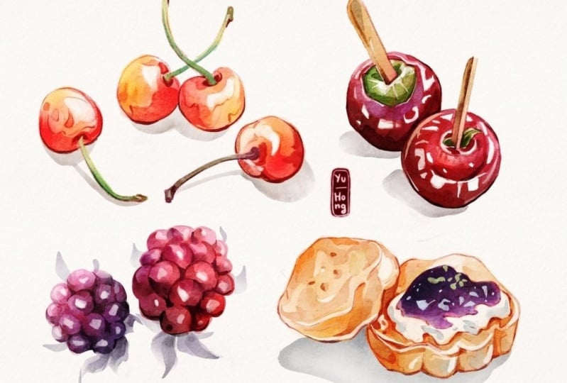
depends in this class a food, because it's a colorful
one and easy to paint. I also had a demonstration
on how I paint a character in the final class
project advance section. Grab your iPad and pencil
and let's get started.
2. Setting up: [MUSIC] Part 1, setting up. It helps us to put the
workflow together. First, please download
the references in the class description. Import is Simon phi in
Procreate and open up. On the top right, select the layer icon. But the names you have are slightly different
from mine here because I have adjusted
them to make more savvy you to follow
the class videos. Check on this warm-up photo, we will use it for
the next video. Also, check the backed photo, they are very important
for transform digital painting to look
like watercolor painting. Paper texture, create a paper texture just
right on the Canvas. Main and organic texture. Create watercolor texture for novel plan colors be panned, turn them on and you will see if there is coloring
when we paint later. The action icon, choose Canvas while
reference's on, and we have this Canvas open. The last lag and
navigator in Photoshop. You can examine as to whether
to have an overall view. Back to the action icon, choose pref this time. Brush cursor on to see the
shape and size of the brush. Click under brush icon, it will show you the
sidebar on the left side by changing the brush size
and brush opacity. If you're left-handed,
choose action, brush, right-hand interface, you have the slide bar
move to the right. Choose light or dark interface
based on your preference. I prefer light
interface because it get colored by works alone
in the dark interface. [MUSIC] [MUSIC] Before
jumping to the next video, I'd like to show you the interesting app I use
with Procreate a lot. It is called [inaudible]
You can zoom in and it's not easily with two fingers just
like in Procreate. You can also select on
multiple photos around. Pull and drag, you can select multiple photos. Written a really
large bar so you keep everything in one place
so you can create many customs [inaudible]
inside [MUSIC] If you have a lot of fashion you can crop, undo, and redo. You can adjust and
flip the photos, turn it to black and white. You can find out many other
fashion in these icons here. Select multiple photos,
and you can also export into another device. This is the part I create
to use for these classes. This is just an option. Use it and that
just depend on you. Now we've finished setting
up Photo Procreate and have chosen our reference bar. Let's move on to
the next classes.
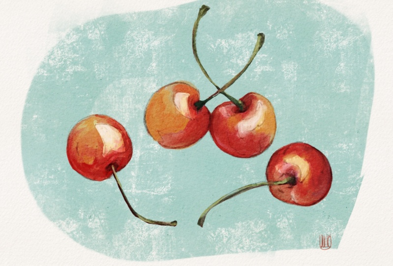
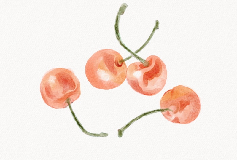
3. Warm up: Part 2 is one exercise. Why? It's for the hand to
warm up and in the process, I will show you the
essentials tone I use in this class to
paint Digital watercolor. First, tap on the Layer icon. We work on the layer
under the last sketch. Don't forget to turn on
the first folder layer. This free process is also attached in the
class references, importing and use it
for this exercise. We will plan in three steps. First, lay in the
base colors, second, paint details and the third
is the final retouch. Try out to press pressure, press lightly away to create
a loosely watercolor effect. If you have any mistake, tap two fingers on
the screen to undo. Paint the rest. Brightest, you have
pressure with the press. The second tone, we use
are the lasso tone. Choose the freehand option. Select parts need
to be ritual red, choose the feather, it makes the color
transistors smoother. Then to adjustment, hue, saturation and brightness and we have three slider
in the bottom. The hue is for
changing the colors, the saturation effects
the color vibrant, the brightness
[inaudible] value and you can refer to the reference
to address the color. [inaudible] part [inaudible]. Choose the lesser tone and
select the yellow part. Choose the feather, and then you will
have two plus on the Copy and Paste button here. You can see it make what we
select into a new layer, and the yellow
[inaudible] visible here, you can duplicate
if you want more, when you certify, you can merge on with two
fingers just like this. Next tab, eraser tone
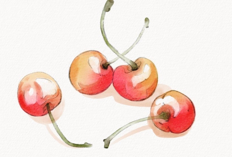
choose a brush here for it. I will pan some wise Bay
I see on the reference. By decreasing the capacity, I can pan into the color
and make the color lighter. Do it for the other
cherries too. Now we enter the next step, append the details, edges, the brush or lay it
with a darker red, and append the details. You can refer to
the reference list or you can paint if you like because it just a warm SSI, the tips here are have
a variety of colors, tones, [inaudible] and values to make the painting
more interesting. I give this mud too with the aquatic brush and
blend some part edges. Now, let's paint some stems with all those tones and
methods as we did above. Remember that you can
pan that along with the brush but also with the
eraser and a smart tone. Be flexible in using the lecithin and adjustment
can really help. Step 3 final transfer
selective birth brush and tap under square here to add
the fade eye dropper tone. You can drop anywhere, you want to copy the color.Try in many
brushes in the set, and it will depend why you use the eyedropper to
copy the color you want. I really let me say
the white paper out in watercolor
paintings so I added a lot in there. It doesn't have a shadow in the reference but I
love to pen it anyway. Before going to the
next lesson visual, here's another warm-up
painting demonstration. The more we do something,
the better we get it right. If you don't want to just skip to the next
video it's fine. It'll just depend this don't worry about doing it
exactly as I did. I just wanted to give you an overview of only [inaudible], which we will study
in the next classes. Just do whatever you can now, then save it as the before
painting to compare it to the final plastic
purchased later. Let's summarize. For painting, we have three basic steps, laying the base color, painting the details, and final retouch with the
personal reference choices. For the tone we use
the brush tone with oppressor to create
a fruity watercolor. The [inaudible] tone to address the color value and saturation, the result tone to create
interesting white, lift off some color. You can also use
more tone to blend some part edges that
we don't want to. And done, so let's move on to
the next lesson.
4. Brushes & Technique: [MUSIC] [inaudible] to
watercolor painting, you have to explore a lot with brushes so you know
what they can do, what you like about them, and how you combine them to imitate the watercolor
painting you like. Let's get started
with these brushes. They're all my favorite
painting digital watercolor. Those six brushes on the top left are my favorite
for sketching. These three brushes, they have really nice texture, so I use them a lot
with smart tone because I don't like the
transition so flat. But when I do want some
smooth transition, I will use the sharp brushes far a smart tone or I use
the water blender. For my most, most favorite brushes are
these two on the bottom left. The 1-p-watercolor clean and
the abstract round brush. You will see I use them a lot throughout on these classes, and you can see how
amazing they are. The rest are for painting
details and final touch. Brushes which, have their name highlighted
are from the PEP. They aren't included in these classic
references but I have these brushing sheets included in the classic reference for you to refer to if you
want to find them. Brushes are essentials, but what more important
are how well we use them. How to combine them
with a right tone and a right method to create
an outcome that you want. Let's move on to
the next session when I will demonstrate to
you how I use them to paint. I will use these two
brushes to paint a base. The 1-p-watercolor brush, depend on your
pressure it will be more color or more water. Bad adding another color, you can create a
really nice gradient. I will use the brush to paint the base color for
the first fox. Mindful with your pressure. A paint darker color
inside his ears, on the nose bridge, and for the face corners. I use the lasso tool and the adjustment hue
saturation and brightness to change the colors. Next, I will use the abstract round brush to brush spreading out
with harder pressure. It doesn't mix too well but can create a classic effects
like in real watercolor. Let's try to add
more colors to it. I will put in some orange, red, and the light yellow to create a gradient and use this blend brush to blending
the color together. The smart tone can
do this well too. I use the muscle Gouache
Bristle Gritty brush as the smart tone to blend out some hard edges and
create a gradient color. You can swipe from outside
into the color and create effects like the water in
plumbing to the color inside. This smart tone is the
Nicaraguan just a big size, the lower opacity and you create a really interesting texture and the color can be
fade out so nicely. Back to the abstract brush. Do you think of any
way we can use it? I will show you how I painted air breath with only this brush. You can pair really quick if you understand how to make
use of the pressure. I will add a darker
color in the inside. I also use it with eraser
to draw the hair and line on lifting up some colors. Let's paint the second first. First, I need a lasso tool
to make the selection. Without lifting up your pen and just your brush pressure you would create
a nice gradient. Also, use smart
tone for blending. I also buy with lasso
and adjustment. Next the third one, I will use the lasso tool and try to color inside like this. Your lasso and adjustment to change the color
and make gradient. Also, the smart tone. The black allows it to do
so I would change into red. I will use the old bleach brush to paint details
or the first fox. If you're using
the full opacity, it just look lovely. If you know want opacity
embraced art and create edges and it
looks so interesting. You can even create
different shades. Here's the hard edge
round for the second fox. The first had the edges
just like the old blade but the color transition is smooth there and we can adjust
the opacity of the brush. They also can spread out a
color like the abstract round. So mixing a color, really easy with the brush too. I use the eyedropper to
pick some color and paint. I want to focus on creating a nice brush stroke
with this fox. Using the eye to pick up the color and
pattern and details, prevent you to introduce some rare color
into your panting. The brush FT 60%
Trementina I will use it to paint the details
on the third fox. The harder you press, the thicker the color is. With a little practice, it can create a
really nice gradient. Let's paint just at your
shade with the pencil. Let's choose the line
starts from the top left so everything in the
bottom and on the right, we will shade it darker. I forgot it wiper here
so I will generate it with the lasso tool
and the adjustment. My last sketch don't
look so good here. I will lower the opacity
and match them together, and then you erase it to
clean up and reshape the fox. You have a nice sketch. You may have saved
time from this tab. You can also use
the lasso tool with the transform tone into
his eyes to fix the shape. Now we enter the last
steps, final touch. For the last step, based on how you choose
to use the brush, the eraser, the smart tone to create your
preference choices. Just like how I really loved these hard edges so
I put them more. I love to have more white in my painting so I
would paint in a lot of white line in it or using the smallest
brush to create some brush stroke to
indicate the fur. Also this by fine
smooth round brush, it's very powerful brush for blending and painting
details too. Use MaxU Gouache Bristle Gritty so I will use the smooth
tone to fix it a bit. Use the fine smooth round brush, to paint detail of the fur. Also, I paint the
eyes and the nose. I paint some light
yellow stroke to indicate darker fur for his eyes, brows, and some white fur sticking out of his
cheek to make his cuter. I really love to add in a really dark base and then burning it with
the white stroke. Then we paint the last fox
just as we did with those two. Here I have made it to summarize for you on the brushes
and the techniques that we use in this closet in every step and for every fox. You can download it in the classic reference
and review it anytime.
5. Apply Exercises : Before doing the
final class project, we would do the apply exercise. I will give this lesson
the real-time painting, so if you missed any information I mentioned
in the preview lesson, you can catch all
of them in here.
6. Class Project : Now we come to the
final class project. You can see in Assignment 5, I have this sketch here for you to do the final
class project, but you feel free to choose any other reference
if you don't want to. First, I will paint a
[inaudible] clean brush. I look at the reference and
I choose the yellow-orange. I paint some thick
color and some thin, just leave out as I
see in the reference. [MUSIC] The bread has some crack, and I would choose
the hard round brush, careful with every
stroke I make. [MUSIC] I choose some darker color to draw those really inner
part of the bread. Now I will paint the [inaudible] with [inaudible] tool so
I don't have to worry. I will paint nicely
inside of my selection. [MUSIC] [inaudible] the color with lesser tone and the adjustment. [MUSIC] Then I will add in some detail with light blue and also some
lighter green on the top. [MUSIC] Then I will clean up some white space and
draw some gray shade. This time I don't look
at the reference, I just add in some
white space to make the bread look
more delicious [MUSIC] I want to fix some part in changing the more vibrant color. I think I have to change the light color with
darker adjustment. I will pull out the red line, and you see as I pull it, this will change the red color. Choose the multiply
for the [inaudible]. Click on the group, and you can use
the liquify tool, which you can find in the [inaudible] liquify and facing over all
of the paintings. [MUSIC] Now I'm doing some cleanup. I erase the unnecessary part. After that, I [inaudible] and I will re-draw
some missing one. [MUSIC] Then I would continue to paint until I feel satisfied with it. [MUSIC] After that, I will merge all into one layer. I can duplicate any on
the layer on the tab. I can choose some
option adjustment like Overlays or
Modify, or anything. [MUSIC] It's nearly done. I just have to make the edge
of the bread and the edge of the shadow becomes more
darker and nice gradient. We're done. How do you feel about painting on
these foods so far? I hope you all enjoyed it, and please don't forget to upload them in the
class project. We're not done here yet. I still have another class
project advance for you. It's a term last
process of me painting the character using the
real photo reference. Let's move on to the next one.
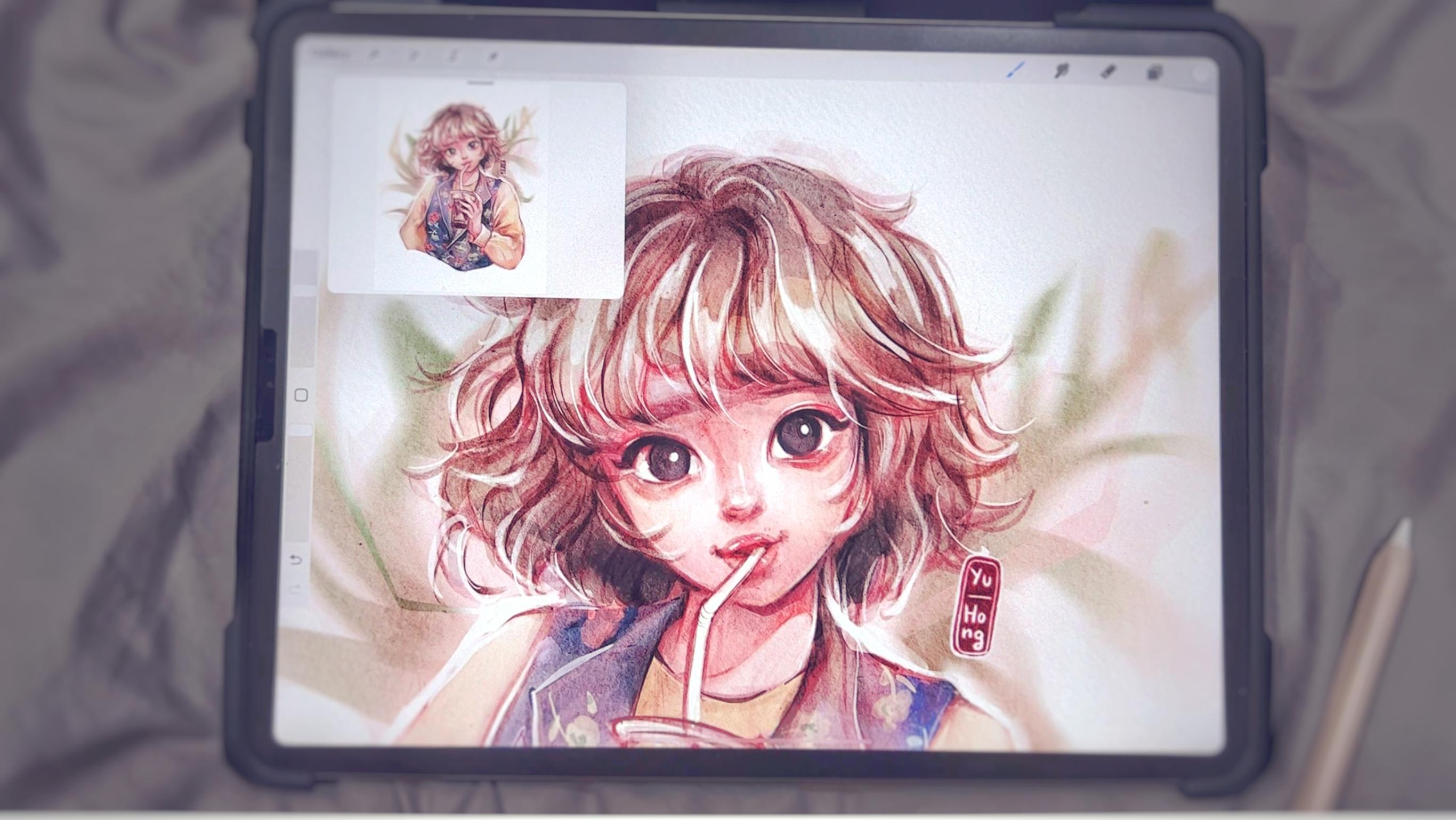
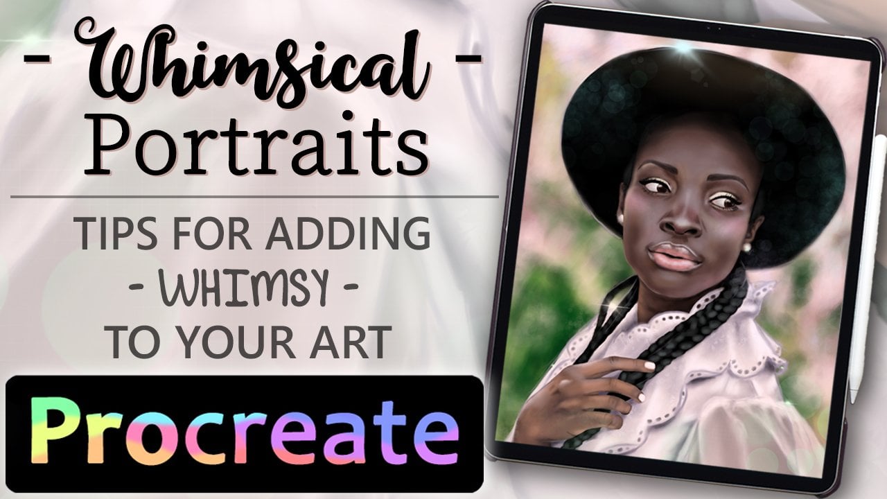
7. Class Project - Advance: [MUSIC] You may think painting character is a challenge or advanced, but basically it's just your own tones
and essential tones. Imagine you're here to painting
whether it's a character, food, object, or scenery. I will use this reference to demonstrate to you how I will paint a character with what we have learned
in this class. The first step here, I will try to sketch some base color from the
reference to the painting. Changing the light
color to pink just make the character more lovely. I'm adding some details of a shadow that make
this more interesting, variety shape and color and
tones as we mentioned before. I use the small brush to redraw some part just to make the
character more stand out. I also use some more tone and [inaudible] to
missing the shape. Adding a lot of white
strap is my everything. [LAUGHTER] Clean up some unnecessary line and paint in more details. What I like in just
reference is her outfit, so I will try to paint it. You don't have to exactly, I just want to copy some of the colors and fit
the shape around, and a lot of white again. In this step I utilize
the tone further, I'm changing the adjustment. I think it's good enough now, so I will stop here. [MUSIC]
8. Final Thoughts : With digital watercolor, you have more space
for exploring. You worry less about
making a mistake because you always have the
tools to fix them later. Maybe in the future classes, I will make pass for each subject like
painting characters, painting field, or
how to paint scenery, or how to make sticker or icons. You can do for iPad
decoration and customize. I hope we have a good time
still we meet here in this class and don't forget, you can share your SSIS in the final club projects
in our project diaries. Thank you for joining me here
and I hope that we'll be able to see each other
in another class again.
 Yu Hong, Illustrator | Graphic designer