Transcripts
1. Intro: Recently I've been going out urban sketching and
drawing buildings and interiors and found
that my perfectionism, my inner critic has
been loud and clear. Drawing out on location has been a particularly
interesting challenge. I usually make everything
up and I was going back to the way things were in school when I was
trying to learn to draw. I felt like I was
starting over again. Here is one of my visits
to a coffee shop. As I went along, it got more and more wonky. My inner critic was going crazy. One of the things that I am
learning in this process is to embrace the imperfection or as I like to call
it the wonkiness. I'm Terry Runyan, visual artist, and
creative encourager. In this class,
embracing the wonky, celebrating your unique voice, drawing, and watercolor. We're going to be looking at wonky from a completely
new perspective. I've been in Illustrator
for a really long time. I worked at Hallmark
for 30 years. I retired to run
my own business. I have several books out and I have several other
classes here on Skillshare. I'd love for you to take
a look at those as well. I'm going to be sharing
with you all about ways to use your wonkiness to help
clarify what your style is, just to practice seeing better and how to navigate
the inner critic, learn to draw a little
bit more accurately, but not worrying about the
wonkiness that happens. This class is for
you people with a fierce inner critic
that would love to be able to really enjoy the
process of creating art. I'll also talk about keeping a sketchbook and showing up for that as
often as possible. How that creates a conversation between you and your creativity. We're going to, of course,
talk about dealing with that inner critic that may pop up for some of you
when you are working. Well then go into drawing
and drawing what you see, seeing edges and shapes, add color and depth to our drawings through
watercolor application. Also talk about
simplifying what you see and making it your own. Finally, I'm going to talk
about breaking the rules. In other words, being wonky
on purpose and ways to bring in stuff you've
made up into what might've started as a
representational scene. In the project for this class, we're going to be playing with those edges of our comfort zone. Ultimately you're going
to come away from this class feeling
more comfortable with your drawing and your painting and be able to
bring some Lindsay, some fun into
something you thought you would never be able to
draw. Let's get started.
2. Class Project: [MUSIC] I want to talk a bit about the project
we're going to be doing. I want us to try something
that maybe we've never drawn before or something
out of our comfort zone. This is a really huge thing. It was for me when I started
doing that urban sketching. I'm just going to show
you a few things from my really the first sketchbook
I've worked in this consistently for a while and definitely the first
one I've been doing things that are just way out of anything I normally do,
which is architecture. I've found ways to do this that have been more fun for me, plus I'm learning
more about drawing. Most importantly,
learning to embrace that wonkiness and celebrate
my unique way of working. I'm going to go ahead and
show you a few things from my sketchbook now. This is the first
sketchbook I really kept fairly consistently
for quite a while. It isn't a sketchbook I
would probably use again. The reason is because although
the paper is pretty nice, it tends to warp. I use a lot of water in
my watercolor paintings, and that causes a little
more warping than I like. Although using these clips helps on the edges
to hold things down. I do use these when I'm using watercolor in this
particular book. I started off with
just trying to see what the paper was like. I tried a little portrait of
my partner and of course, a cat in some brushes. I made a mess on this
page and just made the mess into cats.
There was that. What I'm wanting everyone
to try in this class is to learn how to draw something maybe
you've never drawn before. This was an example
of that for me. But I'm also going to be
talking a lot about edges and seeing the angles and distances and all that when we're working on any kind of architecture. I had my inner critic, my perfectionism coming up
all the time during this. What I found was all the things that I think
are wrong with this are insignificant compared to just getting
out there and trying something new and seeing how my own personality
comes through. I did start hanging out in coffee shops and trying
interiors with some people. Here's more architecture
and definitely had a perfectionist
craziness coming up. But I did enjoy practicing
doing the brick and all that. This is the first
house drawing I did. This is when I
started thinking this could be very fun if
I added some cats. In order to keep the
drawing extra fun for me, the drawing and painting,
I went ahead and started adding cats to my art. This is the first
city scene I did. I was very much aware
of things that I didn't draw correctly and I redrew
this garage over here, added the cats, of course, one here, one here and this
mammoth went back here. That's totally out of proportion for the scene,
which is what I love. More interior drawings
with cats added. I was having hard time
with those ellipses, so just practice to do something that
would help with that. But I also like the wonkiness. I'm noticing, yes wonky, yes, that's what I like. Here I started
really getting into this whole cat invasion on coffee shops thing that
I'm working on a lot now. Here are some more of the
cats in coffee shops. Another architectural attempt. I completely lost
my way over here. But who cares? I mean, it's part of the way I draw. I'm learning to draw and
I really appreciated that we can just do stuff that's not correct
and still be okay. More cat personalities. A couple of different
pages here. I tried some dogs over here. There was no space
to sit inside for this drawing at the coffee shop so we went up on the terrace. Lastly, I was in
a coffee shop and they had a lot of
really cool plants. I decided to take the focus off coffee and just the plants
and cat and bird. That's my out of my comfort zone sketchbook that
I've been playing with. For your project, I want you to try something
out of your comfort zone too. We will be working on things
throughout this class that might help you in tackling some of those things that are not things that are
easy for you to draw or maybe you've
never drawn them before or maybe you just want
more practice with them. We're going to do
our first drawing of whatever it is we're drawing in blind contour
just to loosen up. Then we're going to draw, looking at the item or thing. Then we will move to
drawing from memory. Then we're going to try
adding stuff that we make up. In my case, cats. Feel free to add cats to what you're doing if
that attracts you. You can't go wrong with cats. Before we jump into the
rest of these sections, I want to talk a little bit
about the supplies I use. We'll do that in
the next section.
3. Supplies: [MUSIC] Now we're
going to look at some supplies and ultimately we're going to be
doing some drawing. I'm just going to go through
my supplies really quickly. I already mentioned the
book that hasn't worked that great for me
because warps too much. During this class,
I'm going to be using a brand new sketchbook that I haven't even
tried the paper yet. This is a Speedball product and it's called the
hand-book journal co, company and this is an
eight by eight inch book. This is the book
I'm going to try. Fingers crossed. This may buckle as much as the other one. I might find that
out. We'll see. The tools I'm going to use
are a good old pencil. You could use a 2B pencil if you don't have the
mechanical pencil. I tend to use mechanical pencils because you can refill them
with some nice soft led. This has 2B led in it. All these supplies will
be in the resources. You could use a Staedtler
Permanent Lumocolor. The important thing with whatever ink pens you
decide to use is that you want to use permanent ink that doesn't bleed because
we're going to be working back into
this with watercolor. My most recent acquisitions
are these fountain pens. I'll talk a little
bit about those. This is a LAMY Joy calligraphy
pen with a 1.1 nib in it, and this pen comes apart and you can fill it with
whatever ink you want. All these pens. I have refilled them with permanent ink because they do not come
with permanent ink. So just know that
for all these pens. This is one of the inks I use
and it's an archival ink. You're wanting to look for
archival ink, permanent ink. This is DE ATRAMENTIS. [LAUGHTER]. I don't speak other
languages, so there you go. I'll have it spelled out
for you in the resources. This is carbon ink. This also
is permanent and archival. We'll have both those
in the resources. This is another pen I have. This is LAMY Safari. I have one that's a little smaller and one that's
a little larger. Again, I refill the
ink with a converter where I take the ink out and I fill it up with permanent ink. You can find out all about loading and cleaning
pens and all that. I will attach a YouTube
video to this class. This is Sailor Fude
de Mannen pen, and it has a unique tip
that is bent at the end. It's really a calligraphy pen, but it makes really cool lines, both thin and thick, depending on the angle
that you hold it. I could go a long thick, I can come up up on the edge
and draw a thick somewhere. It's pretty fun that way. Those are the pens I
use and the pencil. I also use a Uni Posca, white extra fine pen for my whites and the whites of the eyes of cats and
highlights and such. A few more supplies that you're going to need is for the painting piece of this. We don't have to use
really expensive paints for a sketchbook. We're just going to use
whatever we have on hand. Or if you'd like to
upgrade your paints, I use Winsor & Newton professional grade
watercolors in tubes. I have a list of what I use
in the resource section. When I'm out on location, I use a palette like this that's got all the colors I use, which are very limited number because I think the less colors, the easier and more fun it
is to paint just personally, and I have all this
space to mix colors in. I also use this Mimik
Creative Mark brush size 10 round for 90
percent of what I do. I also have a few fancy brushes from Rosemary and Company. They come with a nice lid that
doubles as a brush handle. That is really cool. But like I said, mostly I use this really
inexpensive brush. These come with this plastic
thing to keep the tip okay, and I just wet the brush down, make a point and use
this like I would the handle on those fancier
brushes and just make sure your brush is not
all the way to the tip, so it keeps the tip nice. In the next section,
we're going to do some warm-up exercises using watercolor and our fountain pen or whatever it is you
want to draw with. So let's jump into that.
4. Warmup: Now that you have your supplies, whether they are the
ones I mentioned or just a piece of paper
from the copy machine. We're going to jump
into loosening up our drawing and
playing and doing blind contour and all kinds of different things
here as a way to warm up to our sketch books and just to get
in the play mode. Before I go any further, I wanted to tell you about something really important here. This one is Tucker. He's mostly a good boy. This is his sister Riley. Those are my inspirations, and definitely drawing cats is a major part of
my comfort zone. There's a couple of things
I want to talk about before we get jumping
into this sketch book, and that is your
intention when you approach the sketchbook and whatever it is you're
going to draw. I like to think of this as
an opportunity to practice kindness as if your with a child and you want
to encourage them and play with them and
just have a good time. Go to your sketchbook
with a sense of kindness. Also with a sense of adventure, with a sense that whatever you do here is
going to be perfect, however quirky or wonky it is, and we're just
going to cut loose. This is not about doing an
accurate drawing or painting, this is about having fun. In the process of having fun
and drawing what we see, we get to learn a lot about
drawing and how to see. But we also get to learn a lot about our own hand
in our artwork. How the wonkiness of it is
part of our personality. Also I want to bring this up because it's
been very important in my work that when we approach our sketchbooks
or our paper, whatever it is
we're working with, we're entering into a
conversation with our creativity. Even if we start with something that we're
trying to represent, like I'm going to be
drawing my glasses, you never know where creativity
is going to take you. I like to stay pretty
open when I'm working, which is how the cats started showing up in
my urban sketching. That was not a planned thing. The creativity came in and started playing when
I was sketching. I just want you to keep
that open-mindedness because creativity may be leading you other places
than you intended. The last thing I want
you to keep in mind is that whatever shows
up on this page, it is not an indication
of your worth or your value or how good
you are or anything. It's just us playing,
us exploring, us having that conversation with creativity and our worth
and value is inherent. This is something that
is a biggie to learn. It is something I've struggled
with most of my life. If you can realize that your artwork is
independent of your worth, is something you do
as a bonus in life, just to play, have fun, practice, learn, then there's
not the heaviness on it, that it needs to
be a certain way so that you can feel good. It can just be its own entity and you stand in your own value. That's a biggie and it's
a lifelong learning. We're going to start
our practice here, our sketchbook stuff, with some warming up
and getting used to our supplies a bit and just
getting our hand moving. Let's get started with this. We're going to start
our practice here, and I'm going to
be making blobs. I've got paint leftover on my palette here and I'm just
going to paint circles. I'm also going to
overlap a bit so that we have some blending going on which I think is beautiful. Vary the size of these circles. Sometimes there'll be
two colors of paint. Just keep going with this. You can mix up some new paints or use paints you already have. However many rows
you want to make. Point of this is just to get
used to those watercolors on your brush to see how
they blend together. I love this turquoise. I am not making this super dark because I'm
planning on coming over them with pen for doodling. You don't have to
overlap your shapes, I just decided to do that so I can see the
colors blending together. If you've got a huge puddle, you can dry off your brush and pick up some of
that excess water. You can also, like me, bring in your hairdryer. I don't want to dry this
all the way because I want to come in to the
wet paint with my ink pen. What I'm going to
do is just start playing with lines
within these shapes. Since I'm such a fanatic
when it comes to cats. I'm going to start with a cat. Just a little wonky kitty. I'm also going to play
with some flower shapes. Flower shapes are fun to do, and they're great for
getting used to a pen. As I go up and down on this
fudepen with a bent nib, I get thicker and thinner lines as I've talked about before. See how this is blending? I just love when that happens. I'm going to put a face on that, but I'm going to wait
a little bit for that to dry just a little bit more. Maybe you're just
playing with your pen, seeing what kind of lines
you could make with it. My pen does not seem to
be working right now, holding it up, so it
must need to be cleaned. It's doing a little better now. Nice and funky and wonky. This is just a really
great way to warm-up. Anything goes here, we're just trying to
see how our paint moves and our pen makes marks. Then this is another page in my sketchbook. I'm going to go
ahead and date it, put in my name, and
what I'm working on, which is Embracing the Wonky. Making wonky lettering too. Got to finish this
face on this fellow. There you have it. A little
warm-up exercise before you jump into doing something
more representational. I also want to encourage you all to think about sketching, and drawing, and painting as something that you come
to as often as possible. The more often you visit this sketching,
painting, drawing, sketchbook thing,
the more you're going to be connecting
with your creativity, the creativity that's
already there in you. I suggest that, if you can, at least spend a few
minutes a day using your hand to create something on paper or whatever
way you like to create, and just keep that
conversation going. It also is great to develop a habit by showing
up daily if you can. It doesn't have to
be a masterpiece, you could spend that time just
completely making a mess. We're going to start off
with our chosen item. It could be an actual item, which is what I'm going
to do with these glasses. But you could also
work from a photo. It's a really good idea
if you intend to do urban sketching at some point that
you try to work from life. It is a little different than
working from a photograph, although a photograph
is fine if you can't get out and about and you don't have an
item that you like or don't like in front of
you that you want to draw. Anyway, we're going
to start our drawings now and we're going
to start with a blind contour drawing. I am going to use my Fude pen, and I'm going to take my glasses and put
them in front of me. The point of blind
contour drawing is basically you're
drawing blind. You're going to be looking
at the item you're drawing and you're only going
to keep your eyes on the item as you draw and
not look at the paper. It's okay to look
down occasionally if you've completely lost your way, but ultimately we're
going to try to keep our eyes on the
item you've chosen, whether it's that photograph
or this pair of glasses, or maybe it's an ink bottle, and draw without
looking at the page. I'm going to place these
glasses just right in front of me and start my drawing. I'm going to work on the
left-hand side of my sketchbook. What I'm doing is
I'm starting on one end and I'm going to follow that item
along with my eye. As I'm following
it with my eye I'm also following with the drawing. This is eye-hand coordination that we're playing with here, but we have really no control because we're not
looking at the paper. I'm going to set
these glasses off. They're going to be
out of view for you so that I can keep my
eyes off the paper. I'm going to start
at the one end and follow the line around. Just keep going. Most of the time
things won't line up. I've completely lost my variance because
I'm talking to you. I'm looking at it
right now just to get a little idea where
to put my pen. I'm following that around again without
looking at my paper. I've also got these
ear things back here. It's a really good idea, and I forgot to tell you not to pick up your pen
when you're doing this. I'm going to stop there. You
can see how wonky this is, but I really love
it. There we go. The second thing
we're going to do is we're going to
draw that item, but this time we're going
to look at it and we're going to draw what we see. It's not going to
look just like it, and I'm going to
be okay with that. Once again, I'm
following the edge, I've already done this once. I am doing the best
I can going slowly, and still quirky, but
a little bit closer. I have a little bit more
bearings on where to put these glass area. I'm looking to see where this, seeing through here where
that line is back there of the ear thing and
where it comes down. You could see that this
one comes off this side, and joins back up here. It's still far from perfect. Again, the wonkyness of
this makes it unique. We don't want to go
for photographic here. We want to go for the practicing of the line and your
eye-hand coordination. Now I've drawn this twice, once blind contour and once with looking at it
and drawing from it. The next thing I'm going to do is I'm going
to draw it again. This time I'm not going
to look at it at all. I've got it in my memory, I'm going to move to a new page. I'm going to cover up that page so I'm not just copying
what I see over there, and I'm going to
draw it from memory. Maybe I'll even
put these glasses on to make sure I
don't look at them. From memory, I've already drawn it twice, so I have a sense of
the idea of the shape. It really is pretty
amazing how close you can get drawing from memory after you've drawn
it a few times. The thing about it is you're
not going to get perfect, it's going to be wonky, and
look at how fun that is, I just really like it. The fourth and final
thing we're going to do is make something up that goes along
with these glasses. Of course, you know my comfort zone is
the kitty cat thing. I'm going to go ahead
and add a cat head to this pair of glasses
in my next drawing. I'm going to start with
the glasses again. Since these are actually going to
be on a cat head, you're not going to
see the ear parts because the cat is
going to come up here. I have to tell you, so far I'm liking this paper. Of course, I'm not using the watercolor on it
yet. There we go. I've done my little
made-up thing, got four different
drawings of glasses. It was a lot of fun. I hope that's been fun for you as well. This is a great warm-up
exercise to help you see. I'll be talking more about
drawing and loosening up in a section coming up. Until then, let's talk a little bit about
that inner critic, that perfectionist that shows up when we're playing
with our art.
5. Dealing with Perfectionism: [MUSIC] Okay, that darn perfectionist and that inner critic that shows up
when we're drawing. I am so familiar with this. I've been doing this
for a long time and my perfectionist still
comes up just as much, maybe a little bit less. The thing about it is
perfectionism is learned, we're taught in school, maybe our peers,
commercials, everything. Say that we have to
make things look right. I fell into this as we all do, not consciously, but just as
the way things should be. I thought my artwork
needed to look just like what I was trying to draw
and like most human beings, I wanted my stuff to look right. I want it to be perfect, and I couldn't do it. I thought I was supposed
to be able to do it just by pure talent or
something like that, and it just didn't
happen for me. So what happened over time
is I learned to avoid drawing anything that might be too hard or I might
not get right, and those are the
things I've been challenging of late
in a sketchbook. Show up and work on things I've never done
before and just play, notice that critic coming up, see it for what it is
and continue creating. The focus is turned more into fun instead of having
to get it right, but that doesn't mean my inner critic doesn't show up every time
I go to the page, it does, and I'm sure it does
for most of you as well. I also want to mention one of
the things the human brain loves to do is to make
things into symbols. So when I look at these glasses, and I'm just using my symbol
brain or my object brain, you could also call it, they're going to look very much like a child's
drawing or stick figurery thing because
our object symbol brain wants to simplify things, it automatically goes
to what we think we see rather than what
we're actually seeing. That is what tends to throw us off when we're drawing
or painting is we rely on our symbol or object brain to do the drawing for us. And that's why we want
to keep coming back to seeing the edges of things. We're also going to talk
about seeing shapes. What you're doing is
you're letting go of your object brain
and really studying what you're actually seeing
when you're drawing. I also like to name
it the hate it phase. Even if my drawing is
going really well, I always seem to have a time during the process where
I go through I hate it phase where I just really can't stand what I'm doing and think it's going all wrong. And knowing that that's
going to happen and seeing it happen has become
kind of humorous to me, and I don't let it
stop me anymore, I just keep going
and keep playing. Always know with the sketchbook you can draw things again. The more you draw something, the better you're
going to get at it, but we're always remembering
to the point of this class that we don't necessarily want to be perfect
with our drawings. That wonkiness is really what is our personality showing up. We want to learn to draw or
paint better as we practice, but we also want to celebrate that wonkiness that
shows up in our work, because that really gives
our personal voice, our personal spin to
what we're doing. Next, I'm going to go
into drawing a little deeper and talk more
about ways to see, to help you draw, so that your object symbol brain doesn't kick in and take
over quite as much. So we'll be doing
that next [MUSIC].
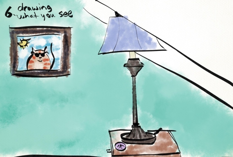
6. Drawing what you see: All right, in this section now what we're going to
be drawing what we see. I'm going to be talking about different ways of
seeing that can help you move from your
symbol object brain. I'm going to be
doing a drawing of my glass with all my
art supplies in it. Feel free to do something more simple than this
for this exercise. But this is just
what I wanted to tackle for this time around. I know it's going
to turn out wonky, but that's the whole point, it's to just play with this. Let's get going on that. I've got my sketchbook here, got my cat hear, and I've
got my item in front of me. What I'm going do with this is, I know about the
contour drawing. I know about following edges, and that's one way
that you can draw. When I talk about the
object symbol brain, it is the brain that says it has a snapshot of
something in your head and it wants to make it look very much a symbol of what
the actual item looks like. In this case with this
cup with items in it. It's going to draw the cup. It's going to draw
items that are in it. It's not really actually
looking at what it's seeing. It's just stylizing
things and it's just creating the symbols
of what it sees rather than what
it actually sees, this is how people usually
work when they start off, they don't actually look at what they're seeing and
draw what they're seeing. They're drawing an idea
of what they're seeing. That would be what the symbol
object brain will draw. It's usually flat. Doesn't have the curves
that's actually going on in the picture or
item in front of us. If I was to show you a chair drawn that way when
we think of a chair, even if we're looking at it, what we think a
chair looks like, that might be a symbol object drawing when in
reality the chair, we may only see a small portion
of that top of the chair. What we're going to
do here do here, I'm still drawing like a symbol because I'm not actually
looking at a chair. But you can see that
this type of a drawing, the symbol of a chair, usually the mind wants
to make the seat larger. It doesn't put things
in perspective. Everything gets flattened out. I hope that makes sense. We're moving on to
drawing what we see. What we're going
to be doing is you have an object and when
you're looking at it, you have a symbol of it right in your head, that's a pen. It goes like this. It's got a cap
thing on the side. That's what it looks
like. But in reality, when I'm looking at it, I see the top of it. I'm going to follow around
what I'm actually seeing. I can see that since I'm
not looking straight on. You can see that in the photo. You can see the tops of a lot of these
items in the photo. In this, if you see it
at an angle that'll look round to you rather than flat unless it's absolutely
flat on the page. When we're drawing, we
want to look at what we're actually seeing and move away
from what we think we see, and the way we do this is
through following the edge, eye-hand coordination, and
seeing, and drawing shapes. We've talked a little bit about following the edge
and drawing it and the eye-hand coordination. We did a little of that
when we were playing with blind contour as well
as looking and drawing. With this, seeing and
drawing the shapes, what we're looking for is, for instance, I've got a
pair of scissors here. There's a shape that
goes up like this, comes around and down. Inside here is another
shape that I'm drawing. Another shape here. It's not just two
circles at the top. It's an actual shape
that's unique. There's a shape in here. I'm going to try to
explain this shape and edge thing using a copy of the photo that I took
of this little setup I have here with my pens and pencils and scissors
[inaudible] things. I'm going to go back
to the overhead here to make it easier
for you to see. When you use a red pencil. When I'm talking about edges, I'm talking about following with your eye around the
edge of an object. The actual objects edge
you're following through eye-hand drawing on the
paper like I did here. When I'm talking about shapes, shapes are what you see. I'll use a different
colored pencil. Shapes are what you see
the whole object as. A shape would be this whole
thing against the background. Another shape would
be this area. You could draw this where it's just the outline of the shape
rather than each object. This is a shape and
this is a shape. It's easier to see this
when you are painting. Let me grab my paintbrush here. This right here is a shape. This is a shape. The shapes look like this. This is just another way to see to help you get out
of your object brain. You're not just stylizing things into what
you think you see. That's that shape right there. This shape right here is
a kidney looking shape. That's what I mean by shapes. I'm going to go ahead and
draw the whole cup with all the pens and pencils and
scissors and brushes in it. I'm going to do that
in my wonky way. Keeping in mind edges and
shapes and also I really want to look at and follow
what I see as it is, rather than use the
object symbol brain to create what I think I see. I'll be doing that
and then I will also be celebrating all
that wonkyness, it's going to happen because
I can guarantee you it will. I will also be having lots of inner critic perfectionist
stuff coming up in my head, which I will notice, name it, and move on. Let's get started with that. I got my food aid pen. The first thing
I'm going to draw is the base because
that's going to set the whole tone for
what the sizes are. I don't have enough
room on this paper to draw this as large
as it actually is, as it is close to me. I'm going to draw it
a little smaller, which is challenging. But when we're
looking at edges and shapes and the way things
relate to each other. It helps to keep everything in proportion to
what you're seeing. I'm going to start with the
straight edge of the glass. We got another straight
edge over here. I've set the parameters
for the size of this. Looking at the edge, this comes out like
that on both sides. There's a ellipse, a round shape at the bottom. There's a round shape here. As we go up, that roundness will get a
little bit more squished, more of a squished oval. In other words, whenever
you do an ellipse, whenever you do anything
that's curved like a glass or a
container like this, it's always variation
of a circle. The more you look
straight down on it, the more round it is. As you get at an angle, it's the same circle
but it's squished. The sides are rounded. Just a more squished rounded. The object brain wants to do this and make points
at either end. But in actuality,
it's a rounded shape. That's what I'm doing over here. Please know that
ellipses are extremely challenging as you can see
with the drawing I just did. I've got the edge
of the cup next. Looking at it to see the
depth of that ellipse. I'm going to start here with the outer shape of this
because it's very complex. I've got a brush
coming out this angle. Another one coming up here, extend it to the other side. I'm looking at relationships. If I look across
from side to side, I can see that this object is slightly
higher than this one. When I'm drawing this, I know this is not going to
come up as far as that brush. I'm already out of
proportions here. We're starting off
our wonky right away. Got a pen coming up here. I can see the top of it and going down in here
because this is a glass that we can see through. Got another one here at
about the same level, a little bit wider. Another one here that's off
a little bit of an angle. Another one here that's a
little bit off at an angle. I'm going to go
ahead and complete these shapes as they hit
the rim of the glass. Continue on in here. You kind of fuzzy. This is really not accurate
to what I'm looking at. But I'm hearing that voice
come up and say Terry, you're doing a demo here. What the heck, you're not
even drawing what you see. I'm doing the best I can. I noticed that voice coming
up and I acknowledge it, yes, that's the inner critic trying to be a perfectionist
about this and make it perfect and not make any mistakes and I am just
going to continue on. I realized what that is and I don't need to
pay attention to it. We've got some pens in there. I'd started this coming up here. There's another brush,
it comes off this way, but I'm going to leave it out
because it's just complex. I can do whatever I want with
this drawing. All is well. On this side we have
yet another pen coming up that is showing the top. Know that let the angle
of the photo that I am showing you is not exactly the angle I'm
looking at this piece from so that's a disadvantage as far as getting
a likeness there, but I'm okay with
the difference. It's just the way it works
with me when I draw. I'm looking at the way
all this intersects. As I do this, I
realized just how off this drawing is and I
realized that's okay. What I'm doing is
constantly going back to affirming that what I'm
doing is perfectly fine, that it doesn't have to be
an exact representation. Actually, the further
I'm going here, the less it looks like what
it actually looks like. I'm having a lot of opportunities
with an inner critic to tell me that this isn't right and I'm continuing
with the drawing. I'm making adjustments
to the drawing as I go to make it slightly
more believable, even though it is not actually
like what it looks like. Getting it closer to what
it looks like comes with time and practice of
eye-hand coordination. In this class
though, we're really being present with the
process and not taking the thing too seriously and realizing that
whatever's coming up here is perfect part of
how we like to create art. We don't need to have it look exactly like what we're drawing. I've simplified this somewhat, left some things out, and I can't actually
see the back of this glass with
what I'm looking at. I'm going to add
another pen in there and finish off some of
these lines in here. You can see this coming around. Now what I'm going to do now is add maybe a couple more in here to finish off this bottom area because that's a
very full glass. There we go. I have, looking at this thing
in front of me, the setup in front of me, a line going this
way and that way. But I'll just put into
ground this object. Okay, I've drawn the
thing on my page. I'm really getting a sense
that I want to add a cat, so that it'll be more fun. I think I might do that
because I enjoy that, but I will finish this
drawing and add the cat, add the watercolor
in the next section.
7. Drawing plus watercolor: We got the drawing done, let's go ahead and do the kitty, and then I'll jump
in with the paint. I'm trying to decide
where to put this cat. I could make it so that
this is the edge of a table and the cat could
be coming up from the back. That feels like
what I want to do. This cat wants to play
with those items. I'm keeping it simple. The cat is now trying to
look like an actual cat, which is what I find
to be extremely fun. I got the kitty in there. I'm going to go ahead and do a little bit of demo
watercolor for those of you who have not used
watercolor before or just would like to
learn about how I use it. For this, I'm going to use
a small sketchbook just to show you how I
use watercolor. I got a few sketches in
here. I'm sealing this. I've got my palette here. I usually use this palette
when I'm out urban sketching. This is the Payne's gray and it's just one
color already blended. To get variation, I use this color and I've got ultramarine here and my
paints are not very clean, but when you mix these two, you get a really nice warm gray. Add a little more water.
There's a little bit more going on in the paint. You get the brown and
the blue happening here, and it makes a very
beautiful warm gray. Still a cool color, the more blue you put in, the more pigment on both
the black and the blue, the dark you're going to get. That's a mixture
of the brown and the blue with a
little more pigment as you can see how
black it's getting. This is a scarlet lake color, I use this and this yellow I mix together with the scarlet
lake to make the orange. The other colors I use
are this turquoise color, I do have a green on my palette, but greens can also be mixed. Most of the time
when I do green, I will mix it with another
color because the green out of the tube is a little
artificial lookings, I mix the green with
this Payne's gray. If you mix the green, let me do it up here
because I'm running out of space here with the turquoise, you get a brighter
color of course. If I mix that sap
green with the yellow, then we'll get this
yellowy green color. Greens are really nice to use particularly if you mix them. They're not as beautiful
out of the tubes. When I'm painting,
I will start with a very warm color as
the place in the light. Actually, I'll
make the portrait. This is the portrait
and this is my face. Some hair, not worried about
it blending at this point. But when I'm doing the shading, I put some of the bluish
color in the shadows because that cool color
makes the shadow recede. You'll see this more as
I work on the portrait. I'm working
wet-on-wet right now. It's doing a little
something different than it would've had I just
put it on dry paint. Like if I do this, it'll have a much crisper edge. This is still a little wet, so it's bleeding a bit. But I find that really pretty. Watercolor by its very nature
is a bit unpredictable. The end predictability,
the wonkiness of it is what makes it
so much fun to use. It has a mind of its own, and the more you are trained
in it and practice in it, of course you know more about what accidents are
going to happen. But I'm not as
concerned about making a perfect watercolor
painting as I am with having fun and seeing where
the brush takes me and that usually
leads to wonkiness. Now, I could follow
what I see in the photo on the colors of things and I'm going to go
ahead and start there. I got some orange in here on these Posca pens or maybe those are
different type of pen. Yeah, those are Molotow pens, but mostly this is
monochrome in here. I'm going to make up some
colors because I can. The scissors are a gray color. So I'll go ahead and
make those gray. I'm not trying to be perfect toward these
watercolors, of course. Already messed that up,
that's supposed to be a different color
so there you go. But I can come in and pull that up if I don't like it
while it's still wet. Or maybe I'll just
make this one blue. Got quite a bit of
brown going on in here. I'm making my brown color out of Payne's gray and red oxide, and I'm going to
paint this brush that color and there's a lot
of black and gray in here. Well, it's a little bit of yellowish color so
instead of using black, I'm using the
Payne's gray again. I want to mix this up and
give it some variety, so I'm not going to make everything gray that
is gray in there. Let me make some of it
a little bit kooky. Watercolor is magical
because it goes everywhere unless you let it fully dry in-between coats
which I'm not doing. I prefer to have all these
accidents happening. These have a white top, so that's why they're
staying white. Get that in. I'm going
to paint the cat now. I'm trying to decide what
color I want to paint the cat. I think I'm going to
do multi-color on it like it's a calico cat. This is where I can get really crazy with the color, of course, I could get crazy with the
color throughout this thing, but I want this cat to
stand out back here. Is actually showing through
back there, somewhat. I'm putting my orange on first and then I'll come back in
with some other colors. I'm just not worrying about
staying within the lines because that's just part
of how I like to work, keeping it loose and fun. Color codes are
usually yellow and orange, browns and black. I'm going to use several
different colors here to represent this calico. I just love it when
it bleeds together, so I'm good with that. Well, let that dry sun. I think I'm going to come
in with trusty hairdryer. If you have a particular spot where your paint
is still paddling, you come in with a dry brush and just suck it out of there. I think what I'm going
to do right now is put orange on this little
foot to make it show up. Now I'm going to come
in with some shading, background, and stuff
to give it some depth. Got most of the base colors on here and now since it's dry, I'm going to go in
and add those shadows and give it some sense of shape. That isn't just flat
watercolor on a page. That'll make more sense as I go. I'm going to use mostly
Payne's gray mixed with a little bit of the red oxide along the side of this glass. I'm making a light source, made-up light
source because it's coming from this direction. I also add shading to the cat, keeping it loose, liberating
the imperfections. I don't yet have my
darkest darks in here. Where your darks and lights
come together is where your eye gets drawn the most. This particular
painting does not have a center of interest other
than this area here, because this is
all turning to be quite neutral and the cat's face is staying clean and white. That's going to bring your
attention to this area. I'm going to make
up a little shadow here under this glass, which is how it really
shows a light source. I'm doing that in almost
straight Payne's gray. I think this little cat would have bit of
a shadow as well. Any of the brushes
and stuff that are behind and putting
those in shade. When they're in shade like that, it pushes them back
behind the ones in front. I'm building this up rather than getting it all down
in one watercolor go. You can see as I'm
adding these darks, it's giving it more depth. I don't need to tell you I like this paper, so that's good. It's not warping very much. I'm happy to find that out. Got some pretty dark
darks in here for the shadow behind these
instruments with drawing. I gave it a little extra
shadow closer to the cup. I'm going to stop
messing with this now because I think it's
reading pretty well. I'm going to add a
little bit of brown to the tips of these brushes. I might add a little
bit more shading to this pair of scissors. What's going to
really get this to kickoff is adding a background. I'm going to grab a
color here and add a background in order
to get the warms to set off from the background, I'm going to do cools
in the background. I'm testing my pink
colors over here on a separate piece of paper
as I'm going along. I want that little darker and I want it to
turn down a bit, so getting this nice
bunch of blue here. Since this is a
sketchbook drawing, I never usually go all
the way to the edges, I just do a loose edge. Come in with some water on
your paper to get that edge. Now I'm getting some buckling, but it took quite a while
before that happens. I am going to use this clip
to get it to lie down. It's much easier to do
this prior to starting, just note to self. I need to finish off
that background. I think that's everything. Once again, I'm not worrying
about everything fitting perfectly within this drawing. I've got the essentials here, and that's all I need. I'm going to take my pen now. Like I mentioned, I want
to document the date, and this will be
embracing the wonky. I always like to
sign my work too. Before I move on, I
want to come in with just a little posca pen for
some highlights on here. This of course isn't necessary. If you know how to
handle watercolors well and you want to be
more careful you can leave the whites and
not paint them in. But I didn't do that. I'm just going to come in
and add a few highlights to some of these implements. Not all of them, just a few where it makes sense and that just makes them a little bit more
three-dimensional. It'll show up better of course on the ones
that are darker. I can put a little
bit of highlight on this glass there that kicked
it off just a little bit. I like that better than it was. There you go with
highlighting with a posca pen. There you have it. I'm going to talk a little
bit more about making up stuff within a drawing
you've done from life. This is just a little thing
that I've found really fun to do like I did
here with the cat. We'll talk about that
in the next section.
8. Breaking the Rules: That was fun creating that
bunch of supplies with a cat. On that note, I did
want to talk to you just a little bit
about adding whimsy to your representational
drawings and paintings. For me, adding these
little bits of sign of life really helped me
to feel like it's mine. It's not necessary but
for me I really enjoy that process of having
some animals or characters or birds
or something in the scene that tell a little bit of a story and make some eye contact and stuff with whoever is
looking at the piece. It just brings a little
bit of fun to it. There's also doing wonking as intentionally where you're
distorting on purpose. That can be really cute as well. Mostly the distortions
I had in the drawing I just did were not on
purpose. They just happened. But I went ahead
and kept going even though my perfectionist
brain was chiming in, I noticed what it was
and I just kept going. Ultimately, these things
that we worry about with our drawings and our
paintings don't really matter. They usually, for me, work into being a secondary item to what the center of focus is. It's not like I'm trying
to do things perfectly. I'm playing around and you
can see that in my drawing. Keep that in mind,
wonky is good. The other thing I
wanted to mention is simplification in drawing, a lot of scenes, including
the items I just did in this class, are
pretty complicated. You notice while I was drawing, I was simplifying as I went. I didn't draw every
single pencil, pen and paintbrush
in that class. I picked and chose and fit
things in where I wanted. This is perfectly
legitimate way to work. I do this quite often
when I'm out on location, urban sketching in
those coffee shops that are so complicated. I know in advance most of the time
that I'm going to add some character in there, so I think about that
when I'm drawing. I leave those spaces
or draw those cats in when I'm working before
I finish the details. It's just a really fun way to work and I highly recommend it. You can also fit birds in almost anywhere in a drawing
even if it's complete. But you may be more
of a purist and want to just represent what you see, which is how I started. These animals started
showing up later as I kept going with
my urban sketching, so you just got to follow
your own instinct, your own intuition,
your own creativity. I'm going to go ahead
and draw again. I've got a photo of this
place I'm drawing and I visit there a few
times and it's called the French Market in
Prairie Village, Kansas. I just wanted to
show you how I wonky up my urban sketching. I start basically
with trying to get the lines right as
far as the angles go for that
counter-top and then I immediately start
adding my characters. Sometimes I wait a little
longer to add the characters. But in this incident, I went ahead and added them right away. I'm putting in all the details. I've got the photo up in
the left-hand corner, showing what this
looks like and how much I modify things
as I go along. I'm really making an effort to be accurate
with this drawing. I had this whole video sped up. So, obviously it's going a lot faster than it
actually happened. As I'm going along, I keep adding more kitties
and adding more details. It was important for me
to get those kitties in early so I can draw
the stuff around them. It's a little harder adding them once you've put in a lot of details because then you got to squish them in wherever you can. I know I'm wonky here. I know my stuff is not accurate, but I'm going ahead
and enjoying myself. I'm also really editing
down what I see in this photo because the photo
is extremely complicated. I'm going to go ahead and
just let this play out and I'll comment as I see
something I need to say. Hope you enjoy. [MUSIC] Now I'm going to switch
over to watercolor. I'm using fairly light colors here as I feel my way through. When you're not seeing
anything going on here, I'm off trying to mix some
colors off to the side. Later in this class, I'm going to do another
demo where I'm doing a portrait and I'll
show how I mix colors. I'm keeping in mind
here with this one that I want the cats to stand out. So, I'm making them
mostly in warm colors. The background
might be more cool. Of course, the bird is
just a different color altogether and don't hesitate to come
in with a tissue if you need to pick up
some of that color. Now I'm starting to add some shading to give
this some dimension. I like to use my fingers
too as I'm working, getting all my base
colors in here and mocking things
up here and there, watering it down and picking
it up with a tissue. [MUSIC] Adding a few
details with the cats. More shading. You can see that this is just very loosely based on the photo I
have of this cafe. There's way more details, but they're just not
necessary for this scene. I'm putting in enough
details and we know it's a coffee shop and I put
a little signs up there. I'm coming back in with
a little more color now and a little deeper shading. I'll eventually put some
color on that mouse too. As you can see here, I'm
working up to my darks. Here's the few details
in the background. I kept this one even
more simple than normal. Finally I'm coming in with a colored pencil to put
cheeks on all the animals. I love doing that. It really
gives them more character. Adding a little white posca. Just a little and then I'm done. I really wanted to add this
here just as a last thought because so many of us with our perfectionist
thinking think that things have to be just like
what we're looking at. We can throw that off, we can keep practicing. I think as we practice and
draw and learn to see edges and shapes and draw
what we see rather than the objects or symbols
of what we see, our drawing will get more alive than the subject
we're looking at. But the goal for me
and maybe some of you is to embrace that
wonkiness as it happens and play with it and follow it and let it lead me as well as me
going back to you. It's a back-and-forth
between the wonky and the well drawn and I don't
know whatever shows up. Just know that the wonkiness in your art is really a signature. It really helps to indicate
your style or your voice. I think it's something that
we can celebrate rather than downplay and try to fix and get upset
with ourselves over. It's really just part
of your personality, part of the learning process. The more we can embrace that learning process and
that personality in our work, the more alive It'll be, and the more interesting,
at least for me.
9. Portrait with a Hat: This time I'm going
to work on hats. This hat that I
ordered of my logo and stuff on it and I took
a photo of myself, and now I'm going to
draw a self-portrait. Let's go for that and I'm
going to see what shows up, the wonky, the whatever. For you, you can either
use the photo I'm including with my
picture on it or you could go ahead and grab
a hat and a mirror or take a picture of yourself
in a hat and use that as a reference
for your drawing. Let's get started. On
this particular one, I'm not in my
sketchbook anymore. I am working on this Fluid
100 cold press finish, 100 percent cotton,
watercolor paper. I'm also going to use
this travel palette that I also will have in the
resources for you to use, and I'll list these colors
in the resources as well. I've also got my test paper
here that I like to use. I use paper towels to
get the moisture out of my brush and I've got my
photo in front of me. Again, you can go ahead and use the mirror if you want to. When you work from life, the wonkiness is going to
be a little different, I think, than when you work from a photo because the
photo is static. I think working from life
for me personally is something more
challenging for sure because things move around. A lot of times I'll look at
a one eye to see what I'm seeing when I'm looking at edges or I'm looking at shapes. This is a big experiment. Haven't done this before, out of my comfort zone,
and I'm going to dive in. I'm going to start this
portrait with the hat shape because that's the most
prominent thing I'm looking at. I'm going to start
with the edge of the top of the hat coming up, following around with my eye. I can see that the brim area, where the brim hits the hat. Now I'm closing one eye
to see this because it's really hard to see it for me. Now this angle of
this hat comes down. I'm going to put this mark
in for where the line is. This comes around and
meets right in here. The brim actually is doing this as part
of it come to here. I'm adding things on to
make it more correct. See that my face is
two of these tall. If you want to measure, you could say 1, 2, and my face comes
down to right there. It's that shading to measure. It's just one tool in
the toolbox to use. I'm going to follow this cheek around down into the chin, back up, and down. I'm not going for
perfection here, I'm just going for the
general shape of the face. No one has said anywhere
that faces are easy. As I'm looking at
this face shape because a lot of my
head is underneath this cap just about
slightly over an equal distance from here to here for the bottom of my nose. That's about the center. I'm going to make
it a little lower, possibly in here somewhere. It's a little lower than center, at least it is my drawing. We'll see what happens. See the lips about halfway down, extending out with
a little smile, knowing that nothing's
going to be perfect here. I'm going to be myself and
not draw all the wrinkles. I don't need to put
the whole mouth in, just an indication of the mouth. Way more nose than
I usually draw, the eyes half way up, and they started
about at the edge of that nose over to about here. I'm mapping this out. You don't have to
map things out. You could just go for it
and this will give you, at least will give
me, more wonkiness. This is just drawing freehand and this is more
measured approach. Keeping my eye on the photo to make sure I've got these
eyes in the right place. Lots of character in this face. Little indication of eyebrows. Don't need to draw every single because I come
in with paint and that'll help to
clarify. There we go. This nose looks way
too big for this face, and that is just the way it is. This is ink and it's not
going to go anywhere. I'm just going to
rough in some hair. Color the turtleneck
spot right there. I'm not going to do
a whole lot more. They come in with color to
describe most of the rest. I think this is
probably just about enough information and I put a little bit of the bottom
of the eye in here. I am going to come up here
and play a little bit with that logo just to
put it in because it's prominent on the hat. It's been forever since I did this painting
with this logo. It's funny to draw it again. If we arrange things just a bit, getting the cat hair off again, I've got my
watercolors over here so you can see them
a little bit better. I'm going to start
with the face color. I've already got a little
bit of red over here. I'm going to add
some yellow to it. I'm going to really water
it down so it's very light. I'm going to bring
in the face color, avoiding the eye whites. It's okay to come over
the lips because lips are pretty much just a little
pinker than skin tone. I'm going to make myself
some blackish color here. This time, I'm mixing
the paints gray in this red oxide color. Get some black on this logo
and there's also black. It's a bluish black down here, but I'm using
artist's license and going ahead with mostly black. My hair is lighter
than this turtleneck, so I'm keeping that
in mind as I go here. I'm not worrying about
finishing off these edges. I like the way they look when
they're loose like that. I'm going to mix a
little brown for my hair now with some gray perhaps. Don't be afraid to leave whites because that
helps with highlighting. I'm really liking the way this
paint is mixing together, it's totally doing
its own thing. Put some stray hairs out here. Underneath the rim of this cap, it is a bluish tint, but also it's a
little warm because it's getting some
reflection from my face. I'm going to go ahead
and do the brim because it's a light color, and I went a little too far with that color because
I want to keep my widest white on the
brim of the hat. I'm going to come in
and pick that up, get it as best I can. If I keep this white and I get some shadows in here in
the white of the eyes, it'll draw the eye
into that area. We've got some
shading on this side. I'm going to designate
a light source, just make one up and it's going to be coming
from this side. It's still going to get
some light on the brim, and I might come in
with some Posca pen later to highlight that. I've got some dark
dots here next to the face on both sides. I'm going to start adding some shading in on the face now. I'm not trying to do
this realistically, so I'm not going to get
too concerned with this. I've chosen that light source, so I'm blending in these lines. I can come in a little bit
later and add more shading in. I'm maintaining as
much lightness as I can of putting shading
in the other areas. Handy-dandy dryer
didn't mean to do that. That would be another
little cough. I just wet it down
and picked it up. Mostly this whole side of
his face is in shadow. If I do indeed have the light source
coming from this side, and it goes for some
very dark dots now. Wherever you've got the
lightest light and the darkest dark hitting
each other is where you're going
to get a lot of attention when someone
looks at your work. Don't be afraid to come in with a tissue if you want to
block some of the paint up. I'm just working
back and forth here. Very wet paint, put some shadows on here. I think I'm going
to add a little bit of paint at these lips. Apparently I'm going for a more realistic look here
than what I normally do. We can always make it
wonky as we go along. The bottom lip, in my observation is usually
lighter than the top. Go ahead and get some
color in those irises. I'm planning to come back
in with my highlights. Like I said, I pretty much never
do portraits, so this is definitely
out of my comfort zone. I'm totally making
up this shirt here. I haven't even really looking at the fabric and what it's doing. So what you want to do is put the
paint down and then stop, let it go so that you're
not overworking it. The beauty of watercolor
is to touch in, pull out, let it dry, and not to
keep messing with it. There's always a shadow
and underneath the eyelid, so I'm adding that in and running my hand
through the paint. Adding a few darks. I think I'm going to give
myself some cheek color. I don't see this much cheek
color in this photograph, but it's going to add some
life to this painting. I'm also going to add a little more dark
to the upper lip. Very deep set eyes. I'm just layering a
lot at this point. I'm just coming in with more
dark as I go along here. Totally learning as I go here. Well, that's a
voice is going off. You can't come back in
with water and blend a little bit dab if you want to soften some
of these edges. I'm at a point now
where I'm going to come in with a
little more pen. Emphasize the pupil
also grab my posca pen. Give it a good shake,
test it out to make sure I'm not
going to end up with a huge blob fixing a few of the mistakes. I think I'm going to go a few
highlights in here as well. I'm lighting this up by
running my finger over it. If you make a little
mess with things, you can always come back
in and touch it up. I don't love how light that is, so I'm just going to come
in with a little color, and blend it in a bit. I really want to add some dark where the darkest
darks are in the shadows. I got a meowing cat, sorry for the interruption. This is where I'm coming in
with my stylized cheeks. We are a little dark. I'm just going to
go around the edge with some clean water. To hold this few day
pen at an angle, you can get thinner lines. I'm just going to
put a few lashes in. Overdid it a bit there. The other thing that
you can do here, I haven't done much of is put a little cover
over the face, and take some of your color
and give it a little spritz, it helps to pull
things together. I've covered up the face to protect the face from
getting splattered. I think it'll be fun to add
a warm background to this. Something darker
than the flesh tone all my color is getting
mixed up on my palette. I've changed my mind, and
I'm going to go ahead and use this turquoise with some Paint's gray tone it down a bit to keep the
background to cool. This is going to
really kick that off. I'm not attempting to
cover this background, I just want to leave
it loose watercolor. Coming in with some watery
paint around the edges. I do want just a little darker, closer to the figure. Wonky. I'm going to go
ahead and stop now. Although it does not quite look like the photo, I'm feeling good about it, for something that's totally
out of my comfort zone. There you have it. That was a first and I did
the best I could. It's not perfect.
I had fun with it. I learned a lot, and I went with what happened
and it's very wonky. It's actually not as wonky
as I normally would go. Normally would have done
here is add a cat to that top of that head and I didn't do that
for some reason. Sometimes it doesn't
happen as breaking all rules by adding posca pen and the black
ink and all that stuff. Normally watercolor
portraits don't have a lot of white
edit back in. You save the whites by not painting on the areas that
are going to be white. Working up from a
light background up into your darks is how most
people use watercolor. This was my little
demo for you on that. Remember whatever way
your portrait turns out, if it's wonky, that's perfect. Being able to just play with
a face is a lot of fun. Let's move on to the
next section now.
10. Final Thoughts: [MUSIC] There's so much fun sharing all this about
wonkiness with you. I'm going to continue
playing with my wonky and I hope you do too. I really encourage
you to try to do something every day even
if it's for five minutes. Just keeping that hand moving, playing with your art, doing some scribbles, anything to connect you
with your creativity. Also remember that practicing, seeing beyond your
object symbol brain will really help you to get some sense of accuracy
in your work. Although that may not
be your end goal, it is fun to be able to play with that along with the wonky. It's just an addition
to your toolbox. I hope you've
enjoyed this class. I can't wait to
see your projects in the projects section. I really look forward to any
questions you might have. You can put those in
the comments section. If you'd like to
share your work, you can hashtag your work
with Embracing the Wonky. That way I'll see
it on Instagram. Have a blast drawing
your fun and funky and wonky creations. [MUSIC]
 Terry Runyan, Visual Artist & Creative Encourager