Transcripts
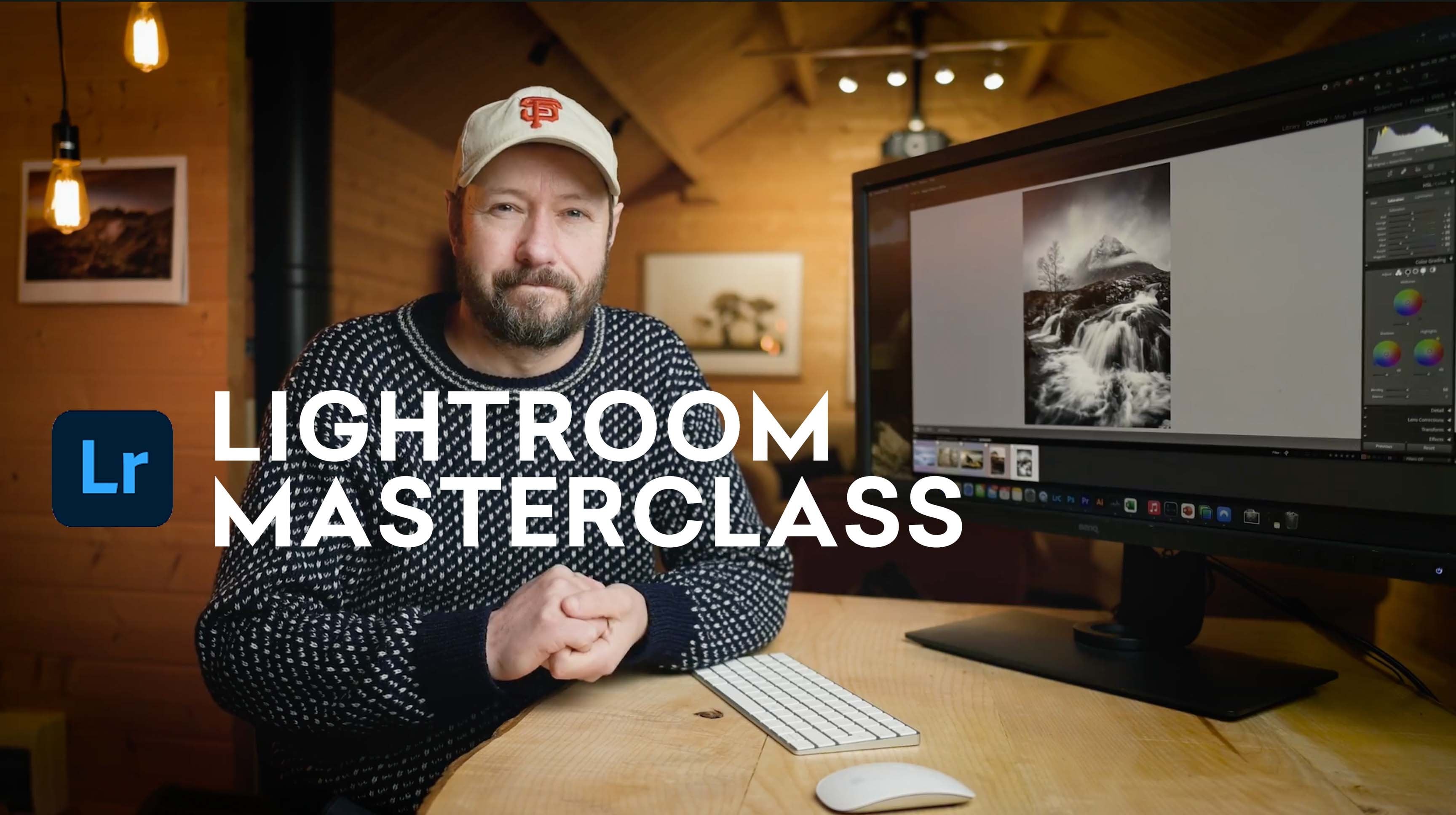
1. Introduction: Hey, how's it going? My name is Jake carbon era
and I am a photographer, filmmaker, and creator based
out of the Chicagoland area. Today we are talking
about editing dark and moody photos
and Adobe Lightroom. This class is designed
for photographers of all levels who want to improve
on their editing skills. If you're already an
experienced photo editor, you may find some
new tricks in here, so I'd highly recommend
sticking around. We will be going over my
personal editing process, tips and tricks in
Lightroom and how to achieve that dark
and moody look, I will be guiding you
step-by-step along the way. And there is a class project, so I'd recommend
checking that out down below in the projects
and resources tab. With that being said, let's
jump in the first lesson.
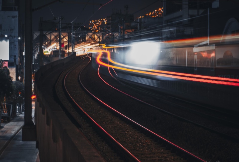
2. Lesson 01: Choosing The Right Photo: First let's talk about what
makes a photo dark and moody. Typically the photo
has lots of contrasts, dark shadows, and
muted highlights. Usually there are colors
such as deep orange, deep greens, blues deals. But basically any
color would work when it comes to dark
and moody photos, you want to first pick a photo best represents
that kind of style. For instance, you
could pick a photo that has leading lines, depth of field,
lots of movement, maybe no movement at all. Something that
looks interesting. It really comes down
to the editing process that makes a photo
dark and moody. And that's what we're
gonna talk about today in this class, we will be working
with this photo. This was taking a
Manhattan in New York City and I chose this photo
because of the leading lines, the depth of field, the movement of the oncoming
cars which are the subjects, and the fact that
it was taking it in an urban environment. Now let's talk about exposure. I took this photo
on my A7 3 with a sigma 24 to 72.8 lens. The settings I used where ISO before F2.8 and one
over 400 shutter speed. And I purposely underexposed
the image just slightly just to make sure that it
kept the details in the sky. I didn't want this guy to be blown out because it would be really difficult to
retain that detail. And as well as I didn't want
the shadows to be too dark, so I kept it in like
a middle ground, speaking of which, let's get started with editing this photo.
3. Lesson 02: Composition: First things first, let's
talk about composition because it is an important
piece of editing any photo composition is how you arrange various elements
and your frame. Typically, the rule of thirds is used to
compose your photo. And this photo, we have a horizon line that we have
to make sure straight. Let's fix that right now. So we're gonna go to the
crop tool right here. Click on it and we
can just hit Auto. See what that does. Looks like it did strain it out. We're also going to change the aspect ratio of the
photo for Instagram. So we're gonna go over
here where it says aspect. Click in that blank
space right there. Go to a four by five
slash eight by 10. We're going to crop
it down right here. I'm putting the horizon line directly in the
middle of the photo because I want the buildings and the sky to be balanced
with the street. So we're going to
hit Enter when it comes to architecture
photography, wide lenses typically make the buildings look like
they're bulging in Word. So to correct that, we're gonna go down to Lens
Corrections right here. And we're going to click on
Enable Profile Corrections. What that's gonna do is
flatten the image so the lines of the buildings are completely straight and curved. So I'm going to toggle on and
off the before and after. So you'd see, you can see it the most and the corners here. So now this is completely straight all throughout
the whole photo. In the next lesson
we're going to talk about basic corrections.
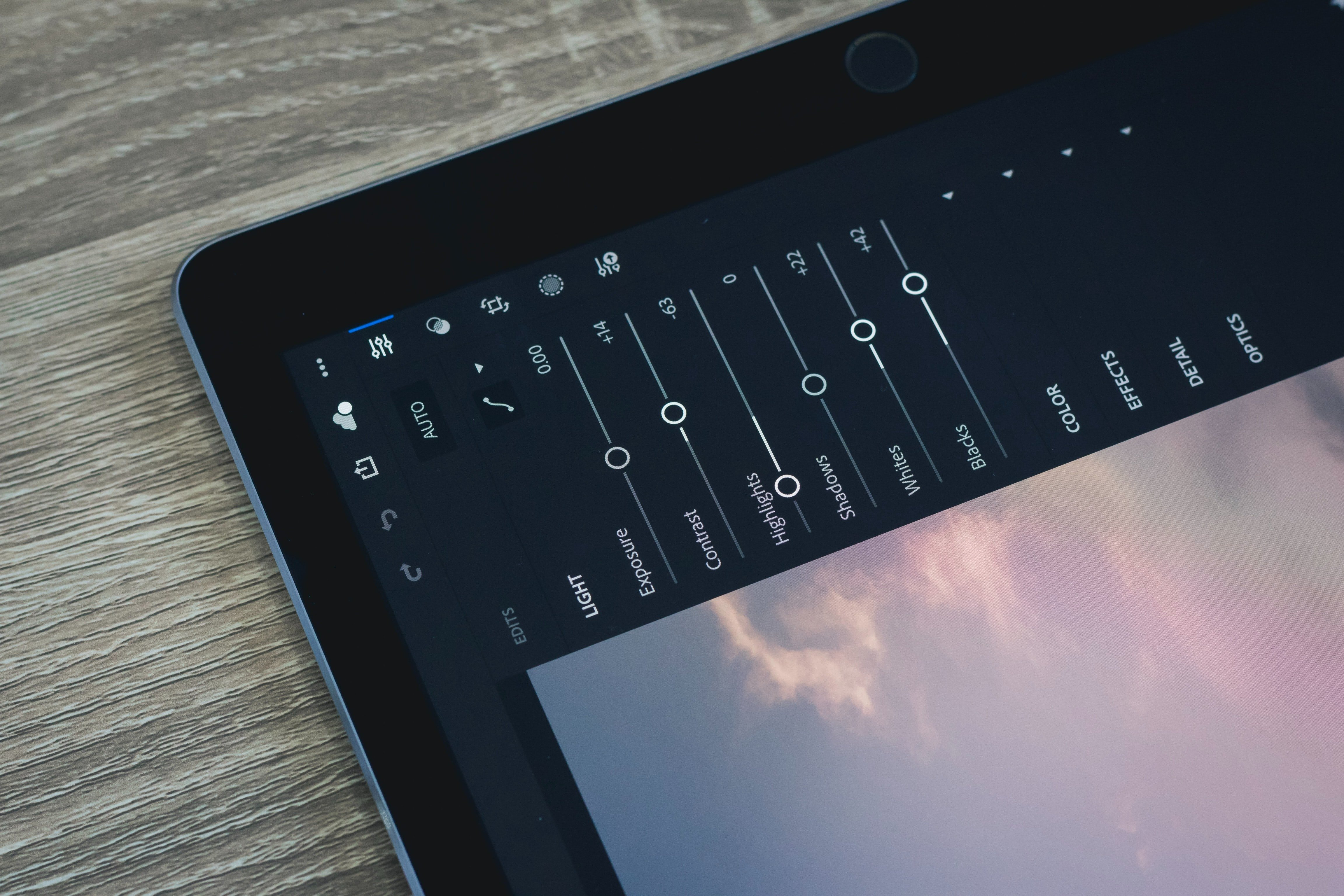
4. Lesson 03: Basic Corrections: I use the basic corrections
section to make some adjustments to
the photo as well as profit for the rest of the
things I'm gonna do to it. Let's start by dropping
down the exposure a bit right there. That's good. We're going to increase the
contrast on and contrast is key when editing dark
and moody photos. So we're going to bump
that up a little more. Right there is good. I want to fix the sky because it's a little
bit blown out. I wanted to show
more detail in it. So I'm going to go over to the highlights and drop it down. Cool, looks great. Then we will bring up the
shadows a bit to show more detail and the darker
parts of the image. So let's go to shadows. Bring that right there is good and we're going to
decrease the white submit to give the image more
of a matte finish. There should be good. We're going to go
down the vibrance and bring that down a bit. I always like to use vibrance
over saturation because saturation takes out all the
colors evenly down or up. Vibrance just takes the most saturated colors in the photo, keeps it at the level
it's at relatively, and brings down the rest
of the colors that aren't as prominent as the
more saturated colors. Cool. So this is looking good so far, what we're gonna do now is change the white
balance, the cloudy. Give it a little bit more
warmth and they're sweet. This is looking good so far. So in the next lesson
we're going to talk about the tone curve and how we can
get more contrasts with it. And I'll show you a
really cool tip with it.
5. Lesson 04: Tone Curve: Using the tone curve
is another way of adjusting the contrast and
brightness of the image, as well as color
grade within it. For today's class, we're just going to use a tone curve to adjust the contrast and give
the color is more of a pop. Alright, so we're gonna go
down to the tone curve now and go to the red
channel. Make an S curve. Just like this. And what you wanna do
is right-click on it. Go to Copy Channel Settings. Go to the green channel, right-click on the grid and
hit Paste Channel Settings. And then do the same thing
for the blue channel. So now the photos
looking really dark, there's a lot of contrast. But what we're gonna do is
go back to the point curve, the gray circle right there. And we're going to bring up the shadows and
highlights a bit. From here. What we can do is go back up
to the basic corrections, drop-down that contrast
just a little bit. Maybe bring up the shadows. We're going to bring
down the exposure, bring down the whites a bit. And we're also going to
bring up the blacks. What you wanna do is have
some sort of balance between the tone curve and the basic corrections to make sure that everything in
the photo looks good. Okay, so now the photo is
showing lots of contrast. It has a good
punchy field to it. The colors are popping and everything is exposed to
where it's supposed to be. In the next lesson, we're
going to talk about color and using the HSL and
color grading tools.
6. Lesson 05: Color: Something I like to do
before adjusting the color is to pay attention to what
the colors are in the photo. So I see lots of reds, oranges, and not that many cool
colors like green or blue. So what I think is best to do in this photo is to keep
it on the warm side. Use basically only warm tones and mute out the cool colors, the skies a little blue. So what we're gonna do is make it a little bit
more of a pale blue. The only greens I see
in the photo are from the trees and the leaves at
the very bottom of the photo. So what we're going
to do is make it like a deep green and make the orange and reds
and yellows really pop. So what we're gonna
do is go down to L tabs and we're gonna kinda just mess around
with the colors, see what we can come up with. So the reds, I want to be
a little bit more orange, so I'm going to
bring it over here. Bring it up a bit. Okay, So next we have orange. I like that. Keep the orange a
little bit more towards the left to make him
more like a deep orange. And we're going to bring
up the saturation on that to maybe a little bit more. So on the yellows and the
photo looks like it's mostly on this on these
buildings on the left here. We're going to make them
more on the orange side. Just like that. We're going to bring it down. Let's see how far
we can take it. Called. That looks good. All right, so we're
going to mess with the cool colors now. We have grains,
but it looks like the trees are already
pretty, pretty dark. It looks like the yellows
took care of that a bit. So we're going to drop
it down like that. Got some green up here, got some green in the trees. So what we're gonna do is shift the hue over to around halfway. Plus 50 is good. And we're going to drop that
saturation all the way. And we're gonna go down to UCLA. I don't think there's
going to be much of it. And here, I like to
go back and forth on the saturation just to see
if it's affected at all. So it doesn't look like it is. I'm just going to drop
down the saturation. All right, so for the blues, looks like it's just a sky. So I'm going to put it to minus 100 and I'm going to
slowly bring it up till, and I think it looks good. Yeah, around there's good. And for purple and magenta is, I don't really see much going on with those
colors in here. So what we'll do is just
bring him down all the way. Great. So I'm going to turn on and off the HSL tab to see how it looks. Great. So it's coming together pretty well with the color. So we're gonna go a little
bit deeper into it. We're gonna go down to the
color grading section, and let's go to shadows. We're going to put some
blues and the shadows just to give the darker parts of the image a little bit more of like a deeper
blue tint to it. So I like to go to 220. That's usually a pretty safe
bet for darker shadows. Sweet. So that looks pretty good. What we're gonna
do last for color is go down to the
color calibration. This stuff is optional. Not every Lightroom
application has it. It's only on Lightroom Classic. So Lightroom CC and CC
mobile will not happen. But basically what
color calibration does as fine tunes the
colors in your photos. So what we're gonna do is
kinda mess around with it. We're gonna go down
to the blue primary and we're going to bump up the saturation of this makes the colors really
pop in the photo. And we're going to drop
down a hue a little bit to the left to bring out the teal and
orange kind of vibe to it, but not too much, just
a little hint of it. I like to work backwards. So we're gonna go back to green. We're going to see what
this does over here. Right there looks good. I bump up the
saturation a bit and then we're going to go
to the red primary. Bring that down. Okay, So that looks good. And the final lesson, we're going to talk about the
final touches that we can make to this photo to
really bring it to life.
7. Lesson 06: Final Touches: There are still a few
things that we can do to this photo
that will give it that dark and moody feel just by making a quick
couple adjustments, what we will do first
is add a vignette. So we're going to scroll
down to the Effects tab. And we're going to move
the vignette over to the left dot right here is good. And we're going to
bring in the mid point a little bit on it, just to really bring in that vignette deep
into the photo. Great, Thanks, awesome. So next we're going to
use the adjustment brush and paint over the street and the buildings to make those sections
pop in the photo. So we're gonna go over to the adjustment brush right here. And then we're going to
bring up the exposure a bit. And the clarity. And what we're gonna do
is paint on the street. Just like this. This will help
brighten up the street because everything
else is kinda dark. So we're also going to paint on the sides of the building
where it's white. Just like this. We're going to go over
here just to highlight those sides of the buildings. And then we're
gonna go over here. Just like that. So this is without and with. Lastly, we're going to use
the graduated filter to add more vignette on certain parts
of the edges of the photo. So we're gonna go up here
to Graduated Filter. We're going to drop
down the exposure. And we're going to drag
on the sides here. Just like that. I'm going to zoom out, cut
that bottom part right here. And I am tilting the graduated filter to
this line right here, just to make it feel like
it's a part of the image. So now with those
adjustments that we made, it really makes the viewer look to the street
and to the buildings. There's many things
going on in this photo. So we want to highlight
certain things to make it feel more dynamic and more
enjoyable to look at. And then the very last thing
that we're going to do is make some last
minute adjustments just to make a
little bit darker. We're going to bring
the exposure down a bit about right there. Bring up the shadows, bring down the blacks. Great. So this is
the final photo. This is before and after. And that is how you edit a dark and moody
photo in Lightroom.
8. Conclusion: In today's class, we
talked about how to edit a dark and moody
photo in Lightroom. I taught you some
tips and tricks, shows you my personal
editing process and how to achieve that
dark and moody look. I hope that I taught
you some valuable information and that you will use the techniques that I showed you and apply
them to your work. Don't forget that there
is a class project in the projects and
resources tab down below. I encourage you to show
me and the rest of the class your work
so you can receive constructive feedback
as well as show off your skills that you
learned from this class. I'm really excited to see
what you all come up with. I'll see you next time.
Thank you for watching.
 Jake Carbonara, Photographer, Filmmaker, Creator