Transcripts
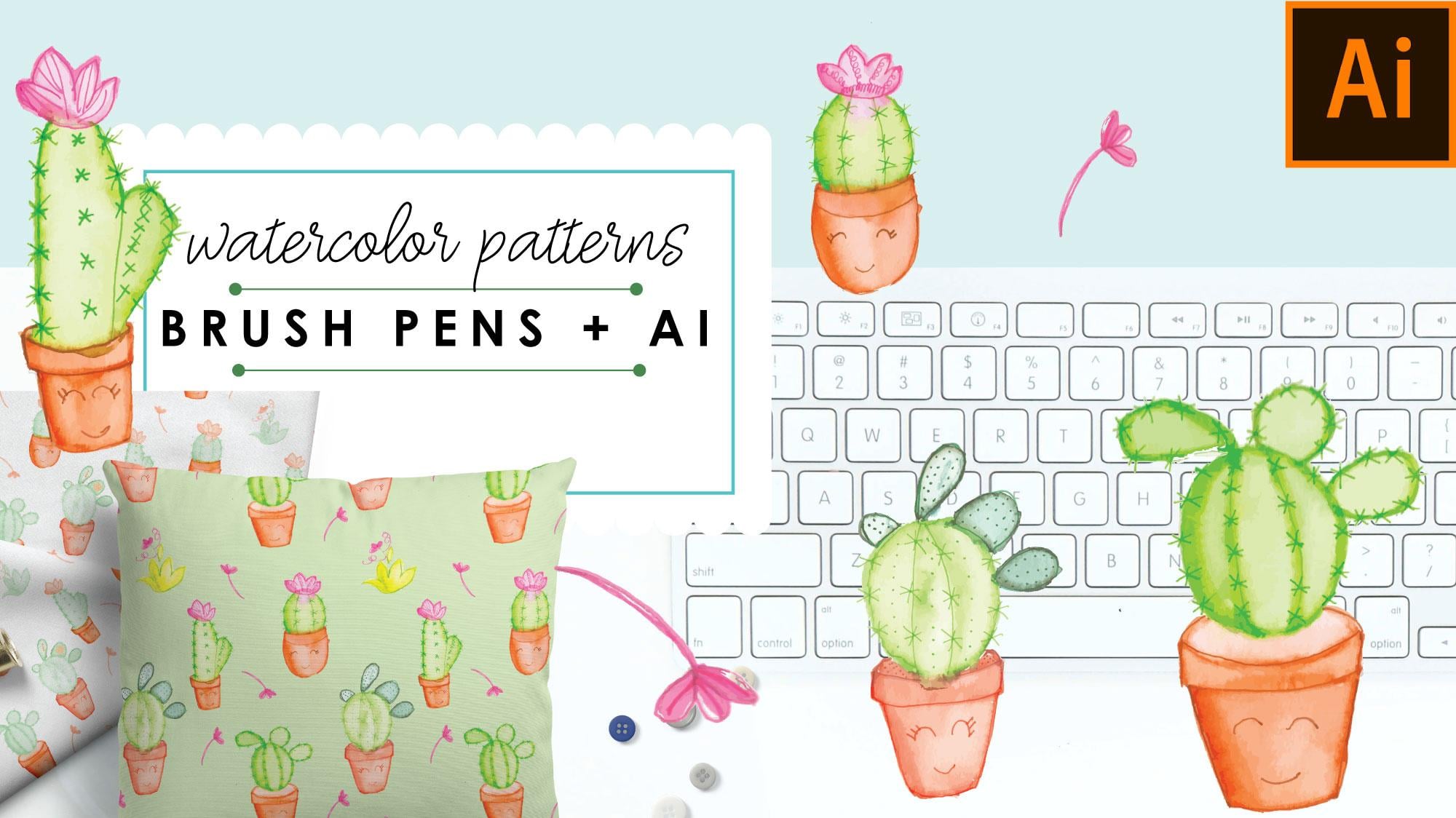
1. Intro: Welcome to Easy Watercolor Patterns Using Brush Pens and Adobe Illustrator. I've always loved the look of watercolor, but I've been so intimidated. I've tried so many times to purchase all the brushes, pens, tubes, everything that goes along with it. I've watched so many videos, and I just find the process so intimidating. Well, ink and brush pens, it's the perfect watercolor solution. They go on like marker and then they spread like watercolor. In this class, I'm going to teach you step-by-step on how to use these fun pens to create the watercolor look we've always wanted to achieve. We'll then take our icons and bring them into Adobe Illustrator and using the Pattern tool we'll create a really cute pattern. This is going to be a really simple class to follow along, and it's going to get you started using watercolor. If you're like me that you've been intimidated this whole time, I really suggest you enroll in this class and you follow along. What are you waiting for? I'll see you in class.
2. Class Materials: Now let's go over some class materials. You'll want to purchase some type of watercolor pens. These are just simple pens that I bought actually in a set of varying brush sizes. As you can see, there's really thick ones and then there's super fine ones. The way these works is that they have a reservoir here. You unscrew them, and you fill the reservoir, and then you close them up. Then by pressing here, you'll be able to squeeze out the water onto the brush. I have these in various sizes, depending on the type of project that I'm working on. But I usually use a really thin one and somewhat thicker one with a broader tip. I purchased this set just like this from Arteza, and I love them. I've used them now for a while and they do hold up their shape. This is a really good set to have. Starting off, you don't have to get a full set like this, but you can purchase just at least two different varying ones. You'll need some type of water reservoir, I just happen to have these two little pails. You'll need two, because one is for cool colors, and one will be for warm colors. You don't want to muddy your water with different types of colors. So if you're using reds and warmer colors like that, you'll want to use a different reservoir than what you use your greens and blues. I usually have just these two little pails that I got, Michaels or something. But you can just use Solo Cups or any type of plastic cups. Just as long as you have two of them, and you can differentiate which one is for warm colors, which one is for cool colors. Now let's get into the brush pens. This is my set of Arteza watercolor pens. This is a set of 48. You can get a larger set and you can get a smaller set if you just want to try it out first. It has a lot of colors to choose from and from here, I can mix colors as well. This is a good phase to get started with. It does come with a brush pen. Just starting off, maybe you just want to try that but like I said, the brush pen that it comes with, is a pretty thick pen. You'll want to have the varying sizes like I said before. This is a pretty diverse set, it's got all the grays and browns, and then it has the reds. It's got some really cool colors here and a lot of blues and greens. This is what I use for watercolor pens. I have tried other watercolor pens and these tend to hold up their shape as far as the tip goes. This is a really good set to have. Another thing that I do recommend is some type of fine liner pens. These are also by Arteza, and they're just really fine markers. These are 0.4 millimeter line. I use them because they do spread a little bit when it comes to the water, but I use these not prior to drawing my design. I use these afterwards just for outlining, and the design would have to be dry. In addition to this, I also use some type of Micron pen. Micron pens will hold the ink and the water won't spread it. If you want to outline your design first in some type of micron pen, you can do that and rest assured that the watercolor is not going to run the black ink on the Micron pens. But this is a good fine pen that you can use afterward to outline. You'll want to have some type of paper towel just so you can wash off your brush when you're cleaning out your brushes. Then this is the watercolor pad that I use, it's by Canson. This happens to be a nine by 12. Just make sure that when you're purchasing a pad, that you're buying one that would be the size that fits your scanner. This one fits into my scanner. Some scanners only take letter size so just bear that in mind when you're purchasing your pad. This one has really good water absorption. It doesn't warp as quickly and the texture is there, but it's pretty subtle. I've tried a few of them by some other brands, this is a pad that I highly recommend. Canson watercolor, and just make sure you like I said, you're paying attention to the sides. In addition to that, you'll need a scanner. The scanner with a high resolution would be best. I happen to have an HP Scanner, It wasn't a really expensive one but it does take a high resolution. So, let's get started.
3. Sketch + Color: We're going to begin with our drawing. Normally I would just draw directly with my brush markers. But for purposes of this class, I wanted you to follow along and be able to see what I'm doing. I'm going to lightly sketch with a pencil. I'm going to draw some happy cactuses. This is just going to be for our pattern, and I wanted you just to see as you follow along, I'm going to speed up the process of the video so I don't bore you with my sketching details [MUSIC]. As you can see, it's just a light sketch. Now we're going to start playing around with our brush markers. The brush markers are just a fine tip as you can see, and it looks similar to the watercolor brushes that you would purchase. Now, some of you may ask, well, why not just use watercolors directly? The reason is, these function as markers. I have better control of just quickly lining out what I need, and then spreading the water. It gives me just a nicer, finer look. I would love to do watercolors from scratch, but I'm a graphic artist, and usually I start off with watercolors directly from a pen. I just find it's a longer process. I do use these watercolor pens quite often. It's an easier clean up and as you'll see, I'll have better control. I'm just going to start, just as if I was using a marker, and I'm just going to lightly start outlining my shapes. As you can see, it's just like using a marker. I'm keeping in mind where my shadows would be, so I would add more pigment to those areas. Don't worry about it drying out, they actually, even after they're dry, you can reactivate the pigment. I usually just try to use while I have the same color in my hand, and just try to outline everything, and add the color where I need it. Then I worry later on about using my watercolor, and activating this pigment. The key here is also to try to cover up some of these pencil marks, if you used a pencil, I try to go over it, but you'll see it's not detrimental because we're going to do an outline later on as well. Now let's take our brush pens, our water pens and I'm actually going to take this one which has a similar width of a brush than the brush pens themselves. Just going to clean that off a bit, and then you'll see here as I explained in the other video, that this here, it says push. This is actually what you're squeezing in order to release the water onto the brush. I'm going to start squeezing and you don't want to put too much water, you want to have some control of the water. But as you can see, the water comes out evenly and then you just start spreading. This is really just a matter of preference whether or not you want a lot of pigment on there. If you really want to spread it out and have a really light like that, it's just a matter of preference. This is just learning what works best for you as you go. The key here is to diffuse the hard lines that you created when you were first outlining it. Still you're bearing in mind where your shadows are and where you want more pigment. But you want to fuse these hard lines so it doesn't look so much like marker and it starts to look like watercolor. Don't worry if you made it to light, you can obviously darken it. If you made it too dark, you can always just dab with a paper towel, if you added too much water onto your surface, that's an easy cleanup. I'm just going to move right along and I'll be speeding up the video [MUSIC]. As you can see, we're done with the pots for now. We're going to move on to the cactuses. We're just going to use the same exact process [MUSIC]. As you can see, we're pretty much done with laying out our water color here. In the next video, we're going to start adding a few details before we begin scanning.
4. Details: Now we're just going to add a few details. Before we go into that, I just wanted to just show you real quick. If you can see here the way the water spread, it's darker around the edges, and I actually like that look. But if it's something that after it dries, you don't like the way something looks, you can always just go back in with your water pen and you can spread it out a bit more and then wait for it to dry again. I also added a few more elements because we will be working on a pattern. You always want to have some type of elements that you can fill in, not just these big motifs. So you'll want at least some few more little elements that you can fill in your pieces. As I explained in the video earlier, these fineliner pens are really good. They're pretty fine tip and they're great for detail. As I did explain earlier, these ARTEZA brand fineliners will spread. I actually use them only when the water is already dry. Once the ink has dried completely, then I go in and I add my details. If you're using microns or maybe some other type of pen that won't spread with water, then you may be able to do that, sketch them out before and then do your watercolor. But I do it this way because I know that these will actually spread and not give me the hard lines that I'm looking for. I'm just going to go ahead and add a few details. I'm going to start with the pots, and this is just to give it a little bit more of depth and dimension. I want to still maintain the watercolor look, so I'm just adding some outline just so it looks a little bit more defined. This is actually going to be a juvenile surface pattern. I'm going to add some happy faces to these pots, and then I'll continue adding my outlines. For the cactuses, I'm going to do the same thing. I'll just add these fine lines to it. I'm actually going to go a bit darker on it. You don't want to get too crazy with too many lines where it detracts from the fact that it is watercolor underneath. I've just continued to add all of the little details, and in the next video you'll see how we're going to start scanning it.
5. Scanning: Now we're going to begin our scanning process. I'll open up my scanner hear and I've already placed my nine by 12 sheet underneath the flatbed and the scanner will just continue by doing an overview scan. This is where we have to start making some decisions. Now, as I have explained earlier, the quality of the scan is really what's going to make for a successful illustration. So my scanner can go all the way up to 2400 DPI. But I do find that if you go anything higher than 300, if you do 600 or 1200, the amount of detail and information that's placed in the file will completely slow down your Illustrator to the point where it will be difficult to create patterns. I scan at 300 DPI. It just works best. So we're going to select 300 DPI, but kind is obviously color. Again, your scanner settings may be a little different than mine. I'm going to scan to the desktop, which is where it's easier to find for me, I give the file a name, New Cactus. I'm scanning in as a JPEG. If your scanner software does have the option to do image correction, you're going to go ahead and select "Manual." This just allows you to do a lot of the color correction here without having to bring it into Illustrator, bring it into Photoshop for real color correction. From this step here, you can correct a lot of the saturation and the brightness. Then we can always alter the colors in Illustrator without having to go into Photoshop for anything. So here, I'm just going to select. I wanted a little more brighter and I want the tint to be a little bit at the temperature. I want those clay pots to really look like clay pots. Then the saturation, you can actually leave the saturation at that. So when you're happy with your corrections, you can go ahead and then begin selecting the scan. Normally, it's doing a whole overview page and then you'll hit "Scan" and it scans the whole page as a unit. We're going to actually create different art boards. So let's start by selecting each object individually. So each illustration here is going to be its own scan. That's okay if you see here in this piece, I'm actually grabbing a piece of that. Don't worry about that. You'll always have overlapping shapes and we actually will delete that once we get it into Illustrator. Here, just going to move this one up. Let's select here. Just want to make sure I'm getting all those pretty needles in their. This guy [inaudible] and last but not least, let's get this guy. So it's okay if you see these artboards overlap like that, don't worry about that. It'll scan perfectly into Illustrator. So when you're happy with your selections, you can go ahead and hit "Scan." If you notice, it's actually scanning them individually, and placing them here on my desktop, completely separate. The document size is nine by 12 and my scanner bed is actually just a little smaller than that. So if you can see here, this one is just a little fuzzy. I'm going off camera. I will rescan just that one just so I can get a crisper look on that one by itself. In the next video, we'll open up Illustrator and start image trace.
6. Image Trace: Now we're going to begin tracing our images. I opened up Illustrator, and this is just a simple 10 by 10 board. The size of the board really does not matter too much. You want to import your images just where they are large enough to be scaled. Once you vectorize them, they're scalable. I like to work in this 10 by 10. Some artist, depending if they're working for fabric or for other industries, they'll end up working with different size art board, but because we're using the pattern tool, it will not matter what size your art board. This is just the default one that I have. It's 10 by 10. We're going to begin by placing our files. You'll go to file place, and I have them all set here so I'll select them all. If you notice, some of the images that we traced in the last video are a little different than the ones that you saw me sketch out. It's because I had other images that I had already worked on and some of the new ones that we worked on together. Some of these images are like these little guys here I had created prior to sketching out together when we did that together. I'm just going to select them all and by holding on down shift, I'll go to the corner here and just rotate them. Then we're going to begin image trace on these one-by-one. I'll want them off the art board just so I can see let's start with this guy wants just to zoom in a little bit. Now I have image trace open, if you don't have it open, you can go to Window and then scroll down to image trace to make sure you have that open. You'll select it and then under the preset, I'm just going to do high-fidelity photo. Once you find the way that you like to image trace. If you use a certain amount of colors or if you just have different tracing results that you would prefer, then you can save it as a custom preset and you don't have to always go and sorted out, but I'm just going to work on the default ones just so you can see how this is done. This step here just takes a little bit of time. Mine defaults to 85 colors. I'll show you once it's done, what we will do in order to reduce the file size. Illustrator, as I explained when we were scanning, takes all of the bits of information. The DPI when you scan if it was higher than 300, and the colors, if it's 1,500 colors or whatever amount of colors you have, right now it's showing I have 6,471 colors. All of that bits of information is illustrator storing at for this little happy cactus. That will significantly slow down your system when you try to apply all of these icons into one pattern. I'm going to go further to change this, and instead of 85 colors, I'm going to reduce that to 40, and then once again, have to rescan. But this will help us reduce that amount of information that's stored for this file. It'll make the file a bit more usable without really changing the look too much. Let's just wait for that to finish, if you've ever scanned anything water color wise or anything else into Illustrator and then try to place it into a pattern. You'll notice that some of the files become almost unusable because of that information being placed. It's just finishing up here, perfect. As you can see, we reduced the colors, it did create a little bit of blobs here and there, but I'm okay with that as long as it's still looks like watercolor. This is something you can play around with if you want more colors or not, but just bear that in mind that it is going to slow down your system. This big X on our file here says that it hasn't been expanded yet. Now we'll expand the image, and as you can see now it's factorized. We will now go to object ungroup. We have to begin eliminating this white background. This gets a little tricky because there's going to be a lot of little pieces here that are wide and it just gets really cumbersome. I like a little bit of the roughness, I feel like it goes with the watercolor, so I try not to take too much away. That looks good to me, there's just some pieces here and there, and I can always clean that up afterwards if I find that I'm placing it on a dark background and these pieces are really becoming an issue, then I can go in and just clean some more. I'll select enroll in command G to group it, and hen I'm going to continue on with all the other ones. I'll speed up the video. For this next one, just so you can follow my process one more time, and then after that I'll do the rest of them off camera. I'll continue to do the rest of these on my own, then we will meet up in the next video. But I just wanted to share a bit of information. Image trace does have an option here that's called ignore white. I don't like using it because sometimes there are areas when you're working with certain colors that may appear to be so light that illustrator will identify it as white. Let's say for instance, this part here, if this was a really, really light color, I'm going to ungroup this real quick illustrator will just identify this as white, let's say, and then this is what will happen. It'll ignore white and get rid of all the white, and then when I try to place this on a dark background, it'll show up as a missing piece. I don't try to play with that. Ignore white. I just stick with deleting it on my own. You can also bring it into Photoshop if you're good at Photoshop and there's easier ways to delete the background, but this process works pretty well. I'll continue to image trace the rest of these icons and we'll meet up in the next video.
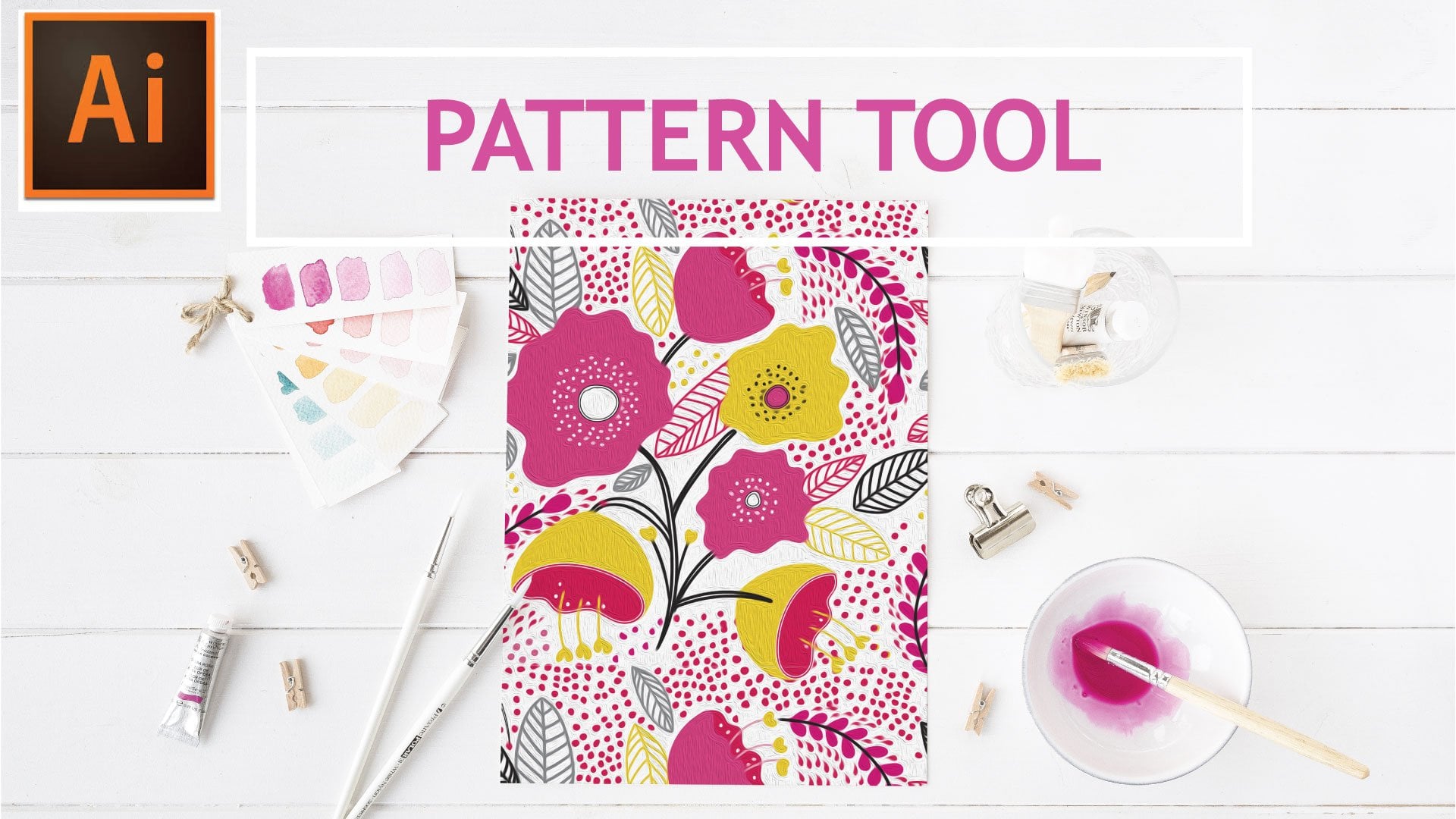
7. Pattern Tool: So now we're going to begin creating our pattern. In the previous class, I taught how to use the pattern tool. It's a pretty fun tool and it cuts down in a lot of the guesswork when creating a pattern from scratch, but I will show you here quickly on how to create the pattern. So you're going to select all of your icons and then we'll go to object, pattern, make, and this just says that a new pattern swatches when added to your palate. You'll click "Okay" and you can actually deactivate that and hit "Don't Show Again". So this is just the pattern that Illustrator created for us quickly. I'm just going to zoom out just so we can get a better idea of how this pattern is repeating. So I'm going to move this icon up, I move this one a bit to the side. Let's see maybe this guy can come to the middle. This guy here, maybe we can make him a little larger, or how about we swap that guy out for this guy. This process here is just a matter of you figuring out a puzzle piece of what works best where. This is really a matter of preference of where you want things, how you want them placed, just make sure that your distributing all of the icons evenly. Just so you'll be able to end up with a cohesive pattern in the end. So I'm just going to click off of here and select this guy by itself. So you see what I'm saying on how Illustrator begins to act just a little slow. If we would have left all those colors in there, this would have been an even harder process. Let's move this over, maybe this guy can move again. It's somewhere around here. You'll begin to see that a lot of these elements, we're just going to repeat over here, just so we can start filling our pattern. It's just like this guy somewhere around here. This one maybe move down. So this is just like I said, a puzzle piece. You'll just have to figure out what works best for you. In hindsight, I could've probably reduced it, a few more colors just so this wouldn't have this little bit of a lag. My computer is fairly new and it has a lot of memory, and even with that obviously as you can see it does take a longer time just for illustrator to catch up. So when you're happy with placement, just going to repeat one more over here somewhere, and then we'll be able to move on from here. So when you are happy with placement, we're going to click "Done". Then we're going to test out our pattern by creating another square here or a rectangle. I'm going to add some type of fill color to the back here. Then let's just place another one in front and that'll be the pattern that we, lost my screen there for a minute. Then here is your new pattern that's been placed and it's here in the front. So let's just reduce the patterns size. Just so we can tell how well or how the pattern doesn't repeat so well. So right now I can see that this guy here should have been centered raised a little more, which is really this guy here. So it leaves just a weird void there, so in order for us to go back in, we're going to double-click our pattern, and that's going to reopen our editable pattern. We're going to move this guy around. Actually looks good there, and let's just move this guy over a little bit. So we'll click "Done" again, and you can do that as many times as you need to just until you're happy with the placement. So let's just reduce the pattern again, scale. You want to click "Transform Objects", just transform patterns has to be selected and so that's looking pretty good there. I'm actually happy with that placement. This is actually a duplicate flower here, so I think I'm going to delete one of those out. This entire process is just about figuring out what works best. It'll be trial and error. Some things may look good for certain applications and then for other applications that not so much so. Where you will find that it's just patterns start to look too busy depending on your end product. You'll may want to simplify the patterns or you'll need bigger icons. So you'll find that may be for fabric, this scale would be good, but if I were to do some type of wrapping paper, let's say, I may want to have bigger cactuses, just so I can have bigger graphics for such a large area like wrapping paper. So let's click "Done". I'm pretty happy with that. That'll work for now. In the next video, I want to teach you how to recolor it, if you really wanted to recolor your pattern.
8. Re-color: In this video, I just want to go over how to recall our pattern quickly. We select, I'm going to just make a copy of this so we don't alter the pattern that we have there. I'm just going to select our top layer here, not so much so the background pattern for now. I have the swatch pallets up here. I'm just going to select one of our folders and click down here to this color wheel, and that's going to bring us to this recolor tool. I'm going to actually leave all these oranges in place because I like what the color of the pots are. I just want to recolor the top. Then down here you can randomly change the colors order so you can start doing that. That's actually a very nice monochromatic look. You just keep playing around with that and it will continue to recolor your art until you settle on something that you're happy with. That actually looks nice also, it's just a nice monochromatic pattern. As you can see, this has a little bit of a lag as well. I like the look of this and I'm going to leave that for now. I'll click Okay, and note changes to my color palette. I'm going to try it again and then maybe put the original palette color back in. Now I'm selecting both the pattern and the background. I'm going to select this broader range of colors. Let's try to recolor it and see what we come up with. Back to our color wheel. This is a nice simple pattern. I can see that on some type of kids clothing. You really can't see the smiley faces too well, I actually like the way this looks. This is just like I said, playing around. I can see this on a nice application for paper. I maybe will keep that one. You'll click no, and you'll notice every time you do that it's just placing an updated pattern. It's not rewriting your pattern. I think we've done good. This is a nice range of patterns. We can always go and put it in an end application. I like this guy and we can use them in cards or in wrapping paper or whatever. Maybe this guy can be the front of a card and then this guy can be a coordinating pattern in the back of a card. It's just limitless what you can do once you create the pattern. Because it's vectorized, you can scale according to your end product, or you can use it and export it in any way from within Illustrator. In the next video we're just going to wrap up and cover some other tips and tricks, and we'll see you there
9. Final: Thank you so much for following along with me on this watercolor journey. I really hope you enjoyed this class. I just want to share some final tips. Let's go over the class project and then a few more additional resources. For the class project. We're going to be creating a cute greeting card. Take one of your icons and put it as your cover, and just add some cute lettering. Then just show the back, what the back of the card would look like and fill that with your pattern. Don't worry about downloading any expensive greeting card mockups or anything like that. Just create a rectangle and that will be sufficient. For additional resources, I'd like to share that Arteza.com is going to be offering a limited time 15% off coupon on all the art supplies needed for this class. More about this in the about section of the class. Some other helpful classes that I wanted to share with you. If you've never to use the pattern tool. My pattern tool class goes in depth on how to create these patterns. It's a really resourceful class and my students have really enjoyed it. It's a great way to introduce yourself to the pattern tool, if you've never used it before. If you also would like to add some really nice lettering to your greeting card, I recommend Erika Irene's lettering in Illustrator part one, the pen tool. It's a really great class to get you started on lettering. If you want to take your patterns to the next level I highly recommend designing a fabric collection by DN Christiansen. This class really gives you the behind the scenes of how to create a fabric collection from start to finish. As always, I am available for questions. Just make sure you post them in the discussion section of the class. I hope to see you around class and see what you've all come up with as far as projects. If you have any questions, like I said, please reach out to me. Thank you so much for taking this journey with me and I'll see you in the next class.
 Shelley Seguinot, Illustrator and Surface Pattern Designer