Transcripts
1. Intro Final: Welcome to Easy Geometrics. This will be your Procreate and Adobe Illustrator class. I am a New York based artist, illustrator and teacher, and I my 12th Skillshare class. Geometrics play a really important role in the design world. Whether you are designing a freestanding design or you are designing [inaudible] , geometrics play an integral role in the creative world. It is an important tool to have in your toolbox. In this class, we are going to cover some Procreate tools, the design outline, how to prep the file and export it into Illustrator, and once in Illustrator, we're going to cover life trace, we will color our design, we will create a pattern, and we will recolor it; and lastly, we will cover the class project. For this class, you will need an iPad and the Procreate app. You will also need a stylus. I myself will be using the Apple pencil. You will need Adobe Illustrator. I would be using Adobe Illustrator CC, and for purposes of this class, we trigger using a version that has the pattern tool. If you do not have Adobe Illustrator, no worries. You can download a free trial version on Adobe.com. We will explore some colors, and lastly, we will create a class project and you too will be able to create beautiful geometrics to add to your toolbox. I really hope you will join me and I'll see you in class.
2. Sketch final: We're going to begin by opening up Procreate, we'll select a new Canvas by tapping on the plus sign on the upper right-hand corner. At this stage it really doesn't matter the size of the canvas or the resolution, because we will be bringing this into Illustrator to live trace it and vectorize it. At this point, it really doesn't matter, where this does matter is, if you're bringing this into Photoshop and then the images raster. You'll want to make sure that you select the correct canvas size, and the correct resolution at this stage. But for our class, bringing it into Illustrator, we won't need to worry about that. I'm just going to select a canvas that's square, 3,000 by 3,000 pixels. We're going to tap on the Wrench button at the top, and that is the Actions button, we're going to toggle on, we'll be in the Canvas tab and we'll toggle on Drawing Guide, and then we'll select just below that, Edit Drawing Guide. This brings us to a sub-menu and you'll see there's 2D Grid, there's an Isometric, there's Perspective, and there's Symmetry. For this class, we're going to be working in symmetry only. Below symmetry there's, different options, we have the Thickness of the line, the Opacity of the line, Assisted Drawing, which we already toggled on, and there's Rotational Symmetry, which we will not be using in this class, but it's a fun feature to play around with, it rotates all of your lines, as you're drawing them. Rotational Symmetry is a fun one to play with, when you're done. Vertical, below that, is what we're on now, Horizontal changes the line, Quadrant and Radial. Radial is what we will be using in this class. Up here on the color bar, you can switch the color to a color that suits you. We will be drawing in black, make sure you don't straight at the black, because then it'll be hard to see the line, I like to stay somewhere in the greens. Then you can select Done, and we're ready to get started. We're going to select a Monoweight line, we want to make sure that we don't have any brush that starts off thin, and goes thick, and then thin, because we want to make sure that we're getting really clean edges. Try to find a monoweight brush that will do that for you. The fine line brush under inking, that comes with Illustrator will do the trick, or a pen one, any one that's just a straight line. I'm using that mono line one, and I've gone ahead and selected black, and now we can begin. Anything that you draw in the one pie shape, I'm going to call this, although it's not really a pie, it's like an isosceles triangle. Anything that you draw in the one triangle, will reflect on all the others. We're basically just drawing on the one triangle, and then we'll see what we come up with. I'm going to start here, in the center, and then I'm going to branch out. This is obviously just me playing around. If you hold it, you'll get pretty clean lines. I'm going to do that again, add another element, I'm going to add a small one here. This is just a matter of preference, you'll just want to play around with it, and as you do it more and more, you'll find that you know where you want to fill your gaps when you bring it into Illustrator. All of that you'll learn through time, through trial and error. Just one more there, and then I'm just going to do some lines to fill in. If you notice, I'm really only drawing on the one quadrant, and it's just reflecting on all the others. Perhaps I'll add another one here, and another one here. You want to make sure that all of your lines are touching, because if they're not, then you'll have a problem when you go to color. You want to make sure that all your gaps are closed. That looks pretty good. I'll meet you in the next lesson, where we will begin coloring.
3. Add color to sketch: Now on to the fun part of coloring it in. In order for illustrators live trace to identify this image and have it to be really crisp, you'll want to only use black. If you begin coloring by the time you go in and live trace it, illustrator picks up on different hues and tones, and you'll end up with something that's not very crisp. Everything we do is going to be in black and then we'll be able to color once we live trace it. In order to do that, first I'm going to rename this first layer, and call that sketch, and we're going to create a second layer, and we will name that one, color 1. In color 1, we want to make sure that black is selected, and we're still using that same monoweight brush or any brush that's pretty precise, and we're going to begin coloring. We're obviously only working in the one quadrant and it'll fill everything else in. I'm going to begin, let's just make sure that we are on that color 1 and we do have to be in drawing assisted. We just have to make sure that is toggled on. Now I'm going to go and just outline once again. I'm going to zoom in so you see really well. I'm going to outline once again, just going to go but up right against that sketch line and make sure I don't go over and then, I'll just bring in and color. I'll drop the color in. I'm going to do the same thing for this one, and I know it seems tedious, but it'll make sense why I do it this way, and you just cannot go in and drop color because we're not working in the sketch layer. If you look in the layers panel, you notice that we are creating new shapes instead of just filling in the sketch layer, and there's a reason why I do that is because I want to be able to color my sketch layers separately. This will all make sense, follow along and you'll see once it's all done. And now the key is, we don't want to color anything that is going to touch the black shape that we've already created in this layer. For example, this one here, I can color now in this layer because it is not going to interfere with the black that I've already created, and that's pretty much it for this layer. If I were to color in any of these other shapes, it will automatically be recognized as a just one big BLOB with the shape next to it because they're all black. Now we can go and start a new layer, and that will become color 2. Sometimes it's easier if I just lower the opacity on the last layer just so I can see what needs to be colored. Now I can go ahead and color. Sorry. As you can see, I did not turn drawing assist on, that cuts down the work. Okay. Drop and color, and we're just going to continue to do that until everything is filled in. Again, we're finding a shape that will not touch with the shapes in this layer. We're able to and we can select this shape as well, because this one will not touch the black of this layer, and that's pretty much it. Now we can go into the next layer. This will become color 3. Make sure drawing assist is toggled on. Let's go back to our last layer and just lower the opacity, and we can color this next one. It helps when you zoom in. If you don't zoom in, once you do, you'll realize you left some lines behind and that's not good. In this layer, this is pretty much all we can color in because the last circle there is going to touch that one. Let's just create another one. This all sounds really confusing I know, but you'll notice in the end that it totally makes sense because this is the only way that Illustrator will be able to read each one of these shapes without, let's just lower the opacity. Illustrator will realize the shapes without having to create different hues and tones. This way, we can keep our layers separate and each one of these will be a different color. That is pretty much it. I'm going to go back and raise the opacity on all of them and in the next video, we're going to export.
4. Export: Now we're getting ready to export our image. We're going to select the actions tab and will be clicking on Share. We're going to select PSD and the reason why we want to export it as a PSD is because we want to make sure that our layers stay intact. You have to select where you'd like to export it to. I'm going to send it right to my desktop which I have open. You can choose to email it, or you can choose to upload it to Dropbox or any other file sharing systems that you have. In the next video, we'll then begin to live traits.
5. Image Trace: We're going to begin by opening up Adobe Illustrator and we're going to find the file that we downloaded. My file, I AirDropped onto my computer and that would go into my Downloads file. Whatever method you use, you could've emailed it to yourself or put it in Dropbox and dragged it from there. If you air dropped it, it would be in your Downloads folder. On the left-hand side here you'll see "Downloads", and here's my artwork. Now from this sub-menu, we want to make sure that "Convert Layers to Objects" is selected. We don't want to flatten the layers into a single image because we want to keep those layers nice and separate. Now here you'll see that I have the Layers palette, the "Background" layer is really just a blank layer, so I'm going to delete that, I won't be using it. Then my "Sketch Image" layer, I'm just going to drag that to the top because I want those lines to show at the top. Starting with the sketch image, I'm going to click so I can select that layer and then I'm going to go to my "Image Trace" button, which is automatically here. From the toggle drop-down menu there, I'm going to select "Graphic Color", and that's a preset that I have and I'm going to share with you the presets that I have in there and I'll also put this in a PDF so you have it. As you can see, you can play around with the "Threshold" and then there's some advanced options that you can use as well. Make sure that in whatever way you put yours, you make sure that "Ignore White" is always selected because you don't want the white showing through. As you can see, some of these bits and pieces that are here will show through as an actual color if you don't select, "Ignore White". You can play around with the presets but if you'd like to use the one that I have, I'll almost certainly put that in a PDF separately for you in the folder. We've already hit "Image Trace", and now you have to make sure you hit "Expand". That expands it into a vectorized image. We'll just do the same with the rest of them, I'm going to "Image Trace" my preset called Graphic Color and then I'm going to hit "Expand". Just continue to go down the line, it's a pretty simple process once you've figured out your preset. My preset necessarily may not work for you, you may be looking for something more of a sketchbook and just create as many as you like for different projects, you'll probably find that you will need different types of presets to achieve a different look. Now that they've all been selected, everything has been vectorized, in the next video, we're going to tackle color.
6. Color: Now we're going to start coloring. I already have a palette that I have p-re selected and I've brought it into here. I'm going to select it all and I'm going to add that as a color group to my swatches palette. By selecting new color group, click okay and now it's added here to my palette. I'm going to delete that so it doesn't interfere with our layers. Starting with the sketch image, we're going to color this one in first. By selecting it, it's selects everything in that layer. Usually I'd like to do my sketch image or my outline image in a really light color. I'm going to select the lightest color in the palette. This is obviously by tastes, you can select a darker color for this sketch if you want a bolder look. We'll just continue to go down the line, coloring in all of the elements of each layer. That looks pretty good. We can always in one of the next videos, I'll show you how to recolor it to play around and maybe move around some of the colors using the same color scheme. In the next video, we're going to create the pattern.
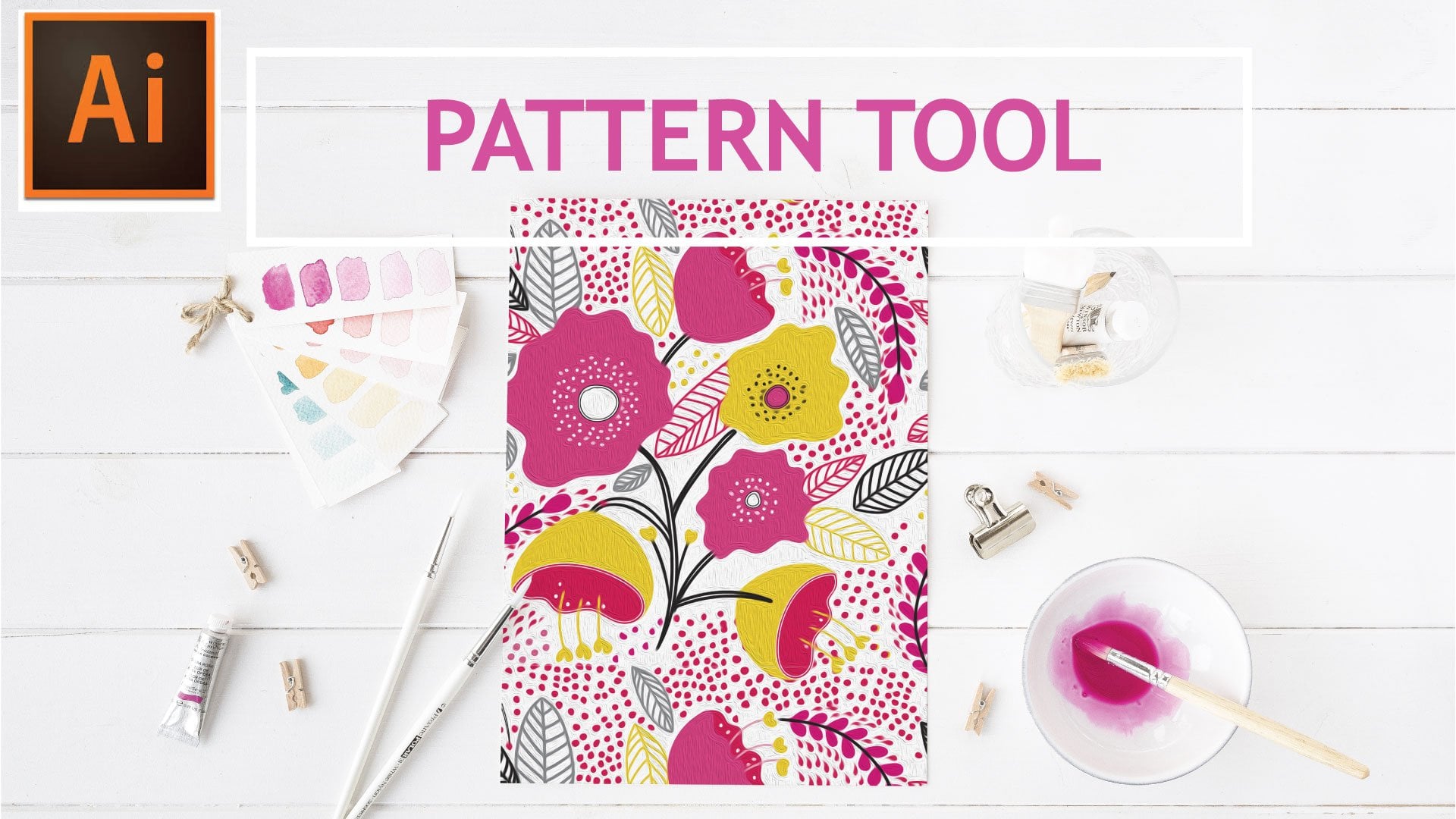
7. Pattern: Now we're going to create our pattern. For this portion, we will be using the pattern maker tool that Illustrator has built in. To do so we're going to select all of the layers by clicking and dragging, and then we're going to Object, Pattern, Make. This is just letting you know that the pattern has been added to the Swatches panel. Let me zoom out. As you can see, this is already a pretty good pattern as it's. There are other options you can go into the Pattern Options tab and you can go to Brick by Row, maybe you'd like a half drop. It's all different things that you can do in here. For example, let's say here when I selected Hex by Column, you'll see that the pattern overlaps and there's two ways that you can fix that. You can either go here to the width and height and using the arrow keys up or down, you can either bring it further out towards no longer touching and then you can do the same thing with the height. Another way of doing that is if you click on this button here the Pattern Tile Tool, that then allows you to move the actual bounding box and that does the same thing as the toggle buttons. I find that the width and height using the arrow keys is easier. You have just a bit more control because you can just shimmy them a little bit at a time. I'm going to bring this one just a little lower, so it's a little closer, and that one looks pretty good. I'm going to hit Done, and now the pattern has been added to my Swatches palette. We're going to test out our pattern to make sure that it's exactly the way we want it to look, and Just select another color here. We're going to just copy another box on top, hopes that didn't paste on top. But there is no problem, I'll put it right on top. Now we're going to fill that box with the pattern. Now it's a bit too large but by have it selected, I'm going to go to Object, Transform, Scale, and toggle off Transform Objects, and then let's scale it at 60 percent just so we can see what it looks like. This back color, we may want to change it into maybe something lighter, maybe light gray, that greenish braille do. As you can see, it's pretty simple. In the next video, I'll show you how to play around with the colors and recolor it if the color scheme that you selected initially is not to your liking.
8. Recolor: Now we're going to play around a little bit with the recolor tool. When I first selected this swatch and I added this gray background, not really fond of the way the colors are all muted. So I'm going to recolor them. I've also brought in a few more swatches that I now have in my swatches palette here. You just want to make sure that you have the right amount of colors that you need to recolor your artwork. For example, we have five layers. Each one has individual colors, so we need a minimum of five, plus the background color will give us six. You want to make sure that when you're recoloring, that you have a minimum of six colors to play with, because if not, what happens is let's say you only have five colors and you have six selected. Illustrator will automatically assign a color, duplicate to one of these other elements, and we really liked the way we've separated our layers here. We want to make sure that we have the right amount of colors, so illustrator can assign the right amount. With both of the pattern, and the background selected, I'm going to click on the color group three here, and then I'm going to go down here to the Edit or Apply color group. And that's going to begin to shift all the colors. Sometimes when you're using white, you'll find that Illustrator will put a line through it, either white or black. It usually does that where as you play around with the colors, that color just will not change because it's assuming that it's either an outline or a background because it's white or black. If that happens when you go to recolor yours, just make sure that you click right on the line, and then as long as you get the arrow, this color will be included in the recoloring. I'm going to select randomly change color, and just keep clicking through until you find a color combination that suits you. This is where it becomes time-consuming because I can click on this all day, because all the colors look pretty, but then you just want to keep looking for more. I actually like the way that one looks. Like I said, I can do this all day. Let's go for this color. That's actually nice. Let's say for example, now, I want to keep the white that I had. I can toggle that off by clicking that, and see what that looks like. Perhaps, I don't want this dark color to be white. Maybe I want it to be dark. I suspect you like the combination of all the other colors. You can toggle on or off any of these arrows to select a new combination. Once you're happy with what you have, just click okay. Then it'll ask you, do you want to save changes to swatch color group three before closing? Just click "No", because you don't want it to alter your color palette. You just wanted to add a new color just for that swatch. That's pretty much of it. You can then go into the recolor tool, and recolor as often as you'd like. I'll see you in the next video.
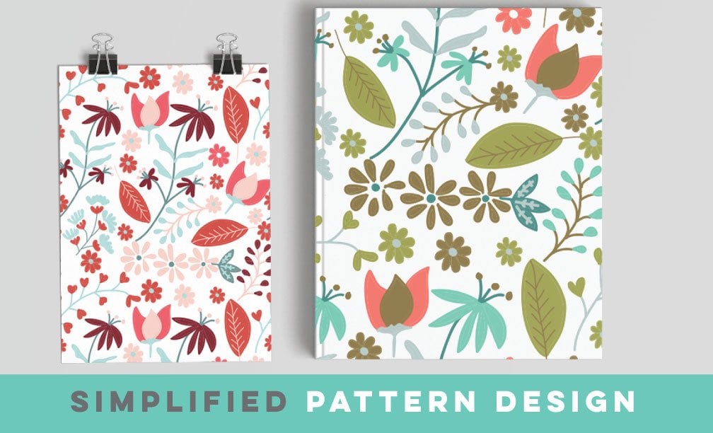
9. Class Project: Now onto the class projects. For your class project, I just want you to put together on one page, your original pattern and then some variations of it. The variations can either be playing around with different color palettes or playing around within the pattern tool, selecting different brick patterns, a hexagon pattern. You'd be surprised when you change around those elements on how the pattern takes on a whole new life. I'm really excited to see what you come up with. Please be sure to post it in the project section. I will also have some resources for you to download. I'm so glad that you joined me on this class. This is a really quick and easy one and it's such a great asset to know how to create some geometrics to complement any of your work. Thank you so much and I'll see you around class.
 Shelley Seguinot, Illustrator and Surface Pattern Designer