Transcripts
1. Welcome and Introduction: Welcome to this class on
easy oil LP still cups. In this class you
will learn to paint seven easy and beautiful
ILP still cups, starting with a
simple purple cup, moving on to the blue cup, a cup with cherry branch. The next three will
be Christmas team, starting with the red cup
with Christmas lights, about poker with biscuits, and find me a
VLOOKUP it snowman. For our final painting, we'll be painting two red cups. We will start the class, but then basic introduction
to the oil pistol and different tools and techniques that can be used in this class. And how you can easily draw
the outline for the cups, as well as some
additional element that you can add
to your paintings. Hi, my name is Michelle MSG, and I'll be your
instructor for this class. Dismissed from India. And my profession,
I'm a civil engineer. I hope you learned something new and exciting
from this class. You can find me either
work on Instagram, happy painting, and see
you in the next video.
2. Class Project: As for the class project, you can paint any
of the seven cups, or you can paint all the cups. You are more than
welcome to come up with your own unique
combination of the cups. You can experiment with
different shapes and sizes. For the cup, you can
use different colors and you can add or subtract different elements to the cuffs. I encourage you to
join along with me as the whole
video in real time. And let's paint. And don't forget to upload your
beautiful artwork in the project section. See you in the next video.
3. List of Supplies: For this class you
will need pencil, light colored pencil to draw
the guidelines of the cups. It is partner. Masking tape to secure
the foot blinding. I'll be using blending
stump, Q-tip, anticipate instead
of tissue paper, you can use cloth also. As for the oil-based stupid, I'm using black coil pistol
paper for this class. I'll be using yellow ULP still. You can use whatever
oil-based till you have. See you in the next video.
4. Pressure and Blending with Oil Pastel: Let's talk about
ILP strlen preset. Ilp cells are very
sensitive to preset. With the ILP style, you can apply three different
types of presses, starting with a demonstration
of light pressure. Now moving into
the medium tracer, applying a little
bit more pressure as compared to the
light pressure. And find me going in
with a heavy precept, applying a lot of pressure
with the ILP still. These are the three different
kinds of tracer that you can use with your
ILP is still n, depending upon a different
kind of situation, will be using different kind
of pressure as required. And now continuing forward with Lending with different
kinds of presets. For this, I'll be demonstrating
you how light pressure, medium pressure, and
having preserved plants. And as for the blending part, I'll be using Q-tip
to blend the colors. Instead of Q tip, you
can use blending stump, piece of paper or cloth
or whatever you prefer. Blending means mixing two
or more colored buttons we are using only
single color in here. Blending refers to getting a uniform consistency of
colors inside the circle. Drawing the circles
with the pencil. The whole redo it in real time. So I encourage you to join
along with me and practice. Starting with the first
circle with light preserved. In case of flight preserver released surface
area is covered. Moving on to the
medium pressure. Then finally, applying
heavy press it. I decided to add
one more circle to demonstrate a
different key scenario of blending with
the heavy bristle. And with these, we
are almost done with filling in that colors
for different preset. Continuing forward
with blending, with the blending here
I'm using Q-tip for this first circle laptop like heavy pressure with a
Q-tip to blend the colors. The surface area covered by the light pre-service
lot in that adult, often with this blending
Egypt translucent quality. Moving on to the second circle. For this, I have to apply medium pressure to
blend the colors. The result obtained
with this kind of blending is somewhat opaque. Now moving on to the third
and the final circle. For this circle, I were playing
a little bit of tracer. And even if you don't
apply the preset, the blending is all opaque. So it depends upon you whether
you'd like to leave it as it is and apply pressure
to blend the color. The foot circle with a lot of heavy pressure.
Prove this point. Now continuing forward
with the demonstration, I'll be using different
tools to blend the colors, starting with the pencil
to draw the circles. Inside this circles,
I'll be using the same color and applying medium pressure to
fill the circles. For this demonstration
of blending the colors, I'll be using my finger tip, blending stump as well as tissue paper to
blend the colors. I'll be keeping the pressure
of the color constant that is medium presser while
wearing their tools. Now going in with a color
to fill inside the circle. The purpose of this demonstration
is to show you that you can use whatever tools
you have to blend the colors. Filling in all the circle
with a medium presser. Now starting with
the first circle, going in with my finger and applying medium presser
to blend the colors. Blending in with
fingers comes in handy. When does that PCA is large. Now moving into
the second circle, blending with a Q-tip. Q-tips are the most
widely used tools for the blending of colors
in case of oil pistols. Moving on to the third circle and blending with
the blending stump. Applying medium to
have a preset to blend the colors inside
this third circle with the blending stump. Blending stumps are used for blending in narrower
and constricted spaces. And finally, moving
on to the fourth and the final circle going in with a tissue paper
to blend the color. Applying heavy preceded
with a tissue paper to blend the color instead
of the tissue paper, you can use clothes. Piece of paper or
floats are generally used when the surface
area is larger. And with these burdened
with a demonstration. And I hope you learned something new and practice along with me. See you in the next video.
5. Blending Overlaying and Blurring: For this section, I'll be demonstrating how to
blend two or more colors, how to achieve
gradient with colors. As well as some of the
ILP style techniques, such as overlaying
and blurring effect. For this first demonstration, blending with two colors, I'll be using three colors, yellow, red, and blue. And as for the placer, I'll be using media
when heavy preserved. So here are the three
colors that I'll be using for this demonstration
of blending of two colors, I'll be showing you
three techniques. The first one will be overlaying
two colors for blending. The second one will be by keeping us a present
in with Tim, the two colors and going in with the blending tools
to blend the colors. And the third one we'll be using white and commitment
to blend the colors. Starting with first
demonstration of overlaying technique for blending orderliness right
on top of the yellow. And as you can see,
that it's overlaid on top of the yellow appears to
be ordered nice and color. Now moving on to our
second demonstration, going in with the red and blue, overlaying blue on top of the red and overlaid sets and appears to be somewhat
of violating color. And find me going in
with the blue and the yellow overlaying yellow
on top of the light blue. And the middle section appears to be somewhat of green color. This was just a
rough demonstration of blending of two
or more colors. This time, I'll be using
the same color competition, yellow and the red, green and blue, and blue
and the yellow. Now continuing forward with the second method of
blending two colors, this time, instead of
overlaying the two colors, are we maintaining the syphilis
and in-between those two? And I'll be going in with
the blending attempt to blend the color in-between. Now going into the right and W. Finally going in with the blue and the yellow. With these, we're
done with the colors. I did not overlaid one
color on top of the other. Now going in with
the blending of stem and blending the
in-between colors, blending the red
with a yellow in the middle to obtain
oranges color. Blending the red with a
blue top ten violet color. And finding, blending the blue with the yellow to
obtain green color. The blending obtained
from this method is somewhat of a more
uniform consistency as compared to the
earlier method that we used by overlaying one
color on top of the other. And finally, moving
toward technique, I'll be using the same
color competition. Yeah, learned the red, green, and blue and yellow. This time I'll be leaving a space in between
the two colors. And then that DSPs, I'll
be filling in the right. Moving on to the second
one, the red and the blue. And finally, moving on to the
third one, blue and yellow. No going in with the white, adding the white
in-between the two colors. Now let's blend the colors. This time I'm using Q-tip
to blend the colors. First time, starting
with blending the white with the
yellow and the white with red and phoneme blending the all three
colors in the middle. Doing the same with
the second one. Learning the white with the
red and blue with the white. And finally, blending the all
three colors in the middle. And then putting the
thing with the third one. And with this, we're done with our blending demonstration
using two colors. Now continuing forward
with the demonstration, this time Malbec fruit ingredient
with the yellow color. And to blend the colors
for the gradient, I'll be using the second
technique that we used earlier for blending
of colors to bring in with a light
yellow, deep yellow. Light orange. Orange. Be pardoned. And find me going in
with already know, going in with a Q-tip
to Blender color, blind, medium pressure with a Q-tip to blend all the colors. So this is our first
example of the gradient. For the second demonstration
that the gradient, I'll be using the same
color combination. But this time I'll be living
space in between the colors. And I'll be adding
white and middle. Light yellow, deep yellow, light orange, orange button. Finally going intimidated. Coding right in the middle. Learning the white with
the rest of the color, using the white and the Q-tip, blending a yellow
with a deep yellow. Deep yellow with a light orange, light orange with the orange. And orange with a
deep orange and finally deep orange, red. And with this, we're done with our second demonstration
of the gradient creation. Now continuing forward with the other two techniques
that will be overlaying and the blending setting with the overlay technique
by overt link, I mean overlaying
one color on top of the other color overlay
technique to work properly, you have to apply how we
created the first example. I'm using yellow and the red. I'm overlaying rate
on top of the yellow. You have to keep in
mind that not all Collette can be overlaid
on top of each other. For the second example, I'm using the same
colors, yellow and red. But this time I'm using
rate as my primary layer. And on top of this, I'm going in with a yellow. As you can see. You're looking not be overlaid properly on top of that red because yellow is
blending with the red and creating orange color. And the same goes for
our third example, using yellow and w, using
yellow as the prime really. And on top of this, I'm
going in with them low, overlaying this blue
on top up the yellow is greeting somebody
greenish color. But reversing the
order of the color, overlaying yellow on top of the blue overlay technique
can be achieved. Removing the accumulated
blue color from the yellow using tissue paper for cleaning
your oil pastel color, you can use Cloud
also now continuing forward with the last
technique for this section, blaring, blaring, blaring
the edges of the color. For this, I'll be using
the same three colors, yellow, the rate or the
orange color, and W. As for the tools, I'll using
Q-tip and blending stump, as well as I'll be
using my finger to blend the edges of the color. Now, let's blur that color. For this first one,
I'm going in with my finger and applying heavy
prefer to blur the color. For the second one, I'm going
in with a blending stump, applying heavy pressure with the blending stump
near the edges of the color to achieve
the blurring effect. And for the third
and the final one, I'm going in with the Q-Tip. The same lighting effect can be achieved using piece
of paper or cloth. With this, we're done with this demonstration for this section. See you in the next video.
6. Cups: Now moving on to drawing cups. In this demonstration,
I will show you how you can easily draw
the simple cups for all our class
predict either I'll be drawing the sake of the
cupboard directly on the paper, but I'll be following the reference line
to draw the cups. When our first
example I am directly drawing the shape of
the cup on the people. The whole renewed in real time. So I encourage you to
join along with me. And let's go some of the cups. Rowing this first basic
cup using simple shapes. Now at I think the
handle to the cup, adding boundary to
the rim of the cup. Now moving on towards I can
come for the second cup. I'm using the reference
line to draw the cup. The cup is facing
towards the right. The center of the top has shifted towards the left corner. Turning handle, Foot
Locker, base to the curb. And with these, we are done with our second example of that curb. Moving on to our third cup for this element
drawing America, starting to drawing with
a flattened ellipse for the top of the cup, dividing the ellipse
into four equal parts. And now I'm going in with a straight line
through the center of the cup and dividing the whole
cup into two equal parts. And now defining the
outer boundaries for the curb hiding there
and therefore the cup. With this, we are done
with our third cup. Moving on to the fourth
and the final cup. For this demonstration,
I'll be drawing two curves using a reference to draw the guideline
for the cup. Instead of killing
the ellipse at the intersecting
lines. Going out. The basic outline of the cup, defining the base of the curb, defining the second cup. Now adding handle to the cups. I forgot to add the
base for our first cup. With this, we are done
with the basic shapes of the curve using
that influence lines. Now moving into the sauces
for the Cubs, groin, so easy, you just have to draw
two concentric ellipses and add a base to the saucer. Following the same method for the saucer and adding
this offset for this big cup do concentric
ellipses with obese. With this, we are done with
the cups and the saucer. See you in the next video.
7. Additional Elements: In this section, I will show you some example of the
artist's name lehman, that you can add to
your main projects. So for our first demonstration, I'll be showing you a symbol cheering done with the theory, starting with a pencil to draw the basic guideline
for the main branch. Now I'm going in with
a rate and creating small circles with array
to represent the theories. And finding going
in with the brown and connecting the terrorists
to the main branch. To add more details
to this painting, you can use to where
reasons of the brown. And that's what
the theories, you can use a little
bit of height two. So the reflection
of the theories. And with this we're done with
our cherry branch moving onto the light for the lights
alveoli using two-color, starting with a yellow,
dots with this yellow. And for the other color,
I'll be using Vue. Bring the scene with them,
loop rating dots with them. You, you can use other
color, whatever you prefer. Now going back again
with a yellow to create the wires connecting
lights to each other. To add more details to it, you can use different
colour of the wire. You can add more colors to it, and you can use fight to add
reflection to the bulbs. And let's put the final touches. I'm going into my finger to add the blurring effect
with a yellow light. And with this, we're done with our second example
of the decimals. Now moving on to
our third example, who lived and for this I'm
starting with a rate setting three smaller circle
with a red and leaving a little bit of space
on the top left corner. Now going in with the
white and adding it on top left corner to represent
the highlighted portion. And as for the
leaves, you can use any color combinations
of the green. Here I'm using tallow
green and light green. You can use whatever
green tube reform, growing them basic
outline for the leaves. The known Lincoln,
even the light beam. And now filling in the light
green side the leaves. I have a blank
medium presser with it and not covering
the whole section. No. Going back once again
with the yellow-green and overlaying it on top of
that and your outlines. With this, we are done
with our holy branch. No, moving on to the fourth
example for this album, drawing three simple theories, starting with the red, drawing
three different circles. Apart from the
red, I'll be using white and dark brown to
add more detail to the theory's going in
with the white to add reflection to the cherries
on the top left corner. And now I'm going in with
them around and adding it to the bottom right corner of the theories to represent
the side of religion. Some of the theories and release we're done
with our cherries. Moving on to the fifth
element number sqrt. For this, I'm starting with our initial load and
drawing a circle, applying medium pressure with the outer nuclear layer
to draw the circle. And now with the
same medium presser, I am filling in the
rest of the circle. And now I'm going in with the skin tone and
overlaying it on top of the ordinance yellow and drawing three
concentric circles. And that's where
the final touches, I'm going in with the dark brown and overlaying it on
top of their skin tone. With this, we are done
with our first element. Or the sixth element
will be drawing the white snow man with
a scarf and hacked, starting with drawing three
circles in as endings, ideas and other to further torso and the rest of the body. And now I'm going in with
a rate for this carbon. The head painting white on top of the head. The hands of the snowmen with a black for the ice and the
buttons of the snowman, I'm using black, the nose, I'm using orange. And with this we are done with our white snow man
with a scarf and hurt. Moving on to the seventh and
the final element for this, I'll be drawing
snow cover trees. This one is very easy. For this knock over trees. I'll be simply drawing
four triangles for the first 3.3 triangles
for the second tree, adding one triangle just
below the other triangle, milkweed, the CBO
snow cover trees. With this, we are done with
our four triangle trig, moving into the second
three triangle tree. And with these, our
seventh and the final elements, snow-covered
places complete. I decided to add some white
to the hand of the snowman, as it was not clearly visible. Burning some final touches
with the white and the black for the
snowman and release, I would add additional
elements, sexiness complete. See you in the next video.
8. Purple Cup: For the first-class
project will be painting a simple purple
cup with a saucer. Going in with a pencil to
draw this kit for the club. He had a hub radically started drawing this
kid with the pencil. If you have difficulty, you can start with drawing the ellipse, dividing the election
to 40 full part, and then using the center of the ellipse to draw
the rest of the cup. Like we did earlier
in our sketches. The whole reduced in real time. So I encourage you to join
along with me and let's pin. If I named the
curvature of the cup, finding the mass of the cup. I didn't the race to the cup. Hurting her nose to the cup in the seat belt, the letter S. And with this, we're done
with this kitchen of the cup. Now let's paint for
our first simple cup. I'll be online using lilac. Salomon, think are good at
a dark variation down here. I've already started with defining the lower boundary
of the cup of the allylic, as well as defining
the boundary of the curvature of the
curve with the allylic. Allylic for the top left corner as well as the
bottom of the cup. Now, going into
the settlement and overlaying some of this
element on top of the lilac. I'll be going back and forth with the settlement
and the lilac. Finding the base of the cup with the lilac going back with the allylic for
the handle of the cup. Going back with the solvent
for the handle of the cup. Once again, going back with a lilac for the top
part of the cup. Heading Salomon in-between. Defining the other
edge of the cup. With these, we're
done with the allylic and this alone for now. Now, let's blend the color. I'm using Q-tip to
blend the color. I'm starting from the base of the cup to blend the colors, you can use whatever
tool you prefer. Now let's blend the
rest of the curve. Starting from the
bottom of data, blending the lilac
with the settlement. Blending the allylic
with the settlement may airplane medium pressure. If you use cloth or tissue paper than lightning
will be much faster. Loved playing how
people decide to blend the colors in the middle. Faith to maintain the contour of the cuff while
blending the colors. Greenland to the
handles of the curve. We lease, we're done
with the handle moving onto the top
part of the curve. Learning the allylic
with the settlement. Blending the colors in
the middle, once again. Going back to the
beats of the cup with this element and adding
it on the left side. Learning this element to
the rest of the lilac. Now, earning the settlement
for the insights of the cup. Going in with a Q-tip to blend the settlement blending mode for the mass of the cup. Now for the insights of the cup, I'm going in with the ocher, learning the ocher to
a smooth consistency. Finally going with a darker
variation of them around. We're done with our purple
cup and then brings, now, moving on with the saucer. For this time I'm starting
with a light pink, going to flatten it
lifts with the pink. Growing up Latin, he lives with the pink and filling
in the color. Blending the pink to a
smoother consistency. Now we're going into the lilac, blending the lilac to
a final consistency. Blending the allylic purified and consistency for the saucer. And with this we're
done without saucer. Now going in with acuity
for the final touches. Blending the colors wherever required for the
finite consistency. And with this, we're done with
our purple cup and saucer. See you in the next video.
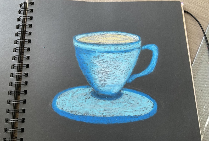
9. Blue Cup: For our second class project, we'll be drawing a blue
cup with a whip cream. I'm starting with pencil to draw the guideline for the cup, starting with a
flattened ellipse and dividing it into fourths, x and the whole we
do it in real time. So I encourage you to join
along with me and let's paint. The center of the ellipse is drawing a straight
line and dividing it by finding the depth of the cupboard,
that straight line. Then finally, in defining
the curvature of the curve with these word inevitably
six people of the cup. The cup notating
handily to the cup. That's what the color
for this project. I'll be using cobalt
blue, turquoise green. Wait for the cup for clean. I'll be using settlement, as well as our nice
yellow for the toppings. I'm using light blue, golden yellow, and
it's cartilage. And as for the reflection, I'll be using little
bit of light gray. Sketching out a rough
guideline for the whip cream. Growing in heart in
the center of the cup. Adding an inverter and
exclamation mark on the left side of the cup to represent the
deflection on the cup. With this, we are done with the sketching section
for the curb. And now let's paint
starting with cobalt blue, defining the outlines of the cupboard, this
cupboard view, adding a small streak of cobalt blue on the
top of the curve. Adding this covariate
blown left side of the cup. Put the coffee mug. I'll be using cobalt blue, turquoise, green, and white. Carefully outlining the inverted exclamation
mark with a cobalt blue, outlining the heart
with the cobalt blue. Adding a little bit of
cobalt blue under the hood, adding little bit of cobalt blue on the right side of the tub. Now going in with
the turquoise green filling in the rest of the
copper turquoise green layer playing heavy preserved. For the cup, I'll be not be
using any blending method. We simply using
overlaying technique to blend the two
colors together. Surrounding the heart with
the turquoise green and overlaying it on top
of the cobalt blue. Filling in the rest of the curve with this turquoise green. As we discussed earlier during the demonstration of
overlaying western blot, all the colors can be overlaid
on top of each other. This turquoise green
can not be totally overlaid on top of
the cobalt blue. So I am using this
asset advantage to blend these two colors. Most of the cobalt, turquoise, green is somewhat visible. So there is no need to blend these two colors using
any blending tools. Adding more turquoise
green wherever required. Redefining the age of the HUD
with this turquoise green. And with this, we're done with the turquoise green
and the cobalt blue. Pull that up for now. Now moving downwards towards
the base of the cup, starting with this cobalt blue, adding this cobalt blue mainly towards the
left side of the cup. If finding the boundary of the base of the cupboard
is cobalt blue. Now I'm going in with
the turquoise green. Filling that costly
for the whole base, as well as overlaying it
on top of the cobalt blue. Applying heavy person with
this turquoise green to blend it with the cobalt blue
for the beta of the curb. Going back once again with the turquoise green to
define the base of the cup. Moving on to the
handle for the cup. Moving into that cobalt blue. Finding the outline of the handle of the cup
with this cobalt blue. Adding two more cobalt blue near the right side of the cup. Now going into the
turquoise green and filling in the
handle of the cup. Overlaying this turquoise green on top of the cobalt blue. Moving their cumulative
oil-based to dust with a virus. Now containing photo with the
rim of the cup with white. White on top of the top
with heavy bristle. With the same almost done with the rim of the
cup with the white. That's what the inverted
exclamation mark that will act as a reflecting
surface for the cup. I'm going in with the white, seamless for the hug, filling in the heart,
but the white. To add some reflection for
the handle of the cup. I'm adding a little
bit of white, seamless for the
base of the cup. Adding little bit of
white on the left side, adding in some more
white wherever required. And with this, we are
done with the cup. Continuing forward with the
whip cream on top of the cup. For this assignment, starting
with the settlement, defining the scope of the
with settlement screen, I'll be using
settlement and oranges, yellow is for the toppings. I'll be using golden, yellow, light blue, and red. With these, we're
almost done with defining the seat
belt and whip cream, adding little bit of settlement on the left side
of the whip cream, as well as on top of the rim. I'm applying medium
pizza with this element. For the cream also, I'll not be using
any blending tools. I'll be using overlaying
technique to blend the colors. Adding little bit of solvent on every layer of the whip cream. Know, going in with the
oranges, yellow folder, clean, supplying medium
pressure with this odd, nice yellow overlaying
some of these oranges, yellow on top of this element. Filling in this order in use, yellow for every year
of the war between and overlaying some of this orangeish yellow on
top of this element. Applying medium pizza
with this or in UCL and leaving a little
bit of a space in-between. Booing Rick once
again with us Elman, and applying a little bit of a reprise it for
the bottom layer. Doing the same for the
rest of the layer, applying little bit
of heavy piece and on the left side of the rib
clean on every layer. Earning in the color
wherever required. Nobody defining the shape of
the guts of the whip cream. With these, we're almost
done with them in between. As for the toppings,
I'll be using Scarlett, golden, yellow, and
light blue here. I've already started
with the Scarlett, creating smaller random
streaks with this cartilage. I was learned satisfied
with a clean, so I decided to add
little bit of more or a nice yellow as well as a
little bit of more Salomon. Continuing forward
with the whip cream, going in with a light blue
and creating random strings. Continue for red with the addition of toppings
on top of the whip cream, confined in, going in with a golden yellow and creating random streaks
here and there. And with this, we're
done with the addition of topping on top of
the whipped cream. And for the final touches, I'm going in with
a light green and adding it just below
the bottom of the cup, applying medium pressure
with this light gray. Now, going in with my finger
to blend the color and creating a blurring effect
with this light green. Adding some more white
wherever required. And with this, our
second product lookup with the whip
cream is complete. See you in the next video.
10. Coffee Mug: For our third class project, we'll be painting a coffee
mug with a cherry branch. For the third project, I'll be using a
reference line to sketch out the
guidelines for the mug, starting with drawing
the intersecting lines. Then instead of calling this intersecting
line with an ellipse, drawing the outer
rim of the mug. Known drawing parallel lines
with the sites of the mug. Now what do we do
it in real time? So I encourage you to
join along with me. And finally, connecting this parallel line for
the base of the mug. I decided to add more volume to the smoke by adding obese, but I was not satisfied with it, so I decided to erase it. Now I think the
handle to the mug and find nice getting out
the deadline for the saucer. That's what the colors
I'll be using, yellow, ocher and brown for the
mug, for the saucer. I'll be using a reset in brown. For the cherry branch, I'll
be using the red and brown. And with this we're done with this getting sex
and for the mug. And there's also no, let's paint starting
with pale yellow, defining the outer edges of
the mug with the pale yellow. Now moving on to the
handle of the month, ending this milimolar
inside them, completely filling in sites
of the mug with the SPD. A look. Now moving to
the rim of the month. I think that being alone
other side of the mug. With this, we are done with
the pale yellow for now, continuing forward
with the ocher, adding a little bit of ocher and on the right side of the handle. Now adding more ocher inside the MC to provide the
control to the moon. And that's, well,
let's look at heat, light and then
friction, the hole. We do it in real time. So I encourage you to join along with me while
adding the circle. Now adding this ocher to
the left side of the room. Doing same for the
other side of the room. Adding some more ocher here in the innovative and required. Also redefining the base of
the mug with this ocher. Now let's blend the color. I'm using Q-tip to
blend the color. I'll be applying
heavy pressure to blend occur with
the pale yellow. You could use any other
tool, whichever you prefer. A blank here, replace
it to blend the colors. Most time are starting to blend the ocher to create a
smooth consistency. Later on, I'll be blinding
the PLO with the alcohol. I decided to add
more pale yellow. Now going back once again with a Q-tip to blend the color. Learning to occur in the middle. Now blending the ocher with
the PEL on the left side. Now I'm blending the ocher
with a p alone the right side. Moving on to blending the color for the
handle of the mug. Blending the PLO with the ocher for the
handle of the mug? No, blending the rim of the mug, applying heavy press
it to blend the ocher with a yellow for
the rim of the mug. Doing the same for the
other side of the room. With these, we're done with them learning section ball no. Going back once
again with the ocher to redefine the rim of the mug. A notary blending the ocher with the PEL look on the
rim of the mug. Now for the insights of the mug, I'm going in with that assert Blaine medium pressure
with that assert. Now going into with the Q-tip to blend the rosette,
finding consistency. Using the scene with
a set for the saucer, heating on the base of
the mug with that effort. Filling in the rest of the
upper part of the saucer. Defining the age of the
saucer with data sets. With this, we're done
with the rosette. Losing bid the bottom
part of the saucer. For the bottom part
of the saucer, I'll be using brown and
I'll be applying happy to distribute the brown leaves. We are done with the saucer. Moving on to the cherry branch. For this, I am
starting with the TVs. If you go for p-value kinetically start
with a red cherries. Otherwise you're going to
start with the pencil escapes. Here. I have already started directly on the
paper with the red. Now for the branch, I'm
using the same brown. Connecting theories
to each other as well as connecting
theories to the branch. Add more depth and detail
to the Cheerios brand. You can use Y2, so
highlight on the genies. And that's what the
bone, you can use another shade of brown to suit the light and
the side dose. But here I'm keeping the
project as simple as possible. So I am only using two colors. I think some materials
he had in there. With these, we're done with
the TVs and the brand. I decided to add some more brown to the inside of the cup. Someone, but I'll do the branch. And with this we're done with the coffee mug with
the cherry branch. See you in the next video.
11. The Cup with the Lights: What about filter
drying? Really painting a red cup with Hollywood
ranch in the light, starting with pencil to sketch out that
guideline for the cup. Starting with drawing the
intersecting lines than encircling this
intersecting line with an ellipse, the hole. We do it in real time. So I encourage you to
join along with me. And let's paint from the center
of the intersecting line, drawing a perpendicular straight
line, facing downwards. Choosing the perpendicular
straight line drawn from intersecting points, defining the depth of the cup. Now I'm drawing
two parallel lines when the both side of the Cubs, earning a little bit of
God when the bottom of the boat parallel lines and
connecting those two lines. Turning the handle for the cup. The cup is not symmetrical as the cup is facing
towards the left. Their Twitter handle is somewhat up centered
from the right side, and thus making it look
symmetrical and off-center. Then finally, adding
in base two the cup. And with these, we are done with this getting sex and for
the scalp, for the cup, I'll be using scarlet, brown, white, and golden yellow. Here. I've already
started with the brown. Starting to add this land
on the top of the cup. Later on, I'll be adding the same amount on the
left side of the cup. So let's just below the handles. I'm using this counter represent the side of
religion for this cup. I'll be overlaying
Scarlett on top of it. Continuing forward
with the brown, adding it on the left
side of the cup. I'm applying medium
pizza with this brown. Adding the brown to
the base of the curve, and adding some more down
below the handle of the cup. And with this, we're done
with the brown for now. Know going into
it that Scarlett, I'll be overlaying it
on top of this brown. Blame medium pressure
without aid. Don't get confused
with the same color. Some primary upset read and sometime I have
said this cartilage overlaying the skull it
on top of the brown. I'll be completely
filling in the cup, the handle, as well as the base of the cupboard.
This is cartilage. This cartilage on
top of the brown carefully filling in this
cartilage near the handles of the curb or link this cartilage on top of the rod near the
handles of the curb. Finding the edges of the
cube with the Scarlett. Moving downward toward the base of the Covenant is cartilage. And with this we're done
with this colored for now. Now moving back with them, I think they're brown for
the handle of the curves. Going back with a
scarlet once again, now overlaying the Scarlett
on top of the brown, not completely
covering in the brown. Defining the upper edge of
the handle with the scarlet. Adding some more discolored for the beats of the cup
to redefine it. C. Now for the rim of the cup, I'm going in with the brown link, some scarlet on top of the ground by not
totally covering it. With these, we're done with
the green for the cup. The inside of the cup,
I'm adding some weight. Now for the inside of the cup, I'm going in with
a golden yellow. I'm applying heavy pressure
with this golden yellow. And now for the final touches
for the inside of the cup, I'm adding some brown and overlaying it on top
of the golden yellow. With these, we're almost
done with our curve. Now let's add the highlights. For the highlights
I'm using white, starting with adding
the highlights for the handle of the cup, overlaying some of the white
on top of the scarlet. Adding some highlights on
the left side of the cup. Earning some highlight on
the left side of the cup by overlaying the right
on top of this cartilage. Adding some more
weight for the inside of the cup that was required. Doing the same for the breach of the curve by
overlaying the white. Now moving on to the
lights for the lights, I'll be using golden
yellow and light blue, starting with a golden yellow, creating a small dots
with a golden yellow. You can add as many
lights as you prefer. Now going in with w.
Instead of this golden, yellow, and blue, you can use
whatever color you prefer. Now for the blending or smoothing the edges of the
golden yellow with my finger. With these lights are complete. Now let's add the wire. For the wire, I am
using my screen, connecting bolts to each other through the wire
with the moss green. And finally, moving on
to the holy branch. For the holy branch, I'll
be using scarlet, white, moss green, and yellow green, starting with the Scarlett and creating three smaller circles. Adding bright as the highlight. Or laying right on
top of the Scarlett, create the highlights for the leaves I love
starting with the most green and defining the
outline of the leaves. If you're not comfortable with directly drawing
on the paper, you can start with
a pencil sketch. For this, I decided
to add three leaves. You can add more
leaves if you prefer. Now for the insights
of the leaf, I'll be using yellow green. Moving on to the second Neil. Filling in the
yellow-green inside the mosque lean plane here with this element,
this yellow-green. And finally, moving
on to the third leaf, that's all the mosques and discovered by this yellow green, I decided to redefine the sake of the leafs with
that small screen. So going back once again with the Maschine to
redefine a seat belt. The leaves are going to be these. We are done with our later with the lights and
the holly brand. See you in the next video.
12. The Big Purple Cup: For our first project, we'll be painting a big bulk, bulk up, starting with this kid's drawing an ellipse from the center of one side of the ellipse, drawing a perpendicular line. Using the both ends
of the ellipsis, sketching out to
straight line and connecting it to the
base of the cup. And now I'm defining the
curvature of the curve, starting with the left side. Now moving to the right side and defining the
temperature of the cup. The whole videos in real time. So I encourage you to
join along with me. And let's begin with this. We're done with the
basic SI for the cup. For this group, I'll
be adding two handles, starting with the first
terminal on the left side, using a straight
reference line to draw out the second
handle for the curve. With these two are learned
without escaping section. Now let's paint. I'm starting with the lilac, defining the outlines of
the curve with this lilac. I'm using this slider to depict the sideway
regions of the cup. Apart from this lilac, I'll be using more
and light purple. On top of that,
I'll be using wave. I'll be adding the slack on the top left side of the curb, bottom left side of the cup, bottom light shade of the cup, and a little bit of
light in the middle. Moving on to adding the allylic on the bottom left
side of the cup. Adding some line like in
the middle of the cup. Now adding comparatively more allylic on the bottom
right side of the cup. Moving on to adding the allylic for the handles of the curve. Now we are done with the lilac. Continuing forward
with them all. I'll be adding this month just beside the allylic, everywhere. Surrounding the allylic
presented the middle with a mv. And now adding them up in the lower section of the cup
just beside the allylic. And with this we're done
with them all for now. Continuing borrowed
with a light purple. Filling in the rest of the
empty space with this slide. But anyone playing media
implicit with this light purple. And with this, we're done
with the light purple. And now let's learn
all the color, the mall, the allylic, as well as the light purple. Applying heavy presented with a Q-tip to blend the colors. Carefully, blending the colors, you the outlines of the cup. Blending the lilac with the mom and the
mom with the light by moving to the upper section of the cup with the sputum. Now finally moving to
the middle section, as there is very less
pigment of the light purple, I was not able to blend
the middle section. So going back once again
with a light purple. Now let's blend the
rest of the cup. Applying heavy pressure
with a Q-tip and blending the rest of the colors for the middle
section of the cup. Moving all across the
cup with this Q-tip and applying heavy visit to blend
all the colors to a TB, find that consistency
of the colors. Continue forward with the
blending and applying. Having visited with this Q-tip, a T-bill, find that consistency
of the blended colors. And with this we're done with
them lending for the cup. Now moving on to the
handlers of the cup. For this, I'm going
in with this slide, but adding this slide, but we'll just below the lilac. Now let's blend my colors. Blending the lilac with a light purple for the
handles of the cup. Moving on to the other handle. Earlier, I mistakenly smells a little bit of the allylic and the bottom part of the tub. So I decided to cover it
with the base of the cup, going back once again with a lilac and adding
and Bs to the cup. Going in with a Q-tip to blend this slide electrodes even find that consistency of the colors. Still I was not able
to cover this month. So I decided later on I'll be adding theories on
top of it continuing forward with the tub going
in with the white and adding designs in the
form of snow cluster, I'll be earning eight
to nine designs. Have this node
cluster throughout the whole week
deals in real time. So I encourage you to join along with me while painting
this little crystals. I'll be wearing the sequence id of the snow crystal designs. Adding a somewhat biggest know Kristen designed on the
right side of the cup, adding and then
there's no distalless and on the bottom
left side of the cup, creating some smallest nucleus, two designs in the
middle of the cup. Moving towards the about
section of the cup and creating another design
of the snow cluster. Adding another smaller Bristol
in the middle of the cup. Now adding details to
the snow crystals. Adding more details and finer distinction that
the ice crystal designs. That button middle section of the curve was somewhat lacking. So I decided to add one more
smallest nucleus to design. With this, we're done
with our snow crystal. This means ending a
little bit of white in the lower base of the cup
to do some reflection. And doing the same for the
upper part of the tub, adding a little bit of
white to so the reflection. And with this we're done
with the white for the cup. Now moving to the biscuits
for the biscuits, I'll be using orange,
yellow, Zelman. And does it get, I've already started with
the orange, yellow. I'll be drawing three
biscuits with it. Now going into this element and this element on
top of the orange, yellow using this
cell went to layer, thicker layer of the color on
top of the oranges, yellow. I'll be using the
settlement as well as other Nicea learned that
alternating pattern. Going back once again
without in this yellow adding it just
below the settlement. Moving back with this element, this element is to be
loved the ironist yellow. Again going with the
oranges, yellow. And that's what the final layer I am going in with this element. Adding this element
wherever required, and release we're done
with the oranges, yellow, and the settlement as the
primary lead for the muskets. Later on I'll be adding
rosette on top of it. Now continuing forward
with a fully branch, I'm starting with the Scarlett, creating two small circle
with the Scarlett. As for the leaves, I'll be using turquoise green as
well as yellow green. I'm starting with the turquoise green to draw the outline with a lead grind outline
for the second leaves. Now going in with
the yellow green, filling this yellow-green inside the outline of the
turquoise green. I'm playing medium presser
with this yellow green. You can use other combination of the green,
whatever you prefer. And with this we're done with the turquoise green as
well as the yellow-green. It's continuing forward with
the rest of the painting. I decided to add six more teary is three on each
side of the cup. Here I have already
made three Cherry with this Scarlett on the
left side of the curve, moving towards the
right side of the cup, creating three more series with a scarlet on the right
side of the cup. Now going in with the white to add highlight on the Chinese, adding white for
the holy bronchial. So with this, we are done with the holy
branch in the series. Now moving back to the
biscuit with the rosette, I'll be overlaying this little sit on top of the settlement, creating small circles with
the rosette and overlaying it on top of the solvent in the middle of
the two biscuits. And overlaying a little bit of receptors on top of
every cell when layered. With this, we are done
with the biscuit. And finally going met with the lilac could
define the rim of the cup and release. We're done with
our first project. Let's unmask the masking tape. I hope you learned something new and exciting from this project. See you in the next video.
13. The Snowman Cup: Photoresist the
brain. We'll look painting of lookup
with a snowman design. Starting with pencil to draw the guideline for the sketch. Growing a little
slanted straight line from the center of
that slanted line, going somewhat
perpendicular line to define the depth
of the curve. No drawing two parallel line
for the sites of the cup. Growing new lives in circling the first line that we drew. No defining the base of the cup and 510k, adding their
own data backup. And with this, we are done with this getting sex and
for this painting. Now let's paint. I'm
starting with the Cepheid, defining the outline of the
cupboard, the sapphire blue. I am using the Cepheid recruit depict us how do we
lead into the cup? I'll be using the sapphire blue on the top left
side of the curve, as well as the bottom-right
side of the cup. I'm applying heavy pressure
with this stuff. I add blue. Ablating this, if I add blue
on top of the pencil sketch. Now continue forward with the sapphire blue on the
bottom right side of the cup. Defining the outline
of the curve with the sapphire
blue and filling in the rest of the space
with this sapphire blue by applying heavy place it. With this, we are done
with the SEP IMU. Now continuing forward
with the white overlaying some white on
top of the sapphire blue. Now moving on to the other side, overlaying this white on top of the sapphire blue on
the bottom right side. Adding some more white here
and there, wherever required. By adding a little bit of
light on the top left side, as well as the bottom-right
side of the cup. With these, we're
done with the white continuing forward
with the ultramarine blue overlaying some of this ultramarine blue
on top of the white. I'm applying medium pressure
with this ultramarine blue. And with this we're done
with the ultramarine blue. And finally, going into
with the light blue. Filling in the rest of the empty space with
this light blue, I'm blowing medium to heavy pressure with this light blue. And with this we're done
with the light blue. Now let's blend the color. I'm starting with blending the light blue with
the ultramarine blue. I'm applying heavy pressure
with this guilt trip to blend this ultramarine
blue with the light blue. You can use whatever
blending tool you prefer. No blending the right
with the sapphire blue. Applying heavy bleed it
to blend this color to a ***** and consistency
of the colors. Moving downward, blending the sapphire blue
with the white, going back to them and
they love the cup and blending the light blue to it
through their consistency. And finally, blending
the sapphire blue, white and the light
blue altogether. Moving a little lower, I'm blending the
light blue with the ultramarine blue and the white. Now, learning the
ultramarine blue, sapphire blue and the
white altogether. With these, we are done with the blending for the cup for now. Moving on to the
handles of the cup, I'm starting with
a sapphire blue, defining the outline of the handle with
the sapphire blue. Adding a little bit
of sapphire blue near the bottom of the handle. Now going in with a light blue. Now going in with the
light blue and applying medium press and then filling in the rest of this handle
with this light blue. Now let's blend these
two colors together. Blending the sapphire blue with the slight blue by applying heavy pressure with a Q-tip to obtain a smoother
consistency. Blending the lower
section of the handle. And with this, we're done with the blending for the
handle of the tub. Now let's add
details to the cup. Going in with a white, I'll be creating
three circles of increasing size for the snowman. I need to tighten the biggest
circle with this white. And with this, we're done with the basic theme of the snowman. Apart from the snowman, I'll be adding snow-covered. Please. Bring out the guideline for the trees for wood that
reads Albert into triangles. Starting with the first
triangle for our slope, our tree on the left side. The left, we decide this
other triangle will be comparatively bigger as
compared to the right one. The third and the final triangle for our snow-covered tree. Moving on to that tree
on the other side, starting with first
triangle, second triangle. And finally the third
and the final one. Now adding the main
trend for the tree. Adding a little
bit of white just below the snowman and the tree. And with this, we're done
with the white for now, bringing it with a Q-tip and learning the lower
section of this white. Now going back once again with the white for the
rim of the cup. Applying heavy
pedestrian with this white could define
the rim of this cup. Now I'm going in with a
light blue and adding in this below the white on
the other side of the cup. And that's what the
inside of the cup I'm going in with the
island this yellow. And finally adding
a little bit of brown on top of this
orangeish yellow. With these we're, and for
the insights of the cup. Now moving back to the snowman, going in with the black, adding the ice of the snowman, the hands of the snowman, as well as the button
for the snowman going in with a red for
the cap of the snowman, as well as the scarf
up this lumen. Adding this scarf of the
snowman with this red. For the notes of the snowman, I'm going in with the orange. Adding weight on
top of the snow, mentored and learning
a little bit of white for the highlights
in the eyes of the snowman. Lastly, moving on to the
holy branch for this, I'm starting with this red. I'm overlaying this
right on top of them. Lose, we will go
to the other side, adding some more circles with
the red on the left side. Now, moving on to the
lips for the holy branch, for this, I'll be using a
middle green and yellow green. Here. I've already started with the emerald green to draw
the outline for the leaf. Bring the outline for the
leaves with this emerald green. Moving on to the other side
for the whole rebrand, bring out an outline
for the leaves. I decided to add
one more red circle and now going into the black and adding it on
top left corner of the right to represent
the side of religion. And that's for the highlights. I'm going in with the white and adding it onto the
bottom-right corner. Continuing forward
with the Lean, going in with the yellow-green and filling in the leaves
with this yellow green. I'm applying medium pressure
to fill this leaves. Well known to the other side. Earlier I was using medium
pressure to fill the leaves. Now I have decided
to use heavy prison. Filling in the leaves. Once again, we're
playing heavy precess, defining the shape
of the leaves with this yellow-green
and then filling it. And finally filling in the last live with
this yellow green. With this, we're done
with the yellow-green. Because of the overlapping of
the yellow-green on top of the green outline of the leaves
are not clearly visible. So I decided to add the
middle green once again and bring in defining the
outline of the leaves. Overlaying the weather
vane on top of the yellow-green and redefining
the shape of the leaves. And with this, we're done
with the holly branch. And for the final touches, I'm going in with white to add
some highlight to the top, starting with the handle, adding a little bit of
white on the handle. Now going in with a Q-tip
to blend the colors, blending the white on the cup, as well as blending the right
on the handle of the cup, adding some more white here
and there wherever required. With these, we're done
with our sixth project. I hope you learned something new and exciting from this project. See you in the next video.
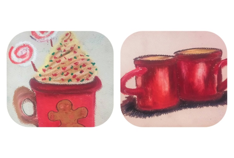
14. The Double Red Cups: The seventh and
the final project we'll be painting to read cups. Here I've already started with drawing the basic
escape for the Cubs. This getting us lended a
straight line with this pencil. Instead of killing the slender discrete line with the ellipse. The whole renewed in real time. So I encourage you to
join along with it. Let's bring this
two beautiful cubs. Going to parallel lines
coming out from this led to the straight line to represent the sides
of the curve. Then finally connecting
these two parallel lines to make the base of the cup. And with these weird and
without first cup moving on to the second curve
following the same procedure, starting with growing a
slanted straight line and then encircling
it with an ellipse. Now I'm drawing
another parallel lines and finally connecting it to form the base of the second cup. And with this, we're done with the basic Seafood.
Would the cup. Now moving on to adding
the handle for the cuff, starting with adding the
handle for the left curve, hardening the handle
for the right curve. And now continuing fire
with this, getting, adding that to the curb, and finally adding
the base to the Cubs. And with this, we're done
with the basic excuse. Put our class project, moving on to adding the colors. Here. I'm already
started with a brown. I'll be overlaying this, but on, on top of the pencil sketch, I am using this button to depict the darker
region for the cup. Adding a little bit of brown
for the rims of the cup. Adding some more without
another handle of the cup. Adding done with the
two cup touches. Adding more without under
the handle of the left cup. And finally adding a
little bit of more brown for our right cup. And with this we
are done with them around continuing forward
with the light green. I'm using this light we do to present the lighter the
agents have this cup. I need some of the slides
people the rim of the cup, concentrating most of the lightly on the right
side of the left cup. Know going in with a settlement overlaying some
of the settlement on top of the light gray. And gentlemen, the slide
degree with this element, this cup apart from this brown, light gray and the settlement, I'll use the audit and what we know going in with the audit. So don't need the light ray and the settlement with the orange. After the iron comes
down with a blank, heavy person when there's
someone million and filling in the rest of the empty space of the tub with
this, when me and I'll be leaving a little bit of a space while using this when we're moving on to
the second tab, over links some of this vitamin
lean on top of the brown. And with this we're almost done with the primary
layer for this cup. Apart from this
pilus, I'll be adding more layers of color
wherever required. And finally, I'll
be going in with the white to add the
highlights for the cup. Now let's blend the color. I'm going in with acute
them to blend the color, you could use whatever
tool you prefer. I have a blank. I replace
it with this Q-tip to blend this brown
with a 1 million. Moving up one, blending the colors near the
handle of the cup. Totally blending them
around with a vermillion. In Plotina, find that consistency
of the blending colors. Now moving a little bit lower, lending this element and now are innervated
by the median. And finally, moving on to
the middle of the cup, blending the light gray with
the rest of the colors. Applying heavy
preserve the Q-tip to blend all these colors. And now blending wherever the final consistency of the
color has not been achieved. Moving on to the second cup
following the same procedure, blending them vermilion
with the brown first, applying heavy Preston with the sputum to blend the
vermilion with the midtone. Now moving but the
middle texts and learning their grieved for
the rest of the colors. Moving downwards. Learning
this word mean with them, I don't know. Learning the orange
with the brown. Learning the lower section
of the cupboard that filter. And with this we are
almost done with about primary lead
for the blending. By primary, I mean, I'll be adding more
colors on top of this and blending it to
the rest of the car. Let's now going in with about 1 million and
adding it wherever required to make that curve
appear more sign here. And now blending this vermilion
to the rest of the color. This time instead of applying how inquisitive blend up when meeting with the
rest of the color, I were playing medium pressure, the modal yet you will be
adding on top of each other, the harder it will get
to blend the colors. So that's why you're
applying medium precedent set of
the heavy pressure. And with this, we're
done with blending the vermillion for now, moving on to the
handles of the cup, I'm starting with a brown overlaying this ground on top of the pencil sketch with this
thread done with the brown. Bringing with them 1 million. Pulling the rest of the
handle with this value mean, overlaying some of this
vermilion and top of the brown. Now let's blend this vermilion with the brown using the Q-tip. Totally blending
this one mean with that brown by applying
heavy preceded with the Q2 to achieve consistency of the
blending colors. Moving on to the handle, bling him implicit to blend the colors because there was no clear distinction between the handle and
the rest of the cup. So I decided to add little bit
of brown below the handle. I think Tim Woodward
million to the handles of the cup per million to
the rest of the handle. Now moving on to the
mass of the cup, the starting with the brown, brown for the
release of the cup. As well as defining
the curvature of the cupboard, this brown. And now I'm going in with about 1 million overlaying them. I don't mean to get
on top of the ground. And now let's blend this by
meeting with them around, applying medium pressure with a Q-tip to blend this brown
with them at the median. With this, we are
done with a piece of the cup moving on to
the rim of the cup, filling in that aid
in between them down. Now, let's blend the color. Learning the vermillion
in the middle with the brown on the
top and the bottom. Moving on to the other
cup of language, instead of with a Q-tip
to blend the colors. And now blending the other side of that in by applying medium, place it on top of the brown. Let's put the inside of the cup. I'm going in with the ocher. Blending this occur
with the Q2 to achieve a final
consistency of the rocket. And with this, we're
done with the cup. All that is left is to add the final touches and
financing for the cup. I'll be going over the same
color wherever required, as well as I'll be adding
the highlight for the curve, and I'll be adding some color
for the base of the cup. Here. I've already started
with a very million adding a little bit of well-being for the
base of the cube, as well as some of
the very middle and just below the
handle of the cup. Now blending the
vermillion that we just added by applying medium
presser with a Q-Tip. Blank medium pressure to
blend the color this time, blending the colors
wherever required. Learning to occur inside
the cup a little bit. And now finally
going in with the white to add the
highlights with a curb, hiding the highlights for
the handle of the cup. I didn't write on the
upper left side of the cups adding a little bit of white on the rim of the cup. Now going in with a Q-tip
and blending this white to the rest of the color by
applying medium presser. Blending them, wait
for the other cup. And with this, we're
done with our two cup. Moving onto the base of the cup. Put this, I'll be using
brown ocher alternatively, starting with the brown know
going in with the alcohol, overlaying some of this
ocher on top of the brown, adding a thin layer of the
ocher just below the ground. And once again, going
back with the brown, overlaying, a little bit of
brown on top of the ocher. And find me blending the colors. Blending the Brown
with the ocher. I'm applying heavy
pressure with the cuter, cheap, the blurring
effect with these colored a blank, they're heavy
pressure of the Q-tip in the downward direction to
create the blurring effect. Continuing to create the
learning effect with this Q-tip. With this, we are done
with our painting. Now for the fun part,
unmasking the painting. I hope you enjoyed this project. See you in the next video.
15. Thanks and Conclusion: Congratulations on
completing this class. I hope you learned something new and exciting
from this class. If you have any doubts
or question you can ask me in the
discussion section. And if you ever meet
any of the project, please have noted in
the project section, he had limiting
put your project. I would love to hear
feedback on this class. Please leave a review
and that review section. See you in the next class.
 Vishal Munshi