Transcripts
1. Class Project: One of the best beaches
since he looks down and then he looks straight into your
face and his eyes are black. If it is also your favorite
scene from The Witcher. This class is for you. Hi, my name is Alina and I'm emotion artist and illustrator based in these bug in Germany. This is absolutely
beginner friendly class. This gives us realize simple, and we will only
use Adobe Fresco. This is a free software from Adobe for any tablets and iPads. In this class, I will show you some animation principles that will apply to our animation. I will explain you how to use animation function
in Adobe Fresco. At first, we will create
a graph animation using Raster tool
in Adobe Fresco. And then we will create
line for this animation. And finally, we will
colorize this animation and all this in free Adobe
Fresco software. As a class project, we will create two
variations of the richer GIF that you will be able to
upload to your social media. If you're also richer fan. I am and would like to try some new software for your
frame by frame animation. This class is for you.
2. Introduction to Adobe Fresco: Now I will briefly introduce
you to Adobe fresco. To start our work, we should select size
of the artboard. You can create your own size
or you can use screen size. I will select current
screen size from now. And as we can see here, there is a tool kit
with different brushes, Text Tool, eyedropper tool. On the right side we see layer
panel, Properties panel. For example, if you would
like to have greet. The right side, we
see also layer. So we have this layer selected. If we would like
to add one more, we will press this Plus
button on the right side. If we want to add a mask as well we do in Photoshop or Procreate. Draw one element. Then create a new layer. Select different color,
for example, red. And press this button
to create a mask. One more time to undo this, we can also use
double-tap to do this and three fingers to undo, to leave this, select the layer. Then this three dots. Near. The most interesting
part in Adobe Fresco. This is three brushes, so we have raster brush. I'm using this to do
sketches all the time. This is pencil. We can adjust the size. Usually using this
brush between 810. The color is the flow. Because here, all colors that you use will be
also selected here. Smoothness, you can
select between 5060. I'm usually using 60 or 50. You can also adjust this brush, so this is raster brush, and if you use this, we are clearly see that
this is pixel brush. Brush, and this layer is
also then raster pixel. This dot here is roster. If you want to use vector brush, we can also inspect our brush in Adobe Fresco will
select another car. If we use this brush, another layer will be created. And this time with this circles, this dot, not raster but vector. And if we zoom in, we see this ideal shapes. So this vector. Now the cool feature
of Adobe Fresco, can overshoot our strokes and then delete the
overshoot it part. So we will select this
circle tip two times, so only the line the outline is selected and the
brushes also selected. And then delete the
overshoot it part. Do this. Select the Brush. Double-click. Simply
click the overshoot. But this really helps, helpful and we'll also use
this in the animation. If we select the circle inside, we will be able to erase
the part of the stroke. The other tools, our
eraser selection tool, we can select one part, close Lasso than your size to make it bigger
and make it small. Also mirror it. And then Done deselect. We can also create a shape and then your color tool
and colorize it. Dropbox, a classic
eyedropper tool. You can select your
color as a set. On the right side we
have a layer properties so you can adjust
also blend mode. You can do it to
Multiply of Darwin. As normal illustration program has Photoshop and procreate. You can also reduce the
opacity on the layer. With this button, we can create pixel
layer on vector layer. But if you use a pixel layer, it will be created automatically exactly
for the vector layer. With this three dots, we can add one more layer, duplicate layer, copy
layer, and so on. Really practical is if we
select multiple layers, select multiple
layers and then press this three dots and
match selected. We can also make it invisible. This are the basics of the interface of Adobe
Fresco for illustration. Now, I will also show you
how to use it for animation. So I will delete these layers. One more thing, we can also add image or photo
totally fresco, use this button and then it's false photos of camera
to add a picture to it. The really powerful thing in Adobe Fresco is this animation to it was introduced
in bottom 2021. And to use it, be great. One more layer. Then make for example, circle. And then press this
animation tool. After the press it, we see this animation
timeline posts graded. Now this is all the frames. So if we add one more frame, we can now animate our circle
to see the previous frame. We can to the right, to the left that also
turn on onion skin, press settings and
then onion skin. So we will see the previous
and the next frame. We can also adjust the
frames what we see. So we can see four frames, but I prefer to frames. So the next one
and the last one. You can also adjust the opacity. Now, we can make our so-called
pizza with different, then add one more frame. And BC, the previous
one, the last one. Make it one more time. Soccer was animated on this
layer and this timeline. We can play O, and then we see that we
animated the circle. You can turn it off. Orange skin. Also vary the
frames per seconds. So for example, if we use
eight frames per second, animation will be slow. It's up to you. You can adjust the frames per
second as you like. If you want to add
another detail, for example, square, we
will create one more layer. The term line is already
selected because we use animation for the previous layer when we can use also vector. So we can combine pixel and
vector art in one nation. We will select another
car and draw our circle. Add one more frame, then add onion skin and create
a square one more time. This is rectangle. Now we can see
that we animate it square and circle on
different layers. This principle, the
animation in Adobe fresco. Now we will apply all these principles
to our whichever give.
3. Main Principles of Animation: Before we start our animation, I will explain you the theory of our animation and
animation principles that we will apply
it to our animation. There are 12
animation principles, but as I said, for our animation
will apply three. The first principle
is pose to pose, and the opposite
to pose to pose. Animation is straightforward
but animation. But in our case, the most helpful
is post to post. We will have four key
pose and we will draw this key poses at first and then animate a little
bit in-between. The second principle
is anticipation. So this is naturally
preparing for an action and anticipation we will have
in our lives everywhere. So before we do any action, we will prepare our body for it. For example, if we go down, at first, we will
go a little bit up. And this is also
really helpful to prepare the viewers for
the next animation. In our case, the
Witcher will look down. And before he look down, he looks straight and his eyes are open and we will make them a
little bit bigger, more open before
he closed his eyes so the viewer will have
attention on his eyes. Third, one is one of the most powerful
principles of animation. Slow in and slow out. This means if we
have two key poses, are three key poses. We will add more key
frames at the beginning, at, at the end. To slow the action in
and slow the action out, we might add one
or two key frames for the short
animation in-between. But the most key
frames there will be at the end and the begin. If we want to add
in-between key-frames, we will add in the middle
of the two key poses. One key frame, and then in
the middle of the middle, one key frame and
one in the middle. And so this is the principle
of slow in and slow out. In our case, we will
have four key pose. At first his eyes are normal, then he closed his eyes and
the eyes dark and open, and then the eyes are closed. The second key pose is the
same as the fourth one. And this action, we will add a little bit
in-between key-frames. But the most key
frames will be at the end and at the
beginning of each action. Here, here, and here and here. I also like to prepare
animation first. And I think this is the key
to successful animation. And so to show you how
we apply this principle, there are four key poses. His eyes are normal then
closed and dark then close. And so, as I said,
anticipation principle, we will make his eyes more
open and then close them. Then the eyes will be
dark and then more open a little for two keyframes. And then he will close his eyes. He will stay a little bit
longer at this stage as here. And then here. This is the principle of
slow in and slow out. Another point that
I would like to discuss with you is how he looks down, his eyes, close. If we look straight, our lines and not curved, if we simplify it so the lines straight and the
mouth is inertial position, the ears, the eyeline, the nose is a normal stage. And if we look down, our lines will be curved. We see that our eyes
are more curved. Our eyebrow and the hairline go down and the mouth
will be more smiley. The edges also going up as the line is straight and the
chin will be more ignorant. The ears also are going
up and the neck will be a little bit brighter and the neck line will be
also more rounded. Sphere. We can also applied
it to the head. Here we can see that
It's also more rounded. His nose is more rounded. His hand line goes a little
bit down the ES app, the chin is more England and he not smiling but the
edges of his mouth. Alcohol and a little bit up the neck land is
also more rounded. This is the theory
to our animation. However, animate it. We will start with
four key poses, draw them, and then we
go in-between them.
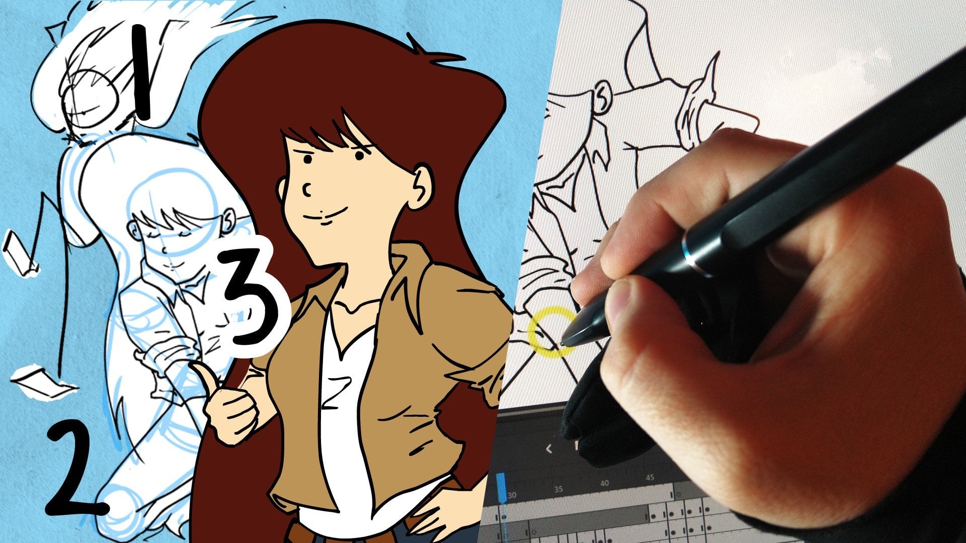
4. Creating a rough Animation: Pose to Pose: Let's begin our animation. And I created already two
stages of the feature, and his eyes open and close. I will use them as a reference. And on a new layer
that I created, we'll create a
pencil brush tool. The first stage,
It's normal eyes. Turn this into an
animation layer and create the second frame with
his eyes are closed. So we'll see the first
one and the second one. There's two stages I
addressed from my sketch. I'm also using this
helpful grid system. I see that his head is
on the same position. And as I said, I use this curved
line to show that his head is down and
his eyes are closed. So we created two main key poses of our animation of our gifts. Stage one. In stage two. Now we will go and copy these keyframes to create
the in-between key-frames. So select the keyframe
and duplicate it. Now, drag it to the end
of the keyframe sequence. So we already created the
basic of o animation and now we can change frames
per second to seven. And yes, this is the
basic of our animation. We can adjust frames per
second as we would like. And so this is the principle
of pose to pose animation.
5. Creating a rough Animation: Anticipation: The next animation principle
that we will apply to our image is anticipation. And so I add more keyframes. I duplicate. First keyframe. Now I will make his eyes edit. Albert began for this. I'm using the eraser tool
and erase parts that I don't need or want to change and
grow on more time his eyes, and in this case
they are bigger. We already have four keyframes, three key pose and one
in-between keyframe. And now I will also adjust his
eyebrow form and his eyes. For this reason, I can also use onion skin in the settings. It makes a little bit easier
to see the position of the elements on previous
and next keyframe. We can also adjust the
opacity of the onion skin. And so I use it as a reference
now to adjust his hair, his eyebrows, and his face. It's not necessary to draw for each key frame from scratch. We can also use
the lasso tool and select the elements that
we would like to adjust. And for example, make them bigger or smaller on our
place it to the right place. And then we use a normal brush, pencil brush, and adjust to
the learns of the element. In some cases it's more
easy and more efficient. Now I will adjust
his hand and make his waves a little bit
different for each keyframe. And I'm using on
your skin and make the opacity and alike
thought to you or 60%. And I'm using reason to, to correct each wave. So in this way, I will continue to
adjust to keep frame. And now I will split up a
little bit in my process. I duplicate it the first key
pose and now I will adjust his eyes farm and make it
a little bit more close. So this is the
anticipation principles that we discussed in the first lesson and make his eyebrows also a
little bit more down, as I said at the beginning of each action and also at the end, we need more keyframes to
make each action most MOOC. Let's preview. We have already created the
first part of our gifts. So he looks straight
and then he looks down. His hair is flying in
the wind so we can adjust in the settings
frames per second. And it looks nice
the first part. And now we will duplicate the keyframes from
our first part. The second part. Then his eyes are dark. Nothing new. The same keyframe
sequence because in the first part
after he looked down, he looks great, but
his eyes dark and so I'm using pencil tool and erase tool to create his pupils. And also we will create the binds that
underneath his eyes. And for each keyframe there
will be bigger and bigger. We will also use onion skin
to create these binds. We see the position of them
on the previous keyframe. So this is how it works. As we discussed in
the first lesson. We create four key
poses and then duplicate the key frames to
create in-between key-frames. And to make it more easy
and efficient to be using the lasso tool and raise two
arrays or change some parts. So we don't need to throw
each keyframe from scratch. Great be graded rough sequence. And at the next step we will
create an ad for this gift.
6. Creating a Line Art: Congratulations, the most difficult
part of our animation, the rough sequence, is done, and now we can start
to create a line out. For this reason, we
will create a new layer and at ten keyframes
for this layer. So we have ten key
frame swollen, rough animation and ten
keyframes for the line. This is important to
have the same amount of keyframes for each layer. Until now we will use
the vector brush. You can adjust the size and
the color of the brush, but we can also do it later. I will choose this dark gray, grayish column for the line art. Now, we can go to the first
key frame of the animation. But before we start
our line art, it's really helpful to
turn their capacity of the rough sequence tube 30% and make it
above our line art. And so let's start our line out. It's important to
create a closed shape. So after that we can
cover price them. And to do this, I will shoot my lines. And as I showed you
in the first lesson, we can use this circle in the right corner
and tip two times. And then we can delete the
overshoot it part of the line. And it's easier for me to create the right
forms of the lines. And so I can really
recommend you to overshoot your lines
in Adobe fresco. Now create all the lines and then we will lose this circle. To delete the part. We've finished our line
out of the first key pose. And now I will duplicate this key frame a couple of times till the second key pose. And I will use onion skin opacity to see
the previous key frames. And I will adjust the
form of the eyes and the position of the
eyebrows for each keyframe. This is my working method
for the line art sequence. And please Guth onion
skin opacity to make it easier for you to see the difference between
the previous keyframe. This keyframe, and
adjust the, these paths, eyebrows and eyes for
each key frame and useful these previous key
frames and the rough sequence. This is also a really
time-consuming part or the animation. But you can also use
it as meditation as I do, enjoy the process. And now we've created, already used the first
part of the animation, the line art on the first part. And now we will duplicate the first keyframe and
make his eyes duck. I'm creating this line
AD on the same layer. I don't use the other layer, but you can also use
the second layer to create his eyes and his finds. And so also for this, I'm using onion skin. And so I can see his finds
on the previous frame and create them deeper in
the faith and more bigger. I'm also using the other
color of the lines, so this is propyl. And don't forget, you
can double-dip on the screen to undo and
three times steep to redo. So this is how it looks
like and I really like it. I will add more
frames for inbetween and duplicate the first
part added to the end, and then create his dark
eyes one more time. The second part of
the animation is actually the same
as the first part. So you can use the created key frames or for his normal stage with
his normal eyes. Duplicate them and change
his eyes, make them dark. And the principle
is quite simple, so I will split out my process. Now, we've created the
French put the line card and we have key frames
spot It's up to you. You can be more
keyframes or less. And the second part of
our animation is done. Now, we will call rice
all the key frames.
7. Animation Coloring: The hard work is done, and now we can relax and
colorize our frame sequence. I use some reference to
create this color palette. And now I will use Paint Bucket tool and colorize
each part of his face, his hair, and his clothes. I don't create a
new layer for it. I'm using this line
at control layer that we created in
our previous lesson. They all shapes are closed. And so this is no problem
to colorize all of them. If they're not close, you can use a brush tool again
and make the farms close. I really enjoy this part of the process because
I can see how my GitHub will look like and
the most difficult parts, yes, it's done and so
enjoy the process. Now I will create a
new vector layer and halite top part of his hair
and use the brush tool. Now, I will than this here
highlights state four, a key frame sequence. And so I will duplicate
this keyframe 18 times. So for the whole sequence, we will see you this
here highlights. Let's go on and colorized. Say here's slips using this
dark gray purple column. I think this color is
purple or two, pinkish. And so I will use a little bit more gray
color, gray purple color. Now, I like this one and I
will call revise his lips for each key frame and also
his yellow brown eyes. I will also coerce them for
each key frames separately. Also his clothes, and I forgot that his eyes should also
have white background. This is not the best way
how I'm dealing with it. But yeah, it's
normal that during the process you forgot
something and then you have to correct. And so now I will add this white background for
his eyes for each keyframe. If I will do it
better next time, I will naturally begin
with the white color and then add his yellow eyes. I will make his transparent at the beginning
and then cold rice, the whitespace on
separate layers.
8. Creating the “Witcher on” Title: Good job. We created already
the first version of our Richard Keith doubt title. We see that he looks straight
and he looks down and then his eyes black and also
you can see his binds. I think it looks really cool. And you can also change
frames per second to make it slower or to make ad fester. And now we can use miss text function in
Adobe Fresco and create a title on a new layer. Tap on your screen and now
you can create your title. So select dark gray light color, and we will use this academic
engraved font enter. We will type pycharm to adjust
the settings on the title, select Add, and we
can style our text, make it bolder on,
make it bigger. You can also use this scale
panel on the left side. We need this title for the
whole key frame sequence. Will duplicate it
18 times and we'll also add on mode with
the brush pen later. But first I will add this
gray color and meets the title on the separate layer and fold the whole lead us. I think I will use
his hair color, this light gray tone. And so now I will duplicate
this a keyframe 18 times. And after that we will use
vector brushes to type on the color of his lips
and to make it more easy. I will also use this great
tool to seeing the lines and using them as guidelines
on his second key pose. This is key frame number seven. We will write with
this purple color and make it as big
as the title itself. For this, I'm using the Lasso
Tool and make it bigger. And after that, I will duplicate this key frame to the end
of the keyframe sequence. As we preview, we can see
that he has his richer mode on after he looks down and
then his eyes are black. In the next lesson,
I will show you how to export our gift.
9. Export and Upload: Now we will export our GIF, go to the right corner, this Publish and Export Pattern. Select motion, and then
select PNG sequence. Not a GIF. Gif will not work. Unfortunately, there is no transparency feature
in Adobe Fresco, but we will use Adobe
Photoshop to create a transparent GIF Export as
PNG sequence and select Add, Drop or your main, but I'm using Google Drive and then you will
create a zip folder. After that, we will
download it on our desktop and then
I will show you how to import this PNG
sequence in Adobe Photoshop. Press Done, and now we will
go to Adobe Photoshop. In this last lesson, I will show you how to
make our GIF transparent and how to export it
for our social media. And in the last lesson, we already exported our gift that the meat in Adobe Fresco as PNG sequence using
Google Drive or Dropbox and it's up to
you and it false zip. And so now if we download it to our desktop and open Photoshop. In Photoshop we will create a new file with the
same size as our gifts. So on town 500 for one hundred, ten hundred in 500
pixel, create. Now go to File, then Open, select the first image
of our PNG sequence, then image sequence asphalt. Once select PNG open. Now you should type
our frame rate, so the hat nine
frames per second. Then press. Okay. Now we can see
that our gift false, created as a transparent GIF. Here in Photoshop. This is only one sequence, but we wanted to have
seamless GIF and X2 to make it into export it
as a gift for social media, we go to File export. Save for Web. Select here, give this color rate is transparency on colors size. Let's all right. Looping option for that's
the most important part. Then we should select the path. Yes, then name it. Done. So now we have our
GIF that the Meeting, Adobe Fresco and Photoshop. Now we can upload this
GIF to keep faith. This is online depth
site that allows you to make a creator account and upload they are your gifts and then use them on
your social media. If you are new to keep fee, you can create a
personal account or create an account
for great account. You should have warned
them five gifts, but it's really simple
to be a greater on QP. I'm object grader. Then you can use
upload or create function and bend your
gifts are approved. You can use search bow with your personal GIF that
you're added to you. Give, for example,
personal name, and then you can see your upload gifs also for your
Instagram account. You can also visit
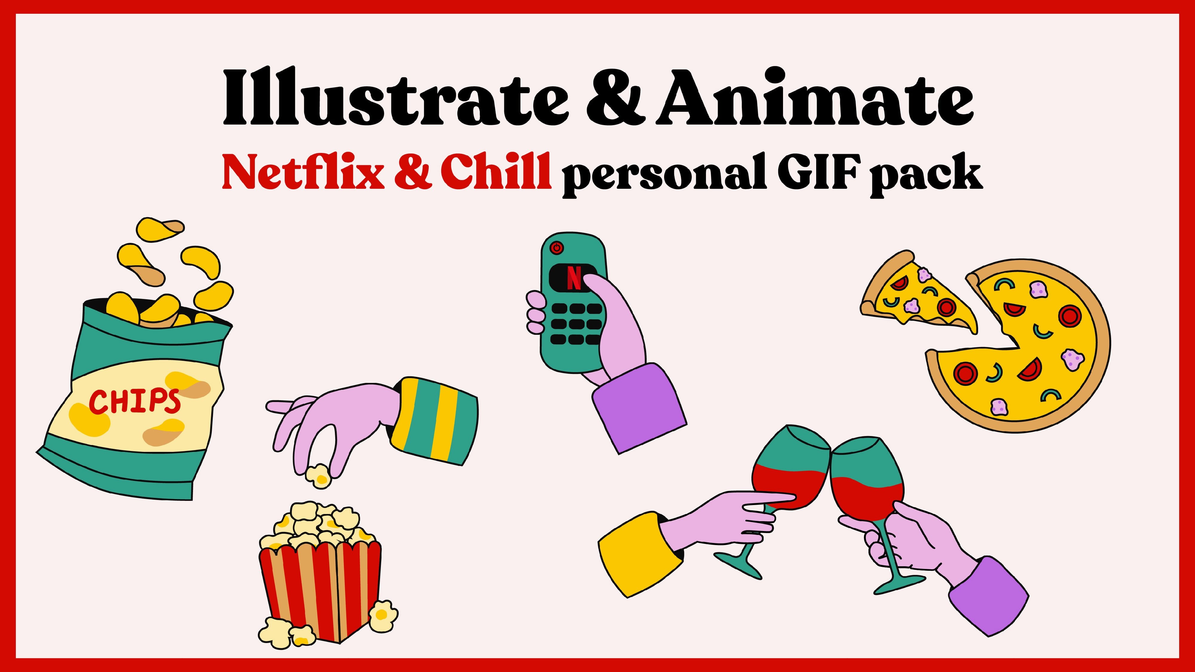
my class there we created the Netflix
and chill give back. It was my first-class and
I will be really glad to see you're also in my first
class, and that's it. We created our pitch. I give in to variations.
10. Final Thought: Congratulations, you've created your first
GIF using Adobe Fresco. I was so excited
you chose my class. Thank you for that. Please take your time and
leave a review for this class. I will really like
to see your project. You can also follow me on
Instagram and YouTube. And in the future I'm
planning to launch more classes on Skillshare so you can also follow me here. Thank you for being
with me and I will see you in my next class. Bye.
 Alina Sauer, Motion artist & Illustrator