Transcripts
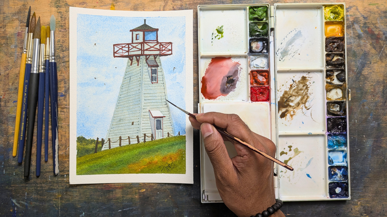
1. Intro: Everyone. Welcome to this class. In this lesson, we'll paint a simple lighthouse
in watercolours. We'll start with a basic sketch. Then layer soft washes to
create a depth and atmosphere. You'll learn how
to paint the sky, add light and shadow
to the lighthouse. Simple brush strokes for
the surrounding landscape. This is a great
project for bigness, and by the end, you will have a beautiful lighthouse painting. And let's get start, everyone.
2. Materials/Supplies: We jump onto the painting,
let's go to the supplies. The first one is a
mechanical pencil, and you can use a
graphic pencil too. And the next one is an eraser. You can also use
a knited eraser, and it doesn't have
to be a fancy one. A regular one works as well. And the third one is my palette, which paints squeezed in. And this is a simple palette
I borrow from Amazon. And again, it's up to you
and it's your preference, and you can buy any palettes
you want from Amazon. And the other watercolors
I personally use. It's Winsor Newton Professional
Grade watercolor paints. So I'm just showing the tubes. It doesn't mean that this is the colors I'm
going to be using. I'm just showing this for
just reference purpose. And I also use Guash, which to bring back
some of the eyelets. And I'll show in a couple of my tutorials and a
couple of my projects. And you can also
check OGuach can be quite handy when you're
doing a watercolor painting. The next one is obvious. I have a couple of range
of variety of brushes. You can start from
round brushes to cat tongue brushes
and to flat brushes. Again, I don't want to be specific with my brushes
because as an artist, you develop your own set of brushes as you
grow as an artist. And next one is a
glass container, or you can use any
container you want. This is just to pour water to mix our watercolor
paints with the brushes. And next one is the tape, and I'll show you how this
tape can be quite handy in our classes to get this crisp edges after our
watercolor painting is done. I use a rack to clean the excess paint that's stuck in my brush after doing the wash. The last one is the
knife and which is used for using scratching techniques that can be used in
watercolor painting.
3. Watercolor Paper/Supplies: Color paper is essential for
any watercolur paintings. That's why I kept this as a separate section because of its importance in
watercolor supplies. My personal favorite is Saunders Waterford
watercolor paper, 300 GSM Col Press, and that's why I say
CP there and 300 GSM. And this is really important
because this as us to have really nice blending and it also gives a
really vibrant colors. So the next one in my arsenal
is Bwan Watercolo paper. It's the same thing. Now
you can see it's 300 GSM, and this is a hard
pressed surface. Press surface means
it's nothing, but it has a smoother paper
than a cold pressed paper. And that's why it's called HP in this Boang Watercolo paper. The next one is arches, and this can be a
little bit expensive. And this is also you
can see 300 GSM, and this is a rough surface. As the name suggests, the surface of the paper
is a little bit rough, and it will give
variety of textures.
4. Sketching: So this is a sketching phase, and watercoloor, we have to
have a little bit of plan. So what I mean by that, it's
good to have a sketching because watercoloor is known for the transparency so you
can't go and paint over it. So we have to make sure we have the sketching
really like. So for this lighthouse, I'll provide the reference
in the project section. So please feel free
to check it out. And this is how it looks like, as you can
see in the screen. And let's get started. The one thing we have to do when it comes
to lighthouse is, um think about where
you're going to potion it. So whenever I portion
a lighthouse, maybe we will portion
it like maybe here. So we will have a little
bit of foreground, as you can see here. And this is the line
I'm establishing it. The other thing I'm
going to establish is how thick is our lighthouse. I'm saying this is a bottom part and this is going to be
the thickness of it. If you see the reference, it looks like a triangle shape. Everything goes like this, like this triangle shape. You can also think like this V shape which is going at the top. I want to make sure
to establish that. And sometimes don't worry about being accurate
to your reference. This one thing I
tell my students whenever they take my classes, not getting caught up with
exactly why it's there. It's okay to sketch and
paint whatever you want. Since I establish the side, the two lines, and there's
going to be a top part. I'm just establishing
that there's two planes. There's a frontal
plane and there's a side plane. I want
to establish that. When I look at the reference, this line goes exactly
that. Like that. This goes here and
this goes here. You can see that we can create this really nice two shapes. Again, I establish
the foreground. What I'm going to
do is I'm going to make this line which is
going across like this. We can also extend the
lighthouse a little bit farther. I create this really
nice composition. That's our point.
There's going to be a little bit of this foreground. There's going to be a
little bit of mid crown. What I'm going to
do the mid crown, I'm going to make
a line like this. So it goes like this
and it goes like that. Now let's block the
top part of it. From here, it goes like this. As I said, I'm not worried about being
close to my reference. I always change everything
in my reference, it's here, and this is the part which is
underneath the house. There's a window here and there's also something goes on the other side and
that's a perspective. There's the stop part which
is hanging like that. I'm just capturing the essence. You can see that out
light I'm sketching it. That's really
important. There's also this small window,
which is this side. Let's block that too. While I'm doing this, I'm also thinking about
my perspective too. Perspective is really important. But this is for bigness, don't worry about
being super close to your reference and
just paint freely. There's also this,
um, what it's called? This is where people stand
and look at the view, a stage, and I'll just do that. In the reference,
there's a Canadian flag. I'm going to totally ignore it and I'm just going to
connect this guy to this guy. And I'll just put one
here and one here. Think about the shape X and X, and there's going
to be another X, there's going to be another X. This also goes the other side. Let's do that and same
thing here as well. You can see that we cannot
block the top part two. This is attached
to the lighthouse, I'm just going to
add that as well. There's going to be one here
and same thing here as well. This also goes like that. There's also one more detail which is underneath
the lighthouse, we can add that as well. I also connects that. It's attached to the lighthouse. There you go. This is the
entrance for the lighthouse. I'll just put a little bit
of this rectangle shape here and I'll also put a shape inside and this is the
door and you can see it, there's a lock there
and this also connected to attached to the
lighthouse too. Let's add that and you can
connect this one to this one. There you go. If you see
the reference on here, it's a little bit
different, but so be it because it's going to
be simple as possible. I also noticed that this
could be a little bit inside. I'm going to put
another line like that. We can have two mountains, one, two, there's a midground,
there's a background. This is sketching. You can
see we have the big shape. I'm completely ignoring
the flag on the reference. There's also the
top part, which I'm also ignoring it as well. And let's go and apply the
first wash of this lighthouse.
5. FirstWash: So let's apply our first wash. In water close, you always
start with the lightest wash. So when I see the reference, the lightest wash is
the sky by itself, and that's a bigger shape. So it's better to paint
the bigger shape first, then we can slowly
build up our pigments. So when I see the sky, it's an overcast, even
though it's an overcast. So I'm going to use serlem blue, and you can see I only
have a little bit in my palette because I
use this color a lot. So that's why I have it. So let's I'm going to
start from the top. I'm slowly bringing it down. I'm going to
take some water. I take some more keep rubbing the waterc paper and bringing my color
all the way down. You can see that
how smooth it is. If you don't have enough color, just go and do it again and I'm just going to
bring it like that. You can also use your So brush to bring your pigments as well. You can see that
I also went over my lighthouse, but it's okay. I'm going to show a
technique what we can do. At the bottom, I'm just
going to go like this. Let's go over everything so that it's easy for
you guys to follow it. Minus well put some more
color here as well, bring it all the
way down because the sky is casting light, the blue light all
across our thing. You can see that there
are certain parts which are white
in our reference. The main white part in our reference is
this guy right here. I'm going to take a tissue paper and I'm just going
to dab it like that. And you can see that we
took out this really nice, um, the white bit from
our watercolor paper. We preserved it. There's one
more thing I'm going to do. What this does is it's called
atmospheric perspective. I'm going to take
a little bit of koba blue and a little
bit of serleu blue. Wherever the horizon is, I'm just going to put
something like this. And going over my lighthouse. I'm going to get out some
of the paint from my brush. This is where I use the rack as a show in my material supplies. I'm just going to
take off my paint. What I'm going to do is I'm
just going to slowly blenden like this and you have to be really careful
in this blending. I'd have to be really
subtle when you do it. If you want, you can also
put some clouds like this. I'm using side of my brush, and you can also go
around this lighthouse and couple here like that and
leave it us. There you go. We successfully create
a really nice sky as well as really
subtlety of clouds. You can keep doing, but
I'll just stop here. I want this to be dry so
then we can apply the other
6. MidGroundWash: See that still it's wet.
It's not dry enough, but I'm going to start
with the background. When you see the
background, it's this greenish color
which is at the back. It's like bushes. What I could do is I'll start with the foreground then
I'll slowly build up. What you could do is you
could see this green. I need a lot of it. There's also a
couple of rocks in the midground in the
foreground sorry, and you can ignore it, you
can just do it like that. I feel like this is not thick enough and this is
good. Like that. You can see that I use green and a little bit of blue in it. I'm just going to
go it like this. But as it comes to
the foreground, I'll take a little
bit of this orange and I'll just mix
it with the green. You can also take
what is it called? This is called burn Sienna,
you can also do this. You can see that gives
a really nice mix of this green mixing with it. Now I can make
something like that. You can see that it
already looking like there is some rocks which
is on the foreground. Since our wash is wet and you can also put couple
of areas like this, because once I finish it, I don't want to go
and paint here. That's why I'm doing wet on wet. You can see that we
cannot get this. The same thing at
the back, this one, I'm going to use Lubra bone
tamber and bra this green. If you want, you can
also use Lubra yellow. Any color you want, but unless it have to be in
the green color, that's why it matters. I'm just going to
create this color and I'm going to
combine it like that. You can see that we mix a lot of different colors in it and you can also break a
little bit like that. You can take a
little bit more of this bone timber and
you can also do this. It creates this really
nice round shape, so that's what
we're trying to do. I'm going to do the same thing. I'm going to take this
green and I'm going to take this slim blue this time and you can see we have
a different color now. I'm just going to combine
this with this dye. And making sure to preserve the edge for the
lighthouse by itself. You can see that as
soon as we add it, we cannot figure out the bottom of the
lighthouse already. I'll take libbra
of yellow Ochre, and you can see the amount
of colors I'm mixing. You can also do by one color, you don't have to do exactly
what color I'm using. Just be adventurous and don't be stuck with what I'm
doing and paint freely. That's the most important part. Because while
painting watercolors, the one thing you
need is conference. You don't need painting
skills or anything. Before it dries out,
I'm going to take a little bit of French
Ultram and blue. I'm just going to put some
on these guys like that on the top. Like that. The other thing I'm going
to do is wherever it differentiate between the
midground and the background, I'm just going to put
some here like that. There's some bushes now. Now we can see that
we cannot separate the midground and
the foreground and the midground Minus well
what we have here since our wash is wet and you can also put couple
of lines like this. This give really nice patches
as well. There you go. Now we successfully created the midground and
the foreground. I'm going to let it dry
and we'll come back and we will start adding details
for the lighthouse.
7. Lighthouse Wash: Okay, so this it looks
like when it's dry, you can see that even if I
put my hand, it's quite dry. I'm going to take another brush. Let's block our um, the lighthouse by itself. And there's a little bit
of it's a white paint, but it looks because of
the there's no light, and I'm also mix a little
bit of warmth in it. So it's kind of concept
of warm and cool colors. I'm going to mix
here and you can see that I'm using white paint
and itbraf yellow ochre, you can use any paint you want. If you want, you can
also put Litbrasum blue. I'm going to put ibasium blue
because that's a sky color and you can see that
we get this really nice mix and that's
why we're doing it. I'm going to apply it here. You can see that this
is a little bit of a thicker value than our sky
and that's what we want. I'm just going to go
here and checking here and I'm making sure not
going over to my windows. Again, these lines, what we
added for the lighthouse, if you're not able to
make a straight line, you can also use your ruler too. Again, I want make
this to be simple. That's why I didn't use a ruler, but please free to use it. It's okay because when you first time try
it, it's okay to use. I'm going to take some
more and I'm going to take some more occur and a
little bit of solu blue. You can also use cob blue. I'm going to us a
little bit of cob blue. I have some color variation in the lighthouse on
the white paint itself. By doing this, you
can see that we separate the sky from
the light of itself. It also goes at the top as well. Let me mix some more. Sometimes this might happen, you think you mixed enough, but this is another
good practice of maintaining consistency
for your painting as well. And it also goes here as well, and I'll just combine
it like that. I can also go. I'm just going
to go through this door. I'll show you in a
second why I can go over it and I'll also
mix it right here as well. Same thing here as well, and I'll show you why
I went over it. And I'm just checking again and I'm going to
take this up as well. When you do this, make sure not to paint
over the windows. The windows are this
guy and this guy. There's two small windows. I'm just going to
combine it with here. I'm also going over through
this the stage at the top. It's okay to do it
and you can see that. Now we create this really
nice fall for the lighthouse. This is the white paint itself and we can leave it as it is. There's also a little bit of coloration coming from the sky. That's what we wanted. Let's
go on add This is wet. Let's go and add the
background on the midground.
8. Secondrary Details: Okay, now let's add the red parts and I go
and add the red parts. So what I did is I used cadmium red and ubra this Winsor red, and I use Libra blue. And we get this color. I went ahead and added it. And when you do this, make sure you have to
keep it really simple. So I'm just trying to
add one at the back, this x which is at the back. You can see that I'm just following the lines
which are there, but yet it looks complicated. I also did a couple
here as well. There you go. There's also one, which
kind of goes at the back. Here and I'll just
add it like that. When you do this, make
sure you're just thinking of yak shape. That's
what I was trying to do. Now let's focus
on this top part. For the top part,
I'm going to use neutral tint and there's also
red in my brush, it's fine. I'll use Lubraf
yellow ocher as well. I'll use yellow ocher. What
I'll do is I'll go here. I'll just block
this guy like that. You can see that we create
this really nice dark shape. I also connect the bottom
part here as well, so it's sitting at the top. Now I'm going to add the
windows for the windows. I'm going to leave a couple of white bits as it is
because I want to make sure it adds and
you can see that. Just by adding the two lines, it looks like a windows
already. Same thing here. I'm just going to attach it here and I'm just going
to do one more here. There you go. Now you can see that we can
create this really nice. What I'll do is
I'll also connect the bottom here as well. You can see that we can add
the windows. The same thing. I want to make sure the lines are a little
bit straighter, that I'll do the same thing
at the bottom as well. And you can see that
as soon as we add it, we can create this
really nice thing. I'm going to take some
more water and take a little bit of it and you can see that it's
really, really light. At the bottom, we can do this. And you can see that looks
like a door at the bottom. There's one more thing
I want to do here is I'm going to take a
libra of this serlem blue. Since there's a shape
here from herar to ear, I'm going to join it like this. So it's attached
to the lighthouse. The same thing as wall,
I'll just do that. Once you add this shape, clean your brush because I want to
make sure this is softer. Because in Workas we don't
see that much of our shadows. Everything will be softer. We want to make sure
this looks softer. As soon as we make it softer, you can see that we create this side plane for the door and the side
plane for the top. You can see that we
created this really nice, the windows as well
as this thing. I feel like the windows
dried out quite a bit. What I could do is I can take some more neutral tint and we can also go again to
make it a little bit darker. There's a little bit more
contrast on the windows. It looks really nice. I'm going to take this. I also see a couple of these
dark parts here. Let's go and add it like
that, and there you go. I also talked about
the windows here. For the windows, I
want to do that too. I'm going to take
a neutral tint. I want to take a little
bit of this blue as well, and I'm going to
create this blue. I'm going to go at the top here. And I'm going to
add it. This are the details of the windows. Other details, we're
just filling in the gap. Just by adding it, you
can see that you can see the other side of
the lighthouse as well and making sure there's not white bits hang to the
red part, there you go. We create this really
nice details already. In the next section,
we'll go and add some more darker values
to make things pop.
9. Adding Contrast: The last section, we can add this red tones as
well as the windows. This one we added another darker value
to make things pop. I'm going to take this red and
this neutral tint and red. Make sure not that much
water in it and make sure it's a little bit
creamy, so we get the value. I'm checking the reference and I'm checking that it's
a little bit darker here. I'll just add it here. I'm also adding the bottom
part of as well like that. Now we can see that it gives
this three dimensional look. That's why we're going after. I'll just connect it at
the top and at the bottom, on the side, and there you go. Now I'll do the same thing
for this piece at the top. Just by adding that, you
can see that we can create this really nice
doer values there. I'll also add the door knob
using this darker value. I'm also going if you see it, it's really slina reference. I'm going to add the separation of this red from this
side and this side. There you go. You can see
that we can create it. The same thing here as well. I also add this one like
that, and there you go. What we can do is I also
feel like I want to separate this plane and this
plane, there you go. I can create another darker
shadow underneath it. It looks three
dimensional already, and that's what I'm after. Maybe I'll just add one more
like that. There you go. Now we created the darker
values and while we're here, before going to
adding the details, there's one more
detail I'm going to add is just this glass
window which is facing us. For that, I'm using serlem blue and I'm just going
to go over it like this. I'm going to go this blue just like I'm going to
take solium blue. I'm going to take serleum blue, and I'm just going to go
and paint it like this. I'm just going to rub it off. Like that. I take it like this. Now it doesn't make sense, but once it dries out, it gives us really nice tint of a glass which is happening. Minus I'll do this on
the other side as well. Just going to do it like that.
10. Tertiary Details: So now we can add the glass. You can see that it looks
like a glass right now. Now what we can do
is, let's go on finish add the details
for the lighthouse. The lighthouse looks
really nice shape. Again, you can
leave it as it is. You don't have to do
any more details, but I'm going to add
one more details, which kind of pops
everything more. I'm going to take allow ochre, and there's a serum blue
already in my palette. You can also make eriumblueo. It's up to you. So you can mix both and make sure my consistency is a
little bit lighter, not that thicker and you can
see it's almost like water. What we can do is we can start adding creating lines
from bottom to the top. I'll just do it from here. And make sure you use
a thin brush for it. Again, if you're not making
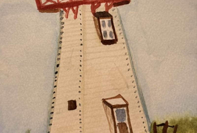
a straight line, it's fine. You can see that I'm also mixing a little bit of this blue as well to have a little bit of color variation on my panels. This the lighthouse are made made of planks,
plank of woods. We're just making it to
pop a little bit more. Again, this step is optional. You can leave it as it is. Trying to a little bit neat. This is really fun
to do. But again, when I'm doing it, I'm also thinking about perspective too, how these lines will go. When you do it, you might get wonky and don't be
scared and let it be. One thing when I teach my students is just
letting go on pain, not worry about being the
lines being straight, not everything to be perfect. You can see that while I was taking I made some mess there. It's really nice. I'll leave
it as it is. I won't care. Once we finish it, I'll go and keep the dots and this is where the contact points on the side plank of this guy
connecting on the side. That also gives you this
really nice detail. You will see in a second
once it dries up, I'm just going to go here as
well and do the same thing. Now we can see that it gives a really nice detail
for lighthouse. I'm going to do the same
thing on this side as well. Might as we go and finish it. This one I'll make it a
little bit faster as well. You can also connect
from this guy to this guy too and you
don't have to be perfect, but make sure somehow, maintaining the
proportions somehow. But again, as I said, you don't have to be perfect. This is also a simple
lighthouse, supposed to be. But I'm just showing
you guys how we can also enhance your look too. This is your bonus section. And if you want, you can add this
and you can leave it and you can
finish the painting. The next day, you can go and
add this once you have time. But this gives
really nice detail for lighthouse for sure. I'm also going to do a couple of lighthouses in
future in the class. I'll show you guys
This is a simple one. I'll be doing a lot of
lighthouse and landscape series. Once you guys
comfortable with this, you can also go and
check the advanced one as well, it's coming in future. You can see how nice
and nice it looks. I'm going to take
some more here. I'm just going to add the same thing what we
did on the other side. There you go. Now we can add these details
and you can see that really nice looking once we add this. We can stop it here. Again, this is a bonus section and you can stop
in the same one. What I'm going to
do is you can take bon amber or Cipia.
Either one works. I'm going to take
a little bit of this Cboblu you can also use something
called Ambra amber, you can see the amber here. Again, this is the extra step
to enhance our lighthouse. This is a bonus section. This is just to separate, what's it called from our
background to the foreground. This also adds a little bit of detail to frame
our lighthouse. I'll make something a
little bit in an angle, not going everything
the same way, some smaller, some thicker and some taller or
somewhere closer as well. You can also make sure that
there's a dip behind it. I'll add one more here, and I will also add
one more here as well. Shaping a little bit better. This is just a shape
we're going to do. That's the important
part, and there you go. Now what I'm going to do is I'm going to connect all
this thing together. I'm going to take this
really thin brush, what I've been using
for making the details. So that, like that. Also connect this guy to
this guy and this guy to this guy and this guy to this guy and this
guy to this guy. You can also connect this guy which goes underneath
it like that. There you go. You can also have something
going like that. And you can see
that we can create this anomal detail, which
is sitting on the top. There's one more last
detail we can add as well is take this guys here and adding a couple
of streaks like this. What this does is it shows
the plane of the lighthouse. Same thing here as well. Maybe I'll do one here. There you go. I'll just
leave it as it is. With the same one, I'm
going to add this detail inside and I'll also
add something here as well. There you go. You can see that I think I'm
going to call this done. I don't want to add
some more details. Maybe I'll just add some
Dara vale like that. Which breaks the part, anything? This one, you can add
it. This are like the bonus section and I'm
going to put some birds. Any painting I do,
I put some birds. That's a thing I do with
my this is near seascape, I'm just creating some bods. There you go. Now, what can I create this really nice detail?
11. Final Painting: Let's see the final painting, and we created this simple lighthouse
using minimal details. Again, you also check
the bonus section to add more details if you want. The reason being I tape
my watercolor paper always is just to get this
really nice criss pages. So I'm going to take this side. You can see that it gives
really nice crisp border, and it looks pretty cool. And that's the reason
being I usually do it. And there's also one more
thing you have to do in painting is not
forget to sign it. Most of the painting I do, I
usually forget to sign it. But this one, let's sign it. There you go. And this is
how our painting looks like.
12. Outro: You for joining
me in this class. In this waterclo lesson, I hope you enjoyed painting the lighthouse and learn
some new techniques. Remember, practice is key, so feel free to revisit
the project anytime. Keep experimenting with your waterclos and don't
forget to have fun with it and post your paintings and projects
in the project section, so I can give you some
feedback and critics. Appy painting, and I'll see
you in the next lesson.
 Dinesh Subramanian, I love painting!!