Transcripts
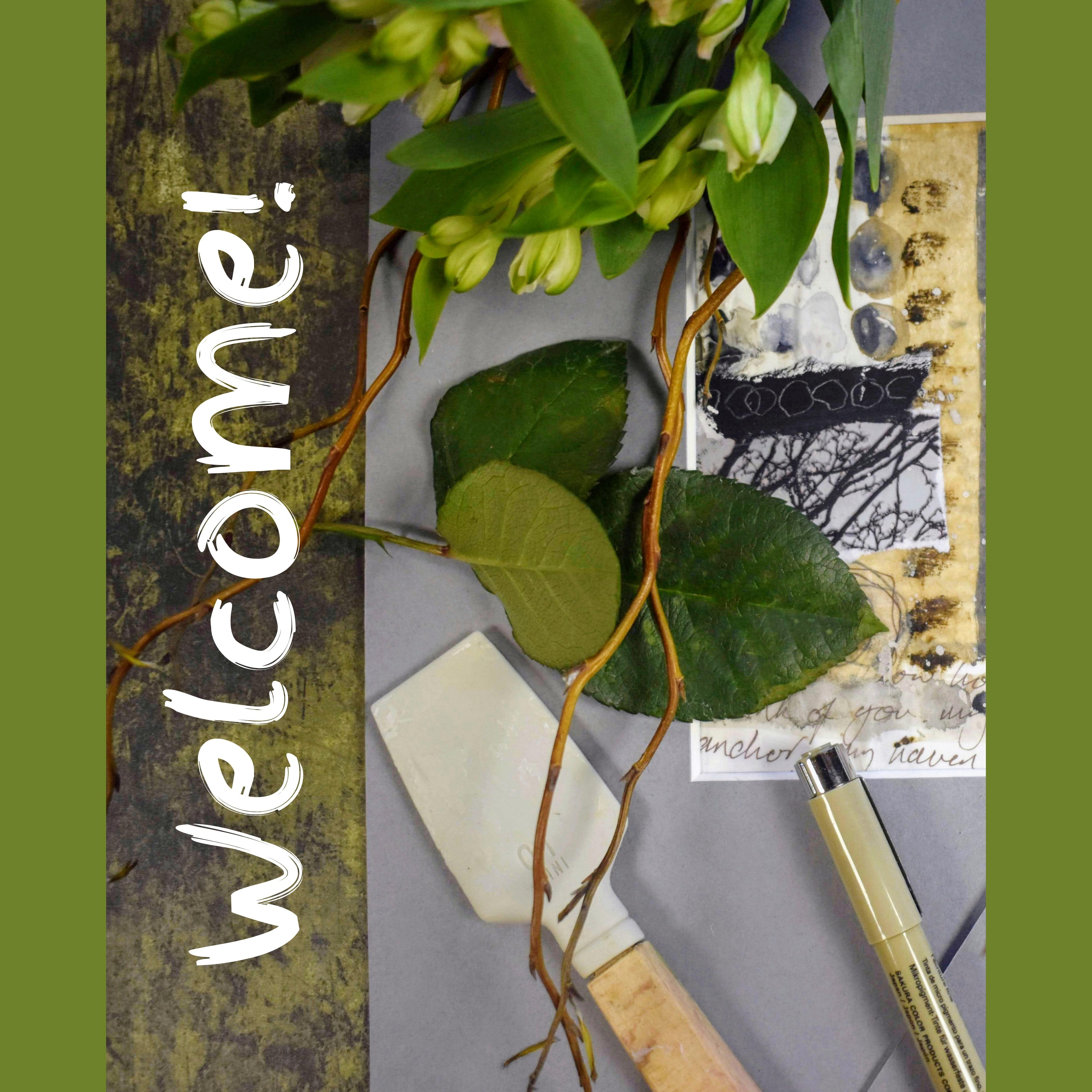
1. Welcome!: Welcome to Earth and Sky. We're going to be
embracing warm, earthy tones and soothing grays into two sibling collages. In all those packaging
papers you've been hoarding, it's time to collect them together and create
something beautiful. If you've never tried
collage before, this may be the class for you. Because I'm trying to create an environment in
this class where we can experiment for the first
time with collage papers, so we can put together a really meaningful and
enjoyable duo of collages. And choosing some
main themes like circles, writing, and lines. You can bring any
paint to this project. Watercolor, gouache or acrylic. Acrylic paint would work best
as it doesn't lift at all. But as I'm allergic
to acrylic paint, I'm going to be experimenting with watercolor
for this project. I'm going to start out with
some brown tissue paper, and we're going to be mark making in pencil,
pen, and paint. We're going to do some more
assemic or angel writing and also bring in phrases, poems, words from a song
that are meaningful for us. We'll be splattering in paint on our handwriting page and
on our packaging paper. This is the recycled
Amazon paper. We'll be creating easy
circles by using our wet into wet technique and creating
wrinkled white tissue paper. We're going to bring
in a nature theme, and I've left you files that you can print off and use for this. And I'll be showing
you how to use gel medium to seal your papers. Although I will be offering alternatives in our
materials section. We'll be using a limited
palette of brown and gray. We'll choose papers
for our base layer, add some brush strokes, and then slowly start
building up the layers. One of my favorite
techniques of all time is to put down some very
thick watercolor or acrylic gouache, and then inscribe into that
whilst it's still wet. And to finish off your project, you could always choose
to buy some mount boards. Don't forget that you can upload your project in our projects
and resources section. And you'll find the M project
section on the right. It's a wonderful way to tap into the Skillshare community and a great way to share
tips and feedback. So how about we do some ripping, splashing, splattering,
and writing together. When you ready?
Let's get started.
2. Materials: So let's run through a
few options for papers. And I use some brown packaging
tissue and some white. And I also used map paper, and I might just use the
back of this because I quite like its weight as paper. But you could also use the map itself as your foundation layer. I chose prescription papers
for my foundation layer, which I enjoyed a lot. Next, I used a different
weight of paper, so this is slightly thicker. And again, packaging paper. And some brown paper. This is quite shiny, so I may not use this, but I could use the back of it. I also printed off
some nature images, and this is just a simple
photo of mine of trees. I copy paper, and it
tears really nicely. And I have left you some files to download if
you want to print them off. So that's our papers. And, of course, these
are just ideas. You'll have lots of papers
that you've been saving maybe I'm using fabriano, hot press paper, and it's
from their studio range. We want something fairly heavy to be able to
take all of the papers. If we move over to glue, I used soft gel mat by Golden. I found that really nice to use. But you could also use mod podge or PVA glue. Or matte medium. This does tend to dry a little shinier
than the gel medium. And of course, there's
always the handy glue stick, which you would just use on
the underside of your paper. I used this catalyst wedge
to apply the gel medium, and it's 01 mini.
It's by Princeton. I used a size four filbert, and we can use that in an unusual way and use it for mark making
to print texture. And I also just picked up this quarter inch kite by
Jackson's for splattering. But any brush that you like, just have a little tryout,
see what suits you. And then the larger filbert for creating some large
brush strokes. And this is a Windsor
and Newton Cotman brush, 1 ", 25 millimetre. As for paints,
we'll need a white, and I used a gouache, but you could use
watercolor or acrylic. And then a brown and
gray of your choice. I chose Paine's Gray, w156, and this is Holbein watercolor
and Van **** brown, w139. And that's also
Holbein watercolor. Use any brown and
gray of your choice. And just to remind you, you can use watercolor gouache
or acrylic for this class. I've got out my
mechanical pencil, which is Faber Castel
and it's a 0.7. And I also have a
graphite pencil handy, which is a four B. And we may not use all
of these materials, but I think it's
good just to have a few things out and ready
so we can grab them easily. I've got my pigma microns out. And as we're going
to be experimenting with thinner and thicker lines, I'm going to use 005
and a 01 in sepia. Now, I choose Sepia
just because it's slightly gentler
than using a black. But any of your
favorite markers, then if you have a giltin, that would be handy just for
trimming down your papers. But I had a handy pair of
scissors, so I used those. And I just wanted to show you the mounts that I think
I might use for my work. I used Pro Cut
Global from Amazon. And these are square mounts, ten by 10 " with a five
by five inch aperture. And I will leave full details of all the materials as well
in our about section. And I think that
concludes our materials. So let's dive into
our class now.
3. Papers | Mark-making On Brown Tissue Paper: Let's start with our
packaging tissue. I've got this brown one. You could use anything you like. You could also buy
this colour tissue if you don't have any packaging. And I'm just getting the two watercolors that I've
chosen for this project, Vandyke brown and Pains Gray. So I'm starting off
with the Vandyke brown. And then choose any brush
that you like and have a play around because we're actually going to just print
with this brush. I'm using my size
for Philbert from that very inexpensive
set of brushes that I've mentioned before
into the Vandyke brown. Quick practice run. Just want some textural marks. And then just printing shapes. Quite thick, almost neat paint. You can always add a
little bit more water if it's not getting the
effect that you wanted. And now I've put some
paints gray down. Adding a little water to that. Taking the excess off the brush. And then I'm going to
fan out the brush. I could have used
a cob brush here, but I don't know if all
of you have one of those, so this is a really
good alternative using the tools that
you have already. And then we're going to
draw a line through, which will be slightly more textural than if we were just
using the brush as normal. I want this quite dry. There's some broken lines
there, which I really like. Taking even more paint off and fanning out the brush again. And this time, we get a
very textural set of lines. And just keep going
until you have enough, you could just carry on and
fill a whole page of tissue with this and just showing
you the quickest way. So I picked up my
mechanical pencil. I'm just going to put the
tissue on some white paper here so that you can
see what's happening. And I really wanted
to bring a kind of a stone shape in like a circle, but not quite a circle. I'm holding my pencil
right near the top, which makes for much more
interesting mark making. And just gently going round, try not to rip up the paper. And maybe one that
starts a little more in the center
and spirals out. Super easy, super effective. And I'll maybe just do some
lines in this in this pencil. We want lots of different
textures, different mediums. And I've got my
005 pigma micron. This is insepia, which
I'm really pleased about because it brings in that
lovely earthy brown feel. And I'm just drawing these along the already laid
down pencil lines. And why not go around
the circles as well? Now I'm bringing in my 01. I do tend to choose
sepia instead of black. It's slightly more
subtle when you're doing details to
flowers and leaves. So this brings in a slightly
thicker line and again, adds that variety that
we're looking for. A
4. Papers | Asemic & Handwriting: So to start with, all we
need is a piece of paper. And this is actually
the back of a map. You could use watercolor
paper, normal copy paper. I touched on aemic or angel writing in our class
T bag tag bunting, and I thought it would be
really nice to bring in some writing as one
of the main themes. So as semic writing is just
writing from your intuition, not trying to form words per se, but just creating movement. I'm doing mine in pencil. These are more like hieroglyphs. Try not to think too much, and if you find it difficult, I find closing my eyes
actually helps quite a lot. I thought I might
go over that with a little bit of pigma
micron as well. This is the 005. Very fun. I think once
you've done it once, you'll probably bring it
into your work again. Now, I'm doing some
ordinary writing. And I'm actually using
some lyrics from a song of mine called
I Want to Stay. And this kind of
became a major theme, really, of my colleges. I'm not worried if I
make spelling mistakes or I do kind of squiggles
at the end of the words. I'm just trying
to create a nice, kind of slightly
antique poetic feel. Strangely enough, that is not what my normal
writing looks like. I tend to write in capitals joined up, which
is really weird. And this is what my
handwriting would look like in cursive writing. So over that with
some of the pencil, trying to interchange between the size of the writing
as well as the medium. You could use any
inspiration here. It could be from a poem
or your favorite song. And I'm going over in
larger writing in places. I want it to look
slightly messy. And I also want to
go the other way and create some
really small writing. A lot of you will have
transferable skills, I imagine from calligraphy
or journaling, so you will be
brilliant at this. So we've got various
sizes there, and they're all intertwining, running into and
over each other. And we're also staying
true to our two colors. We've got the gray of the pencil and the
brown of the pen. Just keep going until you're satisfied with the
writing side of things. And then if you wanted, we could add a
slightly aged look by introducing Sun Panes gray. And I'm just creating some very loose writing and dropping in some other
watercolor in areas. I've got a mix of the two here and adding
some more detail. I'm keeping it very
watery because I don't want to lose the
writing underneath and just doing some
very loose shapes there in a very watery
van **** brown. And dropping in areas of water or slightly
darker watercolor. It creates contrast between
a very watery van **** brown and paint gray to the quite thick paint that's
dropped in in places. And bringing in a
very small brush. It's of the same set, a very small filbert, a size two or zero
would be great. And any other brush like a round brush would
also be great for this. Very loose, feathery writing. I'm getting a real feel now
the vintage poetry look. I'm not really doing that
in any specific way. I'm just doing what feels
right and what is coming up. So I thought a little
bit of a wash there in a very watery Vandyke
brown. I would be nice? And just drop some
darker areas in. And it's really
getting there now. I like that. How about if we splashed some
watercolor in as well, like little ink blots. So lots of water gone up
actually to my kite brush there. But any larger brush, try out which brush gets
the marks that you want. And that's all I want, really, very simple splattering,
not too overboard.
5. Papers | White Tissue, Splatters & Circles: So bringing back the
brown tissue paper. I'm thinking I could add a little bit of
colour to these lines. And actually, a dagger
brush is good for that. Or a flat brush would be great. And again, just dropping
in extra color in places. That's the van **** brown. Just having a quick think. So what next? I have some packaging paper here.
It's quite wrinkled. Recycled feel. Quite easy to rip up
when I really like it. And I thought it might be nice to splatter some white on this. This is white watercolor, but gouache or acrylic. If you're using that, all good. Just do you see my
daca brush again. And I want to add a
bit of water to this. I need a bit of
waking up as well, but not too much because I
quite like the consistency of, like, a thin cream,
single cream. So probably 80%
pigment and 20 water. I quite like the
striping effect that this dagger brush brings out
this paint going everywhere. Quite like that. Adding a bit of water. It's not thin enough, really. I'm just going for a
few more splatters. Yep. I like that.
The darker bits are just where the water
has come off my brush. I'm going over to some
white tissue now. This, I think I bought. And what I like, really, is just water on it. I crinkles up in the
most pleasing way. So I think I might just do that. And I'm thinking that I want to add quite a lot of water
to the tissue paper, I need some sort of substrate, and the best thing for that is one of these plastic
cutting boards, or you could use
grease proof paper, baking paper on the shiny side. And I'm adding a
lot of water and really getting it
thoroughly wet. A sliding my brush under so that the tissue can
adhere to the surface even better and just running
water over the whole thing. You can barely see it,
but once it's dried, it will have this lovely
wrinkling effect. And you can move the tissue very gently with your
fingers or the brush. So let's go through
what we have so far. So we've got our very
wet tissue paper. We've got our brown packaging
paper with white spatters, and we have the brown tissue
with all our mark making on, and then our asmic
and handwriting. I'm actually thinking
now it might be nice to bring a bit of white
into this page. That feels a little
too pigmented, so I'm just going to
run some clear water around it and then
drop in some white. This is white watercolor. If you're using
acrylic, of course, it will be a lot more vibrant and lay more firmly
on the surface. This, I imagine, will disappear quite a bit
into the tissue paper. That's okay. I just
like experimenting. So for one last collage paper, I'm going to paint in
some circles in white. Quite watery and then
dropping in some of the gray. This looks now kind of mixed together because we've
been towing and frowing. So it's a mix now of the paints
gray and van **** brown. I could be so careful
over this and make sure that the paint drops in the
middle and spreads nicely. But I want a kind of a loose, messy feel, so I'm just
really throwing paint around. What of a darker circle there, leaning towards
the Vandyke brown. Slightly lighter in value. So I'm dropping some paints
gray into the brown. And how about some
white into those? Yeah, I like that. So I
think that's pretty cool. We've got quite a lot
of different textures, different values of paint, mark making, dry brushing. So it's looking good.
6. Earth & Sky | Foundation Layer: I had these two mounts in mind before I set
out on this project. As you'll know, I
don't like measuring, so I'm just going to
use one of the mounts, turn it upside down. And I find that if I kind of lay the pencil against
the inner side, that it doesn't mark
the board at all. So but of course, you can measure your paper
to whatever size you like. And another over here. So as I mentioned before, I'm using golden
regular gel mat. But if you happen to
have matte medium, that would work just as well. Or PVA glue or a glue stick, depending on the
finish that you want. I've got a board here from a
finished water colour lock, and I thought I would use this
to put the gel medium on. I'm going to try out
my catalyst wedge, but I've also got a brush
there just for backup. So I'm just going to
put some of that down. And add just a little
bit of water to it. So that's just a preference. I'll leave details about
the catalyst wedge. Now, I've decided
as my base papers, I'm going to use my
prescription leaflets. I thought it was an
elegant way of using something that often just gets
chucked in the recycling. And it kind of made me smile that I was making
something beautiful out of these long lists of possible side effects from the medications that I'm taking. I don't want to go too small. I'm going to use some of the straight edges just to keep a margin
around the squares. It's not that necessary
if you're going to use a mount or mat board. So let's start by putting
some of the gel medium down. This wedge makes
it so much easier. If you have allergies, this does create a bit
of a problem for me. So be careful if you have
asthma or other sensitivities. Just have the window open or an air purifier
nearby if you can. Most people don't have
a problem with it, so I'm hoping it
won't be for you. So we know that this is going to take up the glue underneath, and then we want to put
a layer over the top. All we are watching out for here is we just
want to make sure there's not any large bubbles
underneath the paper. So we're just trying to
smooth out all of the air. And I found using the wedge
this way was the easiest. If you've got edges that
aren't sticking down, just go underneath
and smooth it out. A little bit more gel medium. Actually, I'm going
to turn that round so I have the straight edge
on the right there. Make sure that it's all covered underneath
so that you have a strong adhesion to the paper and there's
no air bubbles, and then smooth out again, just pushing out all of the air. And over the gel medium goes. I noticed when I
pulled that up to put a little bit more gel
medium that it created this lovely effect
where some of the texts stayed on the page when
the paper was lifted. So I think I might go with that. It's quite a nice effect,
and totally accidental. I wasn't expecting that. That paper he sat
there for a while, and this one that I've
just put down is new, so I'm not going to
lift that one just yet. I can decide later if
I want to do that. So the left hand side there was, it was still wet, but it
hadn't dried completely. Ensuring that there's a good
coverage of the gel medium. There's a bit of an air
bubble in the middle there, but it's not too bad. So that's one done.
That's the base layer. I'm just going to move
over to its sibling. Now, the gel medium, as you may know,
dries really quickly. So you need to get
your piece of paper fairly close to you
and ready to put down. And making sure that there's
up medium over the top, and I think I didn't really
get the air bubbles out, so just lifting the paper again, smoothing it out, and then ensuring that there is full coverage
over it, as well. If you're using a glue stick, all you need to do
is make sure that all the edges are
nicely glued down. I think I'm going to go back
to this piece of paper here. It's about the same
amount of time that lapsed between
placing and lifting, and I'm just going to
lift a few pieces. This will all get
covered, perhaps, but I quite like the process and just learning as I go along. So I've got a straight
edge bit here. This is a really relaxing
start to our collages. For anyone who's interested, this is a leaflet from
my Amatroptyne packet, which I take for migraines. I'm so enjoying using
these leaflets. It really is making me smile. Who's a bit of an
air pocket there, but And that's gone
down quite well. I've noticed that there are margins either side
of the writing here, and if you wanted full coverage, of course, you could start with the writing
right at the edge. I probably would have
done that if I'd noticed, but as we'll be
covering all of this, it doesn't really matter. Using my technique
to push all the air out and a nice smooth over. And this seems to be
coming off really nicely, as well, so I'm
pleased about that. It's certainly a technique
I'll use for future projects. So just this bottom
corner to do. Run out of gel medium. And just this we space here. And then I think we're done. So I'm just going to go over, smooth out all the
bits and pieces, make sure that they're all fully adhering to the
paper underneath. One last little tear. That's not come up as well, but certainly an area that I need to experiment
a bit more with. So there we go. G I have fun with these
now. So let's move on.
7. Earth & Sky | First Layer: Before we start laying
down our papers, I'm going to just
replenish our paint, and I've added some white
and I'm just adding a little bit more of the panes
gray and the vandyk brown. I think these layers are
more about the process than the result because we may not even see
these paint marks, but I felt it was something
that maybe you'd like to try, even if we can't see
it in this project, it's a technique that
you could try again. So I've just chosen
a large brush here. Any large brush, you could use a wash brush and just doing a little practice
run on this leaflet, because I don't want it
to obscure the writing, but just to create
a bit of texture. And I'm going to add
some Van **** brown, and that's just brush,
some of the white. Just fanning out the brush a
little bit. I do love this. Just at this layer alone, I think it's really attractive. And I like how
that's highlighted some of the wrinkles
on this right one. I think it might be nice to
have like a cream color. I'm taking a little bit
of the gray and brown, mixing it with the white. I'm just creating some
loose brush strokes. I and maybe some curvy movements. I think that's enough. Just
going to quickly dry those. I also just want to make
sure that the papers underneath are thoroughly dry
as well before we move on. So I'm just going back to
the board that I was using before and adding a little
bit more gel medium. I I'm just adding a touch of water. You don't need to do that. It just thins it at had. I have this print off of
one of my tree photographs, and I've left a few files actually for you to choose from. So you can download
this print it off, and you're very welcome to use the files for this and
for future projects. I just wanted to bring in a
very strong nature element. I'm going to start off, I think, with the circles. And one of our objectives in this project is to
remember that we want to echo a lot of the elements with the other collage as well so
that they remain siblings, each having their own
individual character, but sharing certain themes. I'm pleased that's
gone down really well because this is watercolor. But I think because
I wasn't using it thickly here and it
had dried really well, it hasn't run at all,
so I'm really pleased. So I don't want the same size of element on our right
hand side collage. So I've ripped off a larger bit, and I'm going to put that in the bottom right hand corner. I'm just going over the
edge slightly there and making sure that it's
thoroughly glued underneath. It's really handy, actually, this wedge for getting
underneath paper. And that's gone
down really well, too, so I'm really pleased. So there we have our first
two echoing elements. I'm going for the
packaging paper now with a white splatter. And I want this to be
quite a large component. I think I've got bits
of the underside of this coming off
onto the page. So Things are getting
a little messy, but that is collage for you, well, it is when I'm doing it. Quite a messy affair. So because this is
a thicker paper, I'm just making sure that I have a thicker layer of
the gel medium, and that I'm also putting quite a lot over
the top, as well. So the paint spatter
did run a tiny touch, but it looks really good. And just to reiterate, if you wanted to use
acrylic for this, you'd have absolutely no problem in going over that
with gel medium. It wouldn't budge as long
as it was thoroughly dried, so there is an
advantage to acrylic. Now, collage, again,
just as with paintings, is about balance, and I love
seeing layers come through. Got something about
tissue paper or tracing paper and putting it
over something underneath. I really love that
kind of diffused look. And we may not hold on to this because we'll be
adding lots of layers, but I really like the way it looks over the brown
packaging paper. Now, because tissue
paper is so fragile, as soon as we put that
down on the mac medium, it crinkles a little bit, but as we were going for
that effect, anyway, when we added the water to it, I think that's really pleasing. Those edges are over
the line again, so I still want to make
them lie really well, just to give me a
little room for error. So a little bit
over here, I think. Again, just echoing
the elements. It's always handy just
to lay them down and see if they're working before you
start to lay down the glue. So a nice smooth coverage here. And then almost
embracing the wrinkles. And quite like
that black splodge which was already on it. So now to bring in
some packaging paper. I really like the
top area of this. It's very textual. So I want to have that as a
main part of the collage. And again, making
sure that there's enough gel medium underneath
and then smoothing it over. Don't be afraid to use
lots of medium because you can always
just scrape it off gently with the wedge
or with a brush. Now, this is one of the main elements that
I was aiming for. So I'm going to tear
a strip of this down, and I'm going to rip it
towards me because I want a nice white edge
at the top there. And I want it as quite
a dominant feature. So I'm going to place
it in the middle. Just taking my time. And that really has taken
on quite a presence, really, having torn
it down. What next? I want this same
element in the left. But I don't necessarily want it where that has been placed. I want to keep their
individuality. So quite a lot underneath there, because this is map paper. And I just want to make sure that it goes over the
edges either side, which it does just about. I'm so pleased with the way
that writing has come out. Really can't wait to
see your projects. So I'm going to go over
to the tissue paper. And you can see here
how simple it can be. It's not like we need loads of elements and lots of sheets. We have an adequate sufficiency. So I'm going to start with the brush marks because they bring a certain
texture, which I love. And I just need to
decide where to put it. So we have some horizontal
lines with the writing, so I want to put a
vertical element in now. I'm going to put that just
off center to the left. And it's so nice to have the
different weights of paper. We've got the tissue,
the packaging paper, and the map paper. Definitely time
for some circles. And I'm glad now that I did five because it keeps the integrity
of each one separate. So I think I might
put these three on the right hand side and use
the other two on the left. So they're not completely
mirroring each other. Just keep moving it around and be confident and go
with where it feels best. And having this vertical
element here over the writing, I think will be lovely. And again, the watercolor
in the middle of the top circle has stayed put, so that's good to know. So I have the other two, which are quite
different, actually. I'm gonna tear those down. And that just felt right
as soon as I put it there, so I'm not going
to overthink it. Let's get it down there. And I think actually just one
of these would look good. I'm loving that so
far. So let's move on.
8. Earth & Sky | Second Layer: So I'd still like to
use this other circle. I just wanted to make these
two elements quite different. So the ones on the right
are definitely more circular and their siblings on the left are a little
bit more sketchy. And I've actually just picked up this little element here, which was a practice
for the brush marks. Hikiwe element. And it looks like there's just a custom made area
there just for that. I find doing this is much
more considered than doing a very quick style expressive
impressionistic painting. So it's quite different for me, just pausing and
thinking about it. And I'd be interested to see how you experience
this, as well. So I'm tearing towards me, so I get that lovely
white ripped edge. I as I mentioned earlier, I've left you some files or photos of trees that you
can download and print off. But if you haven't
got a printer, you could always use images from a magazine
or a nature book. So this is yet a
different texture because it's copy paper. And what I hadn't realized
until it was printed out was the background
color to these trees, which is a lovely
kind of warm color. It's quite complex. So again, I'm varying the sizes between the two collages
of the elements. So I want a larger
element here, I think, on the right, and I've decided it will look
good at the top. And I'm going to apply
it right at the top, maybe slightly out of
the pencil mark again, just so that if I want to
frame these, I can do so. Don't be shy with your glue.
And just take your time. That's gone down really well. So at this point, we
can also maybe do some writing straight on to the substrate
of the collages. So I'm just having
a think through. I'm just cleaning out a well to add some white.
This is watercolor. Because I think it might
be quite nice just to flick in a little
bit more paint. And I've picked up my
quarter inch kite brush. But absolutely any
brush that works for you for this technique. And I might just
add a tiny bit of brown just to make it a nice creamy color. Bit more water. So still quite thick, but wet enough to splatter. Not got a very good
technique going here. I've mixed together the
gray and brown there. And then added white to it. We've got a lot
of warm elements, and I thought it'd be nice to
have a little bit of gray, even though we have a little
bit of brown in there. And let's do some mark making. I'm using my kite
brush upside down, but a small round brush
would be great for this. So I have a little
bit of gray there, and I think I might
do some gray lines over on its sibling. They're not perfect
by any means. I want them to have character. And you can see there,
we're also bearing in mind vertical and
horizontal mark making. So I'm wondering what to
do with this area here. Just going to pick up a little
bit of the paint splatter. So we're getting
to the point where we're just slowing down and considering a little bit more. I'd like to add a
little bit of writing. Before I do that, I
might just try adding some shadows to these marks, but it's breaking up the paper and trying to write on that little bit on the
right is also not working. It's not showing up
enough. So I have an idea. I could just make sure that
these areas are thoroughly dry and then I'm going
to try something else. I think the good thing
about collage work is you can take breaks and
come back to things. And, of course, all the layers would have dried naturally. Let me see if this works now. I'm desperately trying to
make that more visible, but it's not working, and I'm going back to the idea that I had
a few moments ago, which was to use
graphite pencils. Any pencil that you have
leaning heavily towards the B. So I'm thinking maybe five
or six B or something. And that's much better. I think this will
be quite visible. That's dry as well, but it's still really not
fully what I want. And again, I could make
this look easy peasy, but I want to show
the process when things aren't working quite
the way that we want. But I'm going to
move on, and I'm going to do some writing
here vertically. I love the smell
of these pencils. And again, that's the title of the song that I'm drawing
inspiration from. I making sure this little area here is thoroughly dry. And I'm just going to
add some pencil marks. It is lifting the tissue
paper underneath, so I'm going very
gently over the top. I might come back and
change that area. I think trying things
at this stage, rather than being too afraid to move is
always the best bet. I wanted to try out a warm brown and the
carving in method. And although I didn't
actually use this element, I'm just showing
it so that you can see how you can carve
in little flowers. It's very sweet, and I'll
keep it for another project. So this is almost neat, pains gray, and I'm going to
cover this piece of paper. It's probably 90%
pigment, ten water. So whilst that's still wet, let's get in really quickly
using my mechanical pencil. Any pencil will do, or even a clay modeling tool. Anything that will inscribe
lines into the paint. And isn't this a cool technique? Very satisfying.
Love, love, love. I do love Pains gray.
9. Earth & Sky | Last Layer: Alright, so I'm showing this because it was a
learning moment. I realized that laying the watercolor down so thickly on a piece
of paper like this, when I drew the gel
medium over the top, it lifted the paint. So I had to kind of rethink, which is good to know because
the more watery motifs, like the circles were fine. So I just know that using thick watercolor is
not going to work. To show these things would
be so easy just to hide, but I like to show the process. Picking up various
pieces of paper, seeing if one talks
to me. And one does. This is the back of the map
paper that I was using. And I want to try again with this method of inscribing
into watercolor. If you're using acrylic, you'll have no
problem whatsoever. You'll be able to
inscribe, dry it, put it down, and then smooth over the gel medium
with no problem. But watercolor and I think gouache does lift
when it's very thick. I think the idea is good, so I'm going to really keep
going until I get there. This time, I'm going to
stick the paper down. Very thin layer over the top. You could just glue it without
smoothing over the top. I quite like that as just a
blank cream piece of paper, but I'm going to just move over to its sibling
whilst I have a think. But I am warming up
to this idea now of having some dark
contrasting elements. So this white piece of paper
on the right is now dry. So I'm really going to embrace the pain's gray this
is the superhero. It's a really lush, dark color. And whilst that's still wet, let's go in and inscribe our
words or images or marks. And I want to stay. It's the title of the song, which I'm taking my
inspiration from. I did this brown paper earlier. I'd like something there, but I'm not sure that's
the paper that I want. I think I want to
echo that dark gray. And I think I'd like it here because it feels like the edge there needs
a little bit of help. So I'm going to tear
down a piece of paper, and I want it just slightly in the margins of the
original pencil marks. Going over lots of layers here, so be generous with gel medium. And let's get that down. I like the placement of that. It's another vertical motif that echoes the brown
tissue on the left. Just imagining that framed. So I'm going to let that dry. And the gel medium
dries so quickly. So I'm going bold and putting some very
thick pins gray down. And immediately, I
love that because it ties both of the
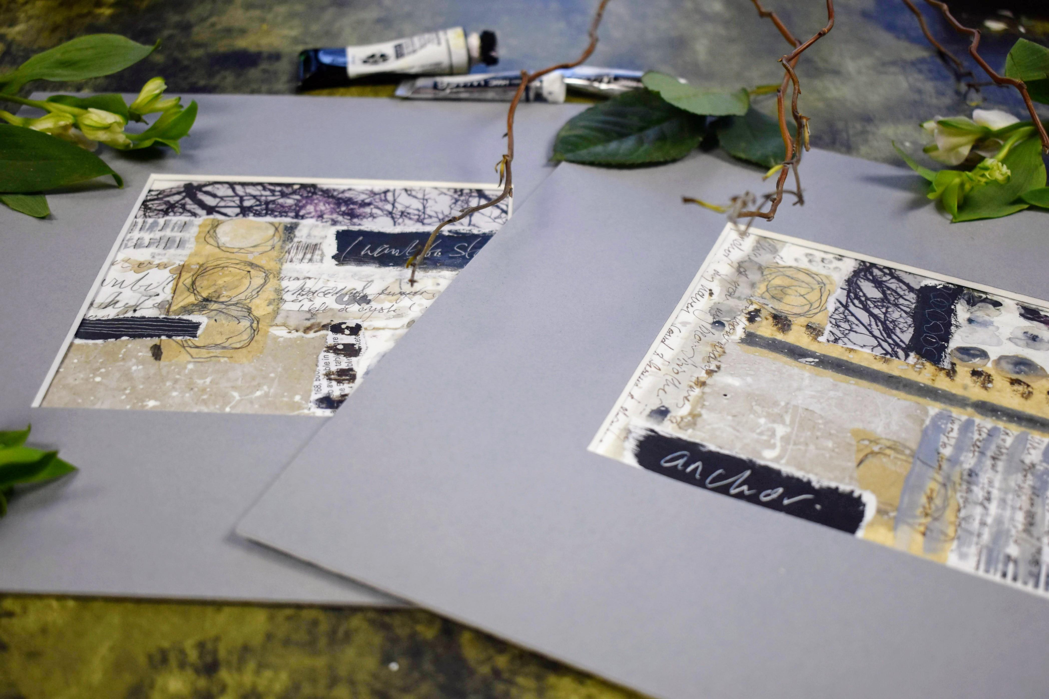
collages together. And I think it'd be nice to do this with vertical writing. I'm writing anchor
from the memory that I have of my brothers
and I discovering a massive ship's
anchor about five foot tall that are being washed up in a storm on the
Lancashire coast. These two phrases mean a
lot to me at the moment, so it's a surprise that it's
come out of these two what I was thinking of as
sketchy ideas for collages. They took on this extra meaning. And I wonder if that would
happen for you, too, and if you'd like to share that have a mount here
which has got some damage, so I'm quite happy just to place that on to see where I'm up to. I want to see what the
margins are looking like, and I can see there that
there's a gap in the top left, which I'm not entirely happy
with where the circles are. And if I do the same
here on the right, I have a similar problem
in the bottom right. I don't want to overdo it, but I think an extra
one or two circles would just finish
this off nicely. So just double checking again
where I need those motifs. I'm feeling quite
heartened now that I've seen it with the
mount around it. I'm aware that the areas that I'm going to be
painting directly onto have MAC medium on them, that's the surface
that I'm working with. So it'll be interesting to see how the watercolor behaves. And I imagine it'll
be something very similar to the mac
medium class that we did together where we
were creating layers with McMdium and watercolor. And, yeah, it's very
similar to that effect. I quite like the effect of
that like raised areas. Because this is watercolor, you can see all
the little ridges. If you're using acrylic here, it will give you a
smoother finish. So just mixing between
the gray and the brown, they can look messy. I don't want it to be too neat. Adding a bit of water
there to my brush. Dropping in some
darker watercolor. And the same up here. Yeah, that's nice. It's really
balanced it all out now. Going to have another look with the mount or mat
board around it. And yeah, that's cool. I'm liking that.
I'm also wondering, and I always do this. I think I finished and then one more idea
pops into my head. I think it would be nice to do some small writing
along these gray lines. Using my 005 Sepia pigma micron. Just checking that I'm not
going to smudge my work. Just going to dry it. It would be a shame to smudge something at this late hour. So I'm going to play it safe. Yep, that's feeling dry. And everything else is, too. Again, just lyrics from a song. This is another opportunity to imbue more meaning
to your collages, bringing in your
own words or poems. I like that this small writing contrasts the larger
elements on the page. As I did little marks like this with our tea bag
tag bunting class, I want to do a very
similar thing here, just adding a wee bit of
shadow on the gray marks. Just mix them pop a little bit. That's sweet. I add a few lines here. I still have this
element from earlier, which is the gray lines. So I'm going to pop this down
in this little white space. And again, just
leaving it and not putting any of the gel
medium over the top. So I've got two darker
elements on the right. So I'm going to create
another one here, a small one. Nice, thick paint. And then I'm going
to keep it very simple and just etch
in some circles, keeping with that major theme. It's still wet and I really want to finish this collage here. So I'm going to hold
on very tightly to it and give it a quick
blast with the hair dryer. If that had flown
across the room, I don't think I would have
found it again, so success. Okay, our final placement. Making sure there's plenty down. And this nicely unites the elements above and below of the circles
and the leaves. They feel really balanced, not only in themselves, but also with each other. Just double checking again, and everything
looks really good. So tempting to do more, but I'm happy to stop a
10. Flattening Our Collages: So if you wanted to flatten
your collages, first, we need to be absolutely
sure that they're thoroughly dried and there's no
stickiness or tackiness left. So I'm using scissors
just to cut them down. I can't cut in a straight
line to save my life, but I didn't want to risk damaging the collages by
using my fiscas gillotin. If you're planning
to frame yours, just remember to leave some
space around the collage. So they're looking good. I'm a relative
newcomer to collage, but this is the way that I'm
going to flatten the work. You may not need to, but
I'm going to try it out. So I'm going to create
a stacking area. And I have some parchment paper. The plastic board underneath is just one of those
cheap cutting boards. I use them for all sorts of
different art techniques. Quite like the
color of that tape. I put that to one side. So it will open out
on the matt side. Mmm. And what we need to bear in mind is we want the shiny side. M. So I have a spray
diffuser here. Any water spray would be great. You want a fine mist
because we're not looking for the paper to
become sodden with water. We just want a very light spray. So just move the parchment paper to the right, turn it over. I go to hold it up
just a little bit. And then a very fine misting. Same for its sibling. I'm going to bring the
parchment paper back. I'm cutting a piece, which is just over the
size of the plastic mat. And then just making sure
I got my handy gloves on. That all the water is lifted and there's nothing
left. It's nice and dry. Mm. So I want to make sure, especially because
I'm using watercolor, that there's no
dampness underneath. I realize here that I'm using the mat side of the
parchment paper. You had one job, Olli, one job. So now, I just want to judge how big the second
sheet will be. And this time, I've remembered to put
the shiny side down. I have one of these
heavy artboards. Which is about a three size. It is quite heavy, so I'm pretty sure this
will do the trick. But just for good
measure, I'm going to put a heavy book on top. I've used the artboard because it gives you an even pressure
across both collages. So that's what I was
going for there. So I've got my big
impressionist revealed book. Love impressionism. And I'm now going to search for
something even heavier. And I think I found
the perfect thing, which is a big box of bird food. I do adore my birds. So definitely heavy,
definitely even, panning out there a little
bit, so you can see. And it should be fine
after about 24 hours, so have a check, and I will be back showing you how they fed underneath
all this weight. Mm hm. M
11. Unveiling & Mounts: Here I am the following day, removing the book and
the heavy artboard. I'll keep the papers for
further art projects. And that's worked really well. Now, I did have these max
or mount boards in mind, and I got a cream and gray one. Just want to make a decision. And I got these from Amazon, so I'll leave you a link. I've decided on the gray. I'm just going to reach
underneath and pin the collage to the mount and then put my scissors on it
to weight it down. And I'm just going to secure
it with masking tape. This tape is so dependable
and really, really cheap. I've used it for years, so I'll leave a link
for that as well. And let's get the other one out. And that looks good. Scooping up the back there so I don't
lose the placement. And then just doing the
same with the masking tape. You could either assign these on the back or wait till you
have a frame for them. Or you could put your
signature on the front. But I think these have a really cohesive relationship
with each other. I'm really chuffed.
12. Thank You!: And here we are. We've
finished our collages. We've looked through
various papers, maps, prescriptions, tissue,
copy, and packaging paper. Created some mark making. We've added painted details. And built up the
layers step by step, echoing the themes
in both collages. So these are very much siblings, but each having
their own identity. For me, some very
meaningful words came up, and it reminded me of a song. So if you're interested
in hearing that, I'll tag it on the
end of the class. So our finished
sibling collages. Thank you so much
again for joining me, and I'll see you
over in discussions and on Instagram. Bye for now.
13. The Song: I Want To Stay | Class 'Add On' :O): Walking into your home sharp too Like bumping into long Bri stra. I want to stay. I want to stay until he
can embroider me home I want to stay until I find my Oh. The fluttering of my noise. Fingers busy themselves. The strains. Well, at hurt To I want to stay I want to stay. Until you can embroider
me I want to stay until I find my breathing for a time better to remaining the word singing I stay can embroider me stay until my
 Holly Tomas Art, Watercolour | Gouache | Mixed Media